Skip to content

Tag: W.W. Norton

The Truth of Life: Paula Fox on Desperate Characters

desperate characters

At Longreads, Sari Botton talks to author Paula Fox talks about the latest reissue of her 1970 novel Desperate Characters:

It’s for all kinds of tension, not just racial, but class—the poor, who don’t have money or success, against the well-to-do. There are all these antagonisms… We live by pressing our palms against the skulls of the people whom we climb over. The sense of that is very strong in human society. Sometimes it’s based on possessions, or looks, or color, or experience, or history, and all these various things that we make judgments out of.

If you haven’t read Desperate Characters — and it’s a pretty perfect read if you’re stuck in the city this summer — Longreads also has an excerpt.

The cover of the W. W. Norton’s new edition (pictured above) was designed by Yang Kim.

1 Comment

Joe Sacco on Bookworm


Following on from my post yesterday, Joe Sacco talks about his new book The Great War with Michael Silverblatt on Bookworm:

KCRW Bookworm: Joe Sacco The Great War mp3

Comments closed

Joe Sacco and Journalism

In this bonus footage from the W.W. Norton’s documentary short on The Great War, Joe Sacco explains his relationship to journalism:

1 Comment

The Great War by Joe Sacco

Joe Sacco talks to The New Yorker about his new accordion book The Great War, which folds out to create a twenty-four-foot-long panorama of the Battle of the Somme:

When we first talked about my drawing a panorama of the Western front, the idea seemed static. But immediately I thought of the Bayeux Tapestry… which has a narrative. William the Conqueror in France is getting ready for the invasion; they’re building the boats; they’re crossing the English Channel; then there’s the Battle of Hastings, and you basically read it left to right. It just came to my mind that I could show soldiers marching up to the front, going to the trenches, going over the top, and then returning after they’ve been wounded, back through the lines to the casualty-clearing station behind the front. So it seemed like a very simple idea, and to be honest, I just wanted to draw. On a visceral level, it was just a pleasure to think only in terms of drawing.

It was a relief not to think about words, and to do a different kind of research. I did a lot of image research and I actually had to read a lot of books, because sometimes prose takes you where photography never went. I would read and get images in my head, and it was just a matter of putting them down. I’ve spent a lot of time doing journalism, and I still am interested in it, but I think the artist side of me wants to sort of come out now. And that’s what the Great War was to me, letting myself go in that direction.

Sacco talks more about the work in this video for publisher W. W. Norton:

1 Comment

Tim Parks: The Romance of Train Stations

Taken from his new book, Italian Ways: On and Off the Rails from Milan to Palermo, Tim Parks considers the emotional drama of the Italian train station:

The train station is the ideal scenario for greetings and farewells. The car is too banal. What does it mean to set off in a car? Nothing. The airport is too exhausting and impersonal, the plane itself remote, unseen, the barriers and security disturbing. Here the powerful beast of the locomotive thrusts its nose under the great arch of the station. The lines straighten from the last bend. Clanking and squealing, the train slows. The last moments of waiting begin. Eyes focus on the platform, keen to possess their loved ones; in the train corridor, meanwhile, the long-awaited beloved is jostling and jostled, luggage at his heels. The train slows, slows, slows, teasing everyone on both sides of the divide, making them wait, making them savor the tension between absence and presence.

The cover design is by the talented Jaya Miceli by the way…

Comments closed

Paula Fox | Writers & Company

Paula Fox, storied author of Desperate Characters, talks about writing and her memoir Borrowed Finery with Eleanor Wachtel in this archive interview for Writers & Company from 2002:

CBC RADIO WRITERS & COMPANY: Paula Fox Interview 2002

The cover above, from Fox’s collection of stories and essays News From the World published earlier this year by W. W. Norton, was designed by Roberto de Vicq de Cumptich.

2 Comments

Under the Influence

Here’s the neat animated short for the new nonfiction comic book The Influencing Machine by Brooke Gladstone, co-host of NPR’s weekly radio show On the Media, and illustrated by Josh Neufeld:

The book apparently looks at the history of the media and argues against the idea that media is external force outside of our control.

The Influencing Machine is published by W.W. Norton.

Comments closed

The Art of Immersion | Jason Booher


The nice folks at W.W. Norton were kind enough to give me a heads up about this beautiful new cover design by Jason Booher for The Art of Immersion by Frank Rose. Stunning stuff.

Be sure to check out W. W. Norton’s Book Design Archive on Flickr if you haven’t already.

Comments closed

Something for the Weekend

A series of book cover design concepts for The Infamous Press by Norwegian graphic designer Morten Iveland (via IS050).

Paid by the Joke — The enduring appeal of Keith Waterhouse’s Billy Liar in The Guardian:

Billy Liar’s longevity is not an example of a tale that is told and told again with a dulling faithfulness; rather, the long life of Billy Liar is a story of reincarnation, of each new generation seizing upon the tale afresh and making the story its own. Its influence may be felt in half a century of creative endeavour, in drama and literature and film, and, perhaps most keenly, in popular music: referenced, for instance, in the video for the Oasis single The Importance of Being Idle, and in a song by the Decemberists, and popping up, too, in many of Morrissey’s lyrics, including the Smiths’ 1984 hit William, It Was Really Nothing.

And if anyone at Penguin is reading, please, please reissue Billy Liar with the Tony Meeuwissen Woodbine cover from the 1970’s (come on, you know you want to):

(image via David The Designer)

If Covers Could Talk — A nice satirical book cover blog, kind of like Unhappy Hipsters for books.

And finally…

W. W. Norton, who have done great job with their Flickr — particularly their book design archive where the above stunner by Gray318 comes from — now have a Tumblr as well. The latest post, at the time of writing, is an animated scene from Stitches, the graphic memoir by David Small. Nice work.

5 Comments

Ben Wiseman | Chekhov

I really like these Chekov covers for W.W. Norton by Rodrigo Corral Design’s Ben Wiseman:


But I think the alternates are pretty special too:

There is a very short interview with Ben at idsgn.

(via FormFiftyFive and Cosas Visuales)

Update:

The good folks at W.W. Norton have just added Ben’s Chekhov covers to their Flickr design archive (thank you!).

These new editions are available in July 2010.

4 Comments

Hunger

At the risk of this turning into W.W. Norton Week on The Casual Optimist, I wanted to re-post this gorgeous cover for Hunger by Lan Samantha Chang designed by High Design, with art direction by Albert Tang. It was originally included with my Q & A with Norton’s Ingsu Liu earlier this week, but removed when I updated the post.

W.W. Norton Book Design Archive on Flickr

Comments closed

Q & A with Ingsu Liu, W.W. Norton

Having spent a lot of my life in the UK, I wasn’t particularly familiar with venerable New York independent publisher  W.W. Norton and Co. until my stint at Toronto’s (now doomed) Pages Books and Magazines where their books were frequently on tables.

Although I left Pages a few years ago, I was recently reminded of the breadth and quality of Norton’s books — and, of course, their covers — by their decision to archive their book cover designs on Flickr.

In a roundabout way, the launch of the design archive also put me in touch with Steve Colca, Norton’s online marketing manager. He in turn, hooked me up with Ingsu Liu who kindly agreed to talk about the design process at Norton for this week’s Q&A.

Currently V.P. art director at W.W. Norton, Ingsu Liu graduated from the graphic design program at Pratt Institute in 1988 and began her career at Penguin, William Morrow and Vintage Books before accepting a position at Norton in 1997.

Briefly, describe your role at Norton

I oversee the hardcover jacket imprint.

How many designers are on your team?

I oversee two in-house art directors; together we collaborate with various outside freelance designers, illustrators, art researchers and photographers.

Approximately how many covers does Norton require each season?

About 55 to 75 books each season. We do 2 seasons, for a total of roughly 125 books a year.

Is there a ‘house’ style?

I certainly hope not. I believe it’s most beneficial to be diverse, so that each book jacket can have it’s own voice. This helps to keep the list fresh and my job more fun.

Do you approach fiction and non-fiction differently?

It really depends on what the book requires, but the basic process is the same. First I talk to the editor, publisher, and marketing… then drawing from those conversations, the book brief, the author’s writing, the current market place, the comparative titles and what the book is about, I then decide which direction the jacket should go and set out to assign the best designer or artists for that title. My focus is on what’s best for the particular title, everything else comes naturally after.

Which books provide the biggest challenges?

The titles that no one can agree how best to market the book and therefore what sort of jacket it should have. Also, big print runs where there is more at stake. Then, there’s the occasional book where the author’s 6 year old daughter gets to dictate the jacket design.

What do you look for in a cover design?

Craftsmanship, mood… but a strong concept will always rule the day. Also, the surprise factor is pure gold; nothing is worse than the “same design, different day” effect. A design should, at the very least, have its own point of view.

How are final covers decided upon?

After I have decided on who is best to work on the cover design, I start presenting the designs at our jacket committee meetings. There we narrow it down to one final choice. Then — when there is not a six year old involved — the author, the author’s agent, the editor, the marketing and the publisher all have to sign off on one final jacket design. Sometimes, after we finally get all these diverse interests on the same boat, a single book buyer can kill our jacket and we start the whole process all over again.

Do you think there’s a tension between producing creative covers and what will play in the market?

See the last sentence in my answer above. That said, we are constantly being subjected to various subjective opinions. It is my job, when I can, to filter through it all and to use the good advice and to discard the bad… and unfortunately, the folks with the bad advice often have the loudest voice. See Dick Cheney.

Have you any recent favourites?

Obsession: A History by Isaac Tobin (University of Chicago)

Milk by Barbara deWilde (A.A. Knopf)

Pride and Prejudice and Mansfield Park by Leigh-Anne Mullock

Metamorphosis and Other Stories by Mother (Penguin Classics)

Waiting For The Barbarians by Paul Buckley (Penguin)

Sedaris by David Drummond (University Of Minnesota Press)

The Paranoid Style by Brett Yasko (Vintage)

The list goes on and on, and on….

Do you discern any current trends in American book cover design?

Most obvious is the rebirth of interest in comic artists. Whether it is a whole book or just a jacket image, I never get tired of seeing great comic art. Growing up in Taiwan, I spent countless hours lost in thousands of comic books, it is what inspired my interest in art and has kept my fascination to this day.

Also it’s nice to see so many designers and artists collaborating so that hand-done art is being combined beautifully with all these hi-tech designs and applications. This mix of raw and slick often creates the most interesting packages.

Are they any designers whose work you particularly admire?

Sagmeister, Will Staehle, Evan Gaffney, Louise Fili, Peter Mendelsund, John Gall, Paul Buckley, David Drummond, Patti Ratchford, David High and Gabriele Wilson. The fact is there are too many to list…

Are there any book or design blogs you read regularly?

I mostly still enjoy going to the book stores to be inspired, but Eye Magazine, the annuals from Print, Communication Art, AIGA, and the Type Directors Club are the good old standby’s for me. For blogs, I like FaceOut Books, The Book Design Review, Design: RelatedThe Book Cover Archive, and most recently The Casual Optimist. And now that you’ve interviewed me, your blog is totally awesome!

With the growth in e-books, do you think cover design will continue to be important?

I very much hope so. I love holding a beautifully produced book in my hands. But the fact is that one must embrace the future — for it’s coming whether you want it to or not.

Thanks Ingsu!

With special thanks to Steve Colca, Manager of Internet Marketing at W. W. Norton & Co. for arranging the interview

UPDATE:

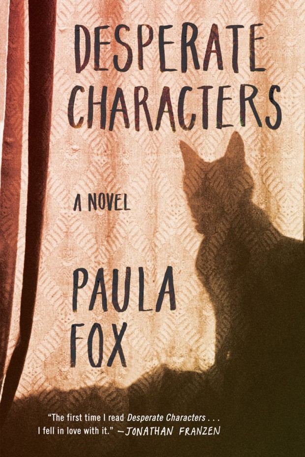
Since originally posted on August 4th, 2009, some of the images accompanying this interview have been changed. The previous images were my selections from the W.W. Norton Design Archive on Flickr chosen to illustrate the work of some of the designers mentioned in the Q & A and to reflect the diversity of books designed and published by the team at W.W. Norton. To avoid confusion, all the current images were art directed by Ingsu Liu.

Design credit for the individual covers included in this post:

Flash Fiction Forward Design by Rodrigo Corral
The Meaning Of Night Design by Patti Ratchford
Busted Design by Jon Grey
What Can I Do When Everything’s On Fire? Design by Evan Gaffney
Stitches Design by Paul Buckley

4 Comments