Skip to content

Tag: ulysses

Ersnt Reichl: Wide Awake Typographer


Elizabeth Hawes, Fashion is Spinach (Random House, 1938; AIGA 50 Books 1939)

At Design Observer, design historian Martha Scotford discusses the work of German-American book designer Ernst Reichl:

Midway in his career, Reichl began to reflect on many of the books he designed in written comments; he spent more time on this during the period 1977-1978, shortly before his death in 1980. In the end, there were approximately 550 3 x 5 inch index cards on which he hand-wrote his thoughts about selected books he designed. In lively prose Reichl comments on myriad elements of book design and details of book production, several for each book. He covers typography, binding design and jackets, illustration, publishers, the publishing industry in New York, design colleagues (revered and annoying), production triumphs and problems, how well the book sold, his opinion of the book and his philosophy of book design as applied to that title. He also critiques his own work, sometimes in the moment, sometimes from the perspective of more time and experience. These comments, often sharp and humorous, are highly entertaining and informative. I know of no other book designer who has done this so extensively.

Reichl’s comments about book design have now been transcribed from the cards and accompany a selection of over 100 examples of his work in an exhibition curated by Scotford, ‘Ernst Reichl: Wide Awake Typographer,’ currently on display at Columbia University’s Rare Book and Manuscript Library in New York until September 13, 2013.

On a related note, Scotford has previously written about the US publication of James Joyce’s Ulysses and the role of Ernst Reichl, who designed the typographic cover for Random House.

Comments closed
Midweek Miscellany, June 17th, 2009

Claustrophobic and Irrational — I love these elegantly understated designs by Rodrigo Corral and Christopher Brand Jason Ramirez for Patricia Highsmith’s Ripley books published by W.W. Norton.

A Strategy For Authenticity — Don Linn, prolific Twitterer and publisher at The Taunton Press, on O’Reilly’s Twitter Boot Camp and Twitter as a marketing channel:

I’m relatively new to twitter, but what I’ve loved about it since discovering it is its immediacy and its spontaneity. That’s where the joy is and, in my opinion, that’s where the power is (witness #iranelection and related topics). My fear is that the suits will “Clear Channel” (yes, that’s a new verb) this simple little application into nothing but a giant vanilla message board filled with thinly-disguised spam, planned spontaneity.

Cars and Books Sean Rogers discusses Dutch cartoonist (and cover artist) Joost Swarte at The Walrus:

Swarte has some mild fun, on the Walrus cover, with the nutty rush out of the city that clogs our highways every summer. But the assignment also offers Swarte the opportunity to clear-line the hell out of some cars and books, a couple preoccupations that crop up all over his work.

Why Ulysses? — To coincide with Bloomsday , Gary Dexter explains how Joyce’s masterpiece got its title:

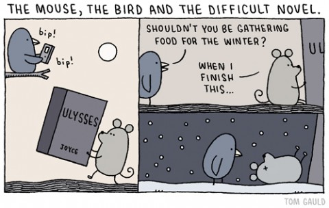
The paradox of Ulysses is that one needs to read it to understand twentieth-century literature, but one needs to read twentieth-century literature to build up the stamina to read Ulysses.

The problem starts with the title. Early readers of Ulysses, exhilarated and appalled after 800 pages, were often still left thinking ‘Why Ulysses?’ Ulysses is barely mentioned.

And lastly… I can’t thank the chaps at the BCA enough for the link love . You are gentlemen and scholars.

And thanks to the scarily talented Nate for creating the Paradox of Awesome album cover yesterday afternoon and sharing on Twitter. Hilarious. Or maybe you just had to be there… It made my day anyway…

5 Comments