Well, it’s been a month. I hope you’re all keeping safe and well, especially my friends and publishing colleagues in Minnesota. Stay Strong.
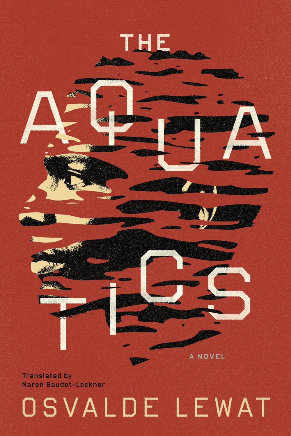
The Aquatics by Osvalde Lewat, translated by Maren Baudet-Lackner; design by Alban Fischer (Coffee House Press / December 2025)
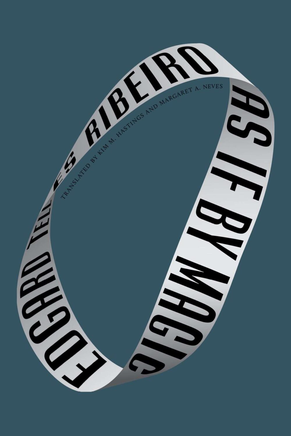
As If by Magic by Edgard Telles Ribeiro, translated by Kim M Hastings & Margaret A Neves; design by Alban Fischer (Bellevue Literary Press / January 2026)
Yes, starting off the year with two covers designed by Alban, but also two books from nonprofit publishers based in Minneapolis, Coffee House Press and Bellevue Literary Press.
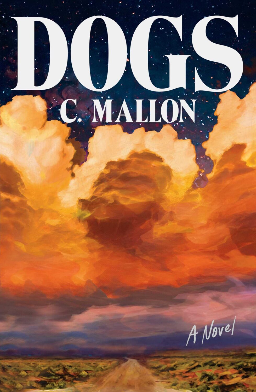
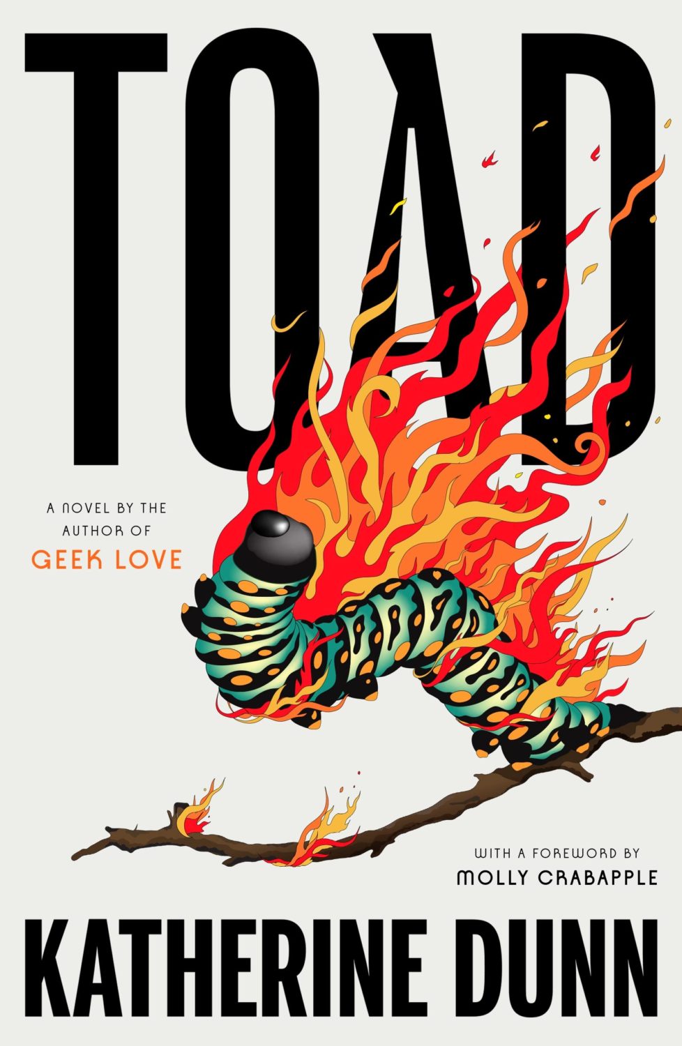
Crux by Gabriel Tallent; design by Jaya Miceli (Riverhead / January 2026)
2022. Twenty twenty-two. Two thousand and twenty-two… “Where did it go?” Or, sobbing, “ are we done yet?” It feels like both. It’s been a year that’s simultaneously dragged on interminably and disappeared in a cognitive blur.
I’m glad other people have already written about it.
At Creative Review, writer and editor Mark Sinclair picked his favourite covers of 2022 and reflected on industry trends in the UK, including the Design Publishing & Inclusivity mentorship program for under-represented creatives launched this year by Ebyan Egal, Donna Payne, and Steve Panton.
Literary Hub posted the best covers of the year as chosen by 31 designers. With a comprehensive 103 covers on the list, it tacitly poses the annual question “what do I have left to add to this conversation?” LitHub have been posting these lists for seven years apparently. I am an ancient desiccated husk.
Fast Company and the Washington Post asked slightly smaller groups of designers to write about their favourites covers.
Designer and art director Matt Dorfman chose the best book covers of 2022 for the New York Times, and empathized with the plight of the designers:
Most often, any personal stylistic expressions in their work are swallowed up in service to the multiple masters — editors, marketing directors, sales teams — who sign off on a book’s cover. There is also the matter of adhering to any one publisher’s dos and don’ts, which can inform mandates about typography, color palettes and production flourishes like embossing or metallic inks. For people employed in a theoretically creative pursuit, designers’ talents are often defined by how effortlessly they can make themselves disappear to serve the book.
Matt Dorfman, New York Times
No one captured the prevailing mood better than this Tom Gauld cartoon. A reminder, if one were needed, that nobody knows anything.
Earlier in the year, Australian reporter Rafqa Touma called out the trend of ‘well dressed and distressed’ young women on covers. As designer Mietta Yans notes, the covers often reflect their books’ stylish and sad protagonists, so I’m not sure this one is on the art departments.
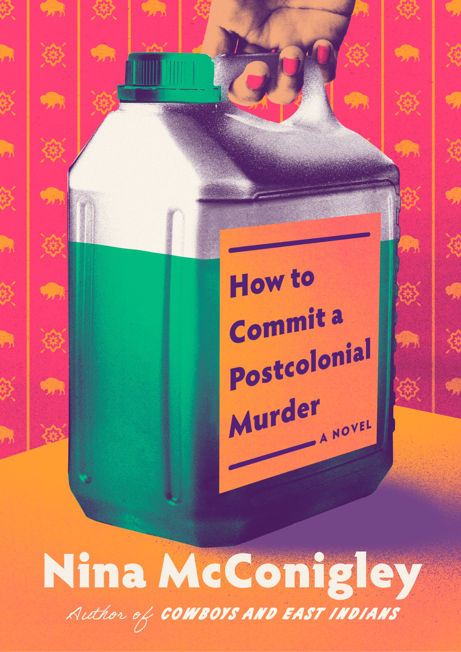
Some of the trends I’ve talked about before spilled over into 2022. Collage, painting (contemporary, and historical — often tightly cropped), big skies, landscapes and seascapes, black and white photography (not just for LGBTQ+ trauma!), retro-ness, idiosyncratic display typefaces. Orange. Pink was in vogue too. The Instagram-ish combination of both pink and orange (sometimes with deep purple-ish blues too) seemed to be very much a thing this year. I suspect this is what happens when you ask designers to make things “pop” one too many times.
It is hard to know if these are genuine trends, or if it is just the stuff I notice. I’m sure there are things going on with commercial covers that I don’t pay enough attention to (although I will not be sad to see the popularity of that flat illustration style — the one that Slate pointed out in TWO THOUSAND AND FIFTEEN! — eventually fade away). I certainly don’t get the sense that everything looks the same, which is often the criticism. There is still room for a little weirdness and that can only be a good thing…
Ghost Music by An Yu; design Suzanne Dean (Harvill Secker / November 2022)Elizabeth Finch by Julian Barnes; design by Suzanne Dean (Jonathan Cape / April 2022)
The Julian Barnes cover also came in blue, and under the die-cut jacket is a beautiful photo from René Groebli’s photoessay The Eye of Love.
Pure Colour by Sheila Heti; design by Na Kim (Farrar, Straus & Giroux / February 2022)
Also designed by Na Kim:
Present Tense Machine by Gunnhild Øyehaug; design by Na Kim (Farrar, Straus & Giroux / January 2022)Run and Hide by Pankaj Mishra; design by Na Kim (Farrar, Straus & Giroux / March 2022)Either/Or by Elif Batuman; design by Na Kim (Penguin Press / May 2022)
You can read about Alban’s design process for Till the Wheels Come Off at Spine.
Worn by Sofi Thanhauser; design by Janet Hansen (Pantheon / January 2022)
Also designed by Janet Hansen:
A Country of Strangers by D. Nurkse; design by Janet Hansen (Knopf / April 2022)Sedating Elaine by Dawn Winter; design by Janet Hansen (Knopf / April 2022)
Yoga by Emmanuel Carrère; design by Rodrigo Corral (Farrar, Straus & Giroux / August 2022)
This month’s post includes a few covers that I missed earlier in the year along side the new and recent releases. I’m starting to think about my annual recap so please let me know if you think I’ve overlooked any other particularly notable covers that stood out for you and/or seemed emblematic of wider trends in 2022.
And just a reminder with all the stuff going on with social media that if you’d prefer to get new posts auto-magically emailed to you, you can subscribe here. I have also re-opened comments on new posts after closing them for a few months if you want to politely share your thoughts below.
“Fuuuuuuuuuck….!” is the only way I can describe the mixture of awe and annoyance that I hadn’t thought of it I felt when I saw this cover. So simple and so clever.
This has a very similar ‘obscured face collage’ feel to Tristan Offit’s cover for Briefly, A Delicious Life by Nell Stevens, which I thought I had posted here earlier in the year but apparently did not (probably because I didn’t — and still don’t! — know who designed the cover of the UK edition (it was designed by Mel Four, photograph by Marta Bevacqua) and I wanted to post them together?).
Pacifique by Sarah L. Taggart; design by Natalie Olsen (Coach House Books / October 2022)
People Person by Candice Carty-Williams; design by Emma A. Van Deun (Scout Press / September 2022)
Mr. Keenan also designed the cover for the Liveright edition of The Waste Land itself a few years ago.
(The US edition of Matthew Hollis’s book, forthcoming from W. W. Norton, also has an interesting cover. If anyone from Norton would like to send me a hi-res image with the design credit, I’ll be happy to add it in!)
You know, I started 2022 with such good intentions and yet here we are again at the end of January on a paved road to hell. At least there are some lovely book covers to look at this month. Sigh.
Print Magazine did a piece last year on Amistad Books’ repackaging of Zora Neale Hurston’s work. I’ve featured a couple of the covers here in the past too.
Earlier this year, a Canadian magazine asked me what the latest trends in book cover design were. I don’t think I had a very satisfactory answer. 2021 felt very much like a continuation of 2020, which itself felt like a year on hold.
The trends that came to mind were not exactly new. In no particular order: big faces (big sunglasses!); cropped faces; hands; mouths; postmodern typefaces;1 big skies; rainbows; gradients; the colour orange; psychedelia; collage; contemporary painting.
A lot was made of “blob” covers this year. I’m not sure that anything has really changed since Vulture published this article about “blocky” covers in 2019. They seemed like much the same thing.
Design is about the constraints and, as it turns out, the constraints around designing commercial literary fiction covers that have to work just as well online as in bookstores can lead to similar design solutions — large, legible type, and bright, abstract backgrounds. 2 The surprising thing is not that a few covers look the same when you squint; it’s that more of them don’t.
There were a lot of good covers (that didn’t look alike) in 2021. LitHub posted 101 of them. Still, it didn’t exactly feel like a vintage year.
Do I say that every December? Possibly.
A few years ago I worried that covers were moving in a more conservative direction, particularly at the big publishers. I’m not sure this has come to pass, at least not in the US. There are plenty of covers from the big, prestigious American literary imprints in this year’s list, as there were last year, and every year before that.
There are fewer covers from the UK in this year’s list than in previous years though, and I feel less confident about the situation there. From a distance, things seem a little sedate. I may be mistaken. It’s quite possible I haven’t see enough covers — or perhaps enough of the right ones — from British publishers to get a good sense of the overall picture.3
It would not be a surprise, however, if publishers were feeling a little risk-averse at the moment. We are two years into a global pandemic, experiencing a major supply chain issues, and living through a seemingly endless series of sociopolitical crises.
Nor would it be a surprise if designers were personally feeling the effects too — I’m not sure we are talking about this enough, and I’m not sure I know how to.
Thank you to everyone who has supported the blog in 2021. It means a lot. Here are this year’s book covers of note…
Na Kim talked to PRINT about her career and the designs for the Ditlevsen series in February. If, like me, you were wondering about typeface on the covers, it’s Prophet from Dinamo apparently.
If you’re wondering about the Super-Seventies Sally Rooney typeface, it is Ronda designed by Herb Lubalin and Tom Carnese (I only know because I asked).
Thank you to everyone who has supported the blog in 2021. It means a lot.
I am not convinced that the term “postmodern” quite captures what I mean here (and/or worse, implies something different in the context of typography), but it’s the best I’ve got. I’m not talking about the kind of experimental typography you might associate with the likes of Wim Crouwel or Emigre, or the aesthetic of someone like David Carson. What I am trying to get at is idiosyncratic type that purposely exaggerates or plays with letterforms, and doesn’t conform to function-first modernism. To my mind, this would include some typefaces from the 1960s and 70s, as well as some more contemporary type. In a sense what I am describing is display faces — and I think the eclectic, innovative use of type in Victorian advertising might be an inspiration to designers here — but I don’t think it is just about size. ↩
I believe this cover was originally used in the UK last year for the Daunt Books edition, but I missed it. Open Letter are publishing the book in the US and Canada this month, so that’s as good as an excuse as any to post the cover now.