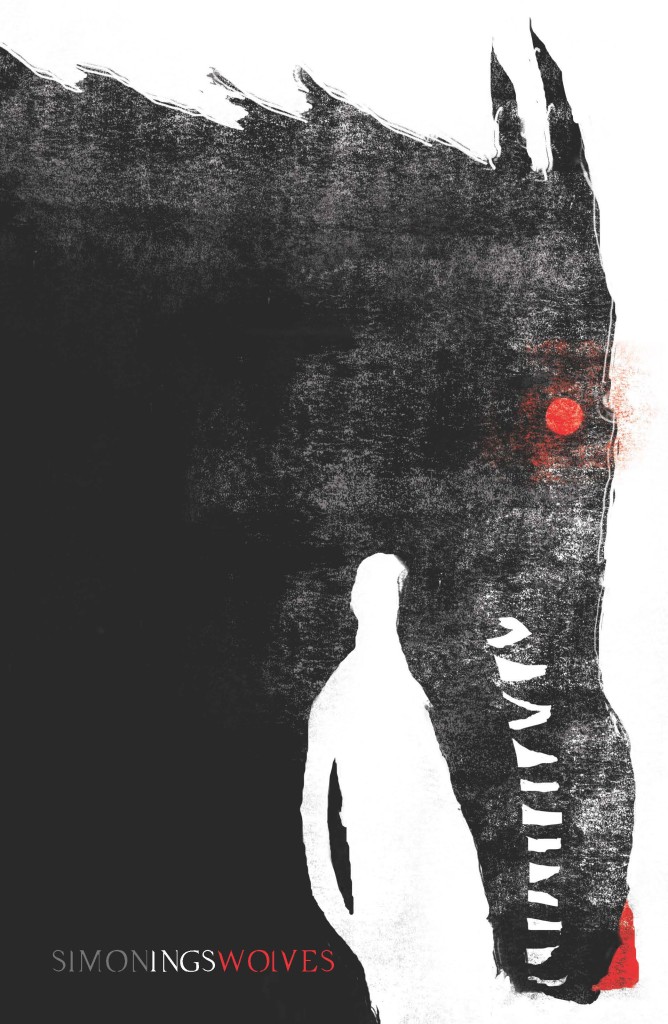
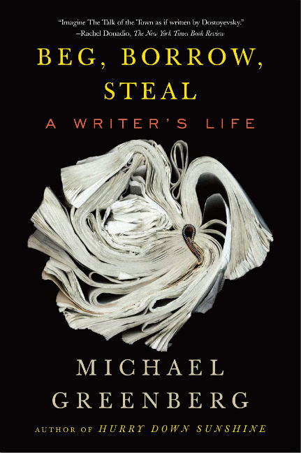
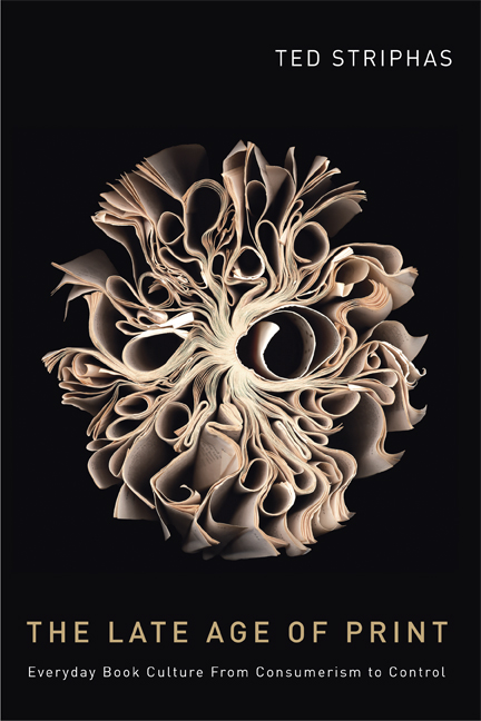
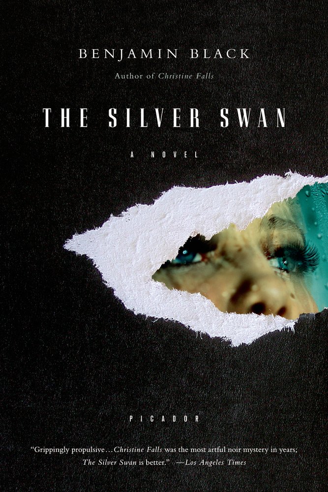
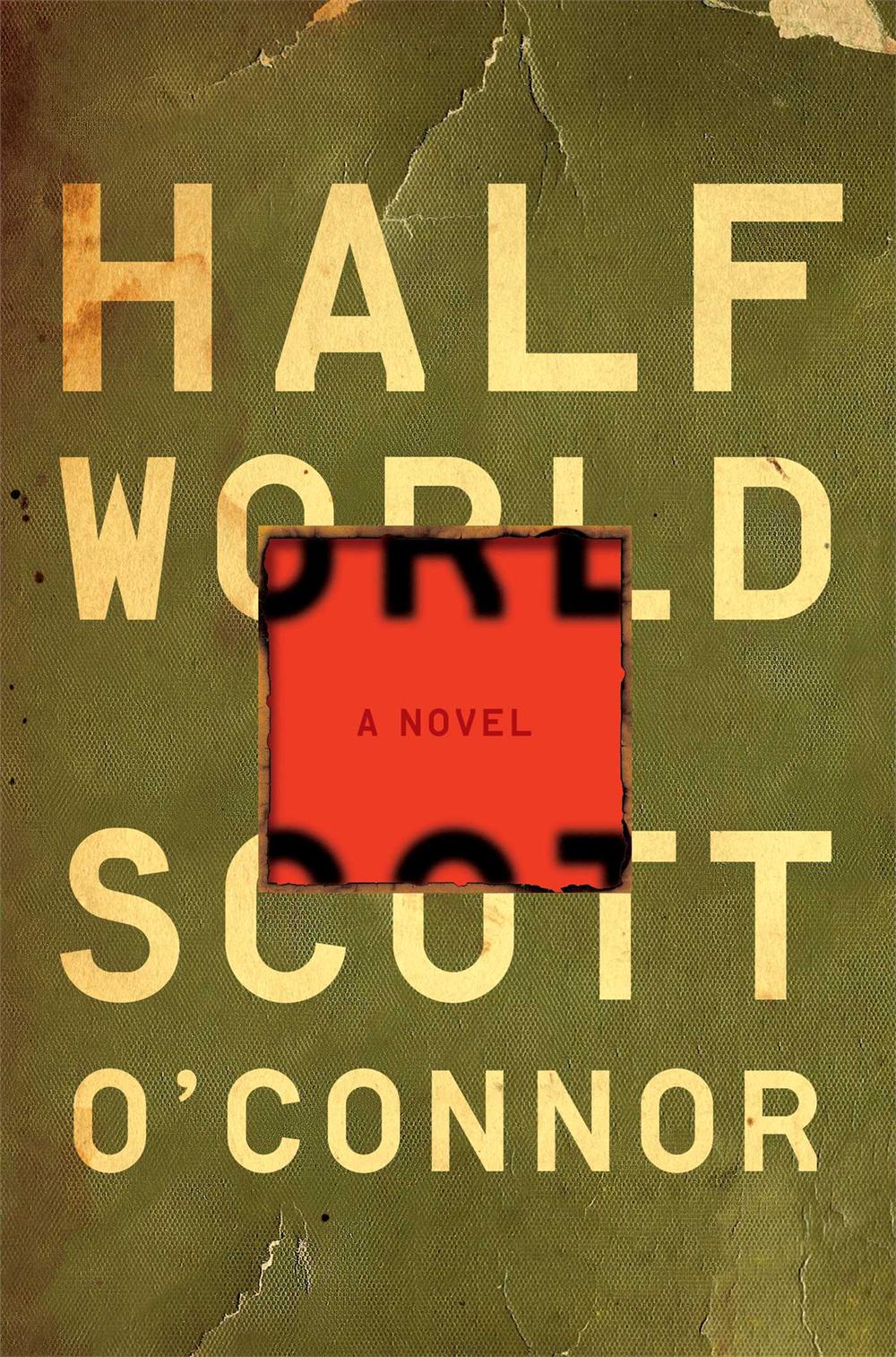
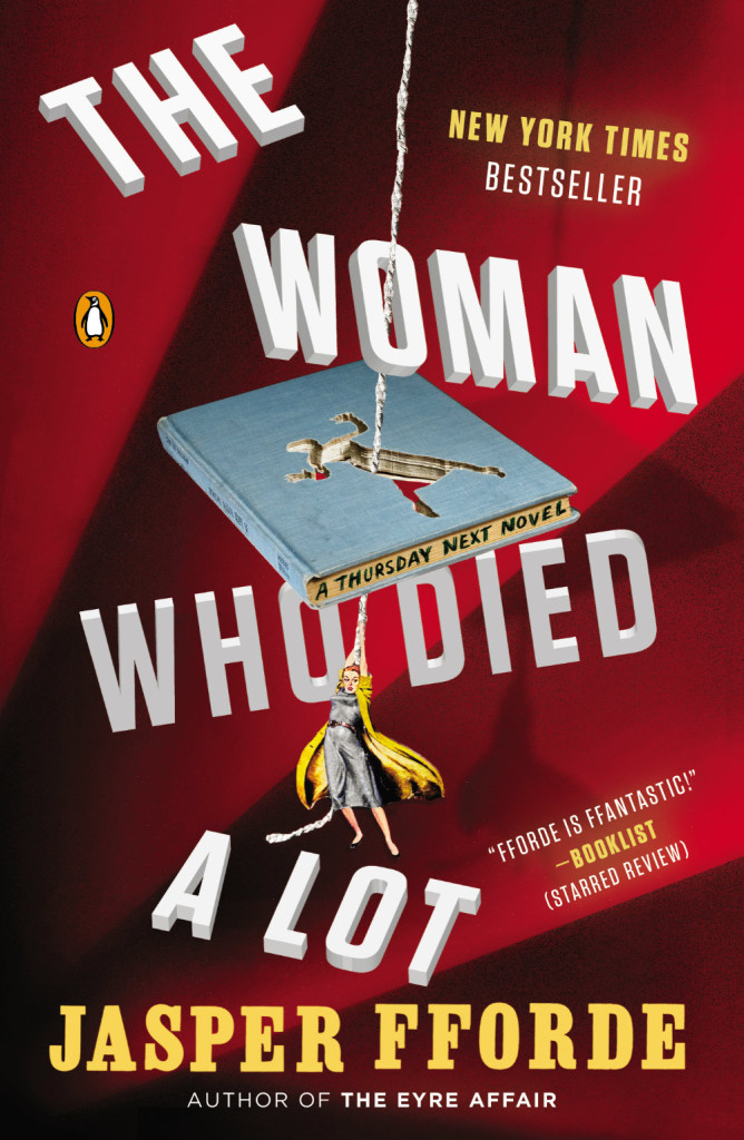
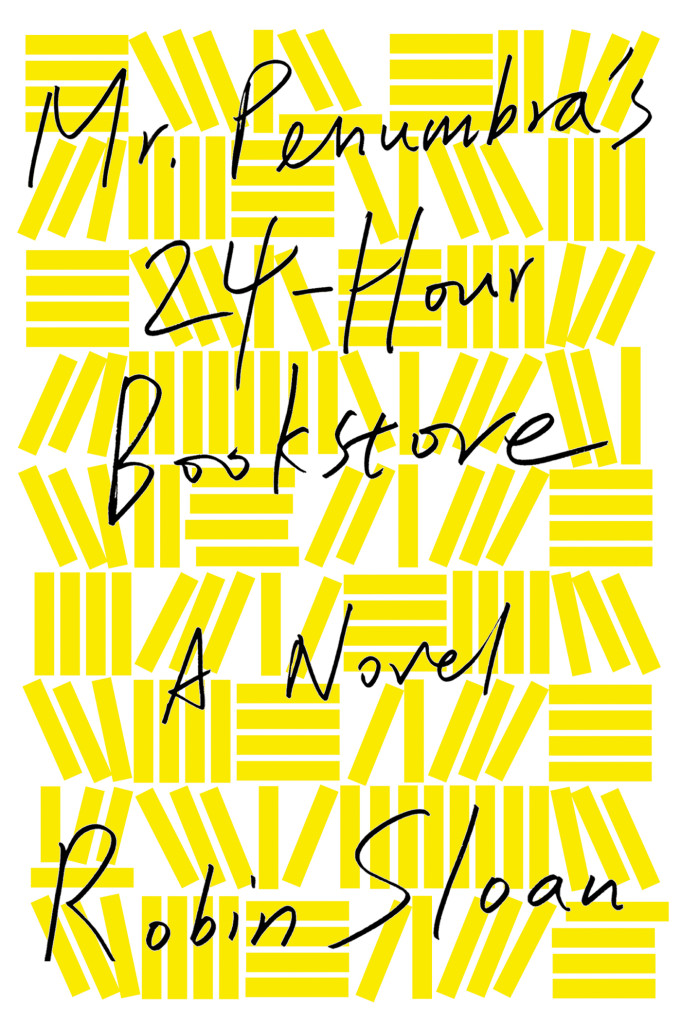
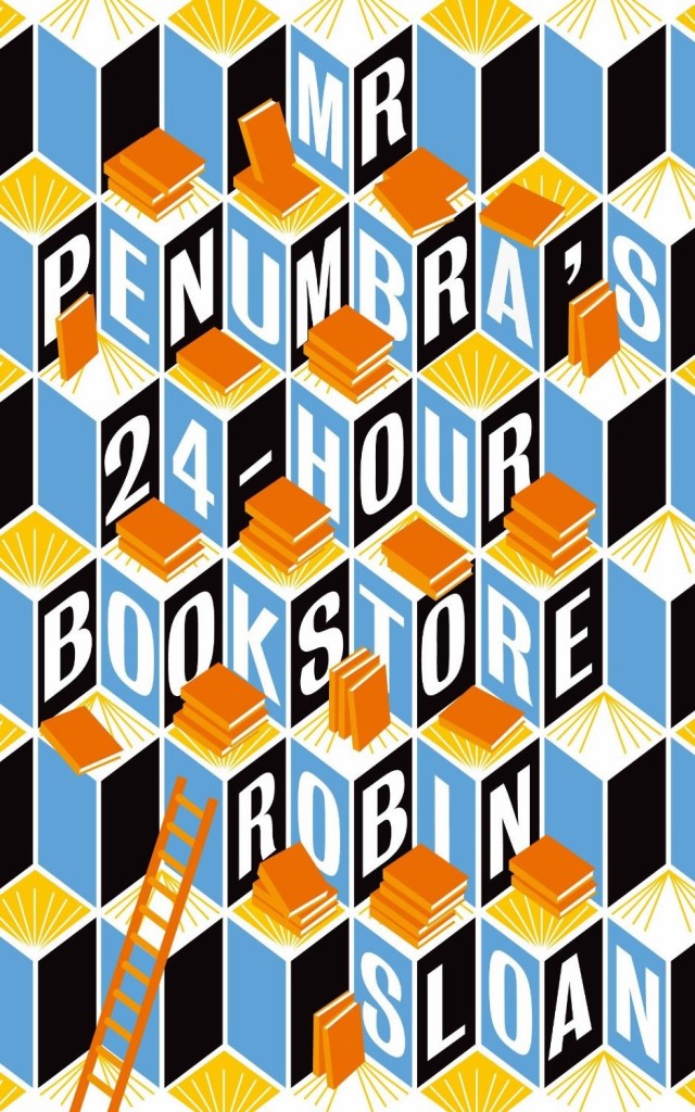
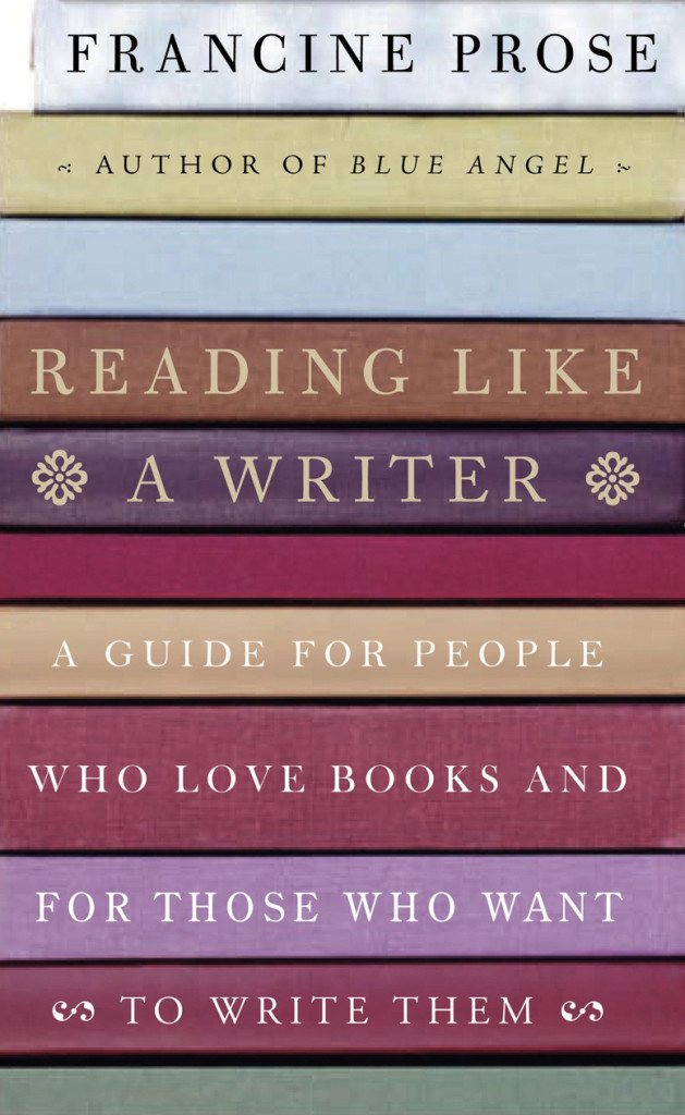
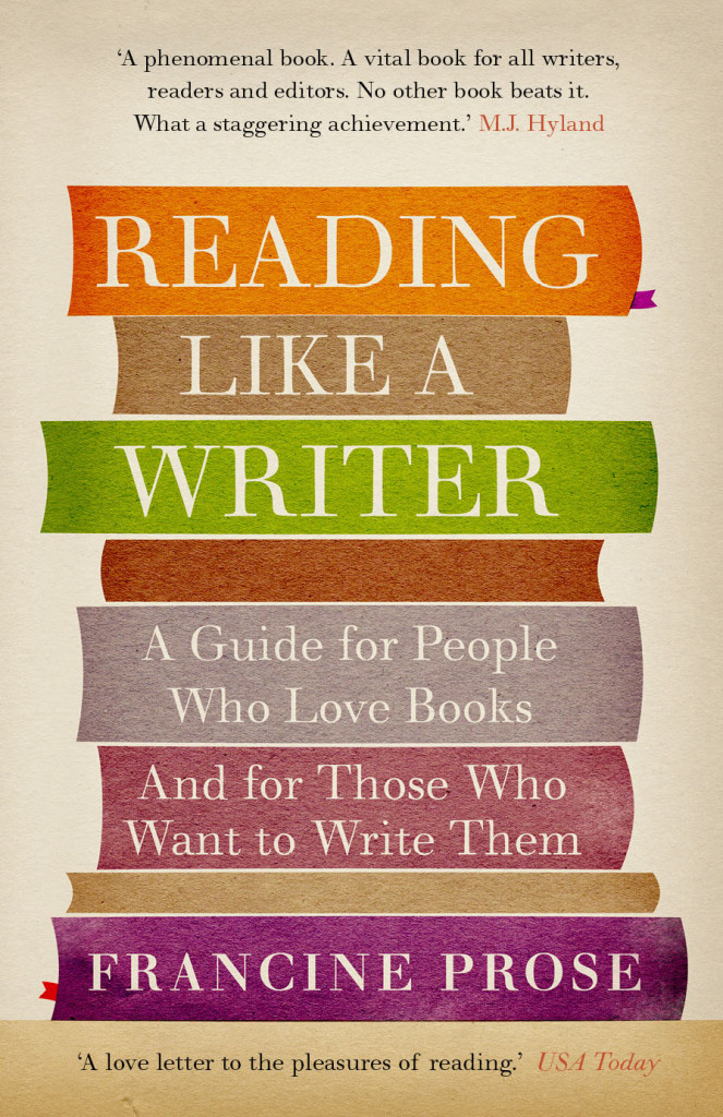
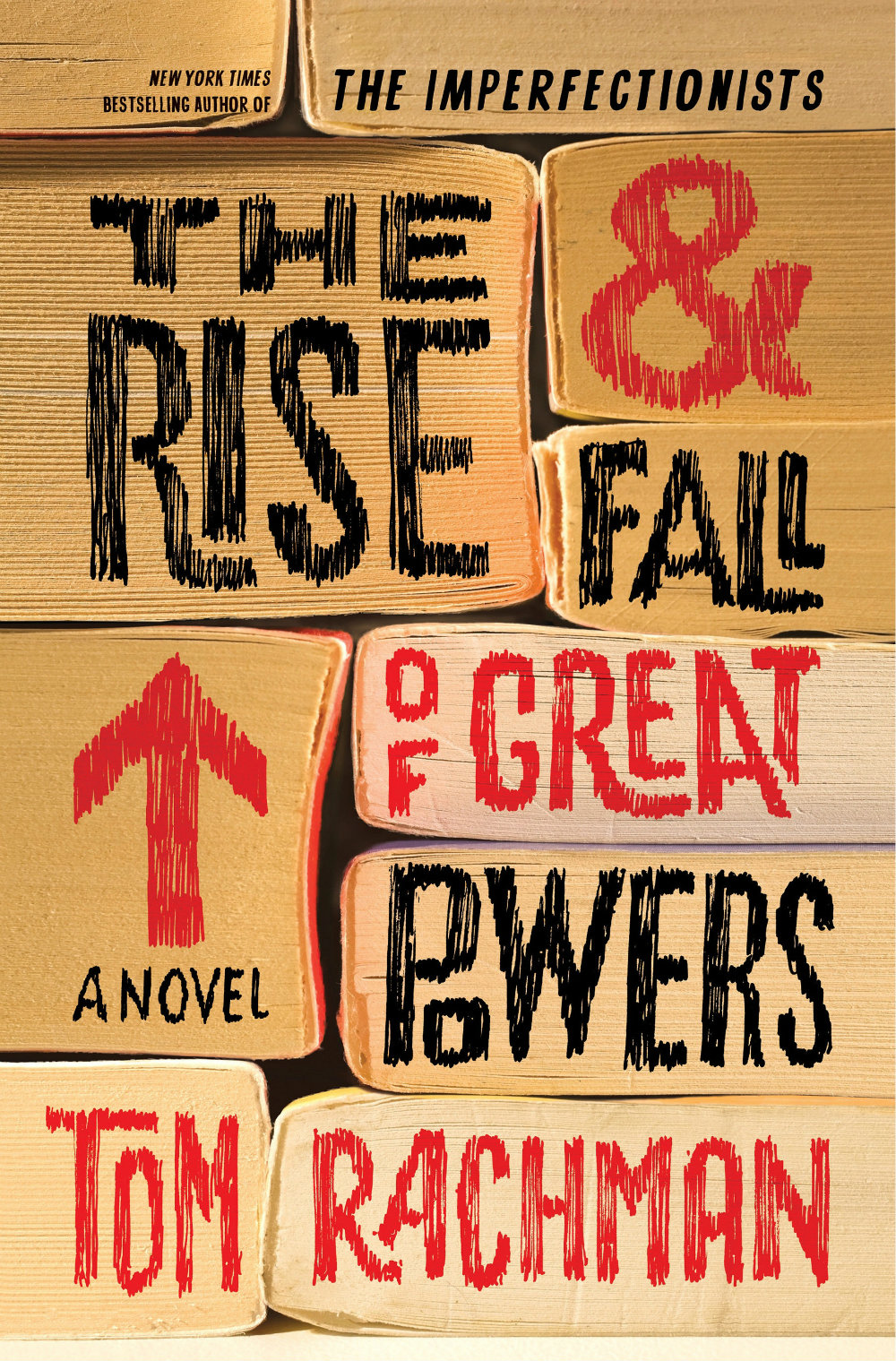
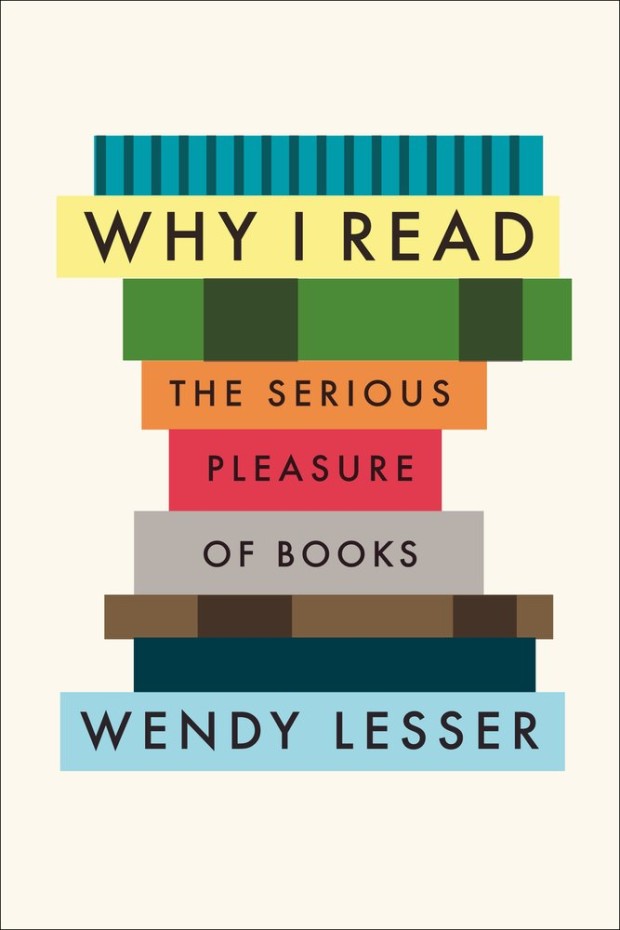
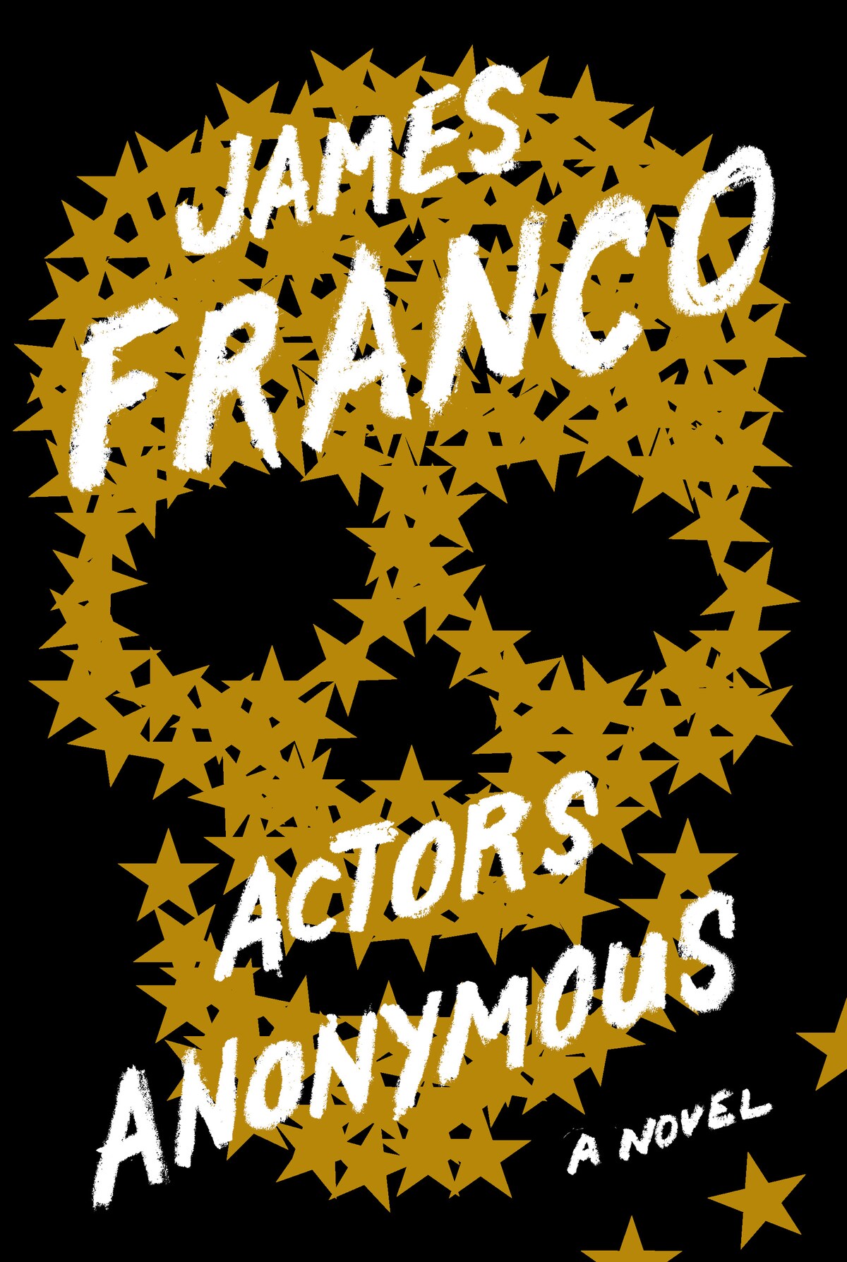
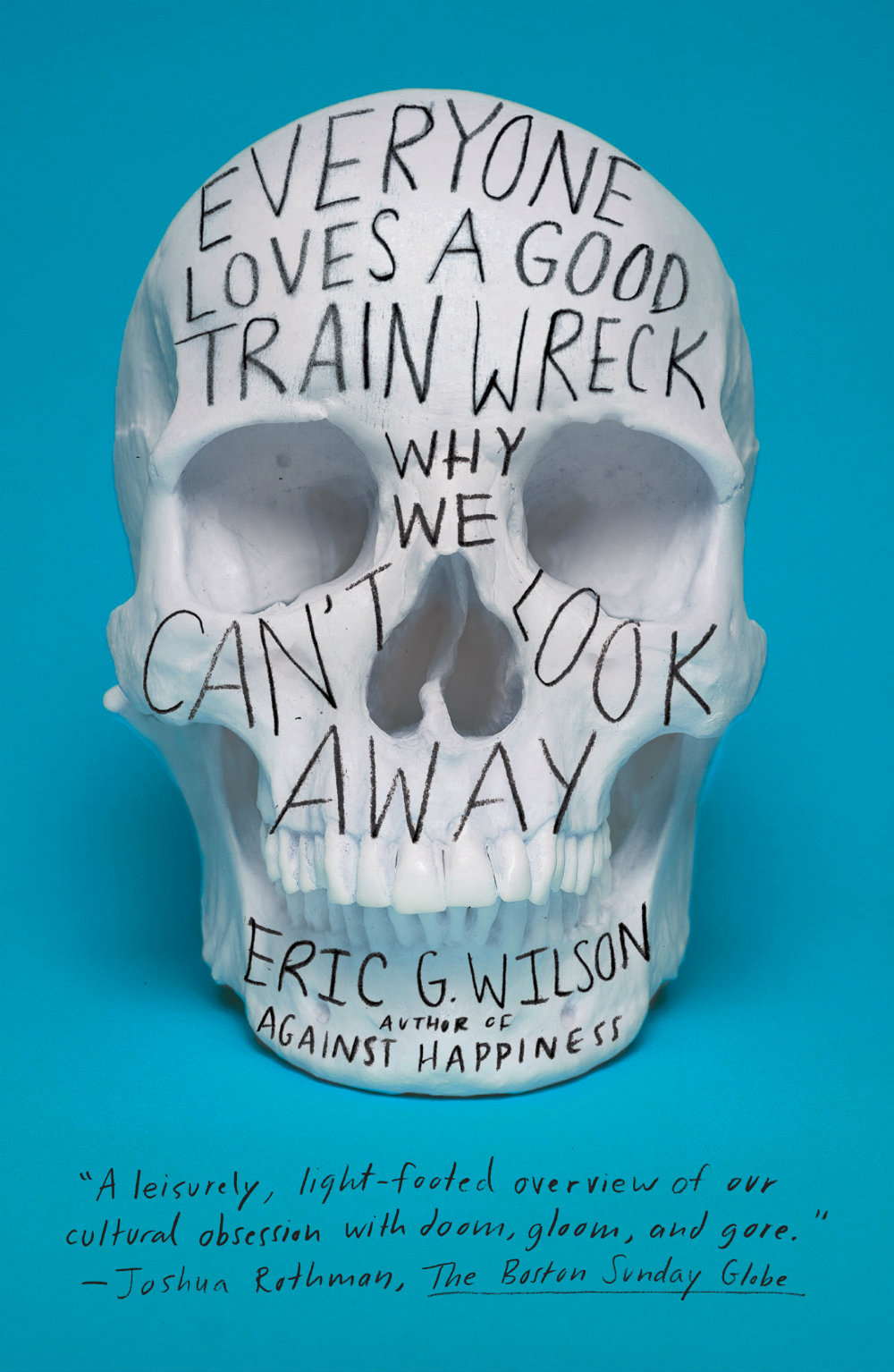
Alana Pockros talked to designers and others in the publishing community about trends in book cover design for the AIGA blog Eye on Design:
The guiding principle of “like that book but different” cover design has existed for decades. In the 1960s, the late book designer Paul Bacon pioneered the “Big Book Look,” which we might associate with Philip Roth’s Portnoy’s Complaint or Joan Didion’s The White Album: type-driven covers with large author names and ample negative space that rely more on hue and font than imagery. Philip DiBello and Devin Washburn, founders of the design studio No Ideas, believe we’re currently seeing an evolution of the Big Book Look. “[There’s] a wave of similar covers that play with type intertwined with a key visual in a striking way,” they suggested. In The Look of the Book, Peter Mendelsund and David Alworth’s 2020 monograph, the authors call this mutative style “the interchangeable, big-type, colorful cover.” It’s a look Mendelsund and Alworth first noticed on the 2015 novel, Fates and Furies, and the style they see as the progenitor of the tired “it will work well as a thumbnail on Amazon” rationale.
It is always interesting to hear designers talk about how they view the process and why we get certain trends. But the post itself, entitled “The Endless Life Cycle of Book Cover Trends”, is a variation on the well-worn, trend-focused ‘why do book covers look the same?’ article that has appeared in various guises over the years. Pokros herself references a New York Times article from 1974(!) that explains that jackets must be identifiable on television, and a Vulture piece from 2019 that postulates that book covers are now being designed for Amazon and Instagram. You could also read this post on Eye on Design from 2019 about the ubiquity of stock images, or this The New Yorker piece on design by committee from 2013, or this story in The Atlantic from 2012 (it’s e-readers fault!) among others.
It’s not that they’re necessarily wrong. There are clearly trends and tropes in book cover design as there are in any other kind of design (and pointing them out is fun — I do it frequently!). And there are lots of designs that aren’t great. That’s true of everything. It’s just that on the whole, book covers (like movie posters) don’t all look the same. Not really. Sure, books in the same genre frequently do. Covers sharing similar traits helps readers identify what kind of books they are buying. It doesn’t mean they are B-A-D. Perhaps part of what gets people so twitchy about high-profile literary fiction covers looking familiar is that they don’t like to think of certain kinds of literary fiction as genres?
I don’t know… I’m one of the marketing people whose fault this usually is.
I guess if you really want to get into it, trends in book covers often reflect trends in publishing itself. When similar books intended to appeal to similar readers are published by similar people at similar imprints that are part of similar, very large publishing conglomerates, maybe the issue isn’t really that they have similar covers?
Anyway TL: DR, if you’re seeing a lot of covers that look the same maybe it says more about the kind of books we are exposed to in our daily lives than about the range of covers that are actually out there?
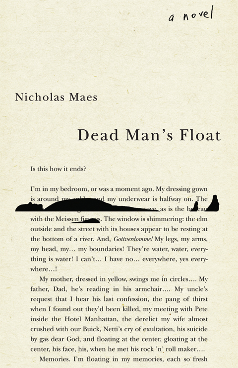
I’ve been thinking about covers that feature one form of redacted text or another for a while, but this post has been sitting in my drafts folder gestating for far too long so I’m publishing now, as-is, because otherwise it is unlikely to ever see the light of day!
The covers of Censoring an IranianLove Story, designed by Peter Mendelsund, and Nineteen Eighty-Four, designed by David Pearson, are classics of the genre:
Censoring an Iranian Love Story by Shahriar Mandanipour; design Peter Mendelsund (Knopf / May 2009)
Nineteen Eighty-Four by George Orwell; design by David Pearson (Penguin / January 2013)
I thought that this kind of bar redaction (is there a technical term for it?) might be a relatively new — post-The 9-11 Commission Report — phenomena, but (friend of the blog) Richard Weston, AKA Acejet170, recently posted this 1974 Penguin cover for Academic Freedom by Anthony Arblaster, designed by Omnific, on Instagram:
In a lovely design touch, the redacted words appear on the back cover:
Related to bar redaction is the strike-through. One of my favourite examples is Barnbrook‘s cover design for How to Run a Government by Michael Barber, published by Allen Lane.
How to Run a Government by Michael Barber; design by Barnbrook (Allen Lane / March 2015)
I’ve been seeing the straight strike-through used a lot recently. It does a neat job of doing two things at once. It allows you to not say something, while also emphasizing that you are pointedly not saying it.
That Perfectly Useless Concentration by Alan Shapiro; design by Isaac Tobin
Ten Myths About Israel by Ilan Pappe; design Isaac Tobin
I’ve seen it mostly used for nonfiction (as above), but Janet Hansen recently used the strike for the cover of Amitava Kumar’s novel Immigrant, Montana:
Immigrant, Montana by Amitava Kumar; design Janet Hansen (Knopf / July 2018)
Black text on a white background with a red strike-through is its own sub-genre:
The Courage of Hopelessness by Slavoj Zizek; design by Richard Green (Allen Lane / May 2017)
Now You See It by Michael Bierut; design by
In fact, using red — be it more artistic blocks, strikeouts or scribbles — is a popular way to highlight what is being crossed out:
Trust Me, PR is Dead by Robert Phillips; design by Jamie Keenan (Unbound / June 2015)
Silence Once Begun by Jesse Ball; design by Peter Mendelsund (Pantheon / 2014)
A Book of Untruths by Miranda Doyle; design by Donna Payne (Faber & Faber / June 2017)
And generally the hand-drawn strike-through or scribble seems to be the most popular way to cross something out …
Hope A Tragedy by Shalom Auslander; design by John Gall (Riverhead Books / January 2012)
Everything I Know About Love by Dolly Alderton; design Helen Crawford White (Fig Tree / March 2018)
Tell Me Lies by Carola Lovering; design Donna Cheng (Simon & Schuster / July 2018)
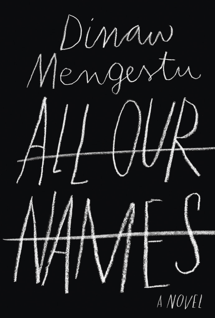
All Our Names by Dinaw Mengestu; design by Isabel Urbina Peña (Knopf / March 2014)
The Only Story by Julian Barnes; design by Suzanne Dean (Jonathan Cape / February 2018)
One Day We’ll All Be Dead and None of This Will Matter by Scaachi Koul; design by C.S. Richardson (Doubleday Canada / March 2017)
If you have (constructive) thoughts on the matter, and/or other examples, please leave them in the comments.
The Last Word by Hanif Kureishi; design by Jaya Miceli (Scribner / March 2015)
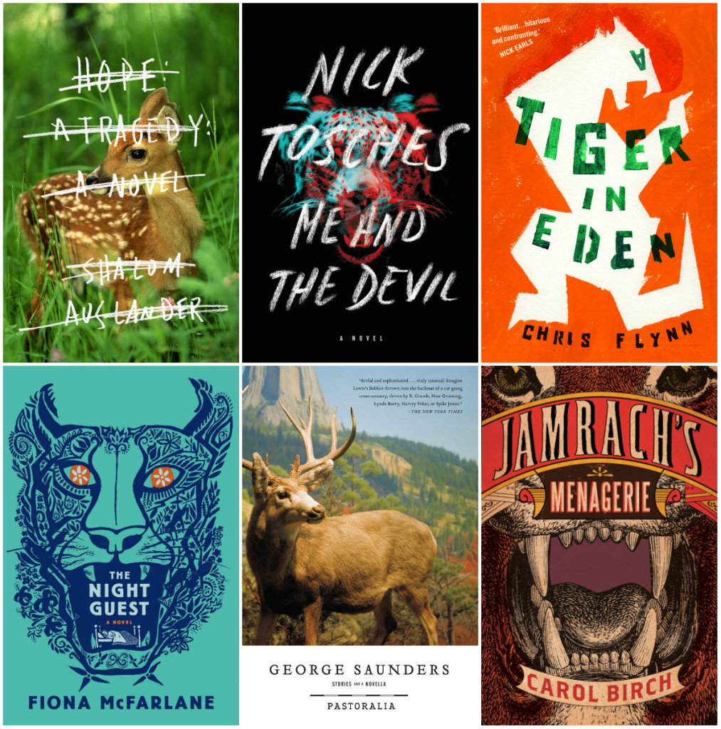
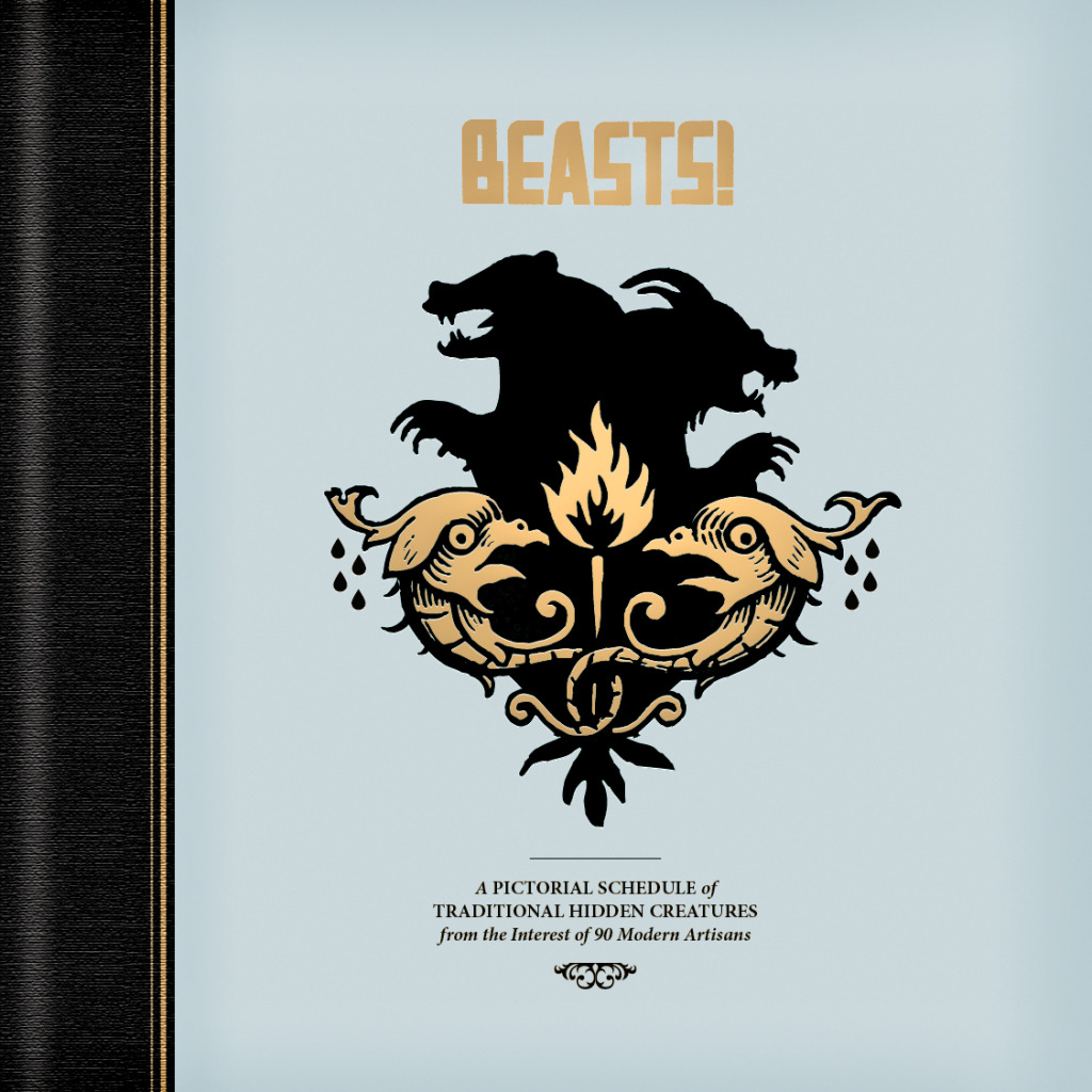
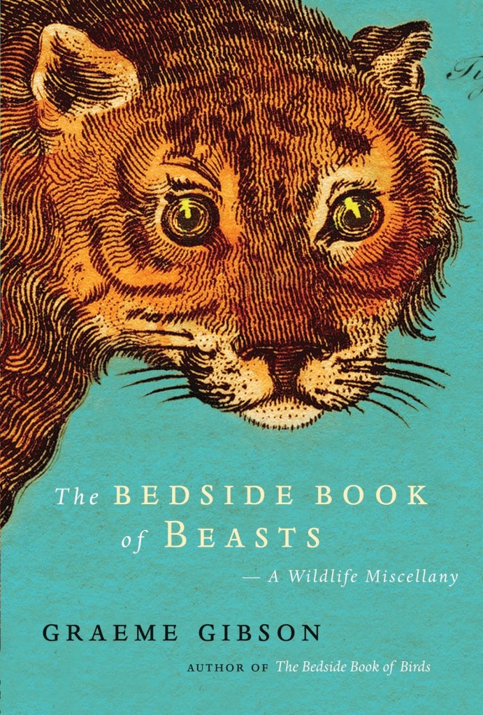
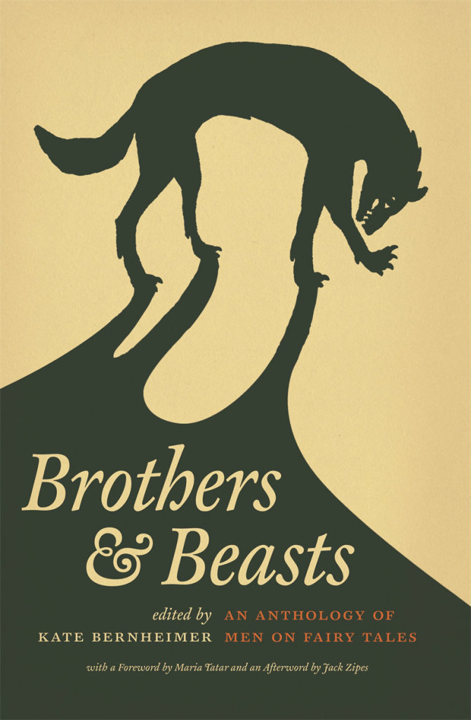
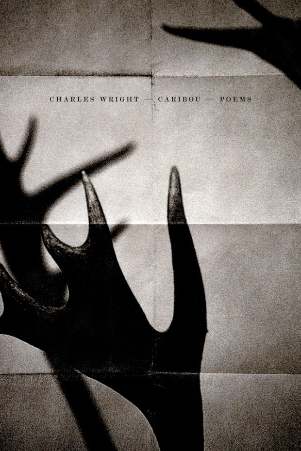
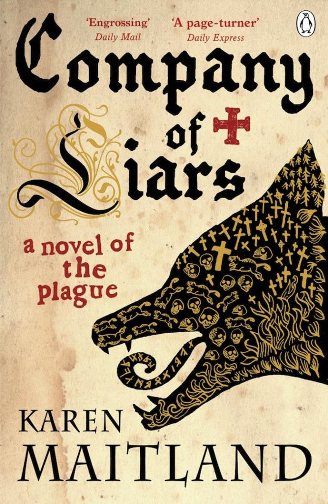
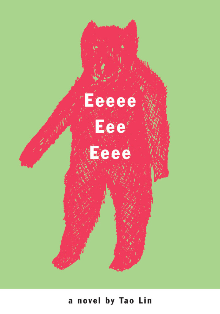
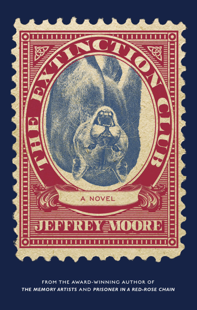
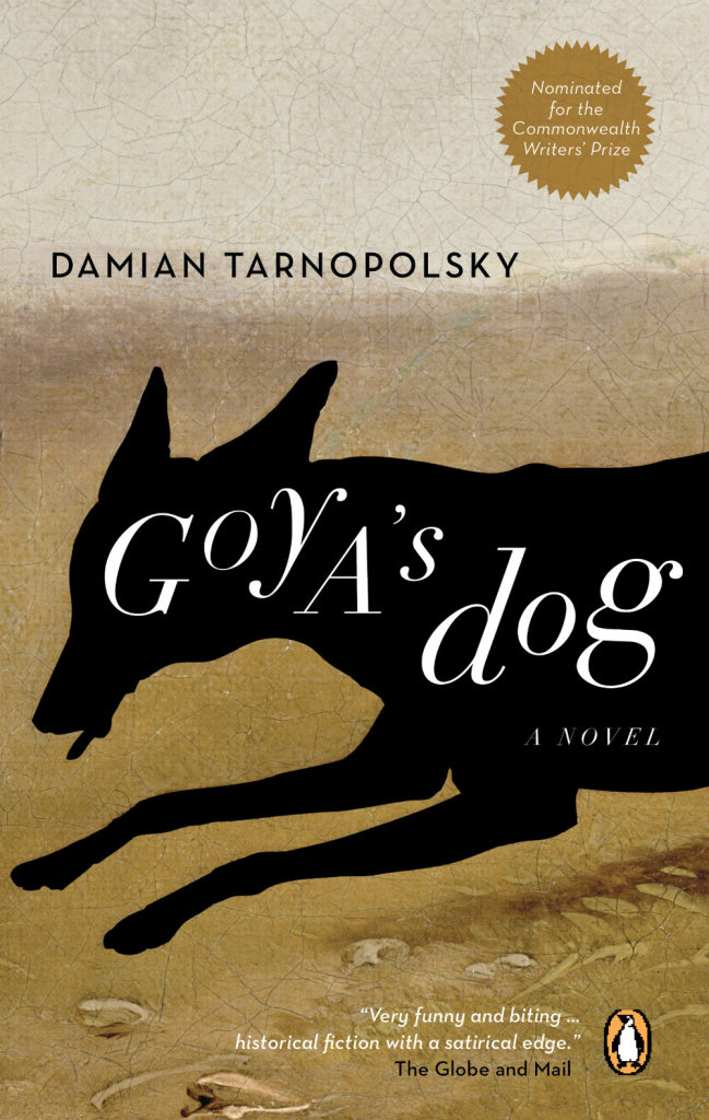
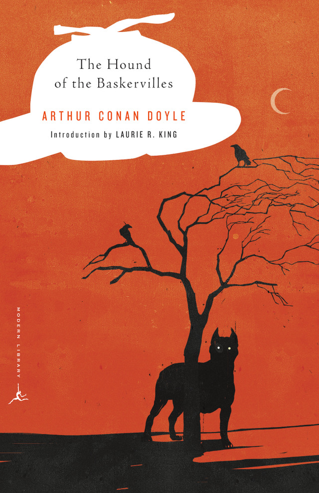
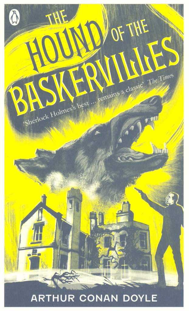
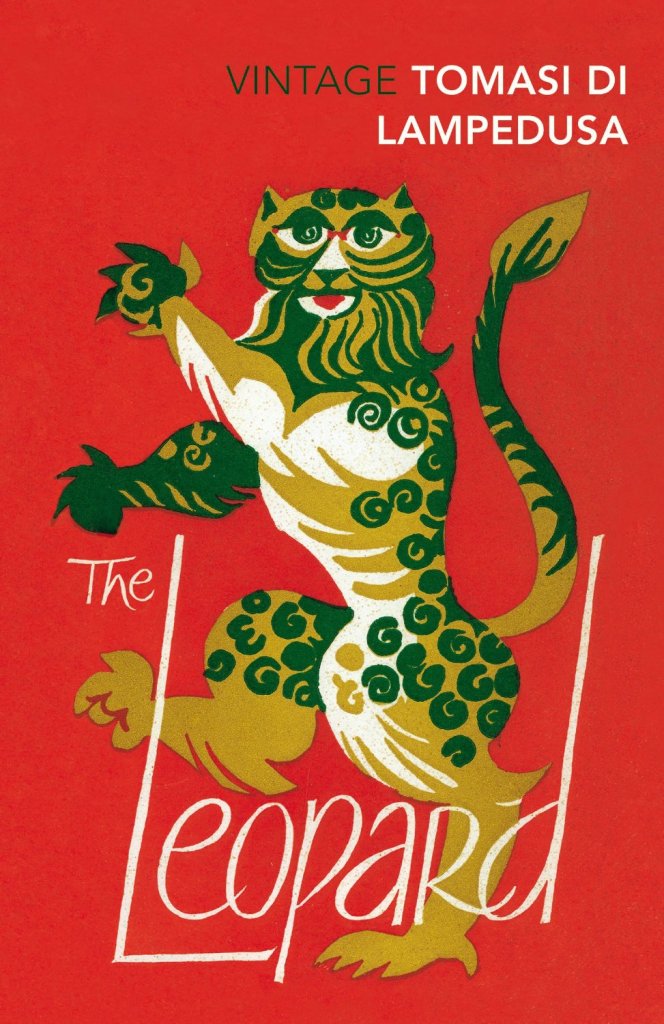
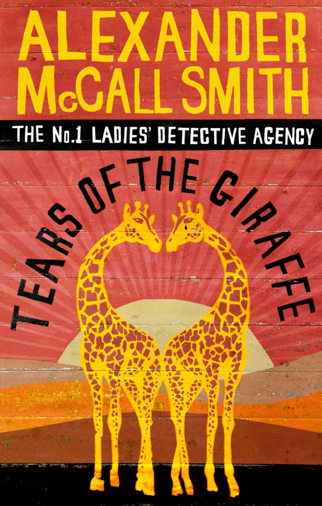
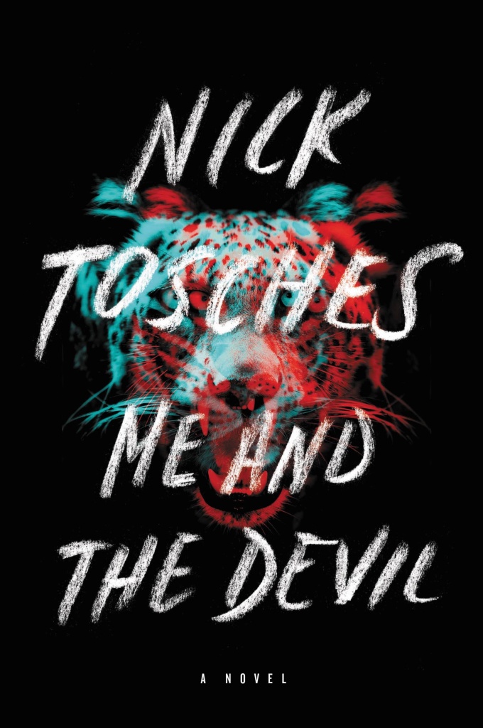
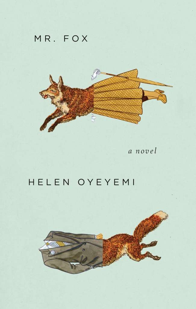
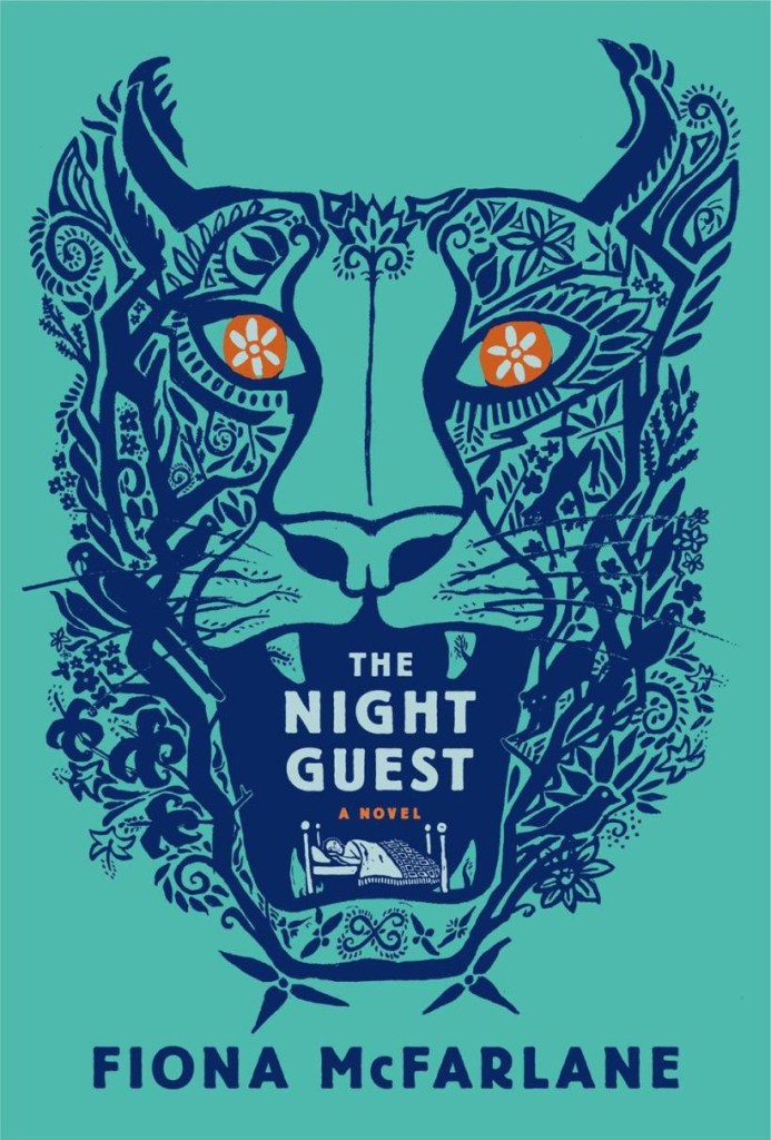
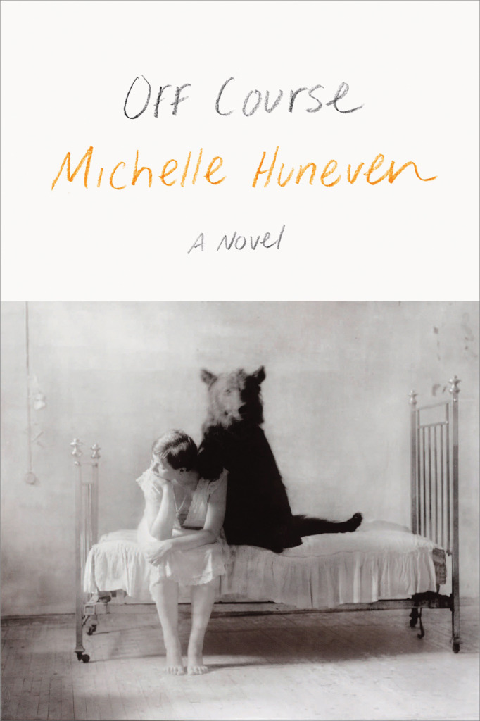
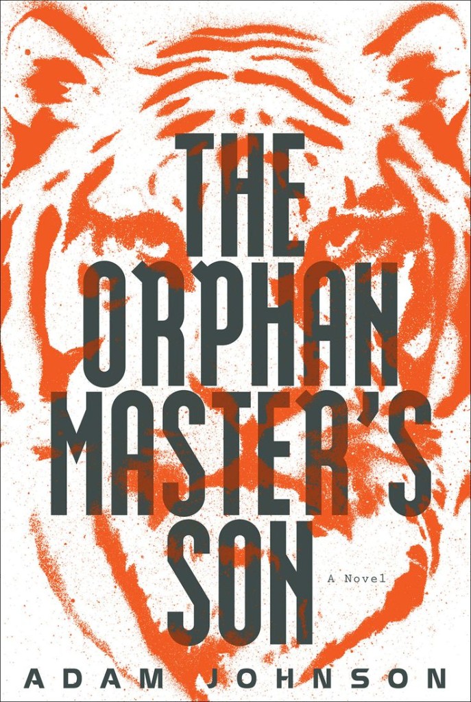
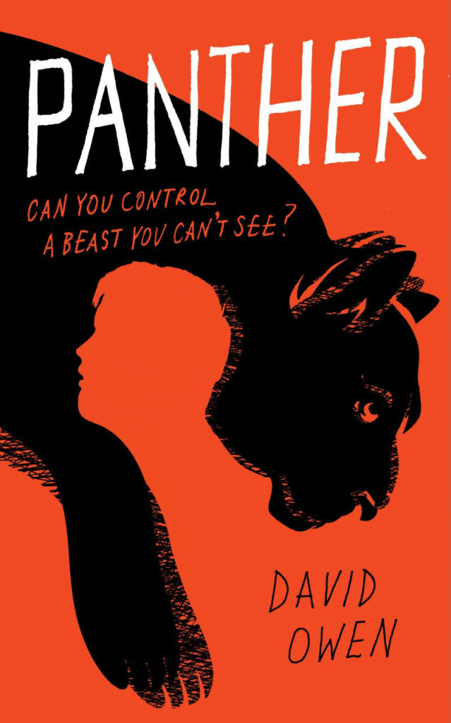
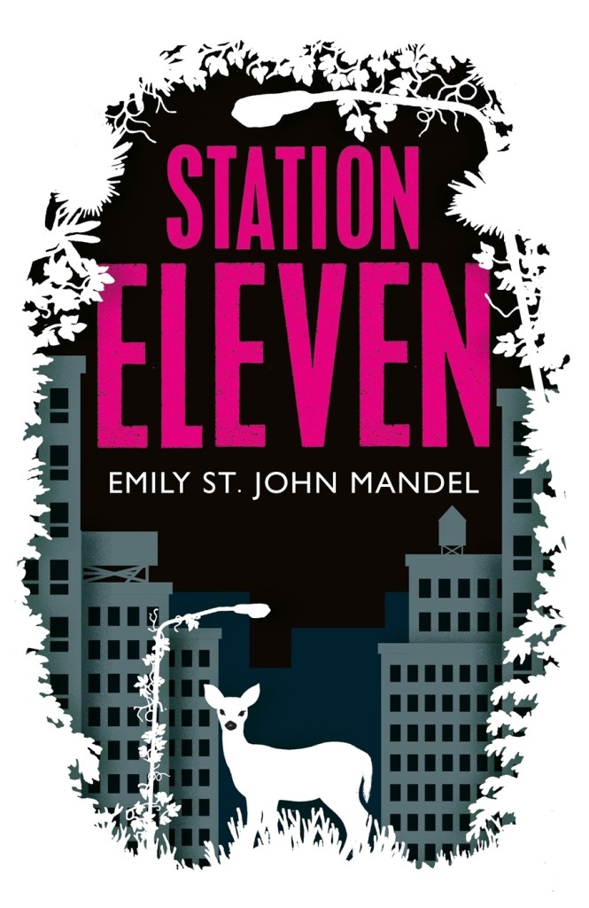
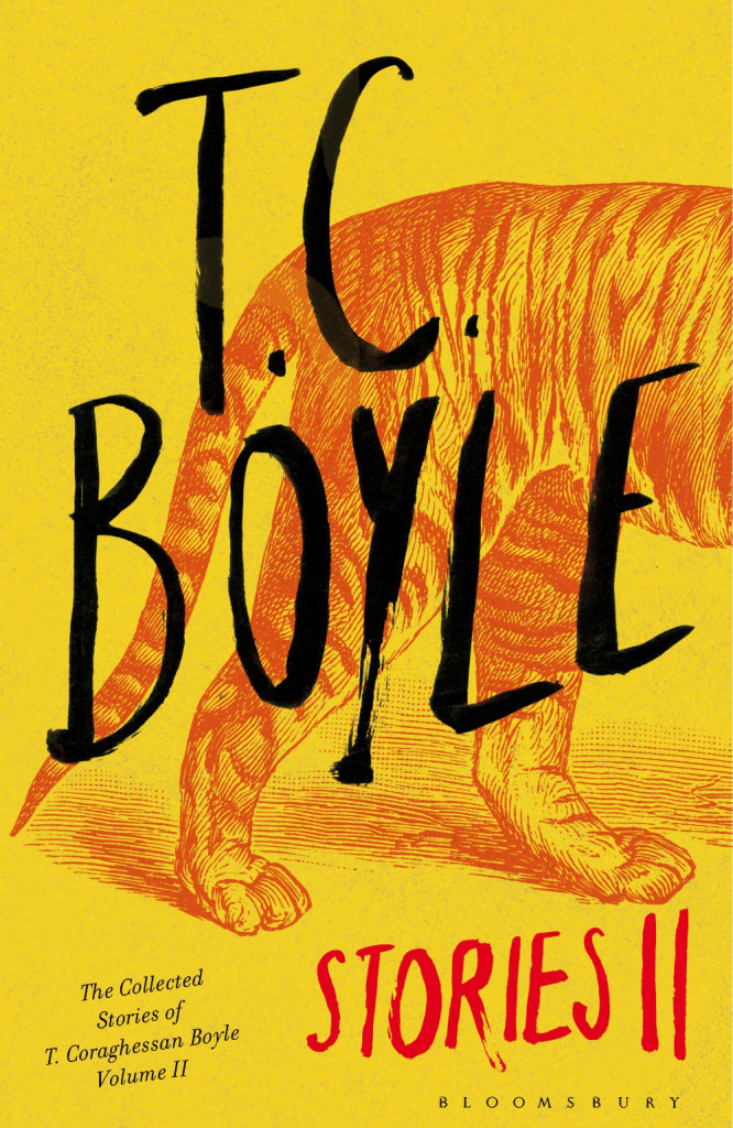
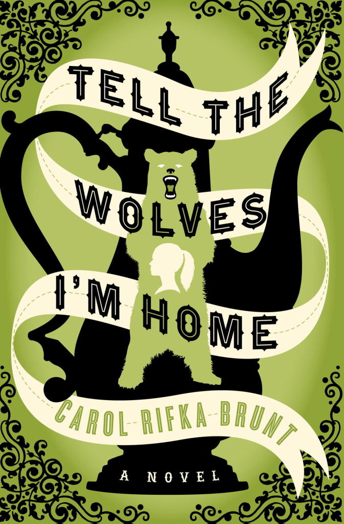
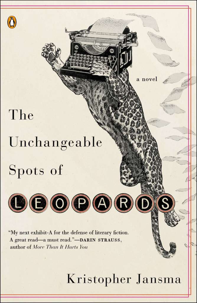
Lions and tigers and bears! Oh my! I’m kicking off a new series today on animal book covers. The first post is on ‘beasts’ — mostly ‘wild’ beasts, but one or two more domesticated (and dead) animals may have nosed their way in. Other posts series will look at birds, bugs, reptiles and amphibians, and quite possibly sea creatures and farm animals (unless someone pays me a large amount of money to stop before that). Thanks to all the designers, ADs, publicists and others who have been helping me with images and credits. If you notice that some information about a cover is missing, please let me know.
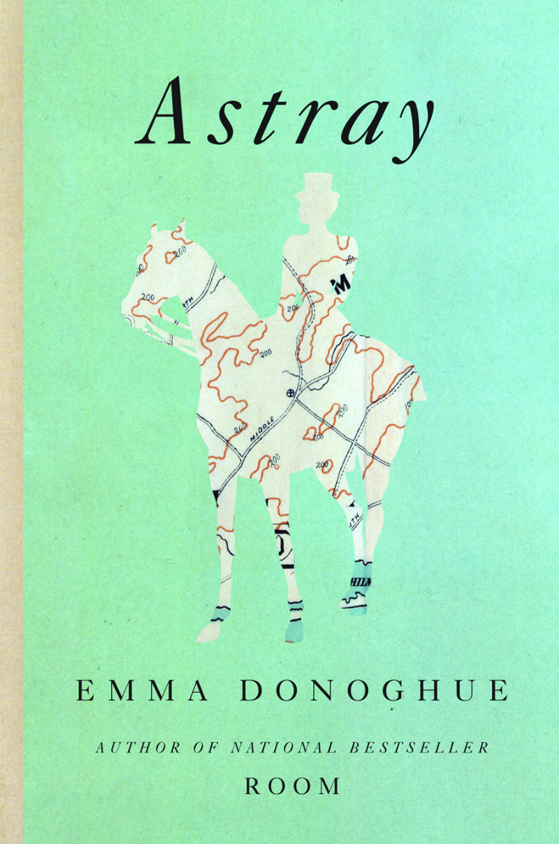
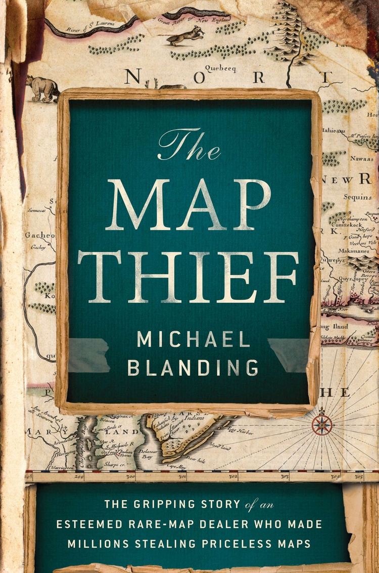
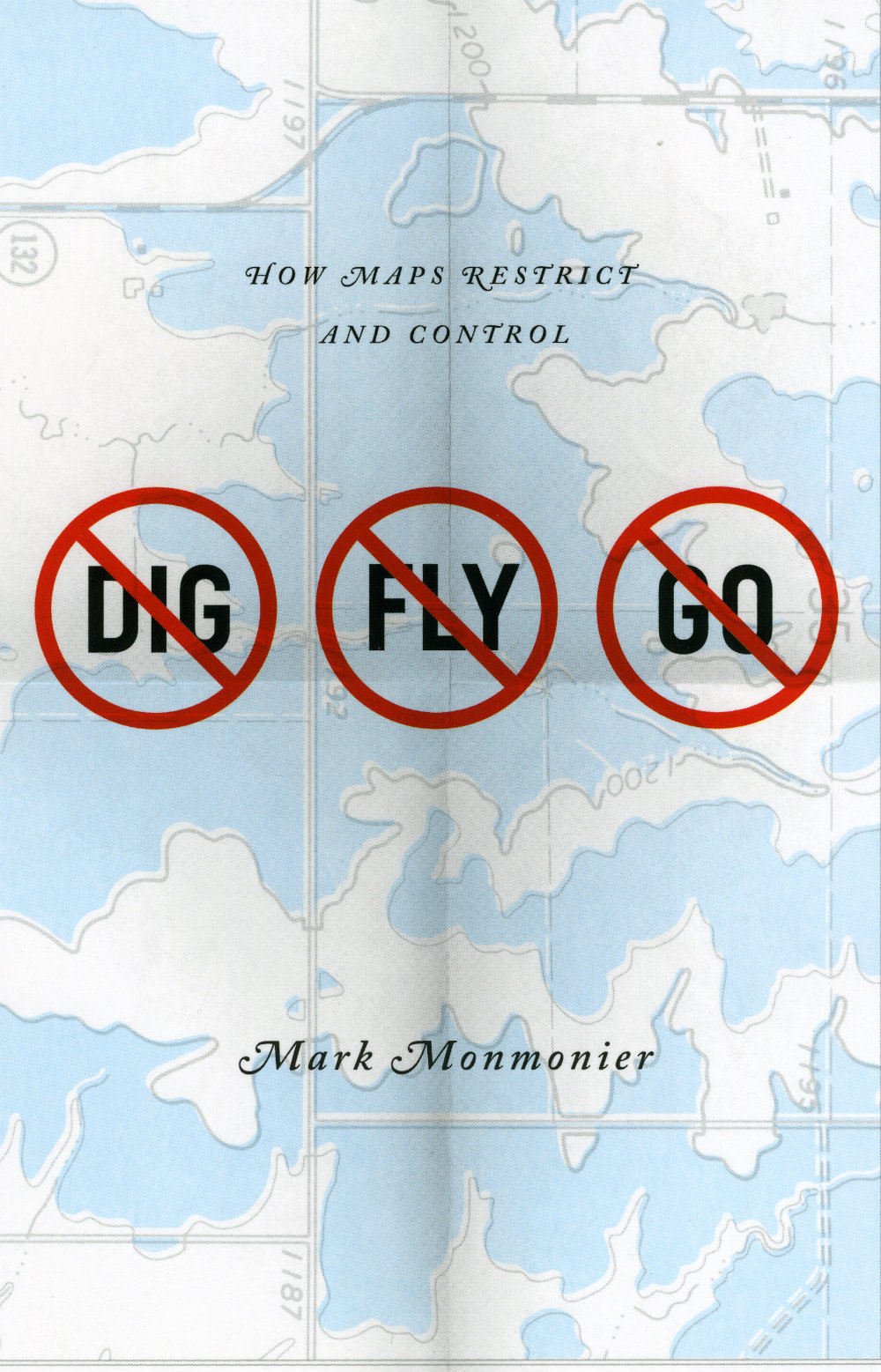
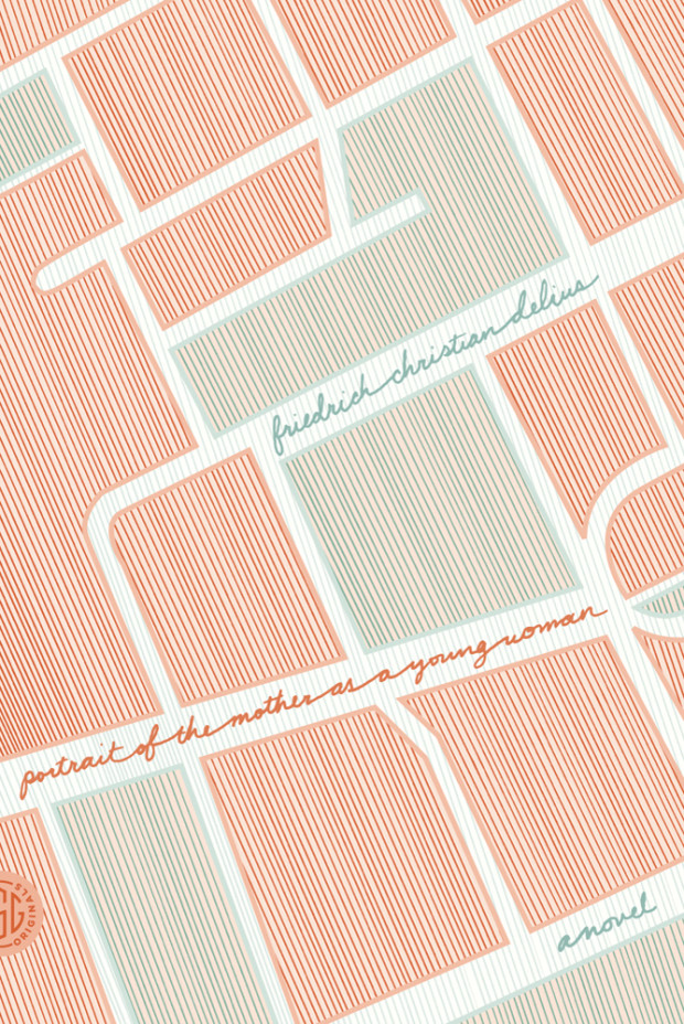
Who doesn’t like a good map? From sophisticated charts to intricate, idiosyncratic drawings to directions drawn on the back of napkin, maps explain the world two-dimensionally. They are flights of imagination anchored in our knowledge of the world — much like books themselves.
The Broom of the System by David Foster Wallace; design by Jamie Keenan (Penguin / May 2004)
The Discomfort Zone by Jonathan Franzen; design by Lynn Buckley (Picador / August 2007)
Guerra by Jason Webster; design by Bill Bragg (Black Swan / July 2007)
Maps of the Imagination by Peter Turchi; design by Pentagram (Trinity University Press / August 2007)
New York Trilogin by Paul Auster; design by Sara R. Acedo (Norstedts klassikerserie / March 2011)
Samedi the Deafness by Jesse Ball; design by Helen Yentus (Vintage / September 2007)
Words Without Borders; design by Helen Yentus (Anchor / March 2007)
You Are Here by Katherine Harmon; design by Jane Jeszeck / Jigsaw (Princeton Architectural Press / November 2003)
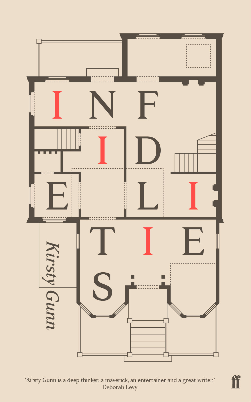
This post is a collection of book covers which use maps as parts of their design. I started this working on it months ago (my earlier post collecting arrows on books covers was originally an offshoot of this one), but it turned out to be surprisingly difficult to find enough interesting covers. I think I’ve finally got there — even if I had to cheat a little to include a couple of floor plans! I hope you agree…
Apostle Islands by Tommy Zurhellen; design by Jamie Keenan (Atticus Books / September 2012)
Nazareth, North Dakota by Tommy Zurhellen; design by Jamie Keenan (Atticus Books / April 2011)
And I don’t think we can end this post without mentioning the amazing Book Map print by Manchester-based studio Dorothy:
The map — loosely based on a turn of the century map of London — is made up from the titles of over 600 books from the history of English Literature. Buy it here.
The brilliant Jason Booher, whose cover for A History of Histories featured in my previous post, kindly just sent me his original design for the book. I think this could be the meta-cover to end all meta-covers. Sadly, the editor decided it might be a little too much of a good thing.
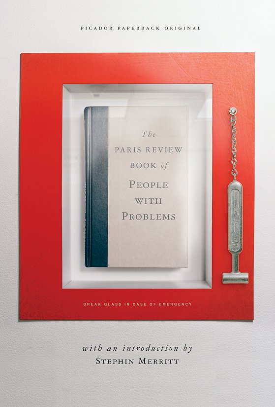
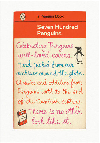
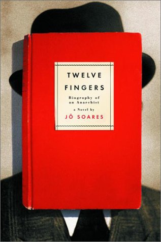
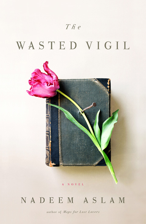
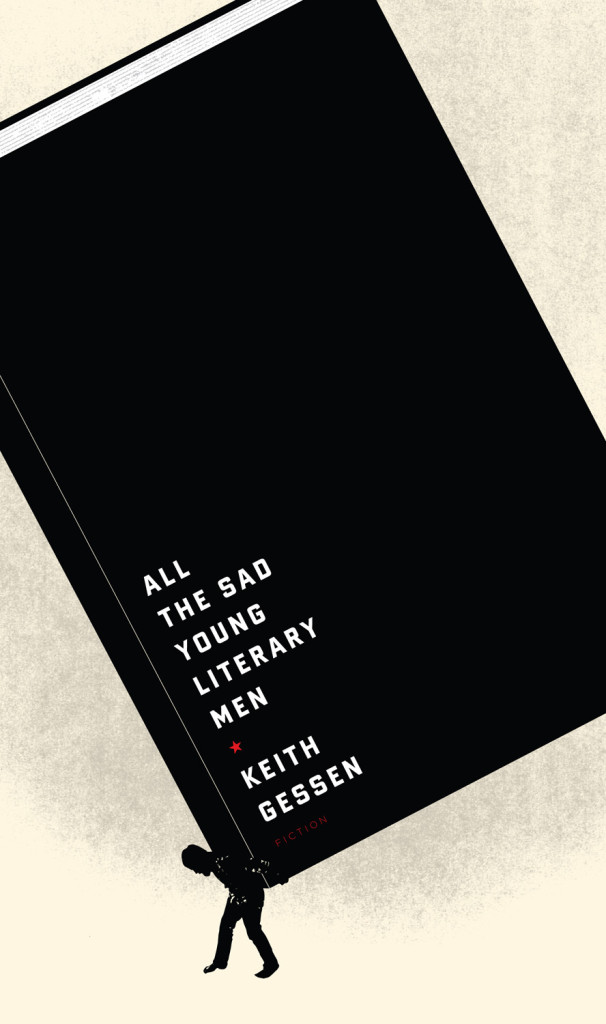
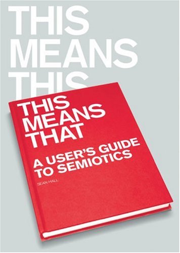
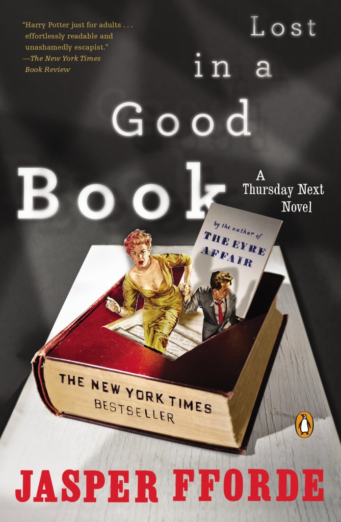
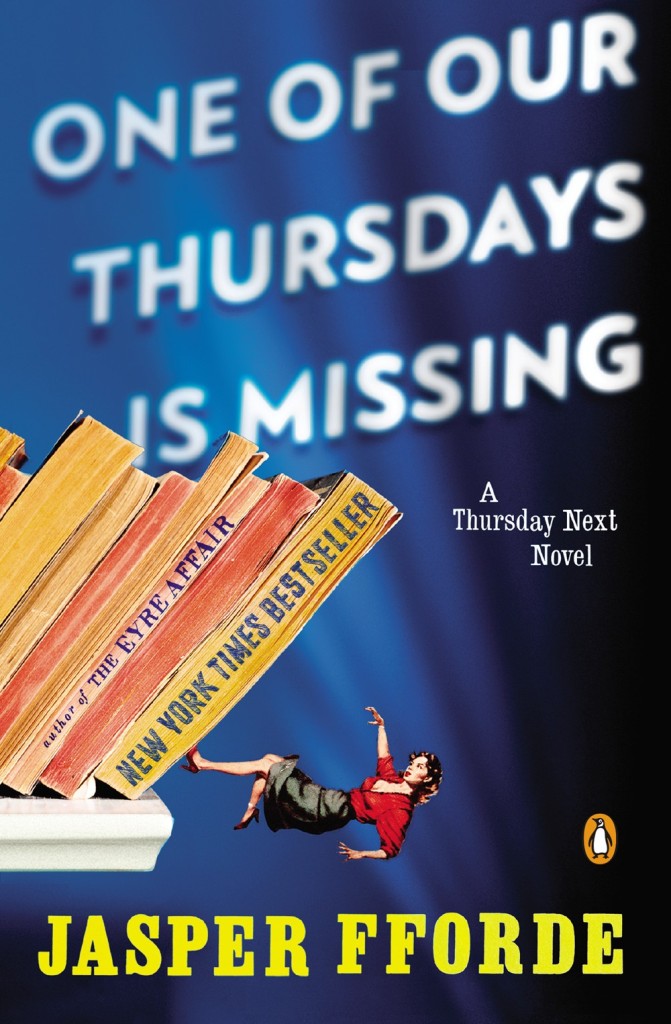
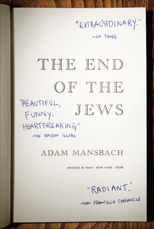
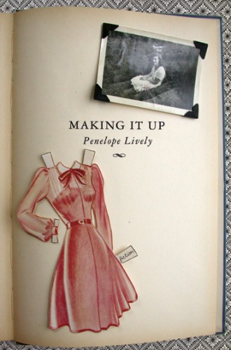
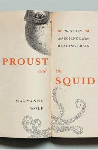
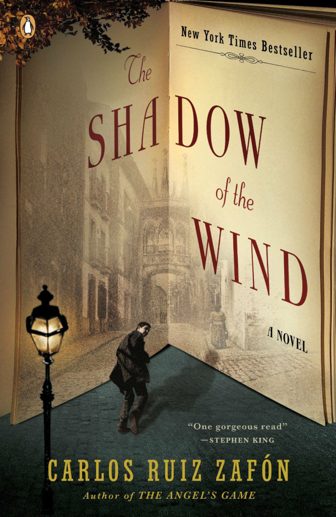
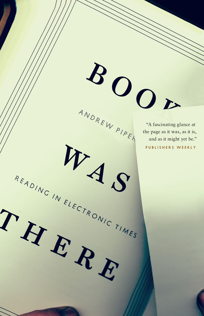
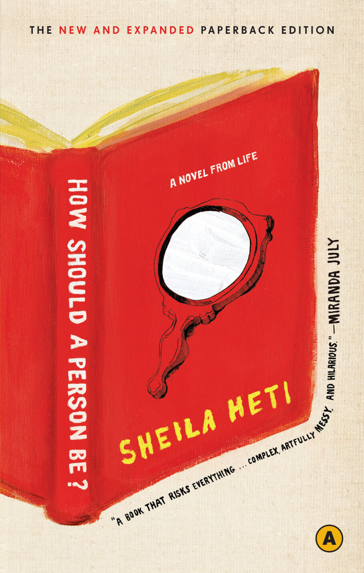
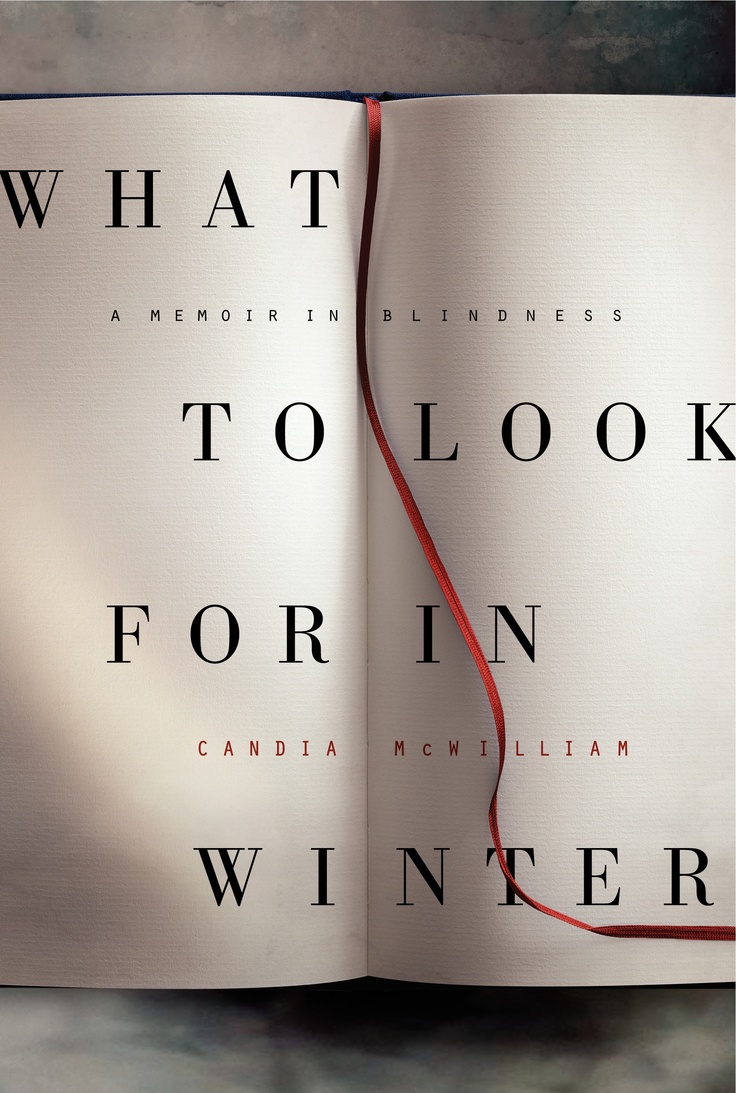
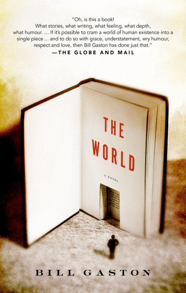
It started, innocently enough, with a tweet from my friend Steven Beattie, book review editor of Canada’s Quill & Quire magazine, about the cover of The Most Dangerous Book, Kevin Birmingham’s new ‘biography’ of Ulysses by James Joyce, designed by Ben Wiseman (Penguin June 2014).
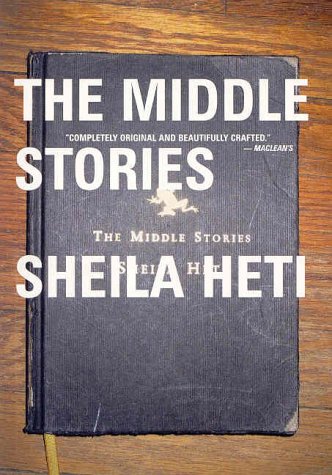
That sparked a conversation with designer David Gee and Joseph Sullivan of The Book Design Review about books on book covers. Joe wrote a a post on the subject in 2009 on the subject, and I rather naïvely thought it would be easy (EASY!) to post a few contemporary examples of the trend, completely underestimating what an undertaking such a project would become.
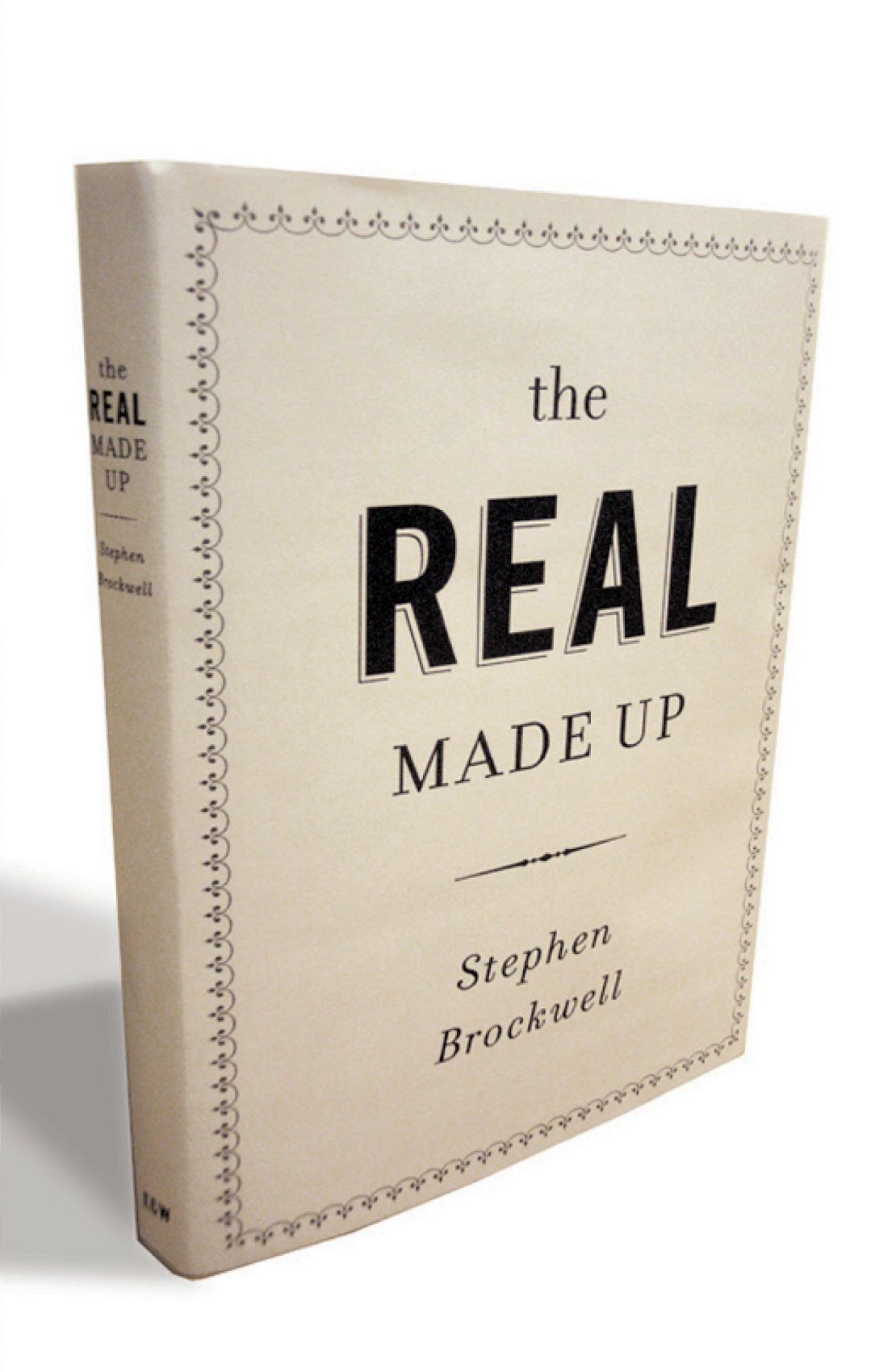
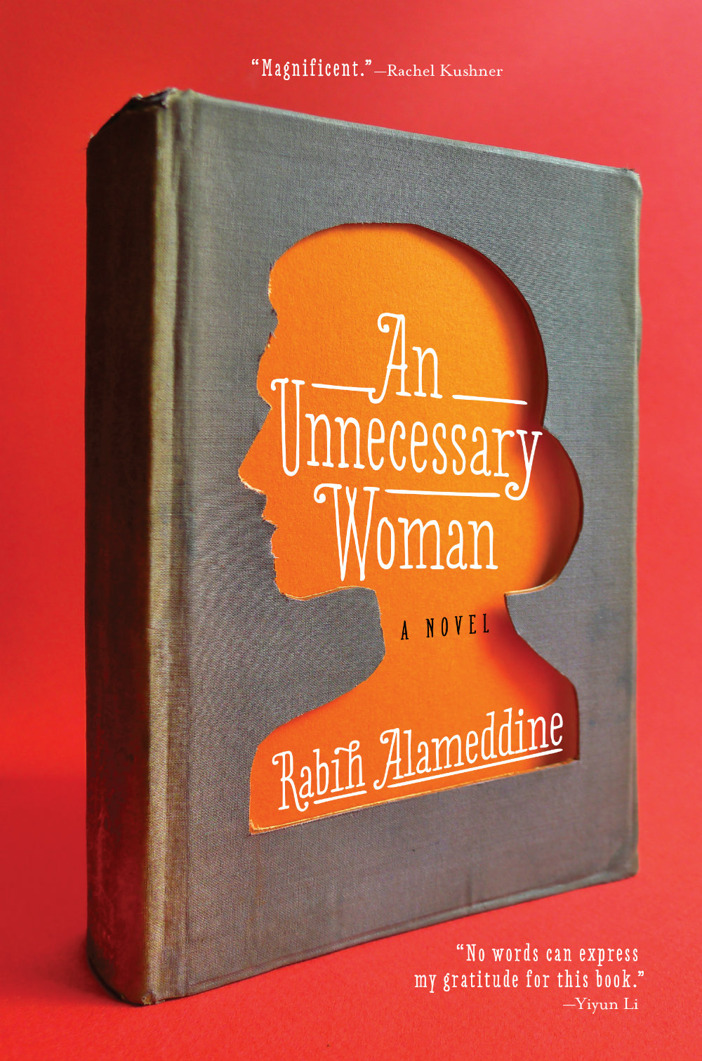
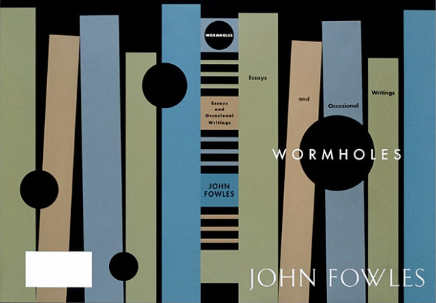
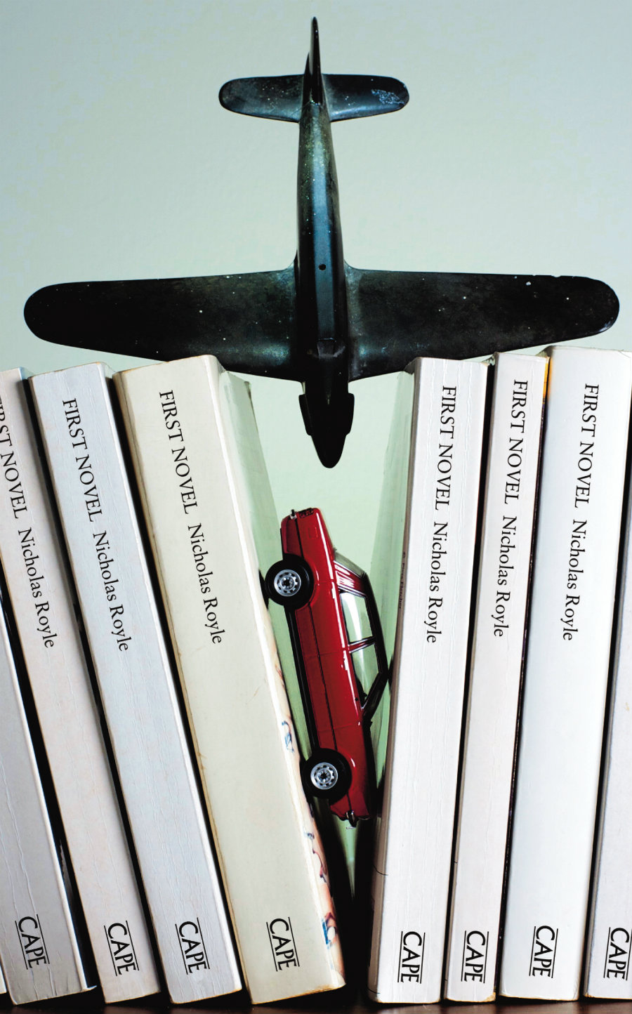
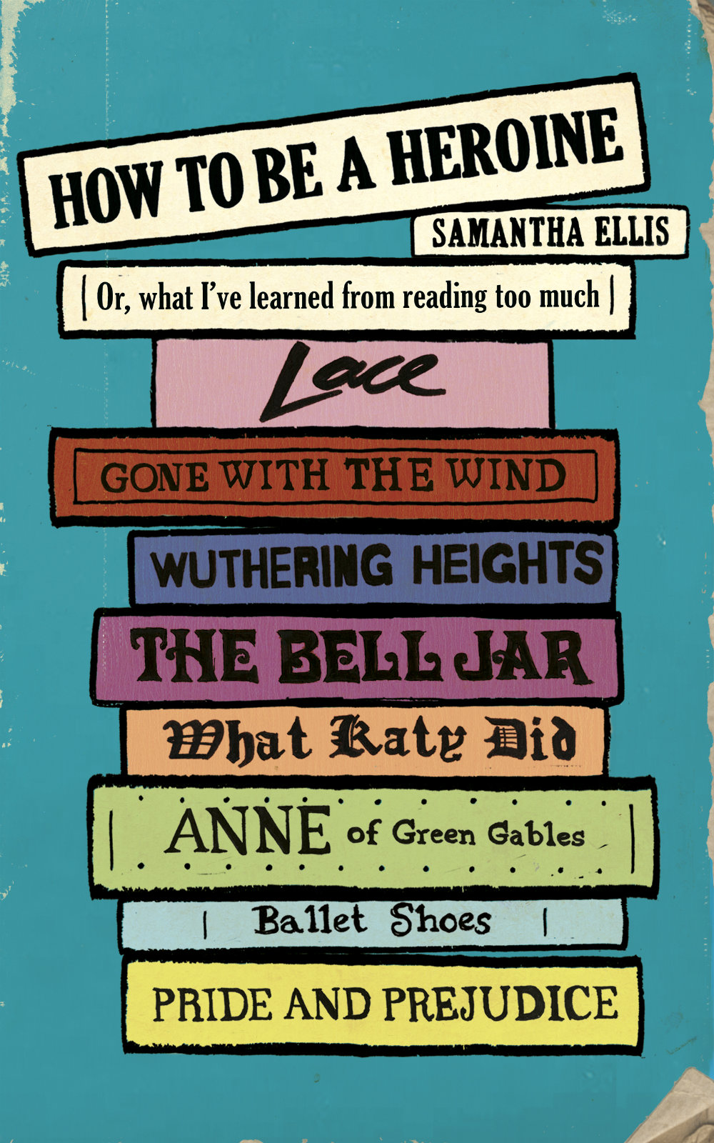
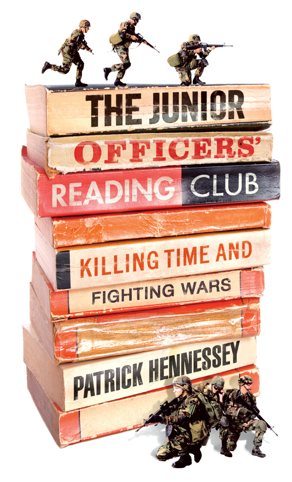
What follows is an attempt to showcase some of different ways designers incorporate books into their cover designs. Along side covers from the past five years, I’ve included some earlier examples from Joe’s post, and this post about ‘meta-covers’ from HTML Giant. Many of the images of the older titles are small (and some are just not very good), but where I have been able to source a larger image, I’ve included it at full (or close to full) size. I’m indebted to the Book Cover Archive, which is still an invaluable resources after all this time, Ferran Lopez‘s (also mothballed) Jacket Museum, and all the designers and book folk who sent me cover images, and helped me in numerous other ways. Thank you. This isn’t comprehensive survey but, to be honest, I had to stop somewhere…
The Knowledge by Lewis Dartnell; design by Kris Potter (Penguin April 2014) Priceless by William Poundstone; design by Jennifer Carrow (Hill & Wang January 2010)
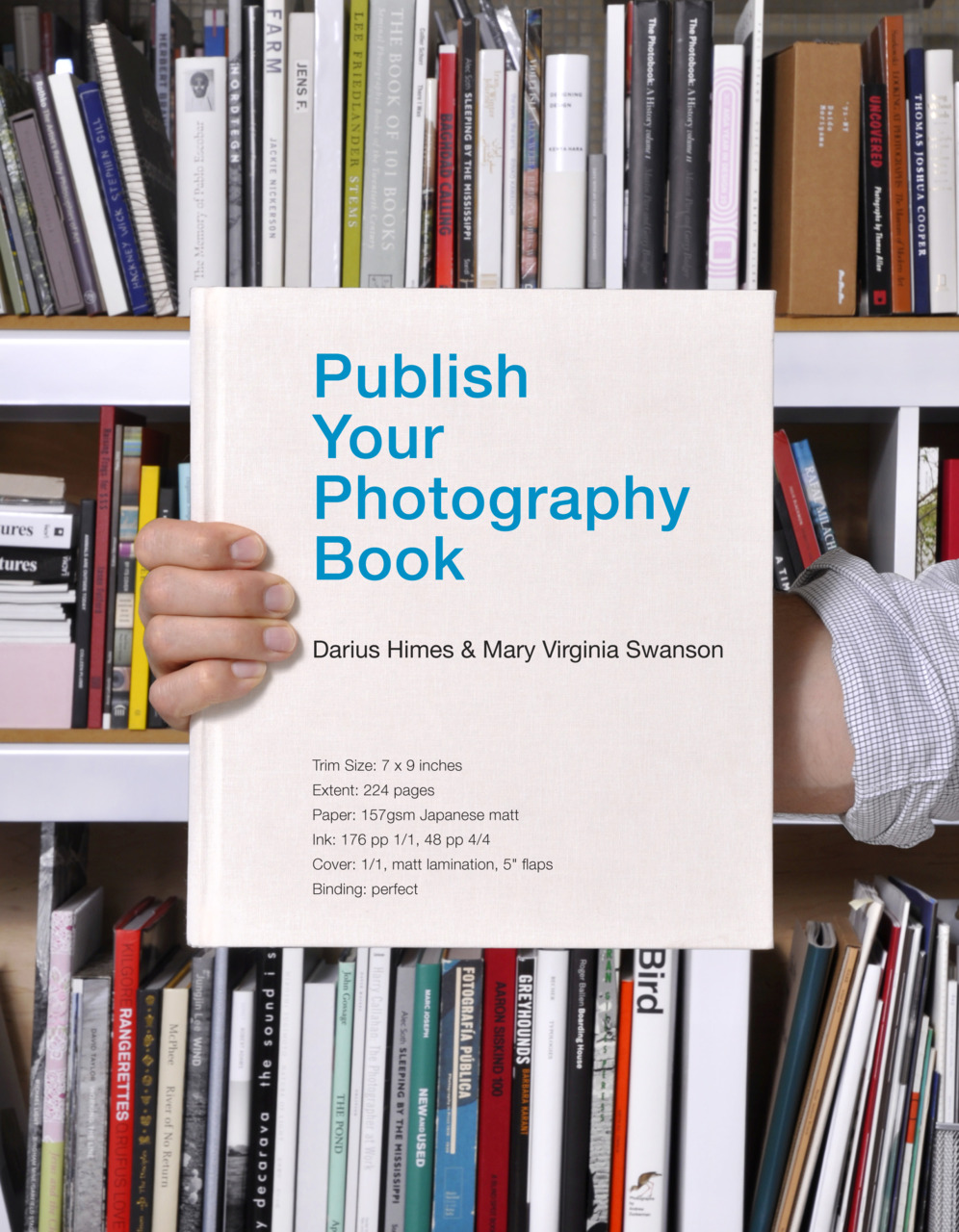
Publish Your Photography Book by Darius D. Himes & Mary Virginia Swanson; design by David Chickey & Masumi Shibata (Princeton Architectural Press March 2011)
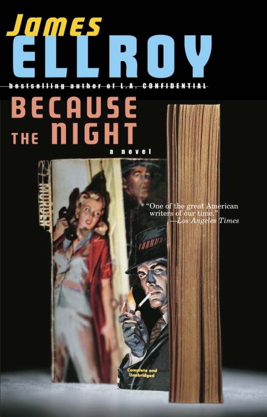
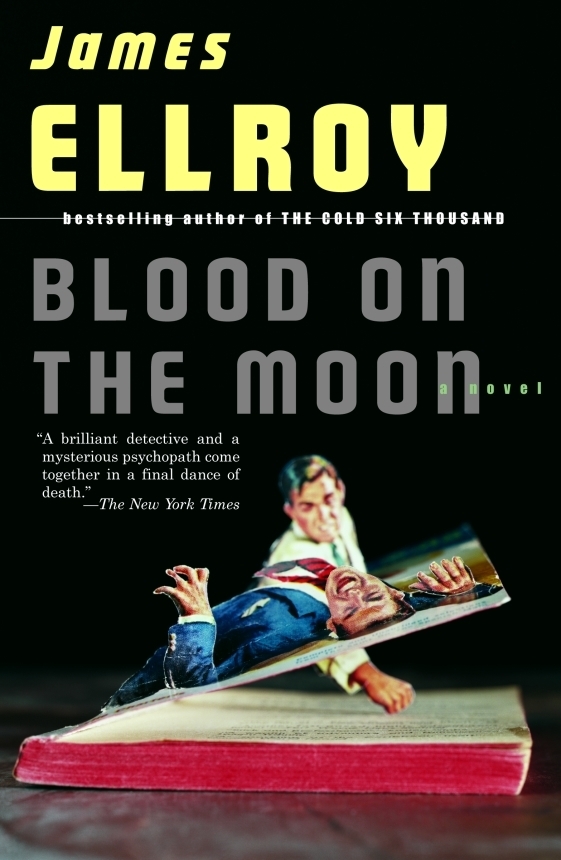
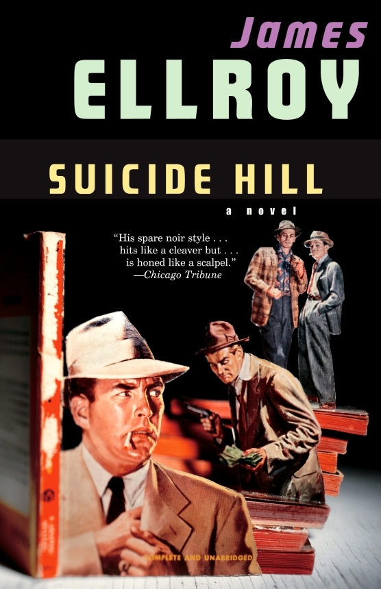
And those of you with a good memory will remember Chip Kidd used also art by Thomas Allen for a series of James Ellroy titles publisher by Vintage in the US:
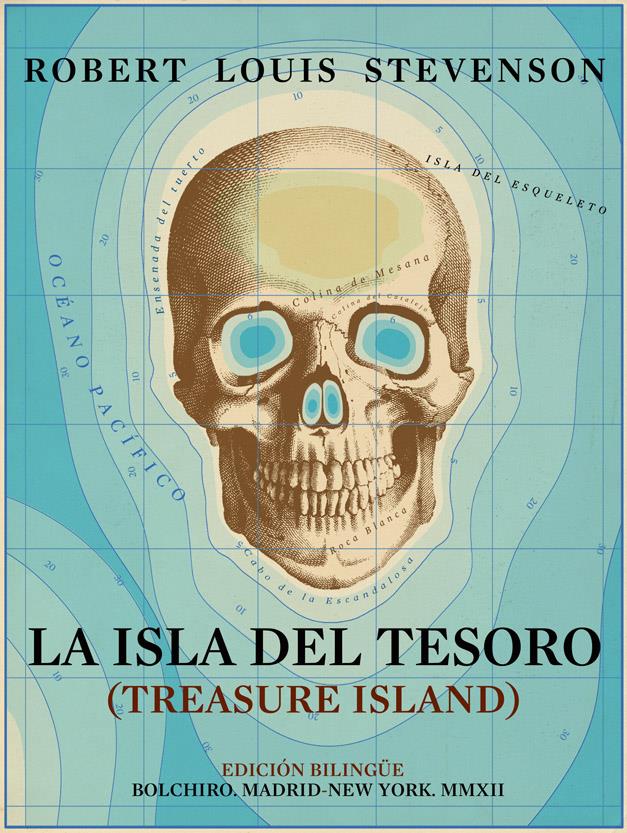
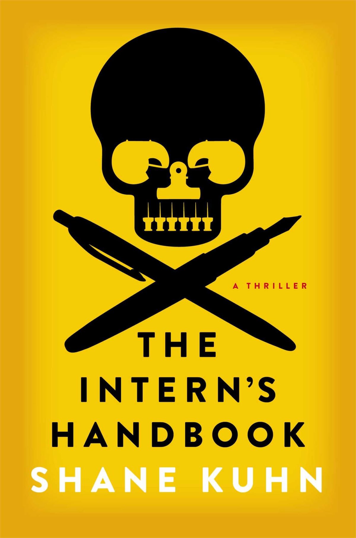
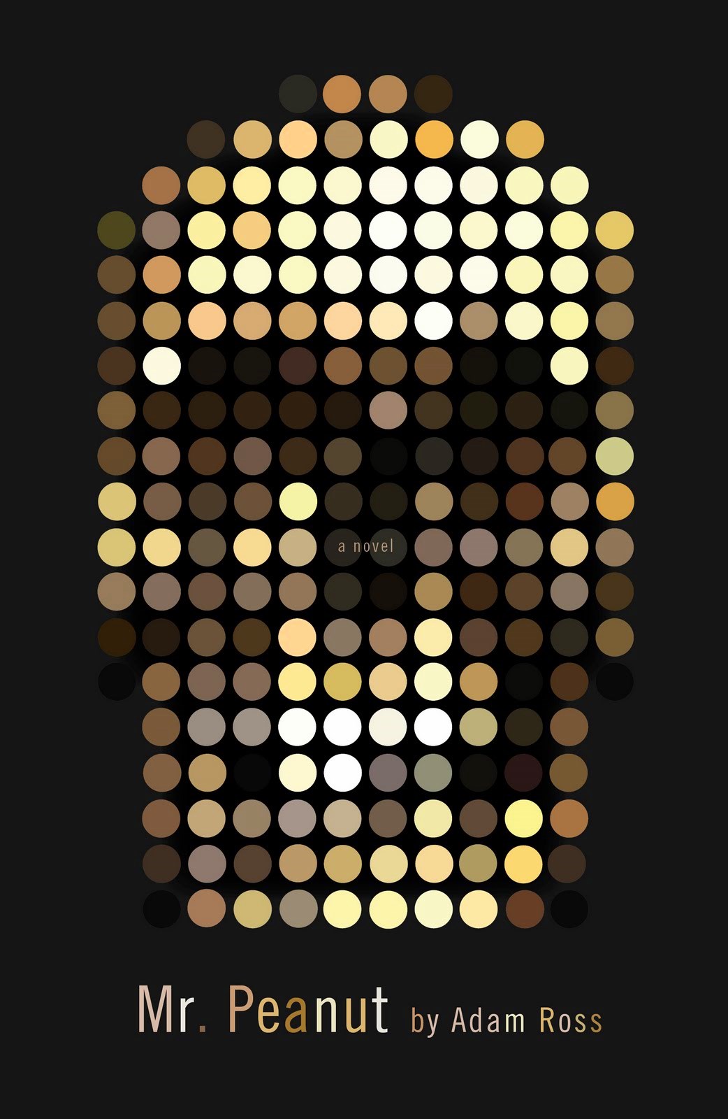
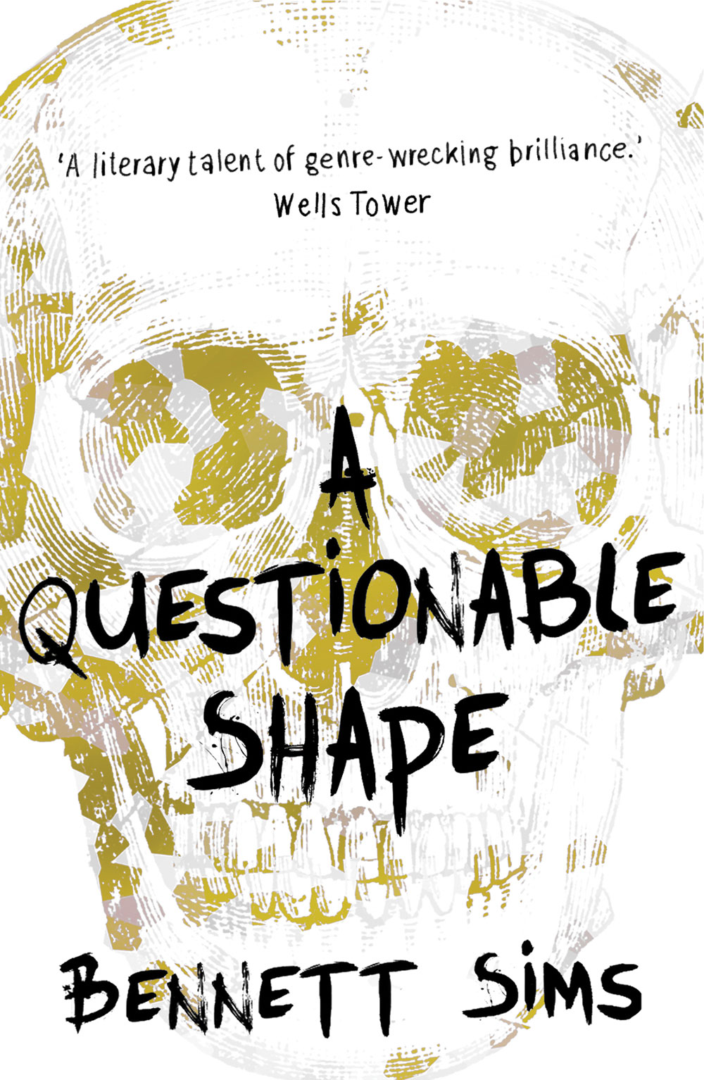
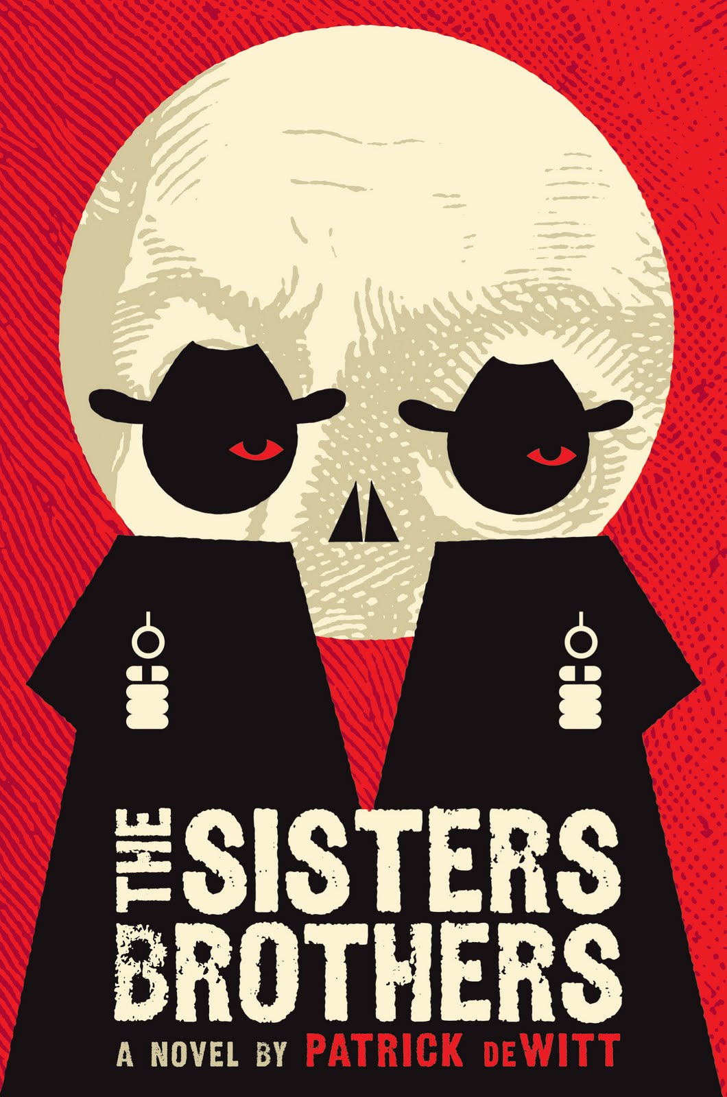
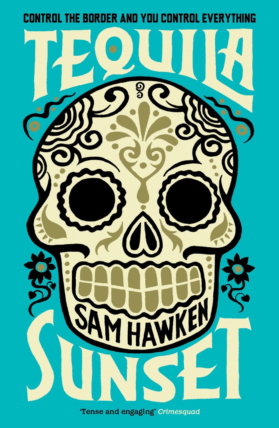
A comprehensive visual history of the human skull is surely an entire Steven Heller book in the making (I guess we’ll just have to make do with a Wikipedia page for now). But as Faye Dowling’s contemporary compendium The Book of Skulls1 makes plain, what was once taboo — terrifying even — has become a pop culture phenomenon. Images of skulls now appear in art, design, fashion, and illustration. Apparently we like to be reminded we are all going to die. Even book covers are not immune. Here are a few recent examples that caught my eye:
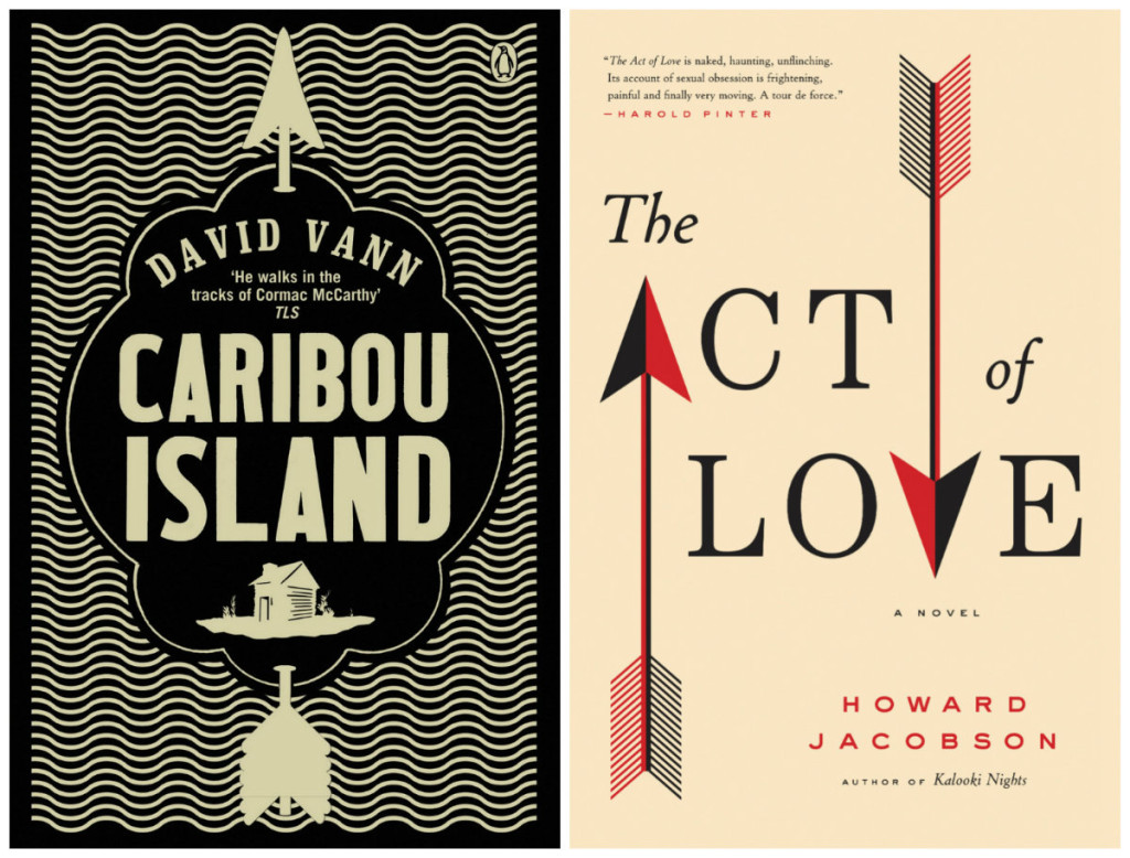
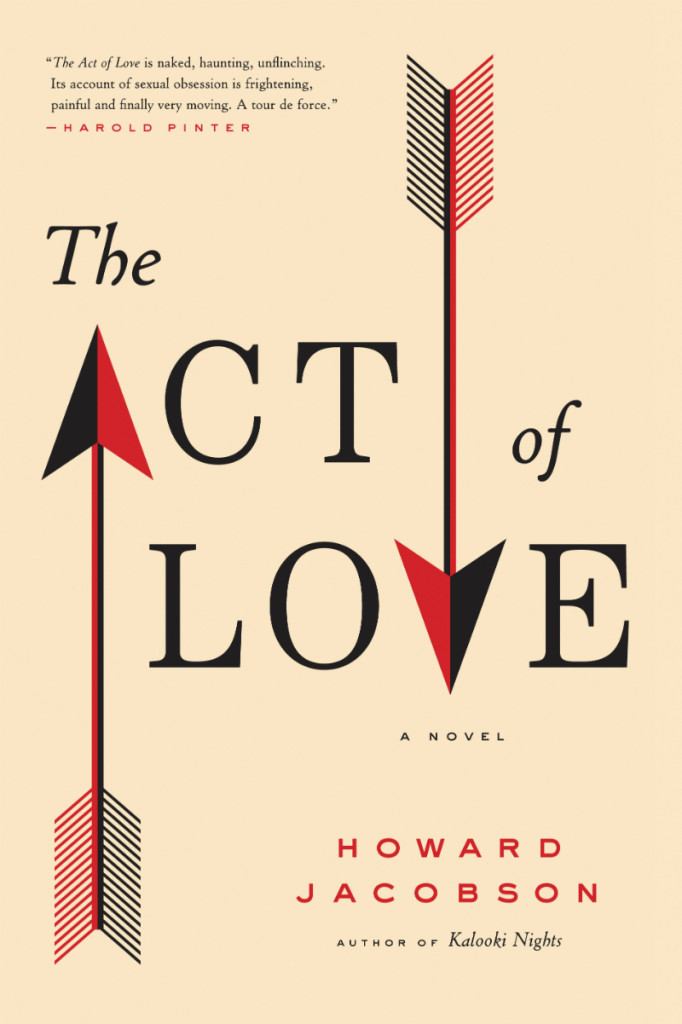
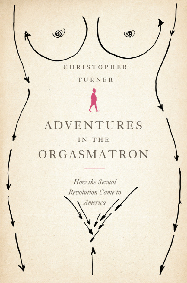
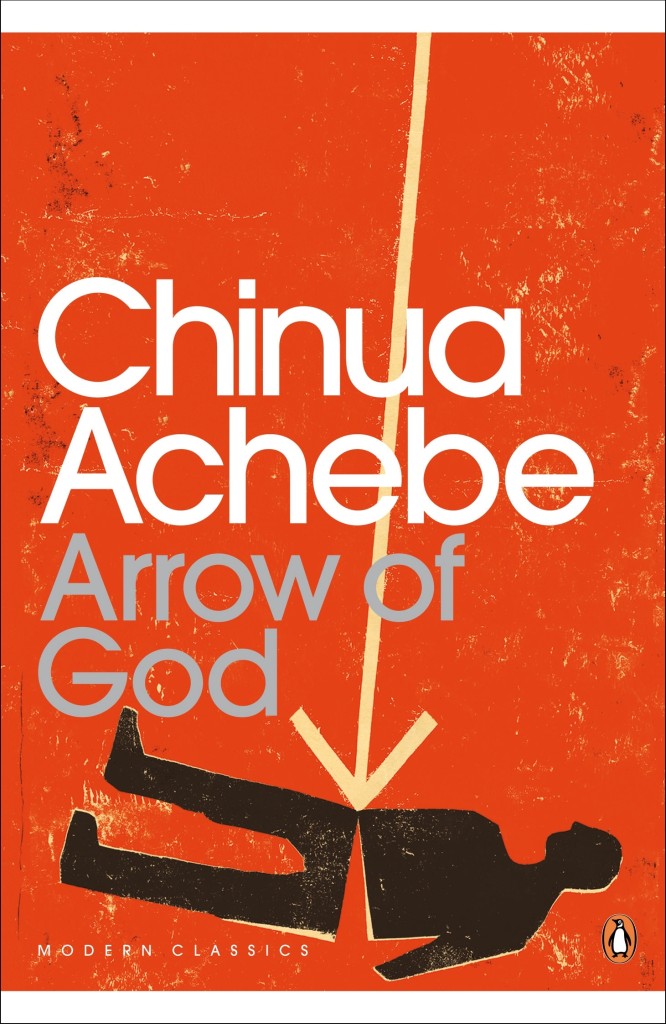
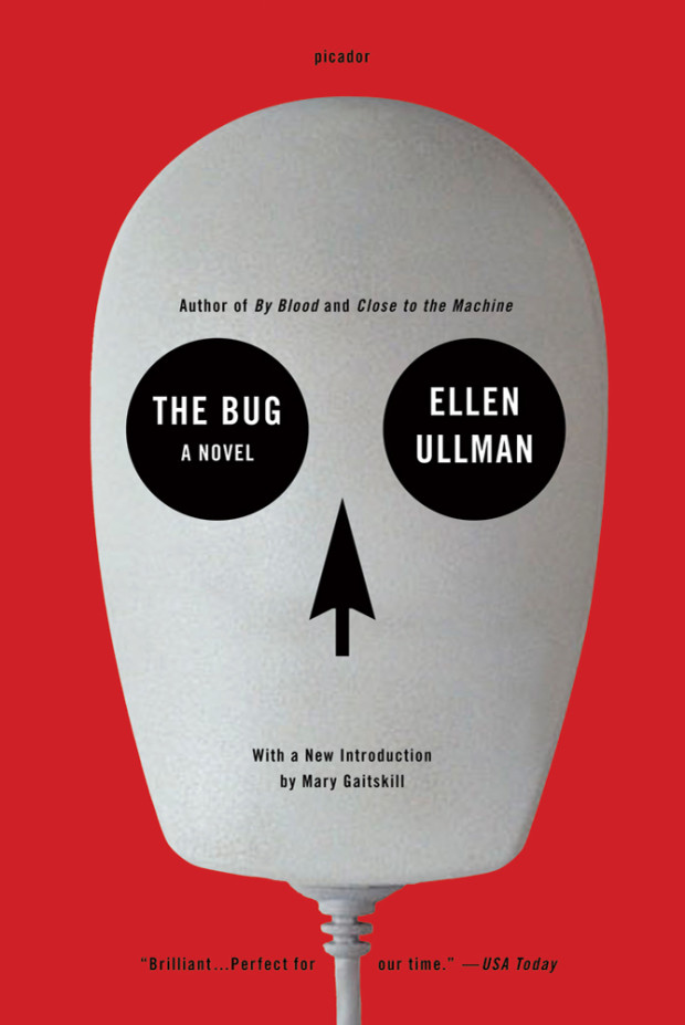
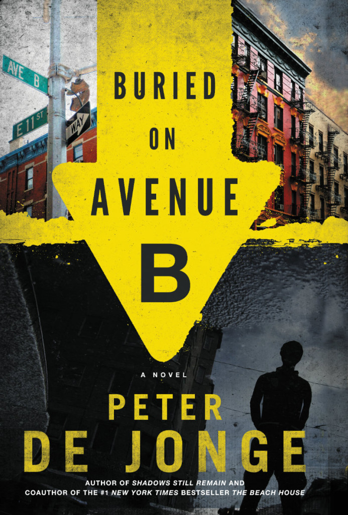
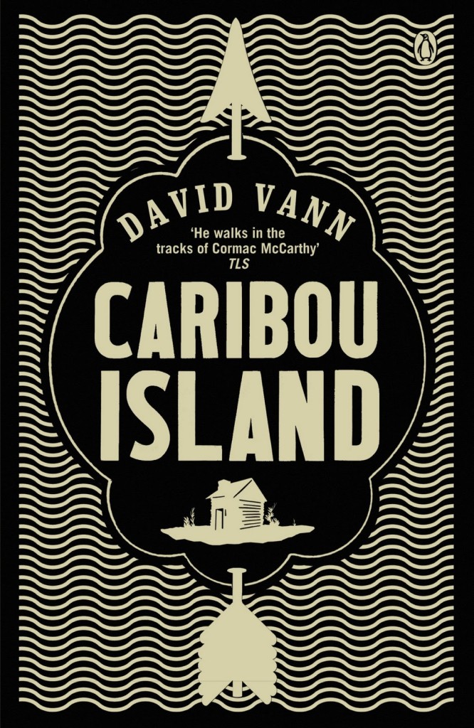
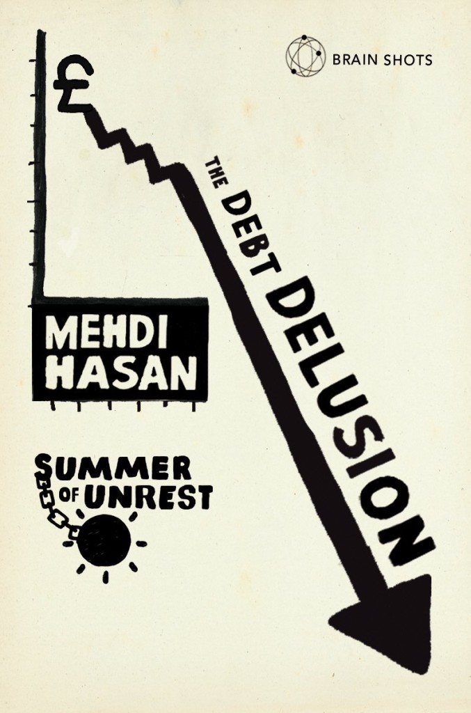
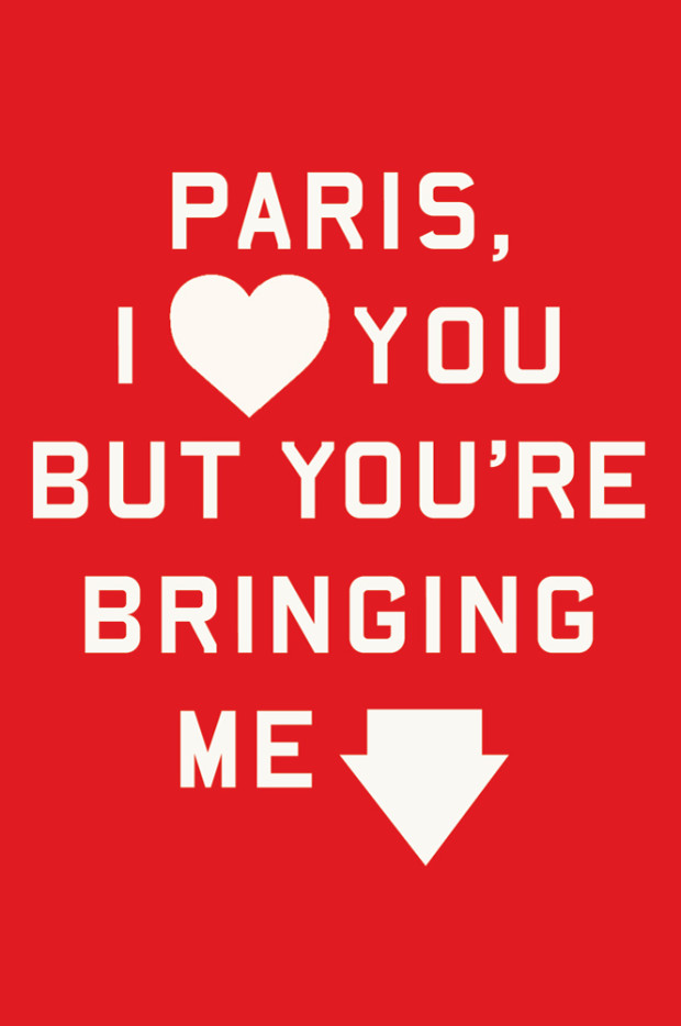
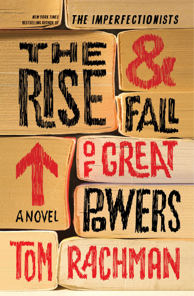
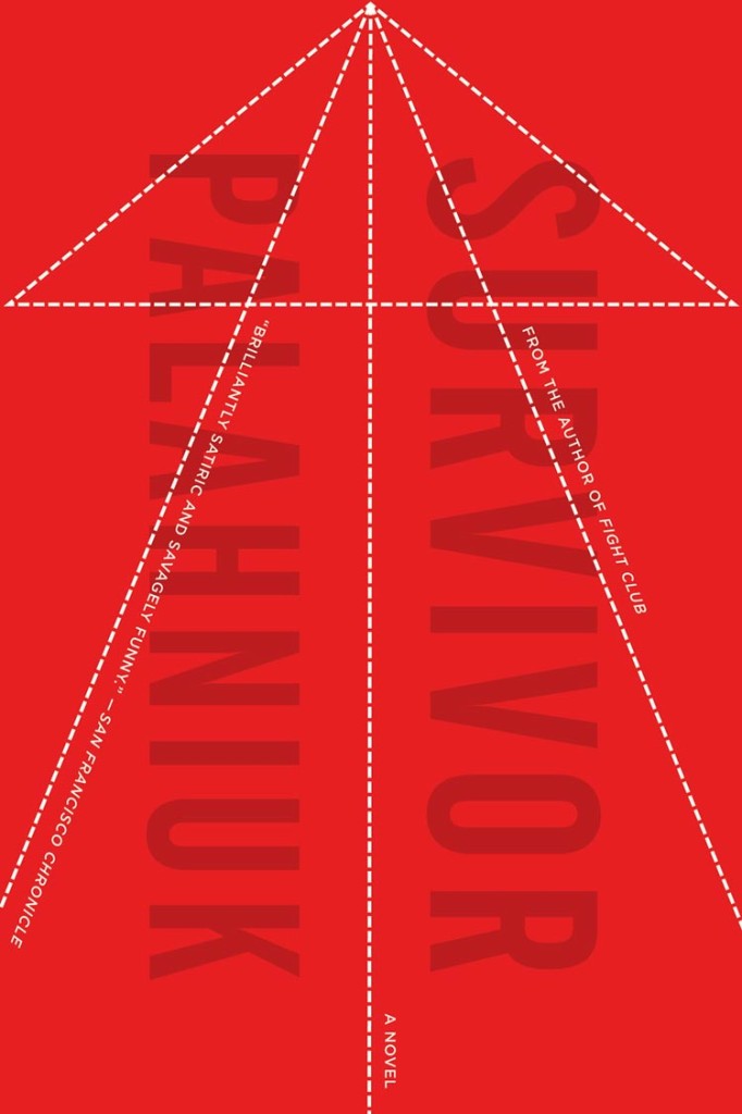
As I was collecting images for my recent posts on triangles and book covers, I started thinking about the use of triangle’s directional cousin, the arrow. Inspired by a vintage cover design by Elaine Lustig and Jay Maisel, I thought I’d gather a selection of recent book covers that use arrows as part of their design.
I’ve spent far too long on this already, but I am sure I have forgotten some corkers. Please let me know what I’ve missed in the comments. I also have to say thanks to all the designers who helped me with this, especially Catherine Casalino, Richard Green, and (the very patient) Jason Ramirez who all dug deep into their archives for me.