Well, I don’t know about you, but I certainly didn’t miss the ceaseless chaos and constant anxiety. It is exhausting.
Anyway… I hope you’re keeping safe and well despite it all. I don’t know where March has gone, but this month’s post is another bumper edition with lots of great covers. I’m happy to have a bit more nonfiction in the mix, and there are lots of covers from indie publishers and even a university press along side the usual suspects. There are also a couple of Canadians if you’re keeping score.
Disposable by Sarah Jones; design by Keith Hayes; photograph by Susan Goldstein (Avid Reader / February 2025)
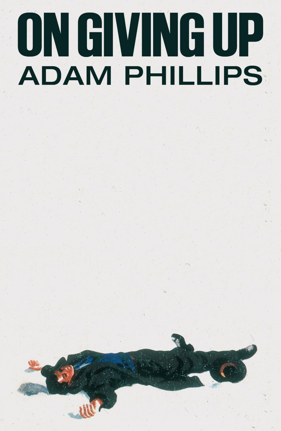
On Giving Up by Adam Phillips; design by Alex Merto (Farrar, Straus & Giroux / March 2024)
Yes, this is from March 2024, so I am precisely a year late posting it. Either I didn’t see it last year or I couldn’t find the credit at the time. Anyway, Alex posted or re-posted this cover relatively recently and it spoke to me.
I also thought it went quite well with this cover…
The slightly less bonkers, but also fun cover of the US edition (published by Scribner this month) was designed by Math Monahan. I’m also quite partial to the definitely bonkers Polish(?) cover designed by Tomasz Majewski.
I hope you’re keeping safe and well. Between work trips and sales conference it’s been a few weeks for me, and there are a lot of covers this month, so I am going to stop prattling and let you get straight to the post…
Kairos by Jenny Erpenbeck; design by John Gall (New Directions / May 2024)
This is the cover of the newly released US paperback. John Gall also designed the cover for the hardback, published by New Directions last year. Author Jenny Erpenbeck and translator Michael Hofmann recently won the 2024 International Booker Prize with Kairos.
This composition brings to mind David Pelham’s covers for J. G. Ballard. (On a semi-related note, air-brushed covers are probably overdue a revival. Or is it a dying art now?)
Hello! I hope you’re safe and well wherever you are.
Before we get to the covers, a couple of brief admin things. First up, there have been a couple of behind-the-scenes changes at the CO this past month. They’ve solved a few tech issues for me and hopefully no one else has noticed. Secondly, I’ve been tinkering with the RSS. I’m not sure that’s quite right yet, so apologies if it’s not been working as expected. Let me know if you’re experiencing any weirdness.
I also wanted quickly mention that the deadline for the DPI mentorship scheme has been extended to April 12th. I’m not involved with the DPI, but some really great people are so if you are a designer from an under represented background living in the UK or Ireland, you should think about applying!
Anyway, it’s a really big post this month! The are lots of great covers with the UK, Australia and Canada all represented, as well as the usual folks from US. There are some compare-and-contrasts, a couple of covers from indie presses, a couple of covers for translations, and a couple of poetry covers too. There’s even a meandering digression in the middle (sorry). Enjoy!
Anxiety by Samir Chopra; design by Karl Spurzem (Princeton University Press / March 2024)
So this cover sent me down a bit of a rabbit hole. It reminded me of a cover design from a few years ago. It didn’t really look the same but, in my mind at least, this other cover featured a blue-red capsule shape (possibly a stretched illustration of a planet and its core) centred on a white background with black Swiss-style sans serif type. It was not exactly minimalist, but clean and precise. I think I saw it on Twitter back in the day. I thought it was maybe literary sci-fi or pop science, and published by one of the big American imprints. I was also pretty convinced that it was designed by Alex Merto or possibly John Gall. One of the dudes.
This is not the first time I have thought about this cover, and I can, or at least could, picture it quite clearly. The problem is that I can find no evidence of this cover ever existing, and the more I think about, the more the details shift and doubt creeps in. I don’t seem to have posted it anywhere, and I can’t find it in the usual places. It’s possible that I am getting some of the crucial details wrong, mentally combining a couple of covers into one, or it was something other than an actual book cover. But maybe this is some kind of Visual Mandela Effect thing, and this design that I’ve believed existed for years is actually a figment of my imagination.
My search has felt a bit like the online equivalent of walking into a bookstore and asking for the book with the blue cover. It has made realise that we have very few tools to find cover designs in a systematic way, especially since the Book Cover Archive stopped being a going concern. You just kind of have to browse and I hope you eventually look in the right place (or risk slowly lose your sanity).
Anyway, if this mystery cover is ringing any bells with you, please let me know and put me out of my misery. I have been going slightly crazy. (This sort of thing happens more than I care to admit by the way, but it is particularly bad this time! And, no, I do not have much of a life. Why do you ask?)
(Thanks to Jon Gray for helping me with the design credit for this and the other Granta title Three Births below. Publishers: post the design credits with your cover reveals!)
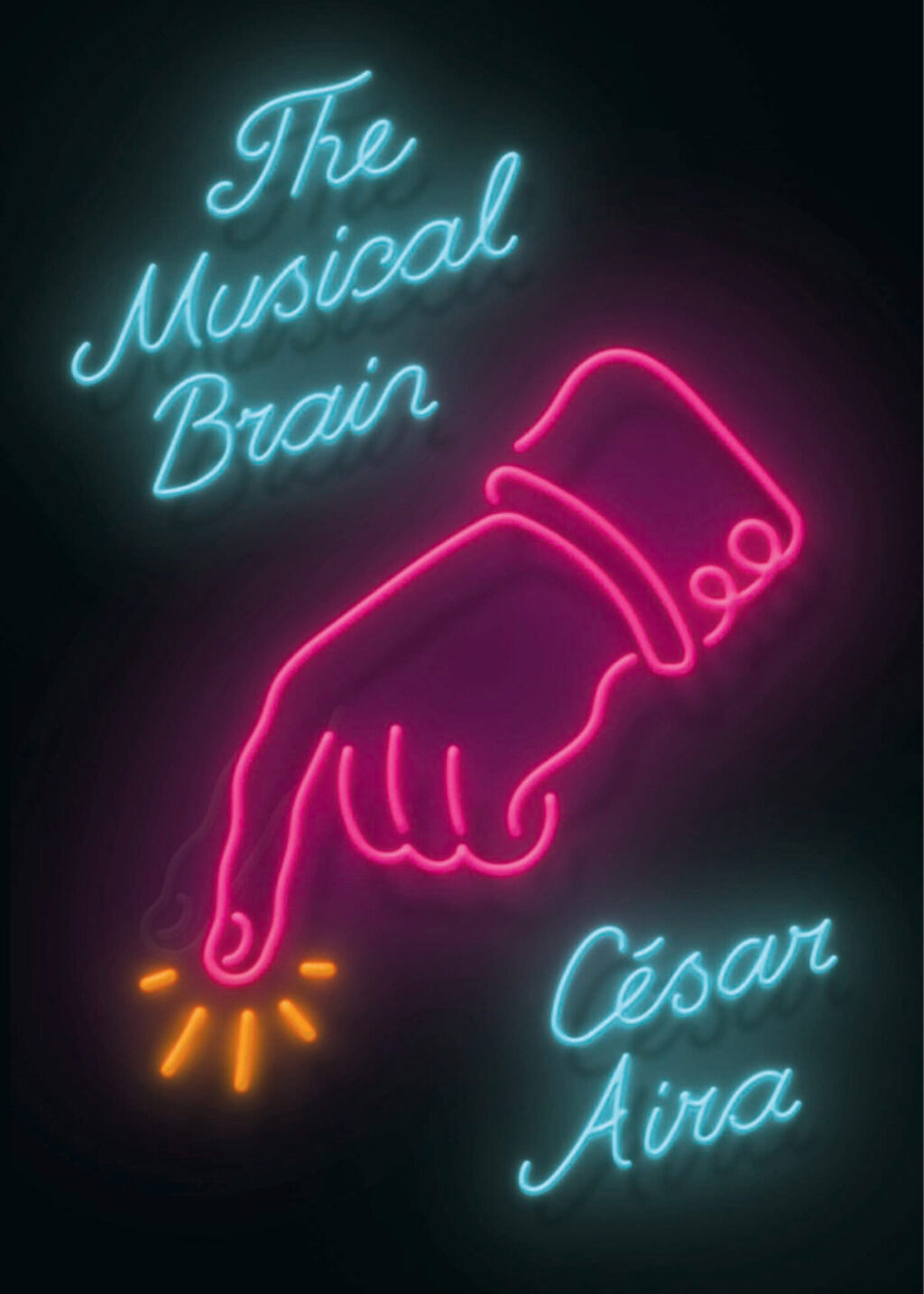
While looking for the other, possibly imaginary, book cover, I came across the cover for the New Directions edition of The Musical Brain by César Aira designed by Rodrigo Corral and Zak Tebbal a few times. It was on one or two best of 2015 lists, including mine.
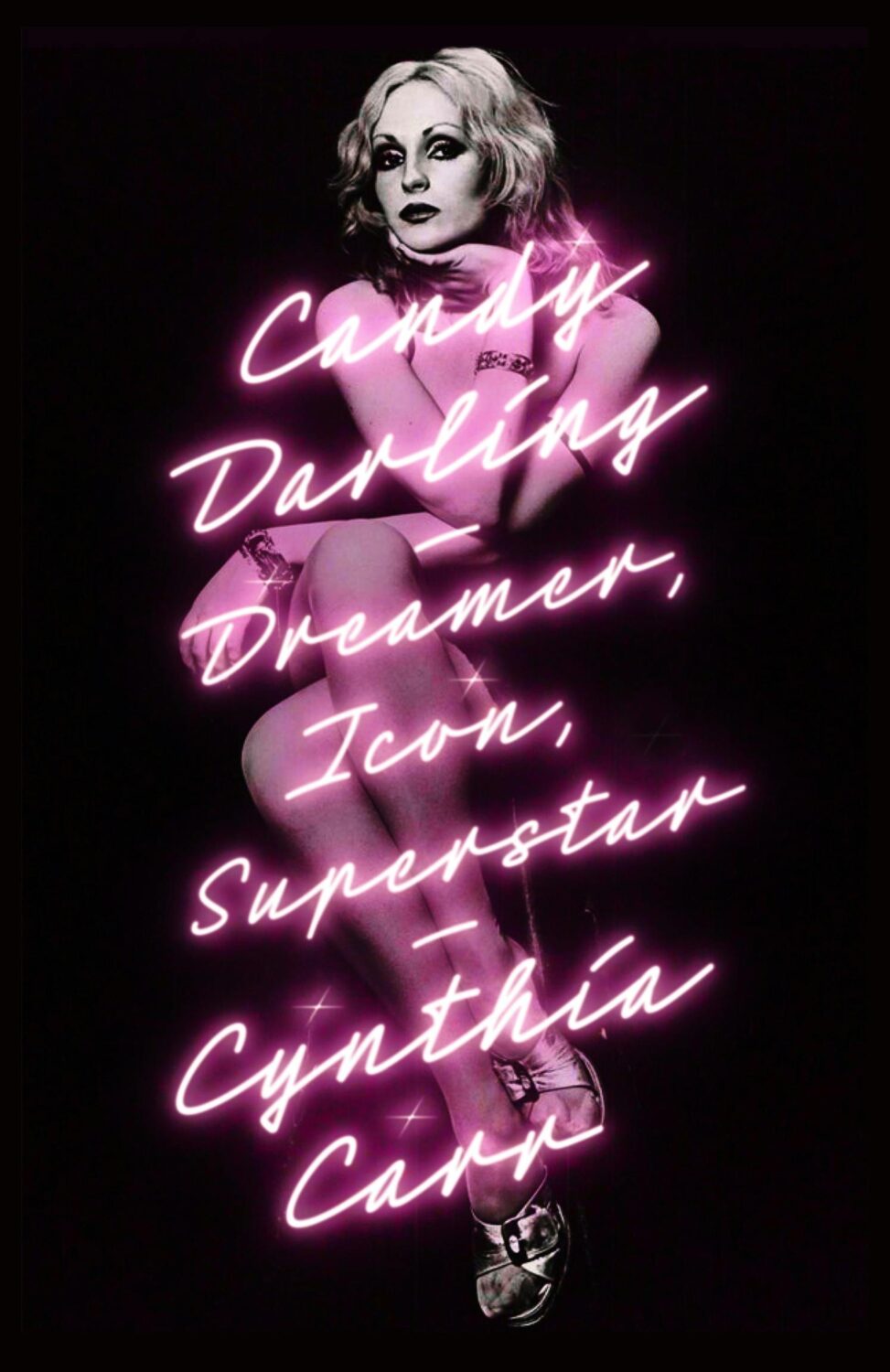
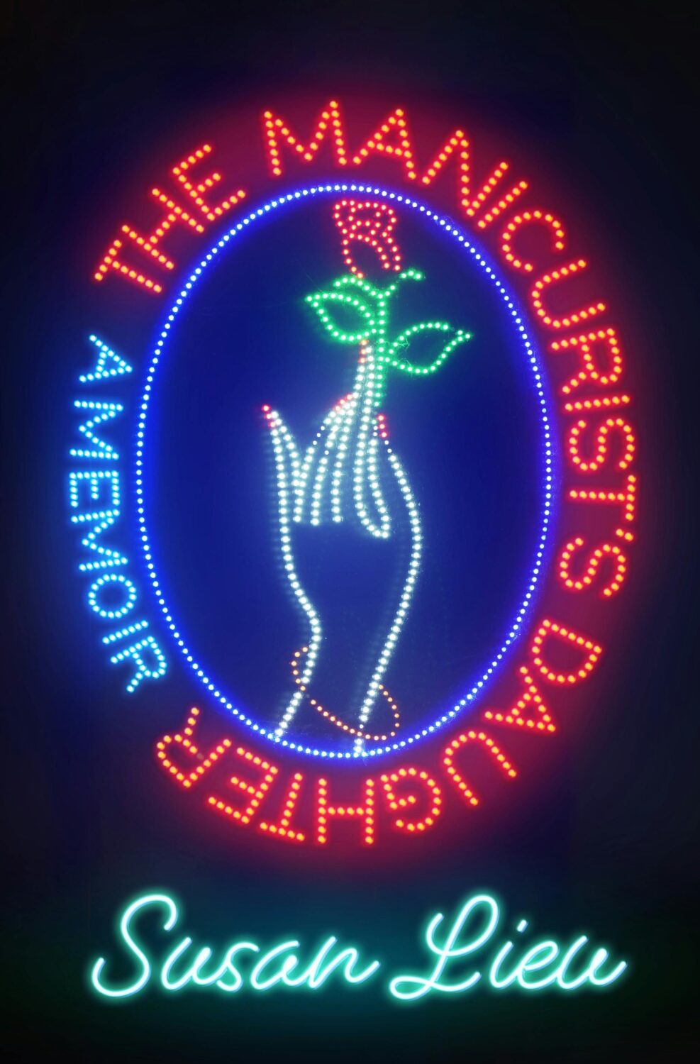
Is neon-style lettering on covers a bit of thing? (see also Candy Darling above)
The cover of the UK edition of The Understory, published by Peirene Press in October last year, was designed by Orlando Lloyd. The illustration is by Miki Lowe.
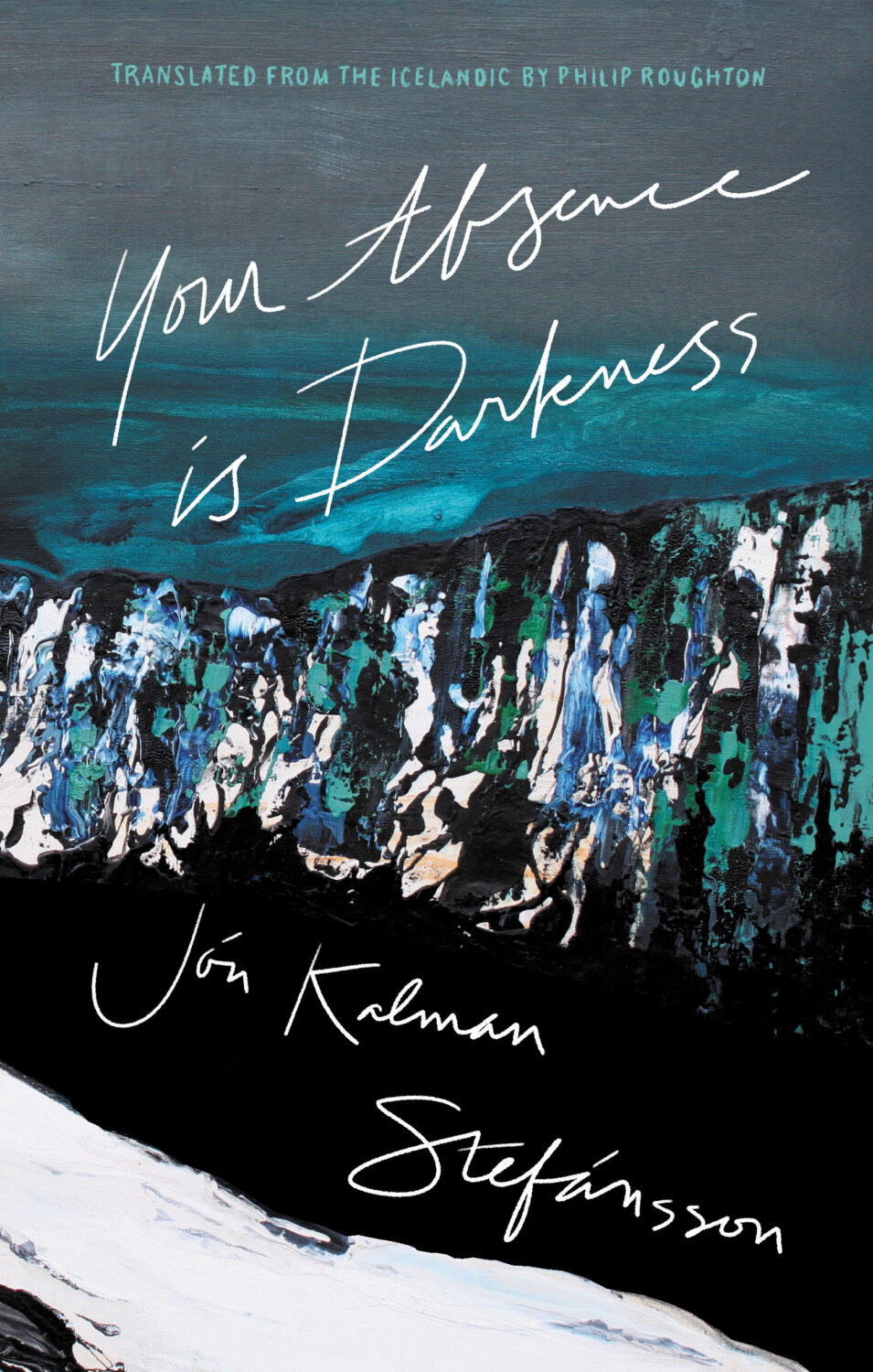
Your Absence is Darkness by Jón Kalman Stefánsson; design by Jason Arias (Biblioasis / March 2024)
2022. Twenty twenty-two. Two thousand and twenty-two… “Where did it go?” Or, sobbing, “ are we done yet?” It feels like both. It’s been a year that’s simultaneously dragged on interminably and disappeared in a cognitive blur.
I’m glad other people have already written about it.
At Creative Review, writer and editor Mark Sinclair picked his favourite covers of 2022 and reflected on industry trends in the UK, including the Design Publishing & Inclusivity mentorship program for under-represented creatives launched this year by Ebyan Egal, Donna Payne, and Steve Panton.
Literary Hub posted the best covers of the year as chosen by 31 designers. With a comprehensive 103 covers on the list, it tacitly poses the annual question “what do I have left to add to this conversation?” LitHub have been posting these lists for seven years apparently. I am an ancient desiccated husk.
Fast Company and the Washington Post asked slightly smaller groups of designers to write about their favourites covers.
Designer and art director Matt Dorfman chose the best book covers of 2022 for the New York Times, and empathized with the plight of the designers:
Most often, any personal stylistic expressions in their work are swallowed up in service to the multiple masters — editors, marketing directors, sales teams — who sign off on a book’s cover. There is also the matter of adhering to any one publisher’s dos and don’ts, which can inform mandates about typography, color palettes and production flourishes like embossing or metallic inks. For people employed in a theoretically creative pursuit, designers’ talents are often defined by how effortlessly they can make themselves disappear to serve the book.
Matt Dorfman, New York Times
No one captured the prevailing mood better than this Tom Gauld cartoon. A reminder, if one were needed, that nobody knows anything.
Earlier in the year, Australian reporter Rafqa Touma called out the trend of ‘well dressed and distressed’ young women on covers. As designer Mietta Yans notes, the covers often reflect their books’ stylish and sad protagonists, so I’m not sure this one is on the art departments.
Some of the trends I’ve talked about before spilled over into 2022. Collage, painting (contemporary, and historical — often tightly cropped), big skies, landscapes and seascapes, black and white photography (not just for LGBTQ+ trauma!), retro-ness, idiosyncratic display typefaces. Orange. Pink was in vogue too. The Instagram-ish combination of both pink and orange (sometimes with deep purple-ish blues too) seemed to be very much a thing this year. I suspect this is what happens when you ask designers to make things “pop” one too many times.
It is hard to know if these are genuine trends, or if it is just the stuff I notice. I’m sure there are things going on with commercial covers that I don’t pay enough attention to (although I will not be sad to see the popularity of that flat illustration style — the one that Slate pointed out in TWO THOUSAND AND FIFTEEN! — eventually fade away). I certainly don’t get the sense that everything looks the same, which is often the criticism. There is still room for a little weirdness and that can only be a good thing…
Ghost Music by An Yu; design Suzanne Dean (Harvill Secker / November 2022)Elizabeth Finch by Julian Barnes; design by Suzanne Dean (Jonathan Cape / April 2022)
The Julian Barnes cover also came in blue, and under the die-cut jacket is a beautiful photo from René Groebli’s photoessay The Eye of Love.
Pure Colour by Sheila Heti; design by Na Kim (Farrar, Straus & Giroux / February 2022)
Also designed by Na Kim:
Present Tense Machine by Gunnhild Øyehaug; design by Na Kim (Farrar, Straus & Giroux / January 2022)Run and Hide by Pankaj Mishra; design by Na Kim (Farrar, Straus & Giroux / March 2022)Either/Or by Elif Batuman; design by Na Kim (Penguin Press / May 2022)
You can read about Alban’s design process for Till the Wheels Come Off at Spine.
Worn by Sofi Thanhauser; design by Janet Hansen (Pantheon / January 2022)
Also designed by Janet Hansen:
A Country of Strangers by D. Nurkse; design by Janet Hansen (Knopf / April 2022)Sedating Elaine by Dawn Winter; design by Janet Hansen (Knopf / April 2022)
Yoga by Emmanuel Carrère; design by Rodrigo Corral (Farrar, Straus & Giroux / August 2022)
“Today is wretched and plain. And it is not the bottom, as many people may feel it is. It will get worse; we will go lower. As the Court’s dissent insists, correctly, ‘Closing our eyes to the suffering today’s decision will impose will not make that suffering disappear.‘
And so, with all this laid out, ugly and incontrovertible, the task for those who are stunned by the baldness of the horror, paralyzed by the bleakness of the view, is to figure out how to move forward anyway.
Because while it is incumbent on us to digest the scope and breadth of the badness, it is equally our responsibility not to despair.
These two tasks are not at odds. They are irrevocably twined. As Dahlia Lithwick wondered just a few weeks ago, after the massacre in Uvalde, another clear and awful day: ‘What does it mean, the opposing imperative of honoring the feeling of being shattered, while gathering up whatever is left to work harder?’
It means doing the thing that people have always done on the arduous path to greater justice: Find the way to hope, not as feel-good anesthetic but as tactical necessity.“
Rebecca Traister, ‘The Necessity of Hope’, The Cut
For my art history friends, I believe the painting is “Agnus Dei” by Spanish Baroque artist Francisco de Zurbarán.
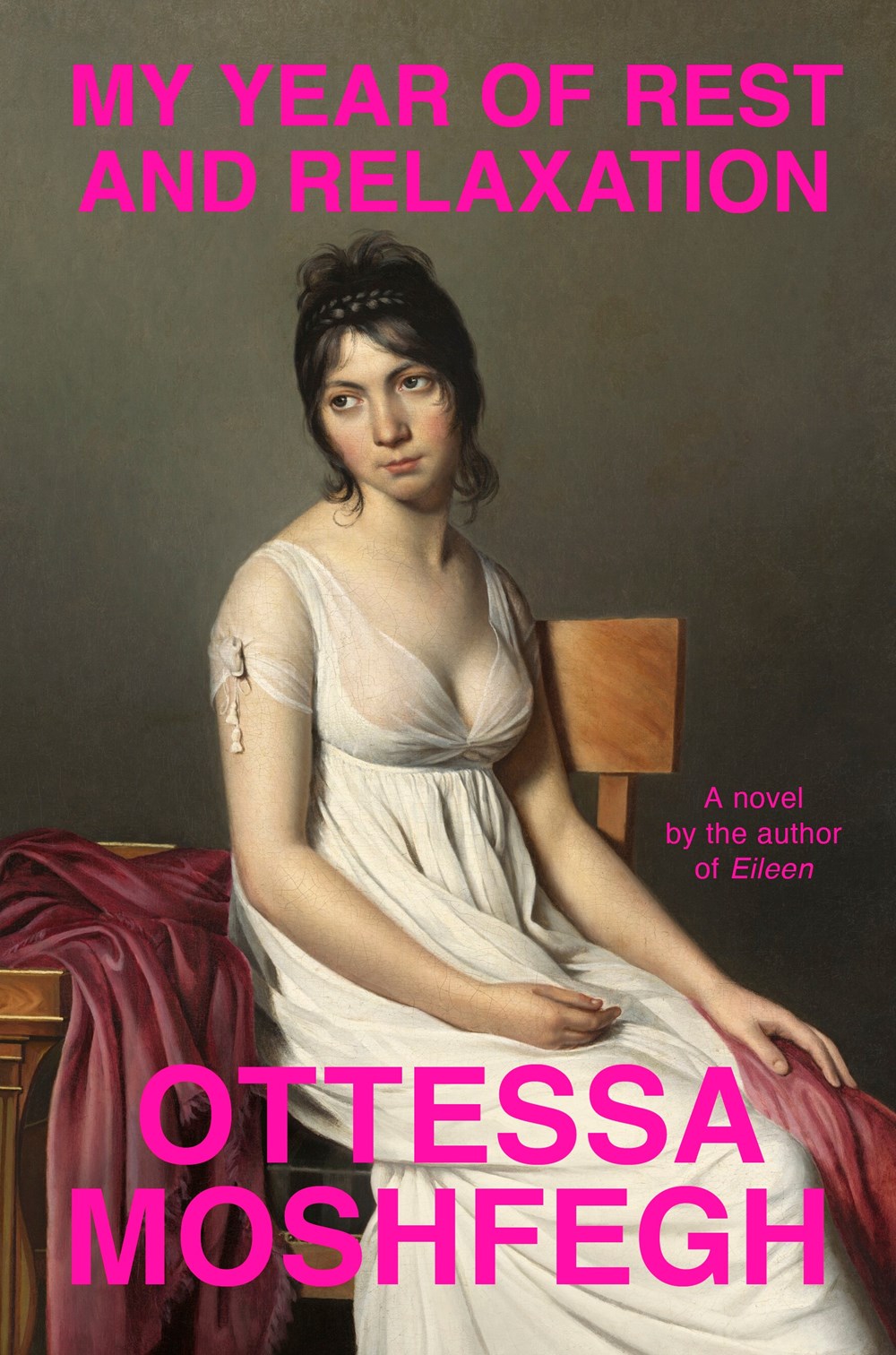
IIRC the cover of Moshfegh’s novel My Year of Rest and Relaxation was designed by Darren Haggar. The painting is by French Neoclassical artist Jacques-Louis David.
As it is almost the end of October this is going to be my last monthly round-up for 2020. I will endeavour to put together a post on the book covers of year soon, but I am sure a lot of great work skimmed under my radar, so designers please drop me a line if I have missed a cover (or two!) you really loved working on (the book has to have been published this year), especially if it was for an independent or university press. In the meantime, I hope you enjoy this month’s selections.
They’re really not all that alike (it’s funny how memory constantly plays this trick on me), but the colour palette and the typographic approach of Alex’s cover reminded me Luke Bird’s 2017 cover for Vivek Shanbhag’s Ghachar Ghochar:
Ghachar Ghochar by Vivek Shanbhag; design by Luke Bird (Faber & Faber / April 2017)
2019 has felt interminable. It has also felt like there are never enough hours in the day to keep up. You can’t talk to me about TV shows or movies. I haven’t seen any.
When it comes to books, I’m fortunate enough to work in the industry. But what hope do casual readers have of finding the good stuff when the same few titles dominate the conversation and there is so much else competing for their attention?
Daisy Jones and The Six by Taylor Jenkins Reid; design by Caroline Teagle Johnson (Ballantine / March 2019) Daisy Jones and The Six by Taylor Jenkins Reid; design by Lauren Wakefield (Hutchinson / March 2019)
Daisy Jones and the Six had a glamorous, louche 1970s look. The US and UK editions, designed by Caroline Teagle Johnson and Lauren Wakefield respectively, took slightly different directions with the type, but the photograph (a stock image apparently) felt ideally suited to social media.
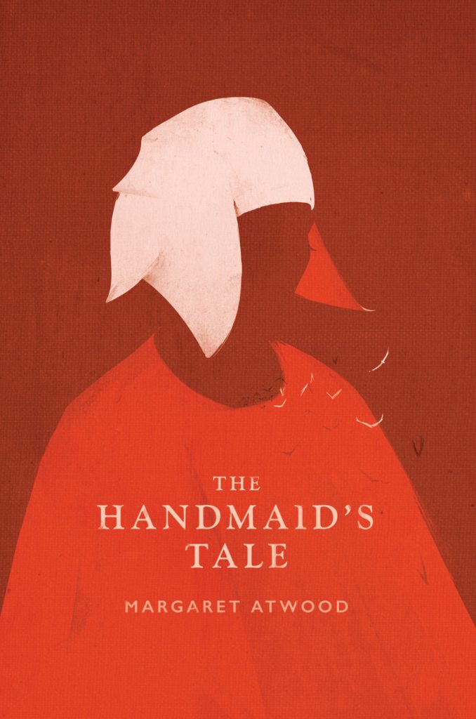
The Testaments by Margaret Atwood; design by Noma Bar (Chatto & Windus / September 2019)The Handmaid’s Tale by Margaret Atwood; art direction by Christopher Moisan; illustration by Patrik Svensson (Houghton Mifflin Harcourt / April 2017)
The Testaments was everywhere and, like the recent Vintage Classics reissue of The Handmaid’s Tale, the cover illustration was unmistakably by Noma Bar. We live in an age where every cult movie and TV show gets a ‘minimalist’ poster now, and I found that The Testaments looked too familiar for me to find it engaging. It didn’t help that the cover of the 2017 US reissue of the The Handmaid’s Tale by Swedish illustrator by Patrik Svenson had already featured a similar 3/4s silhouette. Nevertheless, it was perhaps a bolder cover choice than I’m giving it credit for. If nothing else, it showed that bright green on book covers — once cursed and reviled — is suddenly all the rage!
In terms of trends, 2019 felt more like a continuation of previous years rather than a break with the past. There was a kind of conservatism to a lot of the covers I saw. My sense was that highly polished designs that looked comfortingly familiar were being approved over riskier ones that stood out from the crowd. The most interesting covers often came from small publishers, especially New Directions who seem to be giving a bit more creative license to the designers they work with (some of whom have 9-5s at much bigger publishers!).
Big centred blocks of utilitarian white type over elaborate backgrounds continued to be a mainstay. It’s the book cover as poster, and it works at any size, so I don’t think it’s going away any time soon.
Handwriting and hand-lettering remained popular too, although my sense is that enthusiasm is starting to wane as publishers are opting for greater legibility and designers are turning back to vintage type styles to give a sense of authenticity and craft. (I’m willing to admit the evidence might not back me up on this, however!)
Fun, swishy 1970s-inspired serifs like Benguiat Caslon revival Cabernet are back. People keep trying to make ITC Avant Garde — another iconic 1970s typeface — happen again too. I don’t think it works for the most part, but I can see why designers think it’s cool in a coked-up New York way. Warren Chappell’s earnest calligraphic sans serif Lydian, originally released in 1938, continued its unlikely rise as a go-to literary typeface. It even got an explainer at Vox.
Black and white portrait photography has been the staple of biographies and classics for years, so it was interesting to see closely cropped black and white photographs used on the covers of a couple of new literary novels this year. This isn’t entirely new obviously. Black and white photography has long been used to signify that something is “art” (as opposed to, say, “pornography”). But I think the latest iteration of trend was started by Cardon Webb‘s 2015 cover for A Little Life by Hanya Yanagihara which used a black and white photograph by the late Peter Hujar.
Coincidentally the cover of the US edition of Garth Greenwell’s new novel Cleanness, publishing early 2020, was designed by Thomas Colligan and uses contemporary black and white photograph by Jack Davison. (The UK edition, designed by Ami Smithson fits this trend a little less neatly, but features black and white photograph by Mark McKnight)
Something that I didn’t anticipate was the use of contemporary landscape and figure painting on the covers of some the big literary releases of the year. Like black and white photography, it felt almost pre-digital — a grasp at traditional values of craft. I don’t know if I would go as far as to say it is a rejection of post-modernism. But maybe it is? I don’t know. Discuss amongst yourselves.
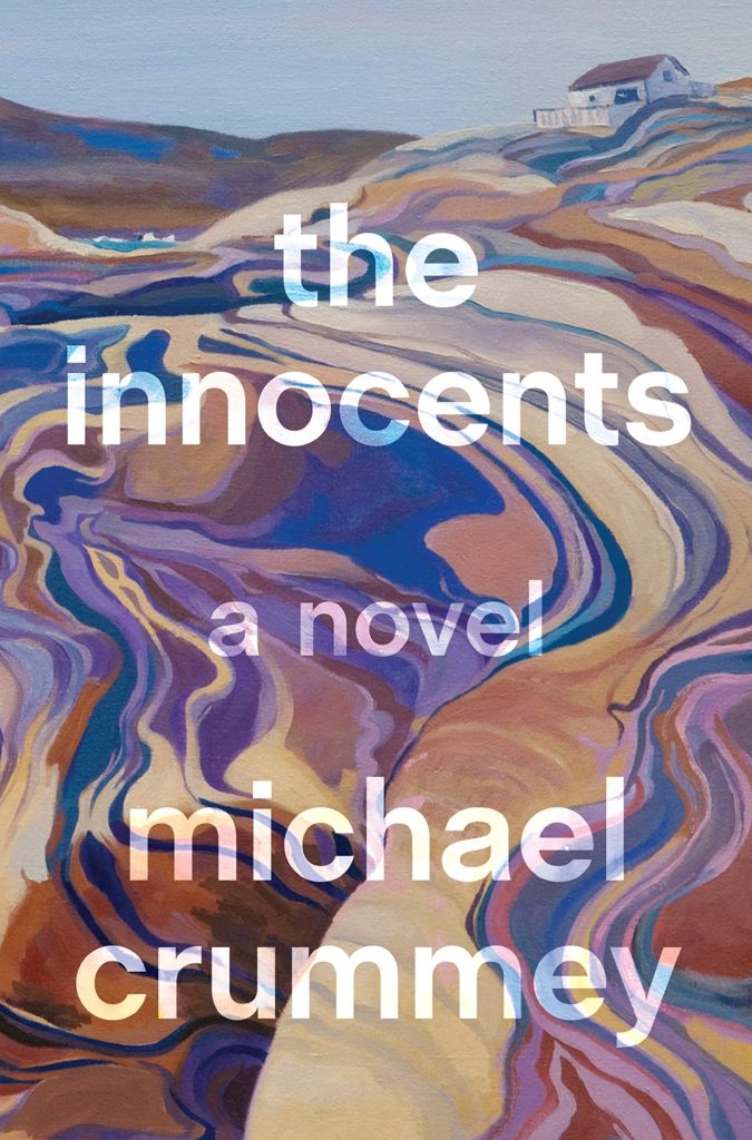
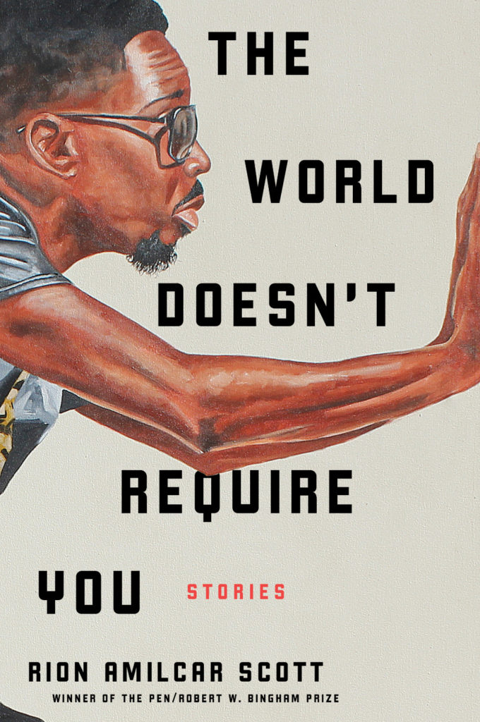
The Innocents by Michael Crummey; design by Emily Mahon; art by Diana Dabinett (Doubleday / August 2019)The World Doesn’t Require You by Rion Amilcar Scott; design by Laywan Kwan; art by Fahamu Pecou (Liveright / August 2019)Inland by Téa Obrecht; design by Jaya Miceli; art by Tamara Ruiz (Random House / August 2019)
Thank you to all the designers and art directors who’ve been in touch and helped me identify covers for my posts. I’m sorry if I haven’t replied to your message. It’s been a year.
Aug 9 — Fog by Kathryn Scanlan; design by Na Kim (Farrar Straus & Giroux MCD / June 2019)
Also designed by Na Kim:
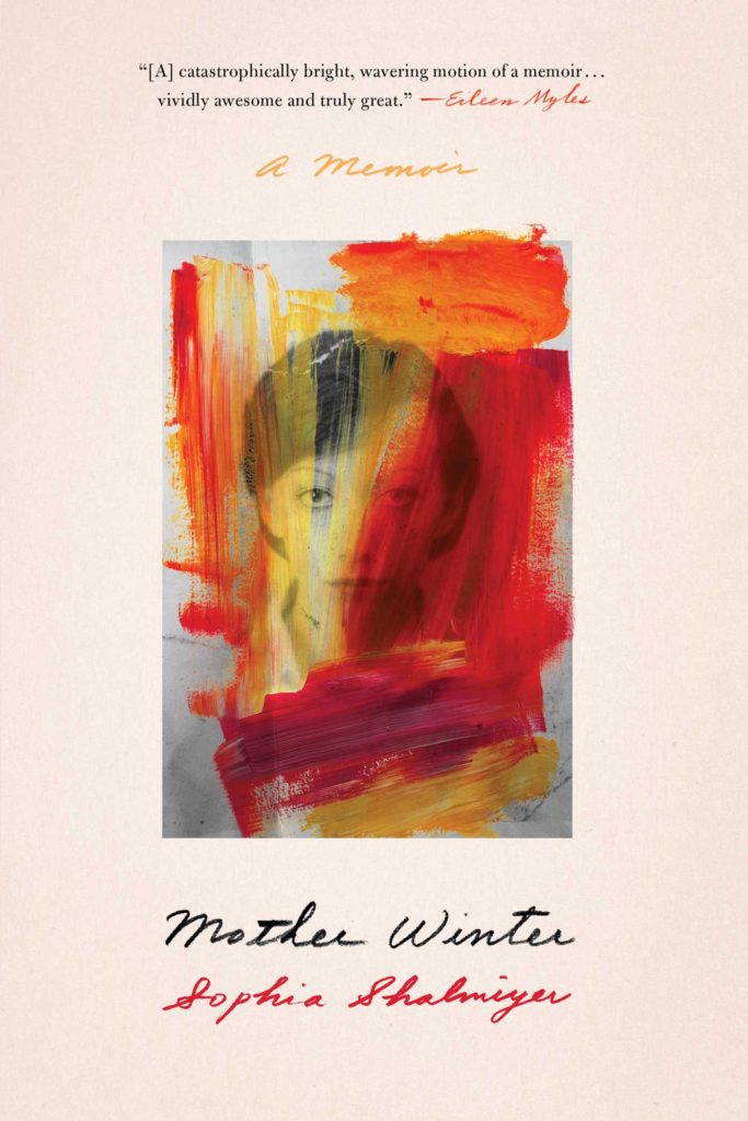
Lie With Me by Philippe Besson; design by Na Kim (Scribner / April 2019)Mother Winter by Sophia Shalmiyev; design by Na Kim (Simon & Schuster / February 2019) High School by Tegan & Sara; design by Na Kim (MCD / September 2019)
Muscle by Alan Trotter; design by Gray318 (Faber & Faber / February 2019)
Also designed by Gray318:
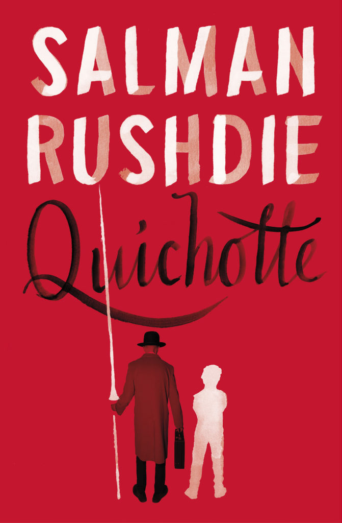
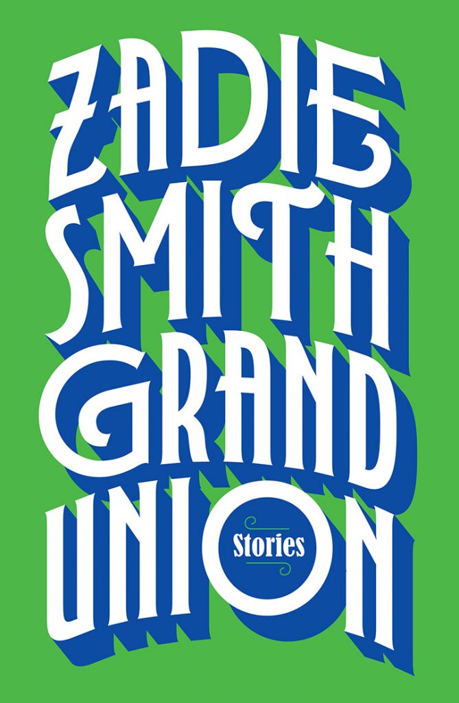
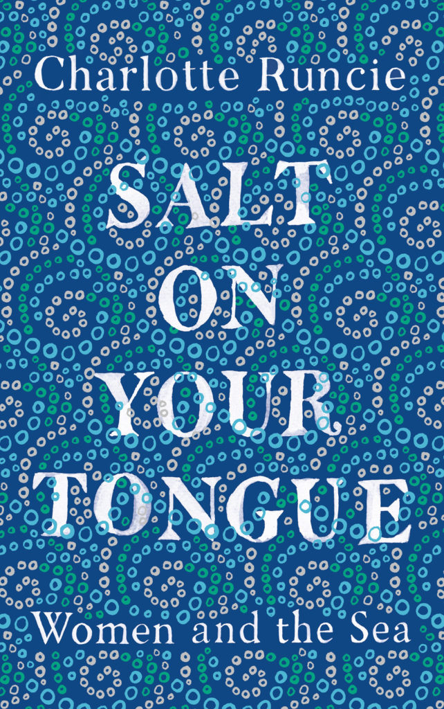
Quichotte by Salman Rushdie; design by Gray318 (Jonathan Cape / August 2019) Grand Union by Zadie Smith; design by Gray318 (Hamish Hamilton / October 2019)Salt On Your Tongue by Charlotte Runcie; design by Gray318 (Canongate / January 2019)
What We Really Do All Day by Jonathan Gershuny and Oriel Sullivan; design Matthew Young (Pelican / September 2019)Artificial Intelligence by Melanie Mithcell; design by Matthew Young (Pelican / October 2019)
One Day by Gene Weingarten; design by David Litman (Blue Rider / October 2019)
Oliver Munday wrote about designing the cover for New Directions at Literary Hub earlier this year.
He also designed a lot my favourite covers this year…
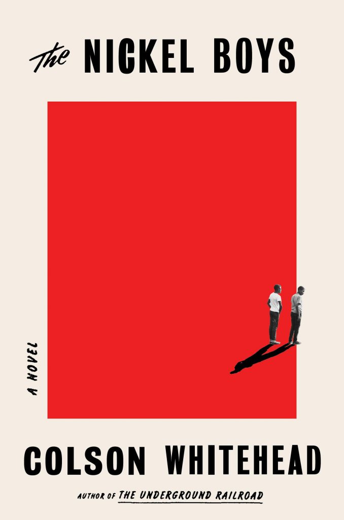
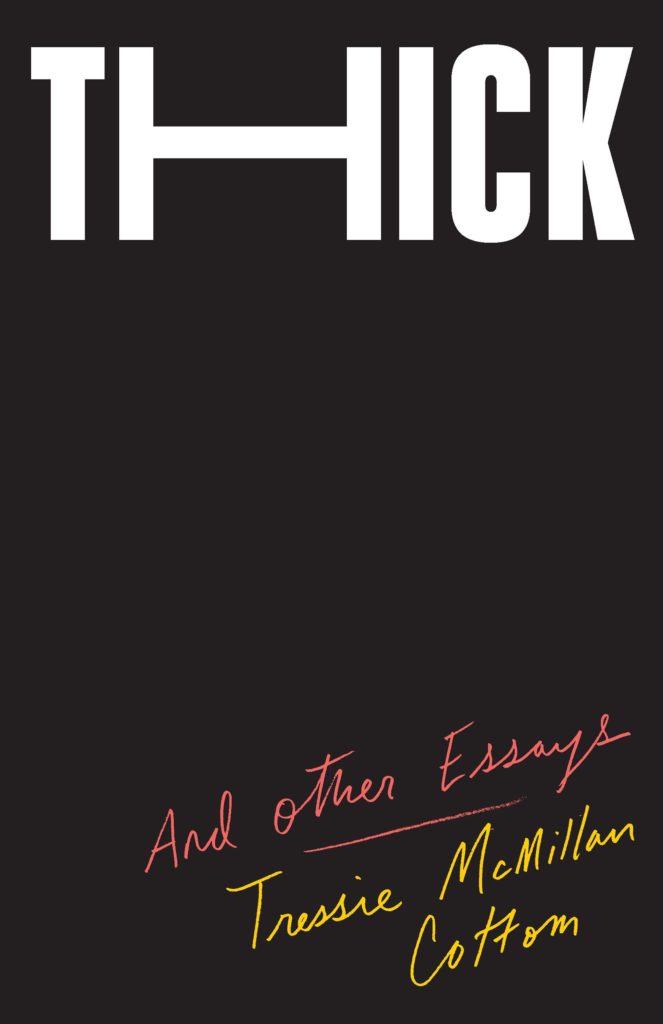
Riots I Have Known by Ryan Chapman; design by Oliver Munday (Simon & Schuster / May 2019)The Nickel Boys by Colson Whitehead; design by Oliver Munday (Doubleday / July 2019)Thick by Tressie McMillan Cotton; design by Oliver Munday (The New Press / January 2019)White Flights by Jess Row; design by Oliver Munday (Graywolf / August 2019) Harbart by Nabarun Bhattacharya; design by Oliver Munday (New Directions / June 2019)
The Revolutionaries by Joshua Furst; design by Tyler Comrie (Knopf / April 2019)The Memory Police by Yoko Ogawa; design by Tyler Comrie (Pantheon / August 2019)Someone Who Will Love You in All Your Damaged Glory by Raphael Bob-Waksberg; design by Tyler Comrie; illustration Justin Metz (Knopf / June)
The Volunteer by Salvatore Scibona; design by Rachel Willey (Penguin / March 2019)
Also designed by Rachel Willey:
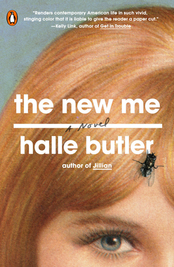
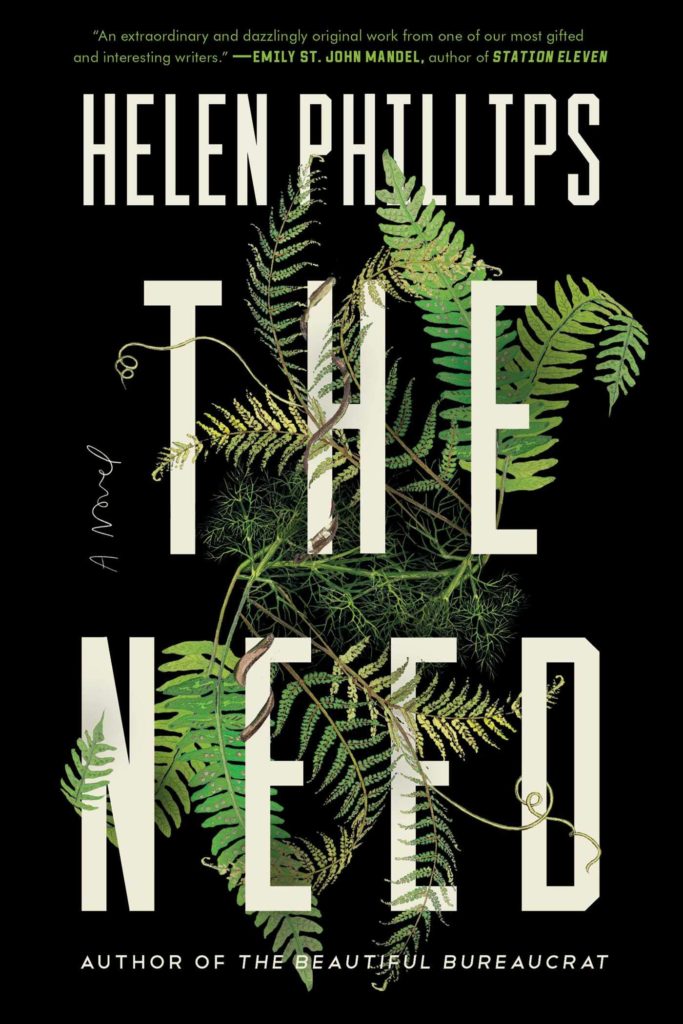
The New Me by Halle Butler; design by Rachel Willey (Penguin / March 2019) The Need by Helen Phillips; design Rachel Willey (Simon & Schuster / July 2019)
Aeneis by Vergilius; design by Gray318 (Jaguar / 2019)
Jon will surely not thank me for mentioning this, but the Aeneid cover reminds me of the brilliant 2007 Penguin Modern Classics editions of Kafka designed by Mother and Jim Stoddart (featuring photographs by Gary Card and Jacob Sutton), and I can’t pass up the opportunity to post them here. They still look extraordinary…
(And in the process of looking for images, I cam across a nice essay from a couple of years ago by designer Clare Skeats discussing the Kafka covers at Grafik)
High School by Tegan & Sara; design by Na Kim (MCD / September 2019)
The cover of the Canadian edition published by Simon & Schuster Canada (left) was designed by Emy Storey. The cover of the UK edition published by Virago (right) was adapted from the Canadian design by Nico Taylor.
Sontag by Benjamin Moser; design by Tom Etherington; photograph by Richard Avedon (Allen Lane / September)
The cover of the US edition published by Ecco was designed by Allison Saltzman. Title only appears on the spine (which, if my social media is anything to go by, gets big high fives from book designers everywhere).
The New York Times ran a short article about the genesis of this cover earlier this year.
For the font-curious, the typeface is Alias Harbour according to the folks at Fonts In Use. Another calligraphic type alternative to the ubiquitous Lydian perhaps?
Here are your August book covers of note. Another good month, I think?
The Bell Jar by Sylvia Plath; design by Gray318 (Faber & Faber / July2019)
This is apparently available now (according to Faber’s Instagram at least!), but I haven’t been able to find it online. If anyone cares to share the ISBN, I will try to add a link.
The new design is inspired by the 1966 cover designed by Shirley Tucker.
This is an interesting change in direction from the cover of The Infatuations by Javier Marías designed by Isabel Urbina Peña and published by Knopf in 2013.
(The UK covers for Javier Marías’ novels published by Hamish Hamilton are photographic. If anyone can supply me with the design/photo credits, I’d be happy to add them in here for reference!).
Thank you to the good folks on Twitter who helped me identify the designer and then the typeface. It turns out the type is “Lydia” from Colophon Foundry — a revival of the Bold Condensed styles of (you guessed it!) Lydian.
Tree also designed the cover of the UK edition published by And Other Stories last year. She wrote about the process of designing both covers for Spine not so long ago (they really are doing a better a job of this than me, aren’t they?).
Michel has also dusted off his comics publishing endeavour Black Eye Books if you’d like to support him. There is a new book by Jay Stephens planned for next month.
Another cover for the Lydian file. (I posted a link to this on Twitter, but I don’t think I’ve mentioned it here — Kaitlyn Tiffany recently wrote a piece on the Lydian phenomenon for Vox if you want to read a bit more about it)
Some lovely type there… Can anyone tell me what the title typeface is please? It seems like a good alternative for our old friend Lydian there… The Lady from the Black Lagoon by Mallory O’Meara; design by Erin Craig; art by Matt Buck (Hanover Square / March 2019)
Is this the first Harlequin book cover to feature on the site? Possibly…
It’s almost the first day of spring, the snow and ice have just about melted in Toronto (for now!), and everything is still awful, so it must be time for March’s book covers of note!
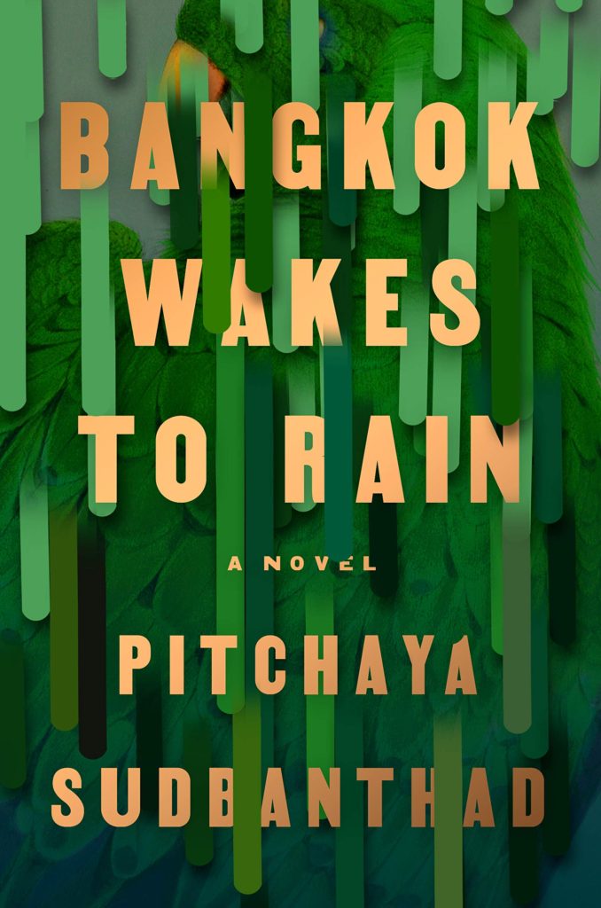
Bangkok Wakes to Rain by Pitchaya Sudbanthad; design by Grace Han (Riverhead / February 2019)
This is the Turkish edition of Men in Space by Tom McCarthy. I like how the composition and colour palette echo the cover of the US edition published by Vintage, designed by John Gall:
It also reminds of the golden leaf cover for ‘True Faith’ by New Order designed by Peter Saville.
The Cook by Maylis de Kerangal; design by Na Kim (Farrar, Straus & Giroux / March 2019)
(I feel like a Freudian could have a field day with this cover.)
The cover of the US edition published by Ballantine (I couldn’t find an image without the book club sticker… sorry), was designed by Caroline Teagle Johnson. The book is getting a lot of buzz so I’ve seen both versions of the cover a lot online. It’s a pretty striking photo. I’m curious about where it came from…
Daisy Jones and The Six by Taylor Jenkins Reid; design by Lauren Wakefield (Hutchinson / March 2019)
Daisy Jones and The Six by Taylor Jenkins Reid; design by Caroline Teagle Johnson (Ballantine / March 2019)
Here are this month’s book covers of note. Better late than never I suppose! (And so much for that New Year’s Resolution to better at blogging in 2019!). I’ll be starting on February’s post next week…
Cusp by Josephine Wilson; design by Alissa Dinallo (UWA Publishing / August 2018)
Starting my first 2019 covers post with a book from 2018 is not ideal, is it? Ah well… Take a look at some of the rejected covers on Alissa’s Instagram.
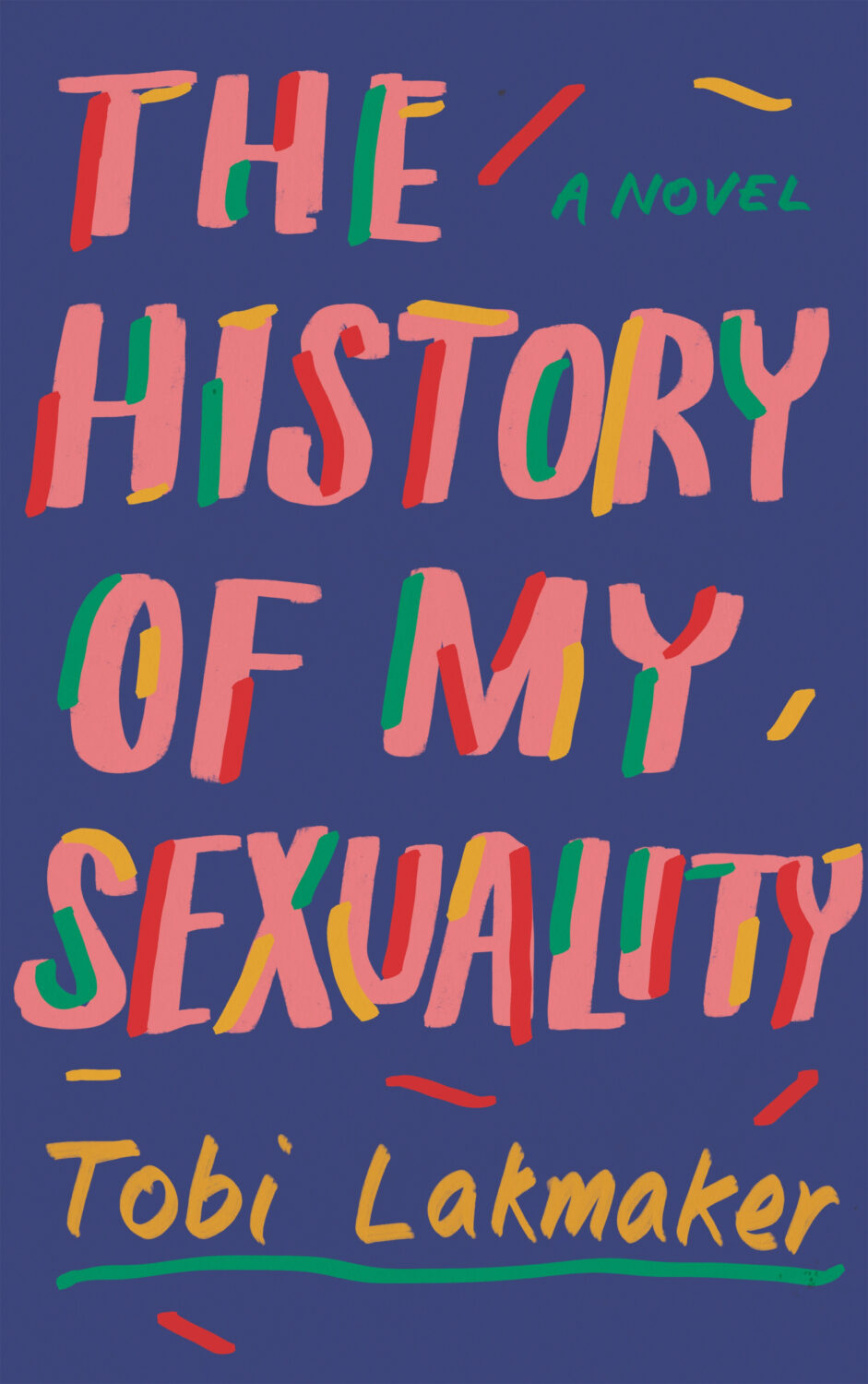
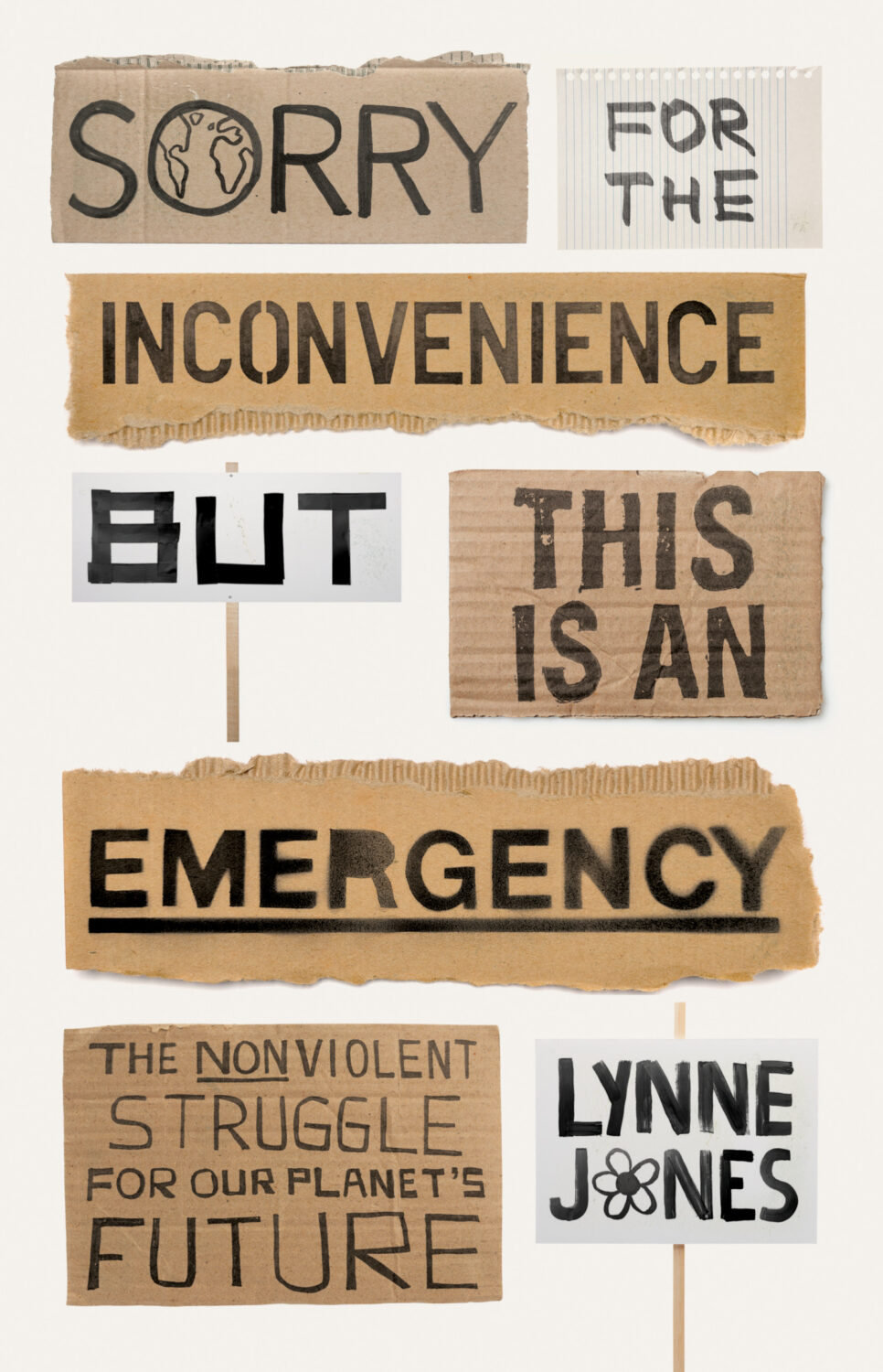
I saw this in a bookstore on a recent visit to the UK. It stood out in a display of new nonfiction. I think it was the doodle-like looseness of the approach that initially caught my eye, but I also like that it feels like a parody of the contemporary nonfiction cover template.