Theo Inglis, whose book Mid-Century Modern Graphic is published this month, has a lovely post on the AIGA Eye on Design blog about the work of artist, teacher, activist, and designer Corita Kent:
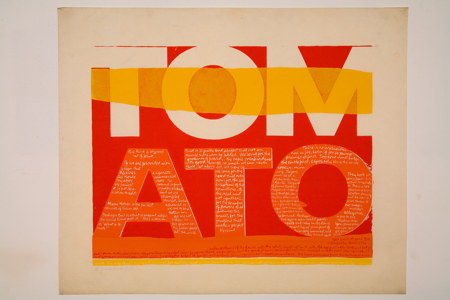
In 1962, Kent saw work by Andy Warhol for the first time, and her aesthetic changed markedly, becoming bolder, flatter, more abstract and brighter, often with saturated, almost fluorescent, colors. Her new style was so successful that it became became known as “nun art,” and was often imitated. Her adherence to the Pop Art aesthetic was well suited to her joyous aims: Kent said she wanted her art to “give people a lift” and help them get “more fun out of life.”
Pop Art’s celebration of the urban everyday also empowered Kent to introduce more quotidian sources into her text works. During the ’60s, she began to incorporate lyrics from pop songs, advertising slogans, and snippets of text seen on signs and packaging into her work, often pairing them with religious text. It was a move that elevated the ordinary to the spiritual, and became a frequent theme in Kent’s art and teaching. She found delight in the commonplace, and believed that the divine could be seen anywhere, even amidst the chaos of the modern city. Kent often took her students on urban expeditions—even day-long trips to gas stations and car lots—armed with cameras and viewfinders.
The largest ever exhibition of Corita Kent’s work in the UK, Corita Kent: Power Up, is currently on display at House of Illustration in King’s Cross until May 12.
Theo’s book is available May 7 from Pavilion Books.
Comments closed