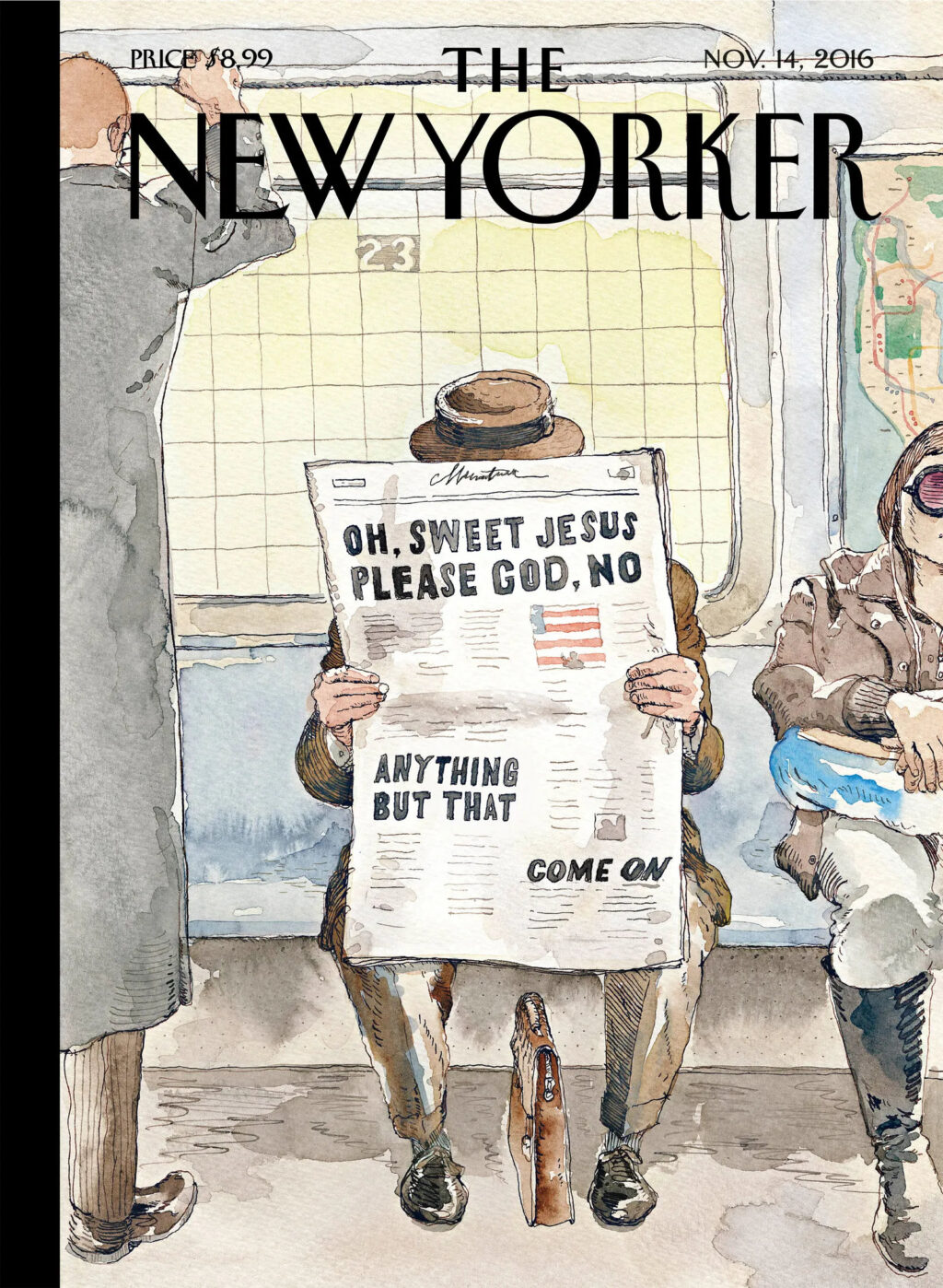
I recently came across this 2016 Barry Blitt cover for The New Yorker. I hadn’t seen it before. Obviously it’s about the US presidential election that year, but I’m not sure that much has changed.
Comments closedBooks, Design and Culture
I recently came across this 2016 Barry Blitt cover for The New Yorker. I hadn’t seen it before. Obviously it’s about the US presidential election that year, but I’m not sure that much has changed.
Comments closed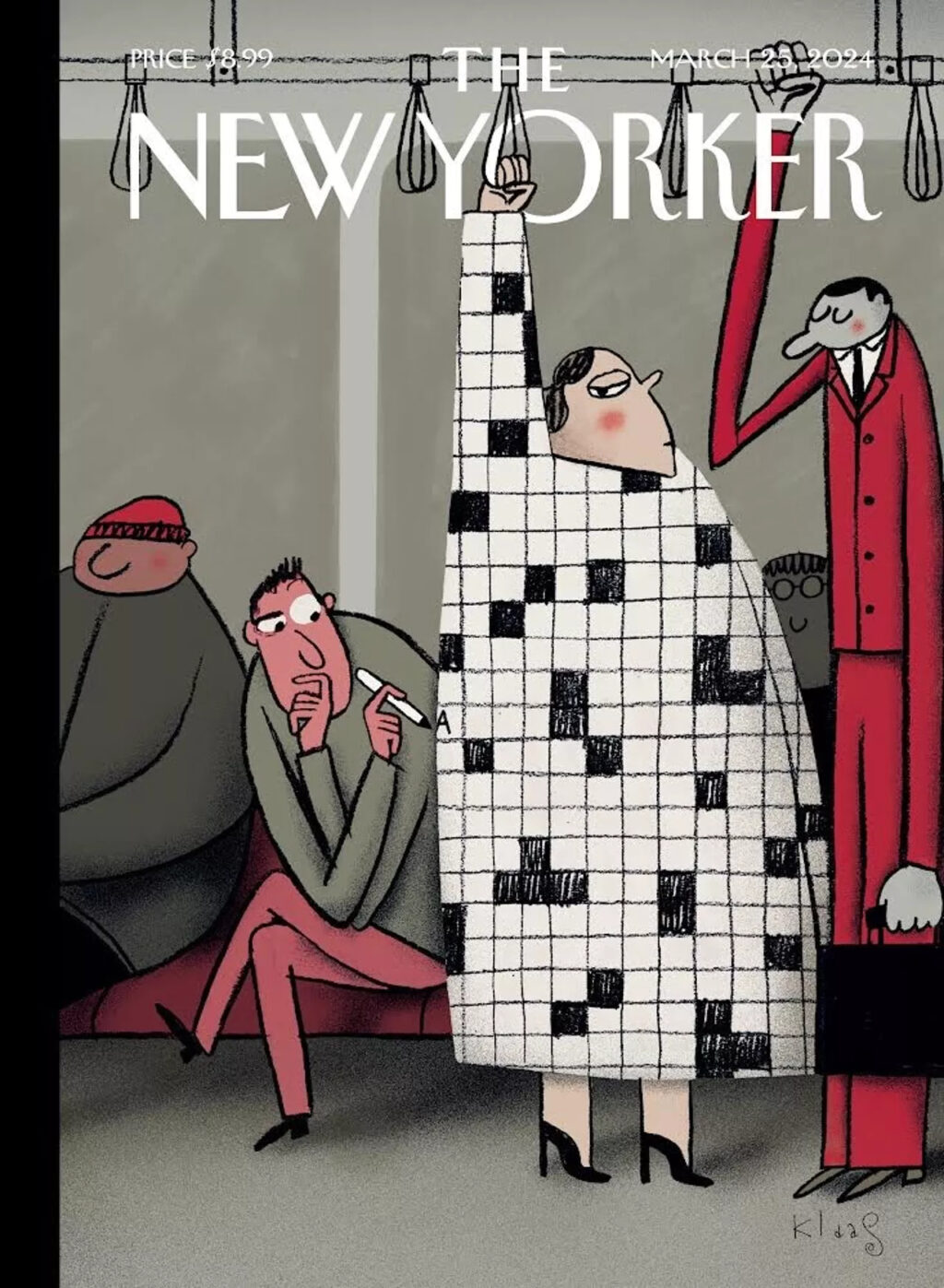
I love this illustration by Klaas Verplancke for the recent ‘Style Issue’ of the New Yorker (which has a fun animated version of the cover on its website).
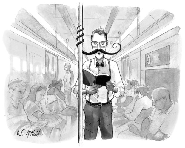
It works on lots of levels, but it also feels like a bit of nostalgic throwback. People look at their phones these days (although I did see someone with a word search book on the Toronto subway this morning, so some people are keeping it old school at least).
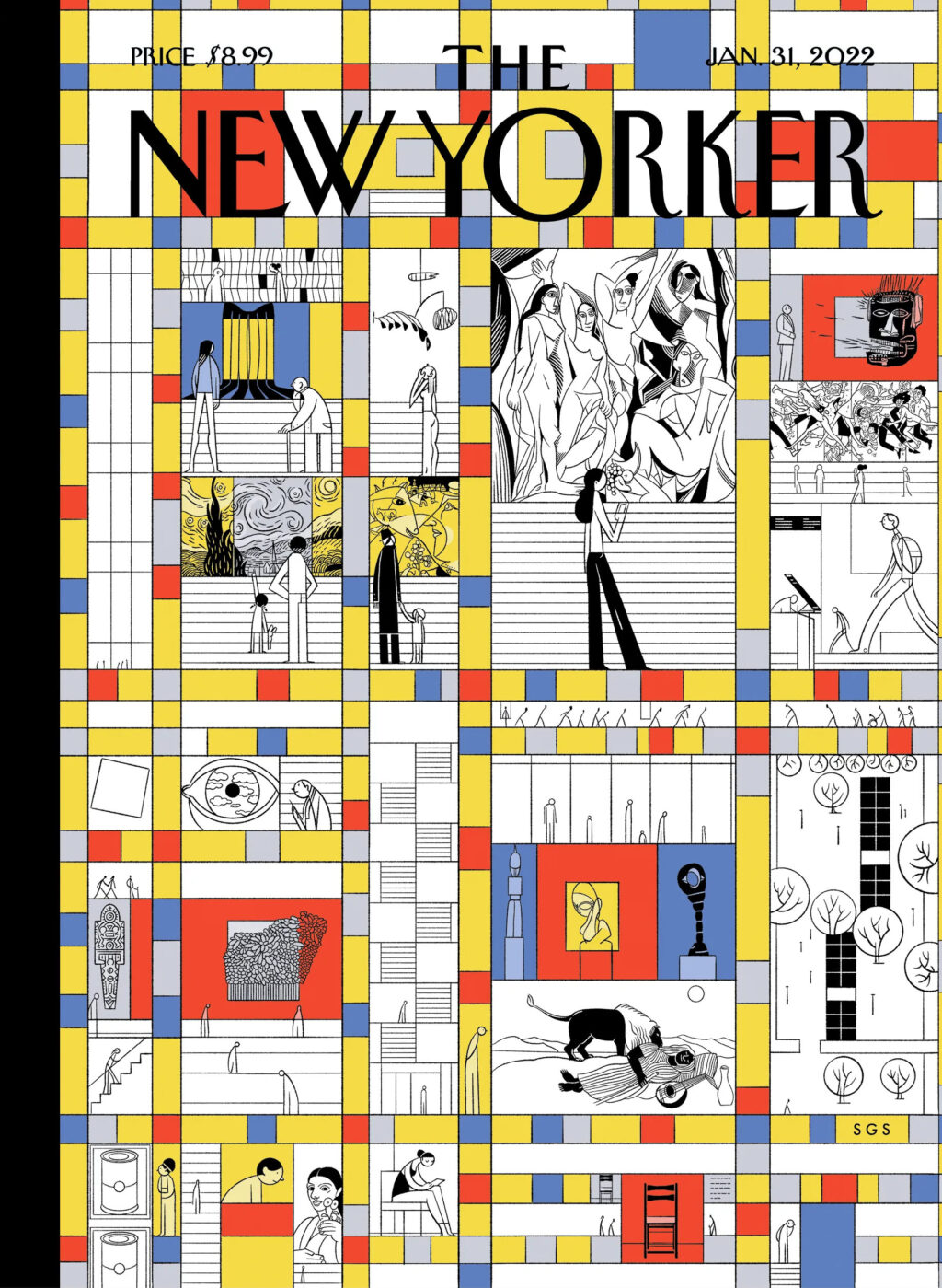
Grid patterns suit the cover of the New Yorker so well though. They work as a representation of Manhattan’s city grid and its skyline, as well as magazine layouts and puzzles. I was reminded me of Sergio García Sánchez’s “Modern Life” cover from a couple of years ago (itself a riff on Piet Mondrian’s New York-inspired painting “Broadway Boogie Woogie“). Chris Ware divided the cover into a comic book (ish) grid during the pandemic too. I’m sure there are more examples. (Grids are good!)
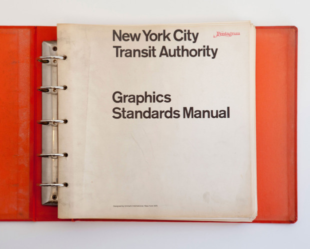
If you’ve been on Twitter for past couple of days you’ll have no doubt noticed that the design community (or the sizeable type-obsessed segment of it) is very excited that designers Jesse Reed and Hamish Smyth, founders of thestandardsmanual.com, have started a Kickstarter project to reissue the 1970 NYC Transit Authority Graphics Standards Manual by Unimark’s Massimo Vignelli and Bob Noorda as a full-size, limited edition book:
Every single day, millions of New Yorkers rely on the subway to get around the city, and you can’t use the subway without encountering the signage designed by Unimark. Over the years many changes have taken place (such as the switch from Standard Medium to Helvetica), but it is a testament to the quality of the work that, 44 years later, the signage holds up.
And perhaps on a deeper level, the signage has given the subway a voice. When a lot of people think of New York City, these signs pop into their head. We feel a tremendous responsibility to publish not only an important piece of design history, but an important part of New York City’s history.
Even if you can’t afford the book itself — it starts at $133USD if you live in Canada, more if you are in the EU — you can back the project for as little as $3, and the project’s video featuring Pentagram‘s Michael Bierut on the graphic standards manual is well worth watching:
You can also see scans from a copy of the manual discovered the basement of design firm Pentagram in 2012 on thestandardsmanual.com.
Comments closed
“I wanted to transform the subway from its dark, degrading, and impersonal reality into images that open up our experience again to the colour, sensuality, and vitality of the individual souls that ride it each day.”
Photographer Bruce Davidson talked to TateShots about Subway, the groundbreaking series of portraits he began taking in the New York subway system in the spring of 1980:
The series was collected into a book published by Aperture in 1986, and the 25th anniversary edition of Subway was published last year. The New York Review of Books ran excerpt of the introduction to that new edition here.
1 Comment