Skip to content

Tag: sport

Munich ’72: The Visual Output of Otl Aicher’s Dept. XI

Munich ’72. The Visual Output of Otl Aicher’s Dept. XI, a book about the design team for the 1972 Olympic Games in Munich, is currently on Kickstarter. The project is the result of three of years of research and it needs a little help to get it over the finish line, so maybe go take a look?  

(via Under Consideration)

Comments closed

The Cycling Anthology Jersey Designs by James Paul Jones

The Cycling Anthology_Killed Cover_1

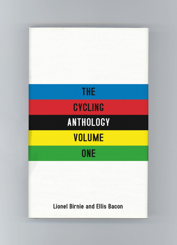
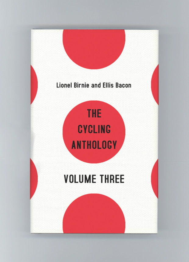
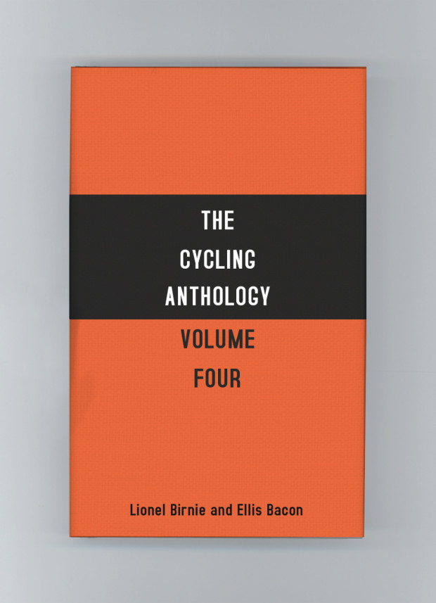
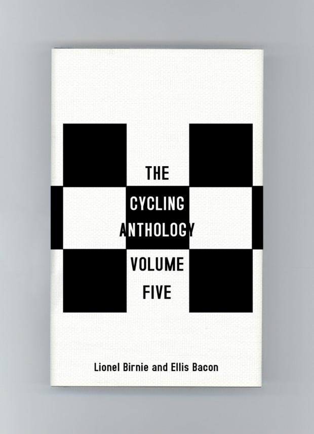
James Paul Jones‘s unused covers for The Cycling Anthology (pictured above) were some of my favourite designs from 2015. Based on famous cycling jerseys, I liked that they were a nod to insiders, but that you that didn’t need to be a cycling fan to appreciate the stylish minimalism of the designs.

When I learnt that they were passed over in favour of a more traditional, illustrative approach, I asked James about his work on cycling books, and why the jersey covers didn’t go to press.
The Cycling Anthology_Killed Cover_2

“I’ve always loved sports but I didn’t count myself a cycling enthusiast until my last year working at Orion Publishing where I was given the job of art directing the photo shoot for David Millar’s book Racing through the Dark,” he told me. “Working with David opened my eyes to the cycling world, and I was lucky enough to work on Sir Bradley Wiggins’ book a couple of years later.”

“Coincidentally David Millar writes beautifully about cycling and has a few essays as part of the Cycling Anthology,” James continued. “I also just finished designing his latest book, The Racer a few months back — all cycling enthusiasts should grab a copy! The contact sheet of ‘tour scars’ is one of my favourite plate sections we’ve ever done, and the back cover features one of the final jerseys he ever wore. Complete with rips, holes and bloody marks from one of his most brutal crashes. As soon as we saw it we knew it had to be featured somewhere, and the photographer captured it brilliantly.”
The Cycling Anthology_Killed Cover_3

The Cycling Anthology presented a different kind of challenge, howeverOriginally self-published, it collects original writing by some of the world’s best writers on the sport, as well as cyclists themselves. Now published by Yellow Jersey Press (an imprint of Penguin Random House), the new volumes of the anthology presented James with an opportunity to repackage the series as a whole, and to experiment with a new look for the covers.

“I wanted to present the editors and authors with two options. A more traditional route, and an option that would hopefully resonate with the cycling community. The jerseys were the latter, and one of the first things I researched. I really wanted to make that connection with the cycling community, and the target market is very design conscious which helps. They are so iconic in the cycling world it just seemed to make perfect sense.”
The Cycling Anthology_Killed Cover_4

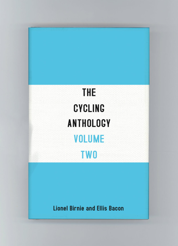
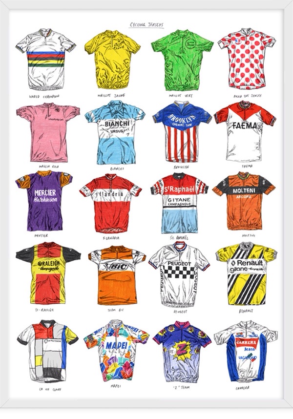
The design of the first volume was inspired by the world champion rainbow jersey. The second by the famous blue and white Bianchi jersey. Volume three was based on the ‘King of the Mountains’ polka dot jersey and the fourth on the Molteni jersey worn by the great Eddy Merckx. The fifth volume was inspired by the chequered shirt of the French cycling team Peugeot. “There were so many jerseys I wanted to include,” said James. “I also recommend David Sparshott’s poster of Cycling Jerseys for anyone wanting to admire the greats in his signature illustration style. Just gorgeous.”
Cycling Jerseys_David Sparshott

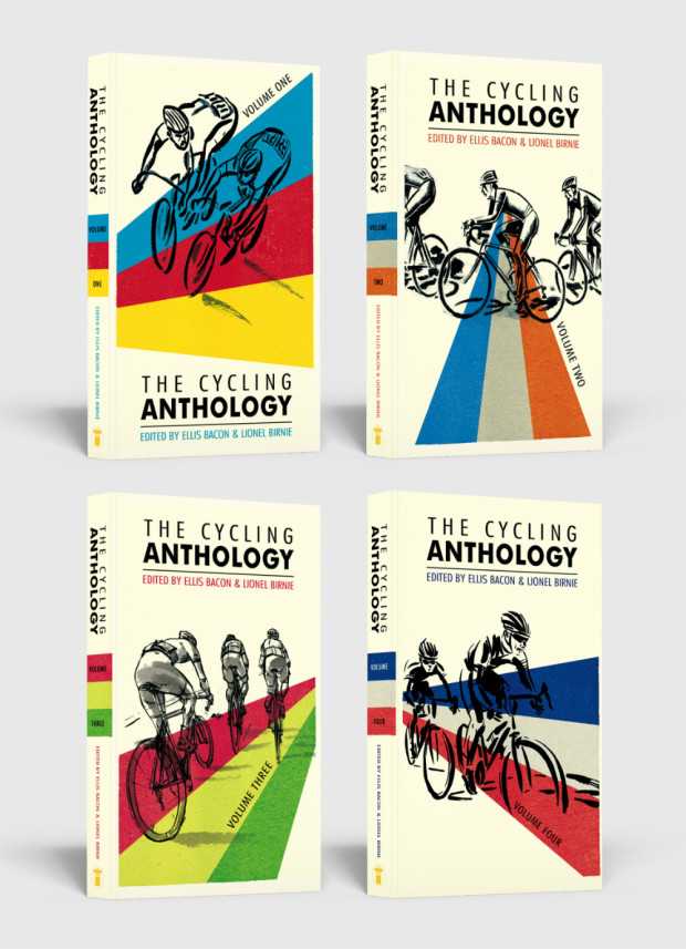
Despite the obvious appeal of these new designs, the publisher decided to stay with a familiar look to the series. “I think the authors wanted to retain some elements from the original designs, which we did on the final covers with the illustrations, and I’m happy with how they turned out,” James told me. “The illustrations are by the talented Simon Scarsbrook. Volumes 1-3 used the original artwork, and we commissioned Simon to come up with two more illustrations for volumes four and five. He was great to work with and they work really well as a series.”
The Cycling Anthology Series

James kept the stripes from the world champion jersey and used them across all the final covers to help unify the series. “The jersey covers will forever by one of my favourite ‘killed covers’ and I really wish they would have taken a chance on them as I’m sure they would have done the job and more.” Agreed.
The Cycling Anthology_Killed Cover_5

Comments closed

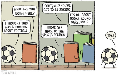
A Cartoon About Football by Tom Gauld

football

It’s possible this is only funny if you’re British, but hey…

Did you know that Tom has prints of his Guardian cartoons for sale?

Comments closed

Sports Plague!

In lieu of any real posting around these parts of late, here’s a recent Tom Gauld cartoon to keep you quiet:

You can find my interview with Tom here if you haven’t read it already.

(And congratulations Spain).

Comments closed

Something for the Weekend

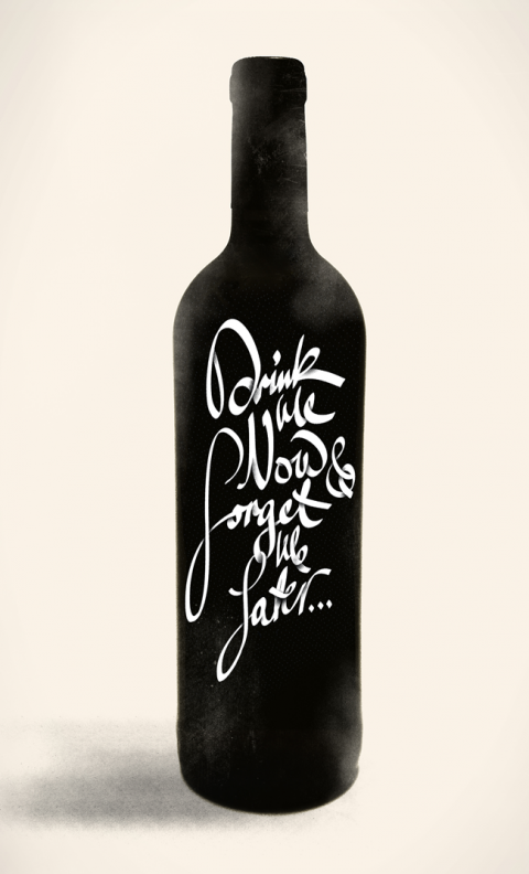
Letter Cult’s epic selection of the best custom lettering of 2011 (don’t click on the link if you have things to do today — and this is only part one!). Pictured above ‘Drink Me Now, Forget Me Later…’ by Michael Spitz.

Rank Amateurs — Design critic Justin McGuirk reviews Home-Made Europe: Contemporary Folk Artifacts for The Guardian:

The makers’ motives are not always need or thrift; sometimes it’s pleasure or obstinacy, or serendipity – a road sign that happens to make a perfect tabletop. This kind of uncelebrated creativity brings to mind artist Jeremy Deller’s Folk Archive, which catalogues everything from protest banners to pizza kiosks. Deller has written a short foreword here, in which he makes a distinction between these objects and DIY, “a hobby that seems so pleased with itself”. The difference is that the DIYer seeks to emulate the professional, whereas these objects all share the nonchalance of the amateur.

Also in The Guardian, Anthony Quinn on cricket and the novel:

Sport in novels is seldom just sport. It’s a way of talking about something else – fellowship, ambition, jealousy, honour. With cricket it’s clearly a way of writing about failure. Lately we’ve been hearing a lot about players who, at the end of their careers, succumb to insecurity and depression; some cannot handle the post-career blues and choose to end it all. As David Frith’s excellent book Silence of the Heart (2001) made clear, cricket has the highest proportion of suicides in any sport. Why? It might be because it is, of all sports, the loneliest.

Repressed Energy — An interview with Daniel Clowes about The Art of Daniel Clowes: Modern Cartoonist at the A.V. Club:

I can look at my early work and see what a pained struggle it was to draw what I was drawing. I was trying so hard to get this specific look that was in my head, and always falling short. I could see the frustration in the lines, and I remember my hand being tensed and redrawing things a thousand times until I finally inked it, and just having this general tense anxiety about every drawing. I think that comes through in the artwork, and gives it this certain kind of manic energy, this kind of repressed energy, so you feel like it’s sort of bursting at the seams or something.

And finally…

Sara Goldsmith on the history of the paper clip at Slate magazine:

The paper clip we think of most readily is an elegant loop within a loop of springy steel wire. In 1899, a patent was issued to William Middlebrook for the design, not of the clip, but of the machinery that made it. He sold the patent to the American office-supply manufacturer Cushman & Denison, who trademarked it as the Gem clip, in 1904. Middlebrook’s rather beautiful patent drawing shows the clip not as an invention but as the outcome of an invention: the best solution to an old problem, using a new material and new manufacturing processes. Coiled in this form, the steel wire was pliant enough to open, allowing papers to nestle between its loops, but springy enough to press those papers back together. When the loops part too far from each other and the steel reaches its elastic limit, the clip breaks.


Comments closed

Some Football Literature for the Weekend

Somehow I managed to miss most of the hype leading up to the World Cup, but now that things are about to kick off I’m actually genuinely excited (not least by England vs. The U.S. on Saturday) and have spent the last couple of days catching up. Here are a few literary, typographical, and just plain interesting things that I’ve stumbled across…

Soccer Aid — A typographic poster for the World Cup designed by Treble Seven | 777 in aid of UNICEF.

Simon Kuper, author of Soccernomics, on CBC Radio’s The Current discussing the World Cup.

The very same Simon Kuper reviews four books about the World Cup and African football for The Financial Times:

Great claims are often made for football’s significance. In fact it’s almost always a mirror rather than a gun: it reflects society, rather than changing it. Usually the sport has just one significant effect on real life: it makes people happier. At least, it usually does.

Nation’s Only Soccer Fan Becoming InsufferableThe Onion of course:

According to sources only peripherally aware of the World Cup, Janovich’s infuriating behavior first became apparent during a Super Bowl viewing party last February when he repeatedly used the phrase “American football” to describe the action on the field. In recent weeks, Janovich has also begun referring to the supposed suspense involved in choosing the players for the U.S. “side,” and has struck up several extended but one-sided conversations concerning figures such as “Kaka” and “Ronaldinho,” generally mystifying and alienating everyone he has come into contact with.

Typographic World Cup T-Shirts. Sadly Drogba is already out for the Ivory Coast, but otherwise these are great (via Kottke).

How Did Football Get So Big? — Tim de Lisle at Intelligent Life:

If the hype is extraordinary, so is the ambient presence. The last World Cup was all around us, on billboards, drink cans and cereal packets, on garage forecourts and millions of flag-bearing cars, in the windows of Boots the chemist and McDonald’s the burger joint (“Want tickets? Win tickets! Buy any large meal to play”). The cup-winning captain from 1966, Bobby Moore, was on every KitKat wrapper, despite having died 13 years earlier; his team-mate Geoff Hurst, now Sir Geoff, was appointed director of football for McDonald’s and had columns in two newspapers. The boys of 1966 were bigger in 2006 than they were in 1966.

Footballers as Film Stars — In a related item at the Intelligent Life blog looks at the Nike’s slick World Cup commercial created by Oscar-winning director Alejandro González Iñárritu (Babel):

And finally… A few literary football lists:

And, not to be outdone, here’s a list of 10 football books worth your time (in no particular order) compiled at great haste for The Casual Optimist by my good friend and recovering sportswriter Nick Clifford who is a great source of useless facts about the beautiful game:

  1. Football Against The Enemy by Simon Kuper
  2. Brilliant Orange: The Neurotic Genius of Dutch Football by David Winner
  3. Full Time: The Secret Life of Tony Cascarino by Paul Kimmage
  4. Futebol: The Brazilian Way of Life by Alex Bellos
  5. The Hand of God: The Life of Diego Maradona by Jimmy Burns
  6. Morbo: The Story of Spanish Football by Philip Ball
  7. Calcio: A History of Italian Football by John Foot
  8. Soccer in the Sun and Shadow by Eduardo Galeano
  9. Among the Thugs by Bill Buford
  10. The Ball is Round: A Global History of Soccer by David Goldblatt

(full disclosure: this list has a couple of late additions from me, so if you disagree, it will probably be with my selections — Nick has impeccable taste).

Update: Flavorwire also has a list of 6 books to read during the World Cup.

2 Comments