
I posted about Peter Mendelsund’s reinterpretations of Kafka for Schocken Books rather breathlessly earlier this week, and I wanted to revisit them now I’ve had some time for greater reflection.
The covers are exceptional designs and surprising reinterpretations of Kafka. What particularly interested me, however, is that they are also a surprising direction for Mendelsund to go in.
As Peter himself notes in his original post, the natural impulse when designing Kafka is to draw on the avant-garde art movements of the early 20th Century. These movements — which smashed together fine art, design, typography, photography, montage, and film — burgeoned in Central and Eastern Europe in aftermath of the Russian Revolution and the First World War, a period when Kafka himself was writing (he died in Vienna in 1924).

Unsurprisingly, recent reinterpretations of Kafka (at least the ones that have eschewed the non-design of an author photograph) have incorporated elements taken from Surrealist photography, modernist posters, and silent film.

The influence of the avant-garde is often apparent in Mendelsund’s work. Covers such as The Idiot, Crime and Punishment and The Double and The Gambler by Fydor Dostoevsky, House of Meetings by Martin Amis, and K. by Roberto Calasso all incorporate elements of Suprematism, Constructivism, DADA and other stark European art movements of the early 20th Century. The new covers, however, which focus on the humour in Kafka’s writing, move in a new direction and incorporate elements from the optimistic age of American mid-century modern design.
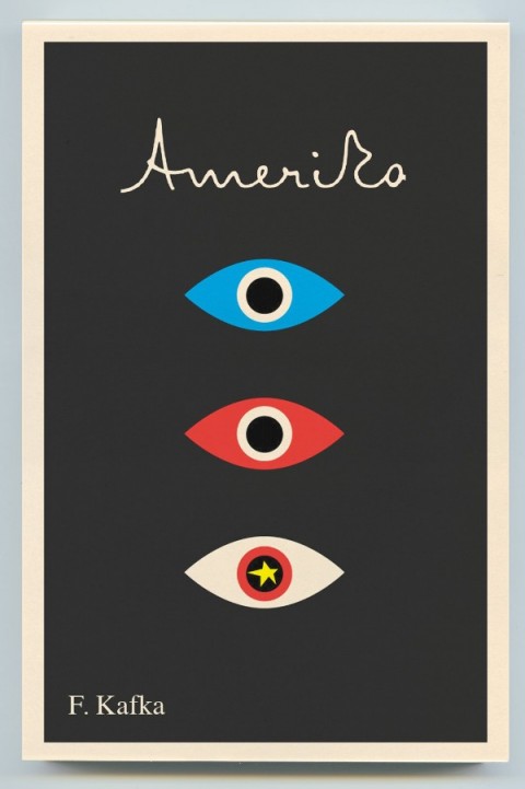

Mendelsund’s use simple geometric shapes, flat colour backgrounds, and stripe patterns are typical of work by Paul Rand and Alvin Lustig.


Hand-written lettering of the type we see in Mendelsund’s Kafkas is used to great effect in Lustig’s design for Kafka’s Amerika and is characteristic of several of Rand’s book covers.

As others have noted, the eye motif used by Mendelsund is also similar to Rand’s iconic IBM poster (and his unused logo for the AIGA). But in this instance at least, Rand is clearly not the only influence. His contemporary Rudolph de Harak used the same motif in his cover design for T.E. Lawrence By His Friends published by McGraw-Hill in 1963.

There are echoes too of an exhibition poster by American expatriate designer E. McKnight Kauffer who designed the cover for the Random House edition of James Joyce’s Ulysses published in 1949 (and who was reputedly an influence on Lustig), and a George Salter cover for a Robert Bloch novel, The Scarf, published by The Dial Press in 1947.


The eye motif also recalls Bill Golden’s CBS logo designed in 1951 (repeated in the British Associated Televison ATC logo), which was itself inspired by a Shaker ‘All Seeing Eye’ symbol Golden had seen. And it is perhaps no coincidence that Mendelsund’s design for The Castle (and McKnight Kauffer’s poster) is reminiscent of the masonic Eye of Providence (also known as the “all-seeing eye of God”) familiar from the US one dollar bill.


Of course, not all of these elements and influences are new to Mendelsund’s work (see his designs for The Millennium Trilogy boxed set), and the new covers draw on some of his more familiar inspirations such as Jean Arp, a founding member of the DADA movement (and likely an influence on Lustig), and post-war European design (see Germano Facetti’s design for George Orwell’s 1984 designed in the early 1960’s).


But compare the Kafka covers to Mendelsund’s recent designs for The Snowman by Jo Nesbø or C by Tom McCarthy, and the difference is striking. To look at these macabre designs for Knopf — which seem to owe more to the cut-and-paste of DADA, the punk aesthetic of Barney Bubbles or, perhaps, the anti-design of David Carson’s Ray Gun — is like looking at the work of a wholly different designer.
That Mendelsund is capable of reinterpreting and subverting mid-century modern and making it his own not only demonstrates his creative flexibility, but serves to reminds us that one of his greatest strengths as a designer is his ability to surprise and delight us.
