To my embarrassment, it wasn’t until his wonderful design for Obsession by Lennard J. Davis that I really began to pay attention to Isaac Tobin‘s work. There was something about the lettering — painstakingly created with pin pricks into thick cardstock — that made me curious about the designer. Who would do that?
But clearly I should have been paying closer attention.
By the time Obsession was published last year, Isaac’s work had already been recognised by the Art Directors Club, the Association of American University Presses, and The Type Director’s Club, and his covers included in AIGA 50/50 and the Print Magazine Regional Annual.
As senior designer at the University of Chicago Press, his portfolio is full of understated, witty designs for books on topics as diverse as American humor, citrus, Iraq, Islam, Italian culture, Victorian illumination, Yiddish and everything in between. And thanks to his imaginative use of type, there is always a lot more show than tell, which cannot be easy with academic titles (and their epic subtitles).
Needless to say, Isaac is more than just one cover. I think his work is remarkable. I hope you agree…

Design by Isaac Tobin

Design by Isaac Tobin
What inspired you to become a book designer?
I grew up in a family of academics and my parents were always working on their books; sending off manuscripts, going over proofs, preparing indexes, and eventually receiving their cover designs. I was always interested in art but designing books didn’t occur to me until much later.
I studied graphic design at RISD and fell in love with typography but wasn’t sure what to do after graduation. Luckily one of my teachers (who worked as a book designer) knew that books would be a good fit for me, and let me know that Beacon Press, one of her clients, had an opening for an assistant designer.
Book design turned out to be perfect for me, and I’ve semi-unintentionally ended up in the familiar world of academic publishing, about as close as I could get to the family business while still doing graphic design. And now I’ve had the privilege of designing covers for both of my parents. My brother is writing his dissertation right now so I may also get to design the cover of one of his books.

Design by Isaac Tobin
Briefly, could you tell me about University of Chicago Press?
The University of Chicago Press is the largest university press in the U.S. We publish about 250 books a year. About a third of those are trade books for general audiences, and the rest are either specialist or academic monographs. Print runs vary dramatically but I’d say the average is about 1000. And of course we’re most well known for publishing the Chicago Manual of Style.
There are 8 of us in the book design department, and we all design both covers and interiors, as well as typeset illustrated books in-house. Jill Shimabukuro, our creative director, has put together a really strong group of designers and it’s a great place to work.

Illustration by Lauren Nassef; design by Isaac Tobin
What is your role there, and approximately how many covers do you work on a season?
I’m a senior designer, and work on about 30-40 covers per year.
How is working at university press different from working at a trade publisher?
I think the biggest difference is that university press designers normally work on both covers and interiors (and typeset illustrated books too). Most trade designers are much more specialized, and work on either covers or interiors.
Academic press art and production budgets are also probably lower than at trade publishers, but I imagine all publishers are trying to cut costs wherever they can these days.

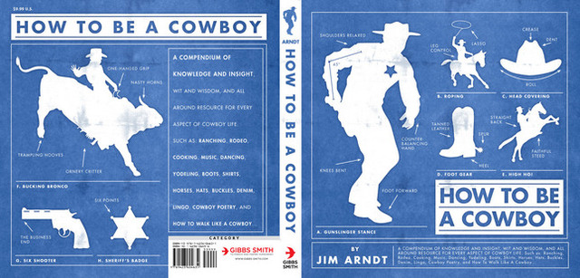
Design by Isaac Tobin
Could you describe your design process?
It really depends on the book. When I’m assigned a book I jot down my first ideas in crude thumbnail sketch form. These tend to be the most obvious and cliched solutions, but sometimes my first reaction is the strongest and purest. Most of the time I put together a big messy Illustrator file filled with visual research and typeface tests. I like to quickly style the title in lots of different typefaces so I can get a sense of the potential word shapes. Then I start combining and recombining various elements and quickly building crude comps so I can explore lots of different options at once. I like being able to zoom out and see all my different comps in a single window. The hardest part is always when I have to stop generating new ideas and variations and start editing down to a single design.

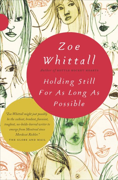
Design by Isaac Tobin
What are your favourite books to work on?
I’ve gotten to work on a couple of books that focus on the history of a single idea; Obsession and Accident. Both were dream opportunities from a design perspective because they were each about a single, clear, yet abstract subject, and their short titles allowed for bold, expressive typography.
I also enjoy working on the less glamorous academic monographs with small print runs and specialist audiences. They often have really suggestive and interesting subject matters. And because of the lower sales expectations it also tends to be easier to get more subtle or unusual designs approved.

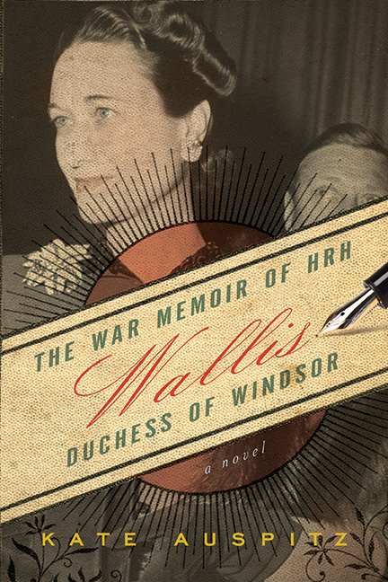
Design by Isaac Tobin
What are the most challenging?
The covers that are asked to communicate too much. Sometimes the title of a book doesn’t clearly define the genre or subject matter, so it is important for the jacket design to define it instead. Sometimes everyone can’t agree on just how a book should be positioned in terms of subject matter and genre, and we have to go through multiple cover designs before the right balance is found.

Lettering by Lauren Nassef; design Isaac Tobin
What was the inspiration for the cover of Obsession: A History?
This book is a wide ranging history of the idea of obsession and the way it has changed over time. Because obsession can be such an important part of the creative process, I wanted to find a way to make the cover itself a result of an obsessive act.
To keep things simple I decided to not bring in outside imagery and work with the title itself. I’m a sucker for the classic typography 101 exercise where you make a word look like its meaning, and the one-word title was a great opportunity. But my attempts to construct the word “obsession” with repetitive typographic elements on the computer were falling flat. My wife pointed out that the computer was making the repetition too easy, and it would be better to make it by hand so the hours of work would be visible in the final product. She had actually been making drawings with pin pricked holes years ago and suggested using that technique. Right away I knew she was right, and could see exactly how the cover would come together.
What was it like collaborating with Lauren on the cover?
Like many of our collaborations, it emerged naturally. I pitch a lot of my cover ideas to her first, and show her all of my comps, so she’s often involved in my work, and in the course of one of these discussions we realized that not only was her idea the right idea for the book, but she was the one who could pull it off. This was a very easy collaboration for me; she pretty much came up with the idea and then did basically all the work. All I had to do was design the typography (in my go to home-made sanserif Attleboro), take the photo at the end, and handle the ancillary type.


Design by Isaac Tobin (using display type Attleboro)

Spread from Whiskey Tango Foxtrot
Do you see any recent trends in book design?
It seems like more cover designers are creating their own lettering and imagery these days. I guess the DIY approach that started with crude and faux-naive hand-made designs has evolved into something more refined and craftsmanship-based. A lot of these custom letterforms and images are being drawn on the computer, but whether handmade or digital they are clearly labored over.
I’m probably too close to the subject matter to be a good judge though. I try not to analyze design trends or how my work fits into them too much. I used to do that a lot and found it kind of crippling, so I’ve been trying to follow my instincts more. My instincts are probably just subconscious recapitulations of the dominant trends, but I’m happier this way.

Illustration Lauren Nassef; design Isaac Tobin
Where do look for inspiration and who are some of your design heroes?
I really can’t believe how many great cover designers are working right now. It’s both incredibly inspiring and humbling. The list of designers I love is too long to recite here and you’re off to a great start with this interview series. I don’t know if the field is getting stronger or if the internet is making it easier to see more work. Maybe a bit of both; the internet is breaking down barriers and putting all of us in direct conversation/competition, leading to better work. Design Related has been a big part of this, as have all the cover blogs. I remember when the only way to see new covers was to prowl bookstores and pore over the AAUP and AIGA annuals.
I’m continually inspired by the work my colleagues at the UofC Press are doing. I think we’ve all gotten better over the last few years and keep inspiring each other. It’s always exciting when I go to grab a print from the communal laser printer and accidentally see someone else’s cover. Not all of my colleagues have websites (yet!) but here are the ones who do: Matt Avery, Maia Wright, Natalie Smith, Mike Brehm, and Dustin Kilgore.
My good friends from college Jenny Volvovski and Matt LaMothe started a design firm with another RISD friend, Julia Rothman, and they’re doing amazing work. And finally my wife Lauren Nassef is a constant inspiration. She just completed the second year of her drawing blog where she posts a new drawing every day.

Design by Isaac Tobin

Interior detail from Cartographies of Travel & Navigation
What does the future hold for book cover design?
I’m really not sure.
But E-books are definitely going to change things. I won’t get into the future of text design (except to say e-books won’t really be viable until they support decent typography and don’t strip away all our work in favor of badly justified default fonts) but I would speculate that cover design is going to get less focused on the cover itself and more on what you might call book identity systems. As books are increasingly sold in multiple formats and for different devices, we’ll have to transition away from designing objects to designing open ended systems. In a best case scenario, this could be great and provide lots of opportunities for inventive designs that range from masterfully produced collectible physical books to all manner of online formats. I hope that publishers continue to support cover design and recognize the value that good design can add to their books, whatever format they may be published in.
Thanks Isaac!

Illustration by Lauren Nassef; design by Isaac Tobin (for Kiepenheuer & Witsch)
You can see more of Isaac’s work at his website and design:related portfolio.
10 Comments") Penguin Great Ideas
Penguin Great Ideas Illustration by Michael Kirkham; design by David Pearson
 This is a terrible question, but I’m curious: Which came first, your interest in Penguin’s design history, or designing books about Penguin’s design history?
 The Penguin archive
 Experimental layout from the Penguin archive
 Artwork by Phil Baines; design by David Pearson
 Artwork and design by David Pearson
 Artwork and design by David Pearson
 Artwork and design by David Pearson
 Artwork by Joe McLaren; design David Pearson
 Artwork and design by David Pearson
 Design by David Pearson
 Design by David Pearson
 Illustration and design by David Pearson
 Illustration by Victoria Sawdon; design by David Pearson
 From David Pearson's ephemera collection
 Design by David Pearson (not yet published/work in progress)
 Design by David Pearson (not yet published/work in progress)