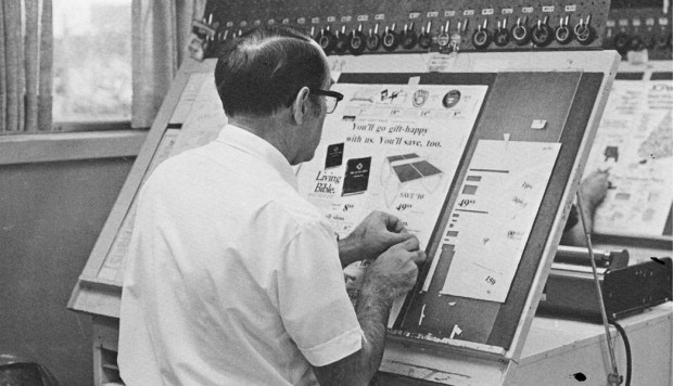
Farewell – etaoin shrdlu is a half-hour documentary about the last day of hot metal typesetting at The New York Times.
The 1978 film by Carl Schlesinger and David Loeb Weiss shows the remarkable nightly production process for a daily newspaper and the changes to come with the transition computers.
The title ‘etaoin shrdlu’ refers the words made by the letters of the first two columns of a type-casting machine keyboard. If I understand this correctly, the phrase was used by operators to create an ‘obvious’ mistake in a line of type to be discarded.
And if this sort of thing is your bag, the video was posted to Vimeo by Linotype: The Film along with number of other archive films about typesetting that are worth checking out.
Before the desktop computer revolutionized the way the graphic design industry worked, type and image were painstakingly put together by hand with the aid of various ingenious machines and tools.
Currently in production, the documentary, Graphic Means explores graphic design production of the 1950s through the 1990s—from linecaster to photocomposition, and from paste-up to PDF.
It looks fascinating:
You can support the production the film by pre-ordering a copy from the Graphic Means website.
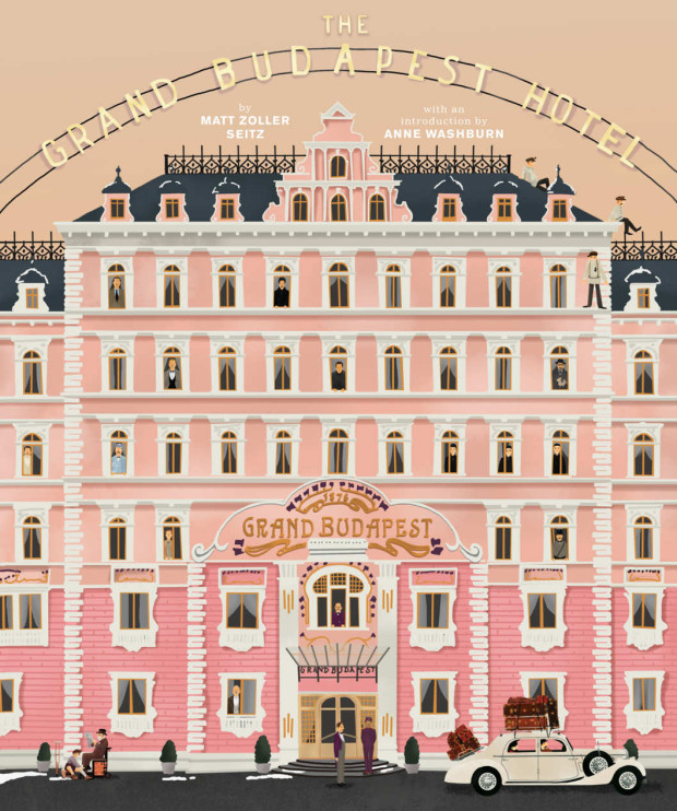
I posted about Wes Anderson’s Zweig-inspired film The Grand Budapest Hotelquitealotin2014. But as the film won four Oscars last month (including the award for production design) and I revisited the movie this past weekend, I don’t feel too bad about posting a few links about it again — it is so beautifully designed and constructed.
“The Grand Budapest Hotel” is an incredibly rich film, one of his best, definitely the most logistically and maybe thematically complex. It’s kind of every Wes Anderson film stacked one on top of the other, like a wedding cake.
While RogerEbert.com produced this 16 minute video essay adapted from the book:
The book even has a nice animated trailer:
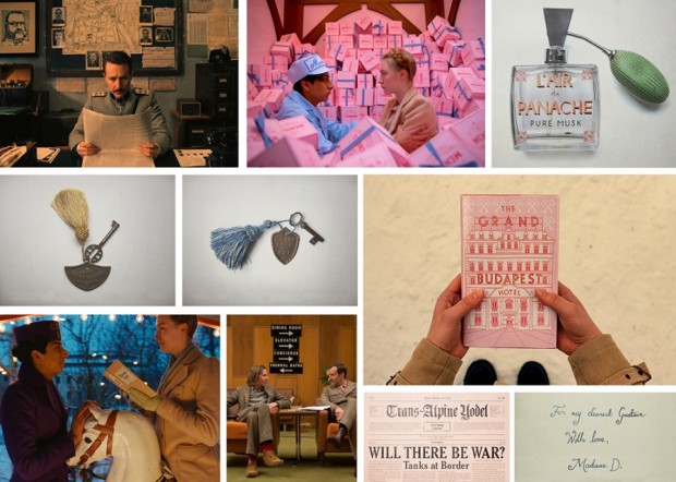
Elsewhere, Quartz interviewed the film’s lead graphic designer Annie Atkins:
“A fictitious country needs all kinds of graphics: flags, banknotes, passports, street signs,” she told Quartz. “It’s impossible to imagine graphics like these. You have to do your research and you’ll find treasures that you couldn’t even have begun to sit down and draw until you saw them in front of your eyes.”
Working closely with Anderson and the film’s production designers Adam Stockhausen and Anna Pinnock, Atkins meticulously hand-crafted almost every of piece of ephemera shown on camera. “Every piece I made began with showing Wes a collection of real examples from the period,” she explained. “We looked at hundreds of pieces of design from Eastern Europe at the beginning of the last century as reference.”
And Deadline talks to production designer Adam Stockhausen about the film and working with Anderson:
Wes knew that he wanted the hotel to be pink. That’s one of the fun things about working with him—he has such a strong sense of color and makes very bold, daring choices that, just left to my own devices I’m not sure I would have come up with. So, working with him is inspiring in that way. And then it’s a process—working with colors that go together, adding in tones that help balance things, figuring out what the right pinks are. The funny thing is, we started with all this pink, and I think this would be true of any color—if you use too much of it, you stop seeing it because it’s everywhere and you start taking it for granted. So, we found that we had to add in yellows and different colors to kind of cut it back so you could see it more. And it’s those kinds of things you learn as you’re going; in this case, we learned from taking a section of the walls in the hotel and painting them.
Most of the inspiration we had for the hotel came from our site visit to Karlovy Vary in the Czech Republic. But we also put tons of research into the setting before we visited Europe. We looked at archive photos from many different hotels, including several hotels in London, Scotland, Switzerland—all over the place. Personally, I think the design was most influenced by the Grandhotel Pupp, which sits on a hill overlooking the town of Karlovy Vary.
The town of Karlovy Vary is filled with pastel-colored buildings that line the riverfront, and it has several hotels that stand on hills that look over the town. The whole place had the right feeling we wanted to convey in the movie.
That National Geographic article also alerted me to this interesting featurette about the creating the film’s hotel in a department store in Görlitz, Germany:
The full-length documentary PressPausePlay is now available to watch on Vimeo. The film, which somehow manages to be simultaneously both inspiring and melancholic, looks at the effects of digital technology and the Internet on the creative economy. Worth watching if you have a spare hour (although depending on your attitude to these things it might make you smile in joyful validation or retreat to your bed for about a week to weep quietly to yourself:
PressPausePlay was made by creative agency House of Radon.
Here’s a short video showing the complex production of Jonathan Safran Foer’s innovative die-cut novel Tree of Codes, published by Visual Editions and printed by Die Keure in Belgium:
One of the ‘joys’ of not getting quite enough sleep at night is that you don’t always say things with the kind of nuance that you might intend. Sometimes the coffee speaks for you.
Unfortunately that happened yesterday with my post about production, which was taken in some quarters as a damning indictment of publishers, rather than a post about some of the problems we face creating decent e-books. Coffee 1, Optimist 0.
Anyway, after I published the post, I was chatting with a friend and colleague at one of the big publishers about their production process. She told me that although they have been converting PDF files into e-books, they are moving towards changing their workflow. This can’t happen overnight though, she said. Changing something that complicated takes time, especially when people have to learn new skills.
She also reminded me that we have to put things into context. Publishers are not the hold-outs they are often portrayed as (or at least not all of them are) — e-books are still only a small part of the overall business, and even though we’ve seen a rapid growth in the market, it is not the same for every genre, category, or publisher. New devices (with different standards) are also appearing on the market with alarming regularity.
None of which means that publishers should sit on their hands of course. But — as my friend rightly pointed out — this a process not “a flip a switch situation.”
As I’ve mentioned in the past, many publishers have tended to treat e-books as shovelware, and (unsurprisingly) the hasty conversion of files intended for print into e-book editions — with little or no consideration for the medium — has meant the quality of e-books has suffered.
Needless to say, poor quality e-books are becoming something of an embarrassment for publishers trying to convince readers to pay a premium for downloads (as Kassia Kroszer recently pointed out in Publishing Perspectives: it is hard to justify higher e-book prices when the product simply isn’t up to scratch), and clearly it’s an issue publishers need to address sooner rather than later if they want win this argument.
The problem of substandard e-books partially stems from the fact that many publishers currently lack the means and expertise (and, to some extent, the will) to produce high quality e-book editions themselves. Their workflow and production process are set up for print, so the quickest way to create e-book files has been to outsource the job to third parties, inevitably with very little quality control.
[B]ig publishers outsource a large part of these services… They’ve found that cutting out expensive production departments and hiring out the services of middlepeople, who also handle distribution and sometimes even retail fulfillment, saves on people power (read: health insurance and pensions), hassle, and extra load on their IT departments. Well, guess what one of the cardinal rules of the digital revolution is: digital production eliminates the need for most middlepeople. Bring this all back in-house, make it a lean operation. Settle on nothing less than a standards-compliant workflow, but please, build it from the ground up, as opposed to tacking it onto your existing production setup as an afterthought.
Pablo is picking a crowd-pleasing soft target in the “big publishers” — many (most even?) small and medium size publishers (the notable exception being O’Reilly of course) are also outsourcing their e-book production — but he does make some really important points about the need to learn new skills, rethink workflow and (ideally) bring e-book production in-house.
The comments are also worth reading but, — if like me — you are just beginning to get your head around this stuff, definitely work your way through the Digital Book World presentation by Liza Daly, of Threepress Consulting, referenced in the article:
Getting Paid by the Joke — Roy Hattersley on Keith Waterhouse, author of Billy Liar, who died last week aged 80:
One of the great lines, spoken in the subsequent film version by Wilfred Pickles playing Billy’s father, combined fury and bewilderment. Why, he demanded to know, had his son told the neighbours that he had only one leg. Billy worked in a dismal office – an ironic tribute to Waterhouse’s first job as clerk to an undertaker. It seemed a step up for the son of a door-to-door vegetable salesmen and a cleaner who had left Osmondthorpe Council School at 15 with an interest in books but no qualifications and few prospects.
When’s That Book Coming Out? — A nice breakdown of the production process by Shelby Peak which explains why it seems to take a long time for books to be released after an author has turned in their final manuscript. Every time I read something like this, I wonder why we don’t hear from publishing professionals more often. It would be great to see publishers explain this kind of thing on their own blogs. (via blog.rightreading)
Spine Out — John Gall has started a blog. Holy fuck.
And — on a related note — there is a nice conversation on Vintage’s TheSun & Anchor blog between designer Peter Buchanan-Smith and photographer Todd Hido about the new Raymond Carver covers (commissioned by John Gall).
Doing the Work — A fascinating interview with Australian book designer Tony Palmer at Caustic Cover Critic:
Sometimes you hear the bigger book publishers described as being like factories – where the work is churned out in a mechanical and unthinking way. It’s never been like that for me at Penguin. The editors, production staff and designers all love their work. But love can be wild and unpredictable. So I’ve dreamt of being a plumber. I like the way water moves on surfaces. I like the fact that there are only four different ways to plumb a house. But book design? Gawd, maybe there’s about 120 right ways to do a good book cover, and there are probably millions of ways to make a bad one.