I recently came across this short PBS Artbound documentary from 2021 on artist, educator, and social justice advocate Corita Kent (1918-1986), which is well worth 20 minutes of your time.
I don’t remember when I first came across Sister Corita’s work. It was probably not until I moved to Canada and became more interested in design and applying typography and lettering to art. Certainly, she was not someone I learnt about in school. It’s hard to know whether that is the result of a parochial British education, or more generalized misogyny and prejudice in art history, or a bit both. But, as the documentary makes clear, she remains a source of inspiration for artists, designers, and teachers 40 years after her death.
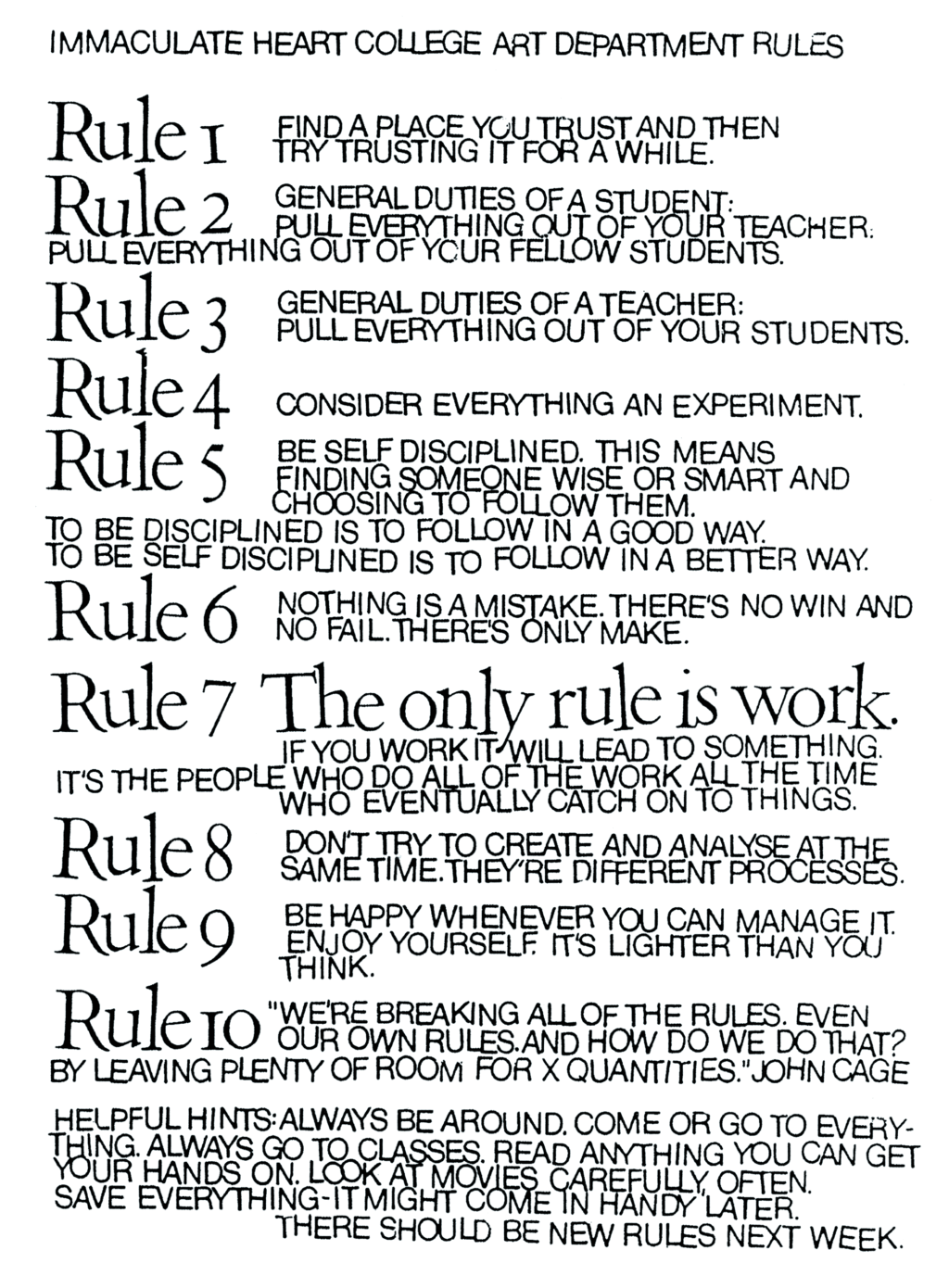
The ‘Ten Rules’ she helped create with the students of the Immaculate Heart College Art Department seem as relevant today as they must have at the time they were first written:
You can listen to former students, artists, community organizers, and others read and reflect on the Ten Rules here.
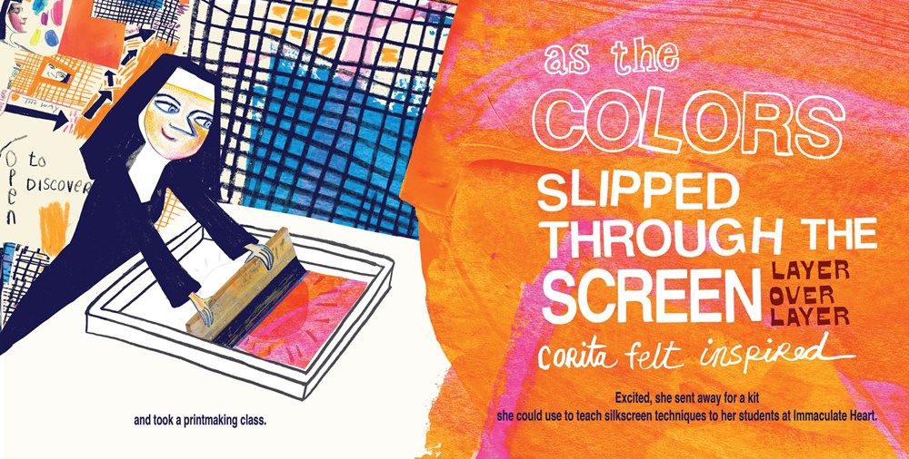
Available this month from Brooklyn-based independent children’s book publisher Enchanted Lion, Make Meatballs Sing by Matthew Burgess and illustrated by Kara Kramer is a new picture book about the life and work of the innovative and unconventional artist, educator and social justice advocate Corita Kent (1918–1986).
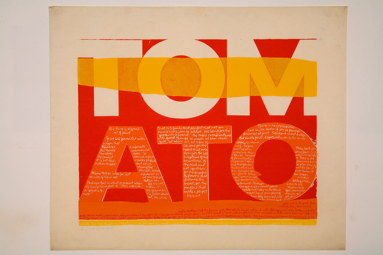
In 1962, Kent saw work by Andy Warhol for the first time, and her aesthetic changed markedly, becoming bolder, flatter, more abstract and brighter, often with saturated, almost fluorescent, colors. Her new style was so successful that it became became known as “nun art,” and was often imitated. Her adherence to the Pop Art aesthetic was well suited to her joyous aims: Kent said she wanted her art to “give people a lift” and help them get “more fun out of life.”
Pop Art’s celebration of the urban everyday also empowered Kent to introduce more quotidian sources into her text works. During the ’60s, she began to incorporate lyrics from pop songs, advertising slogans, and snippets of text seen on signs and packaging into her work, often pairing them with religious text. It was a move that elevated the ordinary to the spiritual, and became a frequent theme in Kent’s art and teaching. She found delight in the commonplace, and believed that the divine could be seen anywhere, even amidst the chaos of the modern city. Kent often took her students on urban expeditions—even day-long trips to gas stations and car lots—armed with cameras and viewfinders.
The largest ever exhibition of Corita Kent’s work in the UK, Corita Kent: Power Up, is currently on display at House of Illustration in King’s Cross until May 12.
Rauschenberg’s ‘muse wall’, a collection of objects and images that inspired him, in his print shop, Captiva, Florida, around 1979. Photograph: Emil Fray/Robert Rauschenberg Foundation
With a major Robert Rauschenberg retrospective opening at Tate Modern in December, Alex Needham, writing for The Guardian, visits the late artist’s island home of Captiva, Florida:
Rauschenberg started visiting in 1962, before moving to Captiva nine years later, describing it as “the foundation of my life and my work… the source and reserve of my energies”. His work by then had become ambitious and complicated; Captiva forced a return to simplicity, and the first things he produced were a selection of wall sculptures made from battered cardboard boxes.
For the world beyond Captiva’s white sands, however, a reacquaintance with Robert Rauschenberg is long overdue. In Britain, there has been no major retrospective of his work since 1981, while the last big US survey, at the Guggenheim in New York, took place in 1997. That will change next month, when Tate Modern opens a London retrospective; it will then move to Moma in New York next May, and after that to the San Francisco Museum of Modern Art.
Rauschenberg left a bold and indelible mark on the 20th century. His combines, which integrated the flotsam and trash of everyday life, including the artist’s own duvet in Bed (1955), were neither painting nor sculpture, and proved that anything could be the material of art. At Tate Modern, pride of place will be given to Monogram 1955–59, a horizontal canvas on which perches a stuffed goat with a tyre around its midriff; the work thrilled and scandalised when it was first shown at Castelli’s gallery in New York, and rapidly became synonymous with the artist’s iconoclasm. Since then, his relevance has only increased, says Leah Dickerman, co-curator of the new retrospective: “When you open a gallery and see the art that’s made out of the stuff of the real world, that’s coming off the walls, that’s interdisciplinary in its approach, all that is the legacy of Rauschenberg.”
Making the combines, Rauschenberg felt he was cracking “the secret language of junk”. They could be composed of anything: a goat corseted by a tire; a stuffed bald eagle. One of the very first, Untitled (Man with White Shoes), contained – deep breath – fabric, newspaper, a photograph of Jasper Johns, a handwritten letter from Rauschenberg’s son, a drawing by Twombly, glass, mirror, tin, cork, a pair of the artist’s socks and painted leather shoes, dried grass and a taxidermied Plymouth Rock hen.
All the same, there’s a limit to how much world you can cram into a sculpture, and as Rauschenberg’s success grew he became increasingly fascinated by replication. Back in 1952, he’d experimented with transfer drawing, and in 1958 he embarked on a grand project of illustrating Dante’s Inferno using lighter fluid to transfer images on to paper. In 1962, Andy Warhol introduced him to a far more sophisticated technique: the wizardry of using photographic images on silkscreen canvases.
Now he could reuse and resize his own photos and those he snipped from newspapers and magazines, giving him an unprecedented power of composition. Anything could be incorporated: John F Kennedy; a water tower; Bonnie and Clyde. As he gleefully observed of the silkscreen paintings: “It’s as much like Christmas to me as using objects I pick up on the street.” He was giddy for them, until in 1964 he was awarded the Golden Lion at the Venice Biennale. Terrified of stasis, the next day he called his New York studio and asked his assistant to burn all the screens.
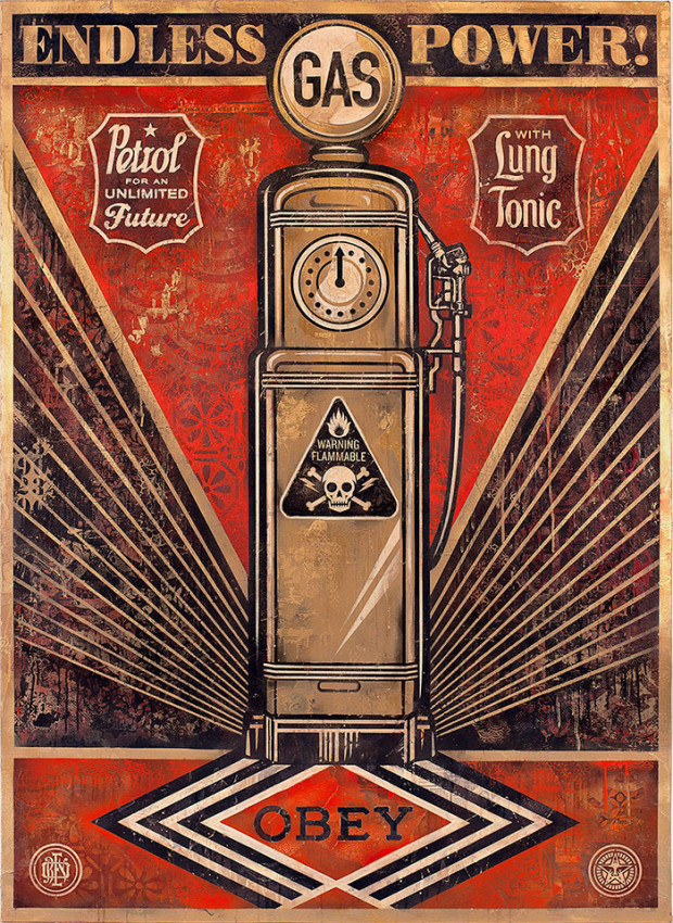
Love it or hate it, Shepard Fairey’s bold graphic style with its limited colour-palette and appropriated pop culture imagery, is immediately recognizable and much-imitated.
In this interesting short film by Brett Novak, the Los Angeles-based artist talks openly about his work, influences, and, yes, the Obama ‘Hope’ poster:
An exhibition of new work by Fairey is currently on display — alongside prints by the artist Jasper Johns — at the Halsey Institute of Contemporary Art in the Fairey’s home town of Charleston, South Carolina.
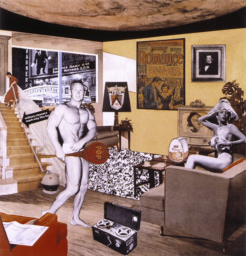
Also writing at The Guardian, Fiona MacCarthy on British pop artist Richard Hamilton:
Among the design cognoscenti of the period, Braun products were the creme de la creme, the must-have objects. I remember a time when no trendy living room would seem complete without its Braun stereo player. All image-conscious offices had Braun electric desk fans… The elegance and rigour of Braun products were drawn on by Hamilton in several of his most peculiarly disconcerting works. The Braun catalogues were plundered not only for the pop-up toaster but also the portable combination grill and even the immaculate typography.
His own admiration for Dieter Rams, Braun’s chief designer, verged on the ecstatic. Hamilton said: “I have for many years been uniquely attracted towards his design sensibility; so much so that his consumer products have come to occupy a place in my heart and consciousness that Mont Sainte-Victoire did in Cézanne’s.” All the same – and typically – this attitude of reverence did not prevent him from affixing to the top of his own Braun electric toothbrush the giant set of sugar-pink confectionery teeth his young son had bought him as a present from Brighton. The assemblage was later made into a multiple, The Critic Laughs(1968), complete with its own Braun-style packaging.
A retrospective of Hamilton’s work opens at the Tate Modern in London later this week.
As mentioned earlier, I was in Vancouver last week and I wasn’t able to post as regularly as I would have liked to. So to make up for Friday’s missing links, here are a few things of interest to start the week off…
Adrian Tomine (Shortcomings) discusses his latest work, Optic Nerve #12, and an unfinished graphic novel with Comic Book Resources:
When I finally sat down to work on my next comics project, I felt obligated to attempt a real “graphic novel.” I was looking at these giant tomes that some of my peers were working on, and I felt really envious of that kind of achievement. It also just seemed like that was the direction everything was moving in, and my old habit of publishing short stories in the comic book format was already an anachronism. So I pursued that for awhile, doing a lot of the kind of preparatory work which is actually the hardest part for me, and the whole time I had these nagging thoughts like, “Do I really want to work on this for ten years? Do I want to draw and write in the same way for that long? Does the material really merit that much of an investment?”
Hard Won — Yet another review for MetaMaus in The New York Times:
Spiegelman recalls the struggles of researching “Maus” at a time before scholarship was widely available to a mass audience. Pre-Internet, he depended on his parents’ collection of pamphlets written and drawn by survivors, and on research visits to Poland. On his second trip to Birkenau, in 1987, Spiegelman was baffled to find a perfectly preserved barracks where once there had been only rubble; it turned out to be a re-creation built for a Holocaust movie, left standing by Polish authorities because it looked accurate. He admits he was jealous of the moviemakers’ unlimited resources, when “every scrap of information I needed for ‘Maus’ was so hard-won.”
With It — Michael Farr, author of Tintin: The Complete Companion, talks about Tintin and discusses five books related to Herge and his creation at The Browser:
If you didn’t meet Hergé, you wouldn’t realise how funny he was – he saw the humorous side of almost everything. He was visually terribly aware, he didn’t miss anything which he saw. He was in his seventies then and I was in my mid-twenties, and I think that’s the reason why he agreed to see me. Younger, a French-speaking British journalist, I was slightly exotic and that intrigued him. Hergé was terribly young for his age. To use an expression that was used more then than now, he was very “with it”. When we got talking about music, he asked me what my favourite Pink Floyd songs were.
You see all this in the books. In many respects, Hergé is Tintin himself.
See also: Hal Foster, art critic and author of The First Pop Age(i.e. not THAT Hal Foster), on pop art at The Browser.
It was being gradually borne in on me by Rome that one of the vital things that make a great city great is not mere raw size, but the amount of care, detail, observation and love precipitated in its contents, including, but not only, its buildings. And it goes without saying, or ought to, that one cannot pay that kind of attention to detail until one understands quite a bit about substance, about different stones, different metals, the variety of woods and other substances—ceramic, glass, brick, plaster and the rest—that go to make up the innards and outer skin of a building, how they age, how they wear: in sum, how they live, if they do live.


 Adrian Tomine (