Skip to content

Tag: phaidon

Richard Sapper’s Vision of the Future

richard-sapper-jonathan-olivares-book-cover

At Curbed, Alexandra Lange discusses the work of German-born industrial designer Richard Sapper, and a new book about his work published by Phaidon:

When Los Angeles-based designer Jonathan Olivares first met Richard Sapper in 2008 in Milan, Sapper’s adopted home, he put it more bluntly: Why black?

“I expected him to come back with a hardcore minimalist modernist objective,” says Olivares who, like Sapper, has designed for Knoll. But Sapper said something different. “Black looks good in all kinds of interiors: old interiors, messy interiors, a clean modern interior. It ages really well. It doesn’t look dirty. You don’t see the seams. He told me, Next time, look at a white car and look at a black car. On a white car you see all the joints.” Sapper told two different stories about the shape of the ThinkPad. One is that he was inspired by the cigar box, the other by the bento box. In either case, a deceptively dark, plain exterior opens to a world of flavor. The red nub is either a beautiful cigar wrapper or a nice piece of tuna. It’s such a practical explanation it takes a moment to sink in. It’s as if this product designer knew your life…

…Sapper lived with multitudes and made multitudes, and his idea of the future didn’t involve getting rid of everything past, whether personal or visual. Technology, in his world, could co-exist with sentiment and age. To the end, he was still trying to invent a lamp for people who couldn’t hardwire to the ceiling above their tables. It was based on a fishing rod. That was the kind of “perching” that was of interest to him.


Save

Save

Comments closed

A Taxonomy of Office Chairs

A Taxonomy of Office Chairs by Jonathan Olivares and published by Phaidon is a visual overview of the evolution of the modern office chair and detailing the most innovative chairs designed and built from the 1840s to the present.

In this video, Olivares talks about the book and the importance of the office chair in design history:

(via Daily Icon)

Comments closed

Wim Crouwel: A Graphic Odyssey

Phaidon Books has posted a short profile of the original “Gridnik”, graphic designer Wim Crouwel:

Crouwel, who appeared in Gary Hustwit’s documentary Helvetica, is famous for his innovative approach to typography and his 1967 ‘New Alphabet’. The New Alphabet font was adapted by designer Peter Saville for the cover of Joy Division’s album Substance, released by Factory Records in 1988.

An exhibition of celebrating Crouwel’s work, Wim Crouwel: A Graphic Odyssey, is at The Design Museum in London from March 30th – July 3rd.

UPDATE: Wim Crouwel: A Graphic Odyssey – Catalogue is published by Unit Editions with three different cover photographs to choose from.

4 Comments

Midweek Miscellany

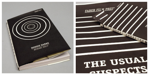
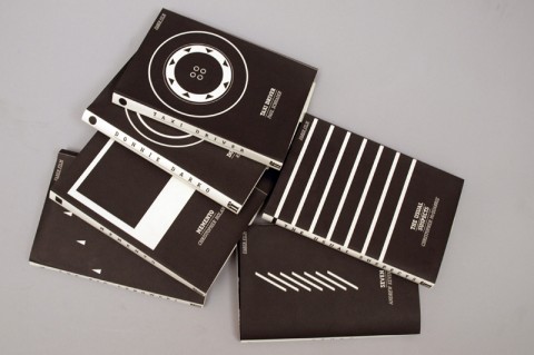
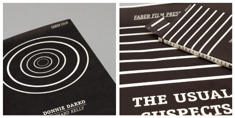
Another great set of designs for the 2009 D&AD student award brief for typography sponsored by Faber and Faber, this time by Rinse Design (via Cosa Visuales). See also: Ed Cornish’s designs for the brief.

Phaidon have relaunched their website and it is really rather nice (via FormFiftyFive).

The Imaginary PresentMike Doherty interviews William Gibson about his new novel Zero History for The National Post:

In his earlier books, Gibson says, he aimed to devise “futures that felt as though they were filled with designed artifacts, as indeed they would be. I can’t think of too many science fiction writers who’d bother trying to do that.” In the [new] series, his devotion to design has gone into overdrive, reflecting the idea that “everything is ‘designer,’ ” even though “with most things, you’ll never know the name of a designer.”

PopMatters also spoke to the author about the new book.

Code — Jennifer Egan, author of A Visit From the Goon Squad, reviews Tom McCarthy’s C for The New York Times:

[McCarthy] aligns disparate things into larger patterns full of recurring images: analogies between the human body and earth, and machinery; hums and whirs; film screens; bowels and tunnels; electric circuits; cauls and other silken membranes. These repetitions come to feel like the articulation of a larger code — as if, were readers to plot their exact positions throughout the novel, they would discover a hidden message.

What Ever Happened to Reading Properly? — ReadySteadyBlog’s Mark Thwaite on critics misreading of  Gabriel Josipovici’s What Ever Happened to Modernism?:

It’s interesting that Josipovici’s book which, in many ways, is both a call to read more carefully and an enquiry into why reading carefully is beyond so many cultural gatekeepers, has been read so sloppily by so many of its critics… Josipovici doesn’t invoke marginal or avant-garde writers, nor praise typographical or narrative playfulness over stale traditionalism, but rather brings us back to canonical writers (a good part of his essay is taken up with Wordsworth) and allows us to see what was at stake for those artists in their work, and what is at stake for us as readers.

And finally… It’s Vignelli week at Design Observer:
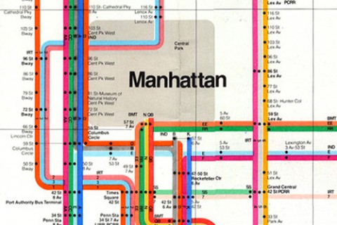
Debbie Millman’s 2007 interview with Massimo Vignelli (excerpted from her book How To Think Like a Graphic Designer):

I’m interested in “essence” — my major aim is really to get to the essence of the problem. And just throw away everything that’s not pertinent to it. At the end of a project, my work should be the projection of that experience, the essence of effect. It’s a habit that you get into… The essence is what is left when there’s nothing else that you can throw away.

Michel Bierut profiles Lella Vignelli:

Massimo has often defined their working relationship like this: “I’m the engine, and Lella is the brakes.” The first time I heard this as a young designer, it was clear to me which was more important. If you were a designer, wouldn’t you want to be the engine, powerful, propulsive, driving forward? It was only years later that I remembered something my high school driving instructor once said: “You don’t get killed in a car accident because the car won’t start. You get killed because the breaks fail.”

And, there is an interesting, beautifully shot, video interview with Massimo Vignelli by photographer John Madere here.

There will surely be more good stuff as the week progresses…

Comments closed

Midweek Miscellany

The portfolio of Julia Hastings, Art Director of Phaidon Press (via It’s Nice That).

Rarefied Content — Alan Rapp on the future of photography books at Imprint:

[A]rguably the independently published photo book is flourishing. You can see this from the increasing popularity of on-demand printing services such as Blurb, Lulu, and MagCloud , as well as the number of successful and well-published photographers who have launched their own publishing ventures, such as Alec Soth, Richard Renaldi, and Shane Lavalette (a practice which itself has a long pedigree, from Alfred Stieglitz to Ralph Gibson). Yet this kind of kaleidoscopic output creates another issue—who but the most ardent follower can keep abreast of this vast dispersion of small-scale publishing?

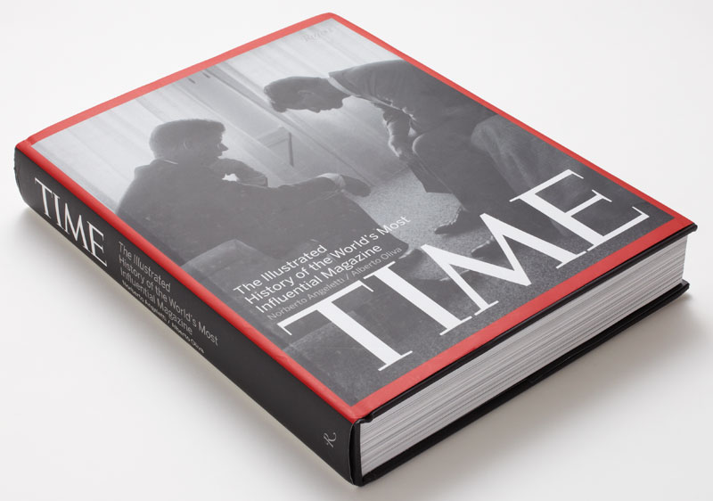
The Illustrated History of Time designed by Luke Hayman at Pentagram:

And finally…

The trailer for the animated adaptation of Shaun Tan‘s The Lost Thing (via The Art Department | Irene Gallo):

I’ve posted this before, but here’s a short documentary about making the film:

The Lost Thing website.

Comments closed