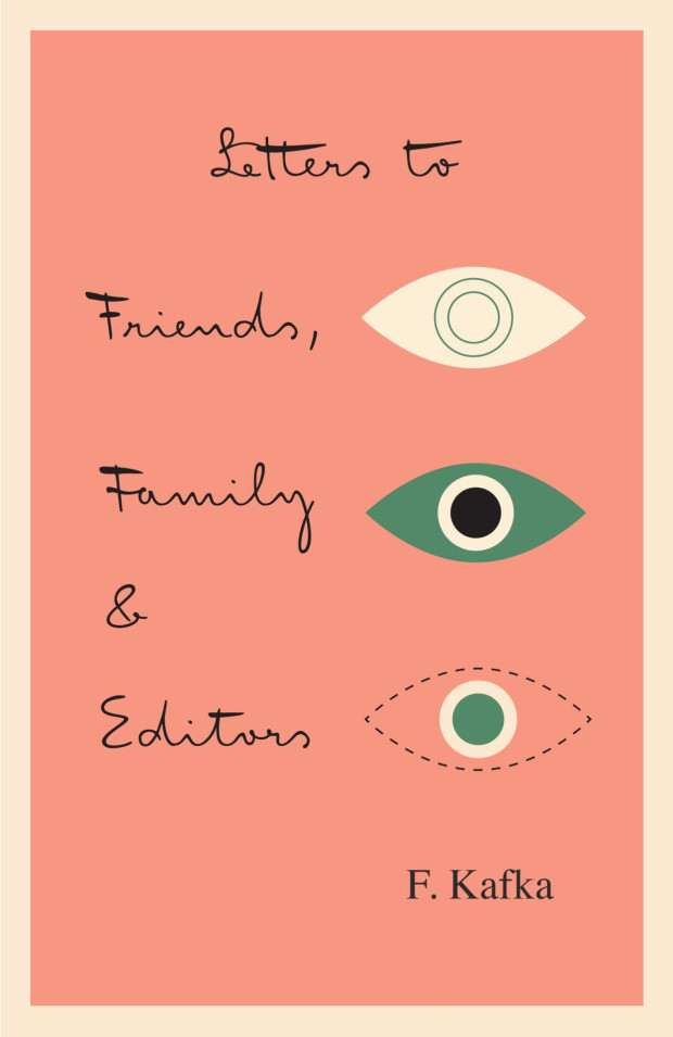
Originality, authenticity, and honesty are crucial qualities to me. I think Mr. K has all of that, just like Franz Kafka’s manuscripts do. While I was working on it, I realized that while Mister K is a font, it is also the visualization of a personality. The font is not pretty, or beautiful in the classic sense — and it doesn’t want to be.
It’s a bit like Kafka’s work. There is no beauty in it as such, but rather a confrontation with reality that goes so far as to be repellent. There are all kinds of attributes — stupidity, cunning, weakness, strength, bitterness, humor, lightness, etc. The authenticity of this confrontation is visually reflected in the manuscripts — and also in Mister K Regular, the style in the font family that is most similar to the original Kafka manuscripts.
Whoever wishes to use the typeface must be willing to embrace this ambiguity. Mister K is not particularly suitable for lending a consumer-friendly smoothness to some brand; but there are corporate identities to which it fits very well. I was pleased to see it used by the Norwegian band Flunk, for Stokke highchairs, and for wellness products by Dresdner Essenz; and, of all things, in the logo of an upmarket design hotel in Berlin, Das Stue. What I found even more astounding was its appearance at the international insurance company Watson Towers (an ironic coincidence, as Kafka himself was an employee at an insurance company). But somehow it made sense: “The organic, hand-drawn nature of the logo and graphic system creates a personal and distinctive look amidst the impersonal, corporate, language of its competitors…” — that’s how Interbrand, the design agency, described the project. In its semi-perfection the typeface simply oozes a kind of honesty. That’s its strength, and brings it closer to a lot of people.
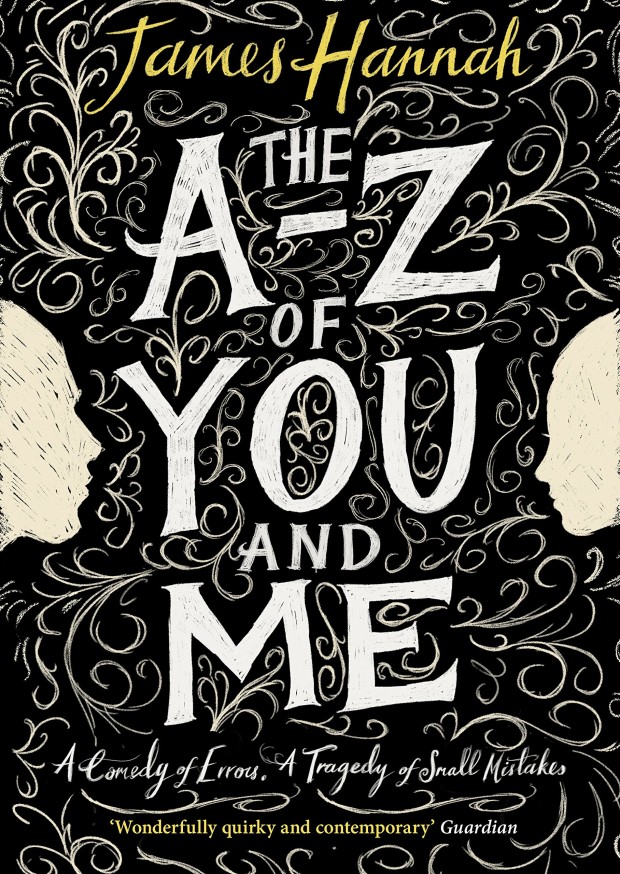
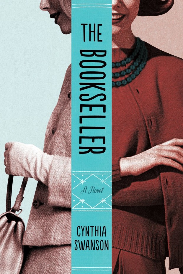
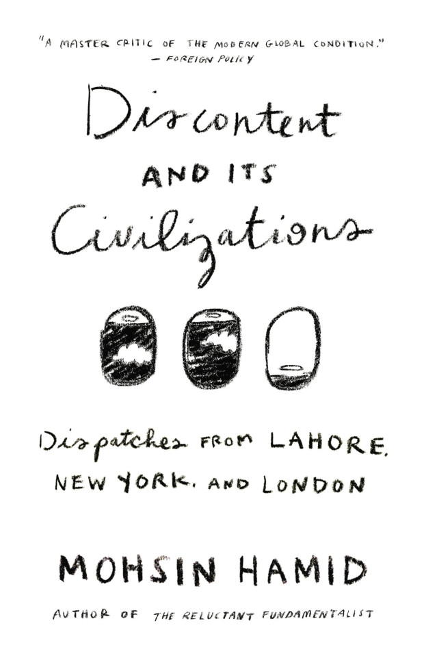
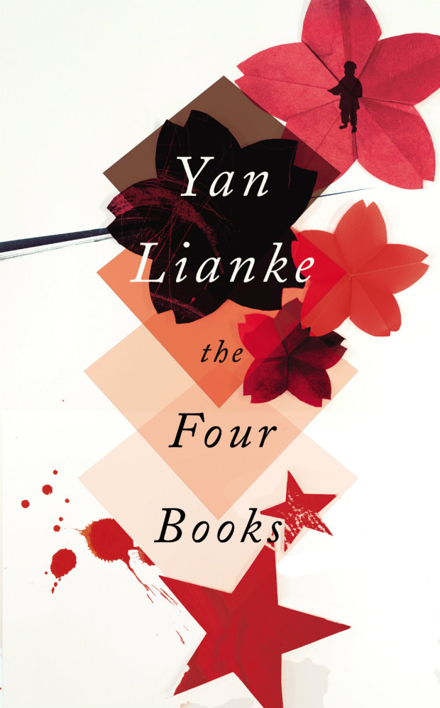
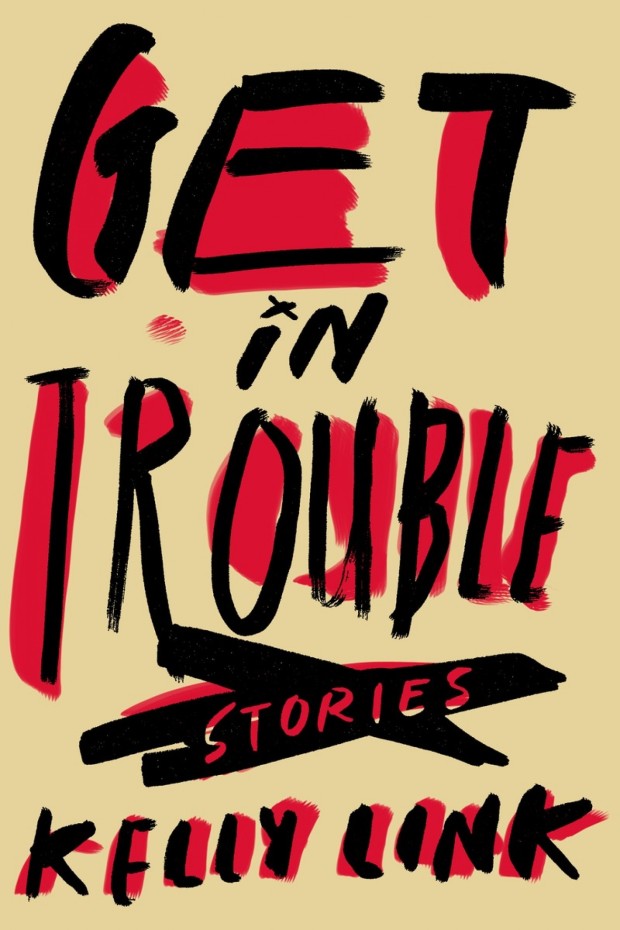
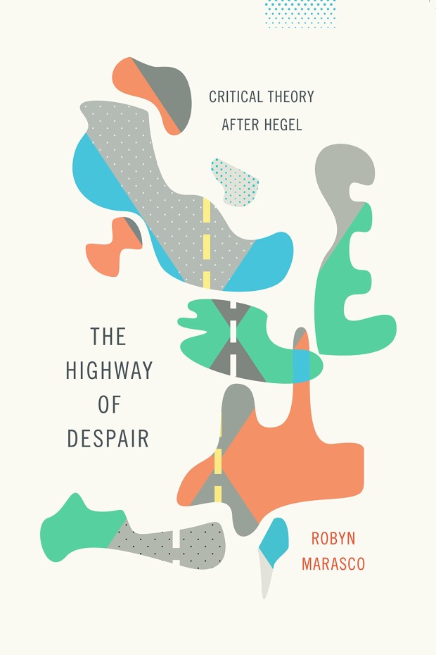
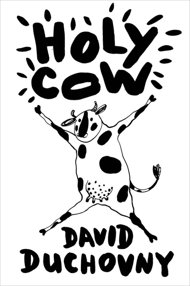
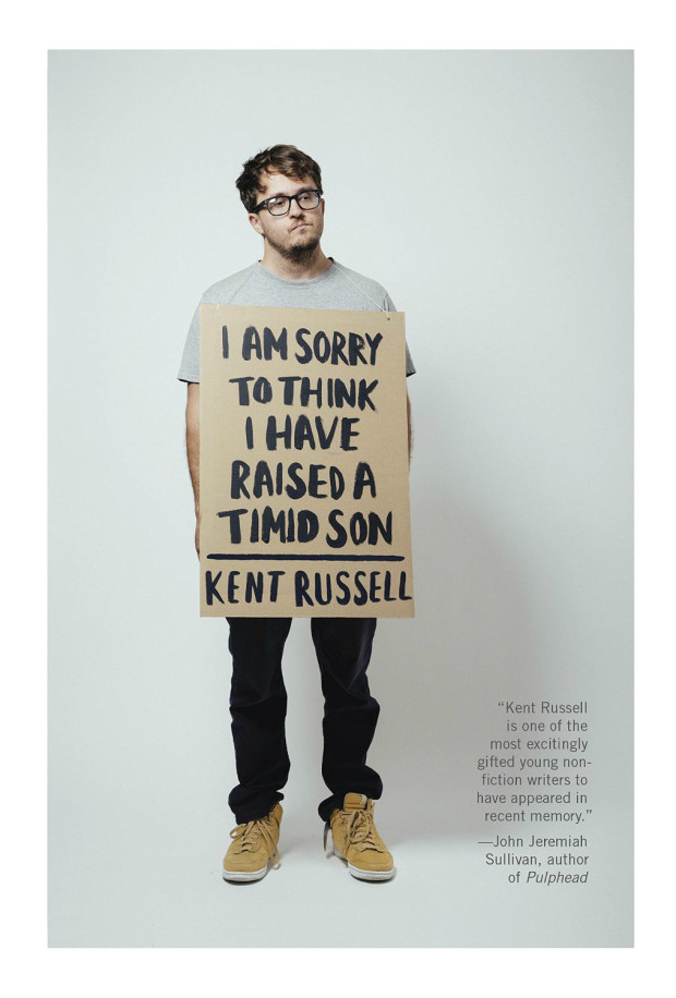
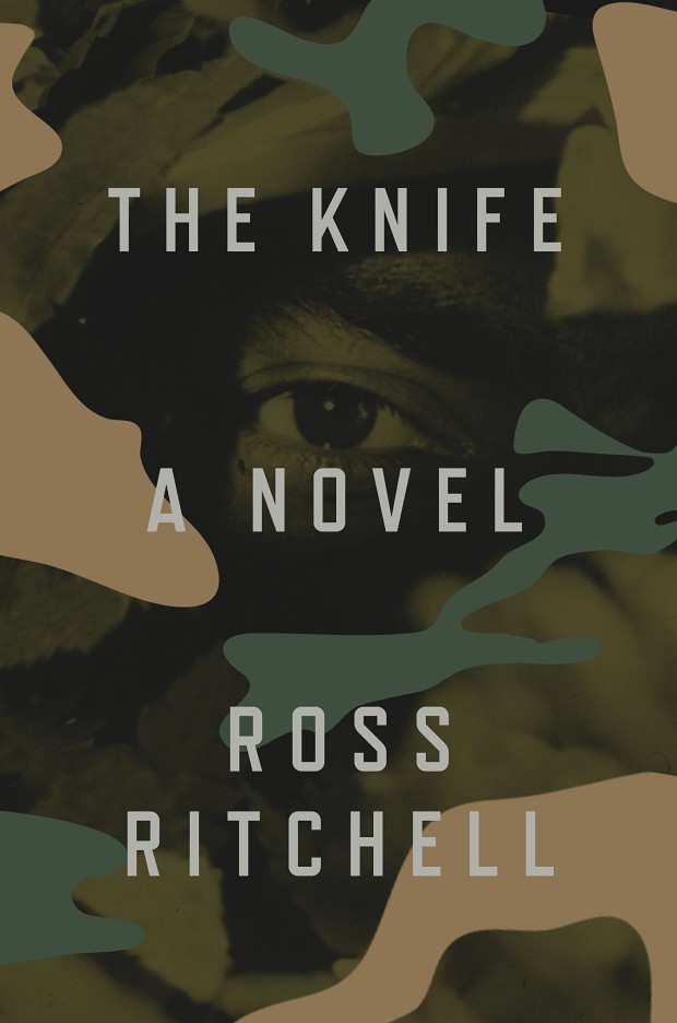
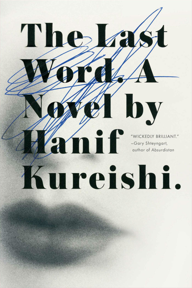
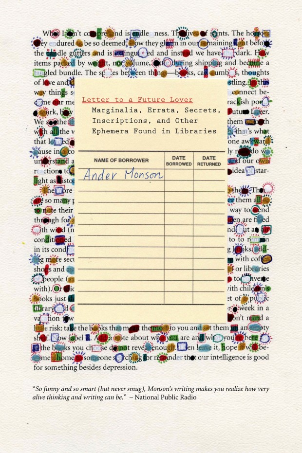
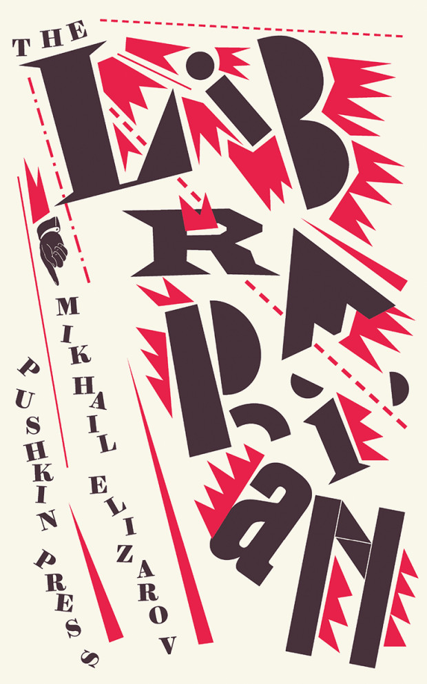
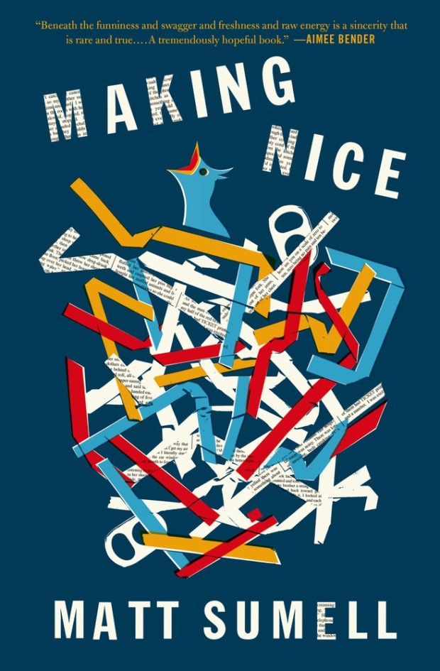
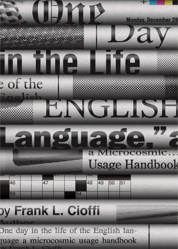
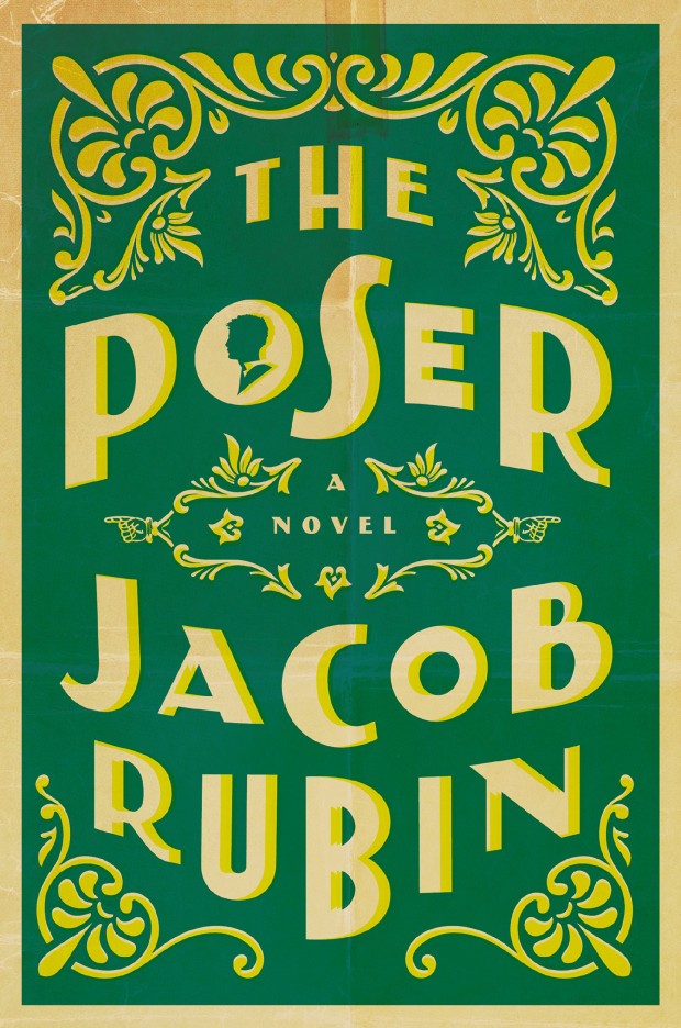
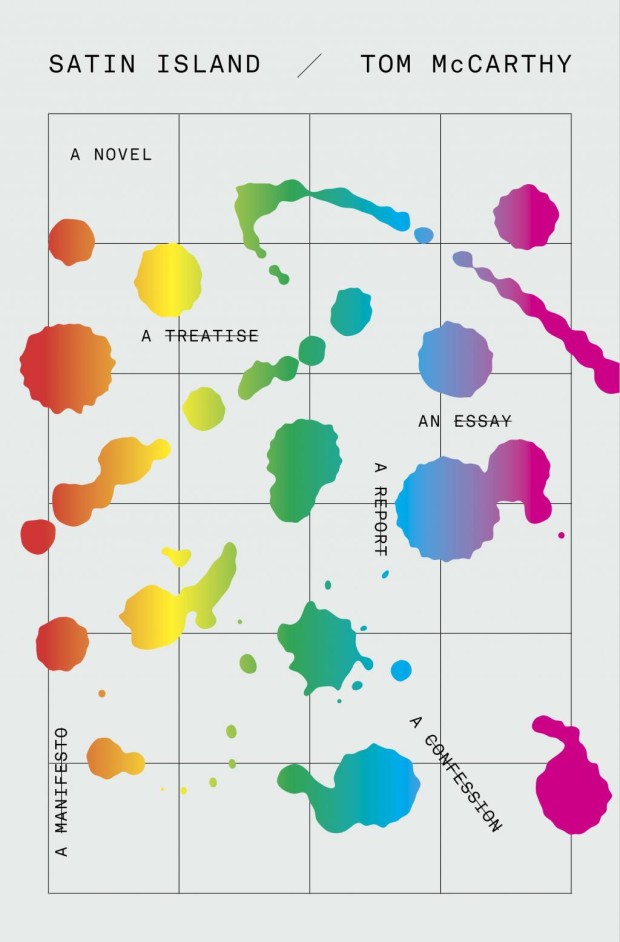
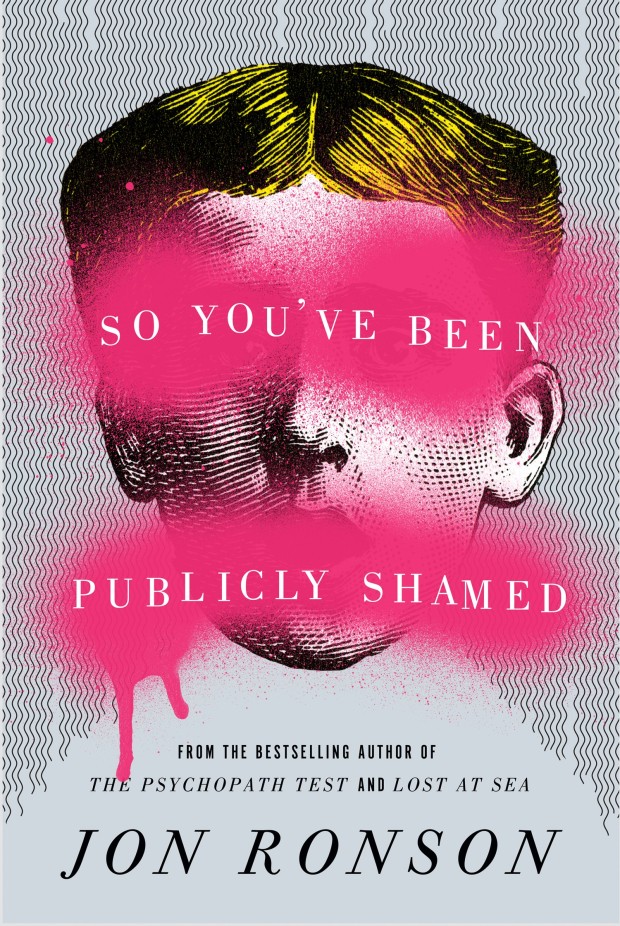
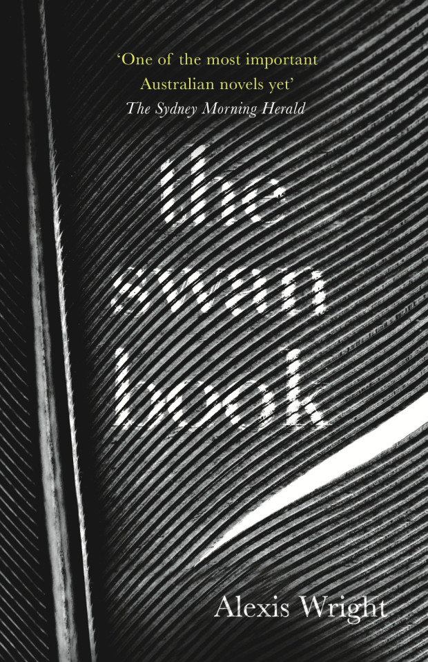
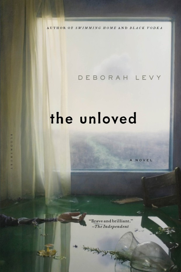
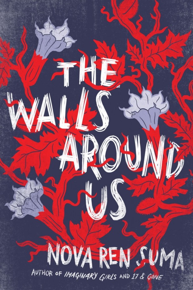
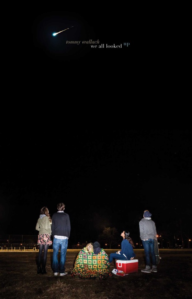
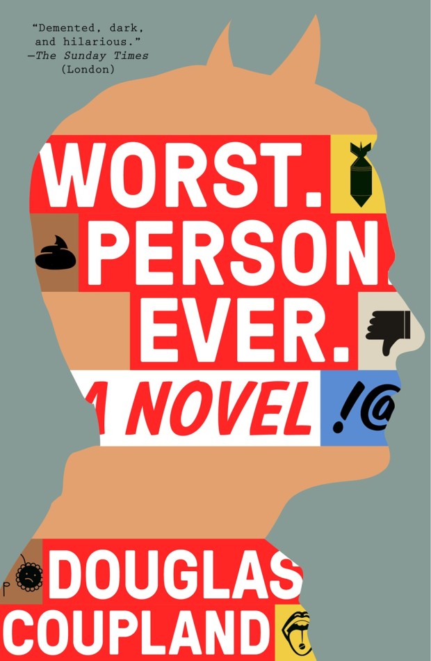
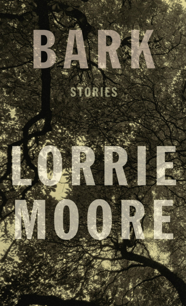
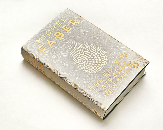
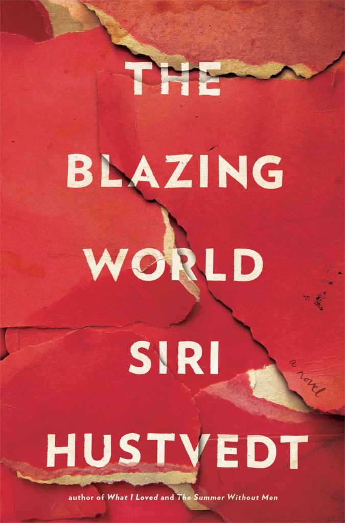
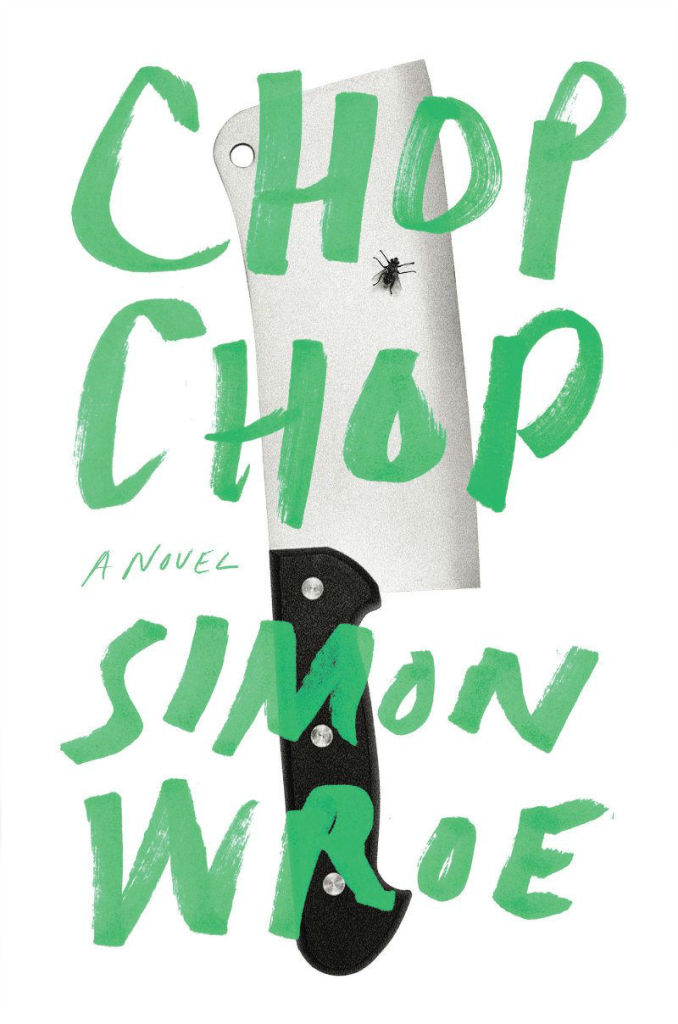
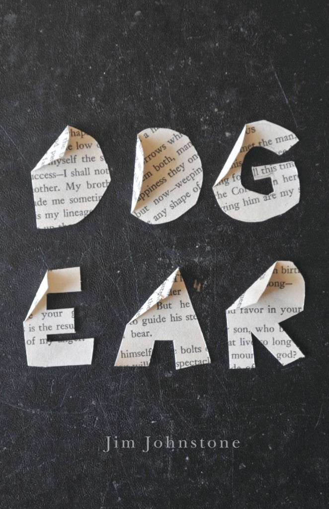
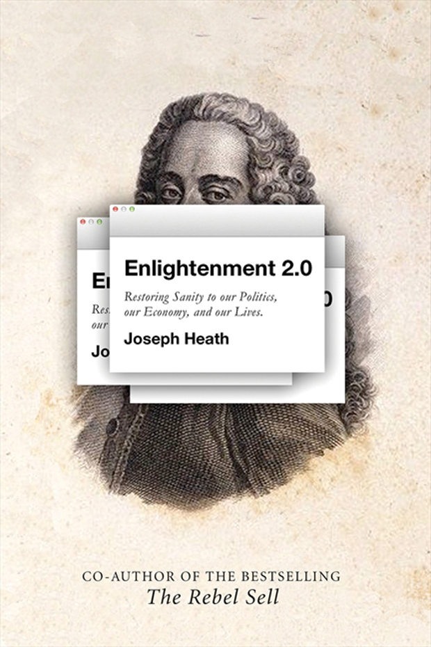
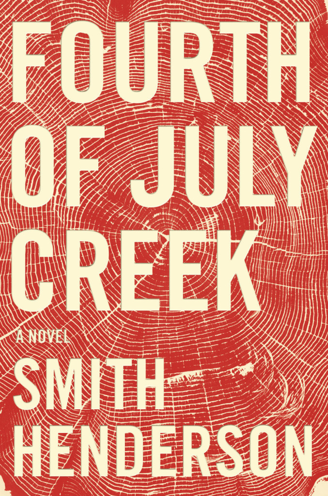
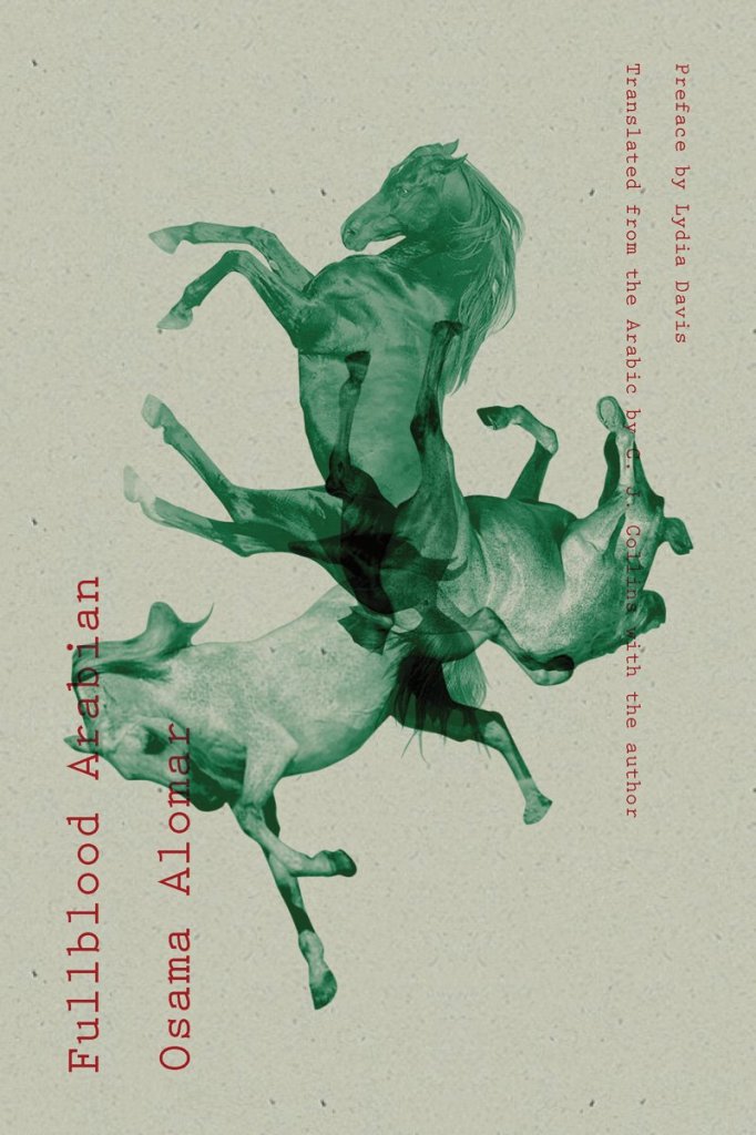
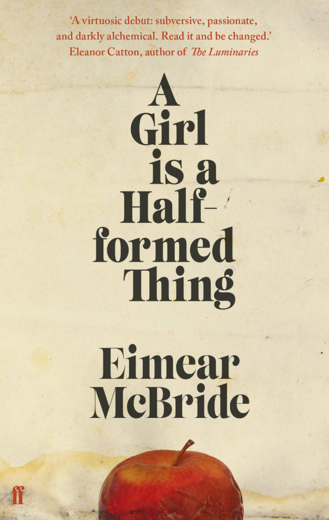
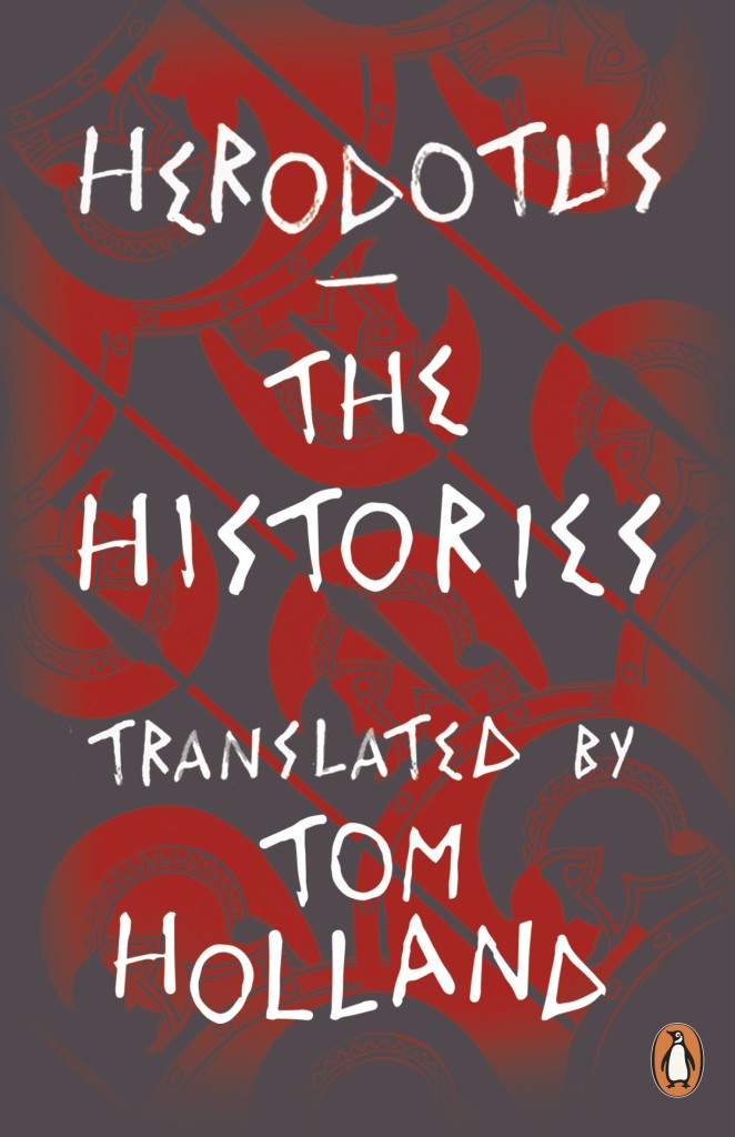
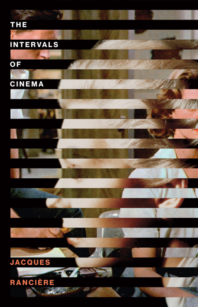
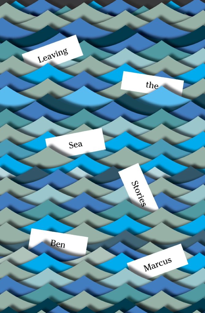
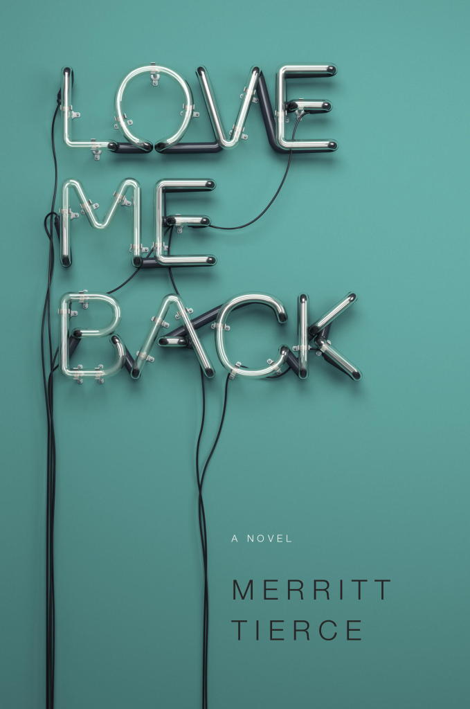
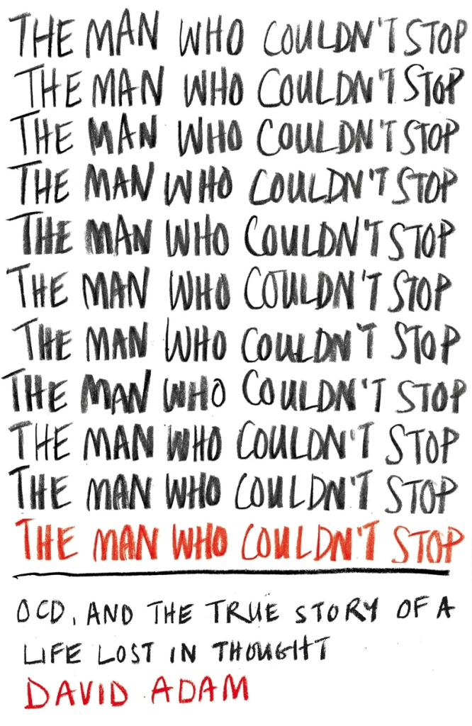
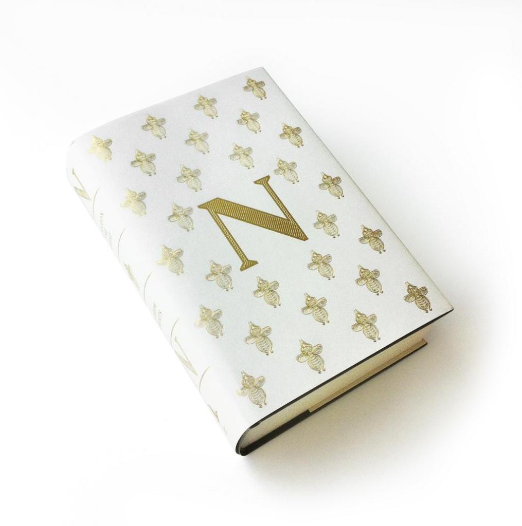
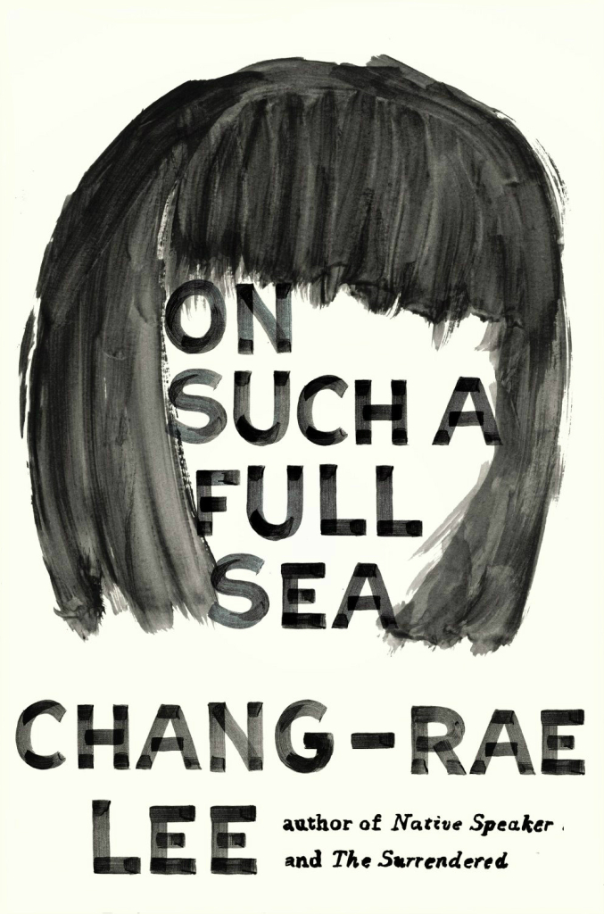
Here is March’s selection of new and noteworthy covers. It’s a little bit of the Merto and Mendelsund show I’ll admit, but I assure you there really are some brilliant covers by other designers this month too!
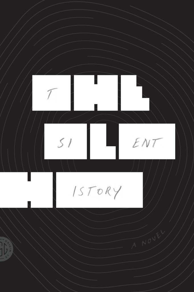
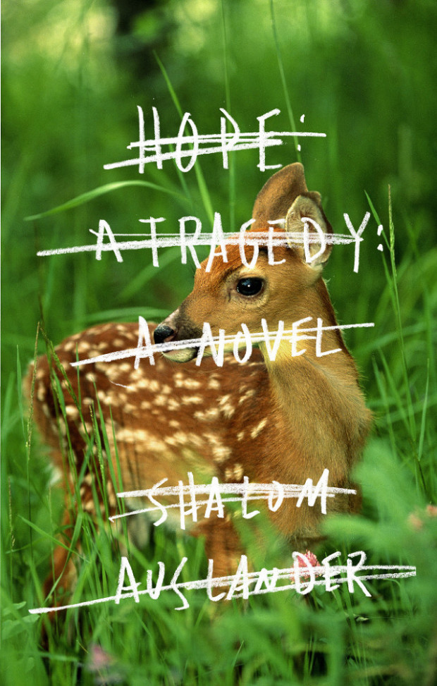
The version of this cover which caught my eye was actually wordless — and I believe that was the designer’s original intention — so I’m a wee bit disappointed that the publisher didn’t quite have the courage to follow through on that.
Book designers, you do amazing work. Thank you. I am especially grateful to all the designers and art directors (not to mention publicists and other publishing folk) who have shared their wisdom, provided me with images, and helped me with design credits this year — these posts would not be possible without you. I also want thank my fellow book design bloggers, notably Book Covrs, Booketing, and Caustic Cover Critic, for their sterling work, and my local bookstores, Type, Book City on the Danforth, Ben McNally Books, and Indigo Bay & Bloor, for letting me browse their shelves.
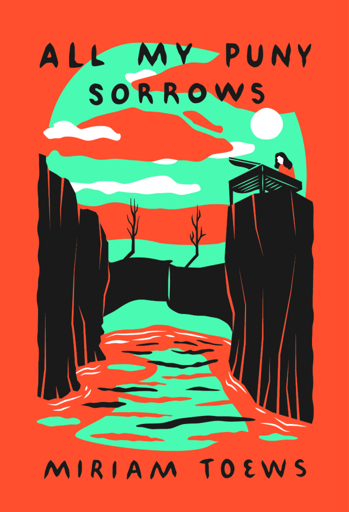
Here are my covers of 2014:
All My Puny Sorrows by Miriam Toews; design by Sunra Thompson (McSweeney’s / November 2014)
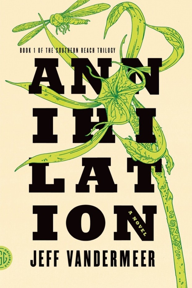
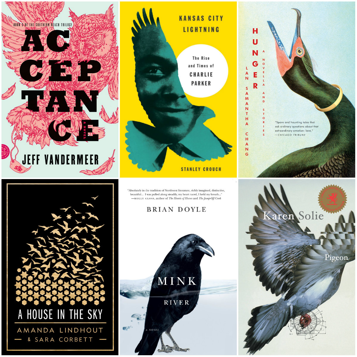
Acceptance by Jeff VanderMeer (US); design by Charlotte Strick; Illustration by Eric Nyquist (FSG / 2014)
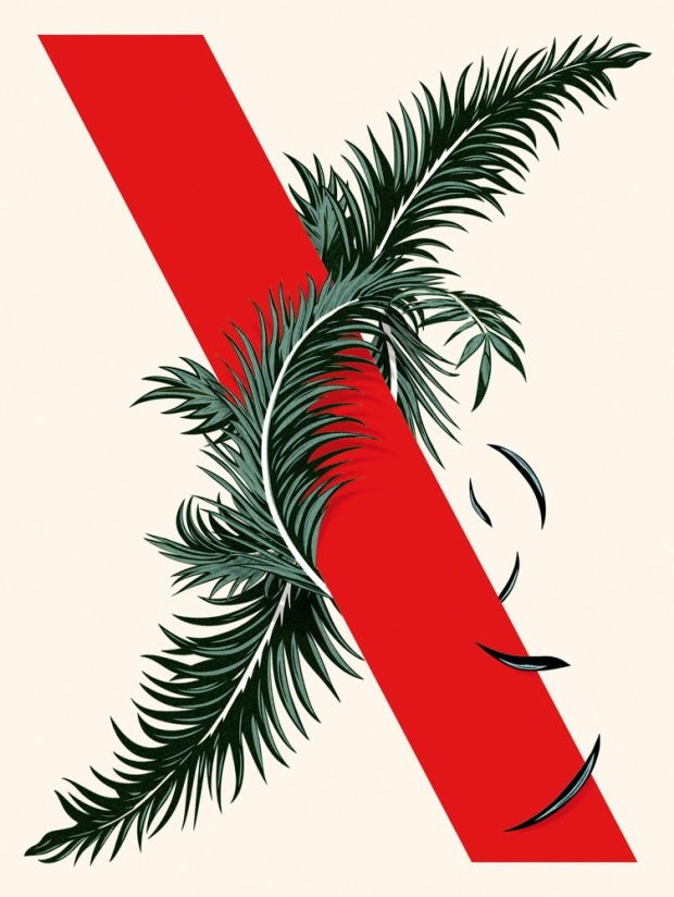
If you only bookmark one long(ish) thing to read today, make sure it’s the slightly bonkers conversation between Jeff VanderMeer, author of the Southern Reach Trilogy, and book designer Peter Mendelsund at Boing Boing:
JV: I very much like how you draw out in ‘What We See When We Read’ this idea of creation of character by the constraints around them. Which helps to create an outline of the character. It’s more or less how I thought of Control in ‘Authority’. Taking this even farther, I think that writers like Karen Joy Fowler do something even weirder where sometimes the absence of text or the cutting of text creates a ghost or resonance that allows the reader to fill in the space. Is there an equivalent effect in art/design? Perhaps it’s something you’ve played around with in your own work. An absence that denotes presence.
PM: “An absence that denotes presence” could be the definition of a good book cover. Good book covers are hard to make, I think, specifically because a designer is asked to deploy the facts of a narrative without showing anything explicit about the setting or characters. It’s a tricky balancing act. Everything is done by implication, proxy, metaphor or analogy.
So what is left off of a jacket is crucial. (I’ve often said that most of my day in the office is spent either suggesting things or hiding things.) I’m not an anti-intentionalist or anything, but I do believe that the reader deserves, to some extent, the right to co-create a fictional world alongside the author. So when you make the author’s world explicit on a cover, you’ve taken something from the reader.
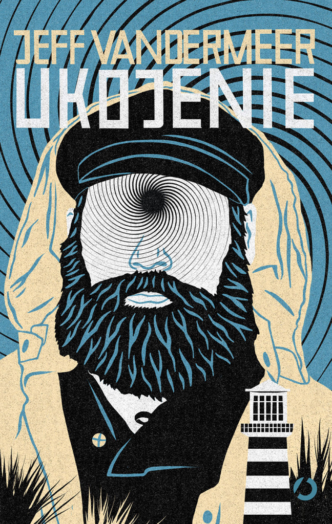
VanderMeer also talks to his editor Sean MacDonald about the process of writing the books at the FSG Work in Progress blog. The post includes an amazing cover for the Polish edition of Acceptance. If anyone can tell me who the designer/illustrator is, I would be much obliged…
I think there are two primary jobs that a jacket has to do: It has to represent a text and it has to sell it. In a way, a book jacket … is sort of like a title that an author comes up with. It’s one thing that has to speak to a big aggregate thing, which is the book itself. And it has to be compelling in some way such that you’re interested enough to pick it up — and perhaps buy it. … It’s like a billboard or an advertisement or a movie trailer or a teaser. …
I think of a book jacket as being sort of like a visual reminder of the book, but … it’s also a souvenir of the reading experience. Reading takes place in this nebulous kind of realm, and in a way, the jacket is part of the thing that you bring back from that experience. It’s the thing that you hold on to.
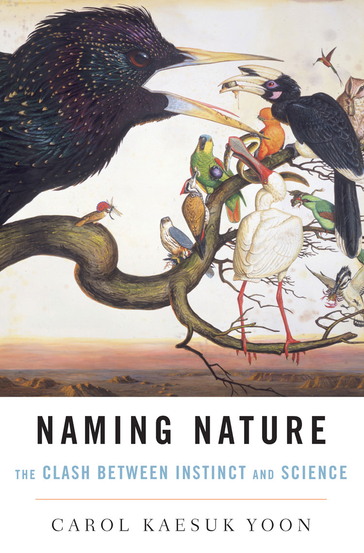
Naming Nature by Carol Kaesuk Yoon; design by Chin-Yee Lai (W. W. Norton / August 2009)
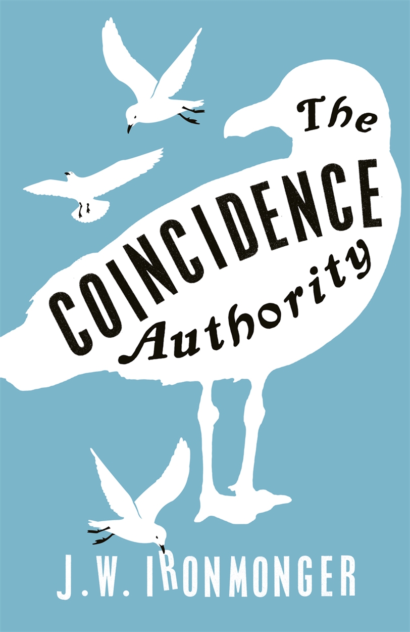
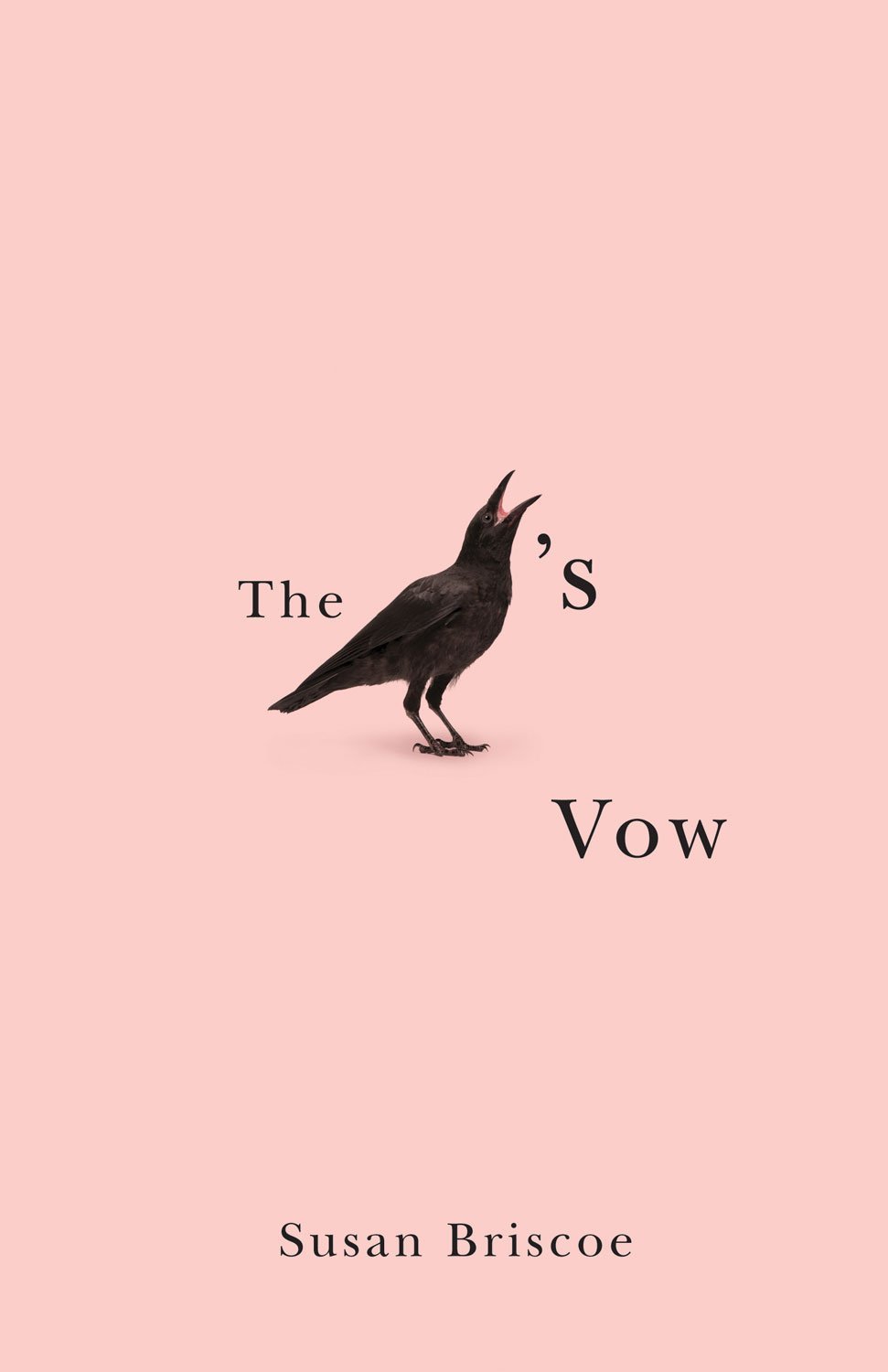
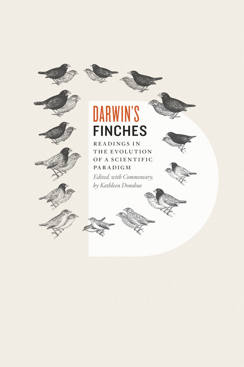
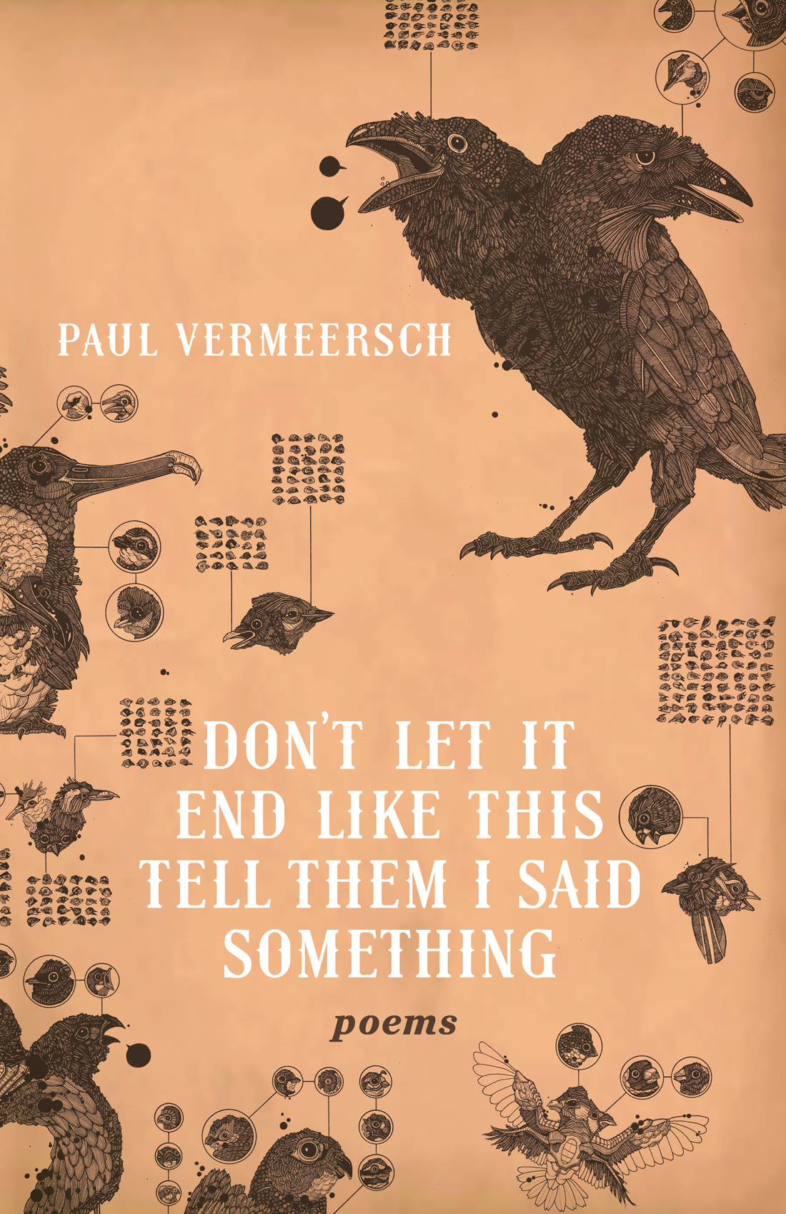
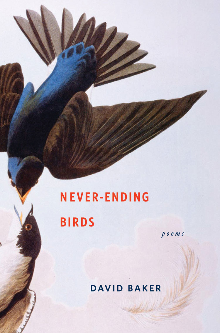
Never-Ending Birds by David Baker; design by Lynn Buckley; jacket illustration: Swallows by Audubon, The Granger Collection (W. W. Norton / October 2009)
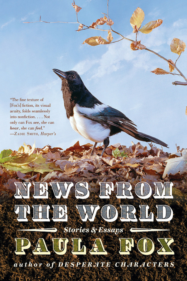
News from the World by Paula Fox; design by Roberto De Vicq de Cumptich (W. W. Norton / May 2011)
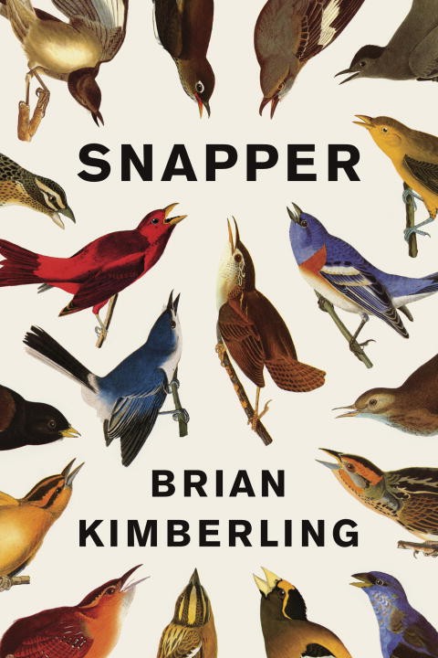
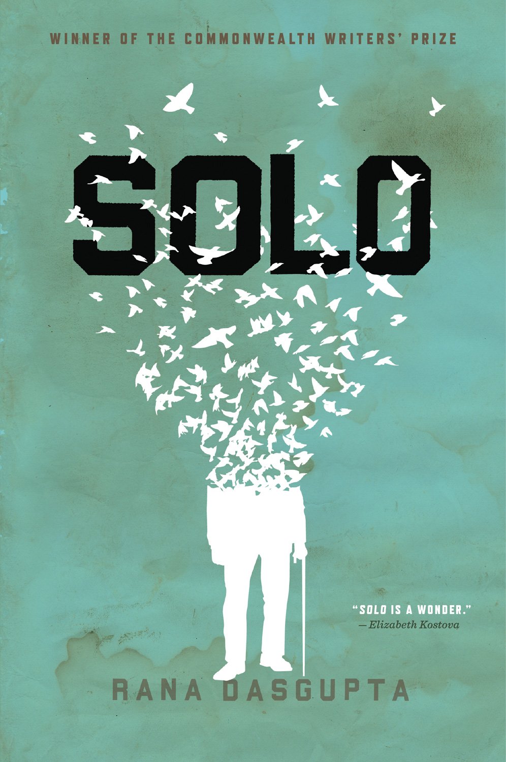
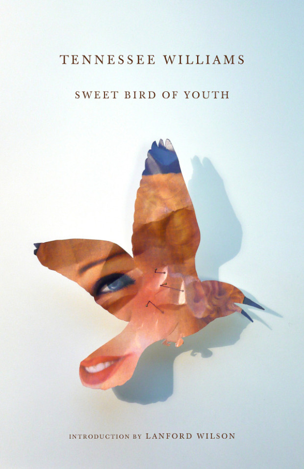
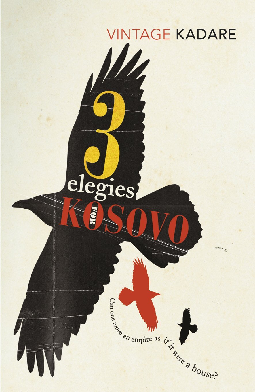
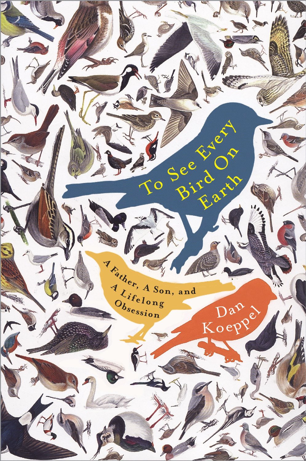
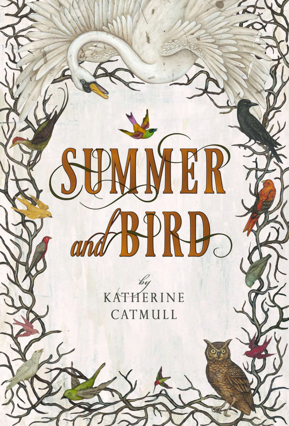
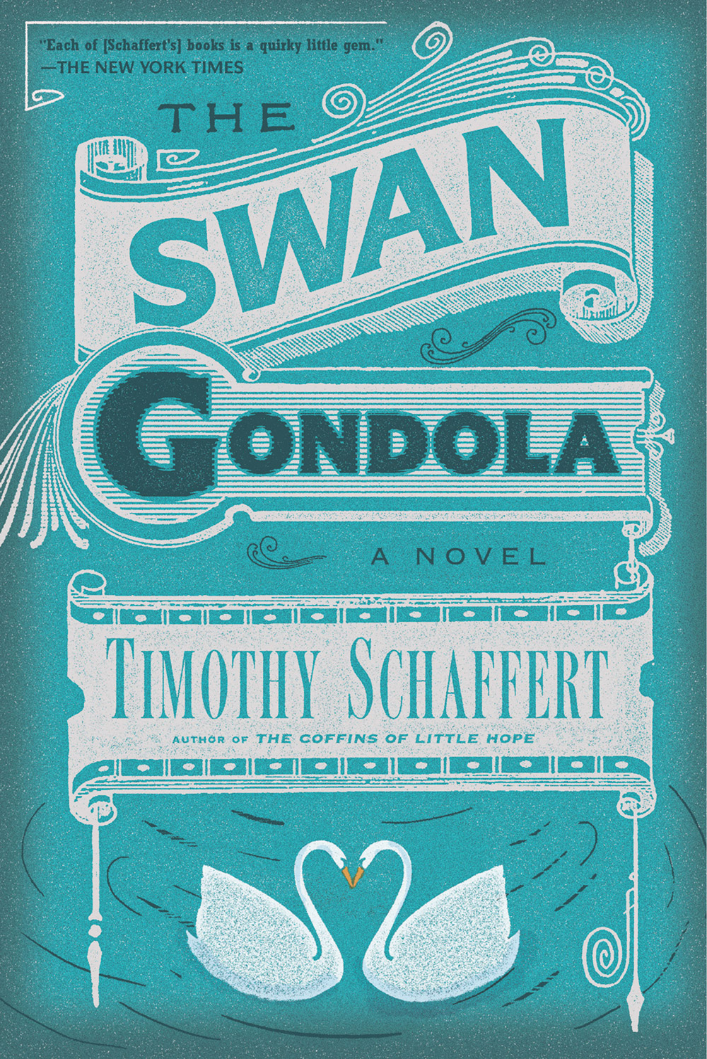
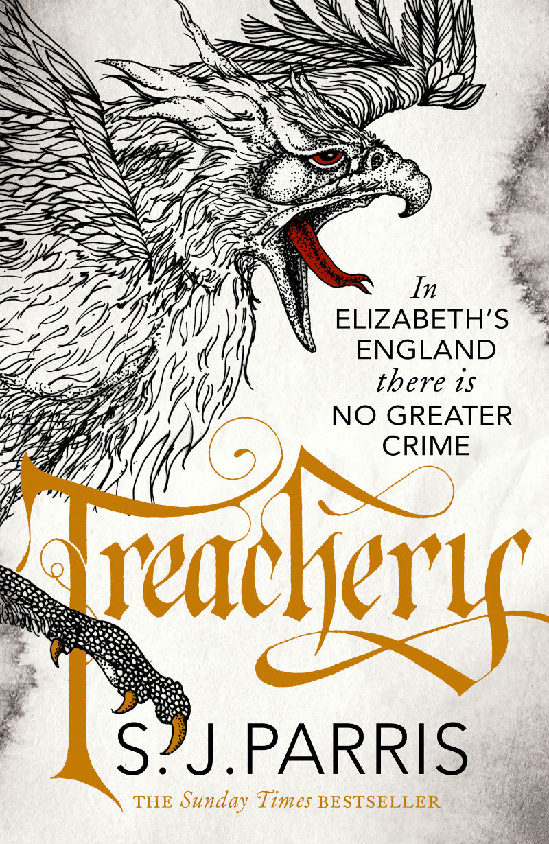
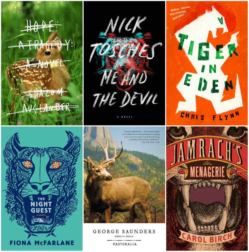
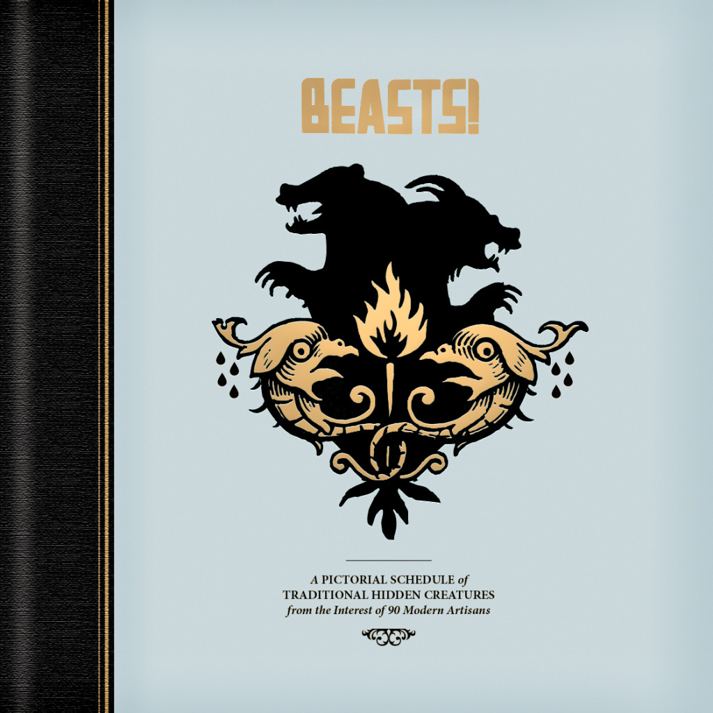
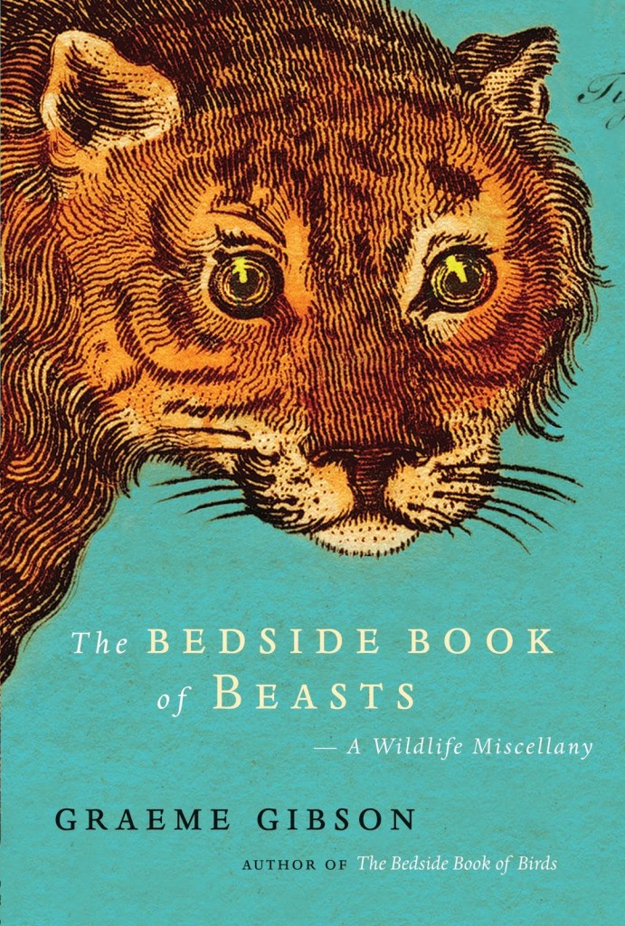
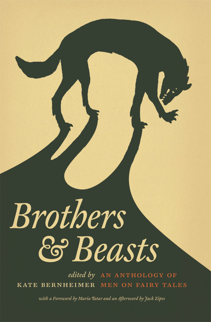
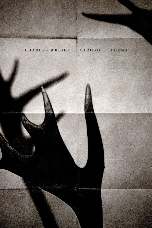
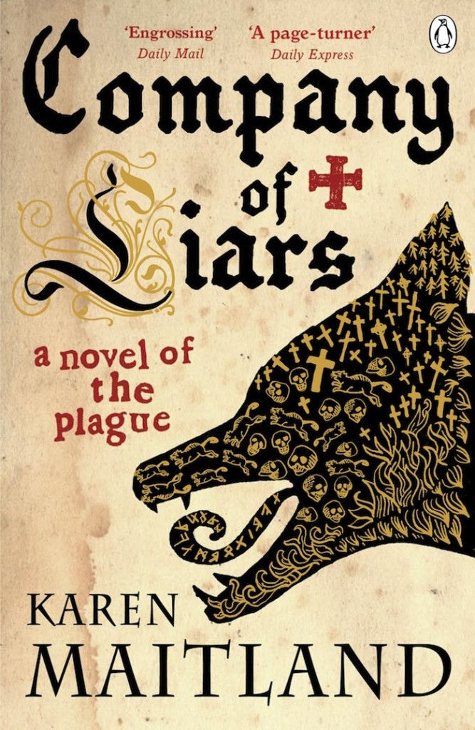
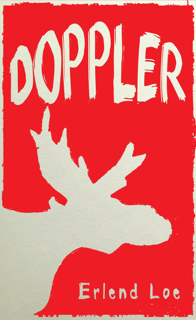
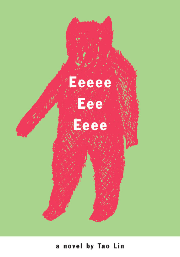
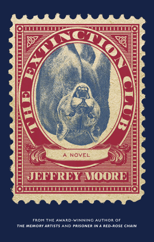
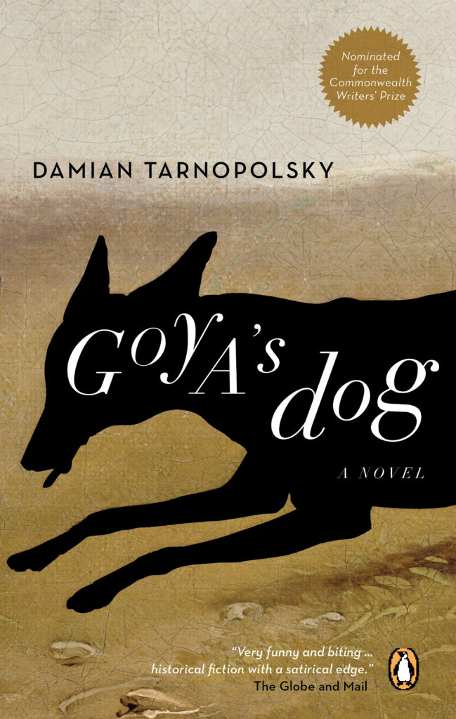
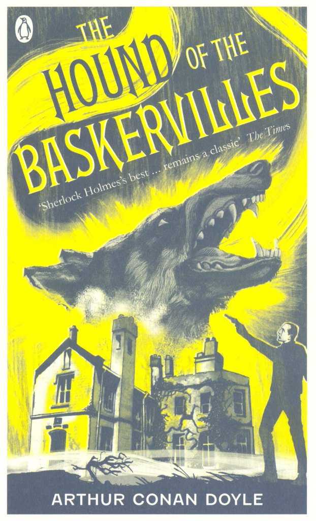
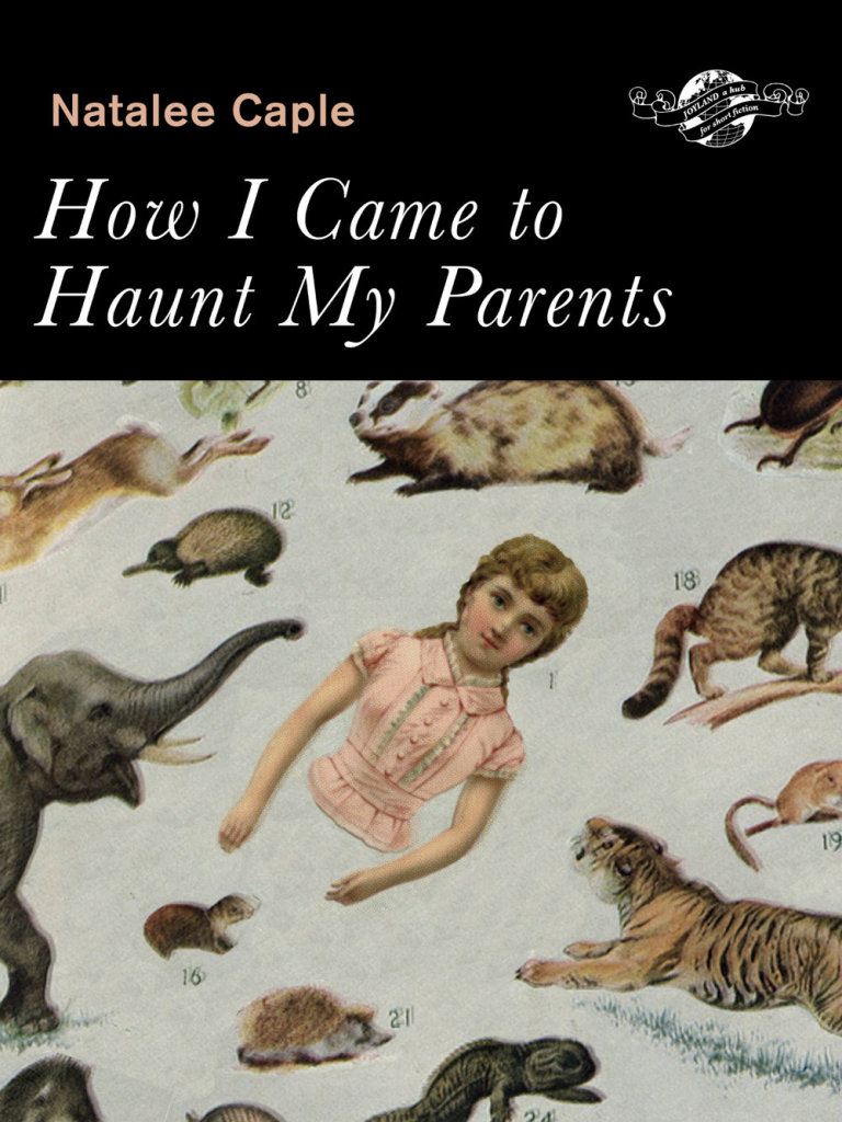
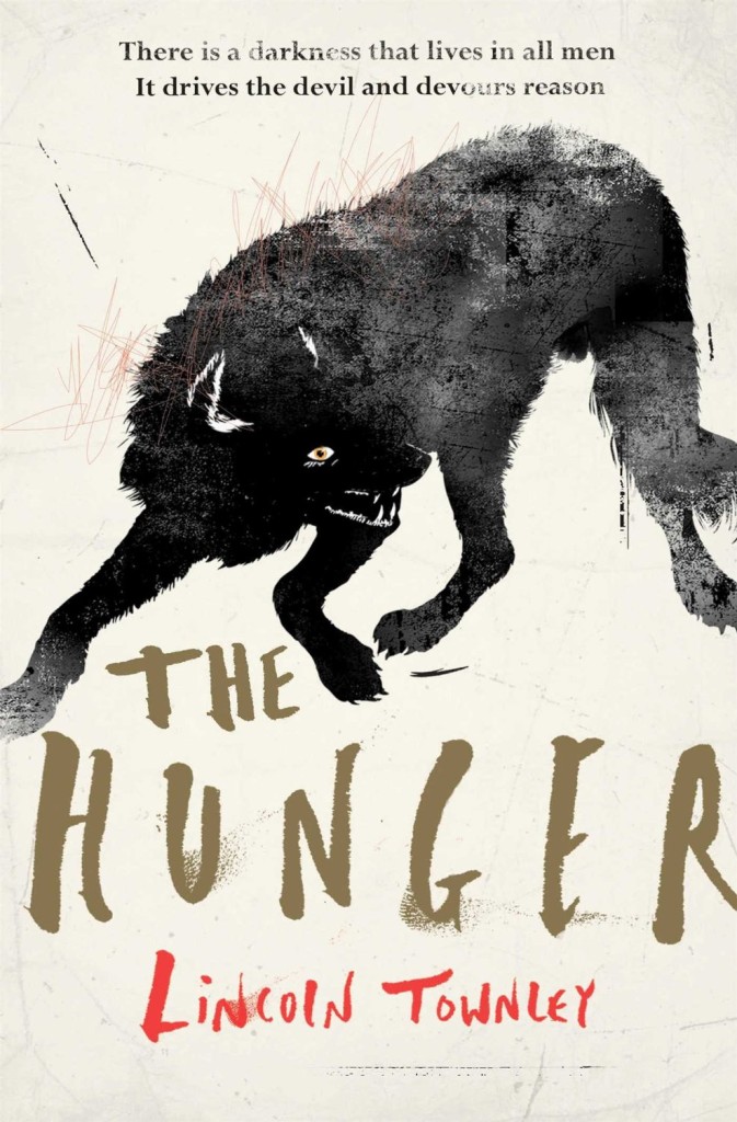
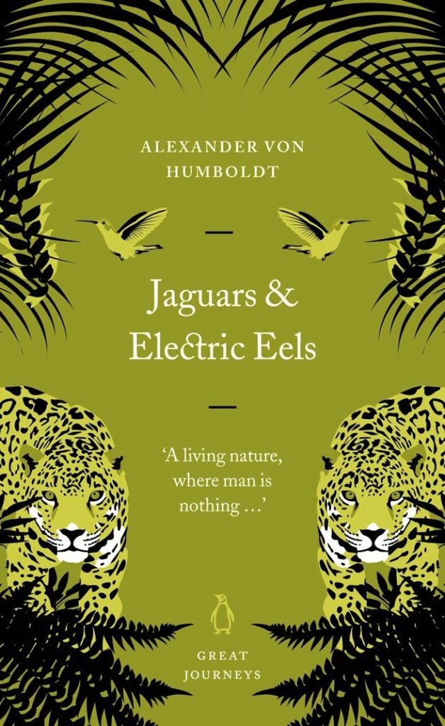
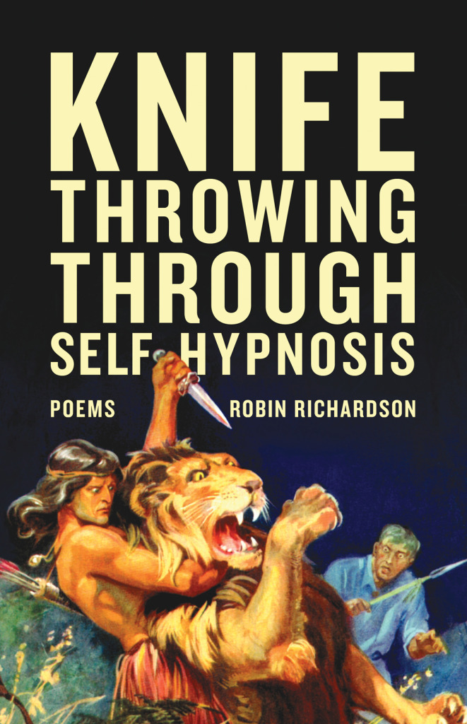
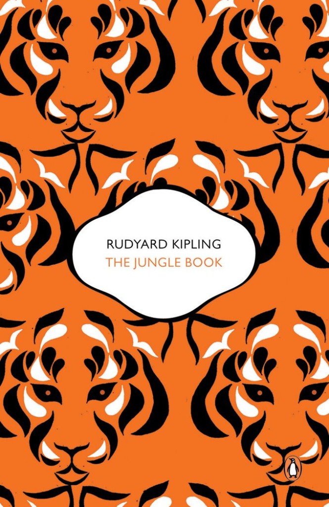
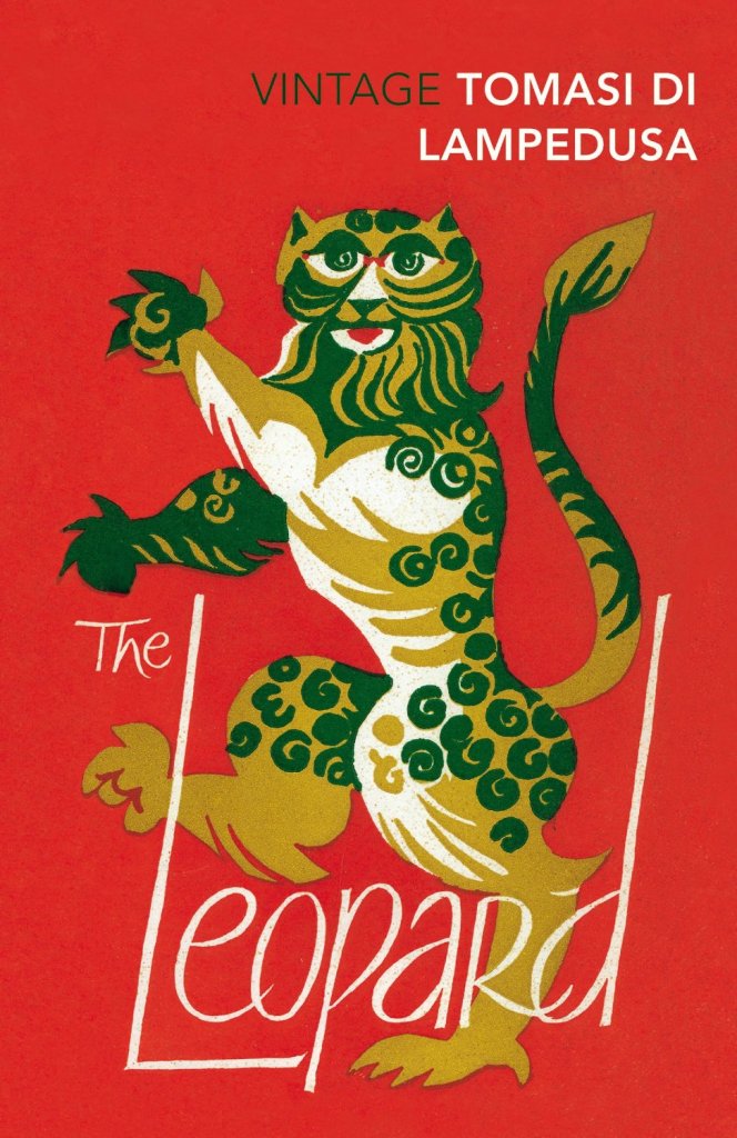
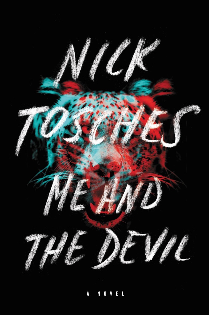
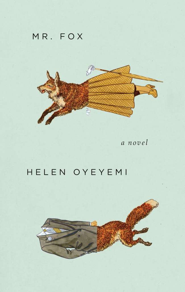
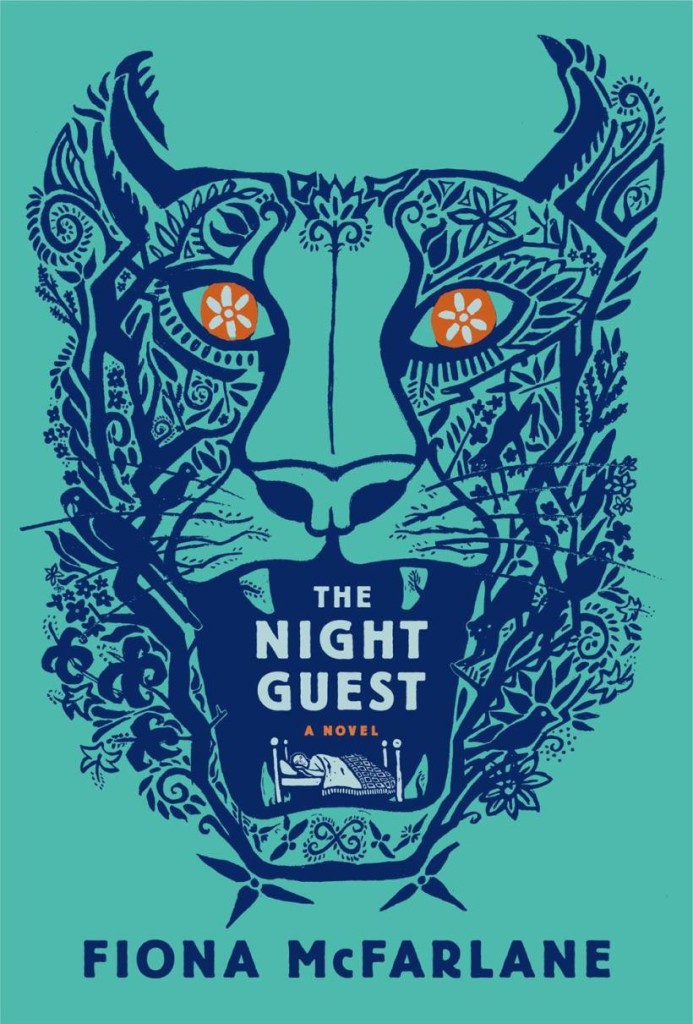
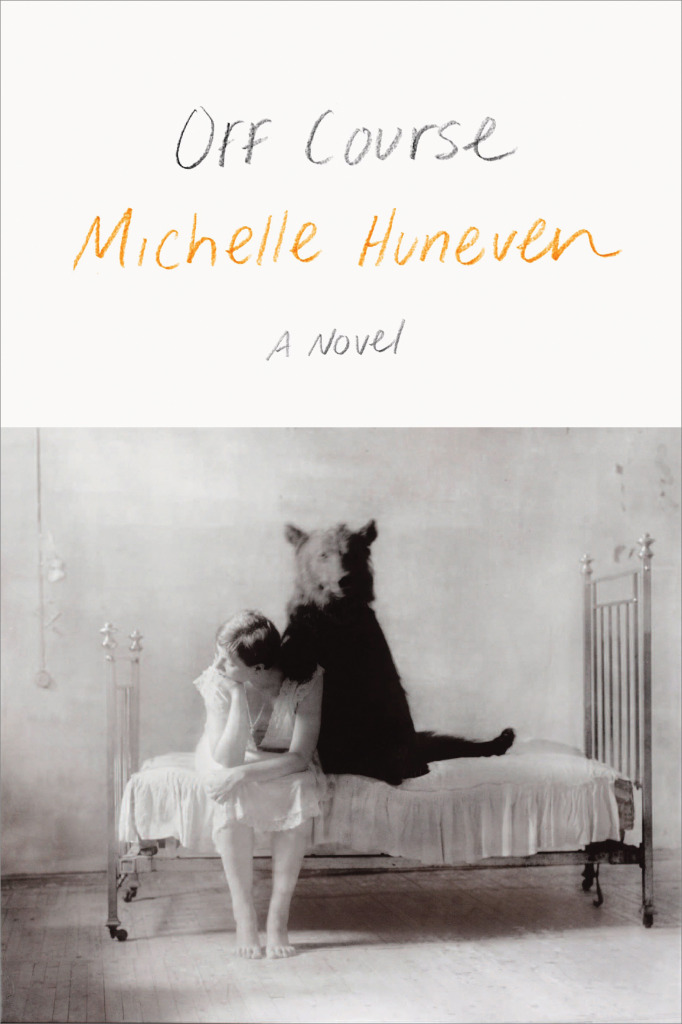
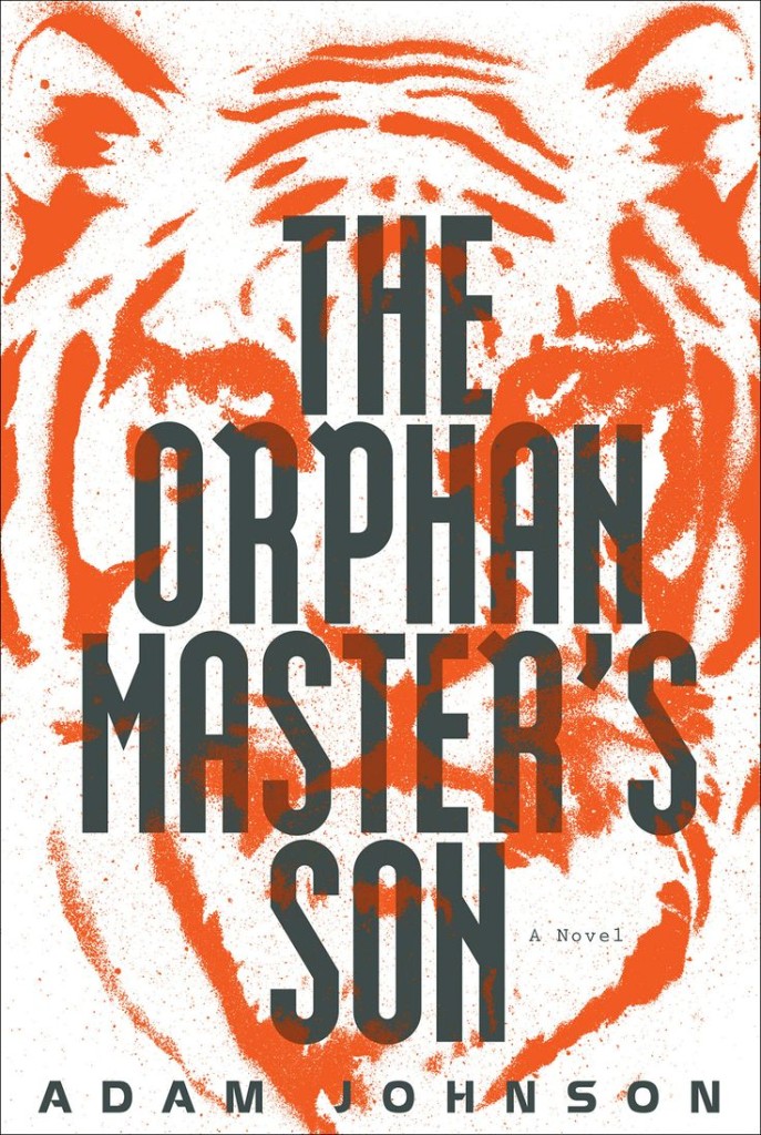
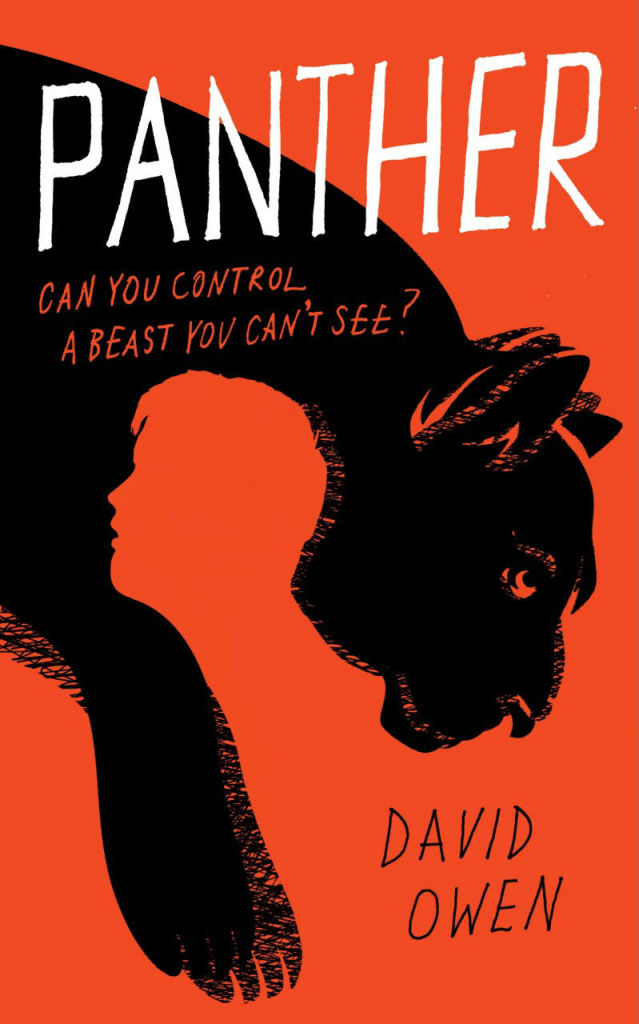
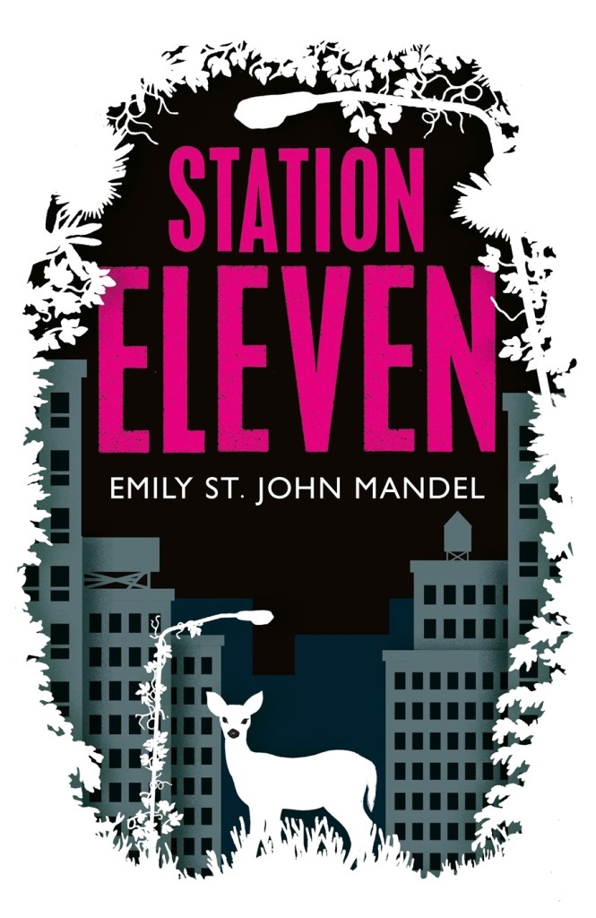
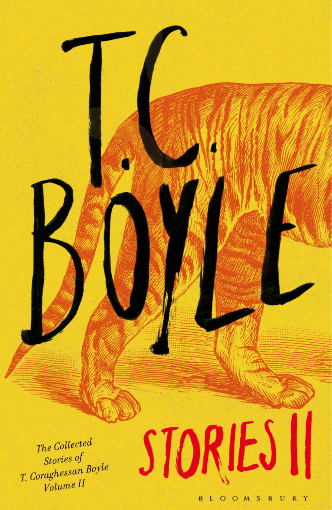
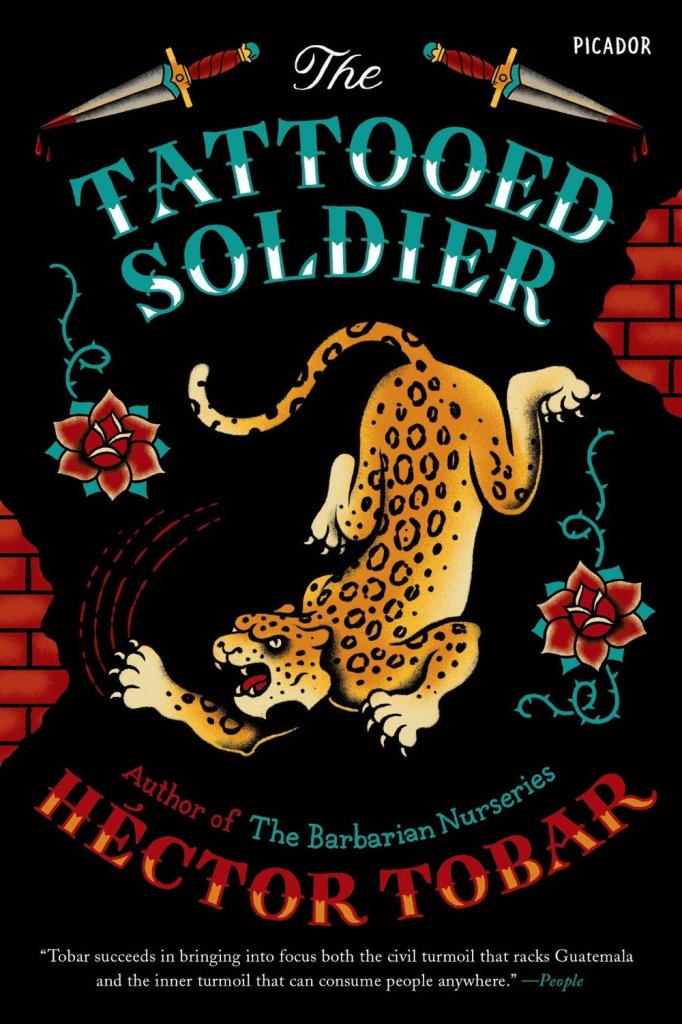
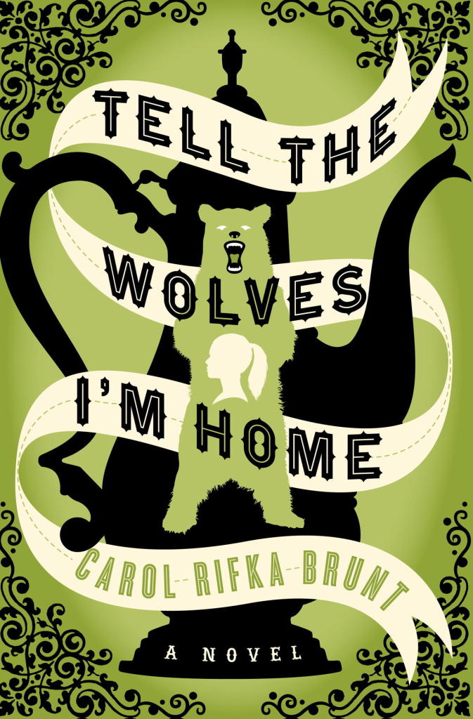
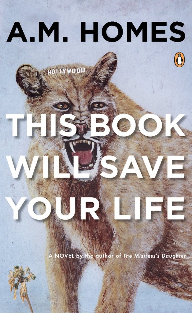
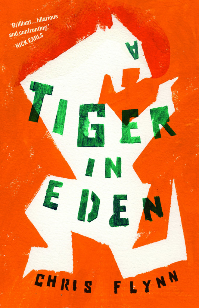
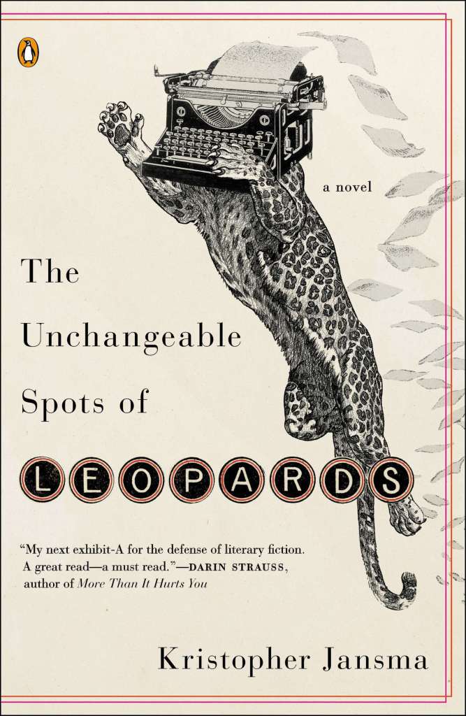
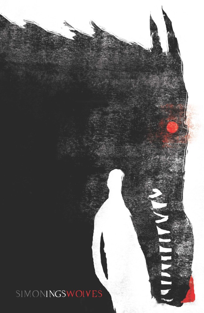
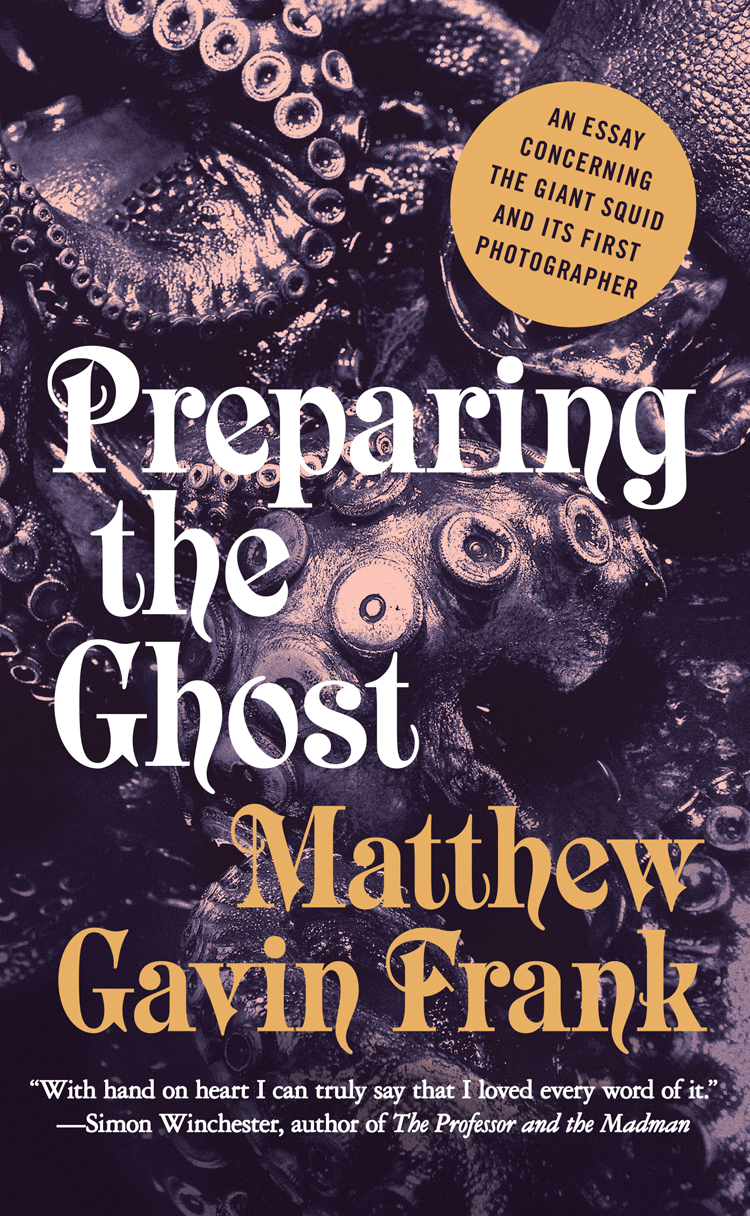
Lions and tigers and bears! Oh my! I’m kicking off a new series today on animal book covers. The first post is on ‘beasts’ — mostly ‘wild’ beasts, but one or two more domesticated (and dead) animals may have nosed their way in. Other posts series will look at birds, bugs, reptiles and amphibians, and quite possibly sea creatures and farm animals (unless someone pays me a large amount of money to stop before that). Thanks to all the designers, ADs, publicists and others who have been helping me with images and credits. If you notice that some information about a cover is missing, please let me know.
It used to be enough for a book to idly stand out in a bookstore. Nowadays, however, new books must jostle for attention with everything. Thousands of distractions are just a click away. Is it any wonder that book-cover design is more important than ever?
In today’s Globe and Mail, I talks about recent trends in book cover design and pick a few of my favourite covers from the year so far. If you live in Canada you can find a lovely-looking print version of the article in the Arts pages.
On the blog of designer and art director Henry Sene Yee there is a fake poll question: “Who is your favourite book cover designer?” Three of poll’s four possible answers are “Chip Kidd.” The fourth is “none of the above.” The joke is, of course, that Kidd is the only book cover designer most people can name (if they can name one at all).
After this week, however, Henry might have to add a second designer to his list — Chip Kidd’s colleague at Knopf, Peter Mendelsund.
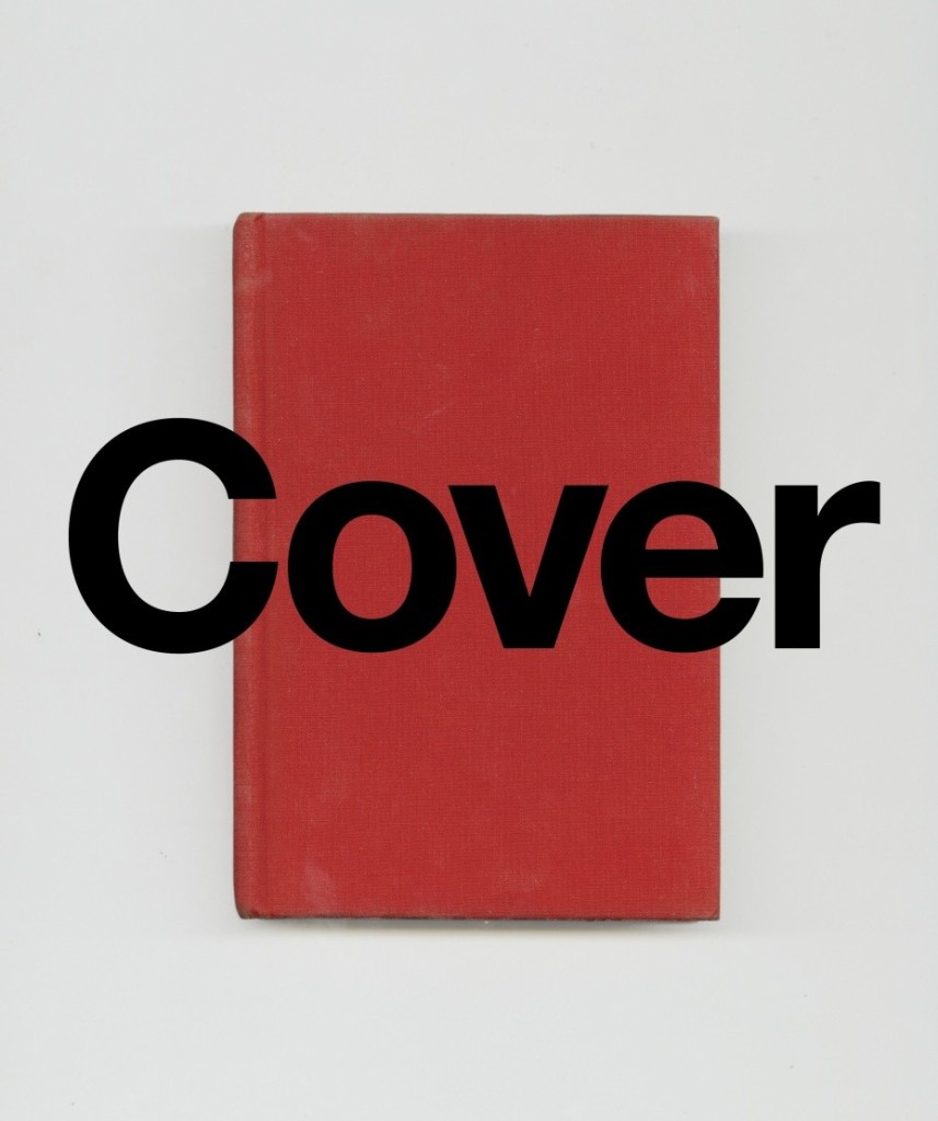
Already a well-known figure in book design circles, the publication of Peter’s two new books this week—Cover and What We See When Read—has apparently made everyone else sit up and take notice. Already interviewed by Alexandra Alter for the New York Times last week, Peter is suddenly everywhere.
At the New Republic, he discusses his work with Amy Weiss-Meyer:
I think the most import thing about being a cover designer is being a decent reader. If you haven’t read a book well, [and] you just throw an image on it, chances are you’re going to fail at representing it. On the other hand, if you do use imagery that’s broad enough, then you want something that’ll serve as a universal emblem to the book rather than one particular reading of it.
The truth is when you go to school to learn something, you’re on a dedicated trajectory. So that puts a certain kind of burden on you to succeed in that particular trajectory. One of the wonderful things about having sidestepped into design is that there was never any pressure for me to succeed. … It’s not something I spent money to learn how to do. So I still kind of feel like I’m dabbling, and I think what’s great about that is you can maintain a certain kind of beginner’s mind when you’re working, which obviously, I think, makes for better work. You’re just fresher because you don’t have the anxiety of influence. There’s nothing really at stake.
And at The New Yorker, Peter talks to his friend Peter Terzian about his work and the genesis of What We See When We Read:
Reading with a mind to designing a jacket is very different from just reading. When I’m reading for work, I’m looking for something described in the book that will be reproducible visually and that will serve as an emblem for the entire book—a character, or an object, or a scene, or a setting. That’s not the way one reads when one is simply immersed in a book.
Let’s say I’m reading something and I come across a scene that I think is particularly pregnant with significance and that could really work as that emblematic something to go on the jacket. It’s not like I picture it completely and then render it on the screen. I have the idea that this scene and its structural components could work well as a jacket, and then I start making things. And when something is made, I compare it back to the reading experience and ask, Is this dissonant with the way I’m reading this, or consonant with it? Does it in fact represent the author’s project? But it’s not like I’m rendering something that I saw. When I start to make it, that’s when I start to look at it for the first time—that’s when it develops visual coherence. That moment is very satisfying, professionally, but also disappointing as a reader.
Dwight Garner reviewed What We See When We Read for the New York Times. While at the Washington Post, visual editor David Griffin reviews both Peter’s new books (one less favourably than the other).
And if that weren’t enough, Pablo Delcán and Brian Rea have also made this trailer, apparently the first in a series, for What We See When We Read:
And this is surely just the beginning. Congratulations Peter, it’s well-deserved.
Mr. Mendelsund has long been regarded as one of the top book designers at work today, taking his place alongside design luminaries like Chip Kidd, Alvin Lustig and George Salter. Now, he’s making his debut as a writer, with two books coming out next week. Both explore the peculiar challenges of transforming words into images, and blend illustrations with philosophy, literary criticism and design theory.
In “What We See When We Read,” which is being published by Vintage Books next Tuesday, Mr. Mendelsund tackles the mysterious way text yields vivid mental pictures, even when the author supplies very little visual detail. Most readers, for instance, feel as if they can perfectly describe Anna Karenina, even though Tolstoy gives us little more than gray eyes, thick lashes and curly brown hair. In short, illustrated chapters, Mr. Mendelsund argues that reading is an act of co-creation, and that our impressions of characters and places owe as much to our own memory and experience as to the descriptive powers of authors.
On the same day, PowerHouse Books is releasing “Cover,” a 267-page coffee-table book with more than 300 of Mr. Mendelsund’s most arresting book jackets, and dozens of rejected drafts. The images are interspersed with notes on his process, along with essays by authors of some of the featured books, including the best-selling Norwegian crime writer Jo Nesbo and James Gleick, author of the nonfiction books “Chaos” and “The Information.”
If you are New York next week, there is a launch party for both books on August 5th, 7:00-9:00 pm at the PowerHouse Arena, 37 Main St, Brooklyn. Peter will be in conversation with Will Schwalbe, author of The End of Your Life Book Club, followed by a brief Q & A.