Skip to content

Tag: Penguin Classics

Work in Progress with Coralie Bickford-Smith

It’s been a while since I posted about author, illustrator and designer Coralie Bickford-Smith. In a new video for Penguin Books she talks about her creative process, her work on the original Clothbound Classics, and Penguin’s new Little Clothbound editions.

Comments closed

David Pearson’s Penguin Camus

David Pearson has designed three new covers for the Penguin editions of Albert Camus’ novels The Plague, The Outsider, and The Fall. The typeface is apparently Portrait, designed by Berton Hasebe for Commercial Type, and the covers are printed on Colorplan Dapple embossed paper from G. F. Smith. The new editions were published July 30, 2020.

Comments closed

Paul Buckley Cover to Cover

Penguin Classics Cover to Cover

At Observer, Penguin creative director Paul Buckley, talks about his new book Classic Penguin: Cover to Cover. I particularly enjoyed this epic rant on designing covers for new books:

New books, this piece of writing, everything is riding on that new cover. Is the mood right? Does the imagery hint at what is going on in the text? Did you tell too much? Did you tell too little? Yes, it takes place in the winter, but we want it as a summer read, so try to avoid seasons; she would never dress like that, or maybe she would, but it makes an off-putting cover; I know everyone in the book dies – but that image is so depressing no one will buy it; is the author’s name prominent enough? The type has to be much, much larger. We understand the word has sixteen letters, make it larger. No, it can’t go sideways, people can’t read sideways. I know spines read sideways, that’s not the same. No, no it’s not, and no, this word cannot be broken. We realize the title is part of the problem, we know it’s confusing, we can’t change it. Ok, the type is too condensed; it’s ok if it goes smaller if we can get a nicer font. Have you tried it sideways? The author hates it sideways and is suggesting you try championing condensed 87, do you have that font? I don’t know who designed this, I think it was one of his students, he asked that we show it to “the art dept;” I know, I know, now I can at least say I did. It’s approved! Sales didn’t like the cover, we have to change it. Was it just one person? Bob, how many in sales disliked the cover? Oh, it was just Jim, he’s always out in left field, never mind, glad I asked. Or, yes it was just Sally, BUT she looooves this book. I know you did too, we all do, we still need a new cover by next Tuesday’s deadline. Huge chain “X” wont commit to this book with this cover, I know we all loved it maybe you can save it for something else, here are some suggestions from the buyer, at least they are trying to be helpful.

You can read my 2009 Q & A with Paul here, and my 2010 interview with Paul and Christopher Brand about their book Penguin 75 here.

1 Comment

New Penguin Essentials

Embers design Gray318

The latest additions to Penguin’s ‘Essentials’ series, released this month, have some rather splendid new covers, including Jon Gray‘s wonderful design for Embers by Sandor Márai, Julian House’s typographic design (with echoes of Robert Brownjohn) for The Spy Who Came in from the Cold, and David Foldvari‘s illustrated design for How Many Miles to Babylon by Jennifer Johnston.


You can see more of the new Penguin Essentials covers, and read about the design process, at Design Week.

Comments closed

Elda Rotor: The Woman Who Runs Penguin Classics

penguin classics elda rotor
Photo by JL Javier

CNN Philippines interviews Elda Rotor, vice president and publisher of Penguin Classics at the Penguin Random House in New York:

The main joy is bringing an audience to a work that would otherwise lead a quiet life, not having the chance to be brought into the light of a modern readership. A greater joy is hearing individual responses of how enlightening or enjoyable a book has been, and connecting that experience with the fact that the edition was a Penguin Classic. The challenges are working very hard to edit, produce, and publish a book and to see its reception to be very modest. So either you realize that the readership was small, or that for some reason we failed to reach a wider audience for a variety of factors… In the 10 years I’ve worked at Penguin Classics, it’s proven to be true that there is nothing that compares to a quality edition of a great work of literature. We are very much in the digital world, providing e-books for much of our list. But there’s something about the physical beauty of a book, finely executed inside and out, that readers find deeply satisfying. We bring much work and thought into the production of our books, from authoritative texts, interior design, to cutting-edge book design, and we have built a strong reputation for this distinction. Developing series such as the Penguin Drop Caps, Penguin Horror, Civic Classics, and soon the Penguin Orange Collection and Penguin Galaxy represents our dedication to our readers and curating special series for their interests that are beautiful objects unto themselves. Overall it reflects the deep respect we have for the reader’s experience and our focus on enriching that experience with a Penguin Classic.

Comments closed

Simenon’s Island of Bad Dreams

mahe circle

At the NYRB Blog, John Banville reviews Georges Simenon’s novel The Mahé Circle, translated into English for the first time and now available from Penguin Classics:

Simenon was a driven creature, who in his lifetime wrote more than four hundred books, drank and womanized incessantly, and, in his younger days, roamed the world in frantic search of he knew not what. His mother despised him; his long-suffering wife wrote a roman à clef in which she portrayed him as a rampaging egotist—“His voice rang through the house from morning to night, and when he was out it was as though the silence was awaiting his return.” Most calamitous of all, his daughter Marie-Jo, who adored and idolized him—as a child she asked him one day to buy her a gold wedding ring—killed herself at the age of twenty-five. He was, all his life, a spirit in flight from others and from himself, and he is present, often lightly disguised, in every one of his books.

Penguin are reissuing Simenon at an astonishing clip. Along side his ‘romans durs’ like The Mahé Circle, they are publishing new translations of all 75 Maigret novels with covers featuring specially commissioned photographs by Magnum photographer Harry Gruyaert:

shadow-puppet

Earlier this year, Scott Bradfield also wrote about the Belgian author for the New York Times:

In many ways, the Maigrets were a sort of comfort food — the books that Simenon wrote to recover from the physical and psychological stress of writing his better, and far less comforting, novels. In these non-Maigret “thrillers,” often referred to as the romans durs (but to most aficionados known simply as the “Simenons”), the central, usually male character is lured from the stultifying cocoon of himself — and his suburban, oppressively Francophile (and often mother-dominated) life — into a wider, vertiginous world of sexual and philosophical peril, where violence, whether it occurs or only threatens to occur, feels like too much freedom coming at a guy far more quickly than he can handle.

Comments closed

You’ll Never Get Anywhere Like That

Or a Few Thoughts on the Cover Design of The Bell Jar (An Illustrated Essay of Sorts)

In his recent essay ‘Graphic Design Criticism as a Spectator Sport’ designer Michael Bierut (author of 79 Short Essays on Design) suggested that “at a time where more people than ever are engaged with design,” design criticism has been reduced to a “seemingly endless series of drive-by shootings punctuated by the occasional lynch mob, conducted by anonymous people with the depth of barroom philosophers and the attention span of fruit flies.”

Unsurprisingly, I thought of Mr. Bierut during the recent furore about the cover design of The Bell Jar.

When Faber and Faber published a 50th anniversary edition of Sylvia Plath’s novel last month with a brightly coloured new cover, they can hardly have expected a controversy. But the design, which features a photograph of a woman holding a compact and touching up her make-up, was, it turned out, nothing less than “a ‘fuck you’ to women everywhere.” It was so truly hideous, that if “Sylvia Plath hadn’t already killed herself, she probably would’ve” when she first saw it. It was “THE BELL JAR as chick lit” — “1990s chick lit“!

It wasn’t much better when the designers weighed in. If the diplomatic Jamie Keenan thought Faber hadn’t “got it quite right,” Barbara DeWilde was less equivocal: “it’s a travesty… I’m still almost speechless that it was published in this form.”

We are, of course, morbidly fascinated by Plath, who died tragically young — there are at least 3 new books about her life being published this year alone. That The Bell Jar is both semi-autobiographical and her only novel makes our opinions about it even more intense.

But just how much of the criticism was actually fair?

On the face of it, the image isn’t entirely inappropriate. Mirrors (and photographs) are a recurrent motif in the book (one of its working titles was The Girl in the Mirror). The novel even begins with Esther working for a fashion magazine in New York. She talks about her looks, her clothes and her make-up. She carries a compact in her bag. Esther is fixated with appearances even as she struggles against being defined by hers.

Nor is the new design some kind of “chick lit makeover” — that just seemed like a convenient, if inaccurate, headline. While defining what qualifies a ‘chick lit’ is notoriously difficult, the cover has none of whimsy usually associated with the genre. Furthermore the new design wasn’t a sudden attempt to make the book look more feminine. The beautiful Faber Firsts cover from 2009 designed by Mark Swan also uses a glamorous retro image (albeit a disturbingly cropped one).

In fact, the new cover, also designed by Swan, is much more jarring than the Faber Firsts’ almost romantic image. There’s an angular sickliness to it — an awkward, unpleasant toxicity. The bright colours are unnaturally heightened, the pose mannered, the jerky lettering like “loops of string lying on the paper” blown askew.

As Faber themselves would later would confirm, it was meant to unsettle. The intent “was that the image of the expressionless woman ‘putting on her mask’ and the discordant colour palette would suggest ambivalence and unease.”

Certainly the new cover, is harder to like. It is indisputably ugly, especially compared to Swan’s earlier design or the original Faber cover from 1967 (pictured above) designed by Shirley Tucker (if not more so than this Warholian shocker from 1998). But tasteful covers rarely stand out on the shelves and from a marketing perspective there isn’t anything necessarily wrong with something being dissonant. It can be startling effective as Peter Mendelsund’s covers for Simone de Beauvoir demonstrate. Disruptive designs can also provoke interest in new readers and there is even some anecdotal evidence this is precisely what has happened with The Bell Jar — it is, apparently, “doing the business.”

Still, the design of The Bell Jar fails, at least as an accurate representation of the book. The mirror’s reflection does nothing to imply the introspection or detachment of the novel — only a coquettish vanity and narcissism. The woman in the photograph is just too put-together, too worldly. The mannered glamour is reminiscent of the stifling fashion photography of the 1950’s. This isn’t a 19 year-old’s face, “bruised and puffy and all the wrong colours.” There is no ennui or anxiety on display. No hint of poverty or isolation. Nothing of the suicidal depression aor a person coming apart. There is none of the disappointment. It is just an icily cool model posing for a photograph — an image Esther herself denies:

The magazine photograph showed a girl in a strapless evening dress of fuzzy white stuff, grinning fit to split, with a whole lot of boys bending in around her. The girl was holding a glass full of a transparent drink and seemed to have her eyes fixed over my left shoulder on something that stood behind me, a little to my left. A faint breath fanned the back of my neck. I wheeled around.

The night nurse had come in, unnoticed, on her soft rubber soles.

“No kidding,” she said, “is that really you?”

“No, it’s not me. Joan’s quite mistaken. It’s somebody else.”

To make matters worse for Faber, they also revealed the new cover shortly after Penguin Classics reissued new editions of George Orwell with cover designs by David Pearson. The contrast is unfavourably stark. Where Pearson deftly combines wit and originality with respect for material (not to mention Penguin’s design heritage), the stock photography, anachronistic type and bright colours of The Bell Jar seem crass and gaudy.

Comparisons with similarly stylish new editions of Kafka and Joyce designed Peter Mendelsund, Truman Capote designed by Megan Wilson, and Ralph Ellison designed by Cardon Webb, are unequally unflattering. It’s not hard to see that Plath, like so many other women writers, has been decidedly short-changed.

As Fatema Ahmed, noted in her post ‘Silly Covers for Lady Novelists‘ for the London Review Books blog, “the anniversary edition fits into the depressing trend for treating fiction by women as a genre, which no man could be expected to read and which women will only know is meant for them if they can see a woman on the cover.”

In recent years, contemporary writers as diverse as Francine Prose, Jodi Picoult, Jennifer Weiner, Meg Wolitzer, Fay Weldon, and Lionel Shriver have all noted how fiction by women is marginalized. No matter that women buy the most books, women writers are less well-reviewed, win fewer literary awards, and all too often the covers of their books don’t accurately reflect nature of the work itself.

If books by Jonathan Franzen, Chad Harbach and Ben Marcus are designed to look different and stand out on the shelves, contemporary literary fiction written by women tends to look the same regardless of the book’s subject matter. All too often there is a photograph of woman on the cover — pretty, domesticated, inoffensive and wistful. The assumption is that women only want to read certain kinds of stories, and that men don’t want to read books by women at all. In discussing the treatment of her own work, Shriver dryly pointed out, “publishing’s notion of ‘what women want’ is dated and condescending.”

This isn’t always true, of course. Hilary Mantel’s Thomas Cromwell novels defy all expectations. See Now Then, Jamaica Kincaid’s first novel in 10 years, has a type-only cover. The Casual Vacancy by J. K. Rowling is notable for its hand-drawn lettering and calculated, corporate blandness. Both the American and the British editions of Zadie Smith’s NW — designed by Darren Haggar/Tal Goretsky and Gray318 respectively — are stunning. Alison Forner’s sinister canned cranberries for May We Be Forgiven by A. M. Homes is a neat inversion of domesticated happiness. The Penguin Modern Classics reissues of Carson McCullers designed by Jim Stoddart — with images selected by Penguin Press picture editor Samantha Johnson — also demonstrate that 20th century classics by women do not have to suffer from poor design or gender stereotypes.

There are surely other isolated examples too. But one can’t help thinking they are exceptions that prove the rule, and it is a particularly bitter irony that Plath’s novel about a young woman struggling with society’s expectations of her should, 50 years later, expose that woman writers are still stereotyped and treated poorly in comparison to their male counterparts. My sense is, however, that this latest controversy is a sign that the tide is turning. Women, both writers and readers, are being more outspoken about what is wrong with the way their books are handled by publishers and the media. They expect more and they expect better. This is the upside of design as a spectator sport. White middle-aged men are no longer the only voices being heard. Thankfully.


I was recently asked for my opinion on the new cover of The Bell Jar for an article in the Chicago Tribune. This an edited and expanded version of my comments to journalist Nara Schoenberg for that article. Thanks to everyone who gave feedback on an earlier draft of these remarks.


9 Comments

The Penguin English Library

Award-winning director Woof Wan-Bau has created a wonderfully weird animated short for the launch of the  Penguin English Library:

(via Ace Jet 170)

1 Comment

Penguin Threads Deluxe Classics | Jillian Tamaki

Award-winning Canadian illustrator and cartoonist Jillian Tamaki (Gilded Lilies, Skim and Indoor Voice*) has embroidered (embroidered!) three beautiful cover designs for a new classics series Penguin Threads to be released this Fall. They are all breathtaking.

There are more details and images of the designs on Jillian’s blog.

*Disclosure: Indoor Voice is published by Drawn & Quarterly and distributed by my employer Raincoast Books.

1 Comment

Something for the Weekend

Punching Through the Din — designer Jim Northover on the exhibition of Saul Bass movie posters at Kemistry in London.

This is the End — Sarah Weinman on chronicling the end of the chain bookstore era:

But maybe what really happened was as simple as this: chain bookstores were never supposed to last as long as they did, and have reached their natural end point after twenty years. Publishing in general has enough struggle with scale, either being too small and prone to great risk and failure, or too big and beholden to larger entities who want greater and greater annual profits. Whatever possessed us to think bookstores could operate this way? Why is the art of bookselling supposed to be conflagrated with abundance, with excess and with millions of square feet?

And on a somewhat related note…

The Cost of Keeping Authors Alive –Boyd Tonkin for The Independent (via MobyLives):

Dirt-cheap e-books benefit the very rich – and the very dead. They might also help new authors to find a foothold and win an audience – although, on that logic, newcomers should think about showcasing their work for nothing. Many do. But the almost-free digital novel hammers another nail into the coffin of a long-term literary career. Who cares? Readers should, if they cherish full-time authors who craft not safe genre pieces but distinctive book after distinctive book that build into a unique body of work.

(see also: Margaret Atwood at TOC)

Kick Ass Annie — An interview with Anne Koyama, the founder and operator of Toronto-based Koyama Press, at Design Feaster:

I look at all kinds of artwork, films, architecture, photography and typography. I subscribe to a lot of art/artist’s blogs. I like to walk around cities and try to really see the details of things around me (which is more difficult than you may think for someone possessed of a short attention span). I carry a little point-and-shoot camera often. Of course, all of the artists I work with inspire me and I seem to find a few artists each week that I’d like to work with if I had the funds.

And lastly…

Meet the Classics — A Brazilian ad campaign to promote Penguin Classic Books (via This Isn’t Happiness).

1 Comment

Coralie Bickford-Smith’s Fitzgeralds

Not only does the talented Coralie Bickford-Smith, senior cover designer for Penguin Press, have a spiffy new website, she has also unveiled her stunning metallic cover designs for Penguin’s new editions of  F. Scott Fitzgerald.

Coralie is now on Twitter, and you can read my Q & A with her here.

Comments closed

Q & A with Paul Buckley, Penguin US

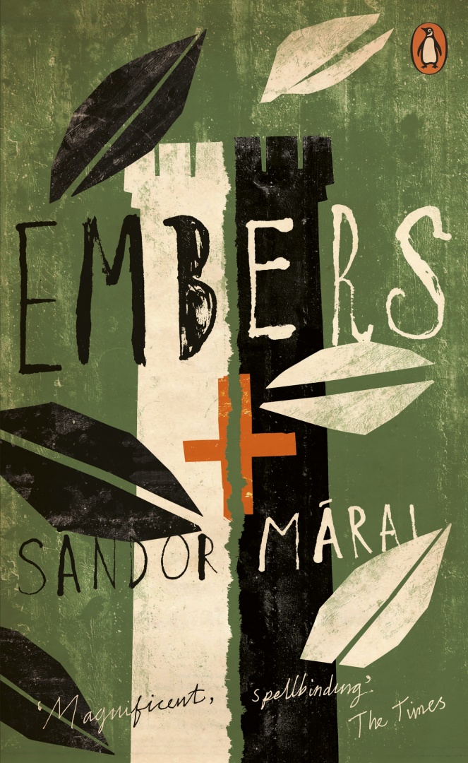
Photo by Erika Larsen. Design by Paul Buckley

It is not every day that I get an email from the Vice President Executive Creative Director of Penguin US, so it was something of a surprise when Paul Buckley sent me a note a few weeks ago about a book cover design mentioned in my interview with his wife Ingsu Liu.

I had been conspicuously unable to locate the image online and Paul was able to help. But it seemed like too good an opportunity to miss, so I asked the Brooklyn-based designer if he would be willing to do a Q & A about his work as well. Again, much to my surprise, not only did Paul say yes, he managed get his answers back to me in record time (with annotations and links included!)…

Of Mice and Men

How did you come to book design?

I went to SVA on an illustration scholarship, and was very intent on becoming an illustrator. While other parents were giving their kids children’s books, my father was giving me illustration annuals. But I supported myself during my college years working for various NYC design studios as a designer, learning through those around me… and at the same time pursuing freelance illustration assignments as well – basically learning both crafts simultaneously through different venues. Right after graduation I took a 3 month road trip spending my savings, and thus came home to Greenpoint needing an income. A studio manager at one of the studios I worked in during my early college years suggested me to her sister who was working at NAL/Plume/Dutton, as they needed a Junior Designer… I landed the position with a portfolio that was equal parts design and illustration. Though in the beginning I was very hardcore about becoming the best painter I could be, I quickly fell in love with designing book covers and never looked back… within two years we merged with Penguin. Though I’ve become far too busy (and lazy!) to pull out the oils and actually paint something, I did manage to get a few simple ink drawings in the Society of Illustrators this year. I realize these will pale in comparison to 99% of everything else done by the true working pros in the annual, but it was still a kick and an honor to have my work chosen for inclusion.

The World According to Garp

Can you describe your role at Penguin?

I act as a Creative Director overseeing a sizeable staff and many many projects. My Penguin publishing team is very open to me and my guys pitching ideas and we nicely act as an overall creative team, in a way that editorial and art together collaborate to create nice projects — most recently I’m directing a cover design book where we have the authors commenting on their covers, and a new series named Penguin Ink, where the world’s leading tattoo artist’s do covers for me. Recently in the stores is the gorgeous collaboration of Roseanne Serra with Ruben Toledo… this was all Roseanne’s brilliant art direction, and I had nothing to do with it — but it is gorgeous Penguin project that is very much worth checking out.

Art by Duke Riley
Waiting for the BarbariansArt by Chris Conn

How many imprints do you oversee?

Six

Does each imprint have a particular design style?

Yes, each imprint is very unique unto itself, as each Publisher/Editorial team brings their own style, as does each Art Director. In my group, Roseanne Serra and I collaborate on Penguin paperbacks, and to a lesser degree, with the Viking imprint as well. Roseanne art directs Pam Dorman books. Joe Perez smartly art directs Portfolio and Sentinel, which are brilliant business and political imprints. Darren Haggar art directs Penguin Press overseeing the packaging for literary giants like Thomas Pynchon and Zadie Smith… and while not it’s own imprint per se, Maggie Payette Art Directs our gorgeous poetry series.

The Jan Tschichold Penguin paperbacks are design icons in the UK. Is there a sense of that legacy within Penguin Group USA?

Very much so. We all have quite a few Tschichold books on our shelves. The UK Penguin art department, under the Art Direction of Jim Stoddart and John Hamilton, does an incredibly beautiful job of keeping that legacy alive.

How is American book cover design different from the UK?

I don’t know that it is all that different. In fact, Art Directors over here, and Art Directors over there, are hiring the same art and design talents on each side of the Atlantic.

Do you discern any current trends in American book cover design? Yes… very nicely a resurgence of designers and illustrators who do both the design and illustration; the whole package. Jaya Miceli, Chris Brand, Jon Gray, Gregg Kulick, Jamie Keenan, Rodrigo Corral, Ben Wiseman, Jennifer Wang, Tal Goretsky, etc – these are the folks creating the personally unique covers of today that will be the design icons of tomorrow.

Art by Chris Ware

How did the Penguin Graphic Classics come about?

We do a handful of what we call Penguin Graphic Classics Deluxe packages every list, and when it was time do one for Voltaire’s Candide, I handed it off to Helen Yentus who was in my group at the time. Helen wanted to work with Chris Ware on it, and off it went with us all happy that he accepted the assignment. When Chris’s sketch came in, it just sort of blew everyone away… Up to that point we’d never had anyone grab editorial control of a cover that way… Chris had gone hog wild and wrote all his own copy and illustrated and designed the living hell out of every square inch of this cover from flap to flap. It took forever to make its way around the packaging meeting table with everyone grabbing hold of it, reading it and laughing out loud. A short time later, our Penguin Publisher Kathryn Court declared that we needed to do more of these. Kathryn really nurtures good art and design and is one of the reasons I’ve been here so long.

Cover by Tomer Hanuka with design by Paul Buckley and Tomer Hanuka


Art by Anders Nilsen
Art by Charles Burns
Art by Roz Chast

How did you match the artists with the titles?

The titles were given to us by the Penguin Classics editorial team, and Helen and I would sit in my office surrounded by comic books and simply have fun matching this artist with that title.

Art by Michael Cho. Design by Paul Buckley

Are their plans to expand the series? What new covers can we look forward to in the future?

We do about 6 a year and I think we are all comfortable with that number at the moment. I just finished White Noise with Michael ChoMoby Dick by Tony Millionaire just came out, as did Huck Finn by Lilli Carré, and Ethan Frome by Jeffrey Brown. In the near future, I’d really love to do something with Jim Rugg, Jeff Lemire, Mike Mignola, David Small, and I still hold out hope that one day Crumb will actually say to me “damnit you pesky bastard… ok, ok, I’ll do it”.

Art by Tony Millionaire


Art by Lilli Carre. Design by Paul Buckley

Do you still design yourself?

All the time… mostly in the evenings after everyone has gone home and I can focus without the constant distractions of the work day. My greatest hits are posted on my website.

 
Art by David Byrne. Design by Paul Buckley. 
Pigmented foil stamped on linen cloth
Art by Will Eisner. Design by Paul Buckley. 
Art direction by Ingsu Liu & Albert Tang
 Photo by Fredrik Broden. Design by Paul Buckley

Could you describe your design process?

I start each project with the hope that I’m going to do something unusual; and then I try my best to do just that — read the material and find a visually unique way to interpret it. I tend to go either very loud, or very subdued and moody. I do a ton of comps for every cover I work on — sometimes, 20 or more to explore what I’m thinking and all the tangents that come along during the process — I get nuts when freelancers send me two or three comps. I’ll show 3-5 of what I think are the best and receive comments and direction on those from editorial… when discussing why a designer did this or that, I think what people commenting on book covers seem to gloss over is that the publishers and editors have far more at stake than the cover designer — they have committed sums of money and must answer to the house and the author to make this book a success — so they are very strong about what they think the cover should be and nothing is being printed without their full consent.

Here are a few rejects from the pile… I’m not saying these covers are better for the individual book, than what got printed… maybe the books would have tanked with these covers… but they do illustrate how in-house visions do not always sync:

Upper left: art by Paul Buckley. Upper right: various stock.
Lower Left: art by Amy Bennett with descending placards by Paul Buckley.
Lower Right: painting by Keniche Hoshine with added stock image.
(see final cover here)
Various antique endpapers combined with altered ebay images
and antique portrait of feral child.
(see final cover here)

Do you approach fiction and non-fiction differently?

Often, yes. Fiction needs a more peripheral approach where I’m looking to capture a mood to reflect the book’s tone, whereas non-fiction often needs you to stare it directly face on and state precisely what the topic is.

What are your favourite books to work on?

Any title where the Editor and Publisher are open.

What are the most challenging?

Any title where the Editor and Publisher are nervous.

Where do you look for inspiration?

Everywhere. My staff blows me away daily. My wife shows me beautiful work constantly. Editors show me stuff. Blogs like yours so nicely showcase how much great work is out there. Friends deluge my inbox with artist links. Illustrators. Photographers. Fine Artists. Music. Furniture. All talent is inspiring. Cruising Flickr and the web in general has me bookmarking new people daily, and I can spend hours google imaging the most absurd things that always tangent me to the greatest places. I found and purchased an image for a difficult book cover project recently just because I decided to google “leucistic squirrel” after I noticed a few in Prospect Park. I have no idea how we all existed before the internet.

What do you look for in a designer’s portfolio?

A unique talent. Distinction.

Front cover art by Frank Miller. Design by Paul Buckley

What does the future hold for book cover design?

There will be a market that just wants/needs to download the material for reading purposes, and there will be a market that is looking for an object. What Penguin does with the Graphic Classics is a great example– some student will download Gravity’s Rainbow cheaply, while an older Thomas Pynchon or Frank Miller fan with a little more cash in their pocket will want the beautiful book/object. So I believe the cover design market will shrink in that way. Textbooks and travel guides will go digital first as there is no real reason to carry all that in your backpack or pay for all that book production. For digital readers, big budget fiction and non fiction titles will have moving covers, more like mini movie trailers. If Grisham were still with us, his future digital reader cover would be something akin to us looking at a murky black screen… the reader would hear running footsteps and ragged breathing… then a loud shot rings out, and a big red splotch hits your screen and drips to form the title type. Then one blurb after another flies across the screen and after a moment Grisham himself pops up in the corner thanking you for purchasing his new book and asking if you’d like to peruse his backlist titles… and click this link if you’d like to pay an extra dollar to help our troops in North Korea, Iran, Afghanistan or Iraq. Interior-wise, there will be tons of product placement… not necessarily for gratuitous reasons; but because people, places and things are mentioned on every page in every book be it fiction or non fiction; and if folks desire a more interactive read that really helps them get into the book in a different way, then it’s possible there will be quick jump links to everything – for instance… if in this book, the character is having lunch in Balthazar and then running off to the Standard Hotel for an ongoing affair… then why not have Balthazar and The Standard pay a small fee to the publisher to provide these links; this seemingly free advertising? Big money to had there. I reserve judgement as to whether any of this is a good thing or a bad thing… but as publishing goes more digital, I think it’s naive to think these things wont happen to books just as they happen everywhere else.

Thank you very much!

You bet.

9 Comments