Skip to content

Tag: paris review

The French Dispatch

I thought I read somewhere that Wes Anderson’s new film The French Dispatch was based on the Paris Review, but the New Yorker is saying no, actually, it is all about them. IDK. ¯\_(ツ)_/¯

(The poster is by illustrator Javi Aznarez by the way. You can read about it at It’s Nice That)

Comments closed

Title Fight

At The Paris Review blog, author Tony Tulathimutte (PRIVATE CITIZENS) considers how the titles of books get chosen:

Every literary generation has its naming conventions, and it’s as hard to imagine the sixty-five-word original title for Robinson Crusoe passing muster today as it is to imagine a nineteenth-century novel called Never Let Me Go. It’s easy to spot the fashions of our publishing moment: short-story collections are named after the collection’s centerpiece practically by default. Titles for longer literary works are often staked to a central relationship—The Time Traveler’s Wife, The Abortionist’s Daughter, The Orphan Master’s Son—or a group in a setting: The Swans of Fifth Avenue, The Mystics of Mile End, The Dogs of Littlefield. Publishing favors the memorable, the concrete, and the vivid; it also has grammatical preferences, like solitary adjectives (Mislaid, Thrown, Wild, Lit), rousing imperatives (See Me, Find Me, Find Her, Lean In), and quirky pleonasms like Everything Here Is the Best Thing Ever or What’s Important Is Feeling… And for whatever reason—maybe a surge of interest in young women’s lives, maybe Lena Dunham—we may soon hit Peak Girl, with The Girl on the Train, A Girl is a Half-formed Thing, Girl Through Glass, Girls on Fire, Girl at War, Gone Girl, The Girls 

Comments closed

In A House Besieged: An Illustrated Adaptation

Illustrator Roman Muradov has drawn a beautiful adaptation of Lydia Davis’s (very) short story ‘In a House Besieged’ — originally published in the collection Break It Down (1986) — for The Paris Review:

housebeseiged1-1
housebeseiged2

You can read the rest of the story here.

Comments closed

The Art of Comics: Chris Ware

tpr-210

Cartoonist Chris Ware is interviewed by Canadian journalist Jeet Heer in the latest issue of The Paris Review as part of the magazine’s ongoing ‘The Art of Comics’ series. You can read a short excerpt online:

It was the Peanuts collections in my grandfather’s basement office that really stayed with me through childhood and into college. Charlie Brown, Linus, Snoopy, and Lucy all felt like real people to me… I’ve said it many times before, but Charles Schulz is the only writer I’ve continually been reading since I was a kid. And I know I’m not alone. He touched millions of people and introduced empathy to comics, an important step in their transition from a mass medium to an artistic and literary one.

1 Comment

Warren Ellis Has Arrived

“I’m a comic book writer. I still don’t think this is going to be run by The Paris Review.”


Warren Ellis, author of Gun Machine and Dead Pig Collector, in conversation with Molly Crabapple for The Paris Review:

I try not to get involved in the business of prediction. It’s a quick way to look like an idiot. There’s an expectation around writers of science fiction, which I sometimes am, that we’re predictors of the future, that that is the business of science fiction. Which we’re not, and never were.

Science fiction is social fiction. That’s the line from Mary Shelley through H. G. Wells and Aldous Huxley and George Orwell to the politically committed writers of the sixties and seventies. It’s about using speculation as a tool with which to examine the contemporary condition. The closest it comes to prediction is in the provision of long-range weather warnings.

Comments closed

Midweek Miscellany

A fantastic new cover for the Vintage (UK) edition of Gravity’s Rainbow by Thomas Pynchon, designed by Matt Broughton (via the Vintage Books design Tumblr CMYK)

CTRL+C; CTRL+P — Music critic Simon Reynolds, author of Retromania, on remix culture and ‘recreativity’ at Slate:

Recreativity has many proponents and represents a wide spectrum of opinion. Still, it’s striking how easily some of these critics and theorists glide from relatively sensible talk about the role of appropriation and allusion in art to sweeping claims of an ontological or biological nature. They seem so confident. How they can be certain that nobody has ever just come up with some totally new idea, ex nihilo? The remixed nature of everything (not new) under the sun has become an article of faith. Impossible to prove, these assertions tell us way more about our current horizons of thought and our cultural predicament than they do about the nature of creativity or the history of art.

The A.V. Club list their 50 best films of the ’90s. (Their list of their most-hated movies is here).

Picture This — Cartoonist Adrian Tomine discusses his work and his new book New York Drawings with the The Paris Review:

If you were to go back in time and talk to the people who invented cartooning, and were doing it for newspapers, and told them that there were going to be guys who were going to do twenty-four-page long stories, they would think that was a strange use of the medium. And if you then said, they’re going to try and inject that with a singular vision and personal experience and do six-hundred-page long stories—I mean, their heads would have exploded.

See also: Adrian on his first cover for The New Yorker at the The Thought Fox, the blog of his UK publisher Faber & Faber.

And Finally…

Speaking of The Paris Review, an interview with editor Lorin Stein at the LA Review of Books:

The tradition of discovering new writers makes it easy to go out and find stuff that excites me, and at the same time feels of a piece with the history… To me it’s like that line in the great Italian novel, Lampedusa’s The Leopard. If you want things to stay the same, everything’s going to have to change. Nowadays we have to exist in the digital world if we don’t want to be strictly of the digital world.

2 Comments

Something for the Weekend

ZonaGeoff Dyer’s book about Andrei Tarkovsky’s 1979 film Stalker,  reviewed at The Daily Telegraph:

Zona’s subheading insists it’s “a book about a film about a journey to a room”. Literally speaking it is. Tarkovsky’s Stalker forms the foundations. Dyer retraces the cinematography faithfully and beautifully. So beautifully, in fact, that I found it difficult not to start falling again for Tarkovsky. But Zona is also about an author on the verge of a nervous breakdown. “I mean, do you think I would be spending my time summarising the action of a film almost devoid of action if I was capable of writing about anything else?” Dyer writes, as if about to explode.

See also: The Guardian. And in a lovely twist, Dyer, a nominee for Hatchet Job of the Year, reviewed by the eventual winner Adam Mars-Jones at The Spectator.

Meanwhile, an interview with the man himself at Guernica Magazine:

I’m most interested in the book which is completely un-sellable on the basis of a proposal or contract. One of the reasons so many nonfiction books are so boring is because what they’ve done, very diligently, is fulfill the terms of their proposals—they’ve written up their proposal, long-form, and often what this does is then set up a sort of serial deal, where the whole book can essentially be reduced back to the size of the original proposal! What I really like about this book is that the proposal would be turned down instantly: there’s nothing to propose. Nicholson Baker talks about the way in which the most successful nonfiction books are those that can be boiled down into an argument so that everybody can wade in with an opinion without having to undergo the inconvenience of having to read the book itself. The more you can condense it, the better. Malcolm Gladwell is the supreme exponent of this: Blink—oh yeah, I get it! “Blink.” That’s all you need to know.

(pictured above, the UK edition of Zona published by Canongate. Design: Rafaela Romaya / Canongate Art Dept. Photograph: Mosfilm. The book is published by Pantheon in the US)

And in non-Geoff Dyer related news…

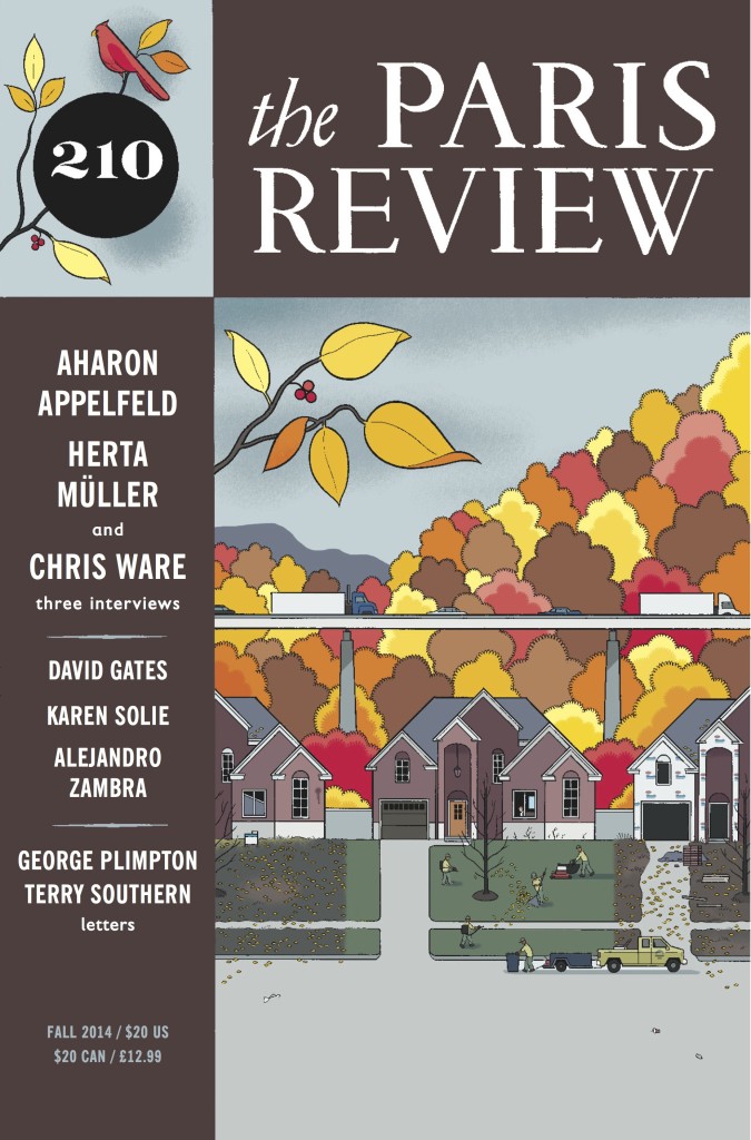
A remarkable set of the Paris Review covers at social media site of the moment Pinterest.

And finally…

At The GuardianSukhdev Sandhu charts the rise of radical alternative publishers, and talks to some of the contributors to the Zero Books imprint, including Nina Power:

The book still retains a curiously weighty status in comparison to blogs. A book is a snapshot of whatever it was you felt was interesting at that moment, and it’s fixed in aspic, which can have its drawbacks.

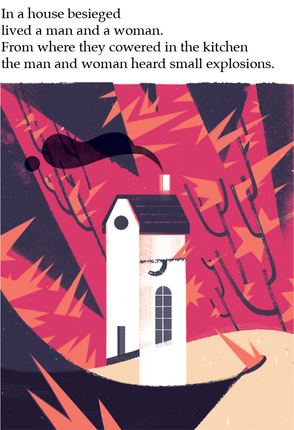
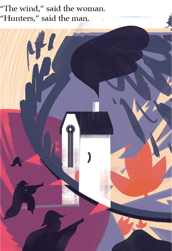
There’s an appeal to physical books, particularly short books like most of the Zer0 catalogue, at the moment: the physical form provides some relief from the relentless pressure of the online environment. It’s very difficult to keep one’s attention on online content – the temptation to click away is always there. In conditions where your attention is besieged in that way, short essayistic books, which you can read in one afternoon, come into their own.

Comments closed

Something for the Weekend

Simplicity with Sophistication — Typographer Gerard Unger talks about his work and the influence of Wim Crouwel with MyFonts:

What seemed amazing when I joined [Crouwel’s] company Total Design in 1967 was how simple it all seemed. When Wim explained how to design and do typography, you got the impression it had always been done like that and that it couldn’t be done any other way — maximum clarity. Later, I realized that this approach also had its limitations. When graphic designers had to select a typeface, they automatically specified Helvetica and stopped thinking. Wim’s own work was different: it seemed clear and simple, but was full of refinement, which comes naturally to him. That is probably why it is so attractive to younger generations: simplicity with sophistication. Yet I personally wouldn’t welcome a revival of Swiss typography — it was too formulaic. Also, I think design should be more of a social thing than that. For too long, graphic design has been about individualism and about fulfilling personal ambitions.

The Doctrine of Immaculate Rejection— A wonderful with E. B. White from the Paris Review 1969. It’s a great read, but it’s hard not to get the feeling it comes from a more genteel era that has long since disappeared (via Longform):

I revise a great deal. I know when something is right because bells begin ringing and lights flash. I’m not at all sure what the “necessary equipment” is for a writer—it seems to vary greatly with the individual. Some writers are equipped with extrasensory perception. Some have a good ear, like O’Hara. Some are equipped with humor—although not nearly as many as think they are. Some are equipped with a massive intellect, like Wilson. Some are prodigious. I do think the ability to evaluate one’s own stuff with reasonable accuracy is a helpful piece of equipment. I’ve known good writers who’ve had it, and I’ve known good writers who’ve not. I’ve known writers who were utterly convinced that anything at all, if it came from their pen, was the work of genius and as close to being right as anything can be.

And finally…

Type and Still Imagery — Writer-director Mike Mills, who began his career as a graphic designer, talks about his semi-autobiographical movie Beginners with AIGA:

Before I was a filmmaker I loved Godard as a graphic designer. He does the best design, to me. And a lot of my graphics being very, almost sort of didactic or presentational, or sort of centered and clean, to me really comes from how Godard uses type and still imagery in his films, in Tout va bien or One Plus One or Pierrot le Fou, so Godard’s been influencing me for a very long time. And the graffiti in the film is much more sort of May 1968, sort of Situationist graffiti rather than being like hip-hop graffiti.

There is also a book, Drawings From the Film Beginners, that accompanies the movie (thx @Henry)

Comments closed

Midweek Miscellany

Mambo for Fonts — Flora Mambo is a new font from the P22 Type Foundry based on Jim Flora’s hand-lettering for the 1955 Mambo For Cats RCA Victor album cover.

Character — Type designer Matthew Carter profiled in The Boston Globe:

Around 1994, he started developing Verdana, a revolutionary font for having prevailed over technical constraints of that time, like coarse computer screen resolution. To hear Carter recall it, it was a pivotal moment: People were on the brink of reading as much — or more — on screen than on paper. And that transition has had a profound effect on the design process.

Carter also talks about his work in this short video for the Globe (via Eightface):


The Paris Review has made it’s entire interview archive — from the 1950’s to the present — available online (via The NY Observer).

An Education — James Bridle of BookTwo and Bookkake interviewed at Publishing Perspectives:

“There’s still a reluctance in the industry to give [e-books] their own space. They are still subsidiary to the traditional book forms… There still an incredible lack of understanding about them and the people who are doing the educating are Apple and Amazon, which means they are taking the market very quickly and we’re kind of letting them do that.”

The Likely Lads — Authors Lee Rourke (Canal) and Tom McCarthy (Remainder, C) in conversation at The Guardian.

And finally…

Writers from The Guardian and Observer newspapers talk about the books that sparked their passion for literature:

Comments closed

Something for the Weekend

John Squire‘s 1980’s covers for the Penguin Decades Series at The Creative Review. The art direction was by Penguin’s Jim Stoddart, but yes, it is THAT John Squire (i.e. awesome).

Fine Independent Publishing — An interesting interview with Barbara Epler, Editor-in-Chief at literary publisher New Directions, at KCRW’s Bookworm (although I could do without the decline of literature being blamed squarely on sales and marketing people. Again):

Permanent Crisis — A post by Rebecca Smart, Managing Director of military history publisher Osprey Publishing, at Digital Book World:

If you perceive that your only environment is that encompassed by your current supply chain then you’re only going to adapt to changes in that environment – so the response to the digital challenge viewed in this way would be to create and sell e-books. If you put the consumer at the heart of your thinking you can consider instead each group of customers you serve and what they might want on top of what you already provide, how they might want you to serve them differently in the future. More to the point, you can ASK them, listen and respond.

Proletarian Erotica — Lorin Stein, former senior editor at Farrar, Straus and Giroux and new editor of the Paris Review, interviewed at The Economist‘s ‘More Intelligent Life’ blog. The National Post also ran a nice interview with Stern last month.

Going Deutsch — Tom McCarthy, whose new book “C” I’m reading right now,  interviewed at the New York Times ‘Paper Cuts’ blog:

One critic described “Remainder” as a French novel written in English; well, by that token, “C” is my German novel. What the next one will be is anyone’s guess. Swedish, maybe…

More from Tom on The Casual Optimist soon (if I can twist his arm)…

Print Junkies — An interview at The Second Pass with the publisher and editor of Stop Smiling magazine J. C. Gabel on the launch if the Stop Smiling book imprint:

We’re still operating with the same mentality… but have adopted a Less Is More mindset — and a production schedule to match. It does feel nice to know that what we spend months or years working on is now being released in a permanent format. We’re really trying to reinvent the DIY aesthetic of the magazine to apply it to editing, publishing, and promoting books. The book-making process itself, of course, is much slower and drawn out, which is refreshing as we all get older.

And finally, I give you Oliver Jeffers’ moustache (via Tragic Right Hip)…

3 Comments