Skip to content

Tag: pantheon

All the Books

Assault design Oliver Munday

At Literary Hub, Designer Oliver Munday discusses his design process and reading the whole text:

As designers, we are forced to read quickly, and incisively, mining for the clues to the coveted iconic cover. It can feel careless at times, leading me to believe that my reading skills are being dulled. I think of the author in this process, and in some ways the guilt that I may feel about a less-than-ideal reading of their text is exceeded by the potential of presenting their book with the best possible jacket, one that their audience of ideal readers will appreciate. A cover that feels simultaneously unexpected and inevitable.

I used to aspire to a process that created an expanse for reading each text, one that merged the ideal-designer and ideal-reader into one, but found the boundaries of distinction too severely marked. It would be amazing to have the time, space, and inclination to read an entire text when designing its cover, but I have realized that is not essential. There may be times when my two selves are reconciled, but in the event that they exist separately, a reading designer, divided against himself, will remain standing.

Comments closed

Midweek Miscellany

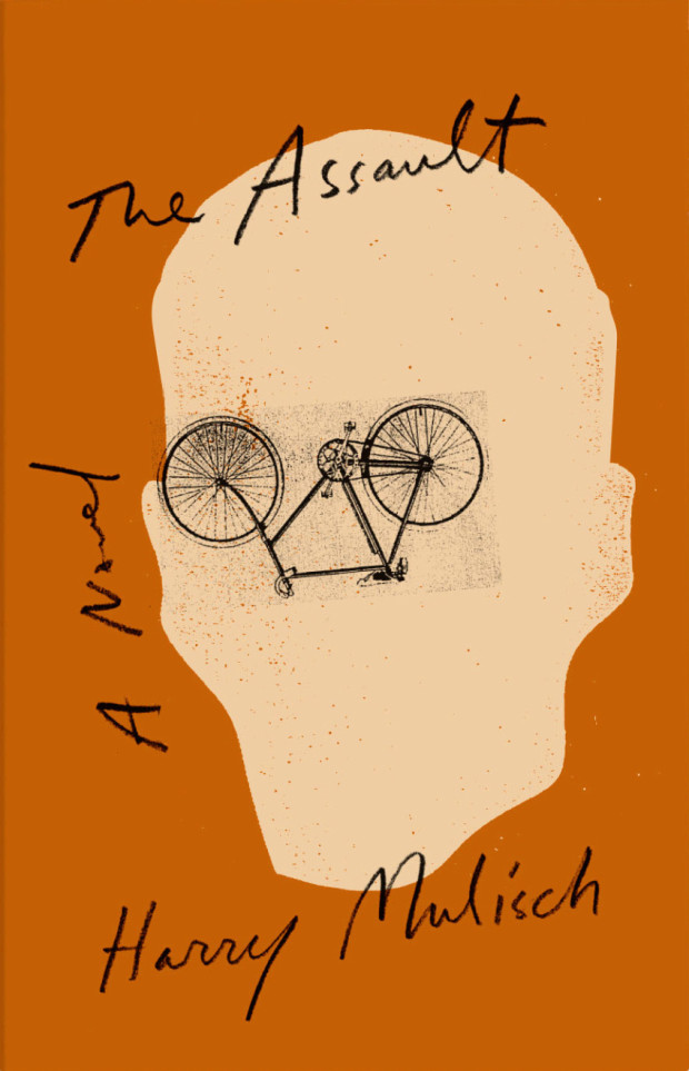
Work / Life — An interview with the brilliant Louise Fili, designer and former art director of Pantheon Books, at The Great Discontent:

Everybody wanted to use standard fonts, but I just wasn’t satisfied doing that. I didn’t realize this until years later, but what I was really doing was developing type treatments for the title of the book and approaching it more like a logo. I wanted each book to have its own personality and that couldn’t be achieved with standard fonts. Again, I was lucky because it was appropriate to do that for the types of books I was working on. The other thing to note is that I was collaborating with a lot of really talented illustrators and made a concerted effort to combine the type and image together. I also tried to encourage illustrators to create their own type. I would sketch it out for them and then ask them to actually draw it so it would become part of the illustration, which makes for a stronger design, whether it’s a book cover or logo.

Colour and Intention — Claire Cameron interviews Sam Garrett about his translation of The Dinner by Herman Koch, for the LA Review of Books:

The words a writer uses not only have a dictionary definition, but also a color and an intention. To pin those down, the translator has to sniff around. From the first to the final word of a translation, you’re leading the reader along a path to a destination. The color is what keeps the reader hopping; the intention is the scent that keeps the translator on the right path.


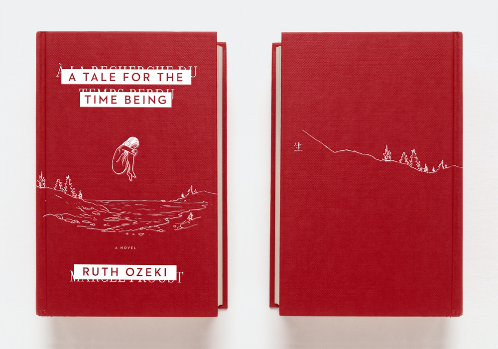
Negotiations — Jim Tierney explains his design process for the cover of Ruth Ozeki’s A Tale for the Time Being:

I decided to run with the first concept that popped into my head: a very simple and tactile facsimile of the red Proust notebook, embossed with an illustration of Nao, floating spectrally above the rocky coast of British Columbia. I think this design is all about questions: How did this book get here? Was it lost intentionally, or by accident? Is Nao alive or dead? Is she even real?

Minimal designs like this is always a hard sell in cover meetings, and it was immediately rejected as too quiet and precious-looking. Loud, colorful, and commercial are popular adjectives in modern book marketing, but it’s always fun to start off negotiations with something a little more obscure.

And finally…

Welcome back from near-death Dan Mogford. Please don’t do that again.

Comments closed

Design Matters with Louise Fili

Designer, and former art director of Pantheon, Louise Fili discusses her work with Debbie Millman on Design Matters:

Design Matters With Debbie Millman: Louise Fili Interview mp3

Elegantissima, the first monograph of Fili’s work, was published earlier this year by Princeton Architectural Press (who are, for the record, are distributed in Canada by my employers, Raincoast Books)

Comments closed

“Why comics? Why mice? Why the Holocaust?”

Cartoonist Art Spiegelman talks about his new book MetaMaus:

Comments closed

James Gleick on the Future of Books

The Book Show recently broadcast James Gleick’s closing address to the Sydney Writers’ Festival, in which the author of The Information discusses the future of the printed book:

THE BOOK SHOW: The Future of the Book with James Gleick

Comments closed

Chip Kidd at The Comic Archive

Last week I linked to a short video of Chip Kidd talking about growing up with comics. Now, The Comic Archive have posted a few more segments from that interview in which Chip discusses his book design and work in comics.

In this first clip, Chip talks about his decision to pursue graphic design in college and the influence of comic books on his work:

In this longer segment, he discusses coming to New York, being hired by Knopf as a cover designer, and returning to comics through DC Comics and Pantheon:

And this may just be for the fan-boys, but in this final clip Chip shows off his specially commissioned one-of-a-kind collections of original artwork:

#Envy

Comments closed