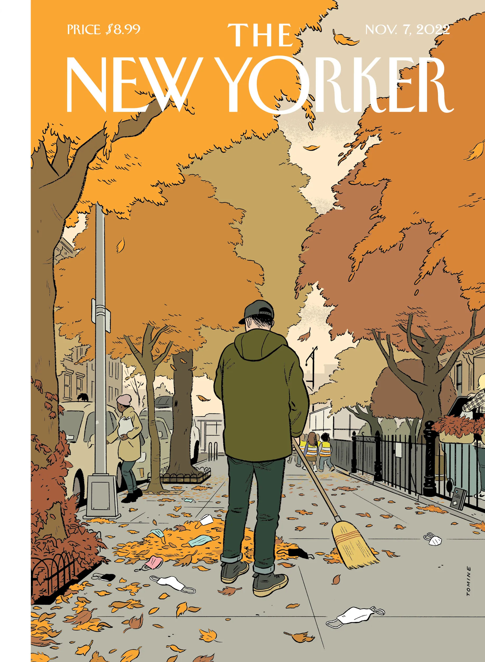
I was raking leaves in Toronto last night where it also feels like a lot of folks have discarded masks, so Adrian Tomine‘s latest cover for The New Yorker resonated with me.
“Having lived in Chicago for thirty years, I’ve only ever been a visitor to New York, but I love it like no other city. Teeming with unpredictable people and unimaginable places and unforeseeable moments, life there is measured not in hours but in densely packed minutes that can fill up a day with a year’s worth of life. Lately, however, closed up in our homes against a worldwide terror, time everywhere has seemed to slur, to become almost Groundhog Day-ish, forced into a sort of present-perfect tense—or, as my fellow New Yorker contributor Masha Gessen more precisely put it, ‘loopy, dotted, and sometimes perpendicular to itself.’ But disaster can also have a recalibrating quality. It reminds us that the real things of life (breakfast, grass, spouse) can, in normal times, become clotted over by anxieties and nonsense.”
Chris Ware has created another brilliant cover for The New Yorker to illustrate April 15th, 2020, “a kaleidoscopic account of a single day in New York” during the pandemic.
Its densely packed grid and the juxtaposition of mundane, ‘snapshots’ reminds me — perhaps more than some of his other covers for the magazine — of Ware’s comics.
Hey. Here are the book covers that have caught my eye online this month. I hope that they bring a little joy in this very grim time.
If you have the means to buy books at the moment (and I appreciate that is not going to be the case for everyone), please consider supporting your local bookstore. I know a lot of stores are taking orders by email even if they are not answering the phone, and many are offering local delivery if curbside pick-up is not currently an option. The situation seems to be changing daily, so if a store wasn’t accepting orders yesterday, they might be today. We are all figuring this out on the fly.
If you are in the US and don’t have access to a local bookstore, there is Bookshop.org who are trying to provide some financial support to independents. If there are similar initiatives elsewhere, let me know — I’m happy to share the link.
Afterlife by Julia Alvarez; design by Jaya Miceli (Algonquin Books / April 2020)
I wonder where the eye — particularly the combination of the colour red and the eye — as a symbol of Orwell and Nineteen Eighty-Four originated? Does it go back to the 1960s and the Penguin paperback designed by Germano Facetti?
I understand that the eye is a short-hand for the surveillance state. But it is almost as if that is now considered the only element of the book worth visualizing (David Pearson’s cover is in an interesting exception in that it cleverly focuses on censorship rather than surveillance).
I haven’t read Nineteen Eighty-Four in years, but my memory is that the infamous “Big Brother is Watching You” poster is a face whose eyes seem to follow you when you move — something I think Matt’s cover above captures quite nicely — not an all-seeing, omniscient eye. The first time I read the novel, I imagined Big Brother looked something like Lord Kitchener / Uncle Sam in the recruitment posters. I was more traumatized by Room 101 to be honest… Has anyone put rats on the cover of Nineteen Eighty-Four?
I actually read Godshot in manuscript form last year and liked it a lot. It is set in drought-stricken California, but I had Ry Cooder’s soundtrack to Paris, Texas playing in my head the whole time I was reading it.
I also wanted to give a quick shout-out to Nicole who was diagnosed with breast cancer at the end of last year and bravely shared her story on social media recently. Stay safe, and get well soon, Nicole. :-)
Griefby Svend Brinkmann; design by David A. Gee (Polity Press / April 2020)
David has designed the covers for a number of books by Svend Brinkmann, including Standpoints, which featured on the blog back in March 2018.
The cover of the UK edition of A Luminous Republic, which Granta is publishing in a couple of months, was designed by Luke Bird. It’s a really interesting contrast!
I’ve already posted a couple of magazine covers about the current crisis, and yet another one has caught my eye. The cover of the April 13-26 edition of New York magazine features an extraordinary photograph by Alexei Hay of all but deserted Times Square on the morning of Monday, March 30.
You can see more of Alexei Hay’s photographs of an eerily empty New York here.
After posting Chris Ware’s pandemic cover for The New Yorkerearlier this week, I remembered I had also meant to post Christoph Niemann’s “Critical Mass” cover from two weeks ago. It may not pull at your heart strings the way Ware’s cover does, but it’s a brilliant and prescient illustration of the pandemic.
I believe that the best concepts develop in the process of drawing. I don’t usually have ideas pop in my head fully formed when I’m not at my desk. Yet the genesis for this image, the idea of a sneezing domino standing on top of a globe packed with other domino pieces, came to me when I was lying in bed, trying to fall asleep… I got up again and sketched down the idea. Only the next day, when I sat down to turn the concept into a proper art work, did I realize that the globe and the pieces actually resemble a virus. In the end, it still proves my theory that all decent ideas come together when you actually draw them.
“As a procrastination tactic, I sometimes ask my fifteen-year-old daughter what the comic strip or drawing I’m working on should be about—not only because it gets me away from my drawing table but because, like most kids of her generation, she pays attention to the world. So, while sketching the cover of this Health Issue, I asked her.
“ ‘Make sure it’s about how most doctors have children and families of their own,’ she said.
I was reminded of his 2009(!) cover for the New Yorker‘s from Halloween edition in which parents all look at their phones while their kids trick-or-treat. It’s an interesting contrast…