Hey, I hope you’re keeping safe, well and warm (or cool!) wherever you are.
If you missed it, my first post of 2025 was a look back at some of last year’s YA covers. You can find my 2024 list of notable literary covers here. Both posts got me thinking more generally about these lists. Do I need to change things up? Or stop altogether? Several other sites are posting lists that do much the same thing mine, and they are all starting to feel too alike. I don’t have answer, and I don’t really know I would do differently. I’m struggling to post once a month as it is. For now at least I’ll keep posting the covers that interest me. It’s just something that’s on my mind, and I have other projects I’ve been neglecting, so I’m curious if you have opinions.
Anyway, this month’s post is a bit of a short (but good!) one, and includes a couple of covers that I missed in 2024 for one reason or another. Enjoy!
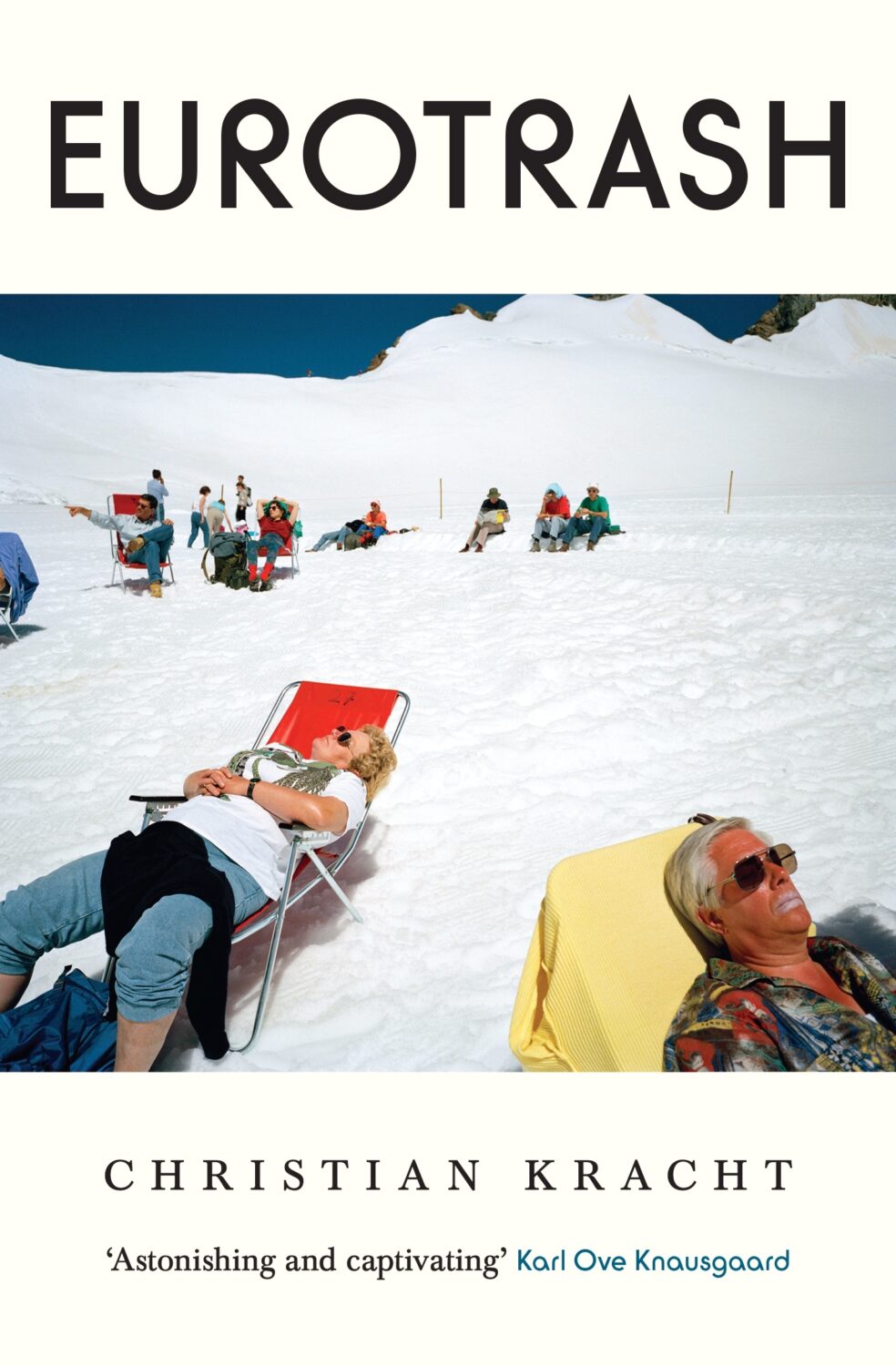
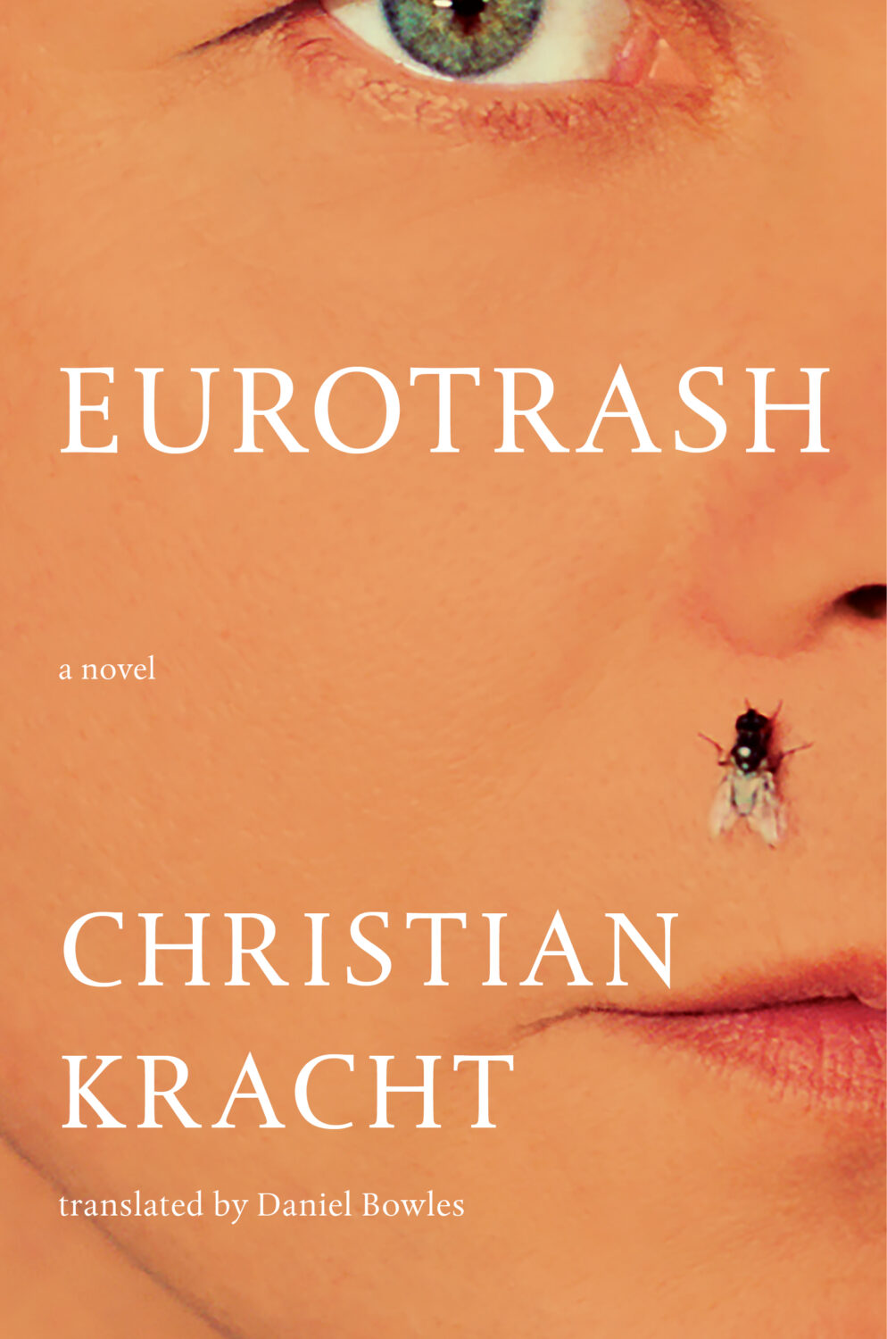
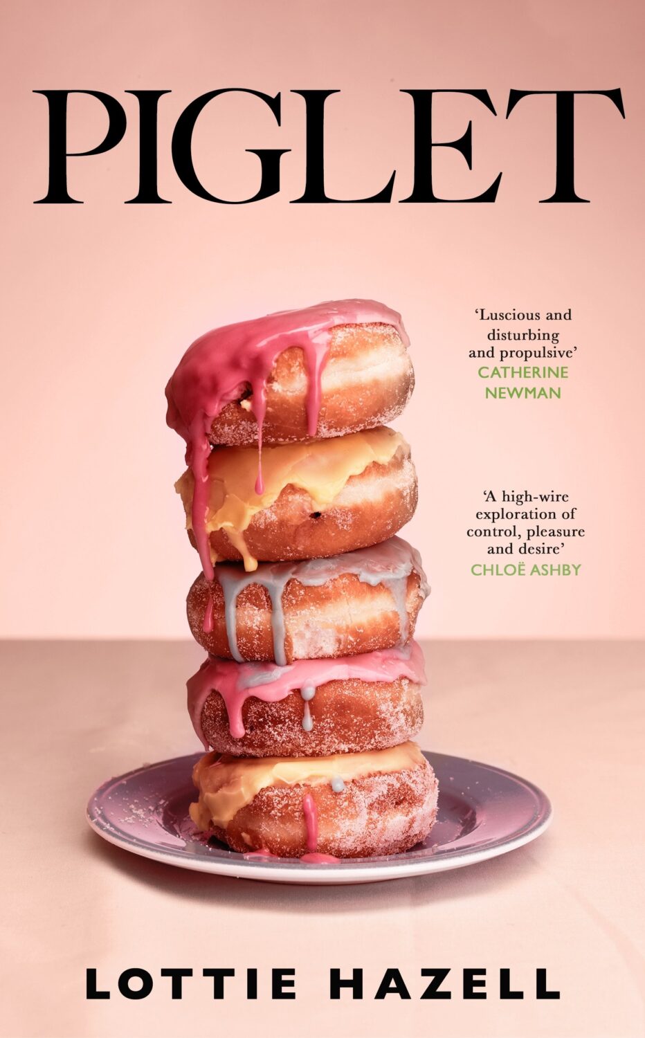
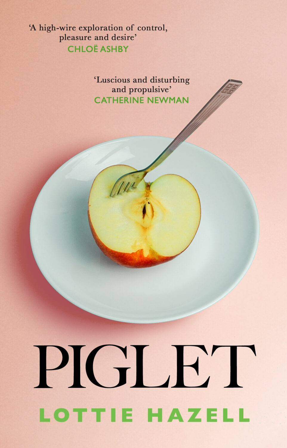
Eurotrash by Christian Kracht; design by Sinem Erkas (Profile Books / November 2024)
I do really like this cover. It looks great! But it also looks a lot like non-fiction, especially when compared to the cover of the US edition (Liveright, October 2024) designed by Jason Heuer. They look like completely different books!
And speaking of Jason Heuer, he’s made a series of fun videos talking about embarrassing moments from his early graphic design career. You can find them on YouTube and Instagram. In the second episode Jason talks about his first book design credit…
Hello! I hope you’re safe and well wherever you are.
Before we get to the covers, a couple of brief admin things. First up, there have been a couple of behind-the-scenes changes at the CO this past month. They’ve solved a few tech issues for me and hopefully no one else has noticed. Secondly, I’ve been tinkering with the RSS. I’m not sure that’s quite right yet, so apologies if it’s not been working as expected. Let me know if you’re experiencing any weirdness.
I also wanted quickly mention that the deadline for the DPI mentorship scheme has been extended to April 12th. I’m not involved with the DPI, but some really great people are so if you are a designer from an under represented background living in the UK or Ireland, you should think about applying!
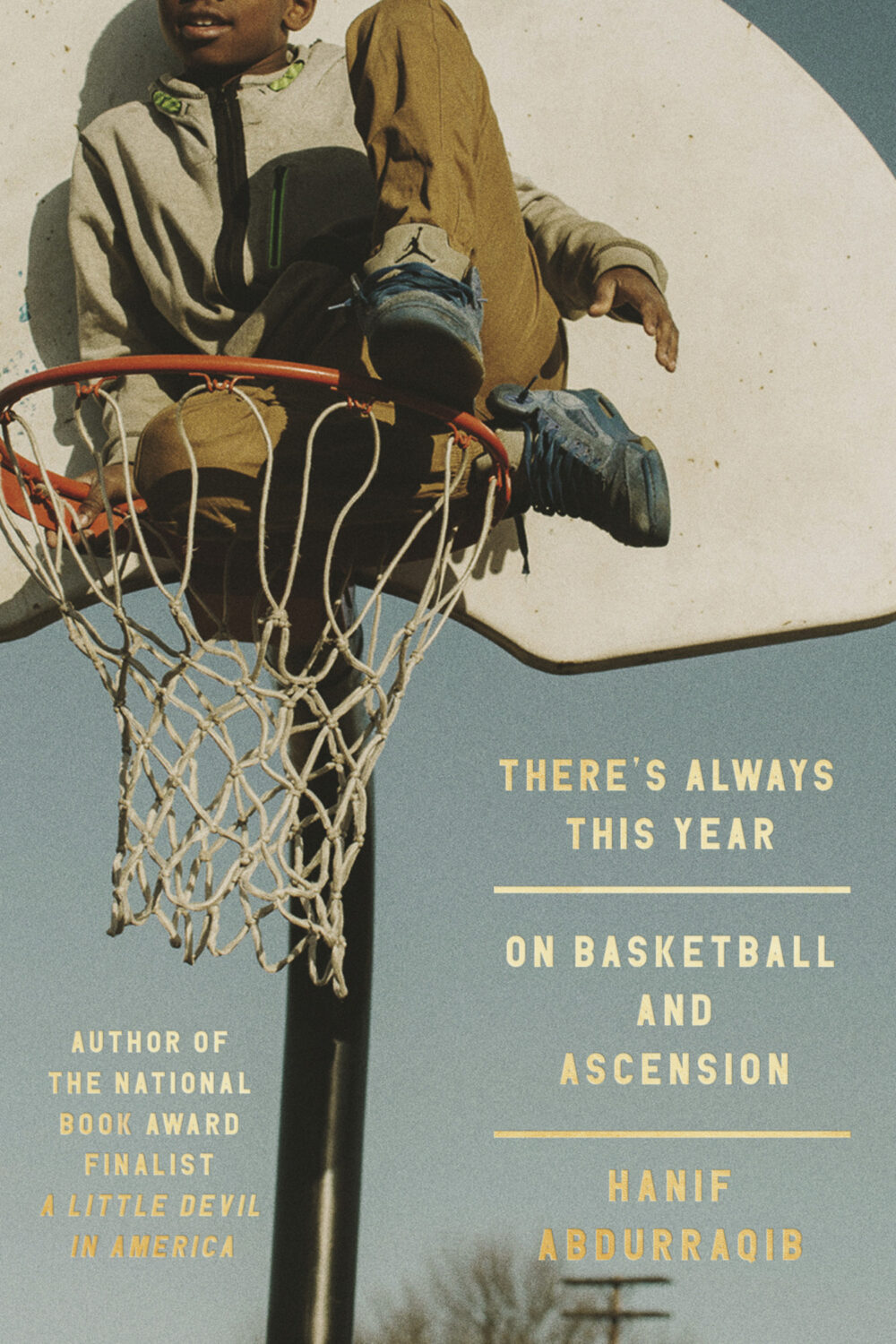
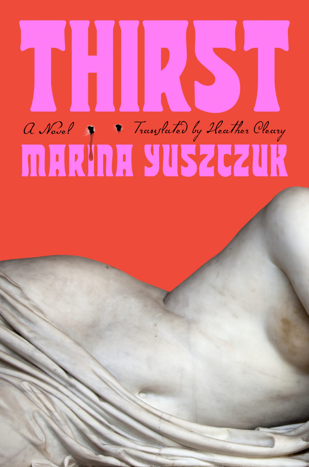
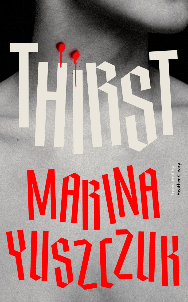
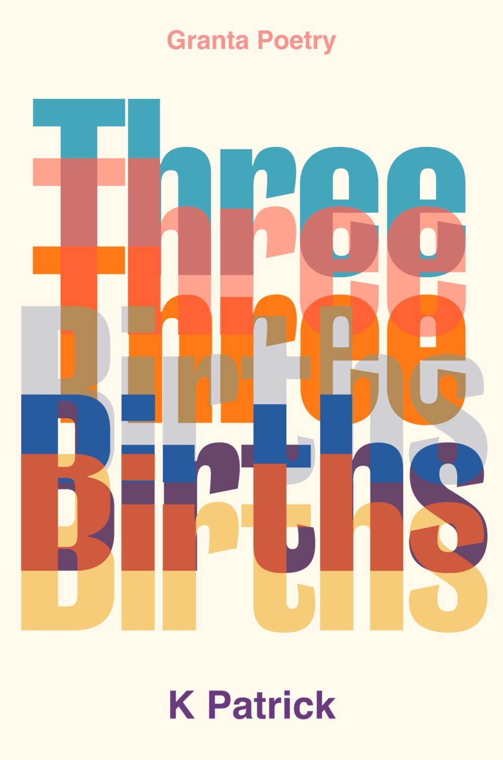
Anyway, it’s a really big post this month! The are lots of great covers with the UK, Australia and Canada all represented, as well as the usual folks from US. There are some compare-and-contrasts, a couple of covers from indie presses, a couple of covers for translations, and a couple of poetry covers too. There’s even a meandering digression in the middle (sorry). Enjoy!
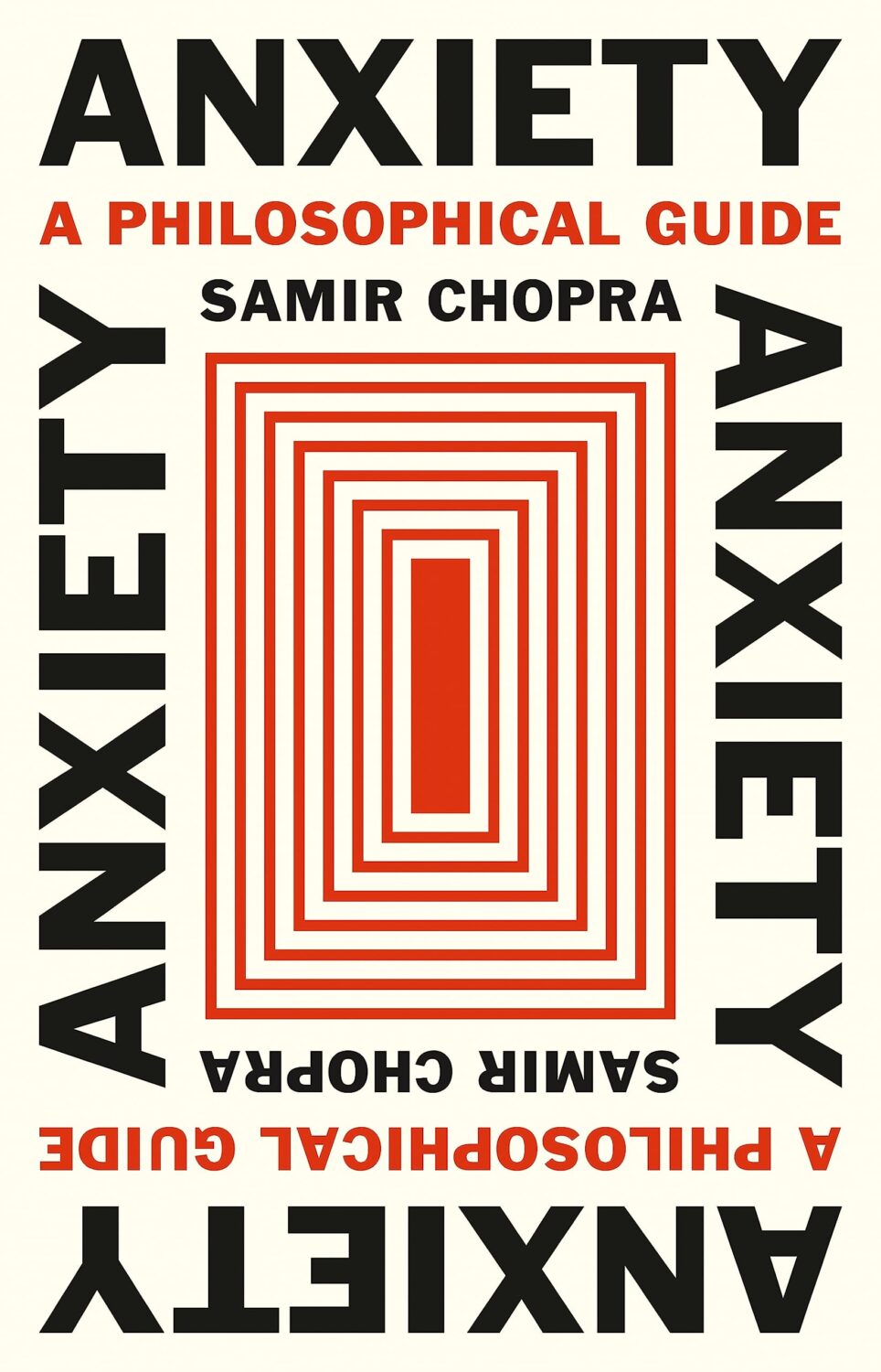
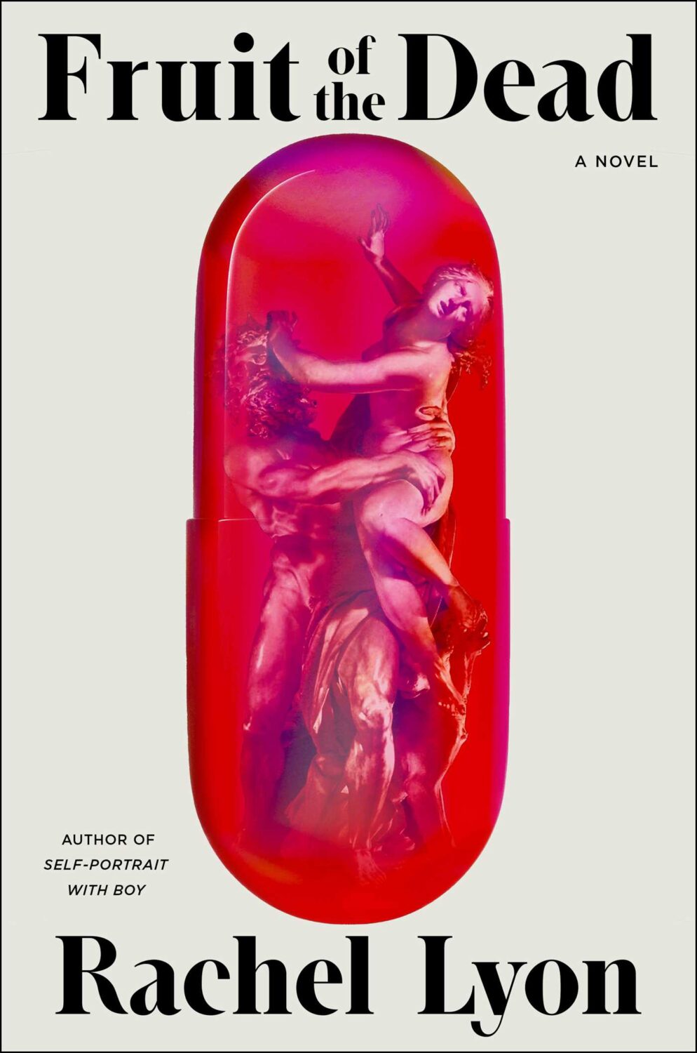
Anxiety by Samir Chopra; design by Karl Spurzem (Princeton University Press / March 2024)
So this cover sent me down a bit of a rabbit hole. It reminded me of a cover design from a few years ago. It didn’t really look the same but, in my mind at least, this other cover featured a blue-red capsule shape (possibly a stretched illustration of a planet and its core) centred on a white background with black Swiss-style sans serif type. It was not exactly minimalist, but clean and precise. I think I saw it on Twitter back in the day. I thought it was maybe literary sci-fi or pop science, and published by one of the big American imprints. I was also pretty convinced that it was designed by Alex Merto or possibly John Gall. One of the dudes.
This is not the first time I have thought about this cover, and I can, or at least could, picture it quite clearly. The problem is that I can find no evidence of this cover ever existing, and the more I think about, the more the details shift and doubt creeps in. I don’t seem to have posted it anywhere, and I can’t find it in the usual places. It’s possible that I am getting some of the crucial details wrong, mentally combining a couple of covers into one, or it was something other than an actual book cover. But maybe this is some kind of Visual Mandela Effect thing, and this design that I’ve believed existed for years is actually a figment of my imagination.
My search has felt a bit like the online equivalent of walking into a bookstore and asking for the book with the blue cover. It has made realise that we have very few tools to find cover designs in a systematic way, especially since the Book Cover Archive stopped being a going concern. You just kind of have to browse and I hope you eventually look in the right place (or risk slowly lose your sanity).
Anyway, if this mystery cover is ringing any bells with you, please let me know and put me out of my misery. I have been going slightly crazy. (This sort of thing happens more than I care to admit by the way, but it is particularly bad this time! And, no, I do not have much of a life. Why do you ask?)
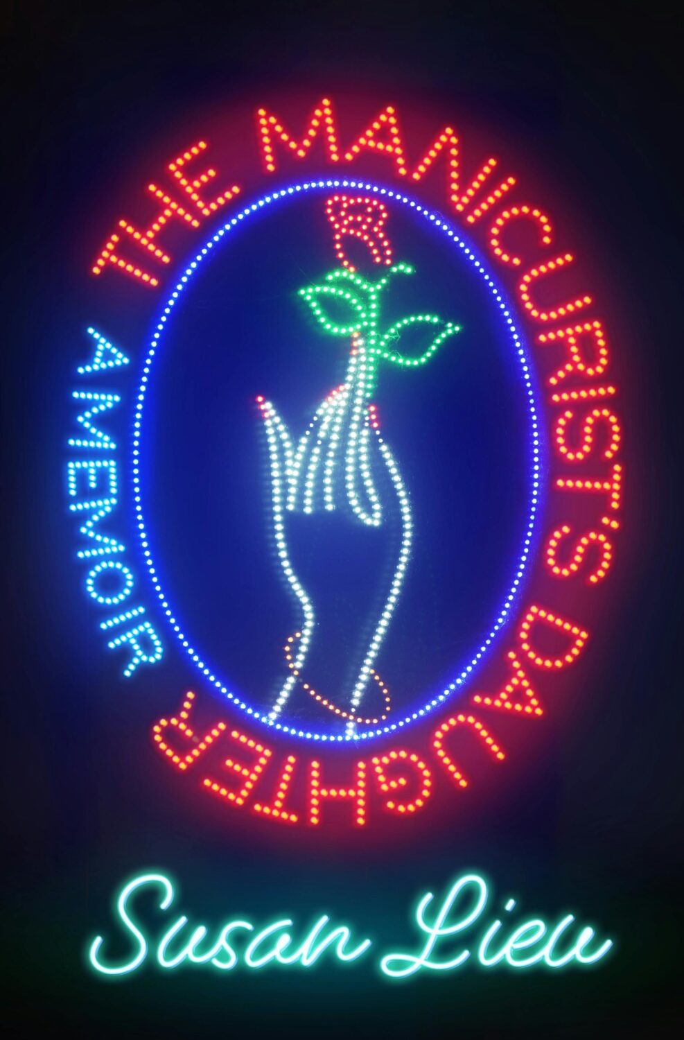
(Thanks to Jon Gray for helping me with the design credit for this and the other Granta title Three Births below. Publishers: post the design credits with your cover reveals!)
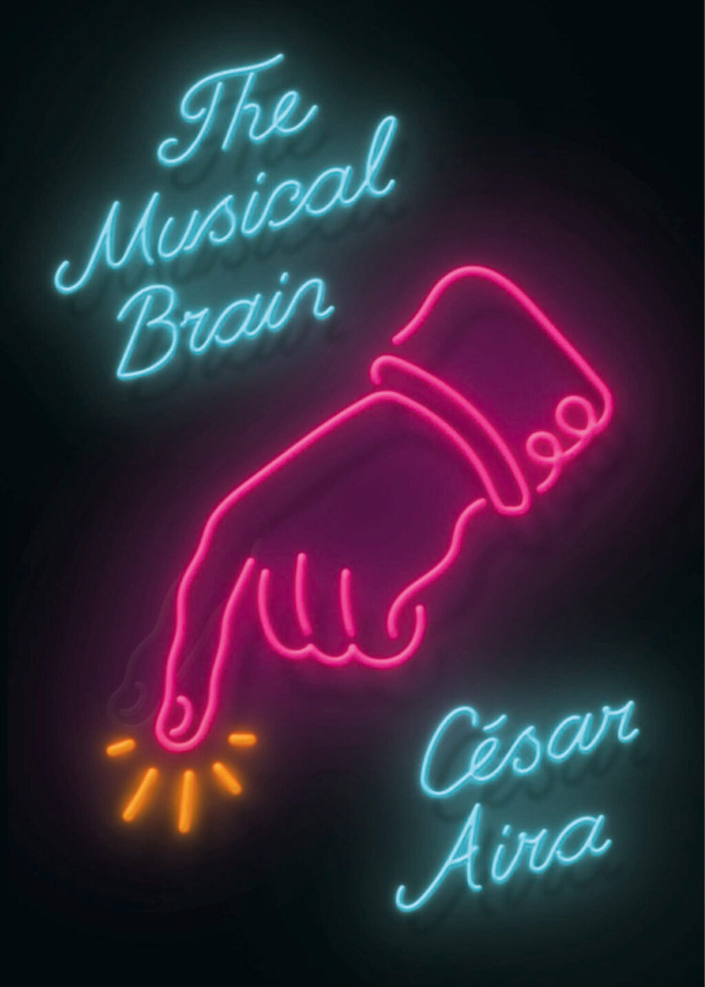
While looking for the other, possibly imaginary, book cover, I came across the cover for the New Directions edition of The Musical Brain by César Aira designed by Rodrigo Corral and Zak Tebbal a few times. It was on one or two best of 2015 lists, including mine.
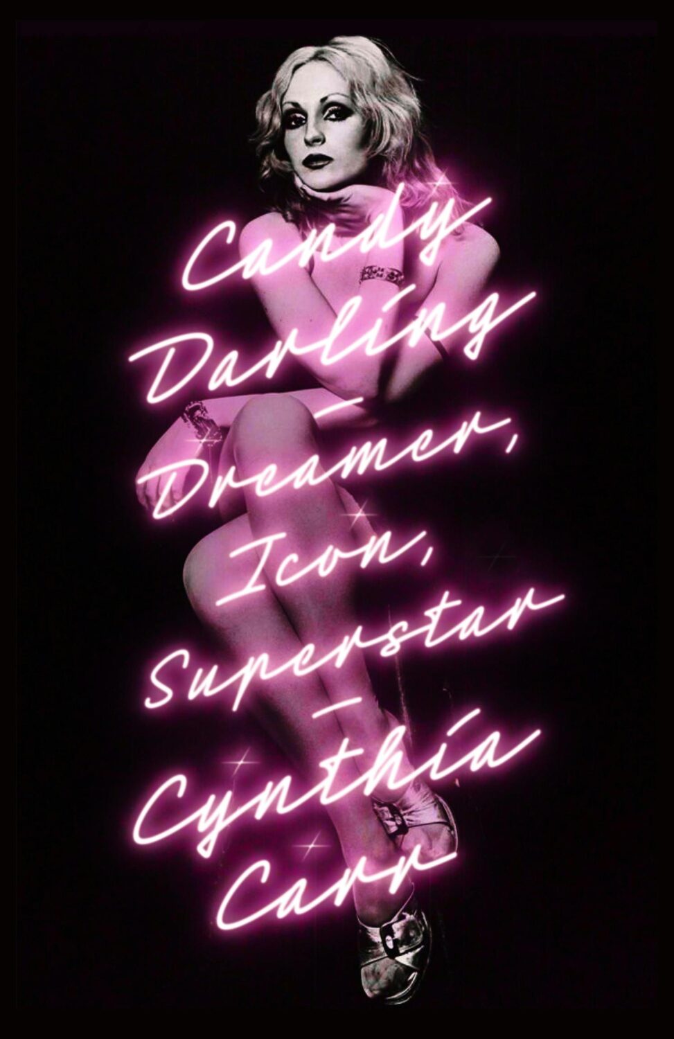
Is neon-style lettering on covers a bit of thing? (see also Candy Darling above)
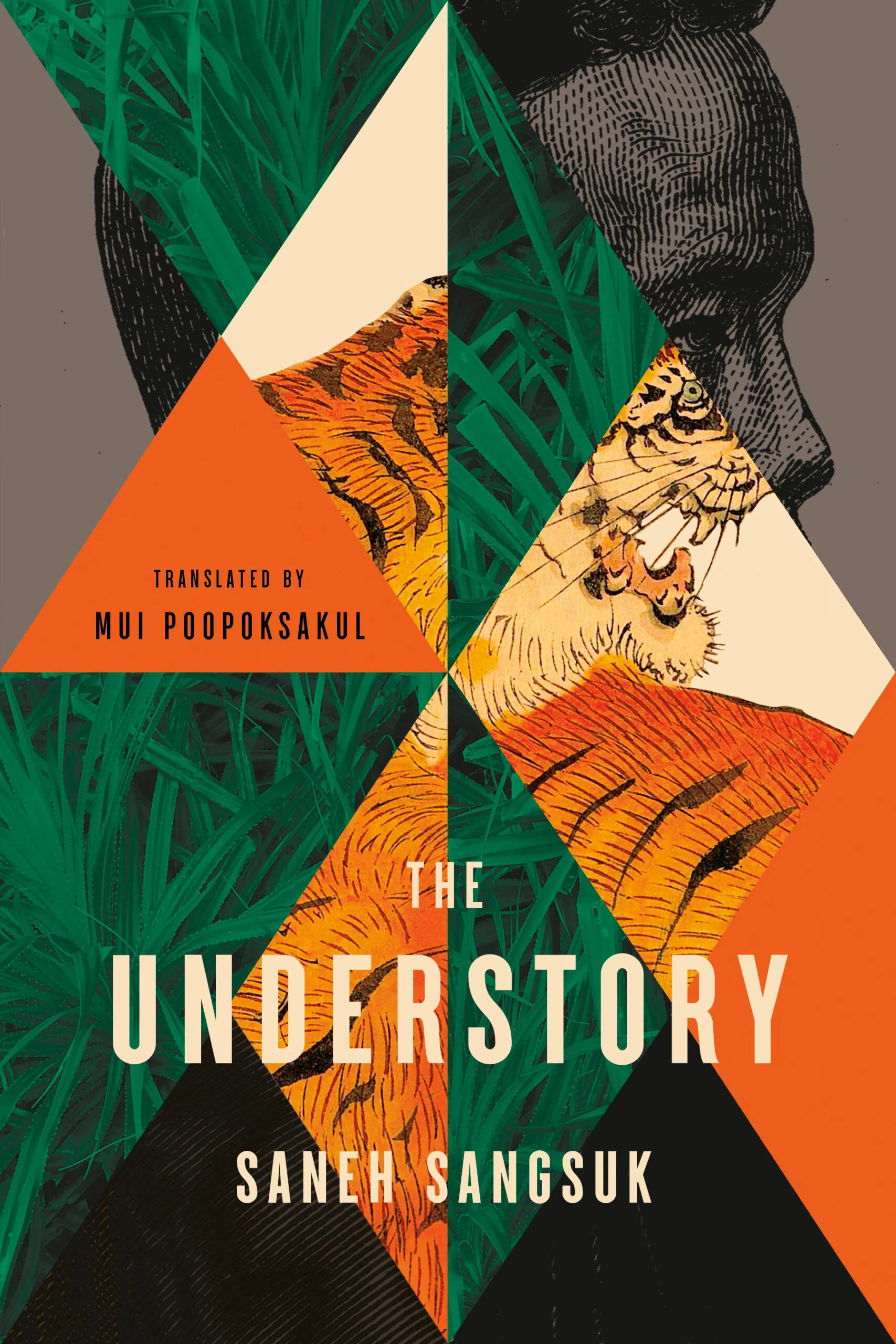
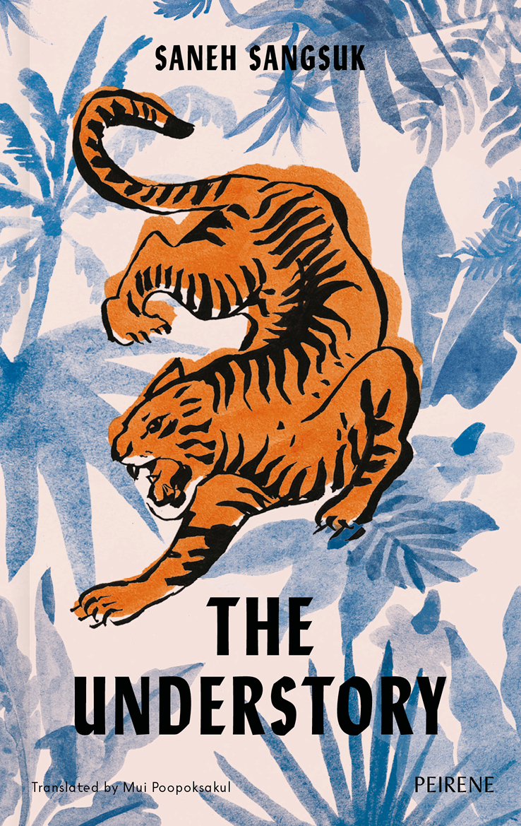
The cover of the UK edition of The Understory, published by Peirene Press in October last year, was designed by Orlando Lloyd. The illustration is by Miki Lowe.
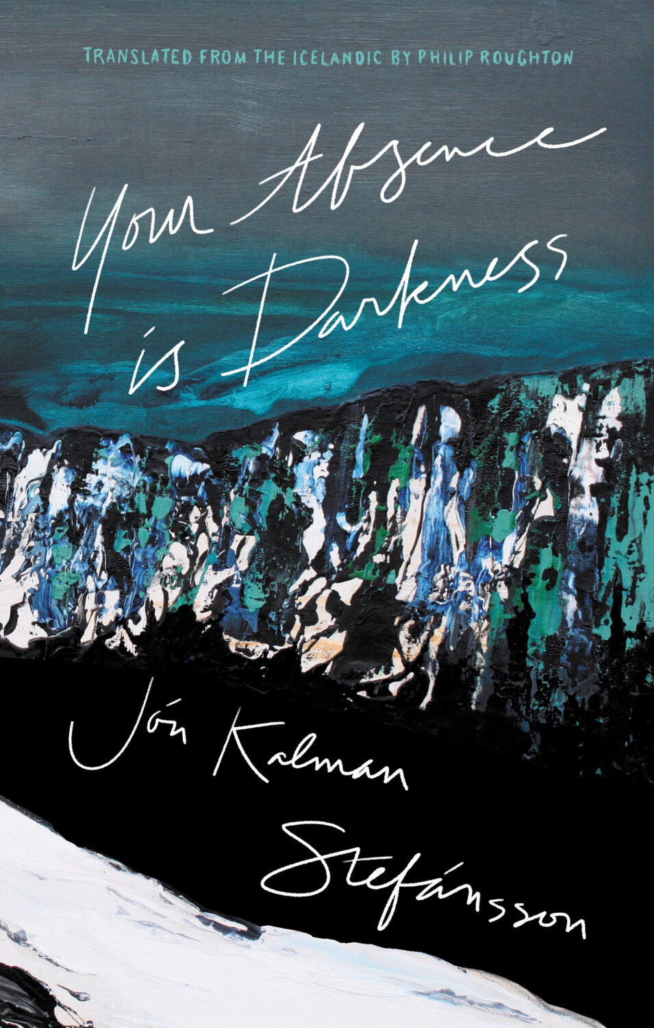
Your Absence is Darkness by Jón Kalman Stefánsson; design by Jason Arias (Biblioasis / March 2024)
Earlier this year, a Canadian magazine asked me what the latest trends in book cover design were. I don’t think I had a very satisfactory answer. 2021 felt very much like a continuation of 2020, which itself felt like a year on hold.
The trends that came to mind were not exactly new. In no particular order: big faces (big sunglasses!); cropped faces; hands; mouths; postmodern typefaces;1 big skies; rainbows; gradients; the colour orange; psychedelia; collage; contemporary painting.
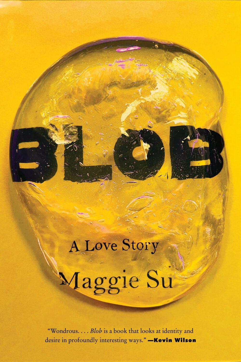
A lot was made of “blob” covers this year. I’m not sure that anything has really changed since Vulture published this article about “blocky” covers in 2019. They seemed like much the same thing.
Design is about the constraints and, as it turns out, the constraints around designing commercial literary fiction covers that have to work just as well online as in bookstores can lead to similar design solutions — large, legible type, and bright, abstract backgrounds. 2 The surprising thing is not that a few covers look the same when you squint; it’s that more of them don’t.
There were a lot of good covers (that didn’t look alike) in 2021. LitHub posted 101 of them. Still, it didn’t exactly feel like a vintage year.
Do I say that every December? Possibly.
A few years ago I worried that covers were moving in a more conservative direction, particularly at the big publishers. I’m not sure this has come to pass, at least not in the US. There are plenty of covers from the big, prestigious American literary imprints in this year’s list, as there were last year, and every year before that.
There are fewer covers from the UK in this year’s list than in previous years though, and I feel less confident about the situation there. From a distance, things seem a little sedate. I may be mistaken. It’s quite possible I haven’t see enough covers — or perhaps enough of the right ones — from British publishers to get a good sense of the overall picture.3
It would not be a surprise, however, if publishers were feeling a little risk-averse at the moment. We are two years into a global pandemic, experiencing a major supply chain issues, and living through a seemingly endless series of sociopolitical crises.
Nor would it be a surprise if designers were personally feeling the effects too — I’m not sure we are talking about this enough, and I’m not sure I know how to.
Thank you to everyone who has supported the blog in 2021. It means a lot. Here are this year’s book covers of note…
Na Kim talked to PRINT about her career and the designs for the Ditlevsen series in February. If, like me, you were wondering about typeface on the covers, it’s Prophet from Dinamo apparently.
If you’re wondering about the Super-Seventies Sally Rooney typeface, it is Ronda designed by Herb Lubalin and Tom Carnese (I only know because I asked).
Thank you to everyone who has supported the blog in 2021. It means a lot.
I am not convinced that the term “postmodern” quite captures what I mean here (and/or worse, implies something different in the context of typography), but it’s the best I’ve got. I’m not talking about the kind of experimental typography you might associate with the likes of Wim Crouwel or Emigre, or the aesthetic of someone like David Carson. What I am trying to get at is idiosyncratic type that purposely exaggerates or plays with letterforms, and doesn’t conform to function-first modernism. To my mind, this would include some typefaces from the 1960s and 70s, as well as some more contemporary type. In a sense what I am describing is display faces — and I think the eclectic, innovative use of type in Victorian advertising might be an inspiration to designers here — but I don’t think it is just about size. ↩
Pure Flame by Michelle Orange; design by Na Kim (Farrar, Straus and Giroux / June 2021)
In the ongoing game of books I think look alike but actually don’t when you put them side by side, the cover of Pure Flame brought to mind Peter Mendelsund‘s design for Civil Wars by David Armitage from a few years ago. Of course they don’t really look anything alike, but that’s how this game works…
Civil Wars by David Armitage; design by Peter Mendelsund (Yale University Press / February 2017)
A read an ARC of A Shock earlier this month and thought it was extraordinary. A recent review in the Observer described it a collection voyeuristic vignettes, which I suppose is accurate. The book is made up of interconnected and intimate stories, often about loneliness and confinement of one kind or another (particularly resonant during the pandemic). They are prying and unsettling… stories about seeing and been seen (or not). But in a wider sense, A Shock is about the telling and retelling stories (myths even!), and the way that is revealed in the novel itself is what elevates it above and beyond the usual fare. Anyway… I liked it. It won’t be for everyone.
The cover of the US edition, available from New Directions next month, was designed by the one and only Mr. Keenan:
So here it is, Merry Xmas, everybody’s having fun, my YA (and middle-grade) covers round-up for 2017. This is far from my area of expertise (I mostly work on the adult trade side of things), but until someone else steps up to do a annual post on YA covers with design credits and publisher details you’re stuck with me. Sorry.
All the picks are, of course, mine, but thank you to all the designers who have helped me over the year with covers, suggestions, and credits, and special thanks to Erin Fitzsimmons at HarperCollins and Sarah Creech at Simon & Schuster who helped me with this post in particular. Happy holidays!
The winners of the annual Academy of British Cover Design (ABCD) Awards were announced at a glittering ceremony London in last night. The dashing Danny Arter has a posted a full report on the proceedings at The Bookseller. You can see all the winning covers below…
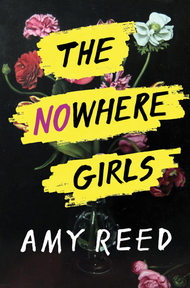
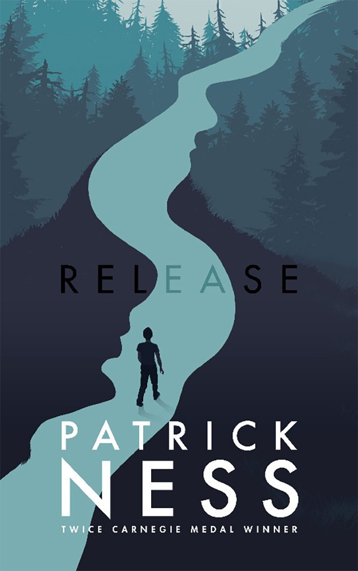
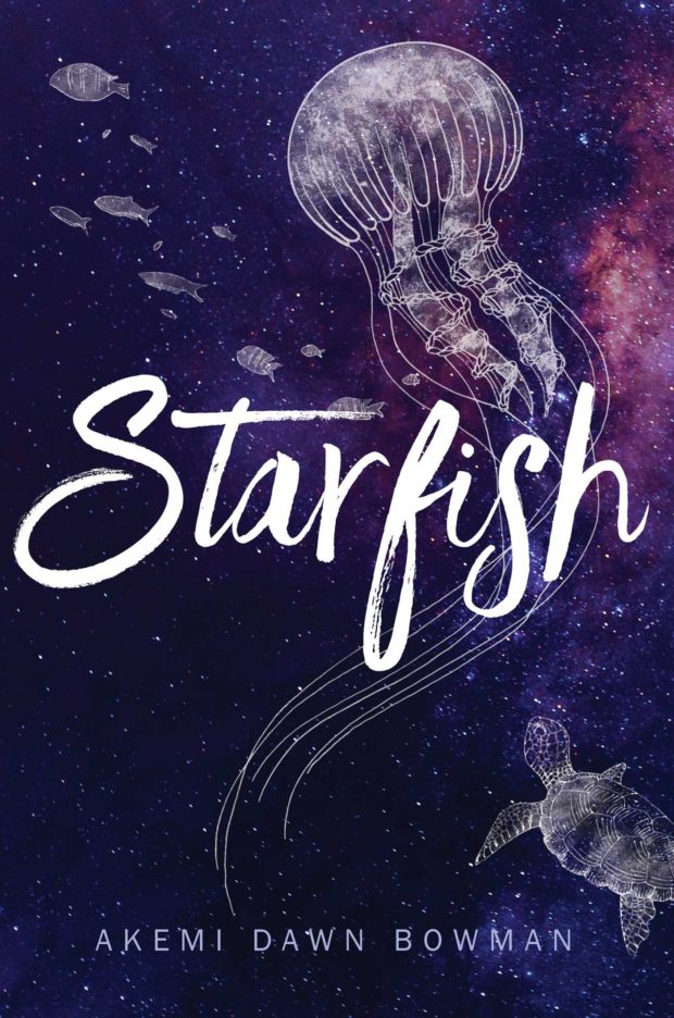
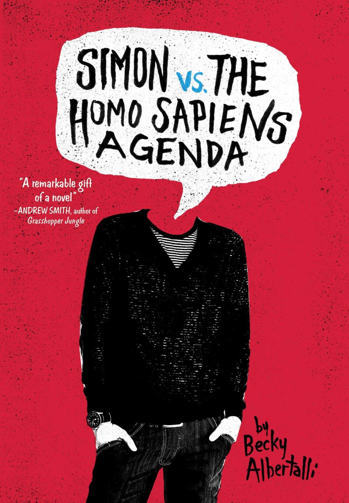
Hot on the heels of my annual covers post, here is my look back at the year’s young adult book covers. As in previous years, this list is a somewhat crowd-sourced affair, so I must thank all the designers and Twitter-folk who made suggestions and helped in various others ways. I’ve tried my best to credit the designs as fully as possible, but please let me know if there are any errors or omissions.
Aluta by Adwoa Badoe; design Michael Solomon; cover art Shonagh Rae (Groundwood / September 2016)
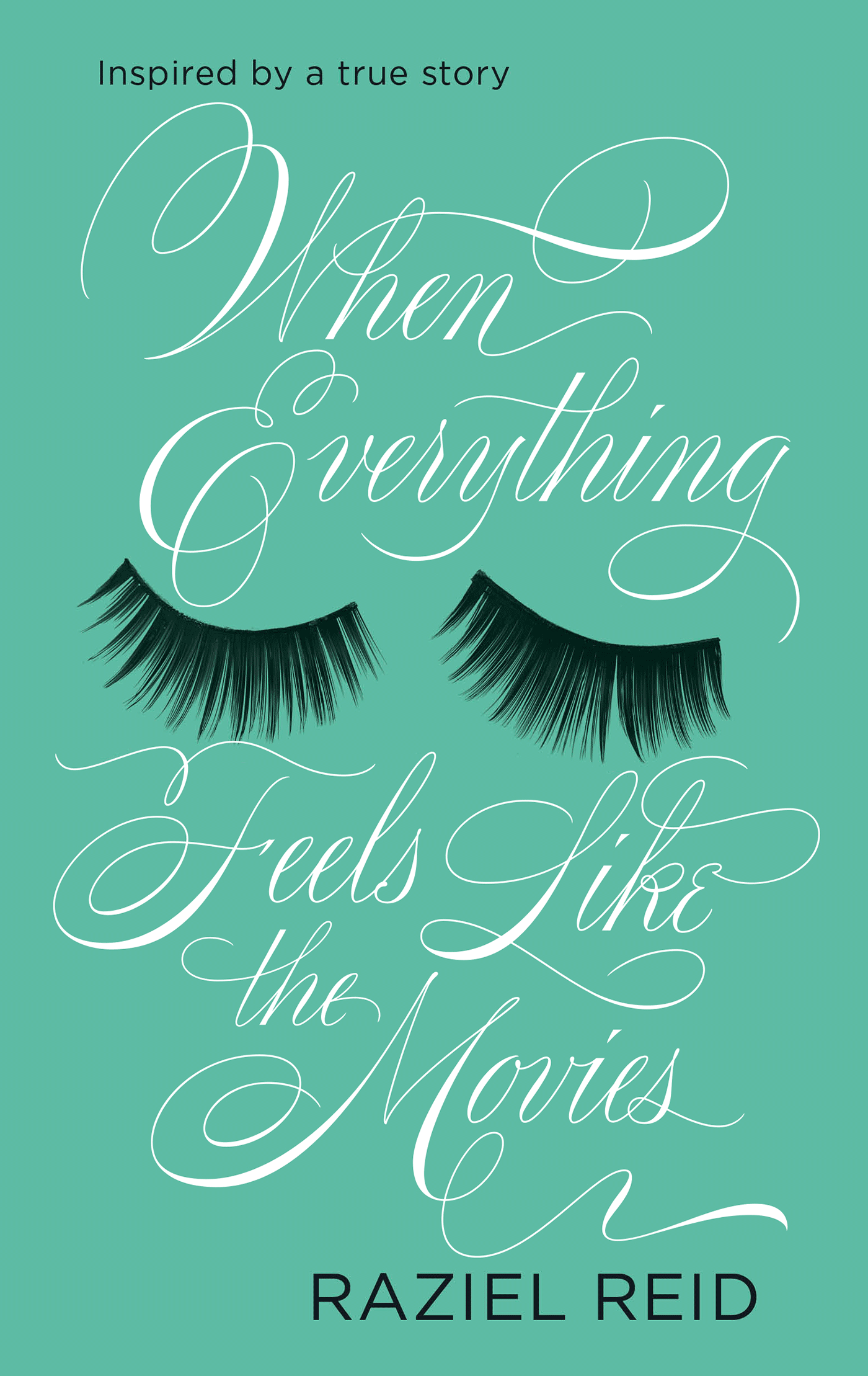
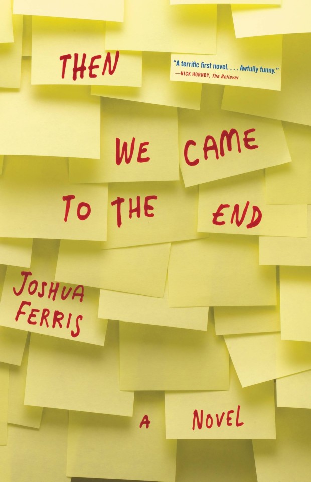
Sticking post-it notes to the front of books is a very real thing in the book industry — at least in the corners I’ve occupied — so perhaps it’s no surprise that they’ve made into cover designs too.
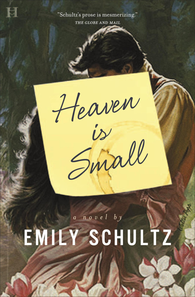
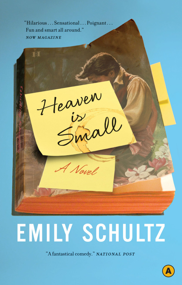
The first cover I can think of to incorporate a post-it was the hardcover of Heaven in Small by Emily Schultz, designed by Ingrid Paulson (House of Anansi in 2009).1 Interestingly, while the paperback, also designed by Ingrid (see below), kept the post-it, it no longer tricks the eye in quite the same way.
The last couple of years has seen a small flurry of post-it note book covers. I particularly like Nathan Burton‘s designs for rising literary star Valeria Luiselli, but post-it notes seem particularly in vogue for young adult covers, so we might well be seeing a few more in the coming months…
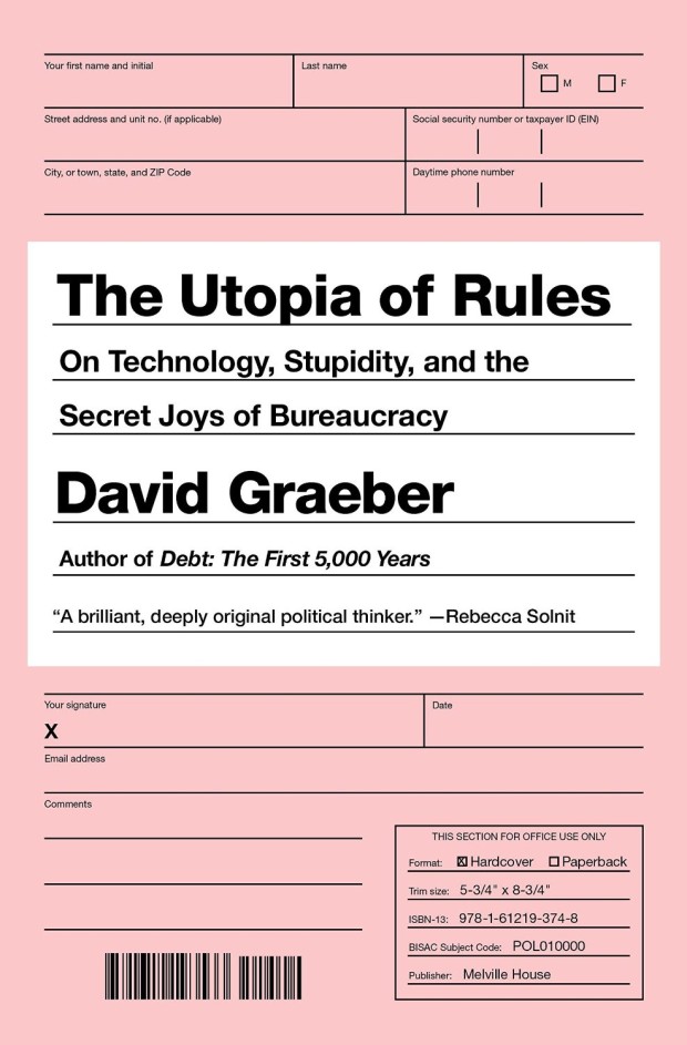
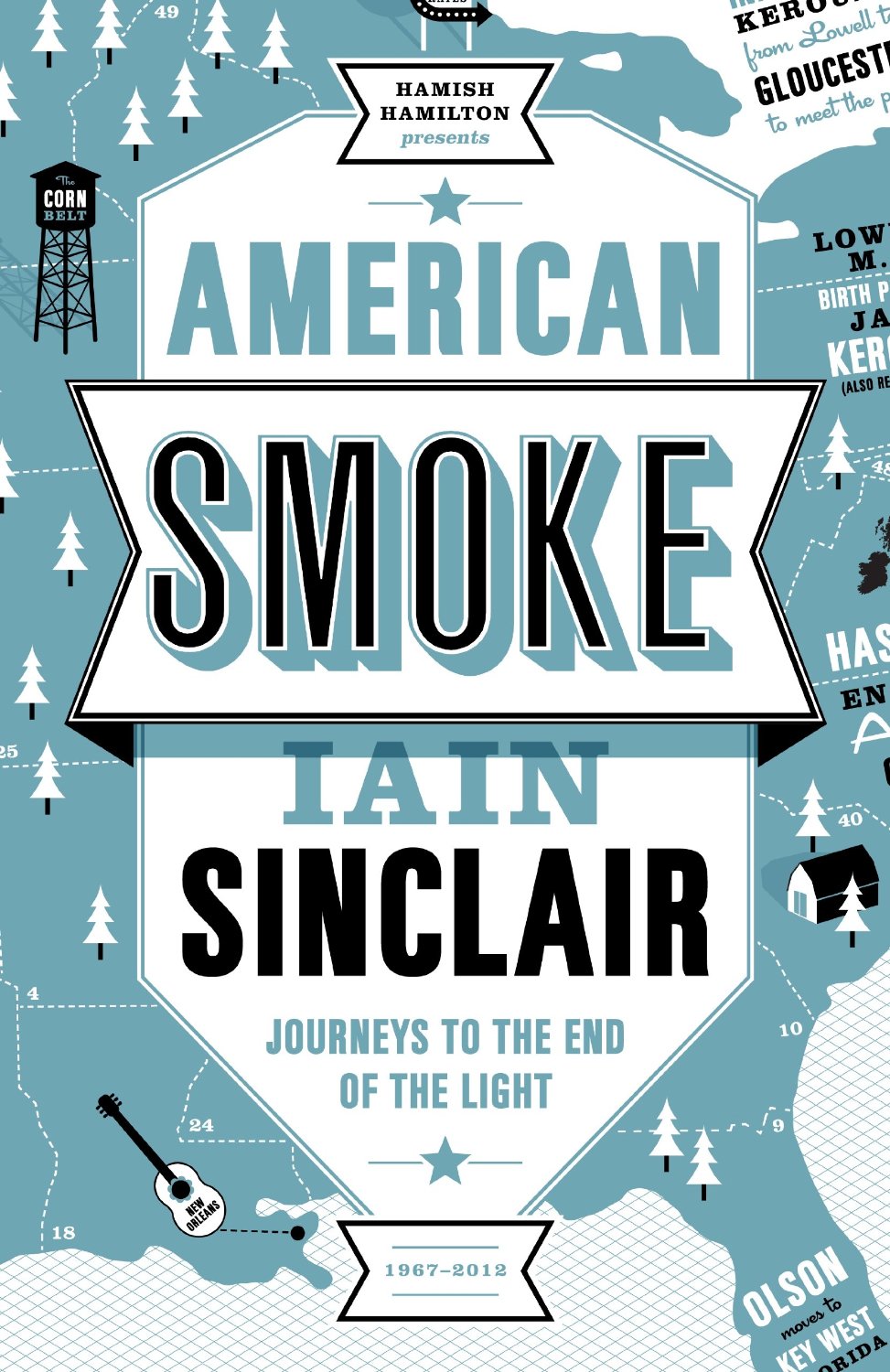
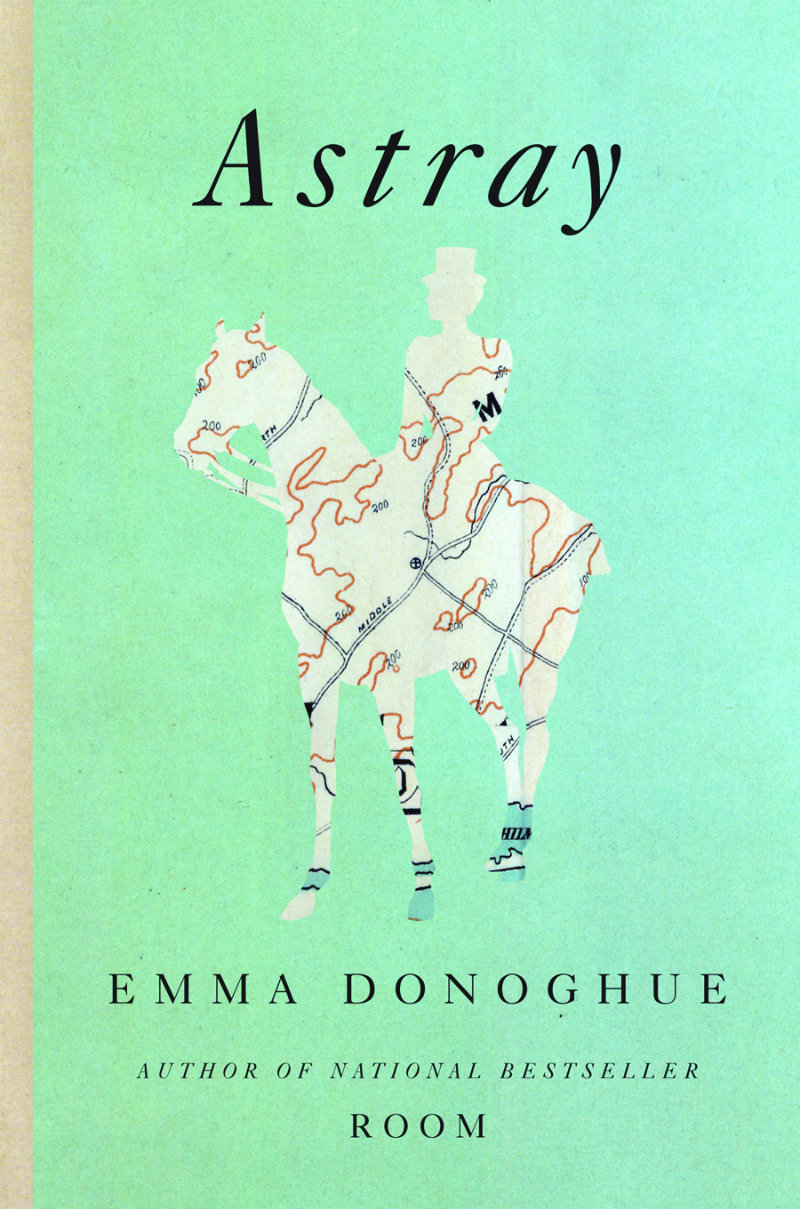
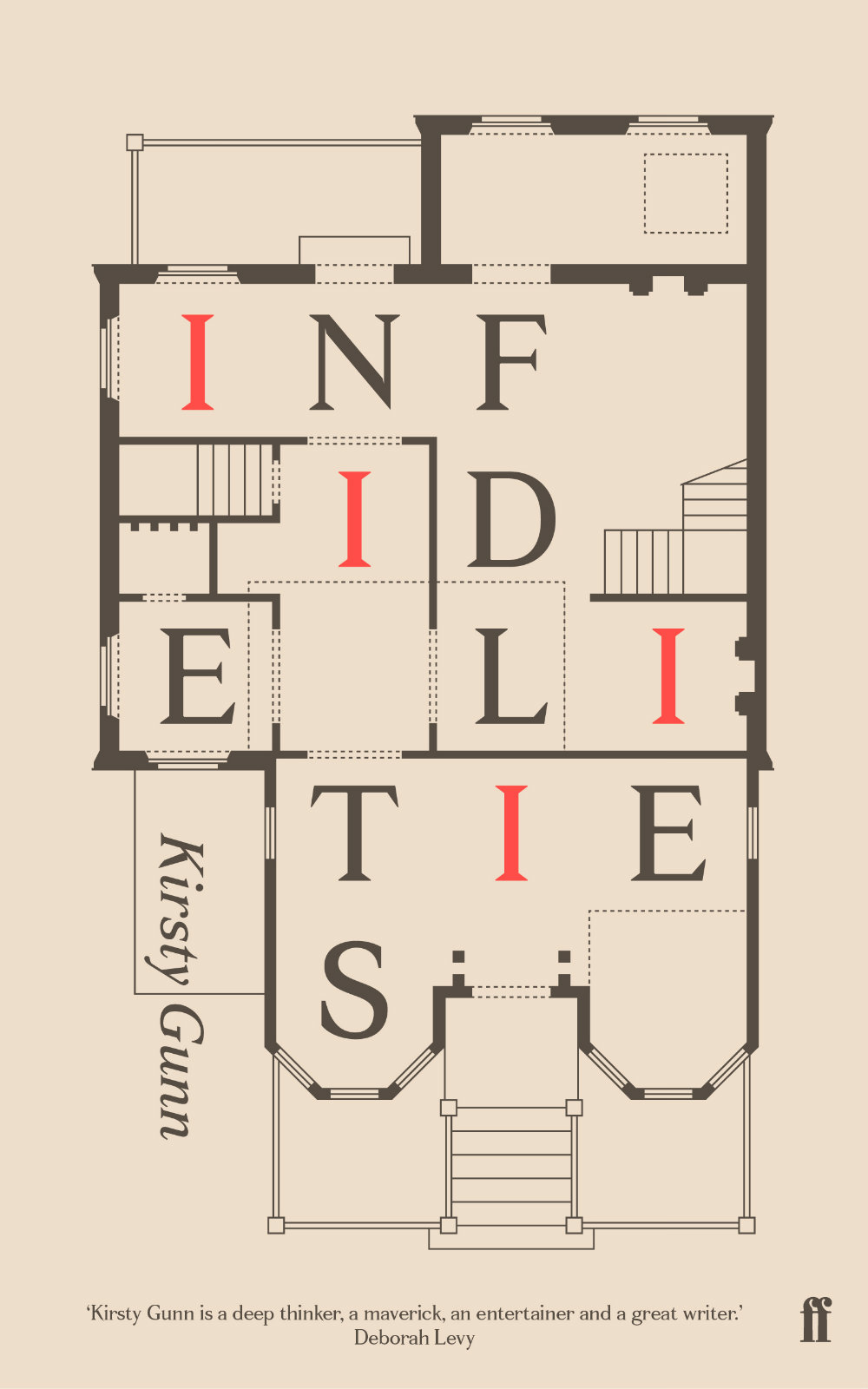
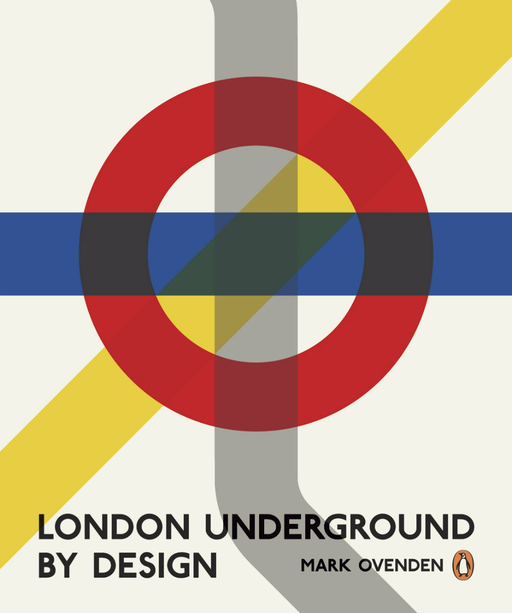
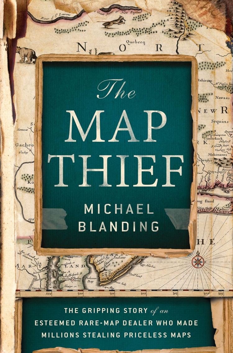
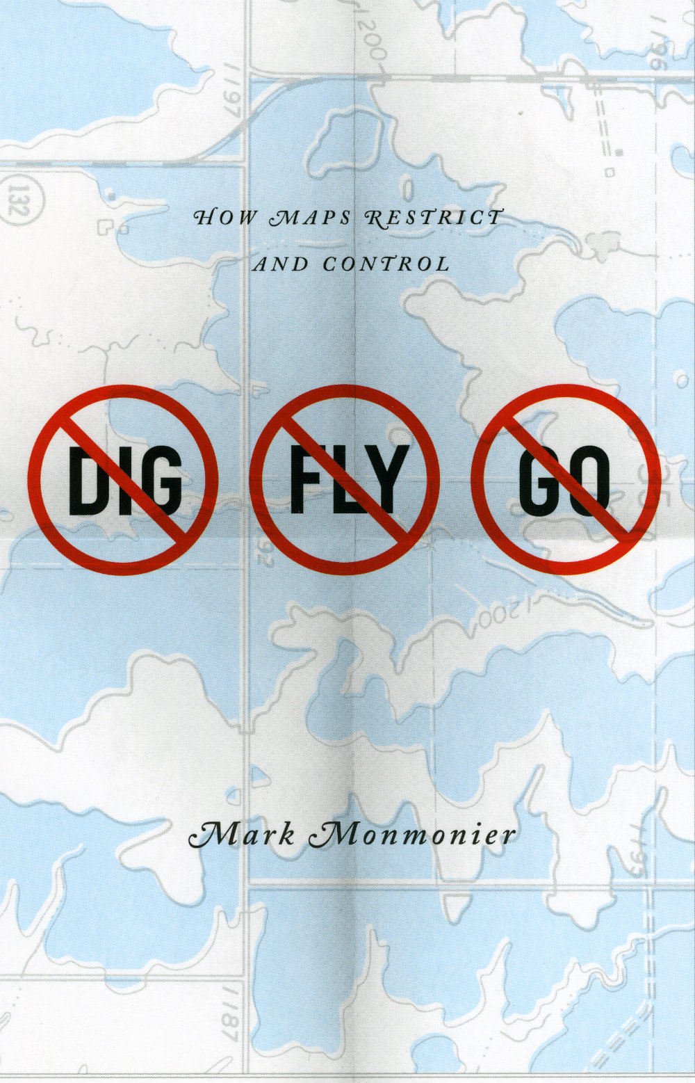
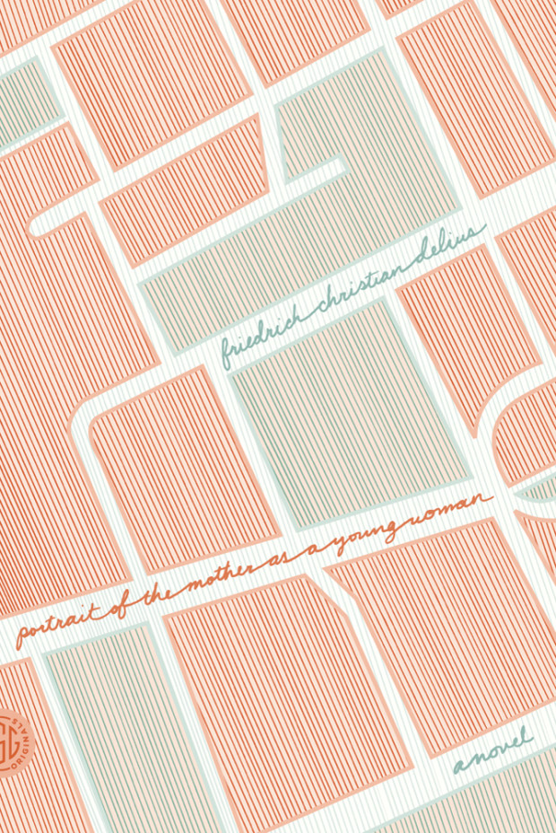
Who doesn’t like a good map? From sophisticated charts to intricate, idiosyncratic drawings to directions drawn on the back of napkin, maps explain the world two-dimensionally. They are flights of imagination anchored in our knowledge of the world — much like books themselves.
The Broom of the System by David Foster Wallace; design by Jamie Keenan (Penguin / May 2004)
The Discomfort Zone by Jonathan Franzen; design by Lynn Buckley (Picador / August 2007)
Guerra by Jason Webster; design by Bill Bragg (Black Swan / July 2007)
Maps of the Imagination by Peter Turchi; design by Pentagram (Trinity University Press / August 2007)
New York Trilogin by Paul Auster; design by Sara R. Acedo (Norstedts klassikerserie / March 2011)
Samedi the Deafness by Jesse Ball; design by Helen Yentus (Vintage / September 2007)
Words Without Borders; design by Helen Yentus (Anchor / March 2007)
You Are Here by Katherine Harmon; design by Jane Jeszeck / Jigsaw (Princeton Architectural Press / November 2003)
This post is a collection of book covers which use maps as parts of their design. I started this working on it months ago (my earlier post collecting arrows on books covers was originally an offshoot of this one), but it turned out to be surprisingly difficult to find enough interesting covers. I think I’ve finally got there — even if I had to cheat a little to include a couple of floor plans! I hope you agree…
Apostle Islands by Tommy Zurhellen; design by Jamie Keenan (Atticus Books / September 2012)
Nazareth, North Dakota by Tommy Zurhellen; design by Jamie Keenan (Atticus Books / April 2011)
And I don’t think we can end this post without mentioning the amazing Book Map print by Manchester-based studio Dorothy:
The map — loosely based on a turn of the century map of London — is made up from the titles of over 600 books from the history of English Literature. Buy it here.