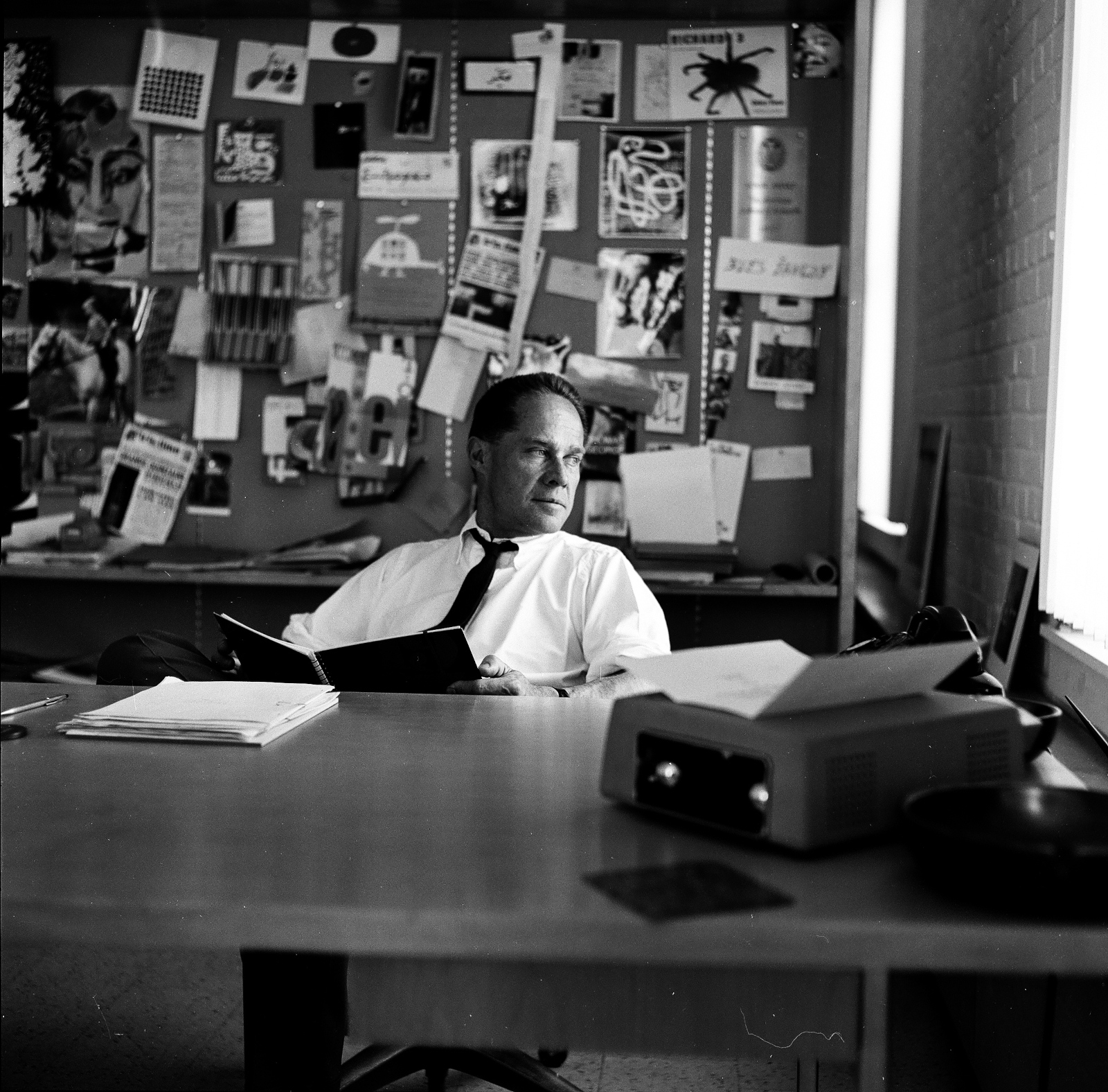
Opening in New York this week at IFC Center, Modernism, Inc. is a new documentary about architect Eliot Noyes, a pioneer of modern corporate design during America’s post-war economic boom.
Eliot Noyes started out as a disciple of Walter Gropius and the Bauhaus, which was a specific flavor of Modernism that developed in Europe between the wars. There was a kind of idealism—a social reform aspect—to it. Modern design promised to improve people’s lives in tangible ways by making high-quality goods and housing affordable for everyone. Once Modernism became installed in America after WWII, however, it lost a lot of that idealism. It was adopted by multinational corporations like IBM and it became the preferred architectural style of the super-rich. I don’t think Eliot Noyes was consciously trying to make this happen, but he was probably as central to this evolution as anyone. I try to let viewers make up their own minds about whether Eliot Noyes made the world better or worse as a result of the work he did in corporate design, but I hope they at least think about what might have happened if Modernism maintained the more independent spirit that it had before if became “Modernism, Inc.”
I was sad to hear that designer Elaine Lustig Cohen had died aged 89 last week. She will forever be associated with her more famous husband Alvin Lustig, but she was a remarkable designer in her own right and her influence, as Steven Heller notes at Design Observer, extended far beyond her studio:
Elaine’s professional standing far outlasted her years of practice because beyond being a pioneer, she was also the benefactor in so many ways for graphic design history, and an advocate for so many other historians, practitioners—and especially women. It is this enduring integrity and generosity that ultimately defined her highly treasured life.
Following Alvin Lustig’s death, Elaine specialized for some time in designing book covers and jackets, initially following her late husband’s aesthetic, until finding her own style and vision. For over a decade she earned commissions from museums, architects, and book publishers—including Noonday Press, whose publisher, Arthur Cohen, would become her second husband. Her own studio closed in 1967, although Elaine continued to design catalog covers for Ex Libris (the antiquarian bookstore she and Cohen ran together) focusing on avant-garde modernist books and documents. She turned instead to making art—inspired in part, by Constructivism, Dada, and the Bauhaus—and continued to do so until the end of her life.
In a profile of the designer forEye magazine in 1995, Ellen Lupton noted what made ELC’s book covers so distinctive…
In her covers for Meridian Books and New Directions, designed from 1955 through 1961, Elaine Lustig Cohen used abstract structural elements, expressive typography, and conceptual photographs to interpret the books’ contents. Working at a time when most book covers employed literal pictorial illustrations, Cohen visualized titles in contemporary literature and philosophy through a rich variety of approaches, from stark abstractions and concept-driven solutions to obtuse evocations that bring to mind the recent work of Chip Kidd and Barbara de Wild for Knopf.
Elaine Lustig Cohen’s cover for the journal ‘The Noble Savage’ 4 (1960) features a time-worn classical statue festooned with a typographic moustache and blasted with a star-burst pull-out quote from Darwin. For Yvor Winter‘s ‘On Modern Poets’ (1959), Cohen photographed a loose arrangement of plastic letters, while she used a field of pebbles to obliquely represent ‘The Varieties of History’ (1957). If such solutions are suggestively poetic, Cohen could also be brilliantly blunt, as in her choice of oversized, cello-wrapped bonbons for Tennessee Williams’s ‘Hard Candy’ (1959).
She designed museum catalogs and furniture. As a book-cover designer, she followed in Mr. Lustig’s precisionist footsteps but eventually established her own, more free-form style.
“I tried to reflect the spirit of the books,” she said in a video made by AIGA, the graphic arts organization, when she was awarded its medal in 2012.
Her jacket for “Yvor Winters On Modern Poets” looked as if plastic letters had been placed on a tabletop, then jostled by a passing child. A book about St. Augustine featured his name twice, as the arms of a cross. The jacket for Tennessee Williams’s short-story collection “Hard Candy” showed extreme close-ups of cellophane-wrapped sweets, seeming to fall through the air.
You can see a selection of ELC’s book covers on her website, and the video referenced above is here:
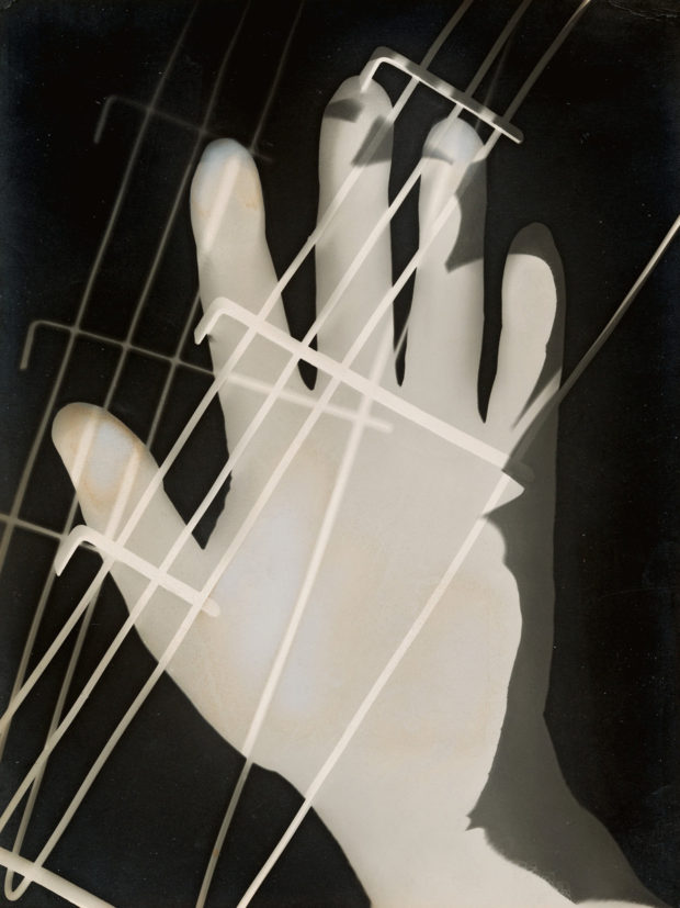
The first large Moholy-Nagy exhibition in this country in over 50 years may also be, its organizers say, the largest anywhere. It packs around 300 works into Frank Lloyd Wright’s great spiral — perhaps a record itself. They represent some dozen mediums including painting and sculpture, film and projection, works on paper as well as graphic, set and exhibition design and several forms of photography.
The show provides a bracing picture of both the extent and the unity of Moholy-Nagy’s art as it moves up the ramp, superbly styled for the occasion by Kelly Cullinan, the museum’s senior exhibition designer. Her scheme separates Moholy-Nagy’s achievement into separate strands and then braids them together fluidly. The abstract paintings and sculptures dominate the museum’s signature bays; most films are displayed in small alcoves between the ramps. Moholy-Nagy’s extensive writings and graphic design are displayed on each level in vitrines, whose bright rectangular lids manage to evoke the colorful trapezoids in his paintings. And his complex involvement with photography is played out on free-standing partitions, enabling close study of the interplay of documentary, photomontage and camera-less photograms — a term he invented — sometimes made using his own sculpture. Certain forms and motifs reappear in different mediums, and the give and take between photography and painting is one of the show’s driving forces.
It sounds like a must-see.
Moholy-Nagy: Future Present is at the Guggenheim until September 7. The exhibition is also travelling to Chicago and Los Angeles.
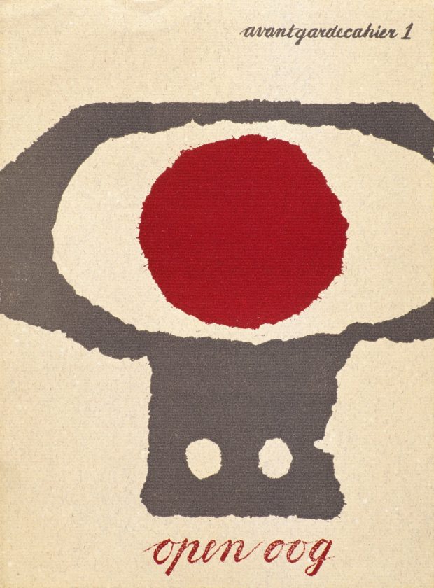
Writing for The Guardian, Simon Garfield (Just My Type), visits the first UK retrospective Dutch designer and curator Willem Sandberg:
“This is printed on wallpaper, very asymmetric … an amazing thing really,” Fraser Muggeridge, the curator, says as he shows me his collection of Sandberg ephemera in his studio in London’s Smithfield. It is a space Sandberg would have admired, with its display of promotional work for emerging artists and galleries crowding in from the walls. “I don’t think he was trying to make the most perfect work, but it was always free-spirited and arresting.” His letters were highly sculptural, revealing negative space; at first glance a torn “T” becomes a sideways “E”. They speak of his obsession not only with making intricate objects by hand, but also with solid branding: his graphics for the Stedelijk created a look and mood for a museum that today would require a huge budget and corporate pitching.
Astonishingly, most of Sandberg’s catalogues and posters were a sideline, designed in the evenings and at weekends. Sandberg was the director of the museum from 1945 to 1962, and his close relationship with the local state printer produced an identity that transformed the Stedelijk into one of Europe’s first truly modern galleries. He created what he liked to refer to as an “Anti-Museum”, rejecting the traditional dark and hushed rooms and creating something bright and accessible, a place of social interaction. He championed young artists, and he succeeded in attracting people who had barely set foot in a museum before. There was a shop, a learning centre and a cafe, all brave innovations in the middle of the century. As was Sandberg’s scheme to get the Stedelijk a little more noticed in the city: he painted the entire building white.
Focusing on European architecture, art and design in the second-half of the twentieth-century, German Post-War Modern is currently one of my favourite Tumblrs.
Mies had dreamed of building skyscrapers since the early 1920s when, as a young architect in Berlin recently returned from the war, he’d been seduced by images of the thrusting New York skyline. Influenced by the utopian futurism of Paul Scheerbart, author of Glasarchitektur, Mies proposed a 20-storey tower completely sheathed in glass. It would have loomed over Berlin like an enormous faceted crystal: each wall was positioned at a slight angle to reflect and refract the light. He was fond of quoting St Augustine – ‘beauty is the radiance of truth’ – and wanted to celebrate rather than disguise structural form. ‘Only skyscrapers under construction reveal the bold constructive thoughts,’ Mies wrote, ‘and then the impression of the high-reaching steel skeletons is overpowering.’ In his glass tower, the bones of the building, with their cantilevered floor slabs, would have been visible through a shimmering, crystalline skin.
The glass skyscraper was, as Schulze and Windhorst put it, ‘beyond the threshold of constructability’ (and would only be possible in the 1970s – Mies was fifty years ahead of his time), but it was intended less as a realistic proposal than a radical, modernist statement. It would thrust him to the forefront of the European avant-garde.
Grove Press and its charismatic owner, Barney Rosset, sit right at the center of postwar intellectual history. Glass notes early that if Rosset made a lot of impulsive bad decisions, he was guided steadily by a shrewd understanding of where American culture was headed. In the 1950s, Americans were beginning to go to college en masse, and when they got there they would seek out whatever was chic, daring, avant-garde, experimental — in a word, hip. Counterculture, the notion of seceding from the mainstream and dwelling in an autonomously created realm of liberated culture, was perhaps the most potent dream of the postwar age. Everybody wanted in. Against the mounting tide of a mass avant-garde, the old censorship codes could not long endure.
But while it’s hard not to be inspired by the story Grove Press, it’s also important to note the less savoury side of it, and how it was overtaken by the cultural changes Rosset helped start:
Those who harkened to Evergreen Review’s call to “join the underground” constituted the higher-brow version of the man who read Playboy: a 1966 advertising survey discovered that he was “a 39-year-old male, married, two children, a college graduate who holds a managerial position in business or industry, and has a median family income of $12,875.” (That’s about $92,000 in 2013.) It turns out that “Chuck,” the everysquare in a 1965 Evergreen Review spoof of Charles Atlas ads, painted a pretty realistic portrait of the Grove readership. But with the emergence of a feminist critique made possible by the very cultural revolution Rosset served, the masculine literati no longer enjoyed the privilege of guiltless consumption, and modernist experimentalism no longer provided a dignified alibi for it. In the 1970s, the Evergreen Review image of the hip intellectual soured. We might imagine Chuck a decade later, up to his ears in alimony, parted hair modishly grown out though thinning and combed-over on top, paunch swelling under a safari suit coat, leering at younger women who wish he would drop dead.
At the London Review of Books, Brian Dillon considers Marcel Duchamp’s vacation in English coastal town of Herne Bay (and other unlikely historical connections between Kent and Europe’s 20th-century experimentalists):
Details about Duchamp’s time in Kent are scarce. We know that he travelled as chaperon to his 17-year-old sister, Yvonne, and stayed for most of August at Lynton College while she learned English… During or soon after his holiday at Herne Bay, Duchamp made four drawings and a couple of notes that all relate to The Large Glass. The drawings are prototypes of enigmatic – animal, mechanical or anthropomorphic – elements in the achieved work: the ‘pendu femelle’ (an apparently female form that hangs at the top left) and the ‘sex cylinder’ or ‘wasp’ that attends it on the right. There is a colony of rare digger wasps at Reculver, which has excited some Duchampians, but the more obvious link to Herne Bay is in the notes. Duchamp tore out and kept a small photograph of the illuminated pier and wrote, apparently describing a potential backdrop for The Large Glass: ‘An electric fête recalling the decorative lighting of Magic city or Luna Park, or the Pier Pavilion at Herne Bay.’
I didn’t know that influential German artist Kurt Schwitters spent the last years of his life in exile in England’s Lake District creating something called the ‘Merz Barn’. Did you?
Schwitters started constructing the original ‘Merzbau’ (pictured above) inside his Hannover studio in the 1920’s and continued to work on it until he fled Nazi Germany in 1937. The Merzbau itself was later destroyed in an Allied bombing raid in World War II.
The uncompleted ‘Merz Barn’ that Schwitters began building near Elterwater in the Lake District is much less well-known. The latest TateShots video visits this only surviving example of Schwitters’ Merz environment:
(I’m not entirely sure how or why radio presenter Tom Ravenscroft (son of the late John Peel) is involved, but if you don’t listen to his weekly music show on BBC, you should probably take a listen… if you like that sort of thing.)
What kind of a problem is a library? It’s clear that for many people it is not a problem at all, only a kind of obsolescence. At the extreme pole of this view is the technocrat’s total faith: with every book in the world online, what need could there be for the physical reality? This kind of argument thinks of the library as a function rather than a plurality of individual spaces. But each library is a different kind of problem and “the Internet” is no more a solution for all of them than it is their universal death knell.
The public library, introduced in Manchester with much municipal self-congratulation in the early 1850s, was ‘free’, unlike ‘leviathan’ circulating libraries such as Mudie’s and W H Smith’s that catered to the middle classes. The lower classes lick their index fingers to turn the page. A quaint ‘fumigator’ in which Victorian public libraries could decontaminate their stock is illustrated in Leah Price’s discussion of the disease-carrying book. Victorians were wedded to the ‘miasmic’ theory of disease. Yet it wasn’t air but spittle that was the vector of the dreaded consumption.
For many of us, the notion that bricks-and-mortar bookstores might one day disappear was unthinkable. Jason Epstein put it best in Book Business, his incisive 2001 book on publishing’s past, present and future, when he offered what now looks to be, given his characteristic unsentimental sobriety, an atypical dollop of unwarranted optimism: “A civilization without retail bookstores is unimaginable. Like shrines and other sacred meeting places, bookstores are essential artifacts of human nature. The feel of a book taken from the shelf and held in the hand is a magical experience, linking writer to reader.” That sentiment is likely to strike today’s younger readers as nostalgia bordering on fetish. Reality is elsewhere.
Also at The Nation — Michael Naumann on Germany’s bookstores and literary culture:
Since the late 1840s in Germany, the ambiguous character of books—simultaneously a commodity and a cultural work—has defined internal discussions in the publishing business. Putting aside the implicit hubris of German nationalism, the country’s self-aggrandizement as a veritable Kulturnation, the fact remains that in Germany the cultural definition of the “book” as a major source of intellectual, scientific, economic and aesthetic self-improvement has carried the day over the capitalist notion that a book is a commodity and therefore deserving of no special considerations. The book as such is sacred. One does not throw books away.
And finally…
The Graphic Modern: USA, Italy and Switzerland 1934–66 exhibition curated by Patricia Belen and Greg D’Onofrio of Kind Co. is on display at Fordham University at Lincoln Center, should you happen to be in New York between now and July 26th.