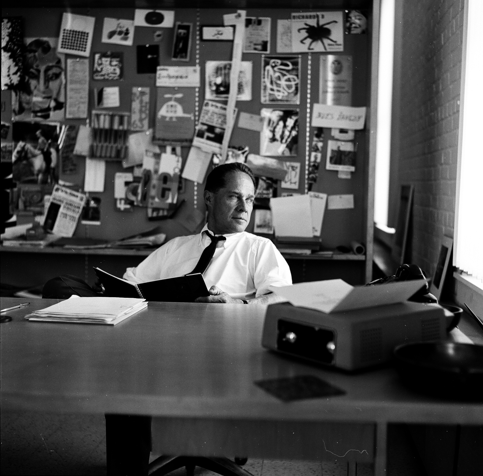
Opening in New York this week at IFC Center, Modernism, Inc. is a new documentary about architect Eliot Noyes, a pioneer of modern corporate design during America’s post-war economic boom.
Eliot Noyes started out as a disciple of Walter Gropius and the Bauhaus, which was a specific flavor of Modernism that developed in Europe between the wars. There was a kind of idealism—a social reform aspect—to it. Modern design promised to improve people’s lives in tangible ways by making high-quality goods and housing affordable for everyone. Once Modernism became installed in America after WWII, however, it lost a lot of that idealism. It was adopted by multinational corporations like IBM and it became the preferred architectural style of the super-rich. I don’t think Eliot Noyes was consciously trying to make this happen, but he was probably as central to this evolution as anyone. I try to let viewers make up their own minds about whether Eliot Noyes made the world better or worse as a result of the work he did in corporate design, but I hope they at least think about what might have happened if Modernism maintained the more independent spirit that it had before if became “Modernism, Inc.”
In April this year, AIGA posthumously honoured designer Alexander Girard (1907-1993) with an AIGA Medal, recognizing “his effortless ability to move across innumerable surfaces and scales, his life-long innovative and inspirational cross-disciplinary design practice, and his undeniable impact on mid-century modernism in America.”
Alexander Girard was a designer who defied easy categorization, mostly because he worked—and excelled—in every field. Tireless, creative, and immersive, Girard was most comfortable when absorbed in a project, and he managed to complete a staggering catalog raisonné in his lifetime: houses, department stores, trendy restaurants, less trendy restaurants, logos, a terrazzo material, an airline, a folk art museum, even an imaginary land with its own language…
…Girard’s colorful, geometric, typography-driven, and folk-inspired personal aesthetic became indistinguishable from the midcentury look still sold by the Michigan-based company [Herman Miller]. As later brand director… Sam Grawe wrote back in 2008 for Dwell, “colors hitherto considered gauche—magenta, yellow, emerald green, crimson, orange—became a part of the company’s formal vocabulary, and in time, the world’s.”
Herman Miller — the company with which Girard is most closely associated — recently posted an extended cut of the tribute video made for the AIGA’s celebration of Girard’s life and work:
In 1962, Kent saw work by Andy Warhol for the first time, and her aesthetic changed markedly, becoming bolder, flatter, more abstract and brighter, often with saturated, almost fluorescent, colors. Her new style was so successful that it became became known as “nun art,” and was often imitated. Her adherence to the Pop Art aesthetic was well suited to her joyous aims: Kent said she wanted her art to “give people a lift” and help them get “more fun out of life.”
Pop Art’s celebration of the urban everyday also empowered Kent to introduce more quotidian sources into her text works. During the ’60s, she began to incorporate lyrics from pop songs, advertising slogans, and snippets of text seen on signs and packaging into her work, often pairing them with religious text. It was a move that elevated the ordinary to the spiritual, and became a frequent theme in Kent’s art and teaching. She found delight in the commonplace, and believed that the divine could be seen anywhere, even amidst the chaos of the modern city. Kent often took her students on urban expeditions—even day-long trips to gas stations and car lots—armed with cameras and viewfinders.
The largest ever exhibition of Corita Kent’s work in the UK, Corita Kent: Power Up, is currently on display at House of Illustration in King’s Cross until May 12.
In the latest episode of Vox’s Earworm video series, producer Estelle Caswell takes a look at the classic record covers of the jazz label Blue Note designed by Reid Miles and frequently featuring the photographs of Francis Woolf:
I was sad to hear that designer Elaine Lustig Cohen had died aged 89 last week. She will forever be associated with her more famous husband Alvin Lustig, but she was a remarkable designer in her own right and her influence, as Steven Heller notes at Design Observer, extended far beyond her studio:
Elaine’s professional standing far outlasted her years of practice because beyond being a pioneer, she was also the benefactor in so many ways for graphic design history, and an advocate for so many other historians, practitioners—and especially women. It is this enduring integrity and generosity that ultimately defined her highly treasured life.
Following Alvin Lustig’s death, Elaine specialized for some time in designing book covers and jackets, initially following her late husband’s aesthetic, until finding her own style and vision. For over a decade she earned commissions from museums, architects, and book publishers—including Noonday Press, whose publisher, Arthur Cohen, would become her second husband. Her own studio closed in 1967, although Elaine continued to design catalog covers for Ex Libris (the antiquarian bookstore she and Cohen ran together) focusing on avant-garde modernist books and documents. She turned instead to making art—inspired in part, by Constructivism, Dada, and the Bauhaus—and continued to do so until the end of her life.
In a profile of the designer forEye magazine in 1995, Ellen Lupton noted what made ELC’s book covers so distinctive…
In her covers for Meridian Books and New Directions, designed from 1955 through 1961, Elaine Lustig Cohen used abstract structural elements, expressive typography, and conceptual photographs to interpret the books’ contents. Working at a time when most book covers employed literal pictorial illustrations, Cohen visualized titles in contemporary literature and philosophy through a rich variety of approaches, from stark abstractions and concept-driven solutions to obtuse evocations that bring to mind the recent work of Chip Kidd and Barbara de Wild for Knopf.
Elaine Lustig Cohen’s cover for the journal ‘The Noble Savage’ 4 (1960) features a time-worn classical statue festooned with a typographic moustache and blasted with a star-burst pull-out quote from Darwin. For Yvor Winter‘s ‘On Modern Poets’ (1959), Cohen photographed a loose arrangement of plastic letters, while she used a field of pebbles to obliquely represent ‘The Varieties of History’ (1957). If such solutions are suggestively poetic, Cohen could also be brilliantly blunt, as in her choice of oversized, cello-wrapped bonbons for Tennessee Williams’s ‘Hard Candy’ (1959).
She designed museum catalogs and furniture. As a book-cover designer, she followed in Mr. Lustig’s precisionist footsteps but eventually established her own, more free-form style.
“I tried to reflect the spirit of the books,” she said in a video made by AIGA, the graphic arts organization, when she was awarded its medal in 2012.
Her jacket for “Yvor Winters On Modern Poets” looked as if plastic letters had been placed on a tabletop, then jostled by a passing child. A book about St. Augustine featured his name twice, as the arms of a cross. The jacket for Tennessee Williams’s short-story collection “Hard Candy” showed extreme close-ups of cellophane-wrapped sweets, seeming to fall through the air.
You can see a selection of ELC’s book covers on her website, and the video referenced above is here:
Remember Those Great Volkswagen Ads? is a short documentary about the classic, highly influential ad campaigns created by Manhattan advertising agency Doyle Dane Bernbach (DDB) for Volkwagen in the 1950s and 60s:
‘Dominique’ by Eugene Fromentin. Copyright 1948; No print date (circa 1952-53). Grove Press dust jacket on an imported hardcover originally published and printed by The Cresset Press (London). Cover design by Roy Kuhlman.
‘America Day by Day’ by Simone de Beauvoir. Grove Press, 1953. Hardcover. Cover designed by Roy Kuhlman.
Kuhlman is best known, of course, for the brilliant mid-century modern book covers he designed for Grove Press. The site is not comprehensive — at least not yet — but given the number of covers and other pieces Kuhlman must have designed over his career that is, perhaps, not surprising. Archiving his work must be a massive undertaking. Hopefully there is much more to come.
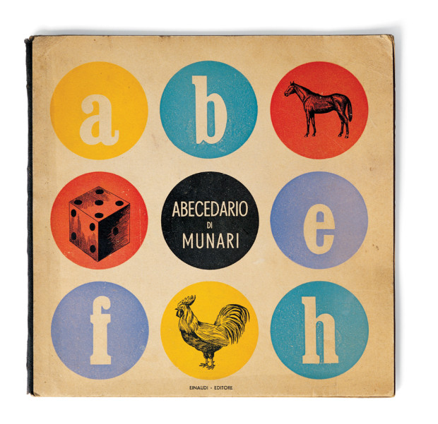
Before turning his attention to graphics and advertising, Italian artist and designer Bruno Munari (1907-1998) made his mark as a member of the Futurists, an avant-garde art movement fascinated by modernity, mass production, and pushing at technological limits.
The influence of Futurism — not to mention modernism’s jokers Dada and Surrealism — is apparent throughout Munari’s Books, a collection of Munari’s book design recently published in English by Princeton Architectural Press. Munari relentlessly experimented with typography, photography, collage, and printing materials. There is a book made of metal, another that comes with a hammer. There is page after page of special papers, unique bindings, loose pages, punches, tears, and flaps. The breadth (and the volume!) of his work is staggering, and it all crackles with this restless sense of innovation, urgency, and provocation.
Bruno Munari’s ABC (image credit: Cleveland: World Publishing Company, 1960)
“A great children’s book, with beautiful expressive figures, the right story, printed simply, would not be accepted (by some parents), but children would love it.”1
But Munari’sdesigns and illustrations are also surprisingly full of warmth and wonder. This is most apparent in his expressive illustrations, and the large number of books Munari produced for very young children. Even readers familiar with Bruno Munari’s ABCand Bruno Munari’s Zoo, may find themselves astonished at just how many other extraordinary children’s books he created that aren’t currently available in English.
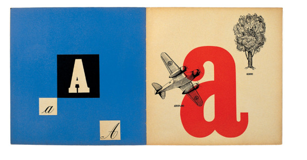
Abecedario de Munari (image credit: Rome: Emanuele Prandi, 1942)
Abecedario de Munari (image credit: Rome: Emanuele Prandi, 1942)
“we need to deconstruct the myth of the artist-hero who produces only masterpieces for the intelligent. We have to show that as long as artists are outside the problems of everyday life, only a few people will be interested. And now, in these days of mass culture, artists must climb down from their pedestals and be so kind as to design a butcher’s sign.”2
If Munari’s Books has a shortcoming, it is the rather academic introductory texts (they will be useful for better design writers than me, but I got little sense of the Munari’s life or the personality behind the designs from them). Fortunately, the book is peppered with lively quotations from Munari himself. The most pithy come from Arte come mestiere, a collection of Munari’s writing on design first published in English in 1971 as Design as Art (and reissued as a Penguin Modern Classic in 2008). The short essays in Arte come mestierewere originally written for Milan daily newspaper Il Giorno, and they address everyday life as well as design. They’re witty, discursive (and sometimes even surprisingly practical), and a perfect accompaniment to the illustrations in Munari’s Books.
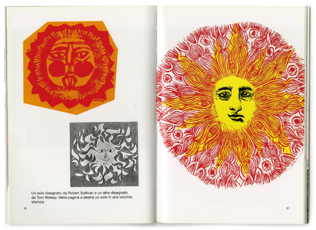
Disegnare il sole (image credit: Mantua: Graziano Peruffo, 1980)
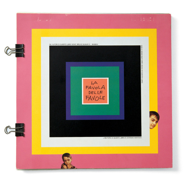
La favola delle favole (image credit: Mantua: Maurizio Corraini Editore, 1994)
Nella nebbia di Milano (Mantua: Graziano Peruffo, 1968)
I don’t post too many crowd-funded publishing projects here on the Casual Optimist — there are so many of them, and so few seem really significant — but I’m more than happy to support the Designers and Books‘
campaign to create a facsimile reprint of Visual Design in Action by modernist graphic designer Ladislav Sutnar. First published in 1961, and out of print for decades, it looks very worthy of a revival:
You can read more about the book and the campaign here.
Considering the punchy, wildly inventive covers he created in the 1950s for books by Henry James, Albert Camus, Jean-Paul Sartre and Herbert Marcuse, you might suppose that he aligned with the liberal intellectual wing of that period’s culture. From the late ’50s on, when he began working directly for corporations to shape their public identities, it seems he pledged allegiance to corporate America.
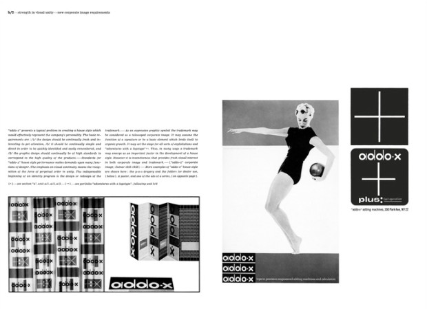
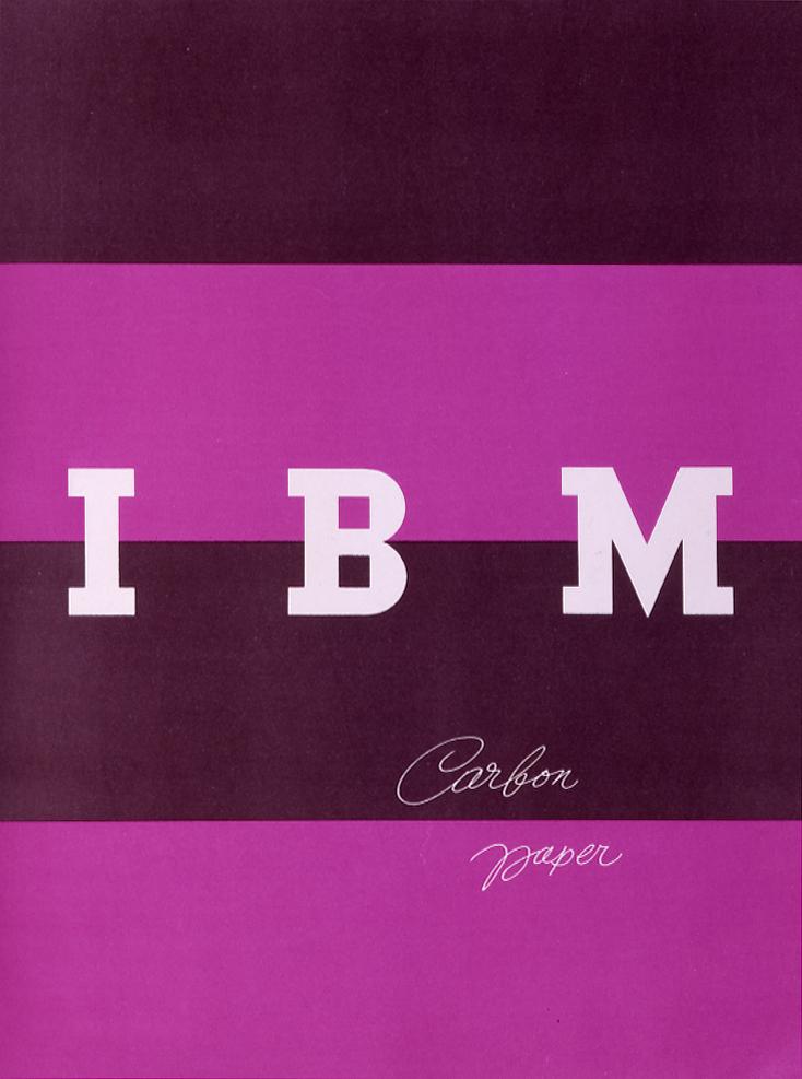
What he did for companies like IBM, ABC and, unfortunately, Enron, was to give each a unified public identity by visual means. He didn’t just create logos; he applied his designs to many facets of a businesses, from business cards and letterheads to product packages, and he required absolute uniformity in all those aspects. What was the secret of Mr. Rand’s success? One of several books about design that he wrote and illustrated is open to a page where he talks about the logo he created in 1962 for ABC, the image of three sans-serif, lowercase letters on a disc. Referring to a picture of the logo that’s heavily, almost but not quite illegibly blurred, he asks, “How far out of focus can an image be and still be recognized?” Pretty far, if it’s a Rand design.
That’s important because, unlike fine art works, graphic images are meant to survive less than ideal conditions. Awareness of that necessity is a big part of what makes Mr. Rand a godfather of today’s image-saturated media world. If it gives some politically oriented viewers pause to think of his evidently unwavering faith in American capitalism and of how he imprinted corporate identities on the minds of millions, that just makes his story all the more interestingly complicated.
There’s also an interesting review of the exhibition by Amelia Stein at The Guardian:
Rand liked to argue that manipulation is integral to design. It is a designer’s job, he wrote in Thoughts on Design (1947), to manipulate ingredients in a given space – to manipulate symbols through juxtaposition, association and analogy. These days, it is difficult to separate logos and branding from other, more insidious forms of manipulation. A recent return to flatness in corporate design – emblematized by Apple’s decision to abandon skeuomorphism in 2013 – could be seen as an attempt to invoke Rand’s heyday, when consumers trusted a brand’s visual cues to communicate some essential truth.
This is an important aspect of Rand’s legacy, enormous and complicated as it is. Although Everything is Design stops short of addressing the lasting implications, artistic and otherwise, of Rand’s work, it provides us with a necessary basis from which to do so… [Looking] at Rand is valuable if we want not just to be as good as Rand, but to understand the complexity of what it is to be good.
Paul Rand’s classic 1947 essay Thoughts on Design is being re-published next month by Chronicle Books1, and Design Observer has just reposted a wonderful essay by Jessica Helfand on Rand, originally published in The New Republic in 1997:
Looking back on his prolific career, it is paradoxical to think that the man who gave graphic life to such technological giants as IBM, IDEO (the international technology think tank based in Northern California), and Steve Jobs’s NeXT should himself have been so averse to the computer. How could Rand, the devout modernist, be so openly resistant to the progressive changes brought about by the machine, the symbolic child of modern industry? It is as though the same geometric forms that embodied the logic of mechanical reproduction, the same formal vocabulary that inspired his mentors and defined the very spirit of modernism, were available to Rand only in theory.
Such contradictions underscored his entire career. The darling of corporate America for decades, Rand rejected the lure of city life, choosing to work alone in his home studio in Connecticut for the better part of his career. He claimed to despise academia, but he remained a devoted member of the Yale faculty for over 35 years. It is likely that the orthodoxy that characterized both his relationship to design and his relationship to God was an attempt to resolve these contradictions, to right the balances, to establish order in the studio and in the spirit. But the contradictory impulses remained: “Five is better than four, three is better than two,” he often announced to his students, claiming that the mind worked harder and received a greater sense of reward when resolving asymmetrical relationships on the page.
In this beautiful short film directed by Gary Nadeau for Dwell magazine, Danish American furniture designer Jens Risom talks about the prefab vacation home he built for his family on Block Island in the 1965: