Hi. Hello. I hope you’re all keeping well. This month seems to have flown by so I apologise for rather rushing this out at the last minute.
I was reminded this week there are people in the world (some of whom should know better) who think that all contemporary book covers are boring and banal. I don’t really know where to start with arguments like this. It just seems objectively false to me?
Anyway, I hope these posts help dispel some of those notions and you enjoy this month’s selections….
It is the time of year for lists and I should’ve been done weeks ago, but I am late and already well behind the pack. Apologies for that.
I admire Matt Dorfman‘s ability to whittle his list down to a dozen covers for the New York Times. I imagine it takes him a lot less time for one thing, but I’m sure Matt still agonizes over every cover. It requires a level of discipline and restraint that I do not possess to keep it that tight year after year.
PRINT’s list of best book covers of 2024, compiled by editor-at-large Zachary Petit, is also long. It’s a 100 covers. Last year it was 50.
I’m not trying to throw stones here. We are all seeing more covers than we used to. There are more books for one thing. But they’re not just something we just experience in print in anymore. You don’t have to go into a bookstore or read the newspaper or magazine to see them. They’ve become something we see and share all the time online. Designers are promoting their own work and (slowly) getting more credit for it (although there is a lot more to be done in that area. Publishers — credit your designers!). My monthly round-ups are now one of several you can choose from.
And it is not like my list is short. This year it features work by 48 designers — more than half of them women — and 86 covers (plus a couple of supplementary images).
The consensus seems to be that it was a decent year for covers, and it’s hard to argue with other people’s selections even if I don’t love them all.
It is telling though that 100 of LitHub’s selections were individual picks. There are covers on my list that are not on the anyone else’s despite their length. So while I think we agree there were lots of good covers, I’m less certain we entirely agree on which ones were actually the outstanding ones.
A recent article Spine argued that there is a battle between minimalism and maximalism going on (you can find Spine’s end of year list here by the way). I think that could be true. Different approaches work for different audiences. But I also think it’s messier than that. I get the sense that publishers are less sure of what they want and what sells (certain genres notwithstanding).
It has been a rough year for a lot of publishers, so there is undoubtedly a lot of uncertainty, and no small amount of anxiety. I could go on about why that it is (and the publishing’s self-inflicted wounds) but, in short, what I think we’re also seeing with book covers is more meddling and less direction.
Anyway, I don’t want to end this on a bleak note. This year was shit enough. Despite it all, there genuinely were a lot of good covers in 2024, and some that I did think we’re outstanding. A couple of them made me laugh, which was no small thing. It was a strong year for several individual designers in particular and, despite the pressures, many produced work that was recognizably theirs. I thought there were more interesting covers coming out of the UK and Ireland (that mercifully wasn’t just about the inks or the finishes!), and there were some fun Canadian covers too.
Thanks, as always, for reading, and I hope you’re all keeping safe and well. Happy Holidays!
Holy Winter 20/21 by Maria Stepanova; design by Oliver Munday (New Directions / October 2024)My Beloved Life by Amitava Kumar; design by Oliver Munday (Knopf / February 2024)
Mammoth by Eva Baltasar; design by Anna Morrison (And Other Stories / August 2025)
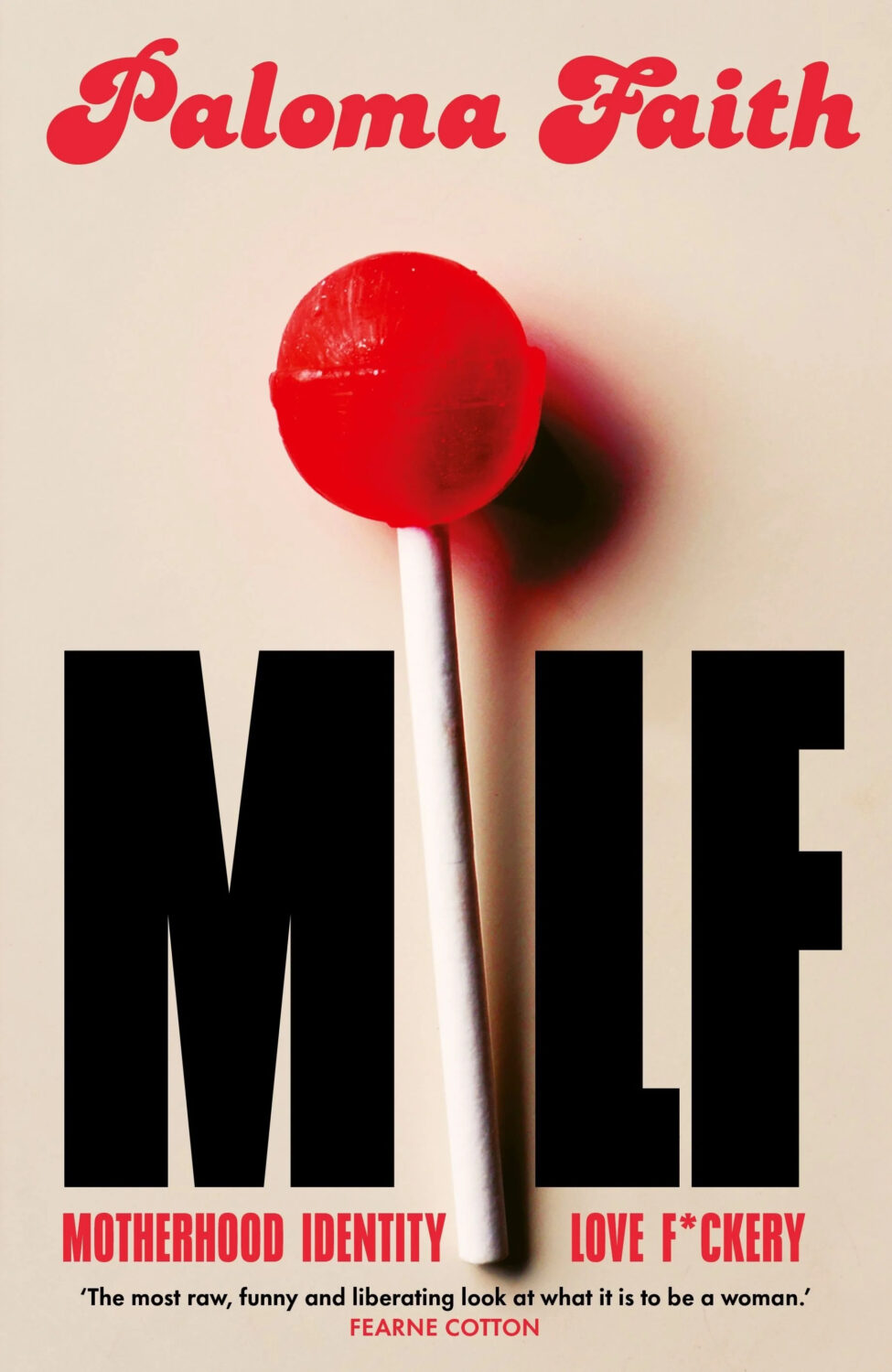
MILF by Paloma Faith; design by Jack Smyth (Ebury / June 2024)
Also designed by Jack Smith:
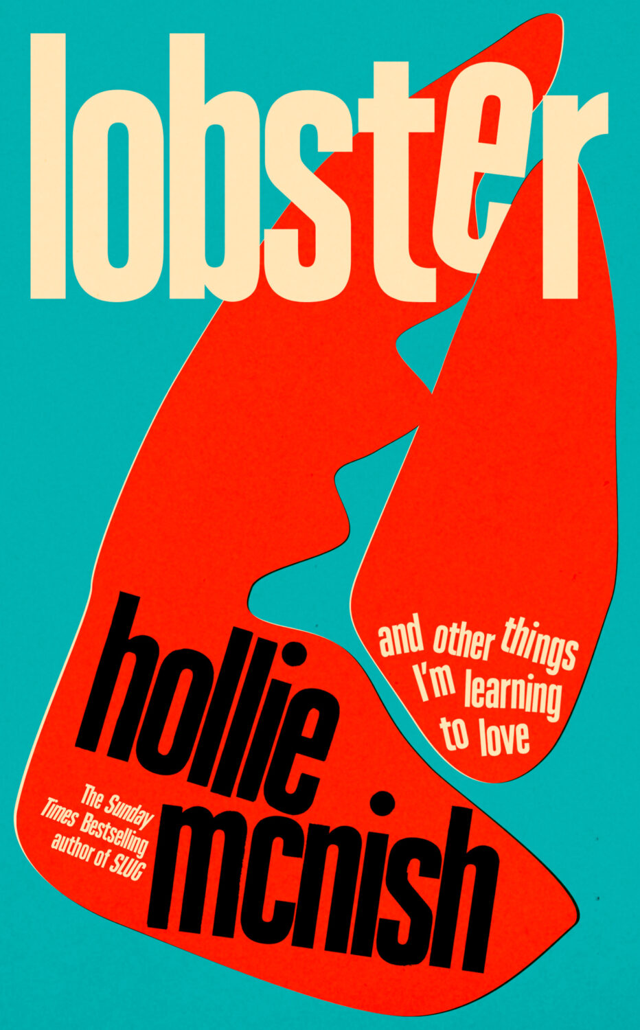
Lobster by Hollie McNish; design by Jack Smyth (Little, Brown / March 2024)Neu Klang by Christoph Dallach; design by Jack Smyth (Faber & Faber / May 2024)
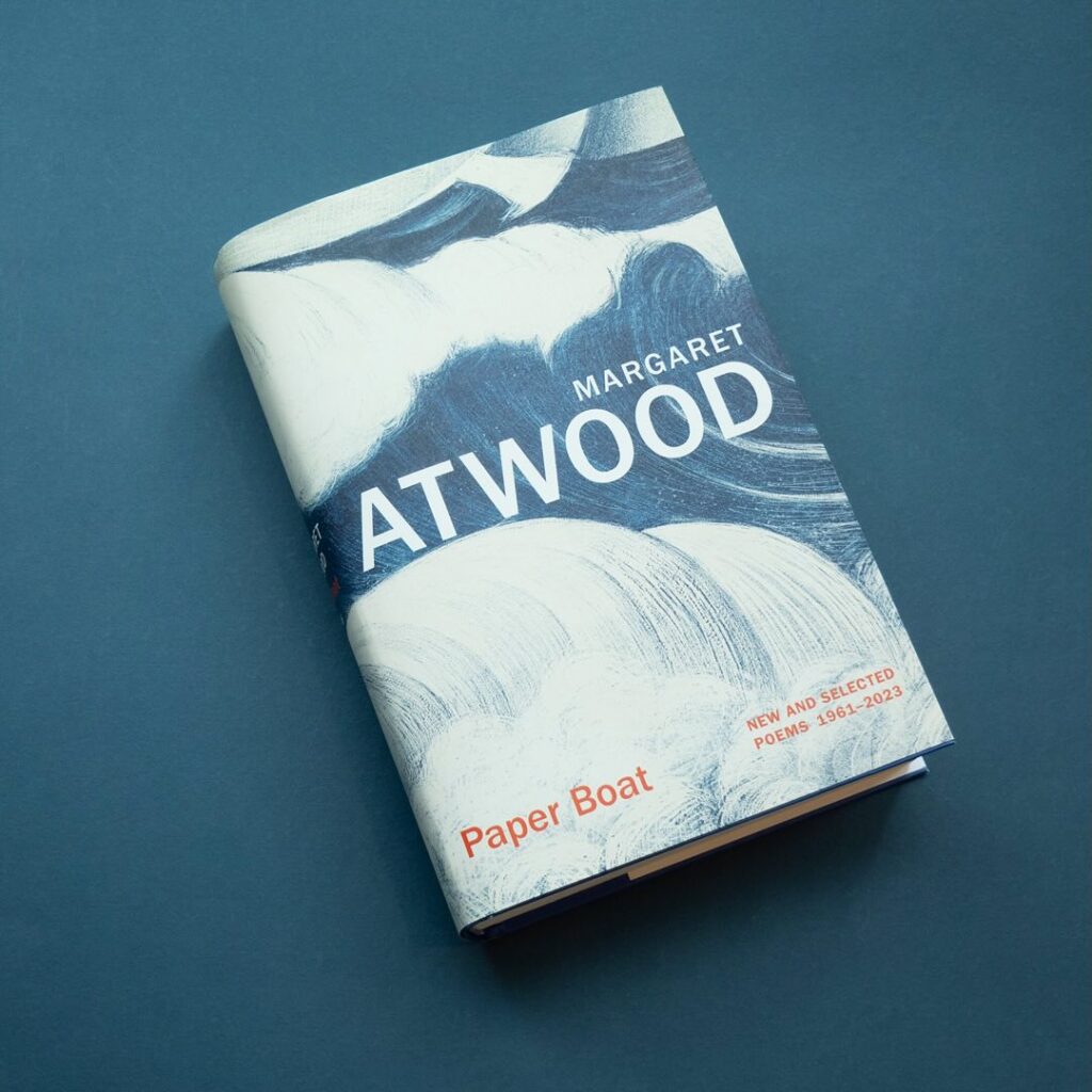
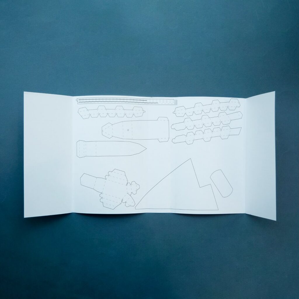
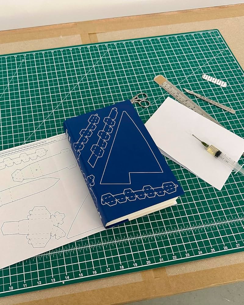
I also have to give a special shout out to the cover for Paper Boat by Margaret Atwood (Chatto & Windus / October 2024). Suzanne commissioned paper art by Nathan Ward to design a template for a paper boat that could be cut out from the dust jacket and stuck together.
2022. Twenty twenty-two. Two thousand and twenty-two… “Where did it go?” Or, sobbing, “ are we done yet?” It feels like both. It’s been a year that’s simultaneously dragged on interminably and disappeared in a cognitive blur.
I’m glad other people have already written about it.
At Creative Review, writer and editor Mark Sinclair picked his favourite covers of 2022 and reflected on industry trends in the UK, including the Design Publishing & Inclusivity mentorship program for under-represented creatives launched this year by Ebyan Egal, Donna Payne, and Steve Panton.
Literary Hub posted the best covers of the year as chosen by 31 designers. With a comprehensive 103 covers on the list, it tacitly poses the annual question “what do I have left to add to this conversation?” LitHub have been posting these lists for seven years apparently. I am an ancient desiccated husk.
Fast Company and the Washington Post asked slightly smaller groups of designers to write about their favourites covers.
Designer and art director Matt Dorfman chose the best book covers of 2022 for the New York Times, and empathized with the plight of the designers:
Most often, any personal stylistic expressions in their work are swallowed up in service to the multiple masters — editors, marketing directors, sales teams — who sign off on a book’s cover. There is also the matter of adhering to any one publisher’s dos and don’ts, which can inform mandates about typography, color palettes and production flourishes like embossing or metallic inks. For people employed in a theoretically creative pursuit, designers’ talents are often defined by how effortlessly they can make themselves disappear to serve the book.
Matt Dorfman, New York Times
No one captured the prevailing mood better than this Tom Gauld cartoon. A reminder, if one were needed, that nobody knows anything.
Earlier in the year, Australian reporter Rafqa Touma called out the trend of ‘well dressed and distressed’ young women on covers. As designer Mietta Yans notes, the covers often reflect their books’ stylish and sad protagonists, so I’m not sure this one is on the art departments.
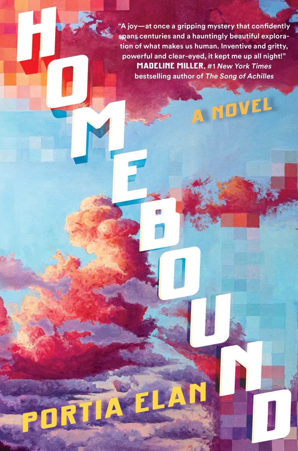
Some of the trends I’ve talked about before spilled over into 2022. Collage, painting (contemporary, and historical — often tightly cropped), big skies, landscapes and seascapes, black and white photography (not just for LGBTQ+ trauma!), retro-ness, idiosyncratic display typefaces. Orange. Pink was in vogue too. The Instagram-ish combination of both pink and orange (sometimes with deep purple-ish blues too) seemed to be very much a thing this year. I suspect this is what happens when you ask designers to make things “pop” one too many times.
It is hard to know if these are genuine trends, or if it is just the stuff I notice. I’m sure there are things going on with commercial covers that I don’t pay enough attention to (although I will not be sad to see the popularity of that flat illustration style — the one that Slate pointed out in TWO THOUSAND AND FIFTEEN! — eventually fade away). I certainly don’t get the sense that everything looks the same, which is often the criticism. There is still room for a little weirdness and that can only be a good thing…
Ghost Music by An Yu; design Suzanne Dean (Harvill Secker / November 2022)Elizabeth Finch by Julian Barnes; design by Suzanne Dean (Jonathan Cape / April 2022)
The Julian Barnes cover also came in blue, and under the die-cut jacket is a beautiful photo from René Groebli’s photoessay The Eye of Love.
Pure Colour by Sheila Heti; design by Na Kim (Farrar, Straus & Giroux / February 2022)
Also designed by Na Kim:
Present Tense Machine by Gunnhild Øyehaug; design by Na Kim (Farrar, Straus & Giroux / January 2022)Run and Hide by Pankaj Mishra; design by Na Kim (Farrar, Straus & Giroux / March 2022)Either/Or by Elif Batuman; design by Na Kim (Penguin Press / May 2022)
You can read about Alban’s design process for Till the Wheels Come Off at Spine.
Worn by Sofi Thanhauser; design by Janet Hansen (Pantheon / January 2022)
Also designed by Janet Hansen:
A Country of Strangers by D. Nurkse; design by Janet Hansen (Knopf / April 2022)Sedating Elaine by Dawn Winter; design by Janet Hansen (Knopf / April 2022)
Yoga by Emmanuel Carrère; design by Rodrigo Corral (Farrar, Straus & Giroux / August 2022)
We’ve almost made it to the end of April, so that’s something. Thanks to Daniel Benneworth-Gray for the mention earlier this month. It surely means I’m about to disappoint a large number of people — if I have not, in fact, already done so — but I hope you find something you like here…
I believe the Elizabeth Finch cover also comes in yellow, but I wasn’t able to find a hi-res image. If anyone wants to send it over, I’ll be happy to add it.
The jacket also comes in yellow, which feels very on trend to me and the blue and yellow look lovely side by side. Thank you to Suzanne for taking the time to send over the image of the yellow version.
Suzanne also sent over an image of the boards for those of you curious to see what is under the jacket, peeking through the die-cuts. The gorgeous photograph is from René Groebli’s photoessay The Eye of Love.
This is the problem with seeing covers/jackets primarily online. You rarely get to appreciate these finer details. This must be a beautiful book to hold and unwrap.
And I have been trying to recall what both these covers remind me of. Possibly ‘Composition of Circles and Semicircles‘ by abstract artist Sophie Taeuber-Arp?
Malika Favre also designed and illustrated the cover of Playing with Matches by Michael Faudet, published by Andrews McMeel at the end of last year, and featured in this month’s ‘Book Covers We Love‘ post at Spine Magazine.
This will be the last of the monthly cover round-ups for 2021 because I have to turn my attention to the year as a whole, but there are some really top-notch covers in this month’s post so it feels like a good place leave off…
The cover of the UK edition, publishing next year I believe, was designed by Jack Smyth:
Jacket Weather by Mike DeCapite; design by Michael Salu (Soft Skull / October 2021)
I was reminded of the cover of The Empty Chair by Bruce Wagner designed by Gregg Kulick from what seems like an age ago (2013 I think?) . It’s very possible I have been doing this for too long…
Bloody January by Alan Parks; design by Chris Gale (Canongate / December 2017)
(I’m including this partly because I spend a lot of my professional life trying to explain the difference between the cover needs of Canada/US and the UK. This is a rare genre cover that — it seems to me at least — does a decent job for both sides of the Atlantic)
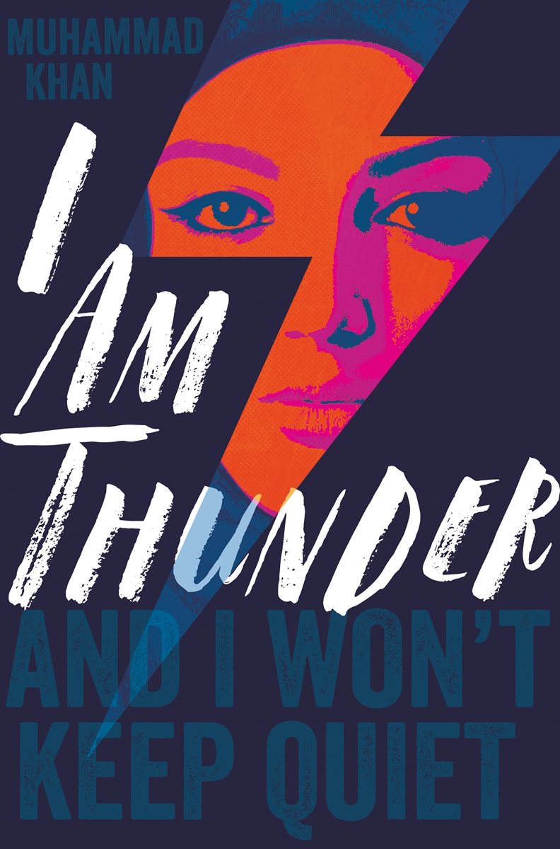
I Am Thunder by Muhammad Khan; design by Rachel Vale (Pan Macmillan / January 2018)
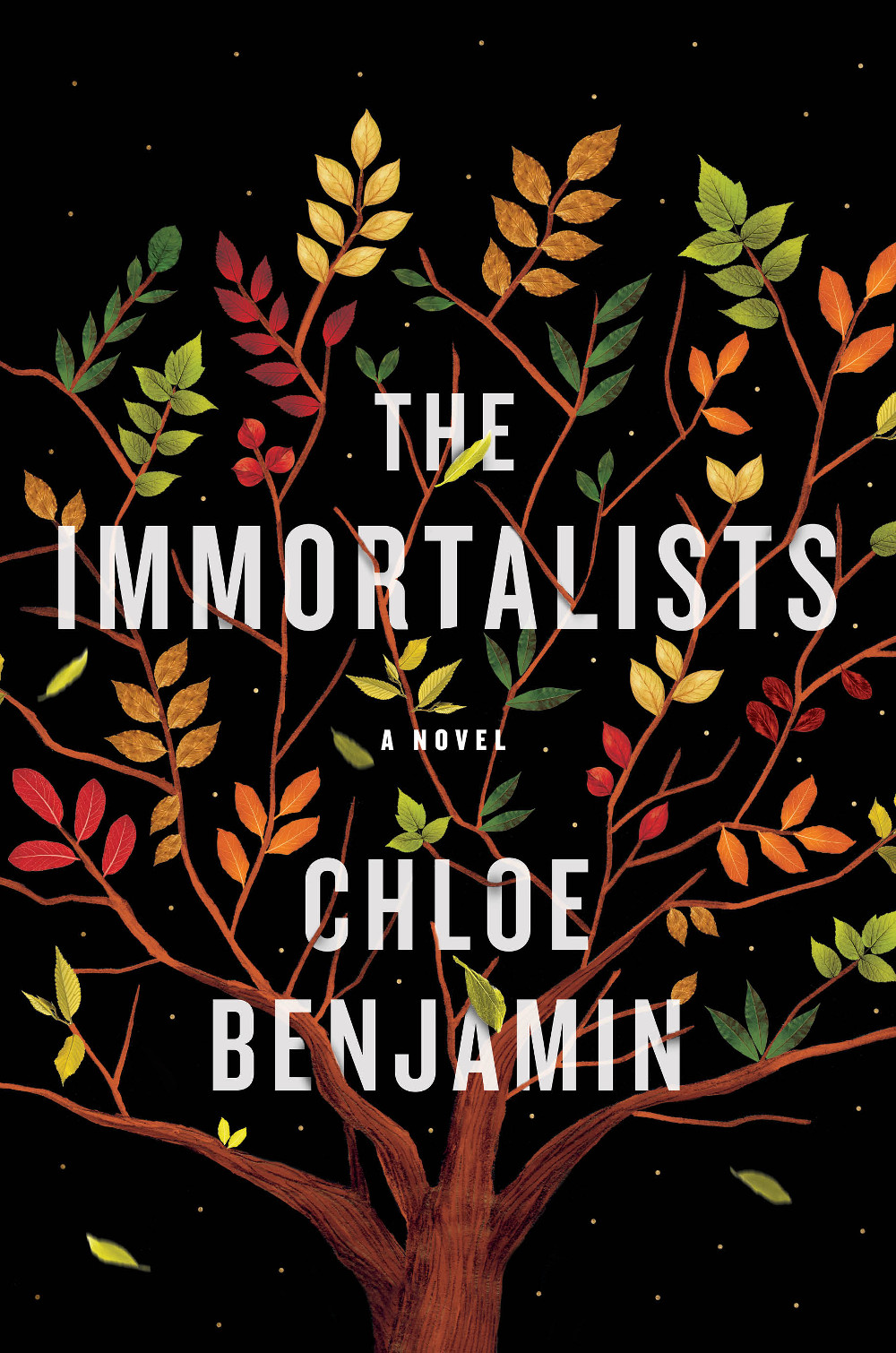
The Immortalists by Chloe Benjamin; design and illustration by Sandra Chiu (G.P. Putnam’s Sons / January 2018)
This cover seems rather on trend to me. It is very nicely done all the same.
(Something about the shape and colour of the leaves on black background also reminds me of the illustrations in Jon Klassen’s picture book This Is Not My Hat).
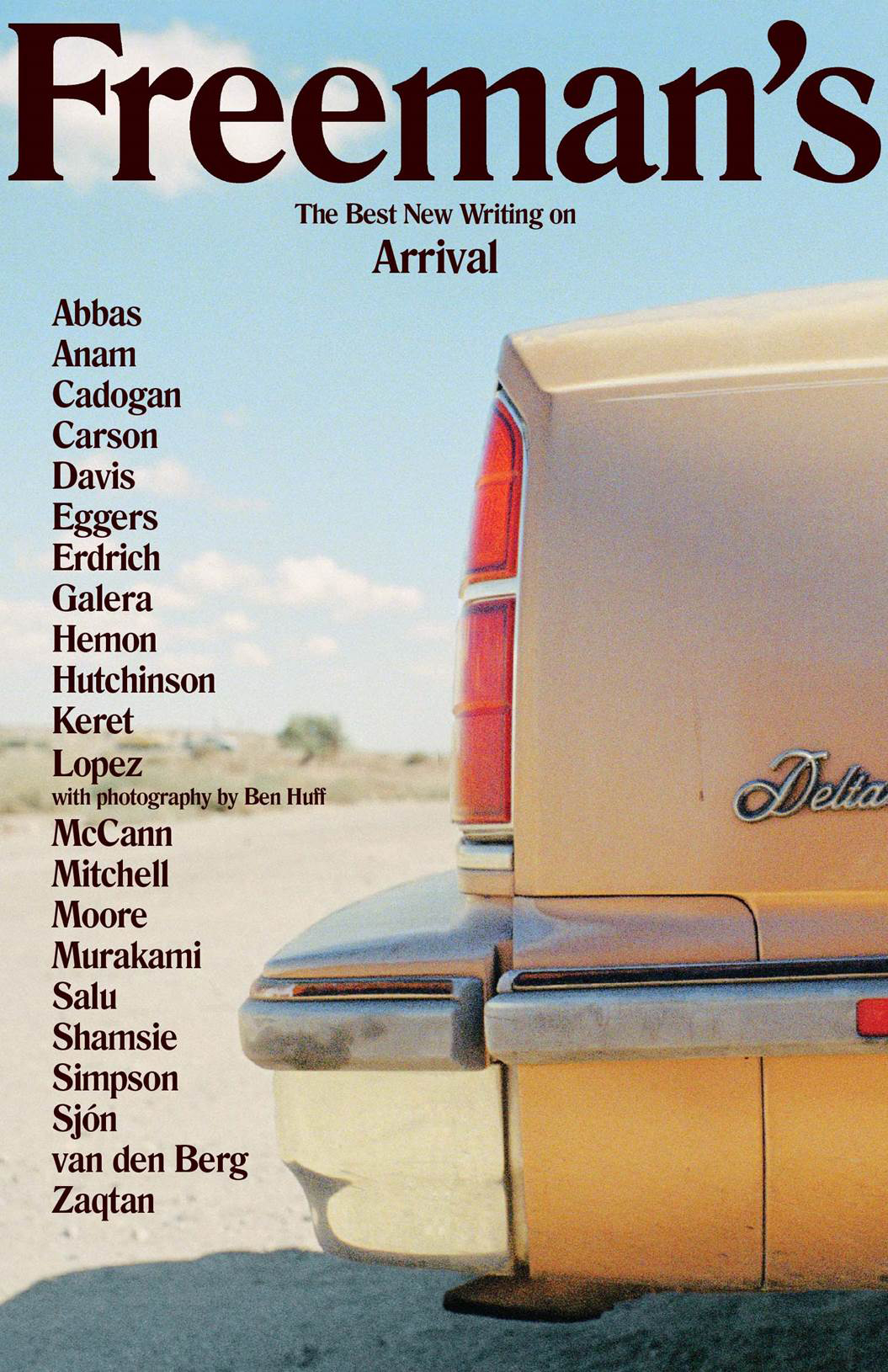
The very first Freeman’s anthology was published in fall this year, but hopefully this design will set the tone for the rest of the series. The second volume is scheduled for next year.
Vintage Feminism; design by Matthew Broughton (Vintage / 2015)
Little Black Classics; design by Jim Stoddart (Penguin / 2015)
An astonishing short film for what looks to be a very important book:
Ian Cobain’s exposure of Britain’s secret history of torture Cruel Britannia is published by Portobello Books. The starkly brilliant cover (on which the video is based) was designed by FUEL.
Designed by the brilliant Michael Salu, the cover for Diana Athill’s forthcoming collection of letters, Instead of a Book, features a stunning portrait of the author by acclaimed British photographer Rankin (co-founder of Dazed & Confused in case you were wondering).
To coincide with the release of the new book in October, Granta are also reissuing paperback editions of Athill’s books Stet, Yesterday Morning and Instead of a Letter with cover designs incorporating Rankin’s photographs.
I don’t think I have made any secret of my love of Stet, Athill’s book about her time as an editor at Andre Deutsch. But I have always been disappointed by the discouraging cover on the tatty copy on my bookshelf, and it makes me incredibly happy to finally see an edition that seems to capture something of Athill’s personality.
Athill’s writing is unflinching and it is remarkable to see that reflected in Rankin’s stark portraits. According to Michael, who art directed series and designed all the covers, “the idea was to not to shy away from age and experience, but to celebrate it and Diana’s distinct personality.” Certainly, it is hard not to be taken by the keenness of Athill’s eyes. One gets the sense she does not suffer fools gladly. There is something of a retired headmistress about her. But I love how in the photograph for Instead of a Letter, Rankin captures Athill’s thumb hooked under her necklace. The author doesn’t appear to be particularly aware that she’s doing it, but it is beautiful and poignant touch.
Going Back — Artistic Director Michael Salu on the creating the cover of the new issue of Granta magazine:
For this concept to work, we needed to strive for authenticity – to create the physical object ourselves. The typefaces would need to be sourced, traditionally hand-set and photographed to give the cover the depth that the issue deserves. For this I approached St Bride Printing Library, which has long been a place of fascination and wonder for me. My first visit to the library – with its oil, wood and metal, its smell of history – made a huge impression on me.
The Connoisseurs — Peter and Charlotte Fiell, who recently ended their 15-year tenure as heads of the design branch of Taschen, talk about their new publishing venture Fiell at More Intelligent Life:
What is design? It’s the forethought that goes into the making of man-made things. It’s films, pharmaceuticals, airplanes, chairs, tape recorders … it’s the world of stuff. It’s huge, so everybody should have a big interest. It’s not some avant-garde, highly expensive niche. We want to make money by publishing books that sell, but we’re in the business of promoting ideas, culture, taste, connoisseurship. If you want to make a difference you want to get into as many people’s heads as you can and change their opinion. The secret is to strike this balance between making your books appealing to learned type readers, while at the same time, making them useful and interesting to novice readers. Our aim is to make books as appealing to teenagers in Tokyo as architects in Amsterdam.
Book designers, you should know, have to be ready to create something new, exciting, and original almost every day in order to eat, and a certain degree of burnout smokes out the weaker specimens; I can’t imagine coming up with cover after cover without at some point resorting to an out-of-breath take, intentional or not, on someone else’s great idea. This urge toward ever-freshness brings the profession perilously close to that of fashion, and the worst examples of such greet us at the grocery store checkout among the tabloids, gum, and ring pops. But the best of it, those that last, have recently been appearing from Penguin (yes, Penguin, not just the bearer of boring spring break assignments anymore!), following a path led by designer Paul Buckley into beautiful new ways of graphically proffering the written word.
The excerpt is accompanied by a slideshow of covers from the book. My interview with Paul Buckley and designer Christopher Brand about Penguin 75 will be up early next week.

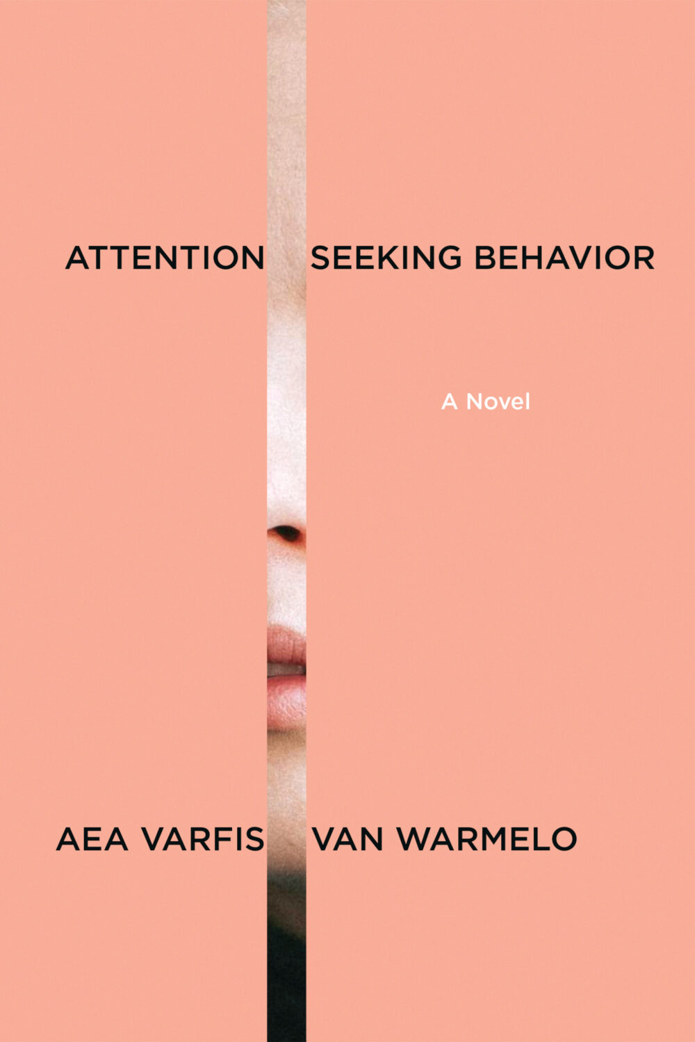
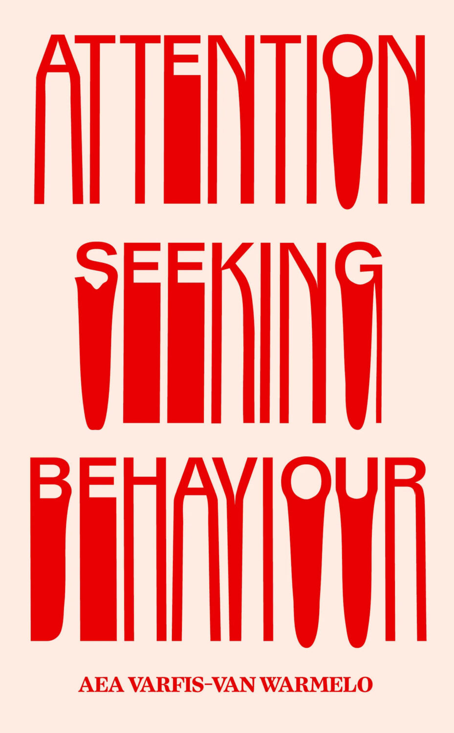






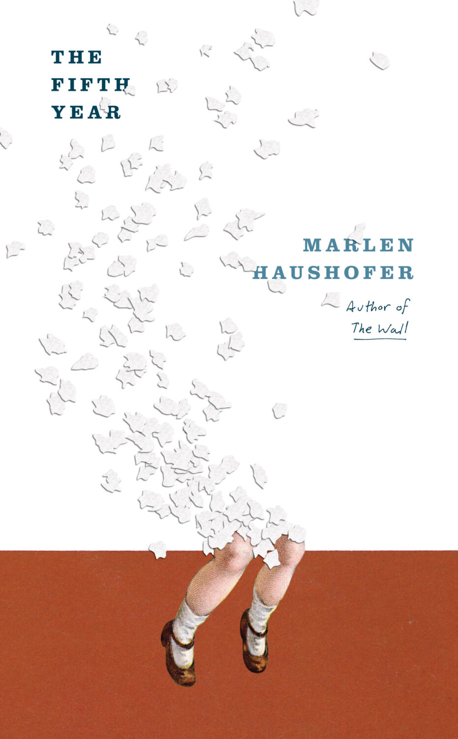

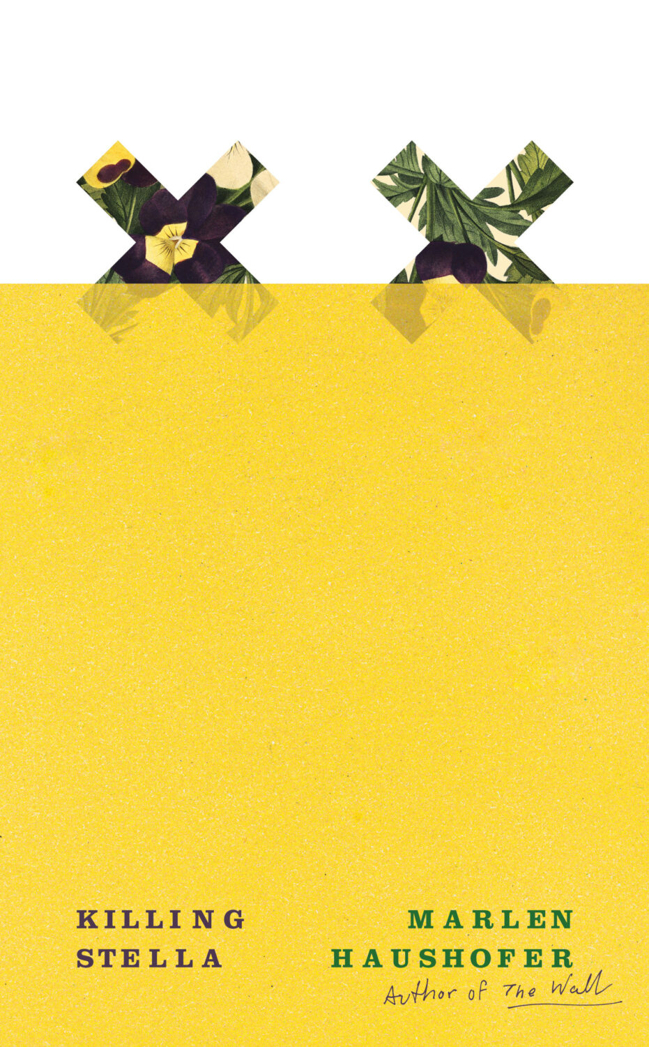














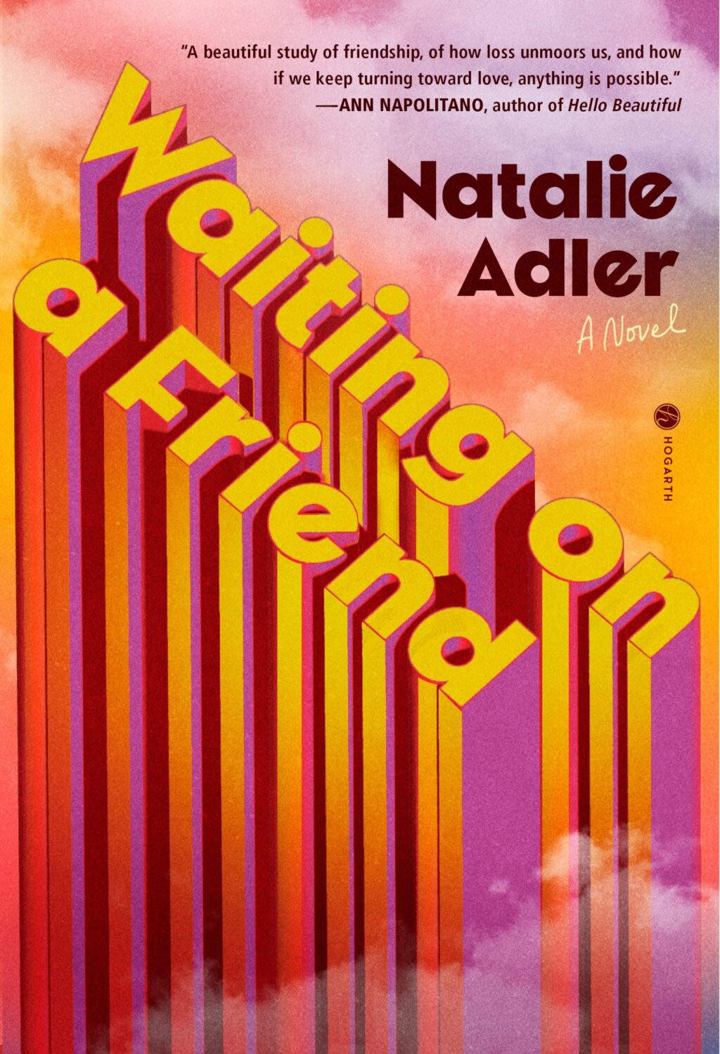




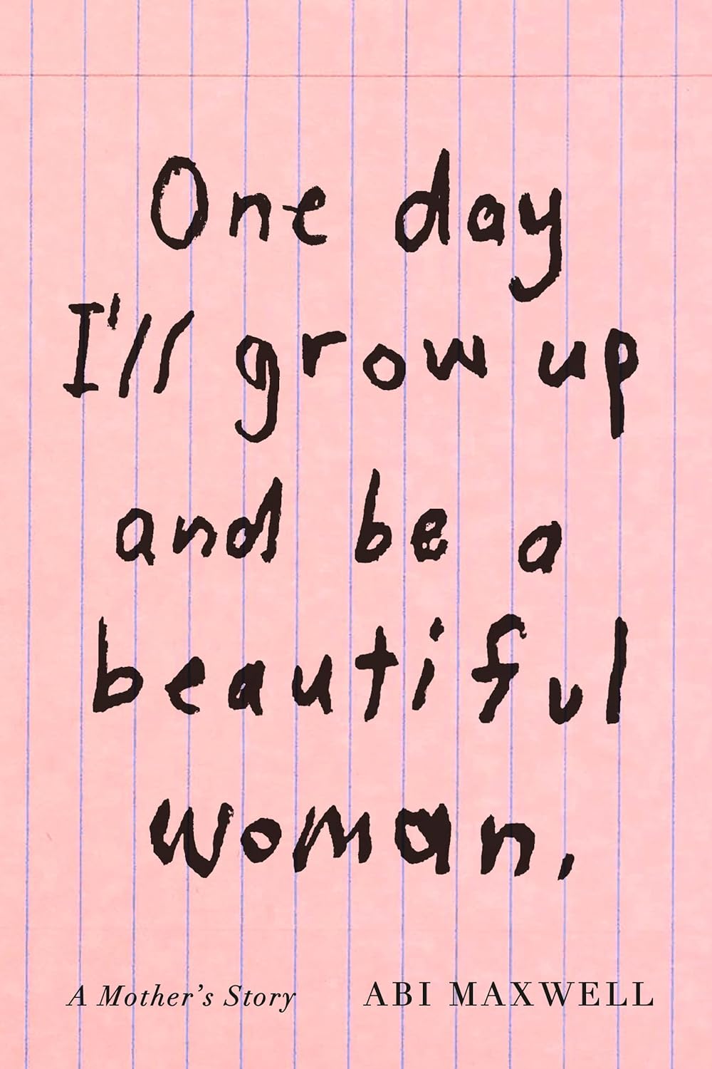
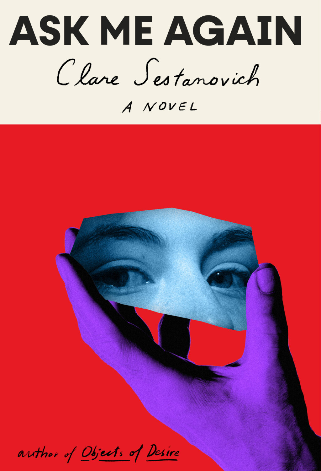

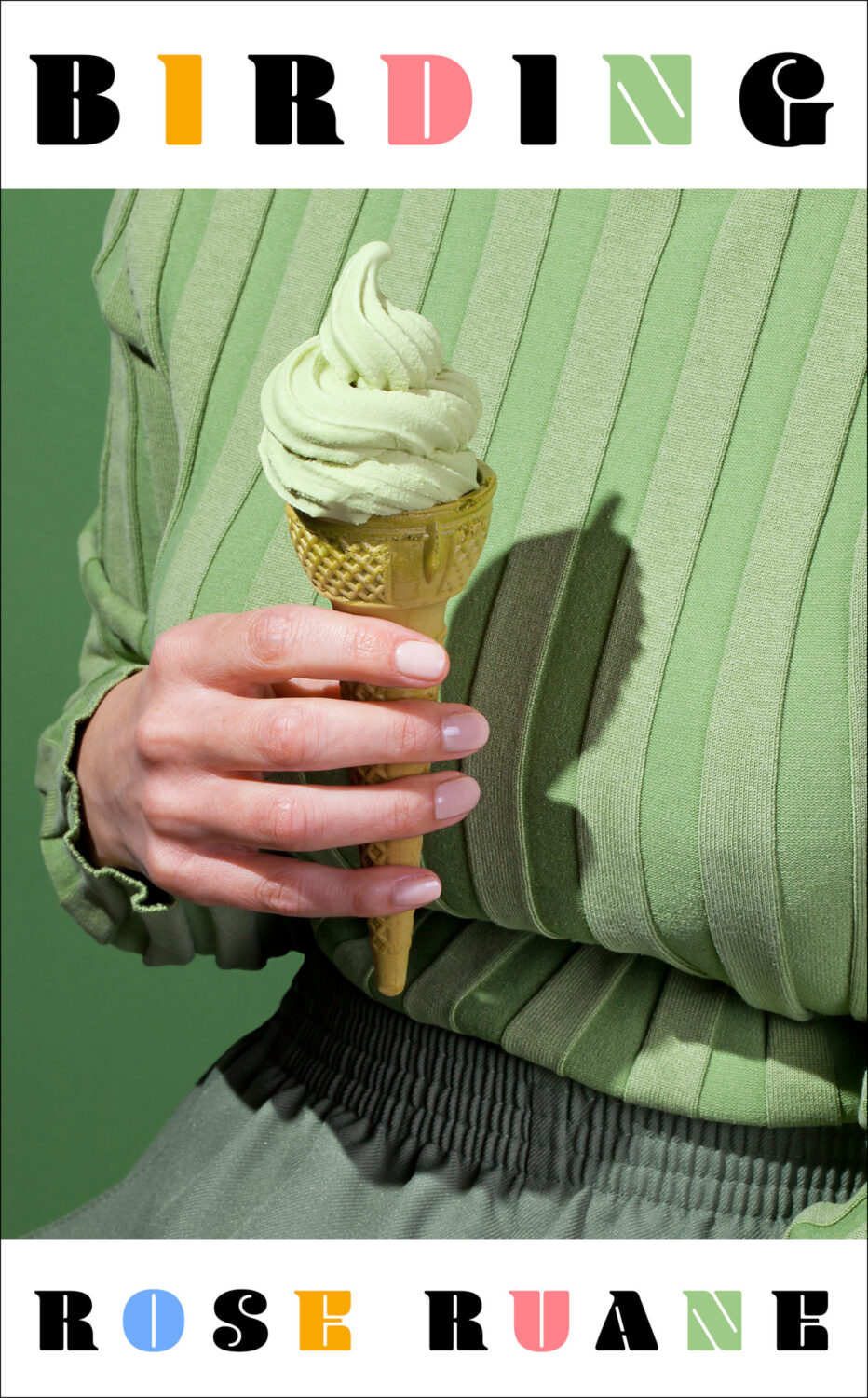




















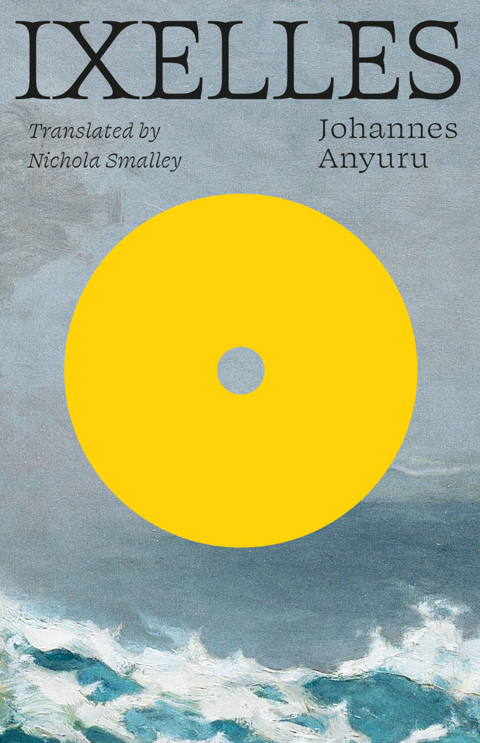



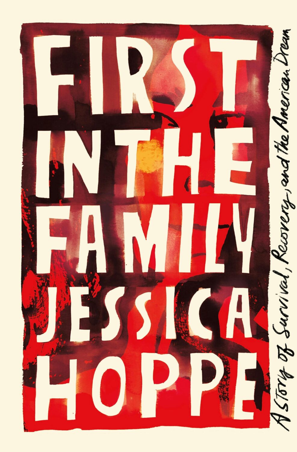
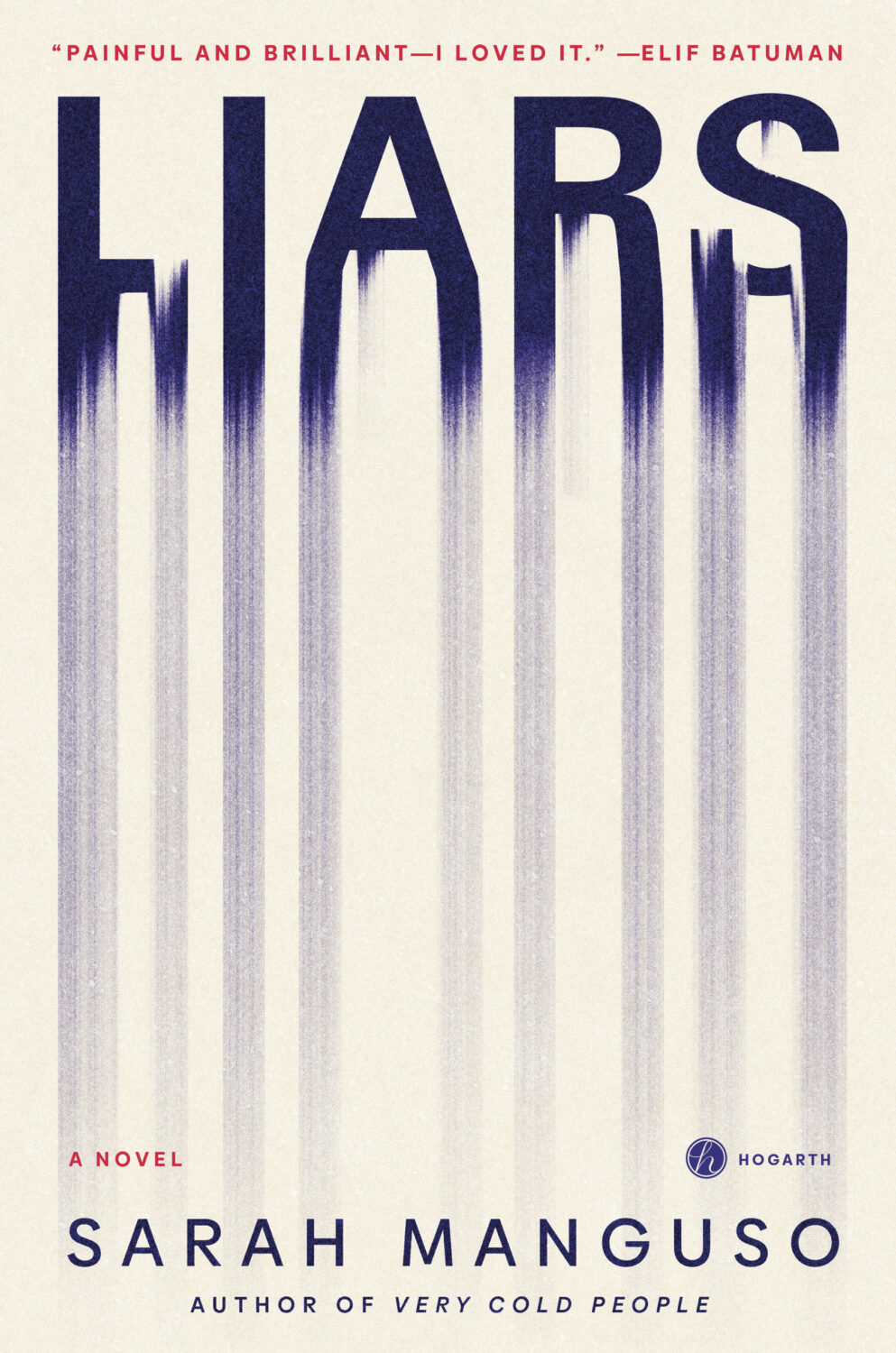


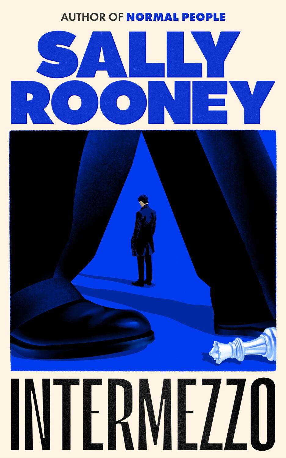











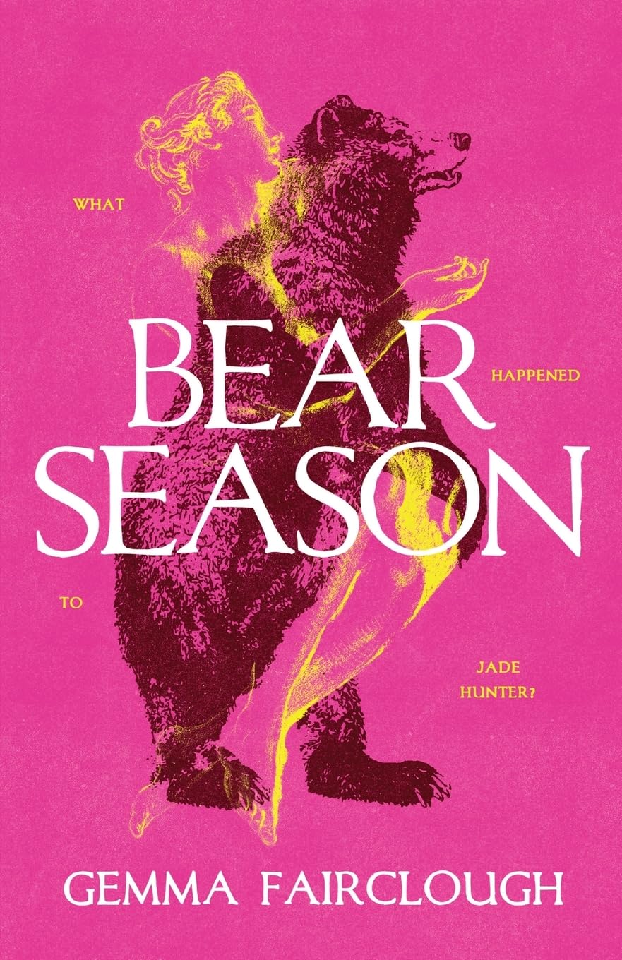
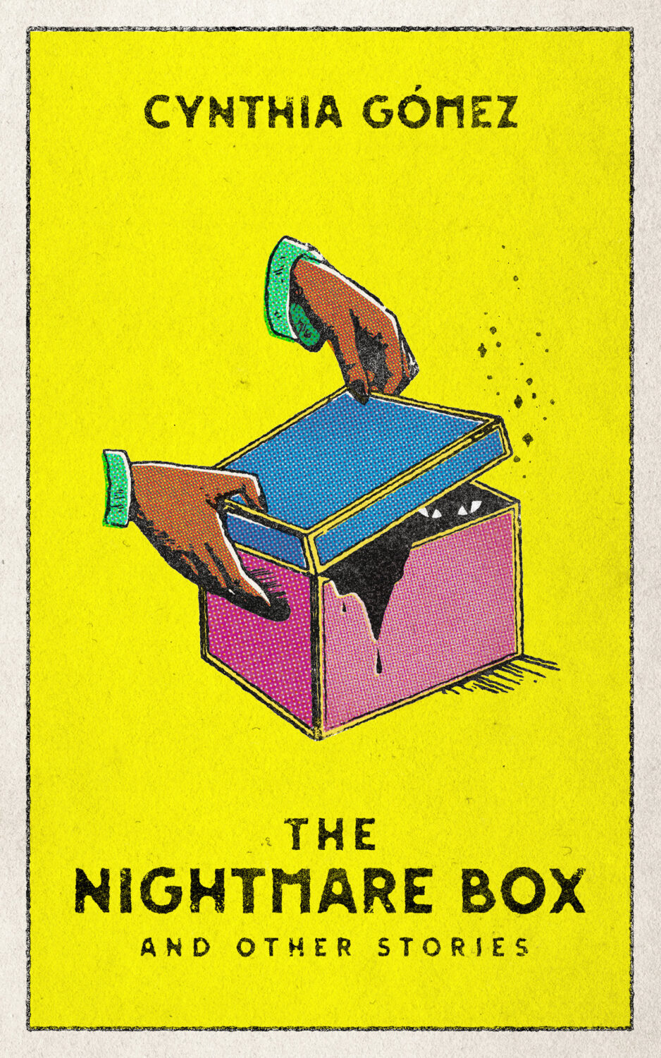
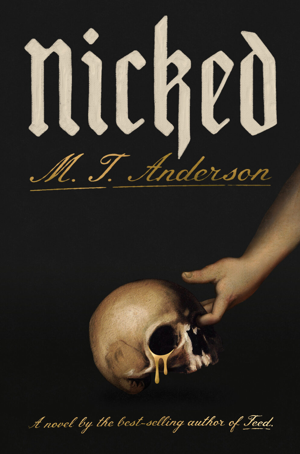
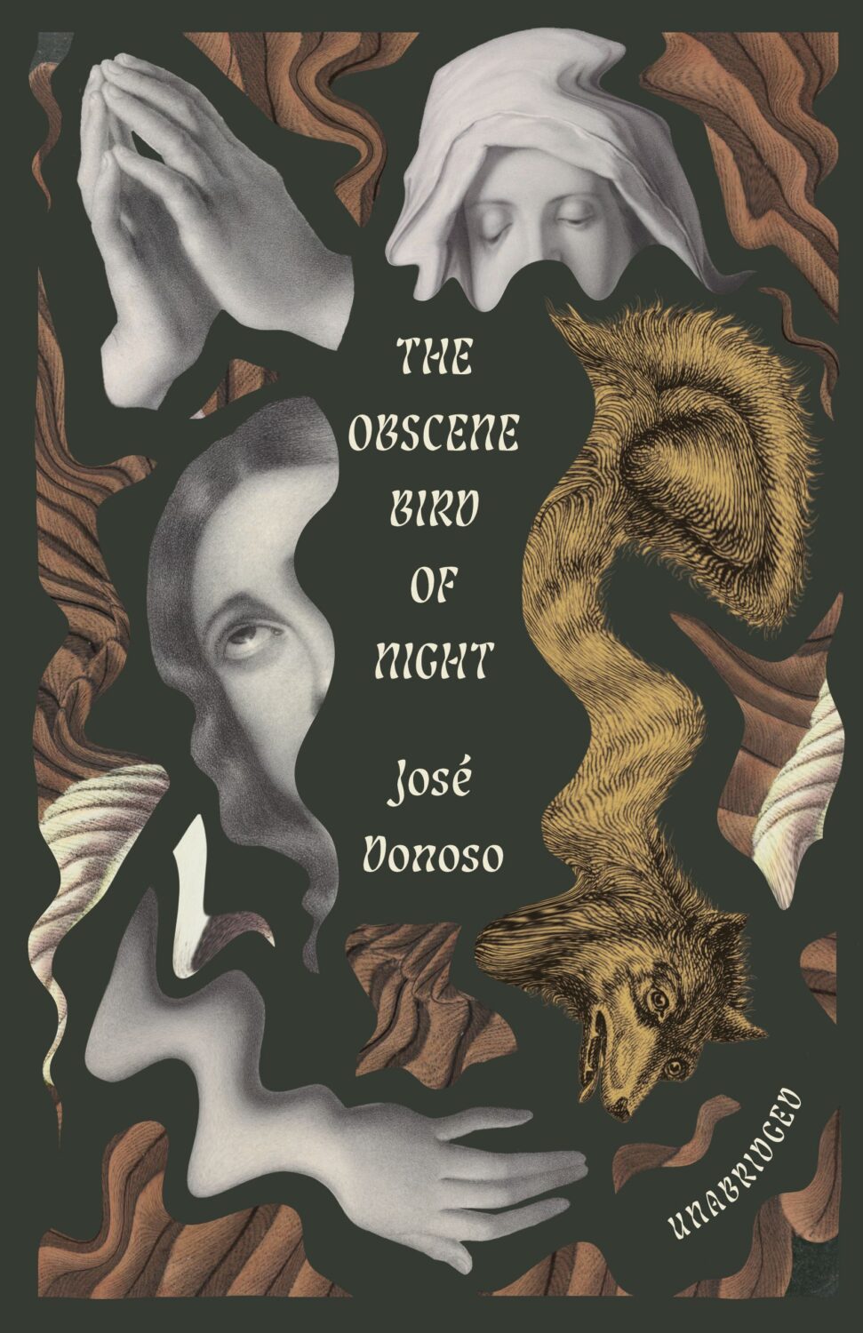

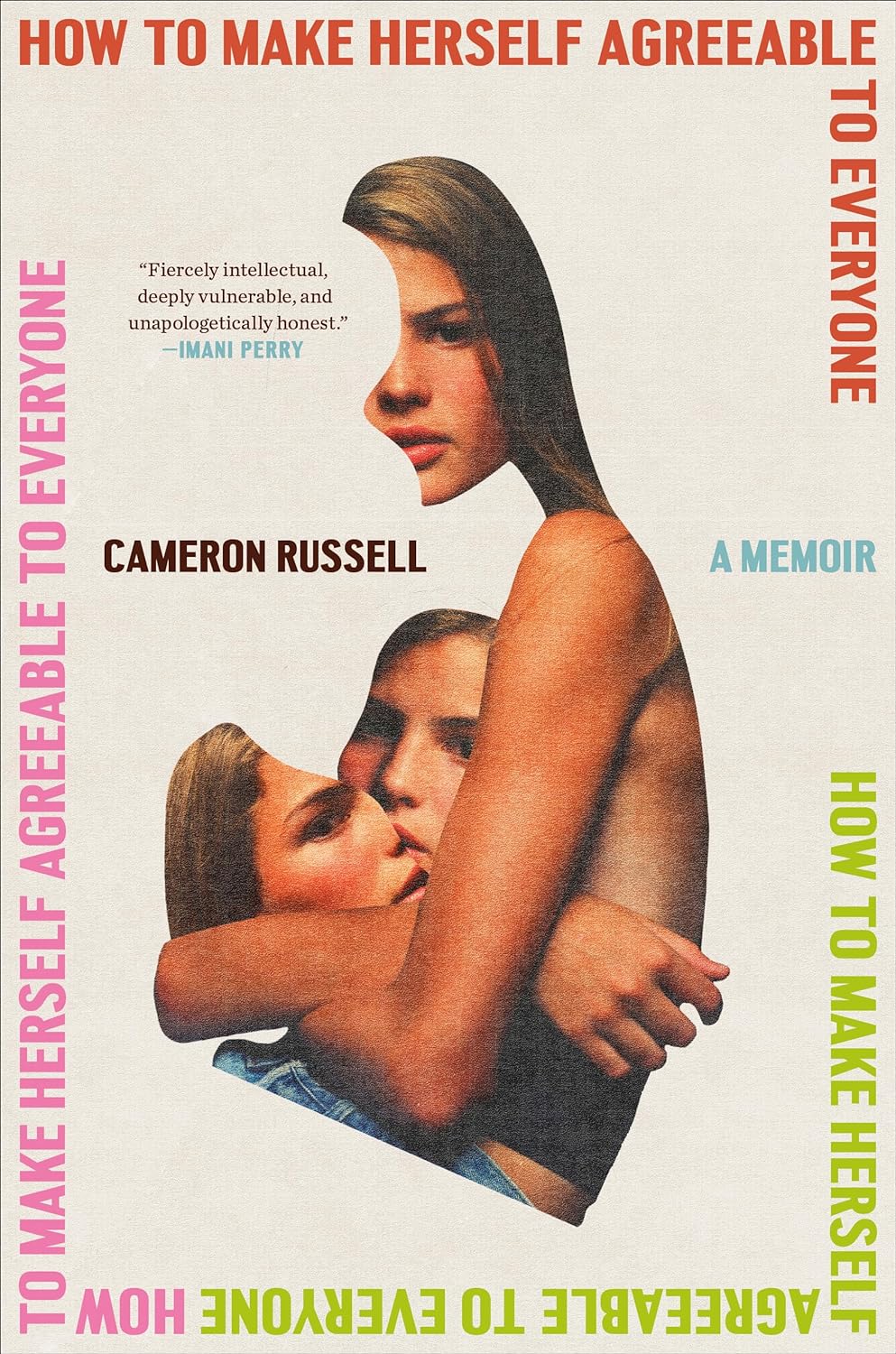
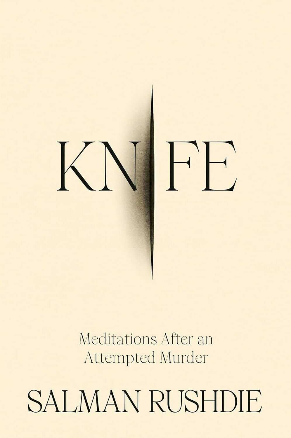



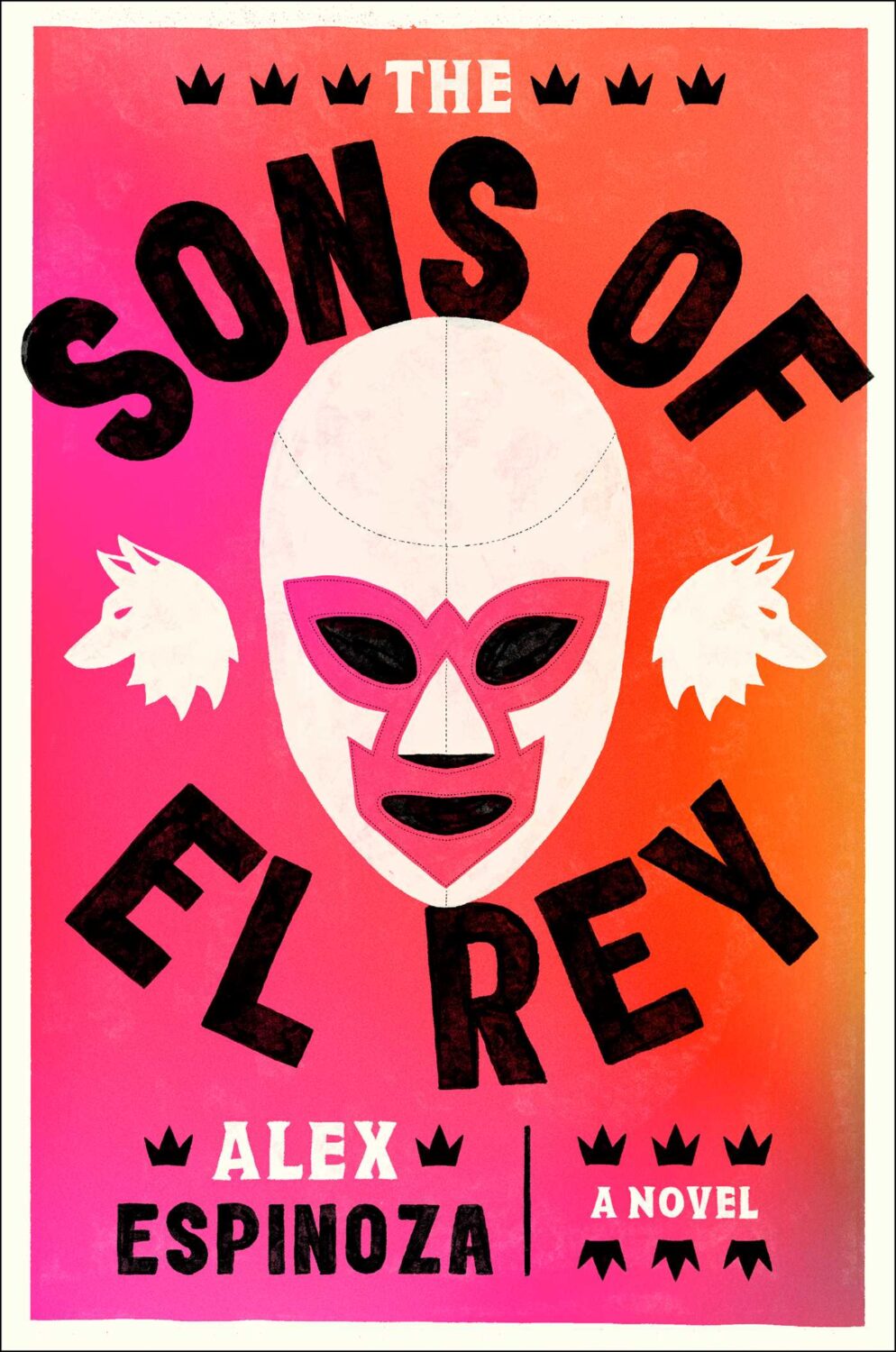



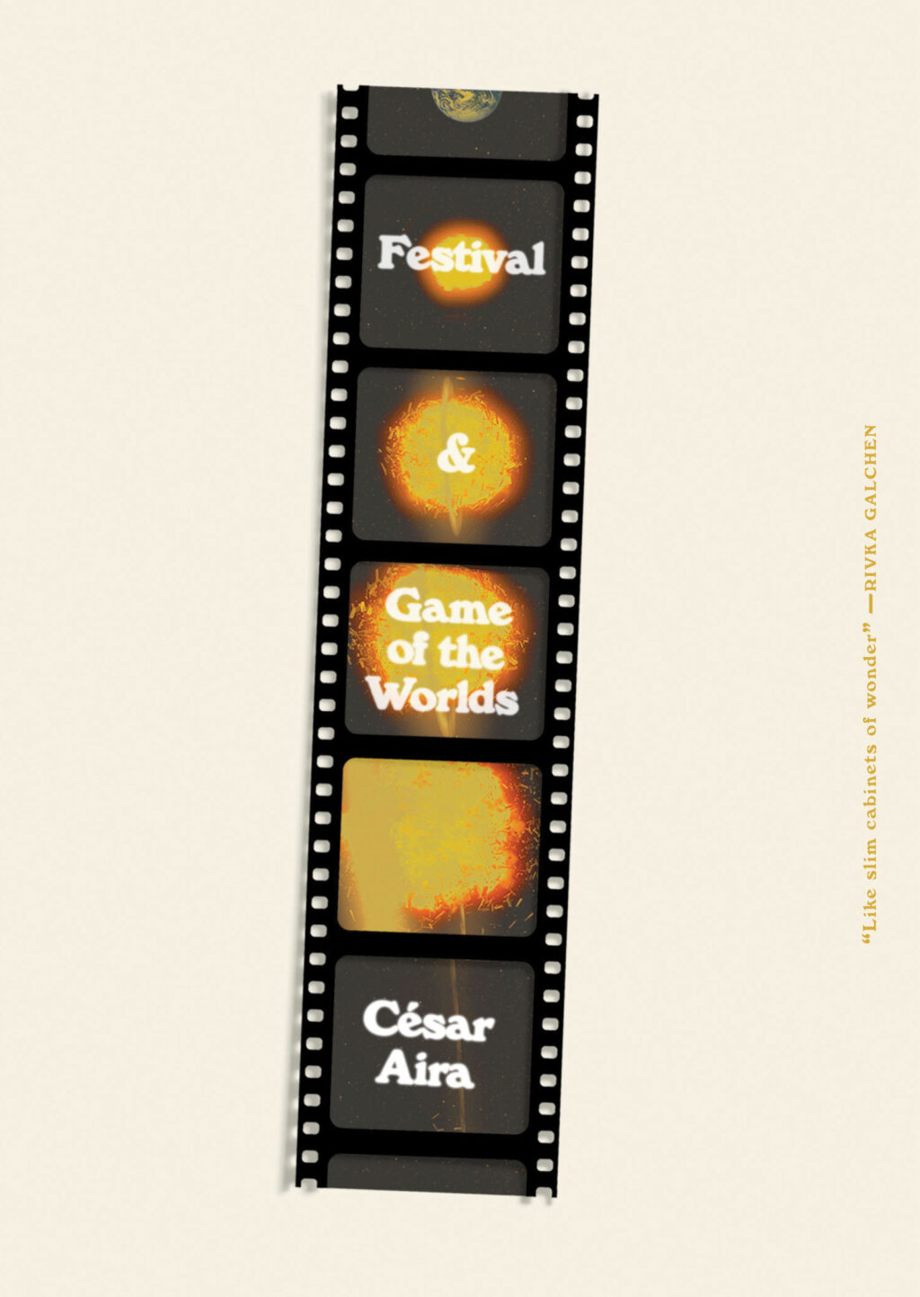




























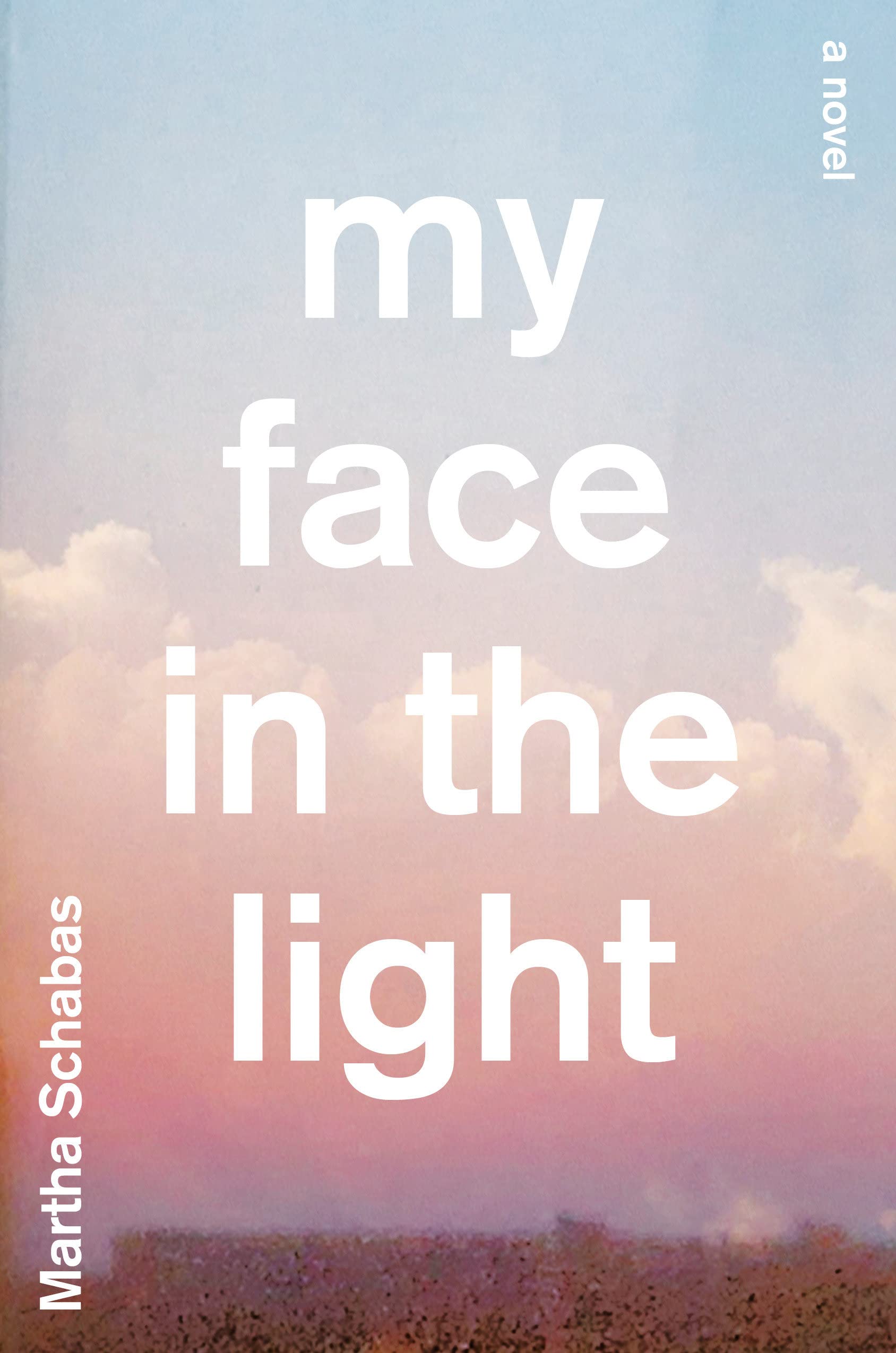





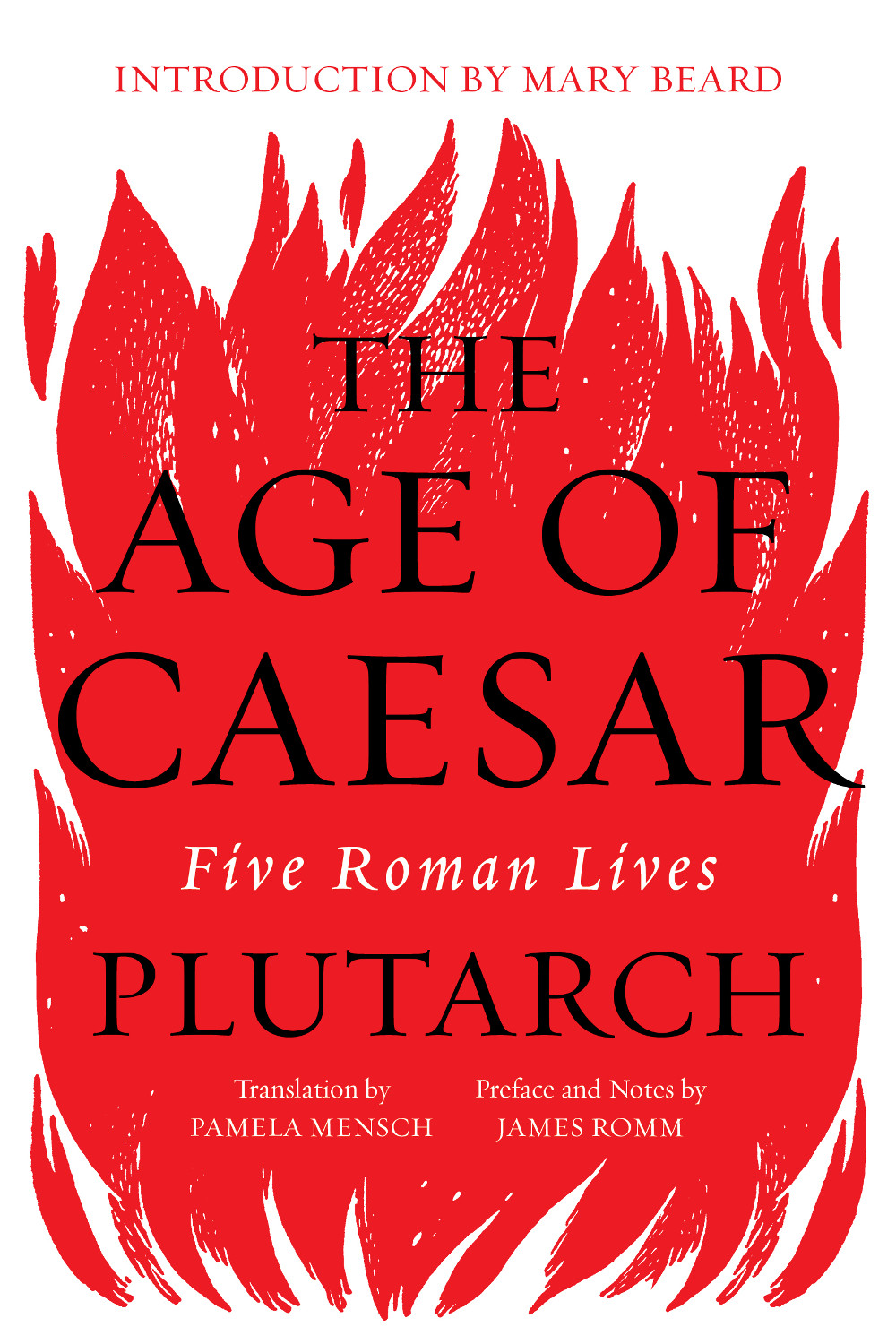



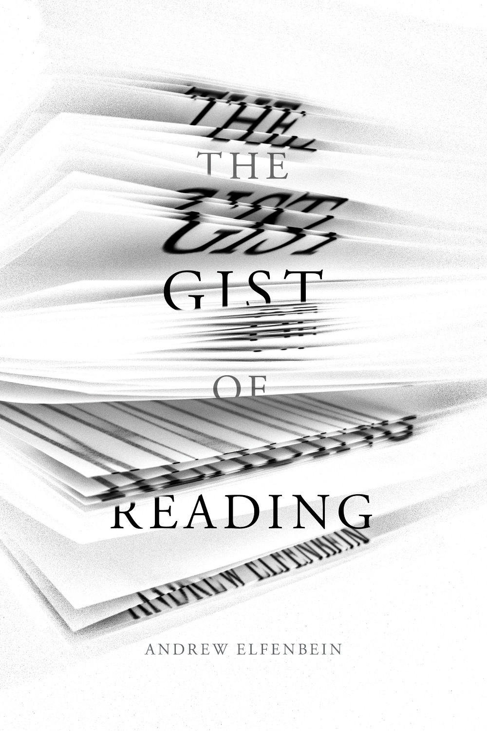
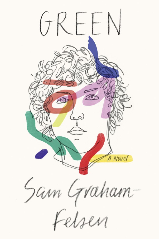



































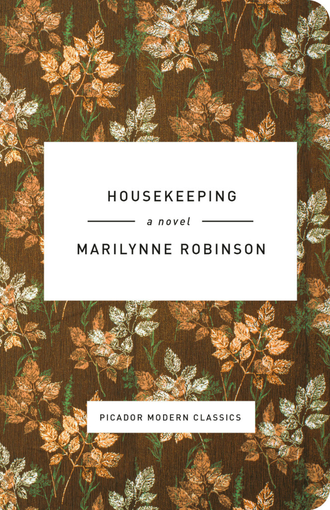




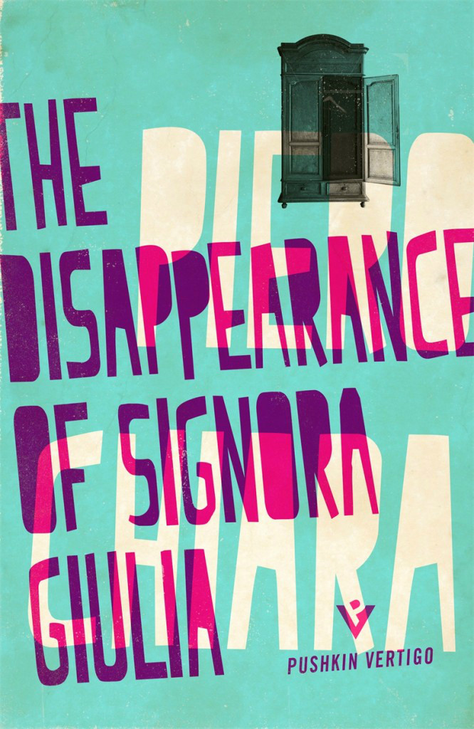
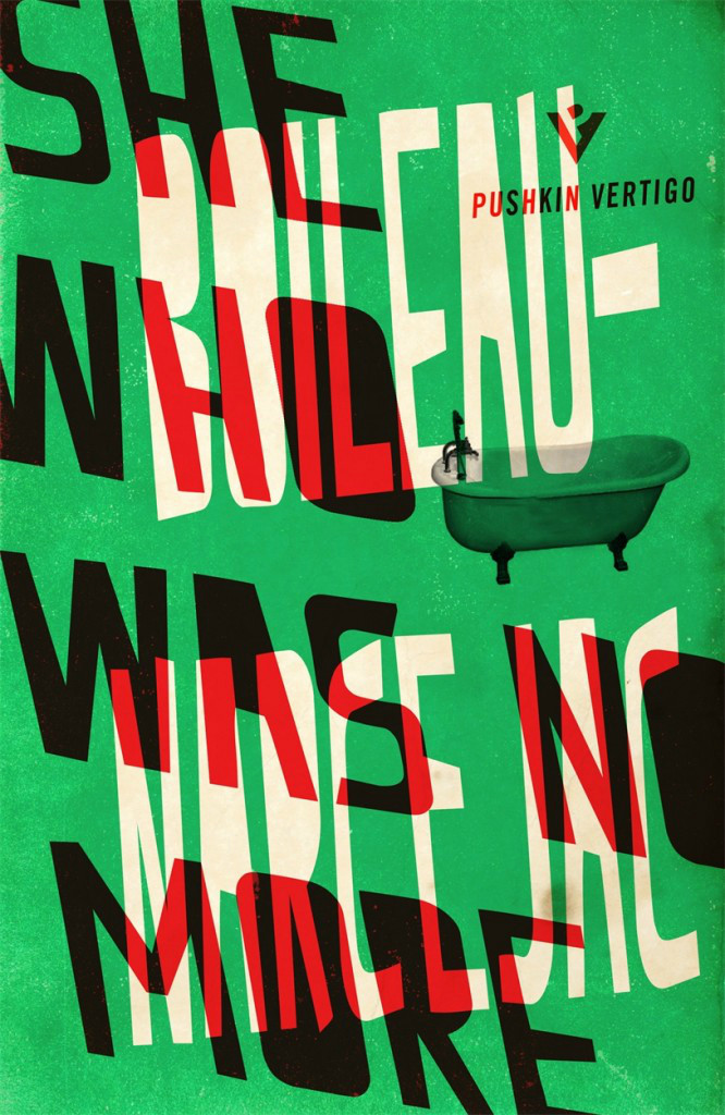
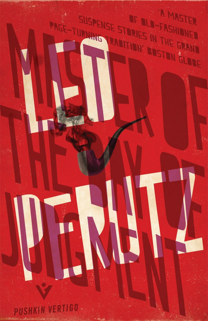
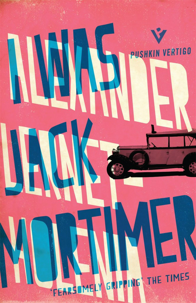





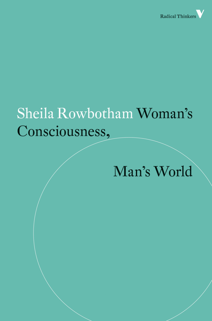



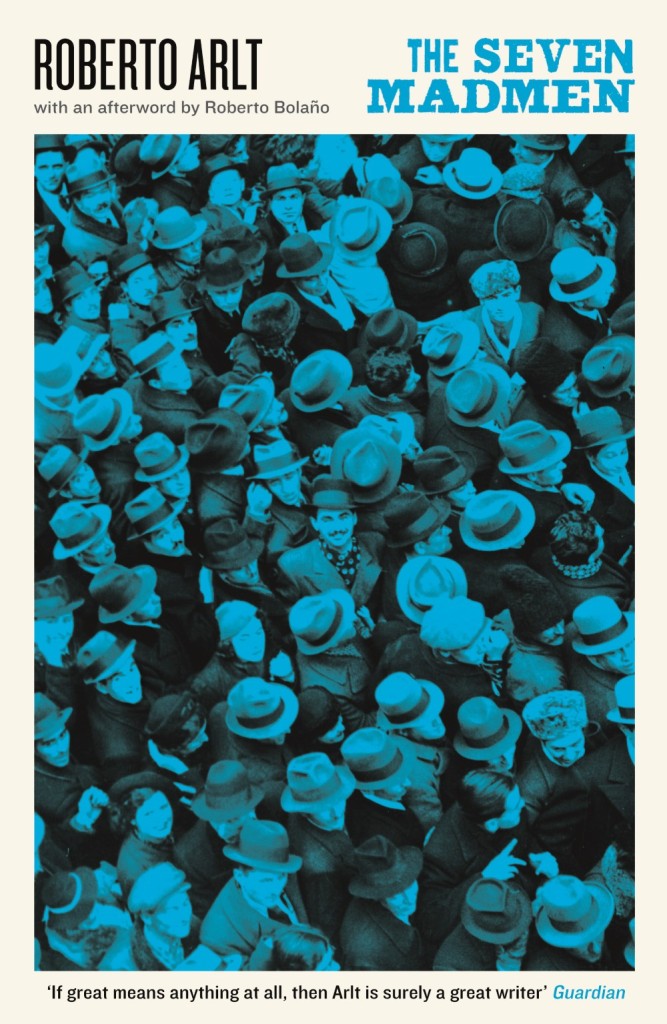


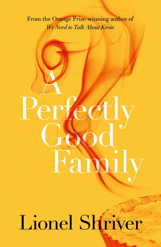





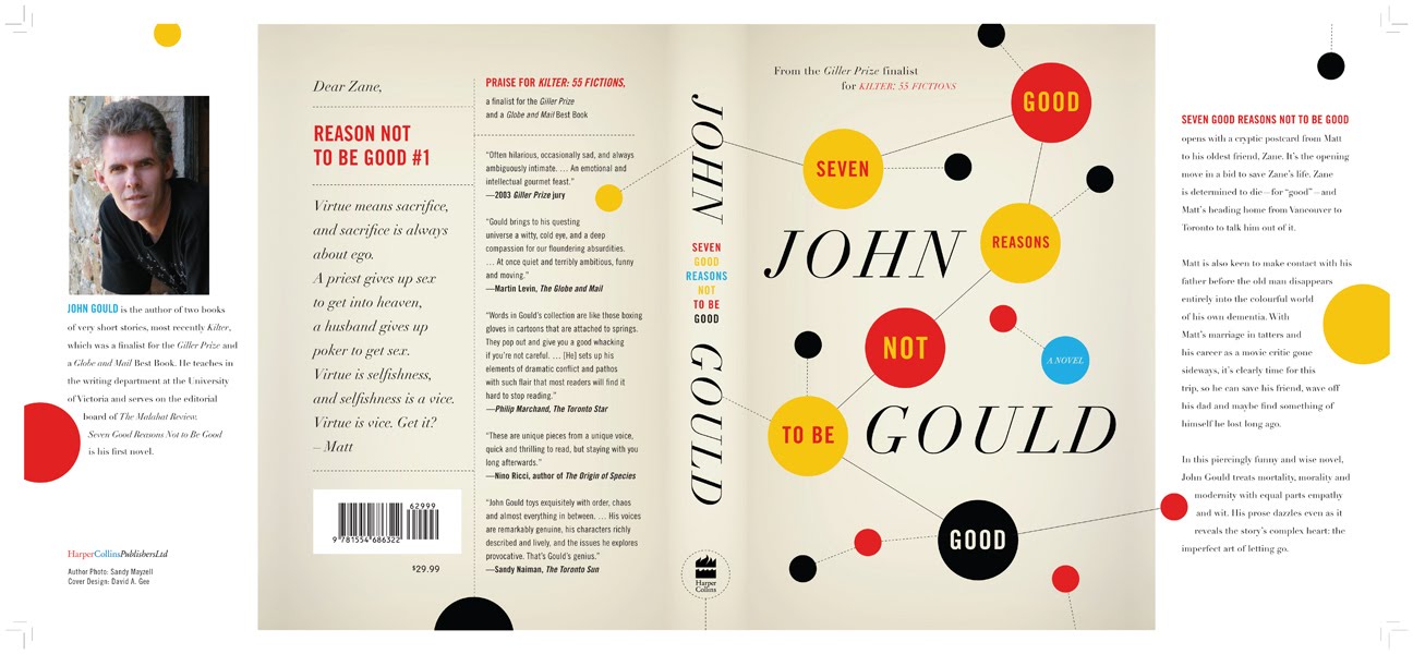
 by John Gould.