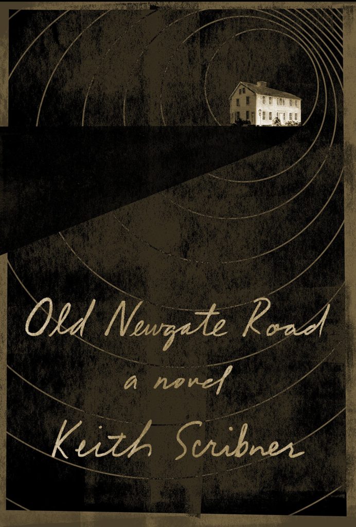
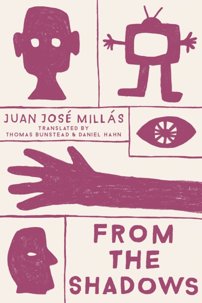
A bit of a bumper post this month with a ton great covers, lots of old friends, a couple of designers that are new to me, and maybe an early contender (or two) for the ‘best of the year’ list.
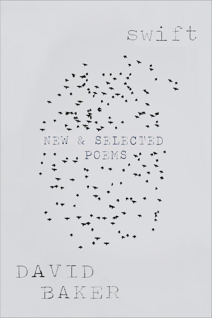
I haven’t posted enough of David’s covers lately. They are always fun. I was struggling to think what this one reminded me of. I’m wondering if it’s maybe Raymond Hawkey’s black and white cover designs for Len Deighton? Or something from Pelican / Penguin in the 1970s?
Come On Up by Jordi Nopca; design by Roman Muradov (Bellevue Literary Press / February 2021)
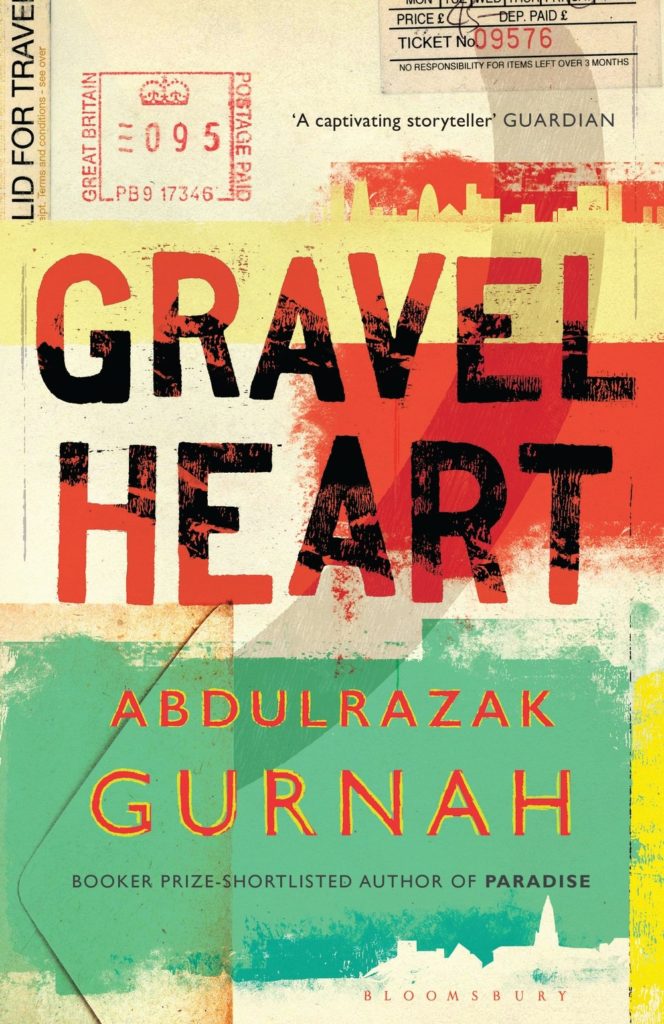
The cover of the UK edition, published this month by Bloomsbury, was designed by Greg Heinimann.
Rachel Willey’s design for Patricia Lockwood’s memoir Priestdaddy is still one of my favourite covers of recent years (hard to believe it is from 2017!).
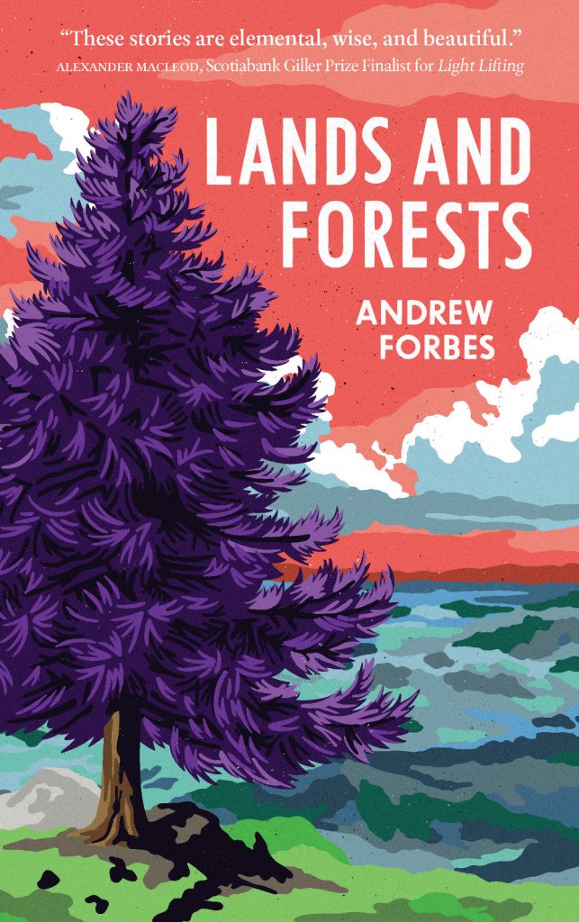
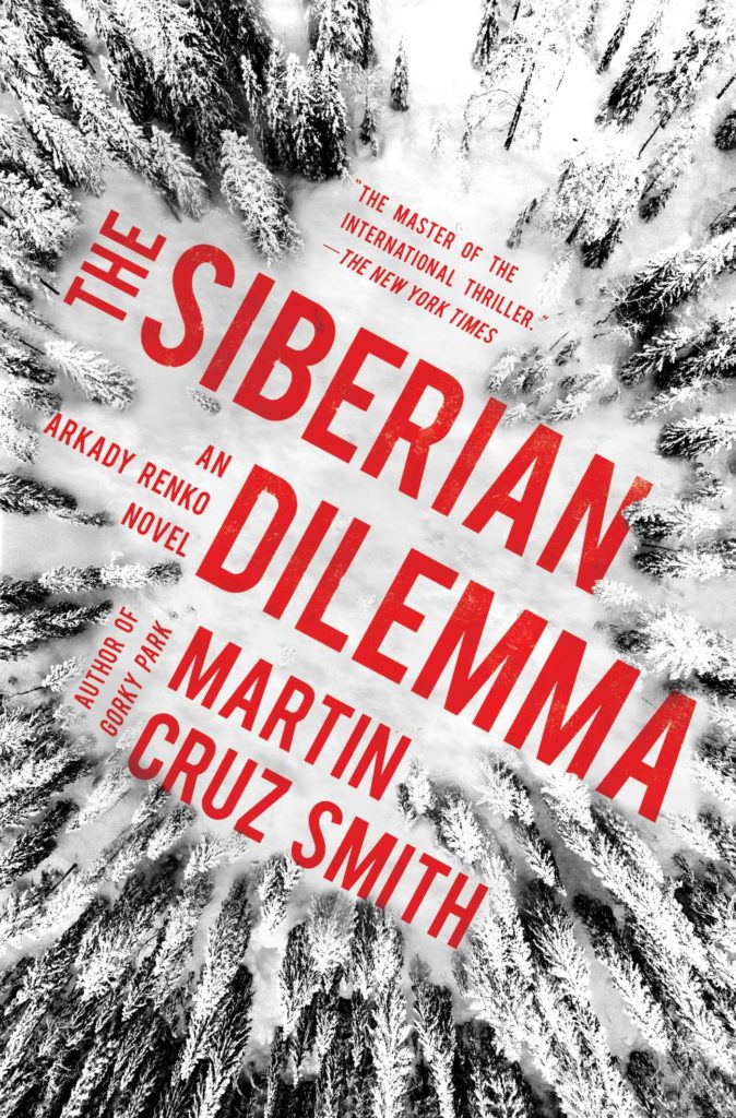
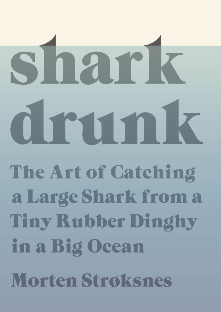
O by Steven Carroll; design by Gray318 (HarperCollins Australia / February 2021)
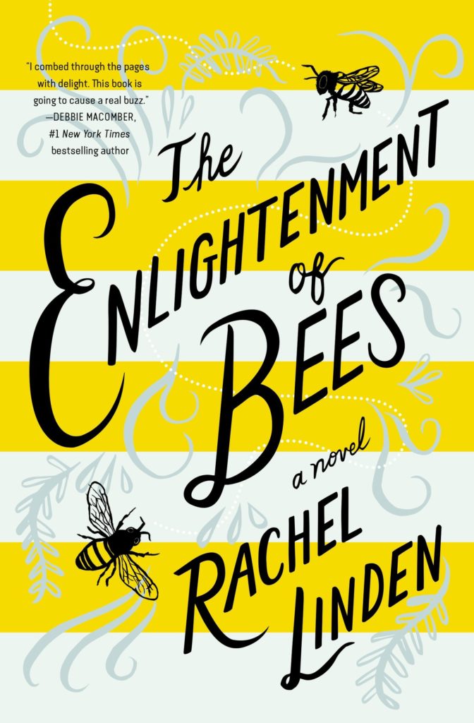
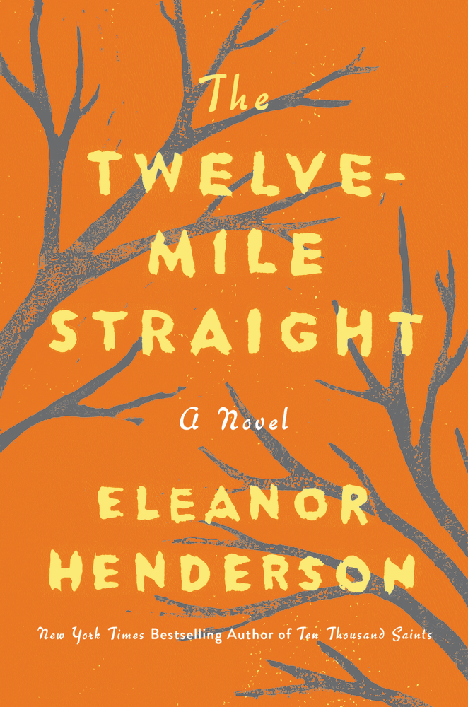
What would you call this background colour? Light brown? Dark beige? Anyway, it seems to be a thing. We could probably include As You Were cover here too, although it doesn’t have the red-orange accent colour.
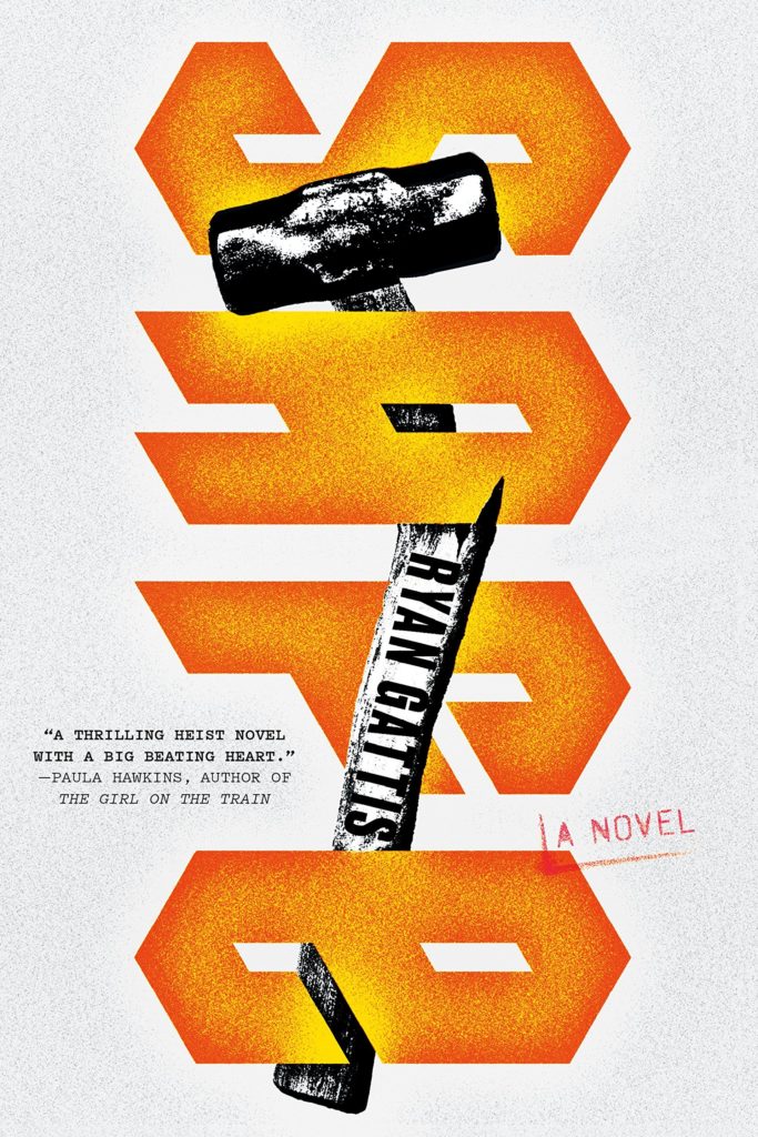
The Witch’s Heart by Genevieve Gornichec; design by Adam Auerbach (Ace Books / February 2021)
I didn’t blog much this year. It felt strange to be posting about something as trivial as book covers during a deadly pandemic. 2020 has been a tough year. I feel lucky that my family are safe and well, and I have kept my job and my health. I know others have not been so fortunate.
It has been hard.
I haven’t read much and I’ve struggled to keep track of new work. Toronto has been in lockdown for most of 2020. Browsing bookstores hasn’t been possible, and I didn’t spend as much time as usual trawling for covers online. Perhaps unsurprisingly, a lot of covers in this year’s post are featured here for the first time.
Looking back at last year’s post, I was apparently feeling gloomy about the state of things in 2019 too.1 If I remember correctly, I was — in the midst of everything — trying to get through sales conference, wrap up a big project before the holidays, and feeling more than a little stressed. Somehow I still managed to write a little bit about the trends I was seeing. A few things — painterly covers for example — seem to have continued into 2020. Lydian certainly hasn’t gone away. It felt so common, in fact, I stopped keeping track of individual examples. On the other hand, I did see less Avant Garde for which I am quietly grateful (although I’m not sure that’s a popular sentiment).
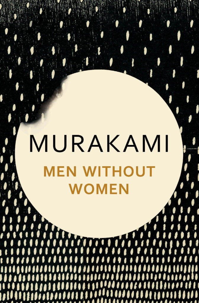
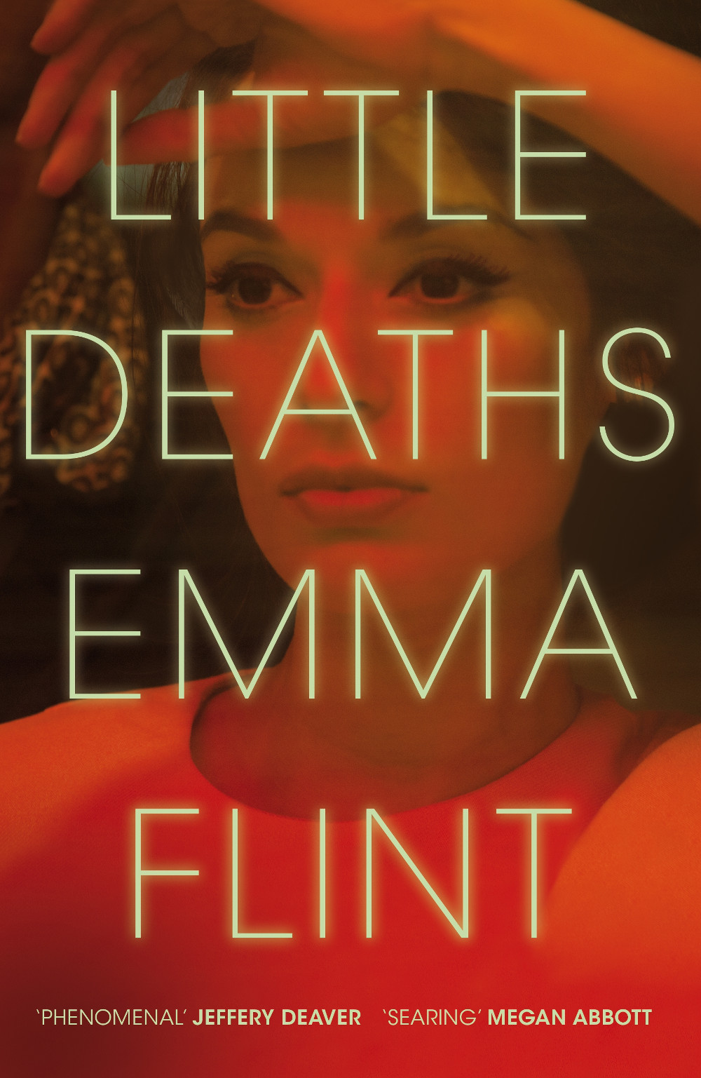
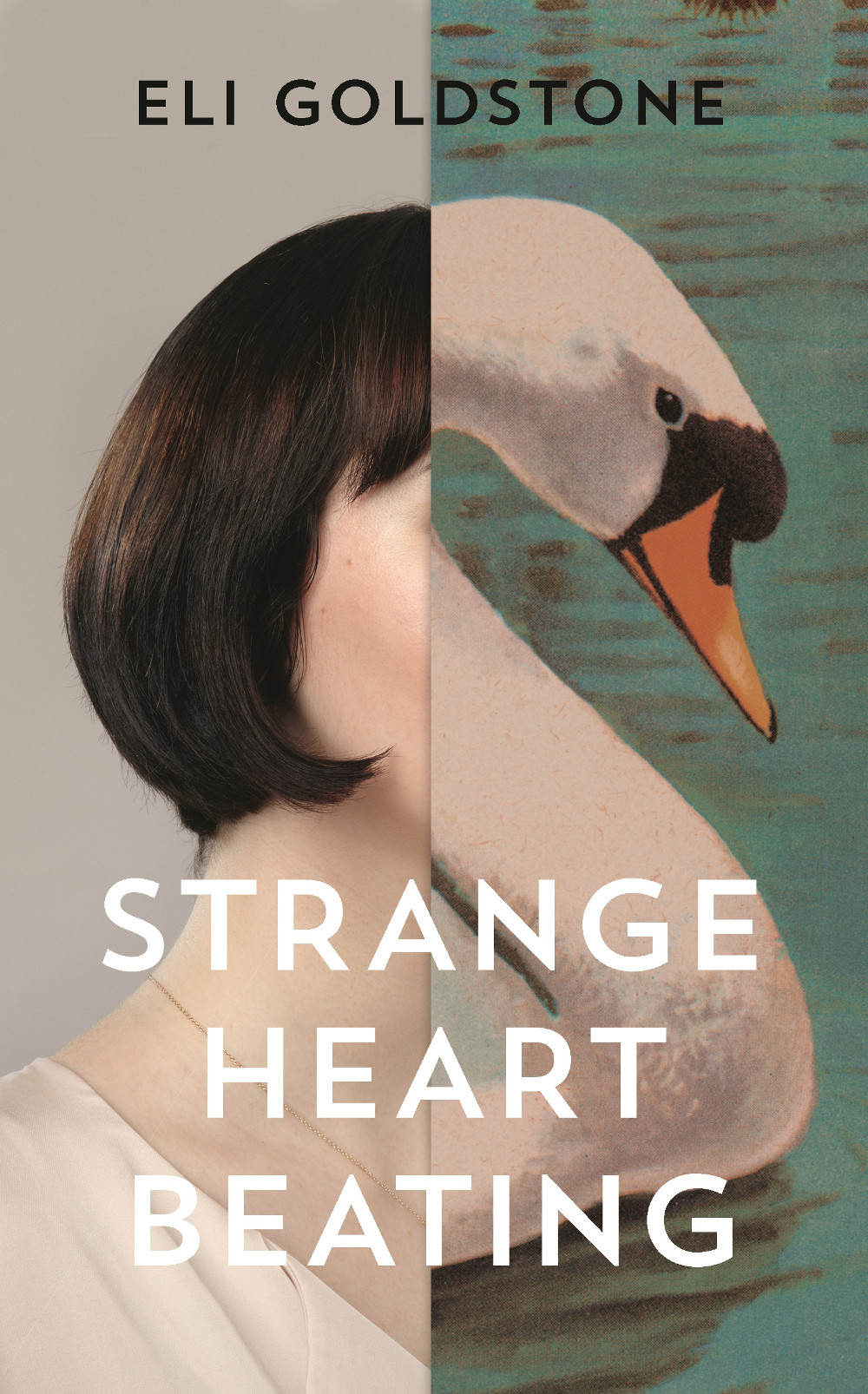
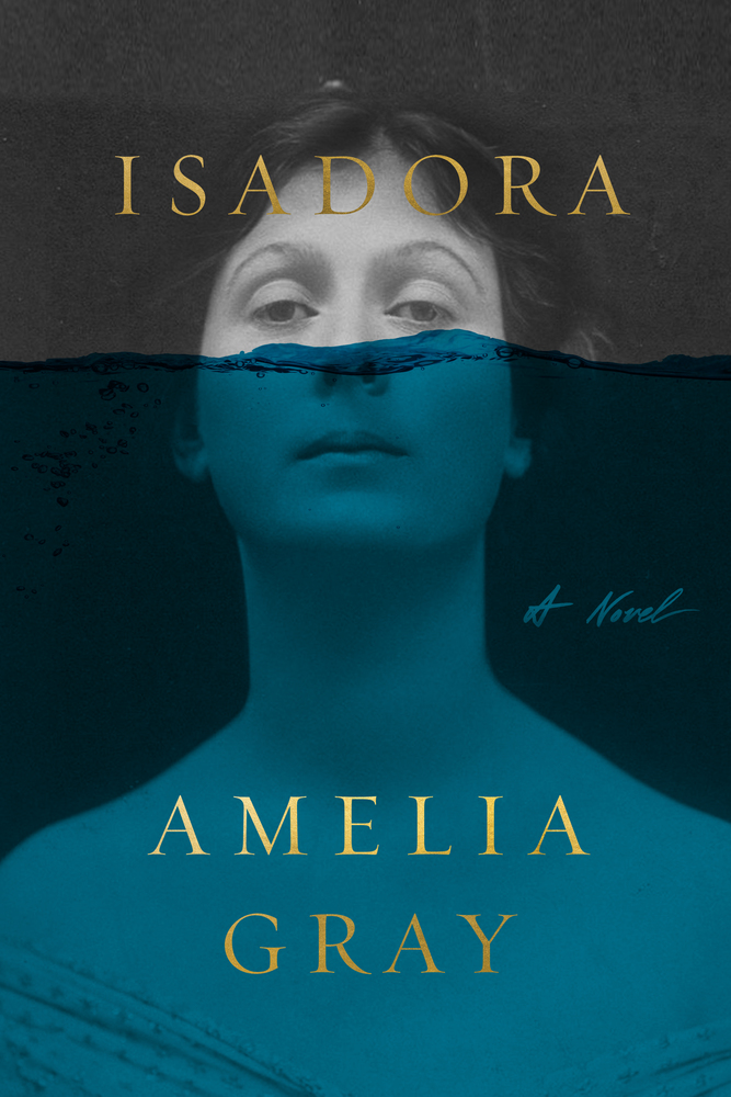
At The Literary Hub, Emily Temple declared 2020 to be “the year of enormous pink lady faces on book covers.” While at Spine Magazine, Viki Hendy collected together examples of covers with type around the edges. I don’t know that I have a lot to add that. There were a few new meta, books on book covers this year, which is always a delight. And I think perhaps collage might be having a moment too, which is fun. Although we may be overdoing the half-face compositions.
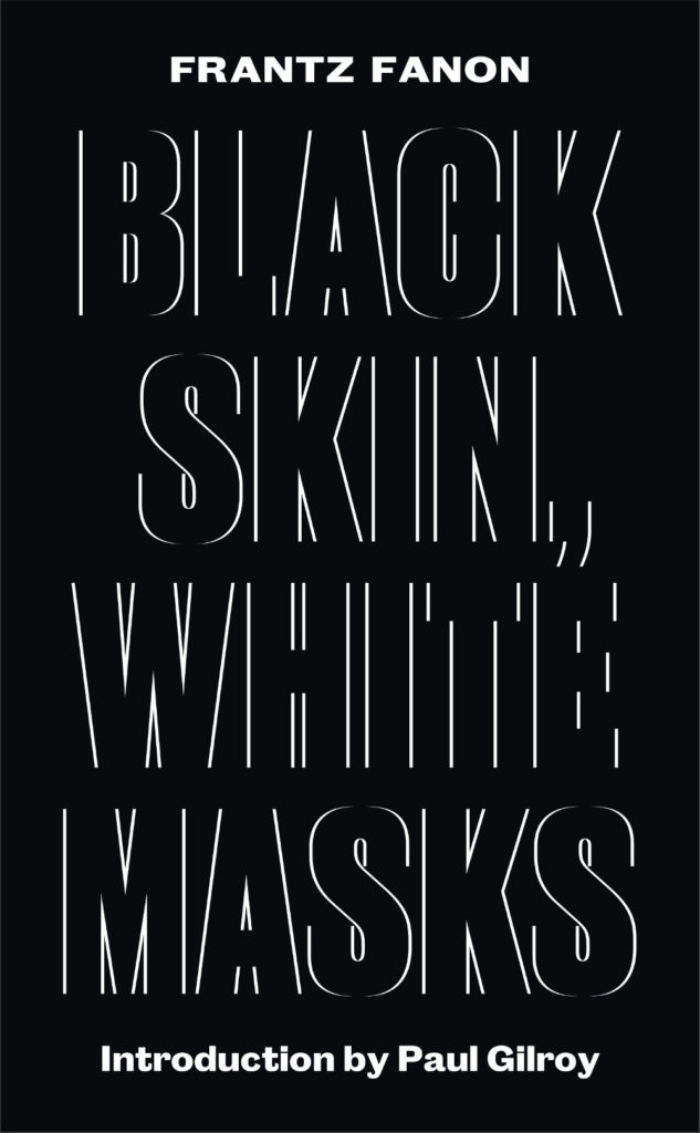
Suppose A Sentence by Brian Dillon; design by Katy Homans; art by John Stezaker (NYRB / September 2020)
The Lightness by Emily Temple; design by Ploy Siripant; art by Beth Hoeckel (William Morrow / June 2020)
There is, of course, a lag. Trends always bleed over from one year to the next. One of this year’s “big books”, Such a Fun Age by Kiley Reid, which featured a bright and bold cover designed by Vi-An Nguyen, was published in the US on December 31, 2019. A lot of 2020 books have been delayed until 2021. But I wonder how the changes in the way we work and consume brought on by the pandemic — designing in isolation for an audience that is now browsing predominantly online — will change things in the next couple of years. Will we see more experimentation or less? Will there be demand for beautiful tactile objects, or will we more fully embrace digital reading experiences? There’s a lot to ponder…
Anyway, thanks to all the folks who have supported the Casual Op this year and encouraged me to keep it going. I’m sorry that I have not responded to all the emails I have received. I’m going to try to be a bit better with that in future. Hopefully there have been some silver linings for you in 2020, and you can still find some joy in a few good book covers…
Afterland by Lauren Beukes; design by Lauren Wakefield (Penguin / July 2020)
Also designed by Lauren Wakefield:
The Driftwood Girls by Mark Douglas-Home; design by Lauren Wakefield (Penguin / April 2020)
The Honey and the Sting by E. C. Freemantle; design by Lauren Wakefield (Penguin / September 2020)
We Are All the Same in the Dark by Julia Heaberlin; design by Lauren Wakefield (Penguin / August 2020)
Sadly, Adalis unexpectedly passed away in July 2020. I only knew Adalis through her work, but she is such a huge a loss to our community. There is a GoFundMe page if you wish to donate to her family.
Also designed by Adalis Martinez:
losi by Molly Ball; design by Adalis Martinez (Henry Holt & Co / May 2020)
Dominicana by Angie Cruz’ design by Adalis Martinez (Flatiron / August 2020)
Love is an Ex-Country by Randa Jarrar; design by Adalis Martinez (Catapult / February 2021)
You can find a short interview with John in which he discusses his cover for Red Pill at Bear Books, and you can read about his design process for Weather by Jenny Offill at Spine Magazine.
The cover of the UK edition, which will not be published until 2021(!), was designed by Craig Fraser. It has a very vintage Faber feel… maybe it’s just the type?
This reminded me of the cover of the similarly themed American Manifesto by Bob Garfield, designed by Richard Ljoenes and published earlier this year by Counterpoint….
2019 has felt interminable. It has also felt like there are never enough hours in the day to keep up. You can’t talk to me about TV shows or movies. I haven’t seen any.
When it comes to books, I’m fortunate enough to work in the industry. But what hope do casual readers have of finding the good stuff when the same few titles dominate the conversation and there is so much else competing for their attention?
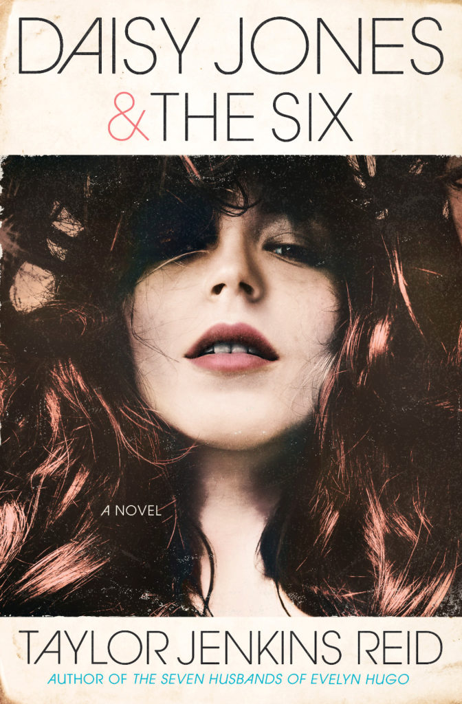
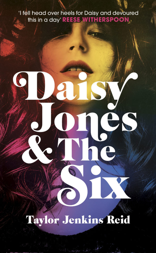
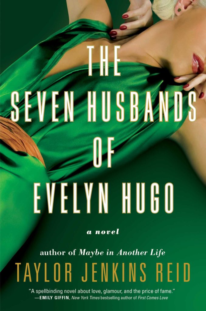
Daisy Jones and The Six by Taylor Jenkins Reid; design by Caroline Teagle Johnson (Ballantine / March 2019) Daisy Jones and The Six by Taylor Jenkins Reid; design by Lauren Wakefield (Hutchinson / March 2019)
Daisy Jones and the Six had a glamorous, louche 1970s look. The US and UK editions, designed by Caroline Teagle Johnson and Lauren Wakefield respectively, took slightly different directions with the type, but the photograph (a stock image apparently) felt ideally suited to social media.
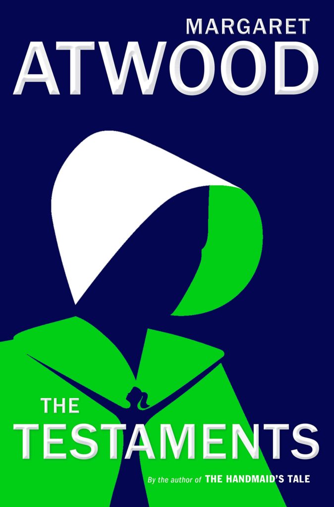
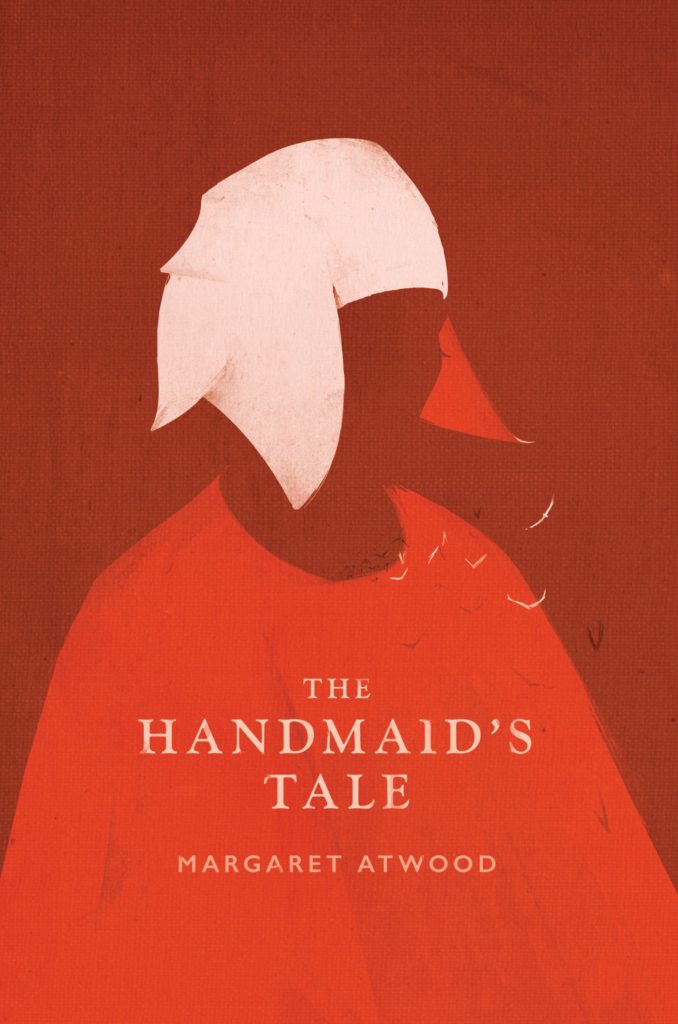
The Testaments by Margaret Atwood; design by Noma Bar (Chatto & Windus / September 2019)The Handmaid’s Tale by Margaret Atwood; art direction by Christopher Moisan; illustration by Patrik Svensson (Houghton Mifflin Harcourt / April 2017)
The Testaments was everywhere and, like the recent Vintage Classics reissue of The Handmaid’s Tale, the cover illustration was unmistakably by Noma Bar. We live in an age where every cult movie and TV show gets a ‘minimalist’ poster now, and I found that The Testaments looked too familiar for me to find it engaging. It didn’t help that the cover of the 2017 US reissue of the The Handmaid’s Tale by Swedish illustrator by Patrik Svenson had already featured a similar 3/4s silhouette. Nevertheless, it was perhaps a bolder cover choice than I’m giving it credit for. If nothing else, it showed that bright green on book covers — once cursed and reviled — is suddenly all the rage!
In terms of trends, 2019 felt more like a continuation of previous years rather than a break with the past. There was a kind of conservatism to a lot of the covers I saw. My sense was that highly polished designs that looked comfortingly familiar were being approved over riskier ones that stood out from the crowd. The most interesting covers often came from small publishers, especially New Directions who seem to be giving a bit more creative license to the designers they work with (some of whom have 9-5s at much bigger publishers!).
Big centred blocks of utilitarian white type over elaborate backgrounds continued to be a mainstay. It’s the book cover as poster, and it works at any size, so I don’t think it’s going away any time soon.
Handwriting and hand-lettering remained popular too, although my sense is that enthusiasm is starting to wane as publishers are opting for greater legibility and designers are turning back to vintage type styles to give a sense of authenticity and craft. (I’m willing to admit the evidence might not back me up on this, however!)
Fun, swishy 1970s-inspired serifs like Benguiat Caslon revival Cabernet are back. People keep trying to make ITC Avant Garde — another iconic 1970s typeface — happen again too. I don’t think it works for the most part, but I can see why designers think it’s cool in a coked-up New York way. Warren Chappell’s earnest calligraphic sans serif Lydian, originally released in 1938, continued its unlikely rise as a go-to literary typeface. It even got an explainer at Vox.
Black and white portrait photography has been the staple of biographies and classics for years, so it was interesting to see closely cropped black and white photographs used on the covers of a couple of new literary novels this year. This isn’t entirely new obviously. Black and white photography has long been used to signify that something is “art” (as opposed to, say, “pornography”). But I think the latest iteration of trend was started by Cardon Webb‘s 2015 cover for A Little Life by Hanya Yanagihara which used a black and white photograph by the late Peter Hujar.
Coincidentally the cover of the US edition of Garth Greenwell’s new novel Cleanness, publishing early 2020, was designed by Thomas Colligan and uses contemporary black and white photograph by Jack Davison. (The UK edition, designed by Ami Smithson fits this trend a little less neatly, but features black and white photograph by Mark McKnight)
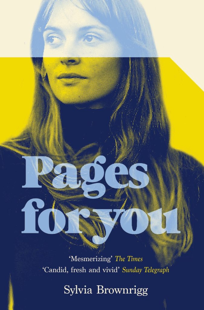
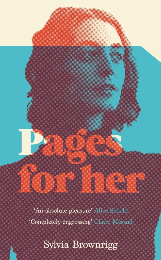
Something that I didn’t anticipate was the use of contemporary landscape and figure painting on the covers of some the big literary releases of the year. Like black and white photography, it felt almost pre-digital — a grasp at traditional values of craft. I don’t know if I would go as far as to say it is a rejection of post-modernism. But maybe it is? I don’t know. Discuss amongst yourselves.
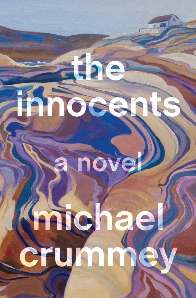
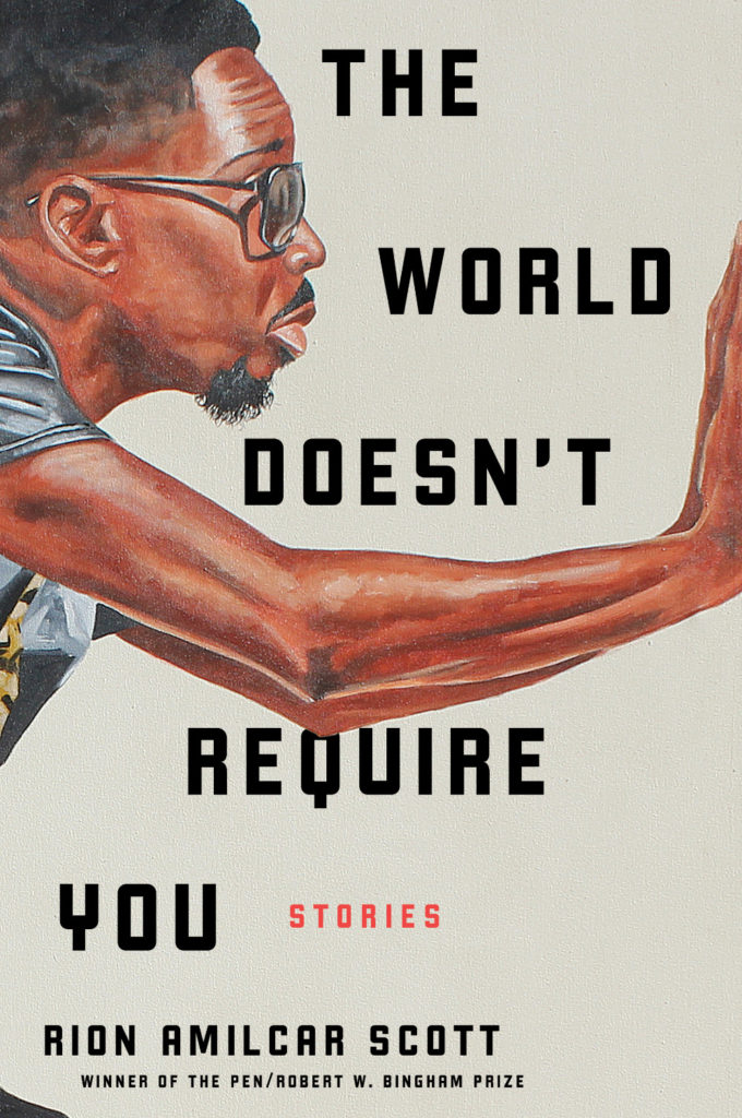
The Innocents by Michael Crummey; design by Emily Mahon; art by Diana Dabinett (Doubleday / August 2019)The World Doesn’t Require You by Rion Amilcar Scott; design by Laywan Kwan; art by Fahamu Pecou (Liveright / August 2019)Inland by Téa Obrecht; design by Jaya Miceli; art by Tamara Ruiz (Random House / August 2019)
Thank you to all the designers and art directors who’ve been in touch and helped me identify covers for my posts. I’m sorry if I haven’t replied to your message. It’s been a year.
Aug 9 — Fog by Kathryn Scanlan; design by Na Kim (Farrar Straus & Giroux MCD / June 2019)
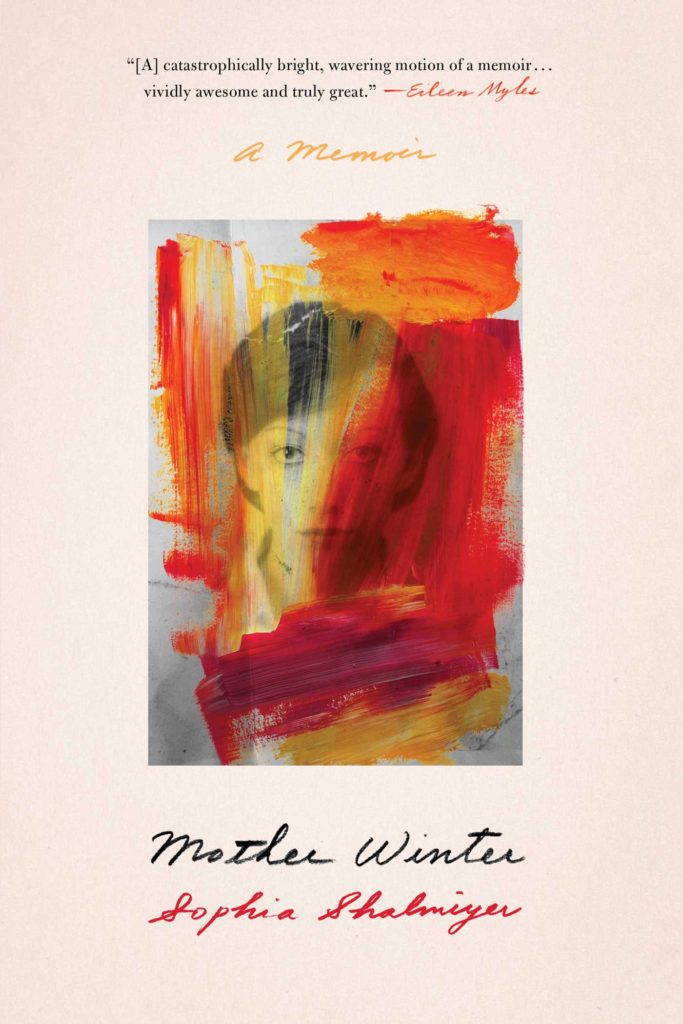
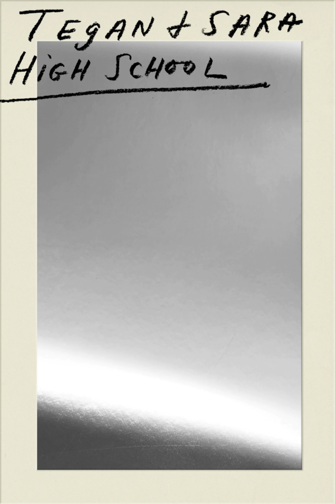
Also designed by Na Kim:
Lie With Me by Philippe Besson; design by Na Kim (Scribner / April 2019)Mother Winter by Sophia Shalmiyev; design by Na Kim (Simon & Schuster / February 2019) High School by Tegan & Sara; design by Na Kim (MCD / September 2019)
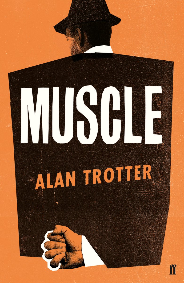
Muscle by Alan Trotter; design by Gray318 (Faber & Faber / February 2019)
Also designed by Gray318:
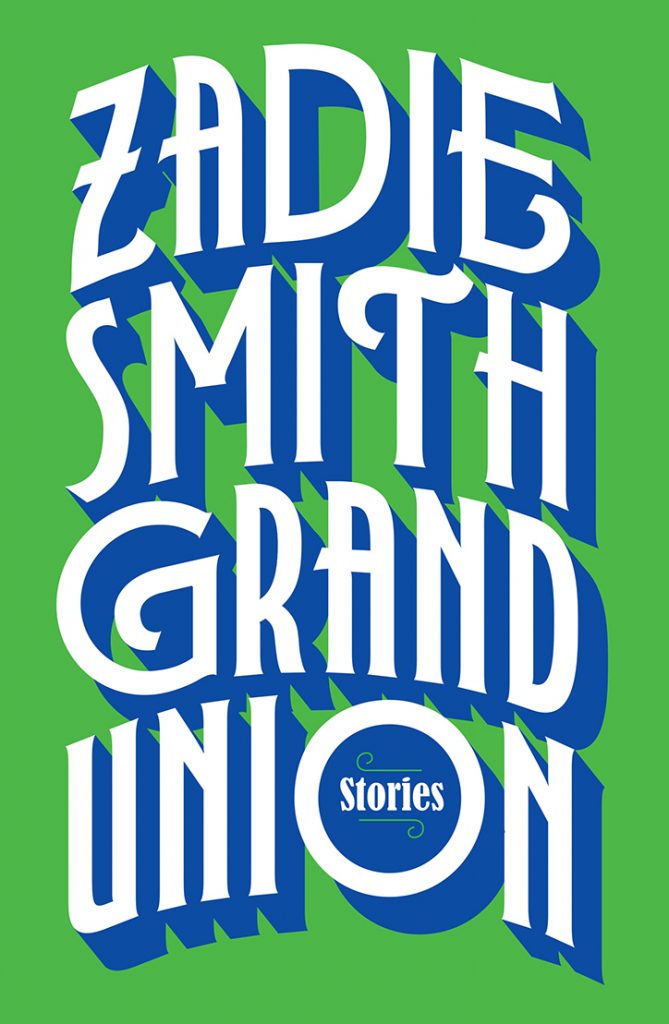
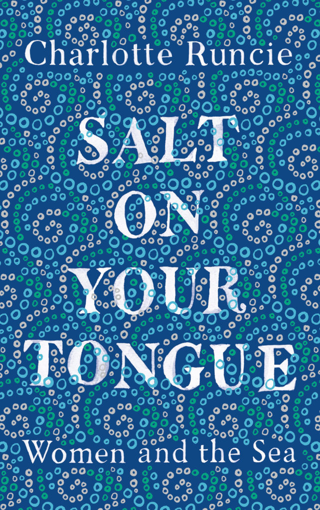
Quichotte by Salman Rushdie; design by Gray318 (Jonathan Cape / August 2019) Grand Union by Zadie Smith; design by Gray318 (Hamish Hamilton / October 2019)Salt On Your Tongue by Charlotte Runcie; design by Gray318 (Canongate / January 2019)
What We Really Do All Day by Jonathan Gershuny and Oriel Sullivan; design Matthew Young (Pelican / September 2019)Artificial Intelligence by Melanie Mithcell; design by Matthew Young (Pelican / October 2019)
One Day by Gene Weingarten; design by David Litman (Blue Rider / October 2019)
Oliver Munday wrote about designing the cover for New Directions at Literary Hub earlier this year.
He also designed a lot my favourite covers this year…
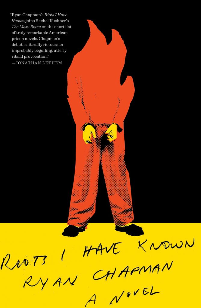
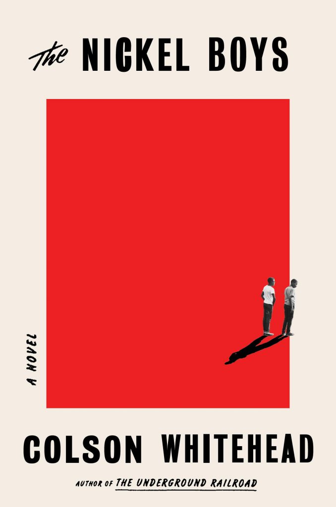
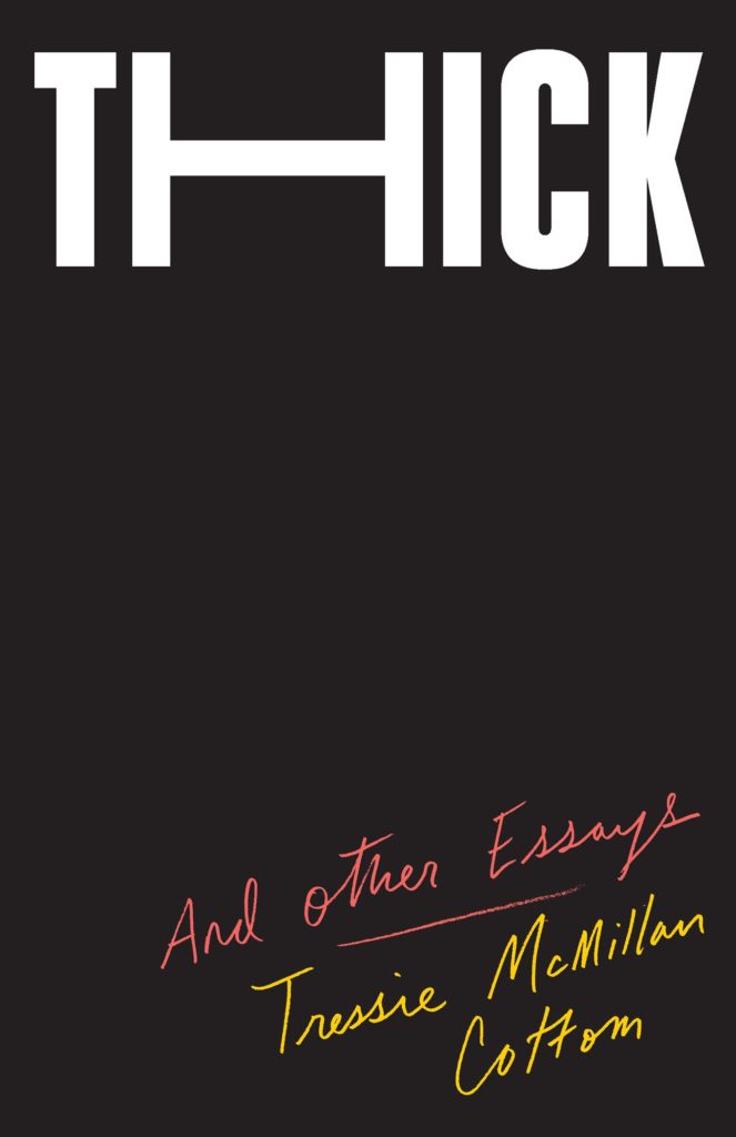
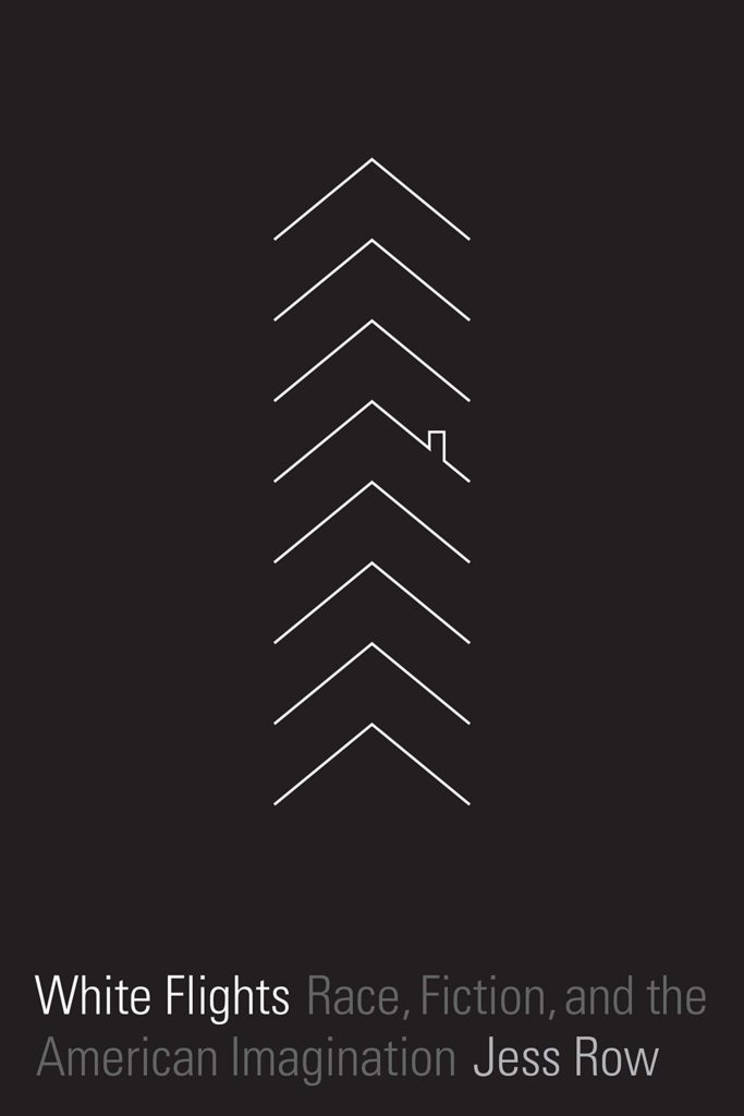
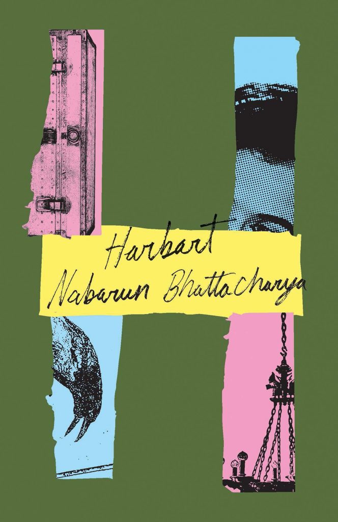
Riots I Have Known by Ryan Chapman; design by Oliver Munday (Simon & Schuster / May 2019)The Nickel Boys by Colson Whitehead; design by Oliver Munday (Doubleday / July 2019)Thick by Tressie McMillan Cotton; design by Oliver Munday (The New Press / January 2019)White Flights by Jess Row; design by Oliver Munday (Graywolf / August 2019) Harbart by Nabarun Bhattacharya; design by Oliver Munday (New Directions / June 2019)
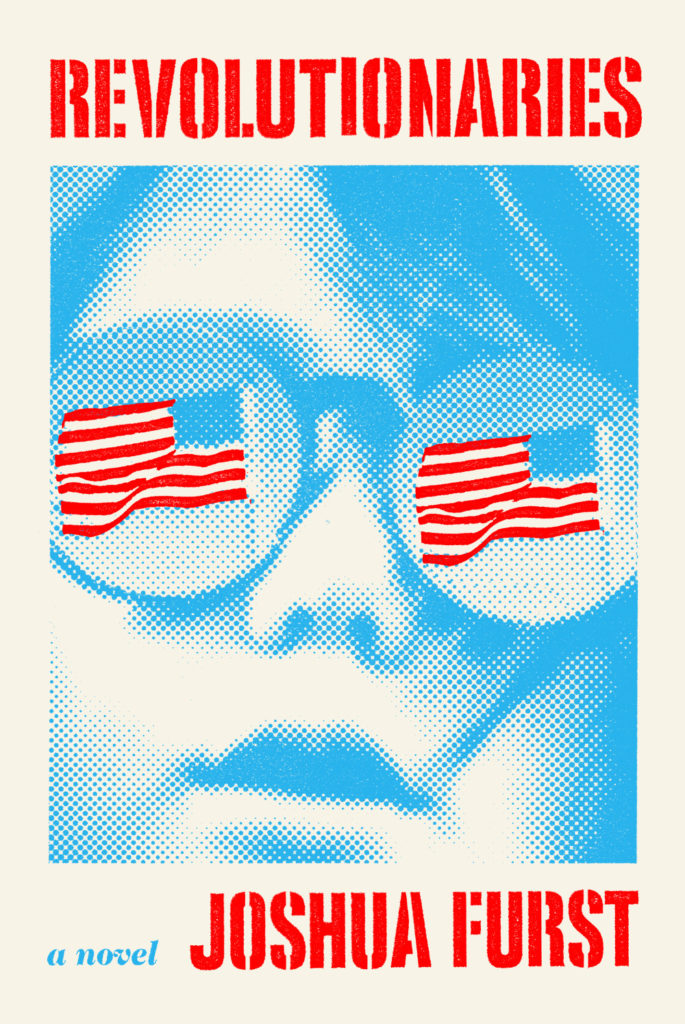
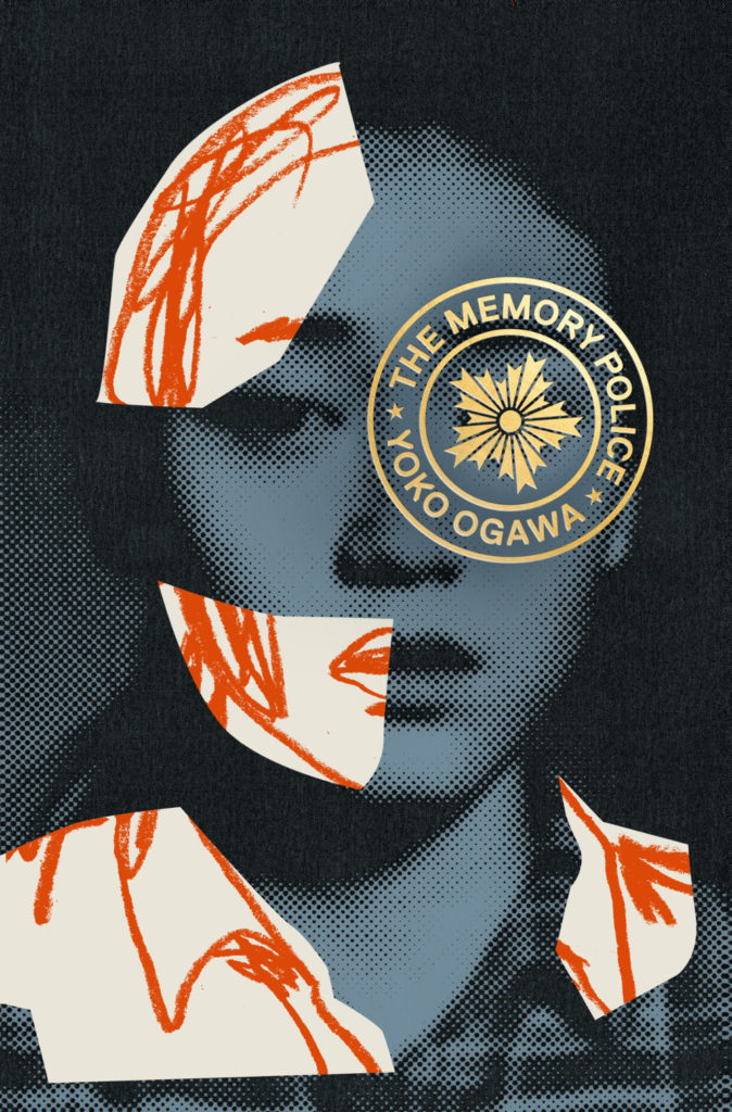
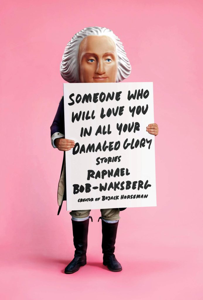
The Revolutionaries by Joshua Furst; design by Tyler Comrie (Knopf / April 2019)The Memory Police by Yoko Ogawa; design by Tyler Comrie (Pantheon / August 2019)Someone Who Will Love You in All Your Damaged Glory by Raphael Bob-Waksberg; design by Tyler Comrie; illustration Justin Metz (Knopf / June)
The Volunteer by Salvatore Scibona; design by Rachel Willey (Penguin / March 2019)
Also designed by Rachel Willey:
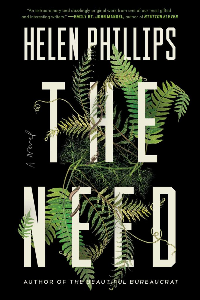
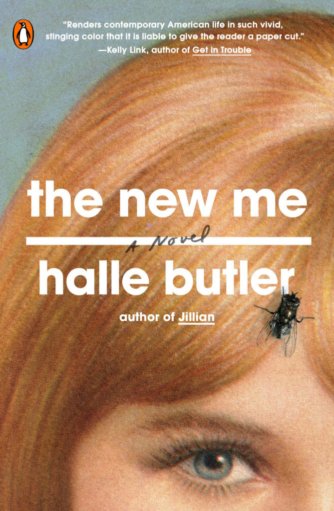
The New Me by Halle Butler; design by Rachel Willey (Penguin / March 2019) The Need by Helen Phillips; design Rachel Willey (Simon & Schuster / July 2019)
Another cover for the Lydian file. (I posted a link to this on Twitter, but I don’t think I’ve mentioned it here — Kaitlyn Tiffany recently wrote a piece on the Lydian phenomenon for Vox if you want to read a bit more about it)
Some lovely type there… Can anyone tell me what the title typeface is please? It seems like a good alternative for our old friend Lydian there… The Lady from the Black Lagoon by Mallory O’Meara; design by Erin Craig; art by Matt Buck (Hanover Square / March 2019)
Is this the first Harlequin book cover to feature on the site? Possibly…
Since 2010, I’ve posted an annual survey of the year in book covers. The post has expanded and developed over the past 7 years, but essentially it is a collection of the covers published in the previous 12 months that I found interesting or noteworthy in some way. As with the previous couple of years, the 2017 list is organized by covers (alphabetical by title), and by designer so that I can show a greater variety of work, and no one designer or studio dominates.
Thank you to everyone who has supported the blog this year, and special thanks to all the designers, art directors, authors, publishers, and fellow design enthusiasts who have helped me with covers and design credits. My sincere apologies to the designers and publishers not on this year’s list and whose covers I have overlooked in the past 12 months.
A post looking back on the YA covers of 2017 is to follow.


