Skip to content

Tag: knopf

Book Covers of Note June 2016

Something of a bumper post this month, with lots of black and white covers for some reason. Perhaps it’s a thing…?

Addlands design Jenny Grigg
Addlands by Tom Bullough; design by Jenny Grigg (Granta / June 2016)

barkskins-design Jaya Miceli
Barkskins by Annie Proulx; design Jaya Miceli (Scribner / June 2016)

The cover of the UK edition (Fourth Estate / June 2016), designed by Anna Morrison, is an interesting contrast:
Barkskins design by Anna Morrison

Boy-s Own Story design Ami Smithson
A Boys Own Story by Edmund White; design by Ami Smithson (Picador / June 2016)

9780399184123
But What If We’re Wrong? by Chuck Klosterman; design by Paul Sahre (Blue Rider Press / June 2016)

TheChaplinMachine
The Chaplin Machine by Owen Hatherley; design by David Pearson (Pluto Press / June 2016)

Crow-Girl design Mendelsund and Munday
The Crow Girl by Erik Axl Sund; design by Peter Mendelsund & Oliver Munday (Knopf / June 2016)

death confetti design Jacob Covey
Death Confetti by Jennifer Robin; design by Jacob Covey (Feral House / June 2016)

Essex Serpent design Peter Dyer
The Essex Serpent by Sarah Perry; design Peter Dyer (Serpent’s Tail / June 2016)

Fen design by Suzanne Dean
Fen by Daisy Johnson; design Suzanne Dean (Vintage / June 2016)


The Girls by Emma Cline; design Peter Mendelsund; lettering by Jenny Pouech (Random House / June 2016)

The cover of the UK edition (Chatto & Windus / June 2016), which makes intriguing use of ITC Avant Garde Gothic,1 was designed by Suzanne Dean:

girls UK

Goldfish_fc
Goldfish JKT_final

Goldfish by Nat Luurtsema; design by Anna Booth (Feiwel & Friends / June 2016)

(This has a fancy spot gloss that makes the school of fish appear to shimmer)

How to Ruin Everything design Ben Denzer
How to Ruin Everything by George Watsky; design by Ben Denzer (Penguin / June 2016)

Human Acts design Tom Darracott
Human Acts by Han Kang; design by Tom Darracott (Portobello Books / January 2016)

Infomocracy design Will Staehle
Infomocracy by Malka Older; design by Will Staehle (Tor Books / June 2016)

ink and bone design Ervin Serrano
Ink and Bone by Lisa Unger; design by Ervin Serrano (Touchstone / June 2016)

In the Dark in the Woods design Kate Gaughran
In the Dark in the Woods by Eliza Wass; design by Kate Gaughran (Quercus / April 2016)

Is That Kafka design Erik Carter
Is That Kafka? 99 Finds by Reiner Stach; design by Erik Carter (New Directions / April 2016)

Invincible Summer design Justine Anweiler
Invincible Summer by Alice Adams; design by Justine Anweiler (Picador / June 2016)

Lost Time Accidents design Pete Adlington
The Lost Time Accidents by John Wray; design by Peter Adlington (Canongate / June 2016)

The cover of the US edition (Farrar, Straus & Giroux / February 2016), designed by Janet Hansen, is another fascinating contrast:
Lost Time Accidents design Janet Hansen

The Muse cover art Lisa Perrin
The Muse by Jessie Burton; design by Ami Smithson, cover art by Lisa Perrin (Picador / June 2016)

Print
Naked Diplomacy by Tom Fletcher; cover design by Jonathan Pelham (William Collins / June 2016)

Nitro Mountain design Oliver Munday
Nitro Mountain by Lee Clay Johnson; design by Oliver Munday (Knopf / May 2016)

The Panama Papers_9781786070470
The Panama Papers by Bastian Obermayer and Frederik Obermaier; design by James Paul Jones (Oneworld / June 2016)

Rasputin design Ed Kluz
Rasputin and Other Ironies by Teffi; design by Eleanor Crow; cover art by Ed Kluz (Pushkin Press / May 2016)

Scar design CS Neal
Scar by J. Albert Mann; design by Christopher Silas Neal (Calkins Creek / April 2016)

sex object design by Lynn Buckley
Sex Object by Jessica Valenti; design by Lynn Buckley (Dey Street / June 2016)

White Sands design Pete Adlington
White Sands by Geoff Dyer; design by Peter Adlington (Canongate / June 2016)


6 Comments

All the Books

Assault design Oliver Munday

At Literary Hub, Designer Oliver Munday discusses his design process and reading the whole text:

As designers, we are forced to read quickly, and incisively, mining for the clues to the coveted iconic cover. It can feel careless at times, leading me to believe that my reading skills are being dulled. I think of the author in this process, and in some ways the guilt that I may feel about a less-than-ideal reading of their text is exceeded by the potential of presenting their book with the best possible jacket, one that their audience of ideal readers will appreciate. A cover that feels simultaneously unexpected and inevitable.

I used to aspire to a process that created an expanse for reading each text, one that merged the ideal-designer and ideal-reader into one, but found the boundaries of distinction too severely marked. It would be amazing to have the time, space, and inclination to read an entire text when designing its cover, but I have realized that is not essential. There may be times when my two selves are reconciled, but in the event that they exist separately, a reading designer, divided against himself, will remain standing.

Comments closed

A Window onto a Window

photograph by Ike Edeani

In this profile of Peter Mendelsund in the June issue of Rhapsody Magazine, there is a lovely bit about the designer’s architect-artist father:

In the living room of Knopf associate art director Peter Mendelsund’s Upper Manhattan apartment, inspiration is everywhere: a battered, sea-green first edition of Ulysses; a toy version of the rocket Tintin takes to the moon; the vertebra of a blue whale; and, on top of his baby grand piano, a wooden model of a convention center made by his father, in the mid-’70s, when he worked for a New York architecture firm. It was never built, because the firm didn’t win the competition (Renzo Piano did), nor were any of his other models, because, in his late 30s, Benjamin Mendelsund was diagnosed with a brain tumor and devoted the rest of his life—he died at 48—to sculpture and painting. “He cut out all the bureaucracy of architecture,” Mendelsund says, “and turned to this.” He points to a small canvas painted entirely black except for two rectangles—two faded photos of a barn’s loft, its window open to the bright of day.

That image of a window onto a window is central to the signature style that’s made Mendelsund one of our preeminent book jacket designers: geometric, fascinated with negative space, striving to capture infinity through simplicity. You see the painting echoed in his cover for Martin Amis’s 2006 novel, House of Meetings, for which he photographed a tiny simulacrum of a room, its perspective slanting toward a miniature door. You see it in his many book jackets with drop-cuts—holes carved out of an image—like the diamond torn from a woman’s face on an early cover for The Girl With the Dragon Tattoo, back in 2005 when it was called The Man Who Hated Women. And you see it in his May 11, 2015, New Yorker cover, which features an American flag smashed like a storefront window, a single star-shaped hole evoking the myriad emotions of last year’s civil unrest in Baltimore.

His father’s second act as an artist also helps explain how, at 33, Mendelsund had the confidence to abandon his career as a classical pianist (“Eventually, I realized that I’d never truly be world class”) and reinvent himself. His wife suggested he try something visual—he was always drawing; he had designed their wedding invitation. “Sometimes the obvious things take a long time to see.”

Comments closed

A Publishing House of Her Own

LadyWiththeBorzoi.indd

Joanna Scutts reviews The Lady with the Borzoi, Laura Claridge’s new biography of Blanche Knopf, for the New Republic:

When the house of Knopf launched in 1915, publishing was a gentleman’s pursuit—amateur, clubbish, WASP, and above all, male. Blanche and Alfred navigated this casually anti-Semitic world, holding themselves aloof from their alcoholic, philandering competitor, the “pushy Jew” Horace Liveright, founder of the Modern Library and publisher of T. S. Eliot’s The Waste Land. Over the years there would be female secretaries, copywriters, reviewers, and editors at Knopf. There would be women in charge of little magazines and the children’s-book divisions of big publishers. But there would be no other woman in the publishing industry with the status of Blanche Knopf—either in the 1920s, when she signed Langston Hughes and Willa Cather, or in the 1950s, when she celebrated Albert Camus’s Nobel prize and oversaw the translation of Simone de Beauvoir’s The Second Sex. And despite it all, although her husband swore he’d put her name on the masthead, he never did…

…For the Knopfs, marriage proved much more difficult than publishing. In Claridge’s hands Alfred Knopf takes his place in twentieth-century literature’s crowded pantheon of assholes—his great loves were the American Southwest, expensive wine, and the ritual humiliations of his friends, his family, and most of all, his wife. One after another, acquaintances and co-workers attest to a relationship that today we’d call toxic; a stew of jealousy, incompatibility, violence, and—just when it couldn’t get worse—yearning affection.

Comments closed

From Thomas Mann to Amazon — The Art of Literary Publishing in New York

The Millions has a long, but very interesting (and, at times, surprisingly blunt) essay by veteran Doubleday editor Gerald Howard on editing and literary publishing in New York:

At the simplest, most basic level, I’ve been reading for a living for 37 years. I arrived at New American Library with a literary and intellectual sensibility formed by the unruly rebellions of the ’60s and the spiritual deflations of the ’70s, with a taste for the novelists and thinkers who had either helped to cause or best reflected and interpreted those rebellions and deflations. I’ve read thousands of books and proposals since then, and I believe I am a better reader than I was at age 27 — I know more because I’ve read more and my judgments are (I sure hope) better informed and more mature. But at the primal level where reader meets text and experiences emotions ranging from boredom and impatience to I-love-this-and-have-to-have-to-publish-it excitement, I think I am still that young man in the hunt and on the make, always searching for the big wow. This process takes place in the private arena of the mind and is entirely unrelated to the corporate arrangements of my employer. It is, quite literally, where I live, where I feel I am most myself.

As for the editing of those books that wow me when happy circumstances dictate that I get to acquire them, that process too takes place in a private arena. When I encounter a sentence that is inelegant or ungrammatical or inefficient or ambiguous in meaning, or a scene in a novel that is implausible or overdone or superfluous, or a plot that drags or goes off course or beggars credulity, or a line of exposition that falls short of the necessary clarity, or feel that some subject is missing and requires coverage, I point those things out to the author and with a carefully calculated mixture of firmness and solicitude suggest ways they might be remedied. I do this usually at nights and on weekends, sometimes on my bus ride to and from work, very occasionally in my office on slow days with my door closed (yes, I have an office with a door that closes), with a complete absence of business calculation beyond the largest context — that a book that is bad or just not good enough is a book that will embarrass me and my employer and be poorly received and will not sell.

But as I read those submissions and edit those manuscripts, on another cognitive plane I am reality testing what I am reading. What other books — the fabled and often tiresome “comp titles” — are like this one, and how did those books sell? (We are always fighting the last war.) Is it too similar to something we published recently or are publishing in the near future, or to a book some other house has or shortly will publish? Are there visual images in the book that might be utilized on the cover? What writers of note can I bug for prepublication blurbs? Is there something about the author, some intriguing or unusual backstory, some charisma radiating off the page (and maybe the author photo? Don’t act so shocked) that suggests that he or she will be a publicity asset? What might a reasonable advance be, given the amounts that have been paid recently for similar books, or might reason for some reason be thrown out the window? (A friend and colleague of mine refers to this feeling as “Let’s get stupid.” More on this matter shortly.) What colleagues in the company, in the editorial department, in marketing, publicity, and sales, could I ask to read the book to drum up support for it? What is my “handle” going to be — the phrases or brief sentences that briskly encapsulate a book’s subject matter and commercial appeal? These and all sorts of other questions will be popping up in my brain, and inevitably there is some crosstalk and bleed-through between the two cognitive spheres. If you want total purity in these matters, go join an Irish monastery and work on illuminated manuscripts, not a New York publishing house. Or at the very least a quiet and scholarly and well-endowed university press.

Well worth reading from beginning to end, the essay is an excerpt from the forthcoming Literary Publishing in the Twenty-First Century edited by Travis Kurowski, Wayne Miller, and Kevin Prufer (to be published by Milkweed Editions in April 2016), which on this evidence of this alone will be essential reading for publishing folks1.

Comments closed

Robert Hughes on Robert Rauschenberg

9781400044450

The New York Review Books has an excerpt from the late Robert Hughes’s unfinished memoir — to be published for the first time this month by Knopf in The Spectacle of Skill: Selected Writings of Robert Hughes — on artist Robert Rauschenberg:

Rauschenberg’s references to other media aren’t just tricks. They’re an integral part of the way he connects the language of his images to that of a wider world. Collagists had always done this, ever since the invention of collage. Braque and Picasso brought newspaper clippings and headlines into their images, though these had to be scaled to the actual size of the printed page—you couldn’t effectively do a cubist collage six feet high, it would need too many elements.

The same was true of Kurt Schwitters, with his bus tickets and cigarette wrappers and bits of wood or rusty iron. But around 1962, Rauschenberg began to use not things but the images of things. He gathered photos and enlarged them into silk screens, so that they could be printed directly on the canvas. This had two main effects. First, it enormously increased his image bank, because just about everything in the world, from mountains to beetles, from spermatozoa to Thor-Agena rockets, has been photographed. And second, by reusing silk-screened images from one painting to the next, it let him use repetition and counterpoint across a series of works in a way that wasn’t possible, or not easily possible, if he had been using things themselves. In doing this, he was adapting to the great central fact of American communication, its takeover by the imagery of television.

Comments closed

Peter Mendelsund on Fresh Air

cover

I think there are two primary jobs that a jacket has to do: It has to represent a text and it has to sell it. In a way, a book jacket … is sort of like a title that an author comes up with. It’s one thing that has to speak to a big aggregate thing, which is the book itself. And it has to be compelling in some way such that you’re interested enough to pick it up — and perhaps buy it. … It’s like a billboard or an advertisement or a movie trailer or a teaser. …

I think of a book jacket as being sort of like a visual reminder of the book, but … it’s also a souvenir of the reading experience. Reading takes place in this nebulous kind of realm, and in a way, the jacket is part of the thing that you bring back from that experience. It’s the thing that you hold on to.

Peter Mendelsund, book designer and author of What We See When We Read, interviewed on NPR’s Fresh Air:

NPR Fresh Air Interview: Author and Designer Peter Mendelsund mp3

2 Comments

Peter Mendelsund, Your New Favourite Designer

Peter Mendelsund / photograph by George Baier IV
photograph by George Baier IV

On the blog of designer and art director Henry Sene Yee there is a fake poll question: “Who is your favourite book cover designer?” Three of poll’s four possible answers are “Chip Kidd.” The fourth is “none of the above.” The joke is, of course, that Kidd is the only book cover designer most people can name (if they can name one at all).

After this week, however, Henry might have to add a second designer to his list — Chip Kidd’s colleague at Knopf, Peter Mendelsund.

Already a well-known figure in book design circles, the publication of Peter’s two new books this week—Cover and What We See When Read—has apparently made everyone else sit up and take notice. Already interviewed by Alexandra Alter for the New York Times last week, Peter is suddenly everywhere.

At the New Republic, he discusses his work with Amy Weiss-Meyer:

I think the most import thing about being a cover designer is being a decent reader. If you haven’t read a book well, [and] you just throw an image on it, chances are you’re going to fail at representing it. On the other hand, if you do use imagery that’s broad enough, then you want something that’ll serve as a universal emblem to the book rather than one particular reading of it.

At the Los Angeles Times, he is interviewed by writer and Stop Smiling founder J.C. Gabel:

The truth is when you go to school to learn something, you’re on a dedicated trajectory. So that puts a certain kind of burden on you to succeed in that particular trajectory. One of the wonderful things about having sidestepped into design is that there was never any pressure for me to succeed. … It’s not something I spent money to learn how to do. So I still kind of feel like I’m dabbling, and I think what’s great about that is you can maintain a certain kind of beginner’s mind when you’re working, which obviously, I think, makes for better work. You’re just fresher because you don’t have the anxiety of influence. There’s nothing really at stake.

And at The New Yorker, Peter talks to his friend Peter Terzian about his work and the genesis of What We See When We Read:

Reading with a mind to designing a jacket is very different from just reading. When I’m reading for work, I’m looking for something described in the book that will be reproducible visually and that will serve as an emblem for the entire book—a character, or an object, or a scene, or a setting. That’s not the way one reads when one is simply immersed in a book.

Let’s say I’m reading something and I come across a scene that I think is particularly pregnant with significance and that could really work as that emblematic something to go on the jacket. It’s not like I picture it completely and then render it on the screen. I have the idea that this scene and its structural components could work well as a jacket, and then I start making things. And when something is made, I compare it back to the reading experience and ask, Is this dissonant with the way I’m reading this, or consonant with it? Does it in fact represent the author’s project? But it’s not like I’m rendering something that I saw. When I start to make it, that’s when I start to look at it for the first time—that’s when it develops visual coherence. That moment is very satisfying, professionally, but also disappointing as a reader.

Dwight Garner reviewed What We See When We Read for the New York Times. While at the Washington Post, visual editor David Griffin reviews both Peter’s new books (one less favourably than the other).

And if that weren’t enough, Pablo Delcán and Brian Rea have also made this trailer, apparently the first in a series, for What We See When We Read:


And this is surely just the beginning. Congratulations Peter, it’s well-deserved.

Comments closed

Peter Mendelsund, Book Designer, Debuts as a Writer

jpmendelsund1-superJumbo

Designer Peter Mendelsund, who has two new books out next week, What We See When We Read and Coveris profiled in today’s New York Times:

Mr. Mendelsund has long been regarded as one of the top book designers at work today, taking his place alongside design luminaries like Chip Kidd, Alvin Lustig and George Salter. Now, he’s making his debut as a writer, with two books coming out next week. Both explore the peculiar challenges of transforming words into images, and blend illustrations with philosophy, literary criticism and design theory.

In “What We See When We Read,” which is being published by Vintage Books next Tuesday, Mr. Mendelsund tackles the mysterious way text yields vivid mental pictures, even when the author supplies very little visual detail. Most readers, for instance, feel as if they can perfectly describe Anna Karenina, even though Tolstoy gives us little more than gray eyes, thick lashes and curly brown hair. In short, illustrated chapters, Mr. Mendelsund argues that reading is an act of co-creation, and that our impressions of characters and places owe as much to our own memory and experience as to the descriptive powers of authors.

On the same day, PowerHouse Books is releasing “Cover,” a 267-page coffee-table book with more than 300 of Mr. Mendelsund’s most arresting book jackets, and dozens of rejected drafts. The images are interspersed with notes on his process, along with essays by authors of some of the featured books, including the best-selling Norwegian crime writer Jo Nesbo and James Gleick, author of the nonfiction books “Chaos” and “The Information.”

If you are New York next week, there is a launch party for both books on August 5th, 7:00-9:00 pm at the PowerHouse Arena, 37 Main St, Brooklyn. Peter will be in conversation with Will Schwalbe, author of The End of Your Life Book Club, followed by a brief Q & A.

Comments closed

Q & A with Isabel Urbina Peña

Untitled-2

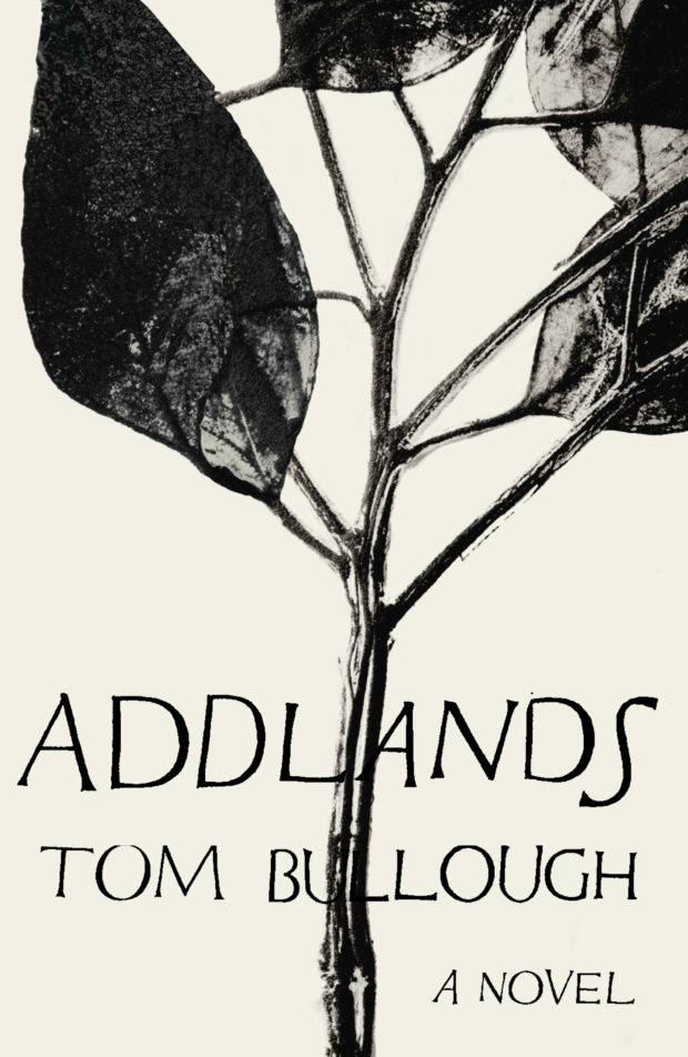
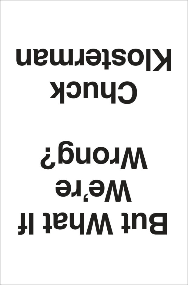
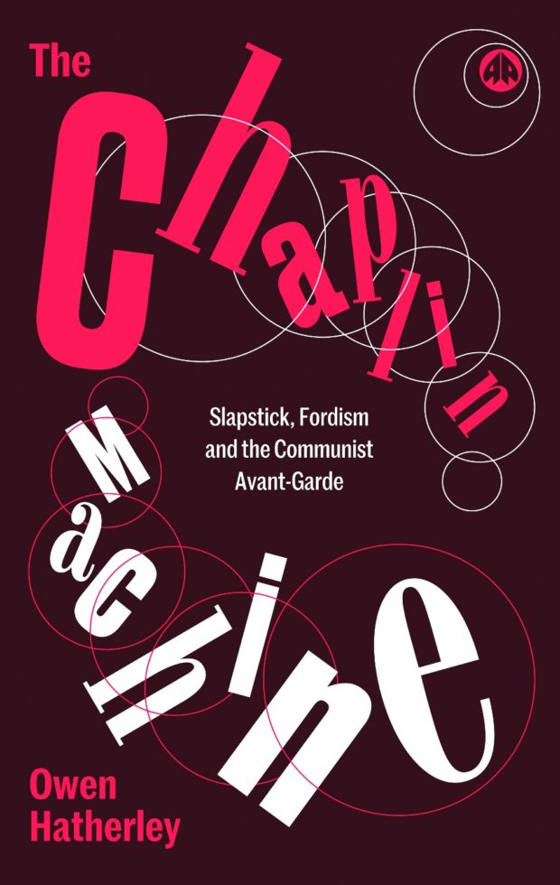
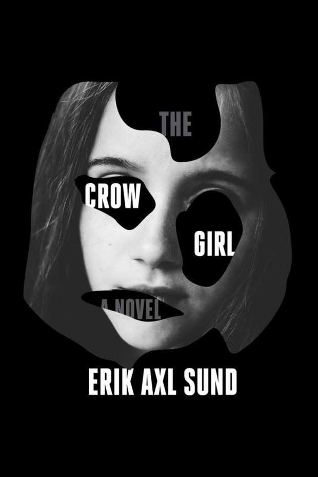
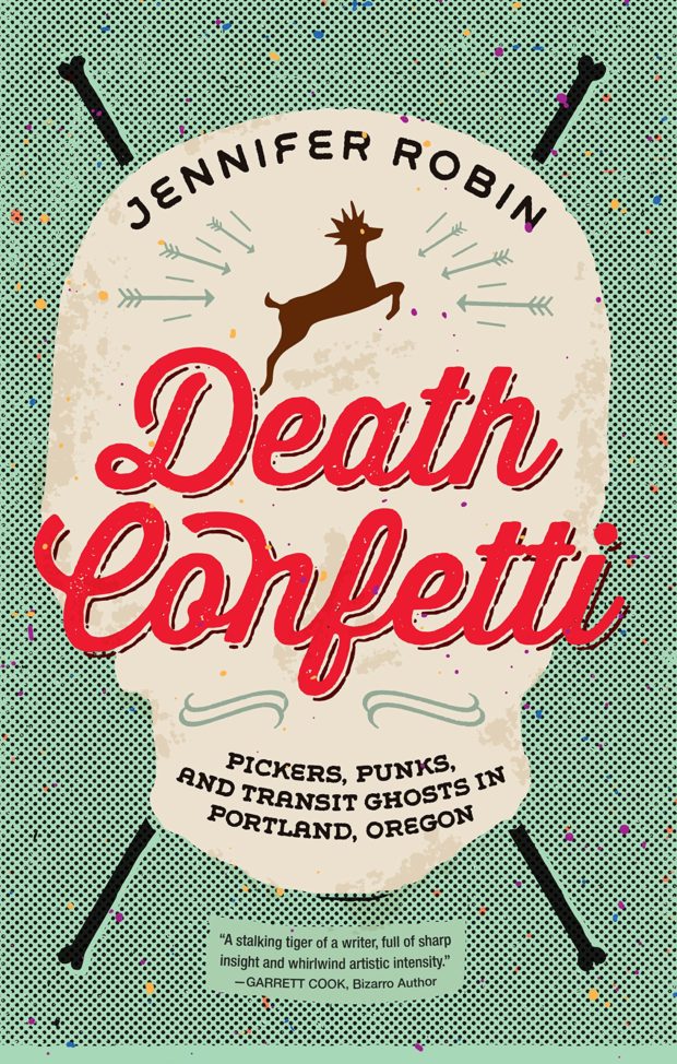
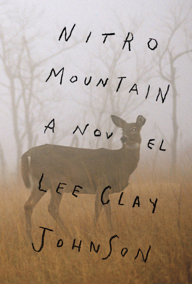
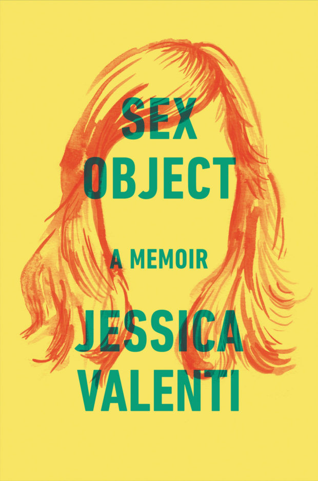
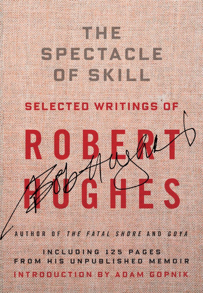
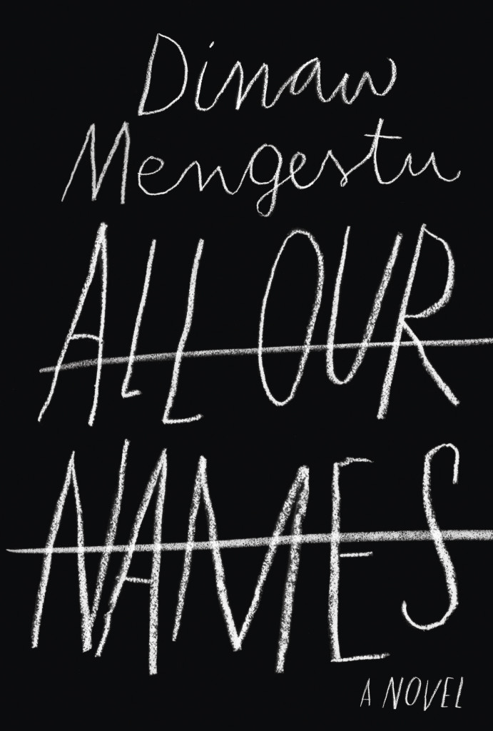
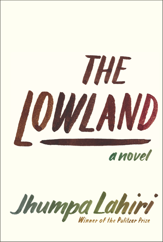
If you’ve walked into a North American bookstore recently, or you’ve been paying attention to the book reviews on this side of the Atlantic, you will have no doubt seen the stylish black cover for All Our Names by Dinaw Mengestu with its distinctive chalkboard lettering. Or perhaps you remember the hand-lettered cover for the Knopf edition of The Lowland by Jhumpa Lahiri? It was one of my favourite covers of the past year. Both are the work of Venezuelan designer Isabel Urbina Peña. Now based in New York City, Isabel is a cover designer for Random House and creator of a typographic zine called Rants from a Stranger.

Since relaunching her website earlier this year, Isabel’s cover designs have been featured on numerous blogs already (including here), but I was thrilled to have the opportunity to talk to her earlier this month about her work and career in greater depth.

Isabel and I corresponded by email. Here is our conversation:

Untitled-3

Do you remember when you first became interested in design?

I think because of my parents, art was in my life since I can remember. But, when I was in 7th grade there was a big boom of internet start-ups in Venezuela and I remember clearly “deciding” that I wanted to be a graphic designer then…I was 13 and the concept of what graphic design was at the time was probably wrong, but that moment definitely steered me in this direction. Also, there was a moment in my “foundation year” in college where one of my type teachers talked about how the “typographer” was present in the page, but invisible to the reader and that just flipped a switch in my brain.

Is anyone else in your family creative?

Both of my parents are architects and they really motivated my sister and me creatively while growing up.

We spent half of our childhoods going to museums, plays, as well as ceramic, poetry and creative writing classes. My dad also paints and belongs to a drawing circle. When I was little he would sit with me and walk me through art books or give me a canvas and ask me to paint from inspiration, or even from some big painting like Van Gogh’s sunflowers. Paul Klee, Gauguin and Chagall are a few of the artists that I discovered through them when I was six or seven… I have to say my mind was blown, I still cherish those moments.

Untitled-2

Were there a lot of books in your house growing up?

A ton. My dad also reads a LOT… So he wanted me to be “a reader.” I would get books for Christmas, birthdays, holidays, regular days…no Nintendo growing up… believe me that was tough, haha. He really sparked a love for reading and I would find new material everywhere; at my grandma’s I would read through all my uncle’s adventure books; at garage sales I started picking up Penguin paperbacks because they looked so simple and literary. Reading felt like something my dad and I shared, but it was also mine to discover.

Did you study design in Venezuela?

Yes, I studied at a small school called ProDiseño. Until very recently the “campus” was literally a two-flight house with a tub and a living room. Classes were really small, so everyone knew each other. The school started after a group of 80 students from IDD (Instituto de Diseño Neumann) left to start their own school. Neumann was founded by a large group of European immigrants who taught them design through the Bauhaus principles. Prodiseño had a very strong inclination towards clean, conceptual design. Everything had a purpose and “a why.” The content always came first; then the form. It was a very special experience and it prepared me to do anything (design, typography, illustration, animation, motion graphics…) and most importantly taught me to learn how to “think.” It was a very complete, Renaissance-style education.

Untitled-4

Is there a strong arts/design community in Caracas?

Definitely, though it is a rather small one compared to New York City, it is very interesting.

There are a lot of events that support the arts and design and mostly DIY culture. A lot of self-proposed shows and collectives that put on parties with great visuals and self-produced posters. Also, a lot of zines and self-published publications are popping all over town.

How is living in New York different?

Well, New York is different in every way: from the variety of people you meet to the cultural experiences that are available to you. Living here, for me, has been a rich experience loaded with references of all kinds, and motivation. If anything it makes me expect more from myself and aim higher.

How long have you lived there?

This is my 6th year in New York, but it honestly feels like I just got here. Of course, I’ve learned so much and evolved, but it feels like it never gets old.

escribiendolanuevahistoria_web

Does what’s going on in Venezuela worry you?

YES, I am glad you asked.

I am extremely worried by what’s going on in Venezuela and I think not enough people know about our situation. Protests started almost two months ago and people are being murdered and attacked on the streets daily and there doesn’t seem to be any change in the attitude of the current government. The truth is the people have the right to protest for the many problems that Venezuelan people are dealing with right now (the extreme insecurity they live in, the rapidly increasing inflation rates, the scarcity of many basic necessities and the extreme corruption, just to name a few) and the way that the government is handling this protests is, just, criminal. There are human right violations occurring left and right and even though there is proof (video and photos) for a lot of these events, the government is turning a blind eye and not doing anything to impart justice. Instead they focus their efforts in bullying opposition leaders and undermining the people’s rights. It is very, very sad and scary for all Venezuelan people and unfortunately change won’t come easily… but Venezuelans are still fighting hard, hopefully with a brighter future awaiting for all.

Can you describe your process for designing a book cover?

I start by reading the book and the TI (Title Info) sheet, getting familiar with the author and his backlist, if there is one. I take a bunch of notes and list ideas while and after I’m reading. I try to list everything—you never know when the “silliest” idea will spark something good. I’ll do a mood board and sketch a selection of these ideas in small (2 x 3 inches or so) detailed thumbnails with pencil and paper. Depending on the book, developing these ideas might be on or off the computer. I do a lot of paperback-size pencil sketches to define a lot of the lettering shapes and details.

Sometimes I will ink and do minimal clean up in the computer and sometimes I digitize the lettering in a font editing software and make the comps. Once I do that, I usually present a range of “developed” ideas and looks to my art director. We discuss if we need to adjust or tighten anything and then show the editors.

fabulasdeesopo_web

What are your favourite kinds of projects to work on?

Honestly, I am quite new at this, and I try to get the most out of any project. Figuring out what best represents the book I’m working on is one of the things I enjoy the most. That said, I really love doing all the cover art from scratch, and creating a “unique” design with custom lettering and illustrations.

Can you tell me about your zine “Rants from a Stranger”?

Rants from a Stranger is a self-published “booklet” inspired by zines, graphic novels, comics and the DIY culture. I like to call it a “typographic novel,” though it doesn’t really qualify as a graphic novel because of its length, and it is more on the zine realm. I love type and lettering and this was the perfect excuse to hand-letter more and produce a periodical self-published piece where I had full control of the creative direction.

I thought it would be fun and different to develop a series of “comics” without illustrations and solely use lettering as the “characters” of the story. So far there are two black and white issues and the third issue (special edition, in color) is coming out in late April as a collaboration with a very talented musician and artist from Venezuela, Mariana Martin Capriles, aka Mpeach. I’m really excited about this issue because of our collaboration, and also because it comes with a paper record player and a flexi EP record of her new song, “Boogaloo Mutante.”

Who are some of your design heroes?

Gerd Leufert, Gego (Gertrude Goldschmidt) and Nedo Mión Ferraro were very important figures in my formation as a designer and I still look through their books every time I have a chance. Their students, now well known graphic designers, and former teachers of mine, like Álvaro Sotillo, Gabriela Fontanillas and Carlos Rodríguez have always inspired me through their impeccable work and dedication.

Doyald Young’s lettering work take my breath away, and old school type designers like W.A. Dwiggins and Frederic Goudy are daily inspirations.

Who do you think is doing interesting work right now?

So many brilliant folks out there! Freddy Arenas, my super talented other half, does amazing motion graphics and illustration.

In the cover design world, my co-workers are doing great stuff, all the time. Linda Huang, Joan Wong, Pablo Delcán, Kelly Blair, Megan Wilson, Peter Mendelsund, Carol Carson, Stephanie Ross… From the type, design, art and illustration world Jesse Ragan, Village, Kris Sowersby, OCD, Steve Powers (ESPO), Sergio Barrios, Wayne WhiteCraig Ward, Alex Trochut, Elizabeth Carey Smith, Gustavo Dao, Suzi Sadler, Ryan Bernis, Priyanka Batra, Sasha Prood, Ping Zhu, Victo Ngai, Elana Schenkler, Geoff McFetridge, Nobrow Press, quite a mix…

I could keep going…

What advice would you give a designer starting their career?

Try harder. I think it’s really important to be critical of your own work and be able to accept its faults. Always, strive for more and be hungry. At the same time, embrace your mistakes, learn from them and move on to the next project. I am a big fan of tweaking and fixing til the end of days… but sometimes you just have to learn to let go of projects and keep going. Erik van Blokland said to our Cooper Type class (regarding typeface design), “Release early and release often; recognize what you did wrong in the project and try again.” I remind myself to do that everyday.

I think you should always try to work in what you love and feel passionate about. Even if it means reinventing yourself and making up your own projects in your spare time. This is where the good work will be. Don’t be afraid to make changes and try different things if you need to.

Untitled-10

What’s in your ‘to read’ pile?

I’m currently reading Americanah by Chimamanda Ngozi Adichie and Inter Views by James Hillman. I really want to read Dissident Gardens by Jonathan Lethem, My Age of Anxiety by Scott Stossel and The Goldfinch by Donna Tartt from this past season.

Someday, I’d love to re-read Cortazar’s Hopscotch (Rayuela) and all of Jorge Luis Borges.

The list goes on…

Do you have system for organizing your books?

Ha, no. I used to be very organized and had them alphabetically, color code them, etc… Those days are over… Nowadays, I move them around pretty often and they stay wherever they land.

Do you have a favourite book?

Not really a favourite single book, but I do have an influential shortlist: Virginia Woolf’s The Waves, L’Étranger by Albert Camus, Cuentos de Amor, Locura y Muerte by Horacio Quiroga, Piedra de Mar by Francisco Massiani, Ficciones by Jorge Luis Borges, Oscar Wilde’s Collection by Siruela (Biblioteca de Babel).

Thanks Isabel!

4 Comments

Design Matters with Chip Kidd

Kicking off a new season Design Matters, designer and art director Chip Kidd in conversation with Debbie Millman:

1 Comment

Chip Kidd: Obsessed with Batman


In this interview from the AGI Open in London earlier this year, Chip Kidd talks about his work designing books covers, his involvement with comics and, of course, his obsession with Batman:


You can read recent interviews with Chip discussing his new book Go: A Kidd’s Guide to Graphic Design at Publishers Weekly and The New York Times.

Comments closed