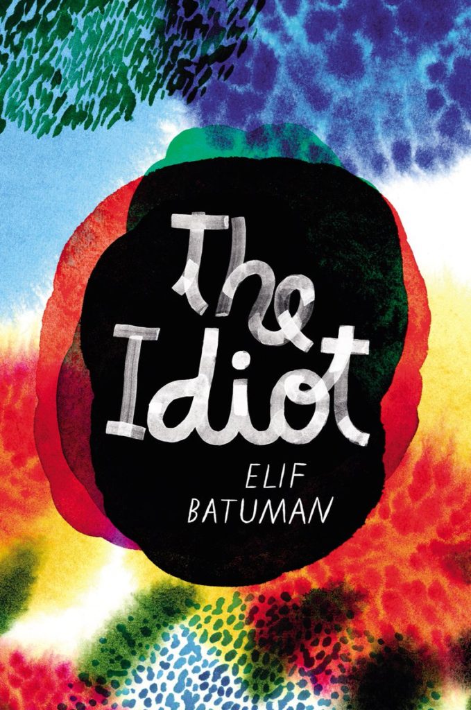
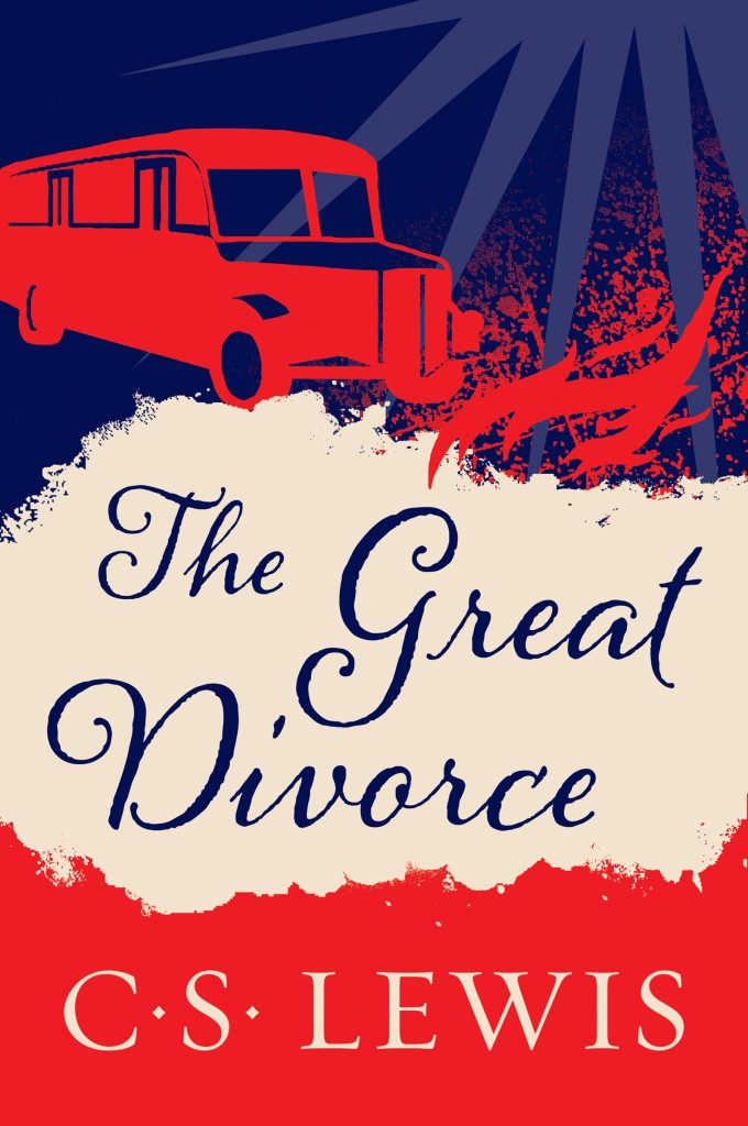
The cover of the UK edition, published earlier this year by Picador, was designed by Katie Tooke. You can read about the design process for the UK cover here.
Dear Mrs Bird by AJ Pearce; design by Kimberly Glyder (Scribner / July 2018)
Florida by Lauren Groff; design by Grace Han (Riverhead / June 2018)
The cover of Groff’s 2015 novel Fates and Furies (also published by Riverhead) was designed by Rodrigo Corral and Adalis Martinez:
Florida by Lauren Groff; design by Grace Han (Riverhead / June 2018)
Fates and Furies by Lauren Groff; design by Rodrigo Corral and Adalis Martinez (Riverhead / September 2015 )
Besides using a beautiful photograph, I get the sense this cover is very much on trend, and not just for YA — I’ve seen the cover of a thriller coming out this fall that also uses a close-cropped image of a woman’s face, a similar sans-serif type, and a warm sepia colour palette.
Smile by Roddy Doyle; design and lettering by Nick Misani (Viking / October 2017)
OK, so I am very late to this one. I saw it last year and didn’t know who the designer was — I only found out this week when art director Jason Ramirez revealed that it was one of the TDC Communication Design Competition winners this year!
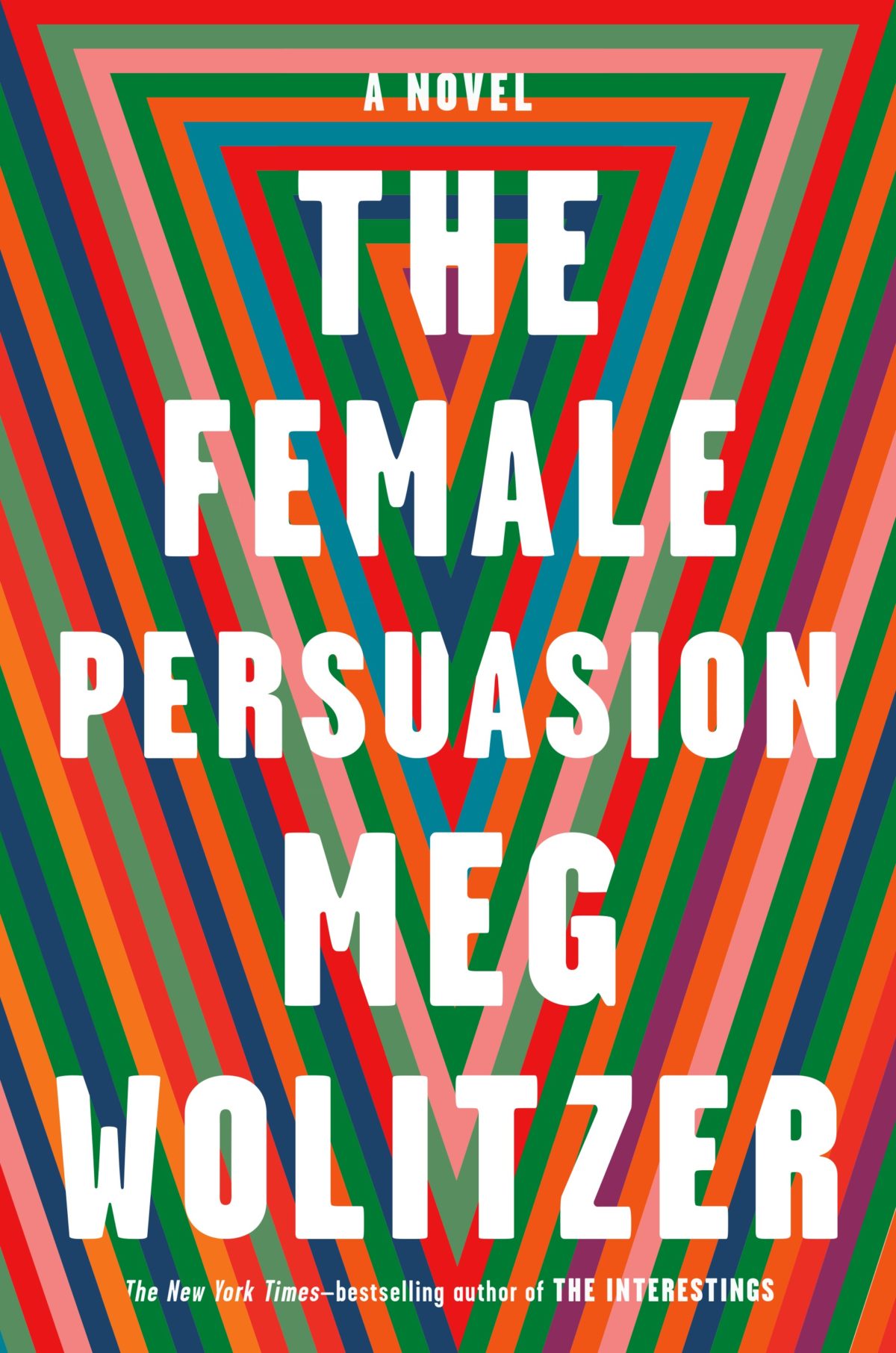
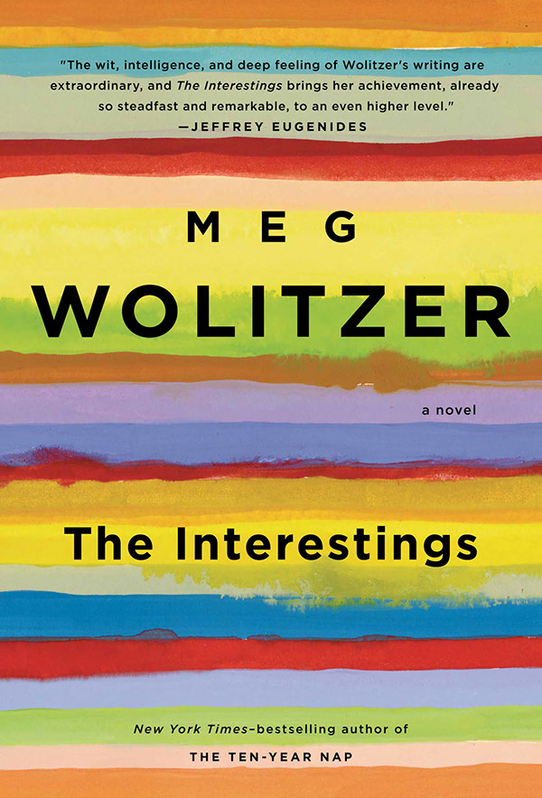
I like how the design for The Female Persuasion has bands of colour similar to those on Lynn Buckley’s cover design for The Interestings, but uses them in a completely different way…
Patient X by David Peace; design by Luke Bird (Faber & Faber / April 2018)
And on the subject of David Peace, Steve Panton has designed new covers for the Red Riding Quartet (1974, 1977, 1980 and 1983) published by Serpent’s Tail this month:
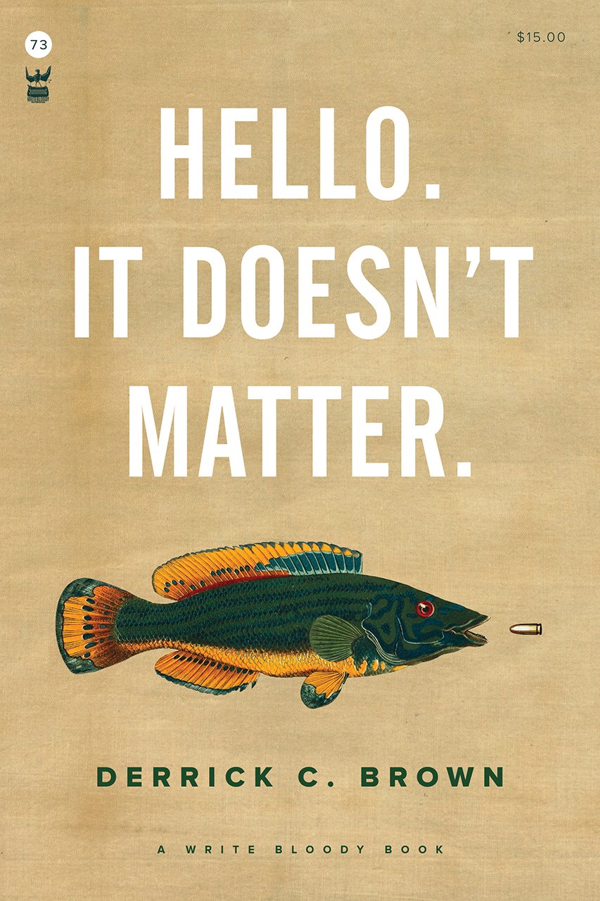
Funnily enough, I was just discussing the prevalence of big and centred white sans serif type on contemporary book covers on Twitter. While it’s common (see the covers of The Female Persuasion and Hello, It Doesn’t Matter above!), it’s also effective when it’s done well. That said I did think that David Pearson — a designer well known for his typographic covers — made a good general point about big type:
The idea that legibility is enhanced by big type is so flawed. Big type surrounded by busyness is often no more legible than small type surrounded by space. Perhaps it is the space that people are scared of. Our idiot eyes might look at the wrong part of the cover.
The show is the oldest continuous book design competition in the US, and I was lucky enough to join McSweeney’s designer Sunra Thompson in deciding this year’s cover selections. The book selections were made by designer Linda Secondari and writer Robert Bringhurst. You can see all the selected entries — books and covers — in this AUPresses slideshow:
Since 2010, I’ve posted an annual survey of the year in book covers. The post has expanded and developed over the past 7 years, but essentially it is a collection of the covers published in the previous 12 months that I found interesting or noteworthy in some way. As with the previous couple of years, the 2017 list is organized by covers (alphabetical by title), and by designer so that I can show a greater variety of work, and no one designer or studio dominates.
Thank you to everyone who has supported the blog this year, and special thanks to all the designers, art directors, authors, publishers, and fellow design enthusiasts who have helped me with covers and design credits. My sincere apologies to the designers and publishers not on this year’s list and whose covers I have overlooked in the past 12 months.
A post looking back on the YA covers of 2017 is to follow.
I have steadily fallen further and further behind with my cover posts this year. There is some cracking work in this month’s round-up. But I can’t help feeling that there are some covers missing. Somehow it almost November, and I have run out of time. If I don’t post this now, I will never catch up!
This Accident of Being Lostby Leanne Betasamosake Simpson; by design Alysia Shewchuk; photograph of ‘Mixed Blessing’ by Rebecca Belmore by Toni Hafkenshied (House of Anansi / April 2017)
Neil’s embossed metallic silver cover for Selfie by Will Storr (Picador / June 2017) is also kind of great (and hilarious), but impossible to show well online:
This edition of ‘book covers of note’ is brought to you entirely by Gray318 who designed the covers of all the books published this month. OK, that’s an exaggeration, but Jon did design FOUR of the covers on my list — all different, all brilliant. How no one has published a monograph of his work yet is beyond me. Anyway… This month’s post also includes covers by David Pearson, Erik Carter, Scott Richardson, Kimberly Glyder, Katie Tooke, Rachel Vale and more…
Black Moses by Alain Mabanckou; design by Gray318 (Serpent’s Tail / April 2017)
And, just FYI, after 6 years at Faber & Faber, Luke has decided to set up his own studio should you wish to hire him (and on the basis of this cover alone, why wouldn’t you?).
The Good People by Hannah Kent; design by Rachel Vale (Picador / February 2017)
The Handmaid’s Tale by Margaret Atwood; art direction by Christopher Moisan; illustration by Patrik Svensson (Houghton Mifflin Harcourt / April 2017)
Nineteen Eighty-Four by George Orwell; design by C. S. Richardson (Penguin Canada / March 2017)
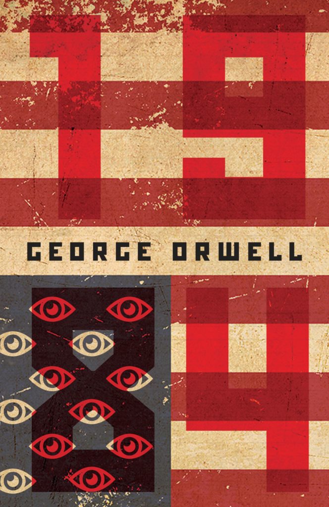
In the US, Houghton Mifflin Harcourt have also published a new edition of Nineteen Eighty-Four. The cover — which owes a wee debt to Peter Mendelsund’s eye motif covers for the Schocken editions of Kafka (in my very humble opinion) — was designed by Mark Robinson.
You can see a few other recent covers for Nineteen Eighty Fourhere.
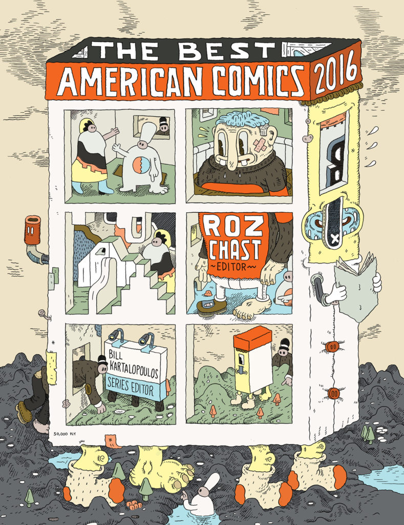
The Best American Comics 2016 edited by Roz Chast; illustration by Marc Bell; design by Christopher Moisan (Mariner / October 2016)
Best American Nonrequired Reading 2016 edited by Rache Kushner; illustration and lettering by Jillian Tamaki; design by Mark Robinson (Mariner / October 2016)
Back from vacation and back to the grind… August is traditionally a slow month in publishing, but that isn’t to say there aren’t plenty of great covers around at this time of year…
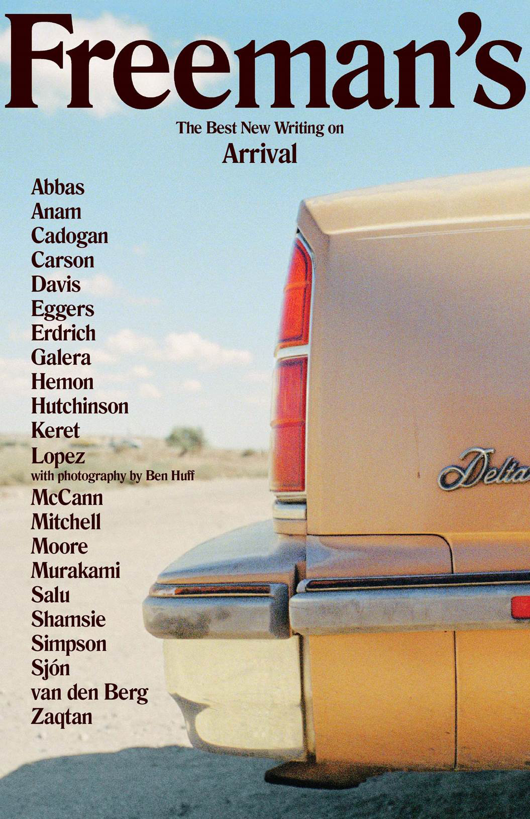
The very first Freeman’s anthology was published in fall this year, but hopefully this design will set the tone for the rest of the series. The second volume is scheduled for next year.
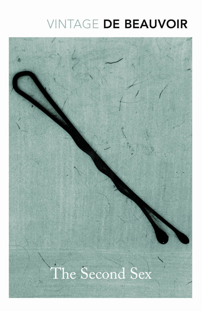
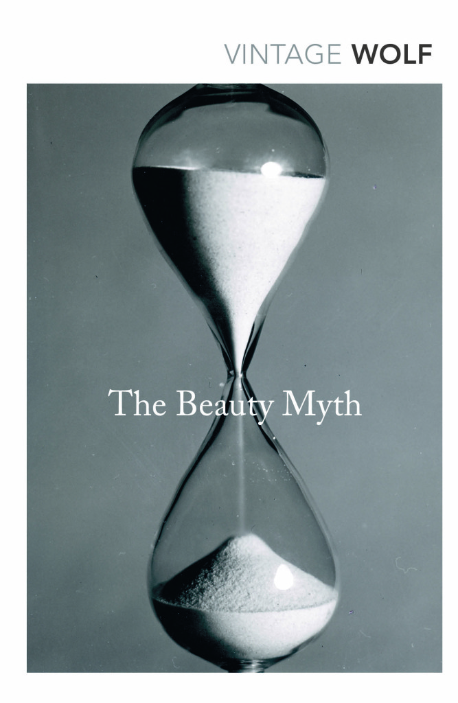
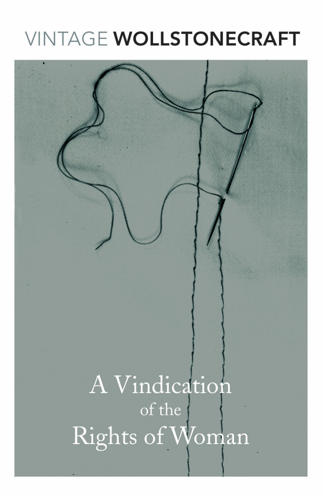
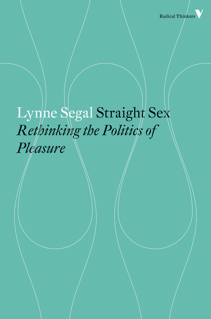
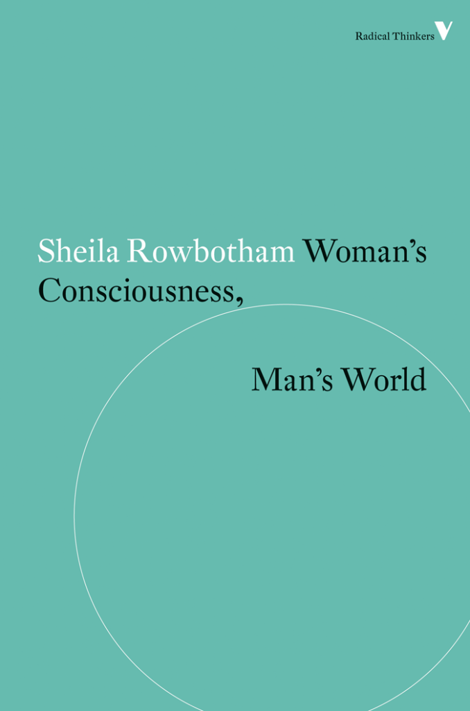
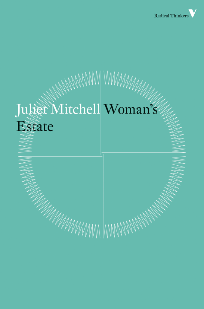
Vintage Feminism; design by Matthew Broughton (Vintage / 2015)
Little Black Classics; design by Jim Stoddart (Penguin / 2015)


