I took a long-planned week off in March, so this month’s post was somewhat cobbled together around that trip and somehow we’ve ended up with lots of great covers to show for it! I should take vacation more often! There’s some particularly fun typography, some nice illustration, and some of the usual weirdness. Enjoy!
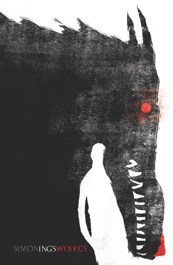
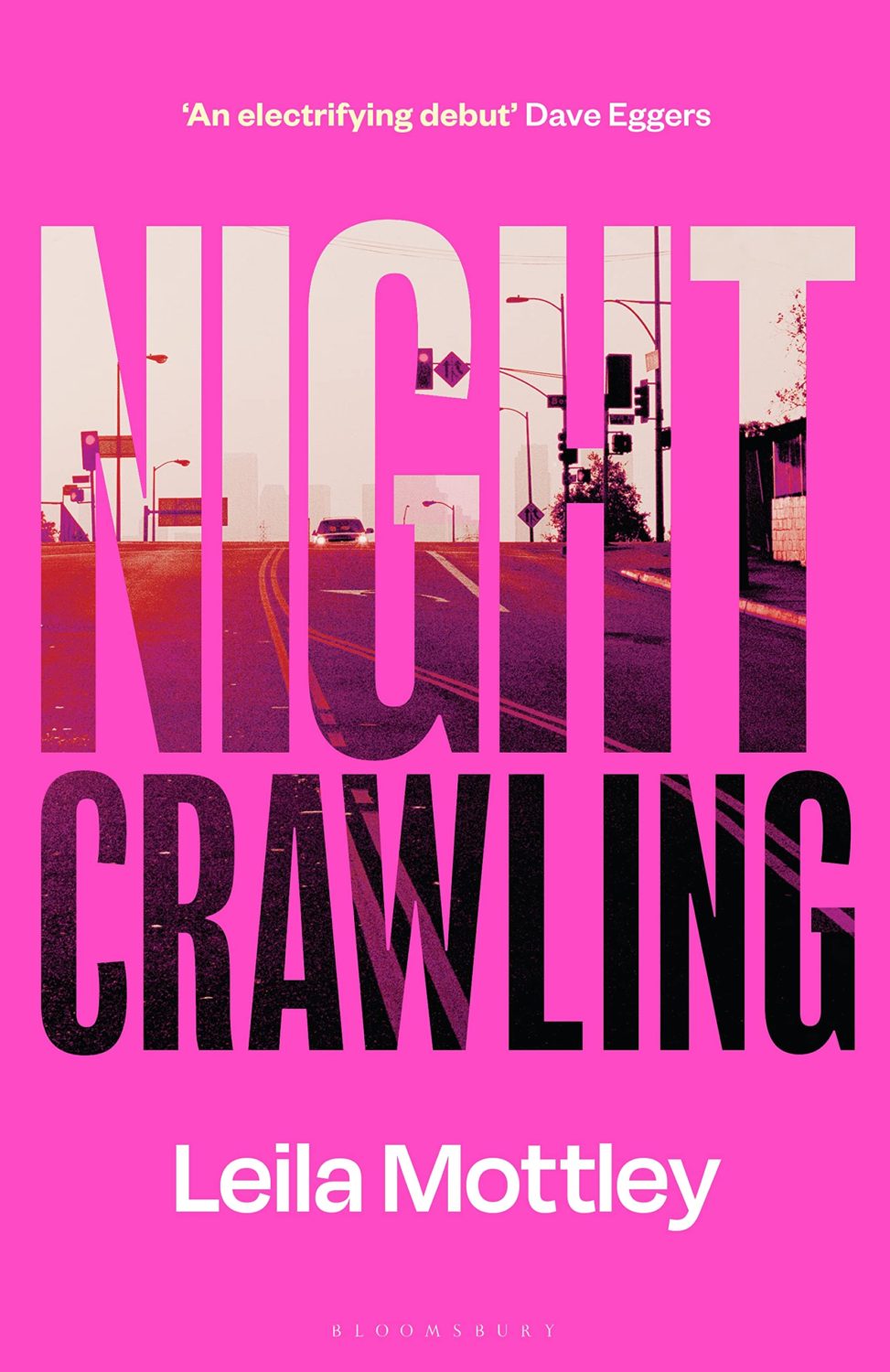
I had a hell of time trying to remember what this reminded me of, I think it is Jeffery Alan Love‘s illustration for the cover of Wolves by author Simon Ings published by Gollancz way back in 2014.
Coincidentally, the cover of Wolves and other Simon Ings titles from Gollancz were among the ABCD Award winners in 2015, and if you’re interested in reading about this year’s ABCD awards, which took place earlier this month, Vyki Hendy has a write up at SPINE.
It’s been another busy month here, so apologies for the slightly scattered post. It includes a few covers that I missed earlier in early in the year, and a few other bits and pieces. I hope everyone is doing OK. Here are the covers…
It looks like this was actually the cover of the editions originally available in New Zealand and Australia in 2023, so apologies for being so late to it.
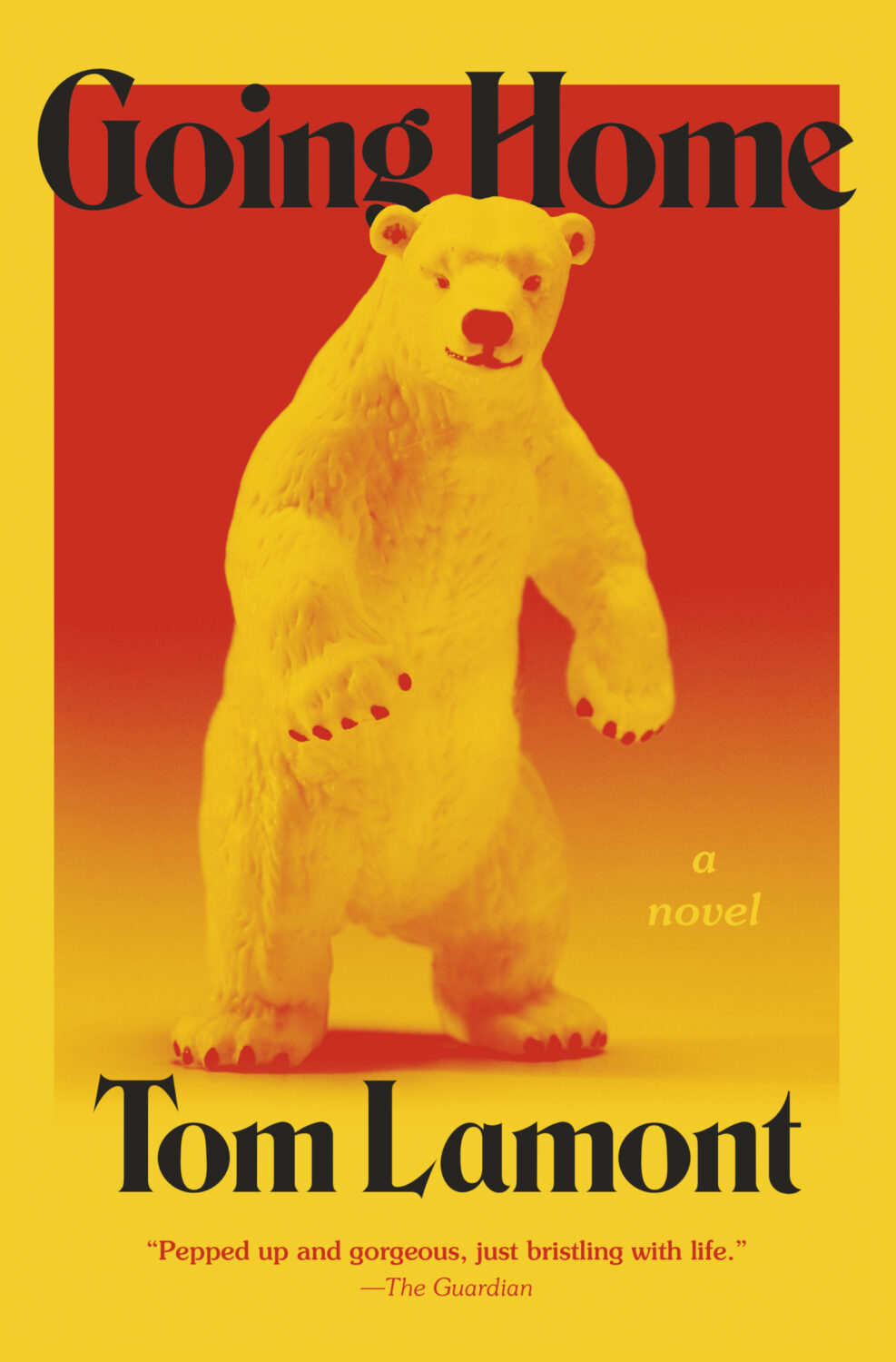
They are obviously very, very different books, but the cover Bear Witness reminded me of the cover for Going Home by Tom Lamont designed by Jared Bartman published by Knopf earlier this year.
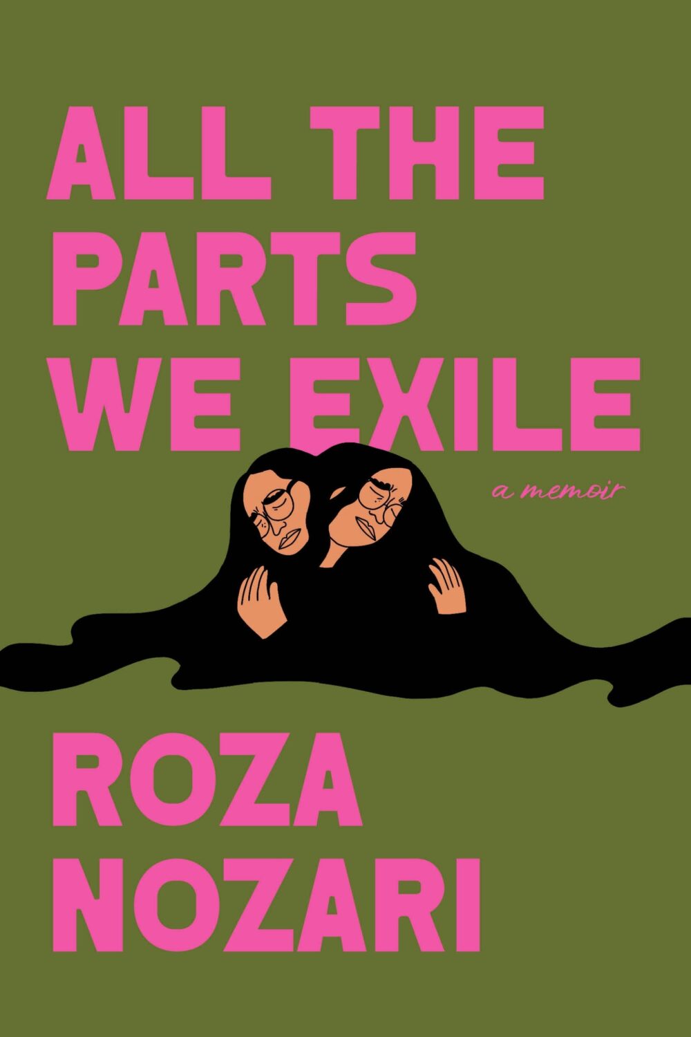
Are green covers with pink type a thing now? There’s also the cover of All the Parts We Exile by Roza Nozari designed by Lisa Jager for Knopf Canada which came out in February…
Another (mostly) green cover, with some pink type here!
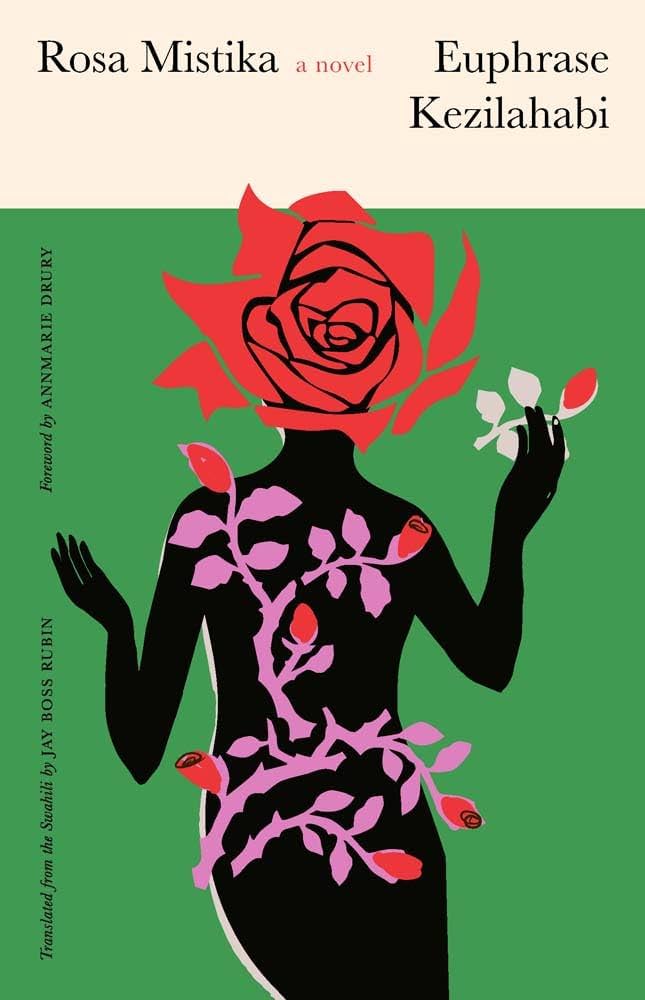
Sarah’s (also mostly green with some pink!) cover for Rosa Mistika by Euphrase Kezilahabi, published this month by Yale University Press, also caught my eye, but I couldn’t source a hi-res image for it in time for the post…
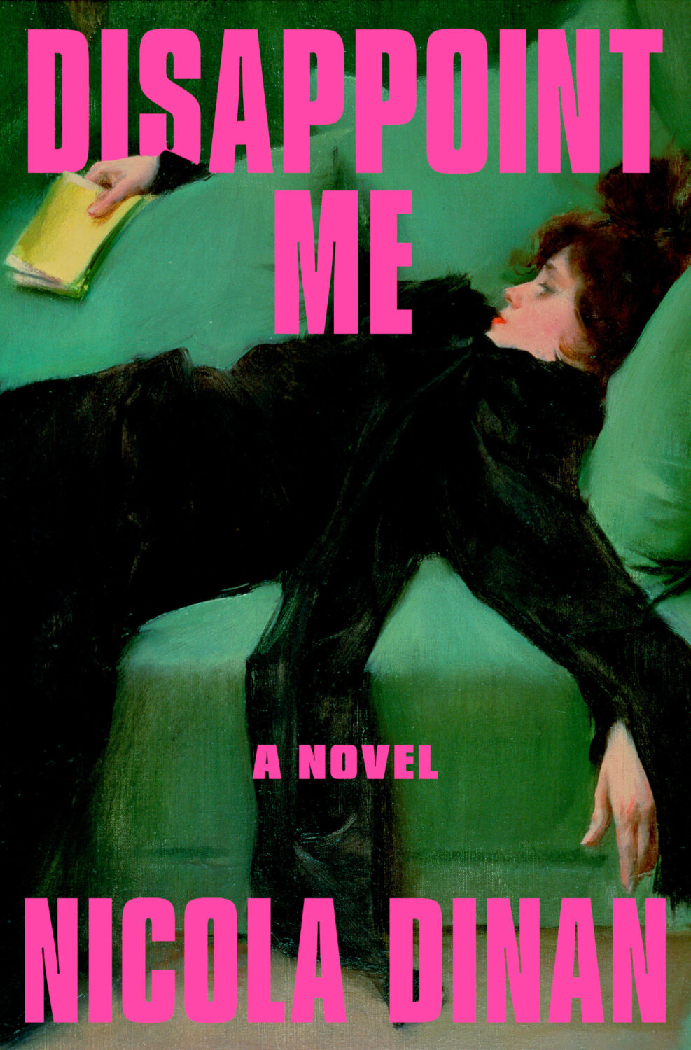
Both this and the cover for Disappoint Me were featured in a New York Times piece about recent books that are part of a painting + bold sans-serif cover trend.
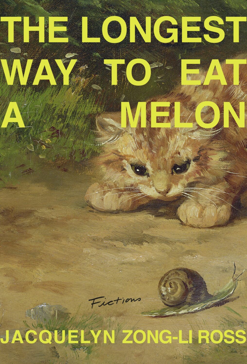
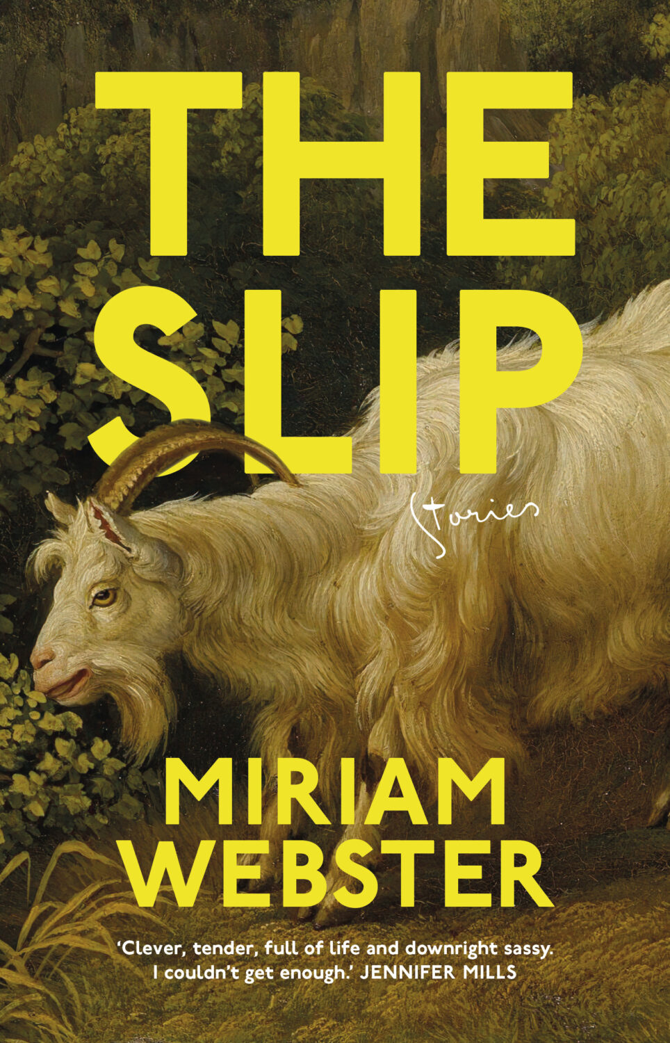
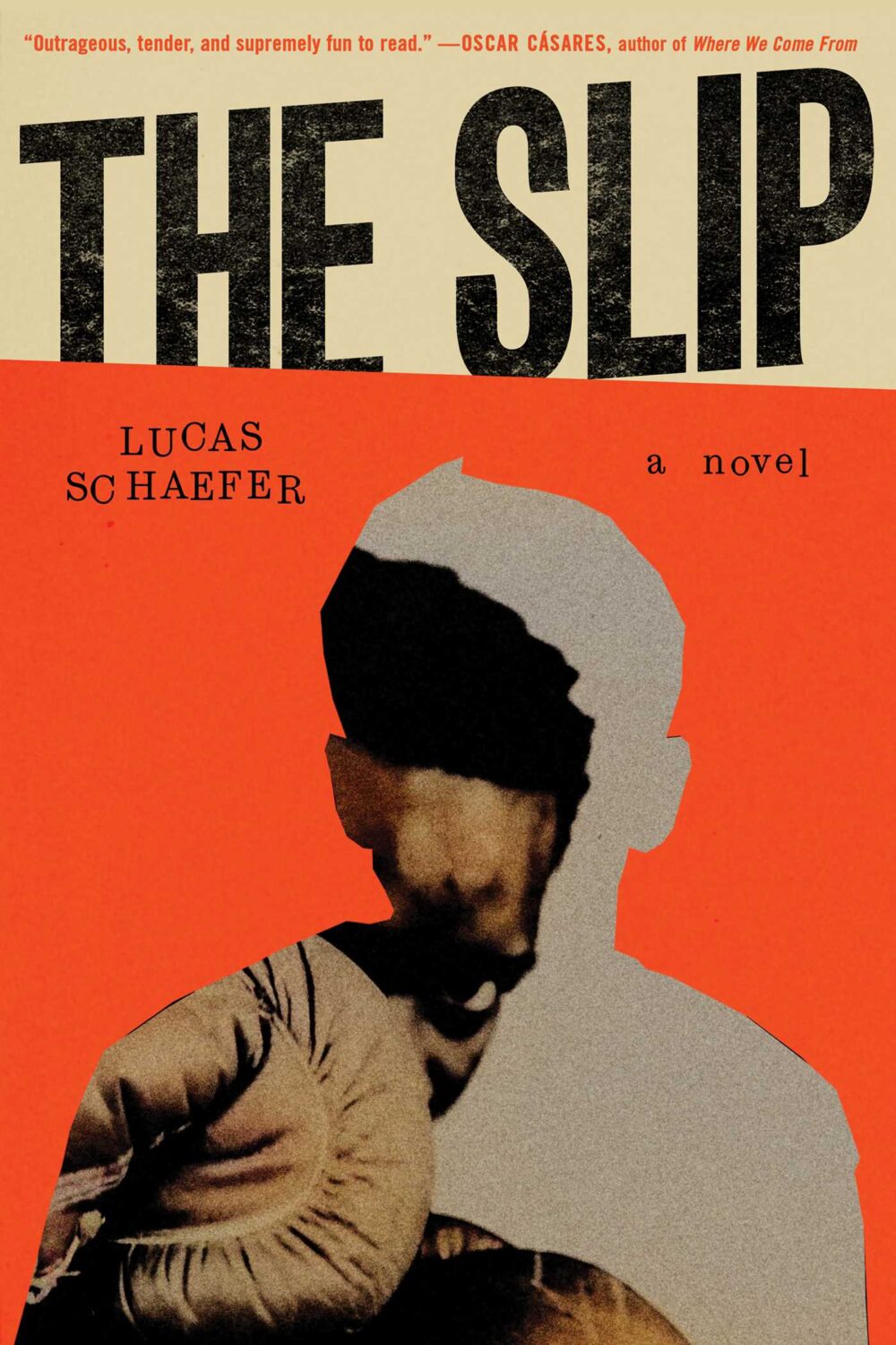
The Longest Way to Eat a Melon is also an addition to the yellow type trend. The cover of The Slip by Miriam Webster designed by Typography Studio, out next month in Australia from Aniko Press, hits both trends too… (Do paintings of animals count as a separate trend from painting of people?)
This made me think of transferring newspaper print with pink silly putty, which probably hasn’t been possible for decades. I am ancient and made of dust.
Spine Magazine has brought back its round-up of recent university press covers too if you’re interested.
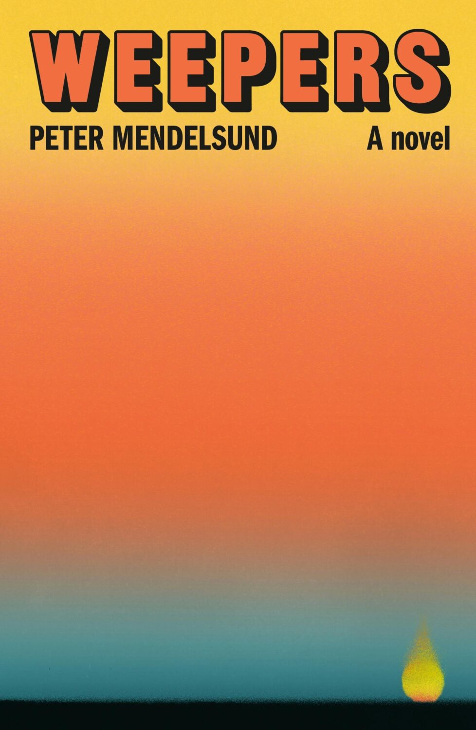
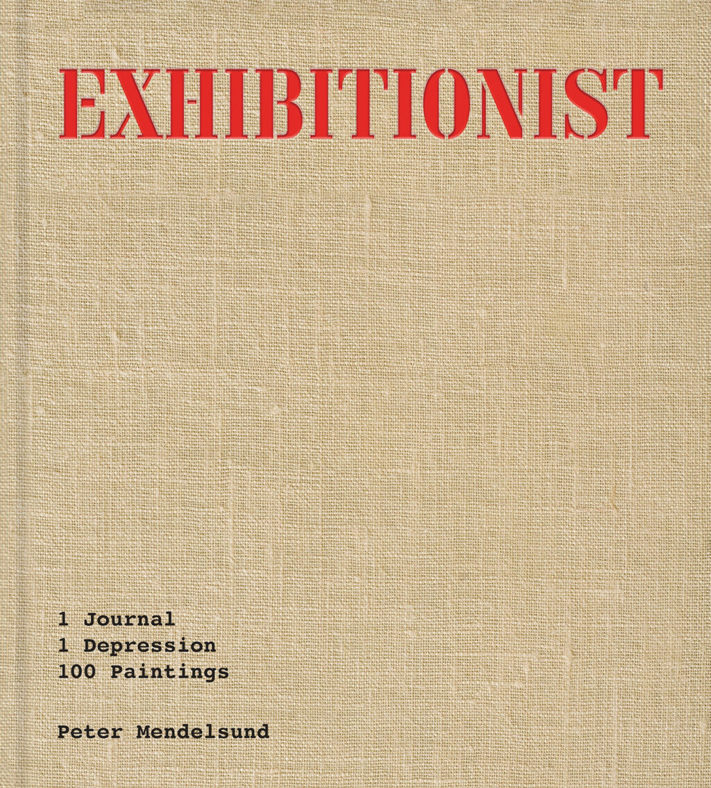
Weepers by Peter Mendelsund; design by Thom Colligan (Farrar, Straus & Giroux / June 2025)
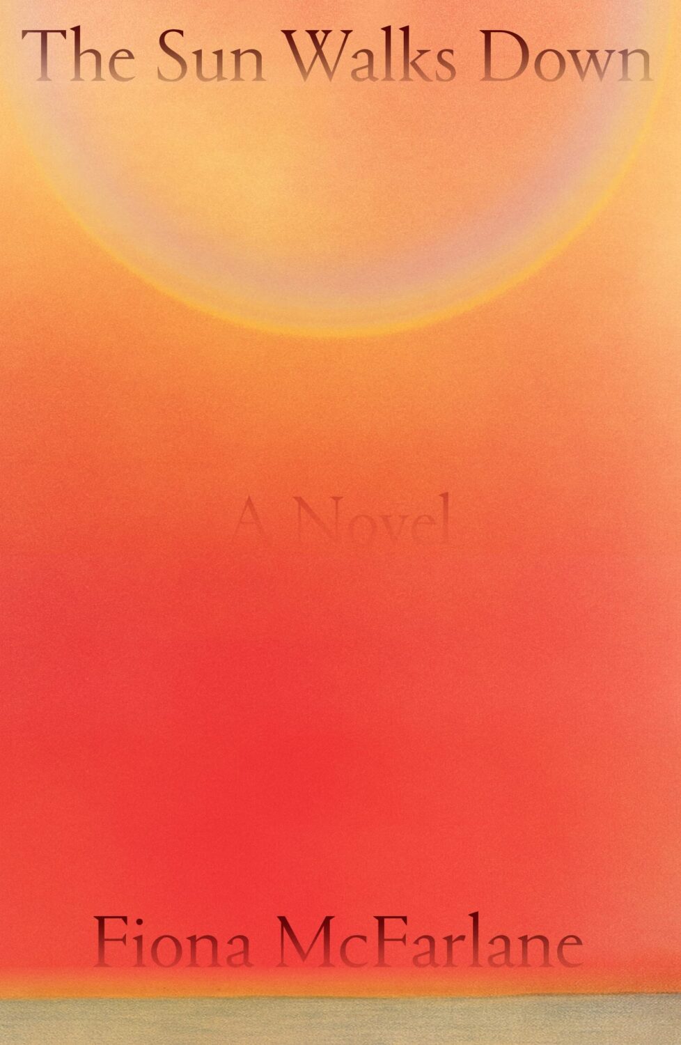
This reminded me of the cover of The Sun Walks Down by Fiona McFarlane designed by Na Kim for FSG a few years ago (the colour palette of which is similar to a lot of Na’s paintings funnily enough!).
Peter Mendelsund‘s memoir/monograph Exhibitionist is available from Catapult this month too. I think Peter designed the cover for this one himself (with Corbusier inspired stencil type?).
The Washington Postrecently toured Peter’s apartment and talked to him about the book.
At the turn of the year, writer and activist Cory Doctorow coined the term “enshitification.” Although he was specifically describing the process of online services getting worse for users, it was hard not to see it everywhere in 2023.
In his annual look at the year’s best book covers for the New York Times, art director Matt Dorfman recounts a friend describing 2023 as a “year of survival”, a year of “no growth, no withering, just getting by.”
This year saw a centuries-old business contending with rounds of buyouts and layoffs, alongside an endless news cycle involving two brutal wars from which no authors, friends, enemies or strangers were immune from accountability for any unrehearsed sentiment they might voice in passing. Add to this the ongoing concern about how artificial intelligence will affect a business historically dependent upon human creativity — yet through it all, there was still the matter of making books, and their covers, to get on with.
I read Matt’s piece the same day I read an article by Kyle Chayka in the New Yorkerabout his search foran epochal term to “evoke the panicky incoherence of our lives of late.” The suggestions range from the bland ‘Long 2016,’ to the incredibly ominous-sounding ‘Chthulucene,’ the Lovecraftian ‘New Dark Age,’ and the frankly terrifying and plausible ‘Jackpot’ from William Gibson’s 2014 novel The Peripheral.
This was the context of life and work in 2023.
Matt notes some designers found inspiration in the zeitgeist. He’s not wrong. But, ironically perhaps, I feel less optimistic about the overall picture than he does.
At the risk of repeating what I’ve written in the past couple of years, it’s like we’re stuck in a holding pattern, circling the same design ideas. Trends have stuck around. A lot of covers feel safe. Some of this was the books themselves. I’m not sure exactly how many celebrity memoirs is too many, but I’m pretty sure we reached that point and sailed right past it in 2023. No doubt some of it is sales and marketing departments sanding down all the edges and demanding the tried and true (see Zachary Petit’s alternative best of 2023 piece on killed covers for Fast Company). But I would not be surprised if it designers were just getting caught up in the churn — too many books, too many covers, and too much other stuff to worry about.
Or maybe it’s just me.
Rouge by Mona Awad; design by Oliver Munday (Simon & Schuster / September 2023)Silver Nitrate by Silvia Moreno-Garcia; design by Regina Flath (Del Rey Books / July 2023)Our Share of Night by Mariana Enriquez; design by Donna Cheng (Hogarth / September 2023)
One of the themes of the year was nostalgia, which I’m sure can also be put down to the present being pretty fucking awful. It was apparent across almost all genres, including literary fiction, but nowhere more so than in the resurgent supernatural suspense and horror categories. There were creative stylistic mashups with retro vibes, along side fastidious Stranger Things-like homages to the 1980s and Stephen King.
Looking Glass Sound by Catriona Ward; design by Katie Klimowicz (Tor / August 2023)The Only One Left by Riley Sager; design by Kaitlin Kall (Dutton / June 2023)Come Closer by Sara Gran; design by Caroline Johnson (Soho Press / September 2023)
One genuinely pleasant surprise was the number of interesting covers from Canadian publishers this year. They’ve been quietly risk-averse in recent years, so it was nice to see a few bolder design choices getting approved. I was happy to see a Canadian cover was one of the top picks on Literary Hub’s (very, very long) list of the best covers of 2023.
There were other things to cheer this year too.
The Lights by Ben Lerner; design by David Pearson (Granta / September 2023)Total Reset by Sinéad Brady; design Steve Leard (HarperCollins / March 2023)How to Build a Boat by Elaine Feeney; design by Zoe Norvell (Biblioasis / November 2023)
Spine continued to give space to designers to talk about their work in a way I’ve never been able to do consistently here. You can find their 2023 cover picks here.
David Pearson started the Book Cover Review, a website for short reviews of book covers.
Zoe Norvell’s I Need A Book Cover, a resource for book cover inspiration as well as place for authors and publishers to connect with designers, also went live.
Steve Leard launched Cover Meeting, a podcast series of in-depth interviews with cover designers (including David and Zoe among others). As Mark Sinclair notes in his piece on book cover design this year for Creative Review, Steve’s conversations shed light on wider concerns in the industry as well as each designer’s individual process. Have a listen if you haven’t already.
Berlin by Bea Setton; design by Emily Mahon; cover image by Nataša Denić (Penguin Books / May 2023)
Also designed by Emily Mahon:
Lost Believers by Irina Zhorov; design by Emily Mahon (Scribner / August 2023)Do Tell by Lindsay Lynch; design by Emily Mahon; illustration and lettering by Studio Martina Flor (Doubleday / July 2023)
B.F.F. by Christie Tate; design by Ben Wiseman (Avid Reader Press / February 2023)
The Illiterate by Ágota Kristóf; design by Oliver Munday (New Directions / April 2023)
Also designed by Oliver Munday:
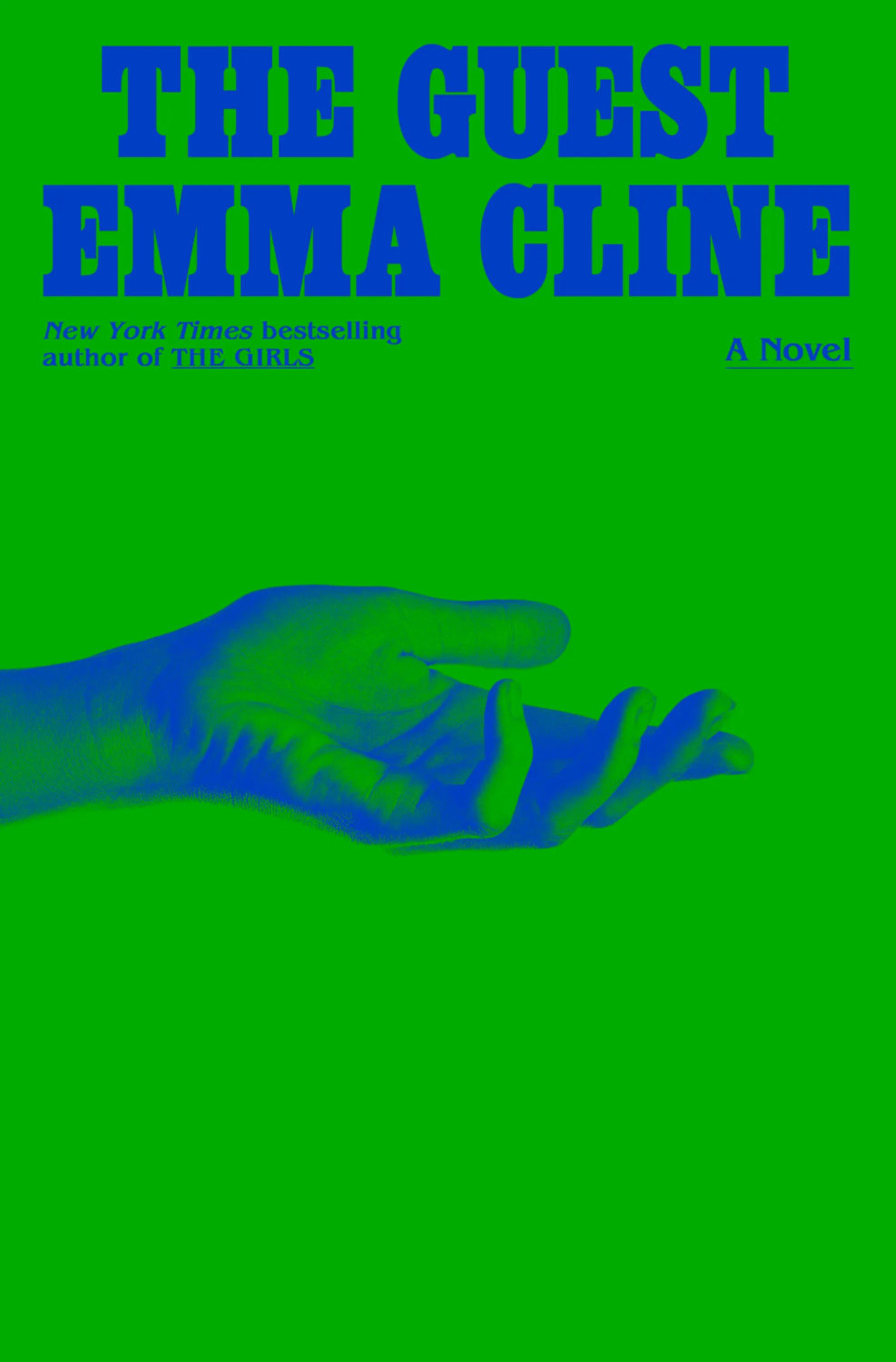
The Guest by Emma Cline; design by Oliver Munday (Random House / May 2023)Life on Delay by John Hendrikson; design by Oliver Munday (Knopf / January 2023)
Sublunar by Harald Voetmann; design by Jamie Keenan (New Directions / August 2023)
Also designed by Jamie Keenan:
The Dimensions of a Cave by Greg Jackson; design by Jamie Keenan (Granta / October 2023)Dr. No by Percival Everett; design by Jamie Keenan (Influx Press / March 2023)
Sam by Allegra Goodman; design by Donna Cheng; photograph by Mariam Sitchinava (Dial Press / January 2023)
I’m not sure exactly why, but I just assumed this was a UK cover when I first saw it (despite it literally having “New York Times Bestselling Author” in all-caps at the top!).
Sing, Nightingale by Marie Hélène Poitras; translated by Rhonda Mullins ; design by Ingrid Paulson (Coach House / February 2023)
For some reason this makes me think of the ‘weird nature’ (including animals with human eyes!) in Annihilation by Jeff Vandermeer, which is still one of my favourite novels of the last 10 years…
True Life by Adam Zagajewski; design by Jeff Clark (Farrar, Straus & Giroux / February 2023)
I also saw Pete Garceau’s cover for School House Burning by Derek W. Black recently, which snuck past me when it was published by PublicAffairs in September 2020 but still seems terribly au courant…
Wolfish by Erica Berry; design by Keith Hayes; illustration by Rokas Aleliunas (Flatiron / February 2023)
2022. Twenty twenty-two. Two thousand and twenty-two… “Where did it go?” Or, sobbing, “ are we done yet?” It feels like both. It’s been a year that’s simultaneously dragged on interminably and disappeared in a cognitive blur.
I’m glad other people have already written about it.
At Creative Review, writer and editor Mark Sinclair picked his favourite covers of 2022 and reflected on industry trends in the UK, including the Design Publishing & Inclusivity mentorship program for under-represented creatives launched this year by Ebyan Egal, Donna Payne, and Steve Panton.
Literary Hub posted the best covers of the year as chosen by 31 designers. With a comprehensive 103 covers on the list, it tacitly poses the annual question “what do I have left to add to this conversation?” LitHub have been posting these lists for seven years apparently. I am an ancient desiccated husk.
Fast Company and the Washington Post asked slightly smaller groups of designers to write about their favourites covers.
Designer and art director Matt Dorfman chose the best book covers of 2022 for the New York Times, and empathized with the plight of the designers:
Most often, any personal stylistic expressions in their work are swallowed up in service to the multiple masters — editors, marketing directors, sales teams — who sign off on a book’s cover. There is also the matter of adhering to any one publisher’s dos and don’ts, which can inform mandates about typography, color palettes and production flourishes like embossing or metallic inks. For people employed in a theoretically creative pursuit, designers’ talents are often defined by how effortlessly they can make themselves disappear to serve the book.
Matt Dorfman, New York Times
No one captured the prevailing mood better than this Tom Gauld cartoon. A reminder, if one were needed, that nobody knows anything.
Earlier in the year, Australian reporter Rafqa Touma called out the trend of ‘well dressed and distressed’ young women on covers. As designer Mietta Yans notes, the covers often reflect their books’ stylish and sad protagonists, so I’m not sure this one is on the art departments.
Some of the trends I’ve talked about before spilled over into 2022. Collage, painting (contemporary, and historical — often tightly cropped), big skies, landscapes and seascapes, black and white photography (not just for LGBTQ+ trauma!), retro-ness, idiosyncratic display typefaces. Orange. Pink was in vogue too. The Instagram-ish combination of both pink and orange (sometimes with deep purple-ish blues too) seemed to be very much a thing this year. I suspect this is what happens when you ask designers to make things “pop” one too many times.
It is hard to know if these are genuine trends, or if it is just the stuff I notice. I’m sure there are things going on with commercial covers that I don’t pay enough attention to (although I will not be sad to see the popularity of that flat illustration style — the one that Slate pointed out in TWO THOUSAND AND FIFTEEN! — eventually fade away). I certainly don’t get the sense that everything looks the same, which is often the criticism. There is still room for a little weirdness and that can only be a good thing…
Ghost Music by An Yu; design Suzanne Dean (Harvill Secker / November 2022)Elizabeth Finch by Julian Barnes; design by Suzanne Dean (Jonathan Cape / April 2022)
The Julian Barnes cover also came in blue, and under the die-cut jacket is a beautiful photo from René Groebli’s photoessay The Eye of Love.
Pure Colour by Sheila Heti; design by Na Kim (Farrar, Straus & Giroux / February 2022)
Also designed by Na Kim:
Present Tense Machine by Gunnhild Øyehaug; design by Na Kim (Farrar, Straus & Giroux / January 2022)Run and Hide by Pankaj Mishra; design by Na Kim (Farrar, Straus & Giroux / March 2022)Either/Or by Elif Batuman; design by Na Kim (Penguin Press / May 2022)
You can read about Alban’s design process for Till the Wheels Come Off at Spine.
Worn by Sofi Thanhauser; design by Janet Hansen (Pantheon / January 2022)
Also designed by Janet Hansen:
A Country of Strangers by D. Nurkse; design by Janet Hansen (Knopf / April 2022)Sedating Elaine by Dawn Winter; design by Janet Hansen (Knopf / April 2022)
Yoga by Emmanuel Carrère; design by Rodrigo Corral (Farrar, Straus & Giroux / August 2022)
This month’s post includes a few covers that I missed earlier in the year along side the new and recent releases. I’m starting to think about my annual recap so please let me know if you think I’ve overlooked any other particularly notable covers that stood out for you and/or seemed emblematic of wider trends in 2022.
And just a reminder with all the stuff going on with social media that if you’d prefer to get new posts auto-magically emailed to you, you can subscribe here. I have also re-opened comments on new posts after closing them for a few months if you want to politely share your thoughts below.
“Fuuuuuuuuuck….!” is the only way I can describe the mixture of awe and annoyance that I hadn’t thought of it I felt when I saw this cover. So simple and so clever.
This has a very similar ‘obscured face collage’ feel to Tristan Offit’s cover for Briefly, A Delicious Life by Nell Stevens, which I thought I had posted here earlier in the year but apparently did not (probably because I didn’t — and still don’t! — know who designed the cover of the UK edition (it was designed by Mel Four, photograph by Marta Bevacqua) and I wanted to post them together?).
Pacifique by Sarah L. Taggart; design by Natalie Olsen (Coach House Books / October 2022)
People Person by Candice Carty-Williams; design by Emma A. Van Deun (Scout Press / September 2022)
Mr. Keenan also designed the cover for the Liveright edition of The Waste Land itself a few years ago.
(The US edition of Matthew Hollis’s book, forthcoming from W. W. Norton, also has an interesting cover. If anyone from Norton would like to send me a hi-res image with the design credit, I’ll be happy to add it in!)
I’m even later than usual this month and everyoneelse posted their selections days ago, so you must really like book covers if you’re still jonesing for more! (And just a reminder: if you are in fact addicted to book covers and don’t want to miss any new posts, you can get them automatically sent to your inbox now. It’s not a newsletter, just magical RSS. But subscribing will confirm that you have a problem and should seek help!)
A bit of a Saul Bass / Hitchcock thing happening at the moment…? (The cover of the Faber edition of The Premonitions Bureau by Sam Knight was designed by Jack Smyth)
“Today is wretched and plain. And it is not the bottom, as many people may feel it is. It will get worse; we will go lower. As the Court’s dissent insists, correctly, ‘Closing our eyes to the suffering today’s decision will impose will not make that suffering disappear.‘
And so, with all this laid out, ugly and incontrovertible, the task for those who are stunned by the baldness of the horror, paralyzed by the bleakness of the view, is to figure out how to move forward anyway.
Because while it is incumbent on us to digest the scope and breadth of the badness, it is equally our responsibility not to despair.
These two tasks are not at odds. They are irrevocably twined. As Dahlia Lithwick wondered just a few weeks ago, after the massacre in Uvalde, another clear and awful day: ‘What does it mean, the opposing imperative of honoring the feeling of being shattered, while gathering up whatever is left to work harder?’
It means doing the thing that people have always done on the arduous path to greater justice: Find the way to hope, not as feel-good anesthetic but as tactical necessity.“
Rebecca Traister, ‘The Necessity of Hope’, The Cut
For my art history friends, I believe the painting is “Agnus Dei” by Spanish Baroque artist Francisco de Zurbarán.
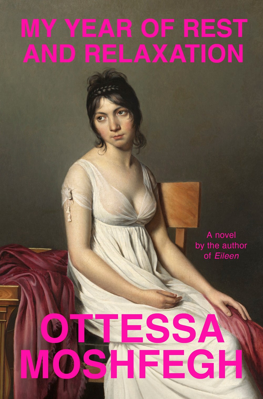
IIRC the cover of Moshfegh’s novel My Year of Rest and Relaxation was designed by Darren Haggar. The painting is by French Neoclassical artist Jacques-Louis David.
Earlier this year, a Canadian magazine asked me what the latest trends in book cover design were. I don’t think I had a very satisfactory answer. 2021 felt very much like a continuation of 2020, which itself felt like a year on hold.
The trends that came to mind were not exactly new. In no particular order: big faces (big sunglasses!); cropped faces; hands; mouths; postmodern typefaces;1 big skies; rainbows; gradients; the colour orange; psychedelia; collage; contemporary painting.
A lot was made of “blob” covers this year. I’m not sure that anything has really changed since Vulture published this article about “blocky” covers in 2019. They seemed like much the same thing.
Design is about the constraints and, as it turns out, the constraints around designing commercial literary fiction covers that have to work just as well online as in bookstores can lead to similar design solutions — large, legible type, and bright, abstract backgrounds. 2 The surprising thing is not that a few covers look the same when you squint; it’s that more of them don’t.
There were a lot of good covers (that didn’t look alike) in 2021. LitHub posted 101 of them. Still, it didn’t exactly feel like a vintage year.
Do I say that every December? Possibly.
A few years ago I worried that covers were moving in a more conservative direction, particularly at the big publishers. I’m not sure this has come to pass, at least not in the US. There are plenty of covers from the big, prestigious American literary imprints in this year’s list, as there were last year, and every year before that.
There are fewer covers from the UK in this year’s list than in previous years though, and I feel less confident about the situation there. From a distance, things seem a little sedate. I may be mistaken. It’s quite possible I haven’t see enough covers — or perhaps enough of the right ones — from British publishers to get a good sense of the overall picture.3
It would not be a surprise, however, if publishers were feeling a little risk-averse at the moment. We are two years into a global pandemic, experiencing a major supply chain issues, and living through a seemingly endless series of sociopolitical crises.
Nor would it be a surprise if designers were personally feeling the effects too — I’m not sure we are talking about this enough, and I’m not sure I know how to.
Thank you to everyone who has supported the blog in 2021. It means a lot. Here are this year’s book covers of note…
Na Kim talked to PRINT about her career and the designs for the Ditlevsen series in February. If, like me, you were wondering about typeface on the covers, it’s Prophet from Dinamo apparently.
If you’re wondering about the Super-Seventies Sally Rooney typeface, it is Ronda designed by Herb Lubalin and Tom Carnese (I only know because I asked).
Thank you to everyone who has supported the blog in 2021. It means a lot.
I am not convinced that the term “postmodern” quite captures what I mean here (and/or worse, implies something different in the context of typography), but it’s the best I’ve got. I’m not talking about the kind of experimental typography you might associate with the likes of Wim Crouwel or Emigre, or the aesthetic of someone like David Carson. What I am trying to get at is idiosyncratic type that purposely exaggerates or plays with letterforms, and doesn’t conform to function-first modernism. To my mind, this would include some typefaces from the 1960s and 70s, as well as some more contemporary type. In a sense what I am describing is display faces — and I think the eclectic, innovative use of type in Victorian advertising might be an inspiration to designers here — but I don’t think it is just about size. ↩
I was immediately reminded of the cover of Department of Speculation by Jenny Offill, also designed designed by Linda Huang:
The cover of the UK paperback of Weather, published by Granta this month, was designed by Jo Walker. She wrote about her design process for Spine Magazine.
Interesting that both paperback designs are so different from each other and their respective hardcovers (which were quite different to each other too)…
This cover immediately reminded me of Helen Crawford-White’s cover A Half-Baked Ideaby Olivia Potts published last year…
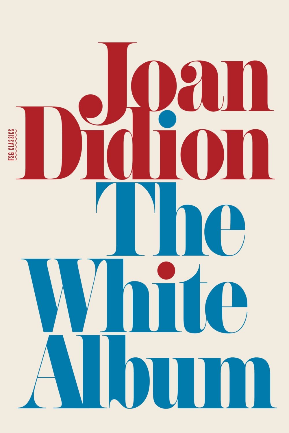
And then I thought maybe it was a nod to the cover of The White Album by Joan Didion, published in 1979 (the reissue below uses the original cover), and which Fonts in Use informs me uses the typeface Pistilli Roman. But maybe I am over thinking it…?
I was also reminded of these two recent covers, so maybe it is just a thing…?
I believe this is only available as an ebook, which seems a bit of shame. It would be nice to see in print. The cover does remind me of something else though. I can’t think what exactly. The best I could come up with was Tyler Comrie‘s cover for The Unwanted by Michael Dobbs. But I feel like there is cover that does something similar with a painting as a background? Possibly I’m just imagining it.
Oh and for those of you who are interested, the design team at Penguin Random House Canada have started posting their work to Instagram as one_last_tweak.
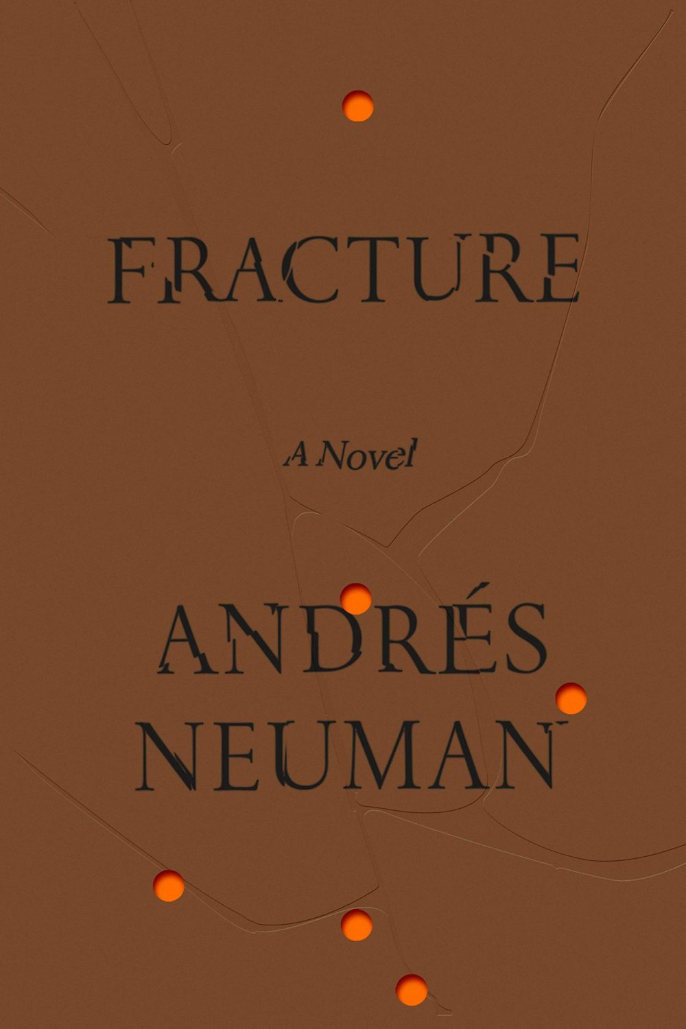
Fracture by André Neuman; design by June Park (Farrar Straus & Giroux / May 2020)


