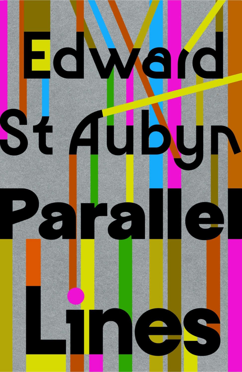
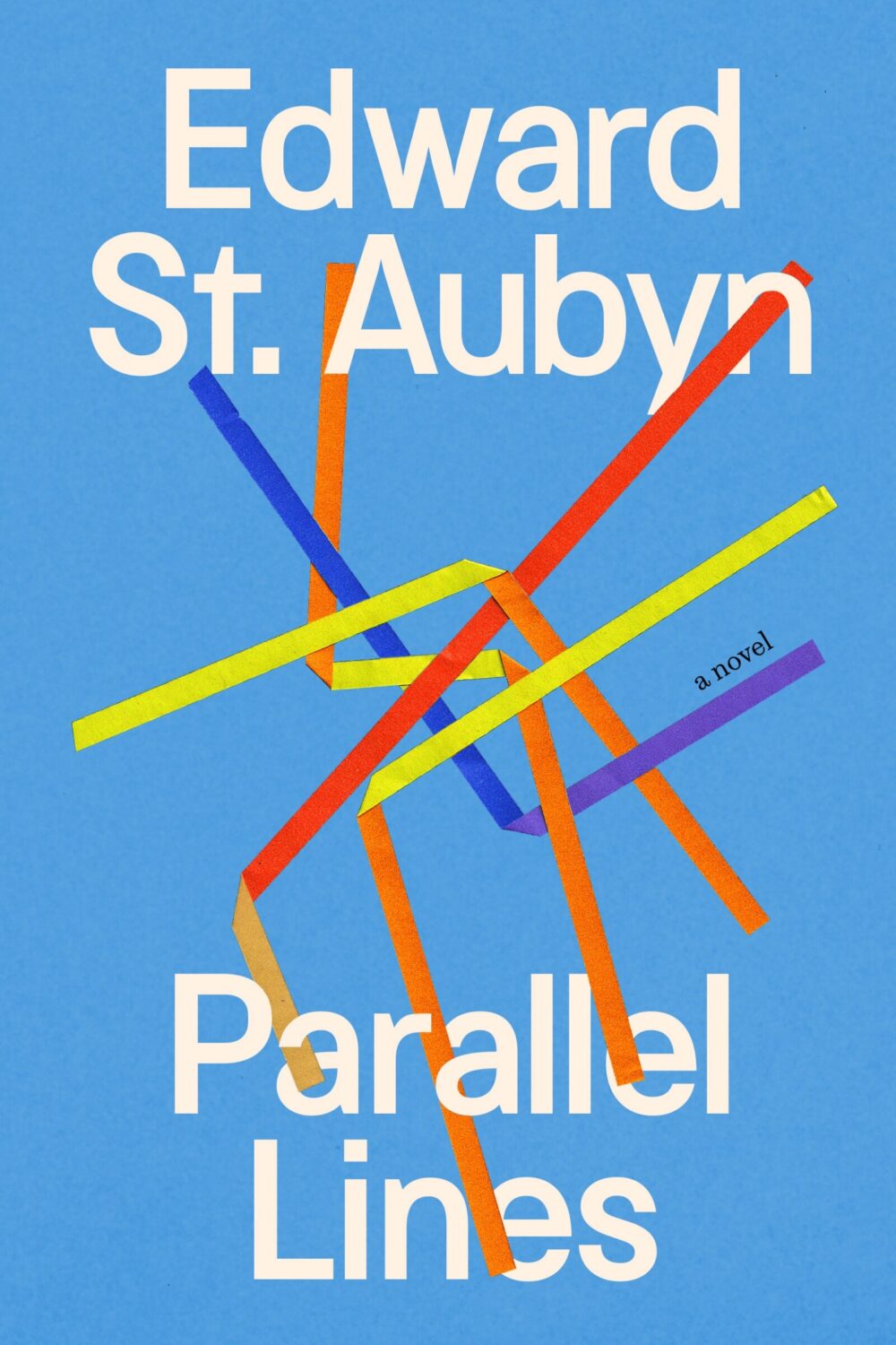
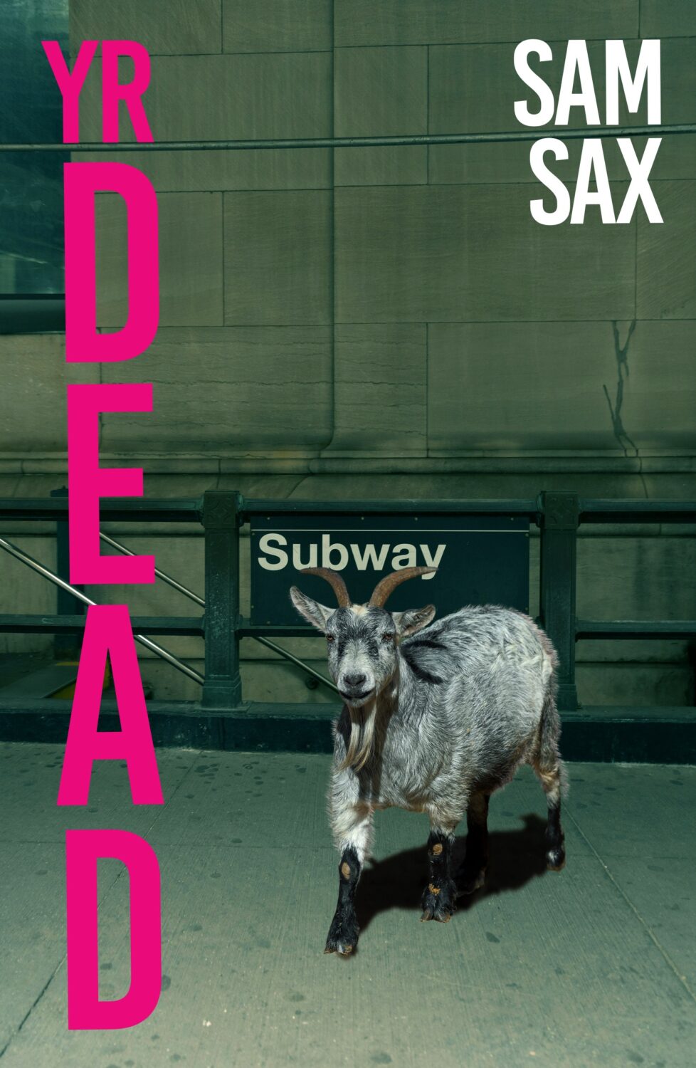
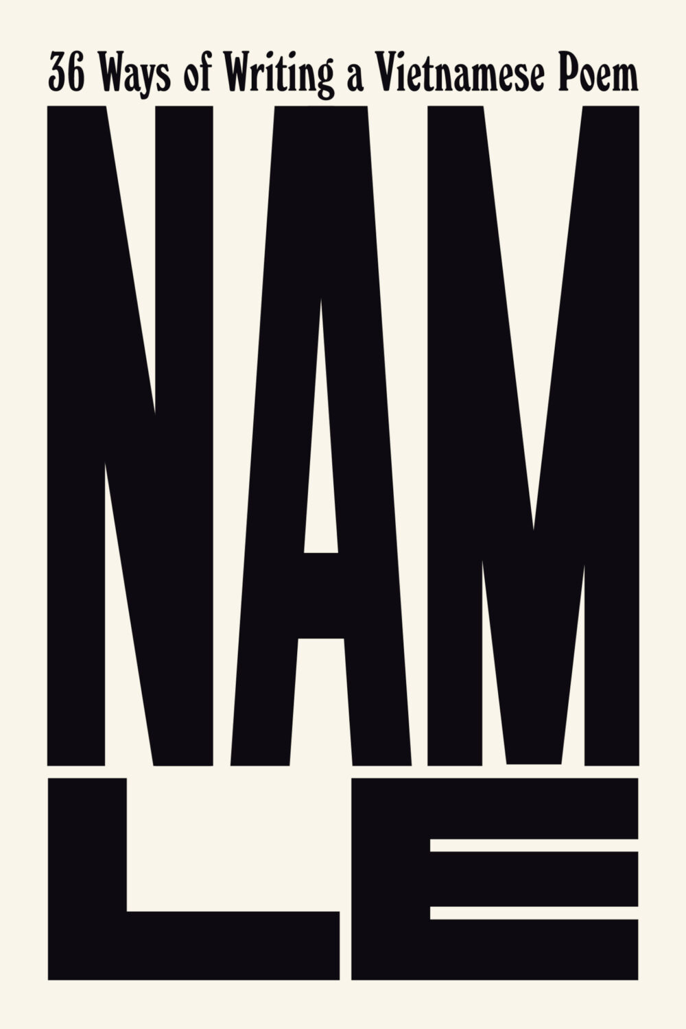
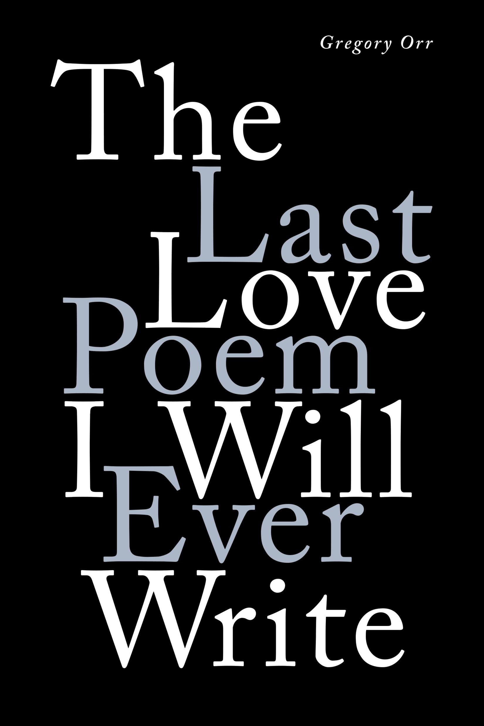
Hey. I hope you’re keeping safe and well, especially my friends and colleagues in snowy NYC. Thanks to everyone who helped with images and design credits this month — it’s been a really busy month so I really appreciate it!
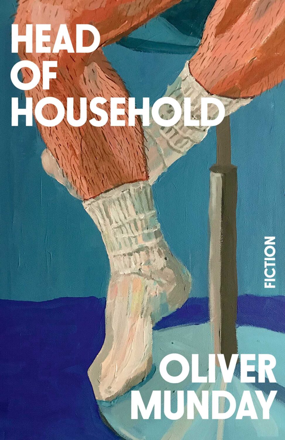
Oliver’s own novel, Head of Household, is out from Simon & Schuster in the US this month too. The cover was designed by Christopher Brand, and you can read a conversation between the two about the design process at LitHub.
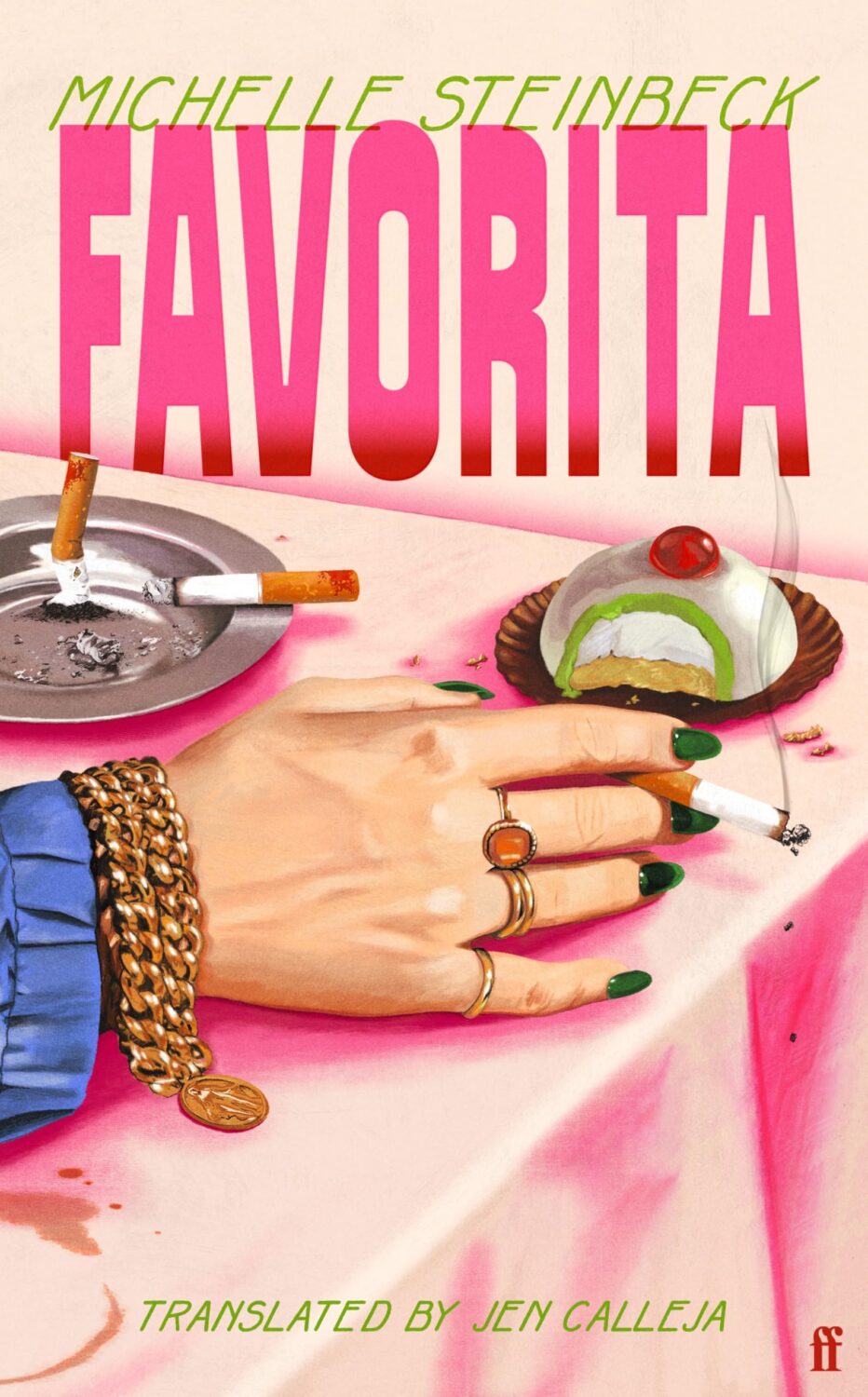
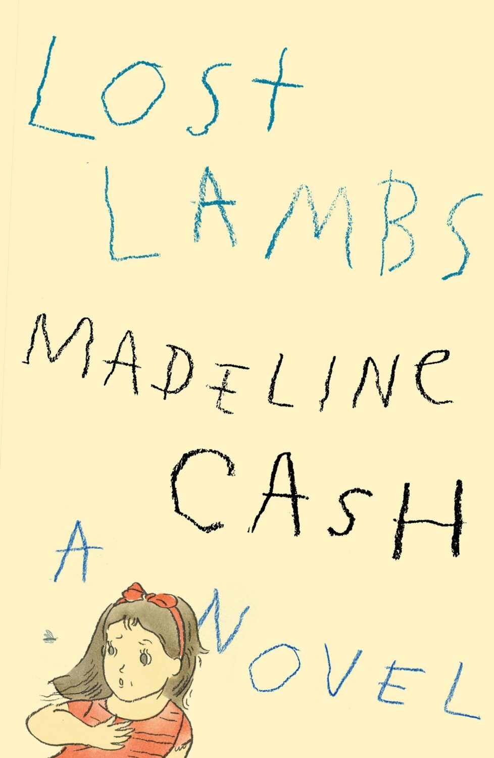
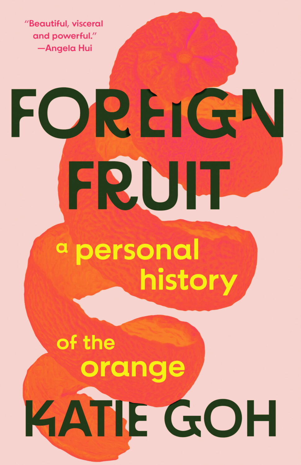
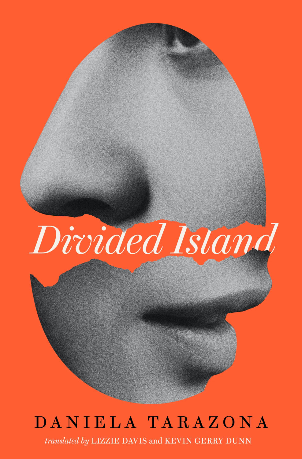
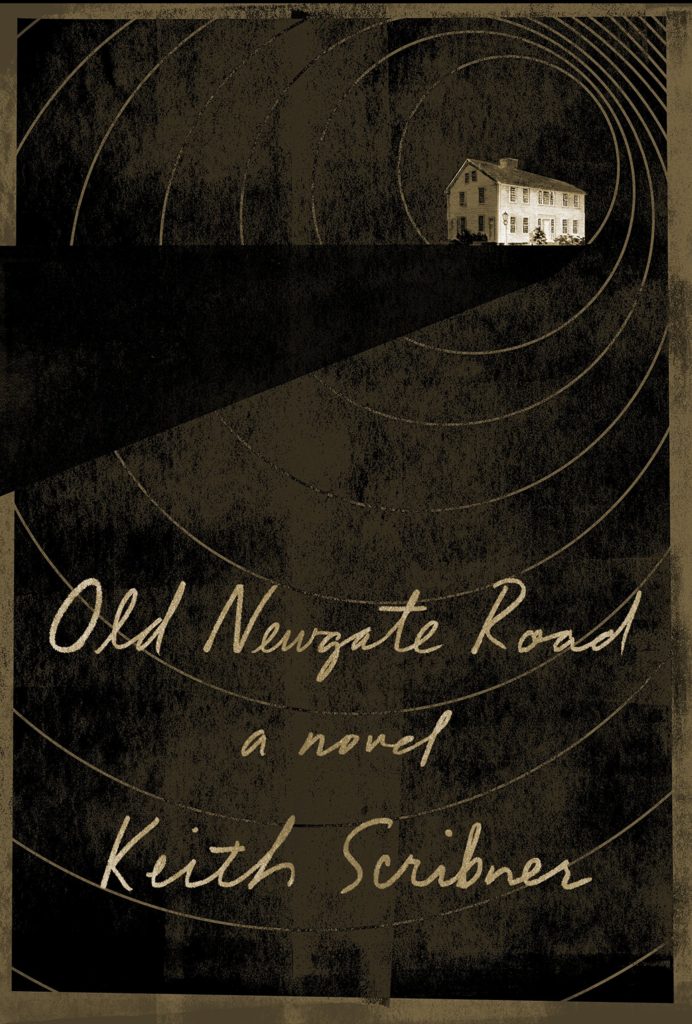
Favorita by Michelle Steinbeck; translated by Jen Calleja; design by Henry Petrides (Faber & Faber / February 2026)
Well, it’s been a month. I hope you’re all keeping safe and well, especially my friends and publishing colleagues in Minnesota. Stay Strong.
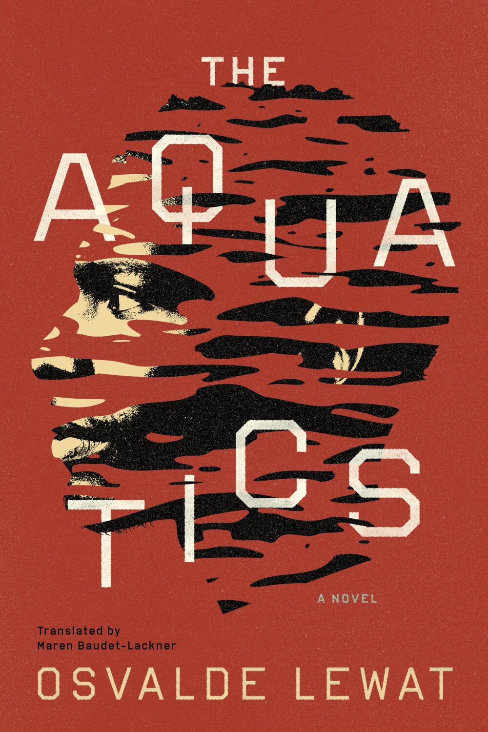
The Aquatics by Osvalde Lewat, translated by Maren Baudet-Lackner; design by Alban Fischer (Coffee House Press / December 2025)
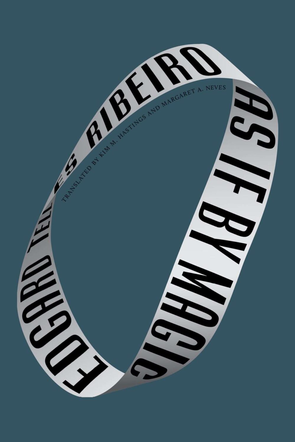
As If by Magic by Edgard Telles Ribeiro, translated by Kim M Hastings & Margaret A Neves; design by Alban Fischer (Bellevue Literary Press / January 2026)
Yes, starting off the year with two covers designed by Alban, but also two books from nonprofit publishers based in Minneapolis, Coffee House Press and Bellevue Literary Press.
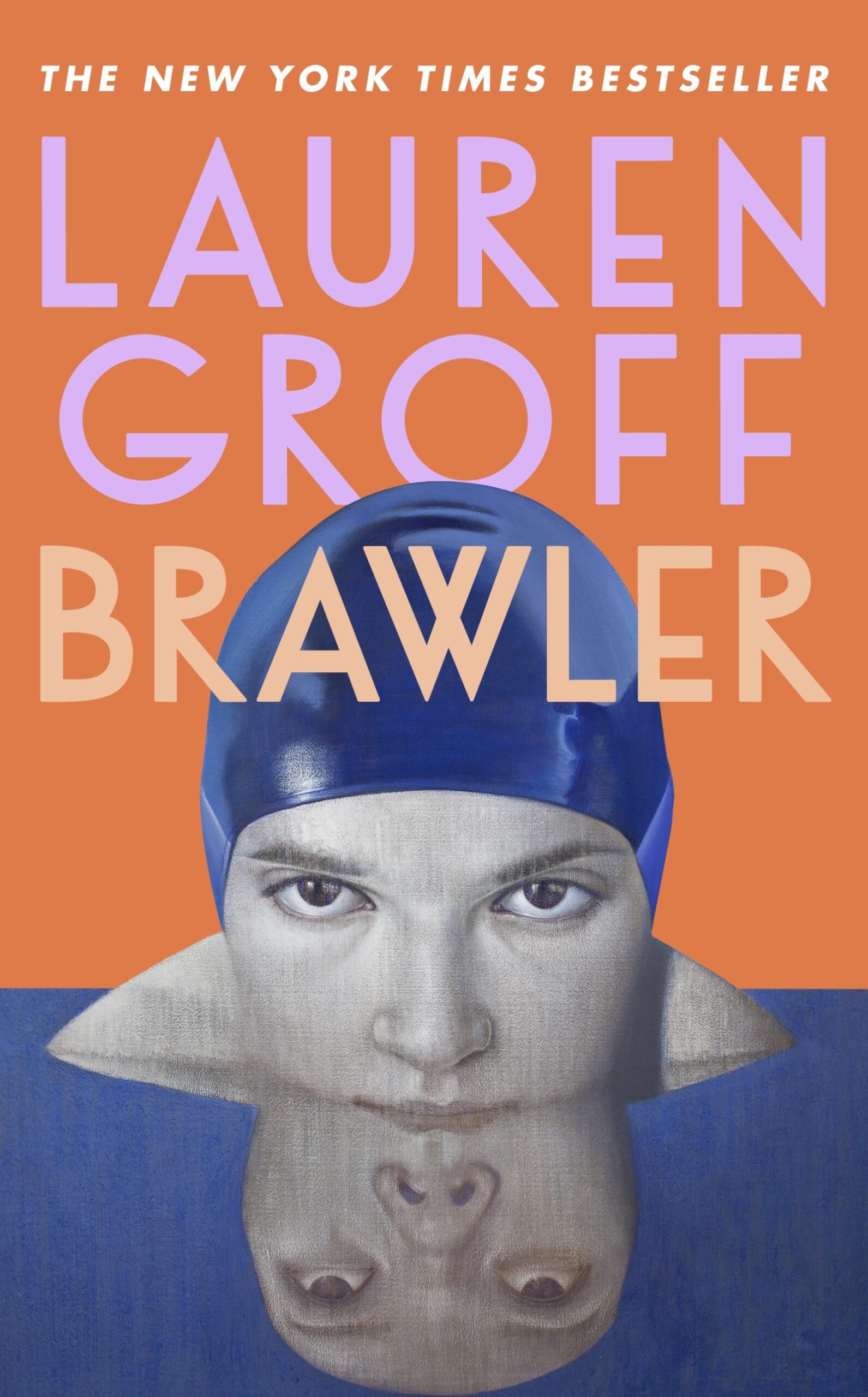
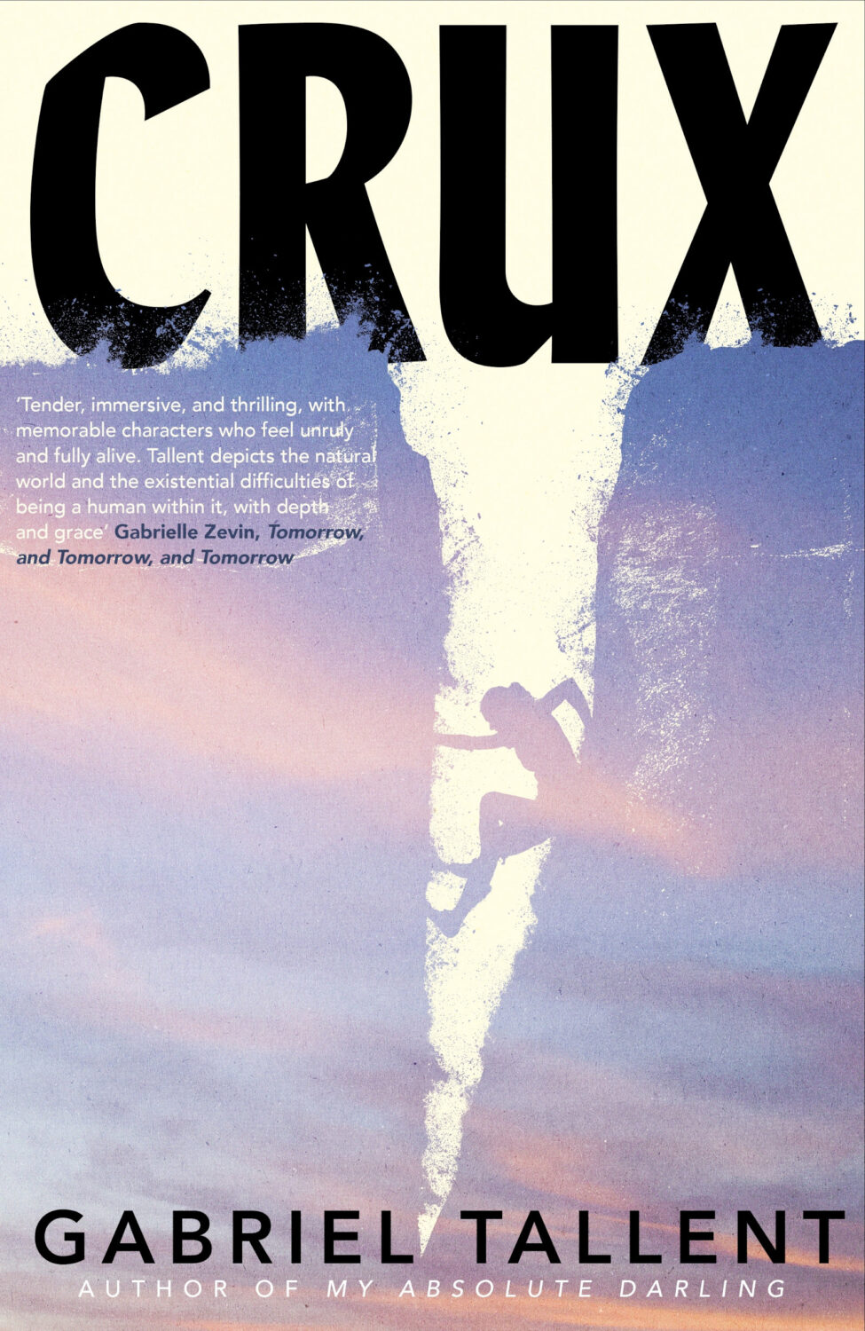
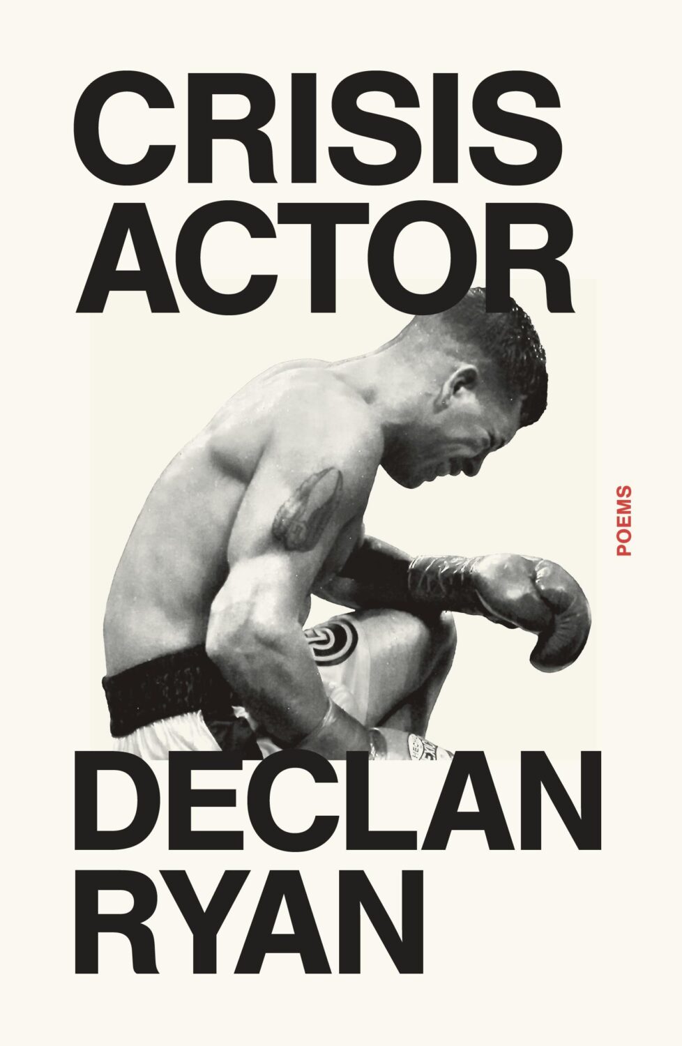
Crux by Gabriel Tallent; design by Jaya Miceli (Riverhead / January 2026)
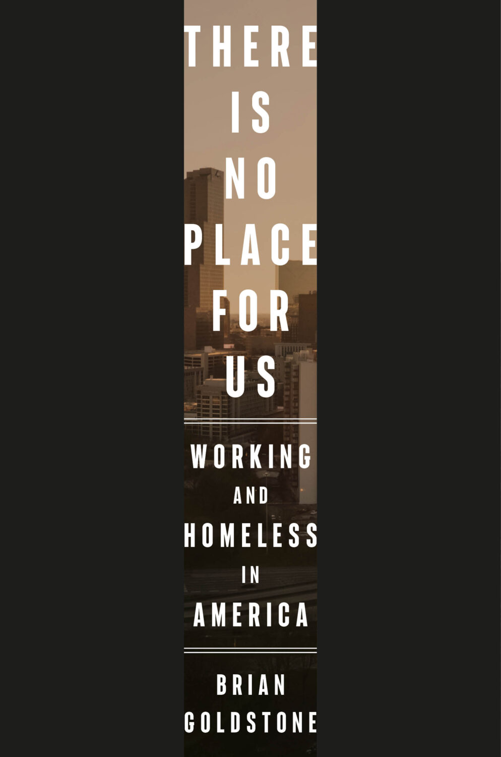
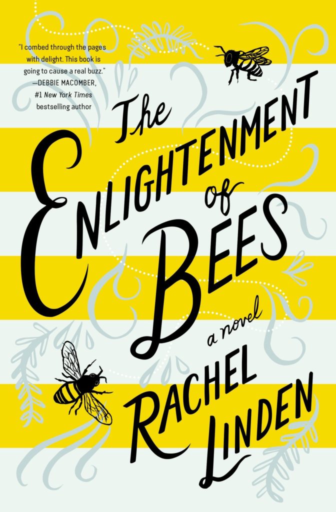
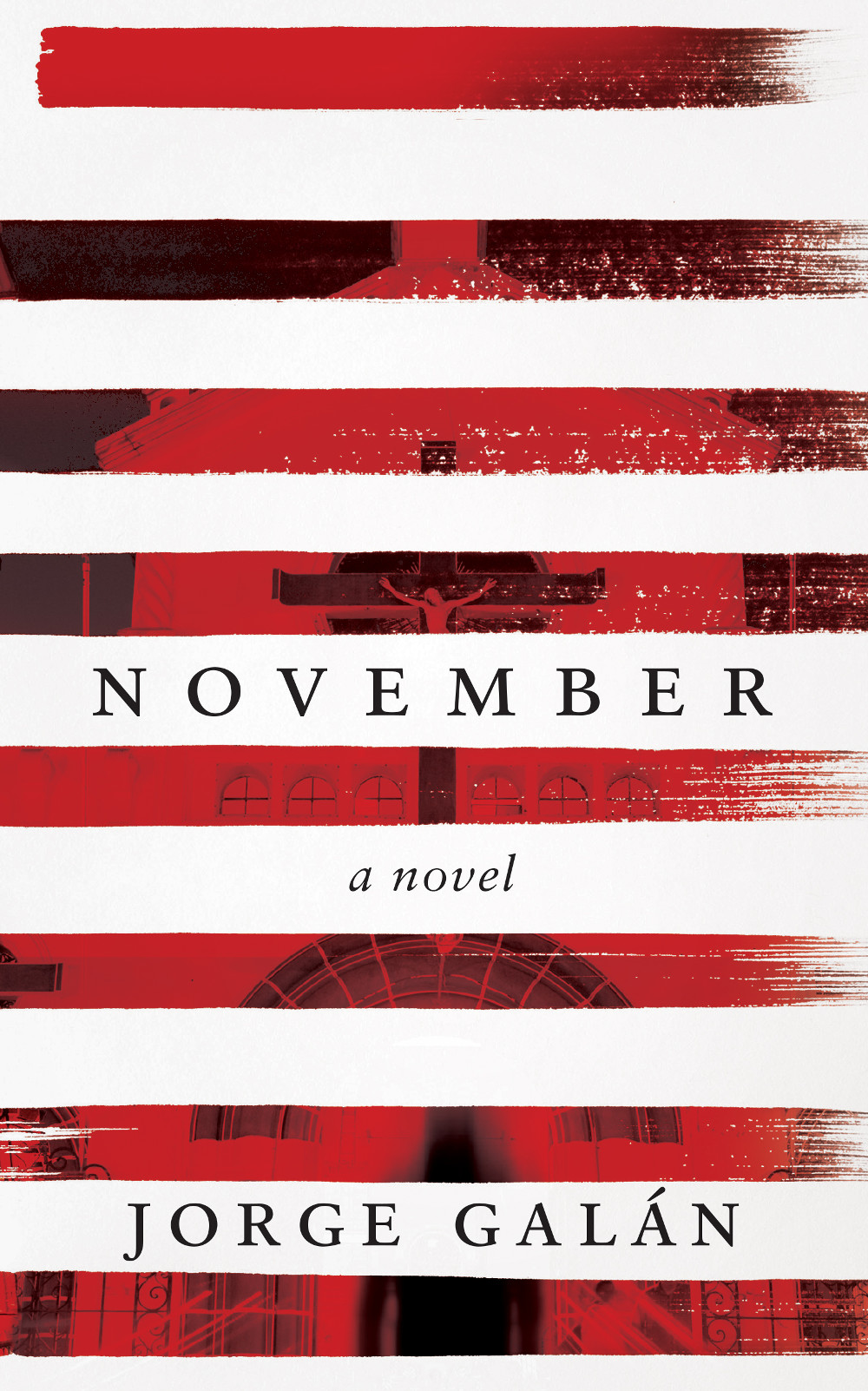
This reminded me of the cover of There Is No Place For Us by Brian Goldstone designed by Anna Kochman for Crown, which featured in March’s post. I’m no Barnett Newman, I do like a bold stripe.
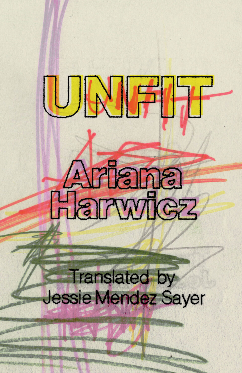
Unfit by Ariana Harwicz, translated by Jessie Mendez Sayer; design by Erik Carter (New Directions / October 2025)
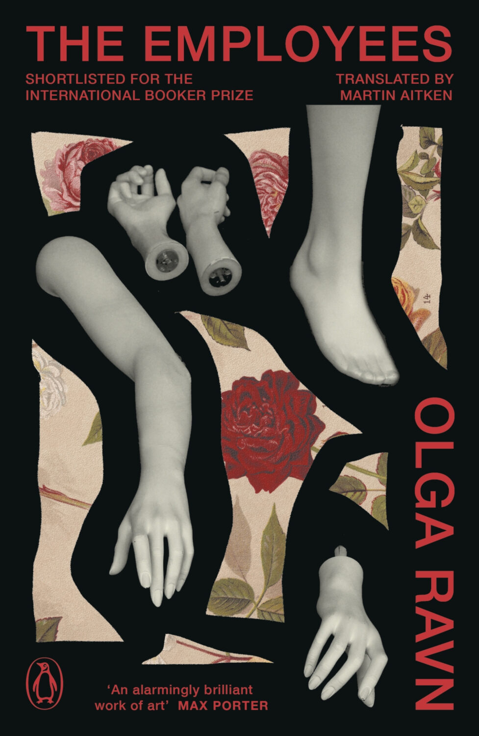
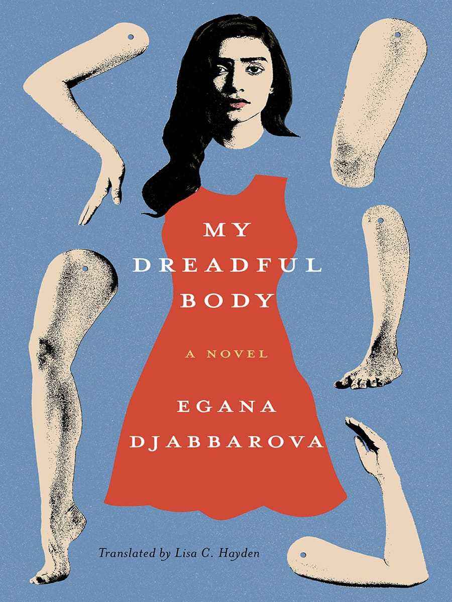
Dan Jackson also designed a new cover for the paperback edition of The Employees by Olga Ravn out next month in the UK from Penguin, which weirdly kind of looks like a Joan Wong collage, but could also be part of a dismembered / disembodied limbs on covers trend? I’m struggling to think of too many examples off the top of my head. Alban Fischer‘s cover design for My Dreadful Body by Egana Djabbarova? But that’s not out until next year. I’m sure there are a couple of others out there. I will have a think on it.
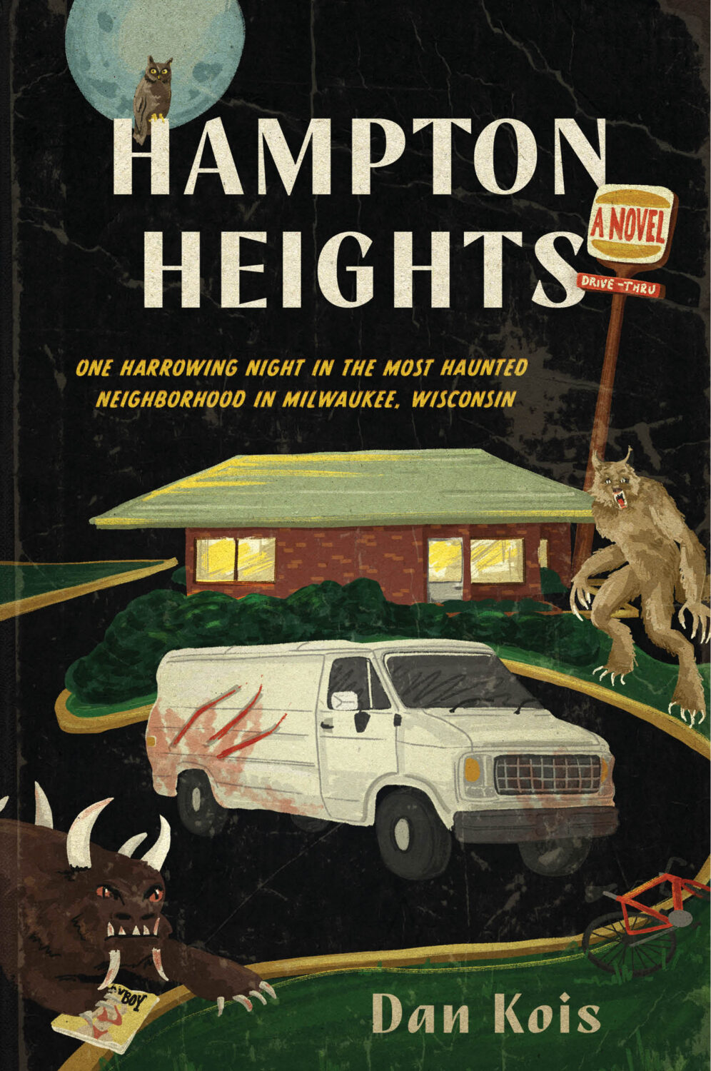
I am very late to this one, but the art is fun and it kind of fits with recent trends so I didn’t want to leave it out. Let me know if there is a design credit to add.
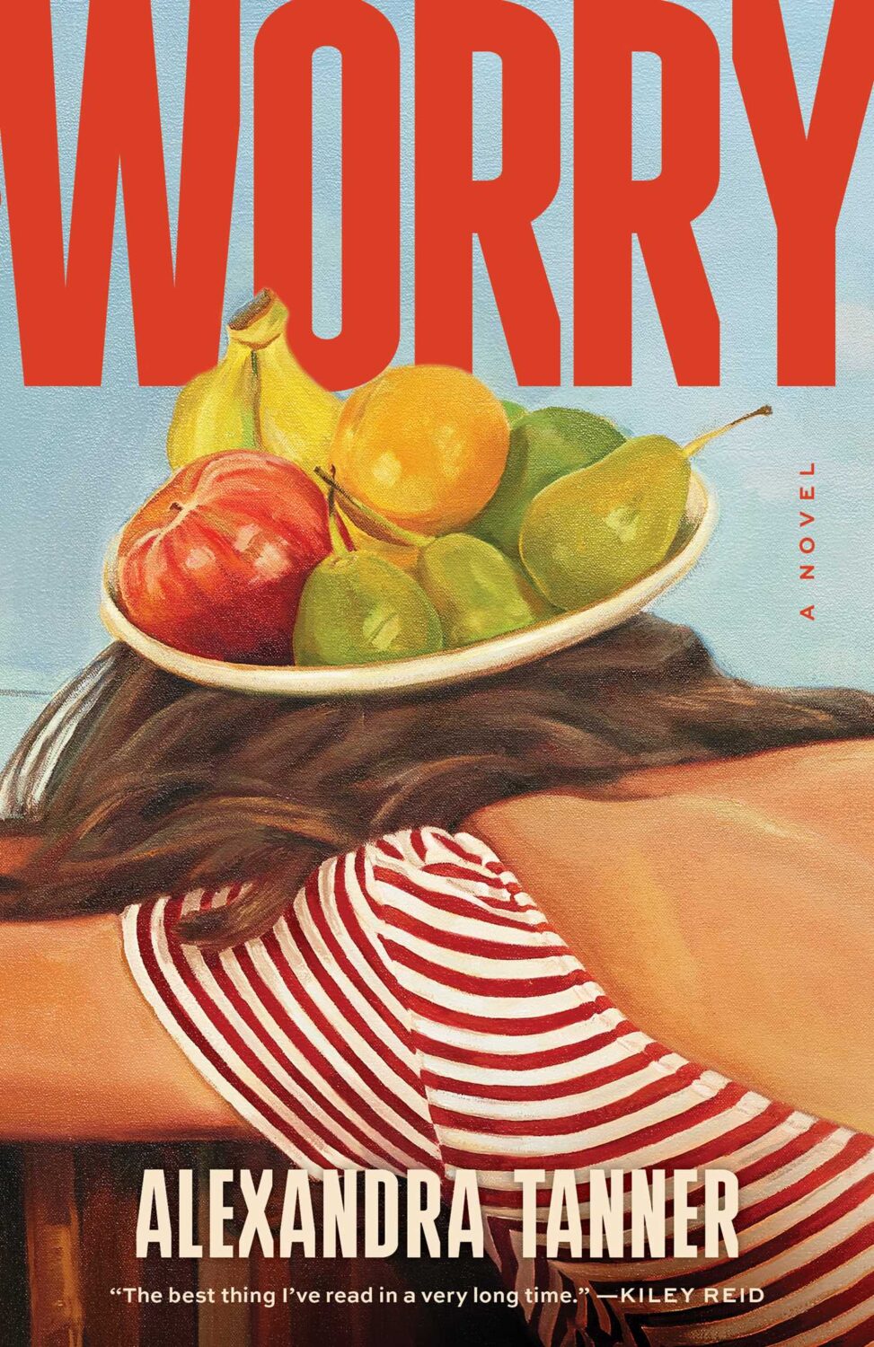
Interestingly, Shannon Cartier Lucy’s art was also used on the cover of Worry by Alexandra Tanner designed by Alicia Tatone for Scribner from last year…
Hey, sorry, just sliding in under the wire with another slightly rushed post this month. I hope everyone is safe and well (all things considered). Let’s just get on with it shall we?
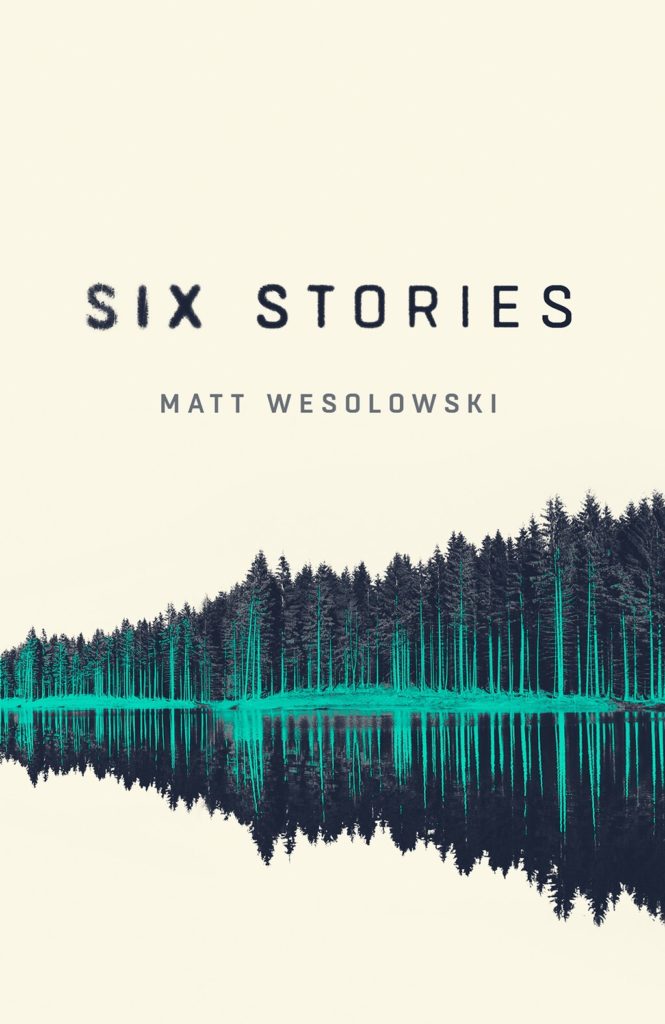
Also, the cover of Matt Wesolowski’s book Six Stories designed by Mark Swan was featured here way back in April 2017 (which was a pretty good month for covers!)
Jenny has a new portfolio site so go check that out. (Also, if anyone has a higher res version of the cover for The Holy Innocents, please send it over! I’d love to have a better one. Thanks!)
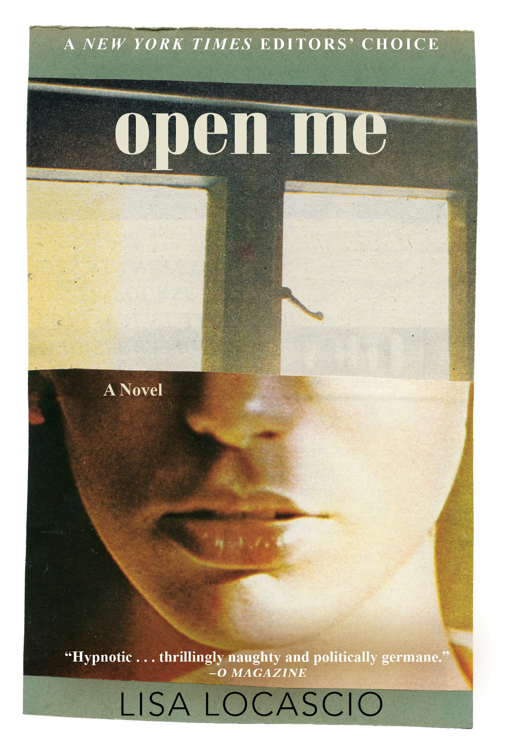
I am a sucker for good photo selection on a cover. This photo is from Ed Templeton’s series/installation (and book) Teenage Smokers. Although it is kind of interesting to me that a book with such a British title uses a photograph by an American photographer, but it does have incredible 1990s vibes.
The cover of the UK edition, published by Daunt Books, was designed by Kishan Rajani. It’s interesting to see the differences in two covers with a similar approach…
It is the time of year for lists and I should’ve been done weeks ago, but I am late and already well behind the pack. Apologies for that.
I admire Matt Dorfman‘s ability to whittle his list down to a dozen covers for the New York Times. I imagine it takes him a lot less time for one thing, but I’m sure Matt still agonizes over every cover. It requires a level of discipline and restraint that I do not possess to keep it that tight year after year.
PRINT’s list of best book covers of 2024, compiled by editor-at-large Zachary Petit, is also long. It’s a 100 covers. Last year it was 50.
I’m not trying to throw stones here. We are all seeing more covers than we used to. There are more books for one thing. But they’re not just something we just experience in print in anymore. You don’t have to go into a bookstore or read the newspaper or magazine to see them. They’ve become something we see and share all the time online. Designers are promoting their own work and (slowly) getting more credit for it (although there is a lot more to be done in that area. Publishers — credit your designers!). My monthly round-ups are now one of several you can choose from.
And it is not like my list is short. This year it features work by 48 designers — more than half of them women — and 86 covers (plus a couple of supplementary images).
The consensus seems to be that it was a decent year for covers, and it’s hard to argue with other people’s selections even if I don’t love them all.
It is telling though that 100 of LitHub’s selections were individual picks. There are covers on my list that are not on the anyone else’s despite their length. So while I think we agree there were lots of good covers, I’m less certain we entirely agree on which ones were actually the outstanding ones.
A recent article Spine argued that there is a battle between minimalism and maximalism going on (you can find Spine’s end of year list here by the way). I think that could be true. Different approaches work for different audiences. But I also think it’s messier than that. I get the sense that publishers are less sure of what they want and what sells (certain genres notwithstanding).
It has been a rough year for a lot of publishers, so there is undoubtedly a lot of uncertainty, and no small amount of anxiety. I could go on about why that it is (and the publishing’s self-inflicted wounds) but, in short, what I think we’re also seeing with book covers is more meddling and less direction.
Anyway, I don’t want to end this on a bleak note. This year was shit enough. Despite it all, there genuinely were a lot of good covers in 2024, and some that I did think we’re outstanding. A couple of them made me laugh, which was no small thing. It was a strong year for several individual designers in particular and, despite the pressures, many produced work that was recognizably theirs. I thought there were more interesting covers coming out of the UK and Ireland (that mercifully wasn’t just about the inks or the finishes!), and there were some fun Canadian covers too.
Thanks, as always, for reading, and I hope you’re all keeping safe and well. Happy Holidays!
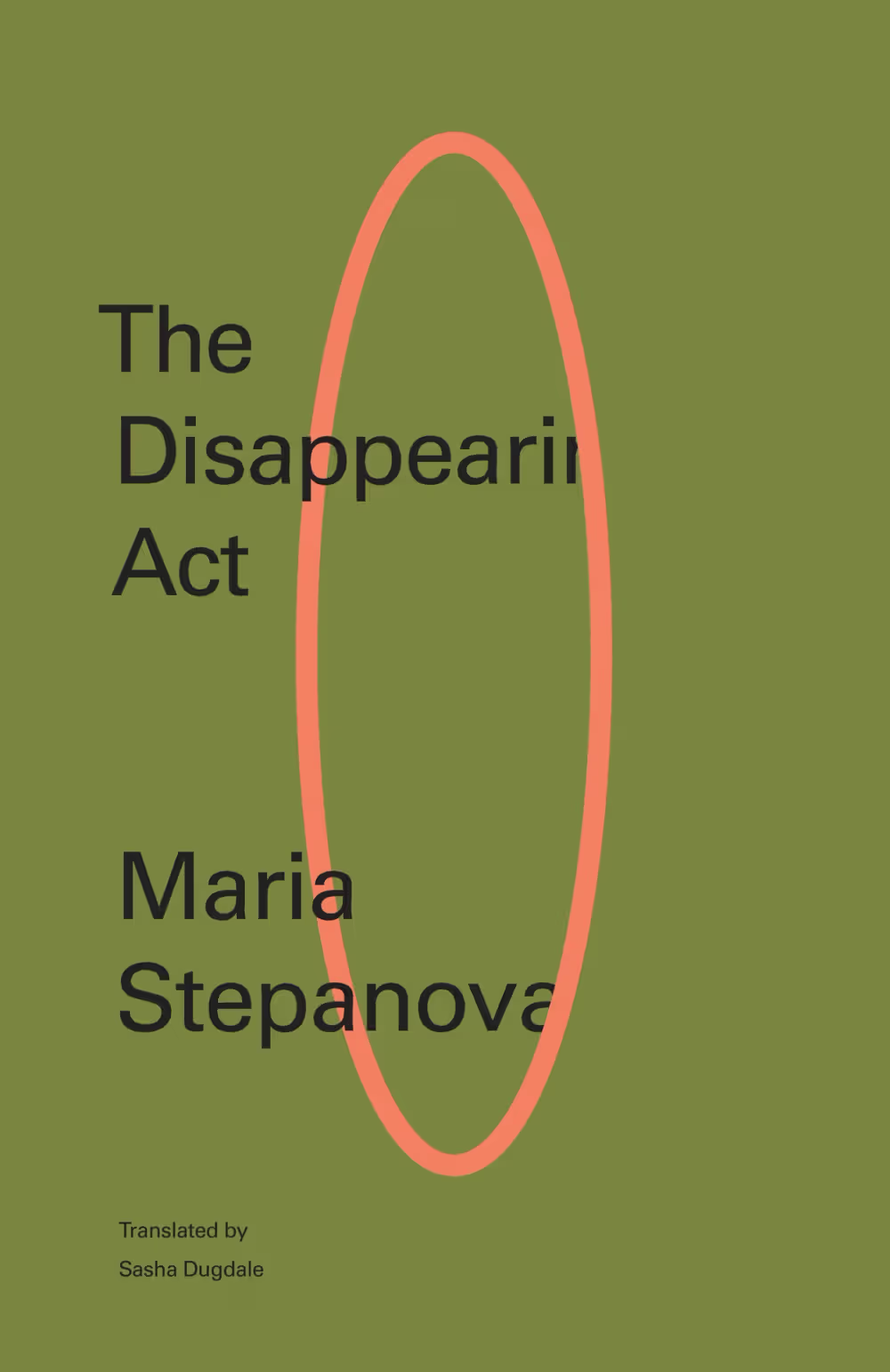
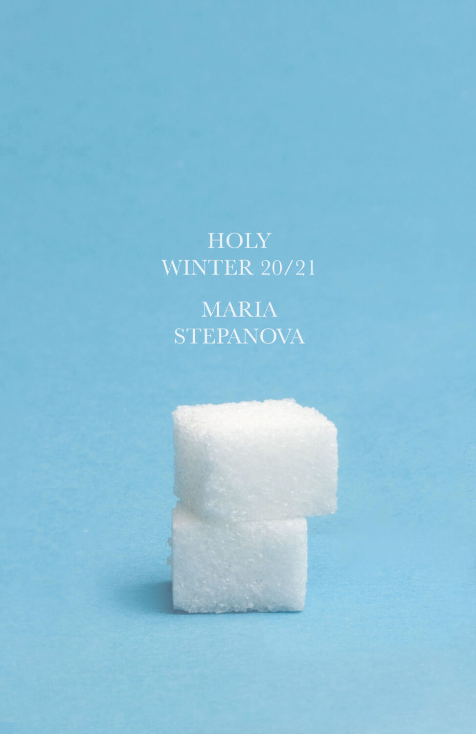
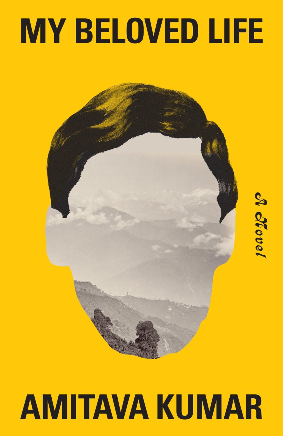
Holy Winter 20/21 by Maria Stepanova; design by Oliver Munday (New Directions / October 2024)My Beloved Life by Amitava Kumar; design by Oliver Munday (Knopf / February 2024)
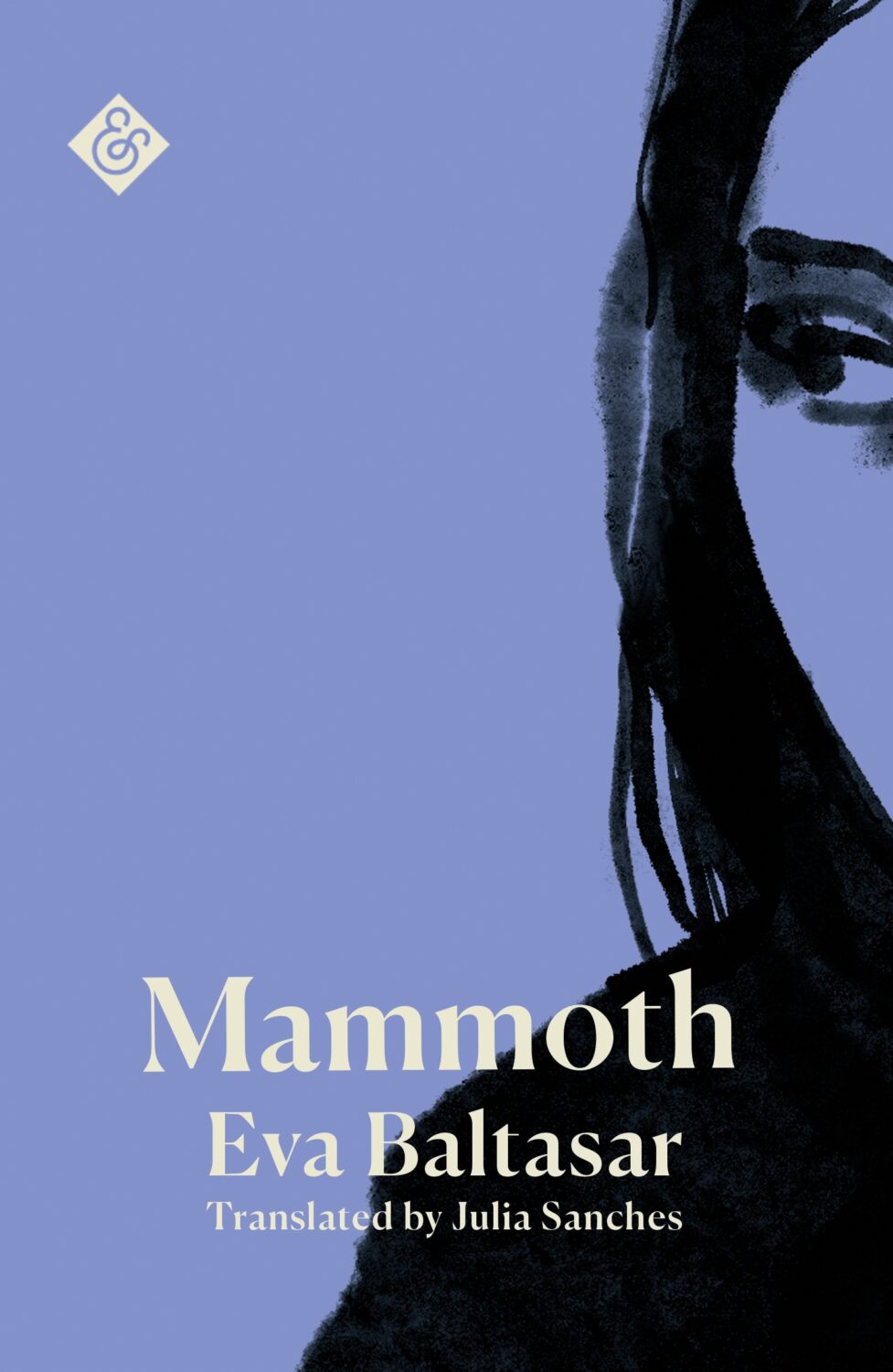
Mammoth by Eva Baltasar; design by Anna Morrison (And Other Stories / August 2025)
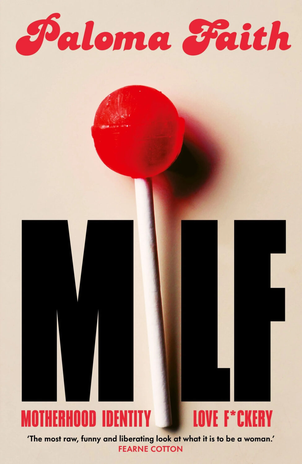
MILF by Paloma Faith; design by Jack Smyth (Ebury / June 2024)
Also designed by Jack Smith:
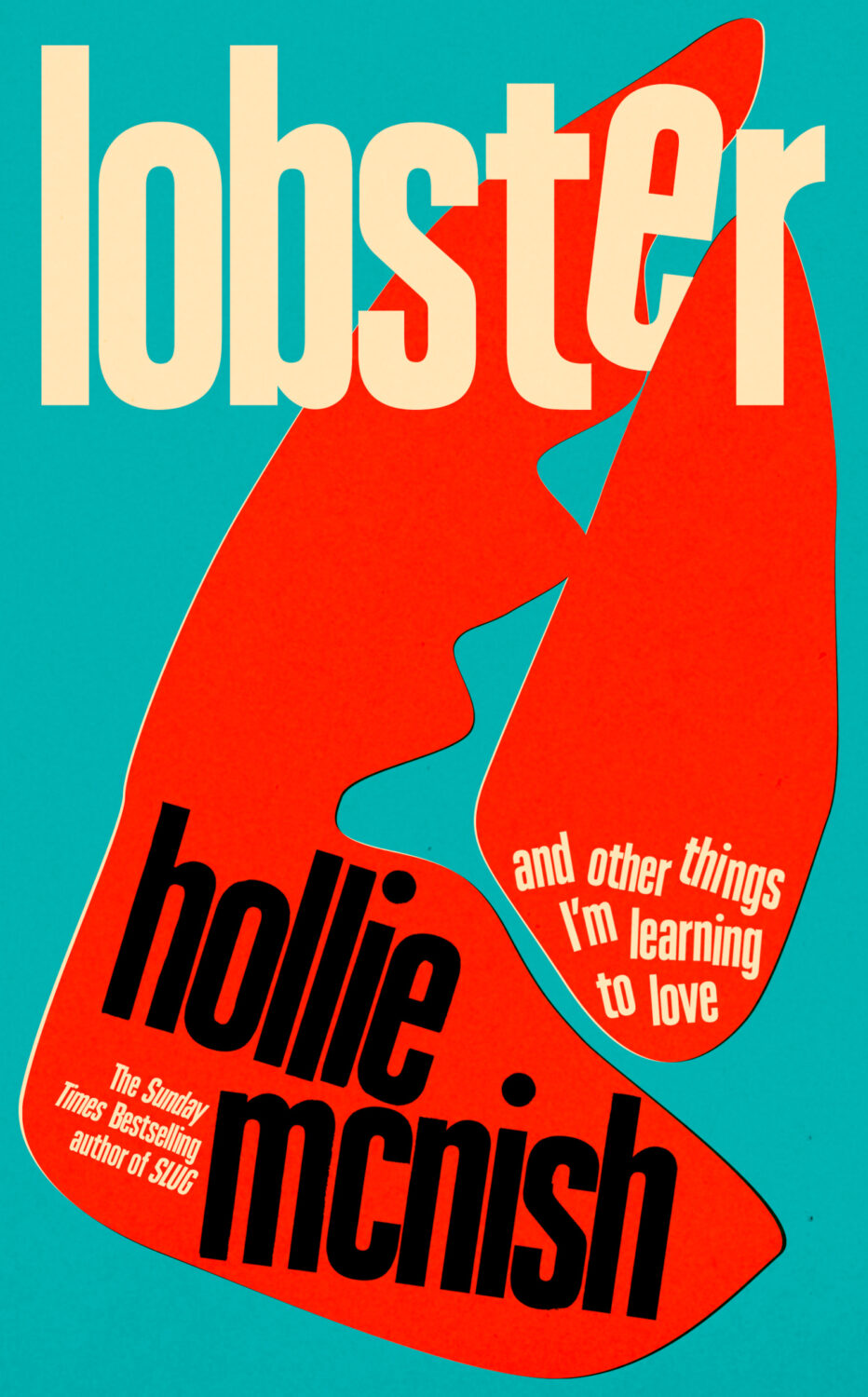
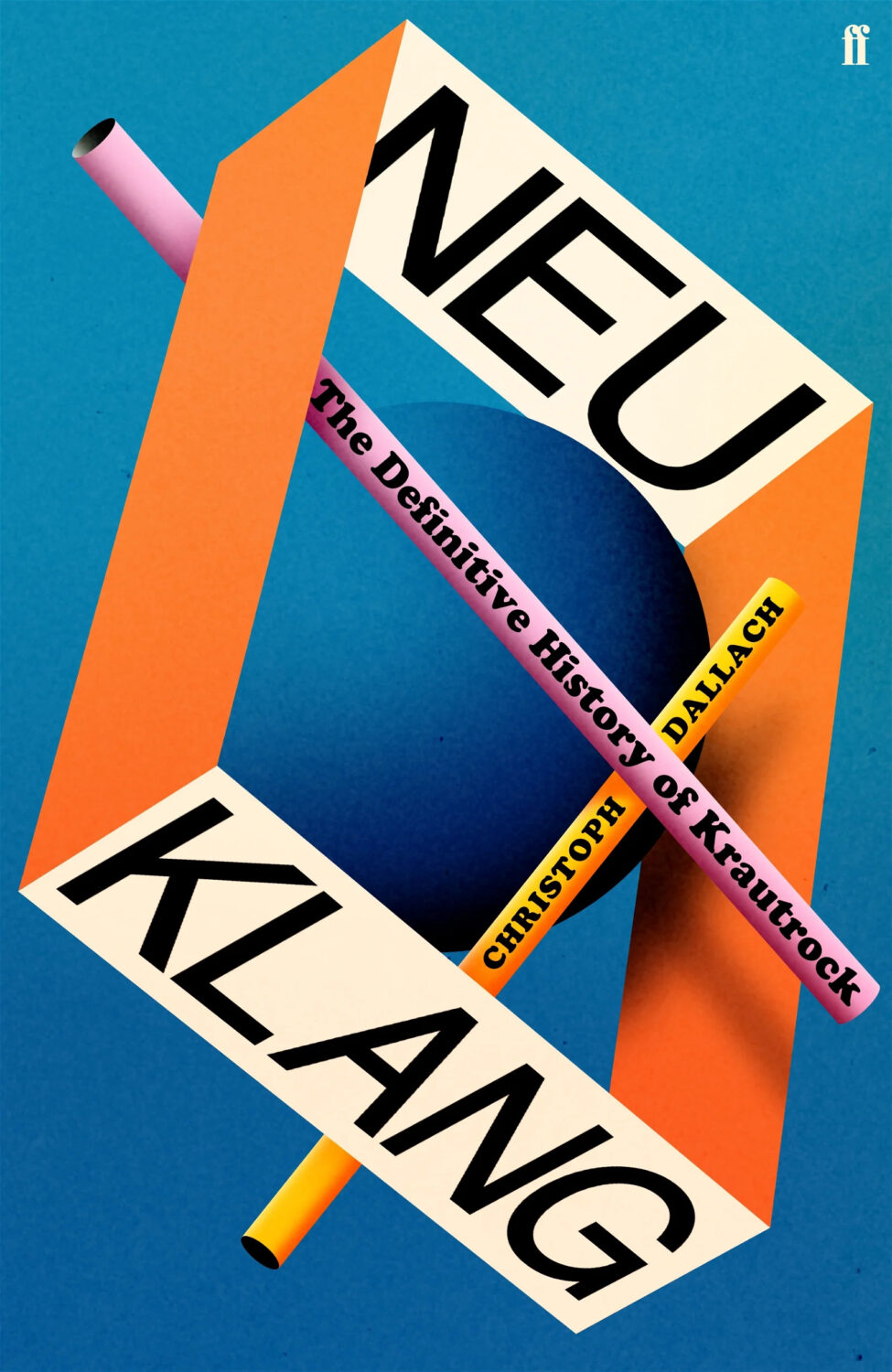
Lobster by Hollie McNish; design by Jack Smyth (Little, Brown / March 2024)Neu Klang by Christoph Dallach; design by Jack Smyth (Faber & Faber / May 2024)
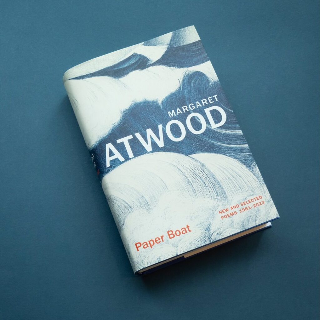
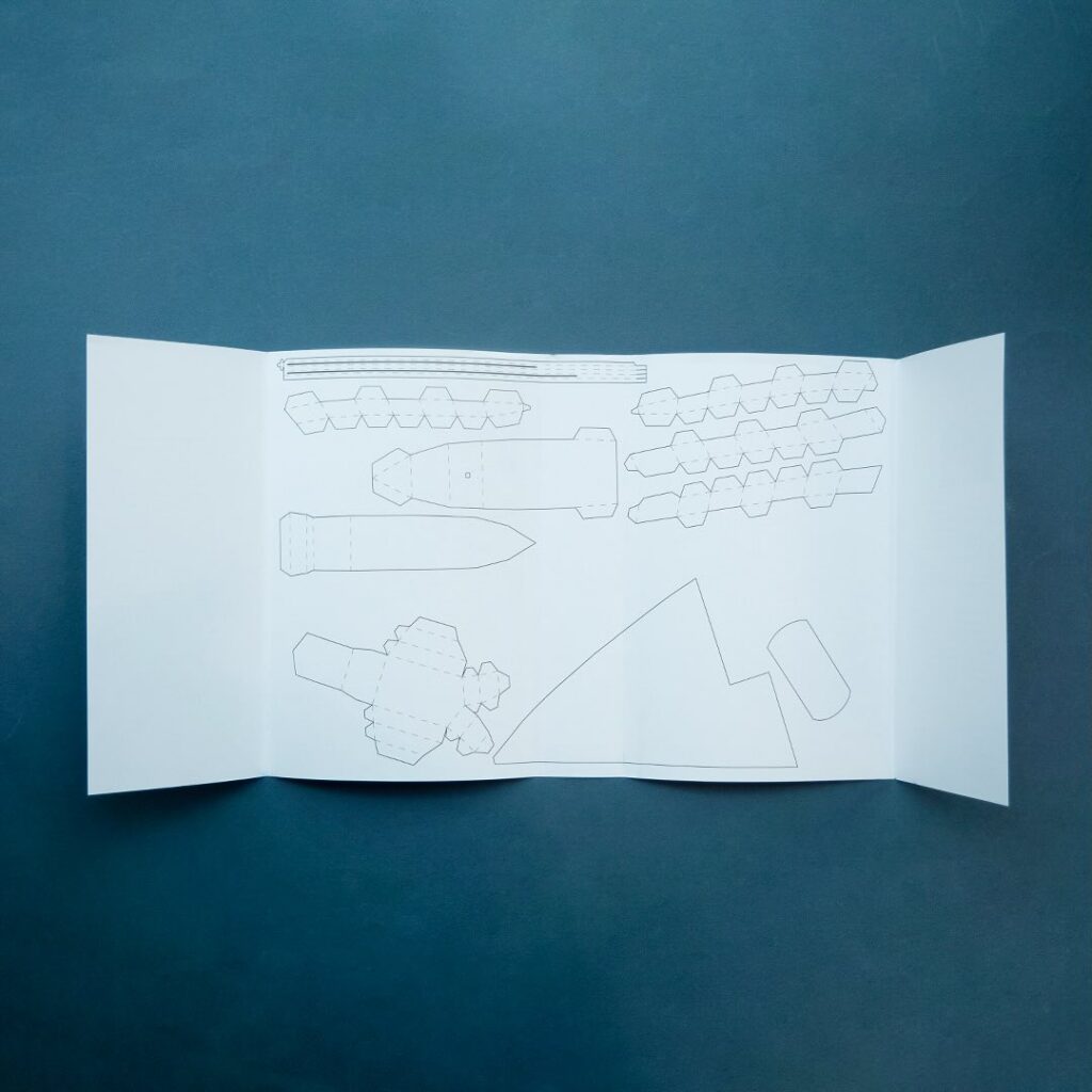
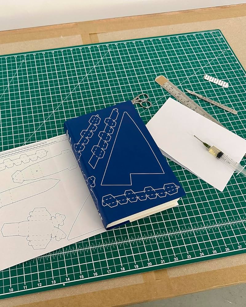
I also have to give a special shout out to the cover for Paper Boat by Margaret Atwood (Chatto & Windus / October 2024). Suzanne commissioned paper art by Nathan Ward to design a template for a paper boat that could be cut out from the dust jacket and stuck together.
Hey, I hope you’re keeping safe and well wherever you are. Apart from the weird Toronto weather, it is definitely FALL here with the kids back in school and days of seemingly endless pre-sales calls and shortlists. It is also the time of year for “big” books of course, and there are more covers from the conglomerate publishers in this month’s post than I would generally like. My sense is that independent publishers try to avoid releasing their books in September if they can these days, but maybe I just haven’t seen the right ones? Anyway I guess we should be glad the big guys still care about fun covers, right?
Hey, I hope you’re safe and well. I’m a little bit ahead of schedule because fall sales conference season is upon us, and I have to be in New York for work next week. I’m less ahead than I would’ve liked — PRINT has already beaten me to the punch! — but here we are, a couple of days earlier than usual, with another look at some new and recent book covers. April is National Poetry Month in the US so there are a few poetry covers in the mix, as well as a couple of covers from independent presses, an Australian cover, and all the usual suspects.
The Formula by Joshua Robinson and Jonathan Clegg; design by Pete Garceau (Mariner Books / March 2024)
Two nonfiction sports books in one post! Does Formula One really count as a sport? Not for me, Clive. But the subtitle says it is, and a Canadian friend once told me that for something to qualify as a sport it has to endanger your life in some fundamental way, so I guess F1 qualifies under Quebec Rules for Teen Boys if nothing else.
Anyway, it might be fun to do a post of interesting sports books covers at some point if I can find the time (let me know if any great examples come to mind!).
I feel like this is a bit different for a psychological thriller? I like the type a lot.
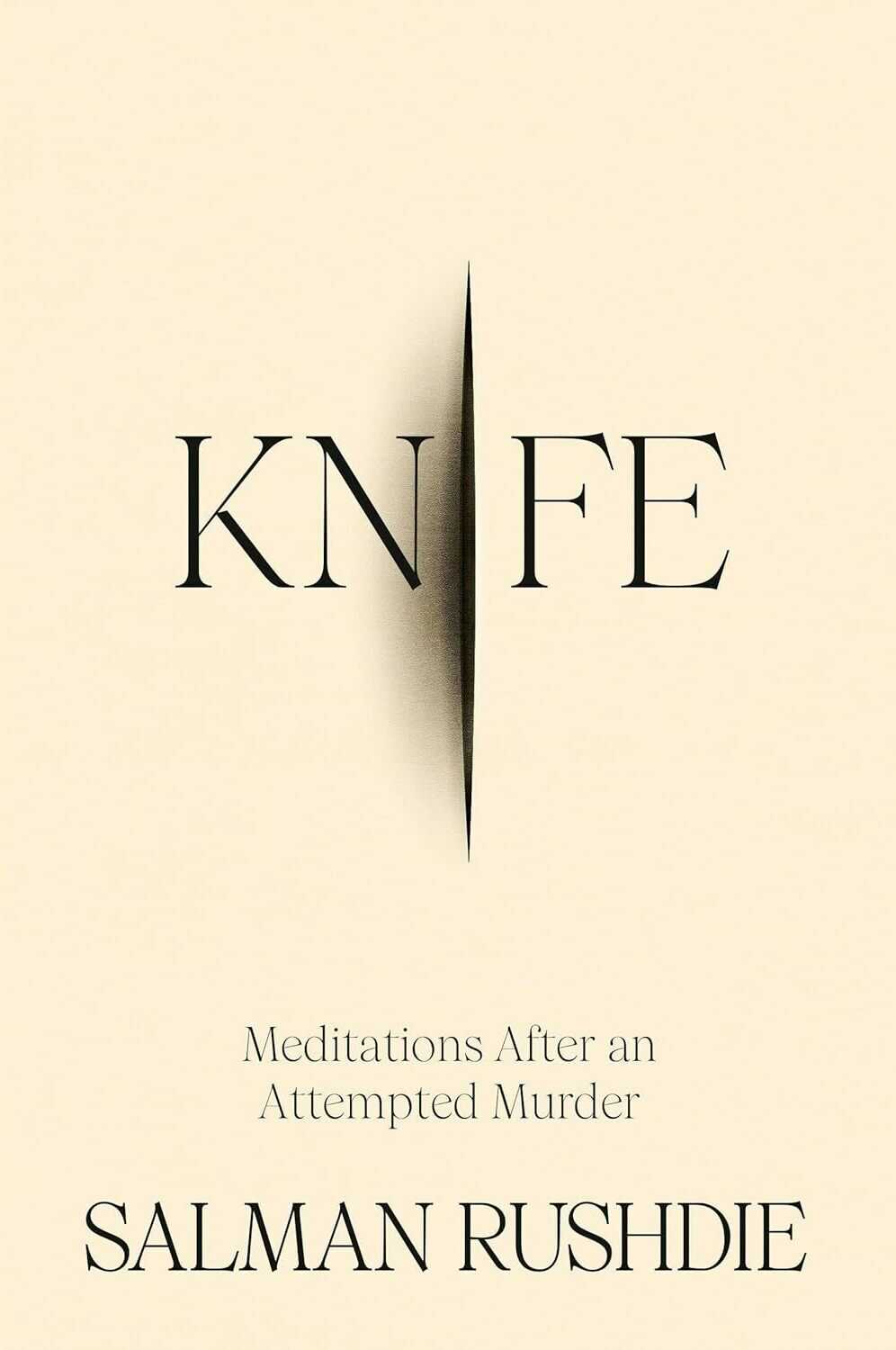
Knife by Salman Rushdie; design by Arsh Raziuddin (Random House / April 2024)
Interestingly, there is an “eye” motif on the spine with the Random House logo in the centre. Look for it next time you’re in a bookstore.
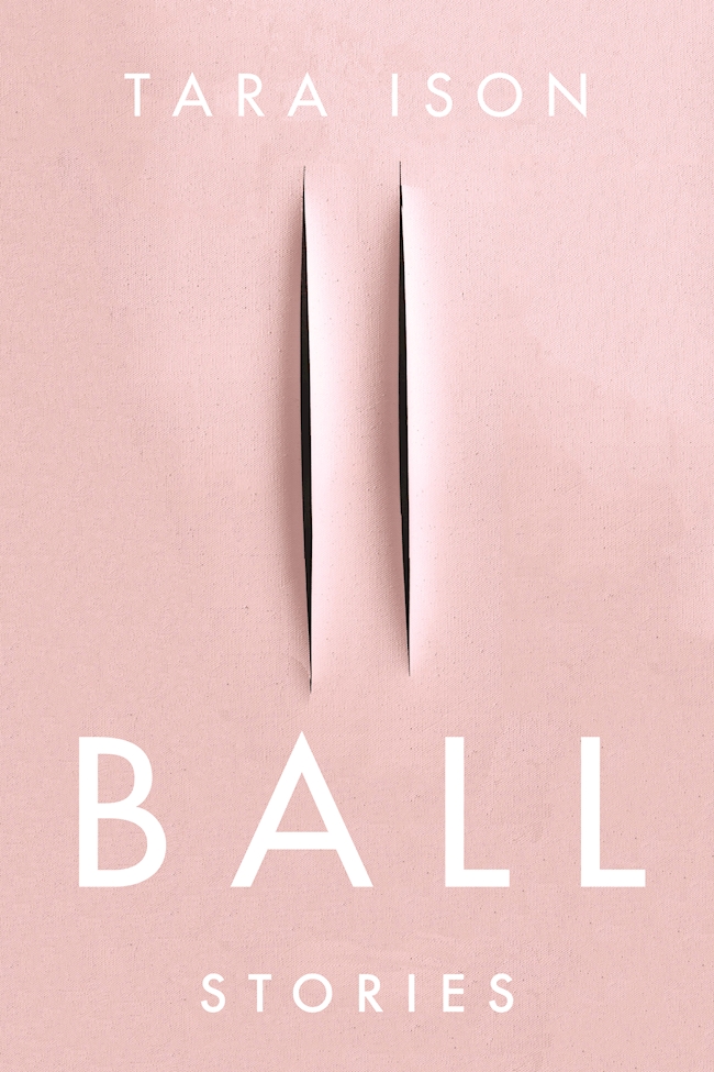
Also, this cover isn’t the first to riff, consciously or otherwise, on the cut canvases of Italian artist Lucio Fontana. The cover of Ball by Tara Ison, designed by Kelly Winton, comes to mind. I’m sure there are other examples (David Gee’s unpublished cover for Lolita. Are the more?).
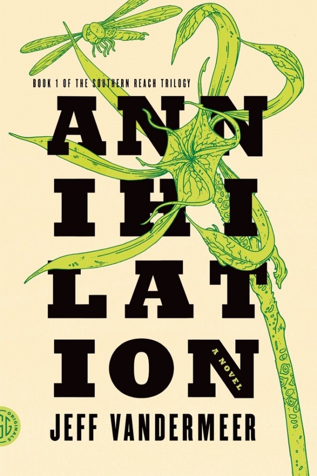
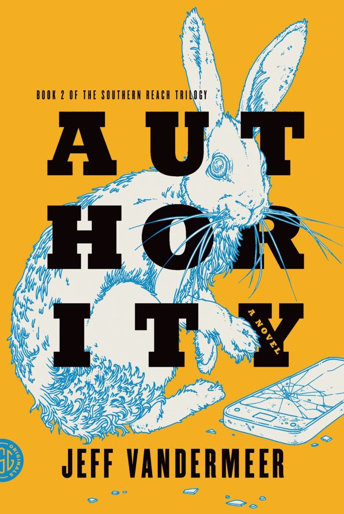
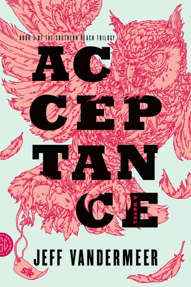
This reminded me of Eric’s illustrations for the covers of Jeff Vandermeer’s Southern Reach trilogy designed by Charlotte Strick.
Annihilation by Jeff VanderMeer (US); design by Charlotte Strick; Illustration by Eric Nyquist (FSG / 2014)Acceptance by Jeff VanderMeer (US); design by Charlotte Strick; Illustration by Eric Nyquist (FSG / 2014)
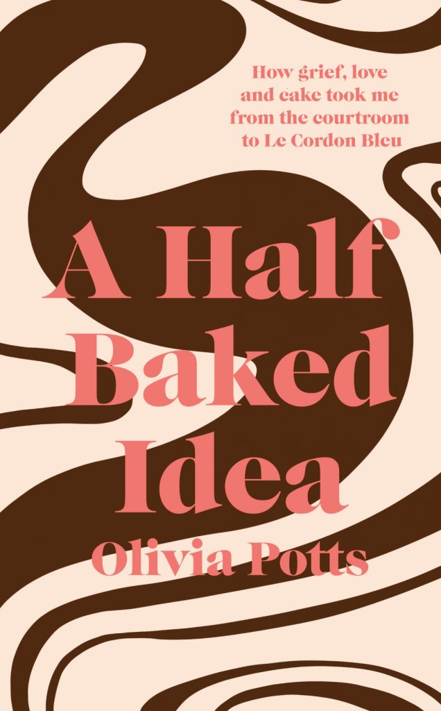
This cover immediately reminded me of Helen Crawford-White’s cover A Half-Baked Ideaby Olivia Potts published last year…
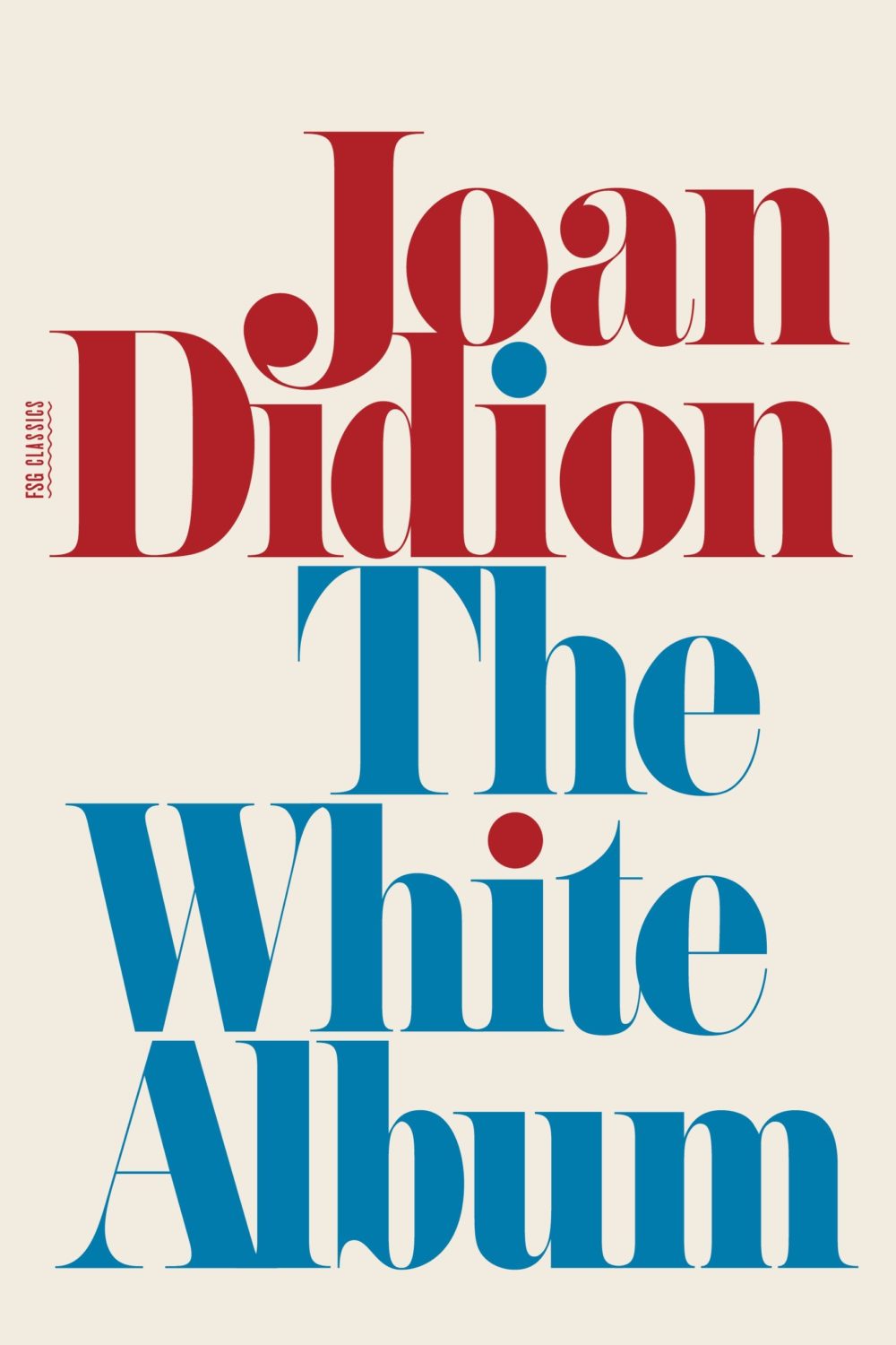
And then I thought maybe it was a nod to the cover of The White Album by Joan Didion, published in 1979 (the reissue below uses the original cover), and which Fonts in Use informs me uses the typeface Pistilli Roman. But maybe I am over thinking it…?
I was also reminded of these two recent covers, so maybe it is just a thing…?
I believe this is only available as an ebook, which seems a bit of shame. It would be nice to see in print. The cover does remind me of something else though. I can’t think what exactly. The best I could come up with was Tyler Comrie‘s cover for The Unwanted by Michael Dobbs. But I feel like there is cover that does something similar with a painting as a background? Possibly I’m just imagining it.
Oh and for those of you who are interested, the design team at Penguin Random House Canada have started posting their work to Instagram as one_last_tweak.
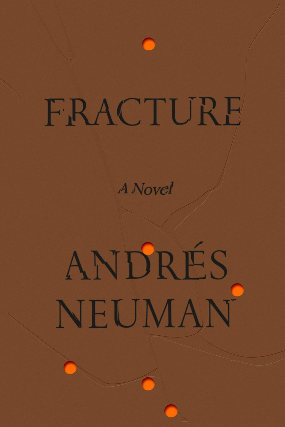
Fracture by André Neuman; design by June Park (Farrar Straus & Giroux / May 2020)
2019 has felt interminable. It has also felt like there are never enough hours in the day to keep up. You can’t talk to me about TV shows or movies. I haven’t seen any.
When it comes to books, I’m fortunate enough to work in the industry. But what hope do casual readers have of finding the good stuff when the same few titles dominate the conversation and there is so much else competing for their attention?
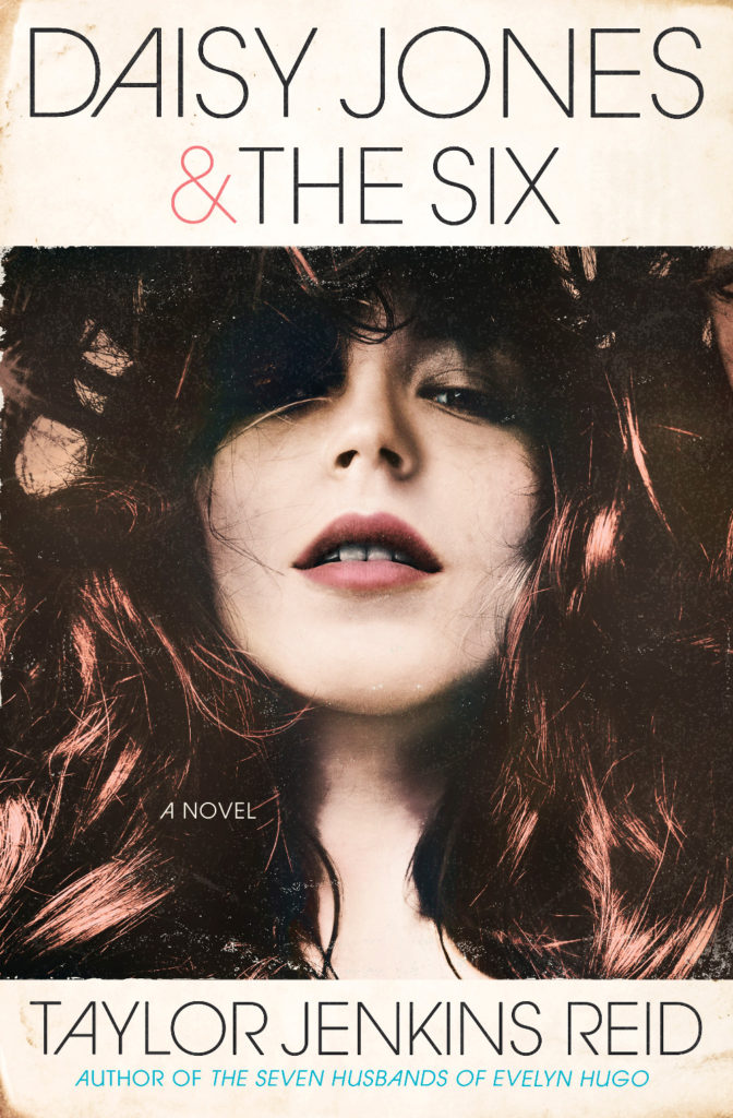
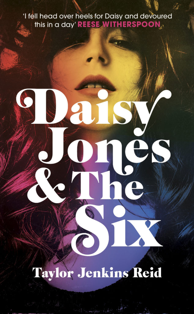
Daisy Jones and The Six by Taylor Jenkins Reid; design by Caroline Teagle Johnson (Ballantine / March 2019) Daisy Jones and The Six by Taylor Jenkins Reid; design by Lauren Wakefield (Hutchinson / March 2019)
Daisy Jones and the Six had a glamorous, louche 1970s look. The US and UK editions, designed by Caroline Teagle Johnson and Lauren Wakefield respectively, took slightly different directions with the type, but the photograph (a stock image apparently) felt ideally suited to social media.
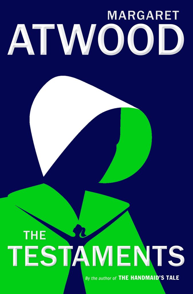
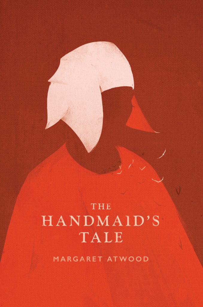
The Testaments by Margaret Atwood; design by Noma Bar (Chatto & Windus / September 2019)The Handmaid’s Tale by Margaret Atwood; art direction by Christopher Moisan; illustration by Patrik Svensson (Houghton Mifflin Harcourt / April 2017)
The Testaments was everywhere and, like the recent Vintage Classics reissue of The Handmaid’s Tale, the cover illustration was unmistakably by Noma Bar. We live in an age where every cult movie and TV show gets a ‘minimalist’ poster now, and I found that The Testaments looked too familiar for me to find it engaging. It didn’t help that the cover of the 2017 US reissue of the The Handmaid’s Tale by Swedish illustrator by Patrik Svenson had already featured a similar 3/4s silhouette. Nevertheless, it was perhaps a bolder cover choice than I’m giving it credit for. If nothing else, it showed that bright green on book covers — once cursed and reviled — is suddenly all the rage!
In terms of trends, 2019 felt more like a continuation of previous years rather than a break with the past. There was a kind of conservatism to a lot of the covers I saw. My sense was that highly polished designs that looked comfortingly familiar were being approved over riskier ones that stood out from the crowd. The most interesting covers often came from small publishers, especially New Directions who seem to be giving a bit more creative license to the designers they work with (some of whom have 9-5s at much bigger publishers!).
Big centred blocks of utilitarian white type over elaborate backgrounds continued to be a mainstay. It’s the book cover as poster, and it works at any size, so I don’t think it’s going away any time soon.
Handwriting and hand-lettering remained popular too, although my sense is that enthusiasm is starting to wane as publishers are opting for greater legibility and designers are turning back to vintage type styles to give a sense of authenticity and craft. (I’m willing to admit the evidence might not back me up on this, however!)
Fun, swishy 1970s-inspired serifs like Benguiat Caslon revival Cabernet are back. People keep trying to make ITC Avant Garde — another iconic 1970s typeface — happen again too. I don’t think it works for the most part, but I can see why designers think it’s cool in a coked-up New York way. Warren Chappell’s earnest calligraphic sans serif Lydian, originally released in 1938, continued its unlikely rise as a go-to literary typeface. It even got an explainer at Vox.
Black and white portrait photography has been the staple of biographies and classics for years, so it was interesting to see closely cropped black and white photographs used on the covers of a couple of new literary novels this year. This isn’t entirely new obviously. Black and white photography has long been used to signify that something is “art” (as opposed to, say, “pornography”). But I think the latest iteration of trend was started by Cardon Webb‘s 2015 cover for A Little Life by Hanya Yanagihara which used a black and white photograph by the late Peter Hujar.
Coincidentally the cover of the US edition of Garth Greenwell’s new novel Cleanness, publishing early 2020, was designed by Thomas Colligan and uses contemporary black and white photograph by Jack Davison. (The UK edition, designed by Ami Smithson fits this trend a little less neatly, but features black and white photograph by Mark McKnight)
Something that I didn’t anticipate was the use of contemporary landscape and figure painting on the covers of some the big literary releases of the year. Like black and white photography, it felt almost pre-digital — a grasp at traditional values of craft. I don’t know if I would go as far as to say it is a rejection of post-modernism. But maybe it is? I don’t know. Discuss amongst yourselves.
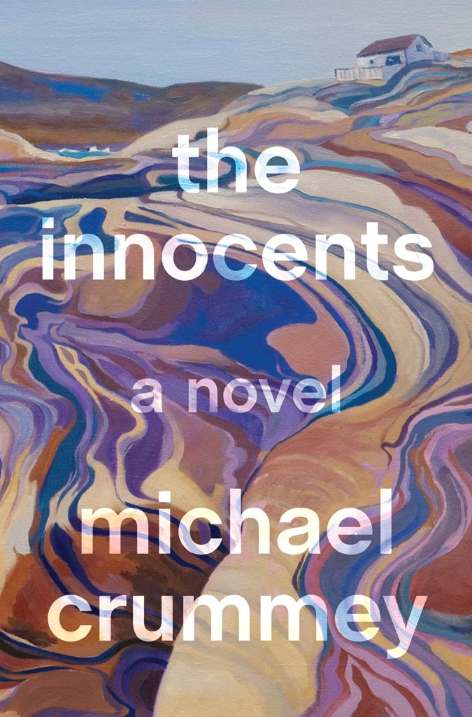
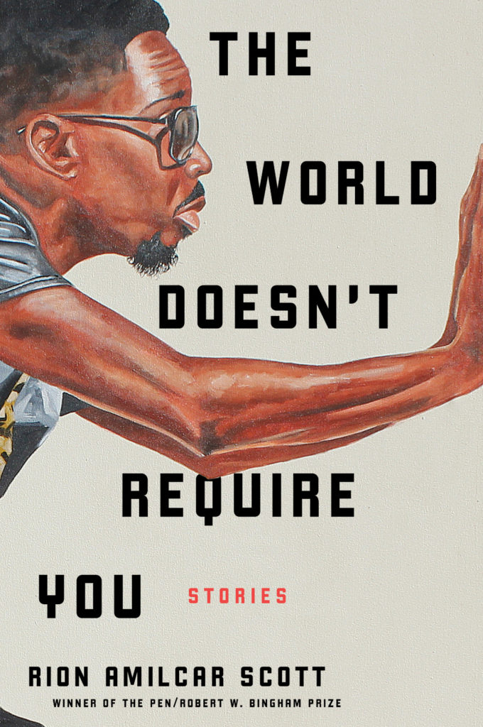
The Innocents by Michael Crummey; design by Emily Mahon; art by Diana Dabinett (Doubleday / August 2019)The World Doesn’t Require You by Rion Amilcar Scott; design by Laywan Kwan; art by Fahamu Pecou (Liveright / August 2019)Inland by Téa Obrecht; design by Jaya Miceli; art by Tamara Ruiz (Random House / August 2019)
Thank you to all the designers and art directors who’ve been in touch and helped me identify covers for my posts. I’m sorry if I haven’t replied to your message. It’s been a year.
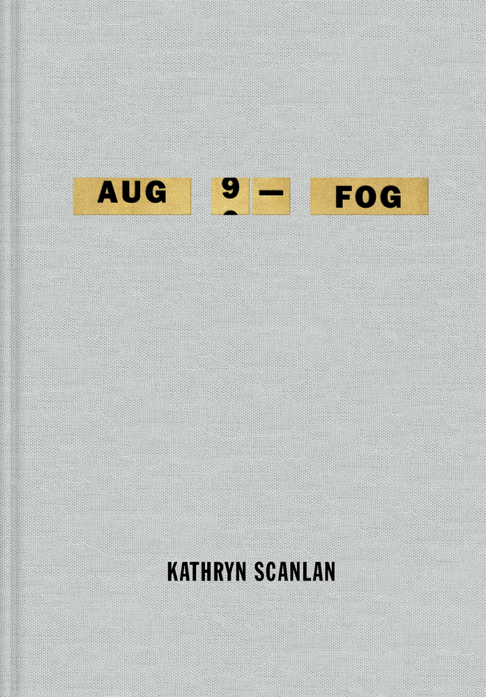
Aug 9 — Fog by Kathryn Scanlan; design by Na Kim (Farrar Straus & Giroux MCD / June 2019)
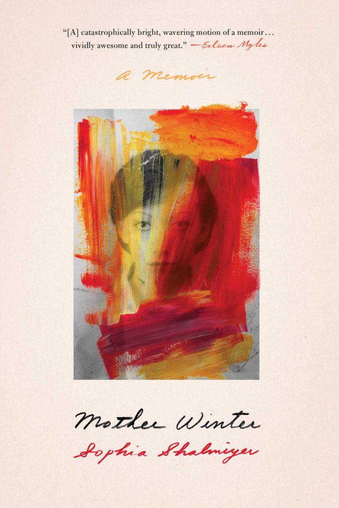
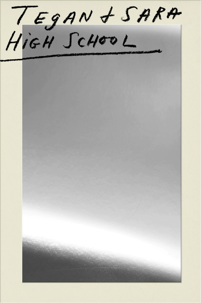
Also designed by Na Kim:
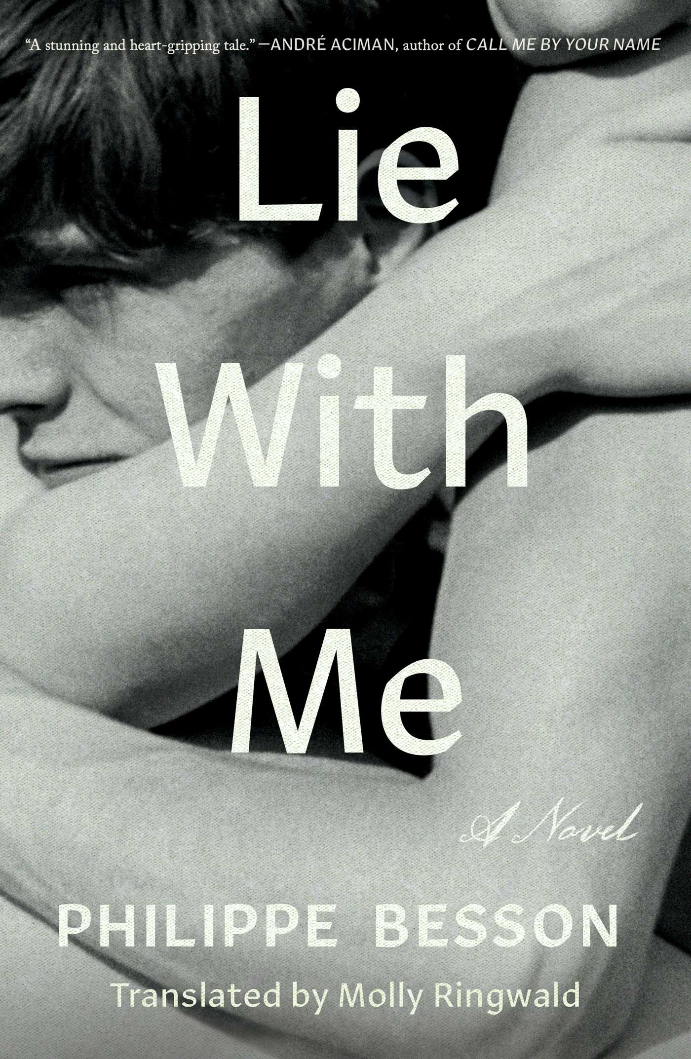
Lie With Me by Philippe Besson; design by Na Kim (Scribner / April 2019)Mother Winter by Sophia Shalmiyev; design by Na Kim (Simon & Schuster / February 2019) High School by Tegan & Sara; design by Na Kim (MCD / September 2019)
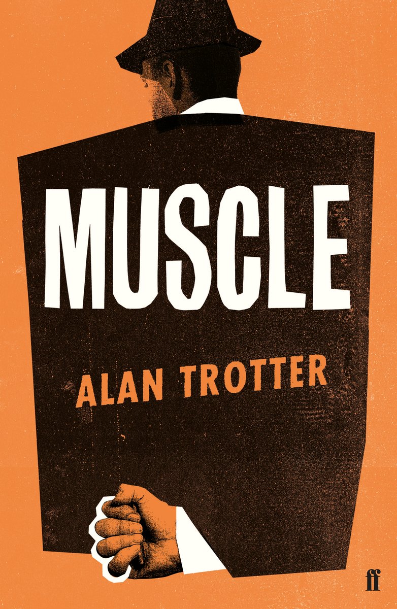
Muscle by Alan Trotter; design by Gray318 (Faber & Faber / February 2019)
Also designed by Gray318:
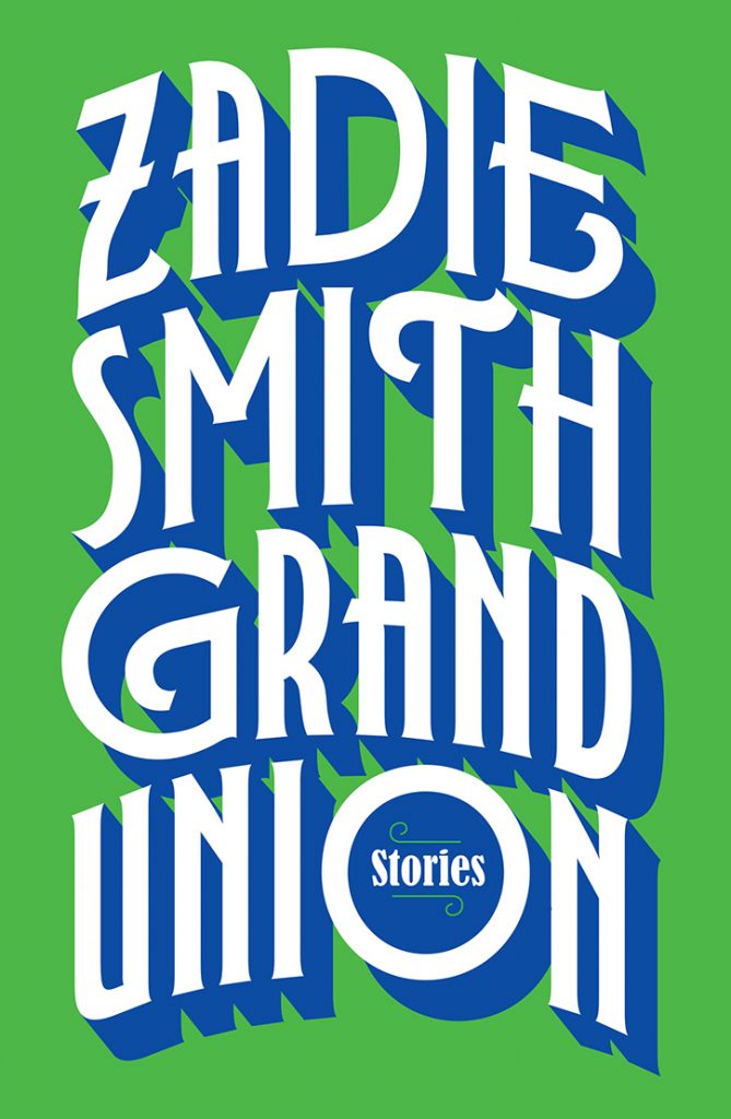
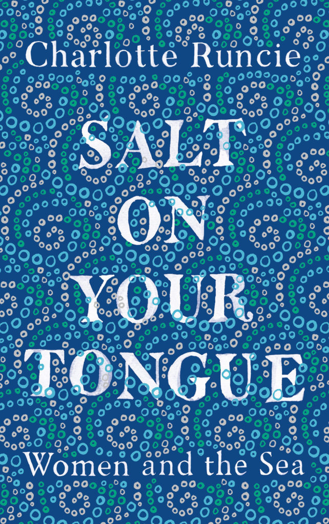
Quichotte by Salman Rushdie; design by Gray318 (Jonathan Cape / August 2019) Grand Union by Zadie Smith; design by Gray318 (Hamish Hamilton / October 2019)Salt On Your Tongue by Charlotte Runcie; design by Gray318 (Canongate / January 2019)
What We Really Do All Day by Jonathan Gershuny and Oriel Sullivan; design Matthew Young (Pelican / September 2019)Artificial Intelligence by Melanie Mithcell; design by Matthew Young (Pelican / October 2019)
One Day by Gene Weingarten; design by David Litman (Blue Rider / October 2019)
Oliver Munday wrote about designing the cover for New Directions at Literary Hub earlier this year.
He also designed a lot my favourite covers this year…
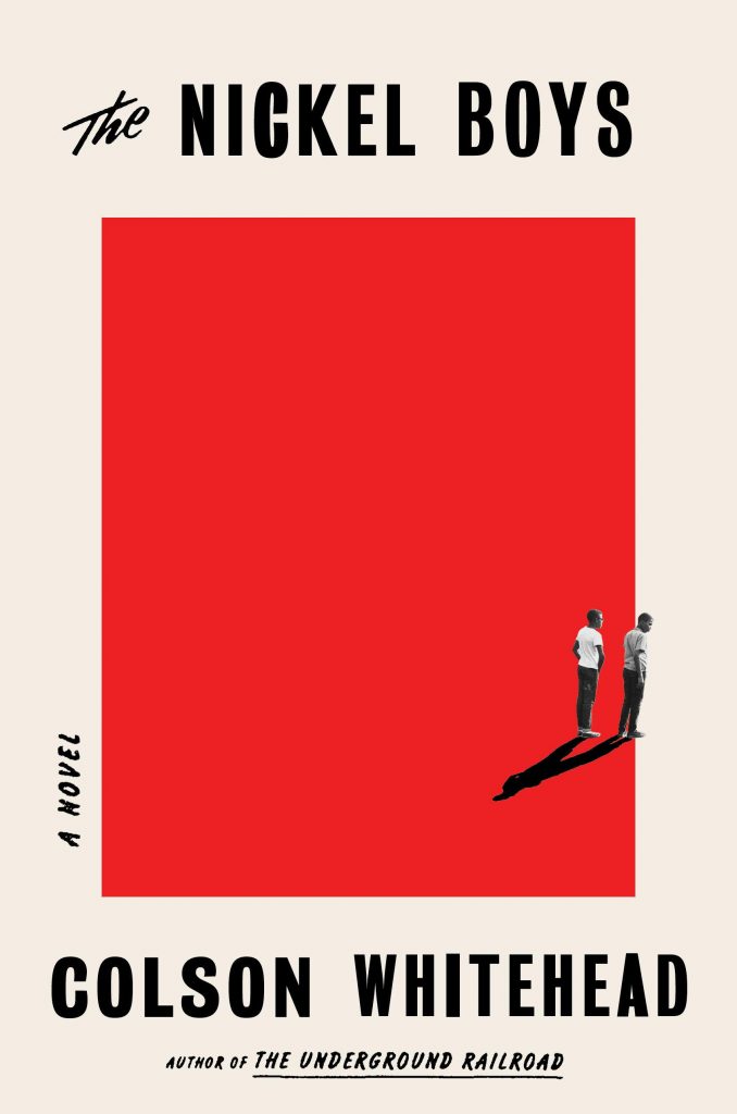
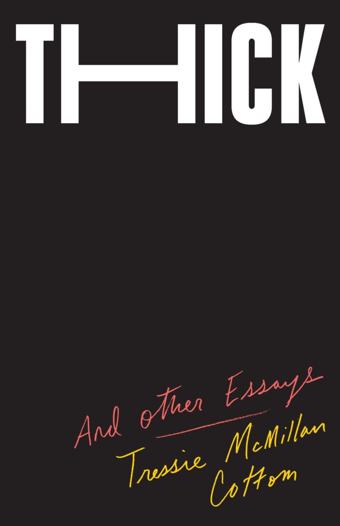
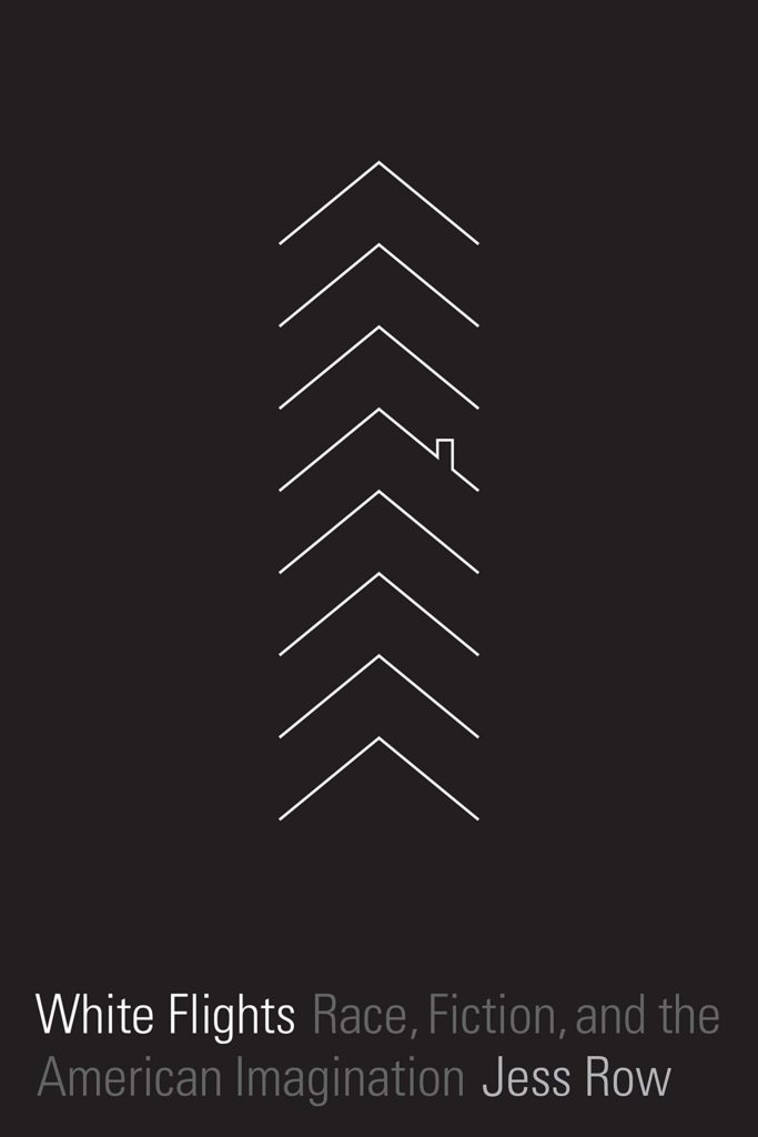
Riots I Have Known by Ryan Chapman; design by Oliver Munday (Simon & Schuster / May 2019)The Nickel Boys by Colson Whitehead; design by Oliver Munday (Doubleday / July 2019)Thick by Tressie McMillan Cotton; design by Oliver Munday (The New Press / January 2019)White Flights by Jess Row; design by Oliver Munday (Graywolf / August 2019) Harbart by Nabarun Bhattacharya; design by Oliver Munday (New Directions / June 2019)
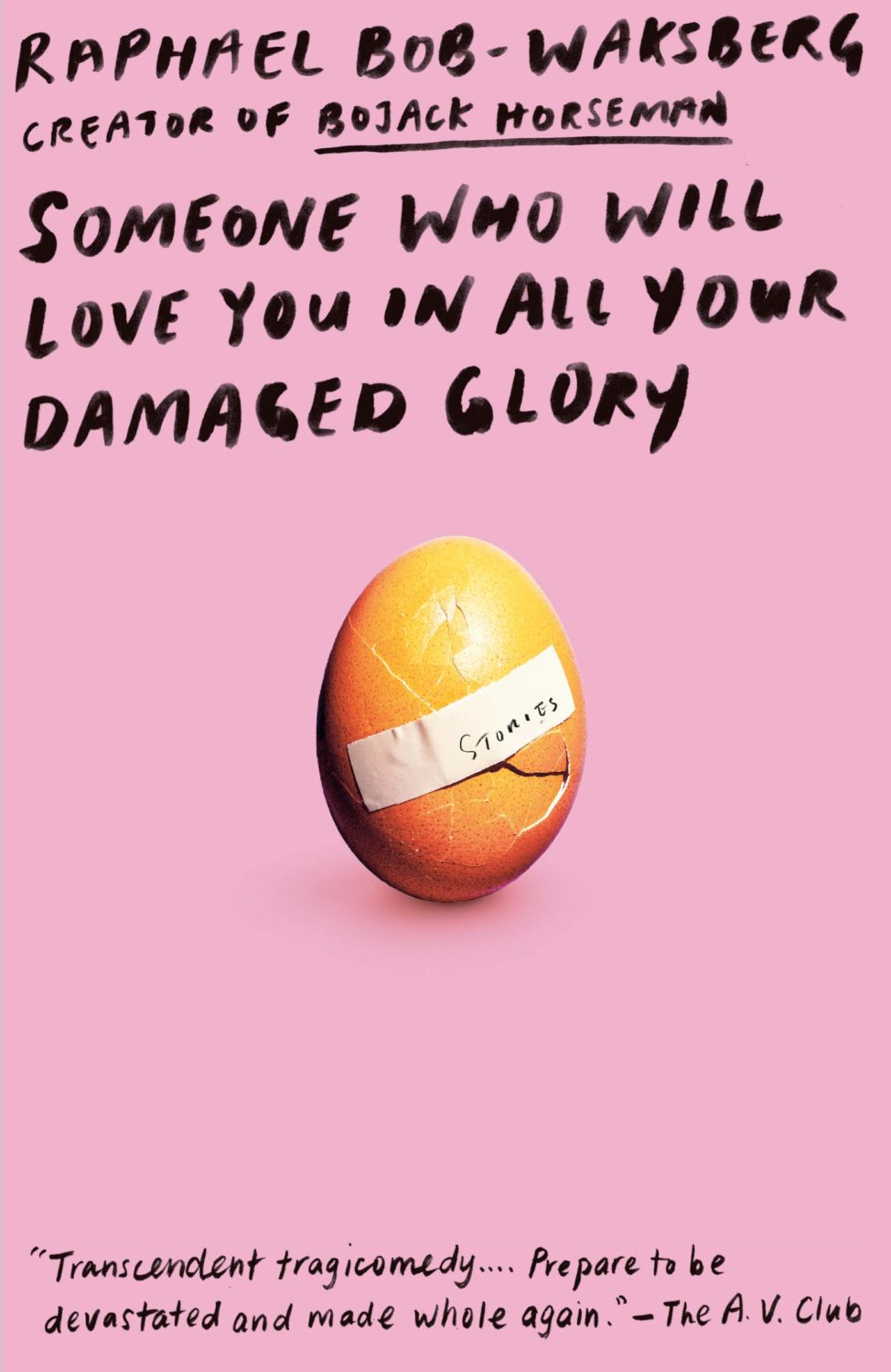
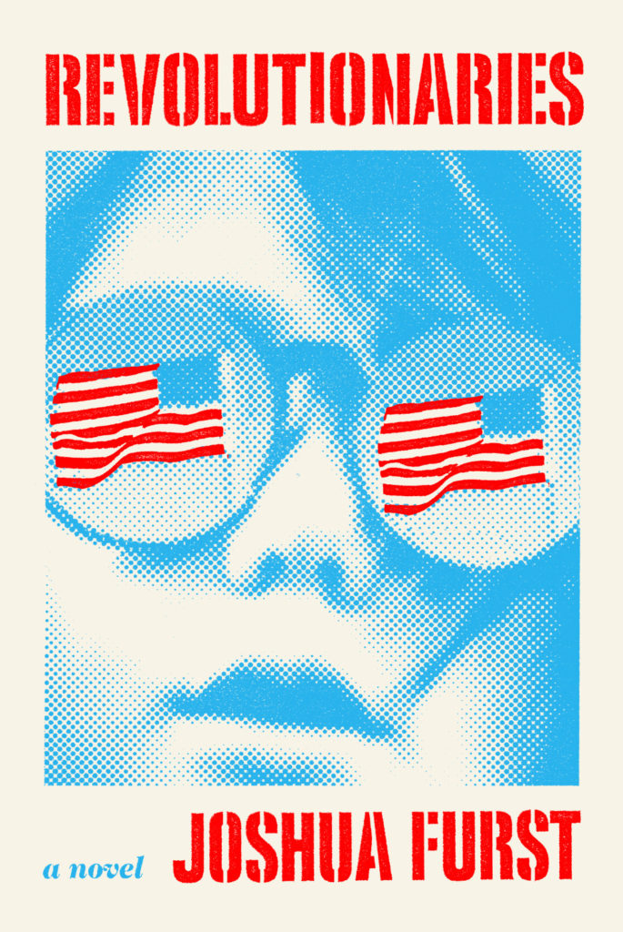
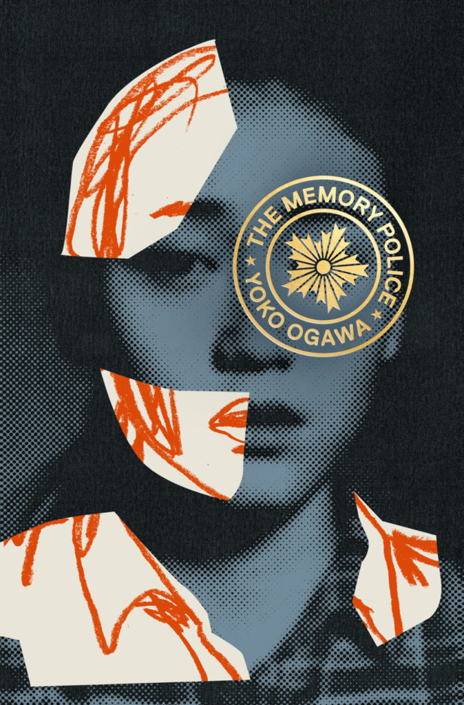
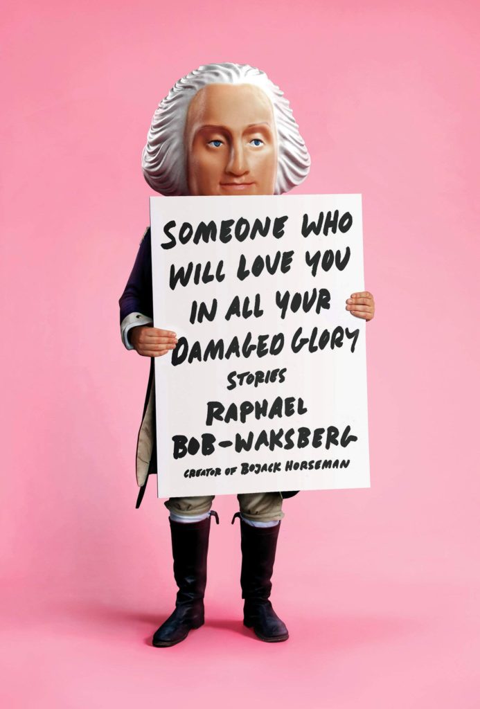
The Revolutionaries by Joshua Furst; design by Tyler Comrie (Knopf / April 2019)The Memory Police by Yoko Ogawa; design by Tyler Comrie (Pantheon / August 2019)Someone Who Will Love You in All Your Damaged Glory by Raphael Bob-Waksberg; design by Tyler Comrie; illustration Justin Metz (Knopf / June)
The Volunteer by Salvatore Scibona; design by Rachel Willey (Penguin / March 2019)
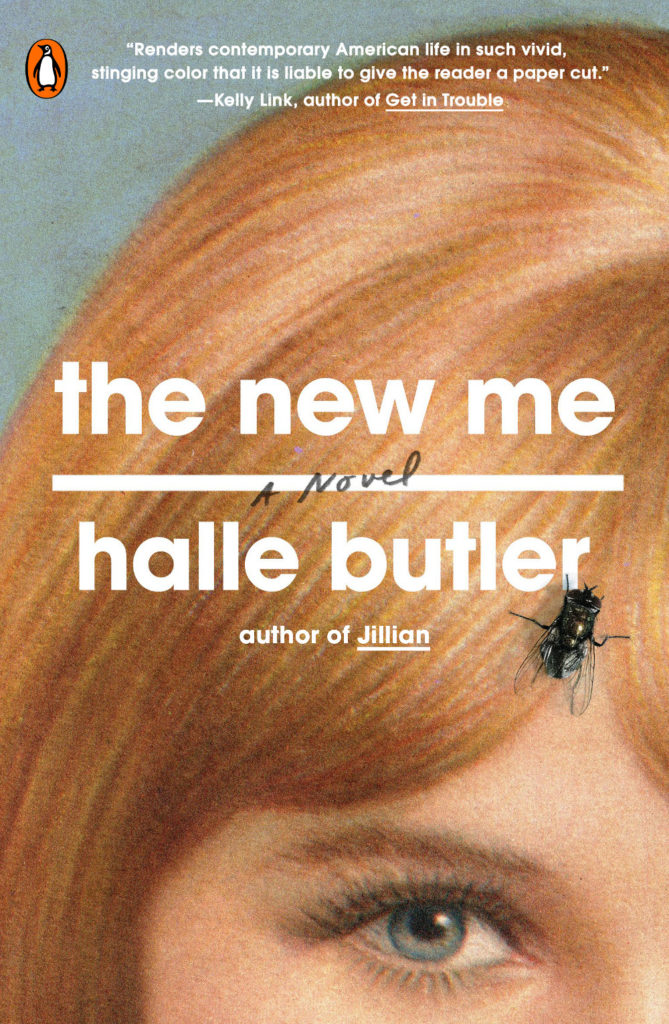
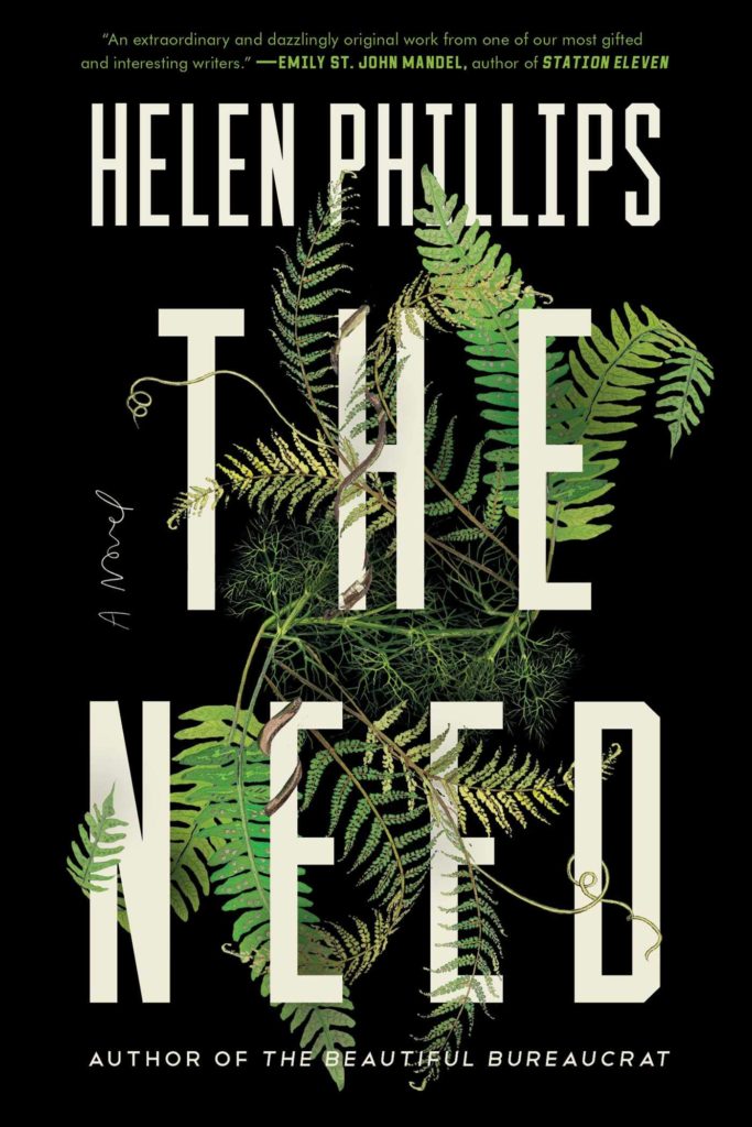
Also designed by Rachel Willey:
The New Me by Halle Butler; design by Rachel Willey (Penguin / March 2019) The Need by Helen Phillips; design Rachel Willey (Simon & Schuster / July 2019)
Apparently it is June already. I’m pretty sure it’s a terrible mistake.
Here are your book covers of note.
Aug 9 — Fog by Kathryn Scanlan; design by Na Kim (Farrar Straus & Giroux MCD / June 2019)
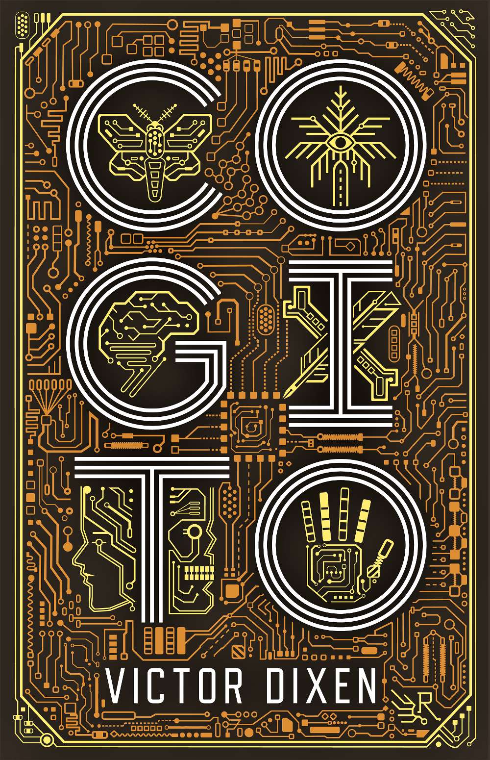
Cogito by Victor Dixen; design by Jim Tierney (Collection R / May 2019)
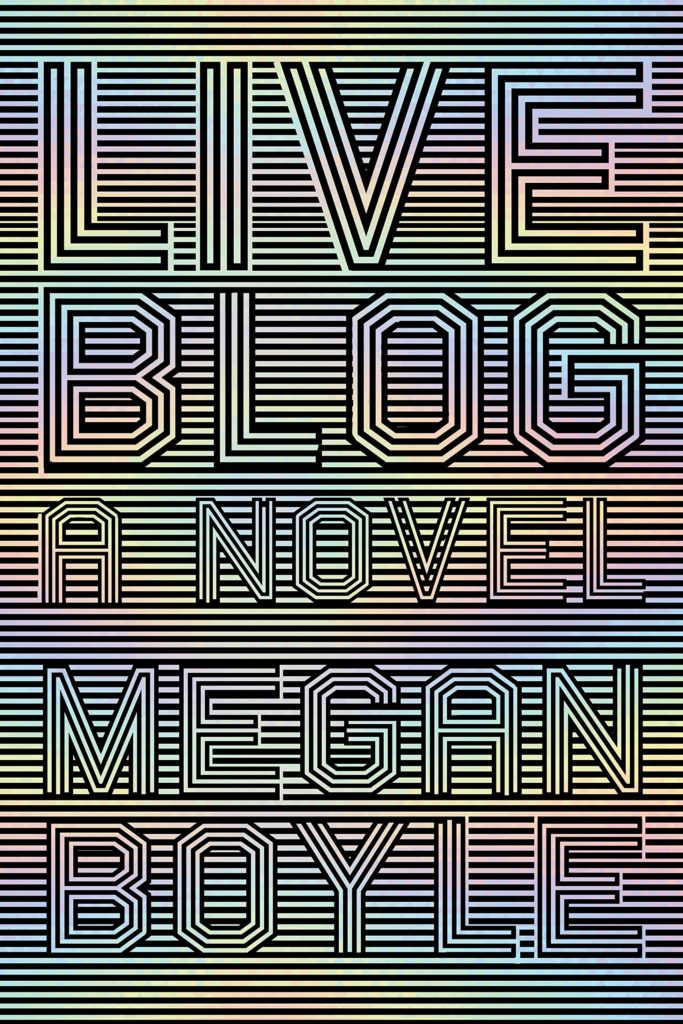
This reminded me of something. I’m not sure exactly what. The best I could up with was Nicole Caputo‘s stripey op-art cover for Liveblog by Megan Boyle, but that’s not it at all…
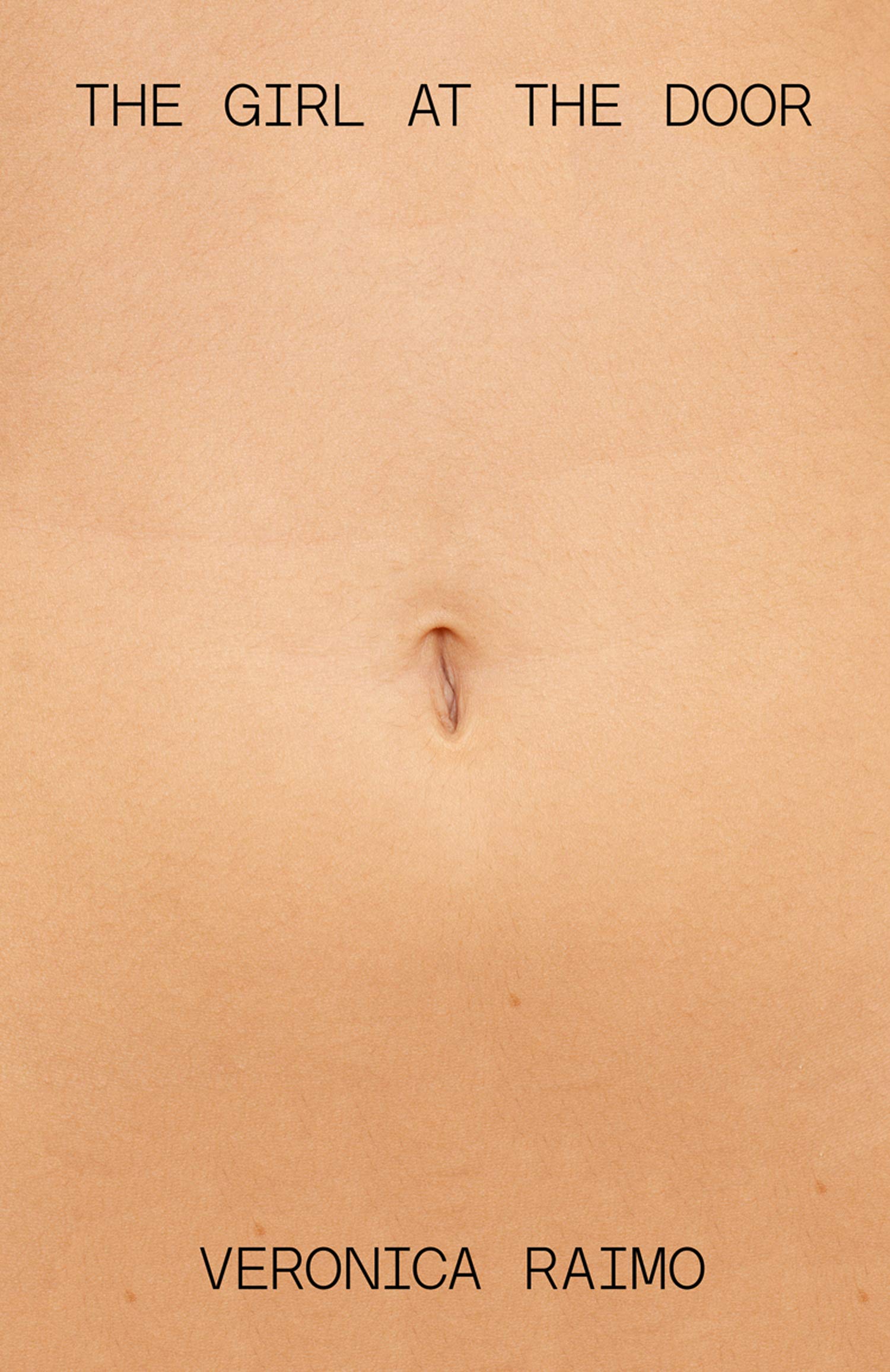
The Girl at the Door by Veronica Raimo; design by Julian Humphries (Fourth Estate / June 2019)
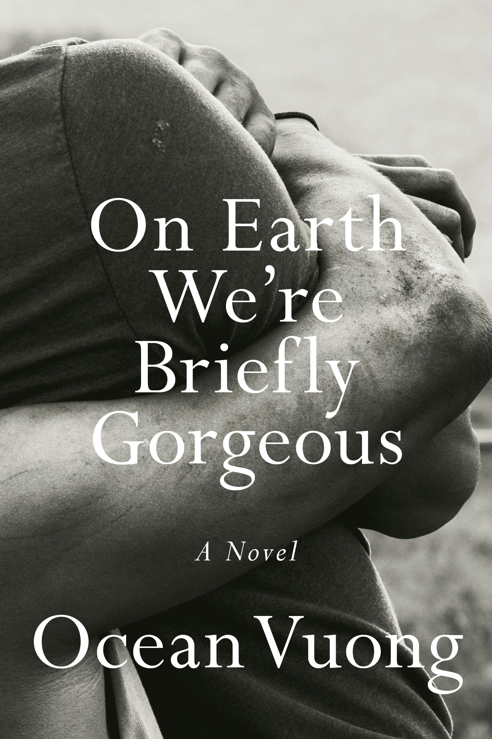
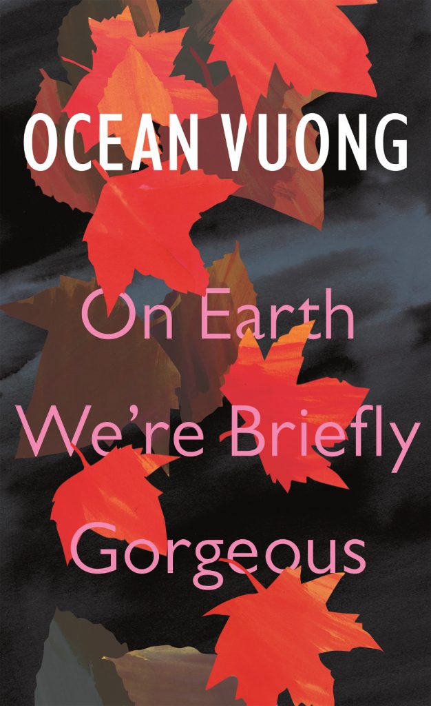
Are we seeing a trend for close cropped photographs of… arms? (Don’t get me wrong, these are both beautiful photographs / covers.)
Also of note in a compare-and-contrast sort of way, the cover of the UK edition of On Earth We’re Briefly Gorgeous published by Jonathan Cape was designed by Suzanne Dean:
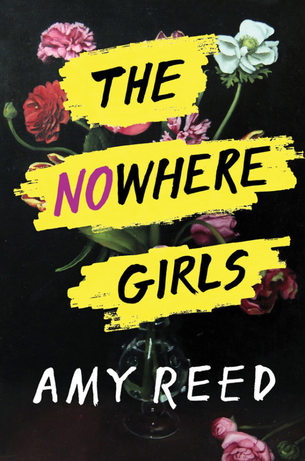
So here it is, Merry Xmas, everybody’s having fun, my YA (and middle-grade) covers round-up for 2017. This is far from my area of expertise (I mostly work on the adult trade side of things), but until someone else steps up to do a annual post on YA covers with design credits and publisher details you’re stuck with me. Sorry.
All the picks are, of course, mine, but thank you to all the designers who have helped me over the year with covers, suggestions, and credits, and special thanks to Erin Fitzsimmons at HarperCollins and Sarah Creech at Simon & Schuster who helped me with this post in particular. Happy holidays!
Neil’s embossed metallic silver cover for Selfie by Will Storr (Picador / June 2017) is also kind of great (and hilarious), but impossible to show well online:


