Skip to content

Tag: jessica hische

Book Covers of Note, April 2026

Hi. Hello. I hope you’re keeping safe and well. I’m getting this month’s post out at little earlier than usual (i.e. not the 11th hour), and on a Monday no less, because I’m going to be in NYC the rest of this week for work. Even though this is a little bit of a quick and dirty post, there are still lots of covers for you to peruse and admire. Apologies if I’ve missed anything obvious and/or spectacular. I will try to catch up next month.
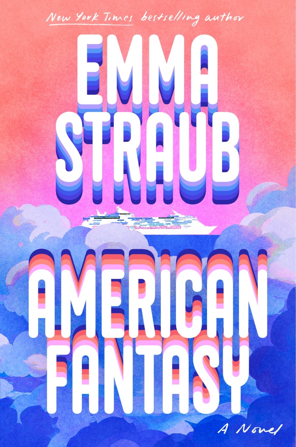
American Fantasy by Emma Straub; lettering by Jessica Hische; art by Vi-An Nguyen (Riverhead / April 2026)
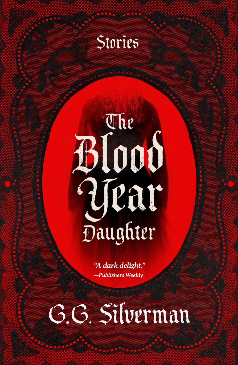
The Blood Year Daughter by G. G. Silverman; design by Luísa Dias (Creature Publishing / April 2026)
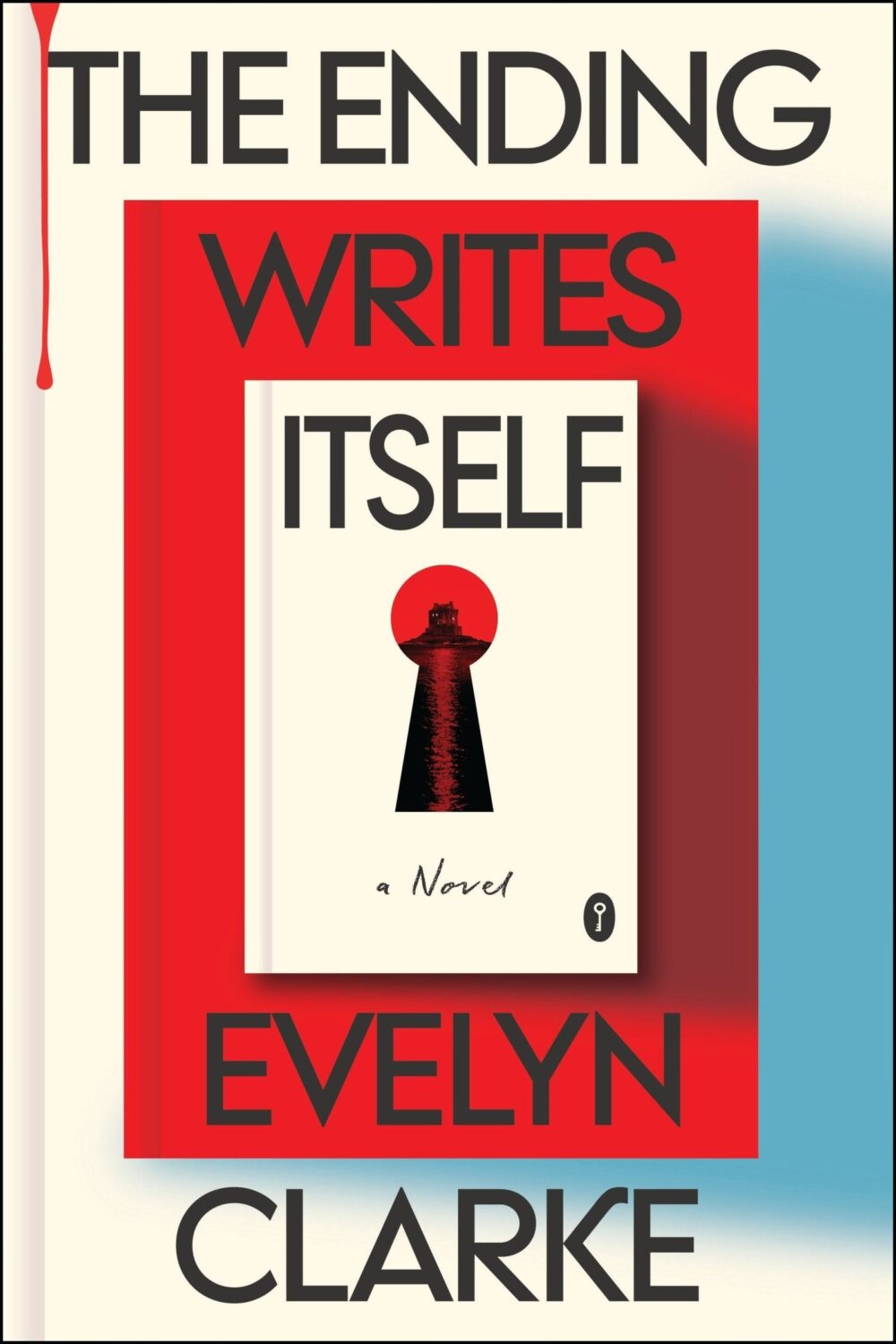
The Ending Writes Itself by Evelyn Clarke; design by Will Staehle (Harper / April 2026)

Book covers on book covers on book covers… (I posted a whole bunch of variations on this theme back in 2014. It’s probably due an update)
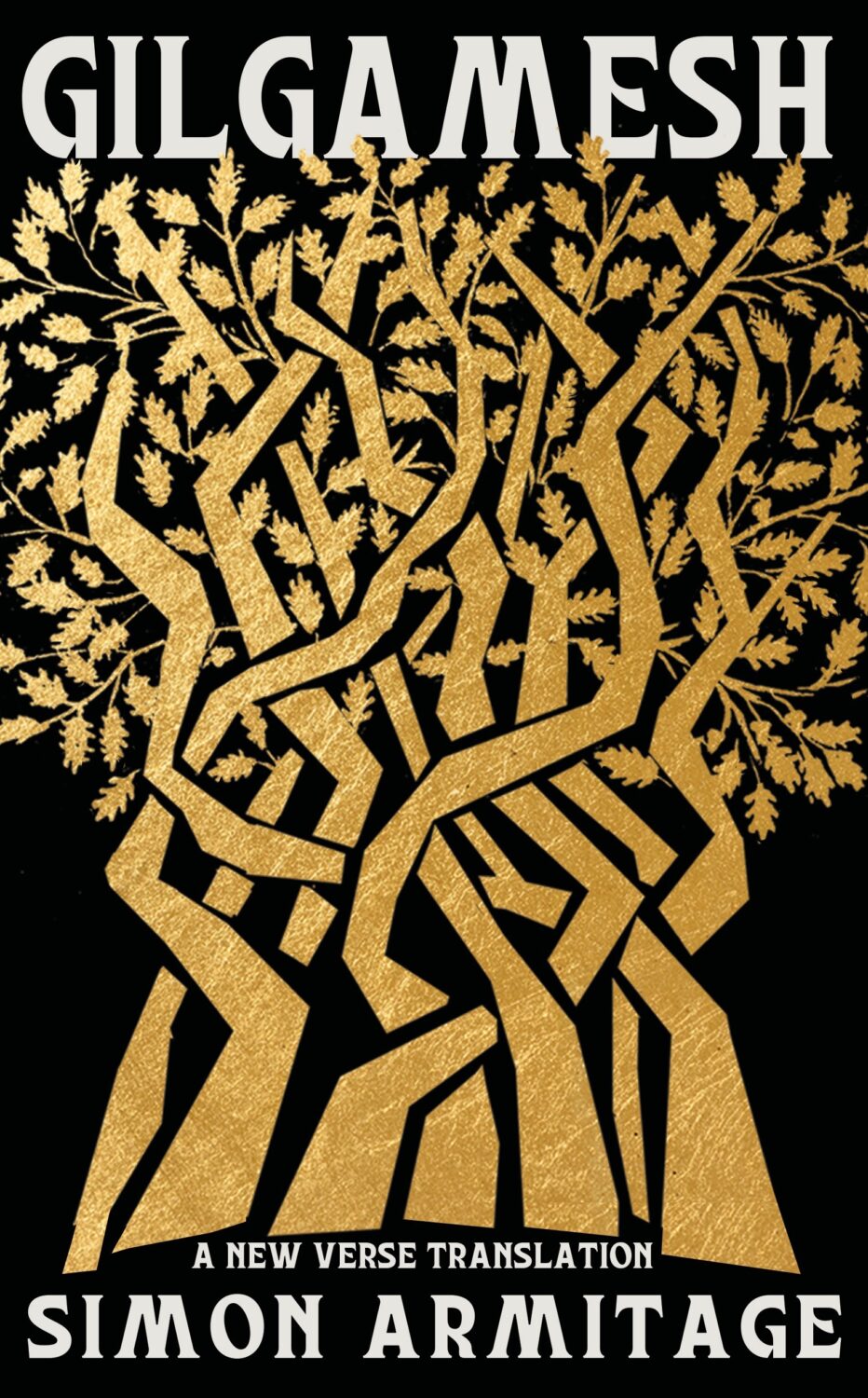
Gilgamesh translated by Simon Armitage; design by Jaya Miceli (Liveright / April 2026)

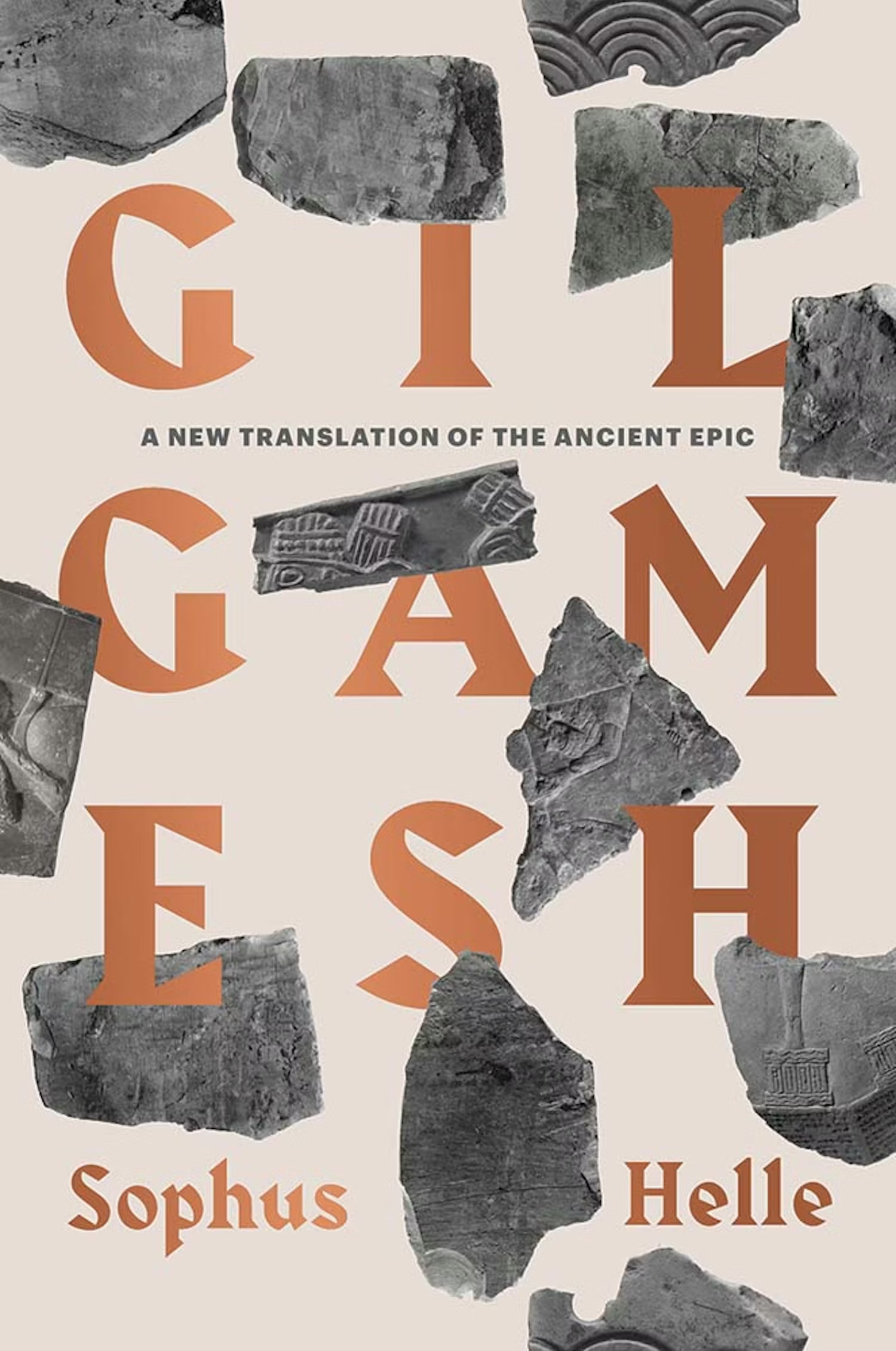
It’s interesting to compare this cover to the one for the Yale University press edition translated by Sophus Helle from a couple of years ago designed by Jenny Volvovski:
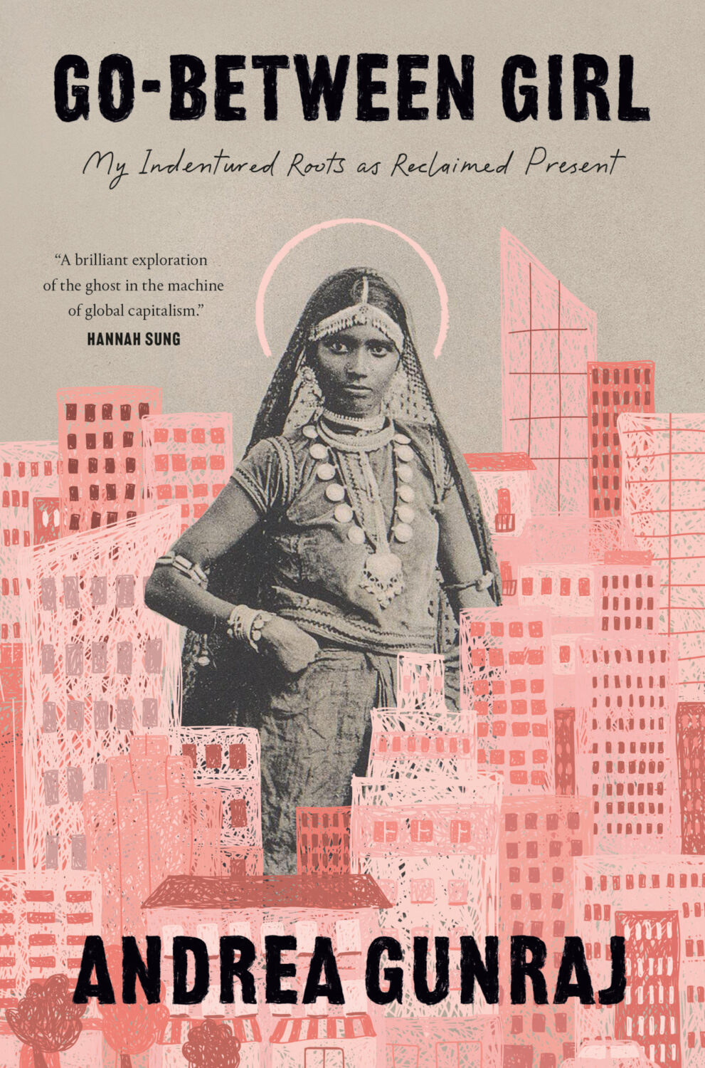
Go-Between Girl by Andrea Gunraj; design by Talia Abramson (McClelland & Stewart / April 2026)
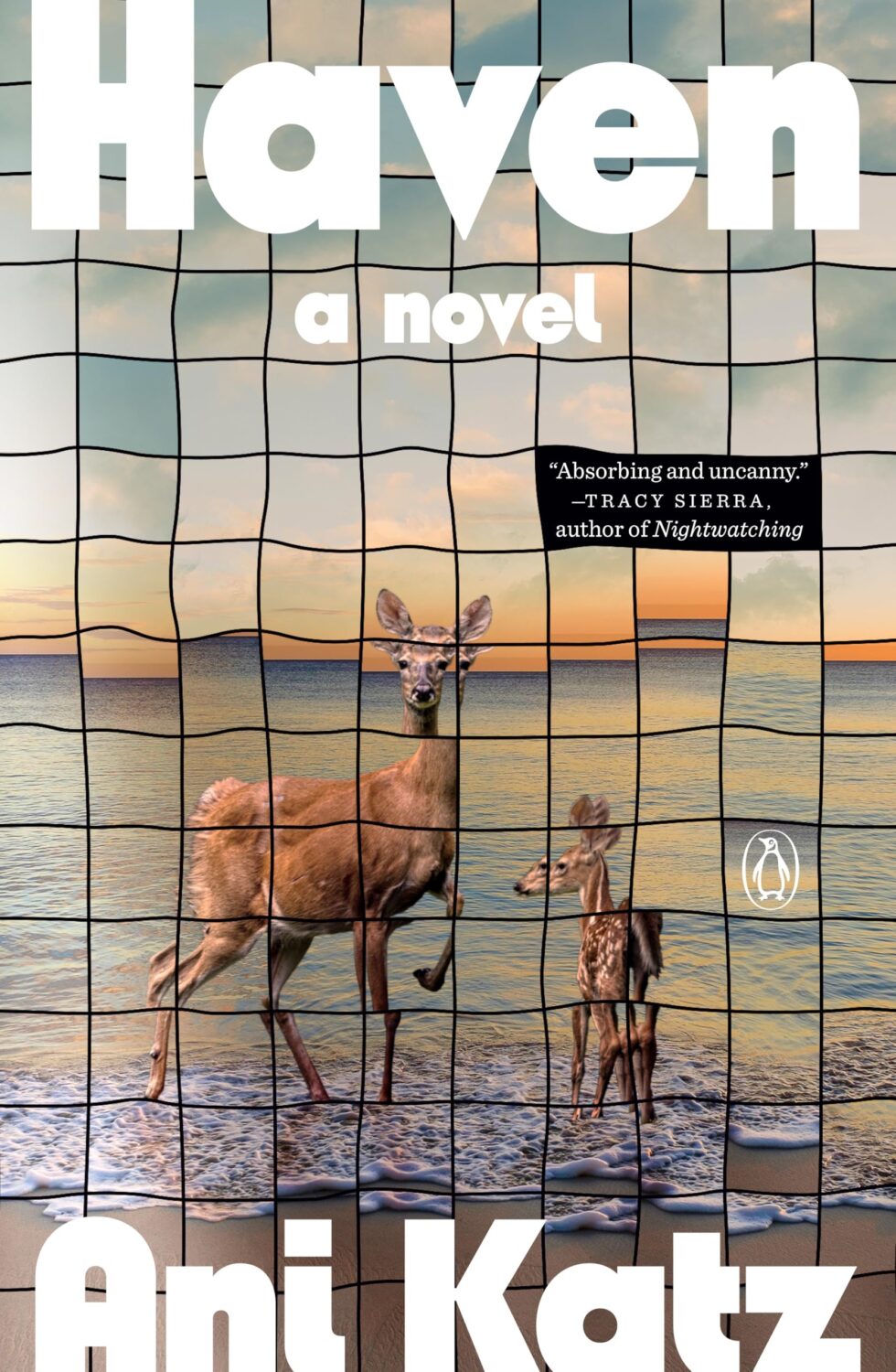
Haven by Ani Katz; design by Elizabeth Yaffe (Penguin Books / March 2026)

Hexes of the Deadwood Forest by Agnieszka Szpila, translated by Scotia Gilroy; design by Linda Huang (Pantheon / April 2026)
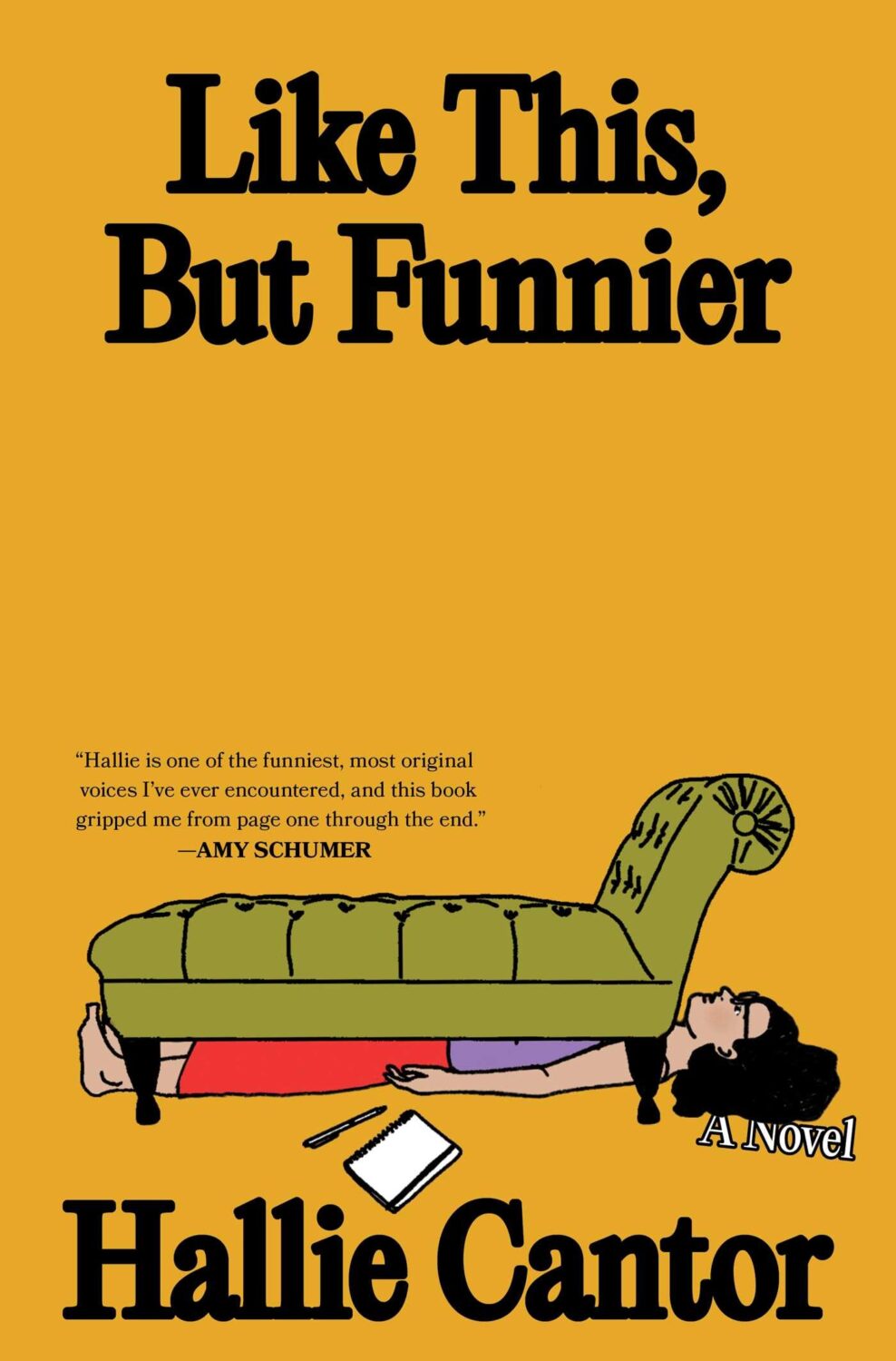
Like This, But Funnier by Hallie Cantor; design and illustration by Rachel Willey (Simon & Schuster / April 2026)

Nice to see a new book cover from Rachel who is busy doing art directing things at the New York Times Magazine these days I believe!

My Lover, the Rabbi by Wayne Koestenbaum; design by Jack Smyth (Granta / March 2026)

If anyone at Granta reads the blog, I would love to chat to someone about getting the design credits for your covers on a regular basis.

And the (very different) cover of the US edition of My Lover, the Rabbi published by FSG Originals last month was designed by Evan Gaffney.


No Ghosts by Max Lury; design by Tom Etherington (Peninsula Press / April 2026)

No Way Home by T. C. Boyle; design by Emily Mahon (Liveright / April 2026)

The Oak and the Larch by Sophie Pinkham; design by Georgie Proctor; art by Masabikh Akhunov (William Collins / January 2026)

A bit late to this one, but the art (which I would guess is a linocut?) is really, really nice.

Odessa by Gabrielle Sher; design by Keith Hayes; cover art by Ben Turner (Little Brown and Company / April 2026)
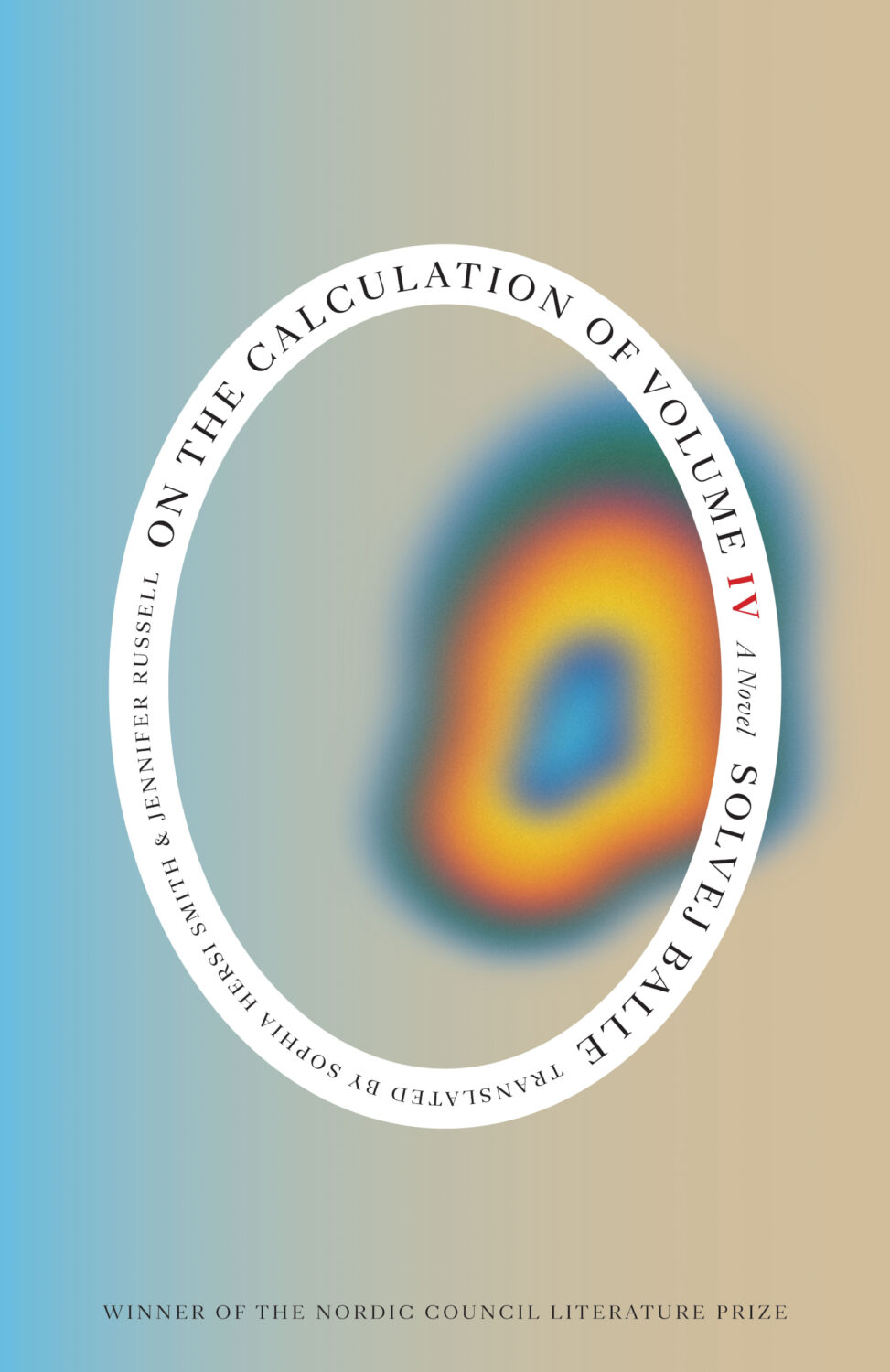
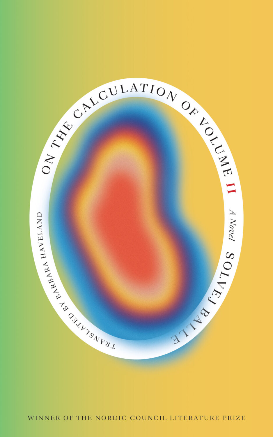
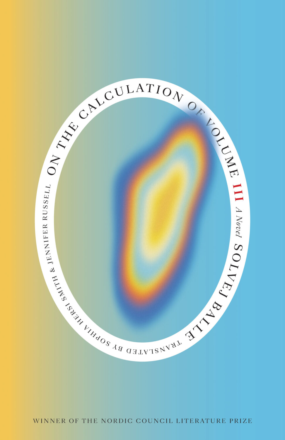
On the Calculation of Volume (Book IV) by Solvej Balle, translated by Sophia Hersi Smith and Jennifer Russell; design by Matt Dorfman (New Directions / April 2026)

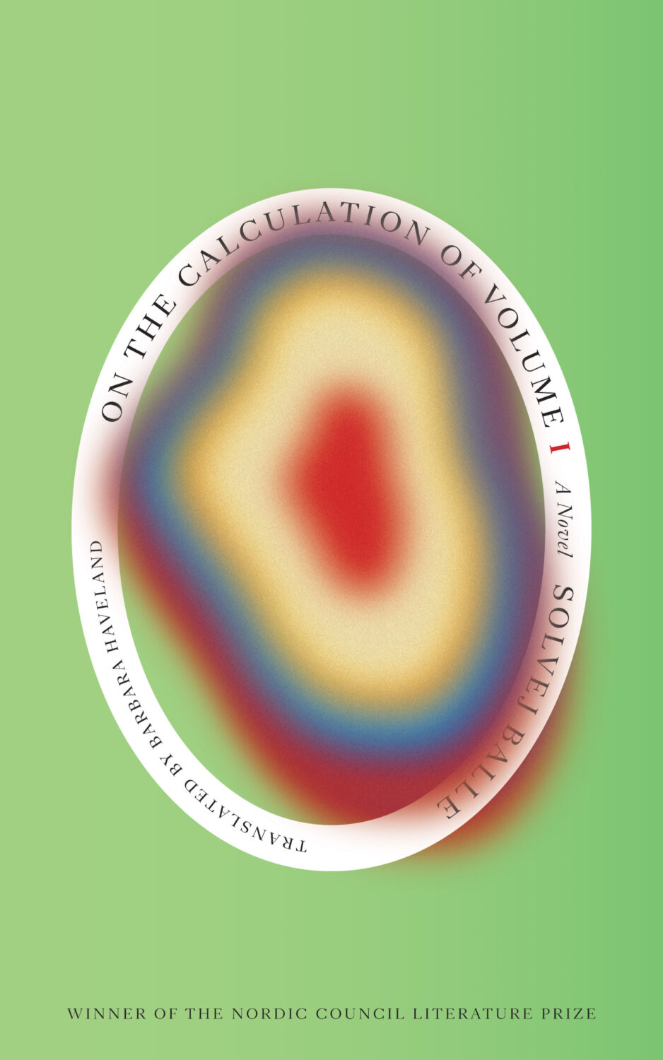
Here are the first four books side by side:
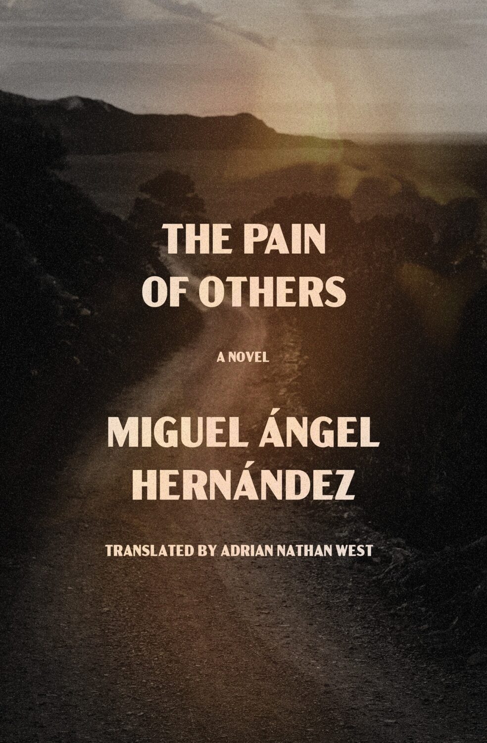
The Pain of Others by Miguel Ángel Hernández, translated by Adrian Nathan West; design by Jared Bartman (Other Press / April 2026)
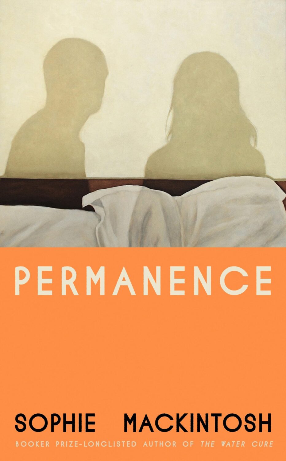
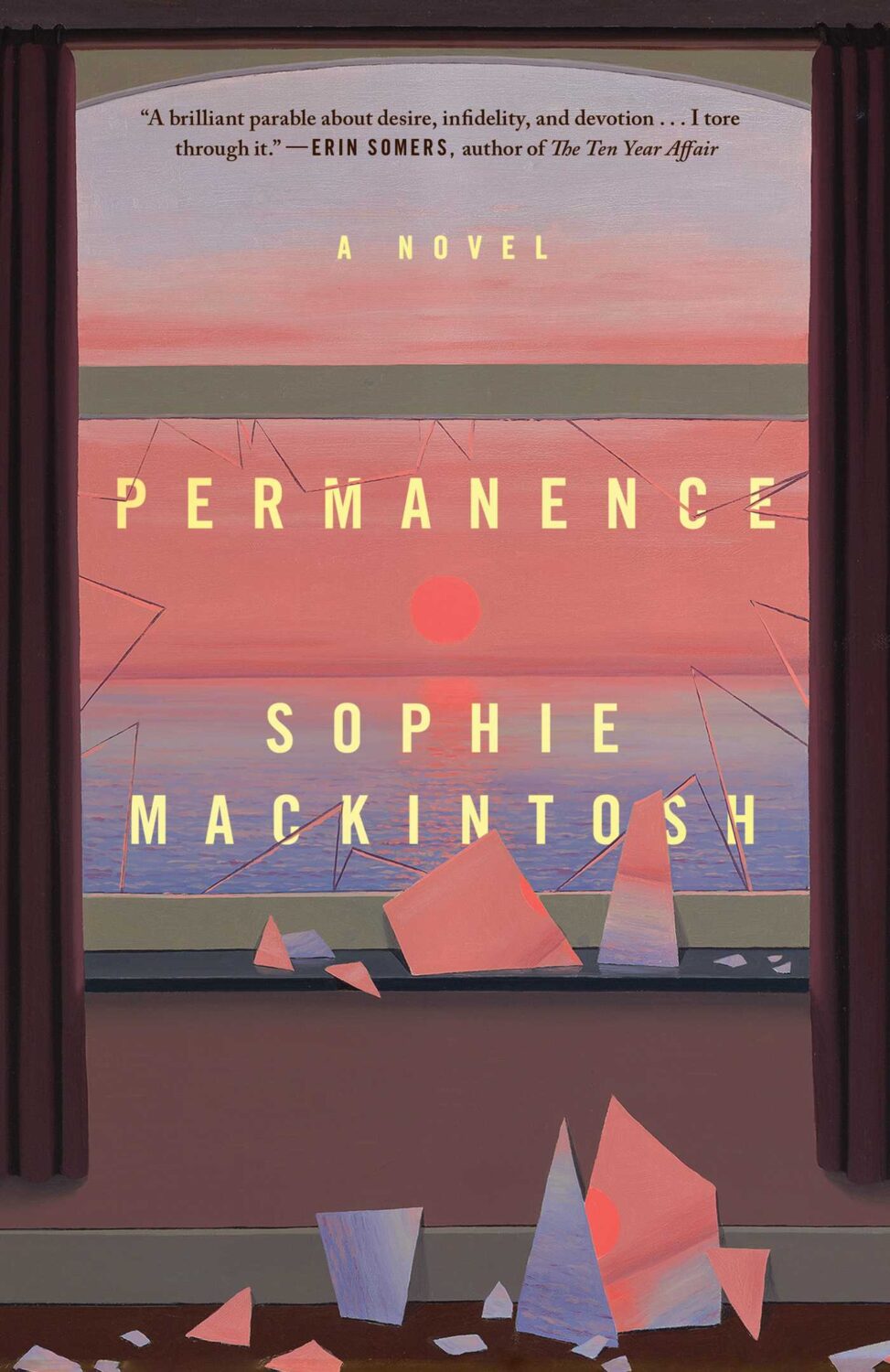
Permanence by Sophie Mackintosh; design Dan Jackson; art by Jess Allen (Hamish Hamilton / April 2026)

The cover of the US edition of Permanence, published by Avid Reader Press this month was designed by Grace Han.
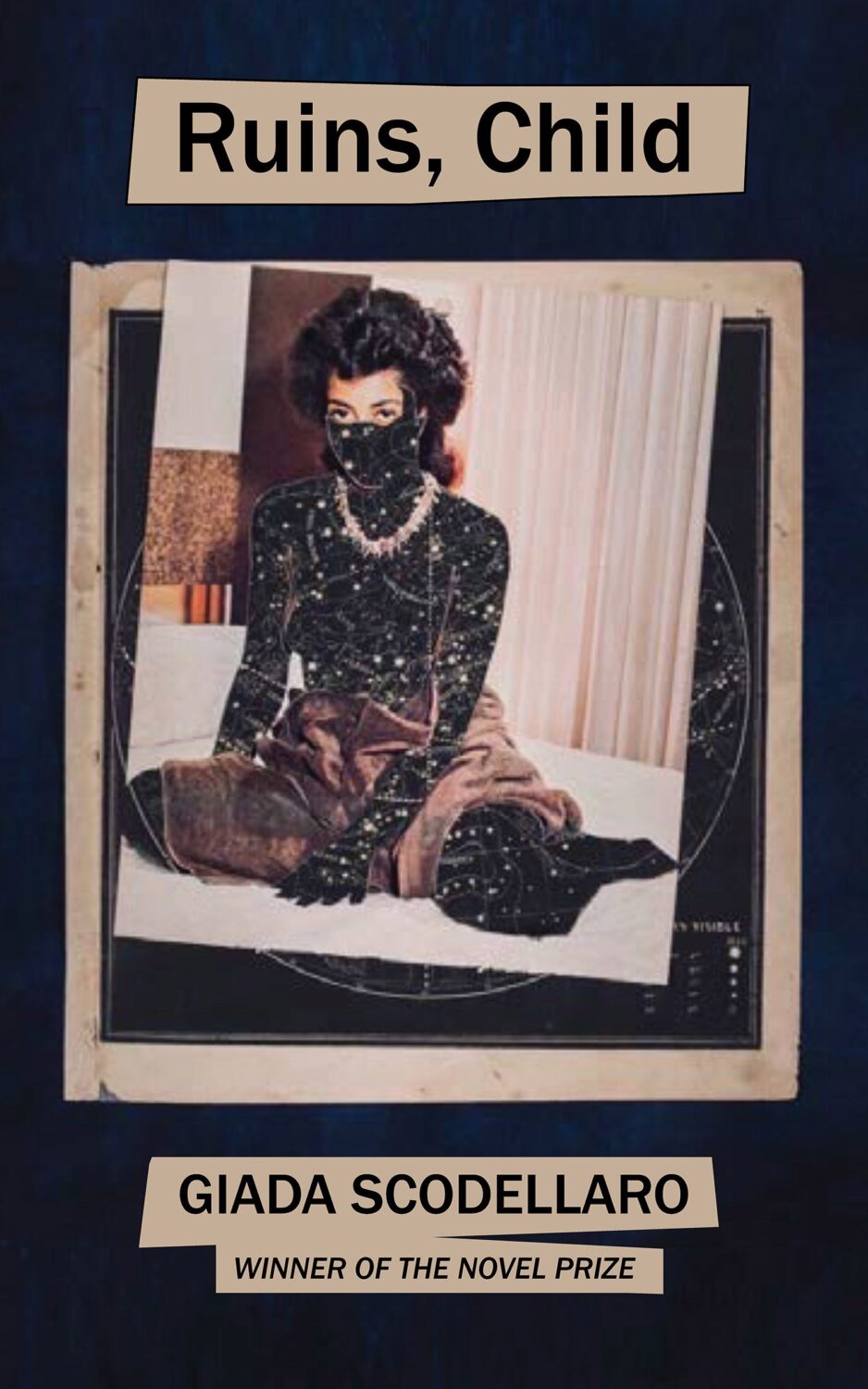
Ruins, Child by Giada Scodellaro; design by John Gall; art by Lorna Simpson (New Directions / April 2026)

Transcription by Ben Lerner; design by Violet Dine, Rodrigo Corral Studio (Farrar, Straus & Giroux / April 2026)

The cover of the UK edition of Transcription, published by Granta this month, was designed by Gray318.

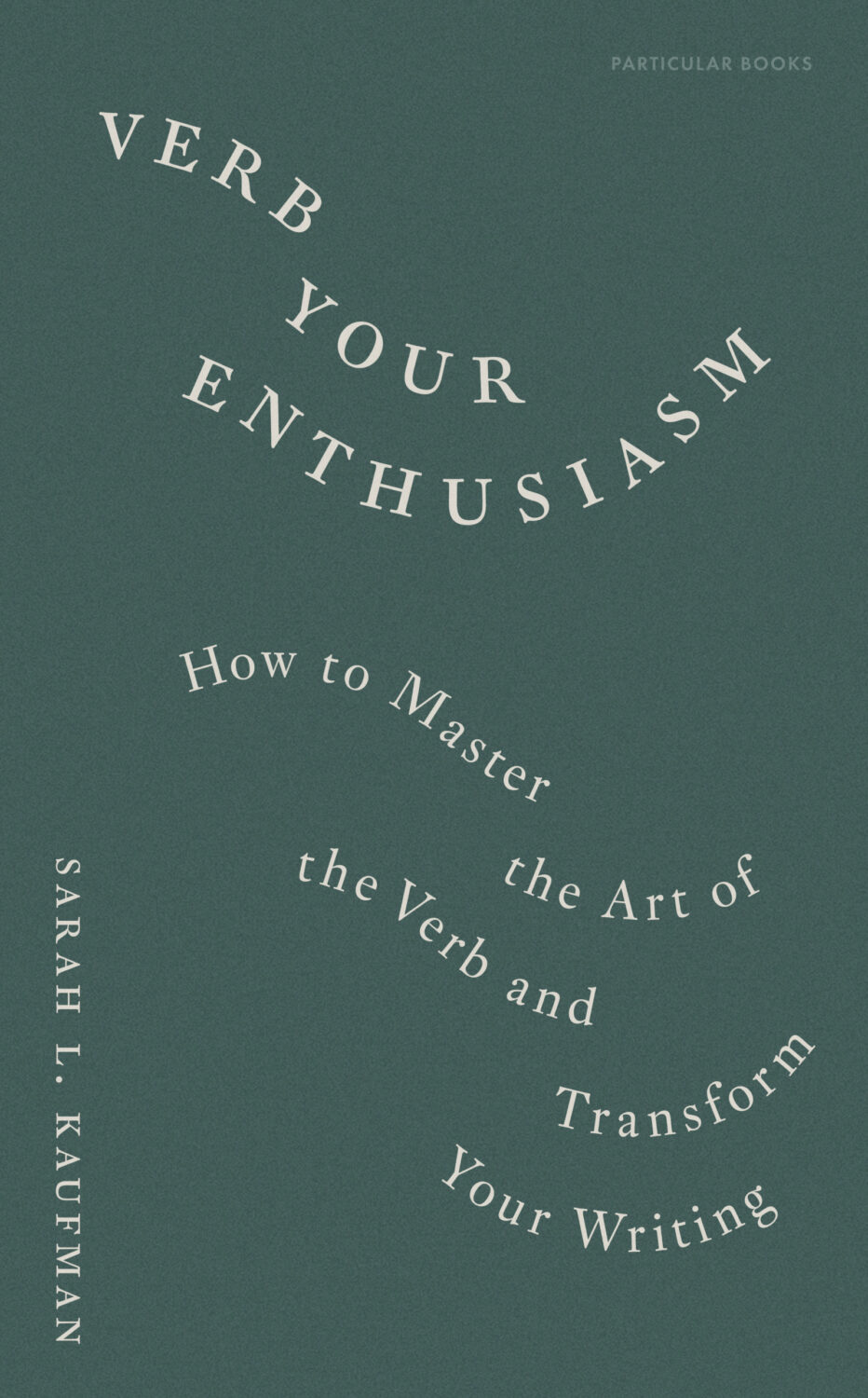
Verb Your Enthusiasm by Sarah L. Kaufman; design by Daniele Roa (Particular Books / April 2026)
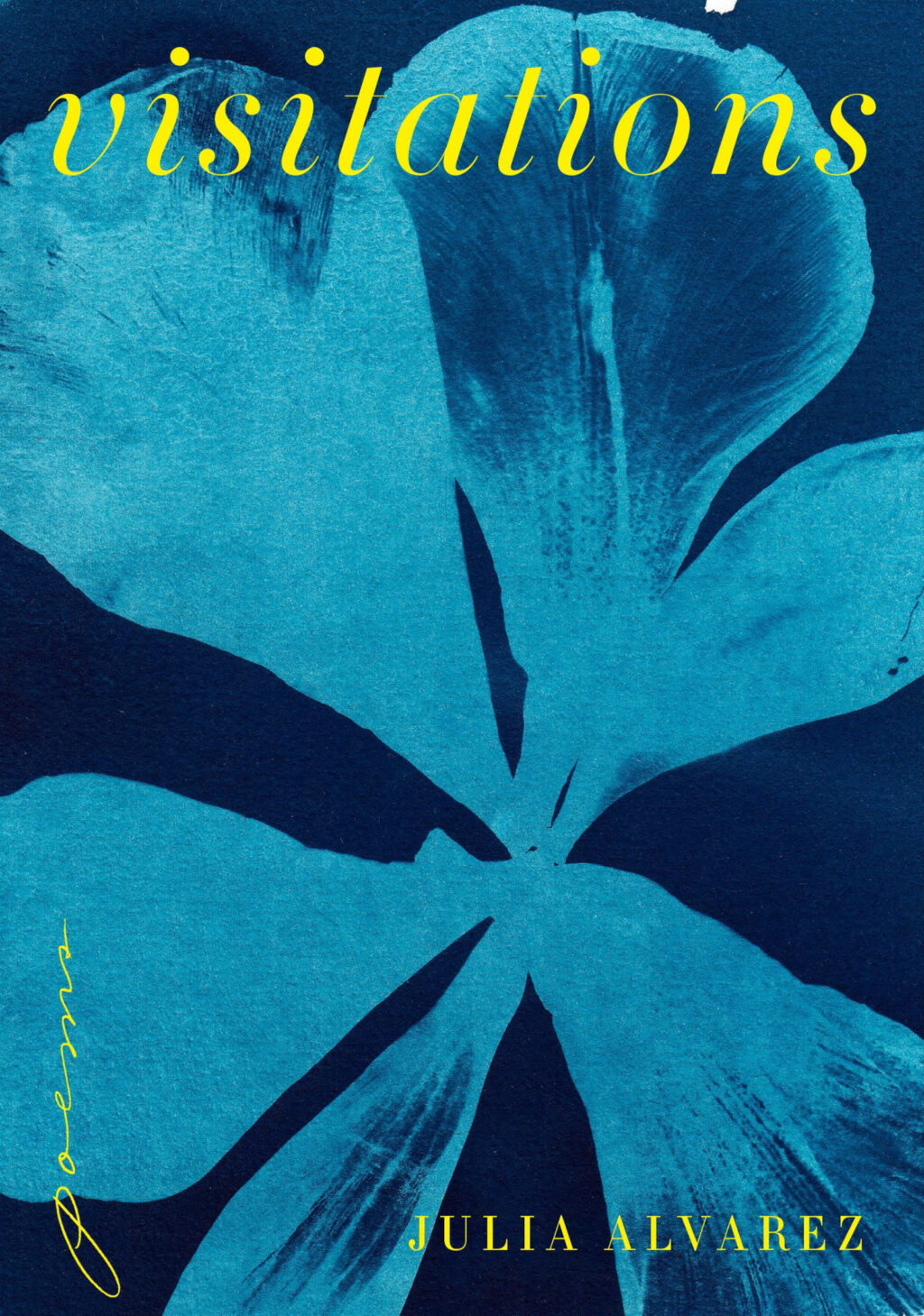
Visitations by Julia Alvarez; design by Janet Hansen (Knopf / April 2026)
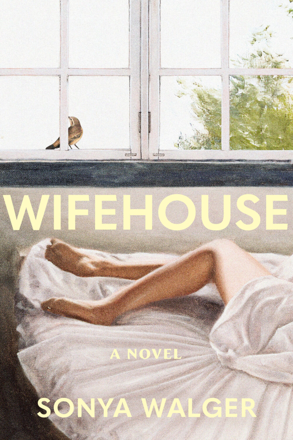
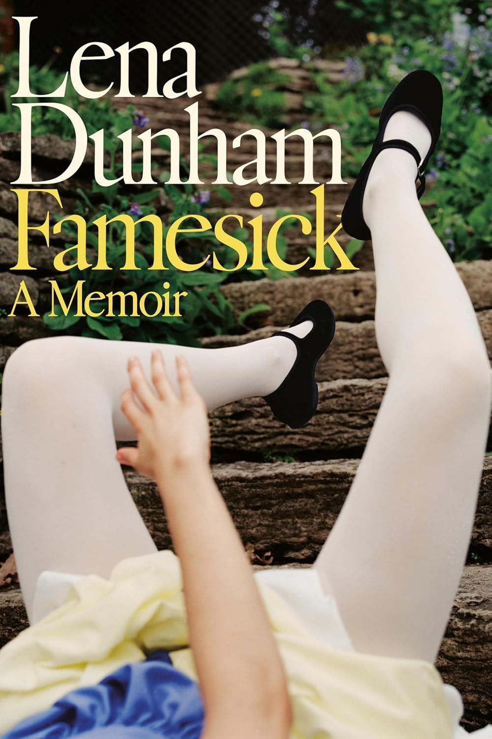
Wifehouse by Sonya Walger; design by Patrick Sullivan; art by John Worthington (Union Square & Co / April 2026)

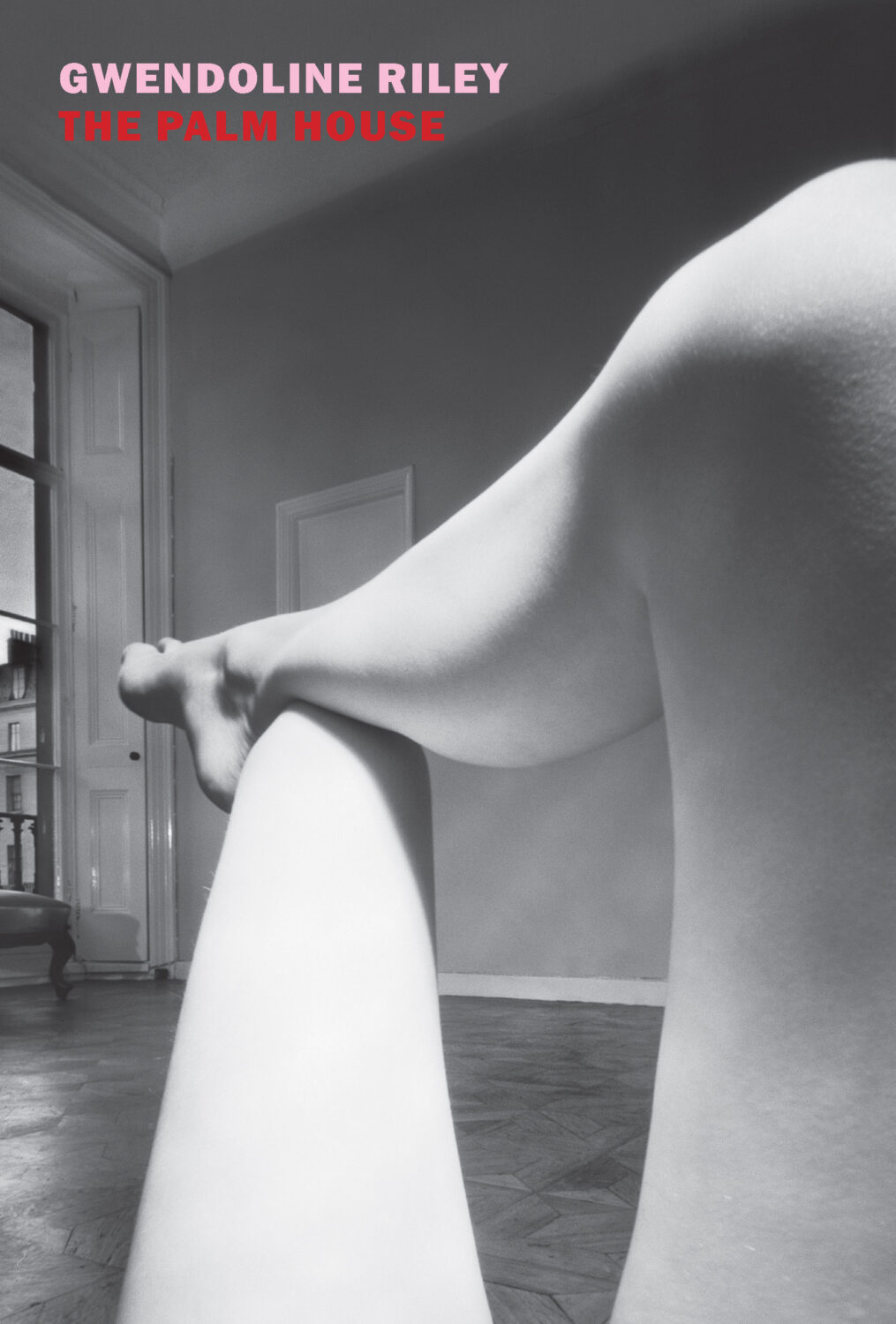
I guess legs on covers are a thing this month?
Leave a Comment

Favourite Covers of 2012

For the past couple of years now (since Joseph Sullivan put the Book Design Review on ice in fact), I’ve been posting a short list of my favourite covers for books for the year. Now that thing for the New York Times is out of the way, I’m free to post my list for 2012.

To make a couple of very general observations about book design this year, the cover that probably made the greatest impact was Fifty Shades of Gray. It was a design that made it OK to read erotica in public, something which surely contributed to the book’s breakout success — a point not lost on other publishers who rushed to re-package their own erotica titles in a similar fashion. The results inevitably lacked the finesse of the original, but imitation is the sincerest form of flattery, as they say…

But while the cover of Fifty Shades of Gray smartly defied the conventions of its genre, it wasn’t an exciting cover and some publishers seemed to be more conservative in their design choices, playing it safe or relying on formulas. The jacket for The Casual Vacancy could hardly have been more forgettable, and it was not alone. A bland sameness crept in. Perhaps that could be said every year. I suspect, however, that smaller budgets, tighter deadlines, and readers browsing thumbnails rather than shelves had an effect.

Nevertheless, some publishers were willing to trust their art directors and designers, and publish interesting and challenging covers. If I was to identify a common theme to my choices this year, it would be hand-drawn lettering and illustrated designs. With the ubiquity of stock photos and uninspired type-choices, that seems to be where the interesting things are happening, at least to my mind. Perhaps photographs will make a come back next year?
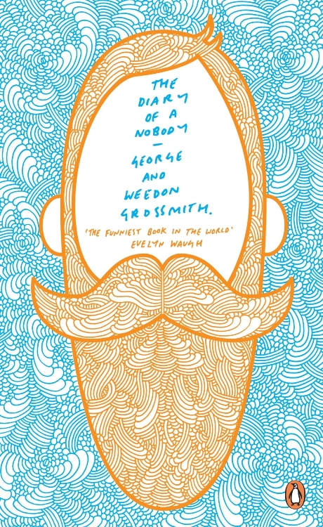
After Freud Left edited by John Burnham; designed by Isaac Tobin
University of Chicago Press

All Men Are Liars by Alberto Manguel; design by Jason Booher
Riverhead

El asenino hipocondríaco by Juan Jacinto Muñoz Rengel; design by Ferran López, illustration Santiago Caruso
Plaza & Janés


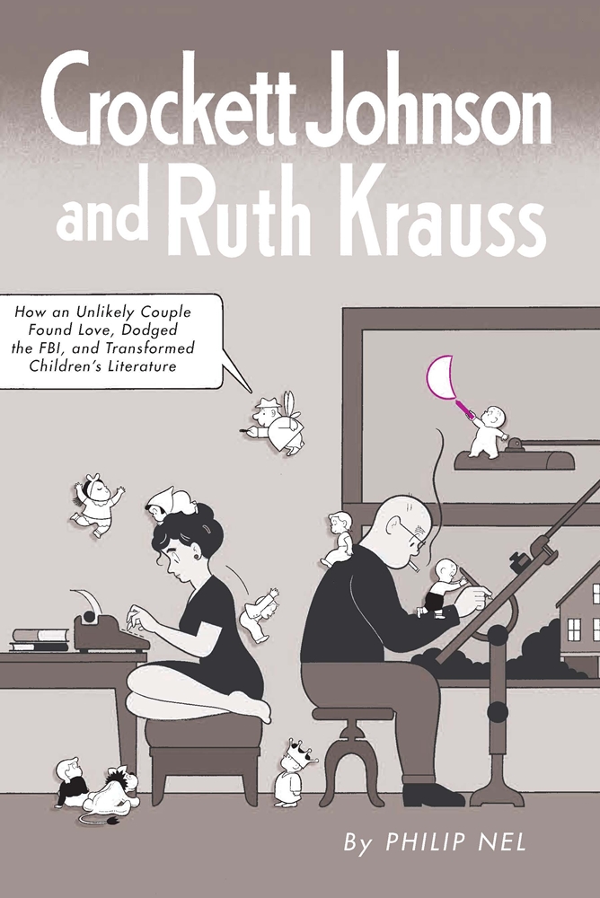
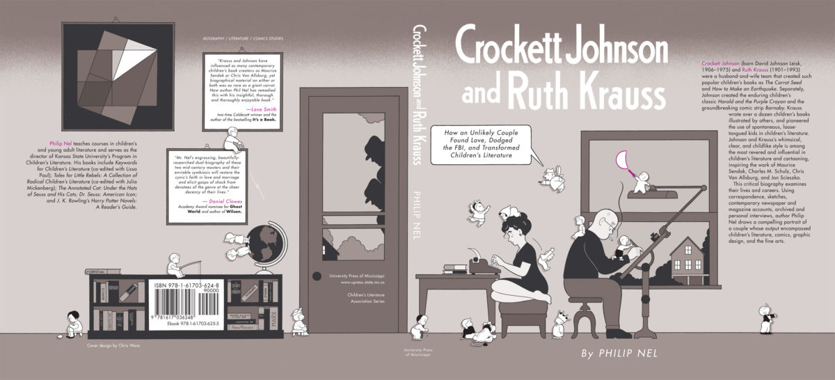
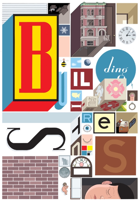
Crockett Johnson and Ruth Krauss by Philip Nel; design by Chris Ware
University Press of Mississippi

Cruel Britannia by Ian Cobain; design by FUEL
Portobello Books

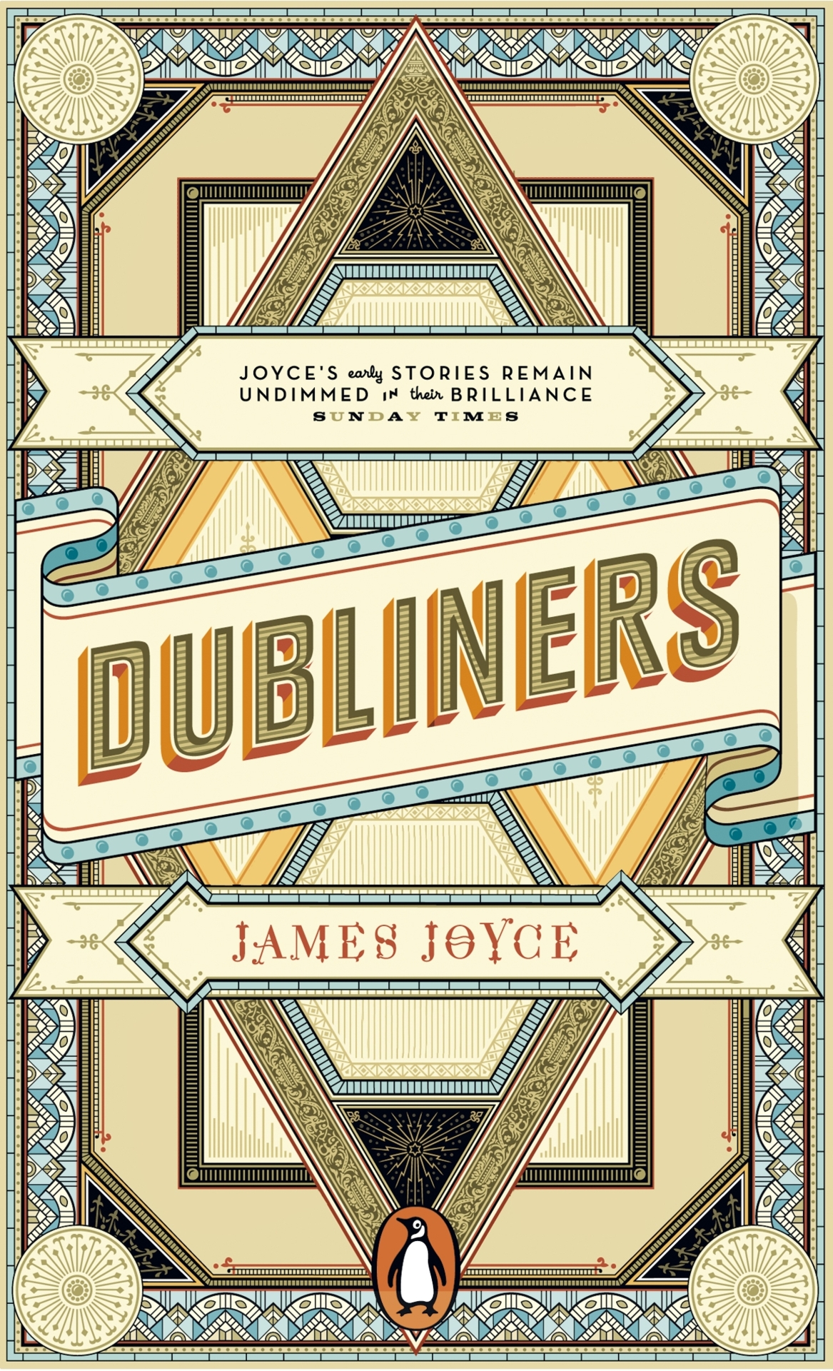
The Dubliners by James Joyce; design by Apfel Zet / Richard Bravery
Penguin Essentials, Penguin (UK)

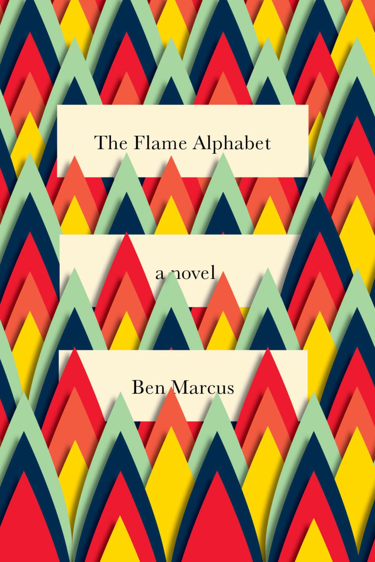
The Flame Alphabet by Ben Marcus; design by Peter Mendelsund
Knopf

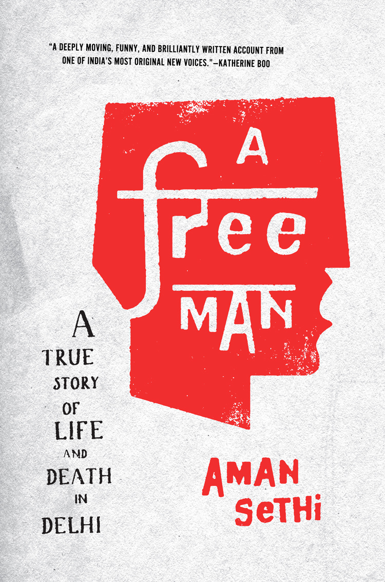
A Free Man by Aman Sethi; design by Ben Wiseman
W.W. Norton

Goodbye to Berlin by Christopher Isherwood; illustration by Vania Zouravliov

Vintage Isherwood, Vintage (UK)

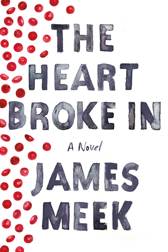
The Heart Broke In by James Meek; design by Jennifer Carrow; illustration by Michele Banks
Farrar, Straus & Giroux

Hope: A Tragedy: A Novel by Shalom Auslander; design by John Gall
Riverhead

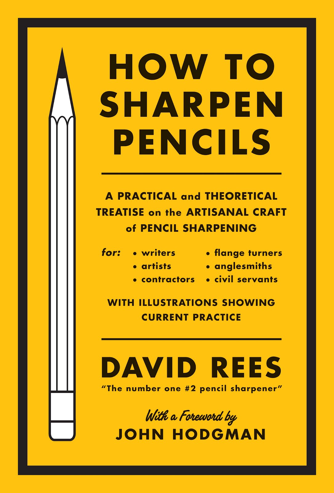
How to Sharpen Pencils by David Rees; design by Christopher Brian King
Melville House

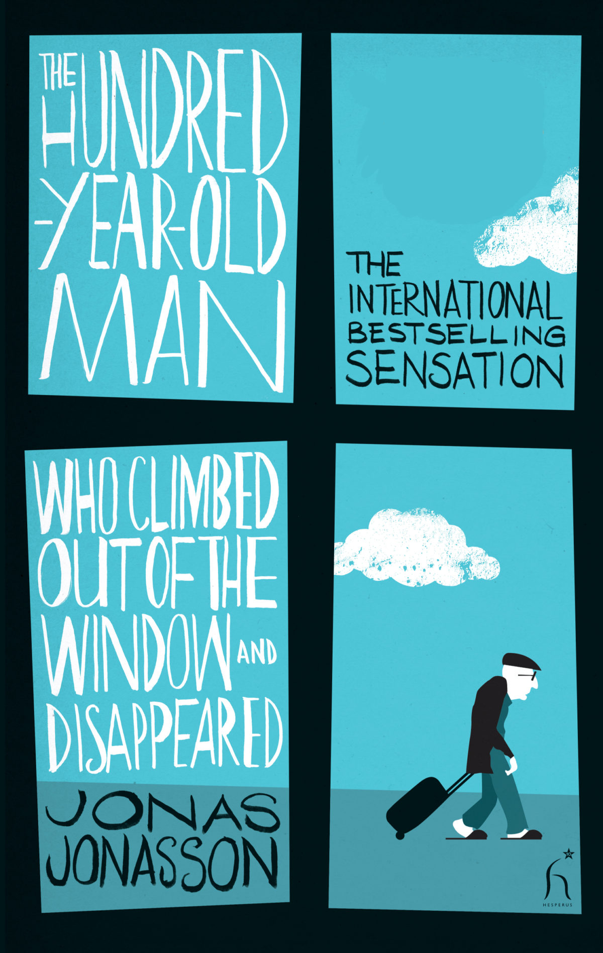
The Hundred-Year-Old Man Who Climbed Out of the Window and Disappeared by Jonas Jonasson; design by Jonny Pelham
Hesperus Press

Husk: A Novel by Corey Redekop; design by David A. Gee

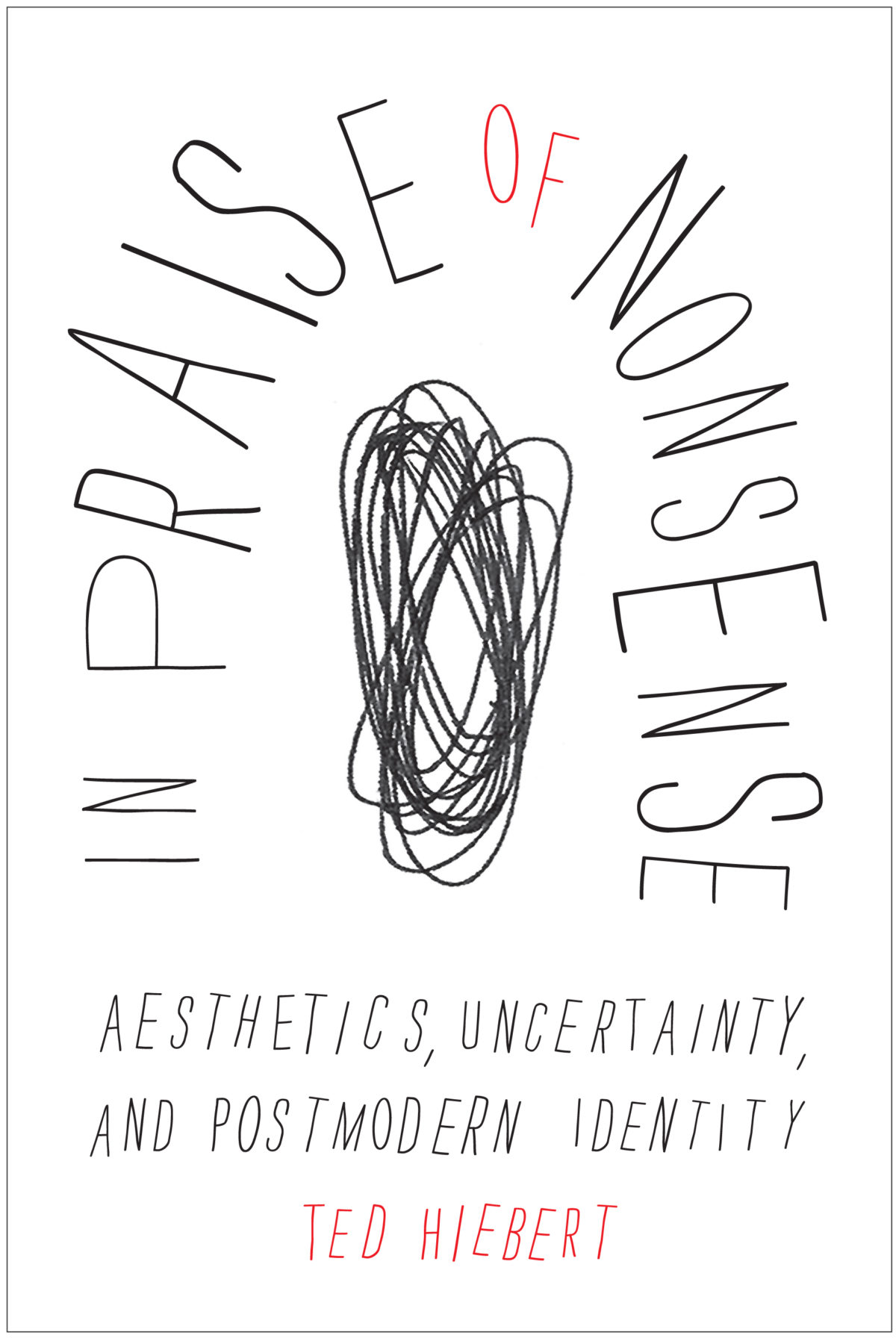
In Praise of Nonsense by Ted Hiebert; design by David Drummond
McGill-Queens University Press

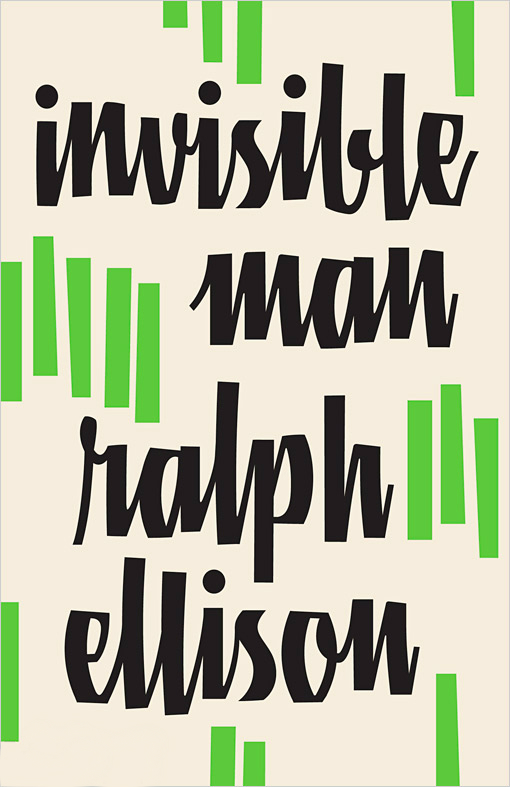
Invisible Man by Ralph Ellison; design by Cardon Webb

Vintage (US)

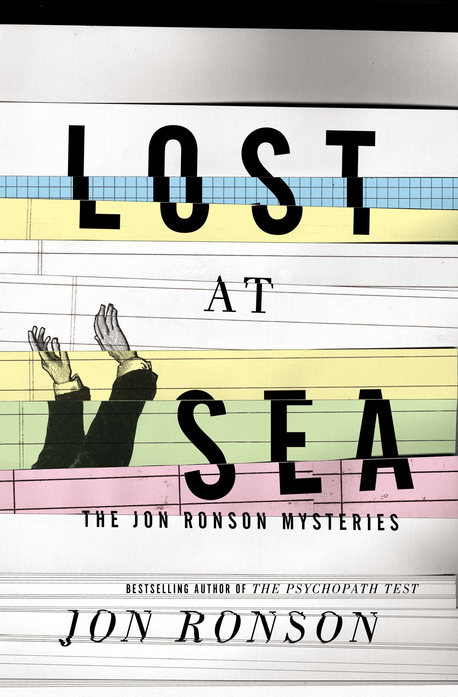
Lost at Sea by Jon Ronson; design by Matt Dorfman
Riverhead

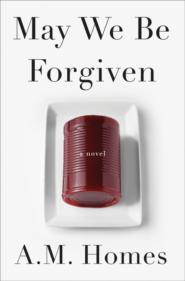
May We Be Forgiven by A. M. Homes; designed by Alison Forner
Viking

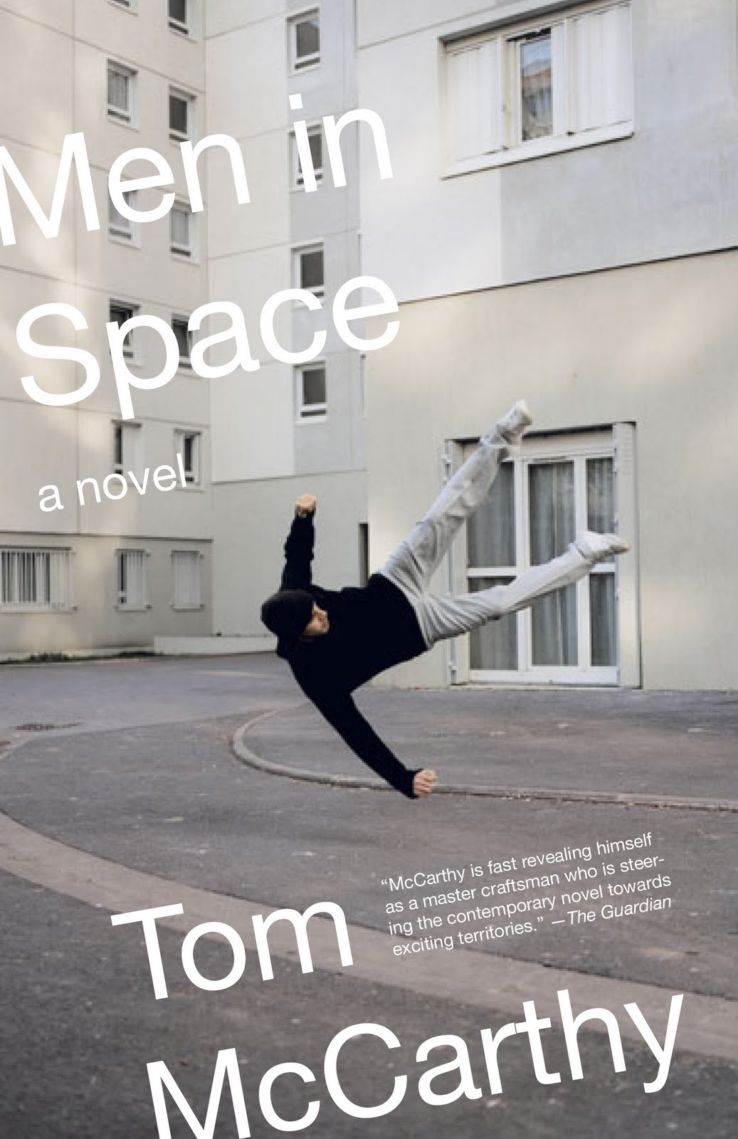
Men in Space by Tom McCarthy; design by John Gall
Vintage (US)

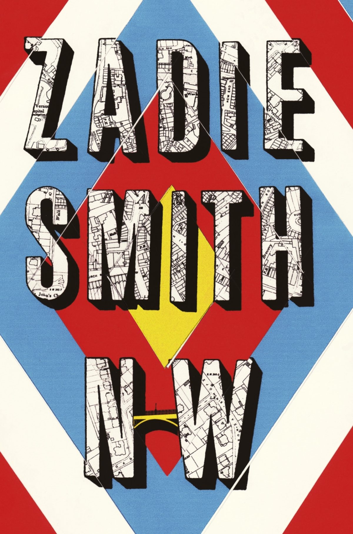
NW by Zadie Smith; designed by Gray318
Hamish Hamilton

Office Girl by Joe Meno; design by Cody Hudson, photograph by Todd Baxter
Akashic

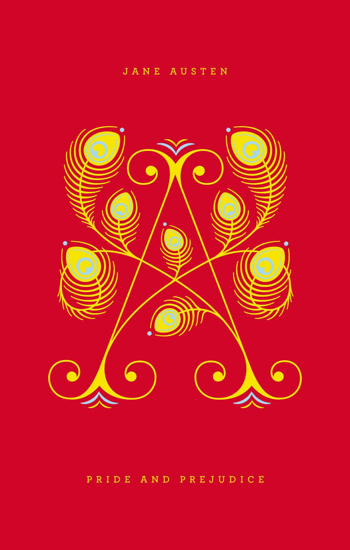
Pride and Prejudice by Jane Austen; design by Jessica Hische / Paul Buckley

Penguin Drop Cap, Penguin (US)

Swimming Studies by Leanne Shapton; design Leanne Shapton / Matthew Young
Particular Books

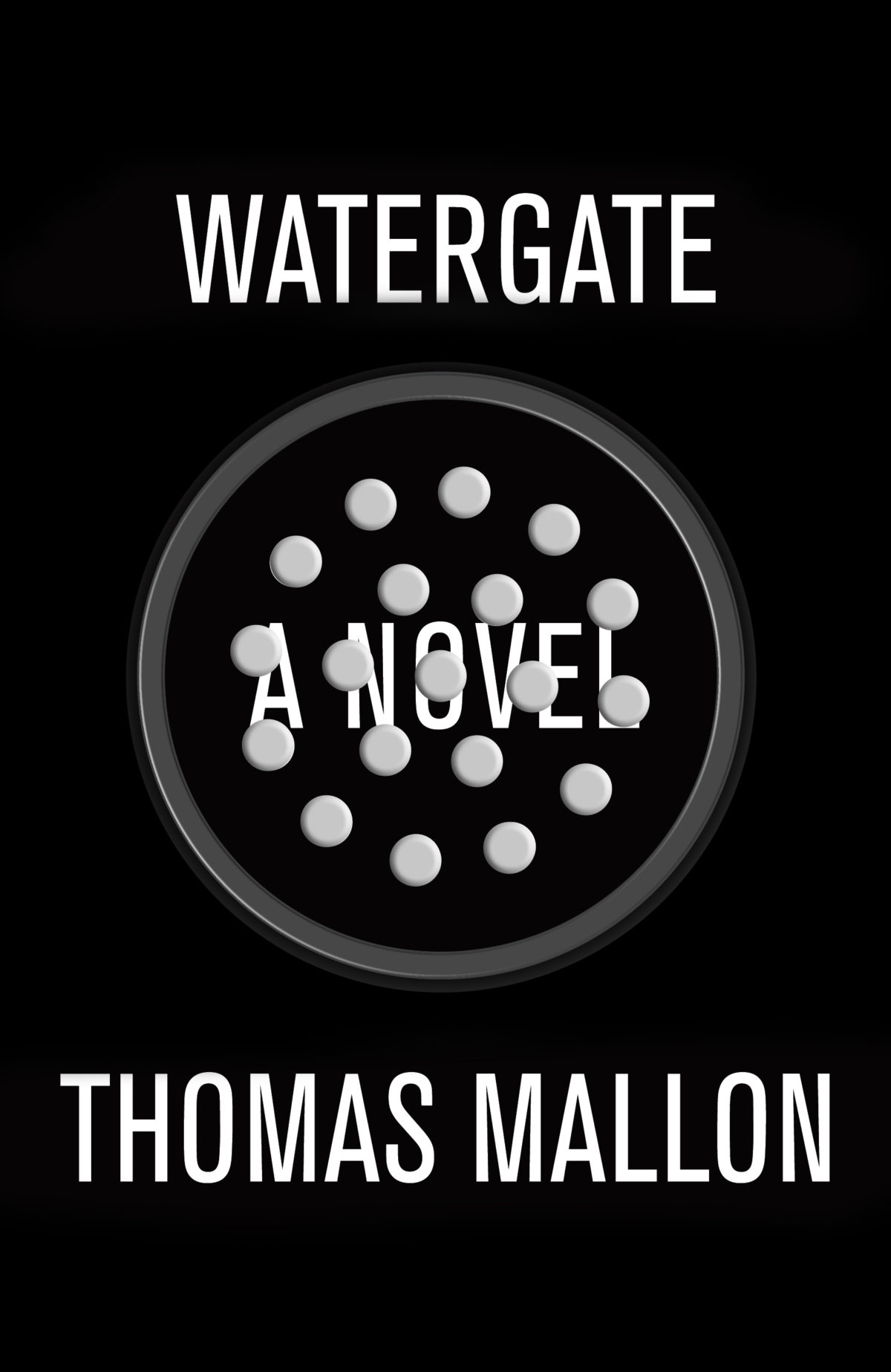
Watergate: A Novel by Thomas Mallon; design by Paul Sahre

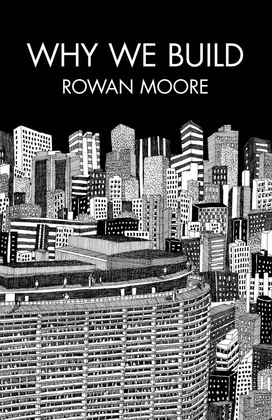
Why We Build by Rowan Moore; illustration by Diane Berg
Picador (UK)

Honourable Mentions:

;

You can find my lists for 2010 and 2011 here and here, and if you haven’t seen my 50 covers post from earlier this year, you can find that here. Happy Holidays!

16 Comments

Midweek Miscellany

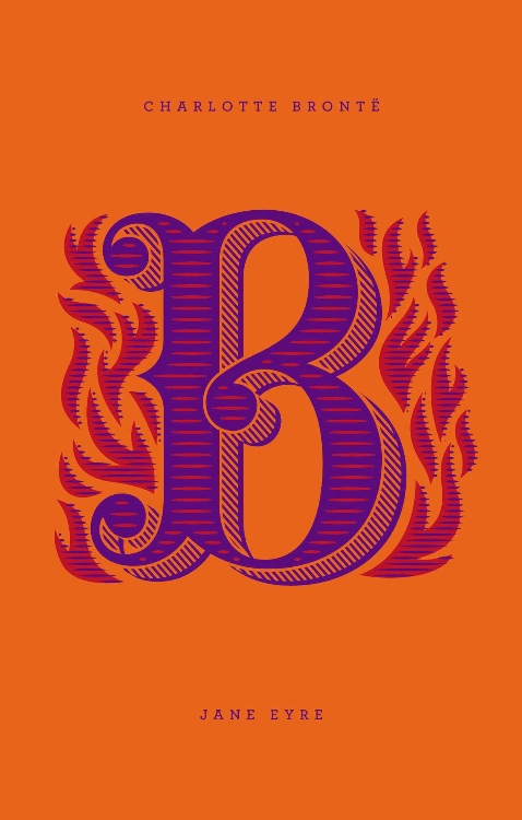
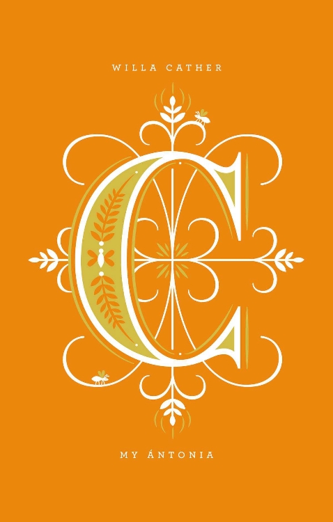
A design collaboration between Paul Buckley and Jessica Hische, Penguin Drop Caps is  a 26-book series of hardcover classics. The first six books go on sale November 27th. See the covers at Imprint.

Plumbing — An interview with book designer John Gall at The Believer:

A cover is a structural part of the book. It protects the pages. It provide the first impression of the content. It’s an eye-catching device – maybe the book’s only means of advertising. It can even add to the editorial content of the book; you can kill bugs with it.  Then, after you buy the book, the cover takes on another function. It’s your visual connection to the book as you develop a relationship with the material. It can also communicate to others who you are. I’m one of those people, who when I visit someone, I snoop around and see what’s on their bookshelves. I’m not doing this to judge them, but to find some common interest, a connection to that person.

There is also this great anecdote about Tom McCarthy and the cover for Remainder:

We did a photo shoot for his cover so it appeared that the book was being slowly immersed into blue liquid. We had to create a somewhat elaborate setup to get it just right. We sent the author a photo of the studio setup as a souvenir, showing the tripods and lights and water tanks. A year later he wrote back saying he had an argument with some artist friends of his over dinner. They were looking at the studio-set photo and were insisting that it was all a fake setup and that the cover was executed in Photoshop; that the photo shoot was all staged to provide “proof,” like a fake moon landing!

My Q & A with John is here.

Graveyard Stillness — Andrew Beckett reviews Unknown Pleasures by Joy Division bassist Peter Hook for The Guardian:

Joy Division, for all the graveyard stillness of their record sleeves, were participants in a frenetic golden age for British pop, which had begun with punk in 1976 and would peak, commercially at least, with the British dominance of the American charts in 1983. Groups grew up fast and seized their moment, or disappeared. Yet Joy Division did not earn enough from their feverish touring and recording to give up their day jobs. Hook worked in the offices of the Manchester Ship Canal Company, Curtis at an employment exchange, and Sumner for a film company where his “job was to colour in Danger Mouse”.

And finally…

The Fight Against Loss — A lovely essay by Simon Schama on why he writes:

Orwell’s four motives for writing still seem to me the most honest account of why long-form non-fiction writers do what they do, with “sheer egoism” at the top; next, “aesthetic enthusiasm” – the pleasure principle or sheer relish of sonority (“pleasure in the impact of one sound on another”); third, the “historical impulse” (the “desire to see things as they are”), and, finally, “political purpose”: the urge to persuade, a communiqué from our convictions.

To that list I would add that writing has always seemed to me a fight against loss, an instinct for replay; a resistance to the attrition of memory.


Comments closed

Midweek Miscellany

Half Crazy — Matt Dorfman on his great book cover design for The Psychopath Test by Jon Ronson, published by Riverhead Books:

Riverhead did not skimp on the production touches for this one. They sprung for a combination gritty matte finish (which covers the white paper portions of the jacket) and a shiny gloss for the yellow/magenta “crazy” half, thereby giving your sense of touch a noticeable edge if you find yourself blindly scanning your shelf for this book in a dark room (which I have done).

The Intimate Orwell — Simon Leys reviews Diaries by George Orwell, edited by Peter Davison, and George Orwell: A Life in Letters also edited and annotated by Davison, for the NYRB:

From the very start, literature was always Orwell’s first concern. This is constantly reflected in his correspondence: since early childhood “I always knew I wanted to write.” This statement is repeated in various forms, all through the years, till the end. But it took him a long time (and incredibly hard work) to discover what to write and how to write it. (His first literary attempt was a long poem, eventually discarded.) Writing novels became his dominant passion—and an accursed ordeal: “writing a novel is agony.” He finally concluded (some would say accurately), “I am not a real novelist.” And yet shortly before he died he was still excitedly announcing to his friend and publisher Fredric Warburg, “I have a stunning idea for a very short novel.”

Investigative Self-Repair — Author James Lasdun (It’s Beginning to Hurt) reviews Edward St. Aubyn’s latest semi-autobiographical Patrick Melrose novel At Last for The Guardian:

This act of investigative self-repair has all along been the underlying project of these extraordinary novels. It is the source of their urgent emotional intensity, and the determining principle of their construction. Not much gets into these books that doesn’t bear directly on Patrick’s predicament. Exposition is kept to a minimum; there are few descriptive passages, no digressions. For all their brilliant social satire, they are closer to the tight, ritualistic poetic drama of another era than the expansive comic fiction of our own.

And finally…

The General Specialist — Designer, illustrator, and letterer Jessica Hische talks to Method & Craft:

I love learning about new things whether or not they directly connect to how I earn a living and I think that this desire to pay attention to related industries is one of the reasons why I’m a figure in the design community. It’s by learning about many things that you’re able to understand specialization—that design is broken into countless micro-industries. If you don’t understand the differences between them (or acknowledge that they exist), there is no way for you to find your own specialized niche with in it.

Comments closed