Skip to content

Tag: jean-luc godard

Auteurmatic for the People

At the New Yorker, film critic Richard Brody, author of Everything Is Cinema: The Working Life of Jean-Luc Godard (and a man with prodigious beard), offers some interesting thoughts on ‘Vulgar Auteurism’ (a new term to me, if not exactly a new idea) and the legacy of the New Wave:

In opposition to the constipated naturalism of the art-house consensus—whether the one that prevailed sixty years ago or that of today—crudeness has an intrinsic merit, and it’s easy to detect the same impulse behind [Vulgar Auteurism] and Godard’s decision to dedicate “Breathless” to the B-movie studio Monogram Pictures. Getting rid of prejudices—acknowledging that there’s no such thing as intrinsically good acting or cinematography or direction, but only the evidence of artistic inspiration—is as great a discovery for critics as for filmmakers. From the start, Godard repudiated the false merits of so-called production values, but he invested the film not with the elements of the usual Monogram movie but with a rich and complex collection of high-art references, intellectual divagations, and documentary-based techniques, all held together by an aesthetic philosophy that owed more to Sartre than to Hawks. His praise of cheapness and scruffiness wasn’t in the service of those qualities but of the virtues of the grandest, greatest art and ideas he knew. The hat tip to the gangster genre served to embody his most intimate emotions and personal experiences—and, for that matter, to suggest the way that those very intimacies had become tied up, for better or worse, with the experience of moviegoing.

New Yorker

Comments closed

Midweek Miscellany

A profile of calligrapher DeAnn Singh at The LA Times:

When the producers of “Mad Men” needed a note in cursive and a signature from Don Draper, they turned to Singh. “Something masculine and from the 1950s” was the request, though they eventually decided that the missive be typed…

Ask her about computers, and she’ll tell the story of Steve Jobs.

Before the founding of Apple and the development of the Macintosh, Jobs dropped out of Reed College and studied calligraphy with artist Lloyd Reynolds. If he hadn’t taken that class, he has said, personal computers might not have come with a variety of fonts.

Fantasy Modernism — Lev Grossman talks to the A.V. Club about The Magician King, the sequel to his 2009 novel The Magicians:

I have this theory about modernism and fantasy, which I’ll do in 30 seconds.

They came into being at the same time, which is very interesting. They were both reactions to the disasters of World War I and the electrification of cities, and urbanization, and the rise of the automobile, the end of that twilight world of the Victorians. They both are reactions to that in different ways. Modernism went very inside and delved into the interior lives of people. Fantasy externalized all that in these fantastical, magical, metaphorical landscapes. I thought, “Well, what if you did both the inside and the outside at once?” I tried to combine those foci of fantasy and modernism into one kind of writing. It sounds like I’m writing a dissertation on my own work, but, you know, you end up thinking about what you’re doing. That’s the kind of thing I thought.

See also: Alexander Chee reviews the book for NPR.

Prussian Pedantry — Susie Harries’ new biography of scholar Nikolaus Pevsner, best known for his 46-volume series The Buildings of England, reviewed by George Walden for The Observer:

For us at least the conflict of national intellectual styles he represented was hugely beneficial. The irony of a “Prussian pedant” lecturing the English on Englishness, for which he was mocked, resolves itself in the fact that, together with Gombrich in art history and Weidenfeld in publishing, Pevsner was one of a golden generation of German/Austrian Jewish refugees who did much to give their adopted country the bottom it prided itself on already possessing.

And for those of you not interested in a county-by-county guide to the wonders of English architecture (what’s wrong with you?), Pevsner also wrote the seminal Pioneers of Modern Design: From William Morris to Walter Gropius. First published in 1936, a revised and expanded edition will be available (in the UK at least) in September.

And finally…

Everyone is an AuteurGuardian correspondent Fiachra Gibbons meets Jean-Luc Godard:

“I am not an auteur, well, not now anyway,” he says as casually, as if it was like giving up smoking. “We once believed we were auteurs but we weren’t. We had no idea, really. Film is over. It’s sad nobody is really exploring it. But what to do? And anyway, with mobile phones and everything, everyone is now an auteur.”

Oh Jean-Luc…

Comments closed

Something for the Weekend

Simplicity with Sophistication — Typographer Gerard Unger talks about his work and the influence of Wim Crouwel with MyFonts:

What seemed amazing when I joined [Crouwel’s] company Total Design in 1967 was how simple it all seemed. When Wim explained how to design and do typography, you got the impression it had always been done like that and that it couldn’t be done any other way — maximum clarity. Later, I realized that this approach also had its limitations. When graphic designers had to select a typeface, they automatically specified Helvetica and stopped thinking. Wim’s own work was different: it seemed clear and simple, but was full of refinement, which comes naturally to him. That is probably why it is so attractive to younger generations: simplicity with sophistication. Yet I personally wouldn’t welcome a revival of Swiss typography — it was too formulaic. Also, I think design should be more of a social thing than that. For too long, graphic design has been about individualism and about fulfilling personal ambitions.

The Doctrine of Immaculate Rejection— A wonderful with E. B. White from the Paris Review 1969. It’s a great read, but it’s hard not to get the feeling it comes from a more genteel era that has long since disappeared (via Longform):

I revise a great deal. I know when something is right because bells begin ringing and lights flash. I’m not at all sure what the “necessary equipment” is for a writer—it seems to vary greatly with the individual. Some writers are equipped with extrasensory perception. Some have a good ear, like O’Hara. Some are equipped with humor—although not nearly as many as think they are. Some are equipped with a massive intellect, like Wilson. Some are prodigious. I do think the ability to evaluate one’s own stuff with reasonable accuracy is a helpful piece of equipment. I’ve known good writers who’ve had it, and I’ve known good writers who’ve not. I’ve known writers who were utterly convinced that anything at all, if it came from their pen, was the work of genius and as close to being right as anything can be.

And finally…

Type and Still Imagery — Writer-director Mike Mills, who began his career as a graphic designer, talks about his semi-autobiographical movie Beginners with AIGA:

Before I was a filmmaker I loved Godard as a graphic designer. He does the best design, to me. And a lot of my graphics being very, almost sort of didactic or presentational, or sort of centered and clean, to me really comes from how Godard uses type and still imagery in his films, in Tout va bien or One Plus One or Pierrot le Fou, so Godard’s been influencing me for a very long time. And the graffiti in the film is much more sort of May 1968, sort of Situationist graffiti rather than being like hip-hop graffiti.

There is also a book, Drawings From the Film Beginners, that accompanies the movie (thx @Henry)

Comments closed

Midweek Miscellany

Little Nemo meets David Lynch — Mark Medley interviews Charles Burns, author of Black Hole and X’ed Out , for The National Post:

Whereas Black Hole, which takes place in the early 1970s, examines the dread and confusion of adolescence using the tropes of a horror film, X’ed Out, which is set in the late 1970s at the height of punk music, is an exploration of young adulthood and the anger, uncertainty and experimentation that comes with aging.

“I definitely started out wanting to do my punk story,” says Burns, 55. “As typically happens, you start with one idea and it spreads.”

A House Full of BooksThe LA Times book critic David L. Ulin on the gift of books:

We have a rule in our house: My wife and I will always pony up for books. It’s not even a subject of discussion — if either of our kids wants a book, we will buy it, no questions asked. This is equally true of the books we have at home, which are equally available to everyone, regardless of subject matter or degree of difficulty. Whatever else they are, after all, books are gifts (for the mind, the eye, the hand), which makes it downright uncharitable to deny them to anyone.

This, I should say, is how I was raised too, in a house full of books, by parents who put a premium on the written word. I was allowed to pick up everything — and often did. When I was in third grade, I checked out “War and Peace” from the school library (I was looking for the longest book in the world), and although I never actually opened it, I remain thrilled by the idea that no one told me not to try.

Don’t Know What They’re MissingThe Economist profiles type designer Matthew Carter:

Mr Carter doesn’t own an iPad, Kindle, or other reading device, as he is waiting for them to mature. (He does own an iPhone.) He frets that, as things stand, reading devices and programs homogenise all the tangible aspects of a book, like size or shape, as well as font. They are also poor at hyphenation and justification: breaking words at lexically appropriate locations, and varying the spacing between letters and between words. This may sound recondite but it is a visual imprint of principles established over the entire written history of a language. “Maybe people who grow up reading online, where every book is identical, don’t know what they’re missing.”

On a sort of related note… Mashable talks to designer Susan Kare about her icon designs for the original Apple Macs.

And finally (as we’re talking about typography)…

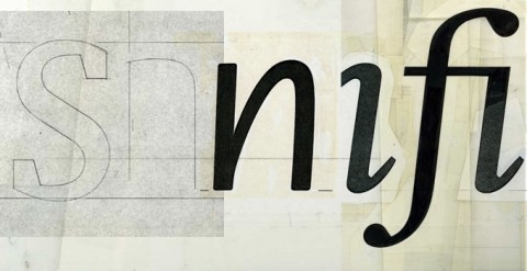
Jean-Luc — A free display typeface in two styles designed by Atelier Carvalho Bernau to celebrate Jean-Luc Godard’s 80th birthday.

Comments closed