Hey, I hope you are keeping safe and well. There’s a wide variety of styles this month, but pink, yellow and orange are something of a minor theme (although since writing this I’ve actually removed one of the covers that combined bright pink and yellow because the book isn’t out until September — you’ll see it in a couple of months).
I think we’re also starting to see a potential new trend with photographic covers for fiction. I don’t have the vocabulary to neatly identify the style of photography I mean (sorry photography people — I mostly studied paintings in school!), but it’s basically contemporary colour photographs of candid, and sometimes intimate, social moments. It’s different, if adjacent, to the more posed ‘stylish sad girl’ phenomenon, or the use of black and white photography for ‘serious’ literary fiction I think. Anyway, maybe it’s a thing? Time will tell…
I was wondering why the weirdly wonderful art seemed familiar and then I remembered that the cover of Lisa Wells’ nonfiction book Believersdesigned by Na Kim also makes use of Lisa Ericson painting…
I know I say everything gives me Annihilation vibes but Lisa Ericson’s art definitely gives me Annihilation vibes. And speaking of weird Vandermeer vibes…
The cover for the UK and Australian edition of Blue Hunger, published by Scribe, was designed by Luke Bird (and thank you to Guy Ivison at Scribe for providing the design credit). It’s an interesting contrast I think:
Sam by Allegra Goodman; design by Donna Cheng; photograph by Mariam Sitchinava (Dial Press / January 2023)
I’m not sure exactly why, but I just assumed this was a UK cover when I first saw it (despite it literally having “New York Times Bestselling Author” in all-caps at the top!).
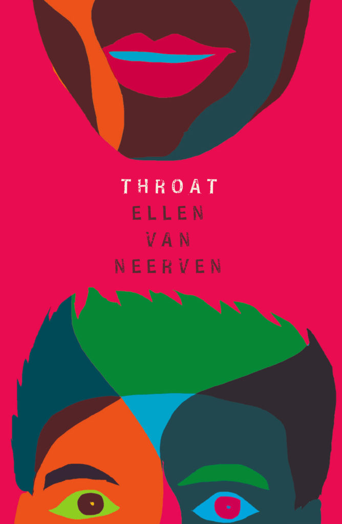
Sing, Nightingale by Marie Hélène Poitras; translated by Rhonda Mullins ; design by Ingrid Paulson (Coach House / February 2023)
For some reason this makes me think of the ‘weird nature’ (including animals with human eyes!) in Annihilation by Jeff Vandermeer, which is still one of my favourite novels of the last 10 years…
True Life by Adam Zagajewski; design by Jeff Clark (Farrar, Straus & Giroux / February 2023)
I also saw Pete Garceau’s cover for School House Burning by Derek W. Black recently, which snuck past me when it was published by PublicAffairs in September 2020 but still seems terribly au courant…
Wolfish by Erica Berry; design by Keith Hayes; illustration by Rokas Aleliunas (Flatiron / February 2023)
This made me think of the opening credits to a movie from the 1960s. I think it’s partly the type, but the colours also reminded me of Maurice Binder’s title sequence of Charade. Maybe it’s more of the overall vibe than anything else?
The New Life by Tom Crewe; design by Jaya Miceli (Scribner / January 2023)
Interestingly, the cover of the UK edition published by Chatto & Windus uses the same photograph but it’s flipped the other way and printed on one of those fancy half dust jackets (forgive me for not remembering their technical name). I believe the design is by Kris Potter.
The cover of the UK edition published by Fourth Estate was designed by Jo Thomson. It’s interesting to see the same basic concept executed in two very different styles.
The cover of Granta edition The Devil’s Workshop by Jáchym Topol designed by Telegramme Studios was on my list of favourite covers back in 2013 (there were some great covers published that year!). Interesting that the colour palettes are similar.
I’m doing my best to catch up a little bit this month, but there’s no such thing as a quiet month in publishing any more. Just rest assured nobody knows what they’re doing — we’re just here for the chaos and romance…
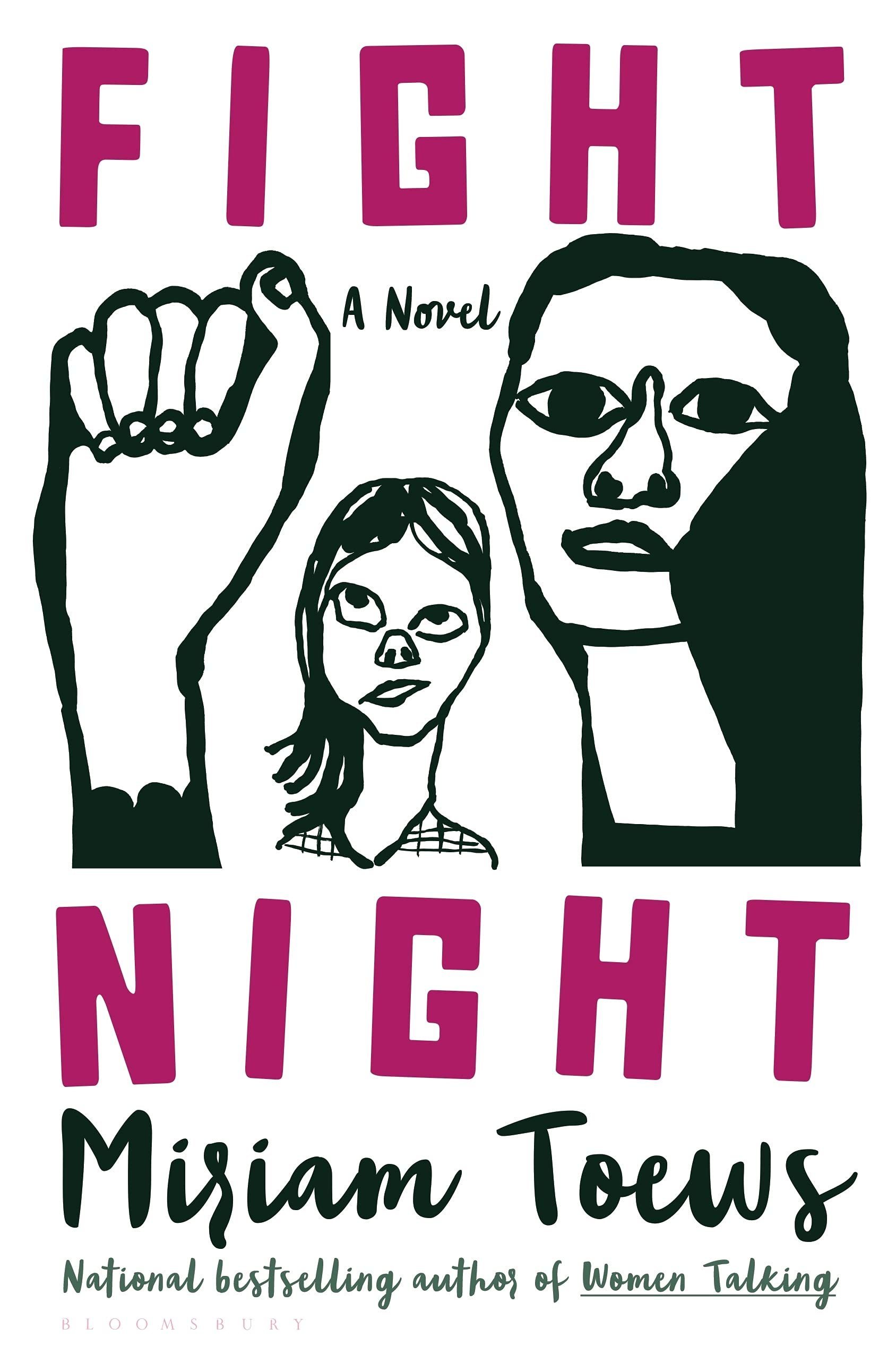
The black and white illustration and pink type reminded me of the US cover for Fight Night by Mirian Toews, designed by Patti Ratchford with an illustration by Christina Zimpel, from last year.
Boothby Karen Joy Fowler; design by Tal Goretsky (G.P. Putnam’s Sons / March 2022)
If you’d asked me to guess sight-unseen, I would’ve 100% said this was designed by someone else. It just goes to show that designers are talented, versatile people and I know nothing (NOTHING).
Malika Favre also designed and illustrated the cover of Playing with Matches by Michael Faudet, published by Andrews McMeel at the end of last year, and featured in this month’s ‘Book Covers We Love‘ post at Spine Magazine.
Earlier this year, a Canadian magazine asked me what the latest trends in book cover design were. I don’t think I had a very satisfactory answer. 2021 felt very much like a continuation of 2020, which itself felt like a year on hold.
The trends that came to mind were not exactly new. In no particular order: big faces (big sunglasses!); cropped faces; hands; mouths; postmodern typefaces;1 big skies; rainbows; gradients; the colour orange; psychedelia; collage; contemporary painting.
A lot was made of “blob” covers this year. I’m not sure that anything has really changed since Vulture published this article about “blocky” covers in 2019. They seemed like much the same thing.
Design is about the constraints and, as it turns out, the constraints around designing commercial literary fiction covers that have to work just as well online as in bookstores can lead to similar design solutions — large, legible type, and bright, abstract backgrounds. 2 The surprising thing is not that a few covers look the same when you squint; it’s that more of them don’t.
There were a lot of good covers (that didn’t look alike) in 2021. LitHub posted 101 of them. Still, it didn’t exactly feel like a vintage year.
Do I say that every December? Possibly.
A few years ago I worried that covers were moving in a more conservative direction, particularly at the big publishers. I’m not sure this has come to pass, at least not in the US. There are plenty of covers from the big, prestigious American literary imprints in this year’s list, as there were last year, and every year before that.
There are fewer covers from the UK in this year’s list than in previous years though, and I feel less confident about the situation there. From a distance, things seem a little sedate. I may be mistaken. It’s quite possible I haven’t see enough covers — or perhaps enough of the right ones — from British publishers to get a good sense of the overall picture.3
It would not be a surprise, however, if publishers were feeling a little risk-averse at the moment. We are two years into a global pandemic, experiencing a major supply chain issues, and living through a seemingly endless series of sociopolitical crises.
Nor would it be a surprise if designers were personally feeling the effects too — I’m not sure we are talking about this enough, and I’m not sure I know how to.
Thank you to everyone who has supported the blog in 2021. It means a lot. Here are this year’s book covers of note…
Na Kim talked to PRINT about her career and the designs for the Ditlevsen series in February. If, like me, you were wondering about typeface on the covers, it’s Prophet from Dinamo apparently.
If you’re wondering about the Super-Seventies Sally Rooney typeface, it is Ronda designed by Herb Lubalin and Tom Carnese (I only know because I asked).
Thank you to everyone who has supported the blog in 2021. It means a lot.
I am not convinced that the term “postmodern” quite captures what I mean here (and/or worse, implies something different in the context of typography), but it’s the best I’ve got. I’m not talking about the kind of experimental typography you might associate with the likes of Wim Crouwel or Emigre, or the aesthetic of someone like David Carson. What I am trying to get at is idiosyncratic type that purposely exaggerates or plays with letterforms, and doesn’t conform to function-first modernism. To my mind, this would include some typefaces from the 1960s and 70s, as well as some more contemporary type. In a sense what I am describing is display faces — and I think the eclectic, innovative use of type in Victorian advertising might be an inspiration to designers here — but I don’t think it is just about size. ↩
They look very different, but I was reminded of another sunset sky cover designed by Lauren from earlier this year. It’s interesting to see the (presumably) coincidental themes in a designers work.
I quite enjoy seeing contemporary painting being used on book covers. A couple of other recent examples that come to mind are Jennifer Carrow’s recent cover for Lorna Mott Comes Home with art by Barbara Hoogeweegen, and Stephen Brayda’s cover for last year’s The End of the Ocean by Maja Lunde with art by Scott Naismith (another sunset sky cover! I guess After the Sun could also be included in this trend broadly speaking. It is not quite the kind of painterly art I am thinking of though…).
I’m drawing lots of unnecessary comparisons today, but I was reminded of this Oliver Munday cover from a while back if only for the similar-ish colour combinations (I was going to say palette, but… ). It reminds me of something else too, I just can’t quite put my finger on it…
If I didn’t already know who the publisher was, I would not have been able to tell you if this was an American or British cover despite the subtitle and very American imagery. I don’t think it would like out of place on the Allen Lane list for example.
As it is almost the end of October this is going to be my last monthly round-up for 2020. I will endeavour to put together a post on the book covers of year soon, but I am sure a lot of great work skimmed under my radar, so designers please drop me a line if I have missed a cover (or two!) you really loved working on (the book has to have been published this year), especially if it was for an independent or university press. In the meantime, I hope you enjoy this month’s selections.
They’re really not all that alike (it’s funny how memory constantly plays this trick on me), but the colour palette and the typographic approach of Alex’s cover reminded me Luke Bird’s 2017 cover for Vivek Shanbhag’s Ghachar Ghochar:
Ghachar Ghochar by Vivek Shanbhag; design by Luke Bird (Faber & Faber / April 2017)
Sisters by Daisy Johnson; design by Suzanne Dean; photograph Simon Kerola (Jonathan Cape / August 2020)
The cover of the US edition of Sisters, published by Riverhead this month, was designed by Jaya Miceli. The painting is by Jeremy Olson. (Thank you to the folks on Twitter who helped me with this!)
Hey. Here are the book covers that have caught my eye online this month. I hope that they bring a little joy in this very grim time.
If you have the means to buy books at the moment (and I appreciate that is not going to be the case for everyone), please consider supporting your local bookstore. I know a lot of stores are taking orders by email even if they are not answering the phone, and many are offering local delivery if curbside pick-up is not currently an option. The situation seems to be changing daily, so if a store wasn’t accepting orders yesterday, they might be today. We are all figuring this out on the fly.
If you are in the US and don’t have access to a local bookstore, there is Bookshop.org who are trying to provide some financial support to independents. If there are similar initiatives elsewhere, let me know — I’m happy to share the link.
Afterlife by Julia Alvarez; design by Jaya Miceli (Algonquin Books / April 2020)
I wonder where the eye — particularly the combination of the colour red and the eye — as a symbol of Orwell and Nineteen Eighty-Four originated? Does it go back to the 1960s and the Penguin paperback designed by Germano Facetti?
I understand that the eye is a short-hand for the surveillance state. But it is almost as if that is now considered the only element of the book worth visualizing (David Pearson’s cover is in an interesting exception in that it cleverly focuses on censorship rather than surveillance).
I haven’t read Nineteen Eighty-Four in years, but my memory is that the infamous “Big Brother is Watching You” poster is a face whose eyes seem to follow you when you move — something I think Matt’s cover above captures quite nicely — not an all-seeing, omniscient eye. The first time I read the novel, I imagined Big Brother looked something like Lord Kitchener / Uncle Sam in the recruitment posters. I was more traumatized by Room 101 to be honest… Has anyone put rats on the cover of Nineteen Eighty-Four?
I actually read Godshot in manuscript form last year and liked it a lot. It is set in drought-stricken California, but I had Ry Cooder’s soundtrack to Paris, Texas playing in my head the whole time I was reading it.
I also wanted to give a quick shout-out to Nicole who was diagnosed with breast cancer at the end of last year and bravely shared her story on social media recently. Stay safe, and get well soon, Nicole. :-)
Griefby Svend Brinkmann; design by David A. Gee (Polity Press / April 2020)
David has designed the covers for a number of books by Svend Brinkmann, including Standpoints, which featured on the blog back in March 2018.
The cover of the UK edition of A Luminous Republic, which Granta is publishing in a couple of months, was designed by Luke Bird. It’s a really interesting contrast!