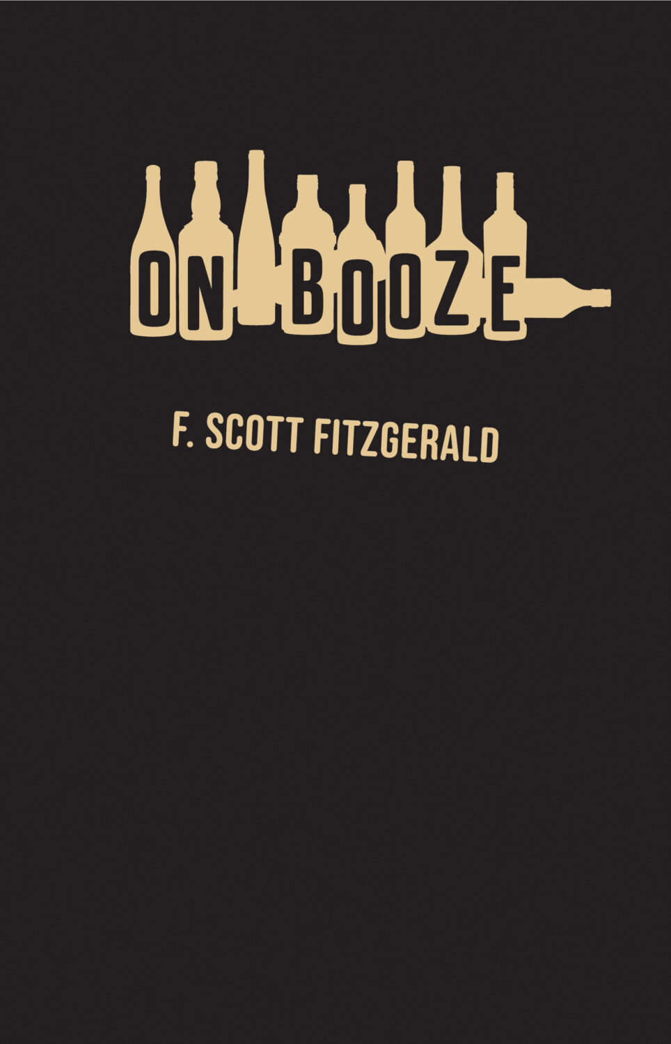
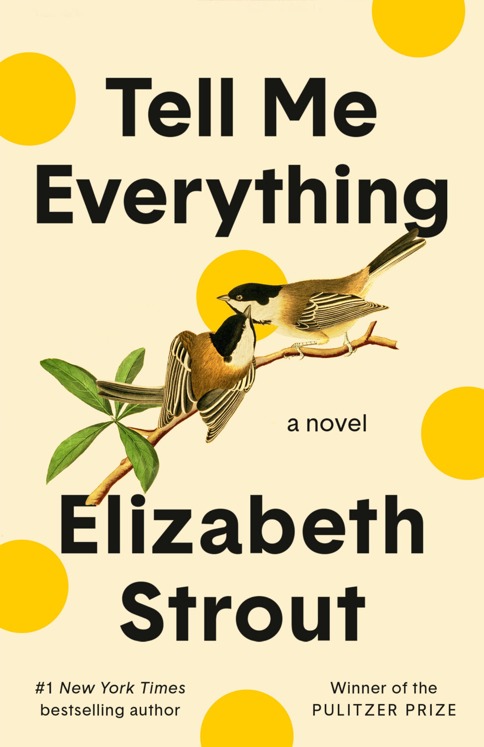
Hi. Hello. I hope you’re keeping safe and well. I’m getting this month’s post out at little earlier than usual (i.e. not the 11th hour), and on a Monday no less, because I’m going to be in NYC the rest of this week for work. Even though this is a little bit of a quick and dirty post, there are still lots of covers for you to peruse and admire. Apologies if I’ve missed anything obvious and/or spectacular. I will try to catch up next month.
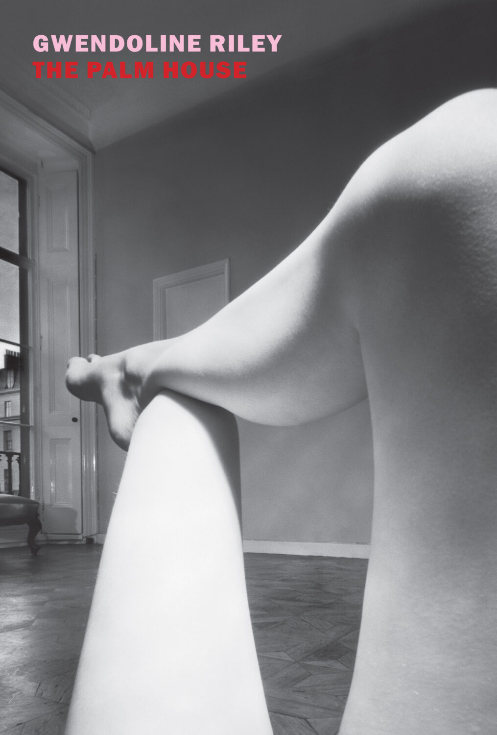
The Palm House by Gwendoline Riley; design by Katy Homans; photo by Bill Brandt (NYRB Books / April 2026)Famesick by Lean Dunham; design by Teddy Blanks (I think?); photo by Anna Gaskell (Random House / April 2026)
Well, it’s been a month. I hope you’re all keeping safe and well, especially my friends and publishing colleagues in Minnesota. Stay Strong.
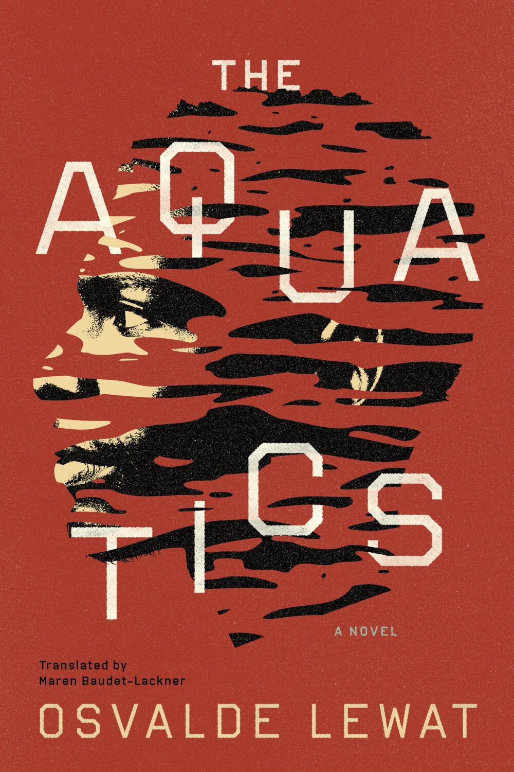
The Aquatics by Osvalde Lewat, translated by Maren Baudet-Lackner; design by Alban Fischer (Coffee House Press / December 2025)
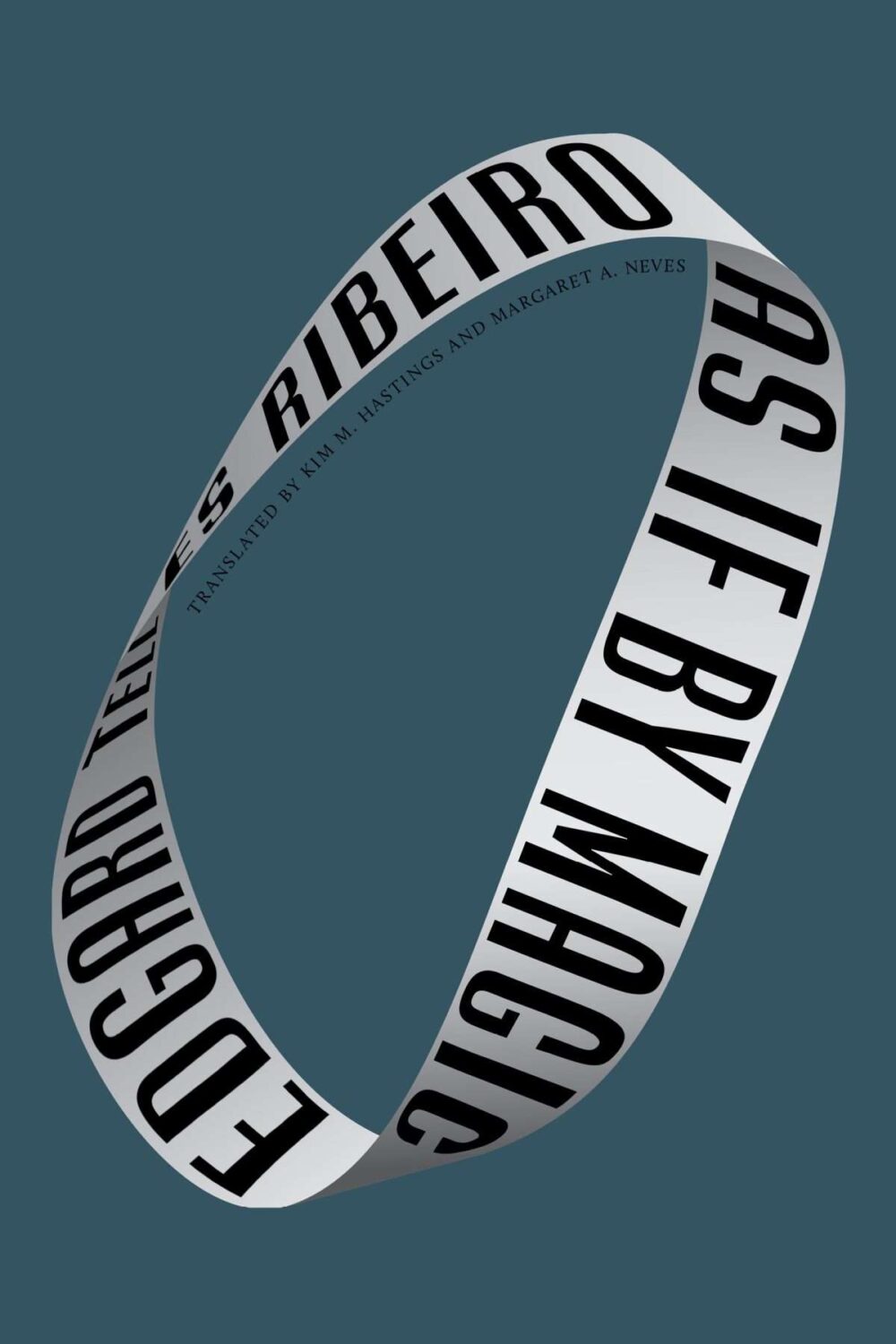
As If by Magic by Edgard Telles Ribeiro, translated by Kim M Hastings & Margaret A Neves; design by Alban Fischer (Bellevue Literary Press / January 2026)
Yes, starting off the year with two covers designed by Alban, but also two books from nonprofit publishers based in Minneapolis, Coffee House Press and Bellevue Literary Press.
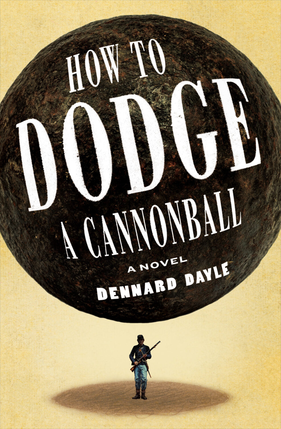
Crux by Gabriel Tallent; design by Jaya Miceli (Riverhead / January 2026)
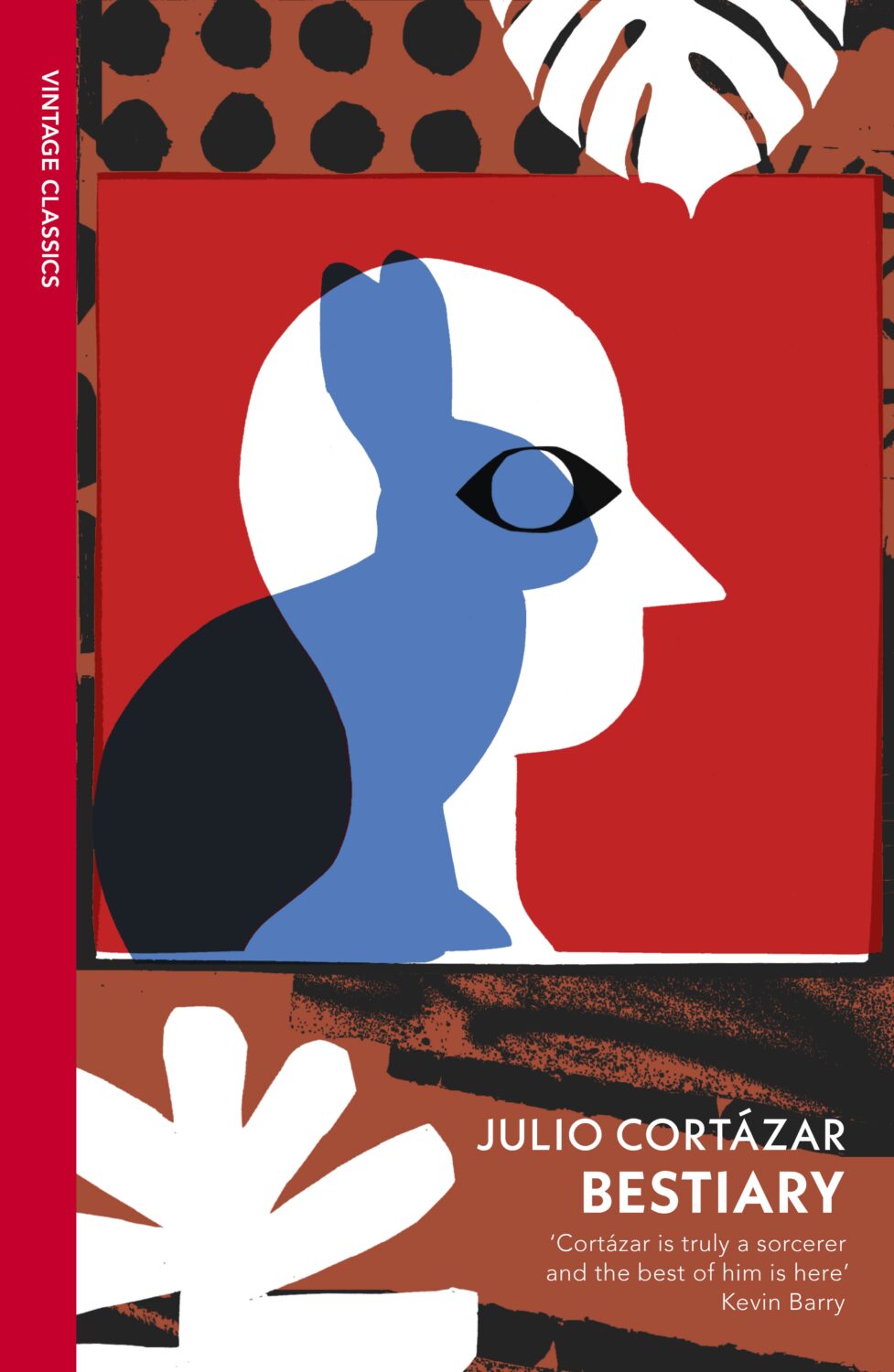
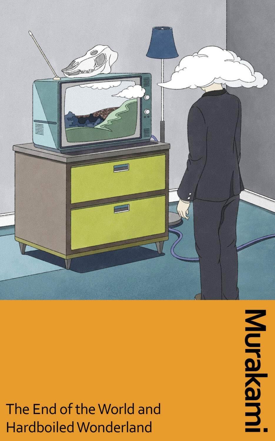
Some of my favourite covers this year were series designs. I loved the Julio Cortázar Vintage Classics editions with covers illustrated by Stephen Smith, AKA Neasden Control Centre. I was lucky enough to meet art director Suzanne Dean for coffee when she visited Toronto this summer, which was lovely. Her Haruki Murakami designs for Vintage Classics and Harvill are always a delight too.
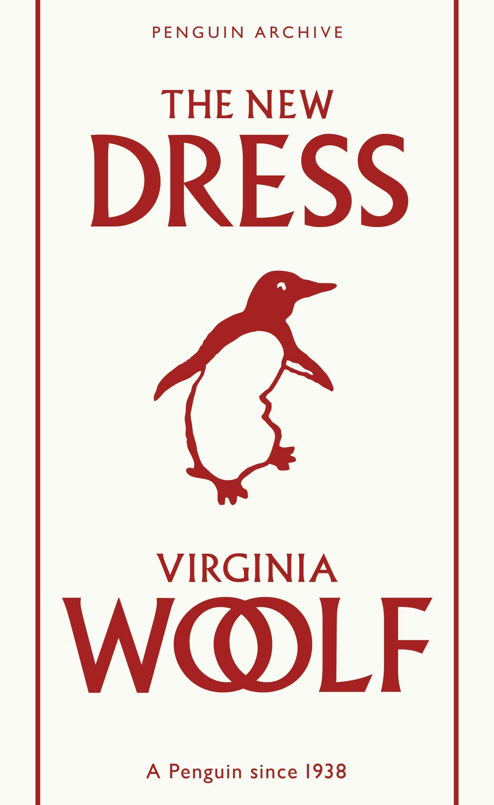
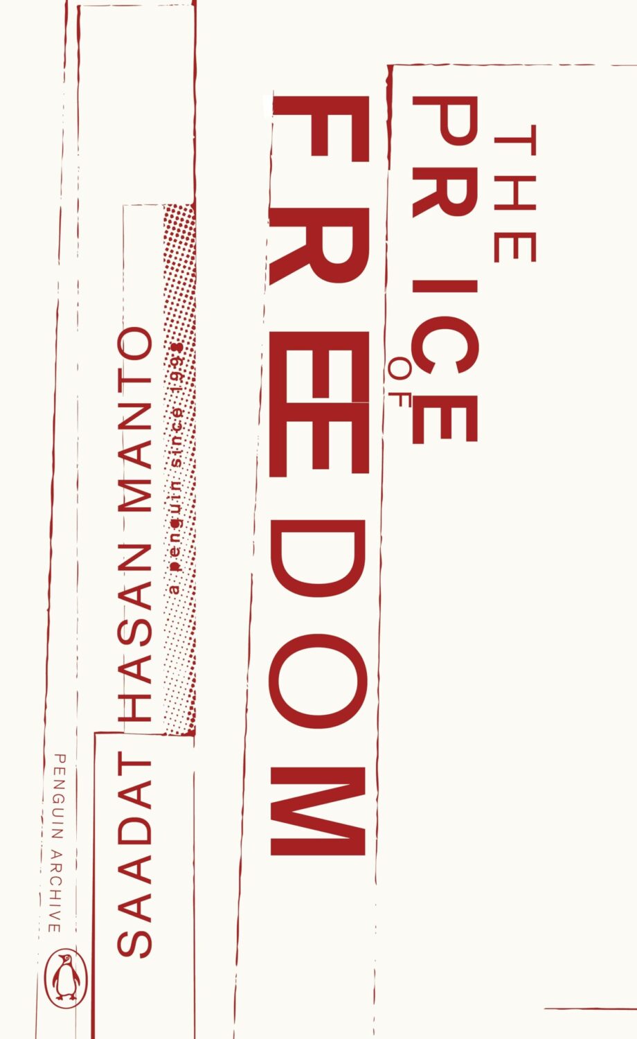
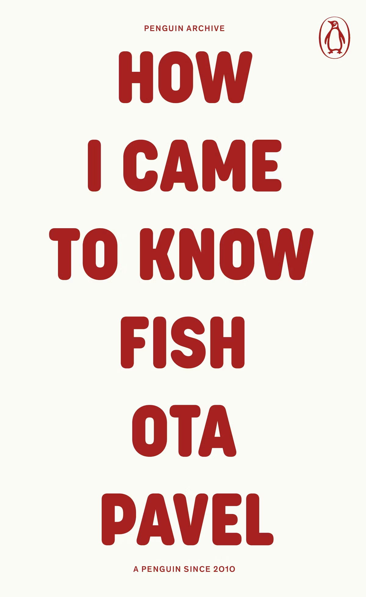
The typographic covers for the ‘Penguin Archive’ designed by Jim Stoddart triggered my curiosity. Published in April to celebrate 90 years of Penguin Books, the designs use typography to evoke the different eras of the publisher. You can read more about the series and the design process at Creative Review. But which historic Penguin covers inspired type choices in the first place?
There was some really nice series design from independent publishers this year too. I really liked Luísa Dias‘s covers for Wild Hunt Books’ Northern Weird Project. I wanted to feature them here when the final book of the series, Turbine 34 by Katherine Clements, came out last month, but time was not on my side. Fortunately, Zachary Petit talked to Luísa about the series for PRINT in April.
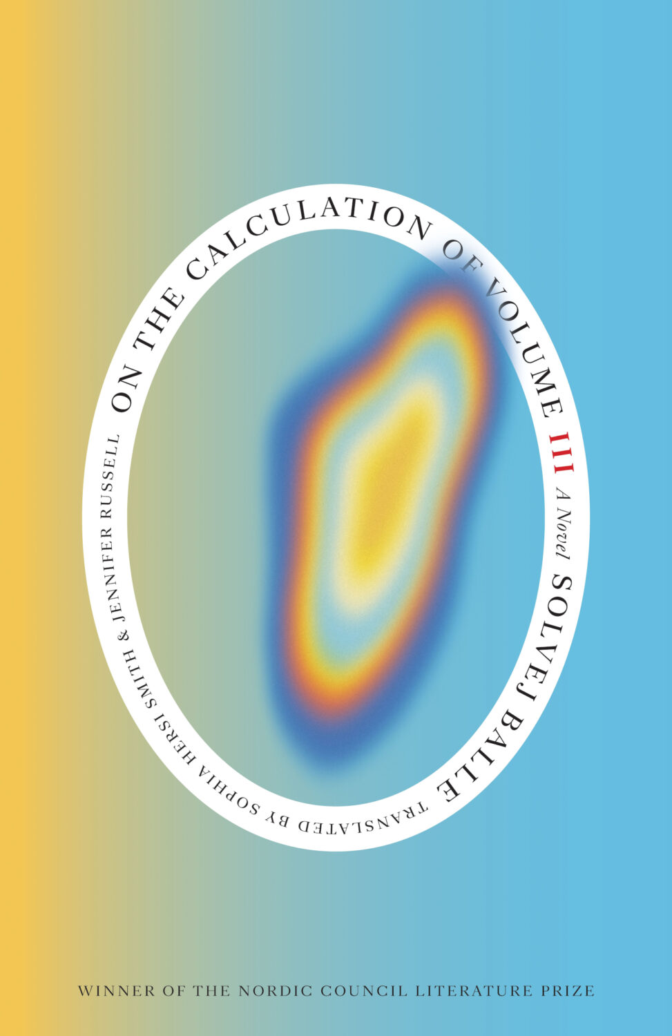
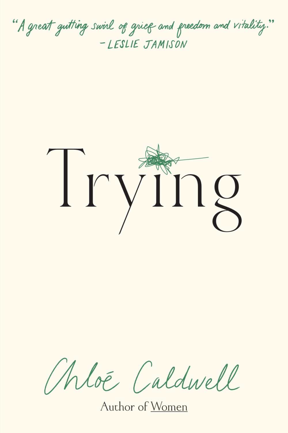
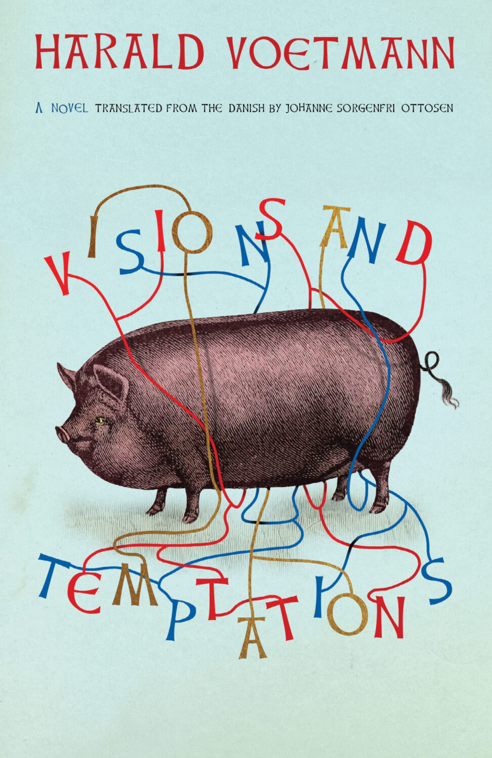
In Solvej Balle’s On the Calculation of Volume septology a women repeats the same day over and over again, and Matt Dorfman‘s covers for the New Direction editions are a really creative take on loops and repetition. The first two books came out last year and were featured in my October 2024 post so they’re not on this year’s list even though the third book was published in November. There are, however, two covers from a different Danish septology included below.
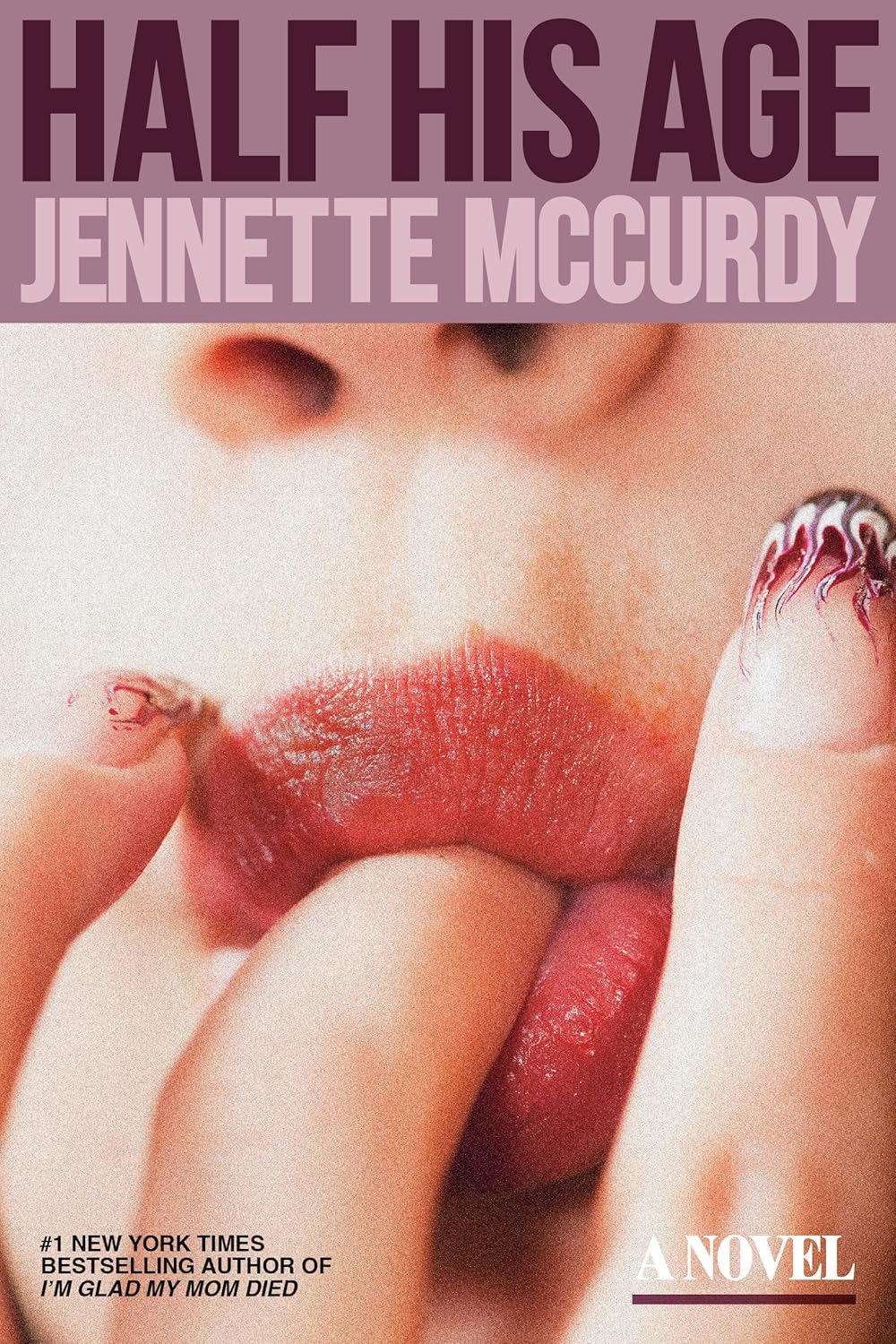
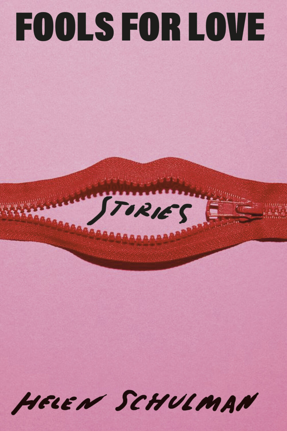
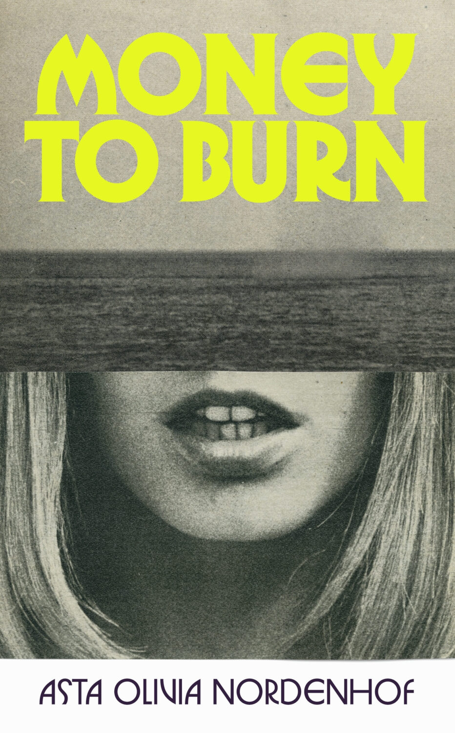
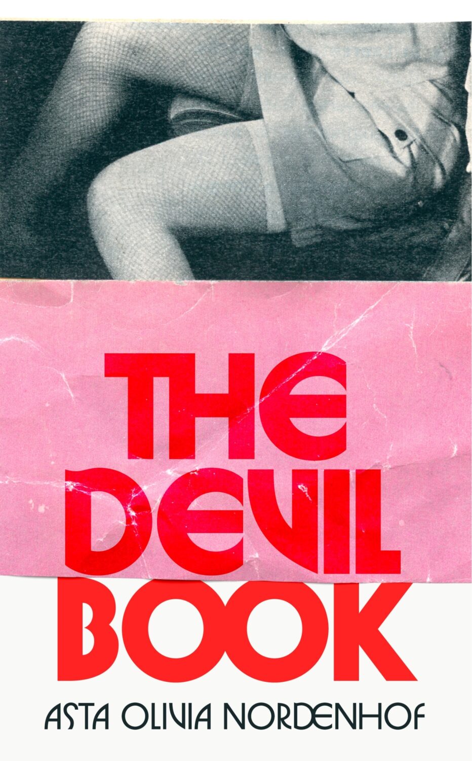
In terms of trends, Alban Fischer noticed that there have been a lot of close-ups of lips recently, something which I Need A Book Cover also picked up on.
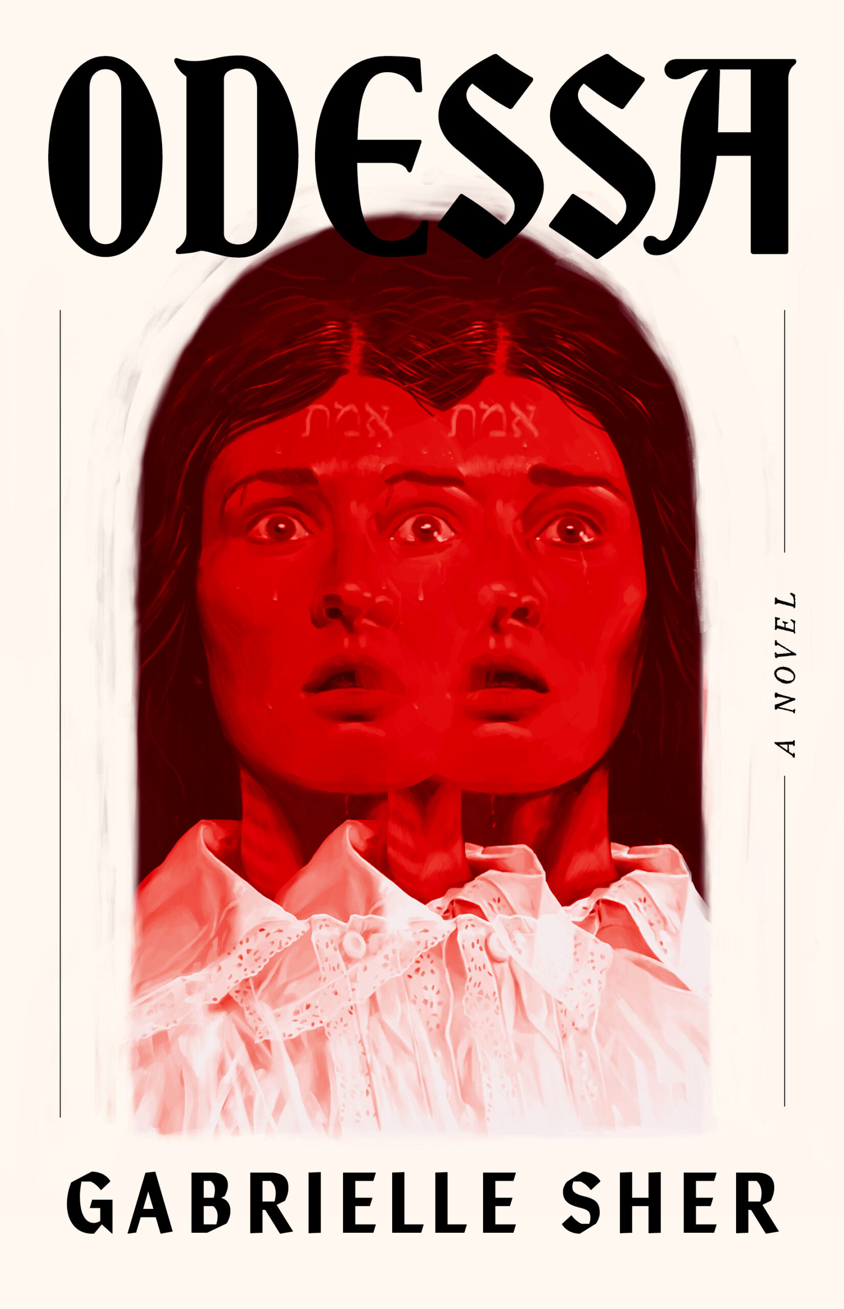
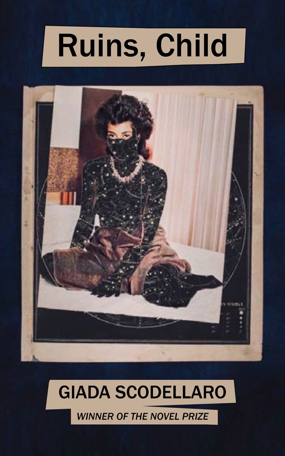
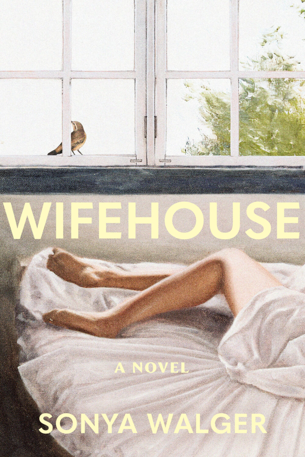
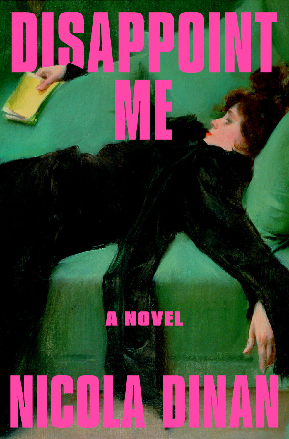
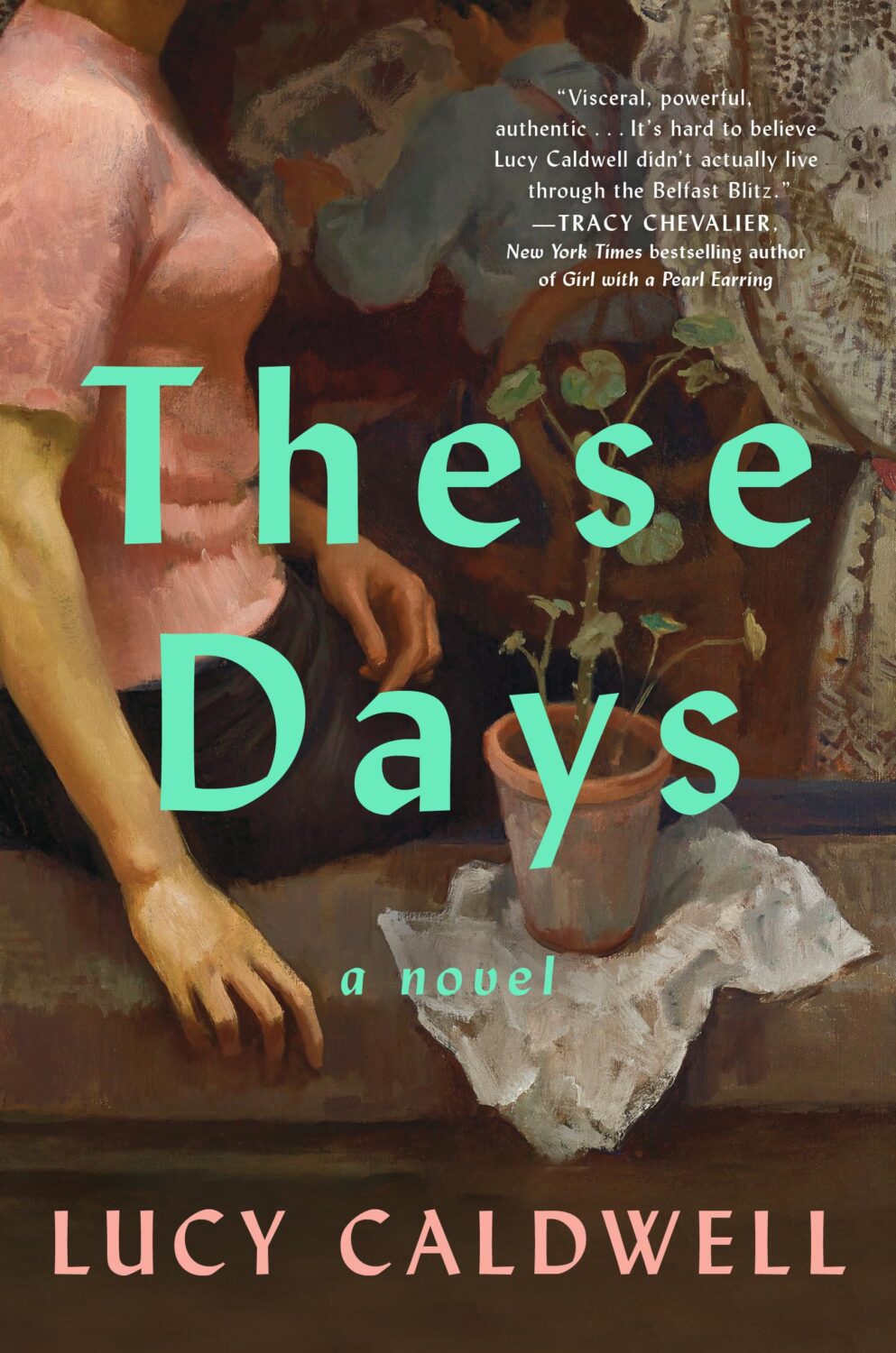
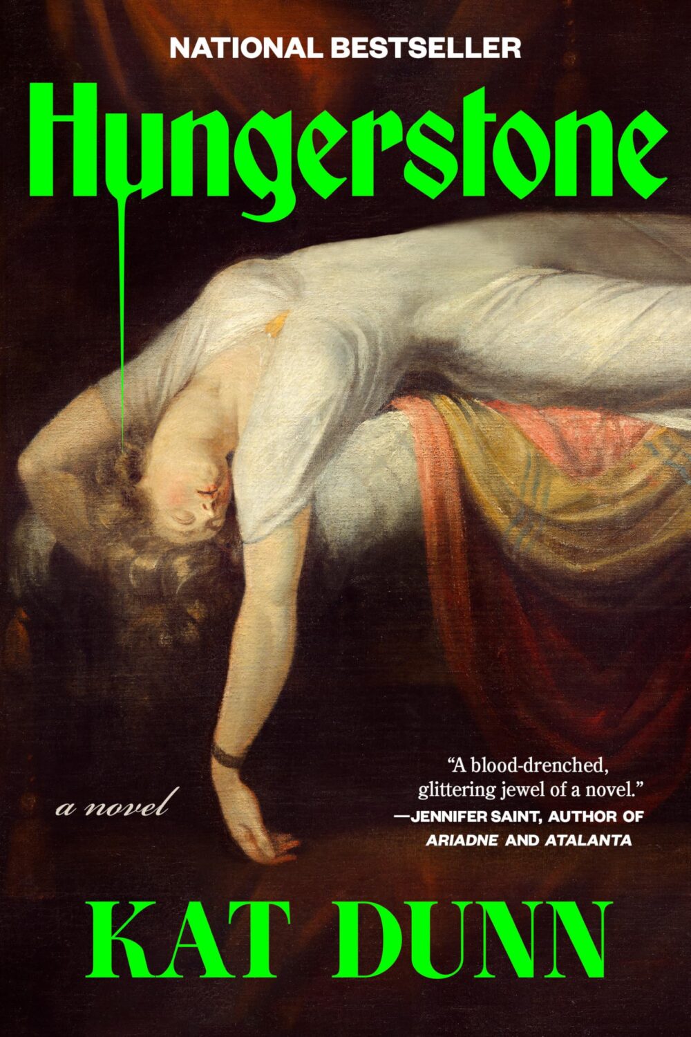
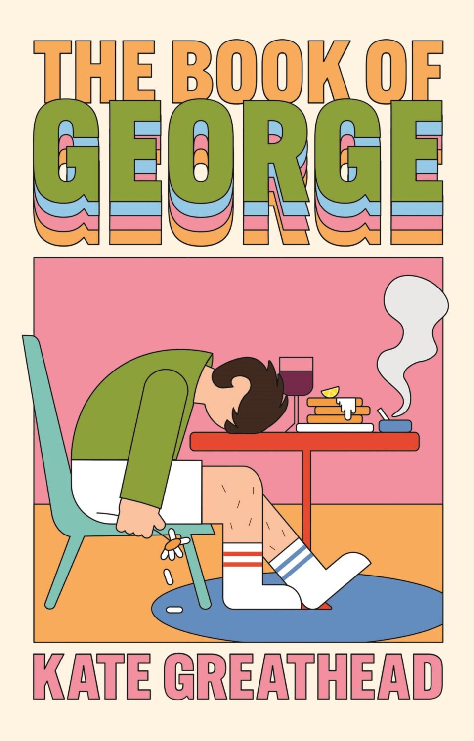
One strand of the ‘trend you’re seeing everywhere’ was paintings of women in various states of repose. There was a lot of elegant ennui and it almost felt like an art school version of well-dressed and distressed covers at times.
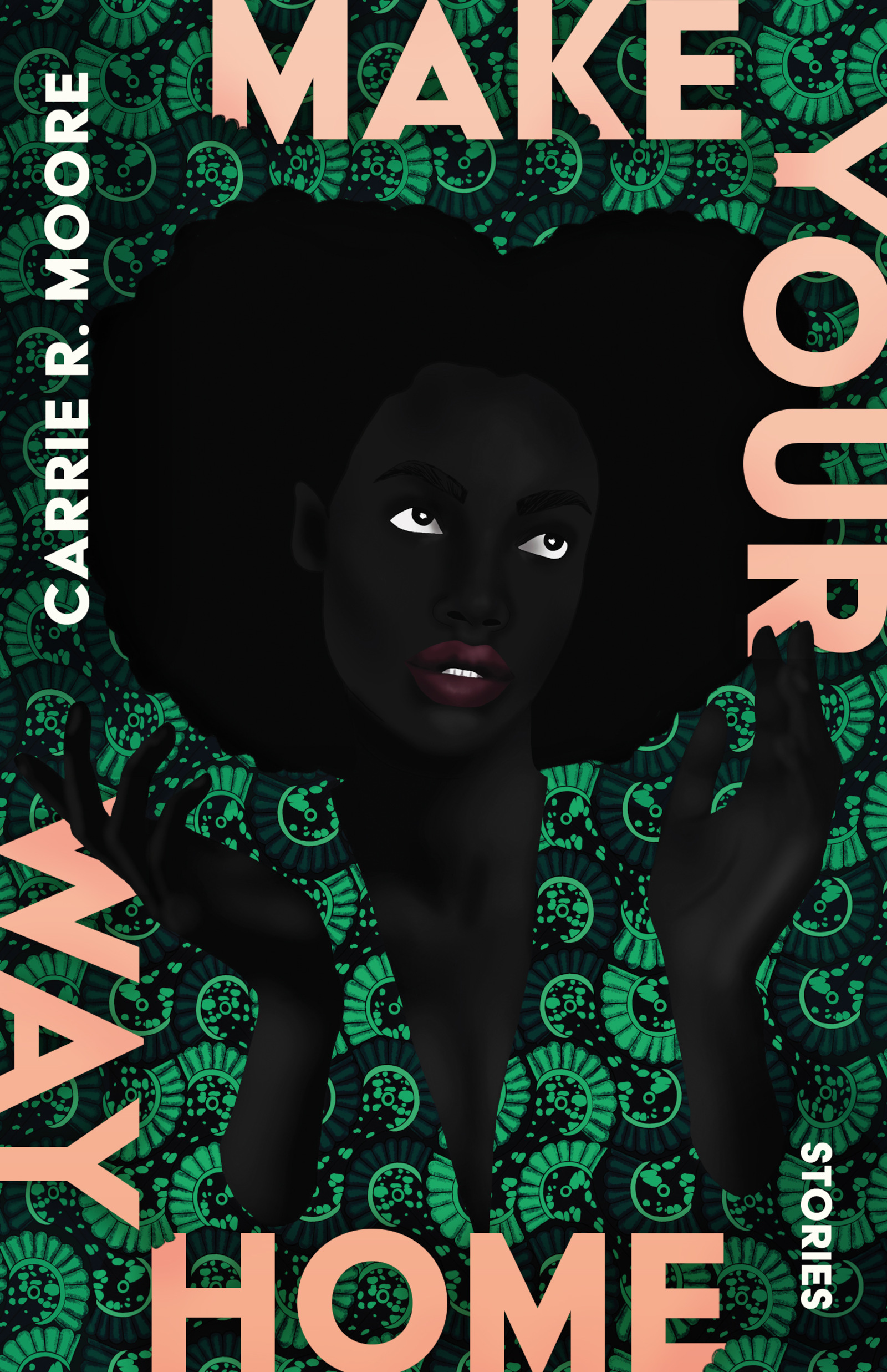
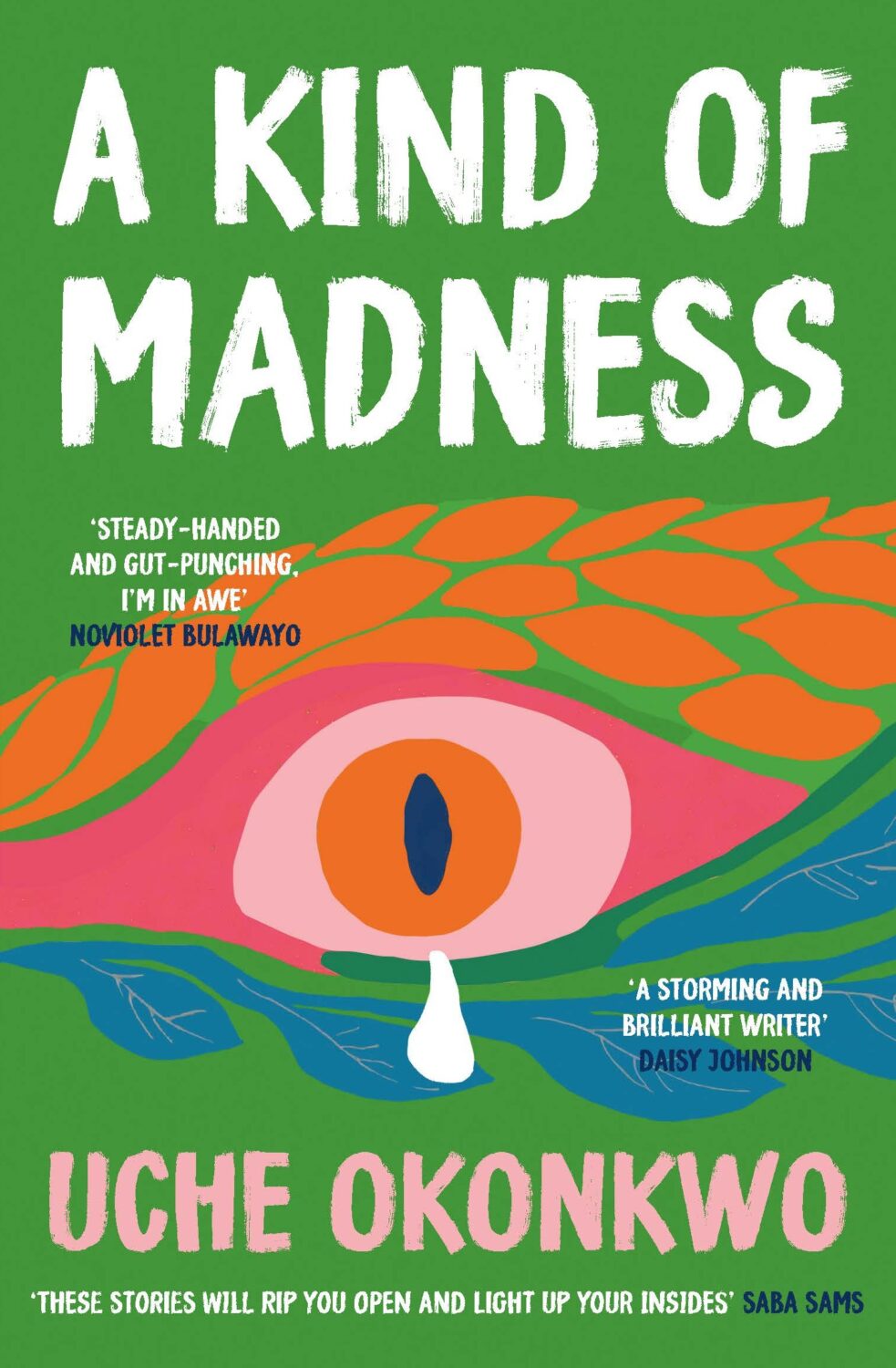
Disappoint Me by Nicola Dinan; design by Rachel Ake; art ‘After the Ball’ by Ramon Casas i Carbo (Dial Press / May 2025)What a Time to be Alive by Jenny Mustard; cover art by Shannon Cartier Lucy (Sceptre / April 2025)These Days by Lucy Caldwell; design by Ploy Siripant; art ‘Woman in the Window’, by Alberto Morrocco (SJP Lit / April 2025)Hungerstone by Kat Dunn; design by Alicia Tatone; art ‘The Nightmare’ by Henry Fuseli
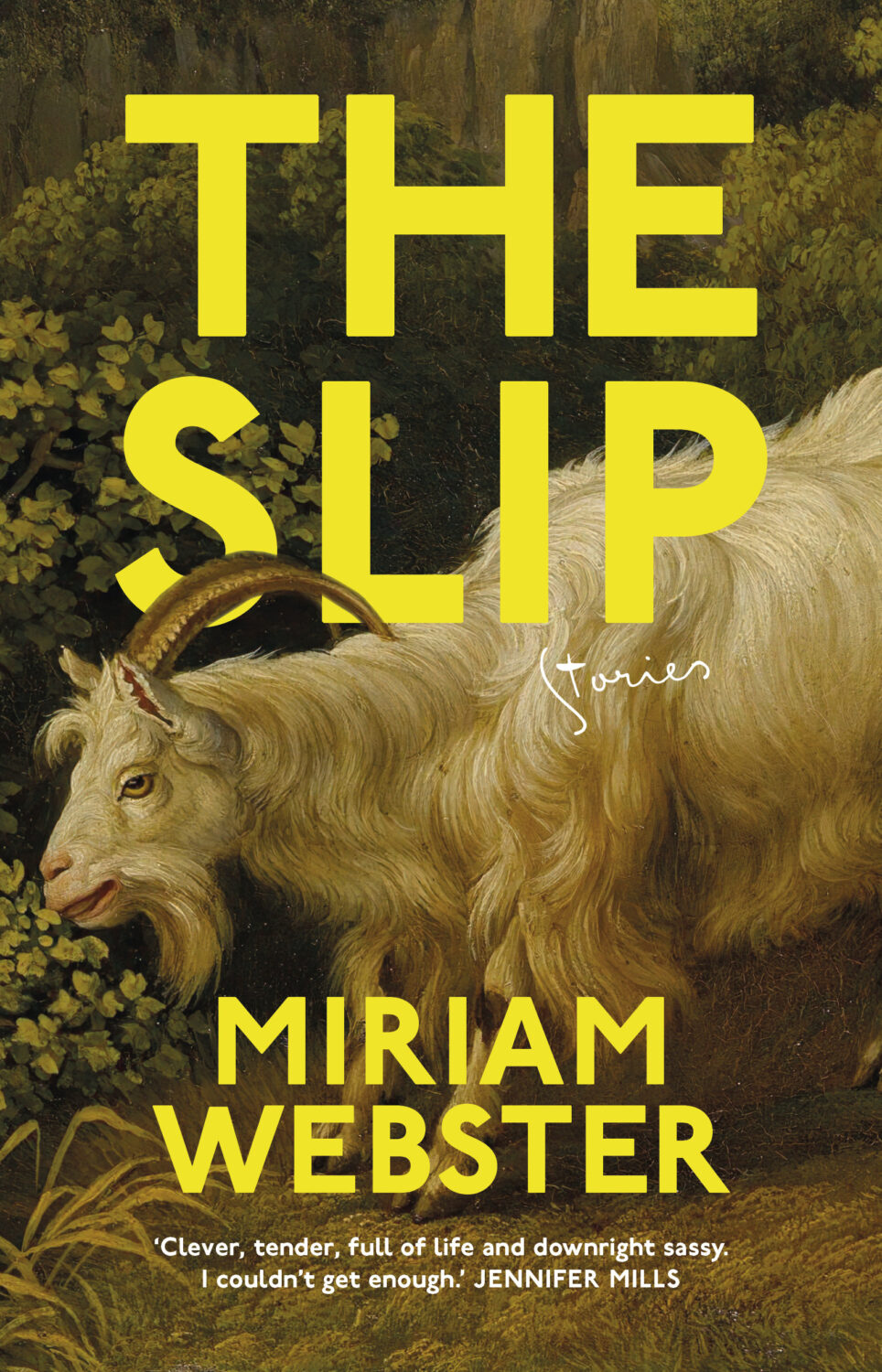
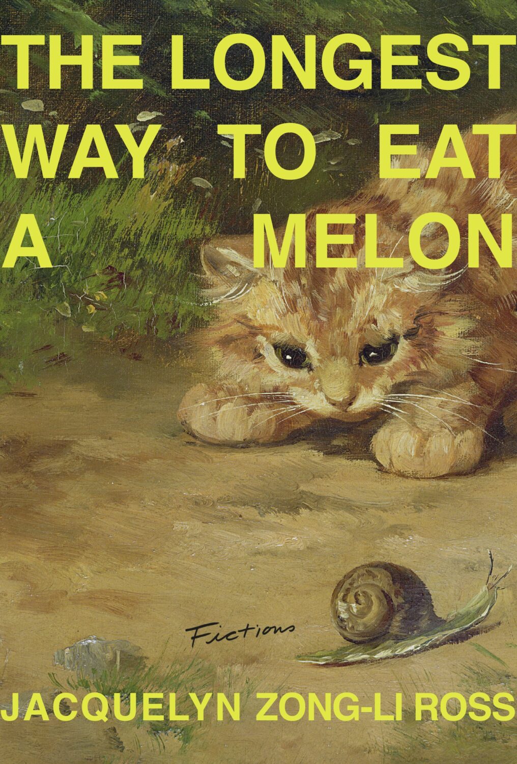
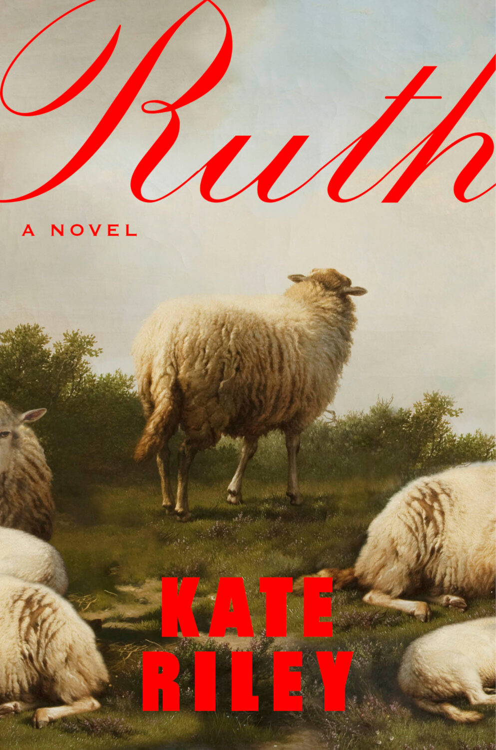
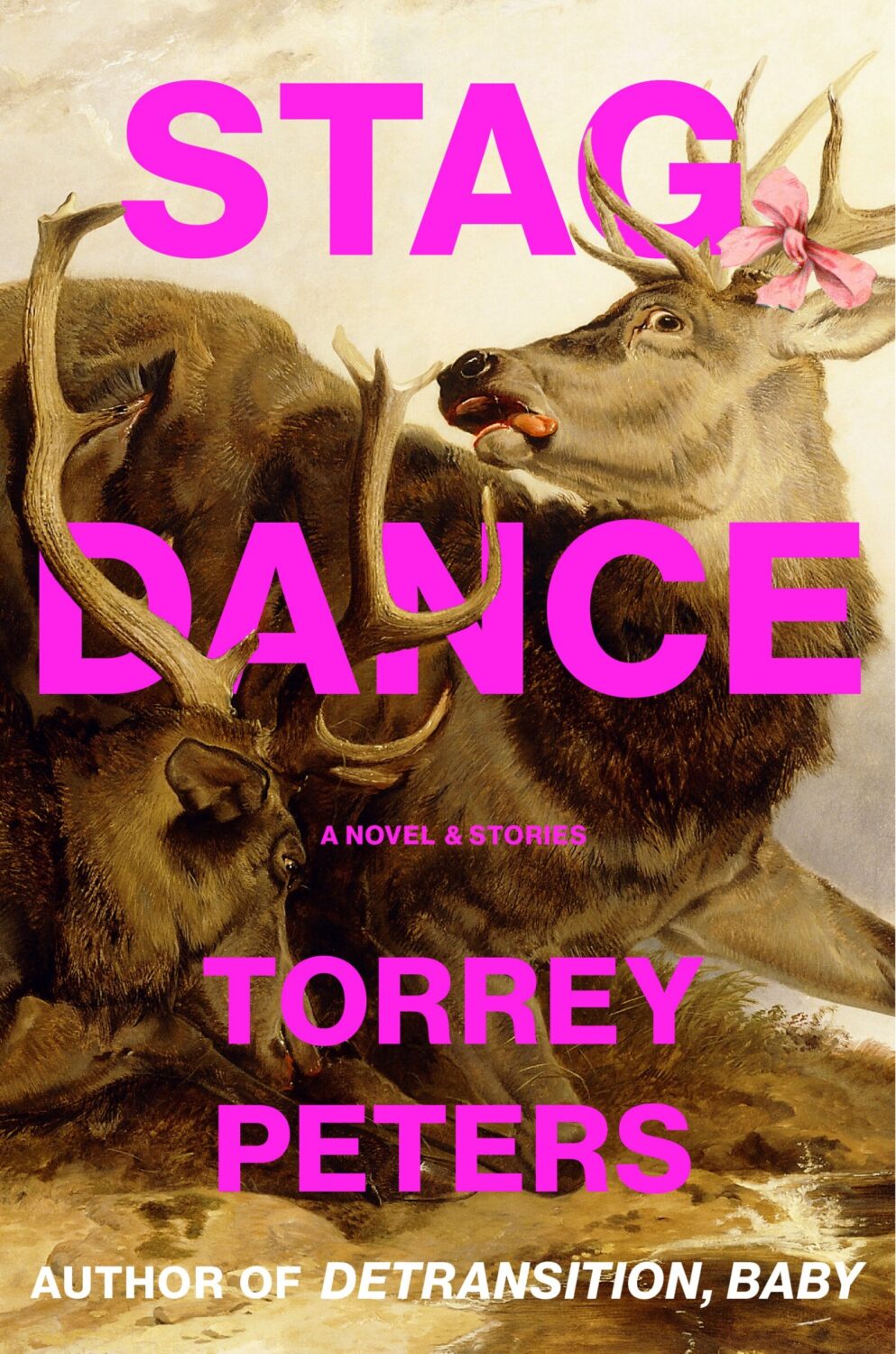
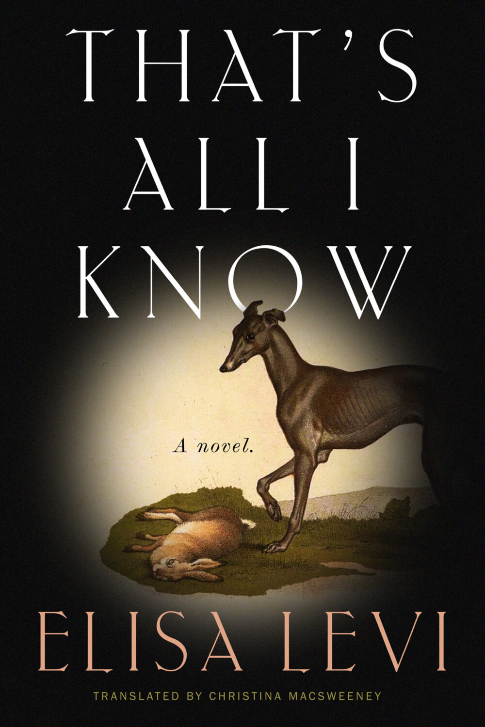
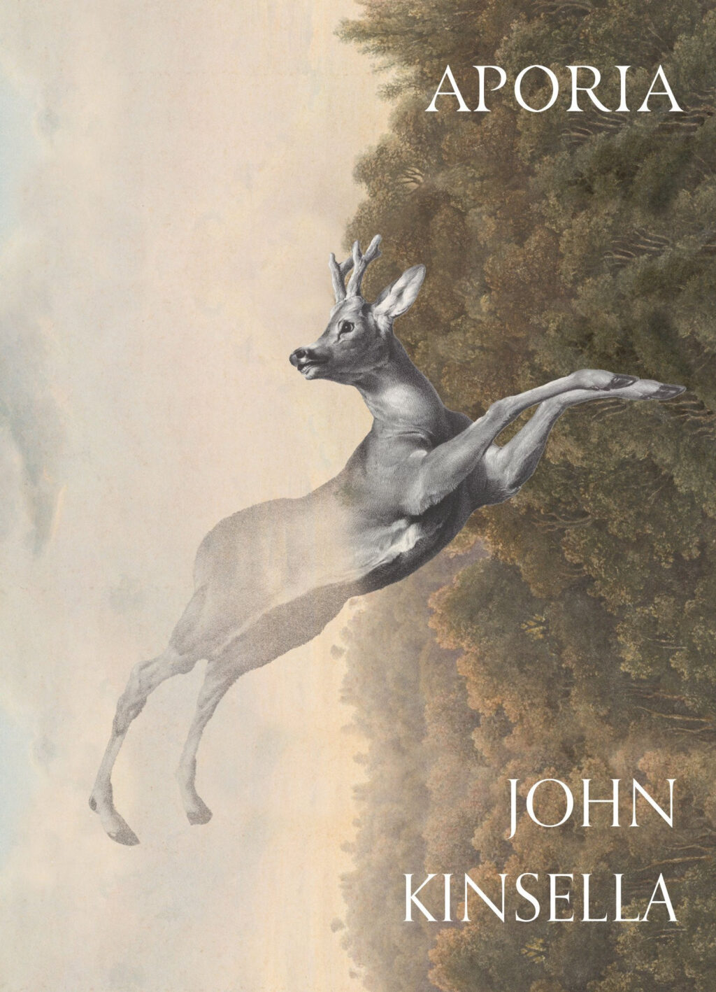
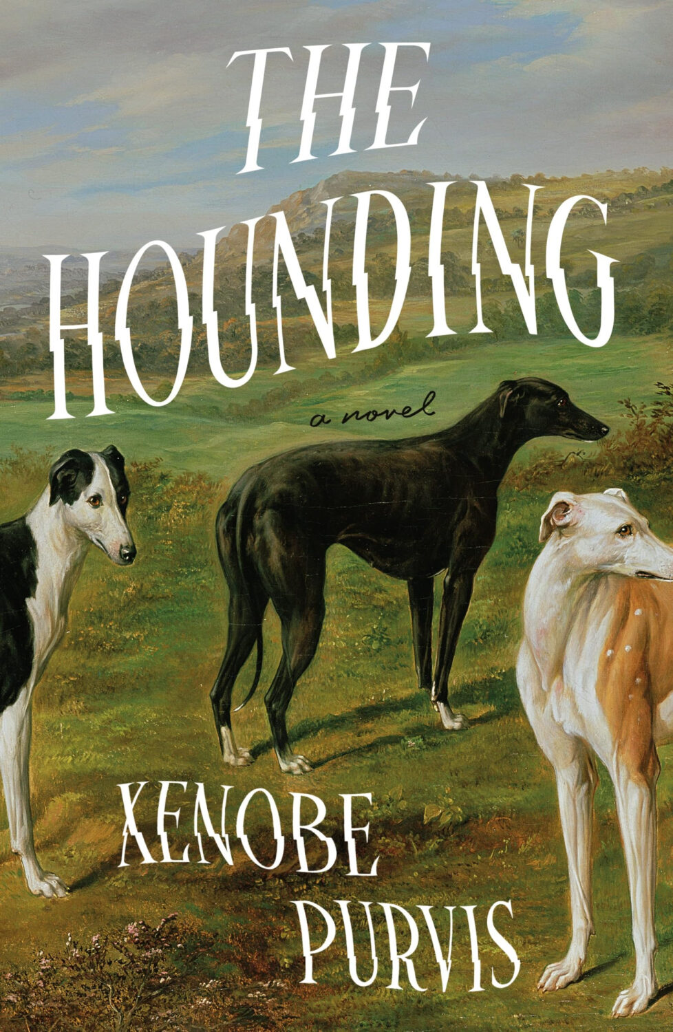
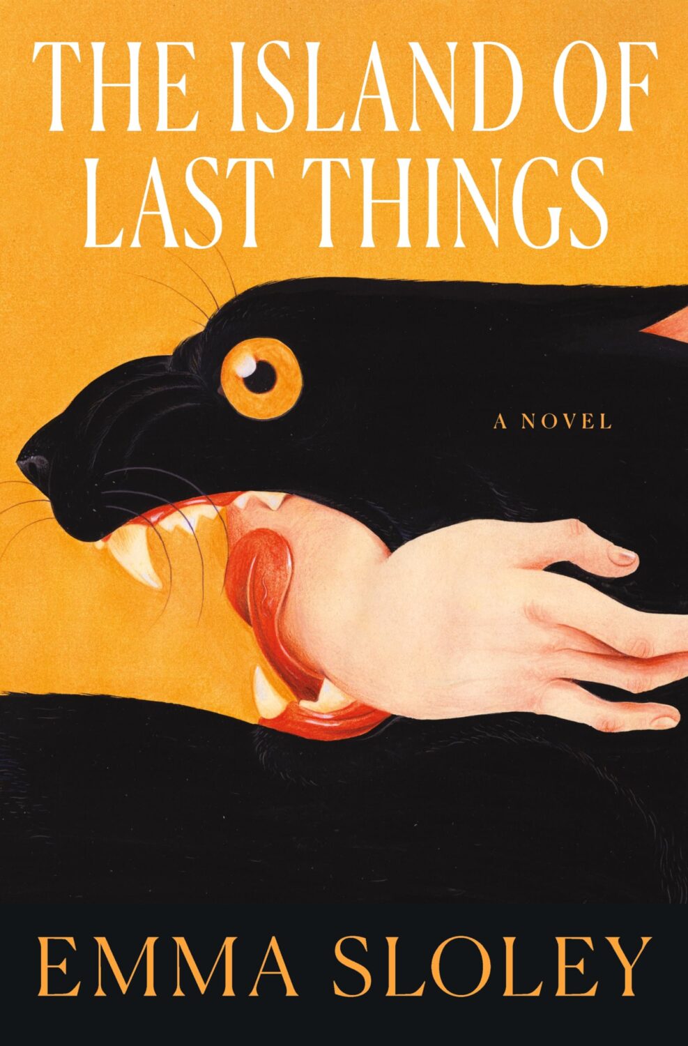
Another strand was historical paintings of animals, which fits with the “old-timey animals” covers Patrick Redford wrote about for Defector last year.
I think the success of these covers largely depends on the image selection and the cleverness of the crop. I’m sure we will see more of them going forward, but doing it well is probably harder than it looks.
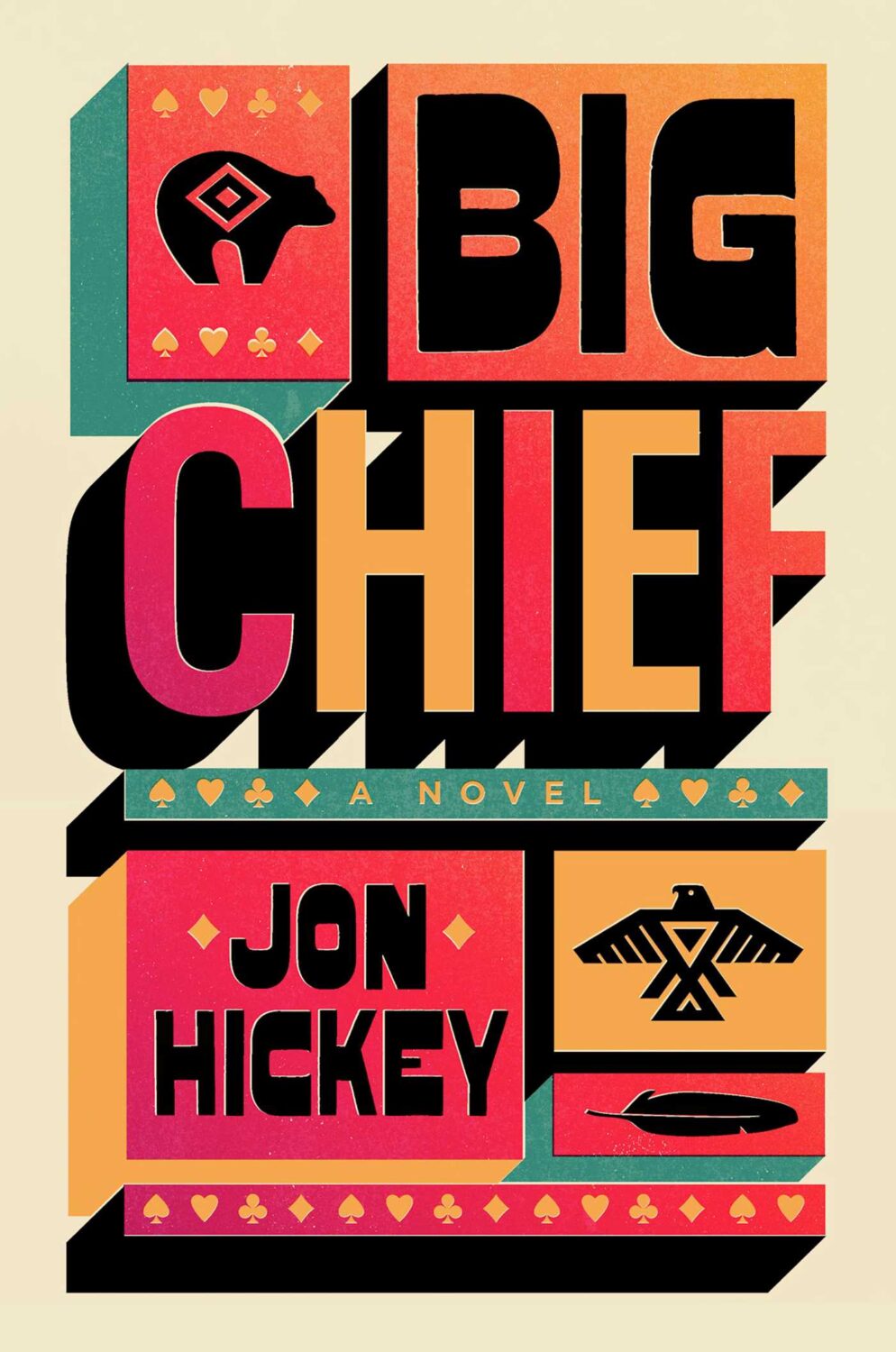
I don’t have a good name for this next trend, but in my mind I’ve been referring to this as “corner type” because of the way the text seems to turn the corners the cover. I guess what it is really doing is framing the central image. I don’t know if this is new, but I noticed it a lot this year.
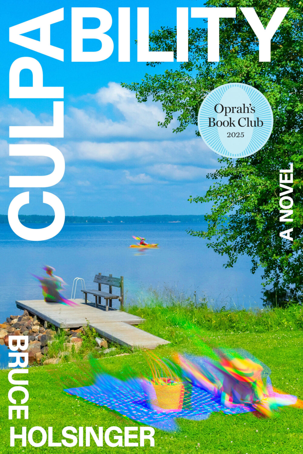
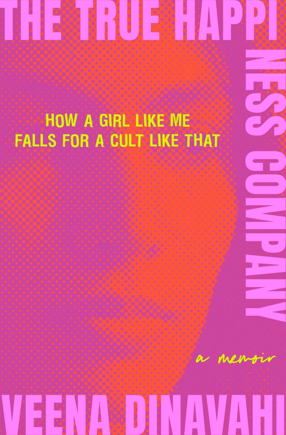
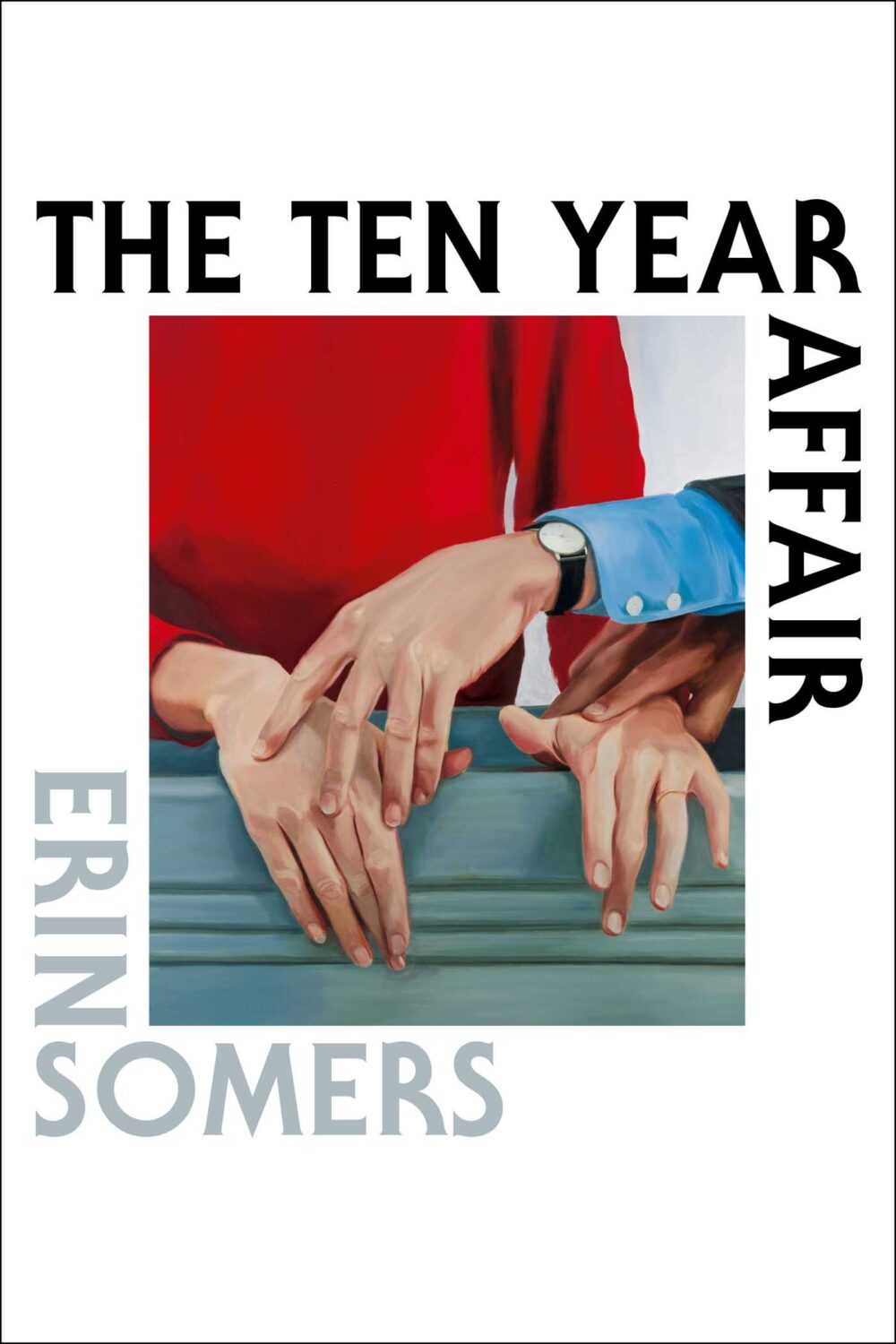
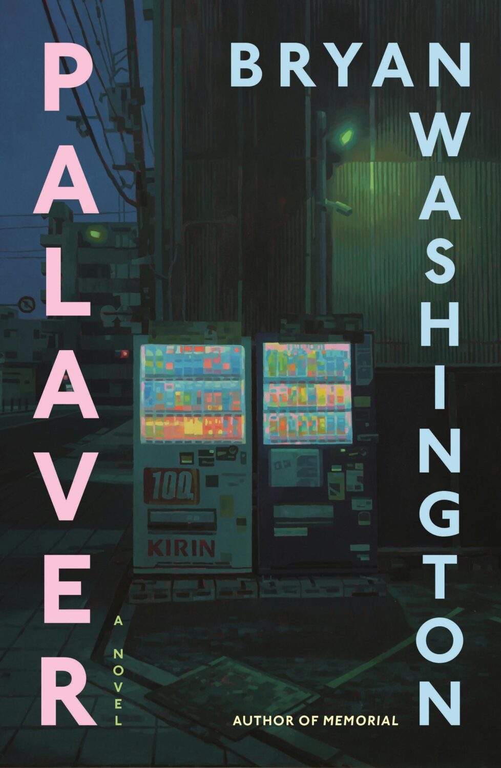
Culpability by Bruce Holsinger; design by Rodrigo Corral (Spiegal & Grau / July 2025)The True Happiness Company by Veena Dinavahi; design by Rachel Ake (Random House / May 2025)The Ten Year Affair; by Erin Somers; design by Emily Mahon; cover art by Shannon Cartier Lucy (Simon & Schuster / October 2025)Palaver by Bryan Washington; design by Na Kim; art by Keita Morimoto (Farrar, Straus & Giroux / November 2025)
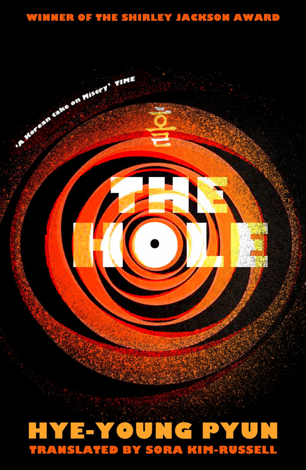
I mentioned a wave of retro-nostalgic horror and suspense covers back in 2023 (I could’ve sworn it was last year until I checked!), but it feels like designers are still having fun with it as the genre as a whole gets more mainstream attention.
And speaking of nostalgia, I feel like covers inspired by 1980s advertising and airbrush art are suddenly a thing. There are a few examples from 2025, but it might be something we see more of next year as well.
Lastly, I just wanted to say thank you to everyone who supported the blog this year, especially the folks that helped out with cover images, credits, and corrections. I really appreciate you taking the time to reach out, and I’m sorry if you sent me a note and didn’t hear back. I try my best to read and reply to everything, but this is a one man show and sometimes life has other plans.
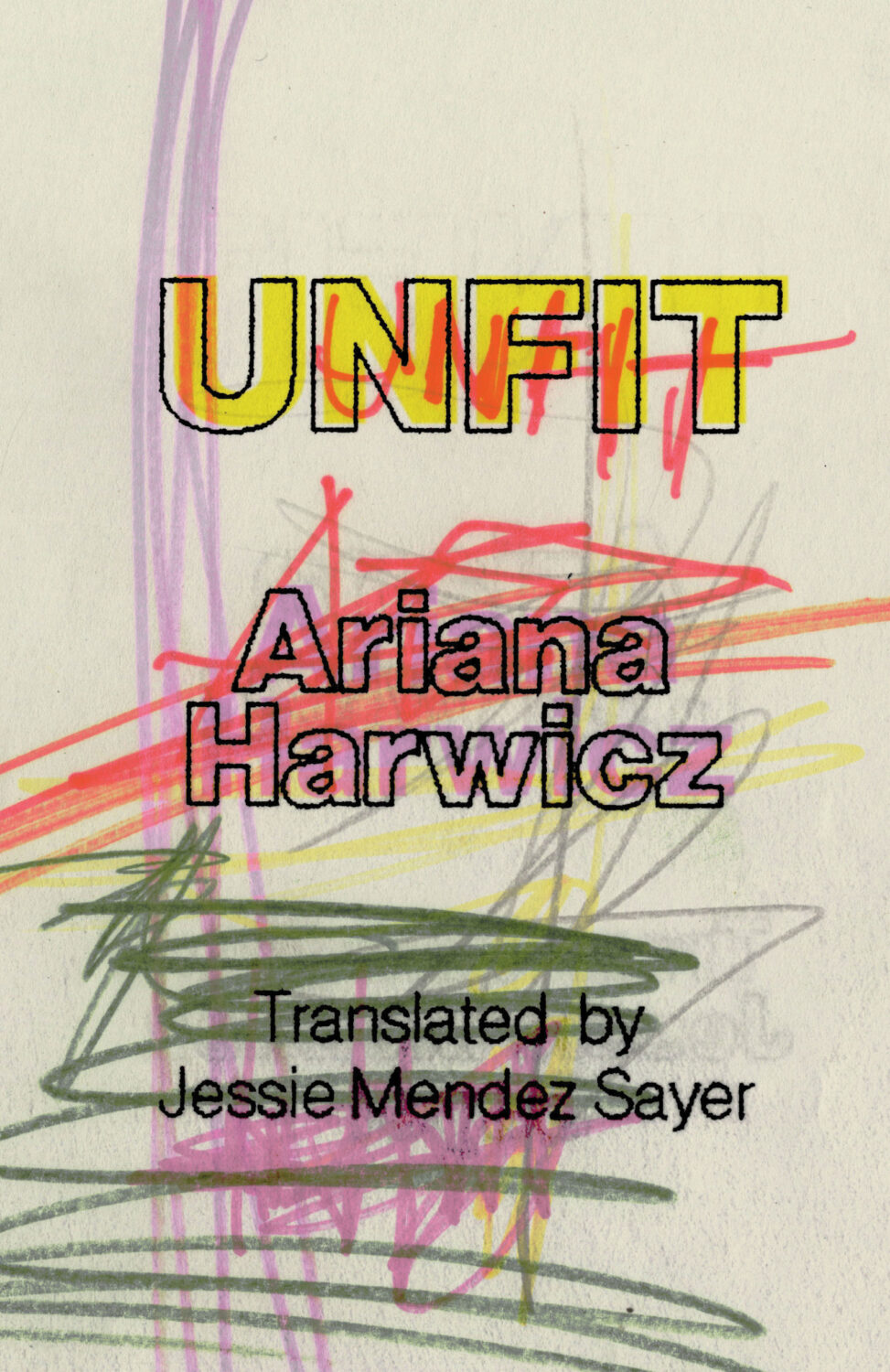
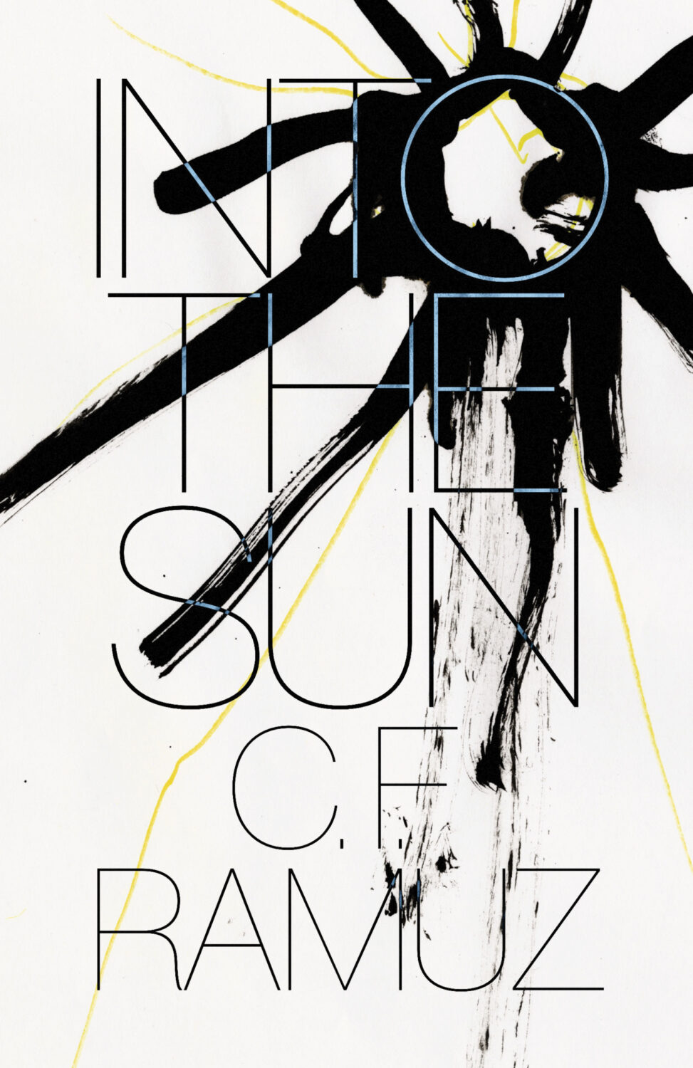
Unfit by Ariana Harwicz, translated by Jessie Mendez Sayer; design by Erik Carter (New Directions / October 2025)Into the Sun by C. F. Ramuz translated by Olivia Baes &, Emma Ramadan; design by Erik Carter (New Directions / August 2025)
Zone Rouge by Michael Jerome Plunkett; design by Jaya Nicely (Unnamed Press / September 2025)Open Up by Thomas Morris; design by Jaya Nicely (Unnamed Press / April 2025)
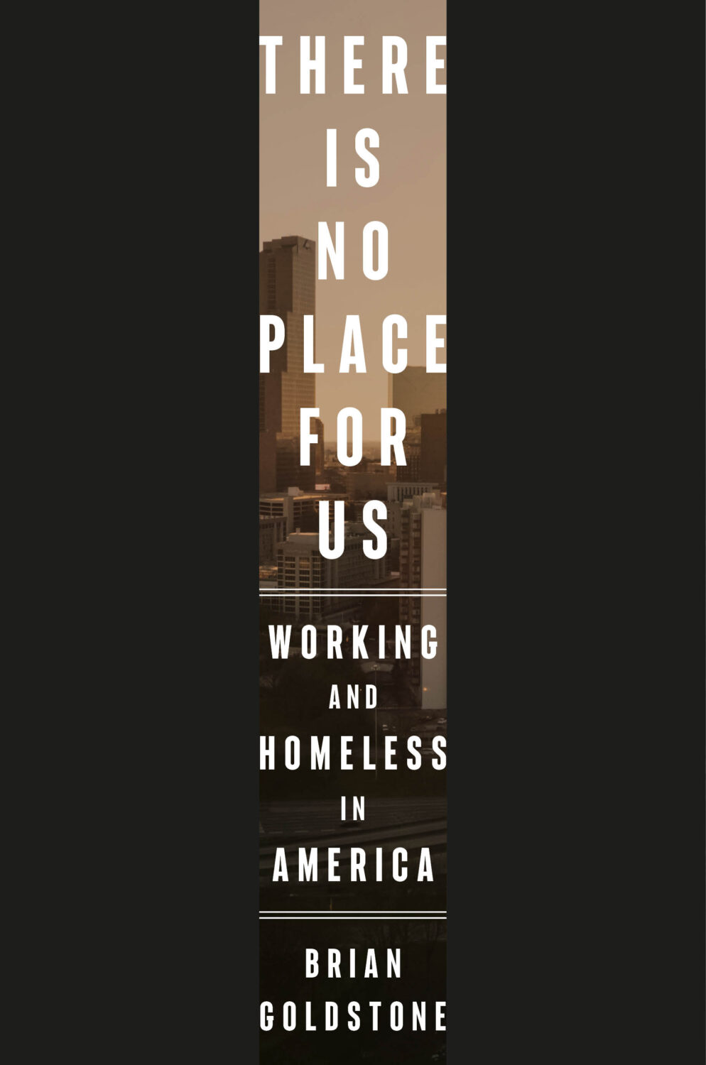
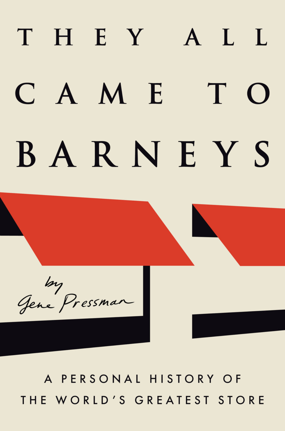
This reminded me of the cover of There Is No Place For Us by Brian Goldstone designed by Anna Kochman for Crown, which featured in March’s post. I’m no Barnett Newman, I do like a bold stripe.
Unfit by Ariana Harwicz, translated by Jessie Mendez Sayer; design by Erik Carter (New Directions / October 2025)
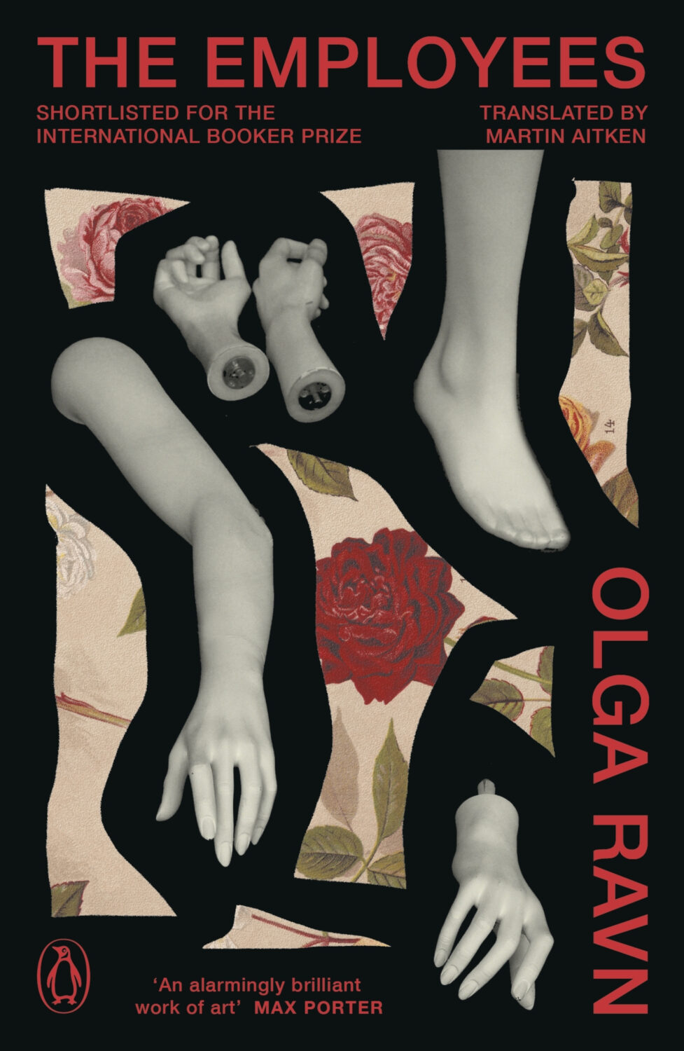
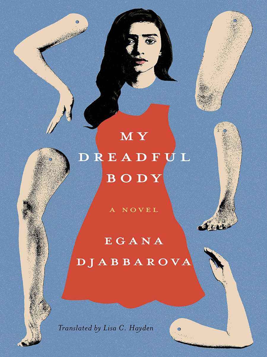
Dan Jackson also designed a new cover for the paperback edition of The Employees by Olga Ravn out next month in the UK from Penguin, which weirdly kind of looks like a Joan Wong collage, but could also be part of a dismembered / disembodied limbs on covers trend? I’m struggling to think of too many examples off the top of my head. Alban Fischer‘s cover design for My Dreadful Body by Egana Djabbarova? But that’s not out until next year. I’m sure there are a couple of others out there. I will have a think on it.
I am very late to this one, but the art is fun and it kind of fits with recent trends so I didn’t want to leave it out. Let me know if there is a design credit to add.
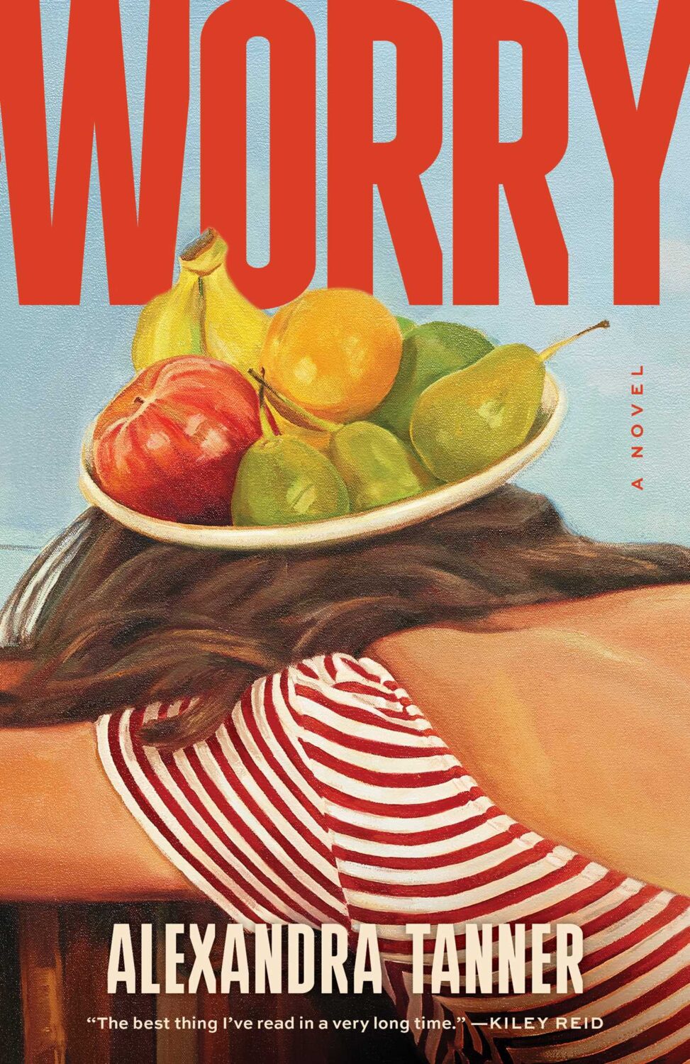
Interestingly, Shannon Cartier Lucy’s art was also used on the cover of Worry by Alexandra Tanner designed by Alicia Tatone for Scribner from last year…
Hey. I hope you’re keeping safe and well. I’m posting this late on the last day of the month, but hopefully it was worth waiting for.
I will let you get to the covers posthaste, but before I go, today (September 30th) is also Orange Shirt Day and National Day for Truth and Reconciliation in Canada, so I would like take a moment to acknowledge and remember the survivors of residential schools, their families and the kids who didn’t come home. <3
This is holographic foil just in case it’s not obvious from the above (and if someone at Head of Zeus / Bloomsbury is reading and wants to fire me a better cover image that would be great!)
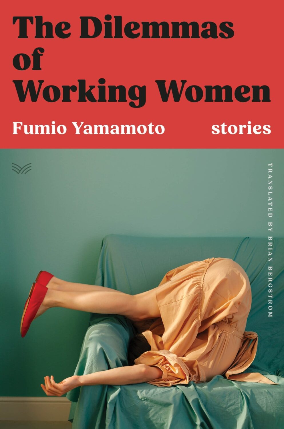
With this and the cover of The Dilemmas of Working Women designed by Sarah Kellogg (featured last month), we may have a new sub-genre of ‘well dressed and distressed’. Are there other examples?
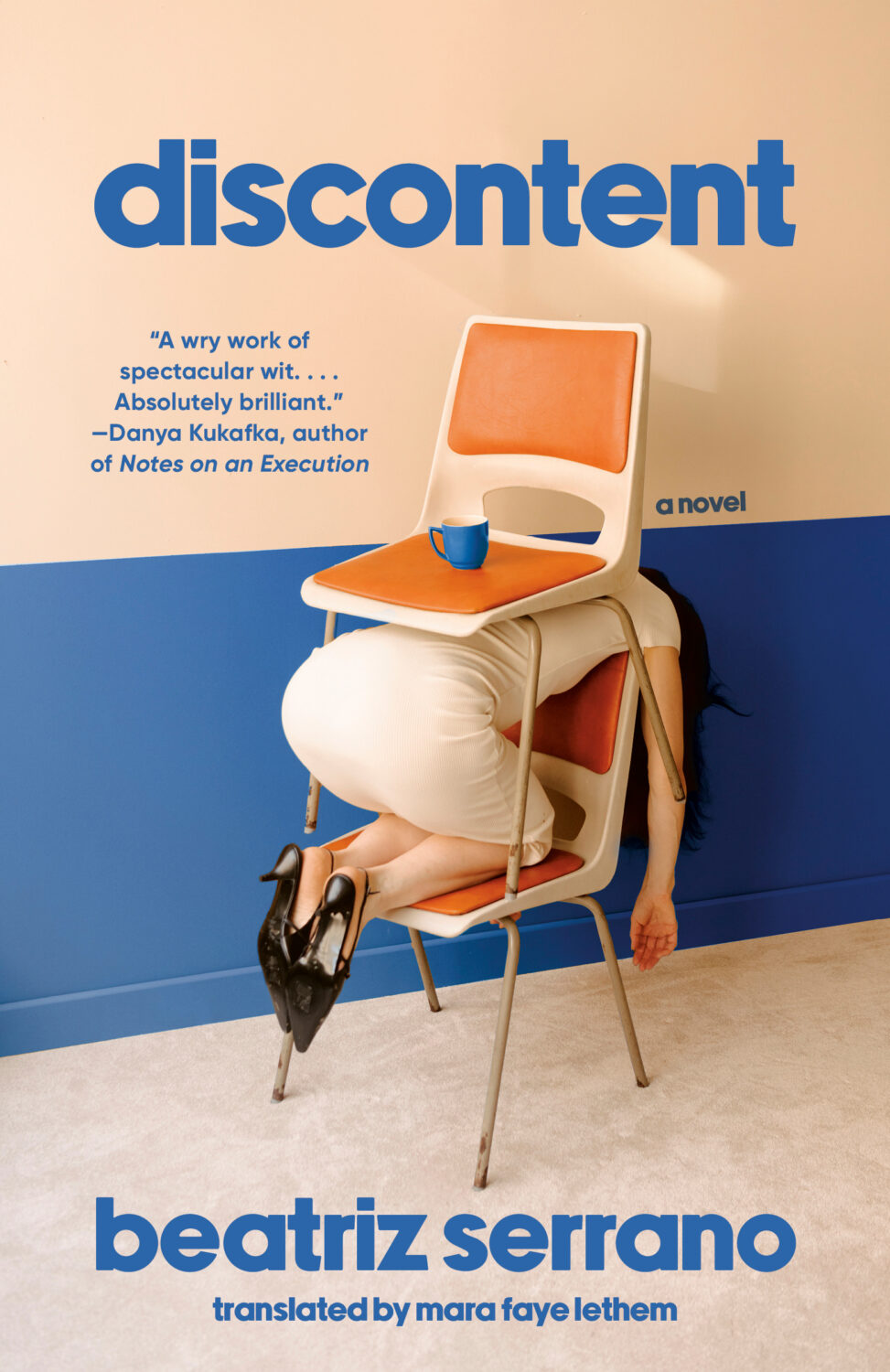
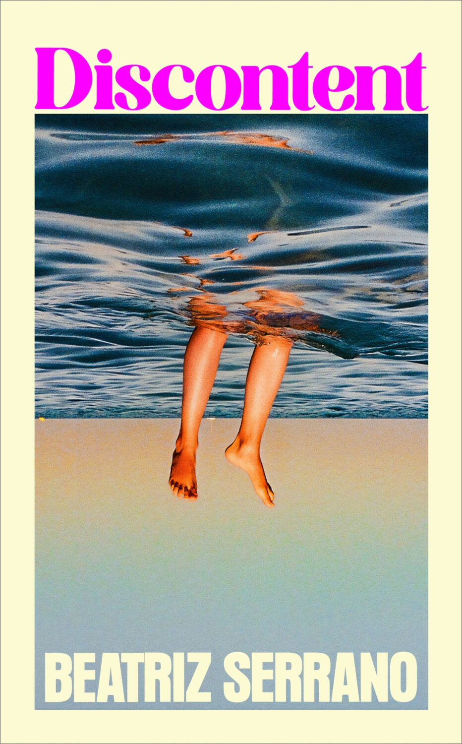
Possibly a different kind of distress, the UK edition of Discontent, published last month by Harvill Secker, was designed by Kris Potter using a photograph by Laurent Tixador.
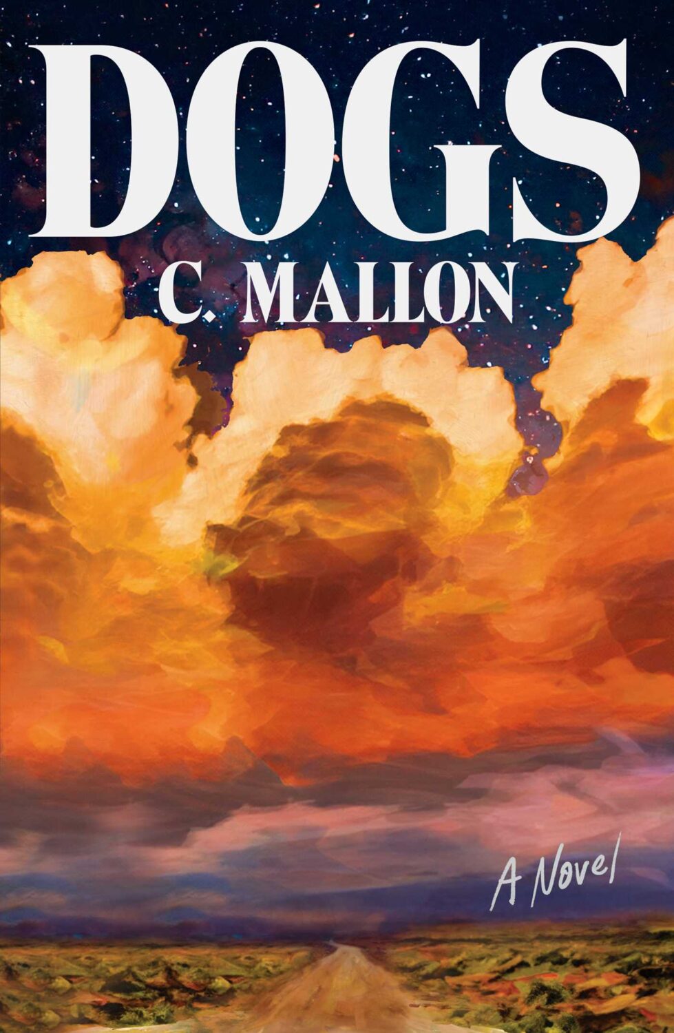
Dogs by C. Mallon; design by Jaya Miceli (Scribner / August 2025)
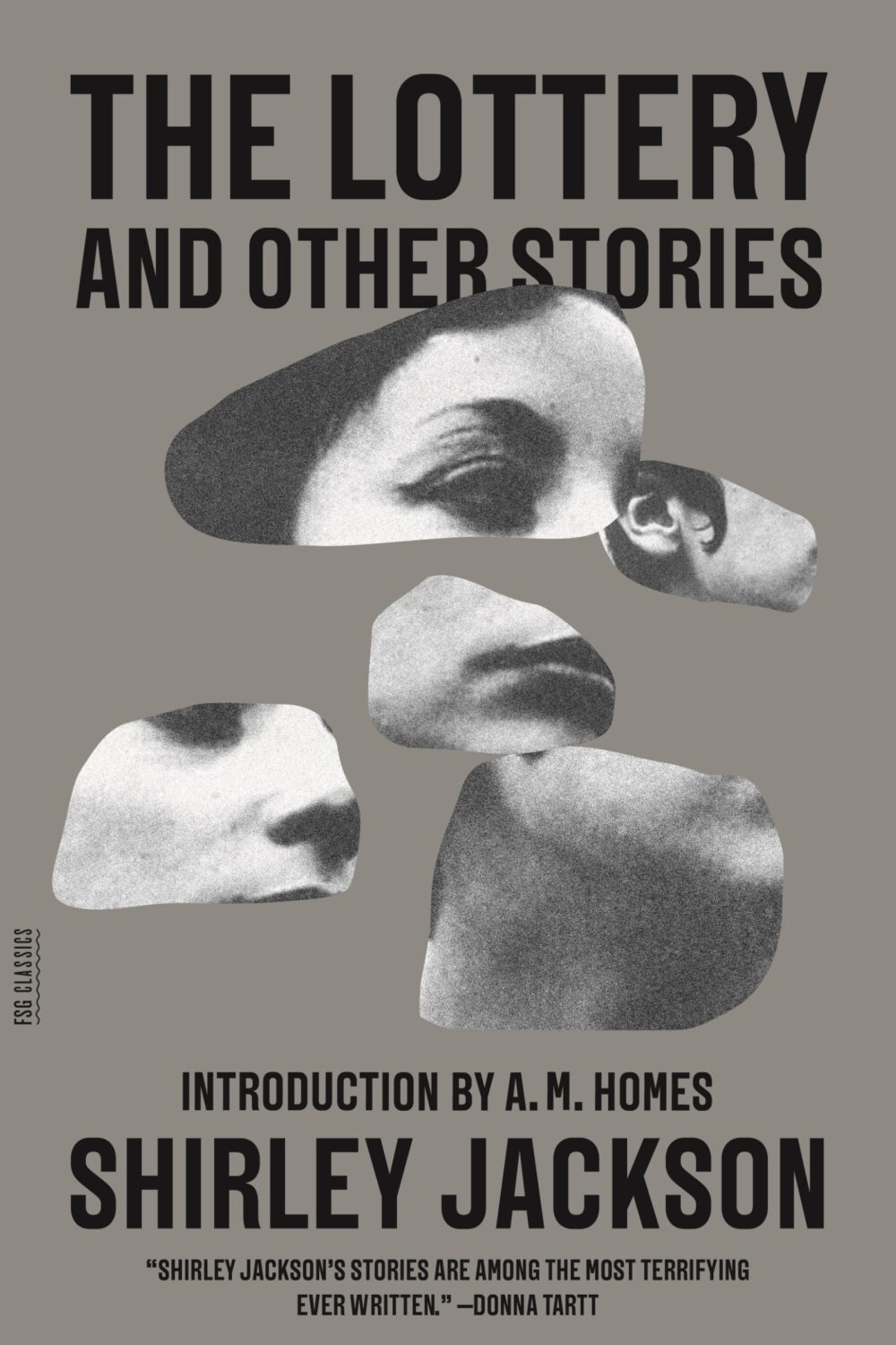
Is the “blob cut-out” a thing? I kind of thought it was but then I couldn’t think of any other examples except maybe this Paul Sahre / Erik Carter cover for The Lottery and Other Stories by Shirley Jackson from a few years ago, which is more of a collage really. Are they any other examples?
Hey, I hope you’re keeping safe, well and warm (or cool!) wherever you are.
If you missed it, my first post of 2025 was a look back at some of last year’s YA covers. You can find my 2024 list of notable literary covers here. Both posts got me thinking more generally about these lists. Do I need to change things up? Or stop altogether? Several other sites are posting lists that do much the same thing mine, and they are all starting to feel too alike. I don’t have answer, and I don’t really know I would do differently. I’m struggling to post once a month as it is. For now at least I’ll keep posting the covers that interest me. It’s just something that’s on my mind, and I have other projects I’ve been neglecting, so I’m curious if you have opinions.
Anyway, this month’s post is a bit of a short (but good!) one, and includes a couple of covers that I missed in 2024 for one reason or another. Enjoy!
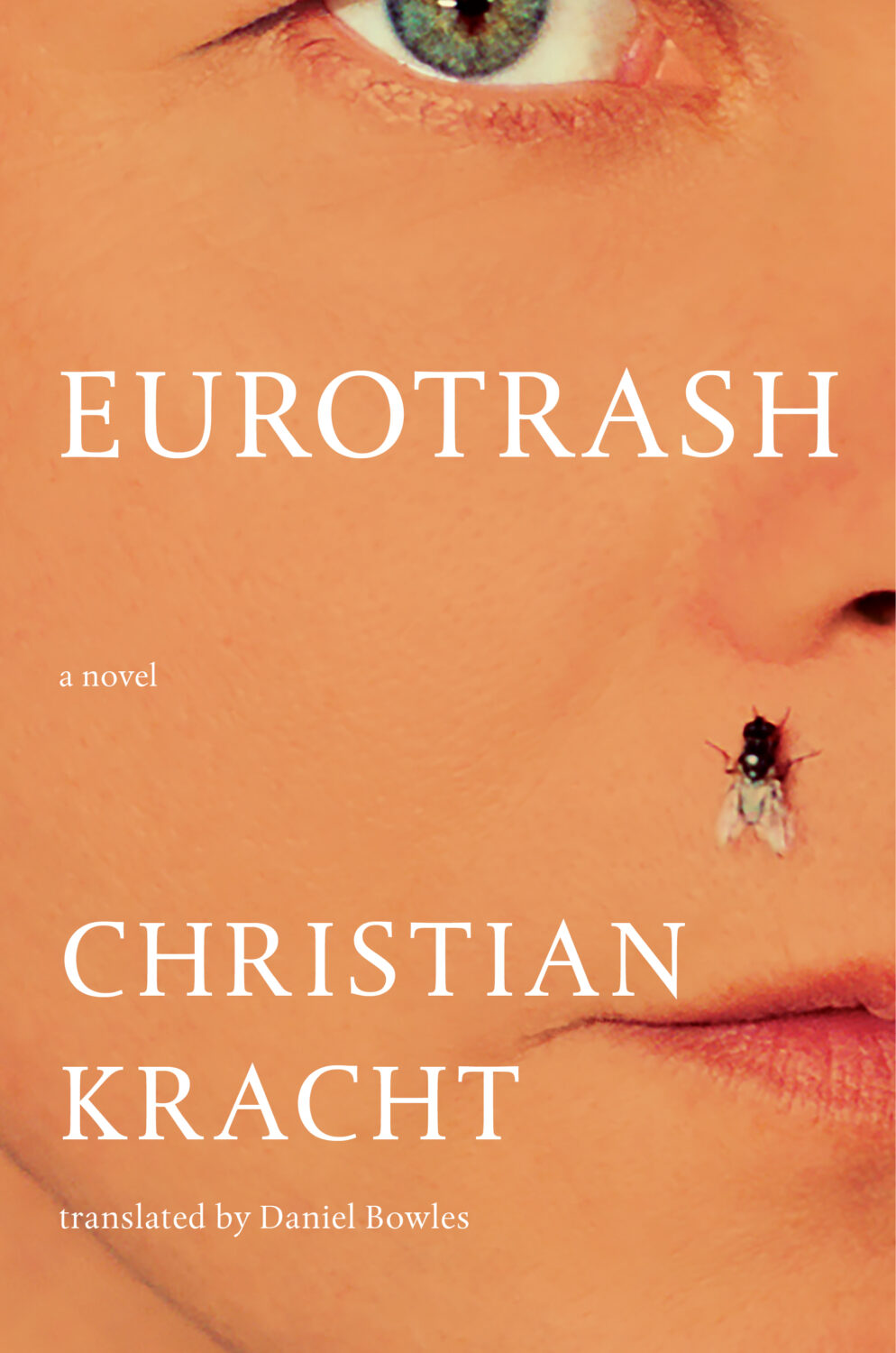
Eurotrash by Christian Kracht; design by Sinem Erkas (Profile Books / November 2024)
I do really like this cover. It looks great! But it also looks a lot like non-fiction, especially when compared to the cover of the US edition (Liveright, October 2024) designed by Jason Heuer. They look like completely different books!
And speaking of Jason Heuer, he’s made a series of fun videos talking about embarrassing moments from his early graphic design career. You can find them on YouTube and Instagram. In the second episode Jason talks about his first book design credit…
Hey, I hope you are good. It’s a stressful time and everyone is super busy trying to hold it together, but here we are at the end of October with another post that is both rushed and yet wordier than ever! As usual, I won’t be doing a covers round-up in November. I have to start working on the massive end of year post so I can get it done in something resembling a timely and relevant manner. I am open to last minute submissions if you think I have missed a cover, or you have something coming out between now and December. I can’t promise to include everything, but it would be especially great to hear from you if you’ve done something cool for a university press or an independent publisher this year. The only requirement is that the book was published and on shelves in 2024. If it was published in a non-English speaking part of the world, be sure to include a link to where people can find out more about the book (and ideally buy it) that isn’t Amazon.
On a related note, I have compiled an annual post of YA covers for, I don’t know, years now (10 maybe?). I don’t read a lot of YA, and it’s not a category I am very involved in professionally, so the posts take quite a long time to compile and I usually end up publishing them early in the New Year, which is less than ideal. So I guess my question is: do you still want a YA round-up? Folks used to ask for them, and now they don’t, which just be general fatigue and the fragmented nature of things at the moment, but the posts don’t attract submissions or much feedback, and interest seems to be waning. Obviously I don’t think I do a great job (if that wasn’t abundantly clear already!), but I haven’t really seen anyone else do one either, so I’ve kept doing it. I don’t know… I’m not a big a believer in clicks or engagement metrics as a measurement of anything useful, so I happy to do it if even just a couple of you say it’s still valuable. Or maybe it is just time to call it quits? Let me know what you think…
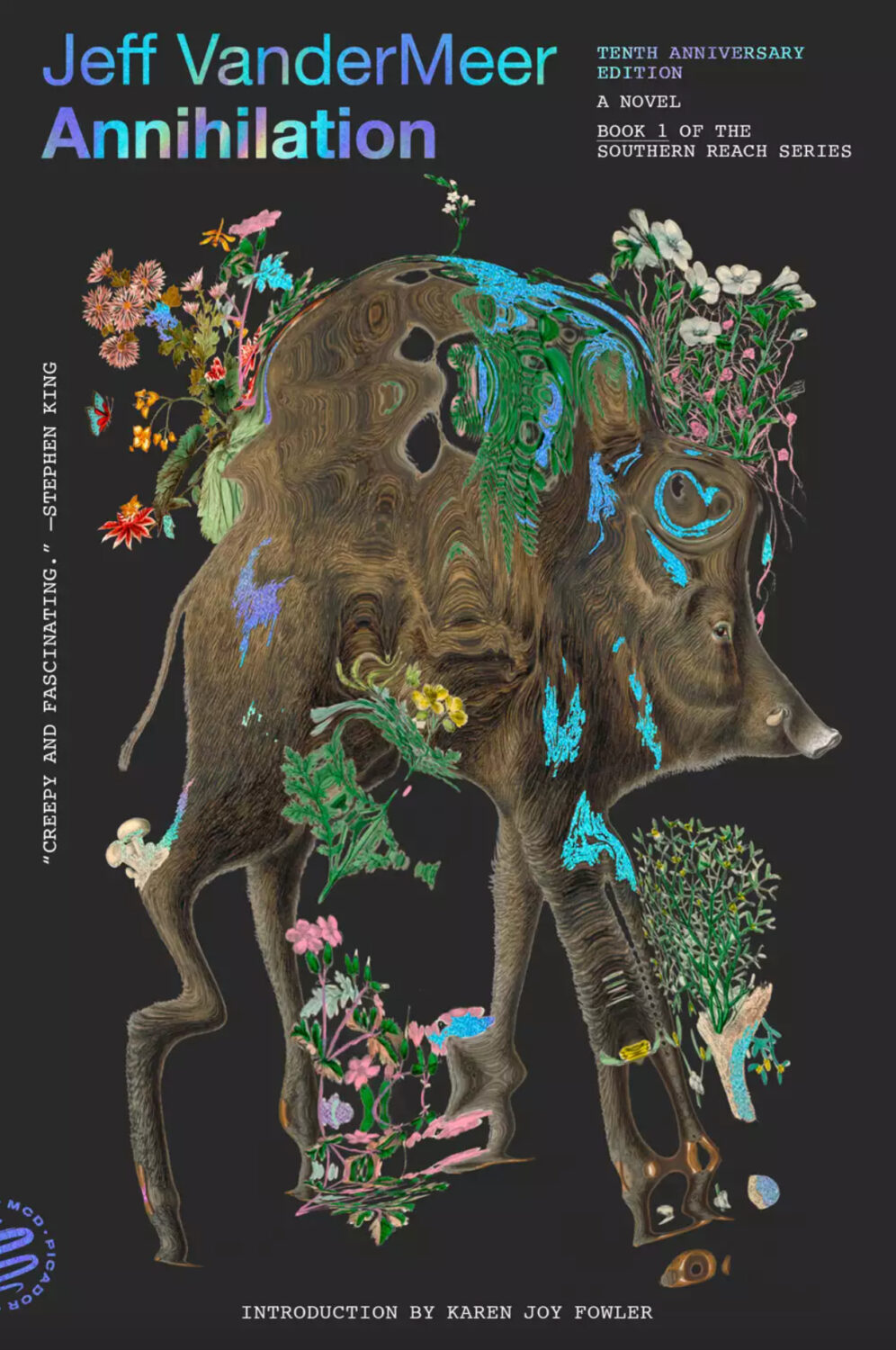
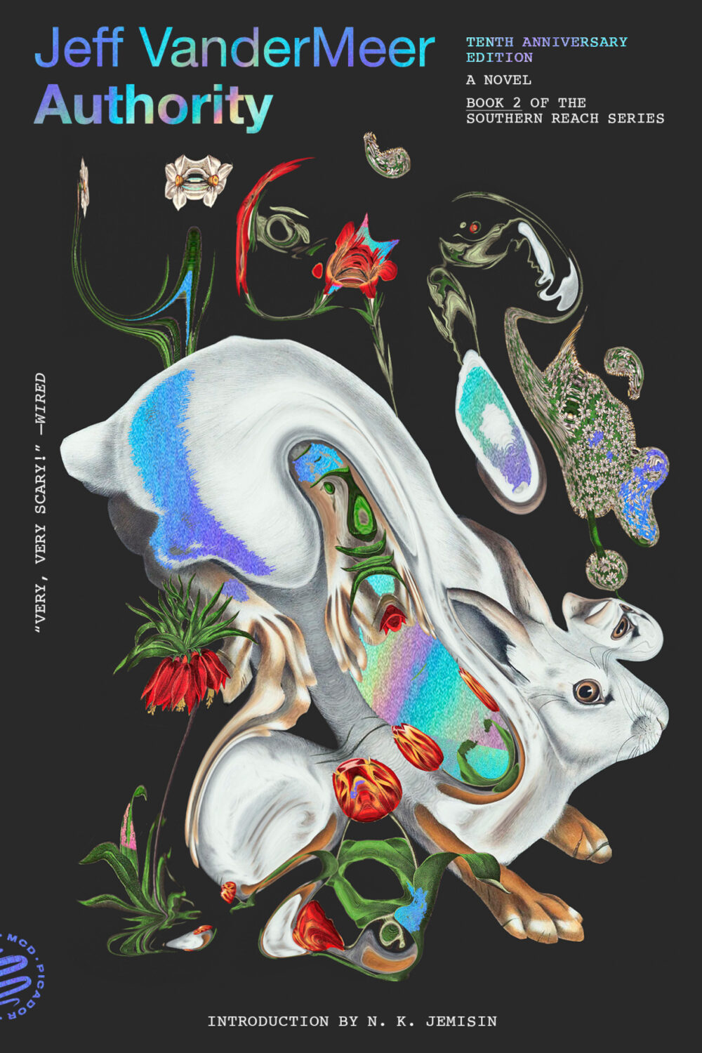
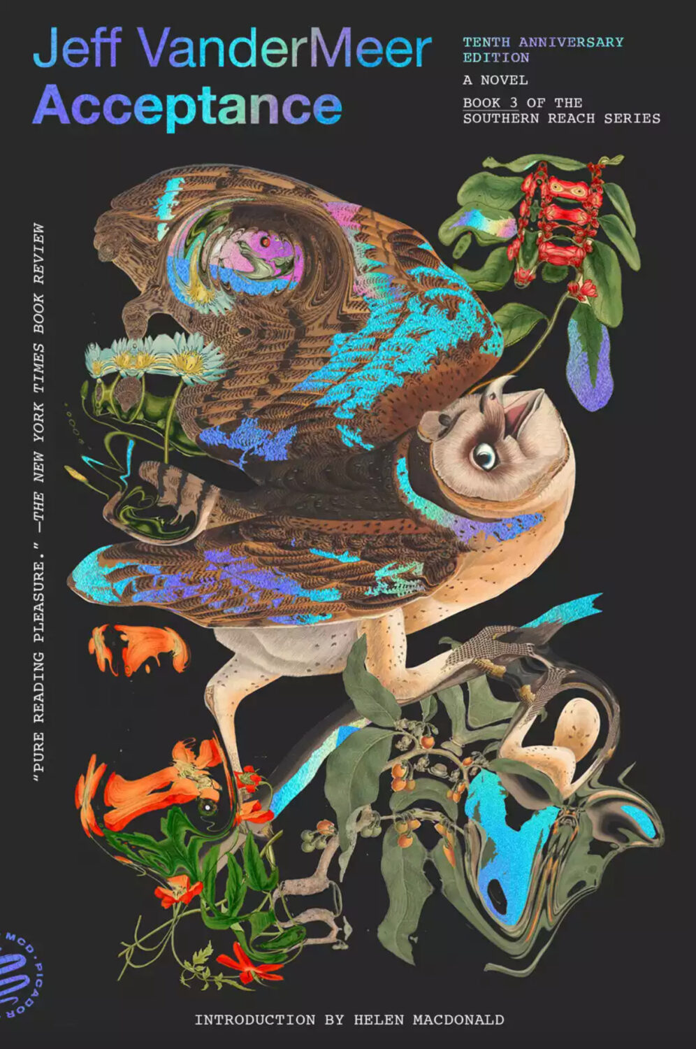
Pablo Delcan also designed the covers of the 10th anniversary editions of the previous books in the Southern Reach series, Annihilation, Authority, and Acceptance, published by Picador earlier this year.
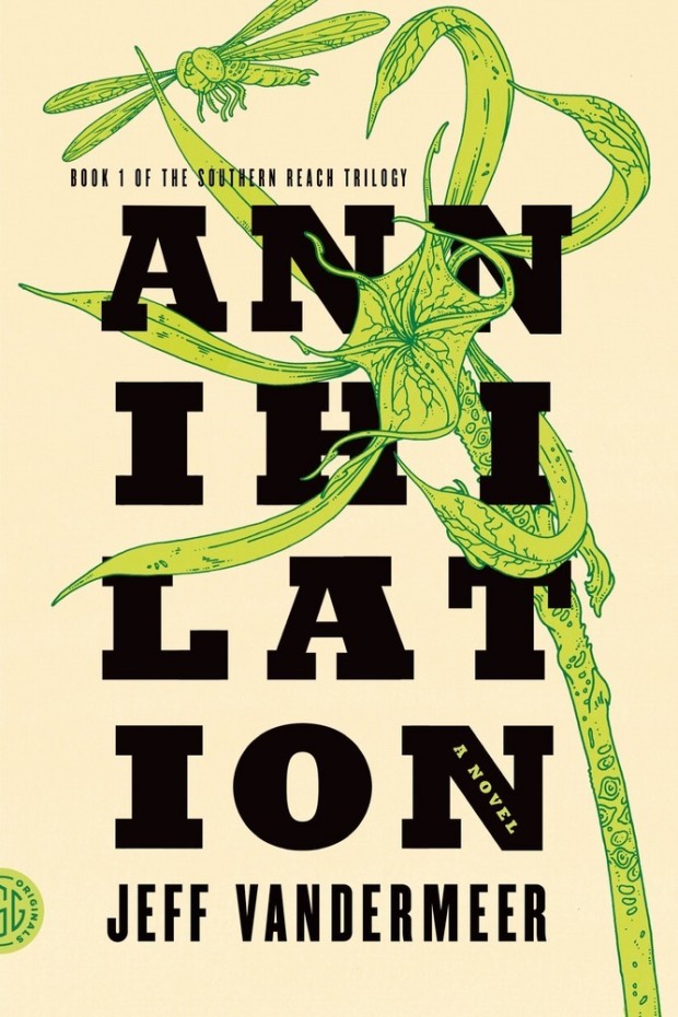
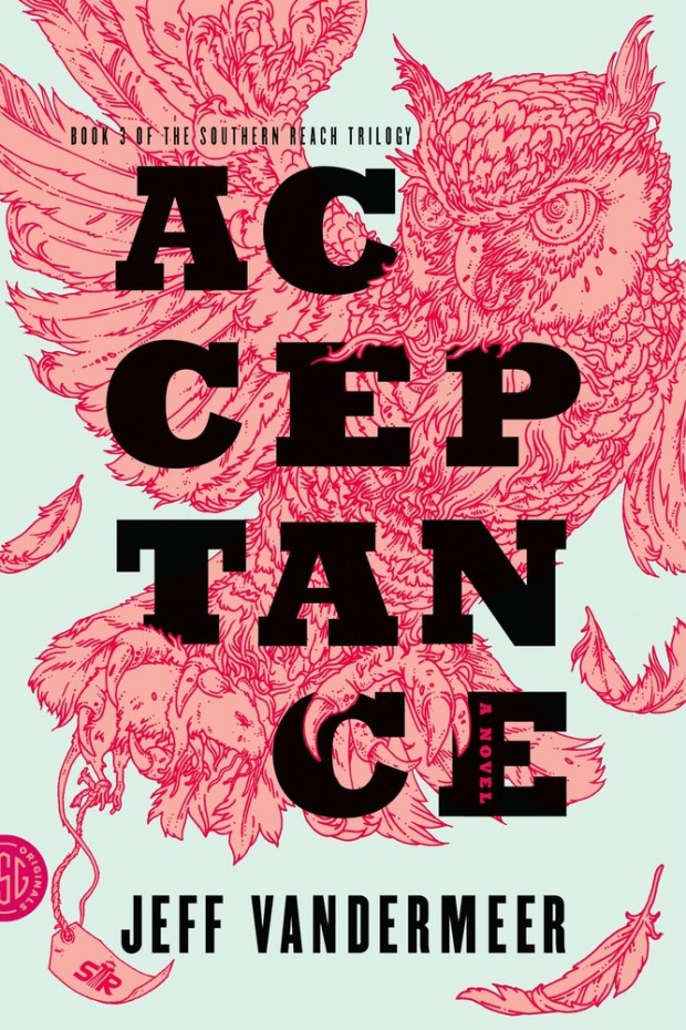
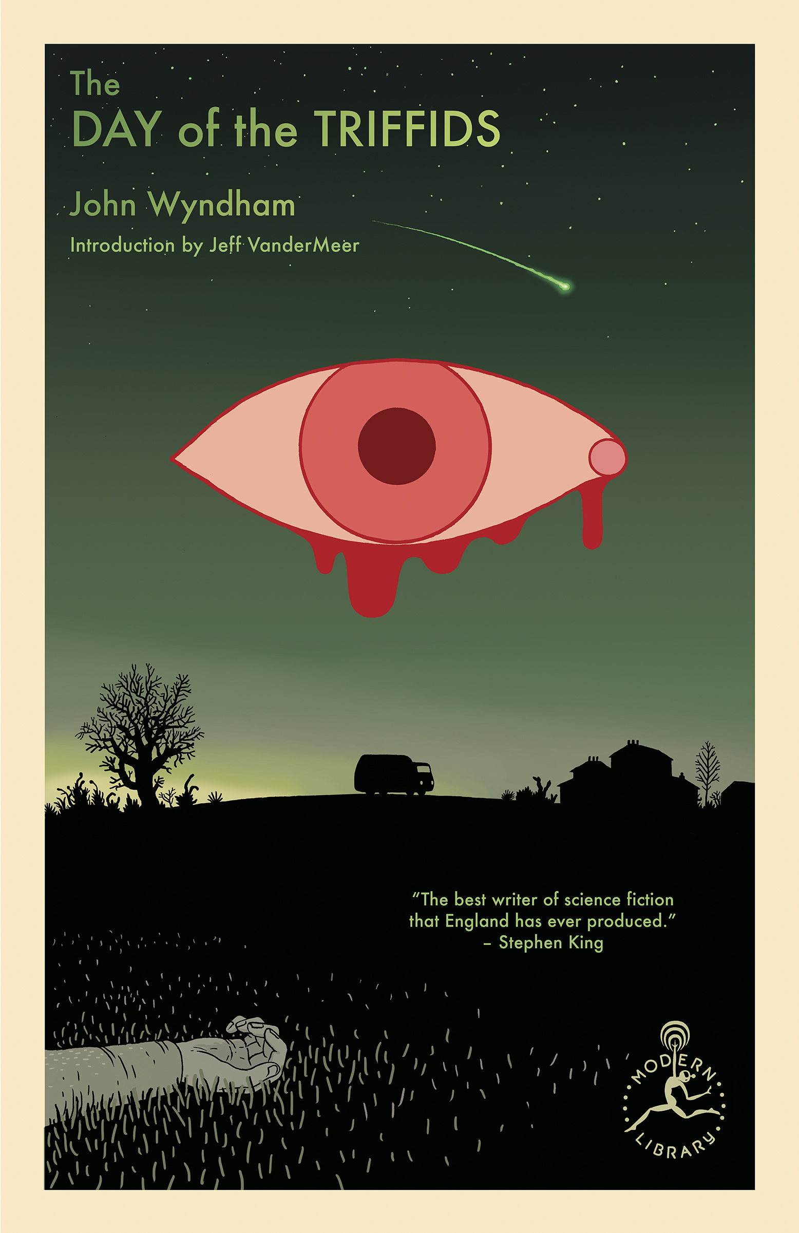
I’m still quite partial to the original US covers the trilogy (as was) designed by Charlotte Strick with illustrations by Eric Nyquist. The cover of Annihilation reminds me of The Day of the Triffids, which coincidentally has has an introduction by Jeff VanderMeer if you have the Modern Library edition. (The slightly bonkers cover of the Modern Library edition was designed by Cassie Gonzales with an illustration by comic book artist and illustrator Anders Nilson). Anyway, I’m a little sad that I can’t get the prequel to match the rest of my existing set.
Annihilation by Jeff VanderMeer (US); design by Charlotte Strick; Illustration by Eric Nyquist (FSG / 2014)Acceptance by Jeff VanderMeer (US); design by Charlotte Strick; Illustration by Eric Nyquist (FSG / 2014)
This feels very familiar, but I can’t put my finger on why. The best I’ve got is that it looks like a poster for a theatre production. It feels very European. The austerity of it gives late 1980s-90s vibes. I don’t know. I think it’s great.
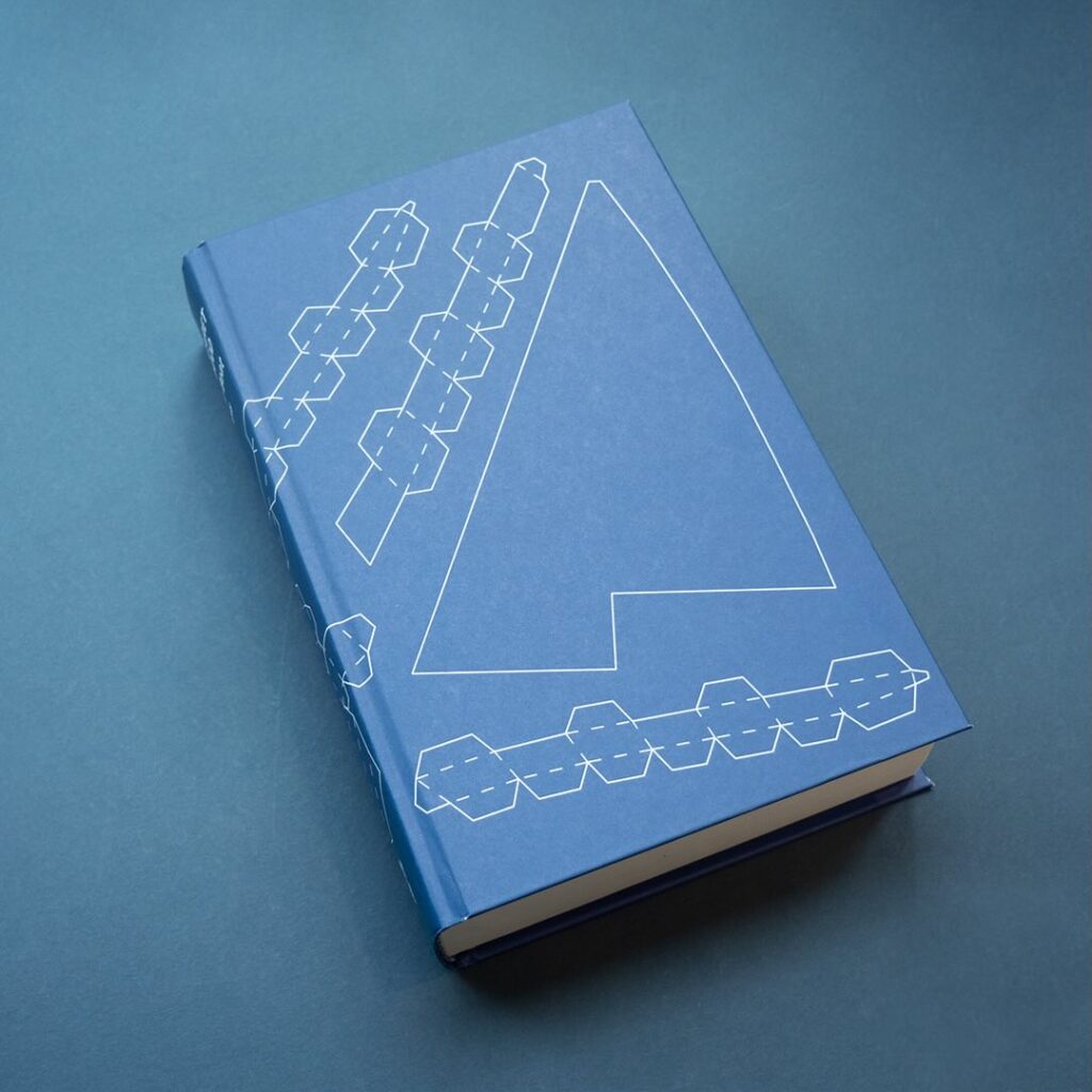
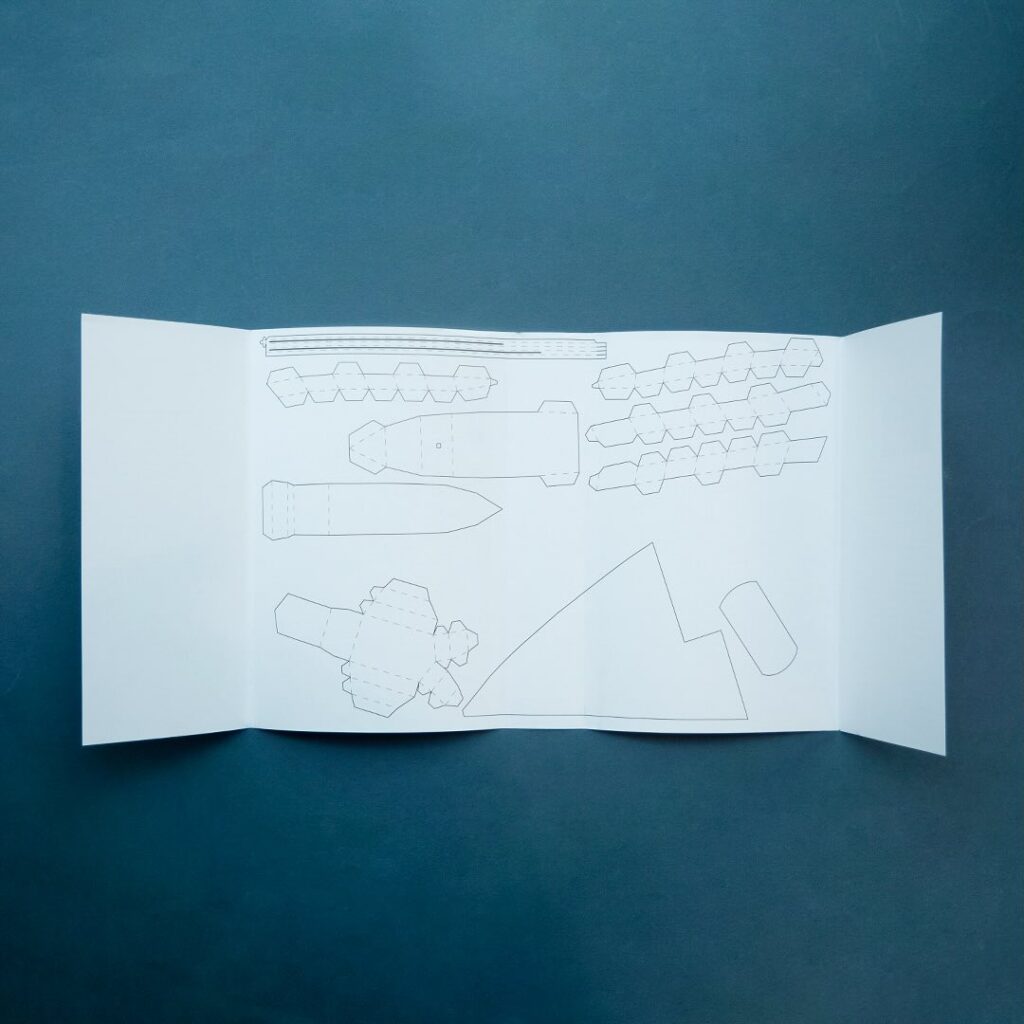
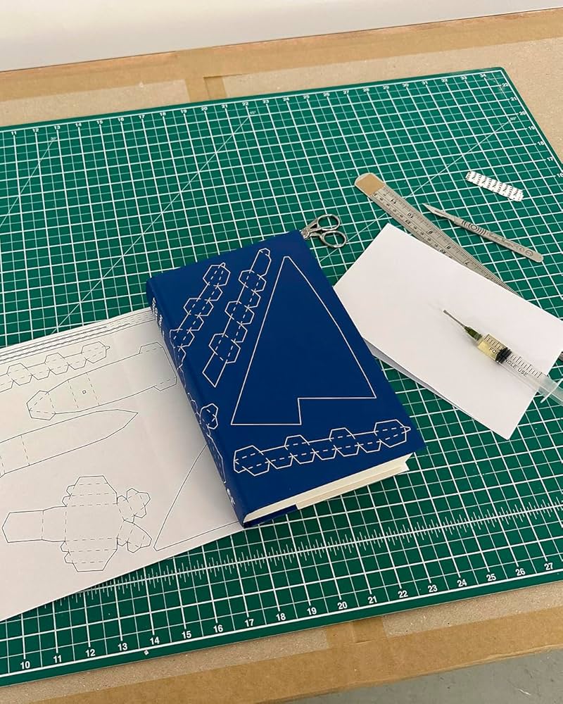
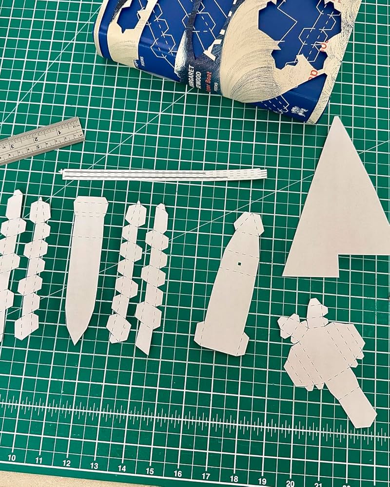
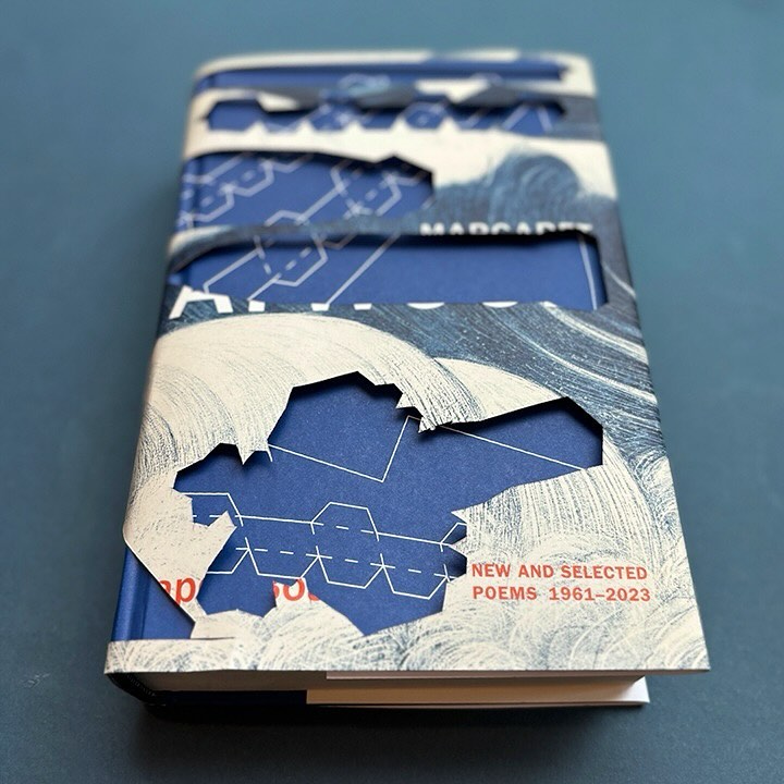
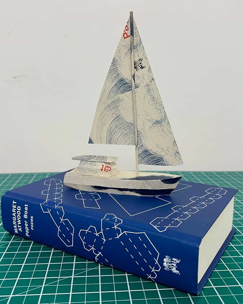
Remarkably, the design incorporates a template for paper boat that can be cut from the dust jacket and stuck together.
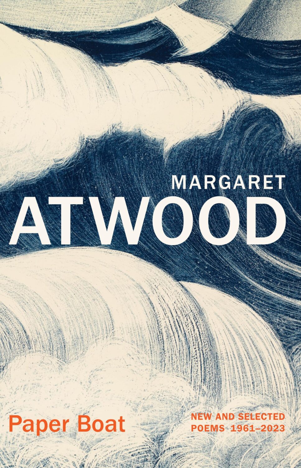
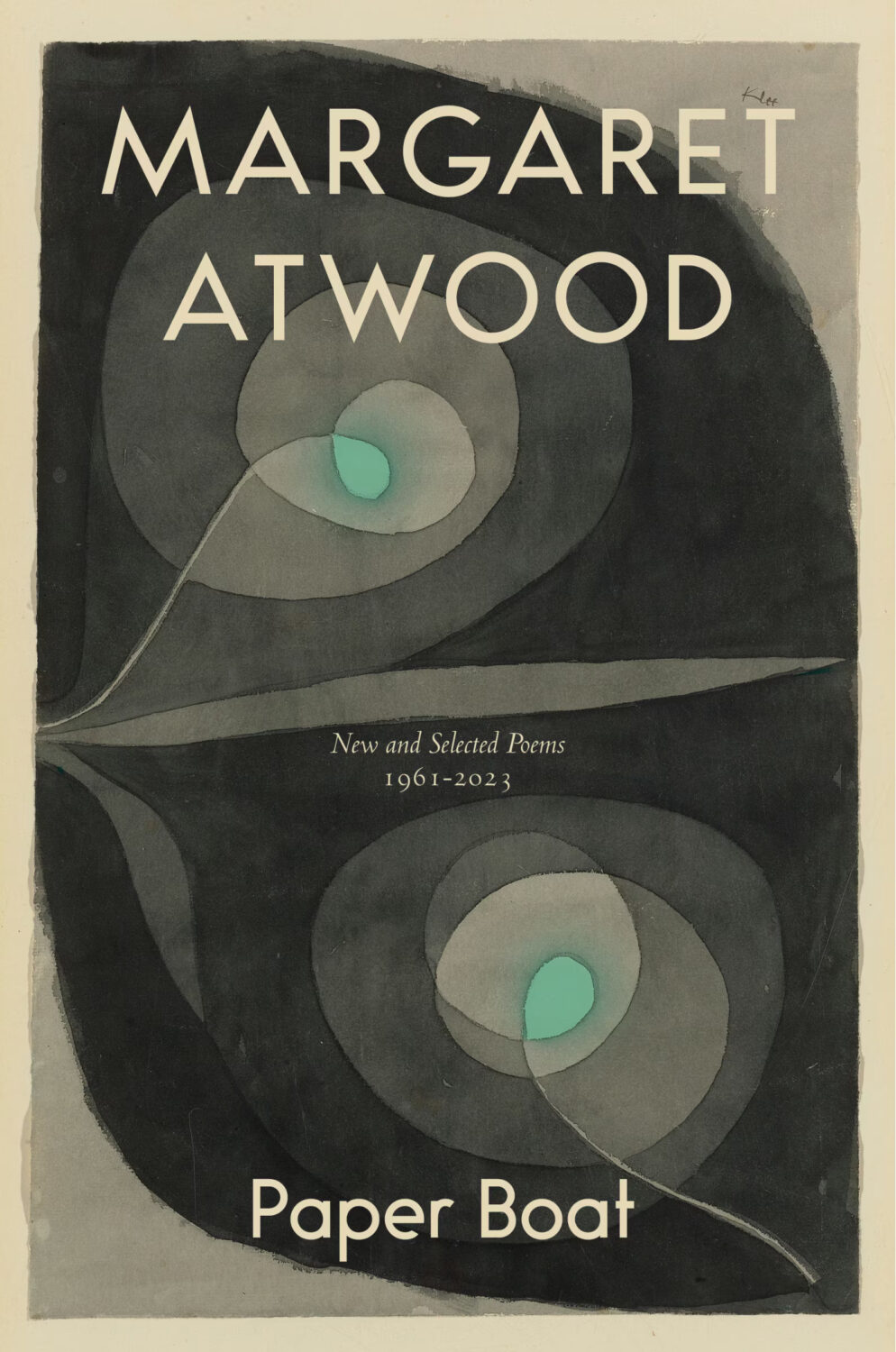
The cover of the Canadian edition of Paper Boat, published by McClelland & Stewart, was designed by Kelly Hill using art by Paul Klee. The cover for the US edition published by Knopf was designed by Janet Hansen. The photograph is by Ruven Afanador. It’s interesting to me that it was the US decided to use a portrait on the cover. I mean it’s a beautiful photograph and Margaret Atwood is very distinctive looking, but I would imagine she would be more recognizable to Canadians than to Americans? Anyway, it’s not often you see three entirely different approaches in the UK, US and Canada for a poetry collection.


