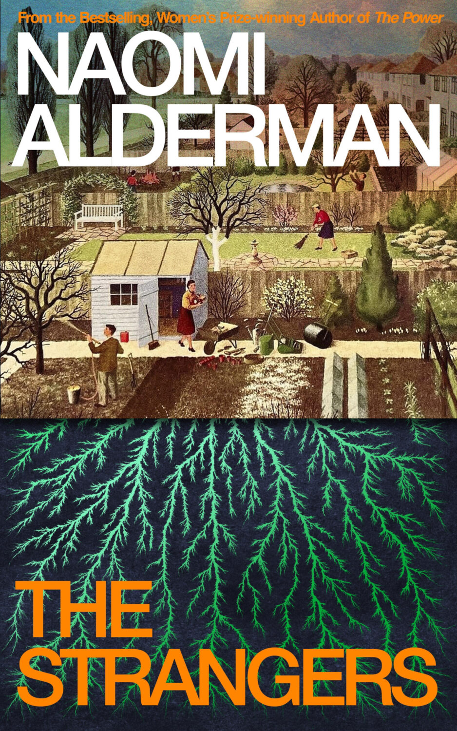
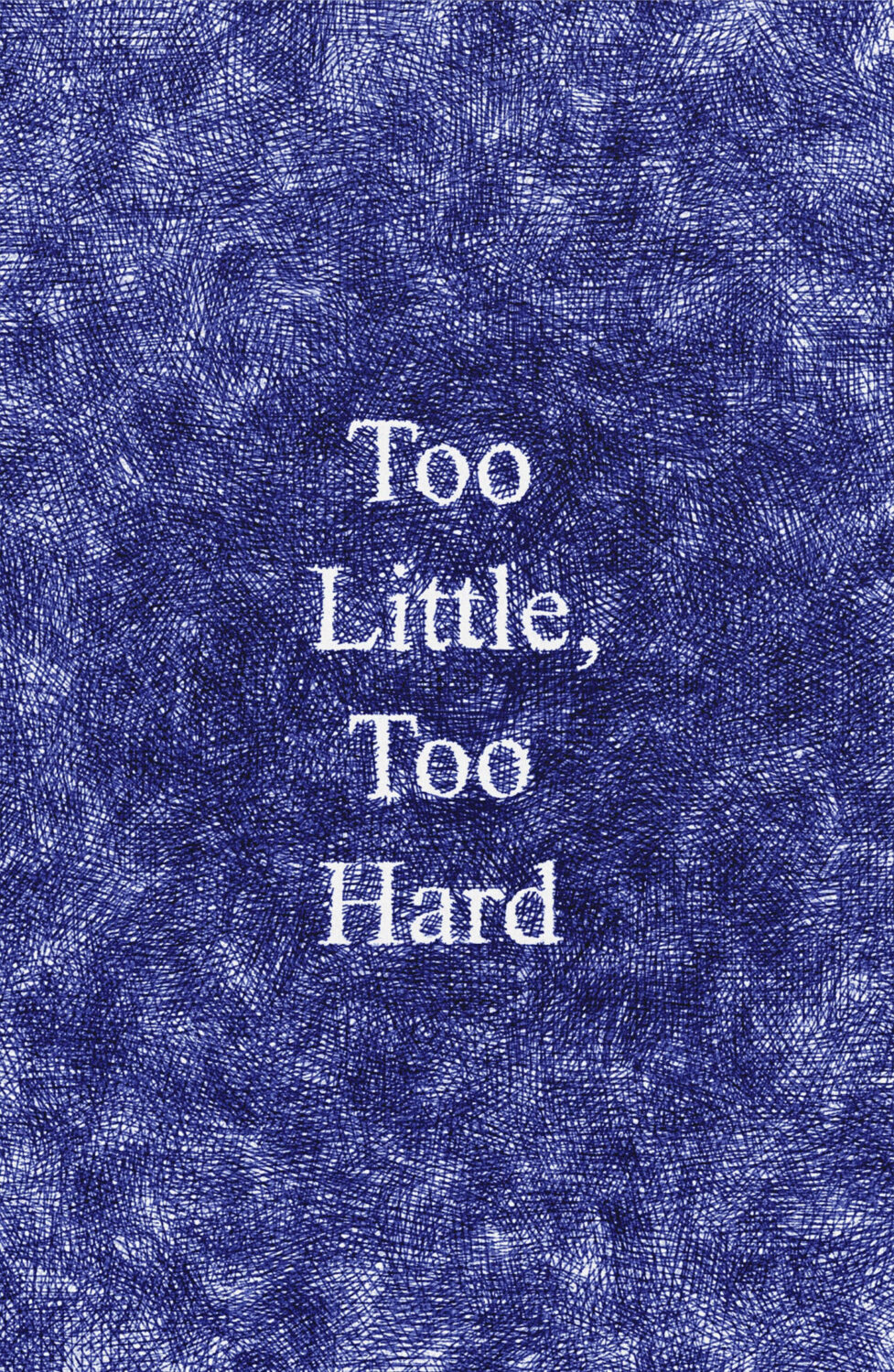
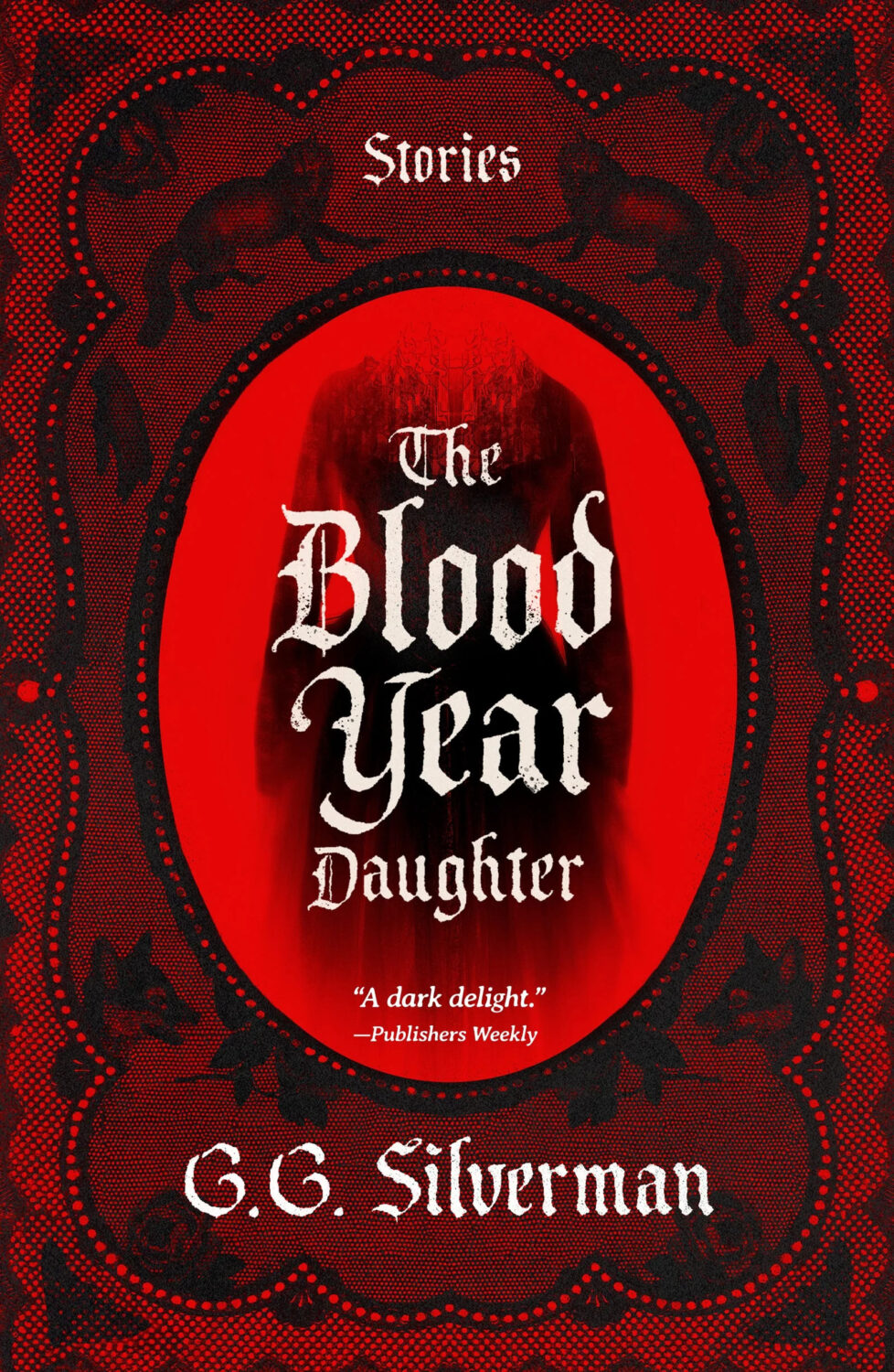
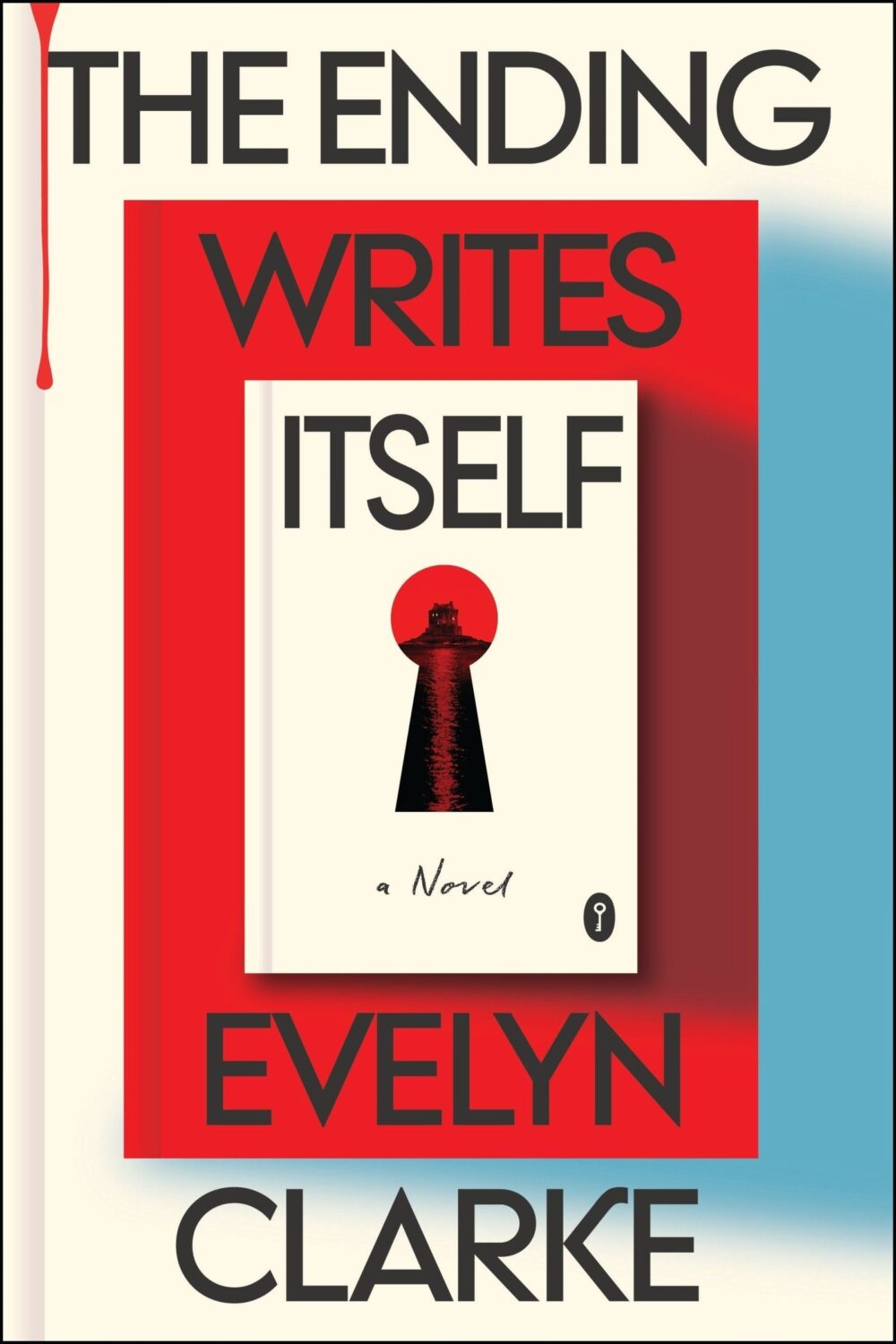
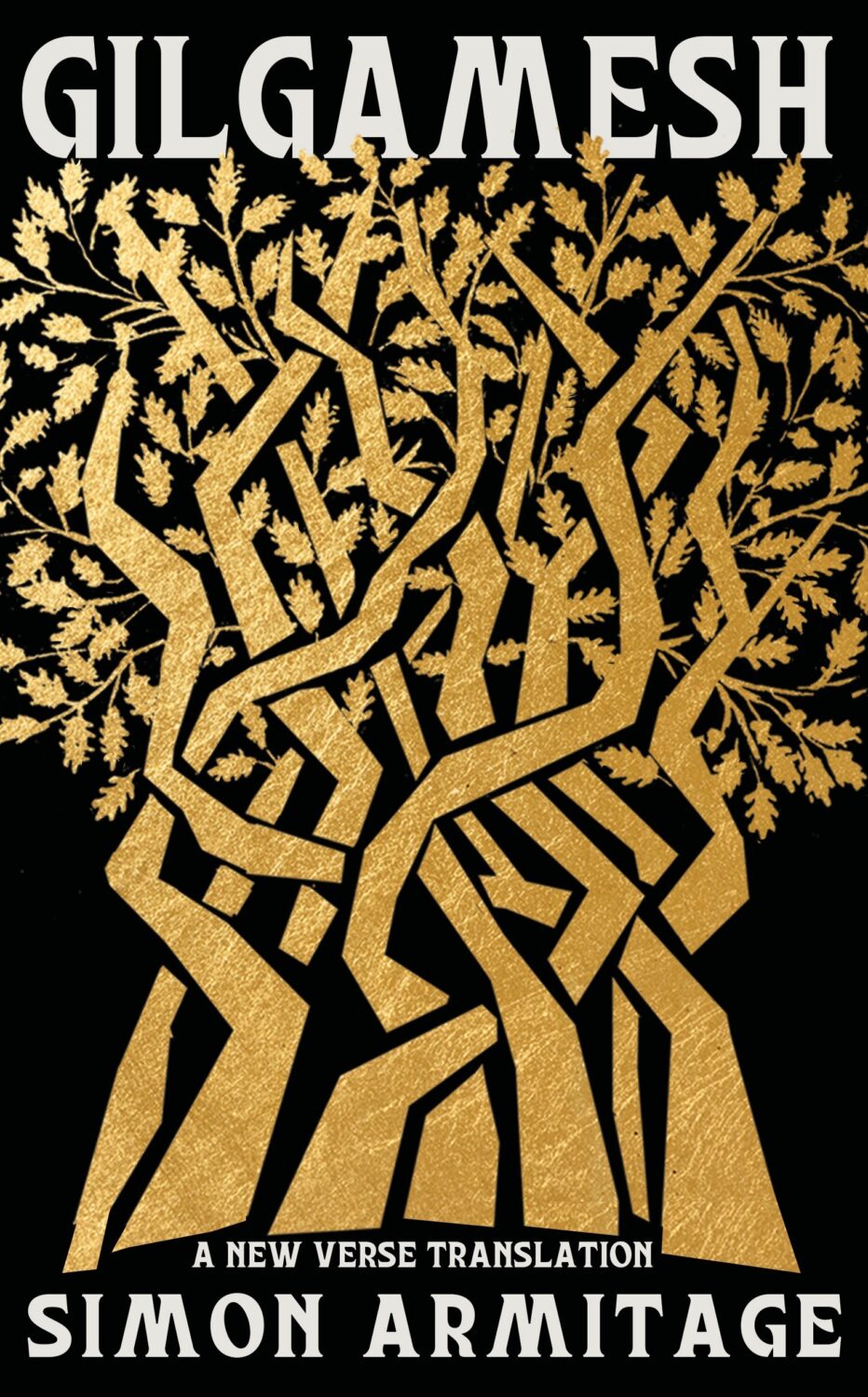
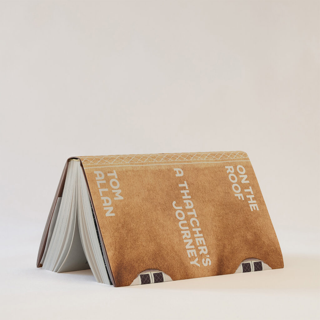
The UK cover of The Strangers published by Fig Tree last month was designed by Chris Bentham. The illustration in the top half of the cover is by the late Ronald Lampitt.
OK, so “Franz Kafka, life coach” are not really words I ever thought I’d read, but here we are. Anyway, this delightful cover reminded me, in tone at least, of Peter Mendelsund‘s cover design for the 2017 New Directions edition of The Book of Disquiet by Fernando Pessoa.
The Book of Disquiet by Fernando Pessoa; design by Peter Mendelsund (New Directions / August 2017)
There not really the same, but the phases of the moon reminded of the cover of How High We Go in the Dark by Sequoia Nagamatsu designed by Will Staehle for William Morrow & Co. from a few years back.
Thanks to Sarah Wasley at Granta for providing the credits for their recent covers. I probably should’ve guessed this particular photo (‘Annie Morton, Forte dei Marmi, Italy, 1995, No.2’) was taken by Juergen Teller, especially given the book is set in the London art world of the 1990s.
This reminds me of something but I can’t remember exactly what. Maybe the cover of Rabbit Islandby Elvira Navarro designed by Gabriele Wilson? I don’t know.
Hi. Hello. I hope you’re keeping safe and well. I’m getting this month’s post out at little earlier than usual (i.e. not the 11th hour), and on a Monday no less, because I’m going to be in NYC the rest of this week for work. Even though this is a little bit of a quick and dirty post, there are still lots of covers for you to peruse and admire. Apologies if I’ve missed anything obvious and/or spectacular. I will try to catch up next month.
The Palm House by Gwendoline Riley; design by Katy Homans; photo by Bill Brandt (NYRB Books / April 2026)Famesick by Lean Dunham; design by Teddy Blanks (I think?); photo by Anna Gaskell (Random House / April 2026)
I took a long-planned week off in March, so this month’s post was somewhat cobbled together around that trip and somehow we’ve ended up with lots of great covers to show for it! I should take vacation more often! There’s some particularly fun typography, some nice illustration, and some of the usual weirdness. Enjoy!
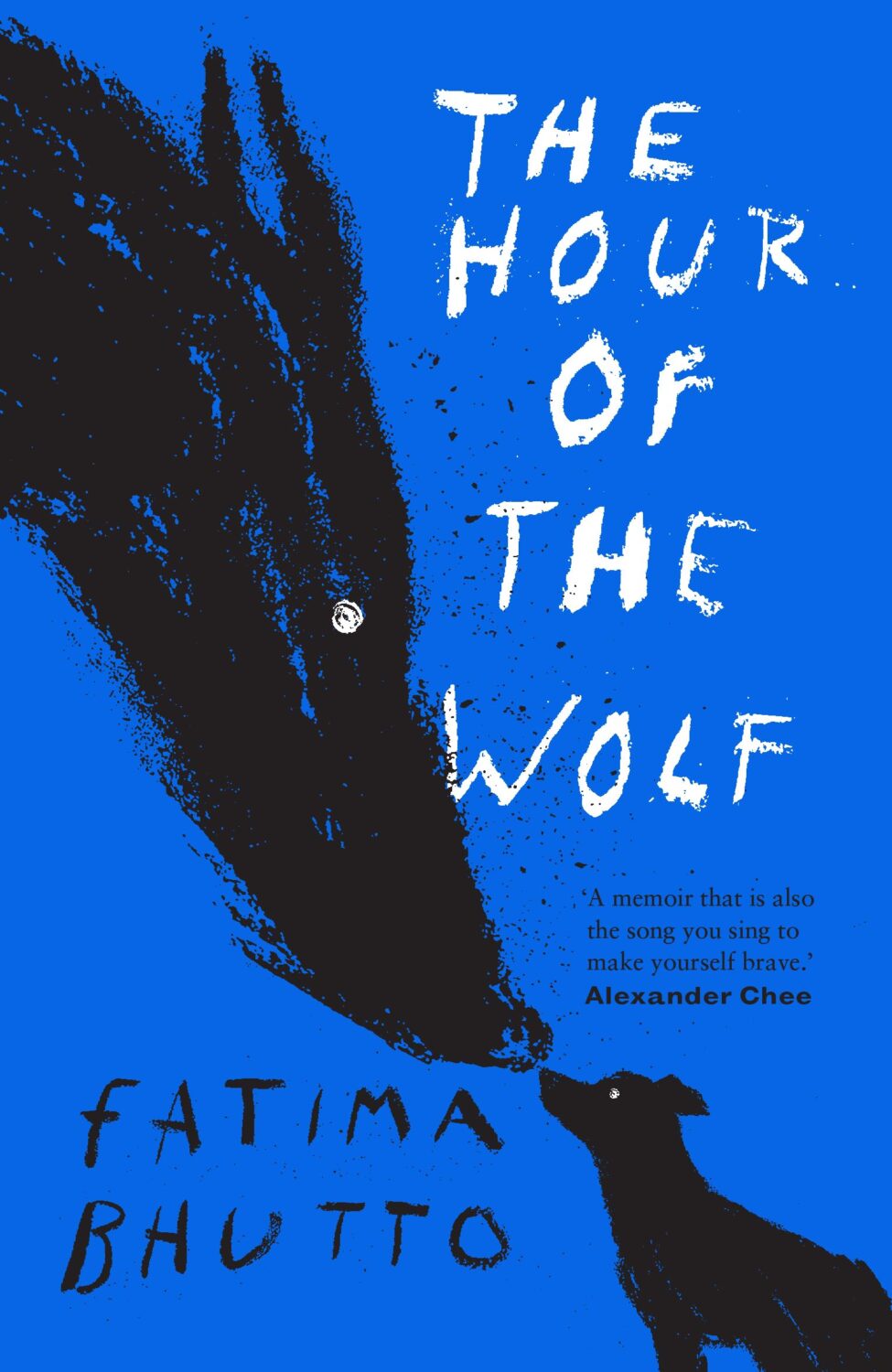
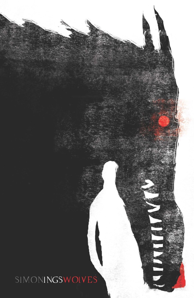
I had a hell of time trying to remember what this reminded me of, I think it is Jeffery Alan Love‘s illustration for the cover of Wolves by author Simon Ings published by Gollancz way back in 2014.
Coincidentally, the cover of Wolves and other Simon Ings titles from Gollancz were among the ABCD Award winners in 2015, and if you’re interested in reading about this year’s ABCD awards, which took place earlier this month, Vyki Hendy has a write up at SPINE.
Somehow it is the end of July, and I am once again rushing to get this done. I think it’s a decent mix of covers this month though, with some big books, some indies, a few type-only covers, some nice art, and a couple of trends to watch out for. I’m glad it’s all come together, even if it is last minute!
Thanks to everyone who took time to help me with cover images and design credits over the past couple of weeks (days!) — it’s really, really appreciated! I hope everyone is having a good summer.
Hey, sorry, just sliding in under the wire with another slightly rushed post this month. I hope everyone is safe and well (all things considered). Let’s just get on with it shall we?
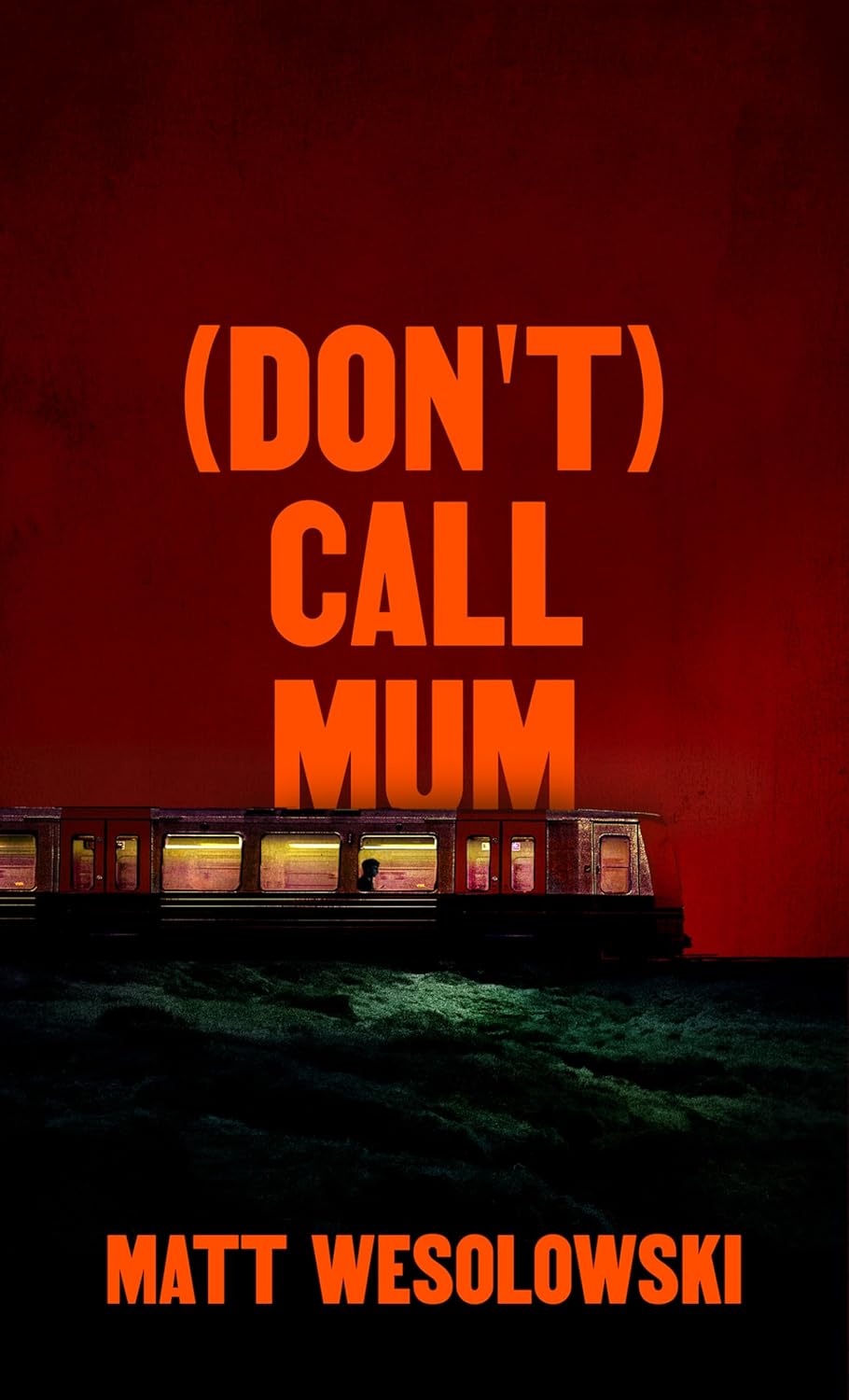
Also, the cover of Matt Wesolowski’s book Six Stories designed by Mark Swan was featured here way back in April 2017 (which was a pretty good month for covers!)
Jenny has a new portfolio site so go check that out. (Also, if anyone has a higher res version of the cover for The Holy Innocents, please send it over! I’d love to have a better one. Thanks!)
I am a sucker for good photo selection on a cover. This photo is from Ed Templeton’s series/installation (and book) Teenage Smokers. Although it is kind of interesting to me that a book with such a British title uses a photograph by an American photographer, but it does have incredible 1990s vibes.
The cover of the UK edition, published by Daunt Books, was designed by Kishan Rajani. It’s interesting to see the differences in two covers with a similar approach…
It is the time of year for lists and I should’ve been done weeks ago, but I am late and already well behind the pack. Apologies for that.
I admire Matt Dorfman‘s ability to whittle his list down to a dozen covers for the New York Times. I imagine it takes him a lot less time for one thing, but I’m sure Matt still agonizes over every cover. It requires a level of discipline and restraint that I do not possess to keep it that tight year after year.
PRINT’s list of best book covers of 2024, compiled by editor-at-large Zachary Petit, is also long. It’s a 100 covers. Last year it was 50.
I’m not trying to throw stones here. We are all seeing more covers than we used to. There are more books for one thing. But they’re not just something we just experience in print in anymore. You don’t have to go into a bookstore or read the newspaper or magazine to see them. They’ve become something we see and share all the time online. Designers are promoting their own work and (slowly) getting more credit for it (although there is a lot more to be done in that area. Publishers — credit your designers!). My monthly round-ups are now one of several you can choose from.
And it is not like my list is short. This year it features work by 48 designers — more than half of them women — and 86 covers (plus a couple of supplementary images).
The consensus seems to be that it was a decent year for covers, and it’s hard to argue with other people’s selections even if I don’t love them all.
It is telling though that 100 of LitHub’s selections were individual picks. There are covers on my list that are not on the anyone else’s despite their length. So while I think we agree there were lots of good covers, I’m less certain we entirely agree on which ones were actually the outstanding ones.
A recent article Spine argued that there is a battle between minimalism and maximalism going on (you can find Spine’s end of year list here by the way). I think that could be true. Different approaches work for different audiences. But I also think it’s messier than that. I get the sense that publishers are less sure of what they want and what sells (certain genres notwithstanding).
It has been a rough year for a lot of publishers, so there is undoubtedly a lot of uncertainty, and no small amount of anxiety. I could go on about why that it is (and the publishing’s self-inflicted wounds) but, in short, what I think we’re also seeing with book covers is more meddling and less direction.
Anyway, I don’t want to end this on a bleak note. This year was shit enough. Despite it all, there genuinely were a lot of good covers in 2024, and some that I did think we’re outstanding. A couple of them made me laugh, which was no small thing. It was a strong year for several individual designers in particular and, despite the pressures, many produced work that was recognizably theirs. I thought there were more interesting covers coming out of the UK and Ireland (that mercifully wasn’t just about the inks or the finishes!), and there were some fun Canadian covers too.
Thanks, as always, for reading, and I hope you’re all keeping safe and well. Happy Holidays!
Holy Winter 20/21 by Maria Stepanova; design by Oliver Munday (New Directions / October 2024)My Beloved Life by Amitava Kumar; design by Oliver Munday (Knopf / February 2024)
Mammoth by Eva Baltasar; design by Anna Morrison (And Other Stories / August 2025)
MILF by Paloma Faith; design by Jack Smyth (Ebury / June 2024)
Also designed by Jack Smith:
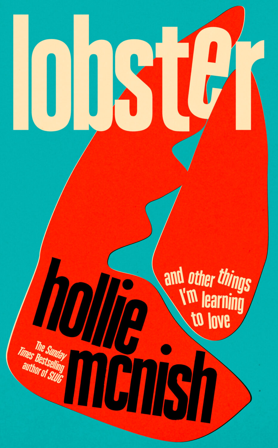
Lobster by Hollie McNish; design by Jack Smyth (Little, Brown / March 2024)Neu Klang by Christoph Dallach; design by Jack Smyth (Faber & Faber / May 2024)
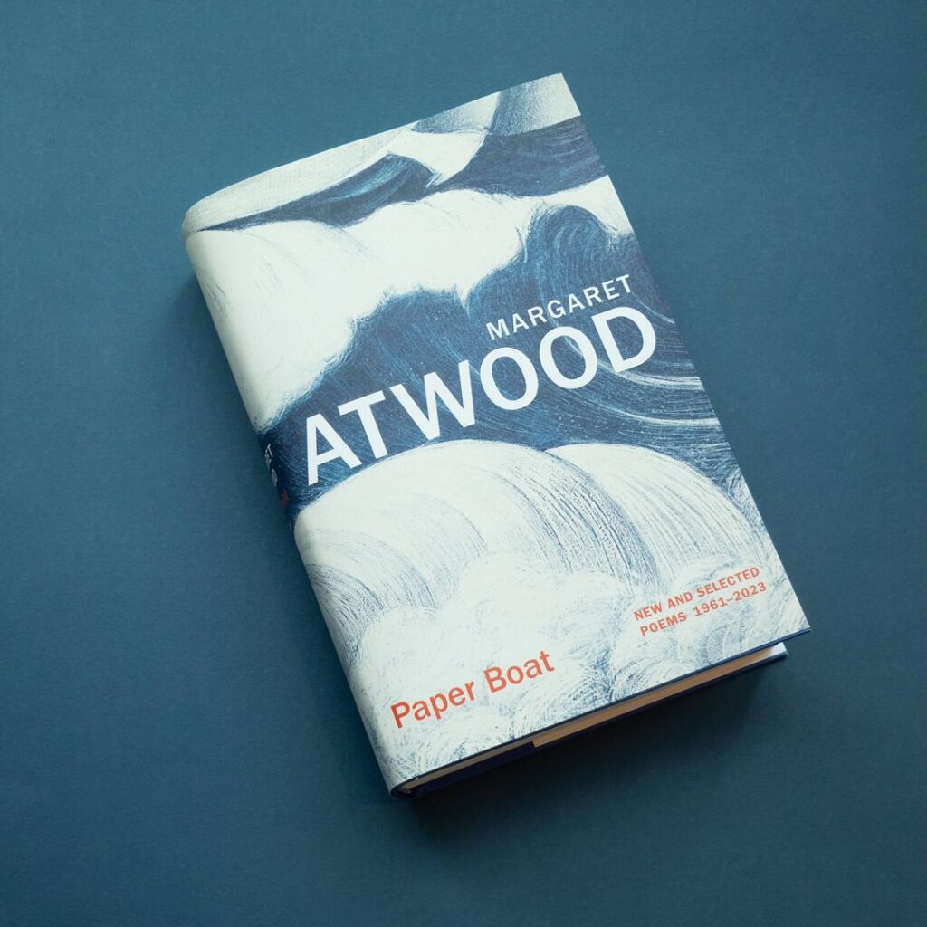
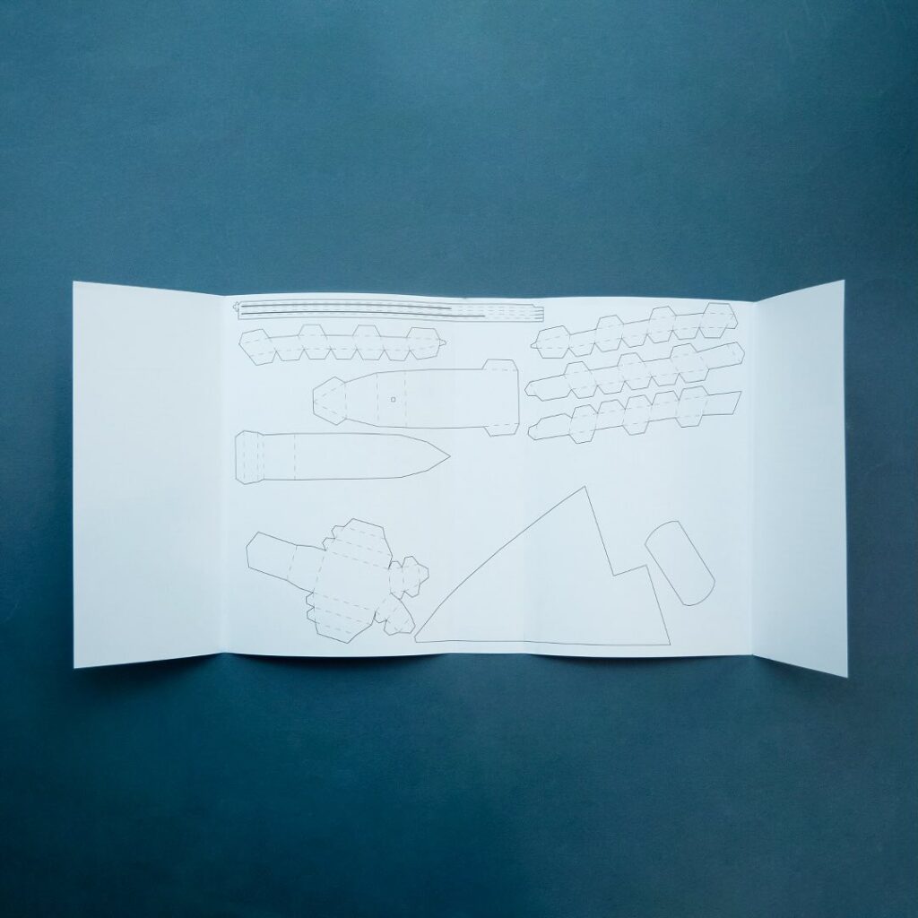
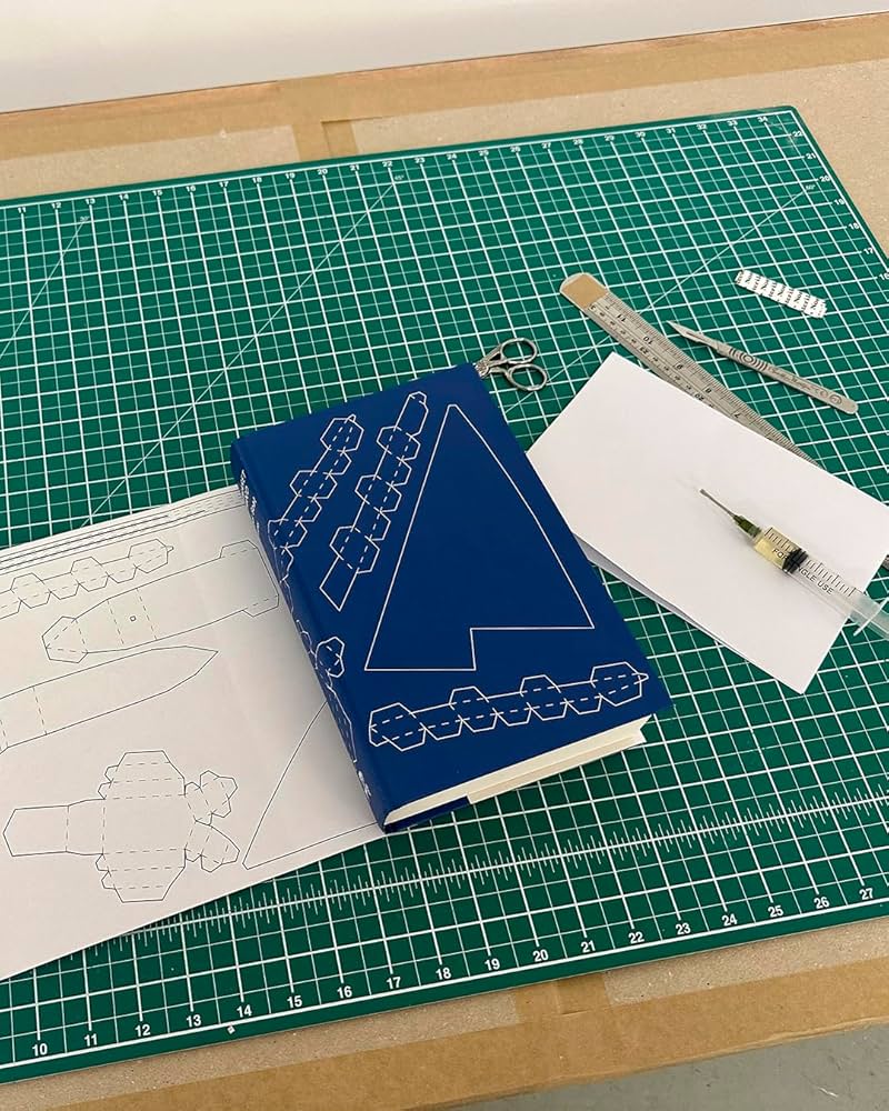
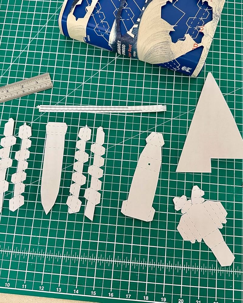
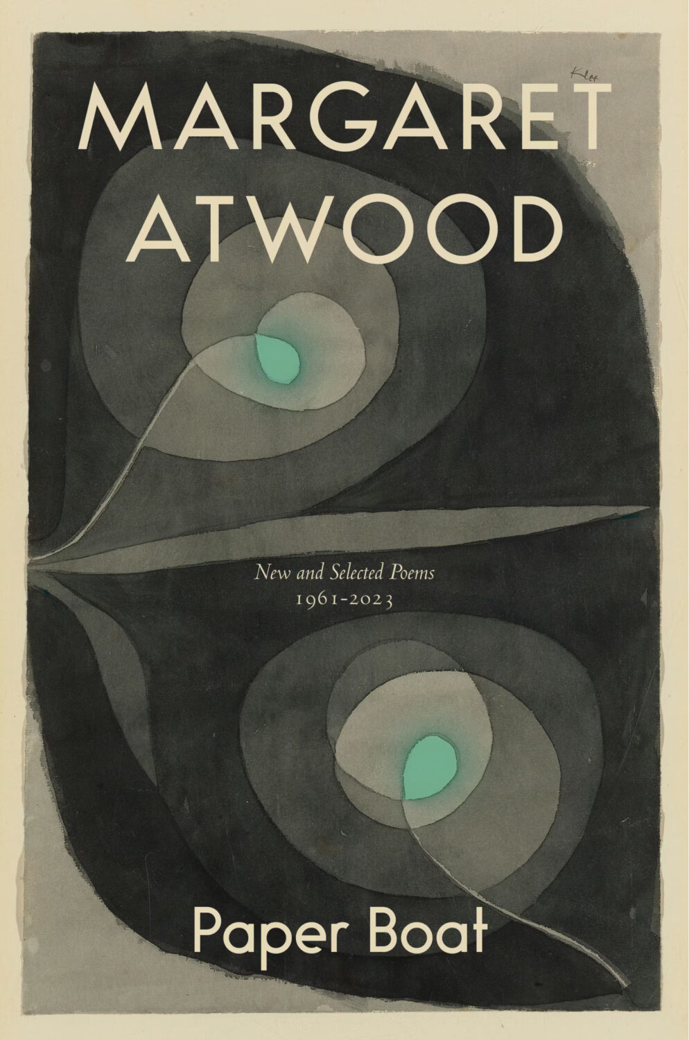
I also have to give a special shout out to the cover for Paper Boat by Margaret Atwood (Chatto & Windus / October 2024). Suzanne commissioned paper art by Nathan Ward to design a template for a paper boat that could be cut out from the dust jacket and stuck together.
Hey, I hope you are good. It’s a stressful time and everyone is super busy trying to hold it together, but here we are at the end of October with another post that is both rushed and yet wordier than ever! As usual, I won’t be doing a covers round-up in November. I have to start working on the massive end of year post so I can get it done in something resembling a timely and relevant manner. I am open to last minute submissions if you think I have missed a cover, or you have something coming out between now and December. I can’t promise to include everything, but it would be especially great to hear from you if you’ve done something cool for a university press or an independent publisher this year. The only requirement is that the book was published and on shelves in 2024. If it was published in a non-English speaking part of the world, be sure to include a link to where people can find out more about the book (and ideally buy it) that isn’t Amazon.
On a related note, I have compiled an annual post of YA covers for, I don’t know, years now (10 maybe?). I don’t read a lot of YA, and it’s not a category I am very involved in professionally, so the posts take quite a long time to compile and I usually end up publishing them early in the New Year, which is less than ideal. So I guess my question is: do you still want a YA round-up? Folks used to ask for them, and now they don’t, which just be general fatigue and the fragmented nature of things at the moment, but the posts don’t attract submissions or much feedback, and interest seems to be waning. Obviously I don’t think I do a great job (if that wasn’t abundantly clear already!), but I haven’t really seen anyone else do one either, so I’ve kept doing it. I don’t know… I’m not a big a believer in clicks or engagement metrics as a measurement of anything useful, so I happy to do it if even just a couple of you say it’s still valuable. Or maybe it is just time to call it quits? Let me know what you think…
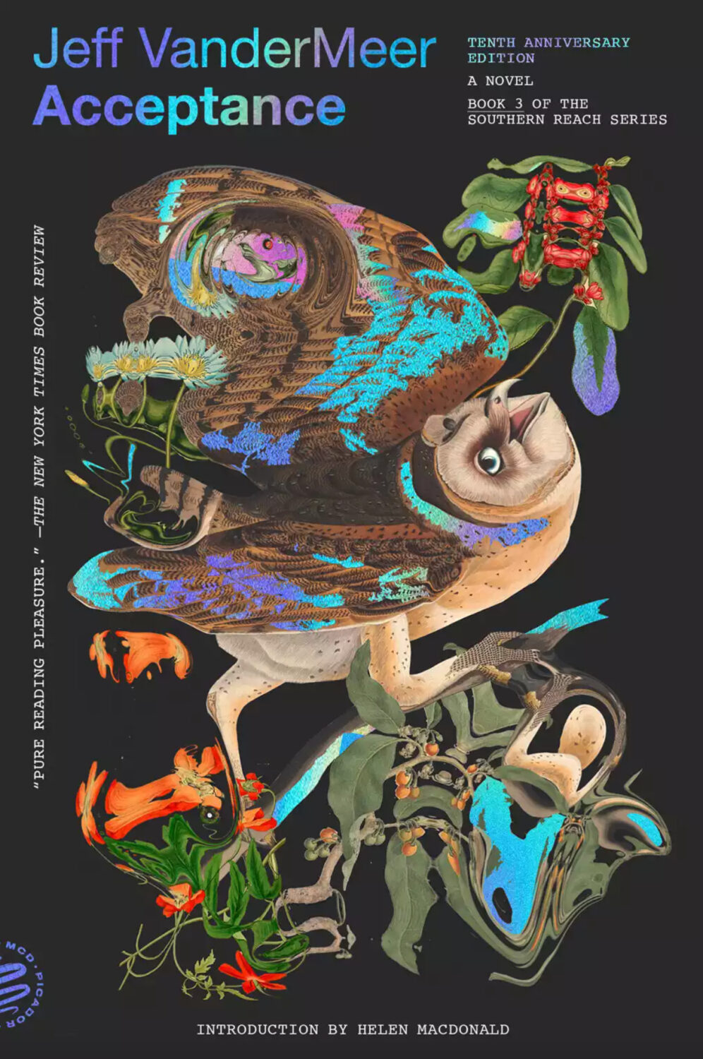
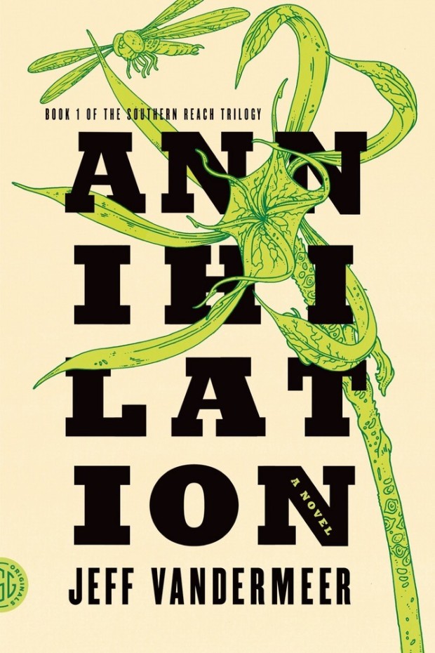
Pablo Delcan also designed the covers of the 10th anniversary editions of the previous books in the Southern Reach series, Annihilation, Authority, and Acceptance, published by Picador earlier this year.
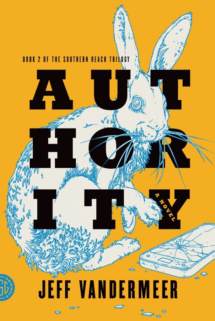
I’m still quite partial to the original US covers the trilogy (as was) designed by Charlotte Strick with illustrations by Eric Nyquist. The cover of Annihilation reminds me of The Day of the Triffids, which coincidentally has has an introduction by Jeff VanderMeer if you have the Modern Library edition. (The slightly bonkers cover of the Modern Library edition was designed by Cassie Gonzales with an illustration by comic book artist and illustrator Anders Nilson). Anyway, I’m a little sad that I can’t get the prequel to match the rest of my existing set.
Annihilation by Jeff VanderMeer (US); design by Charlotte Strick; Illustration by Eric Nyquist (FSG / 2014)Acceptance by Jeff VanderMeer (US); design by Charlotte Strick; Illustration by Eric Nyquist (FSG / 2014)
This feels very familiar, but I can’t put my finger on why. The best I’ve got is that it looks like a poster for a theatre production. It feels very European. The austerity of it gives late 1980s-90s vibes. I don’t know. I think it’s great.
Remarkably, the design incorporates a template for paper boat that can be cut from the dust jacket and stuck together.
The cover of the Canadian edition of Paper Boat, published by McClelland & Stewart, was designed by Kelly Hill using art by Paul Klee. The cover for the US edition published by Knopf was designed by Janet Hansen. The photograph is by Ruven Afanador. It’s interesting to me that it was the US decided to use a portrait on the cover. I mean it’s a beautiful photograph and Margaret Atwood is very distinctive looking, but I would imagine she would be more recognizable to Canadians than to Americans? Anyway, it’s not often you see three entirely different approaches in the UK, US and Canada for a poetry collection.
Hey, I hope you’re keeping safe and well wherever you are. Apart from the weird Toronto weather, it is definitely FALL here with the kids back in school and days of seemingly endless pre-sales calls and shortlists. It is also the time of year for “big” books of course, and there are more covers from the conglomerate publishers in this month’s post than I would generally like. My sense is that independent publishers try to avoid releasing their books in September if they can these days, but maybe I just haven’t seen the right ones? Anyway I guess we should be glad the big guys still care about fun covers, right?
Hey, I hope you’re keeping safe and well. I feel like I just finished July’s post and now it’s the end of August. There are a few more covers from earlier in the year in this month’s post. I’m still catching up. But there’s some Canadian content, a few covers from the UK, some indie presses, and a university press, which is always nice. Enjoy the last few weeks of summer!
1974 by Francine Prose; design by High Tide (Harper / June 2024)
Thanks to Robin Bilardello and AD Milan Bozic at Harper for their help on the credit for this one! :-)
Anyone’s Ghost by August Thompson; design by Keith Hayes (Penguin Press / July 2024)
This was published last month, but I had it in my August folder. If I had to guess it was because of the author’s name. I am easily confused.
I think this came out in July too, but it looks like Faber used the ISBN of the existing 2017 edition even though there is a new cover so I don’t know for sure when it was updated (publishers: don’t do this).
Burn by Peter Heller; design Kelly Blair; painting ‘Boat Building in Maine’ (detail) by Paul Dougherty (Knopf / August 2024)
Coexistence by Billy Ray Belcourt; design by Kelly Hill; photography by Steven Beckly (Hamish Hamilton Canada / May 2024)
Because I am of certain age (old and mouldering like an ancient vampire hiding from the sun of contemporary pop culture) this reminded me of the cabinet art for the original Space Invaders arcade game. Hilariously, if not surprisingly, there is a Fonts in Use post about the typography of the original promo materials and cabinet art of Space Invaders. If anyone knows of a good article about the artwork itself I would love to read it.
Speaking of all things retro, Henry has posted some photos of his Letraset experiments for this cover on Instagram.
Hair for Men by Michelle Williams; design by Greg Tabor (House of Anansi / August 2025)
There is something ‘early 2000s Canlit’ about this cover. If you’d told me this was designed for Anansi by Bill Douglas in like 2004 I would’ve believed you, and I mean that in the best way. (I appreciate that only the grizzled Canadian publishing folks like me will get this reference but hey…)
Mammoth by Eva Baltasar; design by Anna Morrison (And Other Stories / August 2025)
Anna also designed the covers for two previous novels by Eva Baltasar published by AOS, including a pink special edition of Permafrost (which is possibly my favourite).
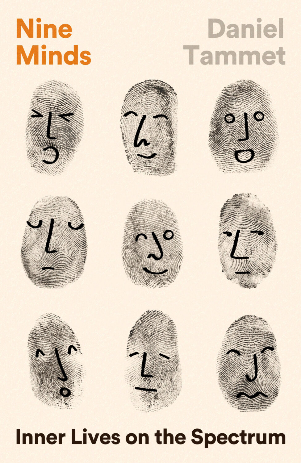
I was trying to think what this reminded me of and I think it’s either Ed Emberley’s Great Thumbprint Drawing Book or possibly the current cover of Design as Artby Bruno Munari, which (IIRC) uses drawings of faces from inside the book (but no thumbprints!).
I don’t know how you would describe this particular shade — salmon pink? Financial Times pink? (Are those variations of the same thing, actually?) — but it feels like a pink covers are still a bit of thing. (Did I mention pink covers already a couple of months ago? I think I did…? Sigh. I am repeating myself. It might be time to give this up)
I like this cover a lot, but is the disembodied hug also becoming a thing? I think I mentioned this a while back too! (Pictured: the cover The Nursery by by Szilvia Molnar designed by Hayley Warnham from May last year, and a poster by Vasilis Marmatakis for the 2015 movie The Lobster)
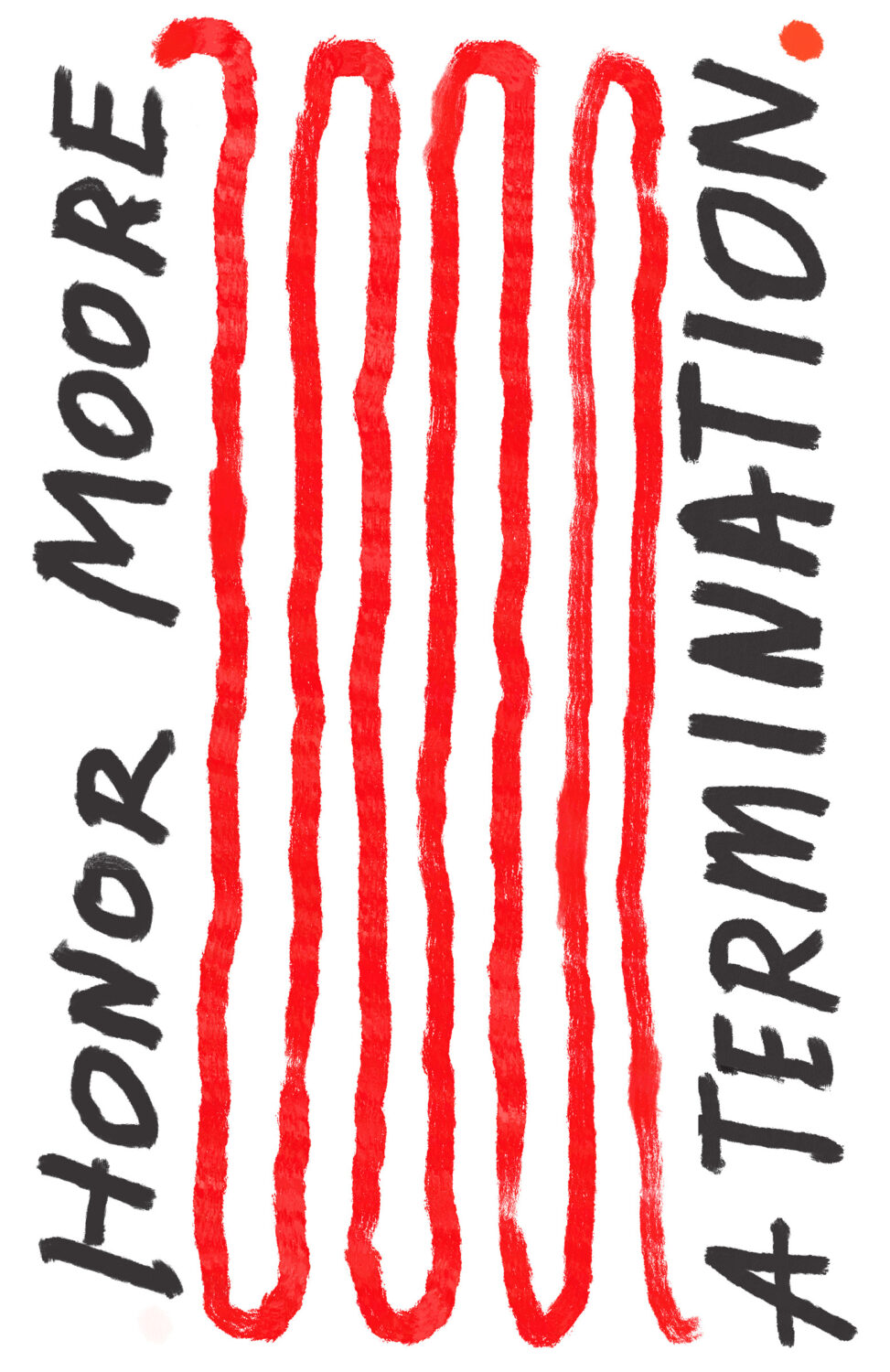
Obviously the details of the designs and the approaches are quite different, but the cover of A Termination reminded me of the cover of Anxiety by Samir Chopra designed by Karl Spurzem for Princeton University Press from March this year. I think it’s an interesting compare and contrast?
The Wisdom of Sheep by Rosamund Young; design by Darren Haggar (Penguin Press / August 2024)
Hey everyone. I hope you keeping well. It’s another big post this month. There are lots of new covers, but also quite a few that I missed (or didn’t have the design credit for!) from earlier this year too. I expect that’ll keep happening over the next couple of posts as I try to catch up over the summer, so feel free to send me stuff I might have overlooked. Now is the time!
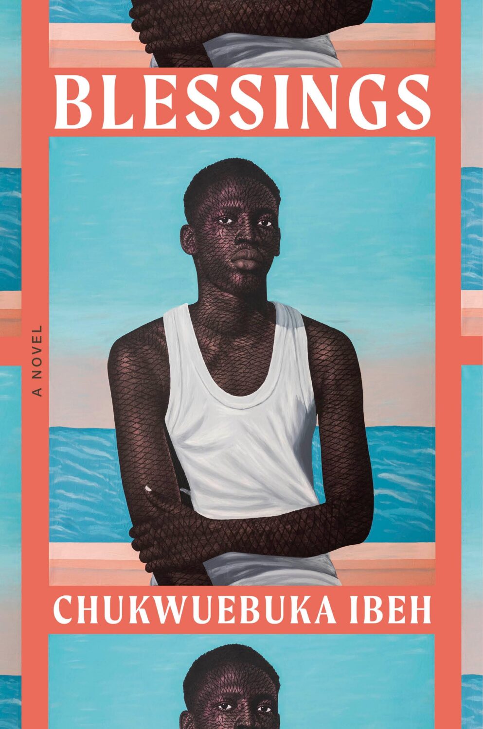
The cover of the UK edition published by Penguin earlier this year, designed by Richard Bravery (I think?), uses the same painting by Tosin Kalejaye but it’s interesting to see the differences in the approach side by side.
Another example of the US and the UK cover sharing the same image but with differing approaches. I like the type and the retro poster vibe of the UK cover a lot. I don’t have the design credit though so please drop me a note if you know whose work it is and I’ll add it in!
Brat by Gabriel Smith; design by Stephanie Ross (Penguin Press / June 2024)
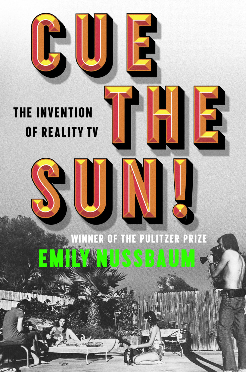
Cue the Sun by Emily Nussbaum; design by Michael Morris (Random House / June 2024)
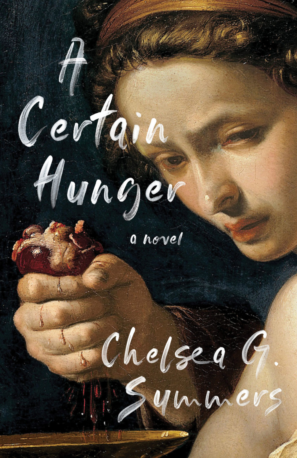
I’m a bit late to this. An Excellent Host, a short story by Chelsea G. Summers author of the cult hit A Certain Hunger, was originally printed exclusively for Independent Bookstore Day back in April. Signed copies are still currently available from the publisher. Jaya Nicely also designed the cover of A Certain Hunger of course…
The cover of the US edition of Monstrilio, published by Zando in March last year, was designed by Alex Merto. I was a little late to it, but it was included in my September round-up.
I’m not much of a horror fan so my frame of reference is very dated, but this cover immediately made me thing of the 1998 Japanese movie Ringu (and the end of The Blair Witch Project).
This makes a nice pair with the cover of The Upstairs Delicatessen by Dwight Garner designed by June Park and published by Farrar, Straus & Giroux in October last year.
Hey, I hope you’re safe and well. I’m a little bit ahead of schedule because fall sales conference season is upon us, and I have to be in New York for work next week. I’m less ahead than I would’ve liked — PRINT has already beaten me to the punch! — but here we are, a couple of days earlier than usual, with another look at some new and recent book covers. April is National Poetry Month in the US so there are a few poetry covers in the mix, as well as a couple of covers from independent presses, an Australian cover, and all the usual suspects.
The Formula by Joshua Robinson and Jonathan Clegg; design by Pete Garceau (Mariner Books / March 2024)
Two nonfiction sports books in one post! Does Formula One really count as a sport? Not for me, Clive. But the subtitle says it is, and a Canadian friend once told me that for something to qualify as a sport it has to endanger your life in some fundamental way, so I guess F1 qualifies under Quebec Rules for Teen Boys if nothing else.
Anyway, it might be fun to do a post of interesting sports books covers at some point if I can find the time (let me know if any great examples come to mind!).
I feel like this is a bit different for a psychological thriller? I like the type a lot.
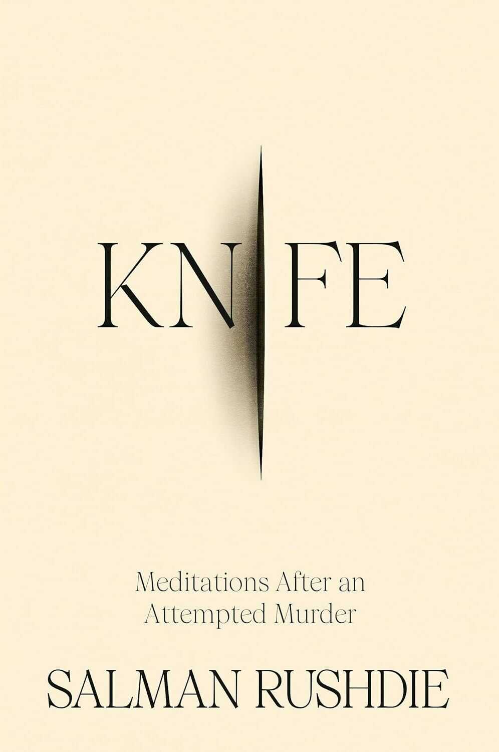
Knife by Salman Rushdie; design by Arsh Raziuddin (Random House / April 2024)
Interestingly, there is an “eye” motif on the spine with the Random House logo in the centre. Look for it next time you’re in a bookstore.
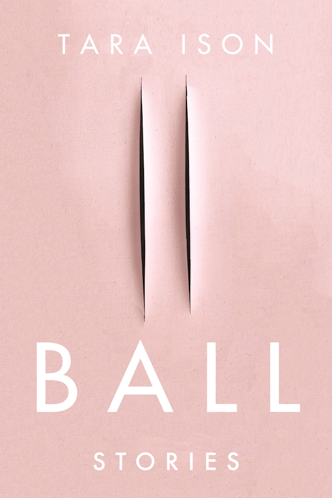
Also, this cover isn’t the first to riff, consciously or otherwise, on the cut canvases of Italian artist Lucio Fontana. The cover of Ball by Tara Ison, designed by Kelly Winton, comes to mind. I’m sure there are other examples (David Gee’s unpublished cover for Lolita. Are the more?).
This reminded me of Eric’s illustrations for the covers of Jeff Vandermeer’s Southern Reach trilogy designed by Charlotte Strick.
Annihilation by Jeff VanderMeer (US); design by Charlotte Strick; Illustration by Eric Nyquist (FSG / 2014)Acceptance by Jeff VanderMeer (US); design by Charlotte Strick; Illustration by Eric Nyquist (FSG / 2014)