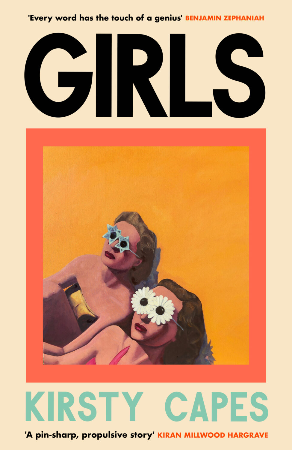
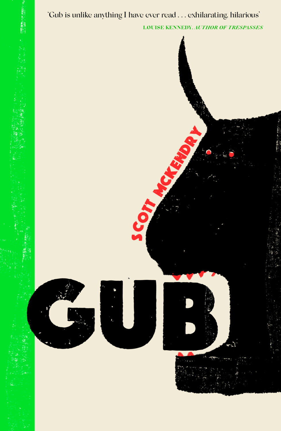
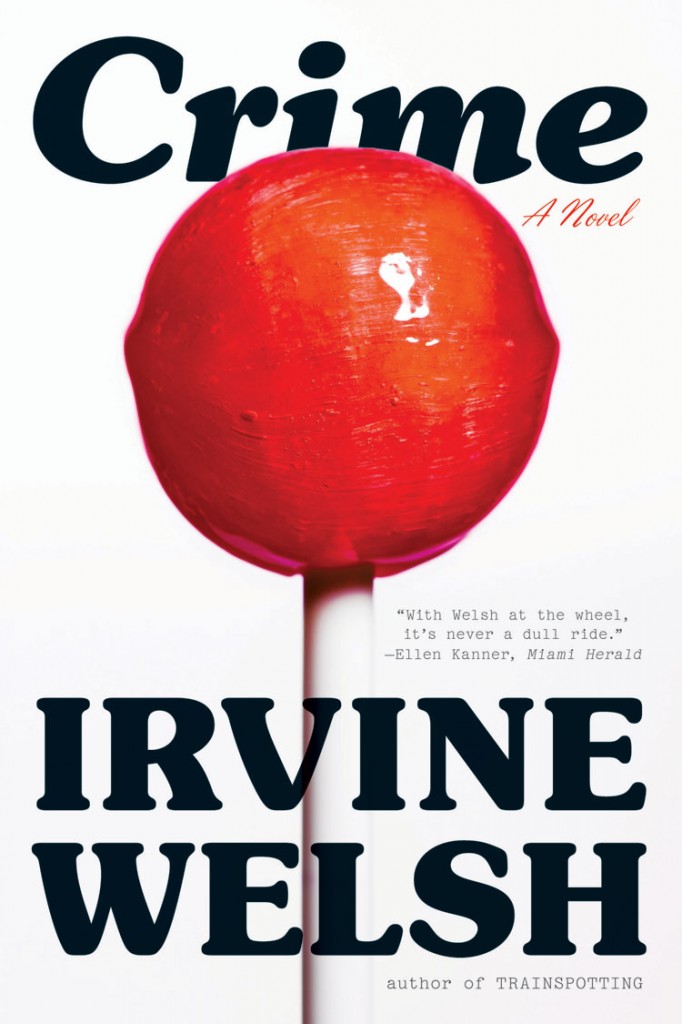
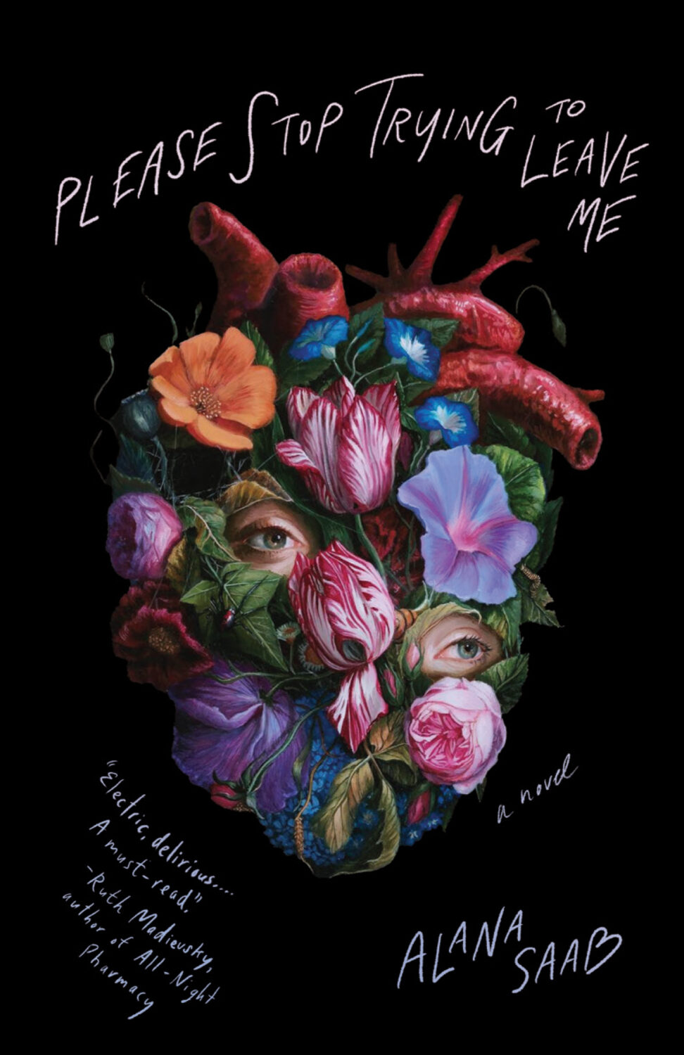
I wonder what it is like to live in uninteresting — boring, even — times? It must be nice. While I continue to ponder that, here are this month’s book covers….
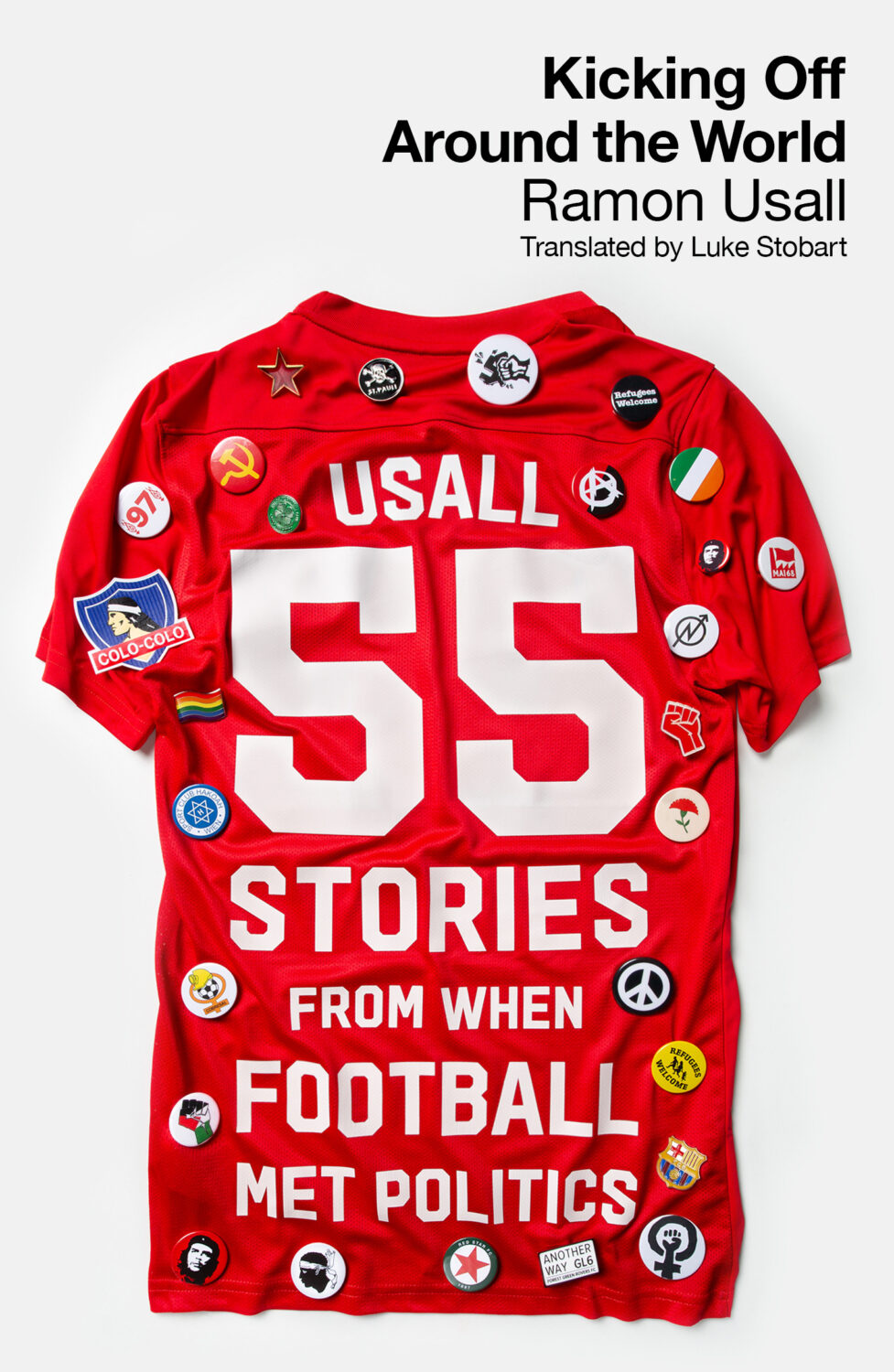
If I was good at blogging I would have posted this last month when the book was actually published and before the finals of Euros and Copa America, but here we are. Better late than never I guess, and politics never goes out of sport however much some people pretend they are unconnected. (I’m still thinking about doing a post of covers from books about sport, but haven’t got any further than that. Again, if I was actually smart and organized, I would have had it done in time for the Olympics. Cover suggestions still welcome by the way!).
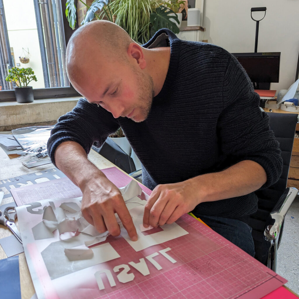
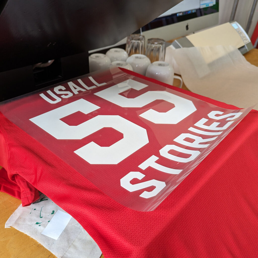
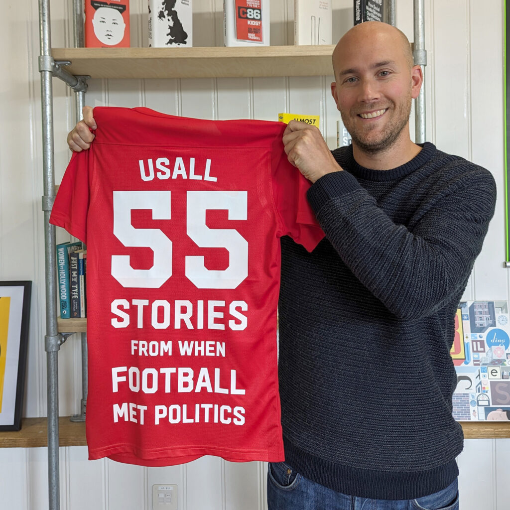
Anyway… The author’s surname and the book’s subtitle were actually printed on to the shirt for the cover and Steve made or bought actual buttons to decorate it. He kindly sent over these shots of the work in progress…
(If anyone in the UK can tell me who designed the red and green cover of Liars for Pan Macmillan — and send me a hi-res cover image! — I would to love to include it next month’s list when it’s released)
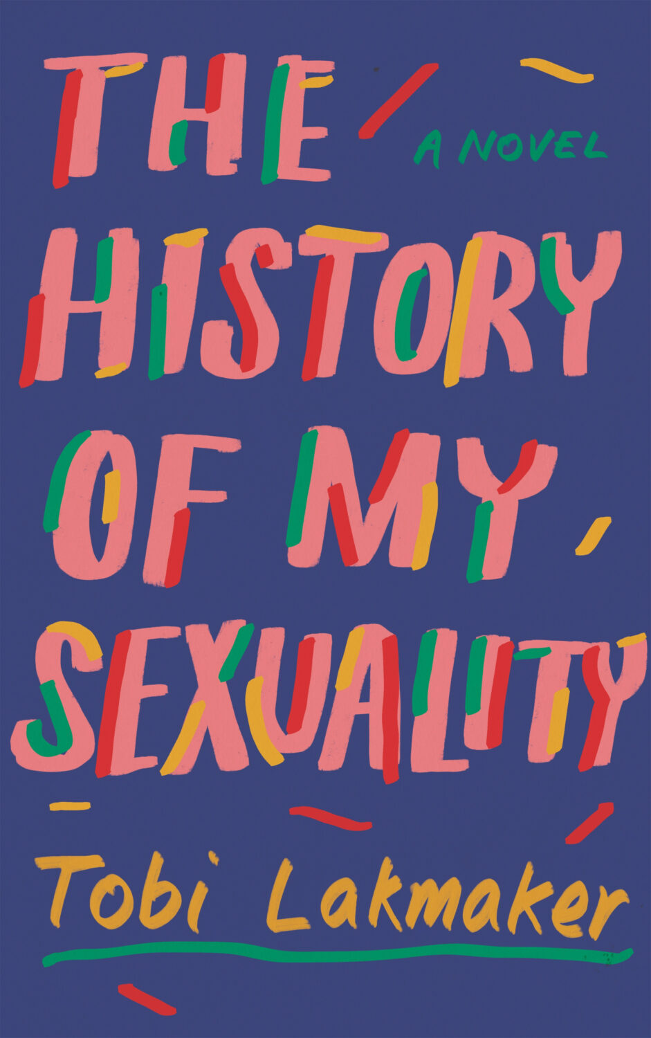
The cover of Taffy Brodesser-Akner’s previous novel Fleishman is in Trouble was designed by Kelly Blair. I feel like these work together despite being quite different? Maybe it’s as simple as the combination of really big type for the title and handwriting of “a novel”?
Neu Klang by Christoph Dallach; design by Jack Smyth (Faber & Faber / May 2024)
Hey everyone. I hope you keeping well. It’s another big post this month. There are lots of new covers, but also quite a few that I missed (or didn’t have the design credit for!) from earlier this year too. I expect that’ll keep happening over the next couple of posts as I try to catch up over the summer, so feel free to send me stuff I might have overlooked. Now is the time!
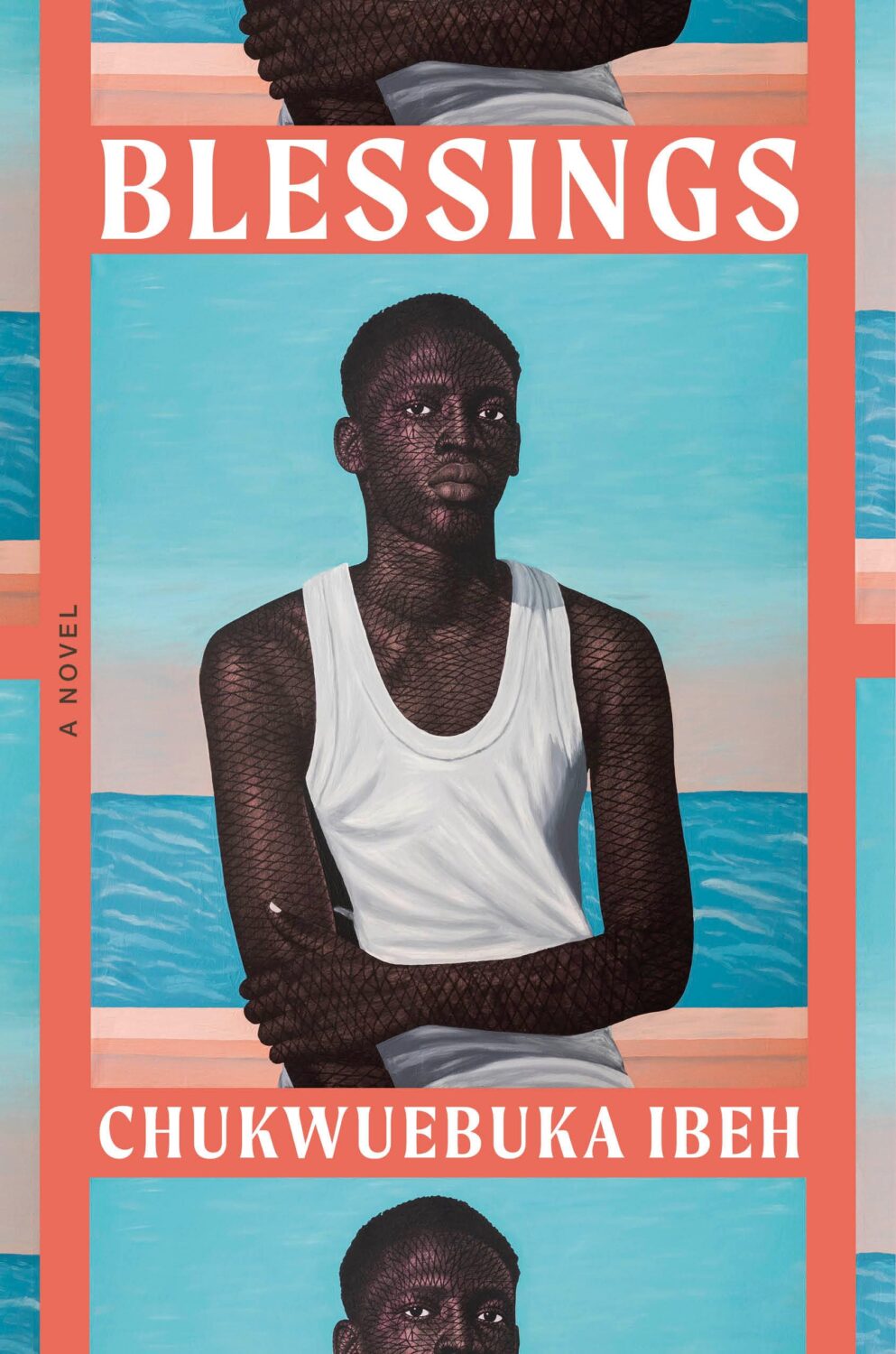
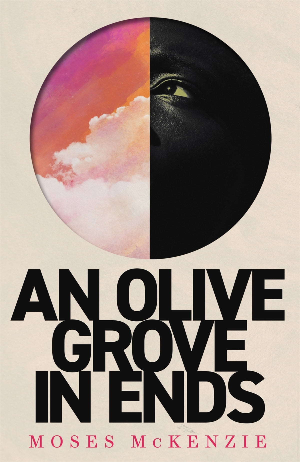
The cover of the UK edition published by Penguin earlier this year, designed by Richard Bravery (I think?), uses the same painting by Tosin Kalejaye but it’s interesting to see the differences in the approach side by side.
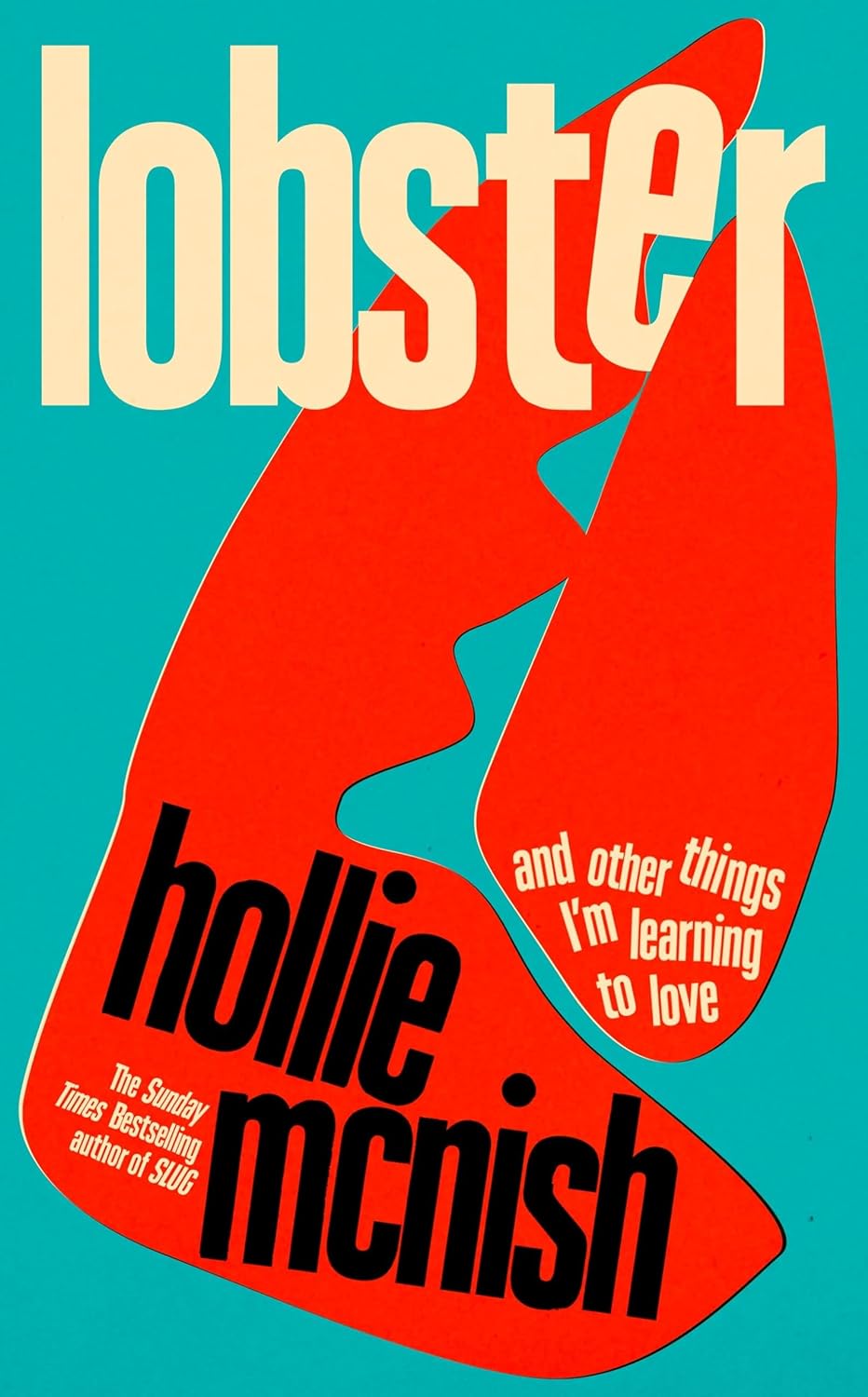
Another example of the US and the UK cover sharing the same image but with differing approaches. I like the type and the retro poster vibe of the UK cover a lot. I don’t have the design credit though so please drop me a note if you know whose work it is and I’ll add it in!
Brat by Gabriel Smith; design by Stephanie Ross (Penguin Press / June 2024)
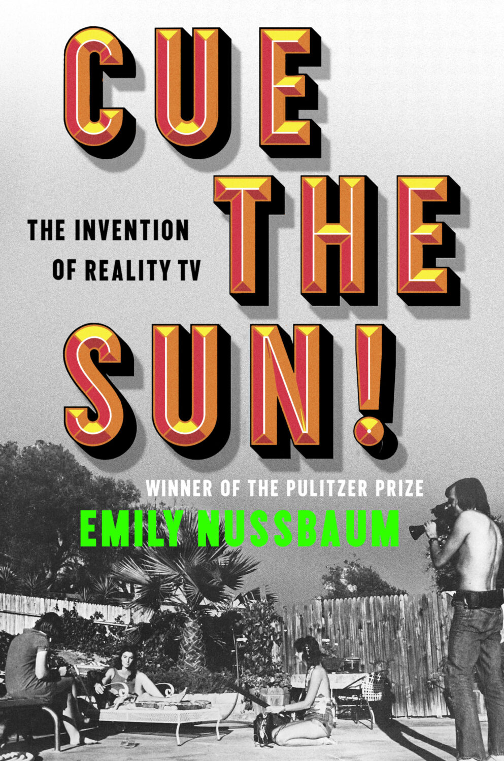
Cue the Sun by Emily Nussbaum; design by Michael Morris (Random House / June 2024)
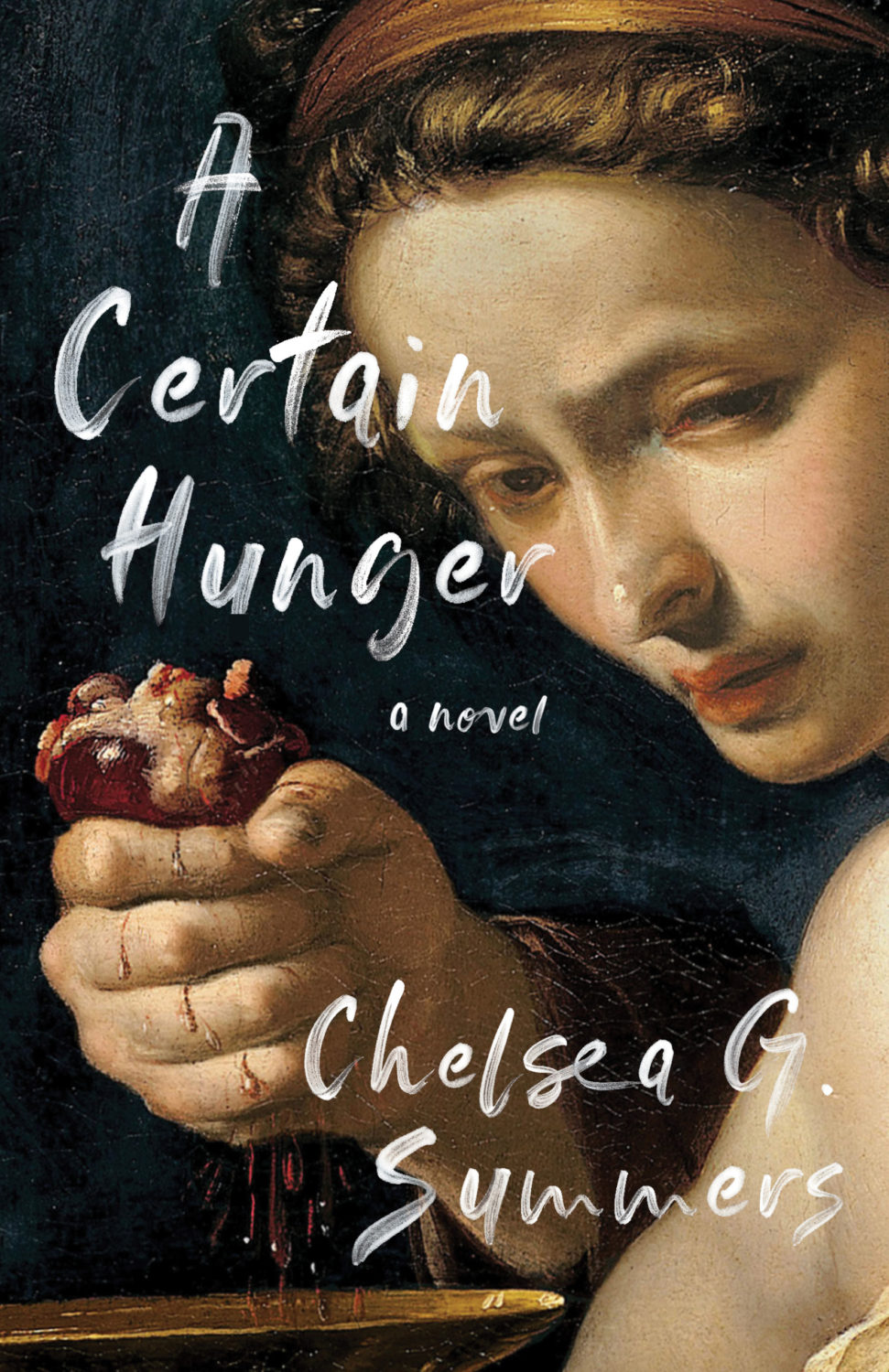
I’m a bit late to this. An Excellent Host, a short story by Chelsea G. Summers author of the cult hit A Certain Hunger, was originally printed exclusively for Independent Bookstore Day back in April. Signed copies are still currently available from the publisher. Jaya Nicely also designed the cover of A Certain Hunger of course…
The cover of the US edition of Monstrilio, published by Zando in March last year, was designed by Alex Merto. I was a little late to it, but it was included in my September round-up.
I’m not much of a horror fan so my frame of reference is very dated, but this cover immediately made me thing of the 1998 Japanese movie Ringu (and the end of The Blair Witch Project).
This makes a nice pair with the cover of The Upstairs Delicatessen by Dwight Garner designed by June Park and published by Farrar, Straus & Giroux in October last year.
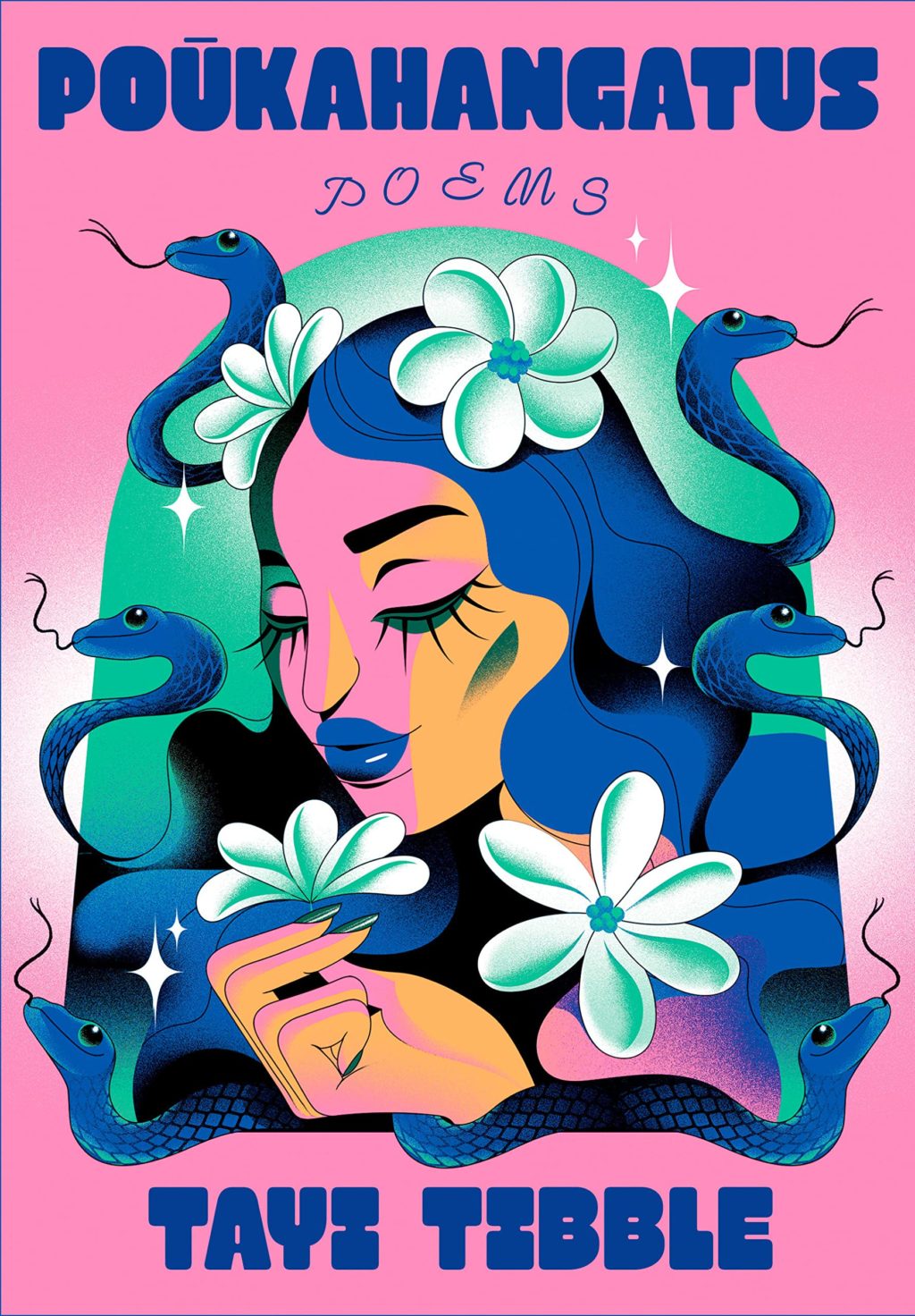
Hey, I hope you’re safe and well. I’m a little bit ahead of schedule because fall sales conference season is upon us, and I have to be in New York for work next week. I’m less ahead than I would’ve liked — PRINT has already beaten me to the punch! — but here we are, a couple of days earlier than usual, with another look at some new and recent book covers. April is National Poetry Month in the US so there are a few poetry covers in the mix, as well as a couple of covers from independent presses, an Australian cover, and all the usual suspects.
The Formula by Joshua Robinson and Jonathan Clegg; design by Pete Garceau (Mariner Books / March 2024)
Two nonfiction sports books in one post! Does Formula One really count as a sport? Not for me, Clive. But the subtitle says it is, and a Canadian friend once told me that for something to qualify as a sport it has to endanger your life in some fundamental way, so I guess F1 qualifies under Quebec Rules for Teen Boys if nothing else.
Anyway, it might be fun to do a post of interesting sports books covers at some point if I can find the time (let me know if any great examples come to mind!).
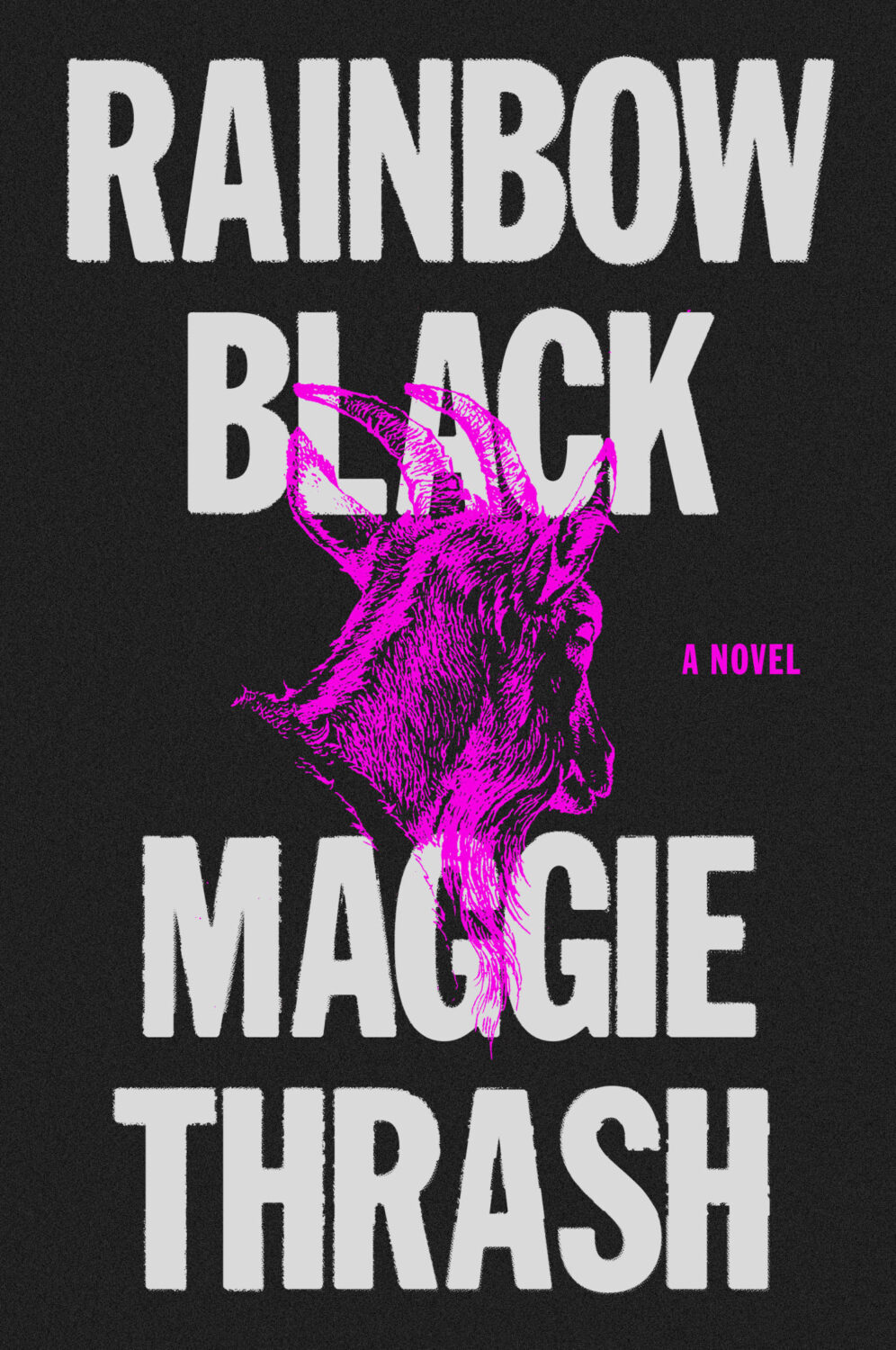
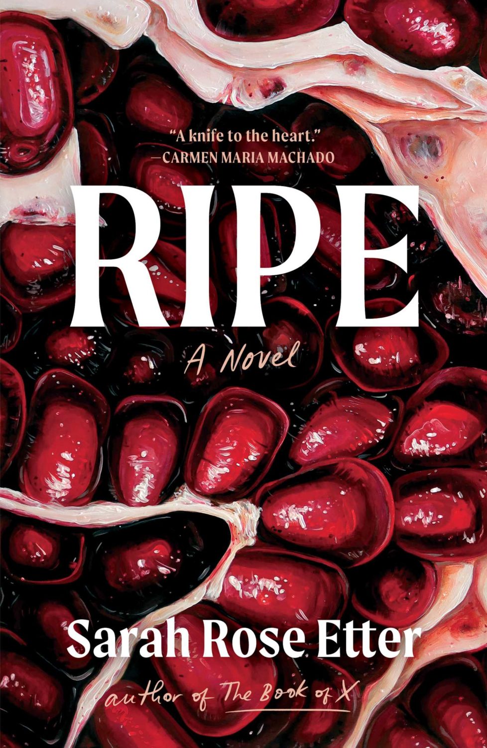
I feel like this is a bit different for a psychological thriller? I like the type a lot.
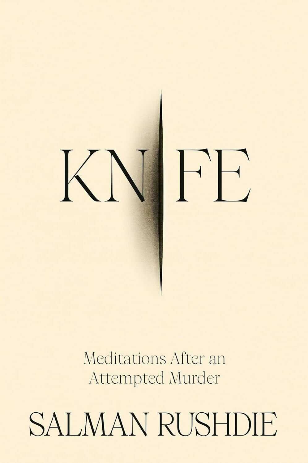
Knife by Salman Rushdie; design by Arsh Raziuddin (Random House / April 2024)
Interestingly, there is an “eye” motif on the spine with the Random House logo in the centre. Look for it next time you’re in a bookstore.
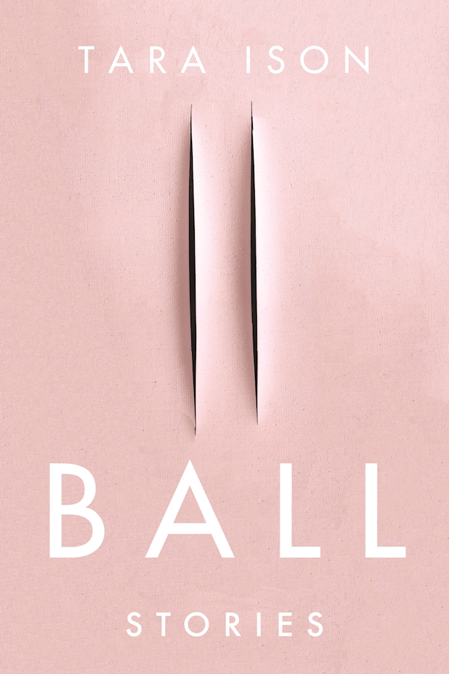
Also, this cover isn’t the first to riff, consciously or otherwise, on the cut canvases of Italian artist Lucio Fontana. The cover of Ball by Tara Ison, designed by Kelly Winton, comes to mind. I’m sure there are other examples (David Gee’s unpublished cover for Lolita. Are the more?).
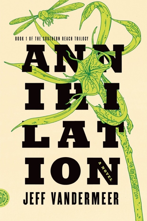
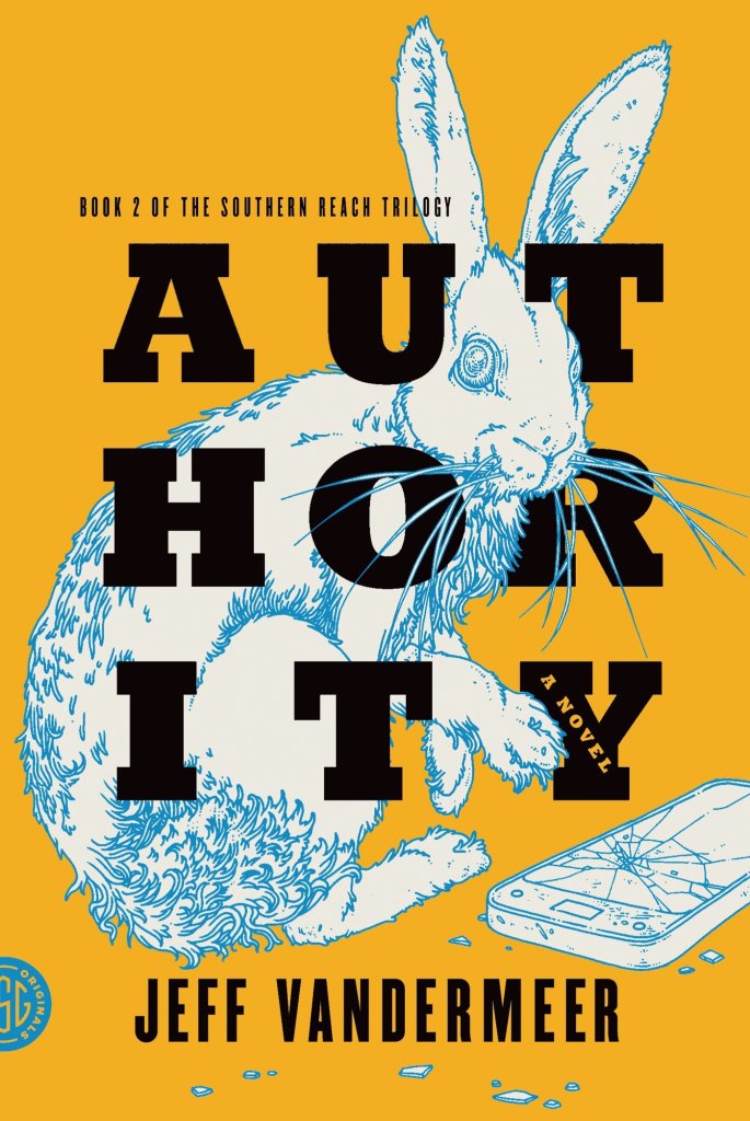
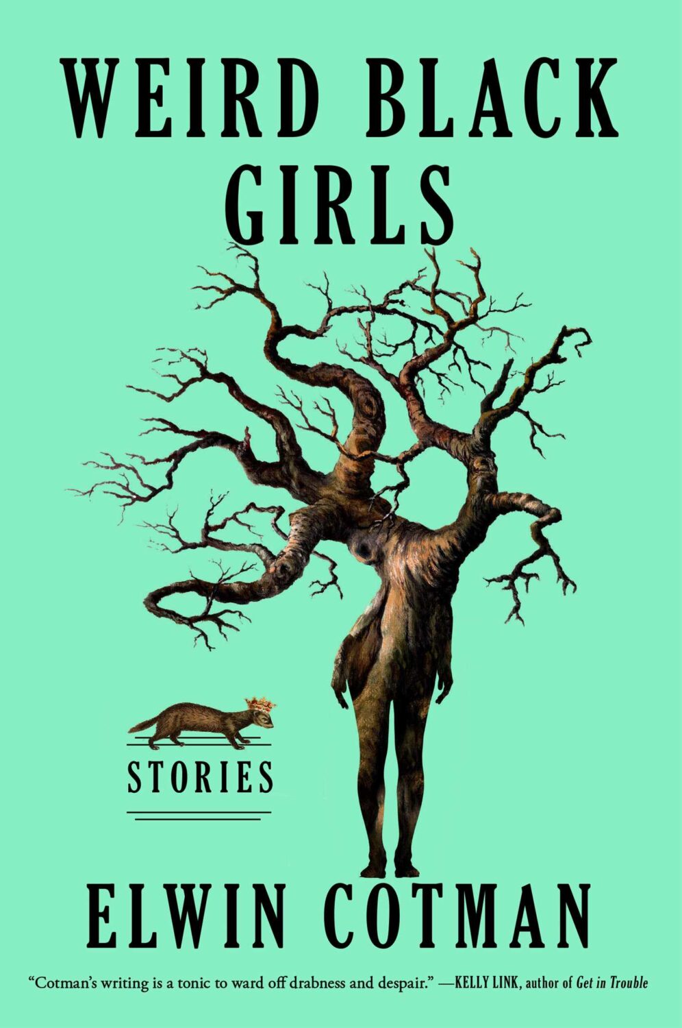
This reminded me of Eric’s illustrations for the covers of Jeff Vandermeer’s Southern Reach trilogy designed by Charlotte Strick.
Annihilation by Jeff VanderMeer (US); design by Charlotte Strick; Illustration by Eric Nyquist (FSG / 2014)Acceptance by Jeff VanderMeer (US); design by Charlotte Strick; Illustration by Eric Nyquist (FSG / 2014)
Hello! I hope you’re safe and well wherever you are.
Before we get to the covers, a couple of brief admin things. First up, there have been a couple of behind-the-scenes changes at the CO this past month. They’ve solved a few tech issues for me and hopefully no one else has noticed. Secondly, I’ve been tinkering with the RSS. I’m not sure that’s quite right yet, so apologies if it’s not been working as expected. Let me know if you’re experiencing any weirdness.
I also wanted quickly mention that the deadline for the DPI mentorship scheme has been extended to April 12th. I’m not involved with the DPI, but some really great people are so if you are a designer from an under represented background living in the UK or Ireland, you should think about applying!
Anyway, it’s a really big post this month! The are lots of great covers with the UK, Australia and Canada all represented, as well as the usual folks from US. There are some compare-and-contrasts, a couple of covers from indie presses, a couple of covers for translations, and a couple of poetry covers too. There’s even a meandering digression in the middle (sorry). Enjoy!
Anxiety by Samir Chopra; design by Karl Spurzem (Princeton University Press / March 2024)
So this cover sent me down a bit of a rabbit hole. It reminded me of a cover design from a few years ago. It didn’t really look the same but, in my mind at least, this other cover featured a blue-red capsule shape (possibly a stretched illustration of a planet and its core) centred on a white background with black Swiss-style sans serif type. It was not exactly minimalist, but clean and precise. I think I saw it on Twitter back in the day. I thought it was maybe literary sci-fi or pop science, and published by one of the big American imprints. I was also pretty convinced that it was designed by Alex Merto or possibly John Gall. One of the dudes.
This is not the first time I have thought about this cover, and I can, or at least could, picture it quite clearly. The problem is that I can find no evidence of this cover ever existing, and the more I think about, the more the details shift and doubt creeps in. I don’t seem to have posted it anywhere, and I can’t find it in the usual places. It’s possible that I am getting some of the crucial details wrong, mentally combining a couple of covers into one, or it was something other than an actual book cover. But maybe this is some kind of Visual Mandela Effect thing, and this design that I’ve believed existed for years is actually a figment of my imagination.
My search has felt a bit like the online equivalent of walking into a bookstore and asking for the book with the blue cover. It has made realise that we have very few tools to find cover designs in a systematic way, especially since the Book Cover Archive stopped being a going concern. You just kind of have to browse and I hope you eventually look in the right place (or risk slowly lose your sanity).
Anyway, if this mystery cover is ringing any bells with you, please let me know and put me out of my misery. I have been going slightly crazy. (This sort of thing happens more than I care to admit by the way, but it is particularly bad this time! And, no, I do not have much of a life. Why do you ask?)
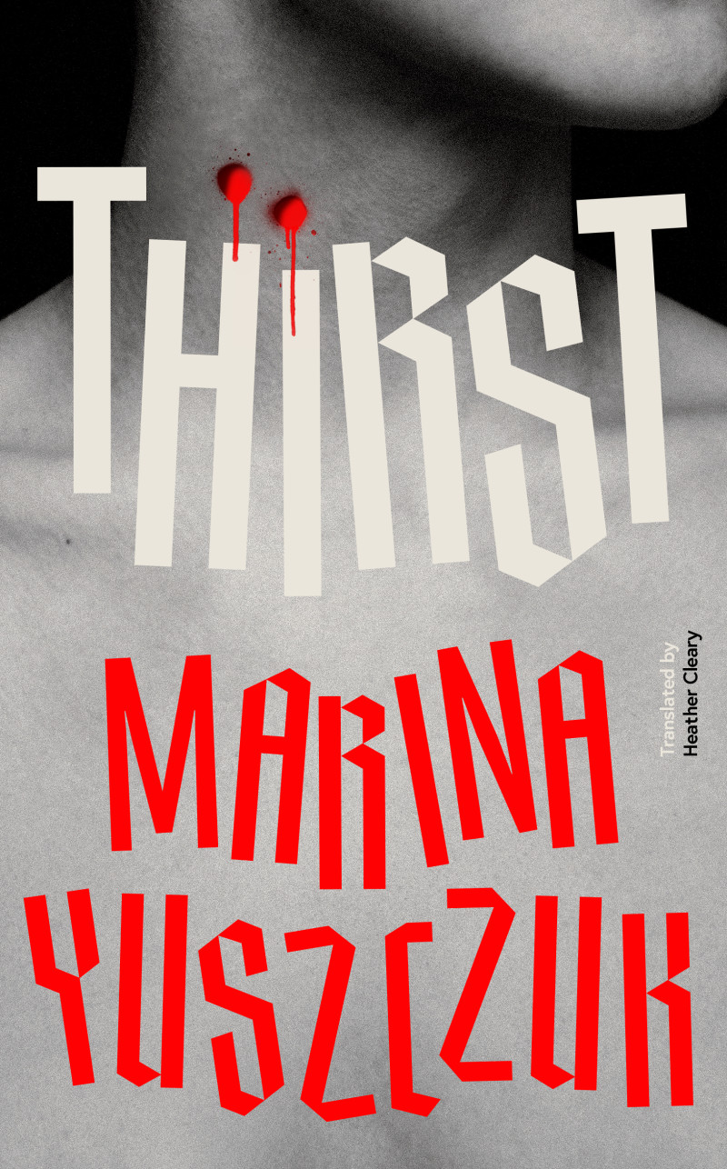
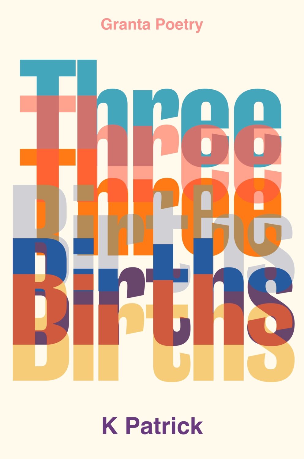
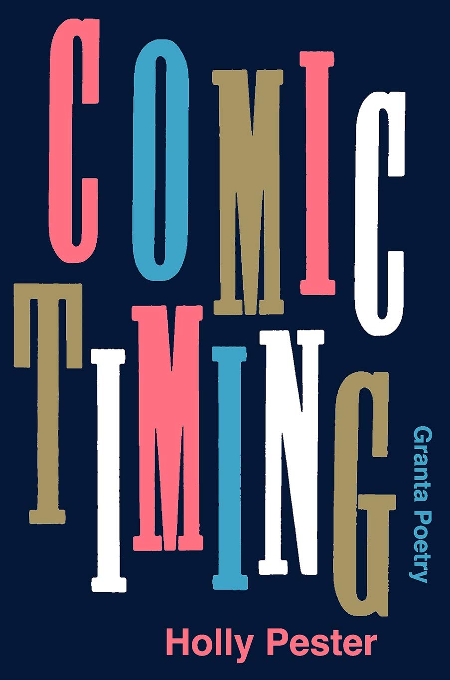
(Thanks to Jon Gray for helping me with the design credit for this and the other Granta title Three Births below. Publishers: post the design credits with your cover reveals!)
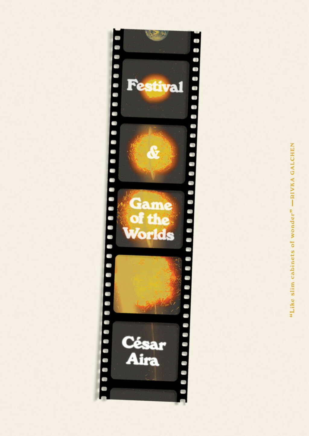
While looking for the other, possibly imaginary, book cover, I came across the cover for the New Directions edition of The Musical Brain by César Aira designed by Rodrigo Corral and Zak Tebbal a few times. It was on one or two best of 2015 lists, including mine.
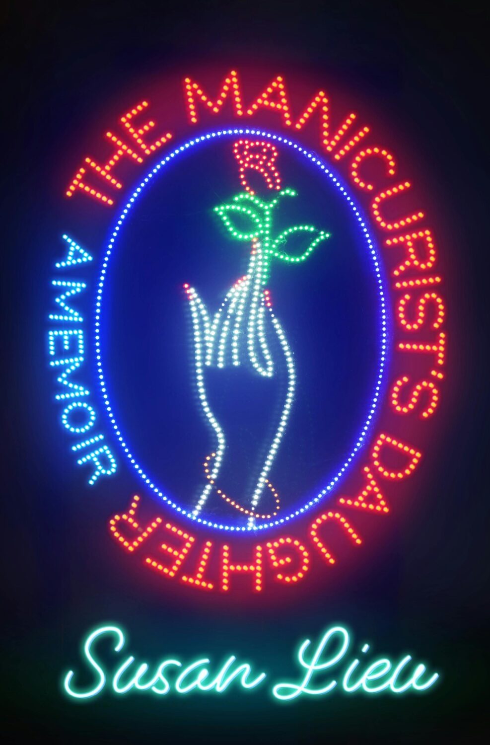
Is neon-style lettering on covers a bit of thing? (see also Candy Darling above)
The cover of the UK edition of The Understory, published by Peirene Press in October last year, was designed by Orlando Lloyd. The illustration is by Miki Lowe.
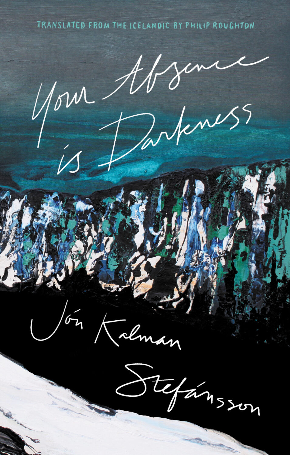
Your Absence is Darkness by Jón Kalman Stefánsson; design by Jason Arias (Biblioasis / March 2024)
Hey. I hope you’re keeping safe and well wherever you are. I’m going to keep this very short as there’s lots going on, but there some great covers, and a couple of tenuous comparisons this month (hey, I can’t help how my brain works!) . Enjoy!
This reminded me of Akiko Stehrenberger‘s poster for the movie Funny Games. They don’t really look alike, and the tone is very different, but I think it was the close crop and the hair that brought it to mind.
Dirtbag by Amber A’Lee Frost; design by Rob Grom (St. Martin’s Press / December 2023)
This brought to mind Peter Mendelsund’s cover for The Woman Destroyedby Simone Beauvoir, published by Pantheon, which in turn reminded me Gunter Rambow‘s Gitanes, Un Hommage à Max Ponty poster…
The image is taken from the 17th Century painting ‘The Torture of Prometheus’ by Giovacchino Assereto (thanks for letting me know, Jason!). The tight crop (which is great!), reminded me of Peter Hujar’s 1969 photograph ‘Orgasmic Man’, which was used on the cover of A Little Life by Hanya Yanagihara designed by Cardon Webb a few years ago. Art imitating art, kind of?
Jacket design by Cardon Webb; jacket photograph Orgasmic Man by Peter Hujar 1987
Splinters by Leslie Jamison; design by Gregg Kulick (Little, Brown & Co / February 2024)
The cover of the UK edition of Splinters, published this month by Granta, was designed by Jack Smyth. It’s interesting to see to a torn author photo in both…
I hope you’re staying healthy and optimistic about the new year. As this is the post about new 2024 covers, it inevitably includes a few from 2023 that I missed at the time. There are also a couple of indie covers, one from a university press, and, continuing a theme from last year, one from a Canadian publisher. Keep warm, friends.
Filterworld by Kyle Chayka; design by Oliver Munday (Doubleday / January 2024)
I mentioned Kyle Chayka in the introduction to my post looking back at 2023. I didn’t realize that he had book coming out. I guess I will have to read it now!
Font wizards correct me if I am wrong, but I *think* both of these covers use Manofa from Inhouse Type? (And I think saw it on the cover of a forthcoming book too recently. Maybe a typeface inspired by Lydian is becoming the new Lydian?)
At the turn of the year, writer and activist Cory Doctorow coined the term “enshitification.” Although he was specifically describing the process of online services getting worse for users, it was hard not to see it everywhere in 2023.
In his annual look at the year’s best book covers for the New York Times, art director Matt Dorfman recounts a friend describing 2023 as a “year of survival”, a year of “no growth, no withering, just getting by.”
This year saw a centuries-old business contending with rounds of buyouts and layoffs, alongside an endless news cycle involving two brutal wars from which no authors, friends, enemies or strangers were immune from accountability for any unrehearsed sentiment they might voice in passing. Add to this the ongoing concern about how artificial intelligence will affect a business historically dependent upon human creativity — yet through it all, there was still the matter of making books, and their covers, to get on with.
I read Matt’s piece the same day I read an article by Kyle Chayka in the New Yorkerabout his search foran epochal term to “evoke the panicky incoherence of our lives of late.” The suggestions range from the bland ‘Long 2016,’ to the incredibly ominous-sounding ‘Chthulucene,’ the Lovecraftian ‘New Dark Age,’ and the frankly terrifying and plausible ‘Jackpot’ from William Gibson’s 2014 novel The Peripheral.
This was the context of life and work in 2023.
Matt notes some designers found inspiration in the zeitgeist. He’s not wrong. But, ironically perhaps, I feel less optimistic about the overall picture than he does.
At the risk of repeating what I’ve written in the past couple of years, it’s like we’re stuck in a holding pattern, circling the same design ideas. Trends have stuck around. A lot of covers feel safe. Some of this was the books themselves. I’m not sure exactly how many celebrity memoirs is too many, but I’m pretty sure we reached that point and sailed right past it in 2023. No doubt some of it is sales and marketing departments sanding down all the edges and demanding the tried and true (see Zachary Petit’s alternative best of 2023 piece on killed covers for Fast Company). But I would not be surprised if it designers were just getting caught up in the churn — too many books, too many covers, and too much other stuff to worry about.
Or maybe it’s just me.
Rouge by Mona Awad; design by Oliver Munday (Simon & Schuster / September 2023)Silver Nitrate by Silvia Moreno-Garcia; design by Regina Flath (Del Rey Books / July 2023)Our Share of Night by Mariana Enriquez; design by Donna Cheng (Hogarth / September 2023)
One of the themes of the year was nostalgia, which I’m sure can also be put down to the present being pretty fucking awful. It was apparent across almost all genres, including literary fiction, but nowhere more so than in the resurgent supernatural suspense and horror categories. There were creative stylistic mashups with retro vibes, along side fastidious Stranger Things-like homages to the 1980s and Stephen King.
Looking Glass Sound by Catriona Ward; design by Katie Klimowicz (Tor / August 2023)The Only One Left by Riley Sager; design by Kaitlin Kall (Dutton / June 2023)Come Closer by Sara Gran; design by Caroline Johnson (Soho Press / September 2023)
One genuinely pleasant surprise was the number of interesting covers from Canadian publishers this year. They’ve been quietly risk-averse in recent years, so it was nice to see a few bolder design choices getting approved. I was happy to see a Canadian cover was one of the top picks on Literary Hub’s (very, very long) list of the best covers of 2023.
There were other things to cheer this year too.
The Lights by Ben Lerner; design by David Pearson (Granta / September 2023)Total Reset by Sinéad Brady; design Steve Leard (HarperCollins / March 2023)How to Build a Boat by Elaine Feeney; design by Zoe Norvell (Biblioasis / November 2023)
Spine continued to give space to designers to talk about their work in a way I’ve never been able to do consistently here. You can find their 2023 cover picks here.
David Pearson started the Book Cover Review, a website for short reviews of book covers.
Zoe Norvell’s I Need A Book Cover, a resource for book cover inspiration as well as place for authors and publishers to connect with designers, also went live.
Steve Leard launched Cover Meeting, a podcast series of in-depth interviews with cover designers (including David and Zoe among others). As Mark Sinclair notes in his piece on book cover design this year for Creative Review, Steve’s conversations shed light on wider concerns in the industry as well as each designer’s individual process. Have a listen if you haven’t already.
Berlin by Bea Setton; design by Emily Mahon; cover image by Nataša Denić (Penguin Books / May 2023)
Also designed by Emily Mahon:
Lost Believers by Irina Zhorov; design by Emily Mahon (Scribner / August 2023)Do Tell by Lindsay Lynch; design by Emily Mahon; illustration and lettering by Studio Martina Flor (Doubleday / July 2023)
B.F.F. by Christie Tate; design by Ben Wiseman (Avid Reader Press / February 2023)
The Illiterate by Ágota Kristóf; design by Oliver Munday (New Directions / April 2023)
Also designed by Oliver Munday:
The Guest by Emma Cline; design by Oliver Munday (Random House / May 2023)Life on Delay by John Hendrikson; design by Oliver Munday (Knopf / January 2023)
Sublunar by Harald Voetmann; design by Jamie Keenan (New Directions / August 2023)
Also designed by Jamie Keenan:
The Dimensions of a Cave by Greg Jackson; design by Jamie Keenan (Granta / October 2023)Dr. No by Percival Everett; design by Jamie Keenan (Influx Press / March 2023)
I’m doing my best to catch up a little bit this month, but there’s no such thing as a quiet month in publishing any more. Just rest assured nobody knows what they’re doing — we’re just here for the chaos and romance…
I compile these posts over the month and then write this bit at the end if I have anything to say. I really don’t have the words at the moment. Posting about the most superficial of subjects feels faintly ridiculous at the end of yet another awful week. But here we are. I am just going to refer you to Wednesday’s Today in Tabs and say that there a lot of really nice covers this month if you are need of distraction…
Appliance by J. O. Morgan; design by the author (Jonathan Cape / May 2022)
I was reminded of Jon Gray‘s cover for Ilustrado by Miguel Syjuco from what seems like ages ago (2010)… Of course they look nothing alike. I had completely forgotten the pen was at jaunty angle.
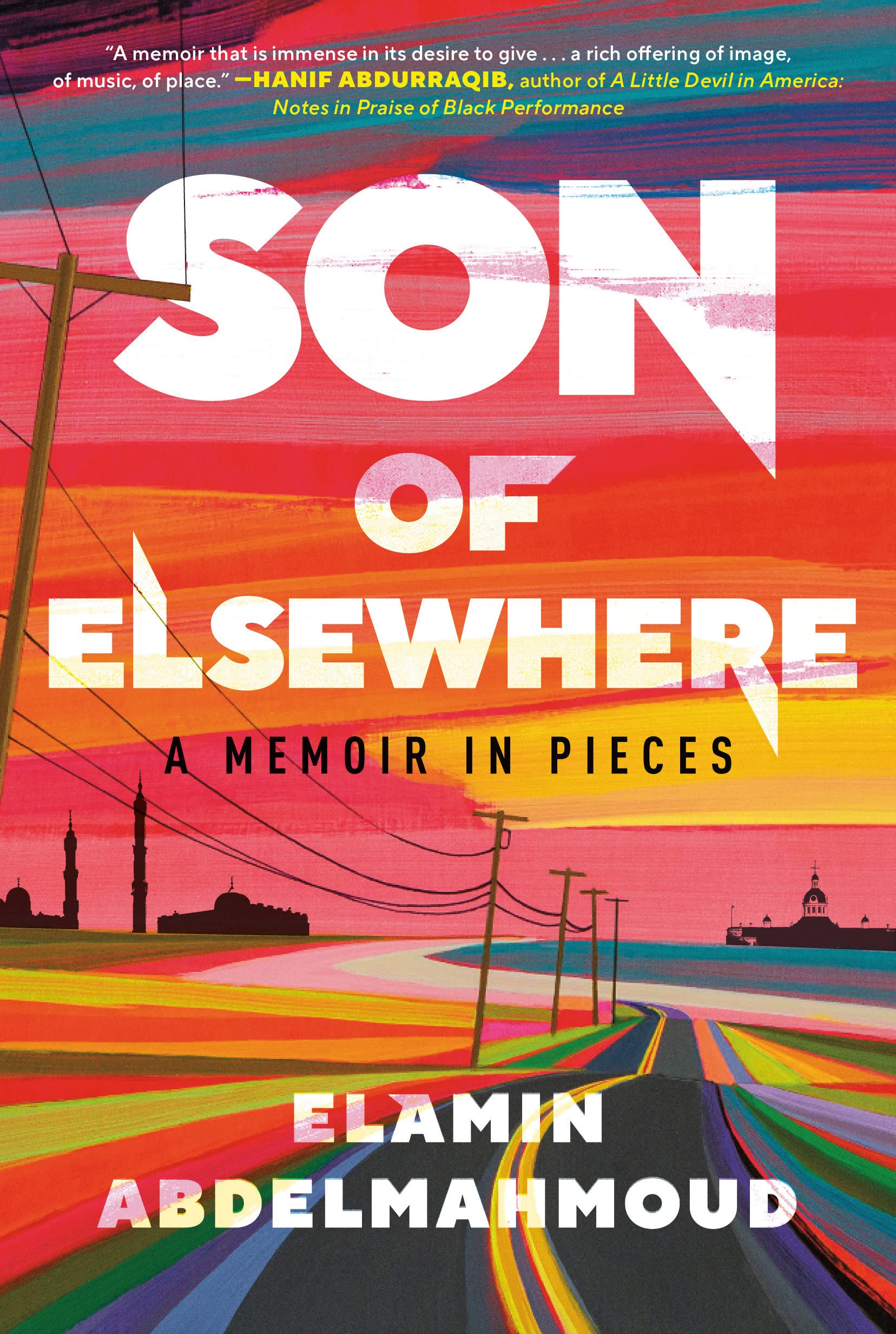
The cover of the US edition was designed by Rachel Ake Kuech using a illustration by Grant Haffner. The difference between how Canada represents Canada and how the US represents Canada is…. interesting.
Big vertical light leaks might also be a thing… (Freedomland designed by Henry Sene Yee for Cornell University Press)
Malika Favre also designed and illustrated the cover of Playing with Matches by Michael Faudet, published by Andrews McMeel at the end of last year, and featured in this month’s ‘Book Covers We Love‘ post at Spine Magazine.
Earlier this year, a Canadian magazine asked me what the latest trends in book cover design were. I don’t think I had a very satisfactory answer. 2021 felt very much like a continuation of 2020, which itself felt like a year on hold.
The trends that came to mind were not exactly new. In no particular order: big faces (big sunglasses!); cropped faces; hands; mouths; postmodern typefaces;1 big skies; rainbows; gradients; the colour orange; psychedelia; collage; contemporary painting.
A lot was made of “blob” covers this year. I’m not sure that anything has really changed since Vulture published this article about “blocky” covers in 2019. They seemed like much the same thing.
Design is about the constraints and, as it turns out, the constraints around designing commercial literary fiction covers that have to work just as well online as in bookstores can lead to similar design solutions — large, legible type, and bright, abstract backgrounds. 2 The surprising thing is not that a few covers look the same when you squint; it’s that more of them don’t.
There were a lot of good covers (that didn’t look alike) in 2021. LitHub posted 101 of them. Still, it didn’t exactly feel like a vintage year.
Do I say that every December? Possibly.
A few years ago I worried that covers were moving in a more conservative direction, particularly at the big publishers. I’m not sure this has come to pass, at least not in the US. There are plenty of covers from the big, prestigious American literary imprints in this year’s list, as there were last year, and every year before that.
There are fewer covers from the UK in this year’s list than in previous years though, and I feel less confident about the situation there. From a distance, things seem a little sedate. I may be mistaken. It’s quite possible I haven’t see enough covers — or perhaps enough of the right ones — from British publishers to get a good sense of the overall picture.3
It would not be a surprise, however, if publishers were feeling a little risk-averse at the moment. We are two years into a global pandemic, experiencing a major supply chain issues, and living through a seemingly endless series of sociopolitical crises.
Nor would it be a surprise if designers were personally feeling the effects too — I’m not sure we are talking about this enough, and I’m not sure I know how to.
Thank you to everyone who has supported the blog in 2021. It means a lot. Here are this year’s book covers of note…
Na Kim talked to PRINT about her career and the designs for the Ditlevsen series in February. If, like me, you were wondering about typeface on the covers, it’s Prophet from Dinamo apparently.
If you’re wondering about the Super-Seventies Sally Rooney typeface, it is Ronda designed by Herb Lubalin and Tom Carnese (I only know because I asked).
Thank you to everyone who has supported the blog in 2021. It means a lot.
I am not convinced that the term “postmodern” quite captures what I mean here (and/or worse, implies something different in the context of typography), but it’s the best I’ve got. I’m not talking about the kind of experimental typography you might associate with the likes of Wim Crouwel or Emigre, or the aesthetic of someone like David Carson. What I am trying to get at is idiosyncratic type that purposely exaggerates or plays with letterforms, and doesn’t conform to function-first modernism. To my mind, this would include some typefaces from the 1960s and 70s, as well as some more contemporary type. In a sense what I am describing is display faces — and I think the eclectic, innovative use of type in Victorian advertising might be an inspiration to designers here — but I don’t think it is just about size. ↩