Another rather rushed update this month I’m afraid, which is especially disappointing given how many new books there out at this time of year. I’m sure I’ve missed more than a few great covers here, but hopefully I will catch them before the end of the year…
Red Pill by Hari Kunzru; design by John Gall (Knopf / September 2020)
This cover is bonkers. The cover of the UK edition of Red Pill published by Scribner (also bonkers but in a different, laser eyes, way), was designed by Craig Fraser.
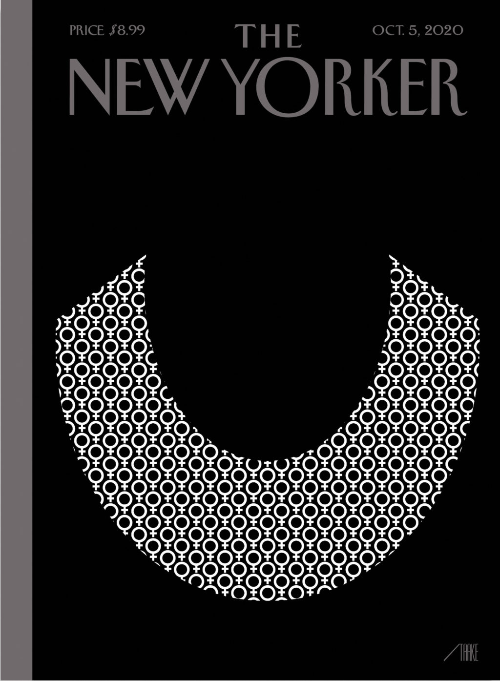
Bob Staake’s new cover for The New Yorker commemorates Ruth Bader Ginsburg, who died aged 87 last week.
It brought to mind Stephanie Ross’s cover for the 2018 biography of Ginsberg by Jane Sherron De Hart published by Knopf, which also focused on her lace collar.
Sisters by Daisy Johnson; design by Suzanne Dean; photograph Simon Kerola (Jonathan Cape / August 2020)
The cover of the US edition of Sisters, published by Riverhead this month, was designed by Jaya Miceli. The painting is by Jeremy Olson. (Thank you to the folks on Twitter who helped me with this!)
Artist Stanley Donwood talks about his artwork for Radiohead, his collaboration with author Robert MacFarlane on Ness, and his own book Bad Island, published earlier this year by Hamish Hamilton (and slated to be published in the US by W.W. Norton this fall).
The cover of the UK edition, which will not be published until 2021(!), was designed by Craig Fraser. It has a very vintage Faber feel… maybe it’s just the type?
This reminded me of the cover of the similarly themed American Manifesto by Bob Garfield, designed by Richard Ljoenes and published earlier this year by Counterpoint….
I love this illustration for the June 29 issue of The New Yorker magazine by Matt Willey. It accompanies ‘The Rescue Will Begin in Its Own Time‘, a series of short pieces by Franz Kafka that have not been published in English before, and that will appear this fall in the New Directions book The Lost Writings.
Inspired by Eugène Delacroix’s ‘Liberty Leading the People’, artist Kadir Nelson explains how he illustrated the July 2020 cover of Rolling Stone to accompany Jamil Smith’s cover story on Black Lives Matter.
This cover immediately reminded me of Helen Crawford-White’s cover A Half-Baked Ideaby Olivia Potts published last year…
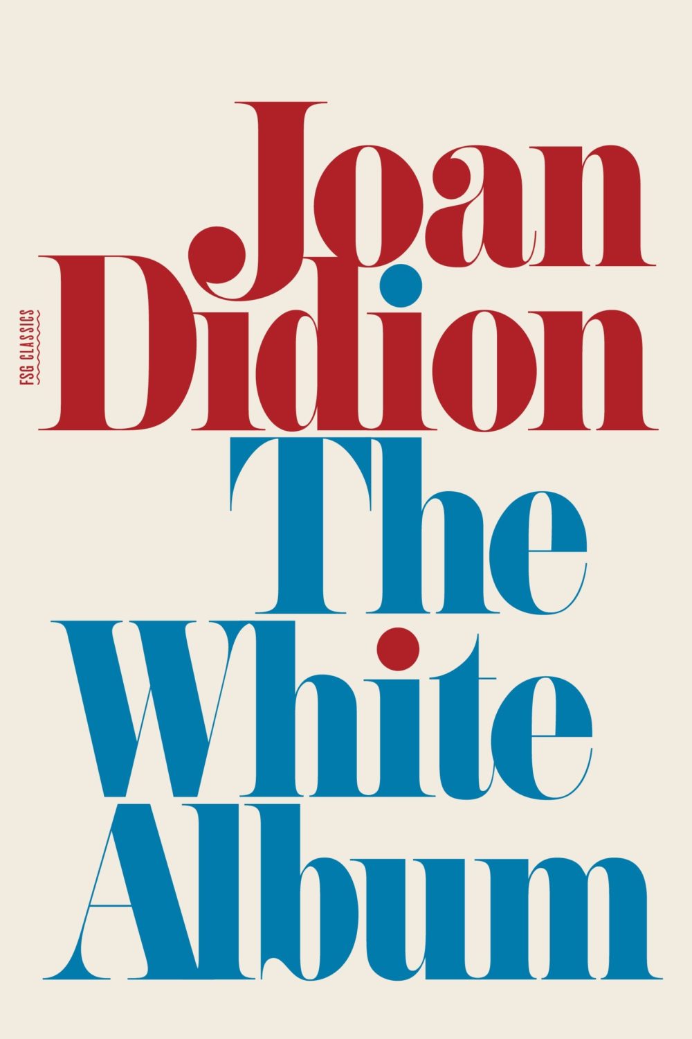
And then I thought maybe it was a nod to the cover of The White Album by Joan Didion, published in 1979 (the reissue below uses the original cover), and which Fonts in Use informs me uses the typeface Pistilli Roman. But maybe I am over thinking it…?
I was also reminded of these two recent covers, so maybe it is just a thing…?
I believe this is only available as an ebook, which seems a bit of shame. It would be nice to see in print. The cover does remind me of something else though. I can’t think what exactly. The best I could come up with was Tyler Comrie‘s cover for The Unwanted by Michael Dobbs. But I feel like there is cover that does something similar with a painting as a background? Possibly I’m just imagining it.
Oh and for those of you who are interested, the design team at Penguin Random House Canada have started posting their work to Instagram as one_last_tweak.
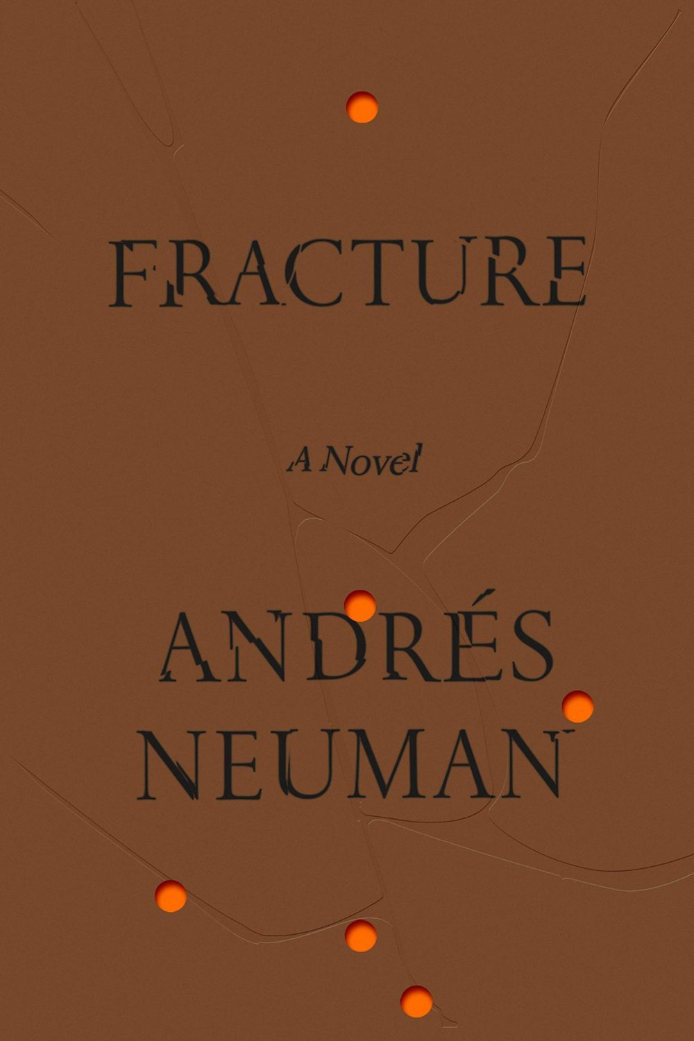
Fracture by André Neuman; design by June Park (Farrar Straus & Giroux / May 2020)
“Having lived in Chicago for thirty years, I’ve only ever been a visitor to New York, but I love it like no other city. Teeming with unpredictable people and unimaginable places and unforeseeable moments, life there is measured not in hours but in densely packed minutes that can fill up a day with a year’s worth of life. Lately, however, closed up in our homes against a worldwide terror, time everywhere has seemed to slur, to become almost Groundhog Day-ish, forced into a sort of present-perfect tense—or, as my fellow New Yorker contributor Masha Gessen more precisely put it, ‘loopy, dotted, and sometimes perpendicular to itself.’ But disaster can also have a recalibrating quality. It reminds us that the real things of life (breakfast, grass, spouse) can, in normal times, become clotted over by anxieties and nonsense.”
Chris Ware has created another brilliant cover for The New Yorker to illustrate April 15th, 2020, “a kaleidoscopic account of a single day in New York” during the pandemic.
Its densely packed grid and the juxtaposition of mundane, ‘snapshots’ reminds me — perhaps more than some of his other covers for the magazine — of Ware’s comics.
Hey. Here are the book covers that have caught my eye online this month. I hope that they bring a little joy in this very grim time.
If you have the means to buy books at the moment (and I appreciate that is not going to be the case for everyone), please consider supporting your local bookstore. I know a lot of stores are taking orders by email even if they are not answering the phone, and many are offering local delivery if curbside pick-up is not currently an option. The situation seems to be changing daily, so if a store wasn’t accepting orders yesterday, they might be today. We are all figuring this out on the fly.
If you are in the US and don’t have access to a local bookstore, there is Bookshop.org who are trying to provide some financial support to independents. If there are similar initiatives elsewhere, let me know — I’m happy to share the link.
Afterlife by Julia Alvarez; design by Jaya Miceli (Algonquin Books / April 2020)
I wonder where the eye — particularly the combination of the colour red and the eye — as a symbol of Orwell and Nineteen Eighty-Four originated? Does it go back to the 1960s and the Penguin paperback designed by Germano Facetti?
I understand that the eye is a short-hand for the surveillance state. But it is almost as if that is now considered the only element of the book worth visualizing (David Pearson’s cover is in an interesting exception in that it cleverly focuses on censorship rather than surveillance).
I haven’t read Nineteen Eighty-Four in years, but my memory is that the infamous “Big Brother is Watching You” poster is a face whose eyes seem to follow you when you move — something I think Matt’s cover above captures quite nicely — not an all-seeing, omniscient eye. The first time I read the novel, I imagined Big Brother looked something like Lord Kitchener / Uncle Sam in the recruitment posters. I was more traumatized by Room 101 to be honest… Has anyone put rats on the cover of Nineteen Eighty-Four?
I actually read Godshot in manuscript form last year and liked it a lot. It is set in drought-stricken California, but I had Ry Cooder’s soundtrack to Paris, Texas playing in my head the whole time I was reading it.
I also wanted to give a quick shout-out to Nicole who was diagnosed with breast cancer at the end of last year and bravely shared her story on social media recently. Stay safe, and get well soon, Nicole. :-)
Griefby Svend Brinkmann; design by David A. Gee (Polity Press / April 2020)
David has designed the covers for a number of books by Svend Brinkmann, including Standpoints, which featured on the blog back in March 2018.
The cover of the UK edition of A Luminous Republic, which Granta is publishing in a couple of months, was designed by Luke Bird. It’s a really interesting contrast!
An inspiration for my drawing is my dad, who was an architect. As a kid, there was always paper around. I’d go and visit him in his office and see him drawing on the drawing board with a ruler and a pen. I think my cartooning is kind of like, I saw him drawing all day and thought, “That looks lovely,” and then I saw him go into a building site and arguing with a builder, and I thought, “That looks awful.” I basically wanted to find a job where I could do the drawing without having to shout at anybody.