At the New York Times, Ken Johnson reviews Everything is Design: The Work of Paul Rand, a new exhibition at the Museum of the City of New York:
Considering the punchy, wildly inventive covers he created in the 1950s for books by Henry James, Albert Camus, Jean-Paul Sartre and Herbert Marcuse, you might suppose that he aligned with the liberal intellectual wing of that period’s culture. From the late ’50s on, when he began working directly for corporations to shape their public identities, it seems he pledged allegiance to corporate America.
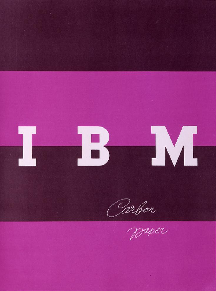
What he did for companies like IBM, ABC and, unfortunately, Enron, was to give each a unified public identity by visual means. He didn’t just create logos; he applied his designs to many facets of a businesses, from business cards and letterheads to product packages, and he required absolute uniformity in all those aspects. What was the secret of Mr. Rand’s success? One of several books about design that he wrote and illustrated is open to a page where he talks about the logo he created in 1962 for ABC, the image of three sans-serif, lowercase letters on a disc. Referring to a picture of the logo that’s heavily, almost but not quite illegibly blurred, he asks, “How far out of focus can an image be and still be recognized?” Pretty far, if it’s a Rand design.
That’s important because, unlike fine art works, graphic images are meant to survive less than ideal conditions. Awareness of that necessity is a big part of what makes Mr. Rand a godfather of today’s image-saturated media world. If it gives some politically oriented viewers pause to think of his evidently unwavering faith in American capitalism and of how he imprinted corporate identities on the minds of millions, that just makes his story all the more interestingly complicated.
There’s also an interesting review of the exhibition by Amelia Stein at The Guardian:
Rand liked to argue that manipulation is integral to design. It is a designer’s job, he wrote in Thoughts on Design (1947), to manipulate ingredients in a given space – to manipulate symbols through juxtaposition, association and analogy. These days, it is difficult to separate logos and branding from other, more insidious forms of manipulation. A recent return to flatness in corporate design – emblematized by Apple’s decision to abandon skeuomorphism in 2013 – could be seen as an attempt to invoke Rand’s heyday, when consumers trusted a brand’s visual cues to communicate some essential truth.
This is an important aspect of Rand’s legacy, enormous and complicated as it is. Although Everything is Design stops short of addressing the lasting implications, artistic and otherwise, of Rand’s work, it provides us with a necessary basis from which to do so… [Looking] at Rand is valuable if we want not just to be as good as Rand, but to understand the complexity of what it is to be good.
The exhibition runs February 25 — July 19, 2015.
Like this:
Like Loading...