Skip to content

Tag: herb lester

Book Covers of Note, July 2019

Oof, I am very late with this month’s covers post. I think it’s quite a good one though as these things go…? 


Categorically Famous by Guy Davidson; design by Michel Vrana (Stanford University Press / June 2019)

Swishy retro fonts are definitely a ‘thing’ now. In this instance I believe the font is Cabernet JF — an unofficial revival of Benguiat Caslon — which has been mentioned here before. The sans is Futura of course. I rather rashly went on record not so long ago saying Futura is a little overused on university press covers (much to the chagrin of Robert Bringhurst!), but I think it works here.     


Come Closer and Listen by Charles Simic; design by Allison Saltzman; art by Jessica Brilli (Ecco / July 2019)


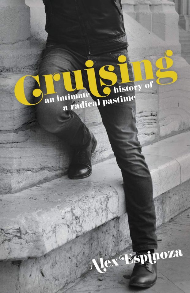
Cruising by Alex Espinoza; design by Robert Bieselen (Unnamed Press / June 2019)

More swishy-swishiness. The positioning of the first “i” in “Cruising” does some work here.  


Cults by Herb Lester Associates; design and illustration Brian Rau (Herb Lester Associates / July 2019)


The Dry Heart by Natalia Ginzburg; design by Pablo Delcan (New Directions / July 2019)

Pablo also designed the cover of Ginzburg’s Happiness, as Such, also out this month from New Directions.


Expectation by Anna Hope; design by Jo Thomson (Doubleday / July 2019)


Feel Free by Nick Laird; design by Yang Kim (W.W. Norton / July 2019)


The Fell by Robert Jenkins; design by Jason Anscomb (RedDoor Press / July 2019)


The Great American Cheese War by Paul Flower; design by Dan Mogford (Farrago / June 2019)

(There is probably a post to be had of covers that feature ‘guns’ made of other things. Although I’m struggling to think of any other examples off the top of my head, so maybe I’m thinking of artworks and/or magazine covers? Or just imagining it?)


A Half-Baked Idea by Olivia Potts; design by Helen Crawford-White (Fig Tree / July 2019)


Harbart by Nabarun Bhattacharya; design by Oliver Munday (New Directions / June 2019) 


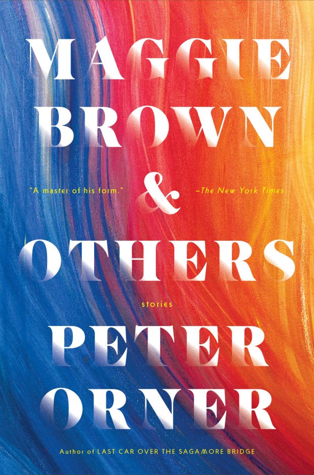
Maggie Brown & Others by Peter Orner; design by Lucy Kim (Little, Brown & Co. / July 2019)


The Nickel Boys by Colson Whitehead; design by Oliver Munday (Doubleday / July 2019)


Novacene by James Lovelock; design by Tom Etherington (Allen Lane / July 2019)


Radical Ritual by Neil Shister; design by Sarah Brody (Counterpoint / July 2019)


Say Say Say by Lila Savage; design by Jennifer Carrow (Knopf / July 2019)


The Travelers by Regina Porter; design by Suzanne Dean (Jonathan Cape / July 2019)

The cover of the US edition published by Hogarth last month was designed by Michael Morris.

I would have have a hard time telling you which country these covers came from if I didn’t already know. Using the US spelling “Travelers” on the UK cover confuses the issue, but I don’t think either cover looks particularly American, which is kind of interesting. Michael Morris recently discussed his version with Spine


Turbulence by David Szalay; design by Lauren Peters-Collaer (Scribner / July 2019)

The cover of the UK edition of Turbulence, published at the end of last year by Jonathan Cape, reminded me of Anne Twomey’s 2015 cover for Munich Airport by Greg Baxter…

Interestingly, the barcode on the front of the UK edition actually works. You can read an interview from earlier this year with designer Rosie Palmer about the UK cover over at Spine


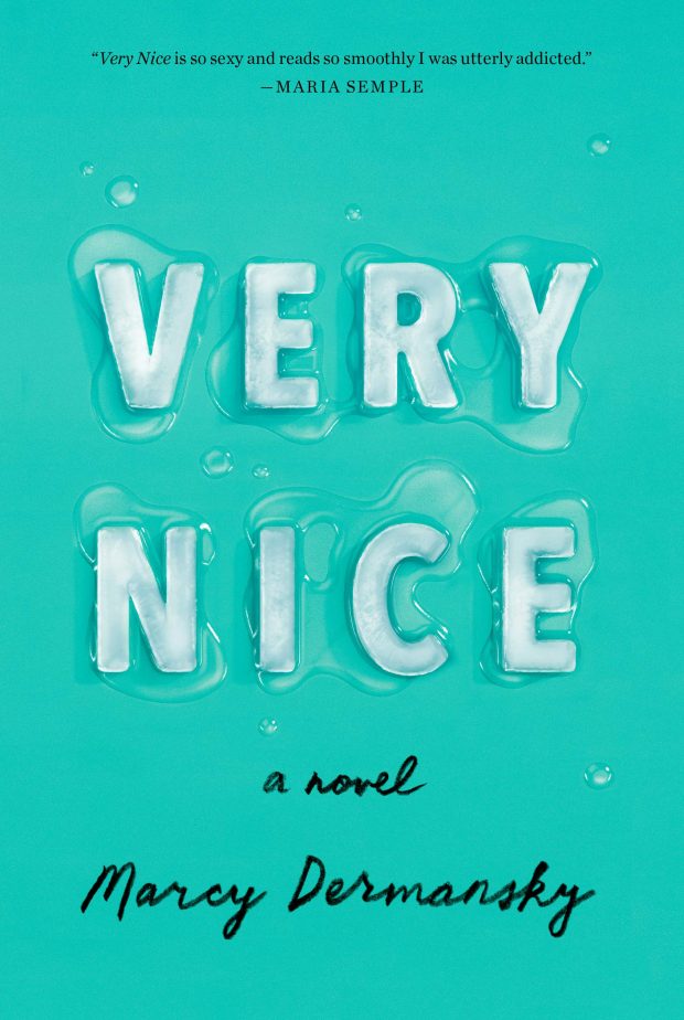
Very Nice by Marcy Dermansky; design by Janet Hansen; ice rendered by Justin Metz (Knopf / July 2019)


The Weil Conjectures by Karen Olsson; design by Emma Ewbank (Bloomsbury / July 2019)

The cover of the US edition published by FSG this month was designed by Alison Forner and Thomas Colligan, with art by Jessica Halonen.


We Went to the Woods by Caite Dolan-Leach; design by Jaya Miceli (Random House / July 2019)

1 Comment

Book Covers of Note, July 2018

Here are my book cover selections for July… 


Brooklyn Mom & Pop by Herb Lester Associates; design Amy Hood (Herb Lester Associates / July 2018)

Another very nice looking guide from the folks at Herb Lester. The question is, where are the guides to Canadian cities? 


Call Me American by Abdi Nor Iftin; design by Kelly Blair (Knopf / June 2018)


Charlotte Walsh Likes To Win by Jo Piazza; design by Zak Tebbal (Simon & Schuster / July 2018)  

In other news, hand-lettered covers aren’t going anywhere (and apparently underlining is a “thing”)…


Convenience Store Woman by Sayaka Murata; design by Luke Bird (Portobello Books / July 2018)


Dear Mrs Bird by AJ Pearce; design by Kimberly Glyder (Scribner /. July 2018)

The cover of the UK edition, published earlier this year by Picador, was designed by Katie Tooke. You can read about the design process for the UK cover here.


Florida by Lauren Groff; design by Grace Han (Riverhead / June 2018)

The cover of Groff’s 2015 novel Fates and Furies (also published by Riverhead) was designed by Rodrigo Corral and Adalis Martinez:


The Girl You Thought I Was by Rebecca Phillips; design Michelle Taormina and Alison Klapthor; Photograph by Marta Bevaqua (Harpercollins / July 2018)

Besides using a beautiful photograph, I get the sense this cover is very much on trend, and not just for YA — I’ve seen the cover of a thriller coming out this fall that also uses a close-cropped image of a woman’s face, a similar sans-serif type, and a warm sepia colour palette. 


Good Trouble by Joseph O’Neill; design by Janet Hansen (Pantheon / June 2018)


Gorse No.10 edited by Christodoulos Makris; design by Niall McCormack (July 2018)

All of Niall’s covers for Gorse are great. No.9 was featured in my November 2017 post:

Also, yellow-orange covers are clearly “in” right now…


A Honeybee Heart Has Five Openings by Helen Jukes; design Helen Crawford-White (Scribner / July 2018)


In the Distance by Hernan Diaz; design by Luke Bird (Daunt Books / June 2018)

One for the sideways covers list (I have kind of stop collecting these, but there are more here).

The cover of the US edition of In the Distance, published by Coffee House Press, features artwork by Jason Fulford.


I Will Be Complete by Glen David Gold; design by Tyler Comrie (Knopf / June 2018)


The Incendiaries by R.O. Kwon; design Jaya Miceli (Riverhead / July 2018)


Smile by Roddy Doyle; design and lettering by Nick Misani (Viking / October 2017)

OK, so I am very late to this one. I saw it last year and didn’t know who the designer was — I only found out this week when art director Jason Ramirez revealed that it was one of the TDC Communication Design Competition winners this year!


Sonic Youth Slept On My Floor by Dave Haslam; design Bekki Guyatt (Constable / May 2018)


Sweet Thames by Matthew Kneale; design by Alice Marwick (Atlantic Books / July 2018)


There There by Tommy Orange; design by Suzanne Dean; art by Bryn Perrott (Harvill Secker / July 2018)

The cover of the US edition, published by Knopf, is another Tyler Comrie design: 

1 Comment

Something for the Weekend

Old Fashioned, Foldy, Inky Things — Daniel Gray (fellow member of the fictional League of Daniels) interviews Ben Olins and Jane Smillie about creating the wonderful Herb Lester city maps:

Old fashioned, foldy, inky things have personality, something which Google maps and web guides lack. But the limitations of the format also force you to be selective, to only recommend things you genuinely believe to be good. It’s a fallacy that comprehensive listings are useful, when really they’re just confusing – it’s so much easier when someone makes a decision for you.

Collecting / Organizing / Cataloging — Steven Heller interviews Greg D’Onofrio and Patricia Belen of Kind Company about DISPLAY, their wonderful a collection of mid-century modern graphic design books and journals:

For us, one of the primary responsibilities of owning a collection is conducting research about the objects we acquire and finding out how they can far exceed their role as inspirational “eye candy”. The combination of collecting / organizing / cataloging has helped us see new, unique perspectives and discover a greater understanding of many of the principles, ideas and theories we so often admire.

See also: Steven Heller (who is apparently waging a one man occupation of the internet) on graphic designers and hoarding:

Design stuff finds refuge in drawers, on shelves, in boxes; we store it in offices, apartments, dens, living rooms, garages and attics (basements are too easily flooded). Along with lint balls, design stuff is often hiding under the bed. Design stuff is mostly paper, but can also be packaging or points-of-purchase displays—it may be small, medium or large. We hang it on walls and pay considerable amounts to have it framed. Uncontrollably, we hunger and devour it in stores, markets, shows and eBay (damn you, eBay!!). Ravenously, we hunger for and devour bargains, but when they don’t materialize, we pay sizable sums to own the more rare and costly stuff (sometimes realizing we owned it when we were children). In fact, knowing that years ago Mom might have thrown out some potential treasure, we are even more conditioned to hoard anything that could be construed as potentially valuable in the future.

Dead End — Cartoonist Joe Sacco on his most recent book, Footnotes in Gaza, in The Believer:

I think, for me, the book ends up being—this is going to sound strange—a dead end. Because I don’t know where to go from here, except to delve into human psychology. I think I understand how history works. I understand why one people are battling another people. I understand that they both want land. But ultimately there’s a level that I haven’t really got to yet. I’m touching on motive in places, like what makes someone pull a trigger? What makes one person beat another one to death? I know we can dehumanize people. Obviously, that’s the main thing. And I know we can fear them enough that we’d kill them before we think they’re going to kill us. There’s all that going on. But I think I need to go in another direction after this book. What am I going to do after this? Keep detailing massacres? For me, personally, I think I’m not going to get anything out of it anymore. I’ve come to the end of that.

And finally…

Simon Reynolds on his new book Retromania: Pop Culture’s Addiction to its Own Past in The Guardian:

The deeper you venture into the underground, the more music involves pilfering from the past. This is one of the central mysteries that propelled me through the writing of Retromania: how come the very kind of people who would have once been in the vanguard of creating new music (bohemian early adopter types) have switched roles to become antiquarians and curators? In the underground, creativity has become recreativity. The techniques involved are salvage and citation; the sensibility mixes hyper-referential irony with reverent nostalgia.

2 Comments