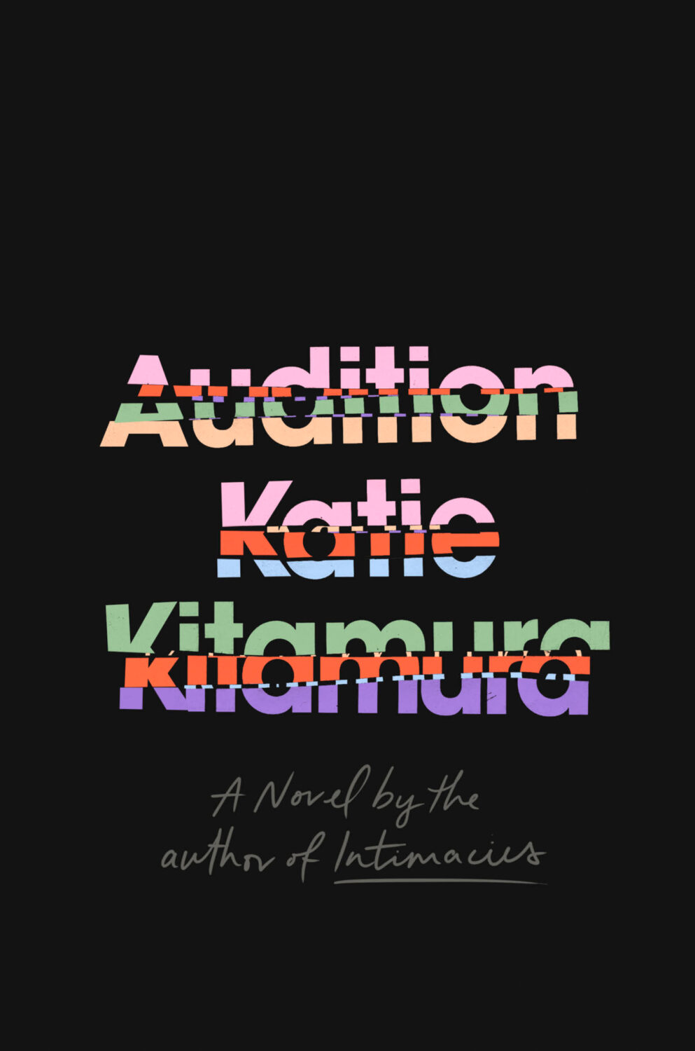
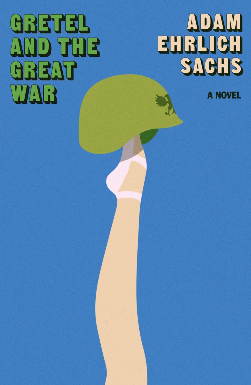
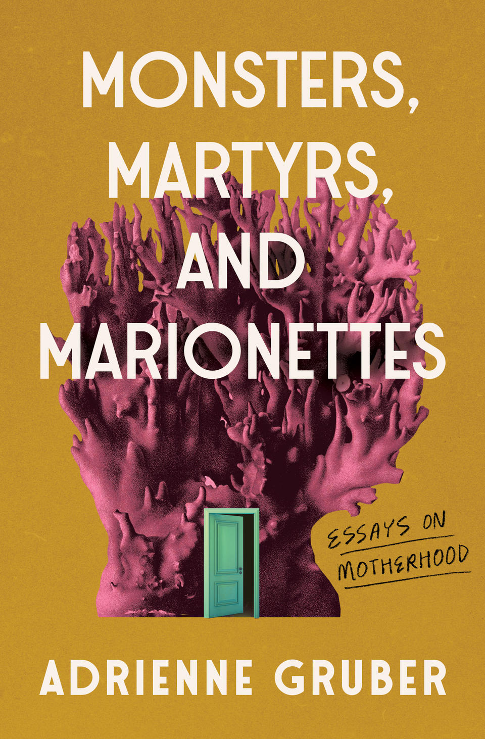
Hey, I hope you’re all keeping safe and well. Apologies for a slightly rushed post this month. It’s been kind of a busy time, and I’m travelling for work next week, so I’m sure I’ve missed a few covers and connections. I’ll try to catch up over the summer if/when things quieten down. Anyway… there are still lots of great covers in this month’s post — some from the usual suspects for sure, but also a few indies, a university press, a couple of covers from the UK and Ireland, and one from Canada…
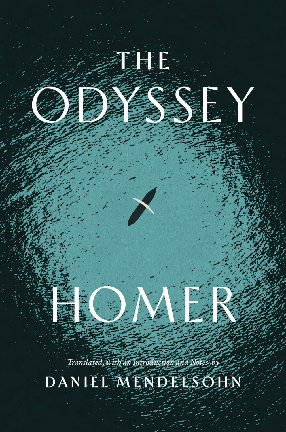
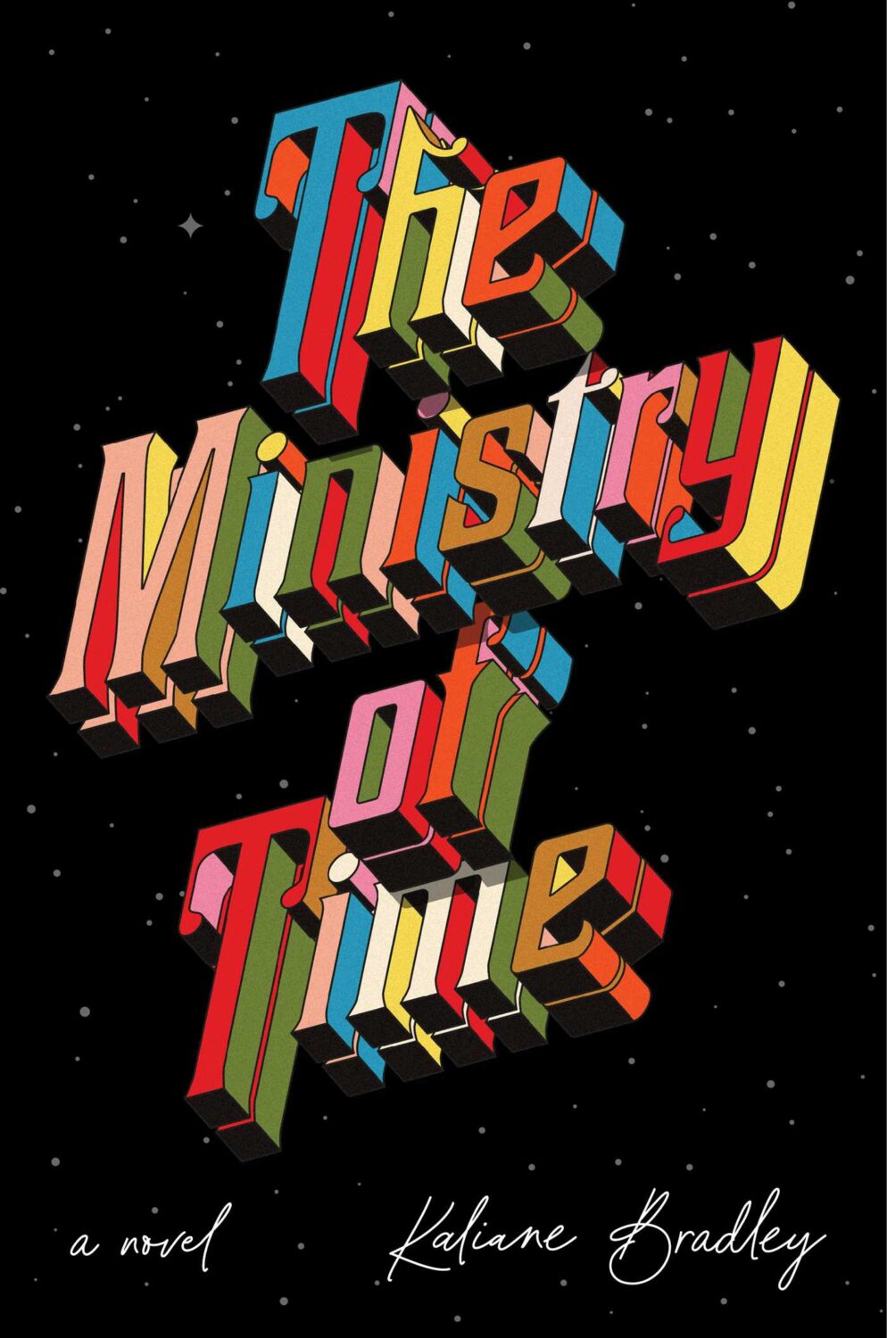
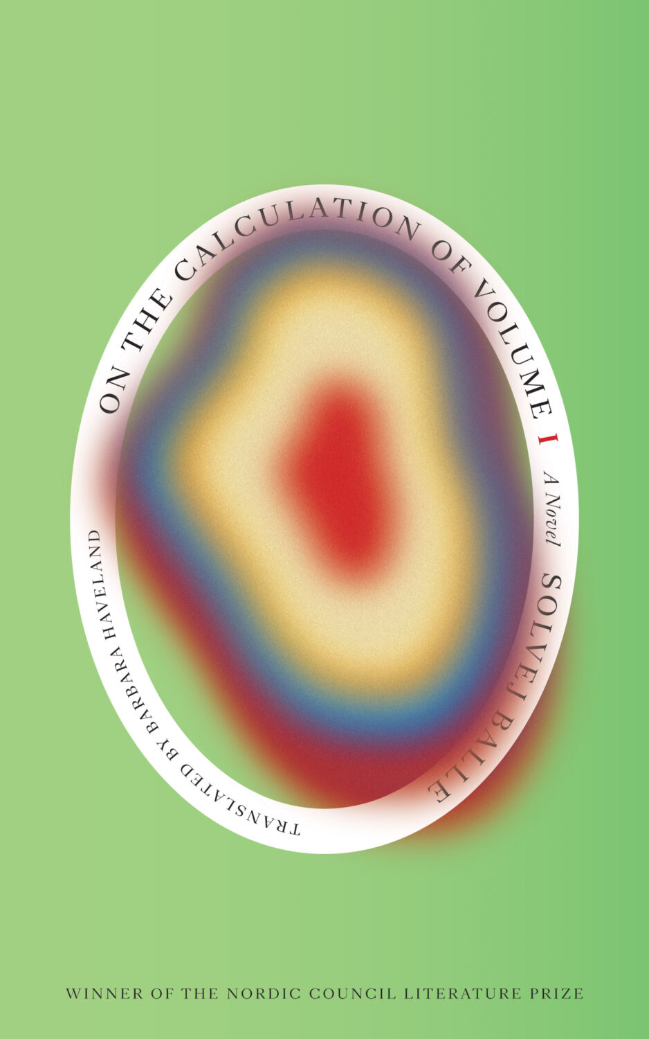
The Odyssey translated by Daniel Mendelsohn; design by Monograph (University of Chicago Press / April 2025)
I was reminded of Matt’s 2017 cover for David Ferry’s translations of the Aeneid from University of Chicago Press. It sticks in my mind at least partially for it’s use of Sandrine Nugue’s typeface Infini.
The Aeneid by Virgil (University of Chicago Press) Design by Matt Avery
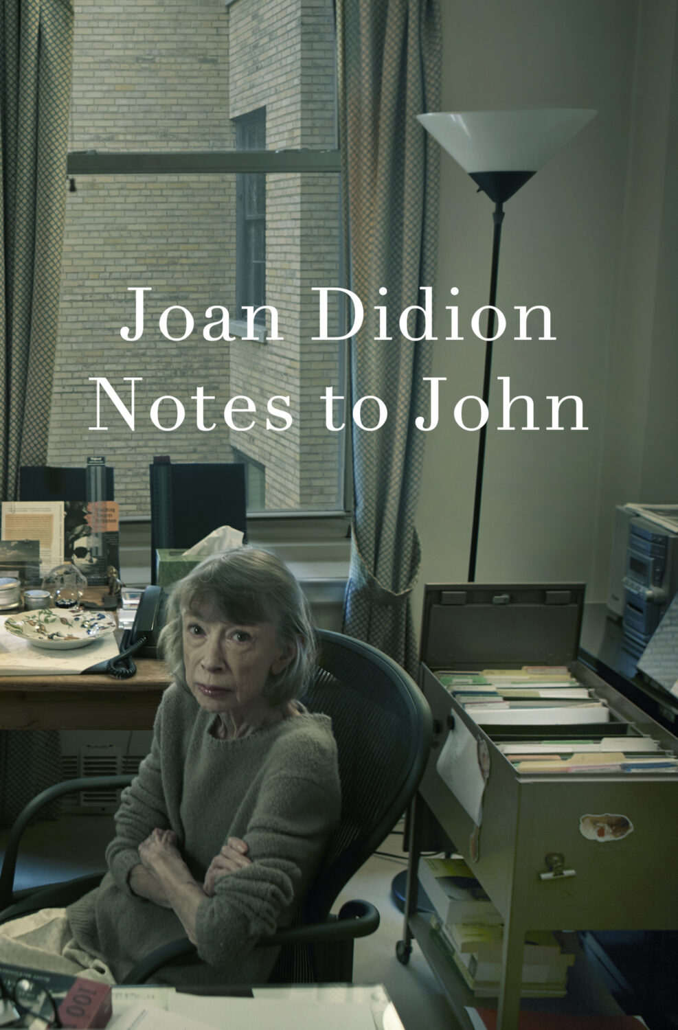
Notes to John by Joan Didion; design John Gall; photograph by Annie Leibovitz (Knopf / April 2025)
The photo feels very appropriate given how Didion would probably have felt about this book being published.
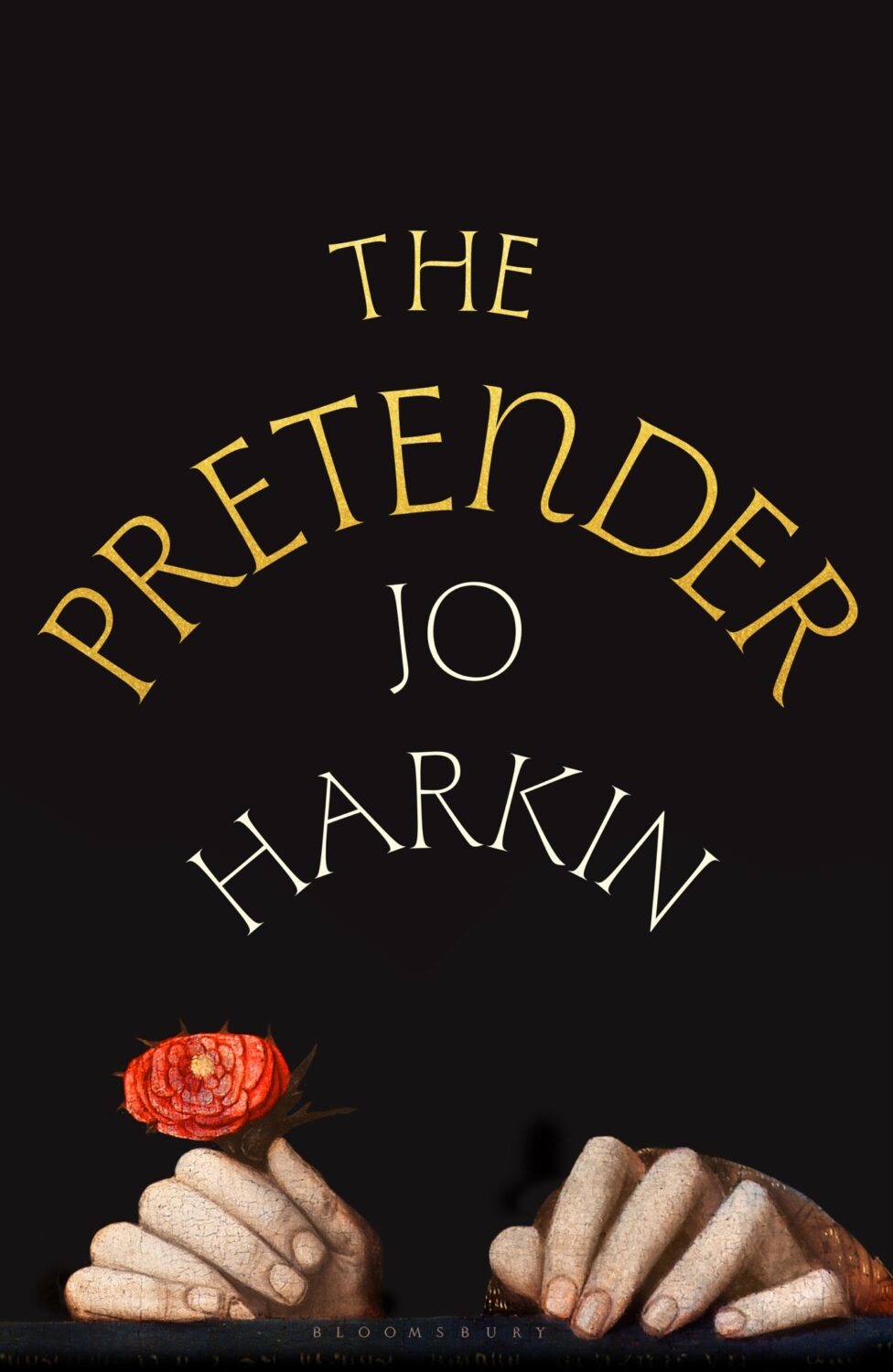
The cover of the US edition, published by Knopf this month, was designed by John Gall (the art is from Portrait of a Boy with a Falcon by 17th century Flemish painter Wallerant Vaillant, which is part of the Met’s collection in NYC if you’re curious)
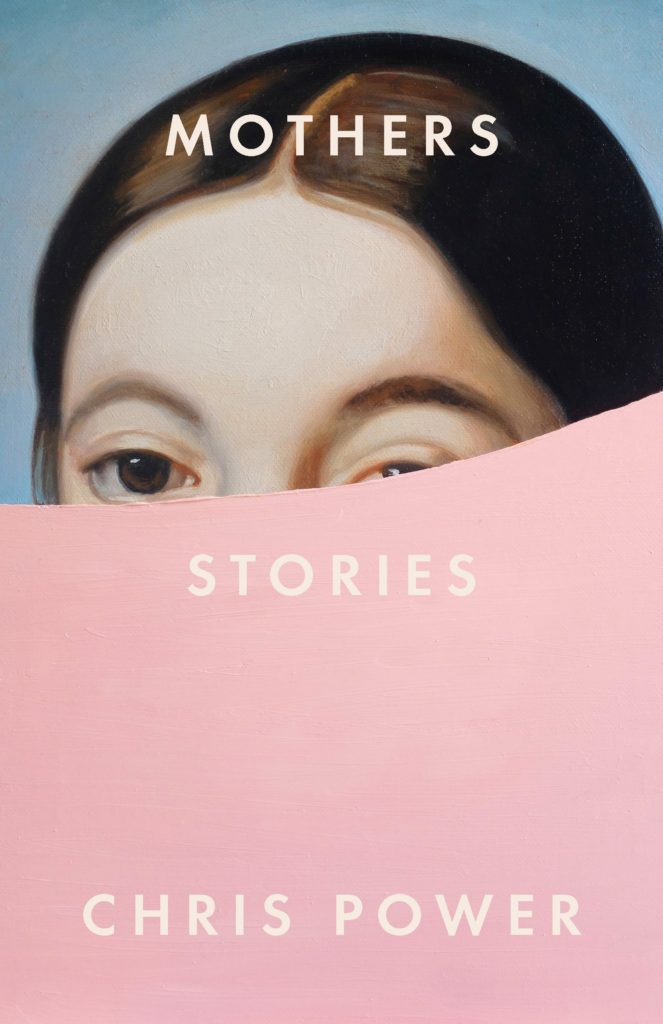
I love the bold movie-posterness of this design, but I also like to think it’s secretly the completes the cover for Mothers by Chris Power designed by Grace Han…
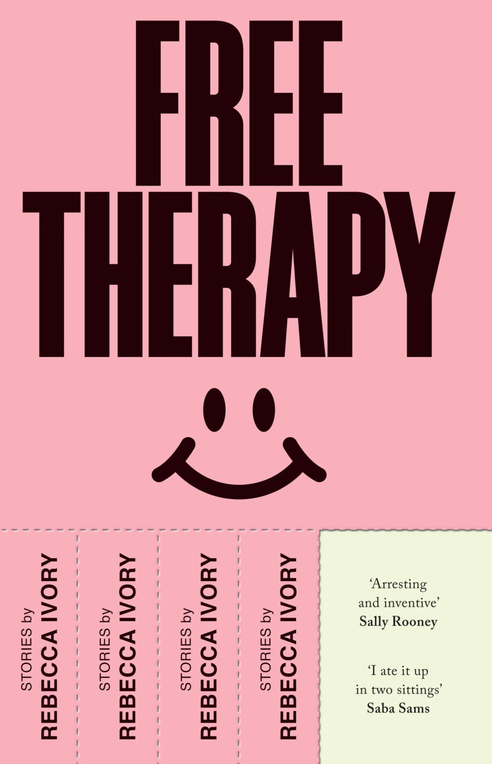
Typefaces with dots are apparently a thing at the moment. The cover of Bad Friend by Tiffany Watt Smith from Faber, also out this month, uses type that has dots for counters too. Please let me know who the designer is and I’ll happily add the credit.
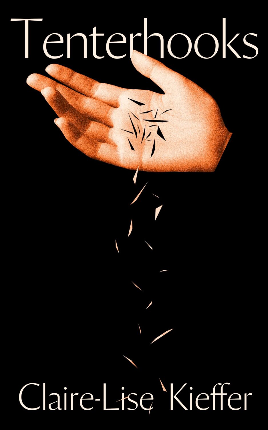
Tenterhoooks by Claire-Lise Kieffer; design by Jack Smyth (Banshee Press / February 2025)
Jack’s conversation with Steve Leard on the Cover Meeting podcast is really great if you haven’t listened to it yet.
It is the time of year for lists and I should’ve been done weeks ago, but I am late and already well behind the pack. Apologies for that.
I admire Matt Dorfman‘s ability to whittle his list down to a dozen covers for the New York Times. I imagine it takes him a lot less time for one thing, but I’m sure Matt still agonizes over every cover. It requires a level of discipline and restraint that I do not possess to keep it that tight year after year.
PRINT’s list of best book covers of 2024, compiled by editor-at-large Zachary Petit, is also long. It’s a 100 covers. Last year it was 50.
I’m not trying to throw stones here. We are all seeing more covers than we used to. There are more books for one thing. But they’re not just something we just experience in print in anymore. You don’t have to go into a bookstore or read the newspaper or magazine to see them. They’ve become something we see and share all the time online. Designers are promoting their own work and (slowly) getting more credit for it (although there is a lot more to be done in that area. Publishers — credit your designers!). My monthly round-ups are now one of several you can choose from.
And it is not like my list is short. This year it features work by 48 designers — more than half of them women — and 86 covers (plus a couple of supplementary images).
The consensus seems to be that it was a decent year for covers, and it’s hard to argue with other people’s selections even if I don’t love them all.
It is telling though that 100 of LitHub’s selections were individual picks. There are covers on my list that are not on the anyone else’s despite their length. So while I think we agree there were lots of good covers, I’m less certain we entirely agree on which ones were actually the outstanding ones.
A recent article Spine argued that there is a battle between minimalism and maximalism going on (you can find Spine’s end of year list here by the way). I think that could be true. Different approaches work for different audiences. But I also think it’s messier than that. I get the sense that publishers are less sure of what they want and what sells (certain genres notwithstanding).
It has been a rough year for a lot of publishers, so there is undoubtedly a lot of uncertainty, and no small amount of anxiety. I could go on about why that it is (and the publishing’s self-inflicted wounds) but, in short, what I think we’re also seeing with book covers is more meddling and less direction.
Anyway, I don’t want to end this on a bleak note. This year was shit enough. Despite it all, there genuinely were a lot of good covers in 2024, and some that I did think we’re outstanding. A couple of them made me laugh, which was no small thing. It was a strong year for several individual designers in particular and, despite the pressures, many produced work that was recognizably theirs. I thought there were more interesting covers coming out of the UK and Ireland (that mercifully wasn’t just about the inks or the finishes!), and there were some fun Canadian covers too.
Thanks, as always, for reading, and I hope you’re all keeping safe and well. Happy Holidays!
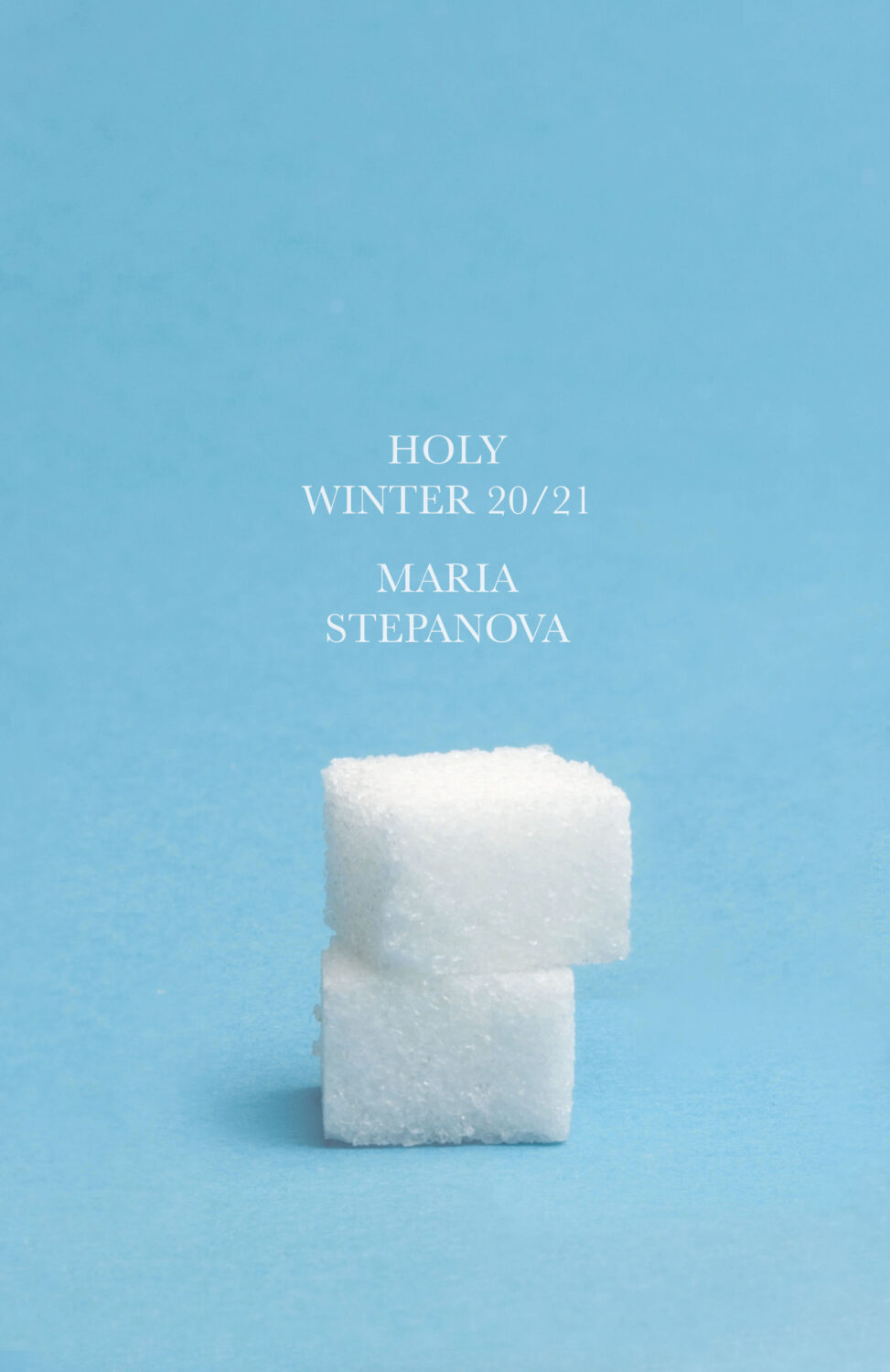
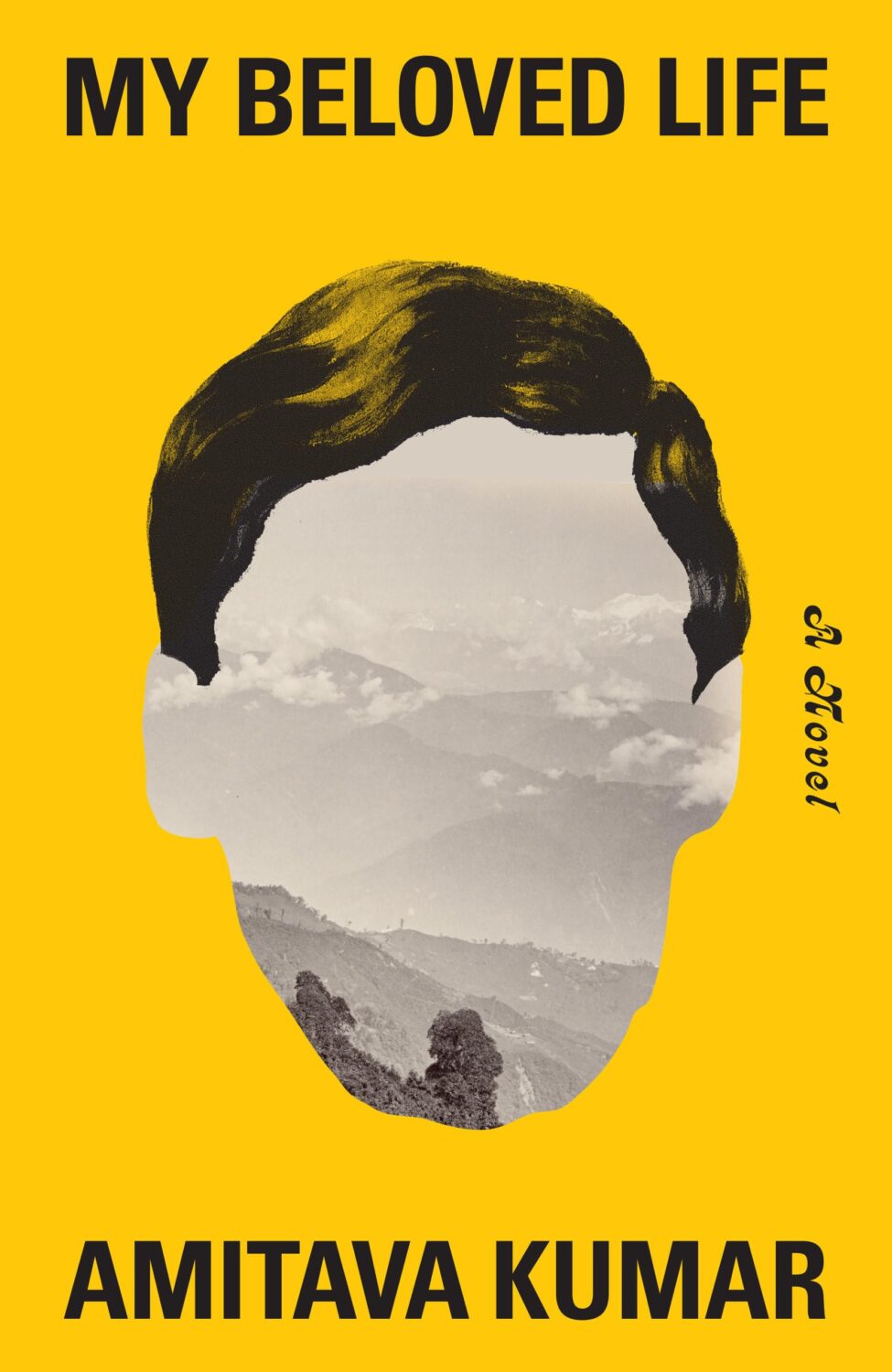
Holy Winter 20/21 by Maria Stepanova; design by Oliver Munday (New Directions / October 2024)My Beloved Life by Amitava Kumar; design by Oliver Munday (Knopf / February 2024)
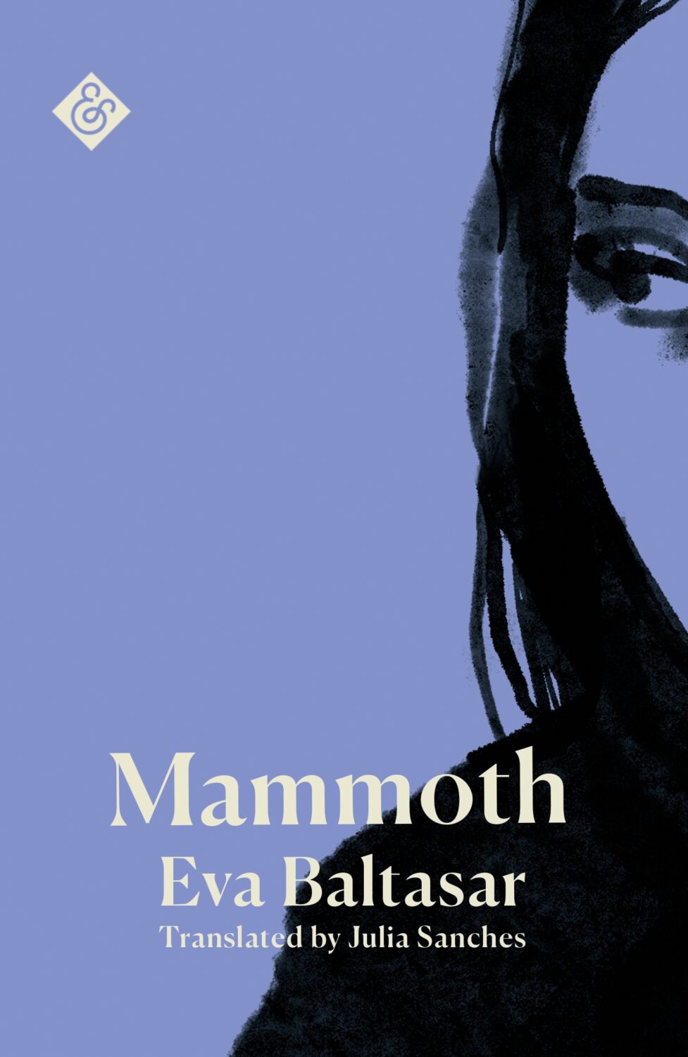
Mammoth by Eva Baltasar; design by Anna Morrison (And Other Stories / August 2025)
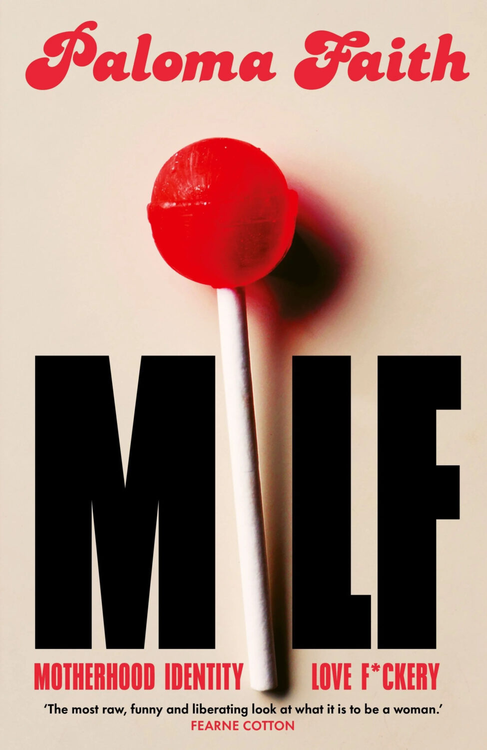
MILF by Paloma Faith; design by Jack Smyth (Ebury / June 2024)
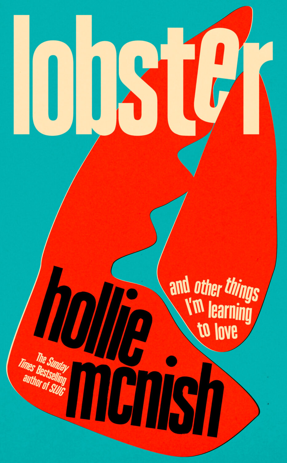
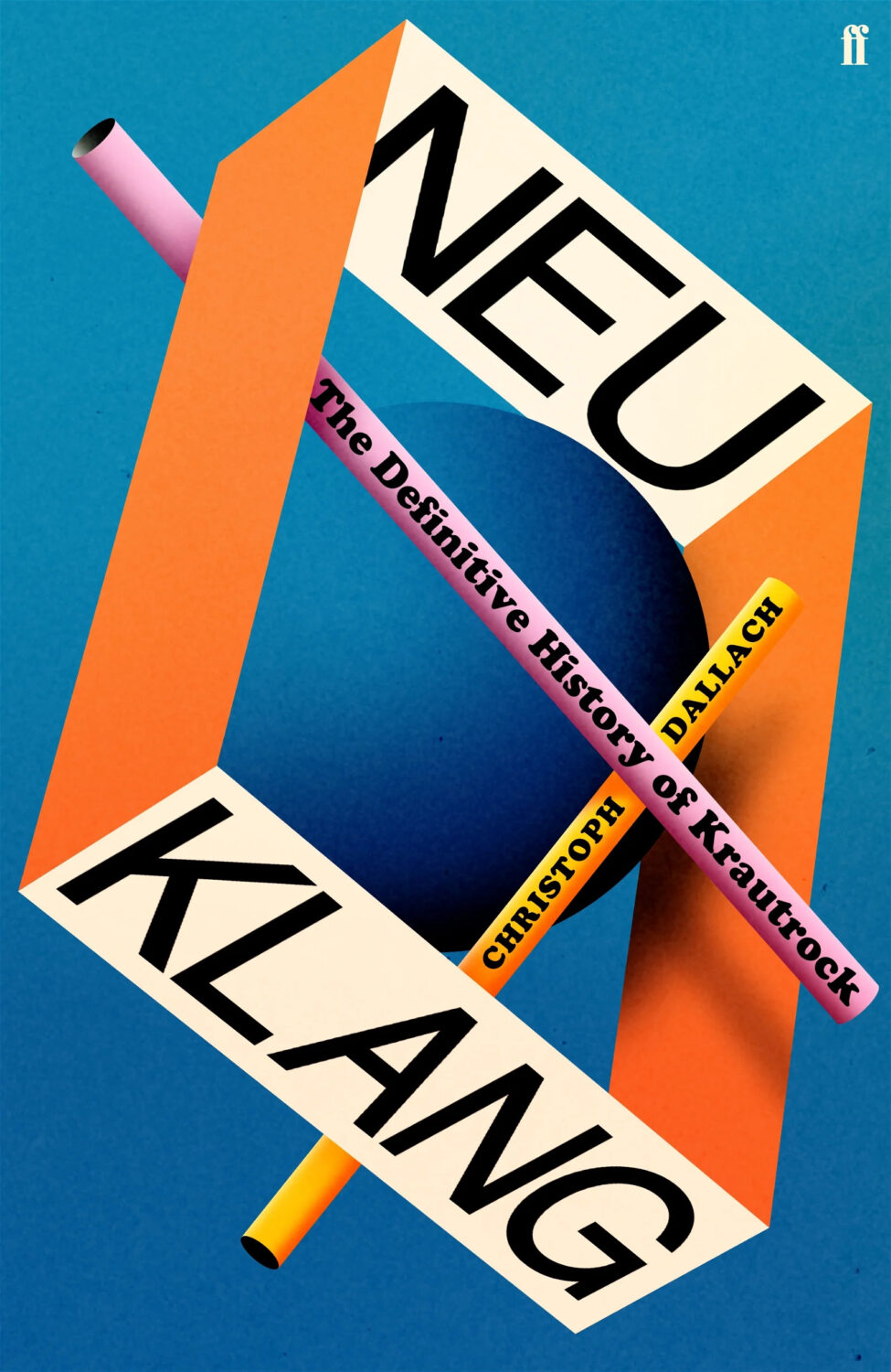
Also designed by Jack Smith:
Lobster by Hollie McNish; design by Jack Smyth (Little, Brown / March 2024)Neu Klang by Christoph Dallach; design by Jack Smyth (Faber & Faber / May 2024)
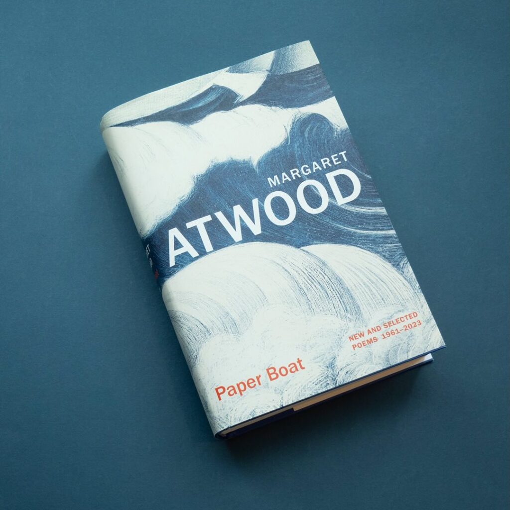
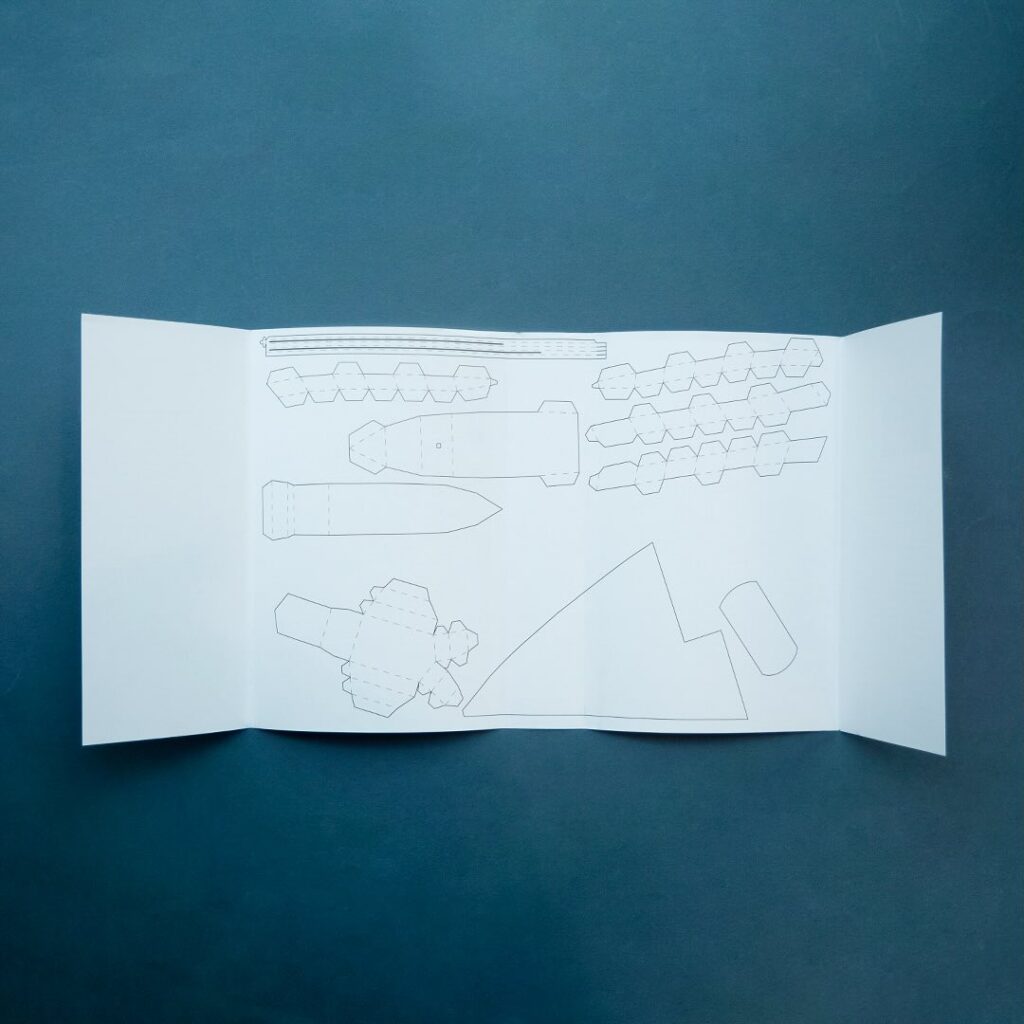
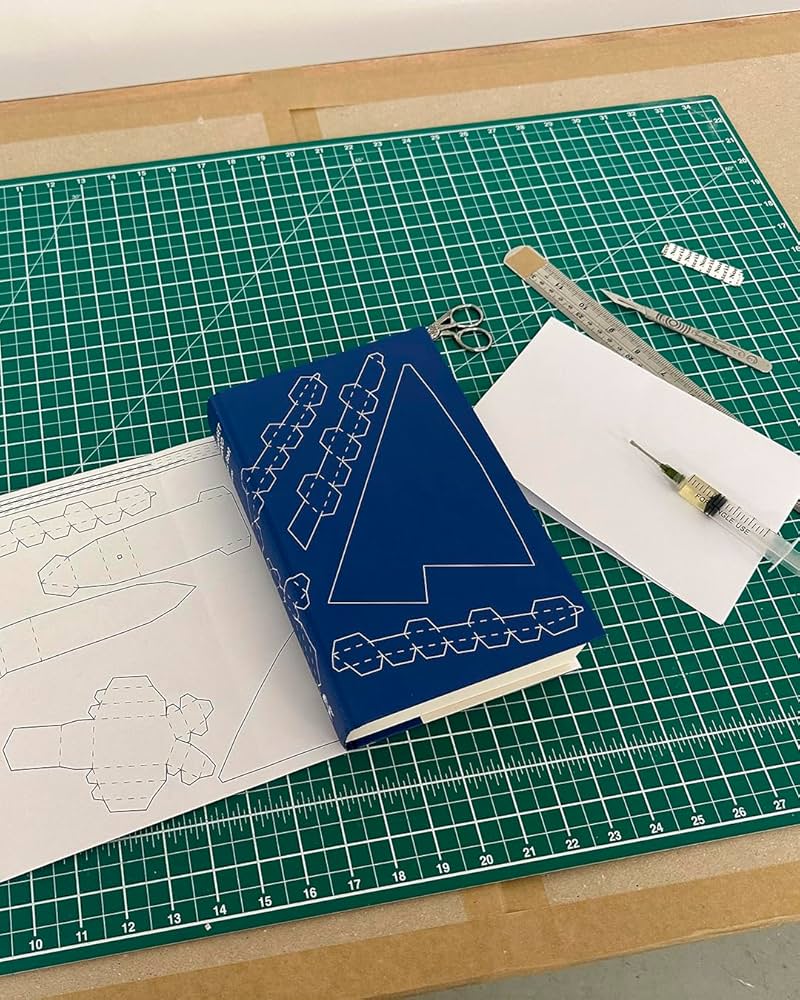
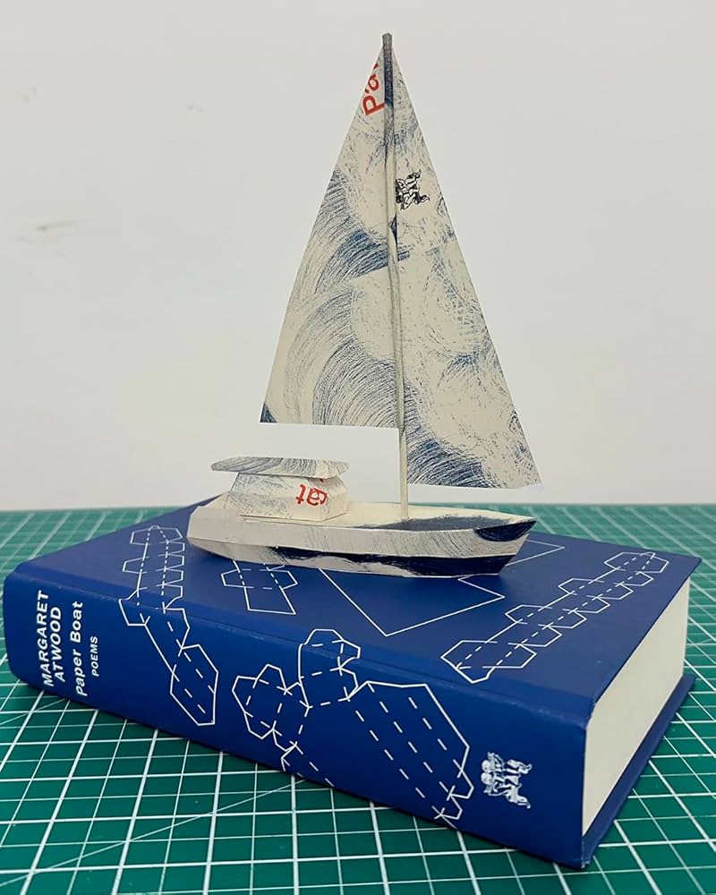
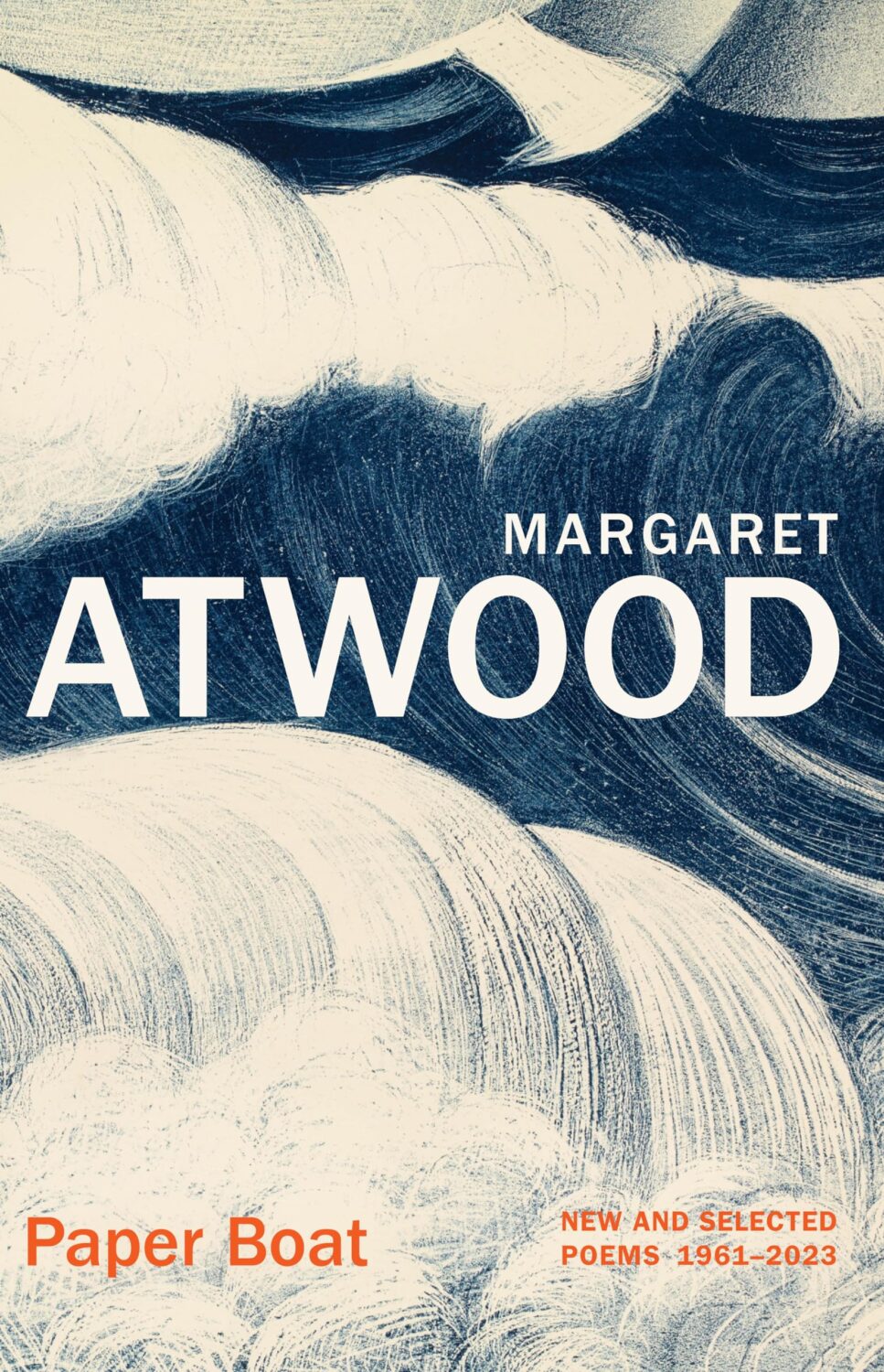
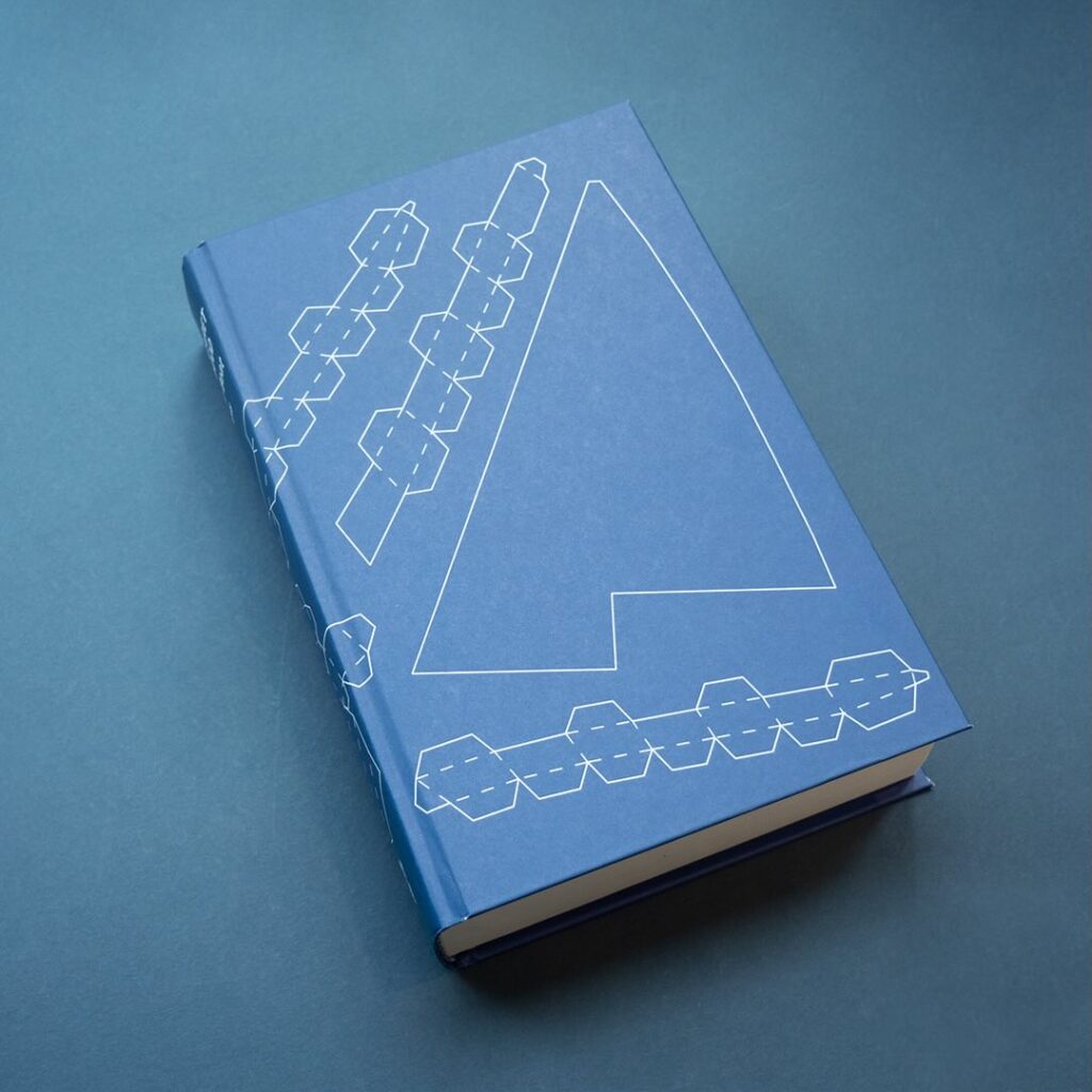
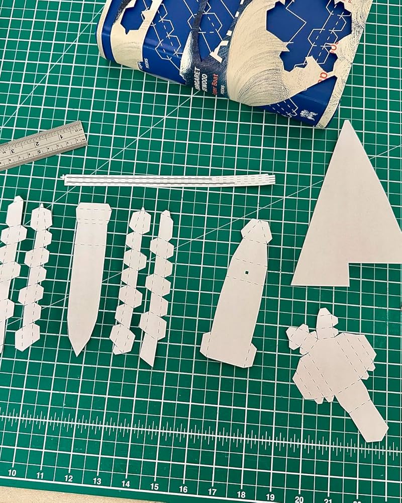
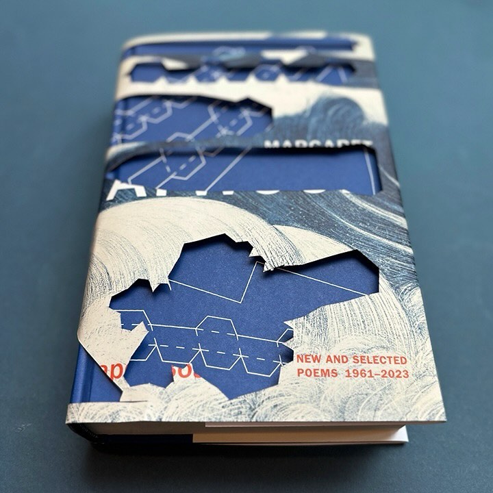
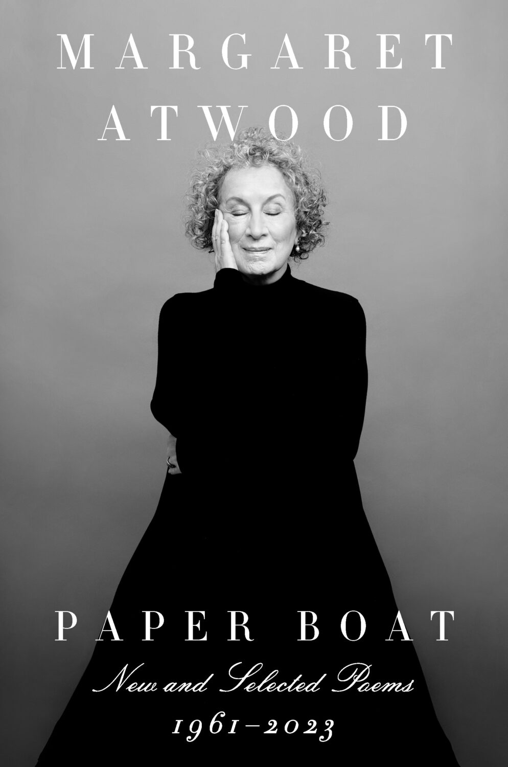
I also have to give a special shout out to the cover for Paper Boat by Margaret Atwood (Chatto & Windus / October 2024). Suzanne commissioned paper art by Nathan Ward to design a template for a paper boat that could be cut out from the dust jacket and stuck together.
Hey, I hope you are good. It’s a stressful time and everyone is super busy trying to hold it together, but here we are at the end of October with another post that is both rushed and yet wordier than ever! As usual, I won’t be doing a covers round-up in November. I have to start working on the massive end of year post so I can get it done in something resembling a timely and relevant manner. I am open to last minute submissions if you think I have missed a cover, or you have something coming out between now and December. I can’t promise to include everything, but it would be especially great to hear from you if you’ve done something cool for a university press or an independent publisher this year. The only requirement is that the book was published and on shelves in 2024. If it was published in a non-English speaking part of the world, be sure to include a link to where people can find out more about the book (and ideally buy it) that isn’t Amazon.
On a related note, I have compiled an annual post of YA covers for, I don’t know, years now (10 maybe?). I don’t read a lot of YA, and it’s not a category I am very involved in professionally, so the posts take quite a long time to compile and I usually end up publishing them early in the New Year, which is less than ideal. So I guess my question is: do you still want a YA round-up? Folks used to ask for them, and now they don’t, which just be general fatigue and the fragmented nature of things at the moment, but the posts don’t attract submissions or much feedback, and interest seems to be waning. Obviously I don’t think I do a great job (if that wasn’t abundantly clear already!), but I haven’t really seen anyone else do one either, so I’ve kept doing it. I don’t know… I’m not a big a believer in clicks or engagement metrics as a measurement of anything useful, so I happy to do it if even just a couple of you say it’s still valuable. Or maybe it is just time to call it quits? Let me know what you think…
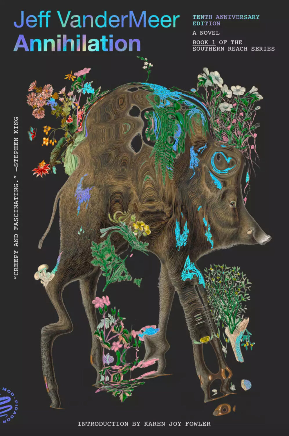
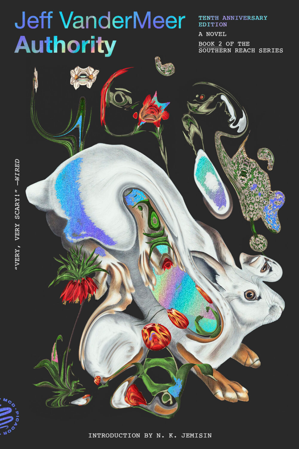
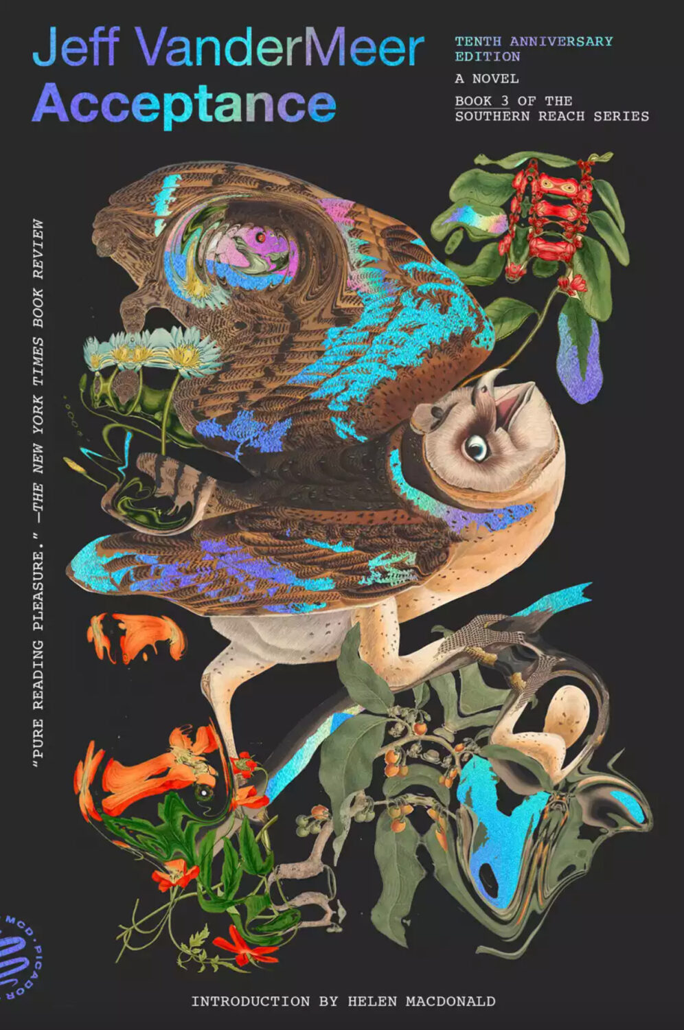
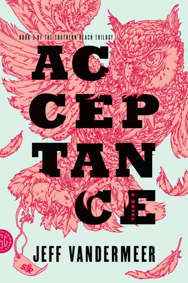
Pablo Delcan also designed the covers of the 10th anniversary editions of the previous books in the Southern Reach series, Annihilation, Authority, and Acceptance, published by Picador earlier this year.
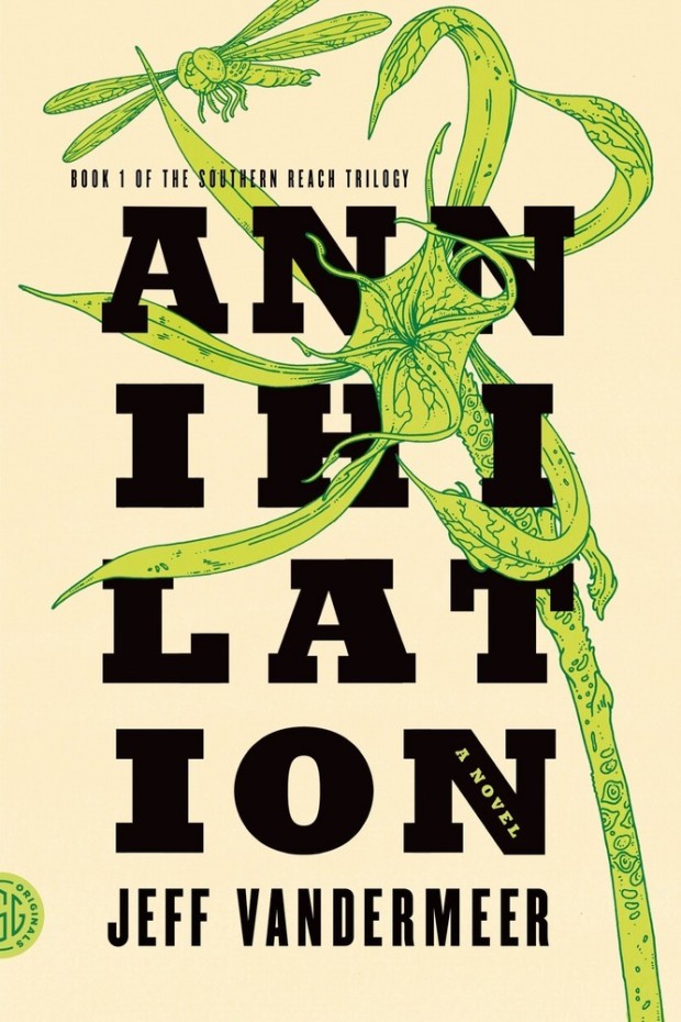
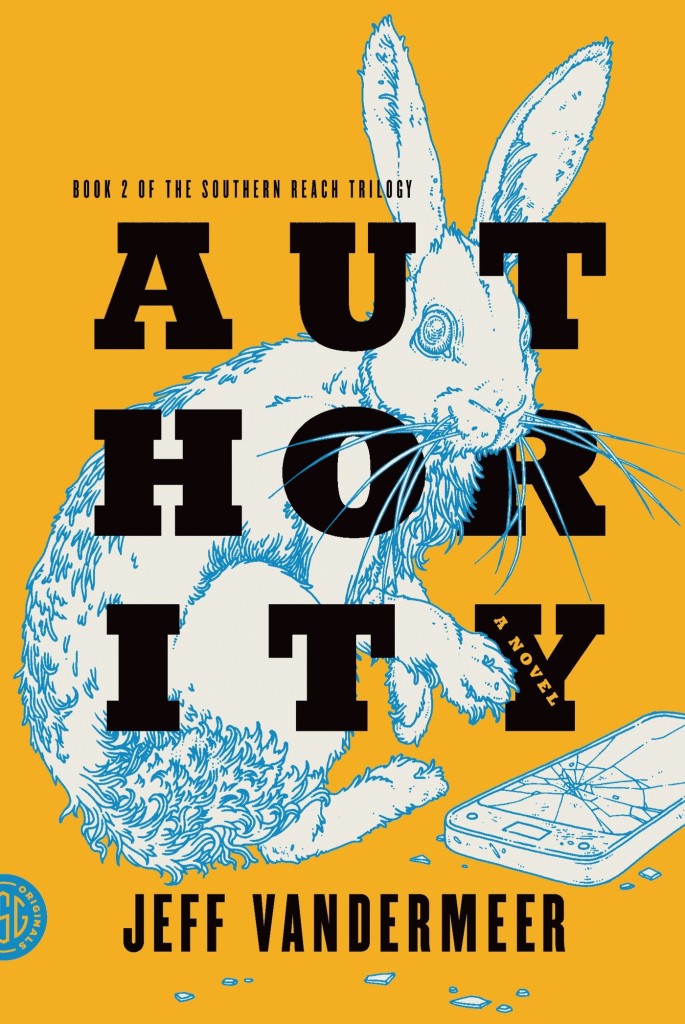
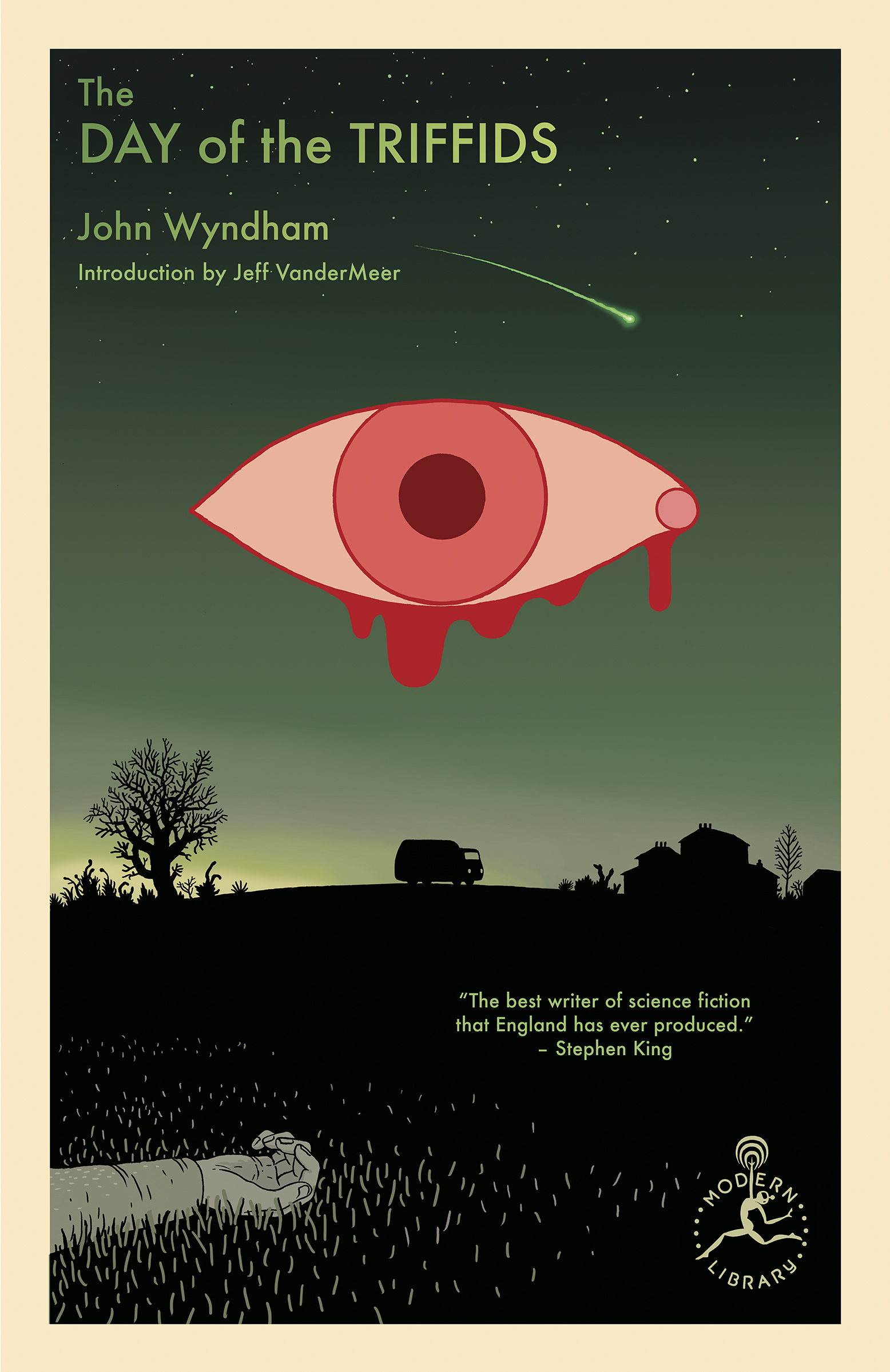
I’m still quite partial to the original US covers the trilogy (as was) designed by Charlotte Strick with illustrations by Eric Nyquist. The cover of Annihilation reminds me of The Day of the Triffids, which coincidentally has has an introduction by Jeff VanderMeer if you have the Modern Library edition. (The slightly bonkers cover of the Modern Library edition was designed by Cassie Gonzales with an illustration by comic book artist and illustrator Anders Nilson). Anyway, I’m a little sad that I can’t get the prequel to match the rest of my existing set.
Annihilation by Jeff VanderMeer (US); design by Charlotte Strick; Illustration by Eric Nyquist (FSG / 2014)Acceptance by Jeff VanderMeer (US); design by Charlotte Strick; Illustration by Eric Nyquist (FSG / 2014)
This feels very familiar, but I can’t put my finger on why. The best I’ve got is that it looks like a poster for a theatre production. It feels very European. The austerity of it gives late 1980s-90s vibes. I don’t know. I think it’s great.
Remarkably, the design incorporates a template for paper boat that can be cut from the dust jacket and stuck together.
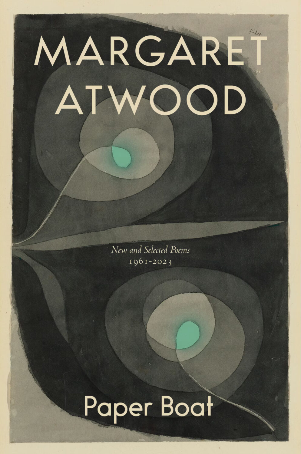
The cover of the Canadian edition of Paper Boat, published by McClelland & Stewart, was designed by Kelly Hill using art by Paul Klee. The cover for the US edition published by Knopf was designed by Janet Hansen. The photograph is by Ruven Afanador. It’s interesting to me that it was the US decided to use a portrait on the cover. I mean it’s a beautiful photograph and Margaret Atwood is very distinctive looking, but I would imagine she would be more recognizable to Canadians than to Americans? Anyway, it’s not often you see three entirely different approaches in the UK, US and Canada for a poetry collection.
I hope you’re keeping safe and well. Between work trips and sales conference it’s been a few weeks for me, and there are a lot of covers this month, so I am going to stop prattling and let you get straight to the post…
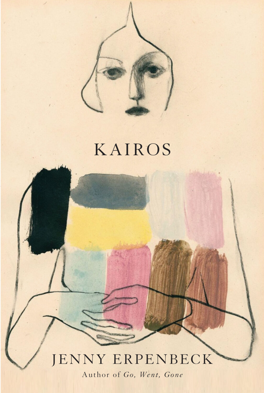
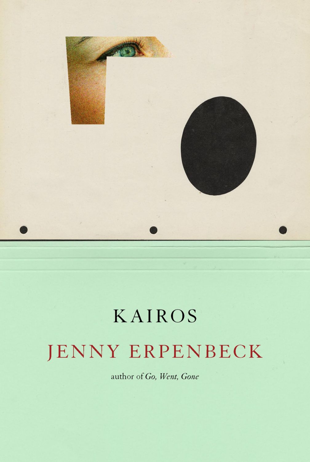
Kairos by Jenny Erpenbeck; design by John Gall (New Directions / May 2024)
This is the cover of the newly released US paperback. John Gall also designed the cover for the hardback, published by New Directions last year. Author Jenny Erpenbeck and translator Michael Hofmann recently won the 2024 International Booker Prize with Kairos.
This composition brings to mind David Pelham’s covers for J. G. Ballard. (On a semi-related note, air-brushed covers are probably overdue a revival. Or is it a dying art now?)
Hey. I hope you’re keeping safe and well wherever you are. I’m going to keep this very short as there’s lots going on, but there some great covers, and a couple of tenuous comparisons this month (hey, I can’t help how my brain works!) . Enjoy!
This reminded me of Akiko Stehrenberger‘s poster for the movie Funny Games. They don’t really look alike, and the tone is very different, but I think it was the close crop and the hair that brought it to mind.
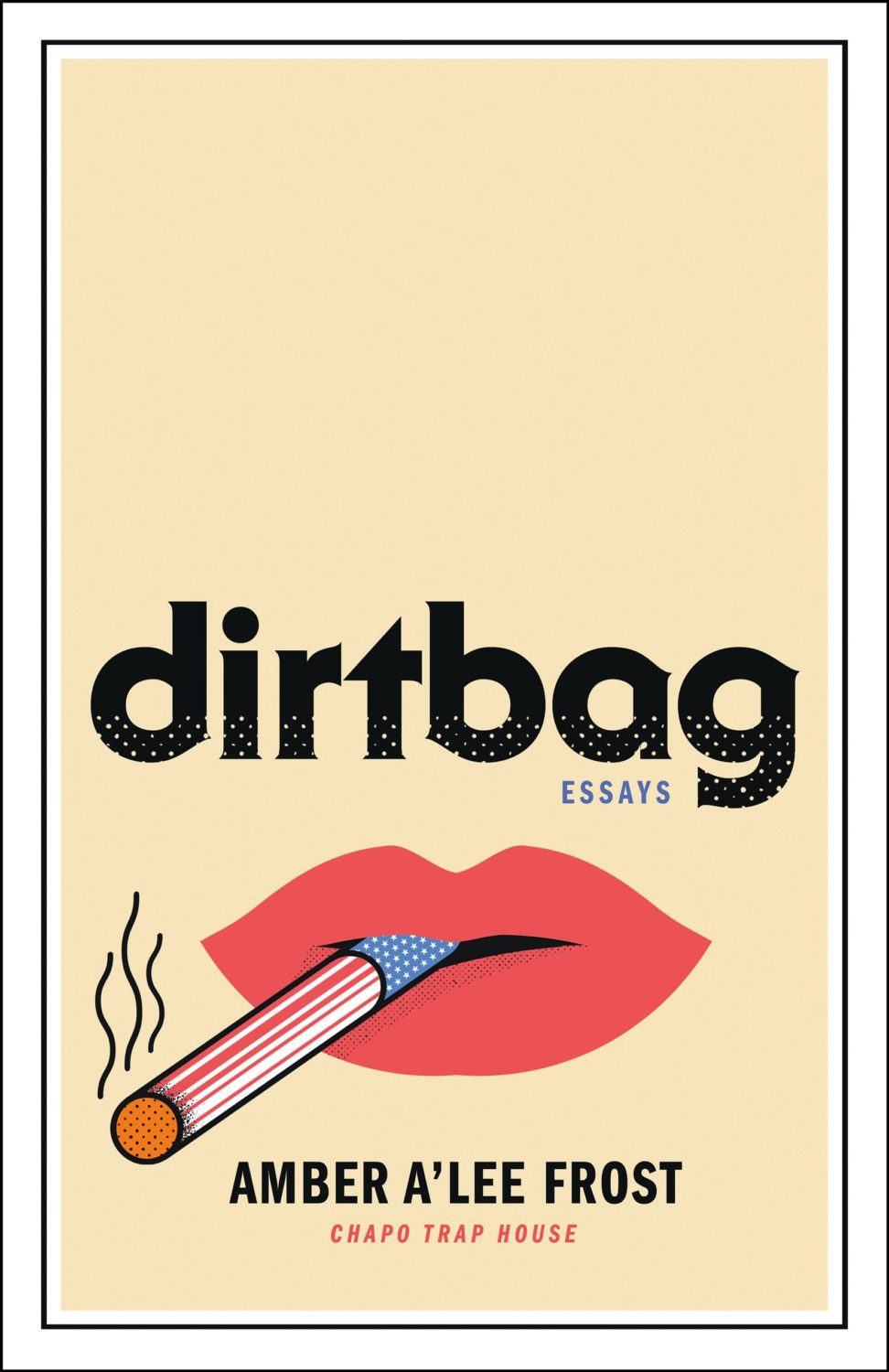
Dirtbag by Amber A’Lee Frost; design by Rob Grom (St. Martin’s Press / December 2023)
This brought to mind Peter Mendelsund’s cover for The Woman Destroyedby Simone Beauvoir, published by Pantheon, which in turn reminded me Gunter Rambow‘s Gitanes, Un Hommage à Max Ponty poster…
The image is taken from the 17th Century painting ‘The Torture of Prometheus’ by Giovacchino Assereto (thanks for letting me know, Jason!). The tight crop (which is great!), reminded me of Peter Hujar’s 1969 photograph ‘Orgasmic Man’, which was used on the cover of A Little Life by Hanya Yanagihara designed by Cardon Webb a few years ago. Art imitating art, kind of?
Jacket design by Cardon Webb; jacket photograph Orgasmic Man by Peter Hujar 1987
Splinters by Leslie Jamison; design by Gregg Kulick (Little, Brown & Co / February 2024)
The cover of the UK edition of Splinters, published this month by Granta, was designed by Jack Smyth. It’s interesting to see to a torn author photo in both…
This made me think of the opening credits to a movie from the 1960s. I think it’s partly the type, but the colours also reminded me of Maurice Binder’s title sequence of Charade. Maybe it’s more of the overall vibe than anything else?
The New Life by Tom Crewe; design by Jaya Miceli (Scribner / January 2023)
Interestingly, the cover of the UK edition published by Chatto & Windus uses the same photograph but it’s flipped the other way and printed on one of those fancy half dust jackets (forgive me for not remembering their technical name). I believe the design is by Kris Potter.
The cover of the UK edition published by Fourth Estate was designed by Jo Thomson. It’s interesting to see the same basic concept executed in two very different styles.
The cover of Granta edition The Devil’s Workshop by Jáchym Topol designed by Telegramme Studios was on my list of favourite covers back in 2013 (there were some great covers published that year!). Interesting that the colour palettes are similar.
This month’s post includes a few covers that I missed earlier in the year along side the new and recent releases. I’m starting to think about my annual recap so please let me know if you think I’ve overlooked any other particularly notable covers that stood out for you and/or seemed emblematic of wider trends in 2022.
And just a reminder with all the stuff going on with social media that if you’d prefer to get new posts auto-magically emailed to you, you can subscribe here. I have also re-opened comments on new posts after closing them for a few months if you want to politely share your thoughts below.
“Fuuuuuuuuuck….!” is the only way I can describe the mixture of awe and annoyance that I hadn’t thought of it I felt when I saw this cover. So simple and so clever.
This has a very similar ‘obscured face collage’ feel to Tristan Offit’s cover for Briefly, A Delicious Life by Nell Stevens, which I thought I had posted here earlier in the year but apparently did not (probably because I didn’t — and still don’t! — know who designed the cover of the UK edition (it was designed by Mel Four, photograph by Marta Bevacqua) and I wanted to post them together?).
Pacifique by Sarah L. Taggart; design by Natalie Olsen (Coach House Books / October 2022)
People Person by Candice Carty-Williams; design by Emma A. Van Deun (Scout Press / September 2022)
Mr. Keenan also designed the cover for the Liveright edition of The Waste Land itself a few years ago.
(The US edition of Matthew Hollis’s book, forthcoming from W. W. Norton, also has an interesting cover. If anyone from Norton would like to send me a hi-res image with the design credit, I’ll be happy to add it in!)
Earlier this year, a Canadian magazine asked me what the latest trends in book cover design were. I don’t think I had a very satisfactory answer. 2021 felt very much like a continuation of 2020, which itself felt like a year on hold.
The trends that came to mind were not exactly new. In no particular order: big faces (big sunglasses!); cropped faces; hands; mouths; postmodern typefaces;1 big skies; rainbows; gradients; the colour orange; psychedelia; collage; contemporary painting.
A lot was made of “blob” covers this year. I’m not sure that anything has really changed since Vulture published this article about “blocky” covers in 2019. They seemed like much the same thing.
Design is about the constraints and, as it turns out, the constraints around designing commercial literary fiction covers that have to work just as well online as in bookstores can lead to similar design solutions — large, legible type, and bright, abstract backgrounds. 2 The surprising thing is not that a few covers look the same when you squint; it’s that more of them don’t.
There were a lot of good covers (that didn’t look alike) in 2021. LitHub posted 101 of them. Still, it didn’t exactly feel like a vintage year.
Do I say that every December? Possibly.
A few years ago I worried that covers were moving in a more conservative direction, particularly at the big publishers. I’m not sure this has come to pass, at least not in the US. There are plenty of covers from the big, prestigious American literary imprints in this year’s list, as there were last year, and every year before that.
There are fewer covers from the UK in this year’s list than in previous years though, and I feel less confident about the situation there. From a distance, things seem a little sedate. I may be mistaken. It’s quite possible I haven’t see enough covers — or perhaps enough of the right ones — from British publishers to get a good sense of the overall picture.3
It would not be a surprise, however, if publishers were feeling a little risk-averse at the moment. We are two years into a global pandemic, experiencing a major supply chain issues, and living through a seemingly endless series of sociopolitical crises.
Nor would it be a surprise if designers were personally feeling the effects too — I’m not sure we are talking about this enough, and I’m not sure I know how to.
Thank you to everyone who has supported the blog in 2021. It means a lot. Here are this year’s book covers of note…
Na Kim talked to PRINT about her career and the designs for the Ditlevsen series in February. If, like me, you were wondering about typeface on the covers, it’s Prophet from Dinamo apparently.
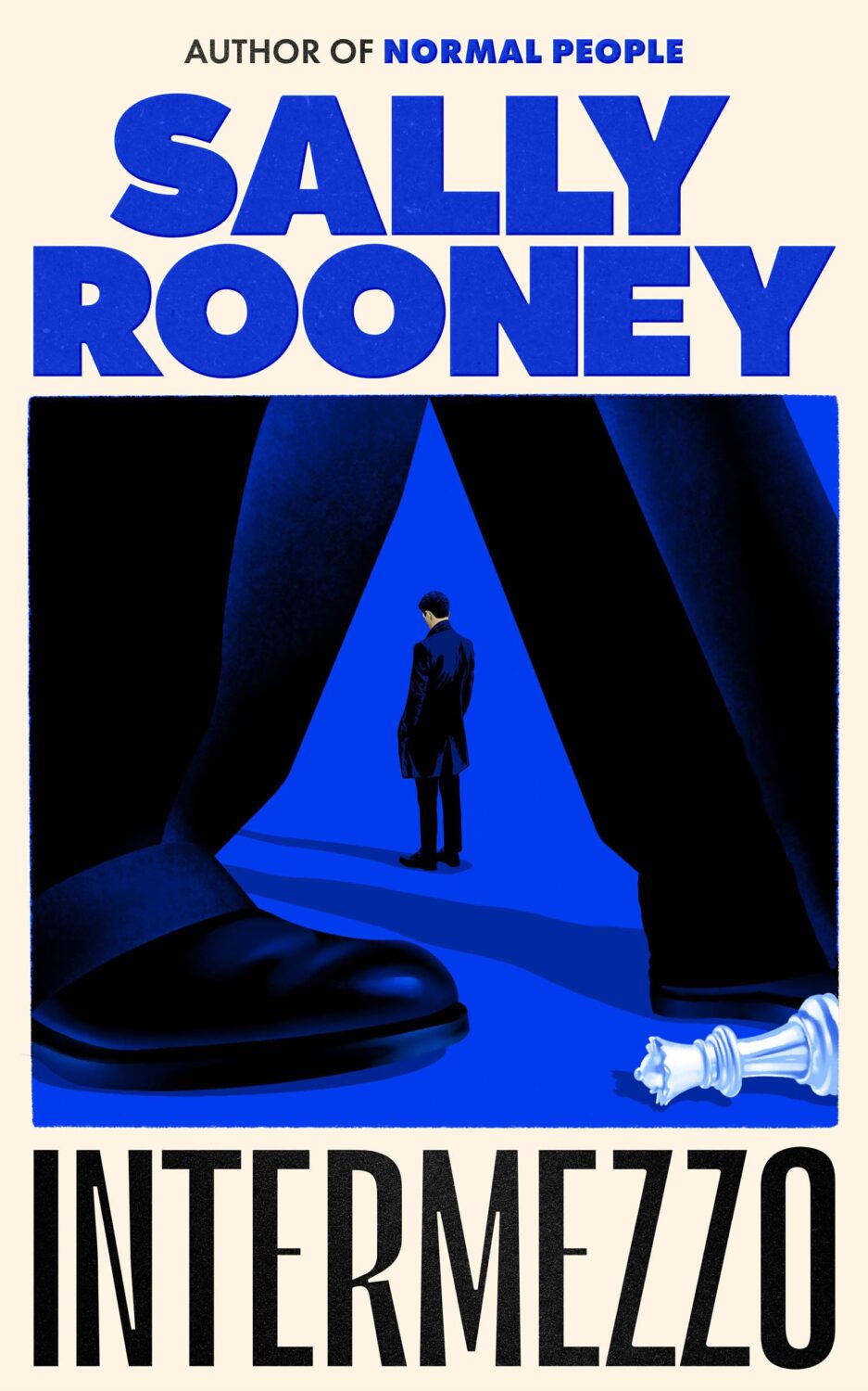
If you’re wondering about the Super-Seventies Sally Rooney typeface, it is Ronda designed by Herb Lubalin and Tom Carnese (I only know because I asked).
Thank you to everyone who has supported the blog in 2021. It means a lot.
I am not convinced that the term “postmodern” quite captures what I mean here (and/or worse, implies something different in the context of typography), but it’s the best I’ve got. I’m not talking about the kind of experimental typography you might associate with the likes of Wim Crouwel or Emigre, or the aesthetic of someone like David Carson. What I am trying to get at is idiosyncratic type that purposely exaggerates or plays with letterforms, and doesn’t conform to function-first modernism. To my mind, this would include some typefaces from the 1960s and 70s, as well as some more contemporary type. In a sense what I am describing is display faces — and I think the eclectic, innovative use of type in Victorian advertising might be an inspiration to designers here — but I don’t think it is just about size. ↩
A big, messy post this month as I catch up on the new releases and some of the covers I missed over the summer. I expect the next couple of month’s might be a bit like this as I work towards my round-up of the year, so feel free to let me know about stuff that you think I’ve overlooked in 2021.
For some reason, I was reminded of this saucy Jacob Covey cover, which I thought was killed in favour of something more (ahem) traditional, but it still exists on Amazon, so who knows? (Jacob probably knows; I do not).
This cover immediately reminded me of Helen Crawford-White’s cover A Half-Baked Ideaby Olivia Potts published last year…
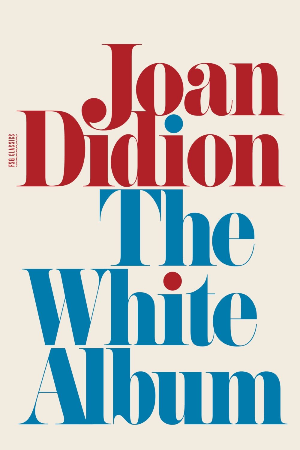
And then I thought maybe it was a nod to the cover of The White Album by Joan Didion, published in 1979 (the reissue below uses the original cover), and which Fonts in Use informs me uses the typeface Pistilli Roman. But maybe I am over thinking it…?
I was also reminded of these two recent covers, so maybe it is just a thing…?
I believe this is only available as an ebook, which seems a bit of shame. It would be nice to see in print. The cover does remind me of something else though. I can’t think what exactly. The best I could come up with was Tyler Comrie‘s cover for The Unwanted by Michael Dobbs. But I feel like there is cover that does something similar with a painting as a background? Possibly I’m just imagining it.
Oh and for those of you who are interested, the design team at Penguin Random House Canada have started posting their work to Instagram as one_last_tweak.
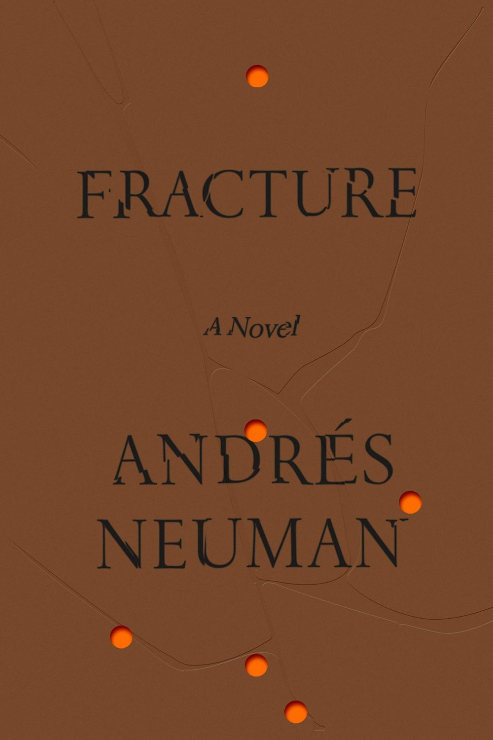
Fracture by André Neuman; design by June Park (Farrar Straus & Giroux / May 2020)
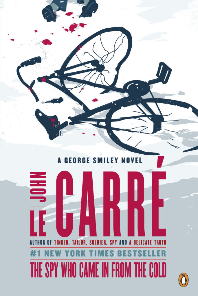
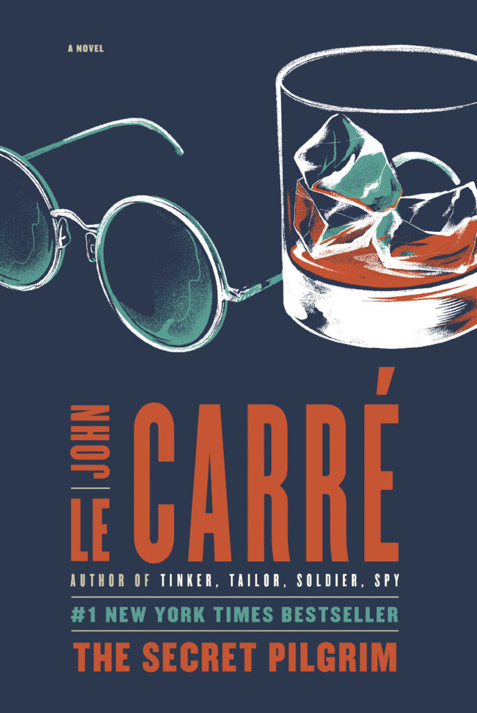
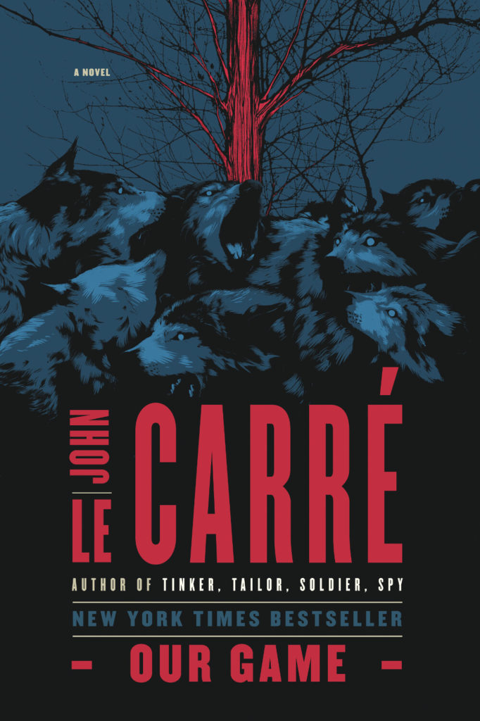
I’m obviously on a bit of a John le Carré kick at the moment as I am currently reading his latest book Agent Running in the Field1. The cover features art by Matt Taylor who has illustrated a quite number of le Carré covers for Penguin Random House and art director Paul Buckley over years. I’ve shared a few of them here before, but since I posted David Pearson’s recent redesign of the George Smiley novels, I thought it would be nice to pull Matt’s versions together too. I believe Gregg Kulick had a hand in the design and type.
Matt has also illustrated the covers for le Carré’s non-Smiley novels too. There’s quite a lot of them!
A Delicate Truth illustration Matt Taylor
The Naive and Sentimental Lover illustration Matt Taylor
The Night Manager illustration Matt Taylor
Our Game illustration Matt Taylor
Our Kind of Traitor illustration Matt Taylor
A Perfect Spy illustration Matt Taylor
The Pigeon Tunnel illustration Matt Taylor
A Small Town in Germany illustration Matt Taylor
The Tailor of Panama illustration Matt Taylor
(Matt’s also did an illustration for The Russia House, but only the audio edition of the book appears to be available from Penguin Random House in the US. In the UK, Penguin uses the same illustration for their cover, although the type is in line with their other Modern Classic editions)


