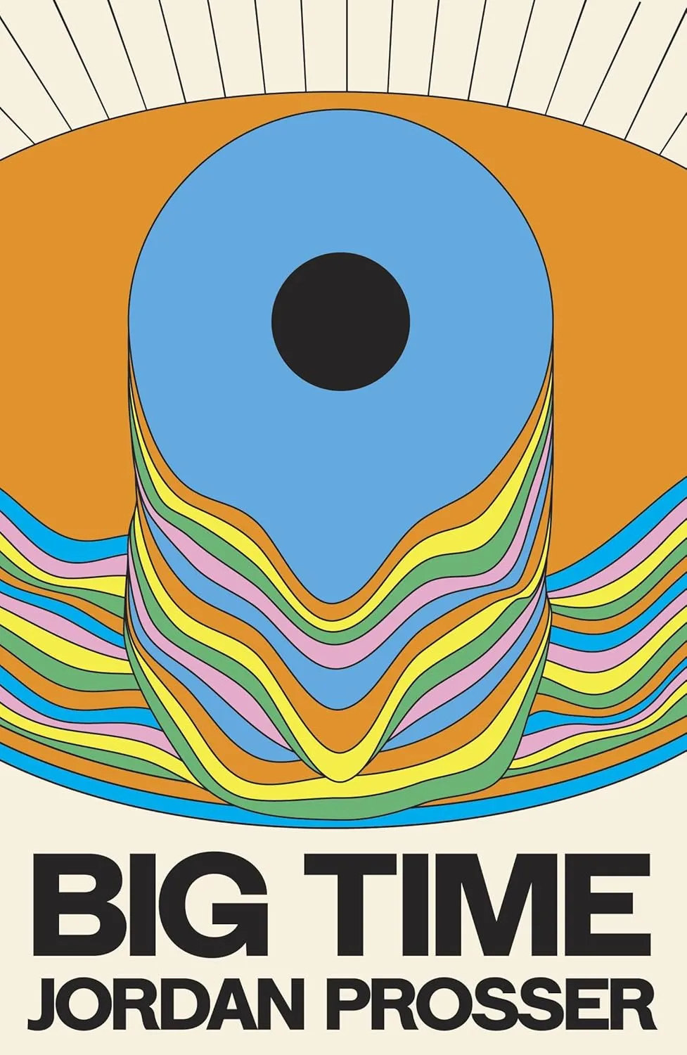
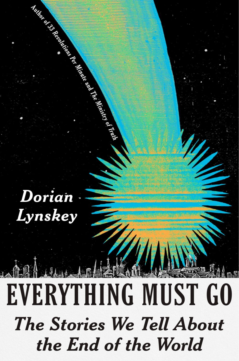
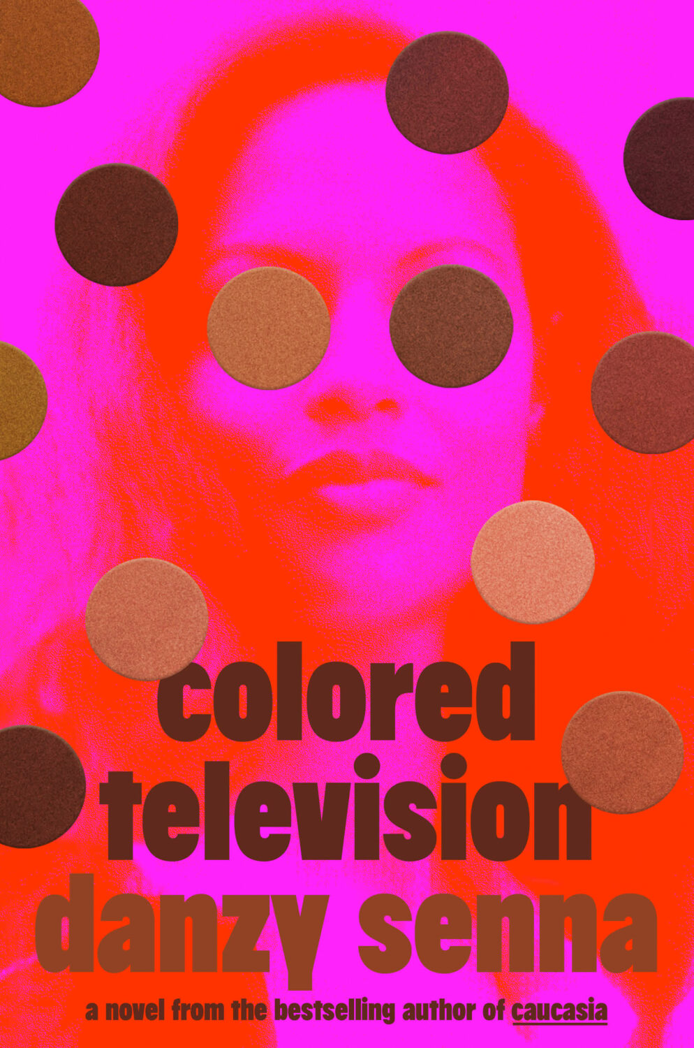
Hi. Hello. I hope you’re keeping safe and well. I’m getting this month’s post out at little earlier than usual (i.e. not the 11th hour), and on a Monday no less, because I’m going to be in NYC the rest of this week for work. Even though this is a little bit of a quick and dirty post, there are still lots of covers for you to peruse and admire. Apologies if I’ve missed anything obvious and/or spectacular. I will try to catch up next month.
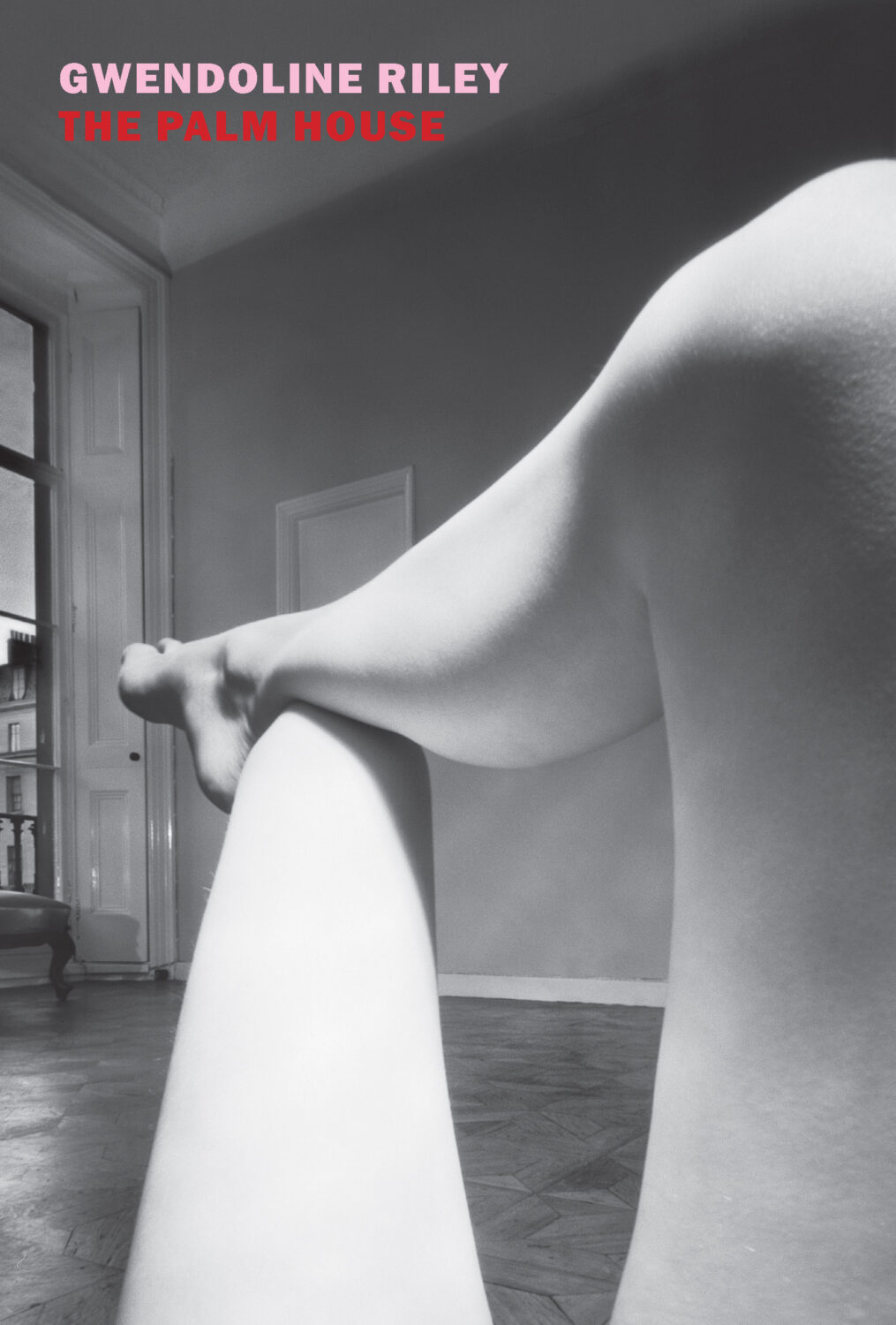
The Palm House by Gwendoline Riley; design by Katy Homans; photo by Bill Brandt (NYRB Books / April 2026)Famesick by Lean Dunham; design by Teddy Blanks (I think?); photo by Anna Gaskell (Random House / April 2026)
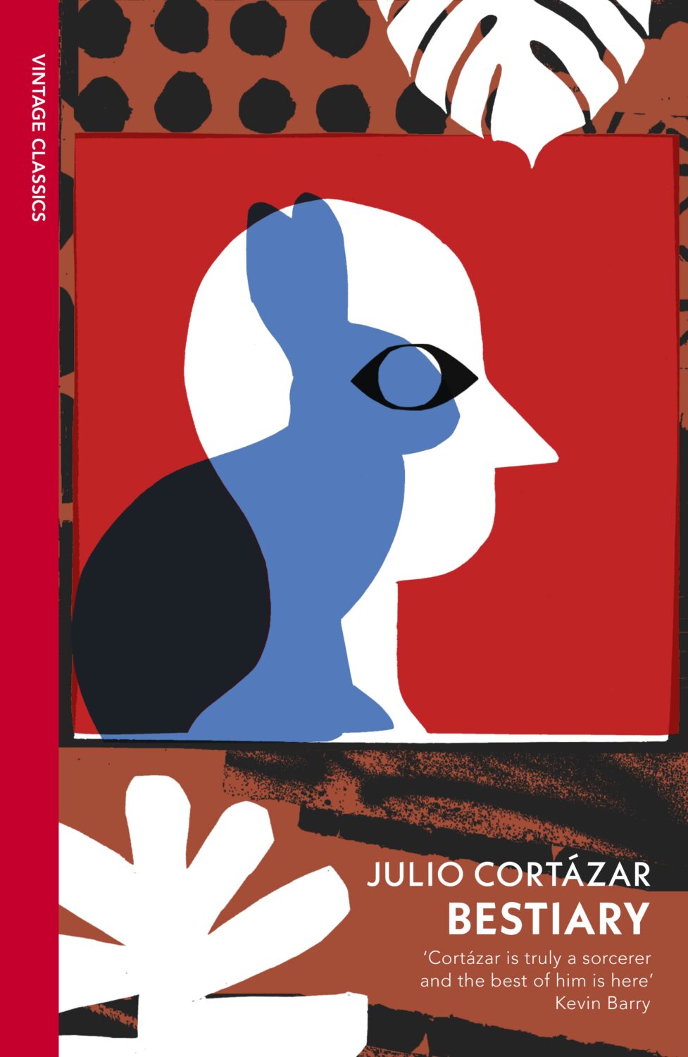
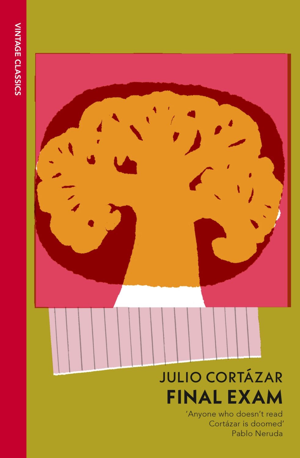
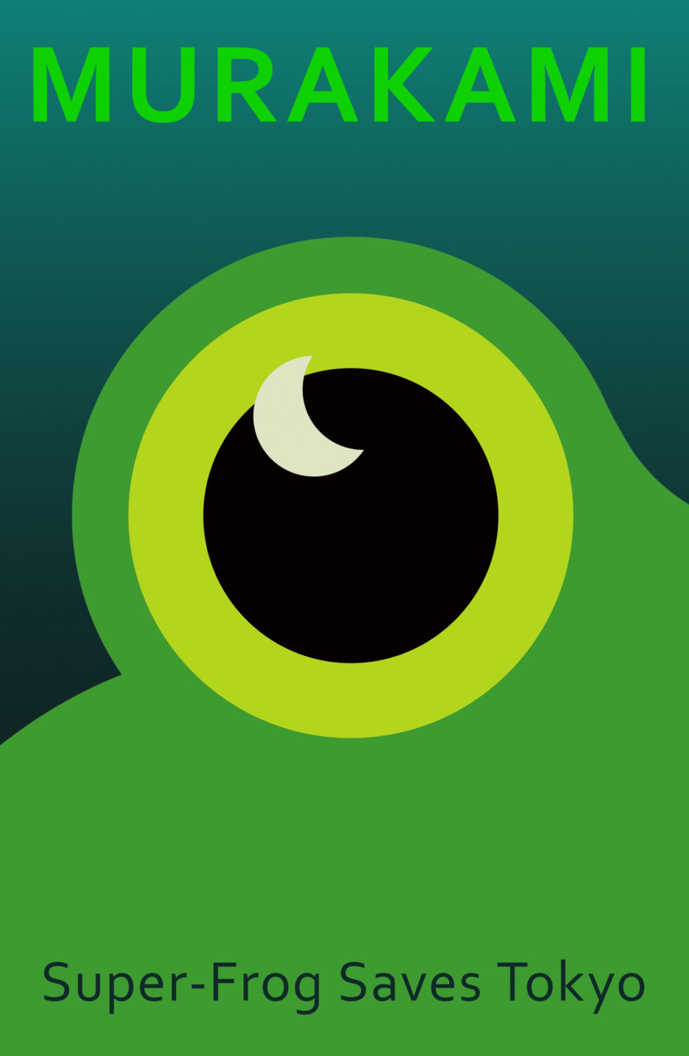
Some of my favourite covers this year were series designs. I loved the Julio Cortázar Vintage Classics editions with covers illustrated by Stephen Smith, AKA Neasden Control Centre. I was lucky enough to meet art director Suzanne Dean for coffee when she visited Toronto this summer, which was lovely. Her Haruki Murakami designs for Vintage Classics and Harvill are always a delight too.
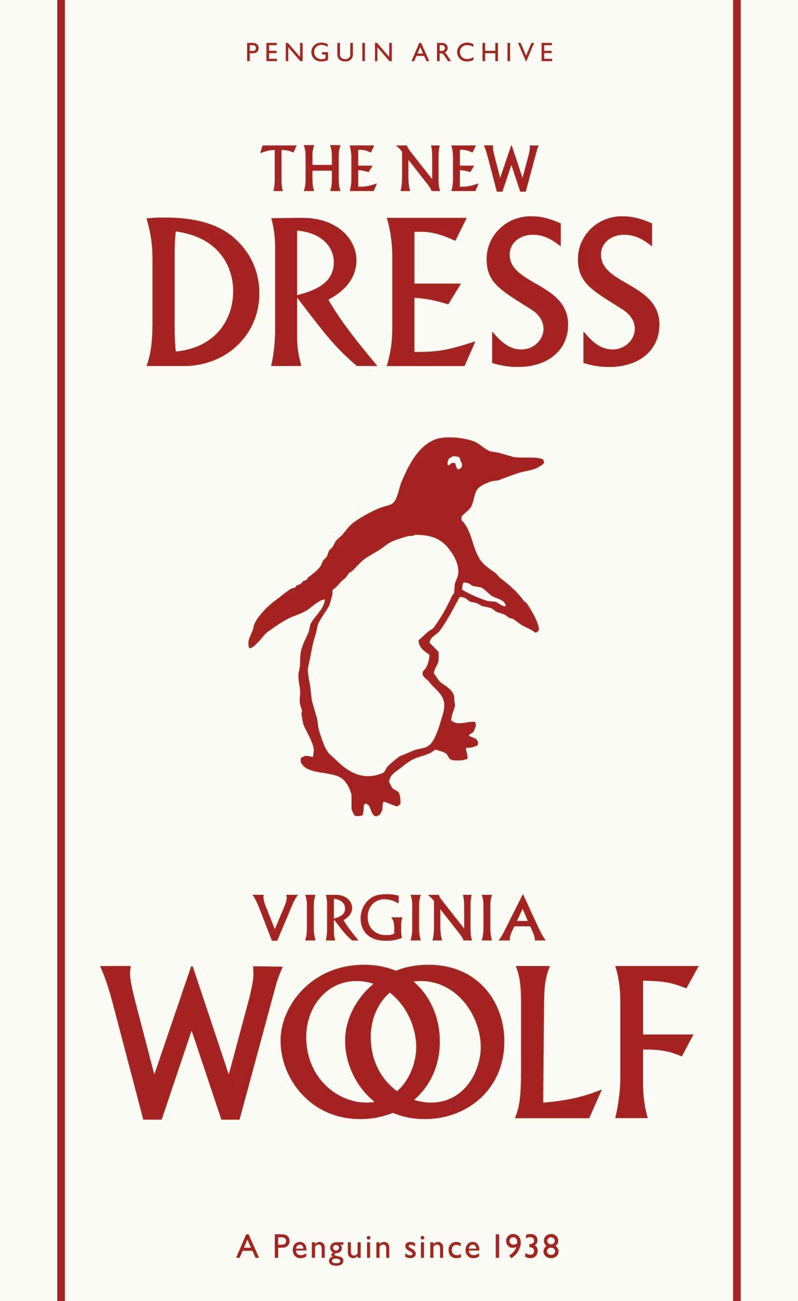
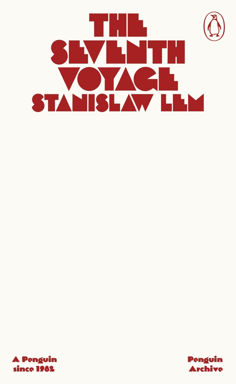
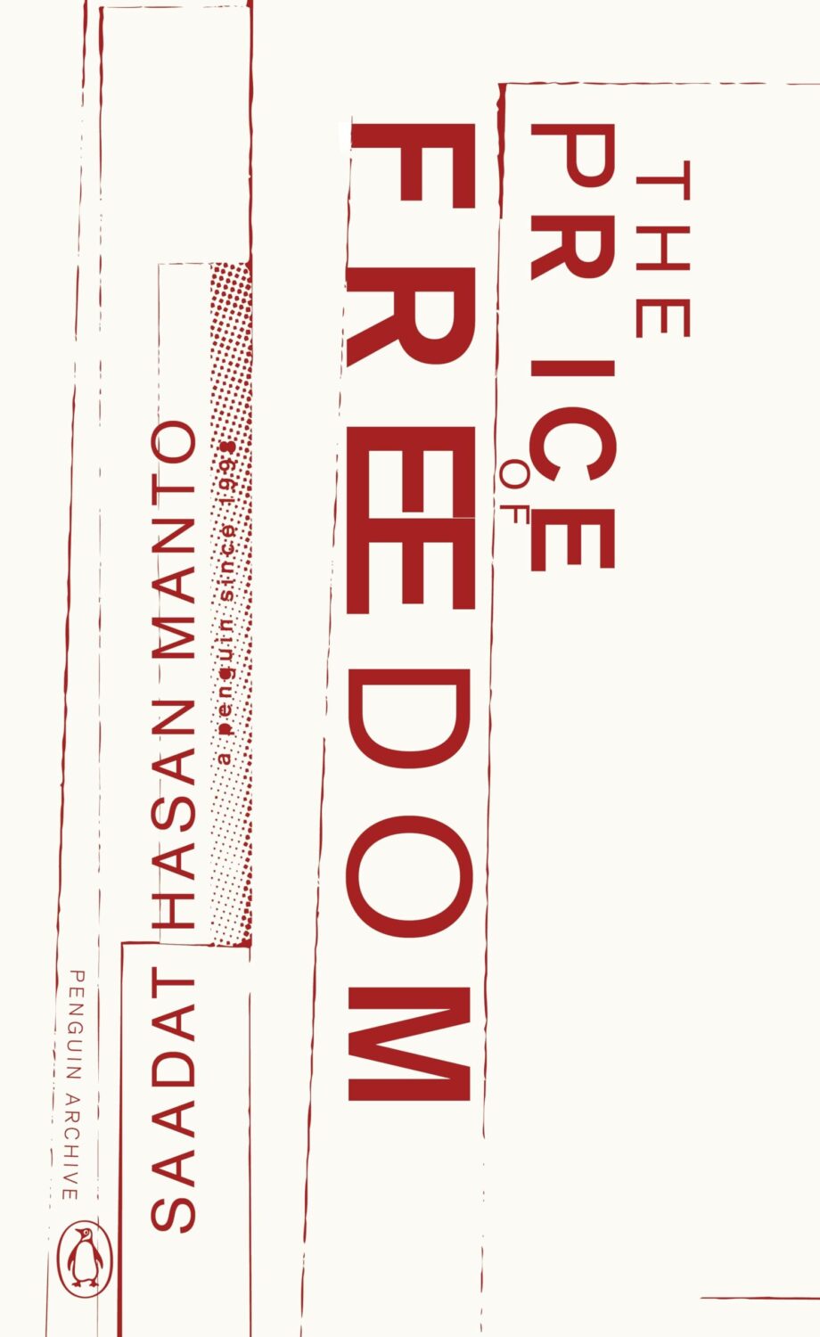
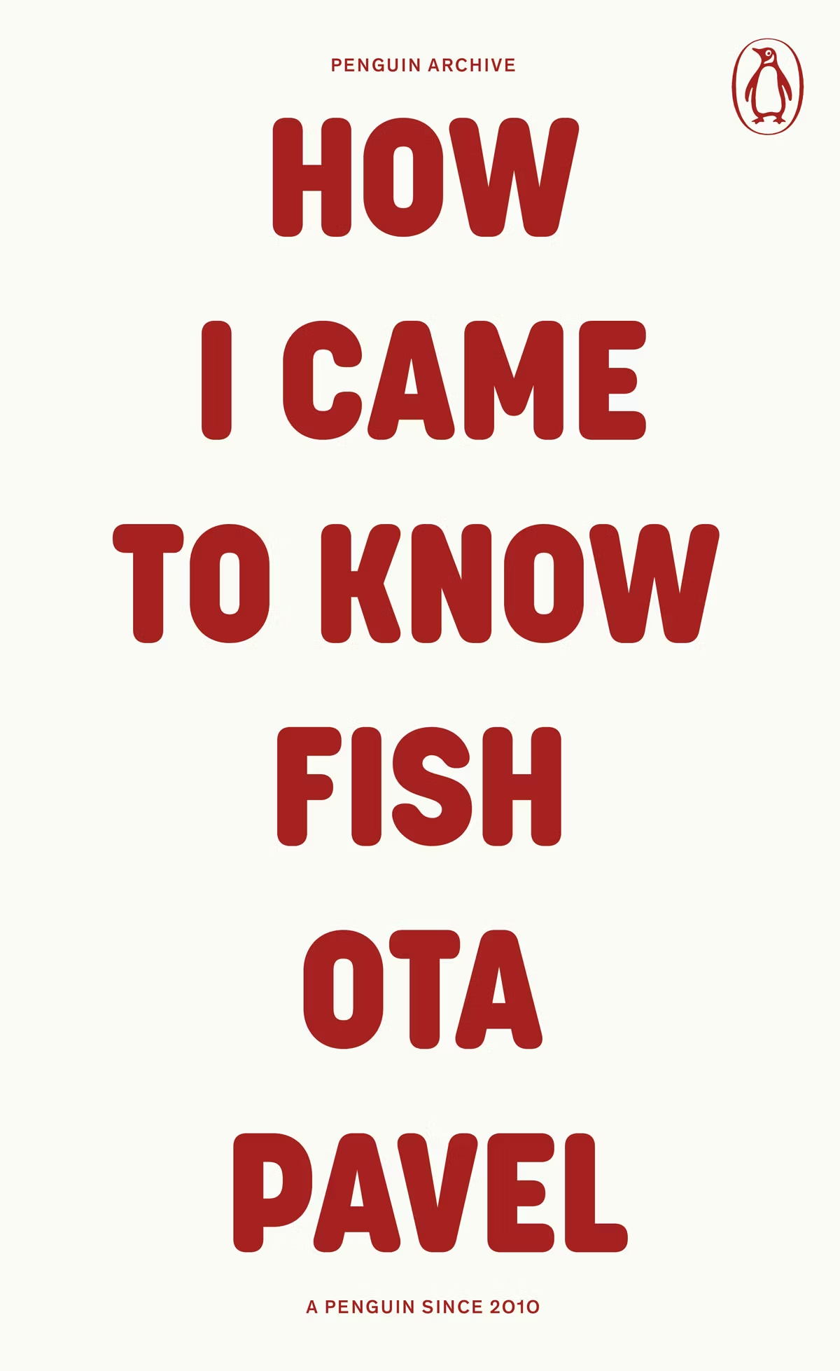
The typographic covers for the ‘Penguin Archive’ designed by Jim Stoddart triggered my curiosity. Published in April to celebrate 90 years of Penguin Books, the designs use typography to evoke the different eras of the publisher. You can read more about the series and the design process at Creative Review. But which historic Penguin covers inspired type choices in the first place?
There was some really nice series design from independent publishers this year too. I really liked Luísa Dias‘s covers for Wild Hunt Books’ Northern Weird Project. I wanted to feature them here when the final book of the series, Turbine 34 by Katherine Clements, came out last month, but time was not on my side. Fortunately, Zachary Petit talked to Luísa about the series for PRINT in April.
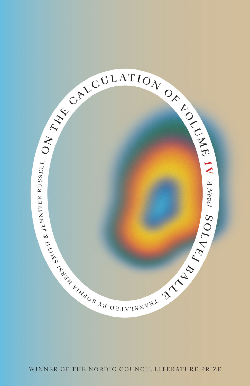
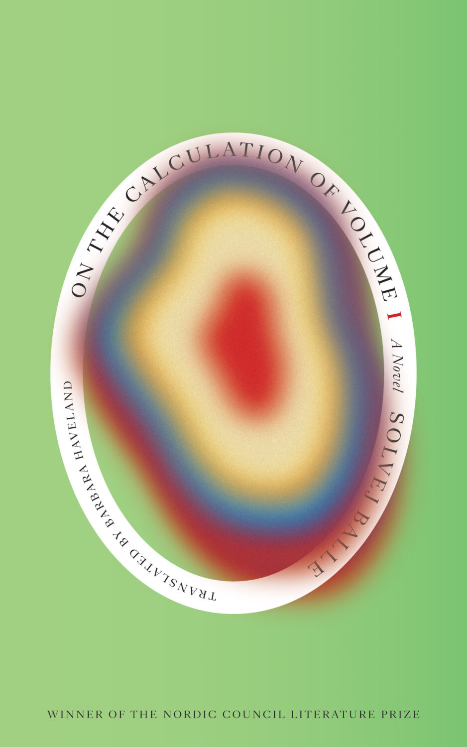
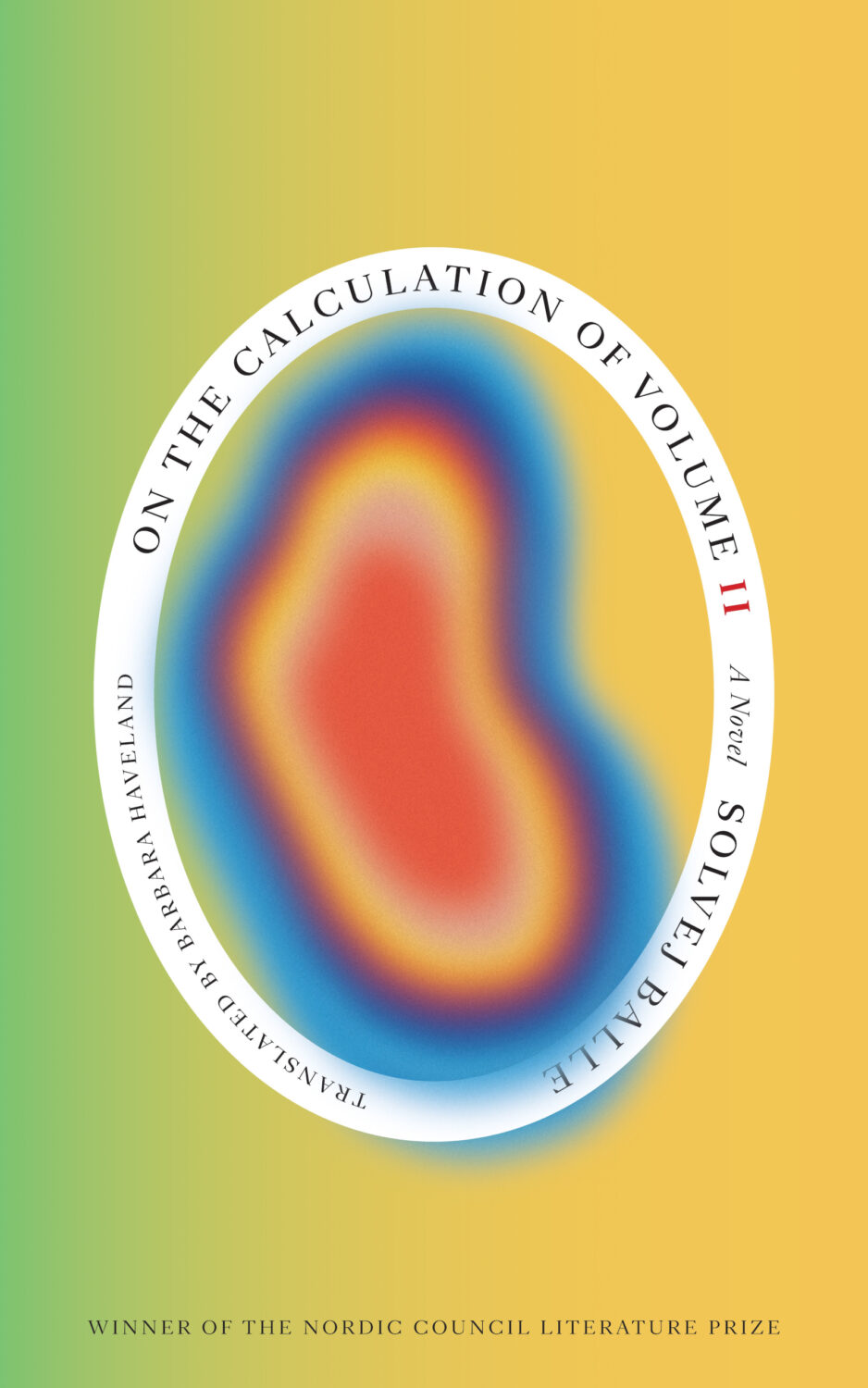
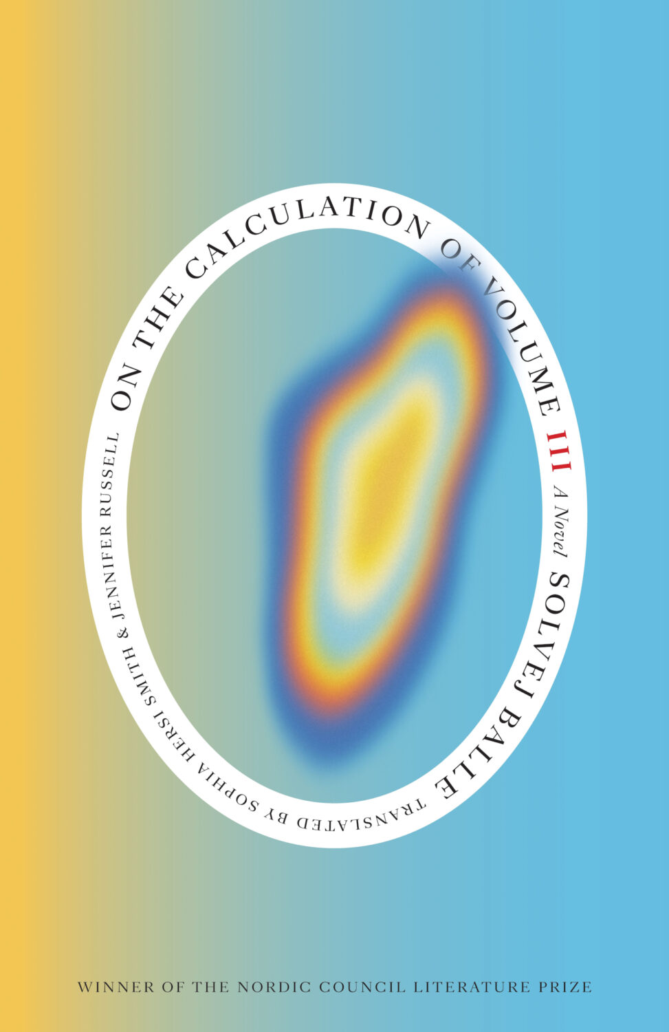
In Solvej Balle’s On the Calculation of Volume septology a women repeats the same day over and over again, and Matt Dorfman‘s covers for the New Direction editions are a really creative take on loops and repetition. The first two books came out last year and were featured in my October 2024 post so they’re not on this year’s list even though the third book was published in November. There are, however, two covers from a different Danish septology included below.
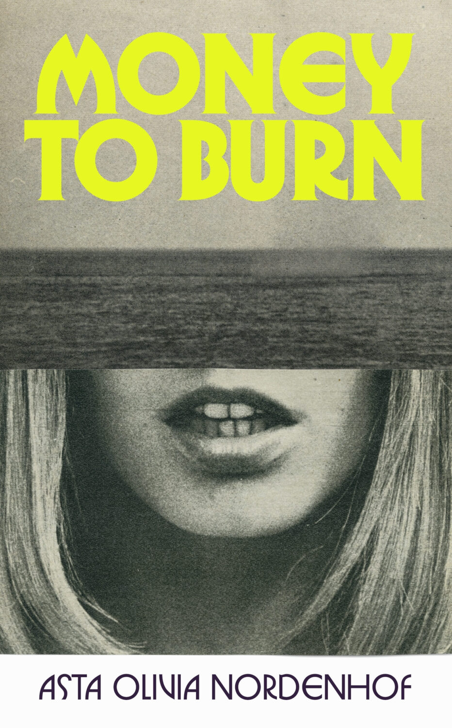
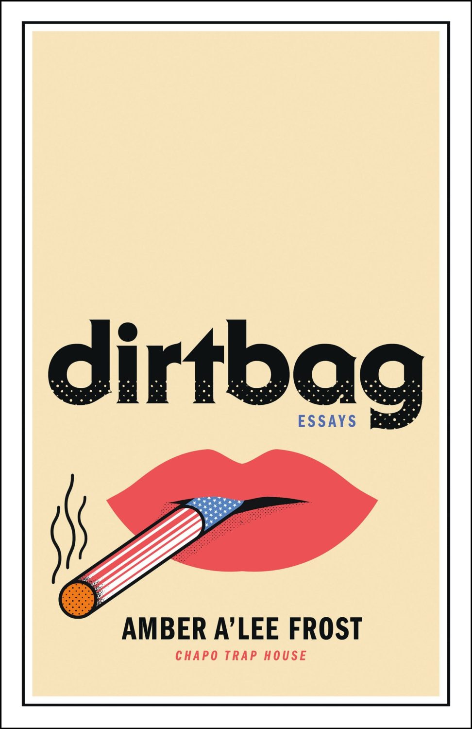
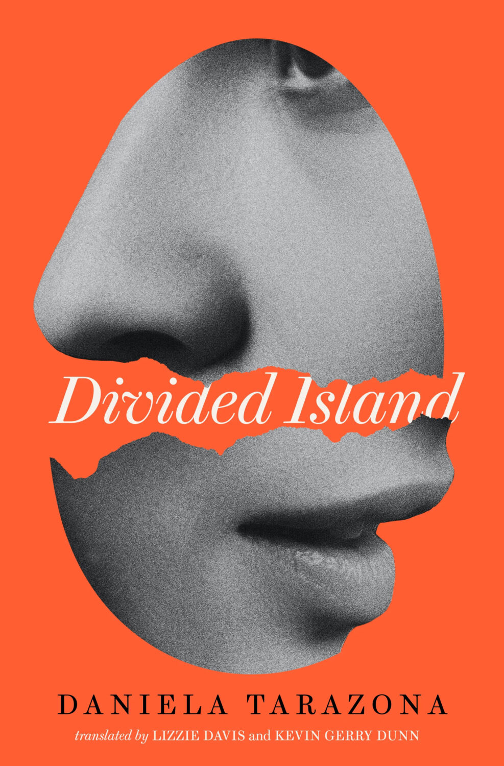
In terms of trends, Alban Fischer noticed that there have been a lot of close-ups of lips recently, something which I Need A Book Cover also picked up on.
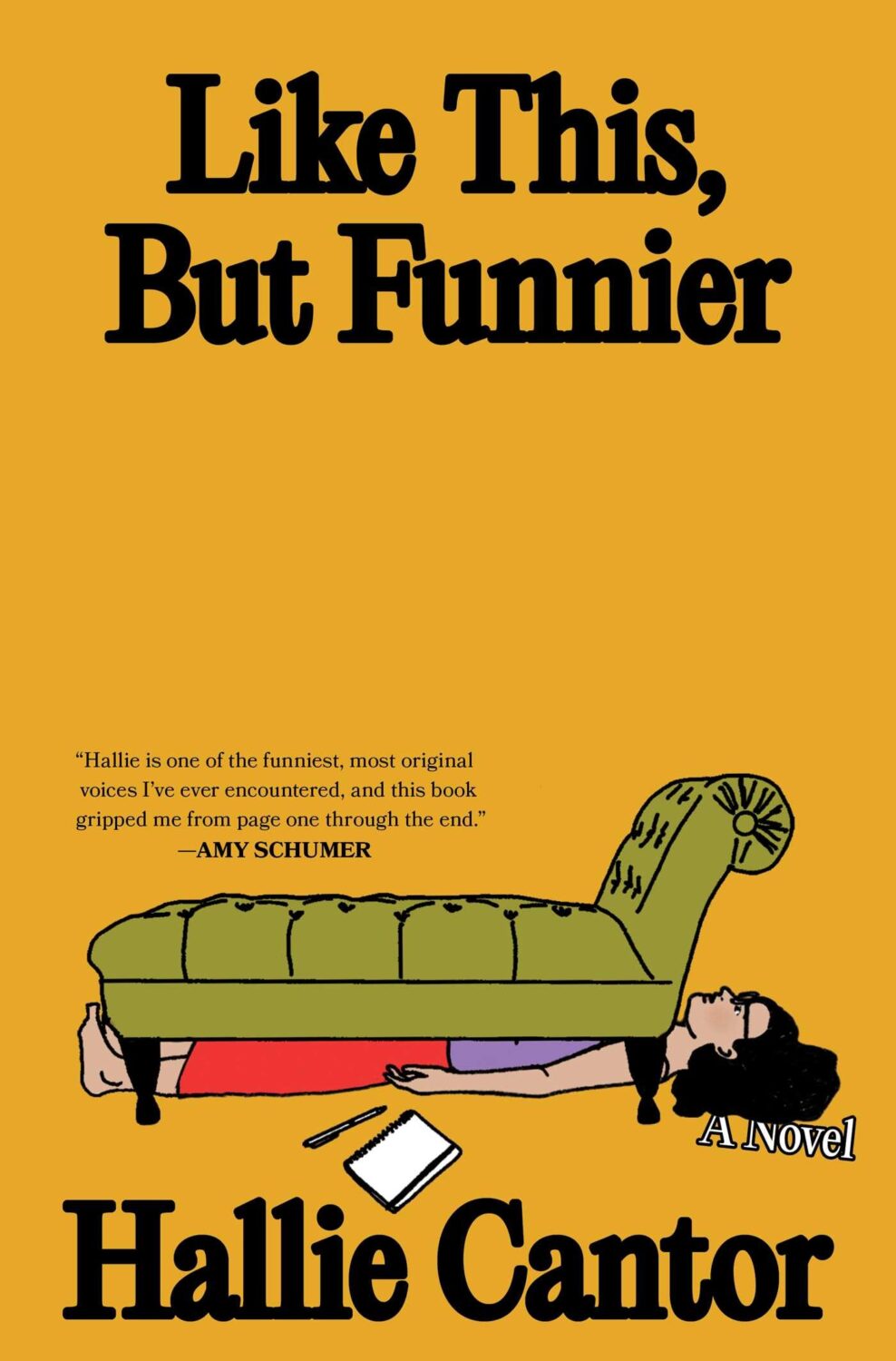
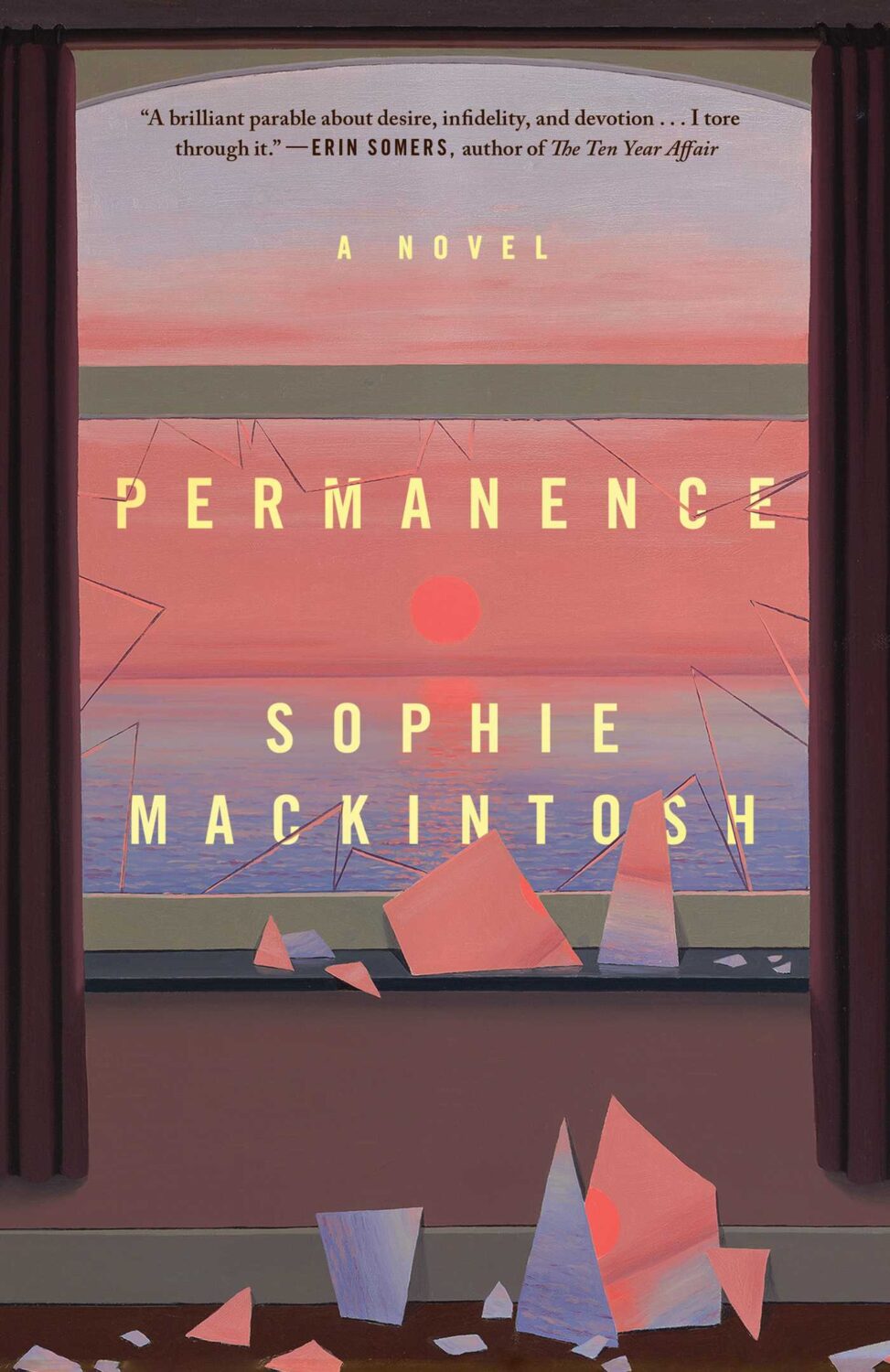
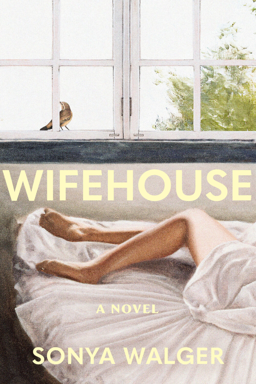
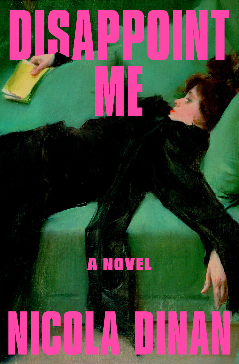
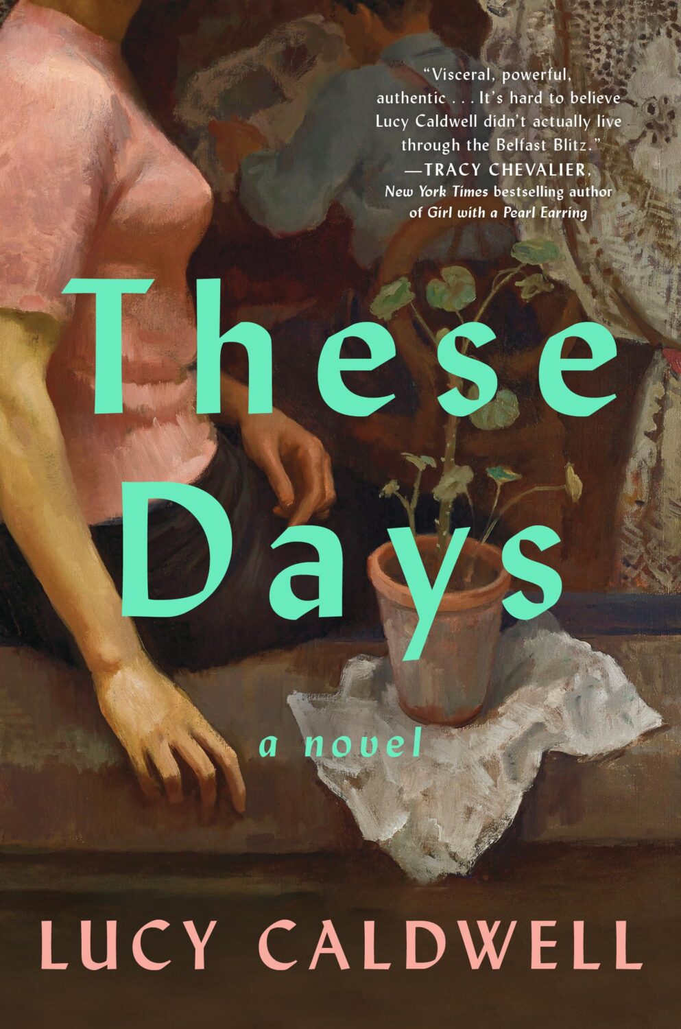
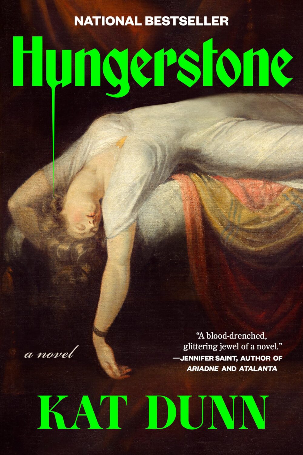
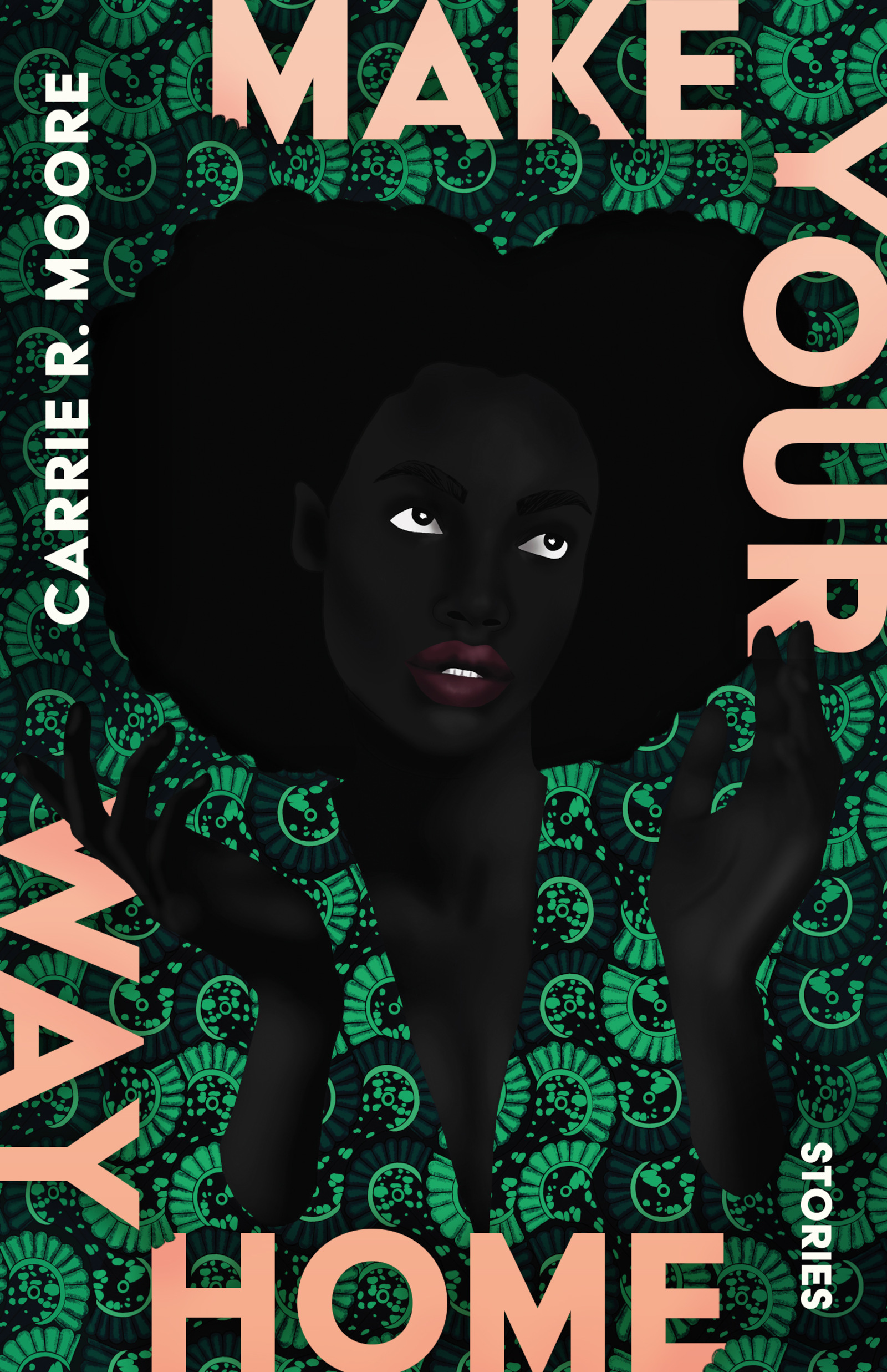
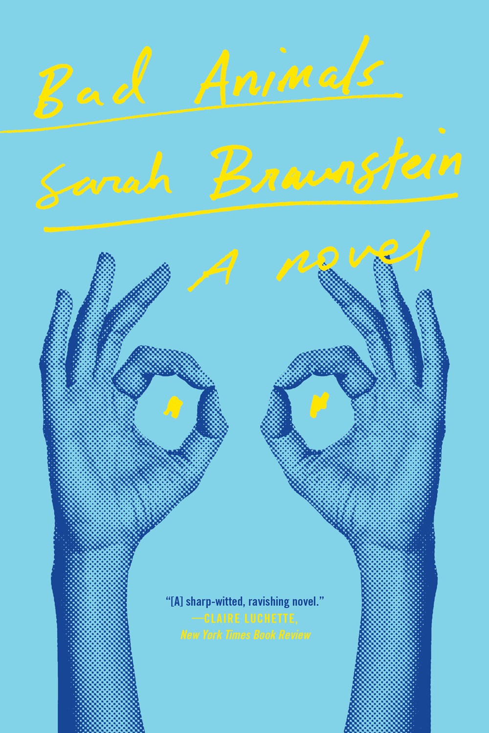
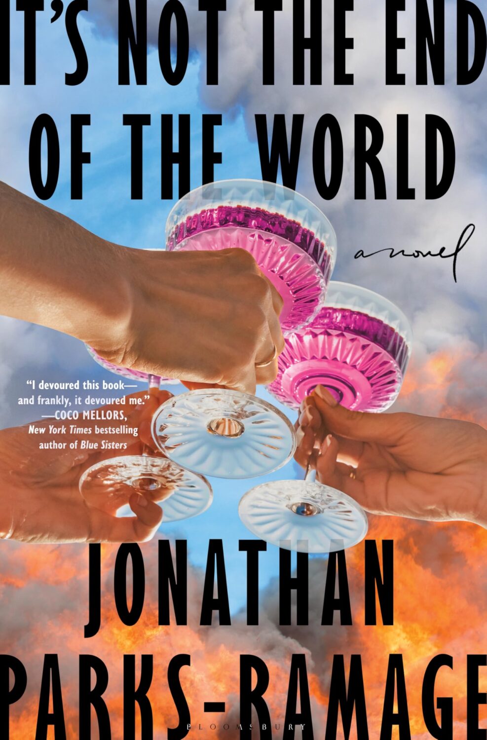
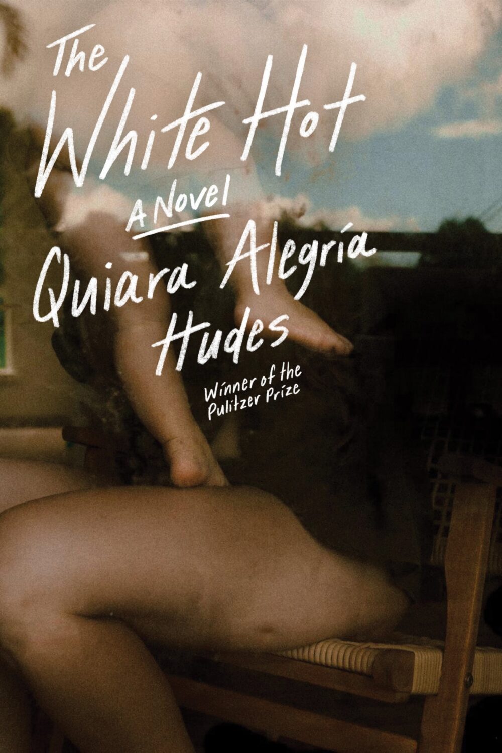
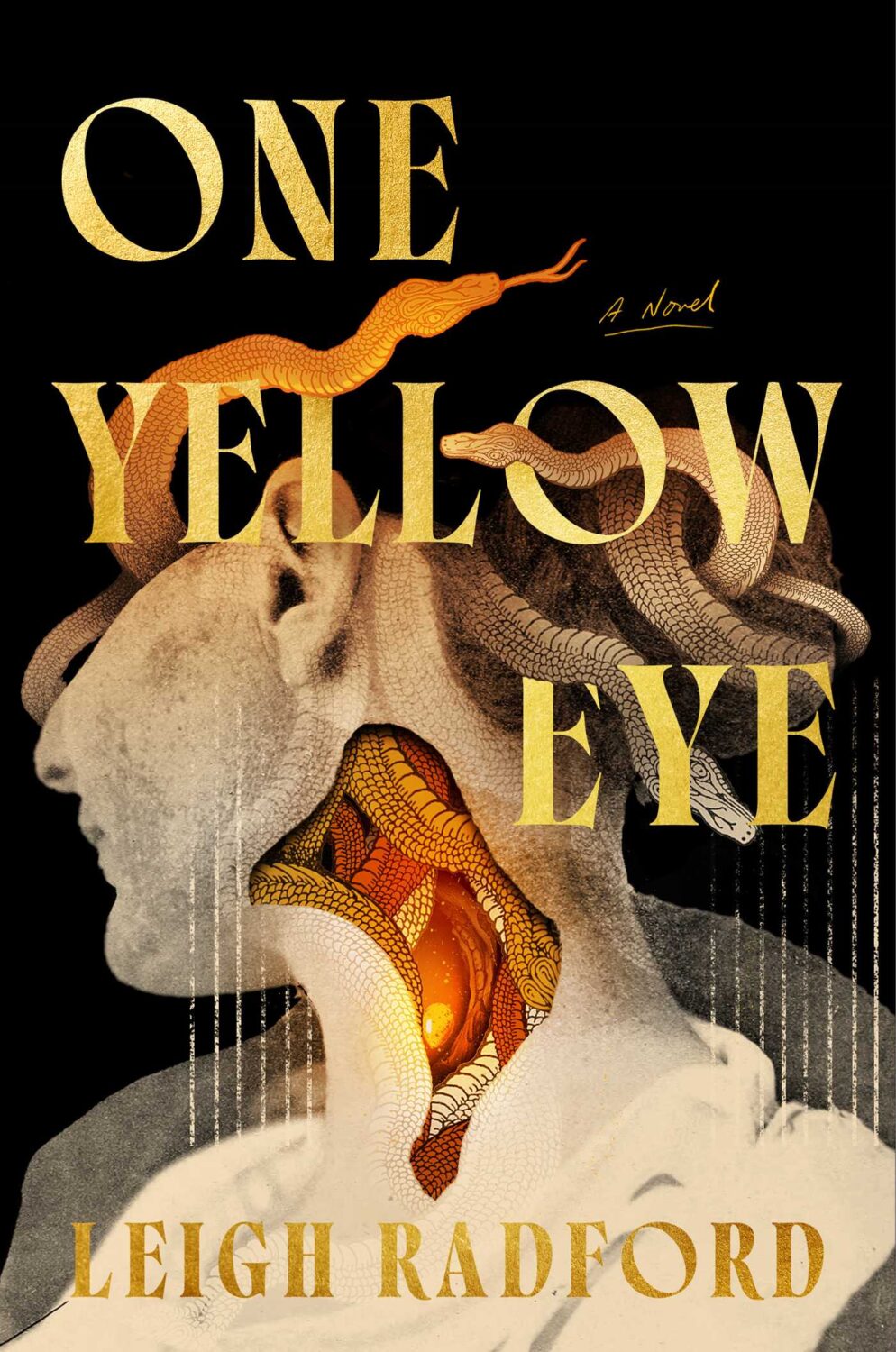
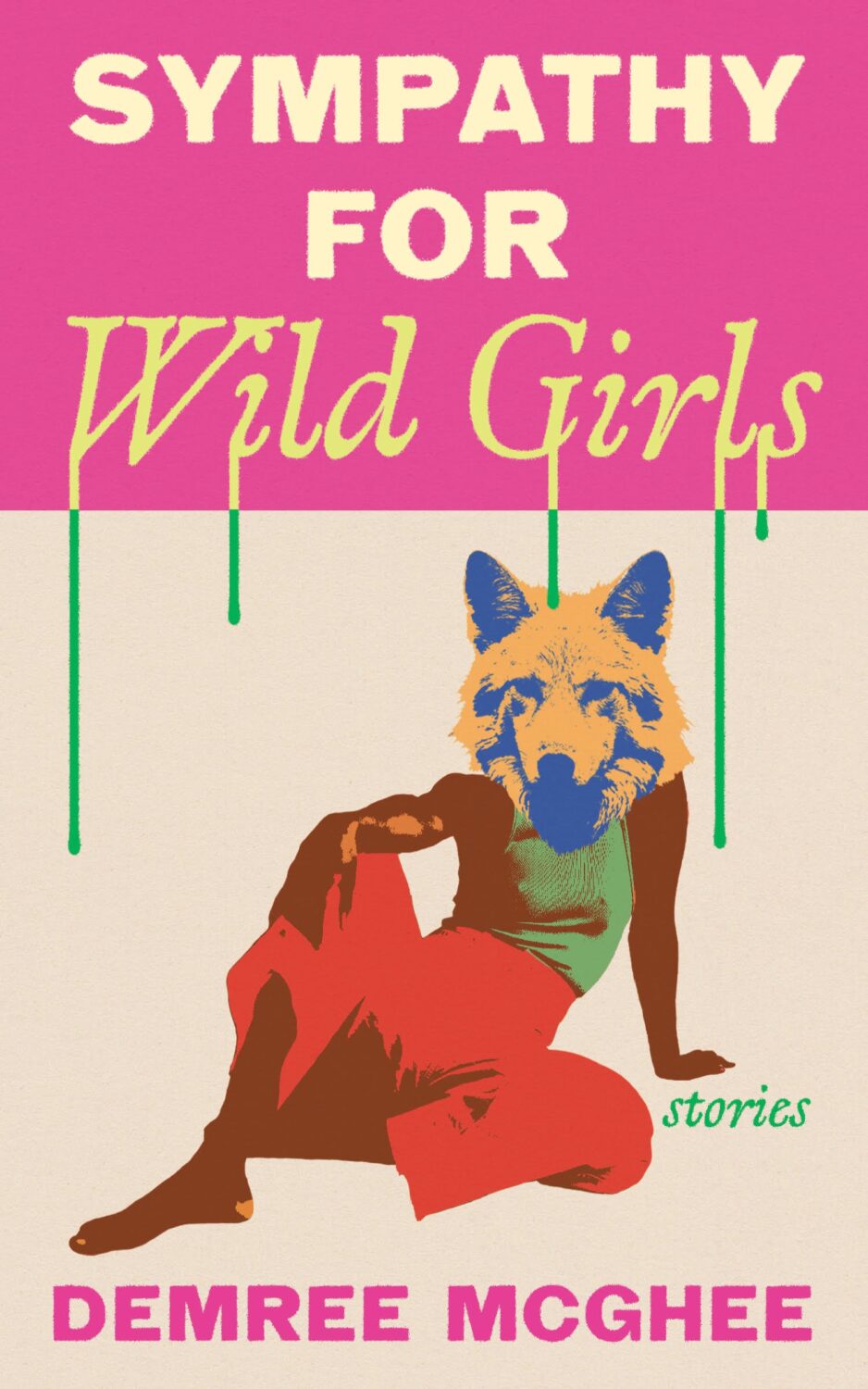
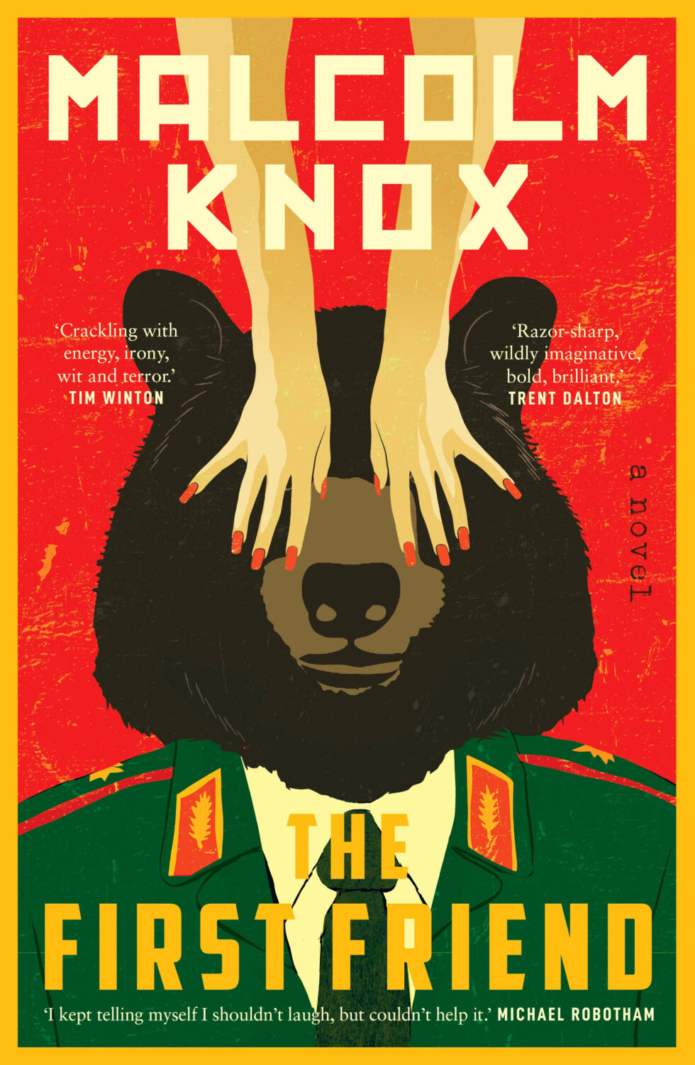
One strand of the ‘trend you’re seeing everywhere’ was paintings of women in various states of repose. There was a lot of elegant ennui and it almost felt like an art school version of well-dressed and distressed covers at times.
Disappoint Me by Nicola Dinan; design by Rachel Ake; art ‘After the Ball’ by Ramon Casas i Carbo (Dial Press / May 2025)What a Time to be Alive by Jenny Mustard; cover art by Shannon Cartier Lucy (Sceptre / April 2025)These Days by Lucy Caldwell; design by Ploy Siripant; art ‘Woman in the Window’, by Alberto Morrocco (SJP Lit / April 2025)Hungerstone by Kat Dunn; design by Alicia Tatone; art ‘The Nightmare’ by Henry Fuseli
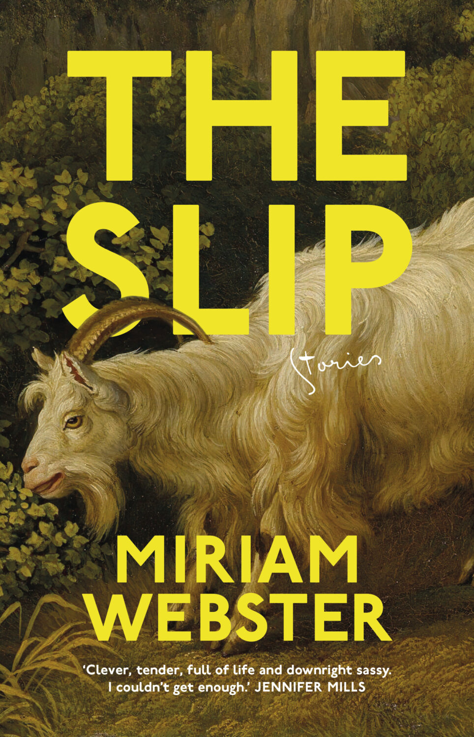
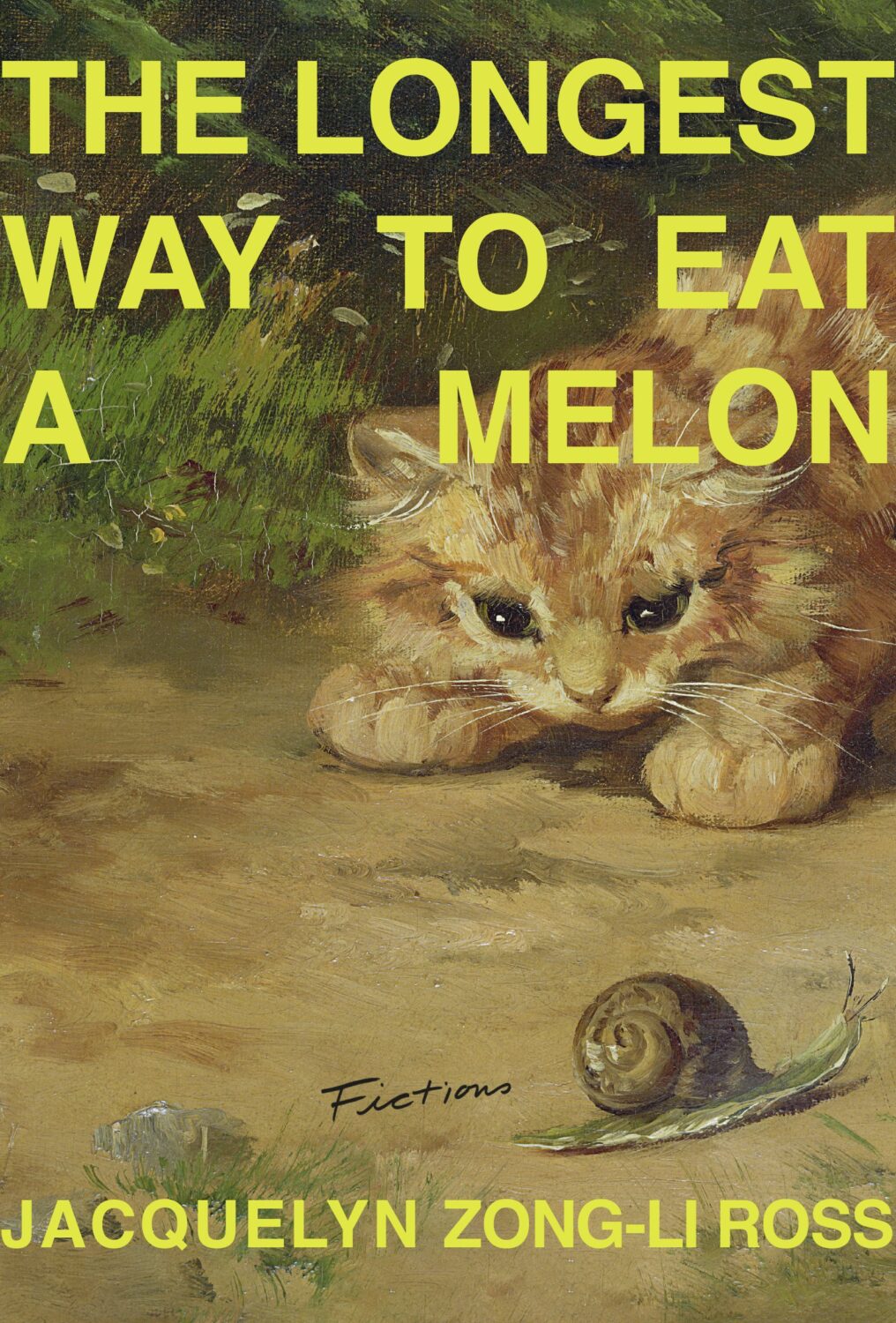
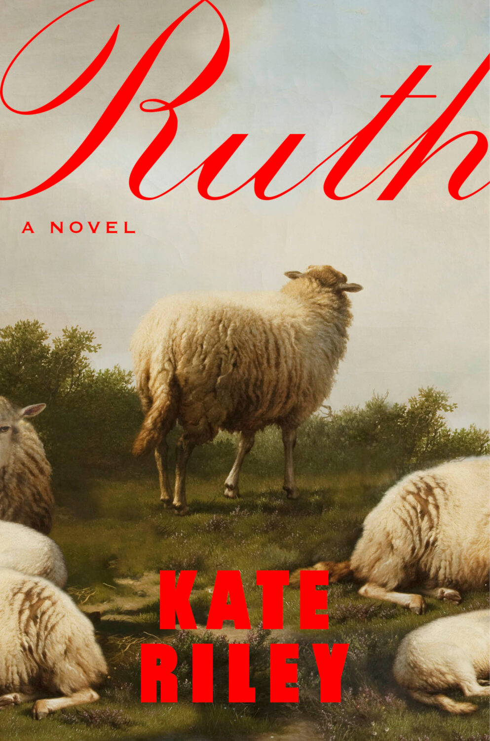
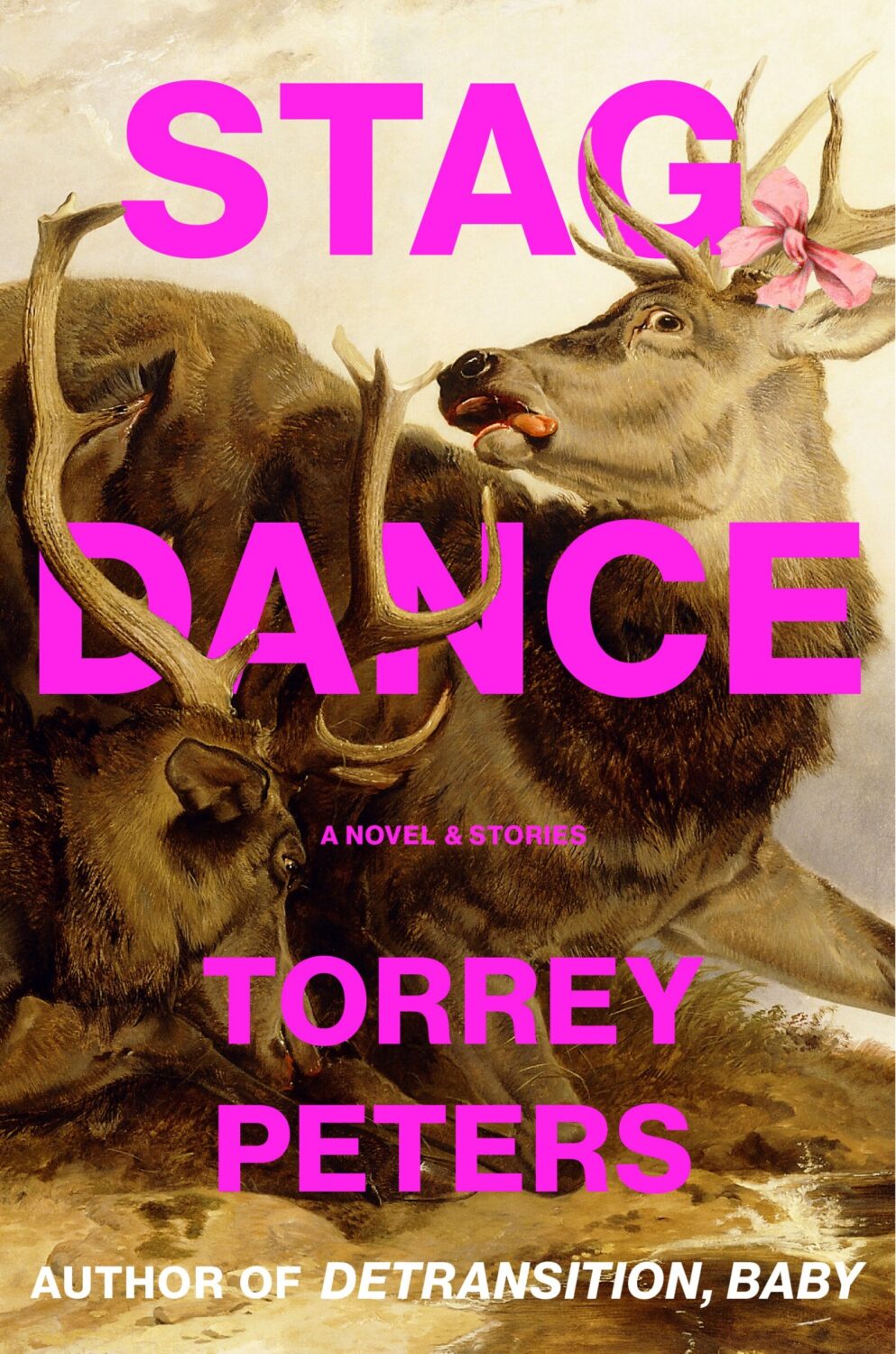
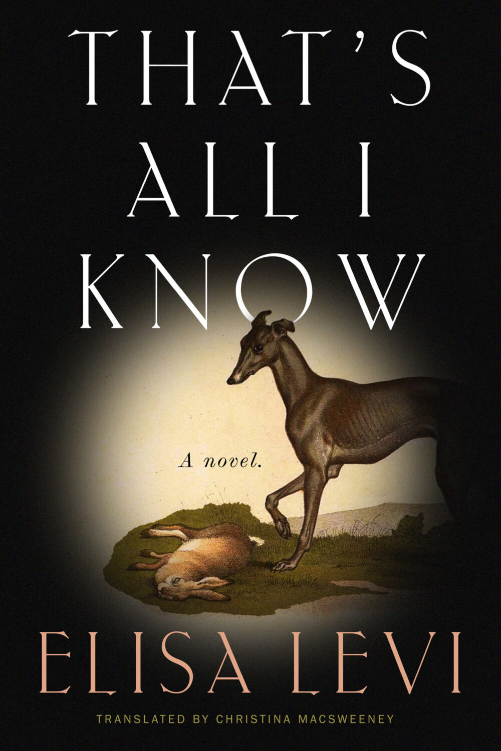
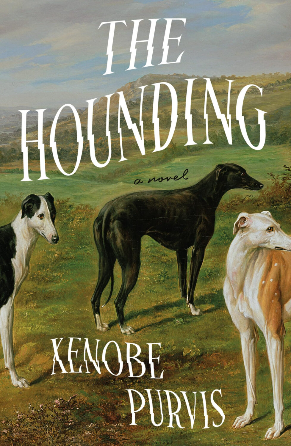
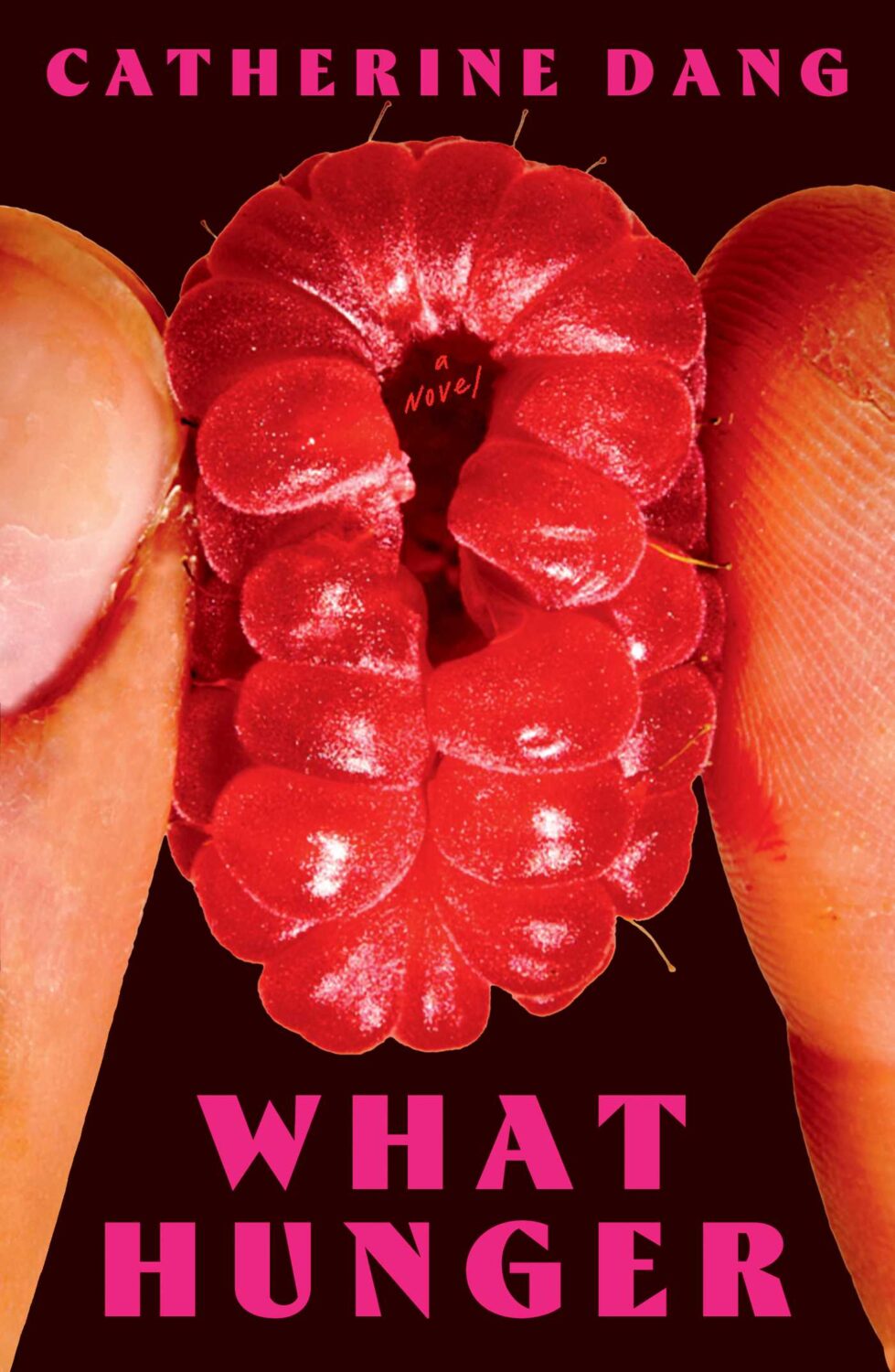
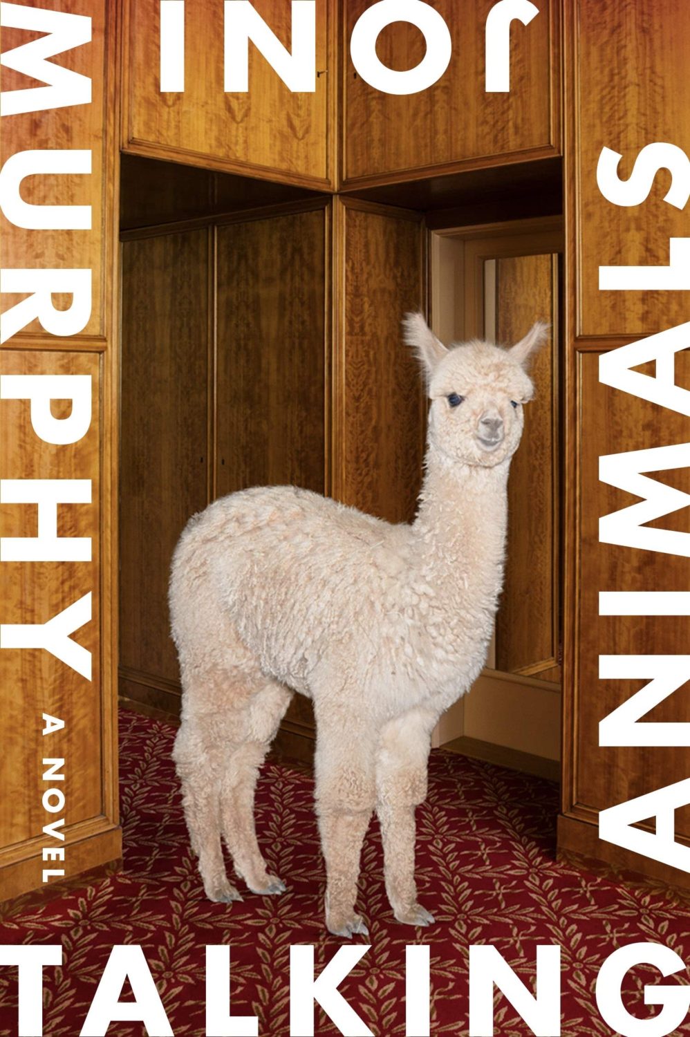
Another strand was historical paintings of animals, which fits with the “old-timey animals” covers Patrick Redford wrote about for Defector last year.
I think the success of these covers largely depends on the image selection and the cleverness of the crop. I’m sure we will see more of them going forward, but doing it well is probably harder than it looks.
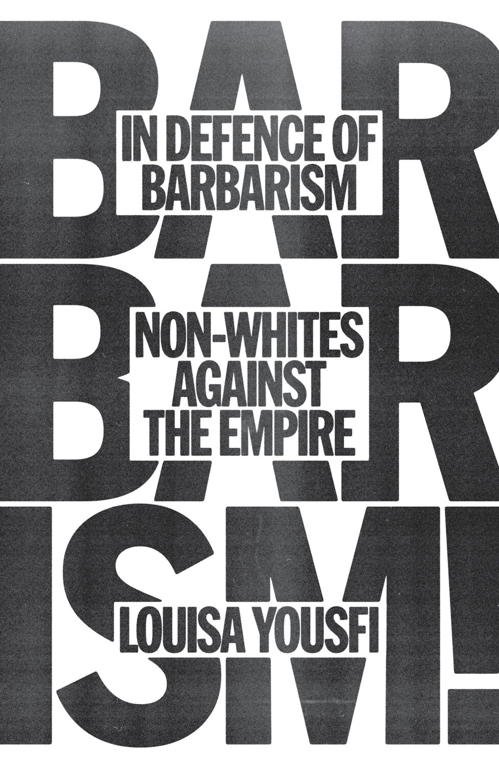
I don’t have a good name for this next trend, but in my mind I’ve been referring to this as “corner type” because of the way the text seems to turn the corners the cover. I guess what it is really doing is framing the central image. I don’t know if this is new, but I noticed it a lot this year.
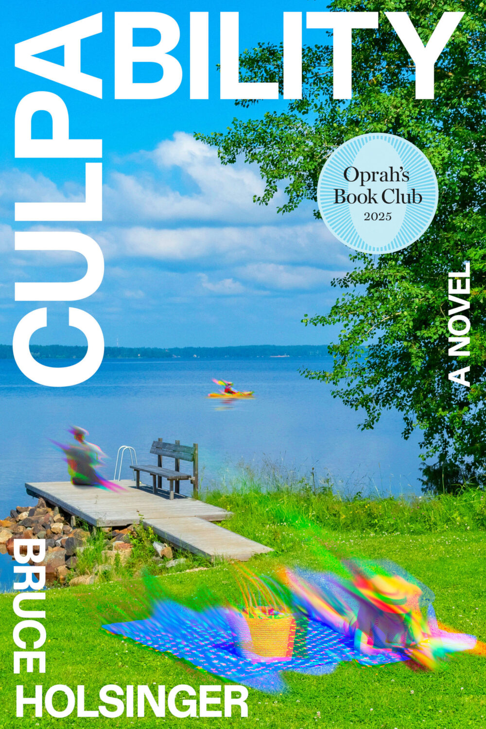
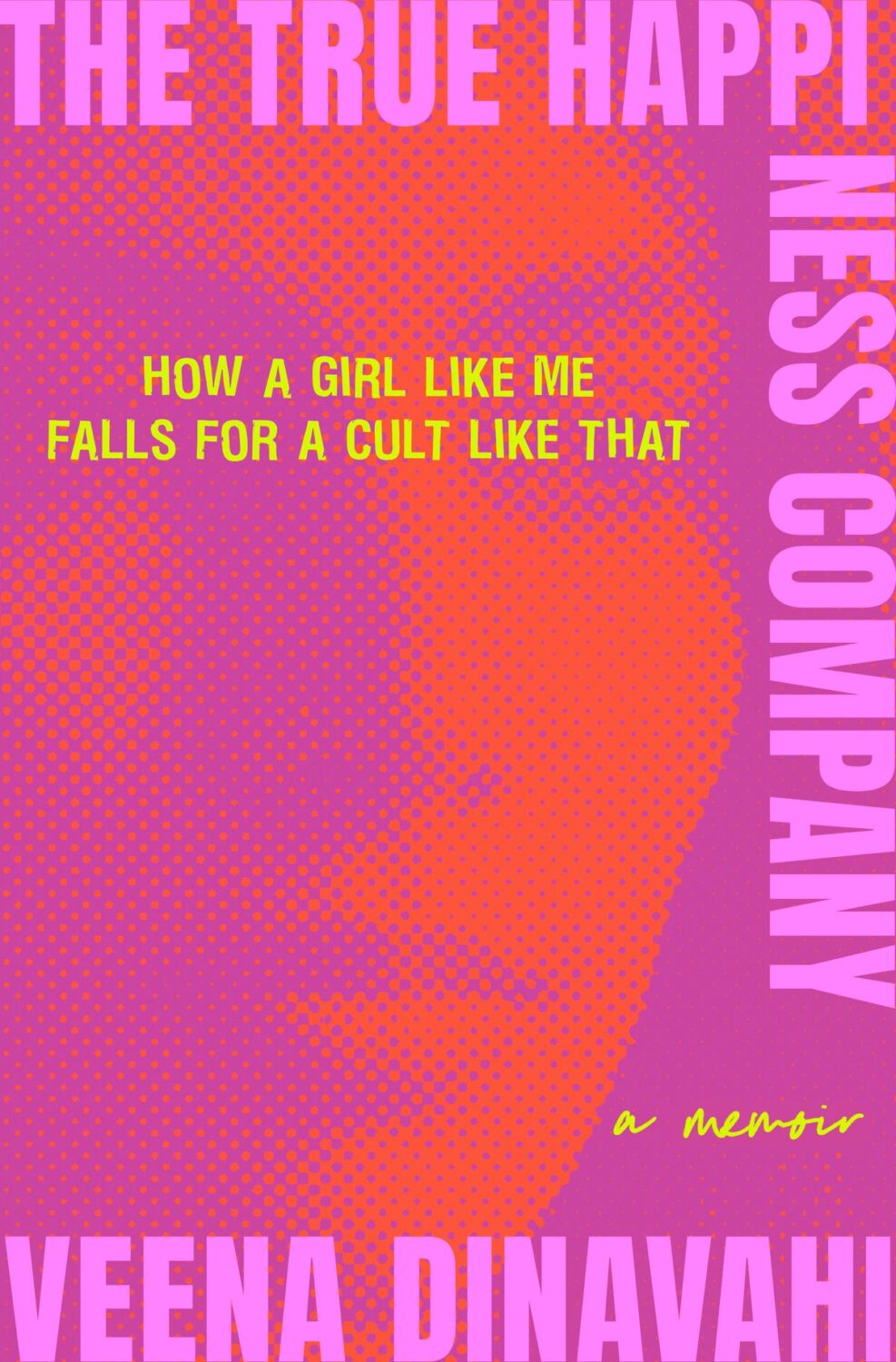
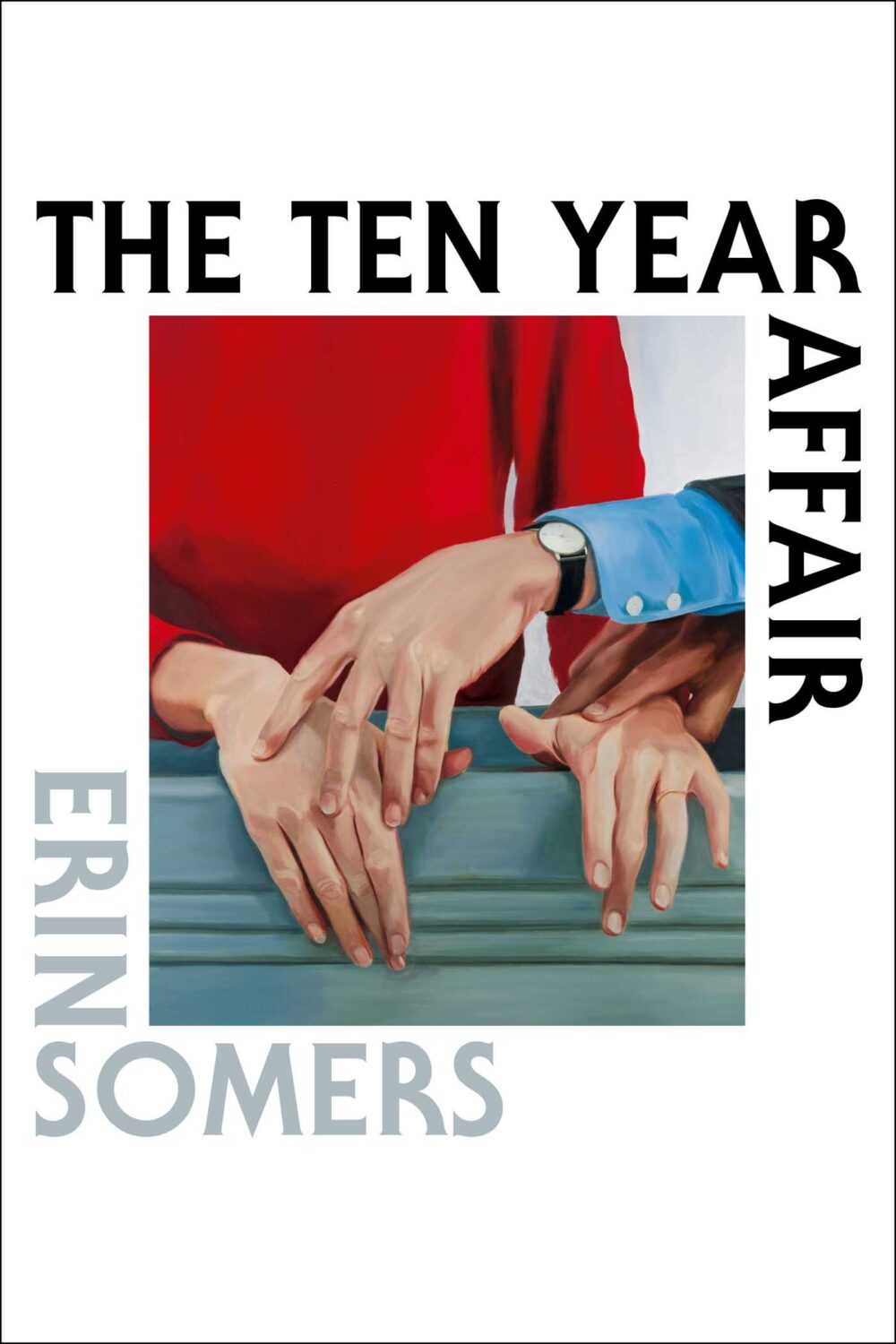
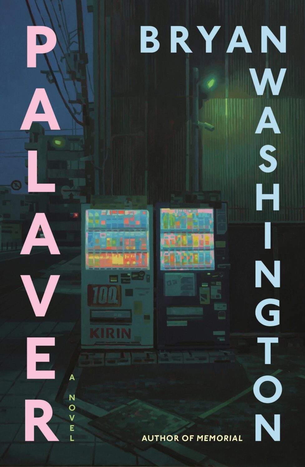
Culpability by Bruce Holsinger; design by Rodrigo Corral (Spiegal & Grau / July 2025)The True Happiness Company by Veena Dinavahi; design by Rachel Ake (Random House / May 2025)The Ten Year Affair; by Erin Somers; design by Emily Mahon; cover art by Shannon Cartier Lucy (Simon & Schuster / October 2025)Palaver by Bryan Washington; design by Na Kim; art by Keita Morimoto (Farrar, Straus & Giroux / November 2025)
I mentioned a wave of retro-nostalgic horror and suspense covers back in 2023 (I could’ve sworn it was last year until I checked!), but it feels like designers are still having fun with it as the genre as a whole gets more mainstream attention.
And speaking of nostalgia, I feel like covers inspired by 1980s advertising and airbrush art are suddenly a thing. There are a few examples from 2025, but it might be something we see more of next year as well.
Lastly, I just wanted to say thank you to everyone who supported the blog this year, especially the folks that helped out with cover images, credits, and corrections. I really appreciate you taking the time to reach out, and I’m sorry if you sent me a note and didn’t hear back. I try my best to read and reply to everything, but this is a one man show and sometimes life has other plans.
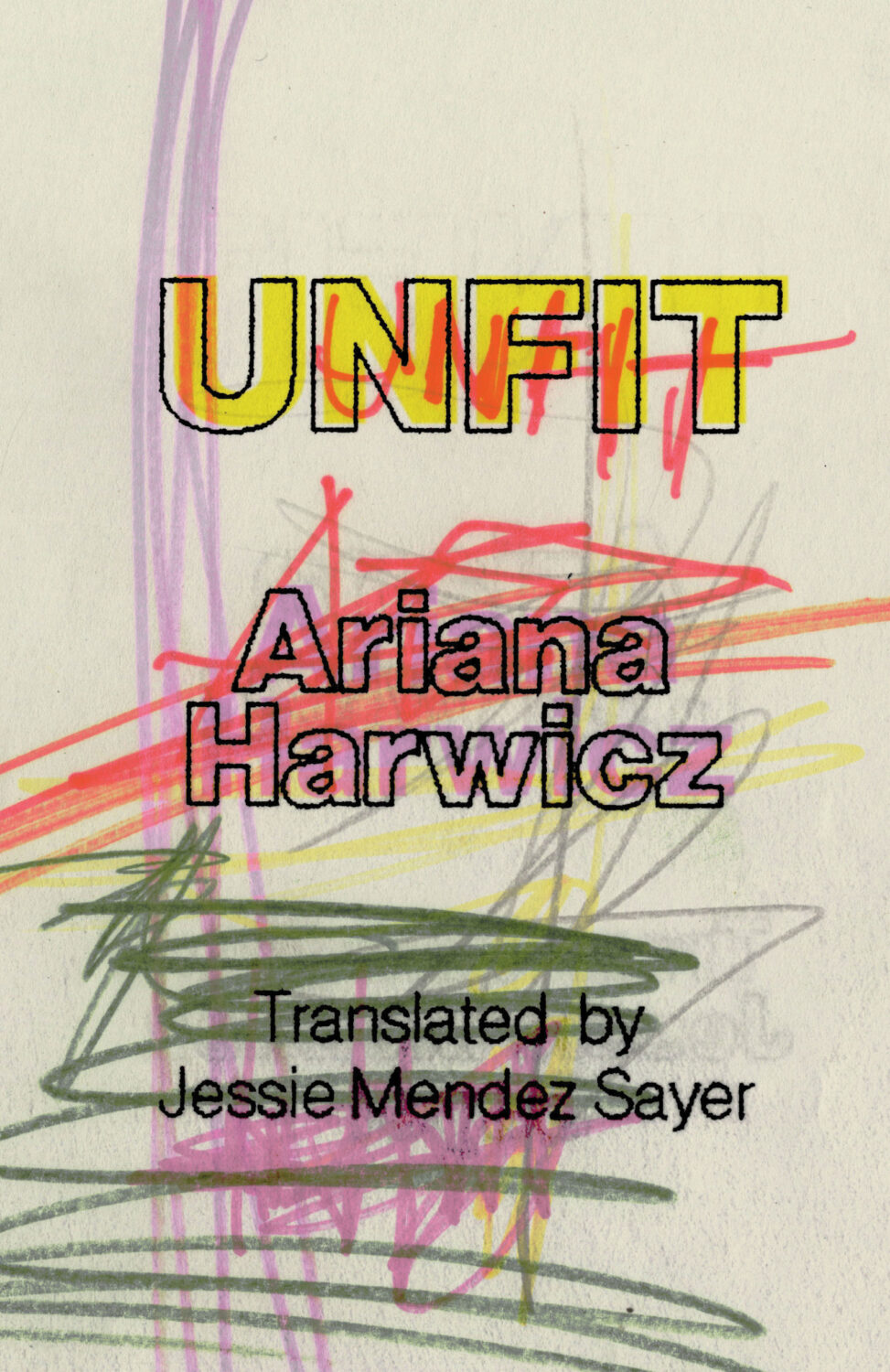
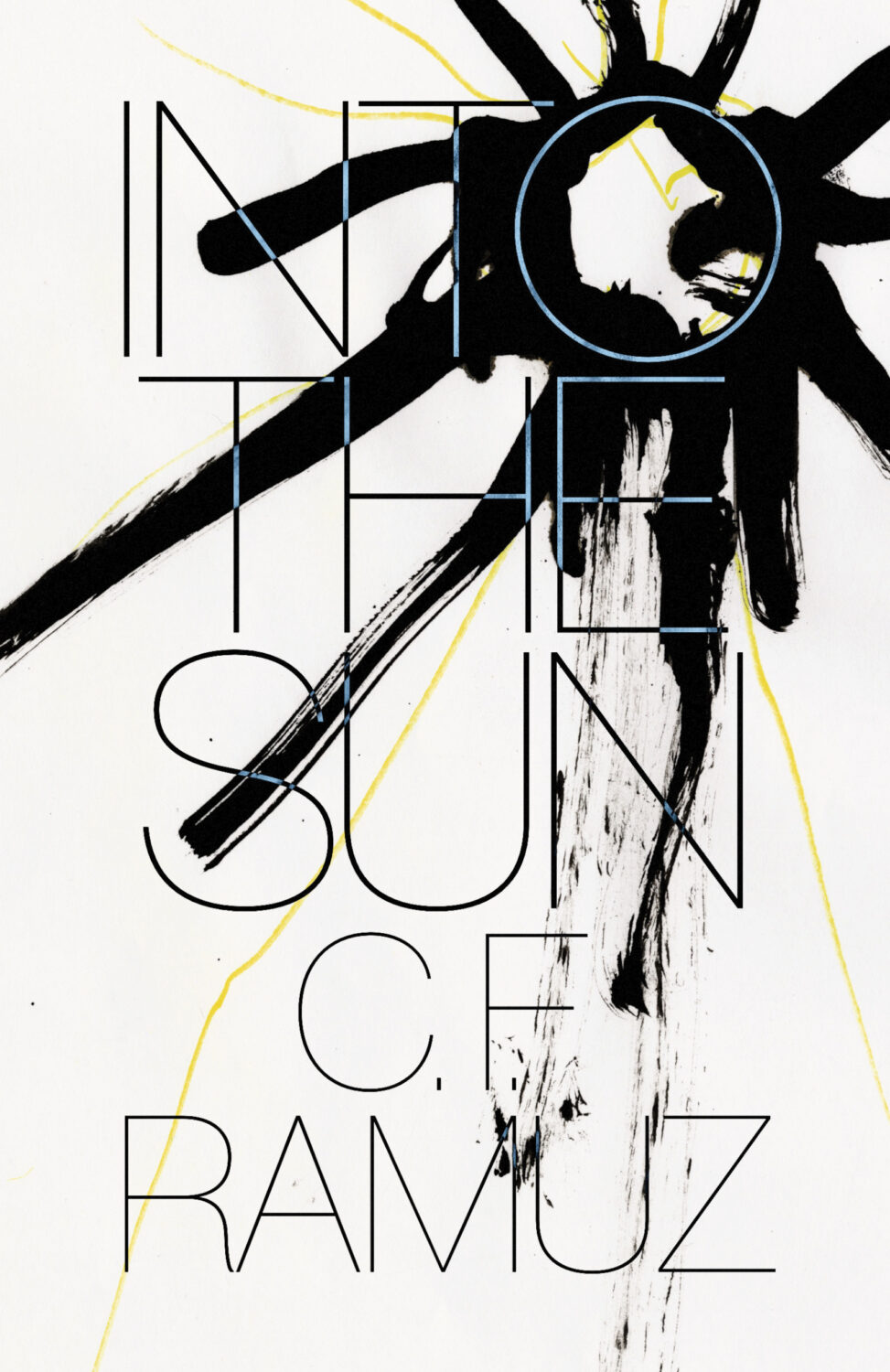
Unfit by Ariana Harwicz, translated by Jessie Mendez Sayer; design by Erik Carter (New Directions / October 2025)Into the Sun by C. F. Ramuz translated by Olivia Baes &, Emma Ramadan; design by Erik Carter (New Directions / August 2025)
Zone Rouge by Michael Jerome Plunkett; design by Jaya Nicely (Unnamed Press / September 2025)Open Up by Thomas Morris; design by Jaya Nicely (Unnamed Press / April 2025)
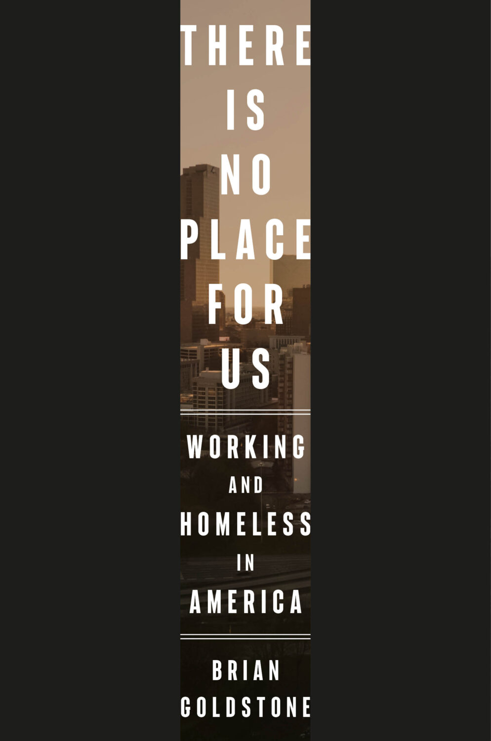
This reminded me of the cover of There Is No Place For Us by Brian Goldstone designed by Anna Kochman for Crown, which featured in March’s post. I’m no Barnett Newman, I do like a bold stripe.
Unfit by Ariana Harwicz, translated by Jessie Mendez Sayer; design by Erik Carter (New Directions / October 2025)
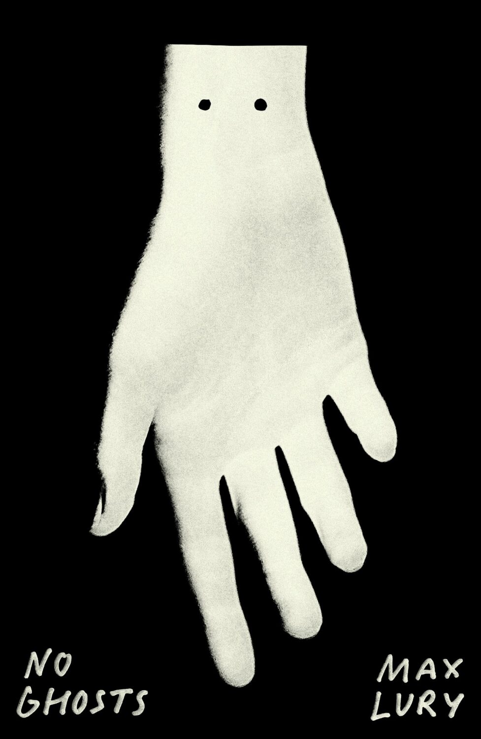
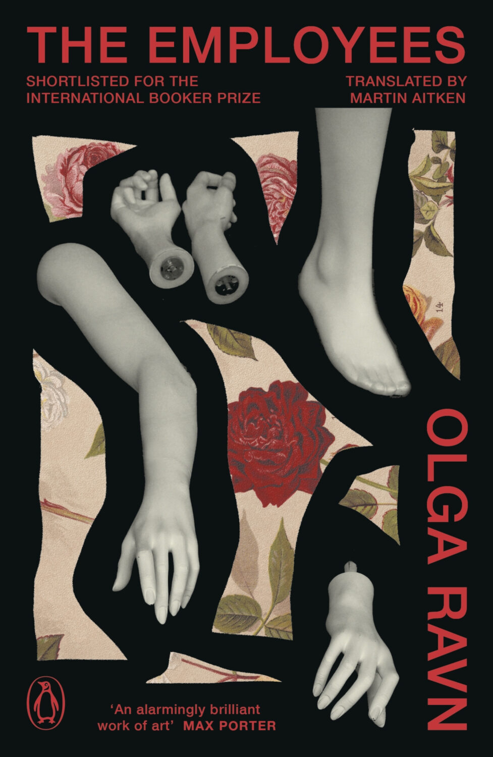
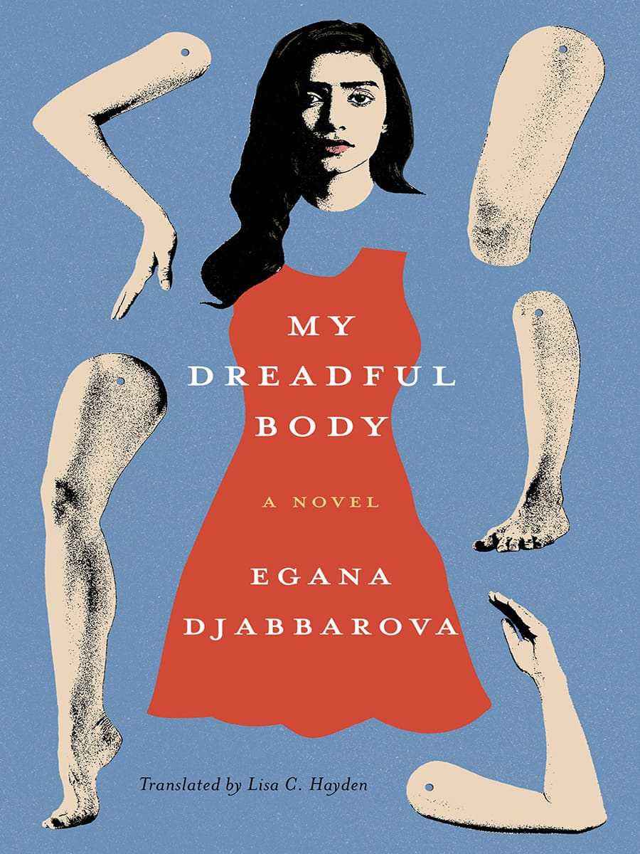
Dan Jackson also designed a new cover for the paperback edition of The Employees by Olga Ravn out next month in the UK from Penguin, which weirdly kind of looks like a Joan Wong collage, but could also be part of a dismembered / disembodied limbs on covers trend? I’m struggling to think of too many examples off the top of my head. Alban Fischer‘s cover design for My Dreadful Body by Egana Djabbarova? But that’s not out until next year. I’m sure there are a couple of others out there. I will have a think on it.
I am very late to this one, but the art is fun and it kind of fits with recent trends so I didn’t want to leave it out. Let me know if there is a design credit to add.
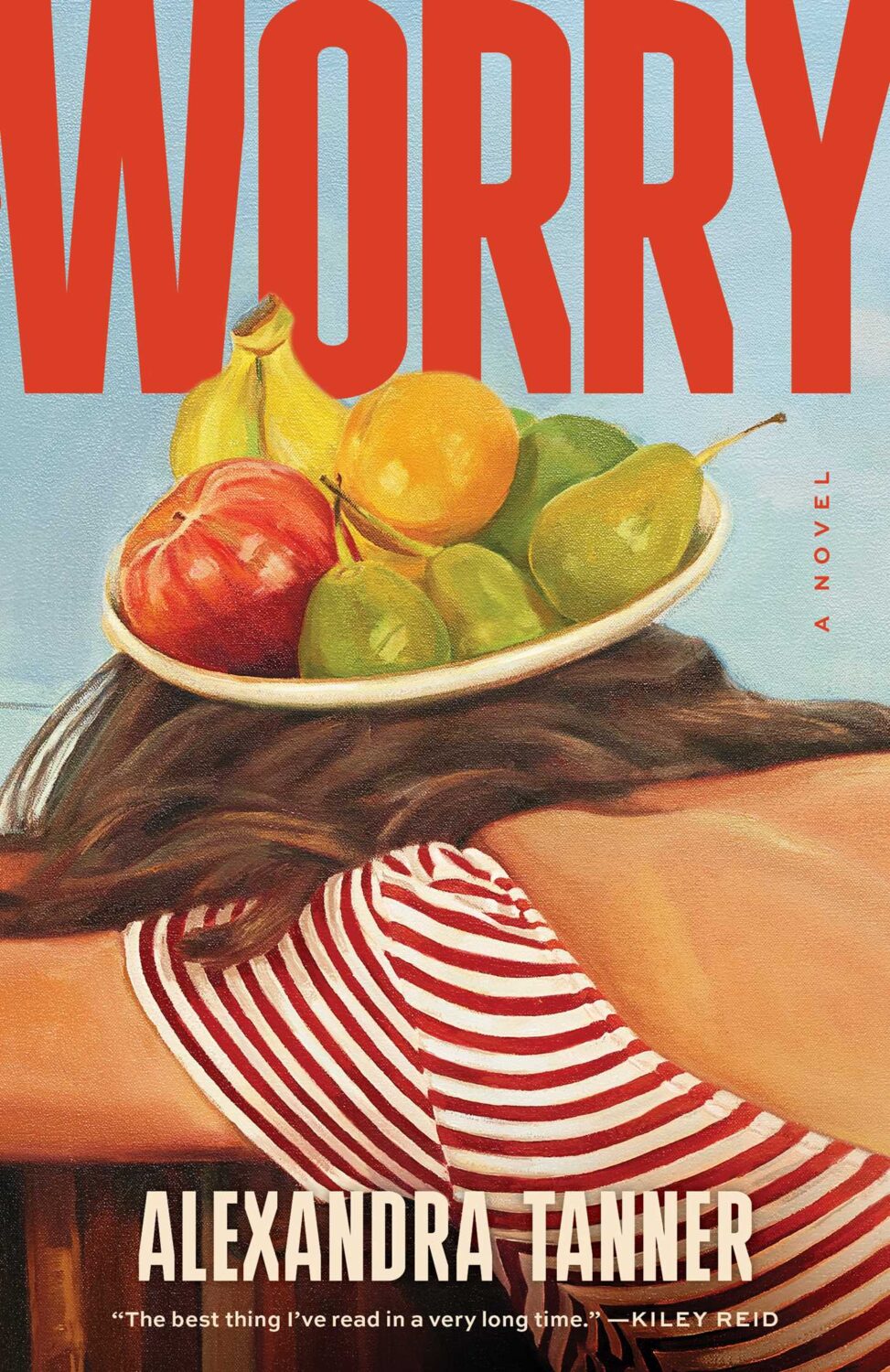
Interestingly, Shannon Cartier Lucy’s art was also used on the cover of Worry by Alexandra Tanner designed by Alicia Tatone for Scribner from last year…
Somehow it is the end of July, and I am once again rushing to get this done. I think it’s a decent mix of covers this month though, with some big books, some indies, a few type-only covers, some nice art, and a couple of trends to watch out for. I’m glad it’s all come together, even if it is last minute!
Thanks to everyone who took time to help me with cover images and design credits over the past couple of weeks (days!) — it’s really, really appreciated! I hope everyone is having a good summer.
Hey, sorry, just sliding in under the wire with another slightly rushed post this month. I hope everyone is safe and well (all things considered). Let’s just get on with it shall we?
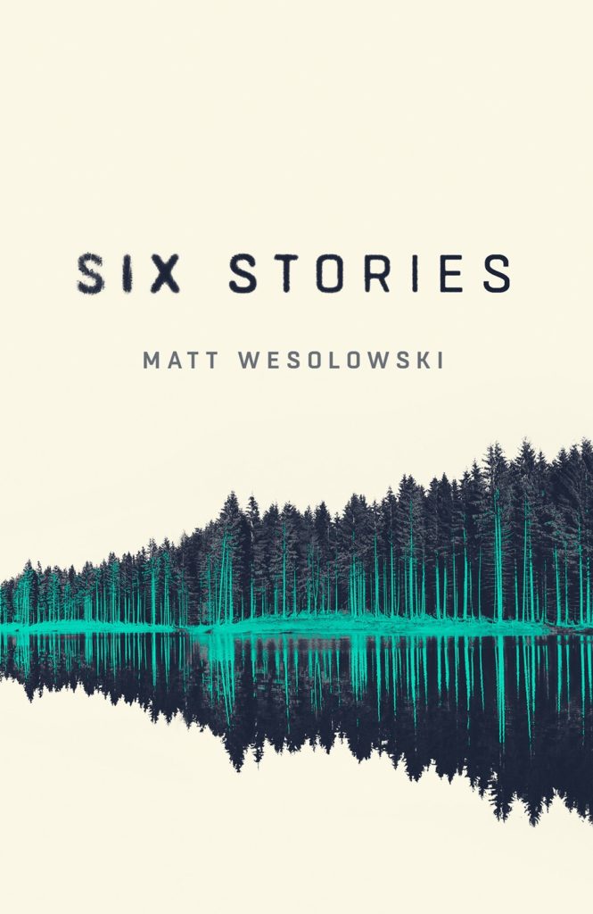
Also, the cover of Matt Wesolowski’s book Six Stories designed by Mark Swan was featured here way back in April 2017 (which was a pretty good month for covers!)
Jenny has a new portfolio site so go check that out. (Also, if anyone has a higher res version of the cover for The Holy Innocents, please send it over! I’d love to have a better one. Thanks!)
I am a sucker for good photo selection on a cover. This photo is from Ed Templeton’s series/installation (and book) Teenage Smokers. Although it is kind of interesting to me that a book with such a British title uses a photograph by an American photographer, but it does have incredible 1990s vibes.
The cover of the UK edition, published by Daunt Books, was designed by Kishan Rajani. It’s interesting to see the differences in two covers with a similar approach…
Hey, I hope you’re all keeping safe and well. Apologies for a slightly rushed post this month. It’s been kind of a busy time, and I’m travelling for work next week, so I’m sure I’ve missed a few covers and connections. I’ll try to catch up over the summer if/when things quieten down. Anyway… there are still lots of great covers in this month’s post — some from the usual suspects for sure, but also a few indies, a university press, a couple of covers from the UK and Ireland, and one from Canada…
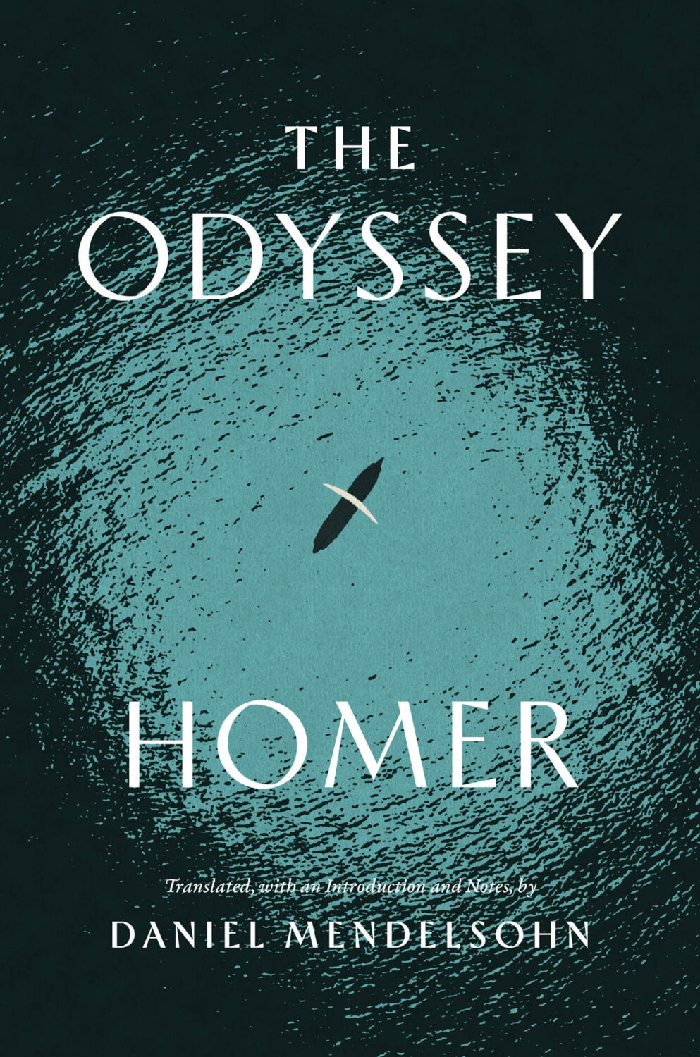
The Odyssey translated by Daniel Mendelsohn; design by Monograph (University of Chicago Press / April 2025)
I was reminded of Matt’s 2017 cover for David Ferry’s translations of the Aeneid from University of Chicago Press. It sticks in my mind at least partially for it’s use of Sandrine Nugue’s typeface Infini.
The Aeneid by Virgil (University of Chicago Press) Design by Matt Avery
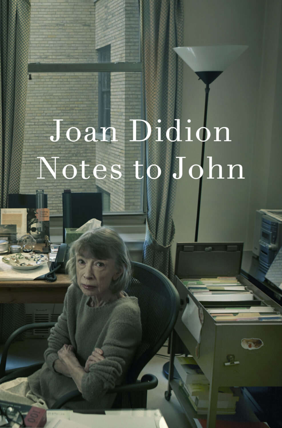
Notes to John by Joan Didion; design John Gall; photograph by Annie Leibovitz (Knopf / April 2025)
The photo feels very appropriate given how Didion would probably have felt about this book being published.
The cover of the US edition, published by Knopf this month, was designed by John Gall (the art is from Portrait of a Boy with a Falcon by 17th century Flemish painter Wallerant Vaillant, which is part of the Met’s collection in NYC if you’re curious)
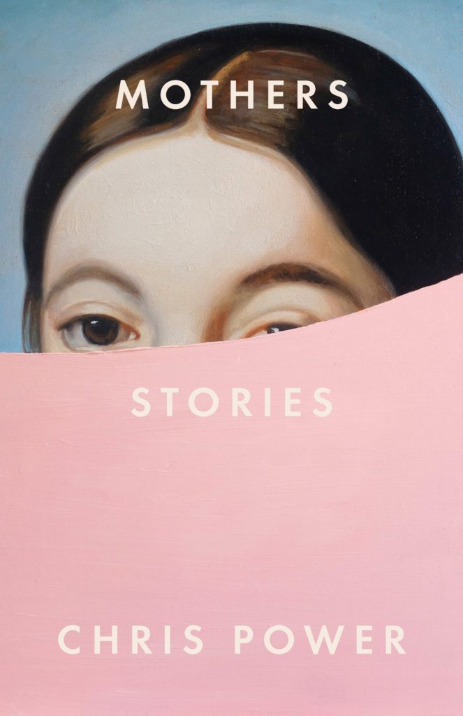
I love the bold movie-posterness of this design, but I also like to think it’s secretly the completes the cover for Mothers by Chris Power designed by Grace Han…
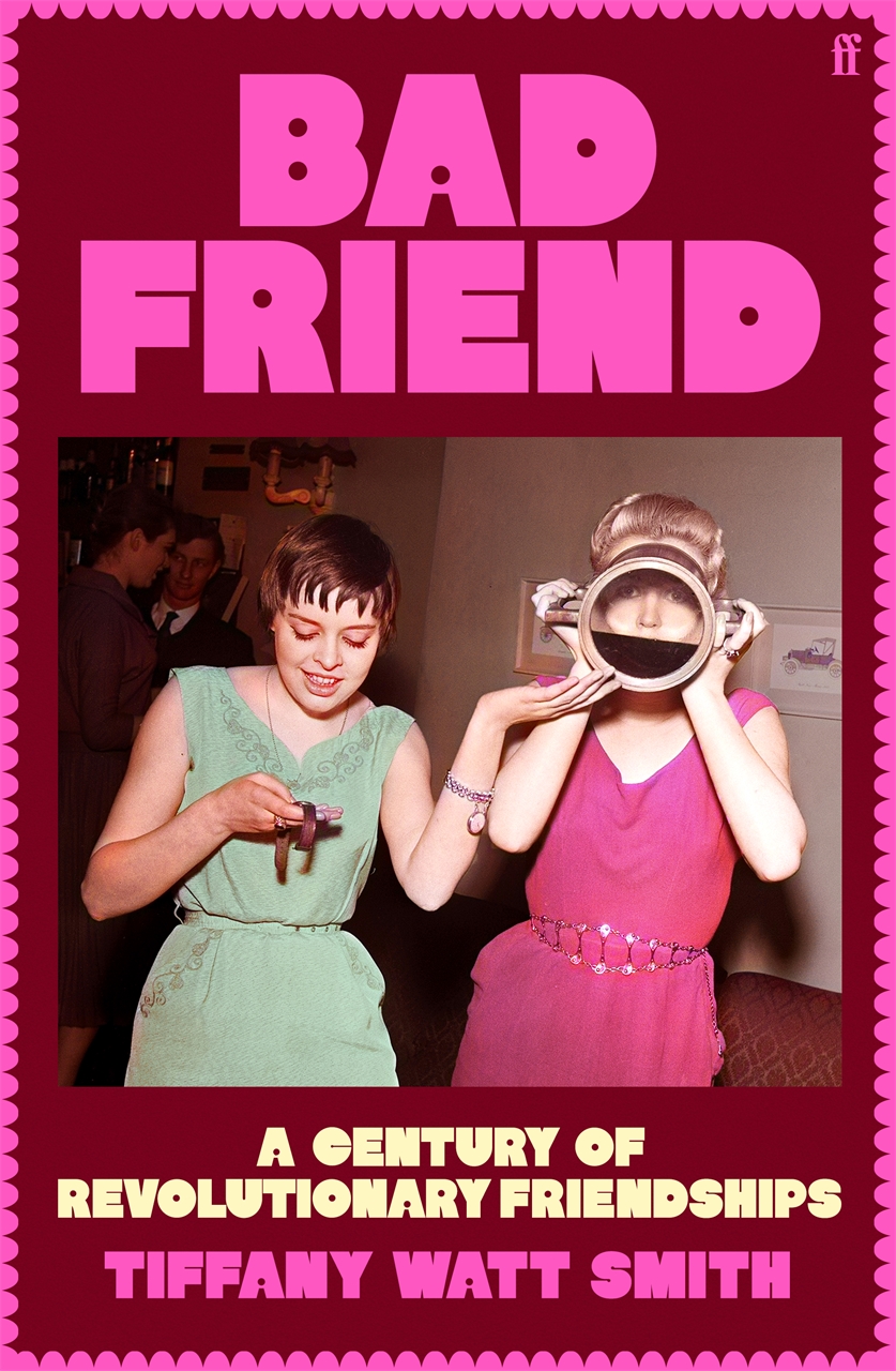
Typefaces with dots are apparently a thing at the moment. The cover of Bad Friend by Tiffany Watt Smith from Faber, also out this month, uses type that has dots for counters too. Please let me know who the designer is and I’ll happily add the credit.
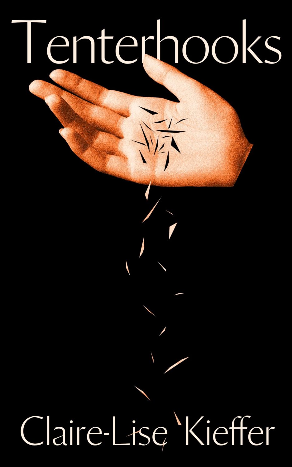
Tenterhoooks by Claire-Lise Kieffer; design by Jack Smyth (Banshee Press / February 2025)
Jack’s conversation with Steve Leard on the Cover Meeting podcast is really great if you haven’t listened to it yet.
Hey, I hope you’re keeping safe and well wherever you are. Apart from the weird Toronto weather, it is definitely FALL here with the kids back in school and days of seemingly endless pre-sales calls and shortlists. It is also the time of year for “big” books of course, and there are more covers from the conglomerate publishers in this month’s post than I would generally like. My sense is that independent publishers try to avoid releasing their books in September if they can these days, but maybe I just haven’t seen the right ones? Anyway I guess we should be glad the big guys still care about fun covers, right?
Hey, I hope you’re safe and well. I’m a little bit ahead of schedule because fall sales conference season is upon us, and I have to be in New York for work next week. I’m less ahead than I would’ve liked — PRINT has already beaten me to the punch! — but here we are, a couple of days earlier than usual, with another look at some new and recent book covers. April is National Poetry Month in the US so there are a few poetry covers in the mix, as well as a couple of covers from independent presses, an Australian cover, and all the usual suspects.
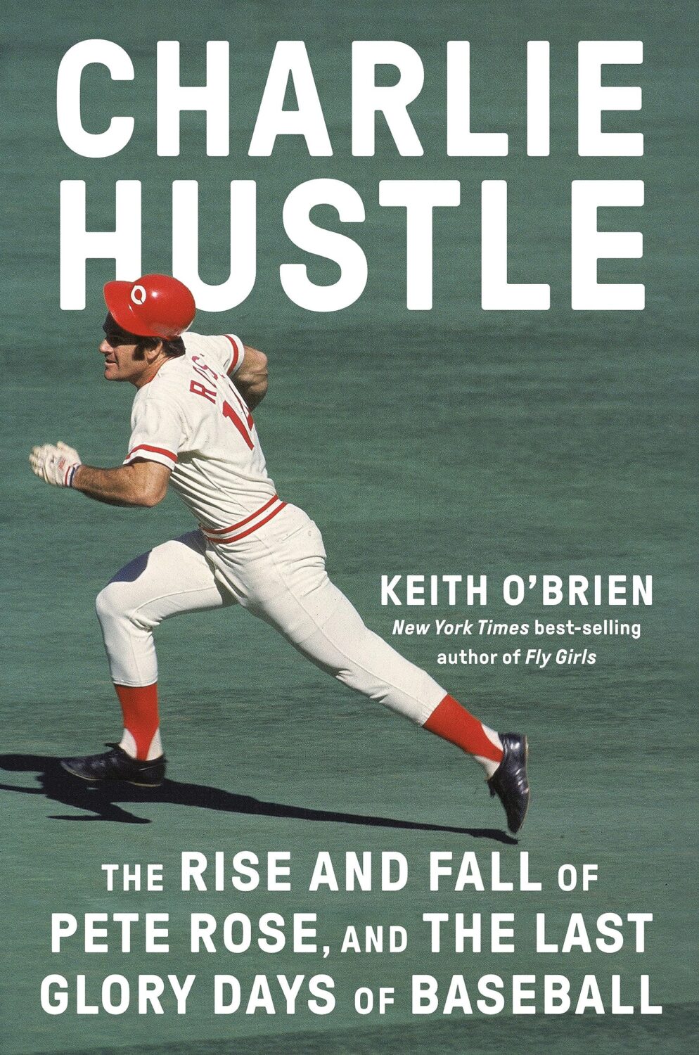
The Formula by Joshua Robinson and Jonathan Clegg; design by Pete Garceau (Mariner Books / March 2024)
Two nonfiction sports books in one post! Does Formula One really count as a sport? Not for me, Clive. But the subtitle says it is, and a Canadian friend once told me that for something to qualify as a sport it has to endanger your life in some fundamental way, so I guess F1 qualifies under Quebec Rules for Teen Boys if nothing else.
Anyway, it might be fun to do a post of interesting sports books covers at some point if I can find the time (let me know if any great examples come to mind!).
I feel like this is a bit different for a psychological thriller? I like the type a lot.
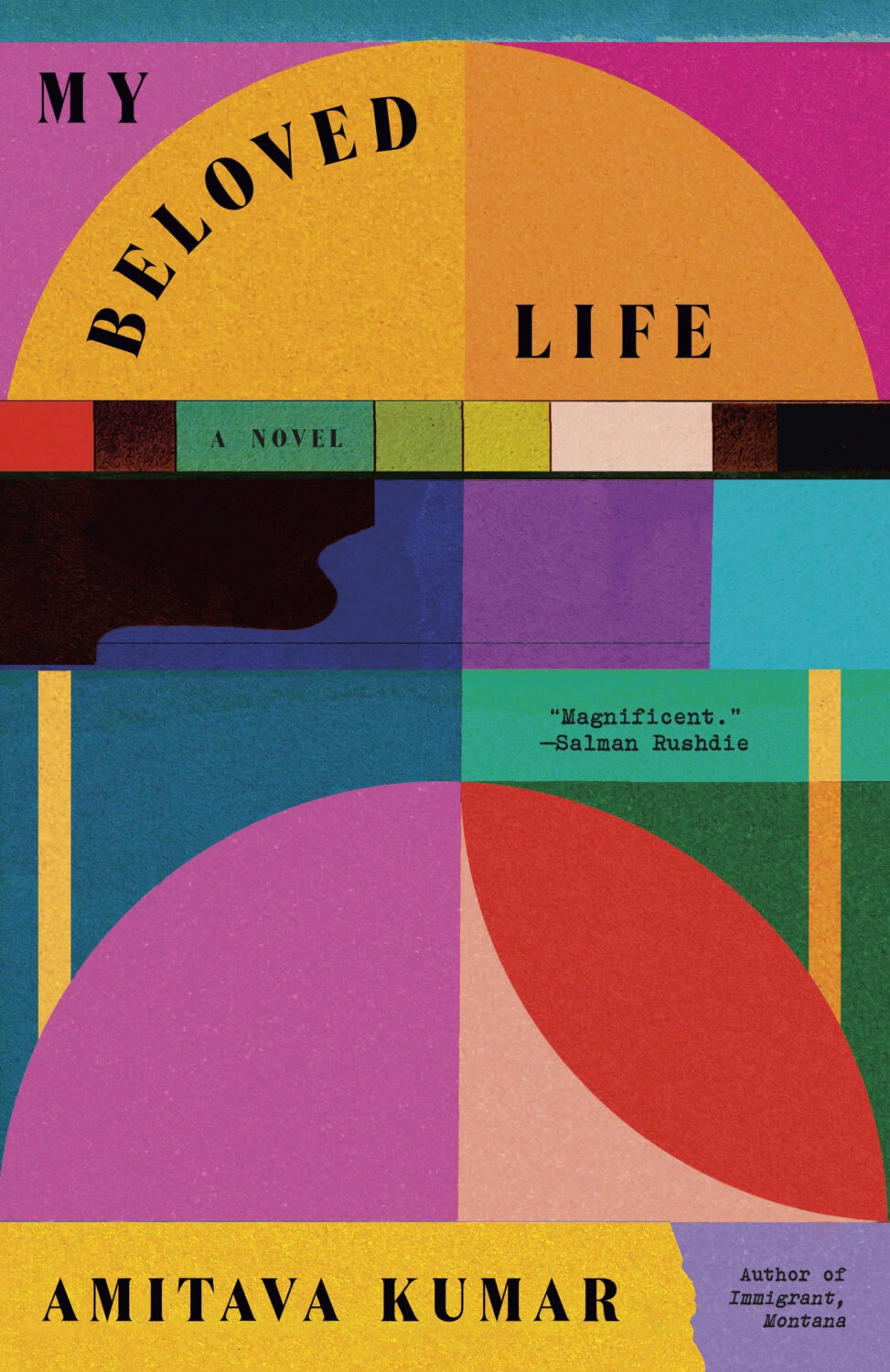
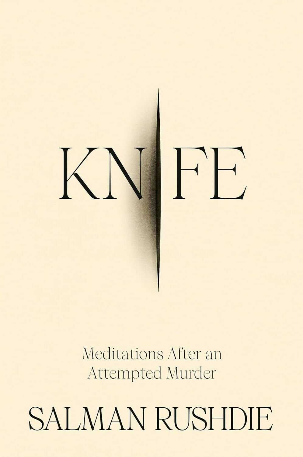
Knife by Salman Rushdie; design by Arsh Raziuddin (Random House / April 2024)
Interestingly, there is an “eye” motif on the spine with the Random House logo in the centre. Look for it next time you’re in a bookstore.
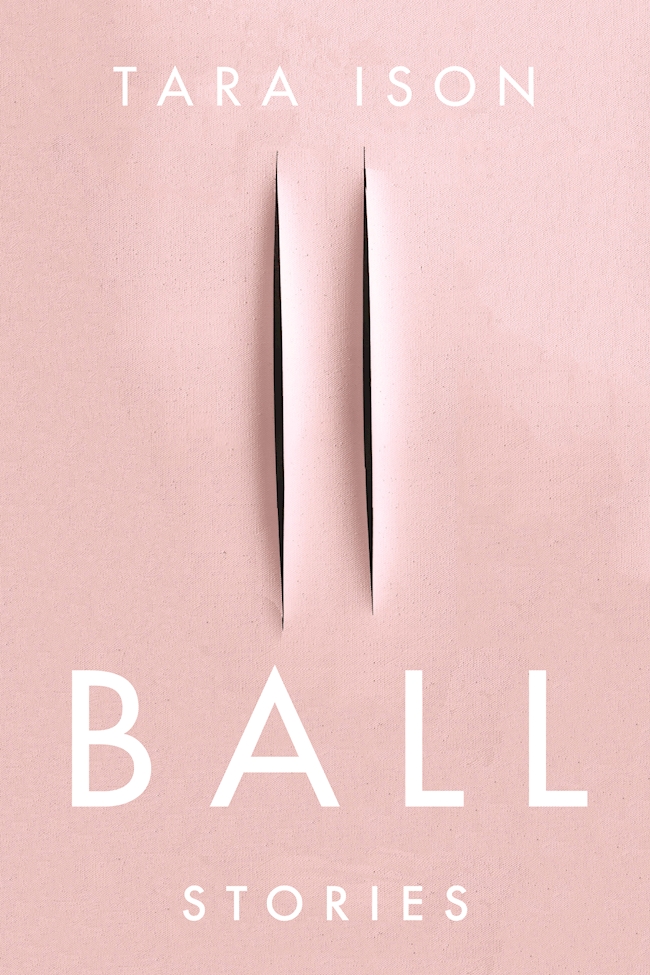
Also, this cover isn’t the first to riff, consciously or otherwise, on the cut canvases of Italian artist Lucio Fontana. The cover of Ball by Tara Ison, designed by Kelly Winton, comes to mind. I’m sure there are other examples (David Gee’s unpublished cover for Lolita. Are the more?).
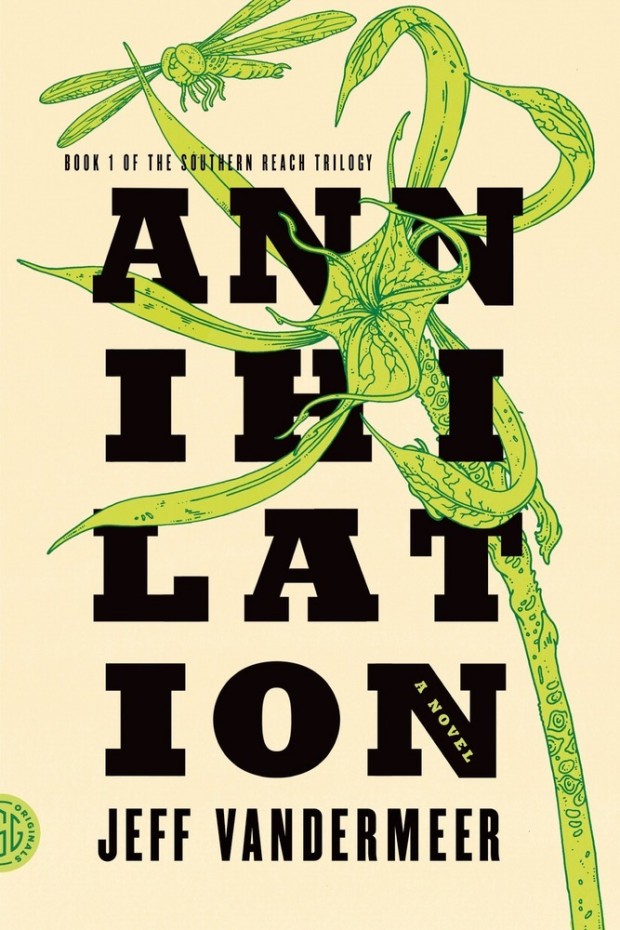
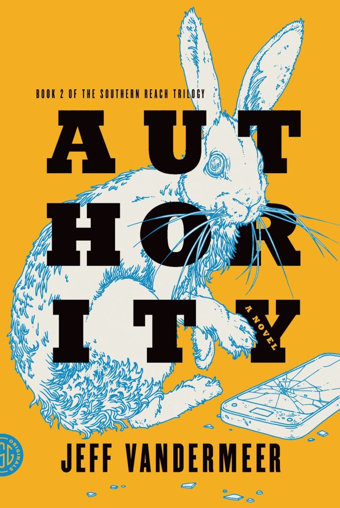
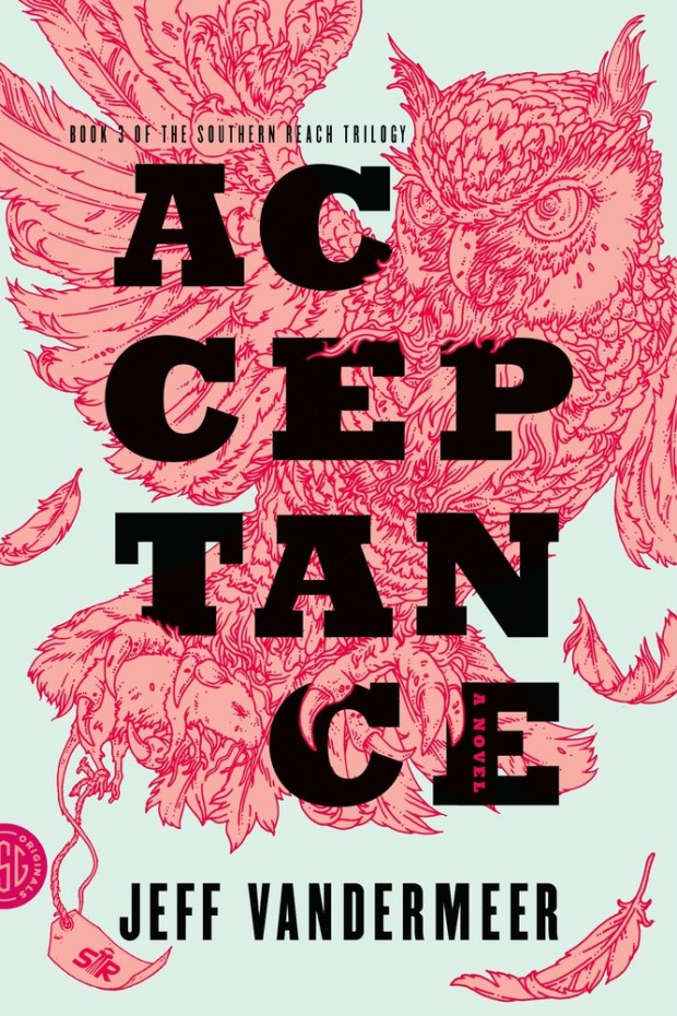
This reminded me of Eric’s illustrations for the covers of Jeff Vandermeer’s Southern Reach trilogy designed by Charlotte Strick.
Annihilation by Jeff VanderMeer (US); design by Charlotte Strick; Illustration by Eric Nyquist (FSG / 2014)Acceptance by Jeff VanderMeer (US); design by Charlotte Strick; Illustration by Eric Nyquist (FSG / 2014)
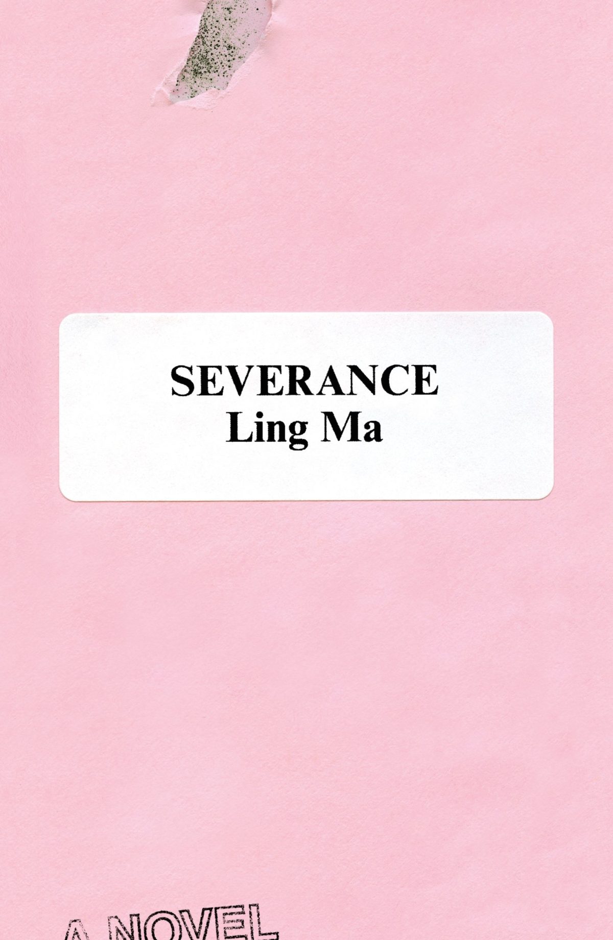
Rodrigo Corral also designed the cover of Ling Ma’s previous novel Severance.
Canción by Eduardo Halfon; design by Alban Fischer (Bellevue Literary Press / September 2022)
Drive by James Sallis; design by David Litman (Poisoned Pen Press / September 2022)
I was just talking about this book — how it is a near perfect thriller, but also great for dudes who don’t read a lot of fiction — so I was happy to see it’s been given a new lick of paint. And pink covers are, as I keep saying ad nauseam, a thing…
I’m including this because of the beautiful photo (with a colour palette remarkably on trend in 2022) and my inevitable teenage crush on indie style icon Miki from Lush.
Sacrificio by Ernesto Mestre-Reed; design by Dana Li (SoHo Press / September 2022)
This reminded me Peter Mendelsund‘s Amerika cover for Schocken back in the day. But, as is the norm around here, the two covers do not actually look that much alike side by side…
I compile these posts over the month and then write this bit at the end if I have anything to say. I really don’t have the words at the moment. Posting about the most superficial of subjects feels faintly ridiculous at the end of yet another awful week. But here we are. I am just going to refer you to Wednesday’s Today in Tabs and say that there a lot of really nice covers this month if you are need of distraction…
Appliance by J. O. Morgan; design by the author (Jonathan Cape / May 2022)
I was reminded of Jon Gray‘s cover for Ilustrado by Miguel Syjuco from what seems like ages ago (2010)… Of course they look nothing alike. I had completely forgotten the pen was at jaunty angle.
The cover of the US edition was designed by Rachel Ake Kuech using a illustration by Grant Haffner. The difference between how Canada represents Canada and how the US represents Canada is…. interesting.
Big vertical light leaks might also be a thing… (Freedomland designed by Henry Sene Yee for Cornell University Press)
Earlier this year, a Canadian magazine asked me what the latest trends in book cover design were. I don’t think I had a very satisfactory answer. 2021 felt very much like a continuation of 2020, which itself felt like a year on hold.
The trends that came to mind were not exactly new. In no particular order: big faces (big sunglasses!); cropped faces; hands; mouths; postmodern typefaces;1 big skies; rainbows; gradients; the colour orange; psychedelia; collage; contemporary painting.
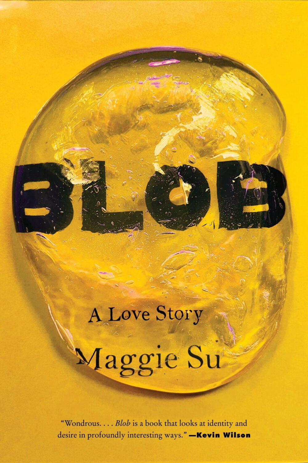
A lot was made of “blob” covers this year. I’m not sure that anything has really changed since Vulture published this article about “blocky” covers in 2019. They seemed like much the same thing.
Design is about the constraints and, as it turns out, the constraints around designing commercial literary fiction covers that have to work just as well online as in bookstores can lead to similar design solutions — large, legible type, and bright, abstract backgrounds. 2 The surprising thing is not that a few covers look the same when you squint; it’s that more of them don’t.
There were a lot of good covers (that didn’t look alike) in 2021. LitHub posted 101 of them. Still, it didn’t exactly feel like a vintage year.
Do I say that every December? Possibly.
A few years ago I worried that covers were moving in a more conservative direction, particularly at the big publishers. I’m not sure this has come to pass, at least not in the US. There are plenty of covers from the big, prestigious American literary imprints in this year’s list, as there were last year, and every year before that.
There are fewer covers from the UK in this year’s list than in previous years though, and I feel less confident about the situation there. From a distance, things seem a little sedate. I may be mistaken. It’s quite possible I haven’t see enough covers — or perhaps enough of the right ones — from British publishers to get a good sense of the overall picture.3
It would not be a surprise, however, if publishers were feeling a little risk-averse at the moment. We are two years into a global pandemic, experiencing a major supply chain issues, and living through a seemingly endless series of sociopolitical crises.
Nor would it be a surprise if designers were personally feeling the effects too — I’m not sure we are talking about this enough, and I’m not sure I know how to.
Thank you to everyone who has supported the blog in 2021. It means a lot. Here are this year’s book covers of note…
Na Kim talked to PRINT about her career and the designs for the Ditlevsen series in February. If, like me, you were wondering about typeface on the covers, it’s Prophet from Dinamo apparently.
If you’re wondering about the Super-Seventies Sally Rooney typeface, it is Ronda designed by Herb Lubalin and Tom Carnese (I only know because I asked).
Thank you to everyone who has supported the blog in 2021. It means a lot.
I am not convinced that the term “postmodern” quite captures what I mean here (and/or worse, implies something different in the context of typography), but it’s the best I’ve got. I’m not talking about the kind of experimental typography you might associate with the likes of Wim Crouwel or Emigre, or the aesthetic of someone like David Carson. What I am trying to get at is idiosyncratic type that purposely exaggerates or plays with letterforms, and doesn’t conform to function-first modernism. To my mind, this would include some typefaces from the 1960s and 70s, as well as some more contemporary type. In a sense what I am describing is display faces — and I think the eclectic, innovative use of type in Victorian advertising might be an inspiration to designers here — but I don’t think it is just about size. ↩


