Hey, I hope you’re keeping safe, well and warm (or cool!) wherever you are.
If you missed it, my first post of 2025 was a look back at some of last year’s YA covers. You can find my 2024 list of notable literary covers here. Both posts got me thinking more generally about these lists. Do I need to change things up? Or stop altogether? Several other sites are posting lists that do much the same thing mine, and they are all starting to feel too alike. I don’t have answer, and I don’t really know I would do differently. I’m struggling to post once a month as it is. For now at least I’ll keep posting the covers that interest me. It’s just something that’s on my mind, and I have other projects I’ve been neglecting, so I’m curious if you have opinions.
Anyway, this month’s post is a bit of a short (but good!) one, and includes a couple of covers that I missed in 2024 for one reason or another. Enjoy!
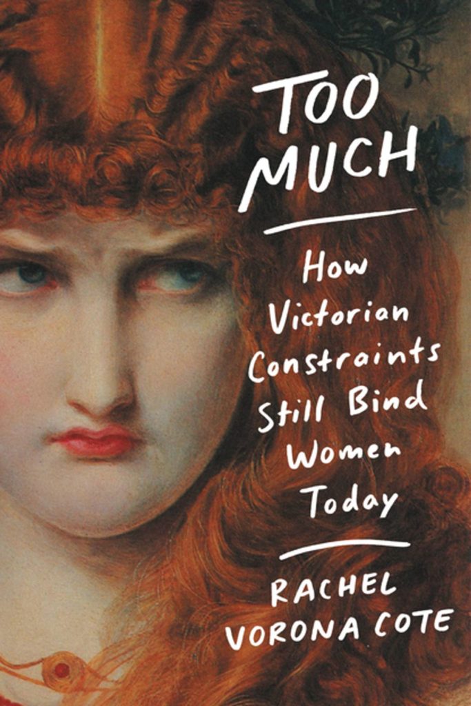
Eurotrash by Christian Kracht; design by Sinem Erkas (Profile Books / November 2024)
I do really like this cover. It looks great! But it also looks a lot like non-fiction, especially when compared to the cover of the US edition (Liveright, October 2024) designed by Jason Heuer. They look like completely different books!
And speaking of Jason Heuer, he’s made a series of fun videos talking about embarrassing moments from his early graphic design career. You can find them on YouTube and Instagram. In the second episode Jason talks about his first book design credit…
Earlier this year, a Canadian magazine asked me what the latest trends in book cover design were. I don’t think I had a very satisfactory answer. 2021 felt very much like a continuation of 2020, which itself felt like a year on hold.
The trends that came to mind were not exactly new. In no particular order: big faces (big sunglasses!); cropped faces; hands; mouths; postmodern typefaces;1 big skies; rainbows; gradients; the colour orange; psychedelia; collage; contemporary painting.
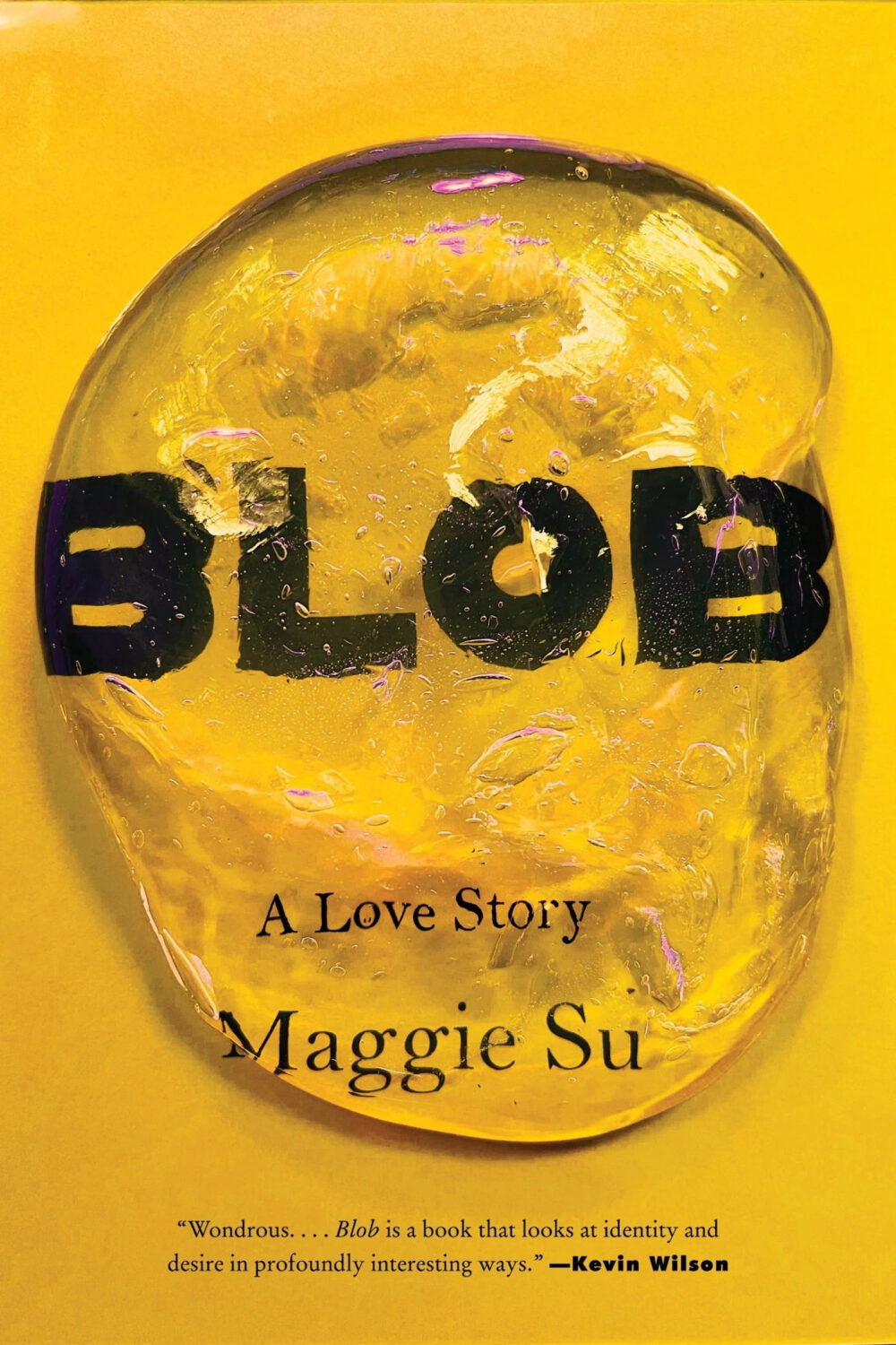
A lot was made of “blob” covers this year. I’m not sure that anything has really changed since Vulture published this article about “blocky” covers in 2019. They seemed like much the same thing.
Design is about the constraints and, as it turns out, the constraints around designing commercial literary fiction covers that have to work just as well online as in bookstores can lead to similar design solutions — large, legible type, and bright, abstract backgrounds. 2 The surprising thing is not that a few covers look the same when you squint; it’s that more of them don’t.
There were a lot of good covers (that didn’t look alike) in 2021. LitHub posted 101 of them. Still, it didn’t exactly feel like a vintage year.
Do I say that every December? Possibly.
A few years ago I worried that covers were moving in a more conservative direction, particularly at the big publishers. I’m not sure this has come to pass, at least not in the US. There are plenty of covers from the big, prestigious American literary imprints in this year’s list, as there were last year, and every year before that.
There are fewer covers from the UK in this year’s list than in previous years though, and I feel less confident about the situation there. From a distance, things seem a little sedate. I may be mistaken. It’s quite possible I haven’t see enough covers — or perhaps enough of the right ones — from British publishers to get a good sense of the overall picture.3
It would not be a surprise, however, if publishers were feeling a little risk-averse at the moment. We are two years into a global pandemic, experiencing a major supply chain issues, and living through a seemingly endless series of sociopolitical crises.
Nor would it be a surprise if designers were personally feeling the effects too — I’m not sure we are talking about this enough, and I’m not sure I know how to.
Thank you to everyone who has supported the blog in 2021. It means a lot. Here are this year’s book covers of note…
Na Kim talked to PRINT about her career and the designs for the Ditlevsen series in February. If, like me, you were wondering about typeface on the covers, it’s Prophet from Dinamo apparently.
If you’re wondering about the Super-Seventies Sally Rooney typeface, it is Ronda designed by Herb Lubalin and Tom Carnese (I only know because I asked).
Thank you to everyone who has supported the blog in 2021. It means a lot.
I am not convinced that the term “postmodern” quite captures what I mean here (and/or worse, implies something different in the context of typography), but it’s the best I’ve got. I’m not talking about the kind of experimental typography you might associate with the likes of Wim Crouwel or Emigre, or the aesthetic of someone like David Carson. What I am trying to get at is idiosyncratic type that purposely exaggerates or plays with letterforms, and doesn’t conform to function-first modernism. To my mind, this would include some typefaces from the 1960s and 70s, as well as some more contemporary type. In a sense what I am describing is display faces — and I think the eclectic, innovative use of type in Victorian advertising might be an inspiration to designers here — but I don’t think it is just about size. ↩
A big, messy post this month as I catch up on the new releases and some of the covers I missed over the summer. I expect the next couple of month’s might be a bit like this as I work towards my round-up of the year, so feel free to let me know about stuff that you think I’ve overlooked in 2021.
For some reason, I was reminded of this saucy Jacob Covey cover, which I thought was killed in favour of something more (ahem) traditional, but it still exists on Amazon, so who knows? (Jacob probably knows; I do not).
The don’t look that similar side by side, by I was reminded of Will Staehle‘s 2018 cover for Circe by Madeline Miller, and the UK cover of the more recent Sistersong by Lucy Holland, designed by Melissa Four (I’m fairly sure I’ve seen an orange/red version of the Sistersong cover. Perhaps it was an ARC?).
Circe by Madeline Miller; design by Will Staehle (Little Brown & Co / April 2018)
When I first saw this cover I immediately thought there was some kind of link to Josef Albers ‘Homage a Square’ series, but nobody else seems to have mentioned it, so perhaps it is coincidental? Is that possible? I should probably pick up the book!
I was immediately reminded of the cover of Department of Speculation by Jenny Offill, also designed designed by Linda Huang:
The cover of the UK paperback of Weather, published by Granta this month, was designed by Jo Walker. She wrote about her design process for Spine Magazine.
Interesting that both paperback designs are so different from each other and their respective hardcovers (which were quite different to each other too)…
Meh. February. At least it’s almost over (and the book covers are good).
The Bear by Andrew Krivak; design by Alban Fischer (Bellevue Literary Press / February 2020)
(I read an ARC of The Bear last year (full disclosure: the folks that pay me distribute Bellevue Literary Press in Canada), and haven’t really stopped talking about it since, so I may as well mention here too. It’s very sincere, and reminiscent of the kind of Cold War science fiction in which war and environmental catastrophe have led to the end of civilization. It is not dystopian though. It reads rather like beautiful melancholy fable. I liked it a lot.)
One for the meta-covers list (and does the use of Lydian on the cover of a book on the cover of book count as ironic?)
The Mercies by Kiran Millwood Hargrave; design by Lucy Kim (Little Brown & Co / February 2020)
The cover of the UK edition published by Picador was designed by Katie Tooke I believe (and if anyone can tell me who the did the illustration — based on traditional Norwegian folk art rosemaling — I would be grateful!)
Verge by Lidia Yuknavitch; design by Rachel Willey (Riverhead / February 2020)
Whistleblower by Susan Fowler; design by Catherine Casalino (Viking / February 2020)
Nice type.
Weather by Jenny Offill; design by John Gall (Knopf / February 2020)
There haven’t been very many John Gall covers on the blog recently, so it’s a delight to post two in the same month. And this really is a most Gallian of John Gall covers.
The cover of the UK edition of Weather, published by Granta, was designed by Gray318…