Skip to content

Tag: geoff dyer

Book Covers of Note November 2018

This is my last monthly round-up for 2018. Next month I’ll post my round-up for the year. I have to confess that I have not given the blog 100% of my attention of late, so if you think that there are covers I might’ve overlooked this year please feel to send them my way for consideration. 


Bitwise: A Life in Code by David Auerbach; design by Tyler Comrie (Pantheon / August 2018)


The Book of Beautiful Questions by Warren Berger; design by Tree Abraham (Bloomsbury / October 2018)


‘Broadsword Calling Danny Boy’ by Geoff Dyer; design Jim Stoddart (Penguin / October 2018)

The blackletter is similar, I believe, to the type used for the movie title / credits, and the chevrons are a nice reference to a design that appears in the movie. The Guardian reviewed the book last month if you are curious. (And someone in the UK needs to buy it for me as a Christmas present!)


The Deserters by Pamela Mulloy; design by David Drummond (Véhicule Press / September 2018)


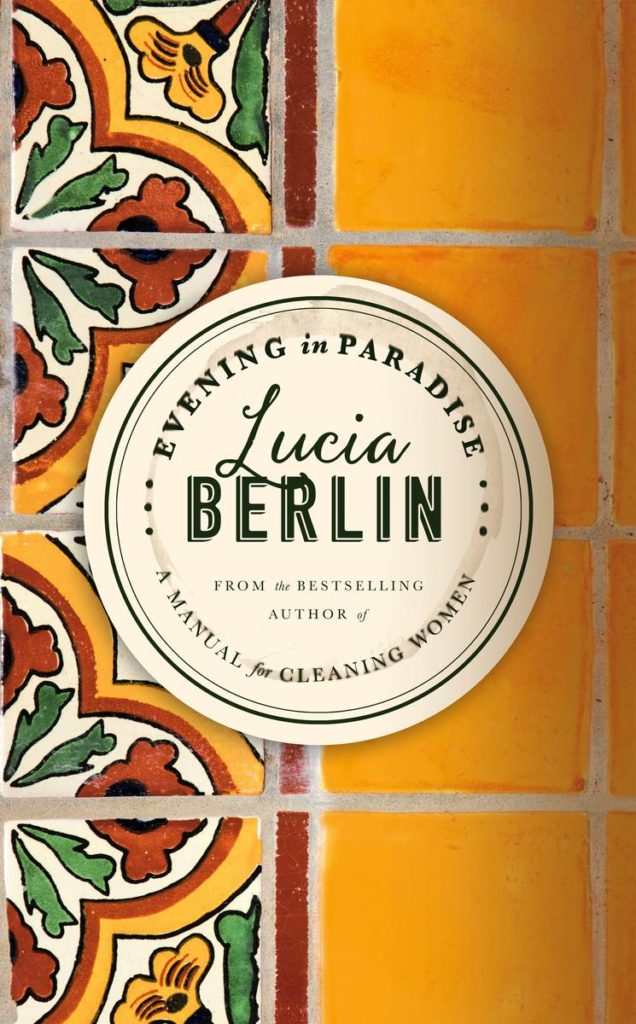
Evening in Paradise by Lucia Berlin; design by Na Kim (Farrar, Straus and Giroux / November 2018)

Na Kim designed the cover for Welcome Home by Lucia Berlin, also released this month, too:

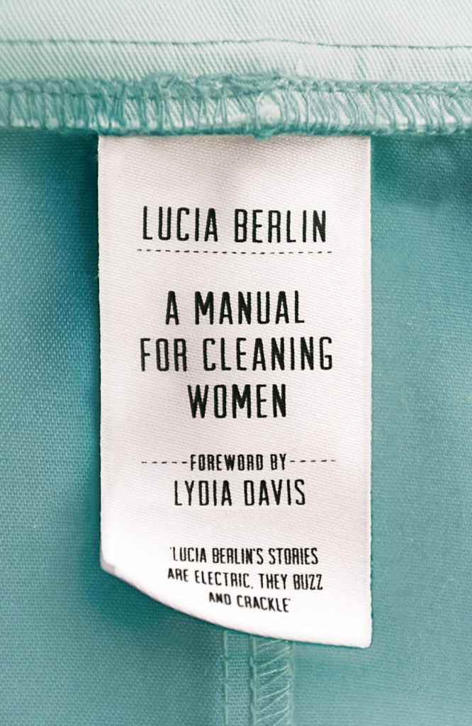
The cover of the UK edition of Evening in Paradise was designed by Justine Anweiler I believe. Justine designed the wonderful cover for hardback of A Manual For Cleaning Women:


Feminasty by Erin Gibson; design by Anne Twomey; photograph by Ricky Middlesworth (Grand Central / September 2018)

Usually I’m a bit reluctant to post the covers of celebrity books, but this is pretty great.

Celebrity book covers are often look beautiful — the recent memoirs by Sally Fields and Michelle Obama come to mind — but often that’s because of a glamourous photograph. The designer’s job is just to get out of the way. That makes sense from a marketing point of view, it’s just not terribly interesting from a design perspective. This feels like it has a bit more to it somehow. Or maybe it’s just more fun…

That all said, I have started to see this kind of swashy retro type pop-up more frequently of late. A couple of recent examples that come to mind are the covers of All the Beautiful Girls by Elizabeth J. Church, designed by Anna Morrison (Fourth Estate), and The Dakota Winters by Tom Barbash designed by Allison Saltzman (Ecco):

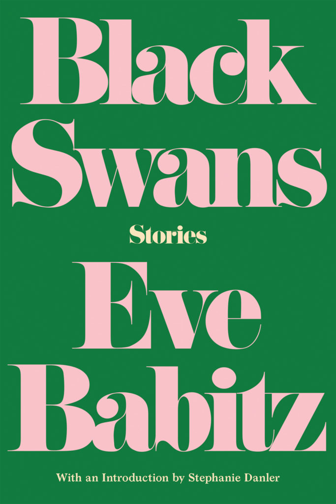
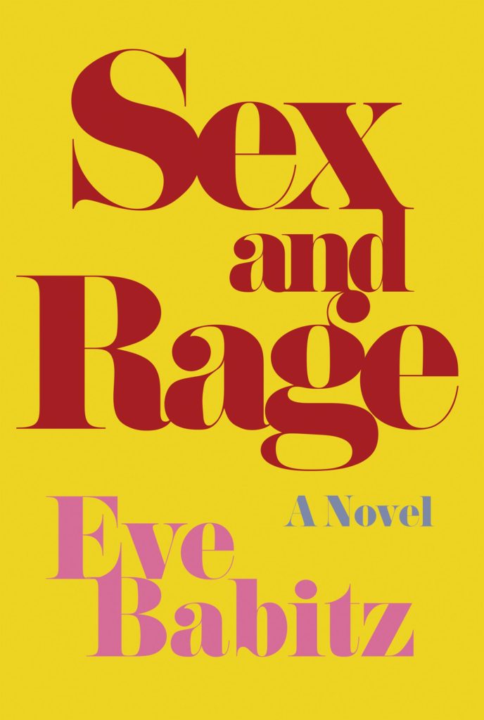
I was also reminded of Kelly Winton‘s covers designs for the reissues of Black Swans and Sex and Rage by Eve Babitz from Counterpoint.

I would guess the fonts are Bodoni or variants thereof, but no doubt someone with a better eye for type will be able to tell us for sure.

UPDATE: Anna Morrison tells me the font she used for All the Beautiful Girls is Cabernet, which just goes to show what I know. According to the ever-useful Fonts in Use, Cabernet is “an uncredited revival of Benguiat Caslon, a 1970s Photo-Lettering typeface by Ed Benguiat.” I’m pretty sure Benguiat Caslon was used for the iconic Philip Roth covers in the 1970s so I probably should’ve recognized it…


The Feral Detective by Jonathan Lethem; design Allison Saltzman; photograph Kate Bellm (Ecco Press / November 2018)


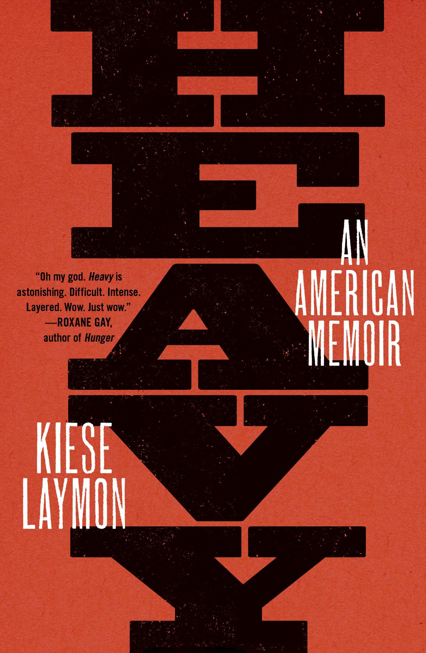
Heavy by Kiese Laymon; design by Na Kim (Scribner / October 2018)


Hippie by Paulo Coelho; design by Tyler Comrie (Knopf / September 2018)

Is this the year of the orange cover…?


The Hole by José Revueltas; design by John Gall (New Directions / November 2018)

John Gall has a new book collecting 10 years of his collages out this month too.

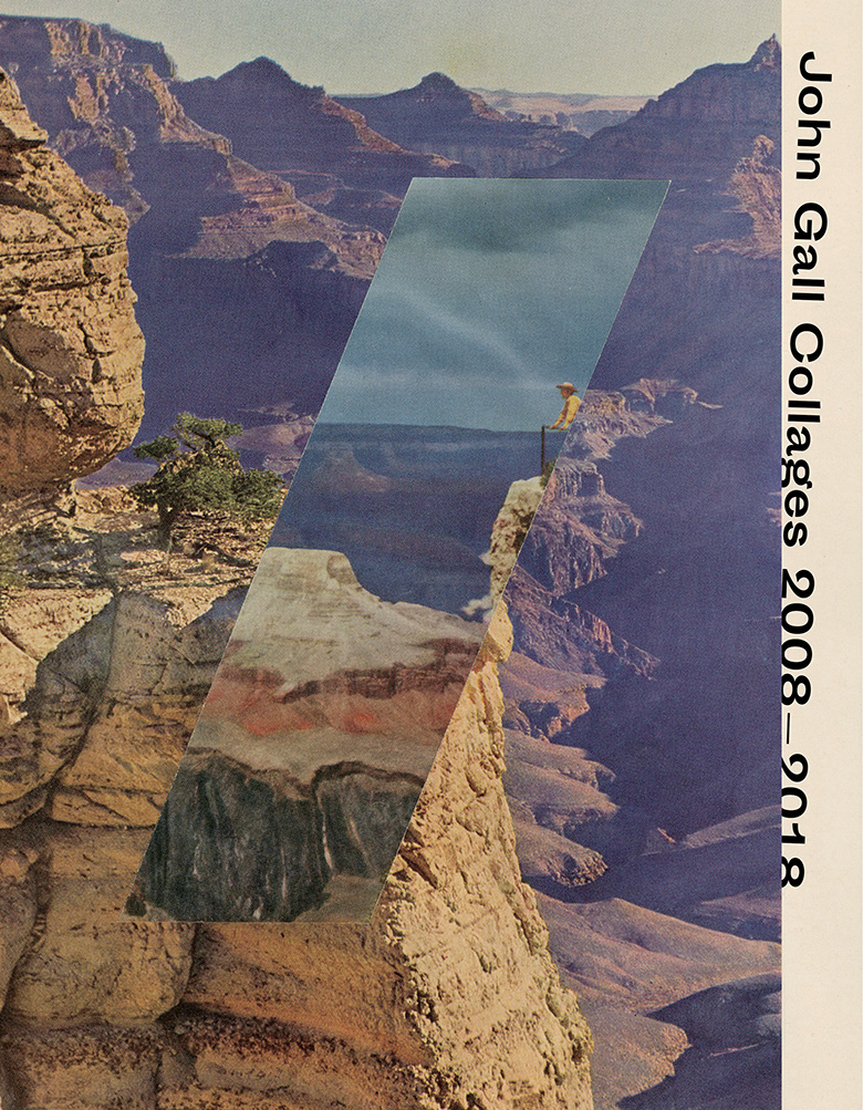
You can read my 2011(!) Q & A with John about his collages here.  


Homeland by Walter Kempowski; design by Dan Mogford (Granta / November 2018)

Dan also designed the cover for All for Nothing by Walter Kempowski a couple of years ago:


I Do Not Trust You by Laura J.Burns & Melinda Metz; design by Olga Grlic (St. Martin’s Press / September 2018)

I had it in my mind that snaky red covers with big white type were very “in” for thrillers right now, but the only other example I could think of was the US cover for Our Kind of Cruelty by Araminta Hall designed by Alex Merto, which is really not that similar…

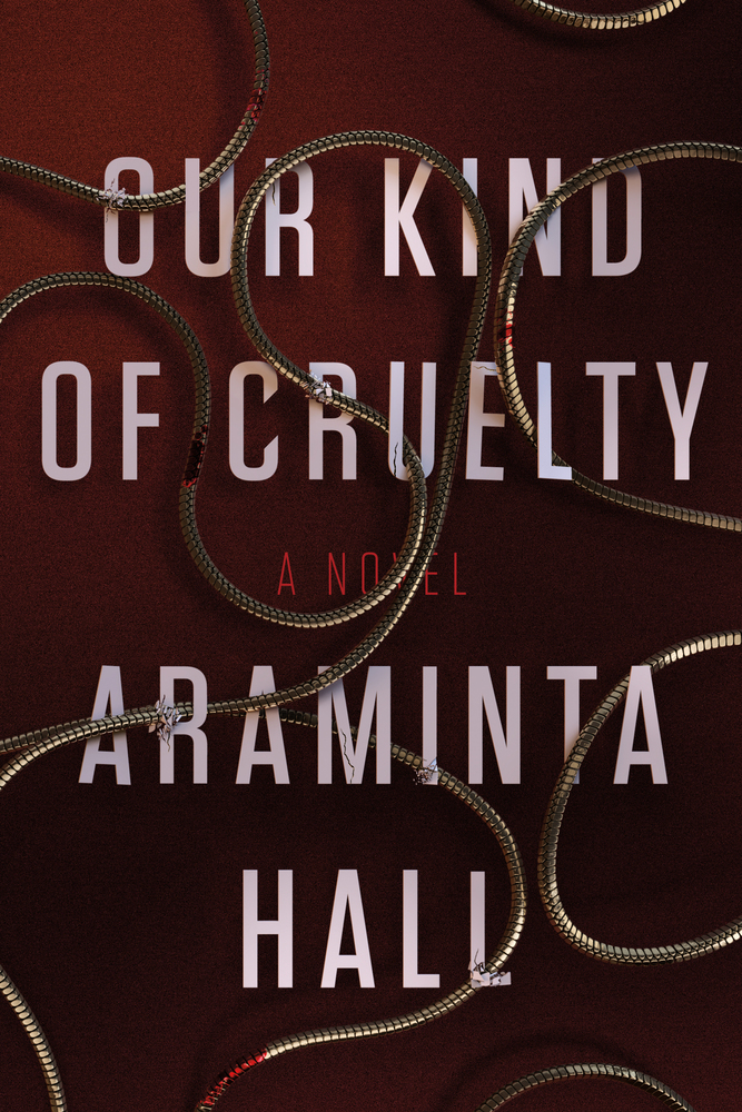
Perhaps I am imagining it.


The Library Book by Susan Orlean; design by Lauren Peters-Collaer (Simon & Schuster / October 2018)


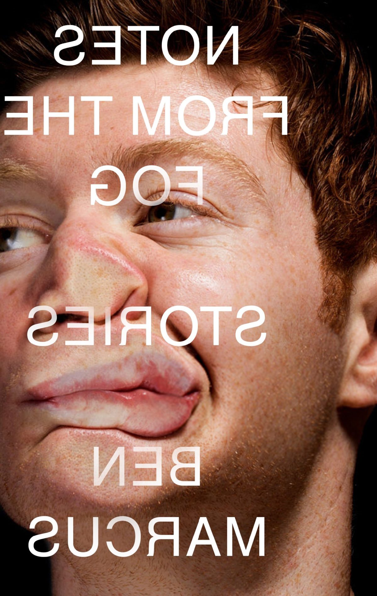
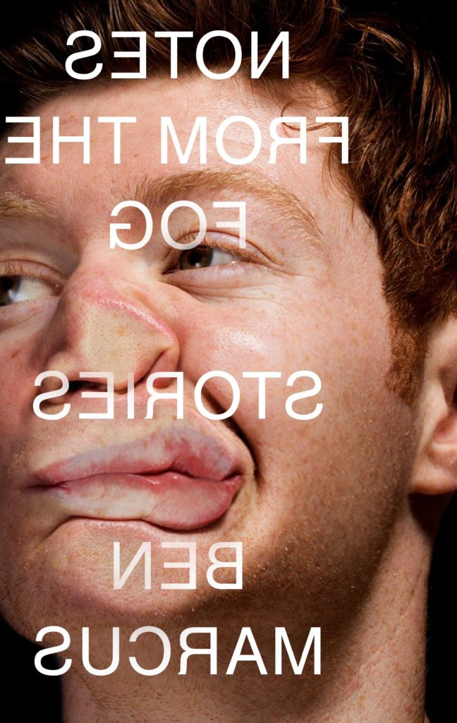
Notes from the Fog by Ben Marcus; design by Jamie Keenan (Granta / September 2018)

The US cover, which I featured in a previous post, was designed by Peter Mendelsund:


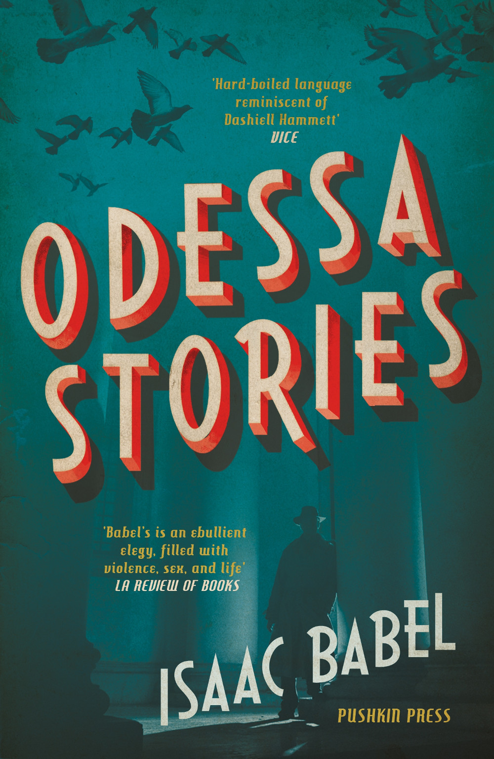
Odessa Stories by Isaac Babel; design by Anna Morrison (Puhskin Press / November 2018)


Portraits Without Frames by Lev Ozerov; design by Dan Mogford (Granta / November 2018)


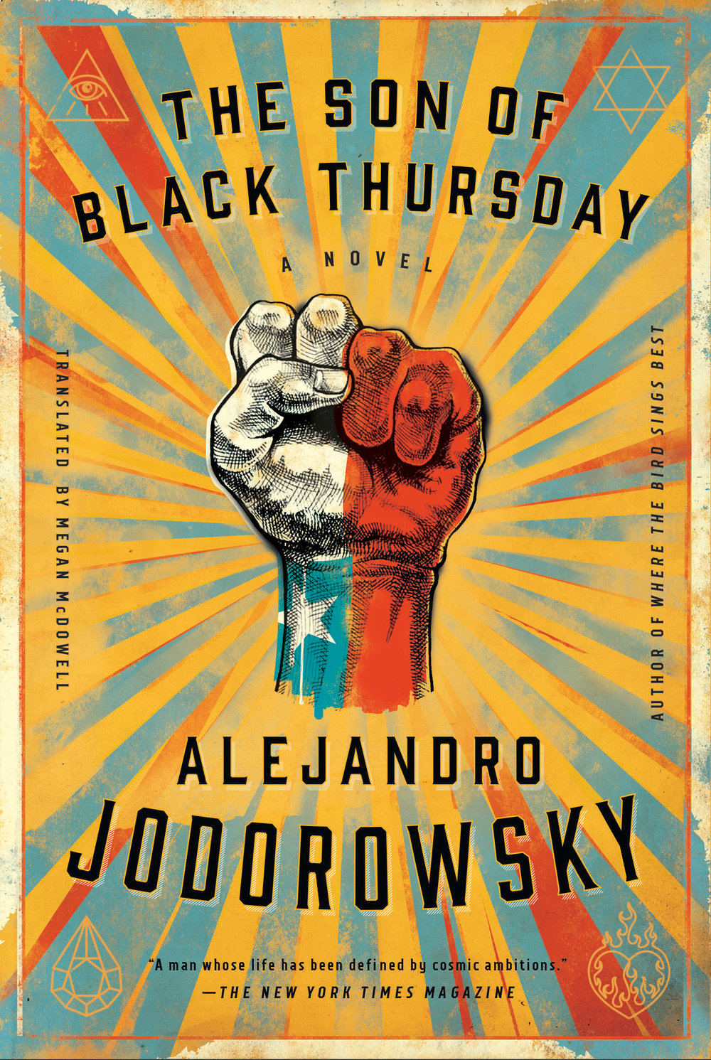
The Son of Black Thursday by Alejandro Jodorowsky; design by Richard Ljoenes (Restless Books / November 2018)

Richard also designed the cover of Jodorowsky’s previous novel Where the Bird Sings Best:

And take a moment to check out Richard’s online portfolio, which is new I believe.


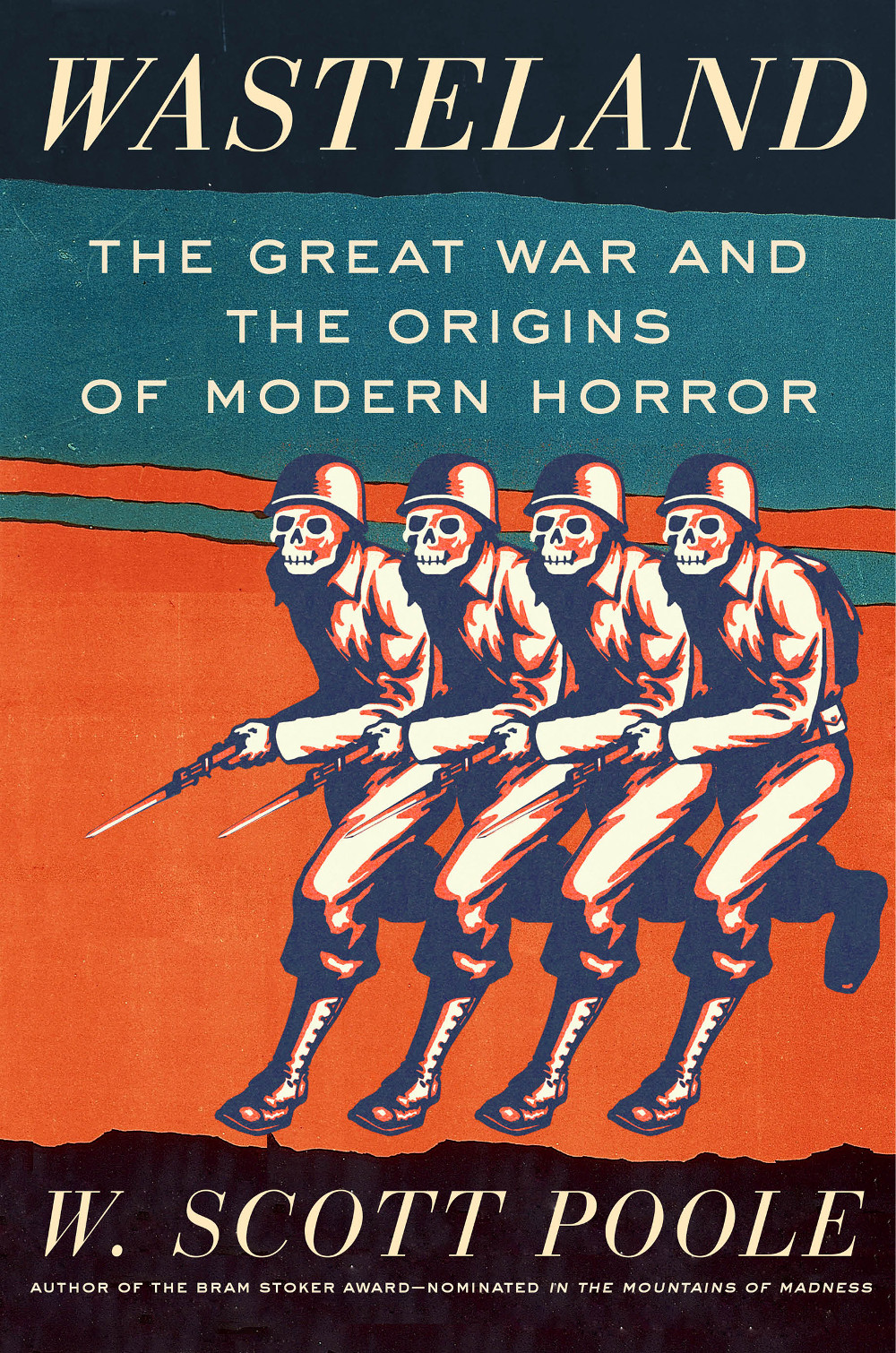
Wasteland by W. Scott Poole; design by Jaya Miceli (Counterpoint / November 2018)


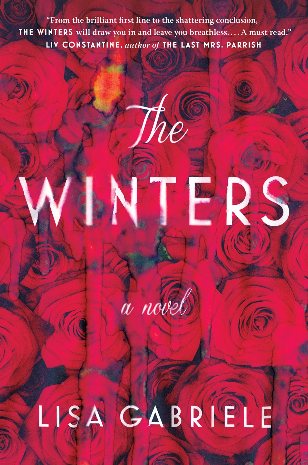
The Winters by Lisa Gabriele; design by Nayon Cho (Viking / October 2018)

Comments closed

Geoff Dyer on Photographs and Essays

Geoff Dyer, whose new book The Street Philosophy of Gary Winogrand features personal essays inspired by Winogrand photographs, considers other books that combine images and essays in The New York Times:

John Szarkowski was for many years the head of photography at the Museum of Modern Art in New York. In 2000, in the twilight of a provocative, highly influential career, he published “Atget,” a selection of 100 images by the French photographer Eugène Atget, each reproduced on the recto page with an accompanying caption-essay on the facing verso page. With Szarkowski as the best kind of guide — one whose itinerary allows interludes of undisturbed contemplation — we wind our way through the haunts of old Paris, emerging from time-shuttered streets into the open skies of the surrounding countryside. Szarkowski had always been a distinctive stylist, but this format enabled him to give free rein to his talents as a writer, which were usually securely tethered by curatorial obligation. He also drew confidence, I think, from an earlier assay at the same form, “Looking at Photographs” (1973), in which he used a single picture by each of the most important photographers in the museum’s holdings to compile a radically synecdochic survey of the medium’s history. The obligation to cover so much ground, to balance what he had to say about so many major figures on such slender plinths, rather limited Szarkowski’s range of literary and thematic movement. With Atget — whose photographs, appropriately enough, were originally offered as “Documents for Artists” — the combination of abundance of subject matter and limited space encouraged a kind of tight flourishing or contained extravagance. Szarkowski’s knowledge of Atget’s work was so extensive that he had scarcely even to think about what he knew. And so the photographs serve as starting-off points for reflections on all sorts of things, including how photography has changed our view of the world: “I do not think that empty chairs meant the same thing before photography as they mean to us now.”

You can find reviews of Dyer’s Winogrand book in the New York Times and The Guardian.

Comments closed

It Kills Everything It Touches

sheer-rage

At the LA Review of Books, Daniel Mark Janes discusses last month’s curious conference at Birkbeck College (University of London) about the author Geoff Dyer:

Anyone who has written about Geoff Dyer will have been tempted to emulate his style, particularly his tendency to digress: “I planned to write about Geoff Dyer but instead I got distracted/stoned/fell asleep.” (Of those who resist this urge, most feel obliged to describe this temptation.) However, the point of works like ‘Out of Sheer Rage’ and ‘Zona’ is not just that Dyer chronicles his experiences; it is that, for all of the tangents, we still at the end find ourselves closer to Lawrence, closer to Tarkovsky. Personal reminiscence alone did not necessarily make us closer to Dyer — but it was still welcome in shaping the tone. Amid the ’ism’s and ’otic’s of traditional academic papers, humanity can often be lacking — yet Dyer’s work is all flesh and bone, united by a persona that is profoundly, playfully human.

And on a related note, Philip Maughan also spoke to Dyer about the conference for the New Statesman:

“I’m one of the people who seem to have licensed the ‘I’m meant to write about this book but I’m just going to write how I got stoned instead’ essay – but it only works for certain subjects. It has to lead you into a deeper appreciation of the subject than could have been attained in a more direct way. It’s like those legal highs,” he said. “Some of them can get you pretty messed up. Really they ought to be proscribed.”

Comments closed

Trains, Punks, and Photographs


In 2002, 17-year-old Mike Brodie started hopping trains. Over the next five years he took photographs — first using a found Polaroid camera and then an old 35-mm Nikon — documenting his experiences. In the July/August edition of Book Forum, Geoff Dyer reviews A Period of Juvenile Prosperity, a book collecting Brodie’s photographs:

As with Nan Goldin’s Ballad of Sexual Dependency—and if ever a book of photographs deserved to be termed a ballad it’s this one—Brodie’s pictures are entirely from within the world depicted. Goldin always had a knack, according to Luc Sante, for finding beautiful colors and light in what was otherwise a complete dump. The light for Brodie and his fellow travelers is a given, filling their lives with lyric and radiant purpose. The land that blossomed once for Dutch sailors’ eyes whizzes and blurs past as they ride the rails; the light fades, and the dark fields of the Republic roll on under the night. But the book is less a record of sights and places seen than one of the people doing the seeing. Photographs by Helen Levitt don’t just show children playing in the street; they convey what it’s like to be a child. Same here. We share the optimism, recklessness, and manifest romance of these outlaws’ take on destiny.

Earlier this year, Brodie, who is now working as mechanic, talked about the book with All Things Considered on NPR:

NPR: All Things Considered: Trains, Punks, Pictures mp3

I’ve not seen any sign of the book in Canada, but apparently it is available from the publisher Twin Palms, and I’m sure there will be US independent bookstores who have it.

Comments closed

Garry Winogrand: The Photographer as Addict

Geoff Dyer reflects on the recent Garry Winogrand exhibition at the San Francisco Museum of Modern Art (or its catalogue, at least) at the London Review of Books:

The more you feed the Winogrand habit the more Winogrand you crave. Partly this is because of the sheer quantity of data amassed by Winogrand, the mind-blowing amount of information he provided about the social landscape of America in the 1960s and 1970s: suits, dresses, jackets, lapel widths, hairstyles, body shapes, faces, drinks, food, cigarettes, architecture, airports, pets, cars – everything. But it’s far more than the thoroughness and extent of this animate inventory that makes Winogrand so important. Taking his lead from Georg Lukács, George Steiner wrote of Balzac that when he ‘describes a hat, he does so because a man is wearing it.’ Granted, in photography hats are forever being verbed – worn, carried, tipped – but it’s helpful to see Winogrand as a visual novelist whose work was a sprawling human comedy. Or perhaps as a dance to the stilled music of photographic time, with a cast of thousands, that stood no chance of ever being completed. (Winogrand admired Norman Mailer, rivalled him in scope, energy, ambition – and in a disdain for any internal system of brakes. As it happens, he photographed Mailer at his fiftieth birthday party in 1973, on the receiving end of a finger-wagging lecture from a guest, so that the picture seems silently captioned by the Winograndian imperative: ‘Look!’)

Is there a word for something that is very much of Geoff Dyer? Dyerian? Geoffian? Anyway, this is that.

London Review of Books

Comments closed

Something for the Weekend

Wondrous Horrors — Ariella Budick on the centenary of the 1913 Armory Show in New York, for the Financial Times:

Critics did not reject every European innovation. They nodded at the impressionists, puzzled respectfully over Cézanne, and tolerated Gauguin. But cubism blew their minds. The impact was not merely aesthetic. American writers perceived a defiant rejection of rules and a contempt for tradition – qualities they associated with violent political movements. Painters who blasted convention with their brushes gave comfort to bomb-throwing subversives. When critics invoked anarchy, it was not just a figure of speech.
See also: Rethinking the Armory in the New York Times:
New York viewers, including artists, to some degree knew what they were in for. Pictures of avant-garde art had been included, often with mocking commentary, in New York newspapers and magazines for years. And by no means were all Armory reviews pans; one critic wrote that he was grateful for “these shocks to our aesthetic sense.” Others were glad for a certain perspective the show offered: compared with avant-garde work from Europe, American art looked sane.
Making It Up — William Deresiewicz on the work of Geoff Dyer, for The New Republic:
Freedom from conventional and institutional expectations—freedom even from his audience—means that Dyer is also free to make it up, like jazz, as he goes along. Every book is different, and every book is different from everybody else’s books. Zona is a running commentary, almost shot-by-shot, on a single film. But Beautiful consists of a series of quasi-imagined episodes—vivid, textured, saturated with feeling—from the lives of the jazz greats. Out of Sheer Rage is memoir, travelogue, criticism—“about” Lawrence in the physical sense of the word: spinning around and around him with a manic, comic, centrifugal energy. The Ongoing Moment makes a poem of the history of photography by considering not artists or schools, technics or techniques, but, improbably, subjects (hats, benches, stairs): a ridiculous idea, it seems, until you figure out that Dyer’s real quarry is the relationships we have with those quotidian objects, the way they can be made to stand for the lives that move among them. “Spare me the drudgery of systematic examinations,” he writes in Out of Sheer Rage, “and give me the lightning flashes of those wild books in which there is no attempt to cover the ground thoroughly or reasonably.”
See also: Rose Mclaren on Zona for The White Review:
[Dyer] claims, ‘if I had not seen Stalker in my early twenties my responsiveness to the world would have been radically diminished’. He shares with his idol an artistic ideal of awareness, describing Tarkovsky’s aesthetic as a length of take demanding ‘a special intensity of attention’. The inverse dominates much contemporary culture where, ‘a lot of what’s being shown on the world’s screens is fit only for morons’ with the result that ‘there are more and more things from which one has to avert one’s ears and eyes’. Rubbish art that warrants ignorance. A bit broad-brush and heavy-handed, but its Dyer’s reason for writing. Against a social dystopia of willed numbness, Zona documents a profound engagement with an artwork. It is not so much homage to the film alone, but to the dialogue it inspires.

And finally…

What Is This Shit? — Brian Dillon interviews photographer and filmmaker William Klein:

I didn’t know how to do a book. I was just discovering photography and once I had all these pictures, I showed them to editors in New York and nobody thought it was worthwhile to do a book with these photographs. They said, “What is this shit?” I came back to Paris and discovered there was a series of travel books called Petite Planète. I called them up and got an appointment and I went to this office which looked like NASA. Chris Marker was there with a laser gun in his belt, and he saw the photographs and said, “We’ll do a book!” In fact he said, “We’ll do a book or I quit!”

Comments closed

Midweek Miscellany

Purple Haze — A typically tangential literary collage about Conrad’s Heart of Darkness by Geoff Dyer:

The actual book is far stranger than accounts of it sometimes suggest. It’s a shame in a way that the book has become so famous as to dull our sense of this pervasive strangeness. Re-reading it now I find it scarcely less bizarre than when I plodded through it as a mystified seventeen-year-old (we were doing The Secret Agent for A-Level). What H. G. Wells wrote of Conrad’s earlier book, An Outcast of the Islands, also holds good for Heart of Darkness: “his story is not so much told as seen intermittently through a haze of sentences.”

Read the whole thing. Trapped on a boat, Dyer apparently wrote the piece in one night. You can almost hear him losing his mind.

Etiquette — Caleb Crain on criticism and the role of critics, at The Paris Review:

A non-question has recently preoccupied the literary corners of the Internet: How rude should a book critic be? I call it a non-question because its non-answer is the same as for people in social situations generally: it depends. It’s impossible to find a universal rule that licenses rudeness. There’s always going to be at least one observer who feels that a conflict could and should be handled politely. (And who knows? Insofar as politeness is a skill, maybe there’s always room for improvement.) Also, there’s always going to be at least one observer who describes as honest what others call rude… Only the particular questions are worth debating, and no matter how many questions like them you answer, you never reach a rule that has the purity of math. The most you can hope for is etiquette.

Hackery — Simon Kuper on the fantasy of being an artist, for the Financial Times:

Even if you are sure that it’s your vocation to make art, you are most likely wrong. For a start, if it was your vocation, you would probably have embarked on it aged 18 instead of making a living first. And even people who do devote their lives to their supposed vocation often discover that they aren’t good at it after all. As Nick Hornby writes in his memoir Fever Pitch, in a riff on the failed Arsenal footballer Gus Caesar: Gus must have known he was good, just as any pop band who has ever played the Marquee know they are destined for Madison Square Garden … and just as any writer who has sent off a completed manuscript to Faber and Faber knows that he is two years away from the Booker. You trust that feeling with your life … and it doesn’t mean anything at all.

The Sadness at the Heart of Dredd — A headline as brilliant as it is unlikely… Antonia Quirke reviews Dredd, also for the Financial Times:

Dredd has something absent from all recent action and science fiction films: sadness. How desperately The Dark Knight craved sadness!… The slow-mo moments in Dredd – imagined by the screenwriter Alex Garland and realised by cinematographer Anthony Dod Mantle – aspire to the bluesy melancholy of the sequence when Joanna Cassidy as the doomed replicant Zhora goes crashing through the glass in Blade Runner: a moment that set the tone for all our hopes for science fiction on screen.

See also: Writer John Wagner talks to the Daily Record about his creation Judge Dredd.

Comments closed

Something for the Weekend

Commercial Indifference — Geoff Dyer’s Zona reviewed at the LA Review of Books:

[Dyer] followed a book of eccentric travel writing with a book on photography, and then in 2009 served up a couple of loosely-linked novellas under the, let’s face it, terrible title of Jeff In Venice, Death in Varanasi. Add in Dyer’s pre-2000 offerings on jazz, D.H. Lawrence, and World War I, along with several novels, and you have an oeuvre that resembles a messy and ever-expanding Venn diagram of the author’s obsessions. Even so, a 200-page book about a Russian film from 1979 takes commercial indifference to heroic lengths.

(And much as I love you and your recent redesign LARB, could we get simple RSS feed please?)

The Great Unwashed — Julia Kingsford, writing at The Bookseller, on the cultural snobbery and clichés surrounding Fifty Shades of Grey  (h/t Don Linn):

Surely they can’t be ‘real’ readers whose papery passions have traditionally been our bread and butter and who shop in ‘real’ bookshops? No, these must be a different sort of reader, new and not as good, ‘silly’ and to be only temporarily humoured and nervously served before we gladly see them off as they return to whatever form of entertainment they normally enjoy. Far from intellectual snobbery about readers being the preserve of the book trade, it runs rife through everyday media and culture, constantly perpetuating the view that books are for the few.

Medium-Rare — Author Lev Grossman (The Magician King) on almost being a rare book collector, at Time:

My specialty as a collector is books that almost have value. When I love a book, I don’t buy the first edition, because those have become incredibly expensive. But I might buy a beat-up copy of the second edition, third printing, which looks almost exactly the same as the first edition except that a couple of typos have been fixed. (In the rare book trade the little details that definitively identify a first edition are called “points.” My books are not strong on points.) It’s not glamorous, but it’s still satisfying, and it’s a hell of a lot cheaper.

And finally…

“New” — An archive interview with art director and pioneer of modern advertising Helmut Krone. There is so much good stuff in this… (via Coudal, naturally):

“New” is when you’ve never seen before what you’ve just put on a piece of paper. You haven’t seen it before and nobody else in the world has ever seen that thing that you’ve just put down on a piece of paper. And when a thing is new all you know about it is that it is brand new. It’s not related to anything that you’ve seen before in your life. And it’s very hard to judge the value of it. You distrust it, and everybody distrusts it. And very often it’s somebody else who has to tell you that that thing has merit, because you have no frame of reference, and you can’t relate it to anything that you or anybody else has ever done before.

(The going rate for Helmut Krone: The Book appears to be upwards of $80 on Abebooks. Time for a reprint?)

Comments closed

Midweek Miscellany

The Forger — Tom McCarthy (whose novel Men in Space has finally been published by Vintage in the US) at Interview Magazine.

People in Business — An interview with Dennis Johnson, publisher of Melville House, at The Economist:

I think it’s very obvious to people that we care about the packaging of our books. I think people know that if we care about the outside of our books then we probably care about the inside of them, too. I recently read a survey that said 39% or 40% of people who bought books on Amazon looked at them in a bookstore first. They could know everything about the book online short of having seen it, but still the physical object had enough meaning to them to want to see it first. That resonates, happily, with the fact that Valerie [Merians] and I came into this not as publishers but as artists. The object means a lot to us.

Parallels — Authors Geoff Dyer (Zona) and John Jeremiah Sullivan (Pulphead) in conversation at Work in Progress.

And finally…

Britain’s Original Information Revolution — Adam Nicolson, author of The Gentry, on a collection of English books dating back to the 17th century:

 We may think we are in the middle of a communications revolution: Flickr, Twitter, Facebook, YouTube, Hulu, iTunes… But all of them are, in their ways, secondary phenomena. Some of them are image-based, post-literate, but none would work without the foundations of a much deeper communications revolution which swept across Europe 400 years ago.

The 17th century is when the Europeans started to write: letters, diaries, journals, notebooks, account books, commonplace books, business correspondence, pamphlets, posters, chapbooks, newspapers. It was the first communications revolution, which both spawned and reflected the most revolutionary century we have ever had.

Comments closed

Midweek Miscellany

Obituary for artist Jean Giraud, AKA Moebius, in The Guardian:

Giraud… had an impact on the visual arts that went beyond comics. He was seen as a figurehead linking bandes dessinées with modernism and nouveau réalisme. As the co-creator of Métal Hurlant magazine, he took comics to an older, more literate audience. In cinema, his fans ranged from Federico Fellini to Hayao Miyazaki and his style influenced dozens of others, including Ridley Scott, George Lucas, James Cameron and Luc Besson.

Tom Spurgeon also has an in-depth obituary at The Comics Reporter:

Giraud would… describe the revolution driven by his work and others as one of creative choice rather than content, that the feeling of the artist inhabiting the work was more important than the kind of work being done. He drew a connection to the undergrounds and cartoonists like Robert Crumb, although he felt that the work of he and his peers existed in an entirely different cultural context.

See also: The comics industry remembers Moebius at Robot 6.

(I remember being very disappointed when I discovered that the drawing above was a standalone piece, and not a panel from a complete Batman story illustrated by Moebius. Heartbreak.)

Material Conversations — An interview with Jonathan Ive, Apple’s Senior Vice President of Industrial Design, in The Evening Standard:

What I love about the creative process, and this may sound naive, but it is this idea that one day there is no idea, and no solution, but then the next day there is an idea. I find that incredibly exciting and conceptually actually remarkable. The nature of having ideas and creativity is incredibly inspiring. There is an idea which is solitary, fragile and tentative and doesn’t have form. What we’ve found here is that it then becomes a conversation, although remains very fragile. When you see the most dramatic shift is when you transition from an abstract idea to a slightly more material conversation. But when you made a 3D model, however crude, you bring form to a nebulous idea, and everything changes – the entire process shifts. It galvanises and brings focus from a broad group of people. It’s a remarkable process.

And finally…

Boredom — Geoff Dyer, author Zona: A Book About a Film About a Journey to a Room, in conversation with Ethan Nosowsky at The Believer:

Boredom is often a side effect of something else. The apparent boredom inflicted by Stalker is actually the friction between the pace of the film and one’s expectations of how a film should proceed, so you just need to give yourself over to it. But then I think some so-called art films are irredeemably and inherently boring. As soon as I say that, though, I realize that the most boring films are the big, moronic action-blockbusters. They really bore the crap out of me. There’s an essential relationship between boring art films and moronic blockbusters because, as Ernst Fischer pointed out, any art form that glories in being understood only by a few—that worships at the altar of its own tedium, as it were—opens the floodgates for trash for the masses. At a certain point, as filmmakers got serious, they willingly took on a slowness that could easily become boring. But there was a long period before that when boredom was just inconceivable, not part of the equation.

Comments closed

Midweek Miscellany

J. David Spurlock on the great Wally Wood at Imprint:

In nearly all of his work – no matter how overworked he was – even when he did risque material, there was always a charm, and he imbued the work with a purity of love for the medium.

And he was a master of every genre. That is one of the things that make him unique. Whether horror for EC, humor for Mad or Plop, war comics for DC or Gold Key, science fiction magazine illustrations, his Wizard King trilogy of fantasy graphic novels, superheroes for Marvel, cheesecake, romance, or westerns, whatever genre one picks, Wood’s contribution is among the finest ever.

Meditations — Dana Stevens on reading Zona, Geoff Dyer’s book about Andrei Tarkovsky’s 1979 film Stalker, while watching the movie:

[If] Zona goes off in a few too many directions, most of them are fascinating enough that we’re happy to zigzag along in the author’s wake. In addition to being a real-time explication of a single movie, Zona is a meditation on movies and time: the way movies change us, and change for us, as we return to them through our lives. Dyer reminisces about seeing Stalker in different decades, in different cities, with different girlfriends, as a young and then a middle-aged man… As he makes his way through Stalker scene by scene, Dyer’s account of what’s happening on screen is constantly being interrupted and informed by associations with the past as well as the present.

See also: Zona reviewed in the New York Times.

Also in the New York Times, author China Miéville on “Apocalyptic London“:

It used to be startling to see a fox in London — impossible not to feel that the city had slipped into a fable. Now you spot them on any late-night jog. In 2011, one of these agents of animal chaos infiltrated the Shard — at 32 London Bridge, the city’s unfinished tallest building — and climbed a thousand feet above the streets to live on builders’ scraps.

At dusk and dawn, green bolts shoot low, as flocks of feral parakeets set about bird business. Walking at dawn in the mud of Wormwood Scrubs, a rough, wild common next to the prison of the same name, we approach a screaming copse. Incredible flocks of these nonnatives preen and screechingly bicker, overlooking the glow of waking London.

And finally… A lovely piece the in The Daily Telegraph on Word on the Water, a Dutch barge selling second-hand books in London:

“We live in times where young people have Debussy moustaches, and listen to Sixties and Seventies music. They are interested in the past. I don’t remember there being a youth cult before where the past was so fascinating. There’s a hunger for authenticity … Younger people are becoming interested in things that machines can’t do: talent.”

1 Comment

Midweek Miscellany

Elegant Simplicity — A nice profile of book designer David Pearson at Spitalfields Life:

On the basis of “Penguin By Design,” David was given the job to design the covers for Penguin Great Ideas, an experimental series of low-budget books with two-colour covers. “I’m not an illustrator and I can’t take photographs, so I decided to do all the covers with type,” explained David, almost apologetically. Yet David’s famous landmark designs for these books, derived from his knowledge of the history of Penguin covers, were a model of elegant simplicity that stood out in bookshops and sold over three million copies. “I saw people picking them up and they didn’t want to put them down!” he confided to me, rolling his eyes in delight, “They were a phenomenon.” Then he placed a hand affectionately upon a stack of copies of this series for which he has now designed one hundred covers.

My interview with David is here.

Books MatteredDavid L. Ulin on the late Barney Rosset for The LA Times:

For Rosset, the mission was simple: Books mattered, they could be dangerous, they could change your life. Writers were heroes, “cosmonauts of inner space,” to borrow a phrase from “Cain’s Book” author Alexander Trocchi, their function less to reassure than to destabilize, to challenge the assumptions by which society was made.

This could happen in all sorts of ways — Beckett’s unflinching absurdism (“Ever tried. Ever failed. No matter. Try Again. Fail again. Fail better”), Burroughs’ scabrous cynicism (“A functioning police state needs no police”), Miller’s sense of living at the end of history, when all the so-called verities had collapsed beneath their own sanctimonious lies.

See also: Barney Rosset obituary in The Guardian.

Sprawling Tentacles — Alexandra Manglis reviews Alan Moore: Storyteller by Gary Spencer Millidge for the Oxonian:

The work and the man have morphed together resulting in a giant Moore myth that fans and comic creators alike have difficulty surmounting, its tentacles sprawled out far beyond his small Northamptonshire home. The infamous Guy Fawkes mask, for one, created in Moore’s anarchist comic V for Vendetta, has been worn by protesters from Tahrir Square to Occupy Wall Street, and Moore is indubitably proud of the anarchist symbol’s use in real civil unrest. Yet the symbol’s popularisation is largely due to the comic’s adaptation into a Hollywood blockbuster, from which Moore removed his name and refused to take royalties. Moore’s stories have become bigger than the man himself; the images he has authored have grown beyond him and often, as in the case of V for Vendetta, in spite of him.

See also: Paul Gravett’s review for The IndependentThe Guardian celebrates 35 years of British comic 2000AD

And finally…

Geoff Dyer, author of Zona, interviewed at Bookforum:

Failure is quite interesting, and it’s something I have a certain amount of experience with. I wasn’t a failure in the way lots of people are failures—I could always get published, that was pretty straightforward. Literary failure is funny because it’s not like you get this massive slap in the face and become a figure of ridicule. It’s more that you do this thing, you write this book, and then this big thing is poised to happen on publication. And nothing happens. It’s just a weird non-event. The literary Richter scale doesn’t register any kind of tremor. That was happening to me for a very long while, and then I managed to persuade myself that these serial failures were perhaps a kind of liberation in that it meant I was free from any kind of pressure from publishers. The stakes were so low that it didn’t really make any kind of difference to anybody that I went from writing a novel to writing a book about the First World War. So I’ve certainly known what it’s like for a book to simply, well, disappear.

Comments closed