Tom Gauld on women leads in spy fiction for The Guardian. See also, people of colour in fantasy films.
Comments closedBooks, Design and Culture
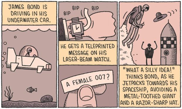
Tom Gauld on women leads in spy fiction for The Guardian. See also, people of colour in fantasy films.
Comments closed
I love these new illustrations by the super-talented Tom Gauld for an article in The Washington Post Book Review about genre fiction:


You can see more of Tom’s work and his regular literary cartoons for The Guardian on Flickr.
Comments closed
Juggling — The multi-tasking Charlotte Strick, art editor of The Paris Review, art director at Faber & Faber and Farrar, Straus & Giroux, and book designer, interviewed at From The Desk Of…
Genre — China Miéville, on his new book Embassytown and genre fiction in The Guardian:
“I love genres; I think they are fascinating. My issue with litfic is not that it is a genre but that (a) it doesn’t think it is and (b) it thinks it’s ipso facto better than all the ones that are genres. Literary fiction of that ilk – insular, socially and psychologically hermetic, neurotically backslapping and self-congratulatory about a certain milieu, disaggregated from any estrangement or rubbing of aesthetics against the grain – is in poor shape.”
Invasion by the Virtual — Iain Sinclair discusses London and five novels that capture the spirit and history of city:
When the railways were first put in, there was devastation, because there were so many competing companies who just ripped up houses right, left, and centre. In the name of catching the spirit of the age and indulging in this technological process (and the idea of progress through science), London was savagely remade. It took a long time to absorb, recover and discover itself through that. At the moment, we’re in this sort of management age — an age of the virtual — in which you can change reality by looking at digitised, computer-generated images and projecting a fantastic city of the future, like a science fiction. People have come to believe that this is reality, even though they are contradicted by observation, which shows you devastated fields, radioactive materials buried in the ground that have been ripped up fast, and absolute destruction… So it is a devastating moment for the city, which I don’t think has ever been under such a prolonged form of invasion by the virtual.
Franzen’s Ugly Americans — Tim Parks on reading Jonathan Franzen’s Freedom in Europe (and, incidentally, the work Swiss novelist Peter Stamm, author of Seven Years, which sounds great) (via Bookslut):
Freedom’s failings are interesting in so far as they deepen the mystery of the book’s international success. It’s one thing for the Americans to hype and canonize one of their favorite authors, but why do the Europeans buy into it? Ever anxious that they need to understand America, fascinated by its glamor and power, Europeans are perhaps attracted to those American novels that explain everything: Roth’s American Pastoral, DeLillo’s Underworld. More than a novel by an American they want The Great American Novel. But of course Europeans also resent American world hegemony and feel (still and no doubt wrongly) superior culturally.
And finally…

20 Books Every Graphic Designer Should Read and an interview with Rick Poynor, founding editor of Eye and a co-founder of Design Observer, who compiled the list, at Designers and Books:
Books always point to other books. A bookshop, like a library, is a fantastic, spatially organized, easily navigable source of vast quantities of interconnected information about what exists for you to discover and know. If someone devised an online virtual space that allowed you to do this kind of rapid, effortless, multifocal, visual, and spatial browsing—perhaps someone has, though it certainly isn’t Amazon or the iPad App Store—we’d applaud them for a brilliant new concept. But these marvelous spaces already exist, at least for the time being, right there in your local shopping street.
It’s funny how topics of conversation sometimes repeat themselves for no apparent reason. This week Romek Marber and his designs for Penguin have come up with sufficient frequency for me to take it as a sign I should post some links about about him:
Eye Magazine has a great article about his classic design of Penguin Crime Series:
Marber’s grid allows for different placements of title and author’s name depending on the length of the title and the needs of the design as a whole. There are small inconsistencies in some of the vertical measurements on a few of the books, probably due to printer’s error, but the basic design is sufficiently robust that it does not matter… With the typographic structure in place, Marber could concentrate on producing images that reflected the atmosphere of the books, which he read with relish from cover to cover. He was a graphic image-maker of great versatility, able to sum up the stories with motifs and ciphers that contrived to be both playful and threatening. Many of these whodunnits were decades old, but his interpretations gave them a contemporary allure.
The Ministry of Type shows you how to construct the famous Marber grid.
Apt Studio have a Marber WordPress theme (demo). Are any literary blogs using this I wonder?
And there’s this great Flickr set of Romek Marber Crime Covers.
Please let me know if you have any other good Marber links…
In other news…

The Electro-Plasmic Hydrocephalic Genre-Fiction Generator 2000 by David Malki (via INDEX // mb).
The Awesomeness Manifesto — I’m a little skeptical about these kinds of manifestos simply because they’re not terribly useful, but Umair Haque’s list is as interesting for its criticism about the chimera that is ‘innovation’ as for what is says about the warm and fuzzy ‘awesomeness’.
1 Comment