Skip to content

Tag: gary taxali

Book Covers of Note May 2016

It’s the first week of May (whaaaat?), so it must be time for some new book covers…

barren cove design Chelsea McGuckin
Barren Cove by Ariel S. Winter; design by Chelsea McGuckin (Atria / May 2016)

congratulations on everything design Gary Taxali
Congratulations on Everything by Nathan Whitlock; cover art by Gary Taxali (ECW / May 2016)

Even-the-Dead design David Shoemaker
Even the Dead by Benjamin Black; design by David Shoemaker (Henry Holt / January 2016)

9781594206863
The Ecliptic by Benjamin Wood; design Jamie Keenan (Penguin Press / May 2016)

Girls on Fire US design Robin Bilardello
Girls on Fire by Robin Wasserman; design by Robin Bilardello (Harper / May 2016)

Girls on Fire UK design Jack Smyth
Girls on Fire by Robin Wasserman; design by Jack Smyth (Little, Brown / May 2016)


The Haters by Jesse Andrews; design by Chad W. Beckerman and Will Staehle (Abrams / April 2016)

How Propaganda Works design Chris Ferrante
How Propaganda Works by Jason Stanley; design by Chris Ferrante (Princeton University Press / May 2016)

Industries of the Future design Jason Heuer
Industries of the Future by Alec Ross; design by Jason Heuer (Simon & Schuster / February 2016)

Imagine Me Gone design Keith Hayes
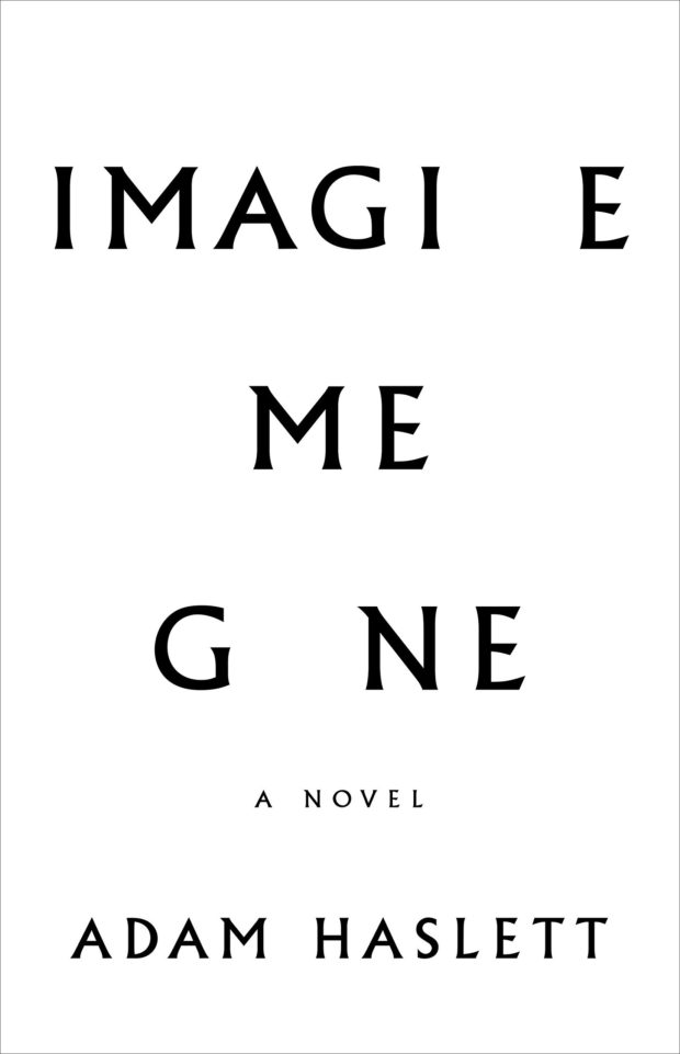
Imagine Me Gone by Adam Haslett; design by Keith Hayes (Little, Brown & Co. / May 2016)

Killing Bobbi Lomax design Alex Kirby
The Killing of Bobbi Lomax by Cal Moriarty; design by Alex Kirby (Faber & Faber / May 2016)

Leviathan Gaspereau
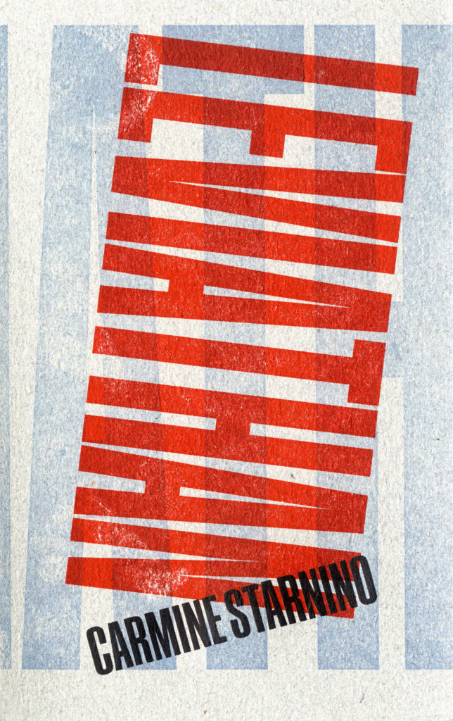
Leviathan by Carmine Starnino; design Andrew Steeves (Gaspereau / April 2016)

OBrien_TheLittleRedChairs_HC.indd
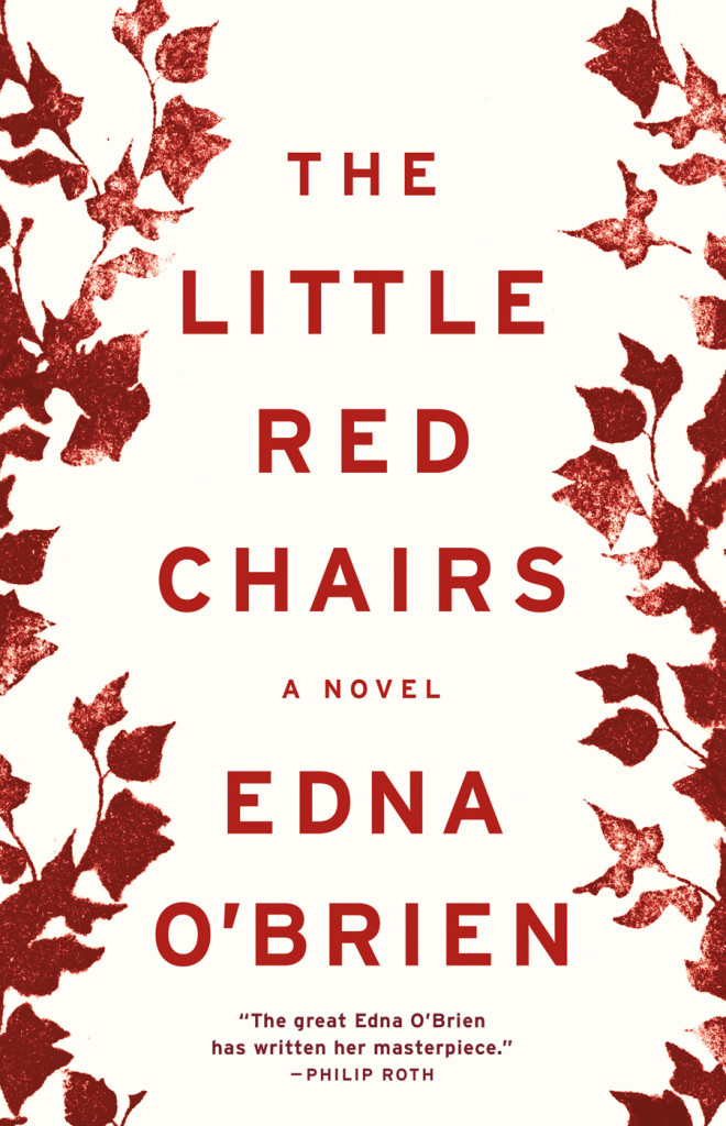
Little Red Chairs by Edna O’Brien; design by Keith Hayes (Little, Brown & Co. / April 2016)

Macroeconomics design David Drummond
Macroeconomics by Ben Fine and Ourania Dimakou; design by David Drummond (Pluto Press / May 2016)

Microeconomics design David Drummond
Microeconomics by Ben Fine; design by David Drummond (Pluto Press / May 2016)

Madonna in a Fur Coat design Coralie Bickford Smith
Madonna in a Fur Coat by Sabahattin Ali; design by Coralie Bickford-Smith (Penguin / May 2016)

Mother Robin Bilardello
The Mother by Yvvette Edwards; design by Robin Bilardello (Amistad / May 2016)

My Mad Fat Diary design Olga Grlic
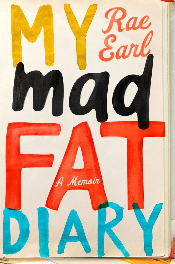
My Mad Fat Diary by Rae Earl; design by Olga Grlic (St. Martin’s Griffin / April 2016)

Once and For All design Erik Carter
Once and for All by Delmore Schwartz; design Erik Carter (New Directions / May 2016)

The Outside Lands design Ami Smithson
The Outside Lands by Hannah Kohler; design by Ami Smithson / Cabin London (Picador / May 2016)

Saltzman_PerfectLife
A Perfect Life by Eileen Pollack; design by Allison Saltzman (Ecco / May 2016)

Prodigals design Rodrigo Corral
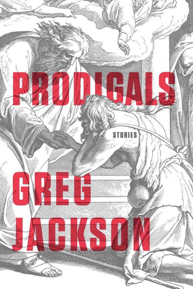
Prodigals by Greg Jackson; design by Rodrigo Corral (Farrar, Straus & Giroux / March 2016)

Sleeping Giants design Chas Brock

sleeping giants design chas brock
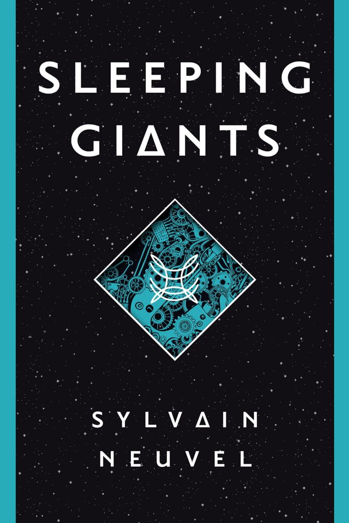
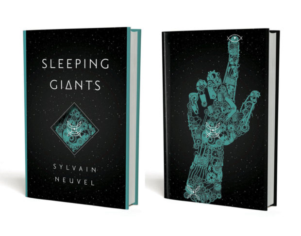
Sleeping Giants by Sylvain Neuvel; design by Charles Brock / Faceout Studio (Del Ray / April 2016)

where-the-bird-sings-best-design-Richard-Ljoenes
Where the Bird Sings Best by Alejandro Jodorowsky; design by Richard Ljoenes (Restless Books / April 2016)

why they run the way they do design Alison Forner
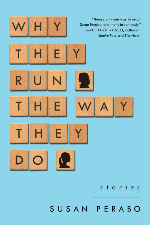
Why They Run the Way They Do by Susan Perabo; design Alison Forner (Simon & Schuster / February 2016)

Comments closed

Midweek Miscellany

Toy Monkeys — Steven Heller interviews Canadian artist and illustrator Gary Taxali for Imprint:

Illustration is in rapid flux. How pictures are being used defies what we traditionally knew about illustration. Many artists are empowered by new digital media. Yet I sense a fear about the continued life of a still picture. People were talking about how illustrations needed to “move” two years ago. That’s not illustration, that’s animation. Most illustrators can’t animate. The timeless power of a still image will never leave the human psyche despite what new gadgets can accomplish.

(pictured above: I Love You, OK? by Gary Taxali, published by teNeues)

Stanley Kubrick’s 1972 rejection letter to Anthony Burgess, at Letters of Note:

I earnestly hope that our all too brief friendship will survive me telling you that the MS is not a work that can help me make a film about the life of Napoleon. Despite its considerable accomplishments, it does not, in my view, help solve either of the two major problems: that of considerably editing the events (and possibly restructuring the time sequence) so as to make a good story, without trivializing history or character, nor does it provide much realistic dialogue, unburdened with easily noticeable exposition or historical fact.

As Shaun Usher, editor of Letters of Note, points out: “Burgess was undeterred, and Napoleon Symphony was published as a novel in 1974. Kubrick’s movie, however, failed to materialise.”

Strange Places — Owen Hatherley reviews Museum without Walls by Jonathan Meades, for the London Review of Books:

What Meades does most often is praise things, especially things that are habitually ignored: he is surely our greatest exponent of what the Russian Formalists called ostranenie, ‘making-strange’. Architecture, as an art form, isn’t quite mundane enough to be made strange, and for that reason Meades would seldom recognise his writing as being about ‘architecture’ as such. Rather, it is about Place, somewhere architecture happens, at times in a very dramatic way, but doesn’t necessarily have the leading role. Architects take non-art, ‘the rich oddness of what we take for granted’, the mutability, detritus and accident that define truly worthwhile Place, and replace them with something static and unchangeable. However, unlike Iain Sinclair or the London ‘psychogeographers’… Meades does not fetishise the spaces between. ‘I have to admit to a fondness for pitted former rolling stock dumped in fields and for abandoned filling stations,’ he writes. ‘But man cannot live by oxidisation alone. It’s not a question of either atmospheric scrappiness or gleaming newbuild. It’s a question of both/and. It’s a question of the quality of the atmospheric scrappiness, the quality of the newbuild.’

And finally…

The best thing I’ve seen in ages… Roy Gardner’s designs for the sales tickets in his store Gardners’ Market Sundriesmen on Commercial St in Spitalfields, London:

No doubt knocking up these sales tickets was all in day’s work to Roy Gardner – just one of the myriad skills required by a Market Sundriesman – yet a close examination of his elegant graphic designs reveals he was also a discriminating and creative typographer.

Comments closed

Midweek Miscellany

An interview with award-winning Toronto-based illustrator Gary Taxali at GrainEdit.

How Disappointing — Book designer Peter Mendelsund on what we picture in our minds when we read literary works:

“Call me Ishmael.” What happens when you read this line? You are being addressed, but by whom? Chances are you hear the line (in your mind’s ear) before you picture the speaker. I can hear Ishmael’s words more clearly than I can see his face. (Audition requires different neurological processes than vision, or smell. And I would submit that we hear more when we read than we see). Picturing Ishmael requires a strong resolve.

But if you indeed took the trouble to summon an image of Ishmael what did you come up with? A sea-faring man of some sort? Is this a picture or a category? Do you picture Richard Basehart, the actor in the John Huston adaptation? How disappointing.

(All I can say is that the follow-up essay had better be about comic books, Peter!)

The Secret Detectives — An interview with Patti Smith in The Telegraph:

“When I was young I knew William Burroughs really well. And William’s secret desire, which he never quite did, was to write a straightforward detective novel. How good would that have been! And I used to say, ‘you have to do it William!’ And he’d say” – Smith gives a passable impersonation of the Burroughsian growl – “‘Oh, I don’t know, one of these days.’ William was like the embodiment of a detective, I just loved him so much.”

Our Greatest Creation — Jonathan Glancey, The Guardian‘s former architecture and design correspondent, reviews City: A Guidebook for the Urban Age by P.D. Smith:

The stuff of lofty intentions and grubby backstreet life, the city represents much of our restless and contradictory natures. “In this dynamic, cosmopolitan space,” Smith writes, “lies the wellspring of our creativity as a species. The greatest cities nurture and stimulate ideas in science and the arts that are the very heart of human civilisation. For this reason, sustainable, humane and well-governed cities are our best hope for the future.”

Amen.

Hiding in Plain Sight — Type designer Ramiro Espinoza on ‘Amsterdamse Krulletter’, the curly lettering painted on the windows of traditional pubs in Amsterdam, and his only typographic revival Krul:

The fact that such gorgeous and original letters have largely been ignored in a country with such a rich type- and letter-making tradition reminds me of the plot of Edgar Allan Poe’s famous story “The Purloined Letter”. In the story, an important document cannot be found because it is lying in plain sight. Sometimes things can become invisible to us because of their very familiarity.

Avant Garde — Adrian Shaughnessy on life and work of designer Herb Lubalin at Imprint:

I have a pet theory about why Lubalin is currently popular: In the eyes of many designers, he offers a way of designing—and of communicating—that doesn’t require expensive art direction, over-manicured photography, or grandiose presentation. Lubalin proved that to be effective, all you need is a typeface and a good idea. In other words, he is a designer for the age of austerity.

Unit Editions’ forthcoming limited edition monograph, Herb Lubalin: American Graphic Designer, 1918–81, will be available in August.

And finally (and also at Imprint)…

An interview with designer and collage artist Graham Moore, who incorporates mid-century modern ephemera and fragments from billboard posters into his work.

Comments closed

Something for the Weekend

I’ve not been entirely convinced by all of the artists’ books covers I’ve seen coming out the Never Judge…? show at StolenSpace in London (to be fair, I’ve not been to the exhibition in person), but Gary Taxali’s design for The Confederacy of Dunces is just great. I believe this edition will be available from Penguin UK in April 2011. There’s more on the exhibition at Creative Review.

What Font Should I Use?Smashing Magazine’s 5 principles for choosing and using typefaces.

The Collectors — NPR on e-readers, data collection and personal privacy (via MobyLives):

Most e-readers, like Amazon’s Kindle, have an antenna that lets users instantly download new books. But the technology also makes it possible for the device to transmit information back to the manufacturer.

“They know how fast you read because you have to click to turn the page,” says Cindy Cohn, legal director at the nonprofit Electronic Frontier Foundation. “It knows if you skip to the end to read how it turns out…”And it’s not just what pages you read; it may also monitor where you read them. Kindles, iPads and other e-readers have geo-location abilities; using GPS or data from Wi-Fi and cell phone towers, it wouldn’t be difficult for the devices to track their own locations in the physical world.

(It’s also worth noting, as Steven W. Beattie does, that this all applies equally (if not more so) to  Kobo’s new Reading Life app.)

Not Just a Stereotype — Michael Bhaskar, Digital Publishing Manager at Profile Books, offers some final thoughts on 2010 at Book Brunch, dispelling a few myths along the way:

Like many groups, publishers are easily stereotyped, and like such groups too, they find that the media usually plays along with the stereotype rather than discovering the nuances behind it. So we hear about a slightly staid world of boring pedants, blinking helplessly at the on-rushing lights of the digital juggernaut and eagerly burrowing their way back to the 1950s… But this isn’t the industry I know. Far from being terrified of digital, publishing has actually already become well adapted to the digital world.

In his recent study of publishing, Cambridge academic John Thompson makes the point that, from the industry’s point of view, much of the digital transition has already taken place. In the workflows of most publishers the only time we see printed material is at the very end of the process… The day to day reality of a publishing house is one of dealing with digital products…

Wave of Information — Gary Shteyngart, author of Super Sad True Love Story, in conversation with Robert Birnbaum for The Morning News:

Sure the novel has survived. Television, radio, telegraph, film—just about anything that has been thrown at it. It’s a very durable form. And the novels are getting better and better. I am shocked at the quality of literature. What I worry about more than anything is—maybe this anecdotal “living in New York”—is the exhaustion of people… The difficulty people have of opening up a book after a day of being bombarded with bits of information, most of it useless. And much, if redundant, certainly information that is ceaseless. Ceaseless waves of it. You come home, the quest for narrative is still there—you want narrative. What’s the water-cooler discussion going to be about? It’ll be about Mad Men, which you can sit there and passively take in—it’s a wonderful show—as opposed to something that requires a mass of concentration and effort. That’s my fear. Who knows, maybe it’s completely unfounded.

And finally…

Carolyn Kellogg chooses her 13 favourite bookplates from Etsy for the LA Times ‘Jacket Copy’ blog (pictured above: Skull and Crossbones bookplates by rxletterpress).

1 Comment

Something for the Weekend

There are two new books about designer Alvin Lustig available this month — Born Modern: The Life and Design of Alvin Lustig by Steven Heller and Elaine Lustig Cohen (Chronicle Books*) and Purity of Aim: The Book Jacket Designs of Alvin Lustig by Ned Drew and Paul Sternberger (RIT Cary Graphic Arts Press).

The Death of the Book has Been Greatly Exaggerated — Tech columnist Christopher Mims on the “irrational exuberance” around e-books (via MobyLives):

Tech pundits recently moved up the date for the death of the book, to sometime around 2015, inspired largely by the rapid adoption of the iPad and the success of Amazon’s Kindle e-reader. But in their rush to christen a new era of media consumption, have the pundits overreached?

I’m calling the peak of inflated expectations now. Get ready for the next phase of the hype cycle – the trough of disillusionment.

The Secret Life of Shepperton — A photo essay on Shepperton, the suburban town south west of London where author J. G. Ballard spent most of his adult life. The photographs are accompanied by text from Ballard’s own novels, autobiography, interviews as well as observations about the town and its history (via 3:AM).

And finally…

The Wonderful 36 Pages features This is Silly! by Toronto-based artist/illustrator Gary Taxali:

* Chronicle Books is distributed in Canada by my employer Raincoast Books.

Comments closed

Something for the Weekend

Sadly I missed the book launch earlier this week, but Toronto-based artist and illustrator Gary Taxali talked to the Torontoist and The National Post about his new kids book This is Silly!. You can see more of Taxali’s amazing book covers here.

ArtifactsMaximus Clarke has a fascinating conversation with William Gibson about his new novel Zero History :

I reach instinctively for something without knowing why, and place it in the narrative, and if it strikes a resonant chord with me, I’ll leave it there… But I myself have wondered why I do that — why I depict a universe of man-made objects, with people walking among them (laughs). My best answer is that it’s the way I perceive things. And I also suspect that the narratives of objects are more available to us when the objects themselves have become slightly decrepit. So I think my interest in old things, and worn things, isn’t about nostalgia in any conventional sense; it’s about the revelation of the narrative of how that object came to be in the world, and what it once might have meant to someone.

And on a somewhat related note, an interview with J.G. Ballard from the Winter 1984(!) issue of The Paris Review:

I would say that I quite consciously rely on my obsessions in all my work, that I deliberately set up an obsessional frame of mind. In a paradoxical way, this leaves one free of the subject of the obsession. It’s like picking up an ashtray and staring so hard at it that one becomes obsessed by its contours, angles, texture, et cetera, and forgets that it is an ashtray—a glass dish for stubbing out cigarettes.

The Black Arts — Book cover designers discuss their devious techniques for winning a clients approval with Peter Mendelsund and Peter Terzian:

Yes, a good design should speak for itself—but what if the client isn’t listening? Well, that’s when designers employ methods that are not taught in design school. Psychological methods. Machiavellian methods. Used-car-dealer methods. Manipulation. Intimidation. Seduction.

The PDF is here.

And Peter T has clearly been busy. The editor of Heavy Rotation: Twenty Writers on the Albums That Changed Their Lives has an article on books about album cover art at BookForum.

And finally (and on the subject of music)…

Finding Our WayRadiohead bassist Colin Greenwood reflects on the digital “pay what you think it’s worth” release of their album In Rainbows in 2007  and the band’s distribution options for their new songs:

I buy hardly any CDs now and get my music from many different sources: Spotify, iTunes, blog playlists, podcasts, online streaming – reviewing this makes me realise that my appetite for music now is just as strong as when I was 13, and how dependent I am upon digital delivery. At the same time, I find a lot of the technology very frustrating and counter-intuitive. I spend a lot of time using music production software, but iTunes feels clunky. I wish it was as simple and elegant as Apple’s hardware. I understand that we have become our own broadcasters and distributors, but I miss the editorialisation of music, the curatorial influences of people like John Peel or a good record label. I liked being on a record label that had us on it, along with Blur, the Beastie Boys and the Beatles.

(via Subtraction)

Comments closed