Skip to content

Tag: Erik Spiekermann

So Meta

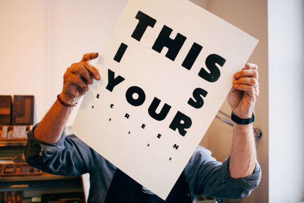
Adrian Shaughnessy talks to Erik Spiekermann about his typeface FF Meta, the corporate font of Herman Miller, for the company magazine WHY:

FF Meta was not designed with Herman Miller in mind, however. It was designed for the German Post Office (Deutsche Bundespost), which hired Spiekermann to rethink the entire graphic design system for the organization—everything from order forms to the once ubiquitous telephone directories. Deutsche Bundespost’s previous font? Like Herman Miller, it was Helvetica. With typical forthrightness, the then 38-year-old Spiekermann urged them to drop it, announcing that it was “unfit for purpose” and “overused.”

Spiekermann recognized that it was the Bundespost’s phone books that offered the greatest potential to benefit from a new typeface: “With just a change of typeface you could save a million trees and be a hero,” he recalls. And so he set about designing FF Meta (then called PT55), a process that involved meticulous research into the proportions of classic letterforms and analysis of developments in printing technology. “We have a great German word, ‘Kopfgeburt’—it means something that springs from your brain. The design of Meta wasn’t like that at all. The process was very theoretical. It wasn’t emotional. This was because at that time I had no experience and couldn’t rely on talent or practice. Everything had to be deducted.”

So thorough was Spiekermann’s process that he arranged to have his new letterforms tested for legibility by perception scientists at Braunschweig University of Technology. “There was a guy there who looked at it, and in his view, there was a little too much ‘noise,’ which you can see in my early drawings. So, I toned down the contrast. There were a couple of numerals that he said were a little too in love with themselves—mannered, in other words.”


Comments closed

Freunde von Freunden: Erik Spiekermann Interview

Freunde von Freunden visit the apartment and studio of designer and typographer Erik Spiekermann:

A look around his tidy, if eclectic, home offers an eye pleasing sampler of the designer’s interests. One of his home’s main attractions is his two-story bookshelf, mostly filled with titles pertinent to his profession and only accessible by the seated pulley system Spiekermann developed for one of his favorite leisure activities – browsing his massive library and getting lost in his passion for words and images. “It’s almost like a safety net having all my books here. I have a lot of cool stuff that other people don’t have, and I love browsing and discovering books I’ve had 50 years. I’d love to spend time just browsing through my bookshelves. Every time I go to look for something I find something else, you get totally stuck. There’s nothing better than getting stuck on a Sunday afternoon with books you’ve forgotten about.”

MG_9983

And on a related note, Madeleine Morley spends a day at Spiekermann’s print workshop, p98a for Port magazine:

The process of printing is repetitive, slow, and surgical, but also very peaceful and contemplative – like knitting or carpentry. We insert pieces of paper into the letterpress, rotate the handle, stack the print on a drying rack, re-ink the font, then start again. By this point, we begin to develop a consistent and robot-like rhythm, but we’re a clunky, less graceful team in comparison to  guild of typographers.

I ask [Alexander] Nagel why he prefers this method of design: “It has more… sinne,” he replies, using a German word that is difficult to translate. The term means ‘touch’ or ‘sense’. It refers to the haptic, but also means ‘significance’. This is something people say a lot about the printed page and its physical tangibility, but it’s something you don’t quite appreciate until you’re actually building one of these templates from metal, wood and paint.

Comments closed

Creative Characters: Erik Spiekermann

P98a-spiekermann

Type designer Erik Spiekermann recently spoke to MyFont’s Creative Characters newsletter about his career and his return to letterpress printing:

I think it’s very appropriate to discuss the new interest in analog technologies, and the ways that young people are now finding to combine the analog and the digital. In fact, the difference between the two is disappearing. As type specialist Indra Kupferschmidt also remarked recently — there’s no longer any reason to make things for the screen that look worse than designs made for print. Anybody who does layouts for the screen must know about type and typography just as well as someone who designs for paper. So what counts is, just like before, how to get the message across. We have the technology, there is no more excuse for a job badly done.

What I find very interesting is the movement of people who are savvy in digital design but are genuinely interested in analog techniques. It is now more than a passing trend; there must be a deeper motive why we are newly interested in the hand-made and the haptic, material and three-dimensional aspects of type and design.

Comments closed

Hello, I Am Erik

hello-erik
Next month, the fine folks at Gestalten are publishing Hello, I Am Erik,  a ‘visual biography’ of typographer and designer Erik Spiekermann. In this new interview with GestaltenTV, Spiekermann talks about his 30 year career, and how working with blocks of movable type is different from designing on a screen:


Comments closed

Design Matters with Erik Spiekermann

Debbie Millman talks with designer and self-confessed typomaniac Erik Spiekermann on the latest episode of Design Matters:

Design Matters with Debbie Millman: Erik Spiekermann mp3

Comments closed

Erik Spiekermann: Typography in the Digital Domain

In this 10-minute film by Johnny Daukes for Microsoft UK,  typographer Erik Spiekermann talks type with Elliot Jay Stocks, founder of 8 Faces magazine:

(via I Love Typography)

Comments closed

Erik Spiekermann | FormFiftyFive

Always entertaining type-designer Erik Spiekermann talks to FormFiftyFive about pretty much everything except type design:

Comments closed

Midweek Miscellany

Line o’ Type — John Hendel celebrates 125 years of Linotype at The Atlantic:

A German immigrant named Ottmar Mergenthaler invented [Linotype] in the 1880s and continued to promote and expand its use until dying in Baltimore in 1899. The Linotype’s power involved transferring a line of text (typed with meticulous care by a Linotypist onto a special 90-key keyboard) to a sheet, creating a “line o’ type” that could be rapidly printed onto many subsequent pages, thanks to the genius of matrices and hot metal.

A Good English ButlerDwell Magazine spends 30 minutes with designer Dieter Rams:

Never forget that a good product should be like a good English butler. They’re there for you when you need them, but in the background at all other times. Besides a few millionaires in London, most of us don’t have butlers.

The butlers of today are our products and our furniture.

And on a related note… Erik Spiekermann talks about typography and crowd-sourcing a logo for human rights with Deutsche Welle:

Typography is the famous crystal goblet – you drink the wine, you don’t think about the glass. I can make things a little bit warmer or colder, or squarer or rounder, but I am a servant to the words… I like to say, typography is like air – you only talk about it when it’s bad. It’s taken for granted, but we would certainly miss it if it wasn’t there.

Lying LiarsIan Leslie, author of Born Liars: Why We Can’t Live Without Deceit, on the connection between lying and storytelling:

[T]here is a gushing river of verbal creativity in the normal human mind, from which both artistic invention and lying are drawn. We are born storytellers, spinning narrative out of our experience and imagination, straining against the leash that keeps us tethered to reality. This is a wonderful thing; it is what gives us our ability to conceive of alternative futures and different worlds. And it helps us to understand our own lives through the entertaining stories of others. But it can lead us into trouble, particularly when we try to persuade others that our inventions are real. Most of the time, as our stories bubble up to consciousness, we exercise our cerebral censors, controlling which stories we tell, and to whom. Yet people lie for all sorts of reasons, including the fact that confabulating can be dangerously fun.

See also: Cynthia Crossen on the allure of unreliable narrators for the WSJ:

Today, unreliable narration does seem to be in vogue. Could that be because so many people are chronicling their lives online now, and we can see how unreliable most personal narratives are? As David Fromkin wrote in his history of civilization, “The Way of the World,” “Life is a story that each of us tells to his or her self; and it therefore is a tale told by an unreliable narrator.”

And finally…

Author Umberto Eco on the books we haven’t read for The Guardian:

There are more books in the world than hours in which to read them. We are thus deeply influenced by books we haven’t read, that we haven’t had the time to read… And yet I’ve a fairly accurate notion of what I haven’t read. I have to admit that I only read War and Peace when I was 40. But I knew the basics before then. The Mahabharata – I’ve never read that, despite owning three editions in different languages. Who has actually read the Kama Sutra? And yet everyone talks about it, and some practise it too. So we can see that the world is full of books that we haven’t read, but that we know pretty well.

Comments closed

Erik Spiekermann — Putting Back the Face into Typography

In this fantastic video from Gestalten, graphic designer and typographer Erik Spiekermann, founder of MetaDesign and FontShop, and author of Stop Stealing Sheep, talks about designing type:

Spiekermann also discusses his love typography in this profile on Deutsche Welle TV:

(via I Love Typography)

1 Comment

Something for the Weekend

EquationsLauren Panepinto’s stunning op-art covers for a new trilogy of novels by Simon Morden, published by Orbit. From the Orbit blog:

These online cover images truly don’t do the packages justice — each book has a single bright colour and in the printed version that will actually be a fluorescent ink. Spot gloss lamination and subtle embossing will heighten the effect of the illusions and make them very nice objects to pick up and stare at — they really draw you in when you see them in person. Here they are separately, and larger, to really start to mess with your eyes…

I immediately thought of Bridget Riley when I saw these…

In Praise of Big Cities — Typographer Erik Spiekermann, author of Stop Stealing Sheep, on cities for blueprint Magazine:

I hardly ever go out; I love to eat at home and can think of nothing worse than a weekend house in the country somewhere. All I would ever need to take my mind off things is right outside. It’s actually a long time since I’ve been to a theatre or the opera, but I wouldn’t want to live in a place that has neither. The thought of all this activity happening outside my front door makes living here attractive. There are lots of cafes, and they always seem to be busy, full of people who seem to neither have a home nor an office to go to. Coffee shops have been described as the perfect place to be out in public while on your own and a good reason to leave your house while avoiding fresh air. I don’t need to go there, but the thought that I could at anytime is enough to avoid feeling lonely.

Iambik — Hugh McGuire walks the talk and launches a new audiobook company with an eclectic collection of literary fiction from independent presses.

And finally…

Good Ideas — Nora Young interviews Steven Johnson, author of Where Good Ideas Come From, for CBC Radio’s Spark:

CBC Radio Spark: Steven Johnson

1 Comment

Something for the Weekend

Patrick Cramsie, author of The Story of Graphic Design, chooses his top 10 graphic design books for The Guardian. The list includes Notes on Book Design by Derek Birdsall.

Type Education — FontShop have released a handful of free typography primers designed for downloading and printing, including ‘Seven Rules for Better Typography’ by Erik Spiekermann.

Frost — Sifting through the Penguin archive in Bristol, writer Gaby Wood profiles the late Eunice Frost, who became an editor at Penguin in the 1930’s and went on to become its first female director, for The Telegraph:

Frost was sharp and, for all her youth and inexperience, in many ways more culturally engaged than the Lane brothers… It was to a large extent thanks to her that Penguin began to publish original work – not just reprinted fiction but the Pelican series of new non-fiction, and the Penguin ‘Specials’ series – quickly produced tracts on various subjects of urgent import. Three weeks after war was declared, for instance, Harold Nicolson was commissioned to write a 50,000-word book entitled Why Britain Is at War, which he delivered two weeks later and which was published a fortnight after that.

Secrets of Life and Death — Artist Jaime Hernandez, co-creator of Love & Rockets, and comics scholar Todd Hignite discuss their new book The Art of Jaime Hernandez with Eric J. Lawrence on KCRW.

Comments closed

Midweek Miscellany

Edward Gorey book cover set on Flickr (via This Isn’t Happiness).

15% of Immortality — Literary agent Andrew Wylie profiled in Harvard Magazine:

“The music industry did itself in by taking its profitability and allocating it to device holders. Manufacturing and distribution accounted for roughly 30 percent of the music industry’s profit. These were conveyed to Apple in the deal for iTunes. But why should someone who makes a machine—the iPod, which is the contemporary equivalent of a jukebox—take all the profit?… [Apple] couldn’t have sold the device without the music that was on it. Instead, why didn’t the music industry say to Apple, ‘We want 30 percent of your iPod sales?’ Or ‘How about paying us 100 percent of your music revenues—you keep your device profits, and give us our music profits?’ That’s not the deal that was made. And that is why the music industry hit the wall.”

“You just can’t kill us”Publisher’s Weekly looks at the future of sales reps, “the roaches of the business”:

[T]he key to the rep business may no longer be synonymous with the key to the car. Independent reps continue to call on as many stores in their territory as possible, but they also tweet, blog, e-mail, Constant Contact, and GoToMeeting, as well as phone, to stay in touch with their accounts. “If there’s a rep who can call on an account in person, it usually benefits the account,” says Kurtis Lowe, head of group for Book Travelers West, who until last year was the only rep traveling to Alaska. Now he uses what he calls “a hybridization of personalization and electronic contact”… Reps now provide stores with a mix of sales, marketing, customer service, and pretty much whatever else is needed.

“We all have our fates” — Berlin-based Bookslut Jessa Crispin talks to Ulrich Ditzen about his late father, the author Hans Fallada, and the posthumous success of his novel Every Man Dies Alone:

It was the fashion designer Diane von Furstenberg who first approached Dennis Loy Johnson at the publisher Melville House, saying it was a shame the book had never been translated into English. “She talked to the American publisher, why didn’t he publish this book, it was a fantastic book,” Ulrich said. “She was very surprised that it had never been translated. Dennis Johnson then read it and shared her opinion and proceeded to get it translated. And it was a runaway success, to my great surprise.”

And speaking of Berlin…

Because who doesn’t want a remote-controlled mountaineer’s harness to peruse their bookshelf? Dwell features the Berlin home of typographer Erik Spiekermann and his wife, designer Susanna Dulkinys:

Inside, the house has a strikingly modern look… Which is not to say that there are no luxurious touches… [E]xtras include an ingenious, if terrifying, remote-controlled mountaineer’s harness that lifts browsers to the books on the two-story-high bookshelf (though they have to be careful not to run into the Ingo Maurer Zettel’z light). To avoid clutter, almost everything is built in, with cleverly designed zippered fabric panels on the walls working to hide plugs and cords. “It’s like creating white space,” says Dulkinys, “so you can free your mind and be creative.”

2 Comments