Hey. I hope you’re keeping safe and well, especially my friends and colleagues in snowy NYC. Thanks to everyone who helped with images and design credits this month — it’s been a really busy month so I really appreciate it!
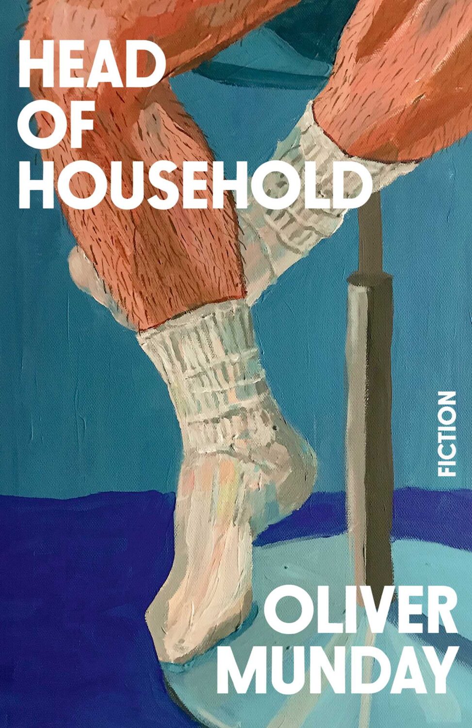
Oliver’s own novel, Head of Household, is out from Simon & Schuster in the US this month too. The cover was designed by Christopher Brand, and you can read a conversation between the two about the design process at LitHub.
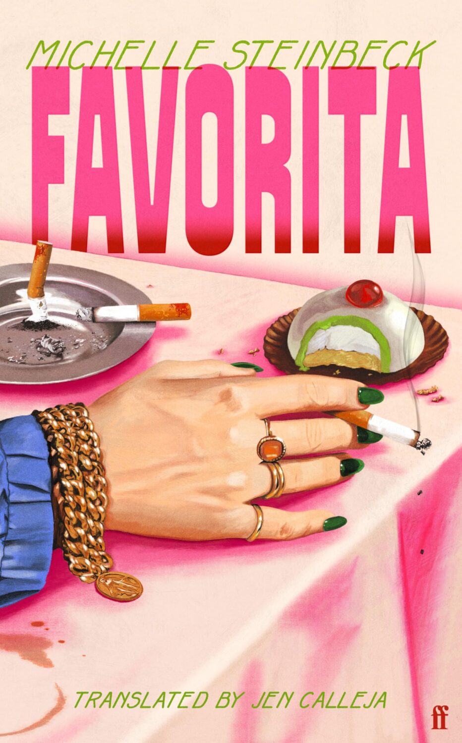
Favorita by Michelle Steinbeck; translated by Jen Calleja; design by Henry Petrides (Faber & Faber / February 2026)
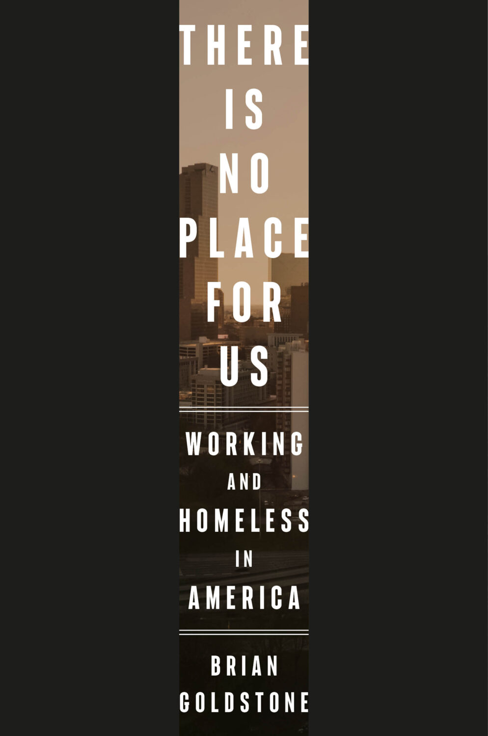
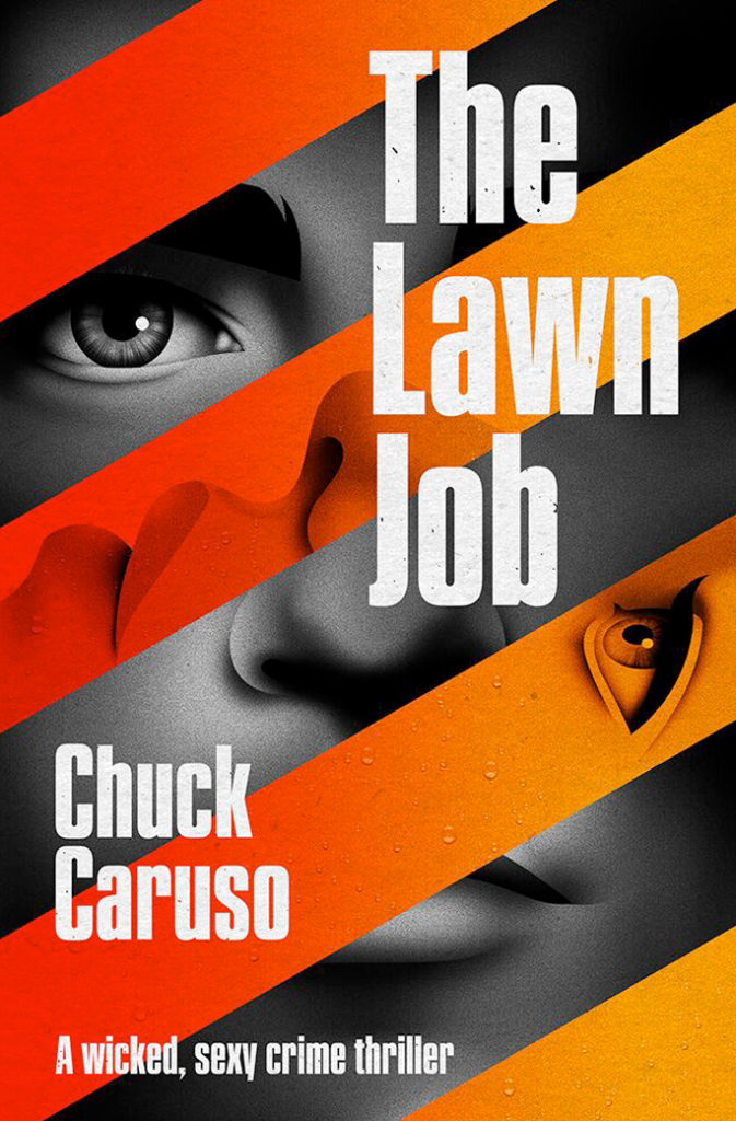
This reminded me of the cover of There Is No Place For Us by Brian Goldstone designed by Anna Kochman for Crown, which featured in March’s post. I’m no Barnett Newman, I do like a bold stripe.
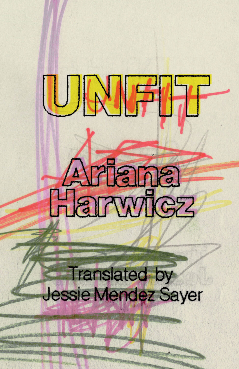
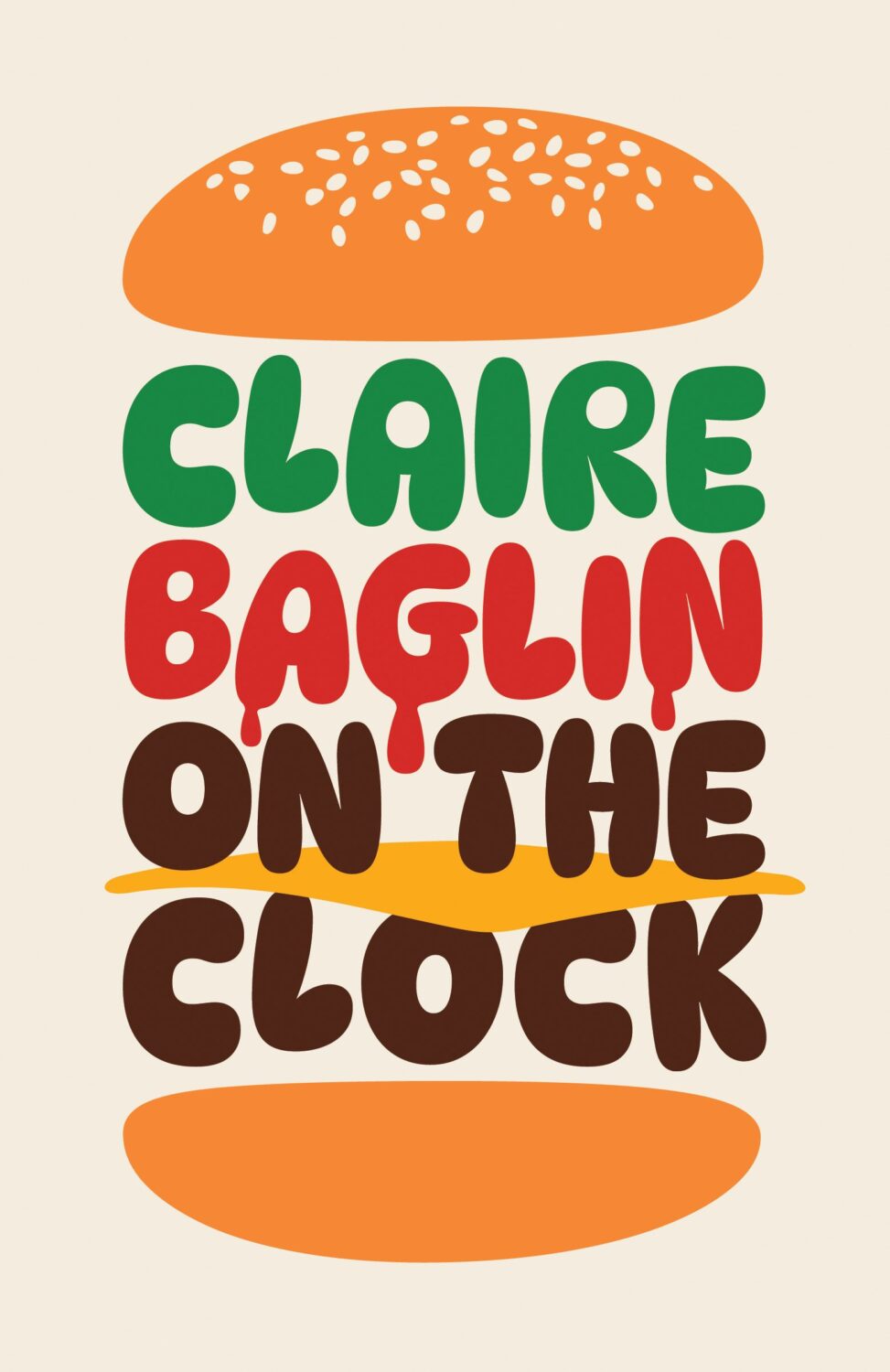
Unfit by Ariana Harwicz, translated by Jessie Mendez Sayer; design by Erik Carter (New Directions / October 2025)
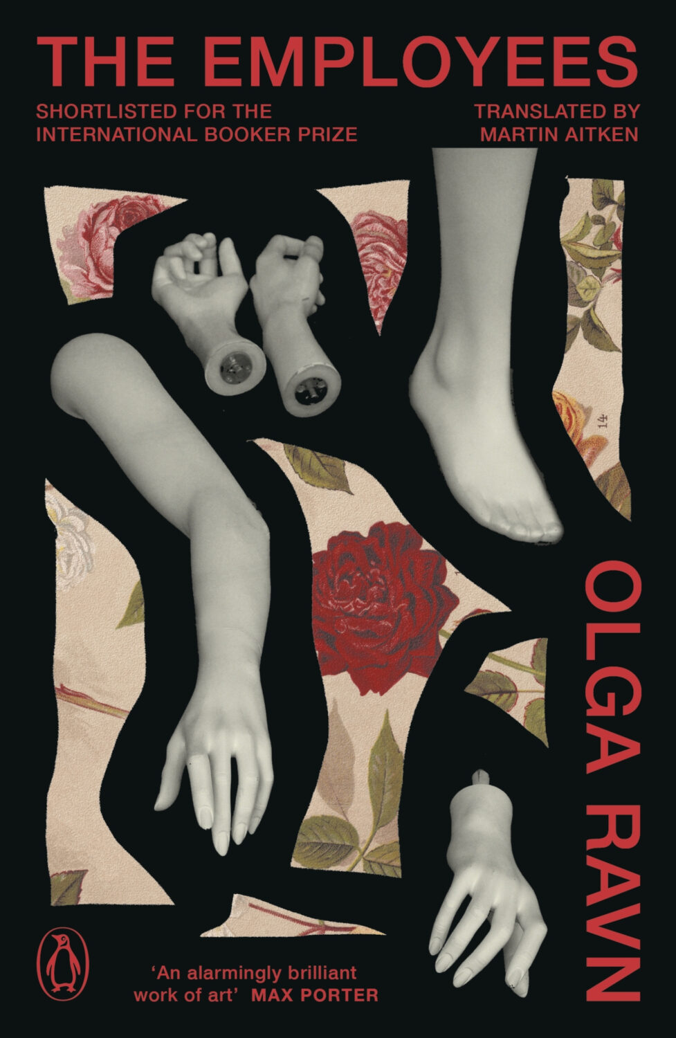
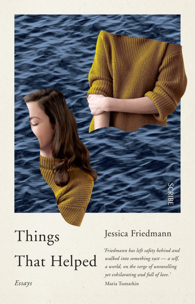
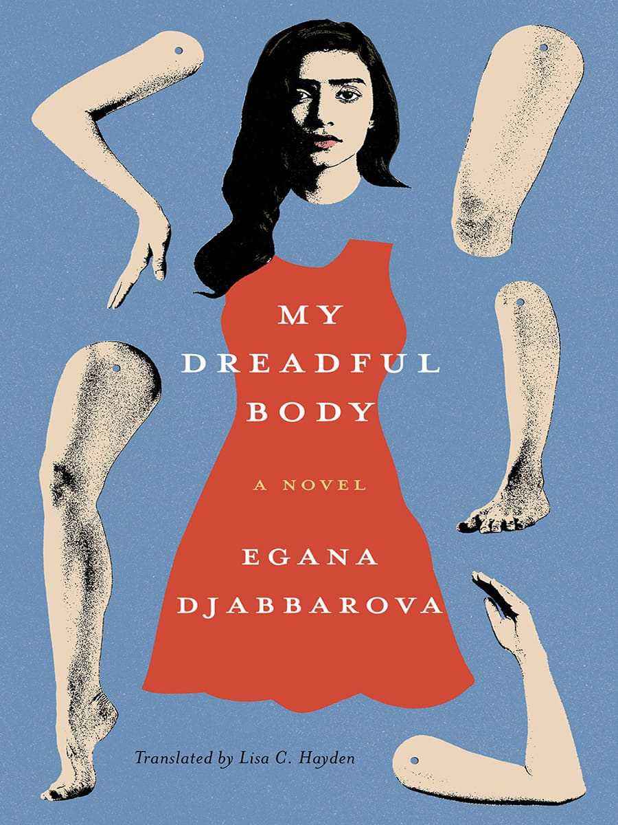
Dan Jackson also designed a new cover for the paperback edition of The Employees by Olga Ravn out next month in the UK from Penguin, which weirdly kind of looks like a Joan Wong collage, but could also be part of a dismembered / disembodied limbs on covers trend? I’m struggling to think of too many examples off the top of my head. Alban Fischer‘s cover design for My Dreadful Body by Egana Djabbarova? But that’s not out until next year. I’m sure there are a couple of others out there. I will have a think on it.
I am very late to this one, but the art is fun and it kind of fits with recent trends so I didn’t want to leave it out. Let me know if there is a design credit to add.
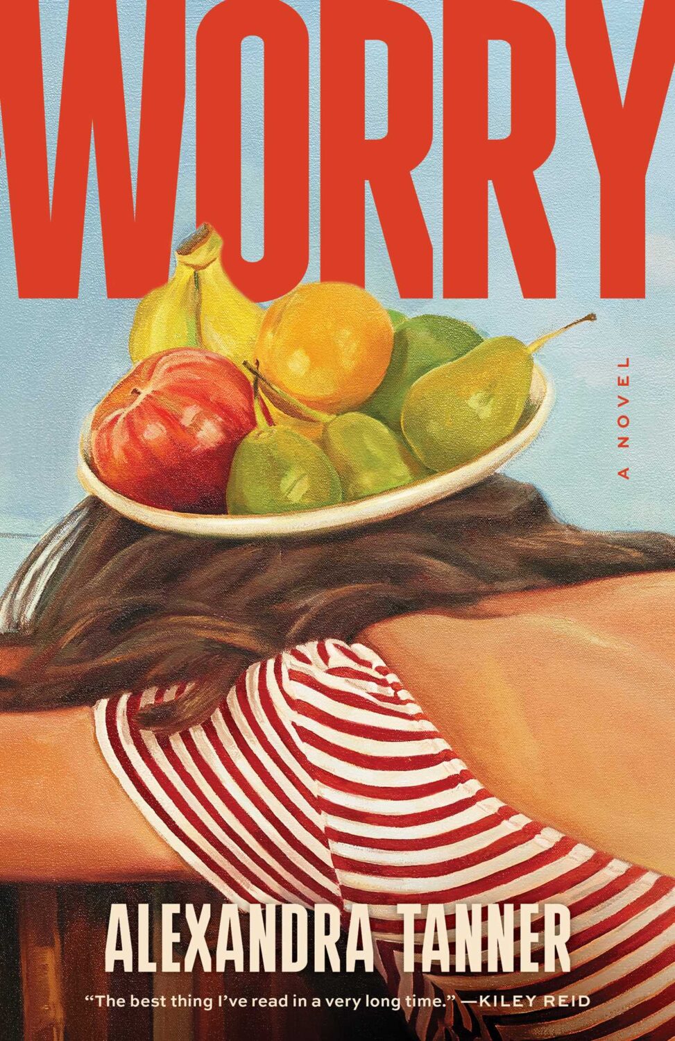
Interestingly, Shannon Cartier Lucy’s art was also used on the cover of Worry by Alexandra Tanner designed by Alicia Tatone for Scribner from last year…
Well, I don’t know about you, but I certainly didn’t miss the ceaseless chaos and constant anxiety. It is exhausting.
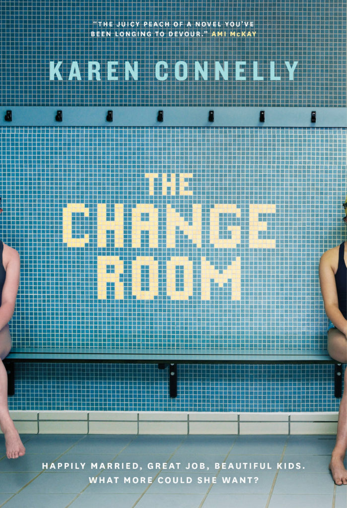
Anyway… I hope you’re keeping safe and well despite it all. I don’t know where March has gone, but this month’s post is another bumper edition with lots of great covers. I’m happy to have a bit more nonfiction in the mix, and there are lots of covers from indie publishers and even a university press along side the usual suspects. There are also a couple of Canadians if you’re keeping score.
Disposable by Sarah Jones; design by Keith Hayes; photograph by Susan Goldstein (Avid Reader / February 2025)
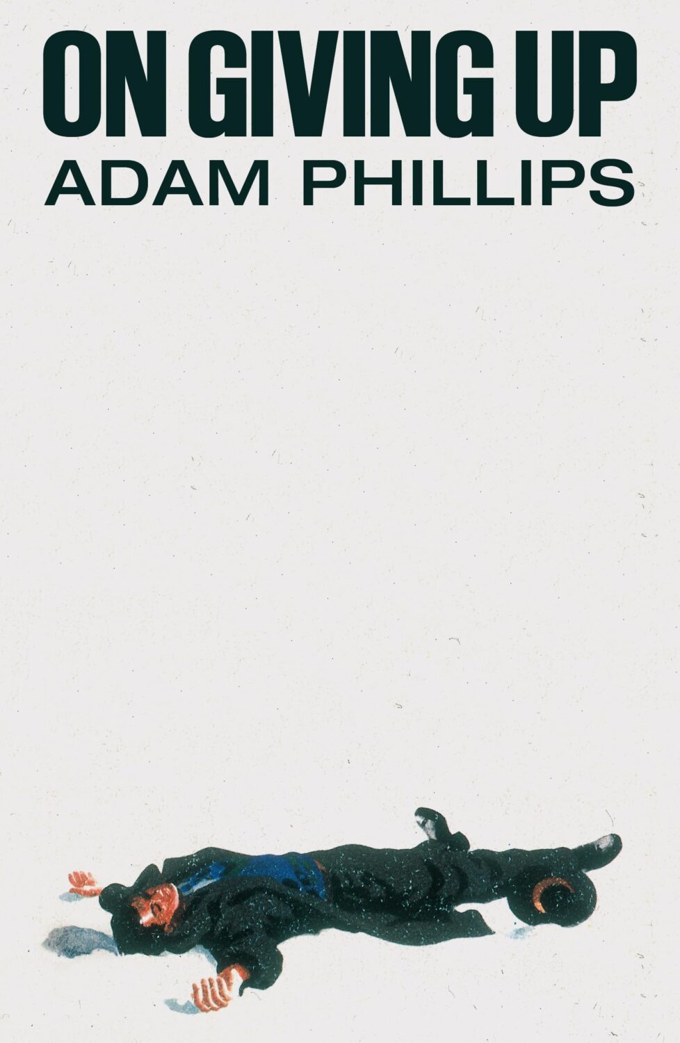
On Giving Up by Adam Phillips; design by Alex Merto (Farrar, Straus & Giroux / March 2024)
Yes, this is from March 2024, so I am precisely a year late posting it. Either I didn’t see it last year or I couldn’t find the credit at the time. Anyway, Alex posted or re-posted this cover relatively recently and it spoke to me.
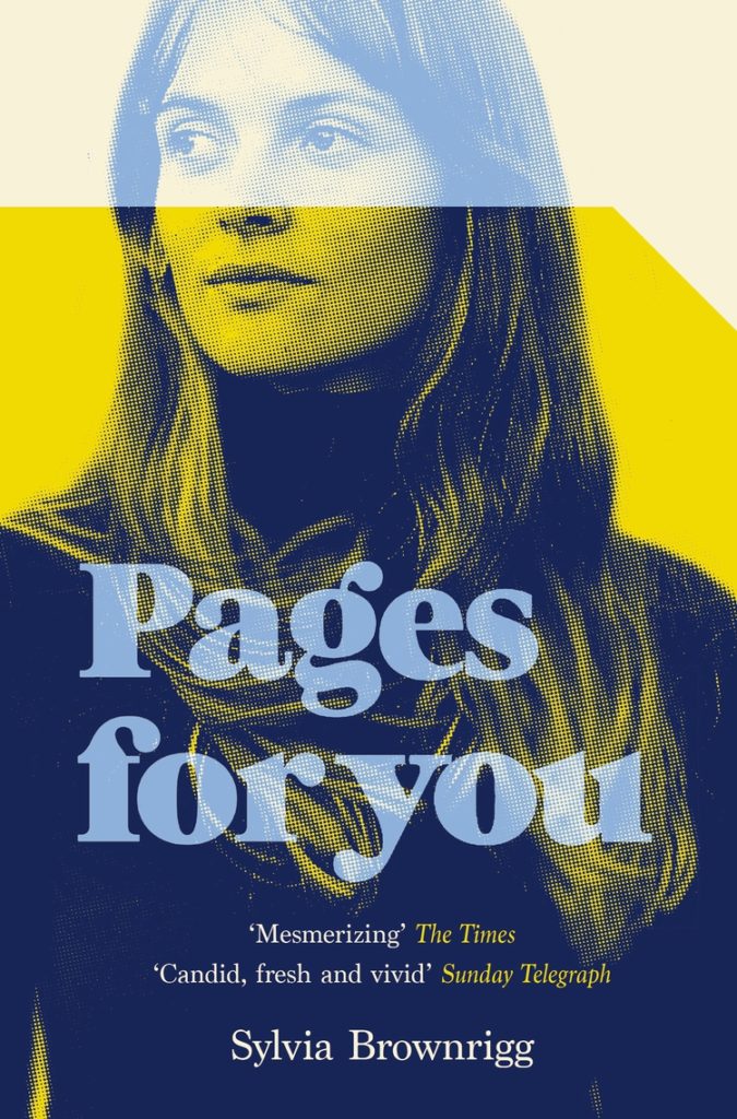
I also thought it went quite well with this cover…
The slightly less bonkers, but also fun cover of the US edition (published by Scribner this month) was designed by Math Monahan. I’m also quite partial to the definitely bonkers Polish(?) cover designed by Tomasz Majewski.
This will be the last of the monthly cover round-ups for 2021 because I have to turn my attention to the year as a whole, but there are some really top-notch covers in this month’s post so it feels like a good place leave off…
The cover of the UK edition, publishing next year I believe, was designed by Jack Smyth:
Jacket Weather by Mike DeCapite; design by Michael Salu (Soft Skull / October 2021)
I was reminded of the cover of The Empty Chair by Bruce Wagner designed by Gregg Kulick from what seems like an age ago (2013 I think?) . It’s very possible I have been doing this for too long…
Since 2010, I’ve posted an annual survey of the year in book covers. The post has expanded and developed over the past 7 years, but essentially it is a collection of the covers published in the previous 12 months that I found interesting or noteworthy in some way. As with the previous couple of years, the 2017 list is organized by covers (alphabetical by title), and by designer so that I can show a greater variety of work, and no one designer or studio dominates.
Thank you to everyone who has supported the blog this year, and special thanks to all the designers, art directors, authors, publishers, and fellow design enthusiasts who have helped me with covers and design credits. My sincere apologies to the designers and publishers not on this year’s list and whose covers I have overlooked in the past 12 months.
A post looking back on the YA covers of 2017 is to follow.
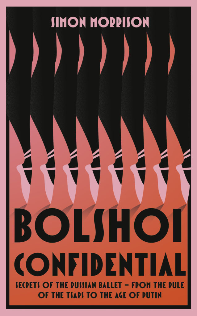
They’re not really the same, but the cover of Bolshoi Confidential reminded me of La Boca‘s excellent cover design for The Teleportation Accident by Ned Beauman from a few years ago…
Bolshoi Confidential by Simon Morrison; design by Jo Walker (Fourth Estate / August 2017)
In an excellent post for The Literary Hub, designer Erik Carter writes about designing the cover of Reiner Stach’s Is That Kafka? 99 Finds for New Directions, and the process of getting a book cover approved:
The actual process of designing a book jacket is more than just reading the book and making a beautiful image with your favorite font and slapping it on the front. A good cover should represent the spirit of the book and celebrate what makes that book unique. So then why do so many covers fall for the same visual clichés as so many other covers? Go on down to your local online book dealer and you’ll see bargain bin stock photos adorned with tiny endorsements about how this book is so, so much better than other one you’re about to click on. In order to get a book cover approved you have to get the sign off from the art director that you’re working for, the marketing department, the author, the editors, sometimes even the author’s spouse, their milkman, or their next door neighbor. It’s a nimble game of politics that you have to play to get the vision that you have for a cover into the bookstore. And it’s a game where design is often the loser. The publisher wants the book to sell, the designer wants the book to look good, and the author wants the cover to match their vision of what the cover of their book should be. And almost always, these three are at odds. There is a lack of definition for “what looks good” and a shaky science as to “what will sell” and authors are so close to their books it can be difficult to find out what it is that they actually want. The language of aesthetics and the aesthetics of language need to trust each other. It’s important for designers to be more acclimated with what it is that a publisher is looking for as to what will sell. Compromising that business by stretching your typefaces to the point of unreadability may not do you any favors. Ultimately it’s the author’s book, and they know it far better than you do, so really it’s their opinion that matters the most, even if they are not familiar with the fundamentals of good design.


