Skip to content

Tag: ellen lupton

Elaine Lustig Cohen, Pioneer

Elaine in 1964, photographed by Naomi Savage (1964)
Elaine Lustig Cohen, photographed by Naomi Savage

I was sad to hear that designer Elaine Lustig Cohen had died aged 89 last week. She will forever be associated with her more famous husband Alvin Lustig, but she was a remarkable designer in her own right and her influence, as Steven Heller notes at Design Observer, extended far beyond her studio:

Elaine’s professional standing far outlasted her years of practice because beyond being a pioneer, she was also the benefactor in so many ways for graphic design history, and an advocate for so many other historians, practitioners—and especially women. It is this enduring integrity and generosity that ultimately defined her highly treasured life.

Following Alvin Lustig’s death, Elaine specialized for some time in designing book covers and jackets, initially following her late husband’s aesthetic, until finding her own style and vision. For over a decade she earned commissions from museums, architects, and book publishers—including Noonday Press, whose publisher, Arthur Cohen, would become her second husband. Her own studio closed in 1967, although Elaine continued to design catalog covers for Ex Libris (the antiquarian bookstore she and Cohen ran together) focusing on avant-garde modernist books and documents. She turned instead to making art—inspired in part, by Constructivism, Dada, and the Bauhaus—and continued to do so until the end of her life.

hard_candy

In a profile of the designer for Eye magazine in 1995, Ellen Lupton noted what made ELC’s book covers so distinctive…

In her covers for Meridian Books and New Directions, designed from 1955 through 1961, Elaine Lustig Cohen used abstract structural elements, expressive typography, and conceptual photographs to interpret the books’ contents. Working at a time when most book covers employed literal pictorial illustrations, Cohen visualized titles in contemporary literature and philosophy through a rich variety of approaches, from stark abstractions and concept-driven solutions to obtuse evocations that bring to mind the recent work of Chip Kidd and Barbara de Wild for Knopf.

Elaine Lustig Cohen’s cover for the journal ‘The Noble Savage’ 4 (1960) features a time-worn classical statue festooned with a typographic moustache and blasted with a star-burst pull-out quote from Darwin. For Yvor Winter‘s ‘On Modern Poets’ (1959), Cohen photographed a loose arrangement of plastic letters, while she used a field of pebbles to obliquely represent ‘The Varieties of History’ (1957). If such solutions are suggestively poetic, Cohen could also be brilliantly blunt, as in her choice of oversized, cello-wrapped bonbons for Tennessee Williams’s ‘Hard Candy’ (1959).

…A point echoed in the New York Times obituary:

She designed museum catalogs and furniture. As a book-cover designer, she followed in Mr. Lustig’s precisionist footsteps but eventually established her own, more free-form style.

“I tried to reflect the spirit of the books,” she said in a video made by AIGA, the graphic arts organization, when she was awarded its medal in 2012.

Her jacket for “Yvor Winters On Modern Poets” looked as if plastic letters had been placed on a tabletop, then jostled by a passing child. A book about St. Augustine featured his name twice, as the arms of a cross. The jacket for Tennessee Williams’s short-story collection “Hard Candy” showed extreme close-ups of cellophane-wrapped sweets, seeming to fall through the air.

You can see a selection of ELC’s book covers on her website, and the video referenced above is here:

Comments closed

Midweek Miscellany

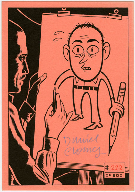
Fantagraphics find a cache of signed, limited-edition bookplates by artists including Dan Clowes, Jaime Hernandez and Gilbert Hernandez.

The Case & Point — A new website showcasing the best in custom type design and lettering curated by Vancouver-based design studio Working Format.

Designer, educator and author Ellen Lupton interviewed at From the Desks Of… (My Q & A with Ellen from 2009 is here).

And finally…

The New Thing — William Gibson, author most recently of Zero History, interviewed at Jack Move Magazine (via the man himself @GreatDismal):

The genuinely new things are really hard to imagine. When you do imagine them, they’re very hard to relay in anything like a sense in which the people who are totally used to them would use them. There’s always this factor in future-tech science fiction where somebody, be it the characters or the narrative voice, is really kind of wowed by future tech. It’s a powerful impulse. You want the reader to get a wowie. But there’s a way in which it’s not naturalistic; it’s not a genuinely naturalistic vision of the future, because that would be one in which people take it utterly for granted.

2 Comments

Something for the Weekend

[A quick note about the poll: thanks to everyone who voted, left a comment or sent me note this week — I really appreciate it. The feedback has been great. I’m going to shut the poll down at midnight tonight, but please let me know if you have any further thoughts about the direction of The Casual Optimist.]

Lauren Kaiser’s Little Red Riding Hood seen at Type Theory (pictured above).

liza-pro-underwareThe Oscars of Type — Ellen Lupton’s list of the year’s top typefaces at Print magazine. “Best Actress” was awarded to Underware’s Liza Pro (pictured above). My interview with Ellen Lupton is here.

Happiness as By-product — Jessa Crispin founder of Bookslut interviewed by Jeff VanderMeer, author of Booklife (which Crispin was critical of interestingly):

I was having a conversation with a writer the other day, and he stated that the best things are always by-products. Happiness is a by-product, and I loved that he said that. You can plot your journey to success or happiness or wealth or whatever it is you’re looking for, but if you’re too focused on the end result, you’re going to miss anything good going on around you… Not that we should all sing songs around the campfire and braid each other’s hair, but there has to be a combination of the two, forward motion and goal planning, but while taking a look at the people around you.

Comics Studies Reader — Jeet Heer on comics and comic scholarship at Books@Torontoist:

I think there’s a wide variety of things that can be done with comics, and I think we’ve only scratched the surface… One of the interesting things about manga is that kids are reading translated manga that reads right to left. Part of the reason that’s possible is because comics are both words and pictures – half of the translation work is already done. So you can look at a comic book in a language you don’t know and you won’t get everything but you can still get a fair bit of what it’s about. And so they have this sort of function as cultural ambassadors. You can actually learn a lot about a culture just by looking at the comics.

The New Yorker 85th anniversary covers by Chris Ware, Adrian Tomine, Dan Clowes, and Ivan Brunetti seen at the Creative Review blog (Adaptation by Tomine pictured below).

Art Spiegelman and Francoise Mouly (art editor at the aforementioned New Yorker) discuss The Toon Treasury of Classic Children’s Comics with (a particularly gushy) Michael Silverblatt for KCRW’s BookWorm :

Comments closed

Something for the Weekend, September 18th, 2009


Bring the Noise — Toronto illustrator Michael Cho (known locally for his much-loved signage for the now defunct Pages Books & Magazines on Queen Street) discusses his jacket art for the Penguin Graphic Classics edition of Don Delillo’s White Noise.

I ‘m very happy to hear that D+Q are publishing a ‘petit livre’, Backalley Drawings, by Michael next year.

And watch this space for an awesome Q & A with Paul Buckley, the art director of the Penguin Graphic Classics series (coming soon!)…

But Is It Type? — Design educator Ellen Lupton on the difference between lettering and typography for Print Magazine:

I subscribe to the rather rigid theory that typography is about readymade, reproducible families of letterforms. Vernacular hot-dog signs, handwritten wedding invitations, and space-age logos aren’t typography…

Perhaps my quibble is an old one: you just can’t view real typography online. Beautifully printed books and magazines are still the best resource for designers who want to know what’s happening in their field. Yet the design discourse is unfolding in real time on the web, and this is where students and young designers go to participate and be inspired.

And while were on the subject of typography, I thought — as a bungling amateur — that Brian Hoff’s post 10 Common Typography Mistakes was useful. Although I like to think I was surprising good at Cheese or Font (for what it’s worth).

Publish Local — An interesting list from The Task Newsletter (via REFERENCE LIBRARY). Would this work for book publishing?:

  1. Find what’s missing
  2. Work in the gaps
  3. Figure it out together
  4. Make it visible
  5. Make it viable
  6. Research and plan
  7. Expand existing systems
  8. Plan transparently
  9. Start small
  10. Commit to it
  11. Learn about your local flora
  12. Don’t get permission
  13. Print what you’ve got
  14. Make positive spaces.
  15. Find funding

And lastly, I just had to post this…

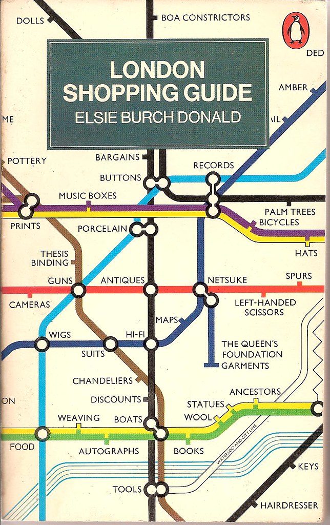
London Shopping Guide — Revised second edition from 1977, cover design by John Carrod, seen at Covers etc on Flickr.

Two design classics in one: Penguin paperbacks and Harry Beck’s tube map. What more could you ask for?

Comments closed

Turning Towards Our Shelves

Ellen Lupton, author of Thinking With Type (interviewed by me here), interviews graphic designer David Barringer about his new collection of essays There’s Nothing Funny About Design over at Design Observer today.

It’s a wide ranging interview — mostly about design unsurprisingly — but a couple of paragraphs about books caught my eye:

I do think that ebooks are a step backwards, however. It’s like the fax. It’s not flexible or useful enough. Handheld computers should have greater power, and the Kindle instead has less. You should be able to access encyclopedias, dictionaries, and other searchable resources, just like we can on the computer or the iPhone. That’s where the real benefit of portable handheld units are. Who cares about downloading Twilight? I care about having access to entire online libraries of reference works, maps, and encyclopedias.

I’ve sort of come to the same conclusion. If e-readers are less convenient than cell phones, less useful than laptops, and less durable than books, what’s the point?

Anyway, David Barringer goes on to discuss our enduring emotional connection with book-books:

I’ve seen many friends who are avid readers turn toward their shelves of books and regard them as they would a photo album of their own lives. We take the contents of books into our imaginations, and our personalities are influenced by them. Looking at the books on my shelves, I feel memories bloom, my own life come back to me. Books are triggers for remembering where we have been, and who we are. A book is like a body part, and when you die and your connection to the book is broken, the book dies a little, too.

I thought that was rather touching…

Link

(NB Full Disclosure: Thinking With Type and There’s Nothing Funny About Design are published by Princeton Architectural Press, who are distributed in Canada by my employer, Raincoast Books)

Comments closed

Q & A with Ellen Lupton

“Ellen Lupton makes this industry smarter. If graphic design has a sense of its own history, an understanding of the theory that drives it and a voice for its continuing discourse, it’s largely because Lupton wrote it, thought it or spoke it.” — Katherine Feo, AIGA

Dedicated to raising design awareness, Ellen Lupton is the Director of the Graphic Design MFA program at Maryland Institute College of Art (MICA) and curator of contemporary design at the Cooper-Hewitt National Design Museum.

A regular columnist  for ReadyMade Magazine, she has contributed to Print, Eye, I.D., and Metropolis, and writes regularly about design at both Design-Your-Life and her own website Design Writing Research.

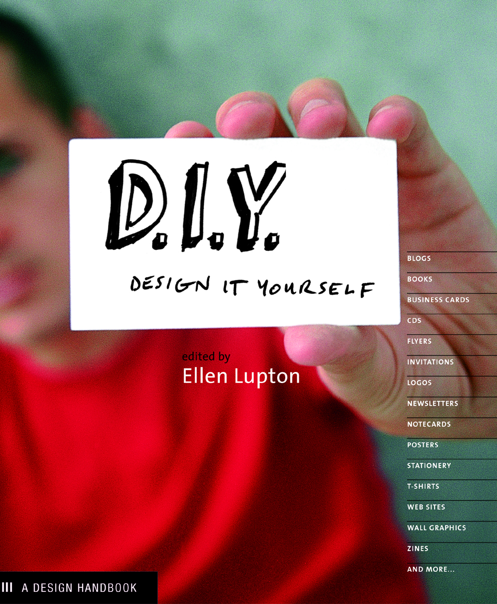
Her books include the indispensable introduction to typography Thinking with Type, DIY: Design It Yourself, D.I.Y. Kids,  co-authored with her identical twin sister Julia Lupton, and Graphic Design: The New Basics, co-authored with Jennifer Cole Phillips.

Design Your Life: The Pleasures and Perils of Everyday Things , another collaboration with her sister Julia, will be published by St. Martin’s Press later this year.

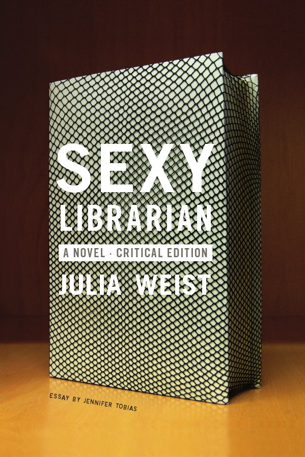
But, not content with being an  author, curator, designer, and educator, Ellen recently became a publisher, founding  Slush Editions to independently publish the novel Sexy Librarian by artist Julia Weist.

Sexy Librarian also features as a case study in Ellen’s latest book  Indie Publishing— a guide for independent authors written, researched, and designed in collaboration with graduate students at MICA — published in December 2008 by Princeton Architectural Press.

Ellen kindly replied to my questions about design and indie publishing by email.

And for the sake of full disclosure, I should make absolutely clear that several of Ellen’s books are published by New York’s Princeton Architectural Press who are distributed by Raincoast Books in Canada. But, for the record, that only explains why I have her email in my address book, not why I chose to interview her.

I have also interviewed Ellen previously for the Pages bookstore in Toronto.

How would you define ‘indie publishing’?
Indie publishing is author-driven. The traditional publishing industry is controlled by publishing professionals — editors, marketing people, promotional staff, and the publishers in charge. These are all skilled people. In our book, we use the term broadly, to encompass everything from handmade zines to print-on-demand books to offset publications distributed by the authors to small imprints created by design firms who wanted to get into the content business.

How is it different from the traditional publishing industry?
Because it’s author-initiated, indie publishing side-steps the traditional barriers of the publishing industry. It gets beyond the gatekeepers. Now, those gatekeepers act as guardians of quality to some degree, but they also contribute to a homogeneous and profit-driven publishing industry that many authors find hostile and hard to penetrate. Indie publishing often serves niche or local markets that can’t be addressed by mainstream publishing.

What are the benefits of publishing yourself?
If you have had difficulty breaking into the mainstream publishing world, going independent is liberating. If you end up producing a successful book, the profits can be substantial, but this shouldn’t be the main motive to get into publishing. Few authors make substantial bucks on their books — regardless of who publishes them. For most of us, writing and producing books is a labor of love.

What are the risks?
Most forms of indie publishing cost money, and that’s a risk. When you work with a commercial publisher, they foot the printing bill. Publishers also provide essential services like editing, proofreading, design, distribution, and marketing. The indie publisher has to take on all these tasks alone (or find friends to help out). It’s not easy, especially the distribution part. Self-published books are still viewed as less legitimate than commercially published books, although this is starting to change.

Do you see indie publishing as part of a wider D.I.Y. movement?
We are seeing more independent production in all creative fields — music, art, theater, design, etc. Younger creative people are interested in creating new institutions and networks outside the official art world or music/literature establishments. They are comfortable using technology to disseminate their ideas.

How has the internet affected the development of indie publishing?
The internet allows indie publishers to reach potential readers outside the bookstore system. Today, anyone can set up an Amazon Marketplace account or sell publications directly from their web sites. Print-on-demand publishers like Lulu and Blurb produce books when someone buys them, sending the finished book directly to the customer. These technologies are creating new possibilities for authors, especially those whose work is directed at narrower, smaller audiences.

What advice would you give someone publishing their first book?
Love your book. Get advice from lots of people in order to have the best possible content. Consider the different avenues that exist for publishing your work, including mainstream publishing as well as independent ventures.

Think about your audience and the best way to reach them. And think about your own primary goals for publishing a book. For example, an artist having a gallery exhibition might use a print-on-demand book as a tool for building his or her career via grant applications, networking with galleries and curators, securing lecturing and teaching opportunities, and more. A well-designed, carefully authored book has many functions. Selling copies to lots of people is just one of them. You might use a book as professional portfolio for landing a job or attracting clients — maybe all you need is a few copies.

What are some of the common mistakes people make designing books?
It’s important to use good software. The industry standard today is Adobe InDesign, which is available for both Mac and PC and can be easily learned via software manuals or technical workshops. Programs like Microsoft Word or Publisher are extremely cumbersome and will ultimately be frustrating to a person trying to design a refined and elegant book. Choosing a good typeface is also important. Avoid Times Roman, which was originally designed for newspapers and is so widely used as to be banal. Beautiful, high-quality typefaces such as  Garamond often come bundled with layout software and computer operating systems. Keeping your design simple and consistent from page to page is a rule of thumb for any book design. You also need to “unlearn” some habits from high school, such as leaving two spaces between sentences — this is not done in formal typesetting, and it will make your book look amateurish.

What do you look for in good book design?
Beautiful type, elegant margins, consistent pages.

Have you ever bought a book just for its cover?
Of course! Cover design is extremely important. A cover is not only a billboard advertising your book on a shelf, it’s also an online logo for your book that needs to look great at 100 pixels high. Getting help from a good graphic designer on your book cover is a worthwhile investment.

What will be the impact of e-books on publishing?
I believe that e-books are going to be very, very good for authors. By lowering the cost of publishing, e-books will make it easier for more authors to get their work published and to reach specific audiences who want their content. What I’m less sure about is how e-books will affect graphic designers!

Are we finally seeing the ‘End of Print’?
I do believe there is a sea change going on. After decades of unsuccessful attempts at creating electronic book readers, suddenly the time seems right. I don’t think print will disappear, but I think we will see less of it. It remains a tactile, permanent, stable medium that users can feel a personal attachment to.

What role do you think print-on-demand will play in the future?
Print-on-demand is where digital media and print meet. I think we will see a lot more of this as prices go down in the future. Ultimately, it is a more sustainable way to publish and involves less financial risk, but right now, it is too expensive for large-scale endeavors.

How will e-books and print co-exist?
E-books are great for disposable reading — magazines, casual fiction, newspapers. Perhaps every physical book in the future will come with an e-book supplement. I often want to quickly reference a book I read, and e-books would be great for that. Personally, I collect books, but I don’t need to keep the latest Richard Price book on my shelf forever.

As a designer, do you feel an attachment to print?
I am very attached to print. I don’t want to see it disappear in my own lifetime, that’s for sure. I love the tactility, permanence, and scale. But I do find myself reading more and more online.

Thanks very much Ellen!

4 Comments