Skip to content

Tag: edward johnston

Edward Johnston: Modest Typographic Purist

Edward Johnston

At The Guardian, Oliver Wainwright considers the work of Edward Johnson, and visits a new exhibition marking the centenary of his famous typeface for London Underground:

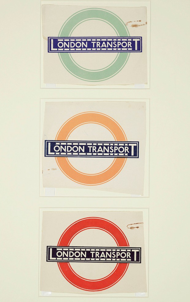
Although sans-serif typefaces (letters without the little flicks at the end of their strokes) date back to the 18th century, Johnston’s Underground typeface can be credited with popularising the style. Indeed, it was so influential that it became the typeface from which every 20th-century sans-serif typeface would be measured. As Gill later wrote in admiration, Johnston “redeemed the whole business of sans-serif from its 19th-century corruption”.

His former student was perhaps driven by the guilt of seeing the success of his own typeface, Gill Sans, which he admitted had been heavily based on Johnston’s work. Promoted and licensed by Monotype, and preloaded into computers, it has become much more widespread than Johnston, which is owned by Transport for London.

“I hope you realise that I take every opportunity of proclaiming the fact that what the Monotype people call Gill Sans owes all its goodness to your Underground letter,” Gill wrote in a letter to Johnston later in life. “It is not altogether my fault that the exaggerated publicity value of my name makes the advertising world keen to call it by the name of Gill.”

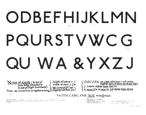
Little did it bother Johnston, accidental creator of one of the world’s longest-lasting corporate identities, who was never one for the limelight. When asked to submit a biography for Who’s Who, he was characteristically to the point, listing only three achievements: “Studied pen shapes of letters in early MSS, British Museum, 1898-99. Teacher of the first classes in formal penmanship and lettering, LCC Central School, 1899-1912. Designed block letters based on classical Roman capital proportions (for London Electric Railways), 1916.” But what influential letters they would turn out to be.

The exhibition Underground: 100 Years of Edward Johnston’s Lettering for London opens at Ditchling Museum of Art and Craft in Sussex March 12 and runs until September 11.

johnston roundels


Comments closed

Something for the Weekend

Rubbish — Rachel Cooke on the artist Kurt Schwitters at The Guardian:

Merz doesn’t mean anything: it is a nonsense word (it comes from Commerzbank, an ad for which appears in one of his earliest collages). But after 1918 everything Schwitters made was Merz, whether it was periodical, painting or poem. He was a one-man movement. “The word denotes essentially the combination of all conceivable materials for artistic purposes,” he said. “And technically the principle of equal evaluation of the individual materials… A perambulator wheel, wire-netting, string and cotton wool are factors having equal rights with paint.” In other words, art could be made from the things most people regarded as rubbish. Almost overnight, he became a collagist.

There is a slide-show of Schwitters’ collages here.

Also: Merzman: The Art of Kurt Schwitters, is a fascinating 30-minute BBC Radio 4 documentary about the artist and his work in Britain.

The exhibition Kurt Schwitters in Britain opens at the Tate January 30, 2013.

Going Underground — The iconic London Underground typeface, designed by Edward Johnston in 1913, turns 100:

“Underground” — later known as “Johnston” — was circulated as a lettering guide for sign-painters and also made into wood and metal type for posters, signs, and other publicity materials used throughout London’s transport network.

Johnston himself only drew one weight of the typeface. He based its weight and proportions on seven diamond-shaped strokes of a pen stacked in a row. This gesture even shows up in the typeface itself, with the characteristic diamond used as the tittle of the “i” and “j”. He felt so strongly about the weight of the design that when another student of his agreed to create an accompanying set of bold capitals, Johnston wouldn’t speak to him for decades afterward.

And finally…

Fire Hose — James Gleick on the Library of Congress collecting and storage of Twitter messages, for the New York Review of Books:

This is an ocean of ephemera. A library of Babel. No one is under any illusions about the likely quality—seriousness, veracity, originality, wisdom—of any one tweet. The library will take the bad with the good: the rumors and lies, the prattle, puns, hoots, jeers, bluster, invective, bawdy probes, vile gossip, epigrams, anagrams, quips and jibes, hearsay and tittle-tattle, pleading, chicanery, jabbering, quibbling, block writing and ASCII art, self-promotion and humblebragging, grandiloquence and stultiloquence. New news every millisecond. A vast confusion of vows, wishes, actions, edicts, petitions, lawsuits, pleas, laws, proclamations, complaints, grievances. Now comical then tragical matters.

Call it what you will, the Twitter corpus now forms a piece of “the creative record of America” and therefore falls squarely within the library’s mission…


Comments closed

Something for the Weekend

It’s been a slightly shite week in the book trade this week.

Amidst the plethora of end of year/decade “Best of…” lists and gift guides, it was announced that Kirkus and Editor & Publisher Magazine are going to close (are we surprised? No); B&N’s Nook e-reader turned out to be not be quite as good as it was cracked up to be (are we surprised? No); and Simon & Schuster, Hachette, and HarperCollins upset the usual suspects (for all the usual reasons — only Moby Lives seemed to get that it might be about something else) by announcing their decision to hold back the release of a few e-book editions (are we surprised? No)… Is any of this particularly interesting? No. (Although — for the record — I am grateful to the WSJ‘s Jeffrey A. Trachtenberg  for reporting on the e-book developments, and to indefatigable Largehearted Boy for compiling a comprehensive list of Best of… lists)…

So needless to say, there isn’t much about the book industy in today’s links. Ah well…

Another addition to the weirdly brilliant (or brilliantly weird?) vintage book/pop culture mash-up phenomenon:  Web Services Book Covers by French illustrator Stéphane Massa-Bidal AKA Hulk4598, or Rétrofuturs. They’re sort of like Olly Moss meets Cristiana Couceiro. (First seen at Design You Trust and then just about everywhere else this morning).

The Sixties — Another fantastic new cover by Henry Sene Yee for Picador’s BIG IDEAS // small books series.

Type for the Tube — an interesting history of Edward Johnston’s typeface for the London Underground from its design to current usage.

And finally…

F is For Fail — A really charming “alphabetical odysessy through the creative process” by Brent Barson (via the lovely Aqua-Velvet):

Can I go home yet?

(Have a great weekend!)

3 Comments