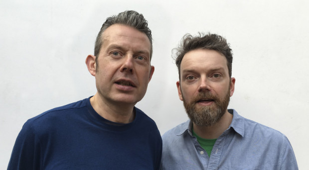
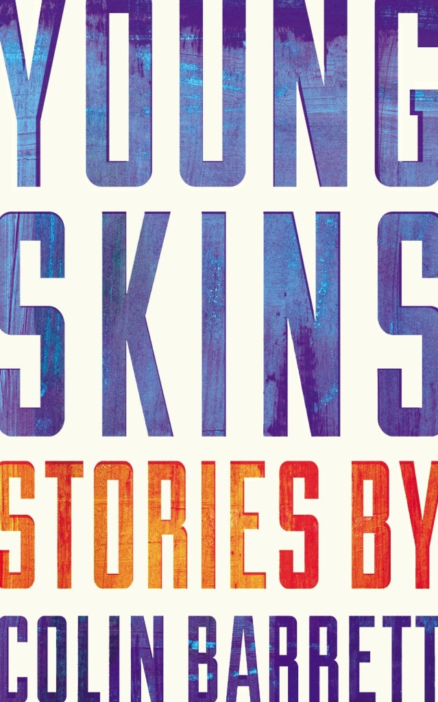
ABCD tends to recognise and reward brave, striking and fresh approaches, rather than more “conventional” cover aesthetics. I ask the pair whether they feel designers have more freedom these days; whether, as books become imbibed with more longevity and are seen as less disposable, publishers are more amenable to the idea of cover art as art, rather than as a marketing tool. They are reticent; Keenan responds: “It’s strange, because when you do see a weirdo cover – for a reason, not just for the sake of it – quite often they are really successful. If you think of a book as an actual package and compare that to other forms of packaging, its really old-fashioned in a lot of ways.
“Imagine a poster for, say, the next iPhone, and it has a quote on it like you’d see on a book cover – ‘this is the best phone I have ever had!’ – you just think, this is so old-fashioned, that kind of endorsement idea. On a book cover it’s the norm. A lot of advertising you see, you aren’t really sure what it’s for but it draws you in, whereas a lot of book covers are really overt – they tell you exactly what the book is about. We’re supposedly becoming more and more visually literate, but book covers are still, in some ways, quite naïve.”
Gray concurs: “It feels like a real nervous habit, the quote on the front. Is that really helping a book to be sold? Can [shoppers] not just read that on the back and get the same idea…on the front, is it really making someone think: ‘aha!’?”
“The greatest and the worst thing about book cover design is that no one really knows if it’s incredibly powerful or a complete waste of time,” Keenan says. “Quite often when you get a brief, you’ll be sent other covers that the [client] likes and some of them will look absolutely terrible…but it was a bestselling book! So that automatically becomes, in their eyes, a sort of ‘good cover’.”
If you follow the Casual Optimist on Twitter, you will know that a couple of weeks ago design studio Aishima asked people to tweet about inspiring women graphic designers using the hashtag #celebratewomen. As today is International Women’s Day, I thought I would follow up my #celebratewomen tweets with a visual list of 52 inspiring women book cover designers (one for every week of the year!) — from influential veterans whose work I’ve admired for years to junior designers that have just appeared on my radar.
The names of all 52 designers can be found at the end of the post. With a few more hours in a day the list could easily have been many times longer, so apologies to anyone I have overlooked. Please let me know who you would’ve included in the comments or on Twitter.
All This Has Nothing To Do With Me; design by Justine Anweiler; illustration Daphne van den Heuvel
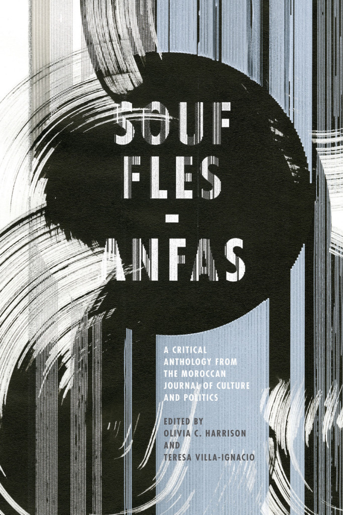
Souffles-Anfas edited by Olivia C. Harrison and Teresa Villa-Ignacio; design Anne Jordan and Mitch Goldstein (Stanford University Press / November 2015)
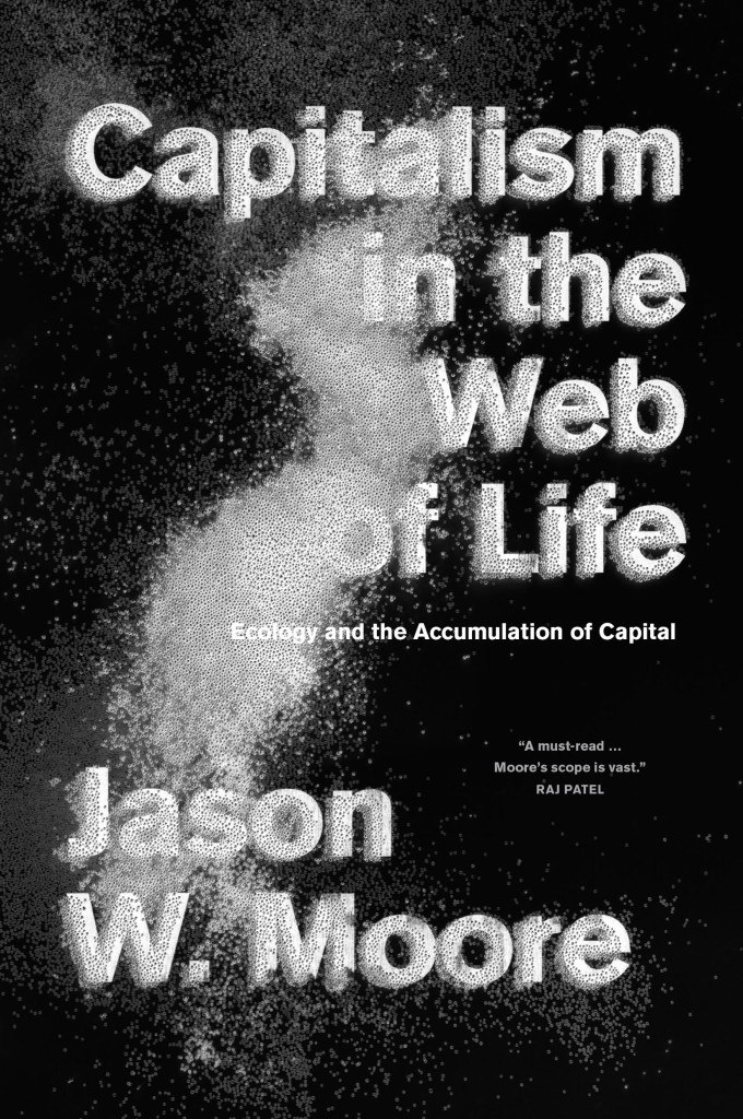
Capitalism in the Web of Life by Jason W. Moore; design by Anne Jordan and Mitch Goldstein (Verso / August 2015)
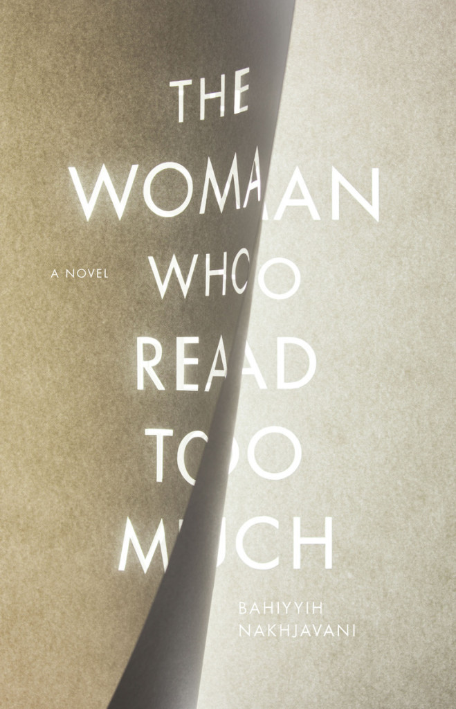
The Woman Who Read Too Much design Anne Jordan & Mitch Goldstein
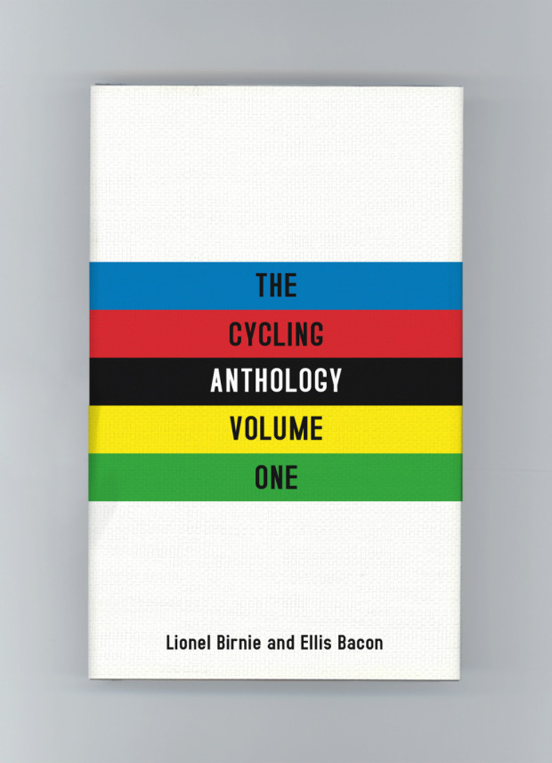
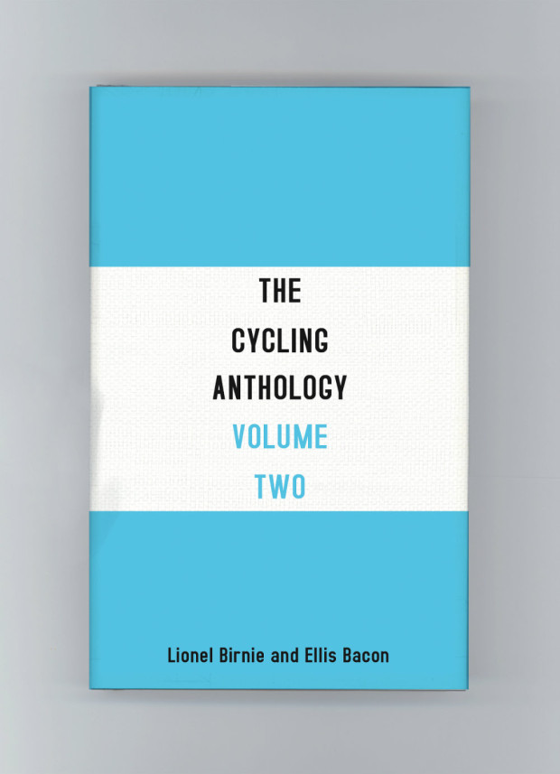
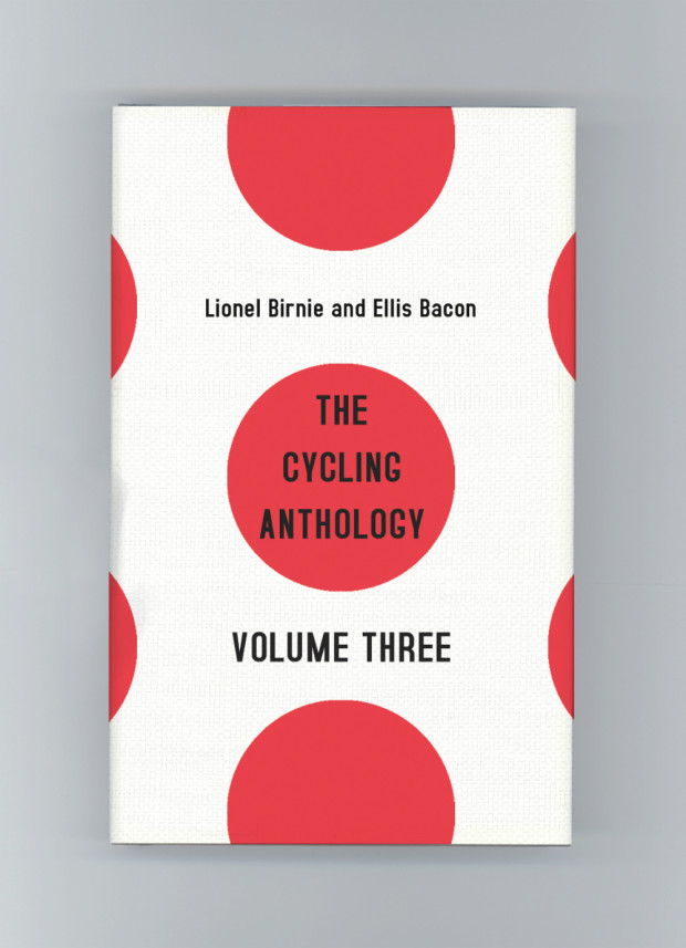
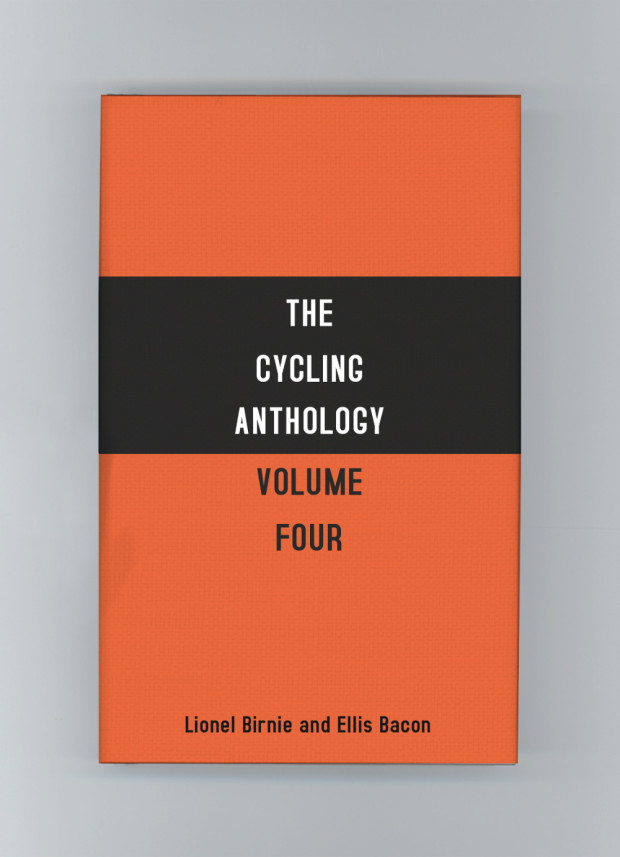
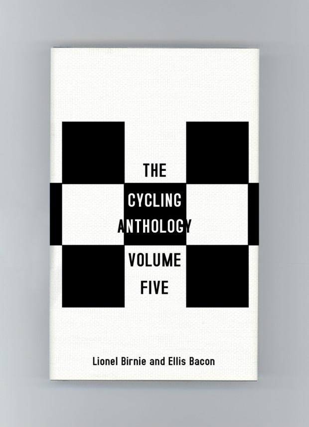
James Paul Jones‘s unused covers for The Cycling Anthology (pictured above) were some of my favourite designs from 2015. Based on famous cycling jerseys, I liked that they were a nod to insiders, but that you that didn’t need to be a cycling fan to appreciate the stylish minimalism of the designs.
When I learnt that they were passed over in favour of a more traditional, illustrative approach, I asked James about his work on cycling books, and why the jersey covers didn’t go to press.
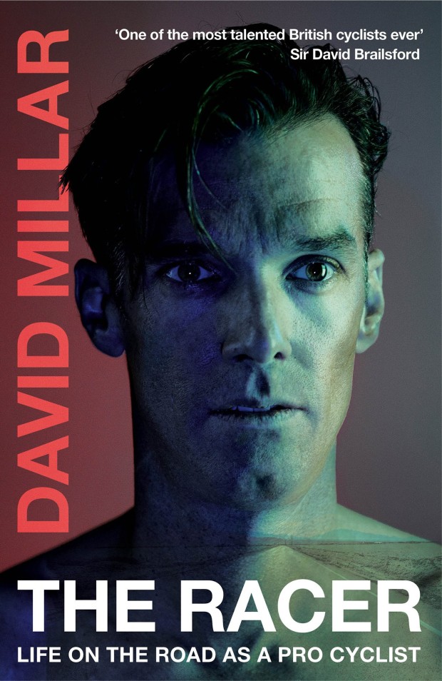
“I’ve always loved sports but I didn’t count myself a cycling enthusiast until my last year working at Orion Publishing where I was given the job of art directing the photo shoot for David Millar’s book Racing through the Dark,” he told me. “Working with David opened my eyes to the cycling world, and I was lucky enough to work on Sir Bradley Wiggins’ book a couple of years later.”
“Coincidentally David Millar writes beautifully about cycling and has a few essays as part of the Cycling Anthology,” James continued. “I also just finished designing his latest book, The Racer a few months back — all cycling enthusiasts should grab a copy! The contact sheet of ‘tour scars’ is one of my favourite plate sections we’ve ever done, and the back cover features one of the final jerseys he ever wore. Complete with rips, holes and bloody marks from one of his most brutal crashes. As soon as we saw it we knew it had to be featured somewhere, and the photographer captured it brilliantly.”
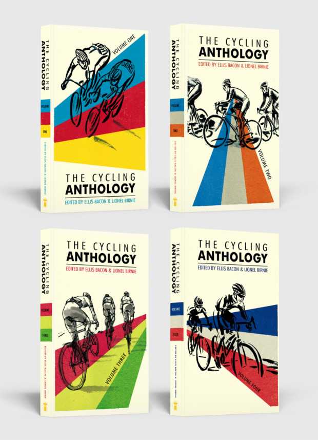
The Cycling Anthology presented a different kind of challenge, however. Originally self-published, it collects original writing by some of the world’s best writers on the sport, as well as cyclists themselves. Now published by Yellow Jersey Press (an imprint of Penguin Random House), the new volumes of the anthology presented James with an opportunity to repackage the series as a whole, and to experiment with a new look for the covers.
“I wanted to present the editors and authors with two options. A more traditional route, and an option that would hopefully resonate with the cycling community. The jerseys were the latter, and one of the first things I researched. I really wanted to make that connection with the cycling community, and the target market is very design conscious which helps. They are so iconic in the cycling world it just seemed to make perfect sense.”
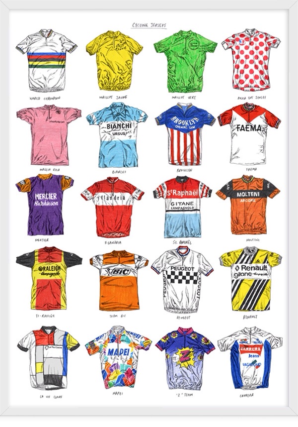
The design of the first volume was inspired by the world champion rainbow jersey. The second by the famous blue and white Bianchi jersey. Volume three was based on the ‘King of the Mountains’ polka dot jersey and the fourth on the Molteni jersey worn by the great Eddy Merckx. The fifth volume was inspired by the chequered shirt of the French cycling team Peugeot. “There were so many jerseys I wanted to include,” said James. “I also recommend David Sparshott’s poster of Cycling Jerseys for anyone wanting to admire the greats in his signature illustration style. Just gorgeous.”
Despite the obvious appeal of these new designs, the publisher decided to stay with a familiar look to the series. “I think the authors wanted to retain some elements from the original designs, which we did on the final covers with the illustrations, and I’m happy with how they turned out,” James told me. “The illustrations are by the talented Simon Scarsbrook. Volumes 1-3 used the original artwork, and we commissioned Simon to come up with two more illustrations for volumes four and five. He was great to work with and they work really well as a series.”
James kept the stripes from the world champion jersey and used them across all the final covers to help unify the series. “The jersey covers will forever by one of my favourite ‘killed covers’ and I really wish they would have taken a chance on them as I’m sure they would have done the job and more.” Agreed.
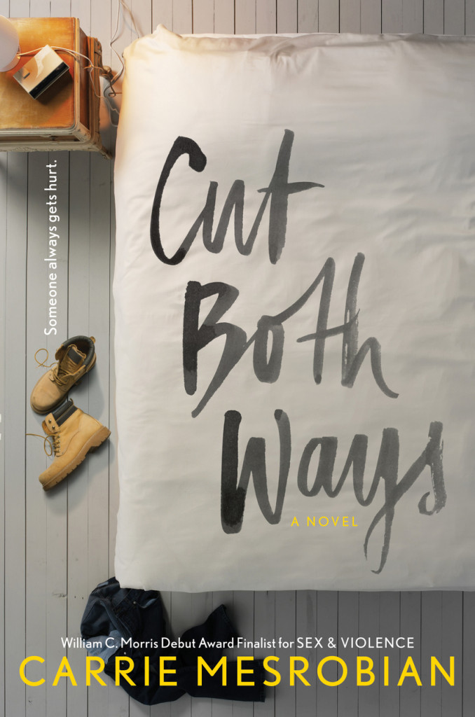
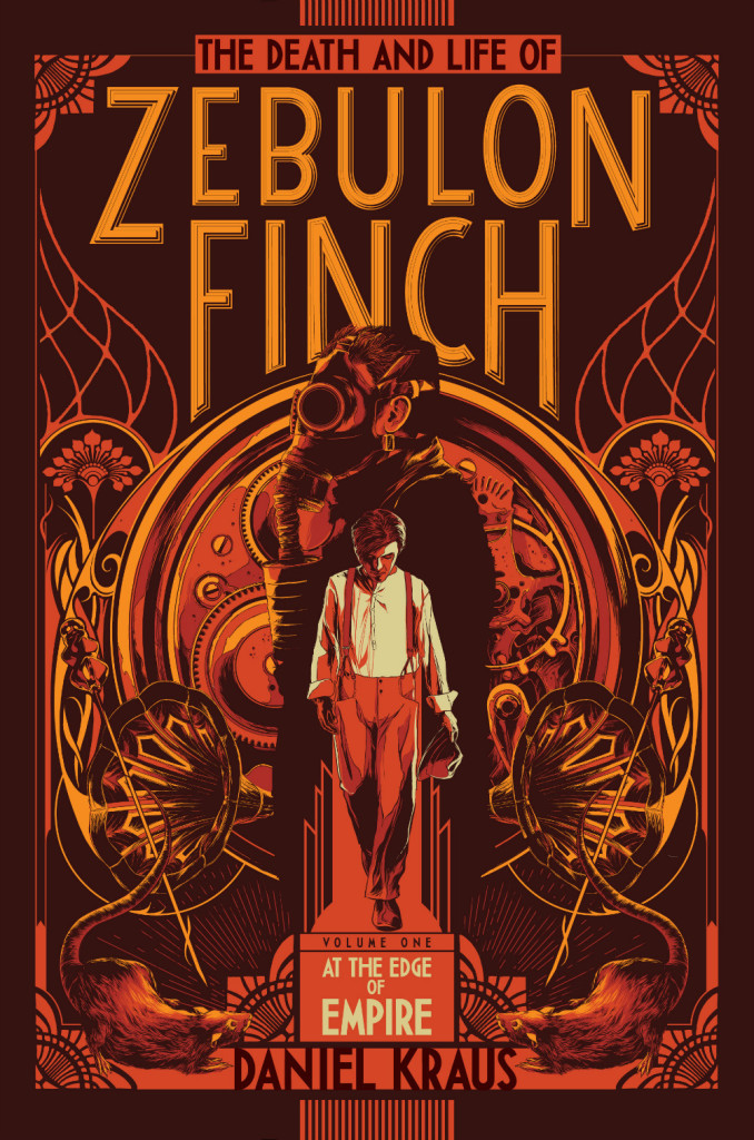
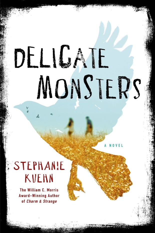
As my 2014 post was such a hit, here is my second annual look at the past year’s young adult book covers. This isn’t my speciality, so this list is a lot more of a crowd-sourced effort than my very personal adult list. A special thank you to all the designers who have made suggestions in the past couple of weeks — you know who you are! — and if there are any burning omissions, please let me know in the comments!
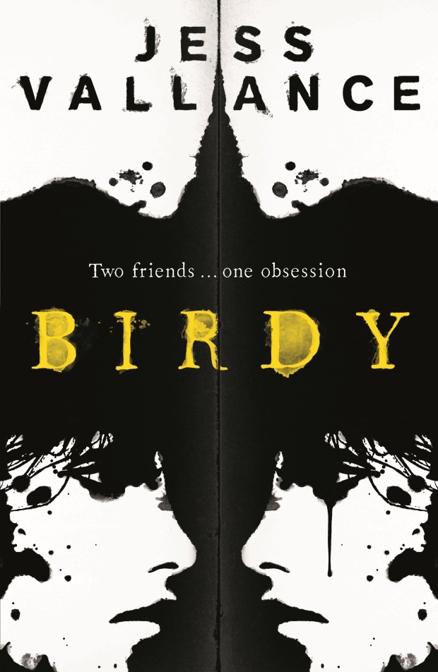
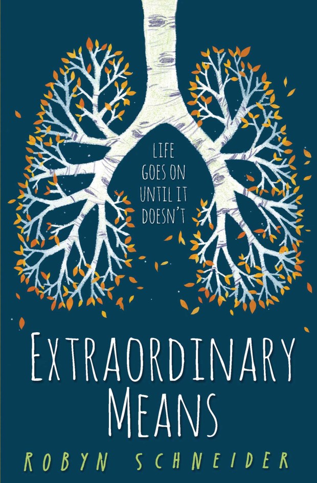
Birdy by Jess Vallance; design by Jet Purdie (Hot Key Books / July 2015)
This lung-tree illustration is just incredible, but it is worth noting that this UK cover is actually an adaptation of the killed US cover (HarperCollins).
(This probably needs to be seen in person as the blue is, I believe, a metallic finish, and the back cover is the image reversed in a lovely orange-red).
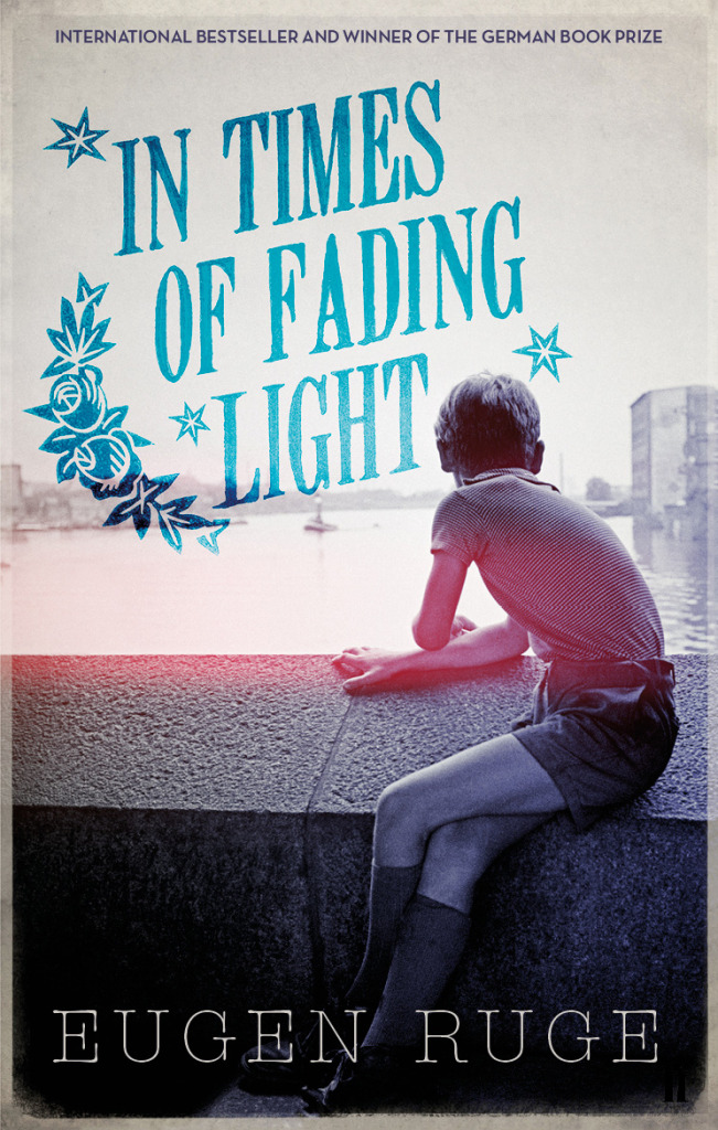
Back in 2014, there were signs that book cover design was maybe, just maybe, having a moment. Suzanne Dean was on the BBC. Peter Mendelsund was on… well, everything. But if 2015 has felt a little quiet by comparison, there were still plenty of reasons to be cheerful. This year’s list includes over 120 covers by 60 designers, and there is little doubt in my mind that this really is a golden time for book design.
Thank you to all the art directors, designers, and publicists who have supported the blog this year, and who make posts like this possible. Thanks too, to my local bookstore TYPE for letting me browse their shelves.
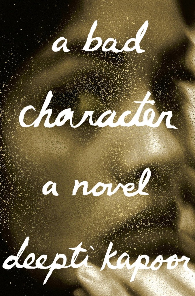
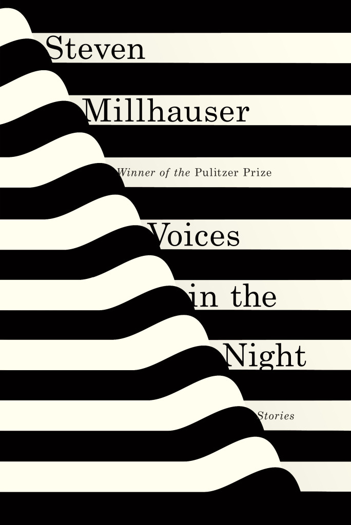
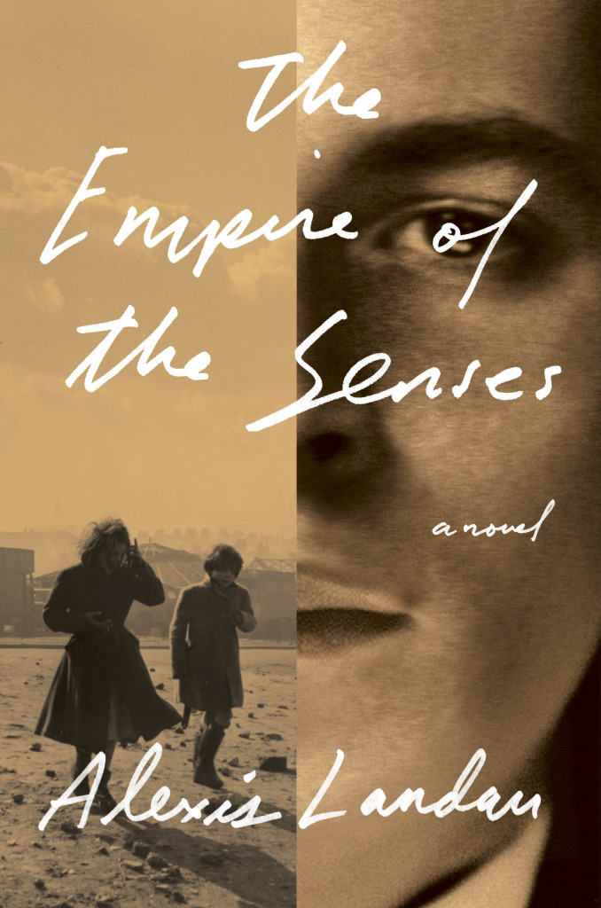
A Bad Character by Deepti Kapoor; design by Janet Hansen (Knopf / January 2015)Voices in the Night by Steven Millhauser; design by Janet Hansen (Knopf / April 2015)Empire of the Senses by Alexis Landau; design by Janet Hansen (Pantheon / March 2015)
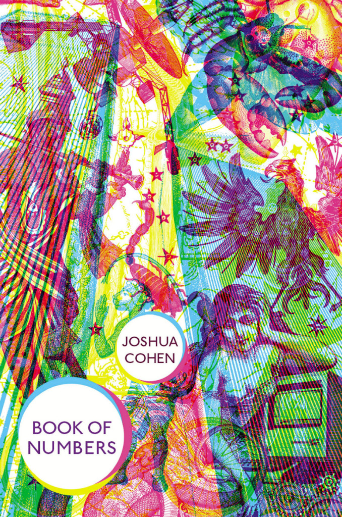
(Oliver Munday’s cover design for the US edition of the Book of Numbers published by Random House is also great.)
Also designed by Suzanne Dean:
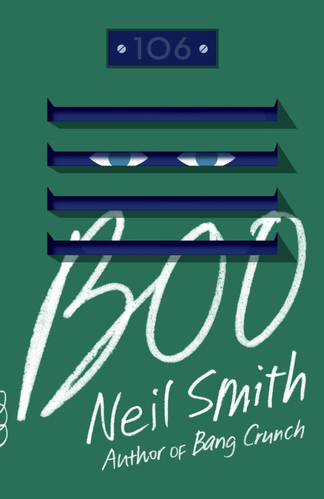
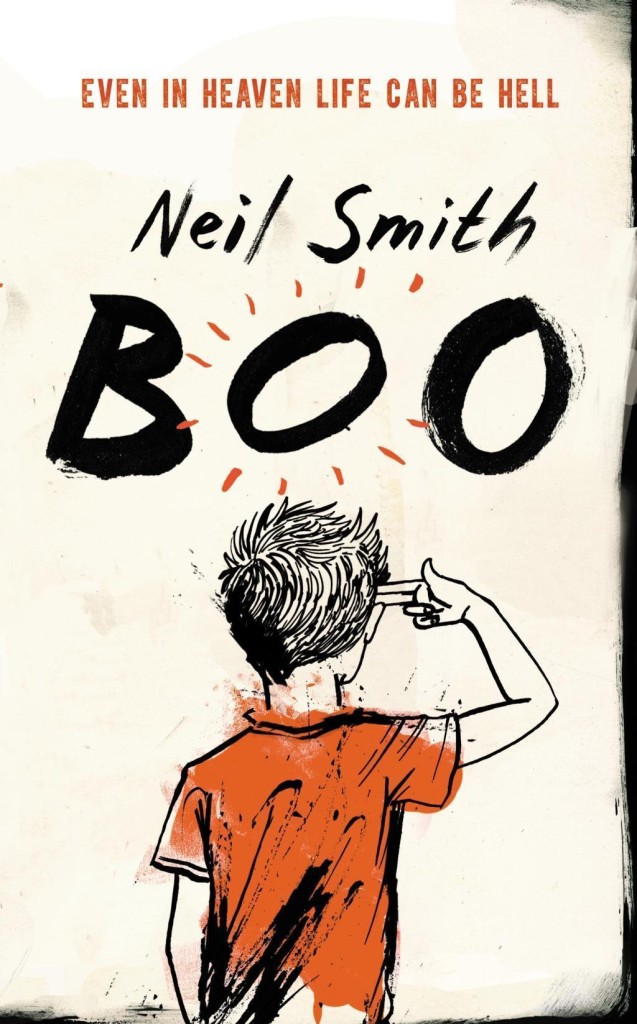
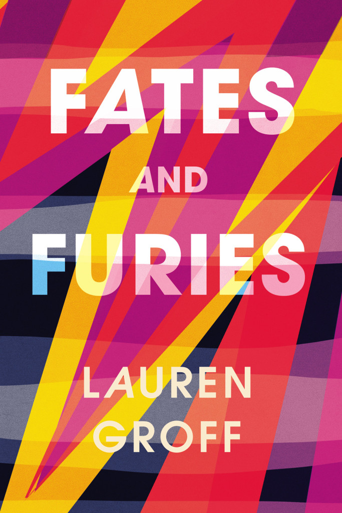
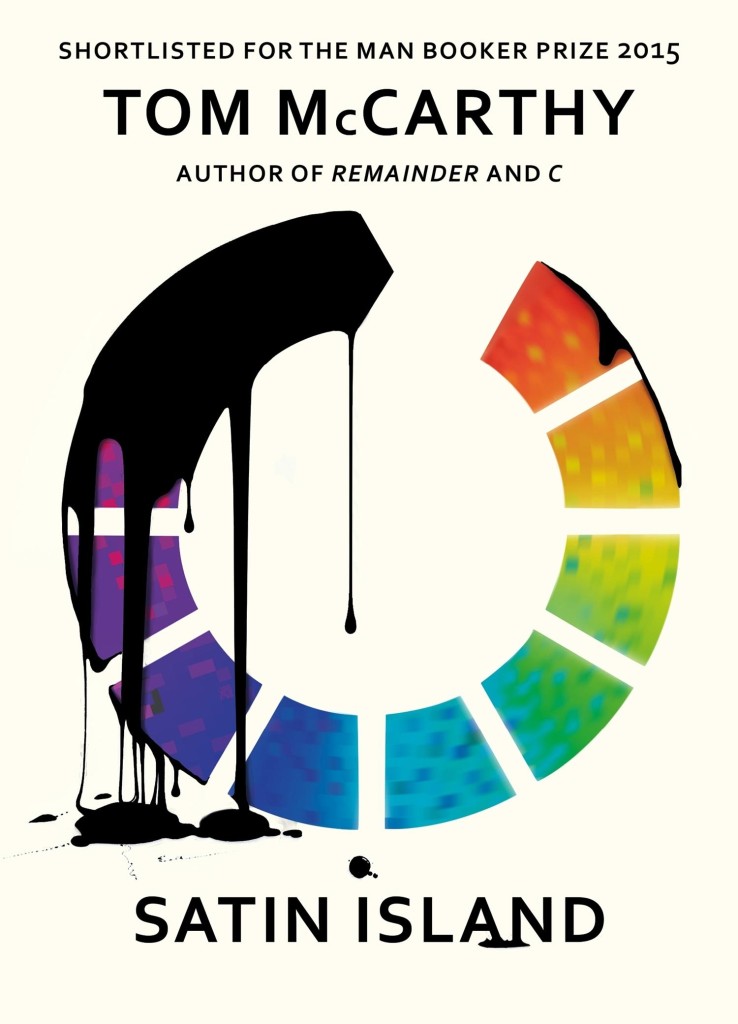
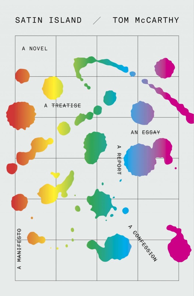
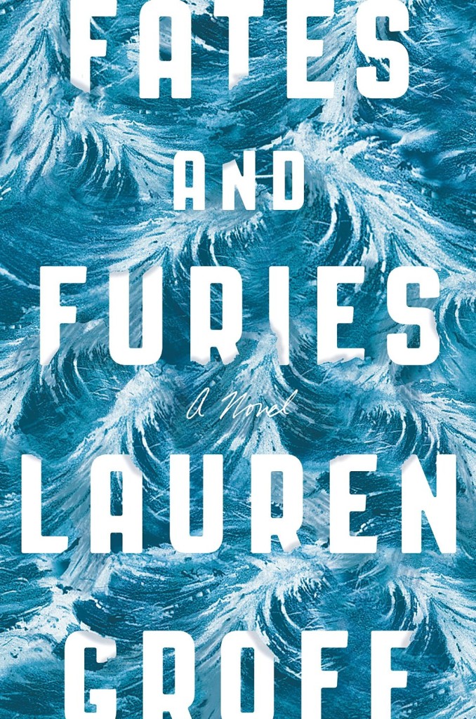
Boo by Neil Smith; design Suzanne Dean; illustration by Stephanie von Reiswitz (William Heinemann / May 2015)Fates and Furies by Lauren Groff; design by Suzanne Dean (William Heinemann / September 2015)Satin Island by Tom McCarthy; design by Suzanne Dean (Jonathan Cape / March 2015)
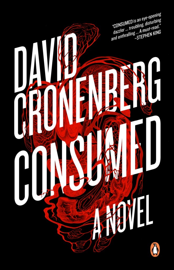
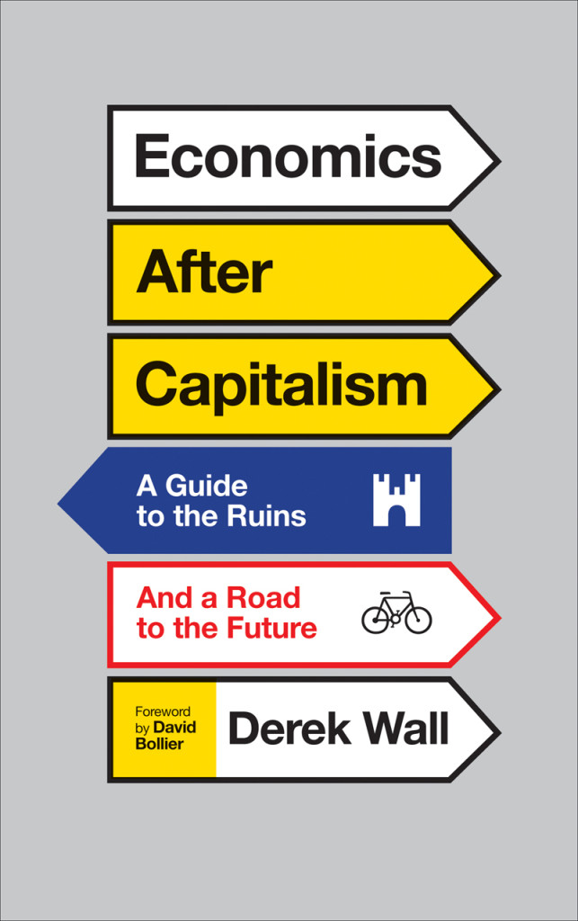
Consumed by David Cronenberg; design by David A. Gee (Penguin Canada / September 2015)Why the World Does Not Exist by Markus Gabriel; design by David Gee (Polity / June 2015)Economics After Capitalism by Derek Wall; design by David A. Gee (Pluto Press / July 2015)
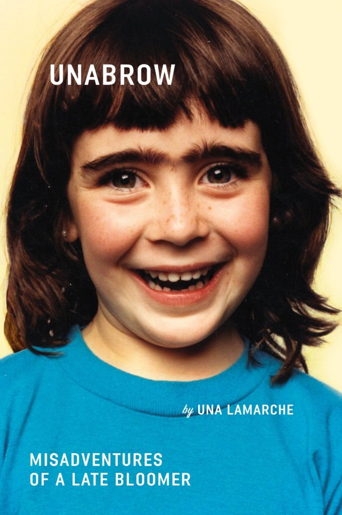
Unabrow by Una Lamarche; design by Zoe Norvell (Plume / March 2015)Anything You Want by Derek Sivers; design by Zoe Norvell (Portfolio / September 2015)
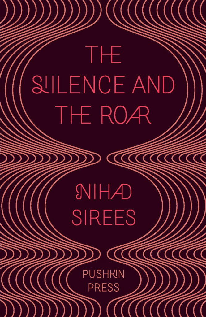
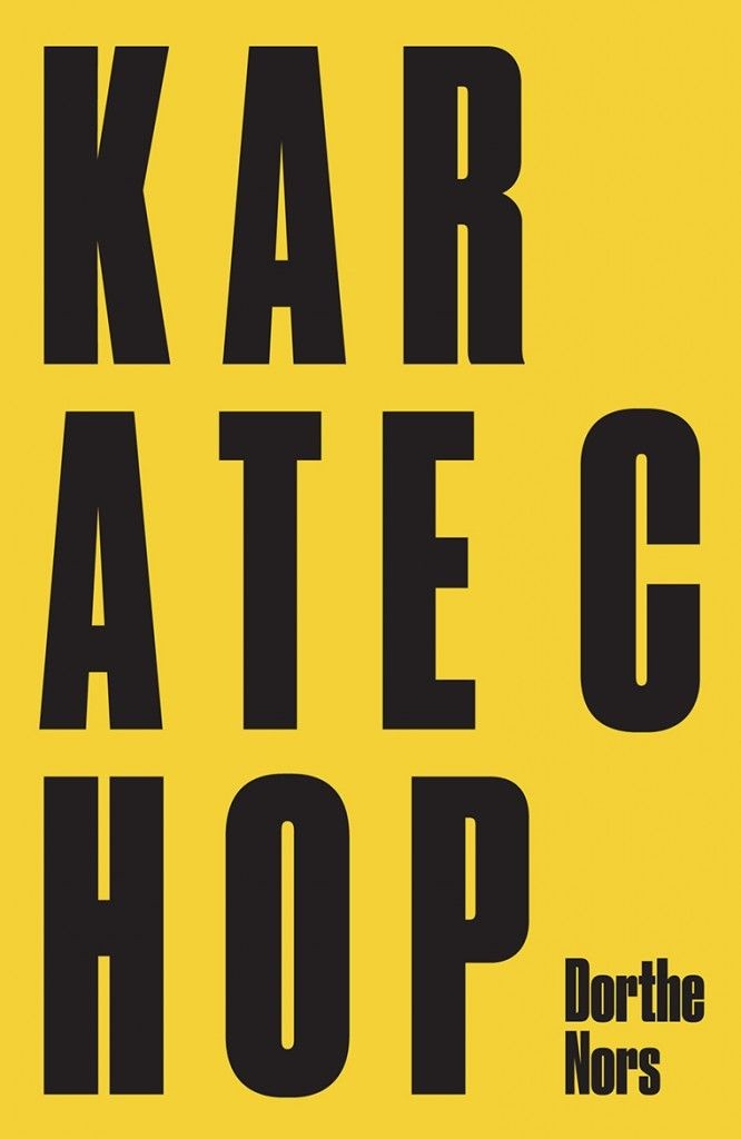
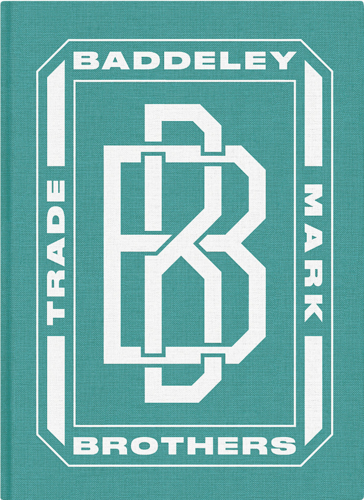
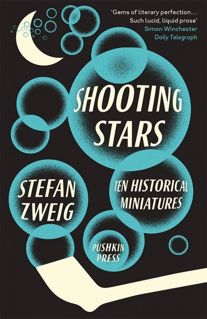
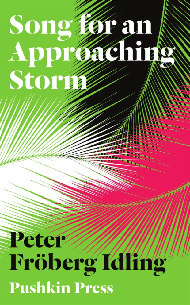
Karate Chop by Dorthe Nors; design by David Pearson (Pushkin Press / February 2015)Baddeley Brothers by The Gentle Author; design David Pearson (October 2015)Shooting Stars by Stefan Zweig; design by David Pearson (Pushkin Press / February 2015)
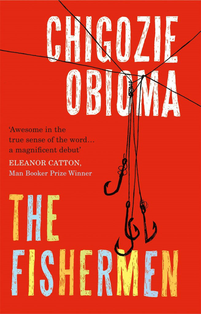
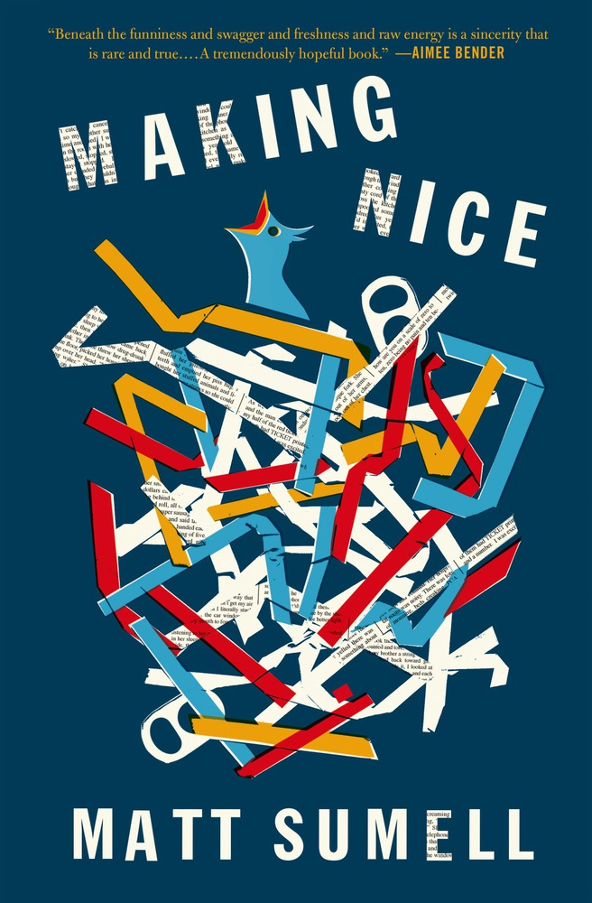
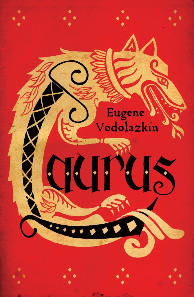
The Fishermen by Chigozie Obioma; design by Gray318 (Pushkin Press / February 2015)Making Nice by Matt Sumell; design by Gray318 (Henry Holt & Co. / February 2015)Laurus by Eugene Vodolazkin; design Gray318 (Oneworld / October 2015)
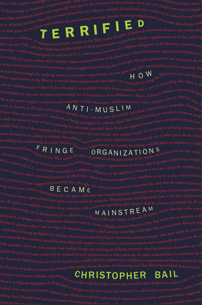
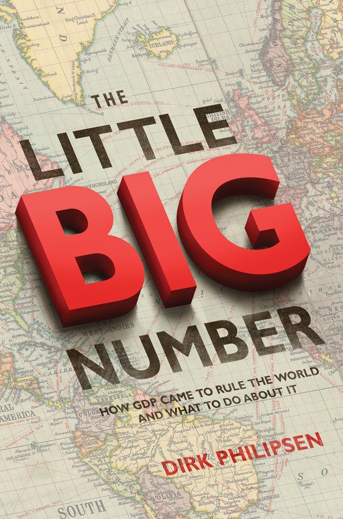
Terrified by Christopher A. Bail; design by Amanda Weiss (Princeton University Press / January 2015)The Little Big Number by Dirk Philipsen; design by Amanda Weiss ( Princeton University Press / June 2015)
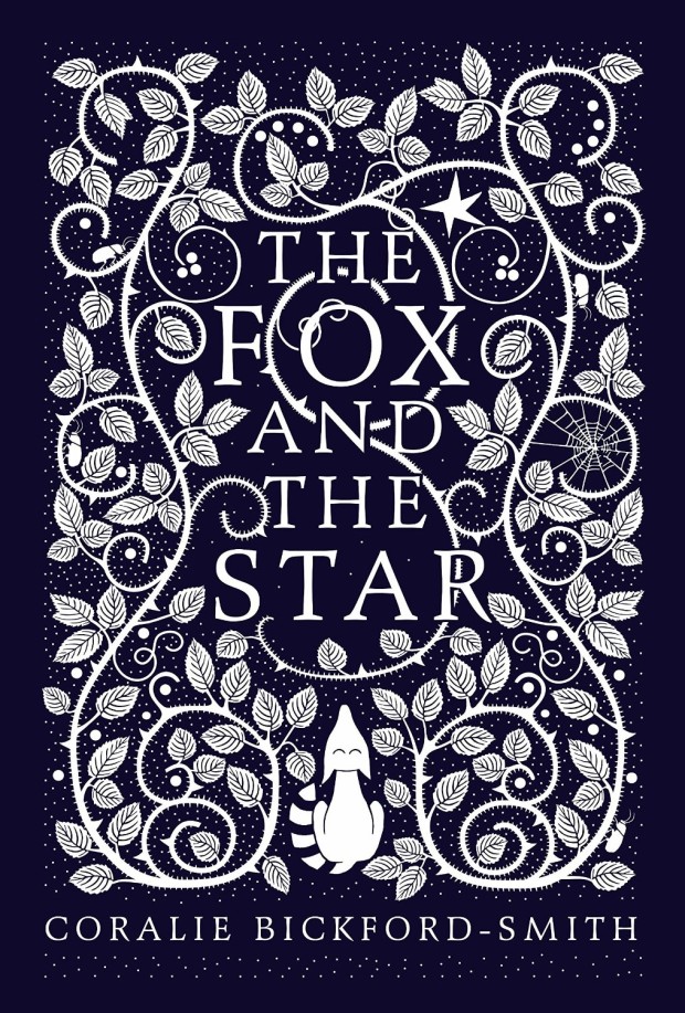
The Fox and the Star, written, illustrated and designed by Coralie Bickford-Smith (Particular Books / August 2015)
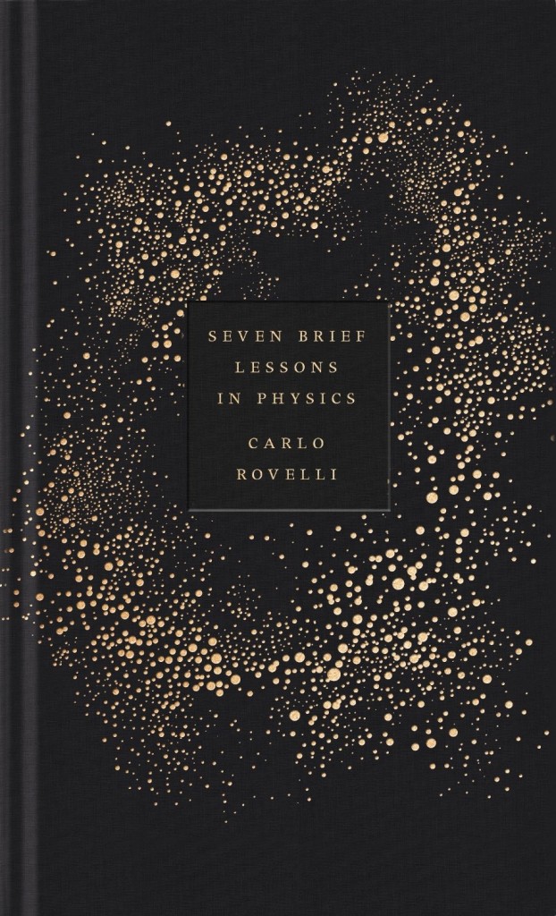
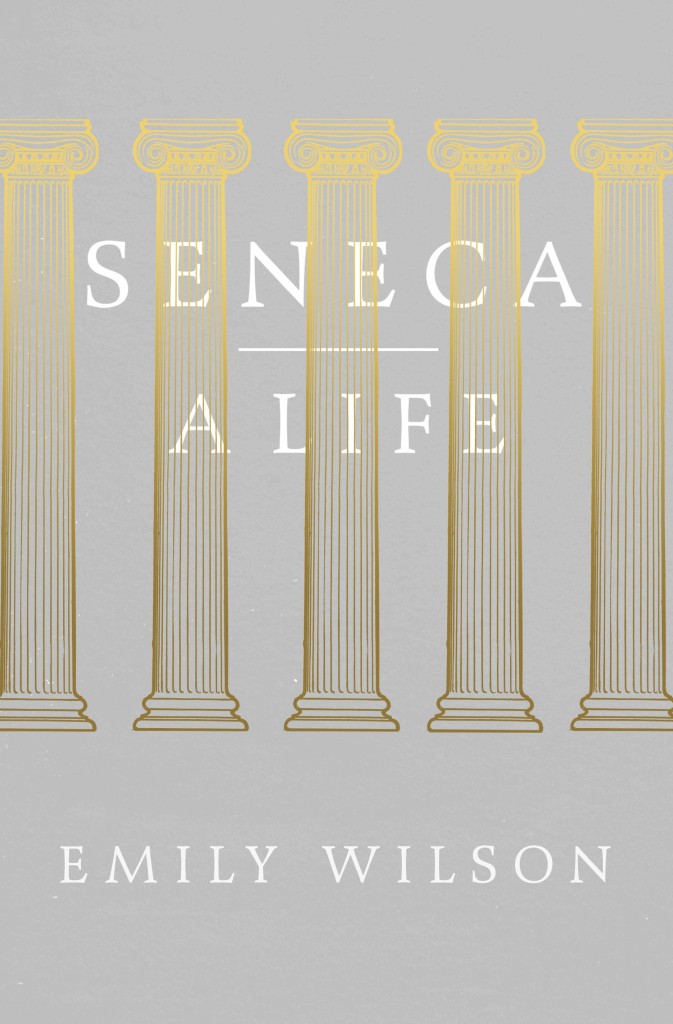
Also designed by Coralie Bickford-Smith:
Seven Brief Lessons on Physics by Carlo Rovelli; design by Coralie Bickford-Smith (Allen Lane / September 2015)Seneca: A Life by Emily Wilson; design by Coralie Bickford-Smith (Allen Lane / March 2015)
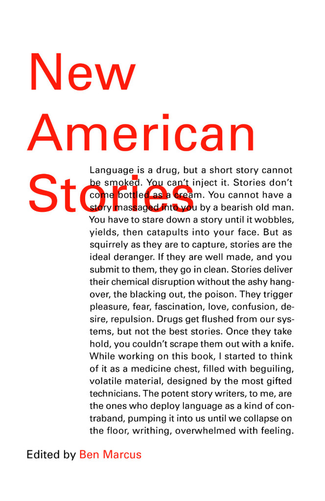
Satin Island by Tom McCarthy; design by Peter Mendelsund (Knopf / February 2015)New American Stories edited by Ben Marcus; design by Peter Mendelsund (Vintage / July 2015)Building Art: The Life and Work of Frank Gehry by Paul Goldberger; design by Peter Mendelsund (Knopf / September 2015)
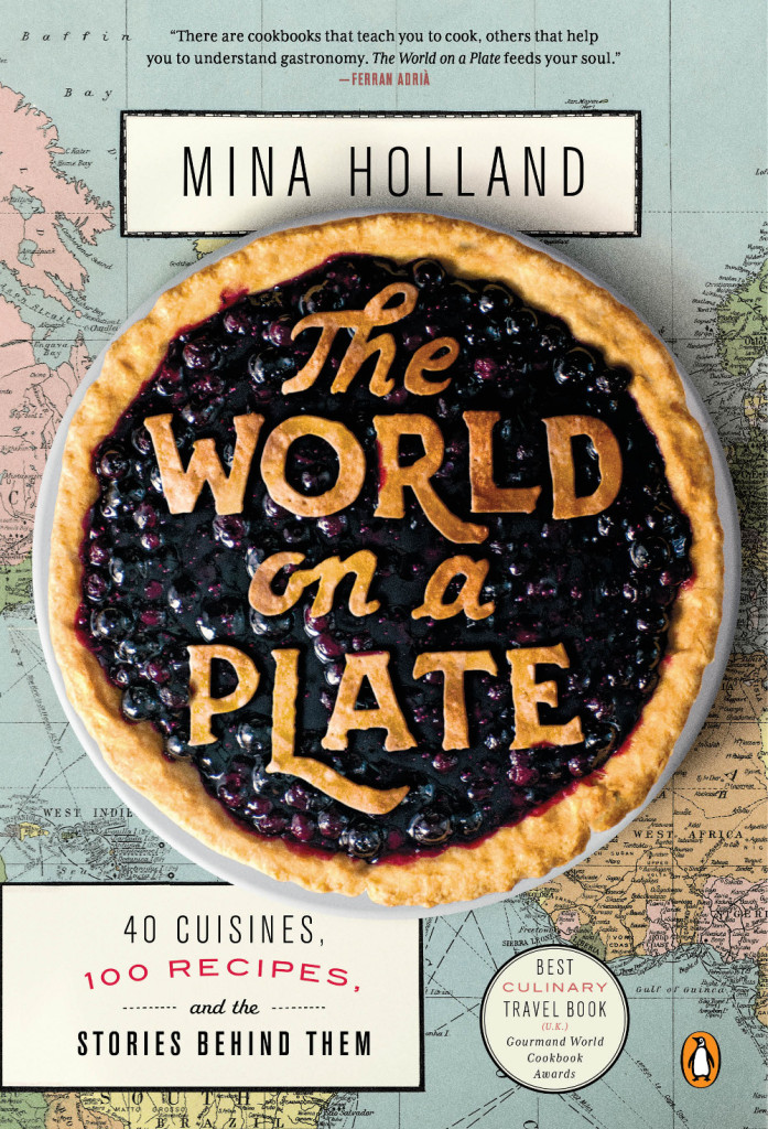
World on a Plate by Mina Holland; design by Nick Misani (Penguin / May 2015)
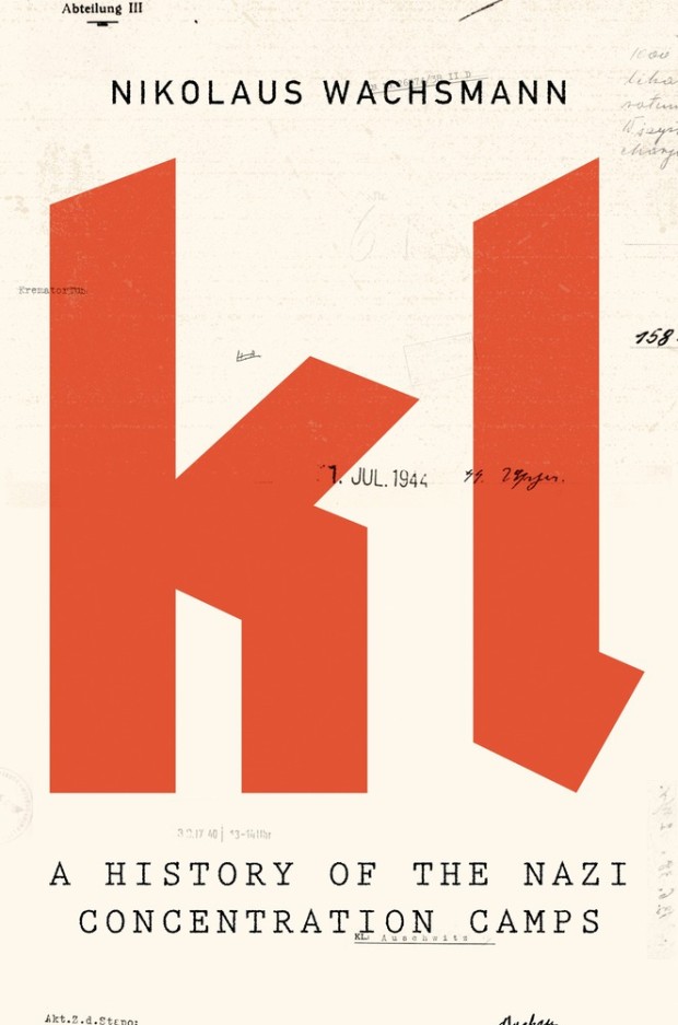
KL by Nikolaus Wachsmann; design by Alex Merto (Farrar, Straus & Giroux / April 2015)
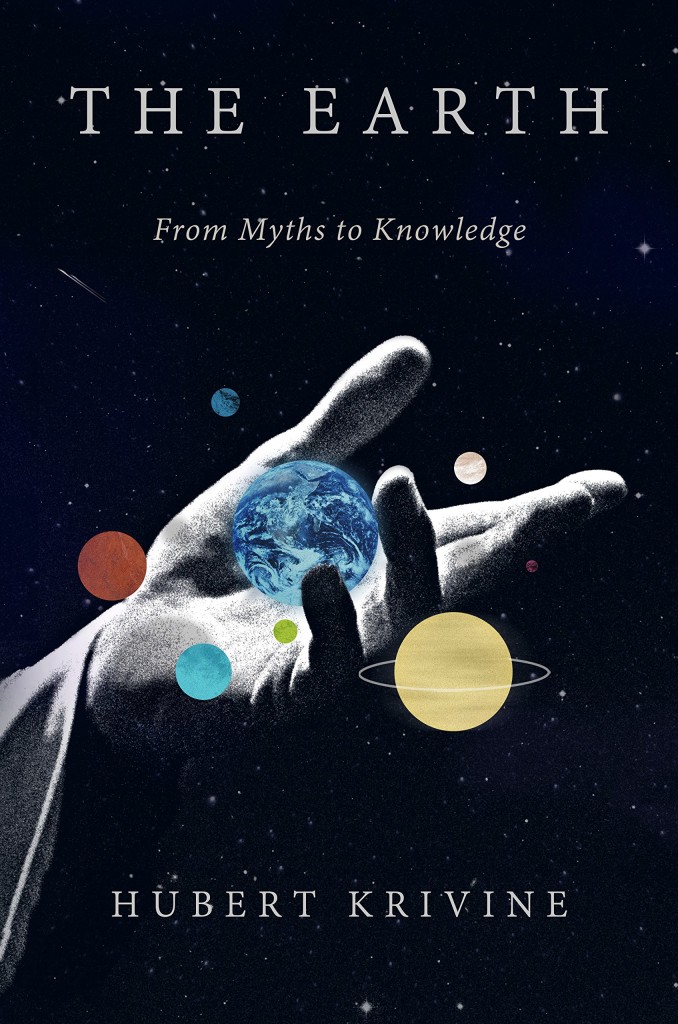
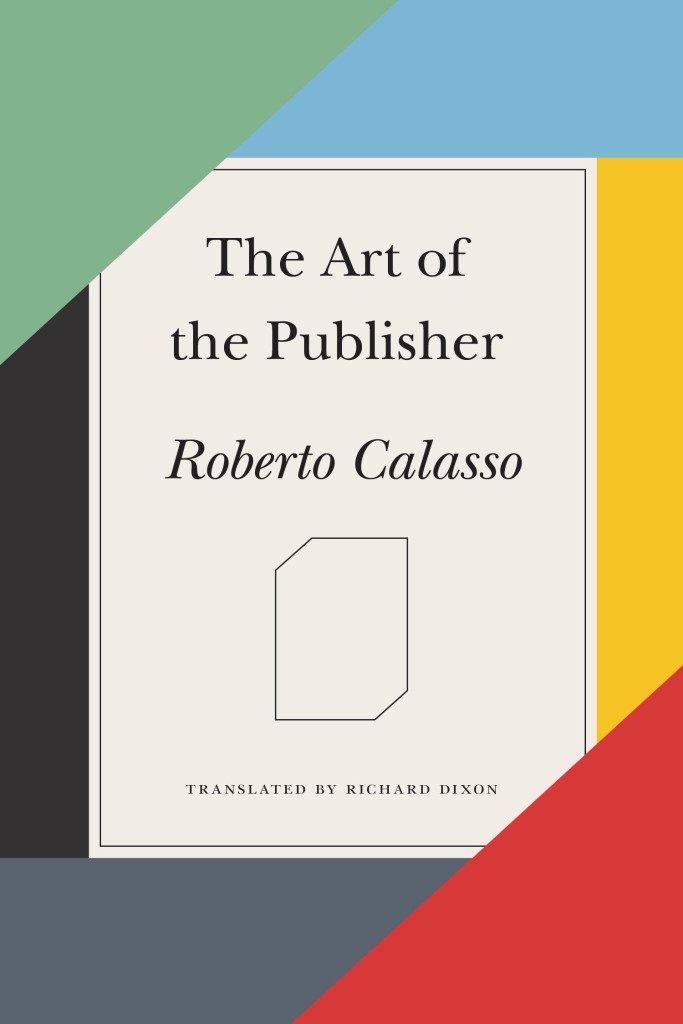
Also designed by Alex Merto:
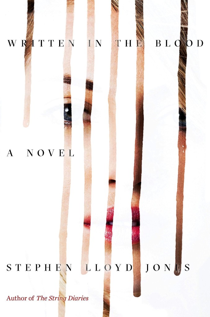
Earth by Hubert Krivine; design by Alex Merto (Verso Books / April 2015)The Art of the Publisher by Roberto Calasso; design by Alex Merto (FSG / November 2015)Written in the Blood by Stephen Lloyd Jones; design by Alex Merto (Mulholland Books / May 2015)
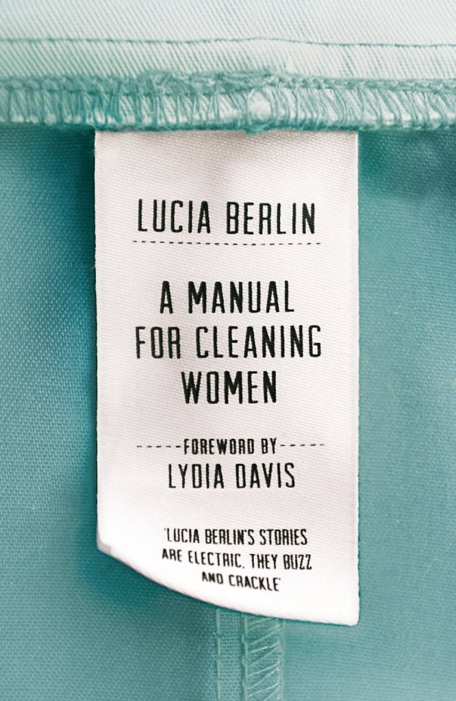
A Manual for Cleaning Women by Lucia Berlin; design by Justine Anweiler; photography Jonathan Simpson (Picador UK / September 2015)
Also designed by Justine Anweiler:
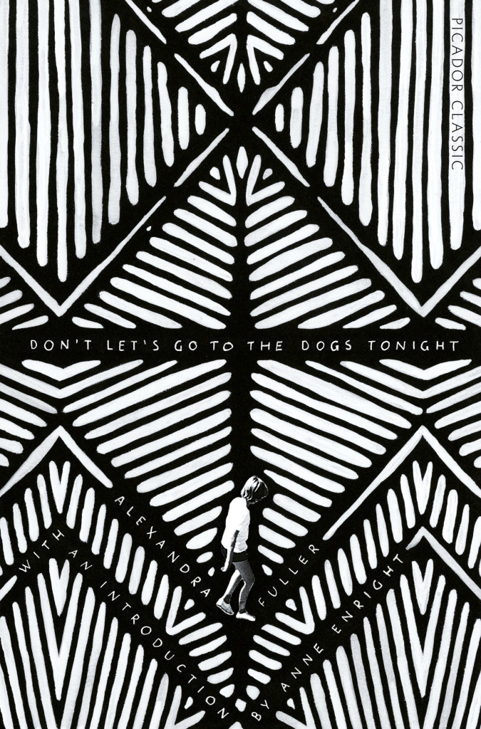
All This Has Nothing To Do With Me; design by Justine Anweiler; illustration Daphne van den HeuvelDon’t Let’s Go To the Dogs Tonight by Alexandra Fuller; design by Justine Anweiler (Picador / January 2015)
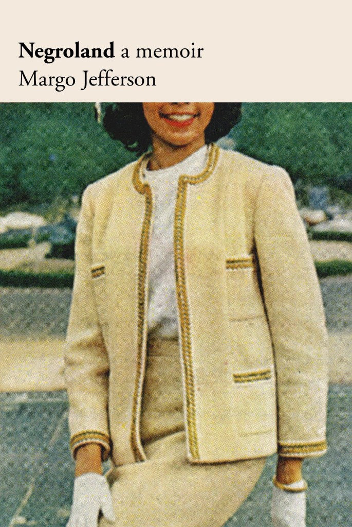
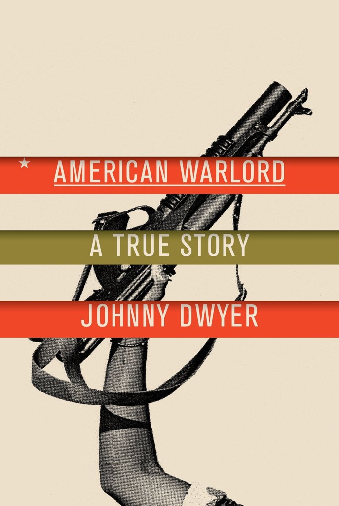
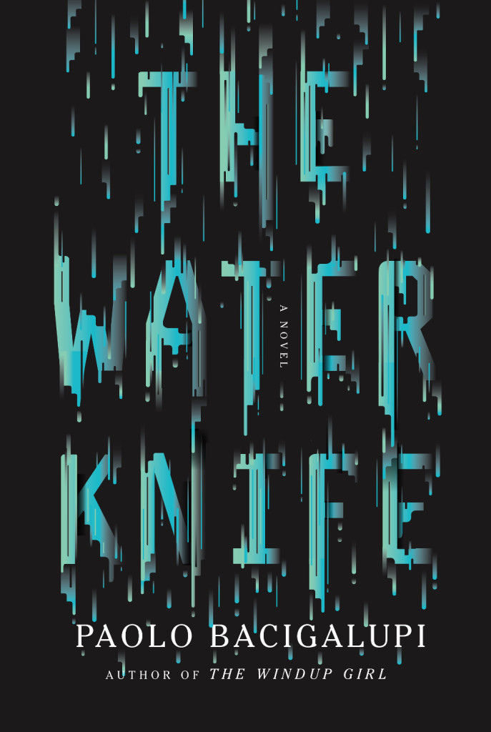
Negroland by Margo Jefferson; design by Oliver Munday (Pantheon / September 2015)American Warlord by Johnny Dwyer; design by Oliver Munday (Knopf / April 2015)The Water Knife by Paolo Bacigalupi; design by Oliver Munday (Knopf / May 2015)
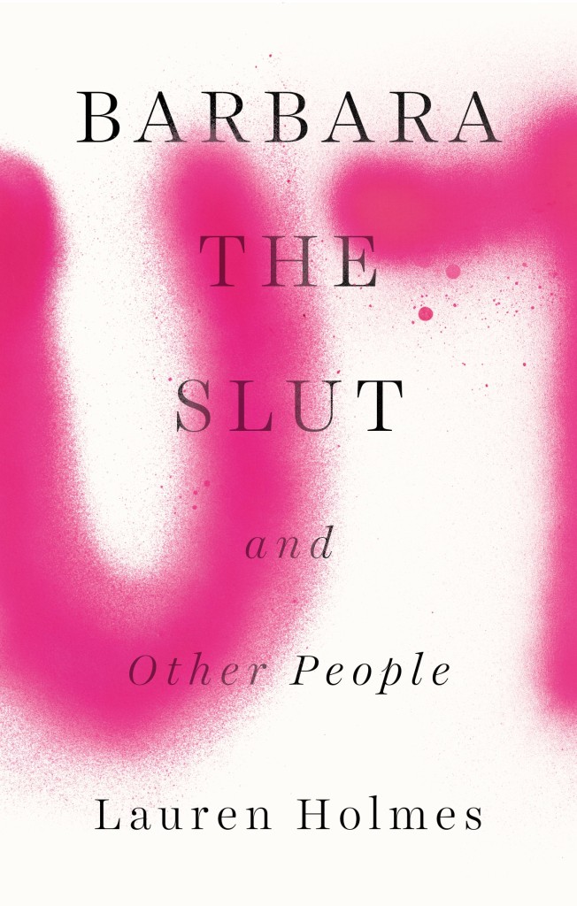
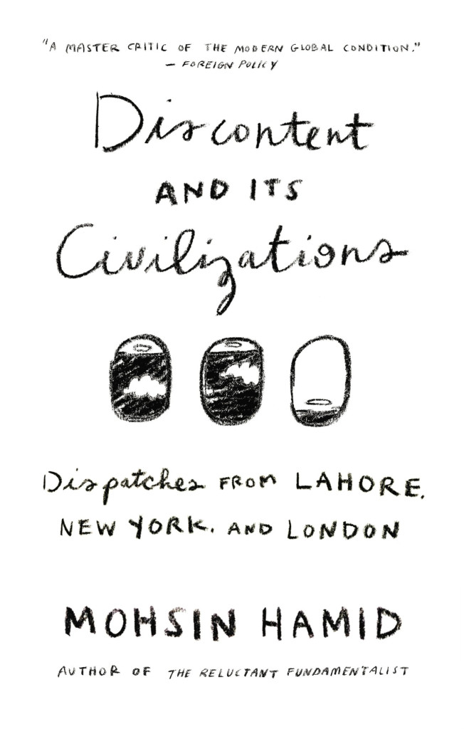
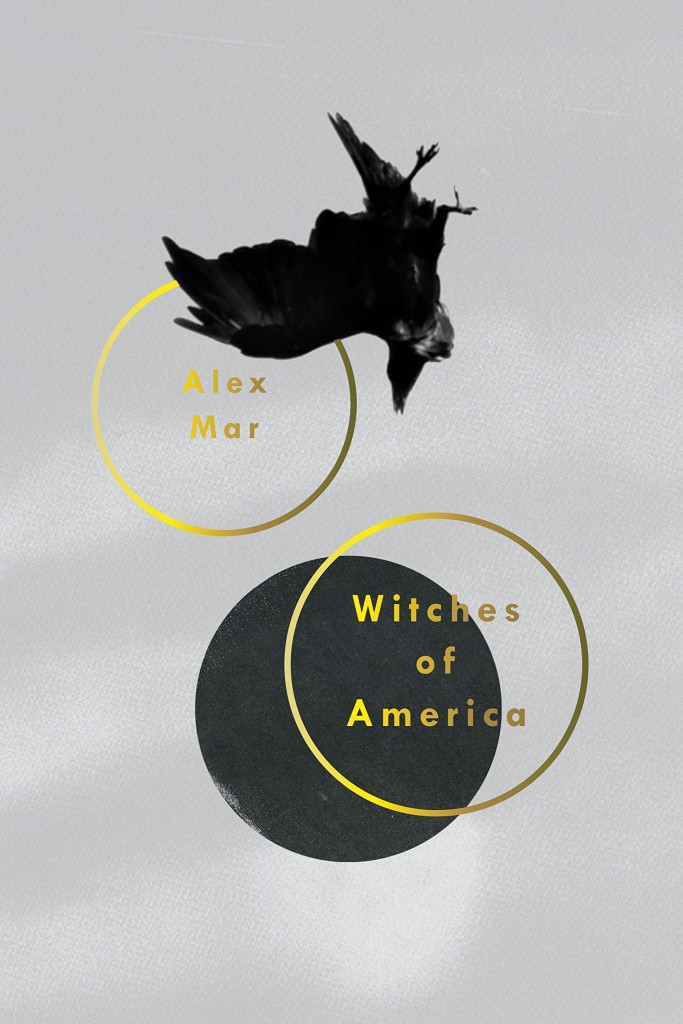
Barbara the Slut by Lauren Holmes; design by Rachel Willey (Riverhead / August 2015)Discontent and its Civilizations by Mohsin Hamid; design by Rachel Willey (Riverhead / February 2015)Witches of America by Alex Mar; design by Rachel Willey (Sarah Crichton Books / Ocotber 2015)
Munich Airport by Greg Baxter; design by Anne Twomey (Twelve Books / January 2015)
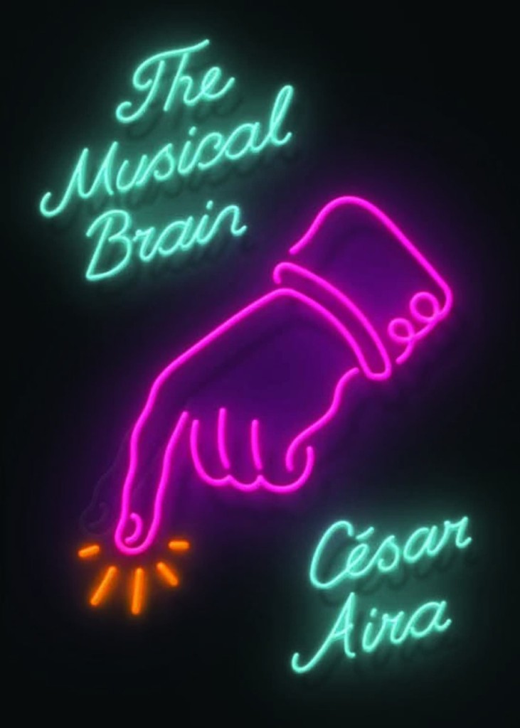
This is actually a rather special lenticular cover that imitates the effect of flashing neon.
Also from Rodrigo Corral:
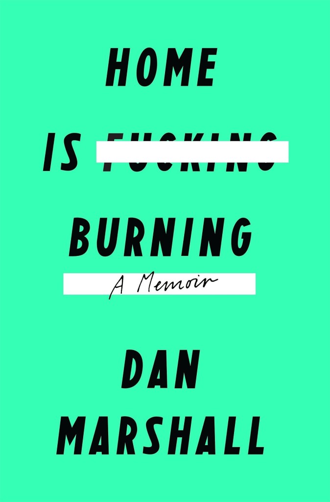
Home is Burning by Dan Marshall; design by Rodrigo Corral (Flatiron / October 2015)Fates and Furies by Lauren Groff; design by Rodrigo Corral and Adalis Martinez (Riverhead / September 2015 )
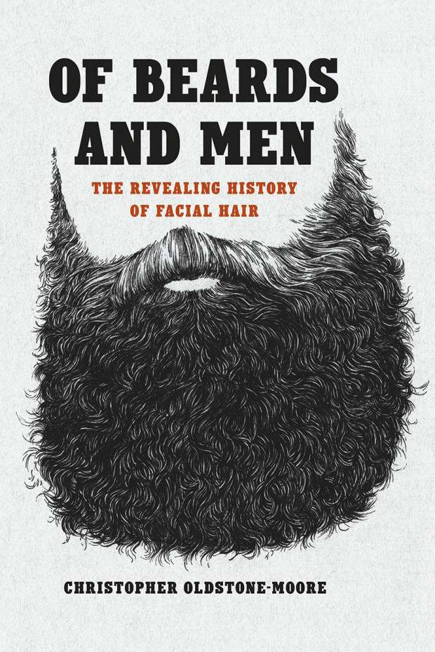
Of Beards and Men by Christopher Oldstone-Moore; design Isaac Tobin (University of Chicago Press / December 2015)
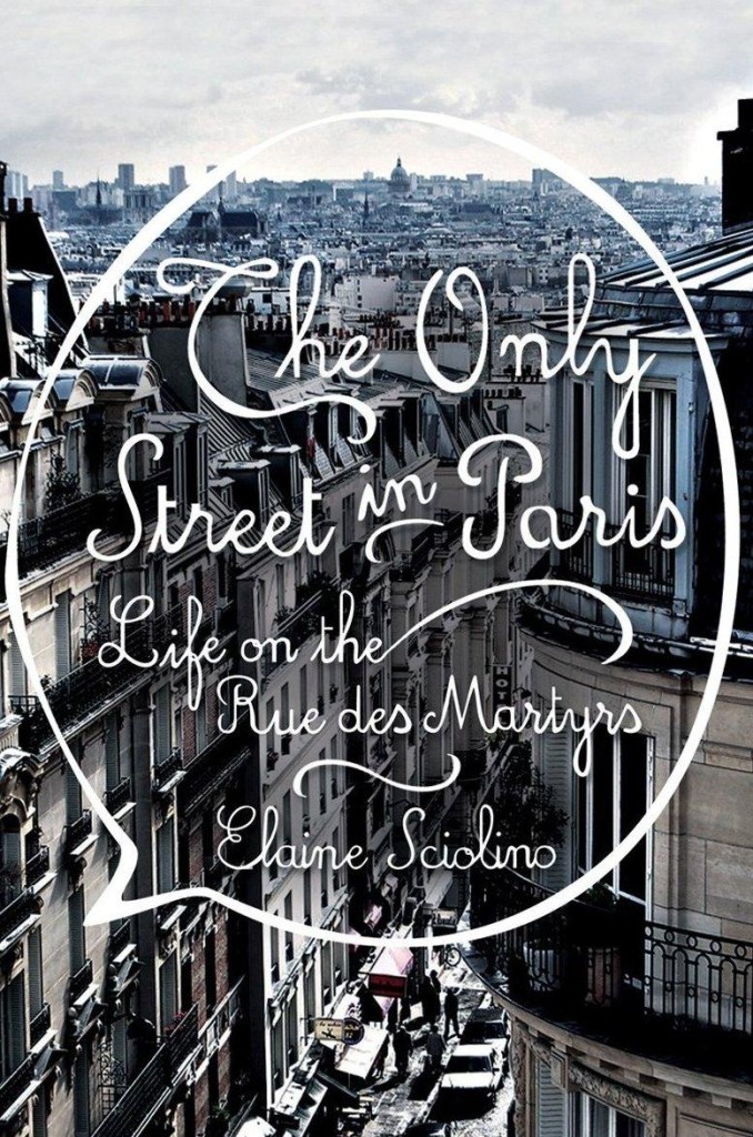
The Only Street in Paris by Elaine Schiolino; design by Strick&Williams (W.W. Norton / November 2015)
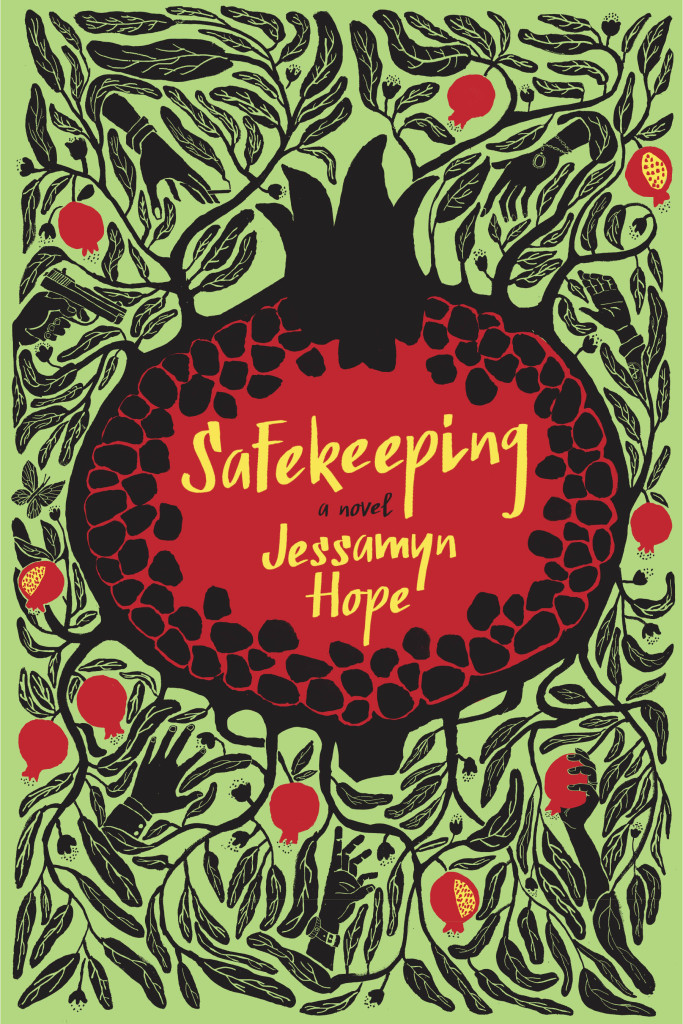
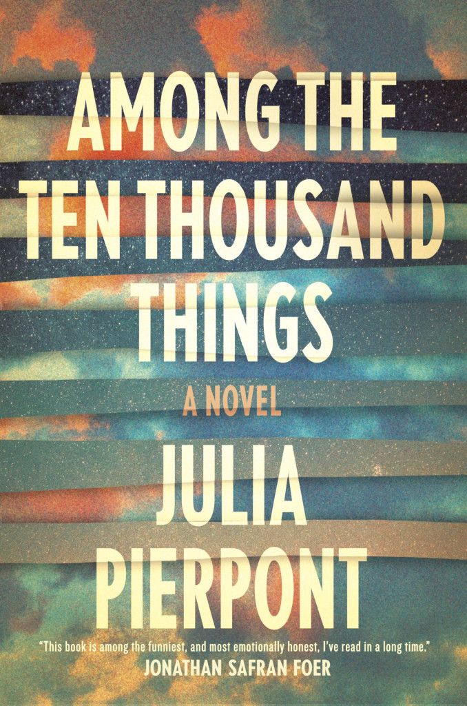
Also from Strick&Williams:
Safekeeping by Jessamyn Hope; design by Strick&Williams (Fig Tree / June 2015)Among the Ten Thousand Things by Julia Pierpoint; design by Strick&Williams (Random House / July 2015)
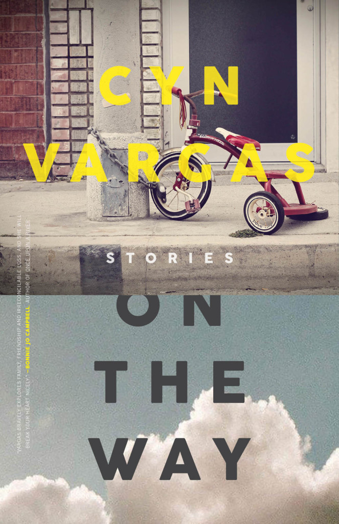
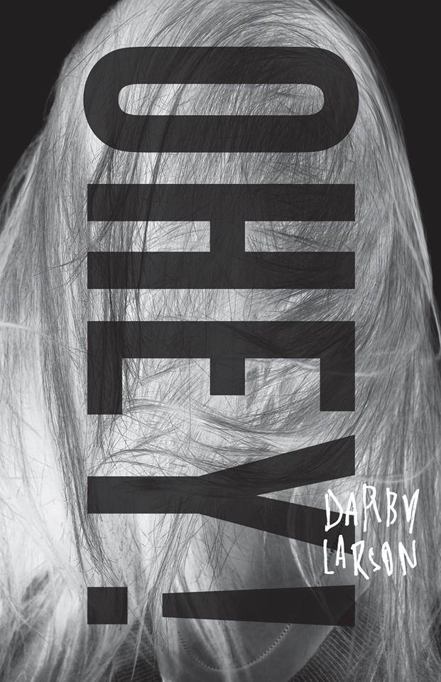
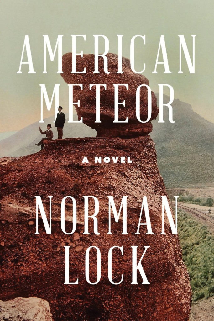
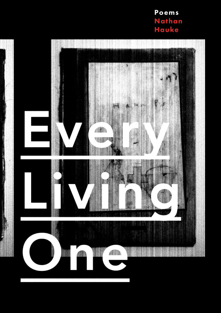
Ohey! by Darby Larson; design by Alban Fischer (CCM / May 2015)American Meteor by Norman Lock; design by Alban Fischer (Bellevue Literary Press / June 2015)Every Living One by Nathan Haukes; design by Alban Fischer (Horse Less Press / March 2015)
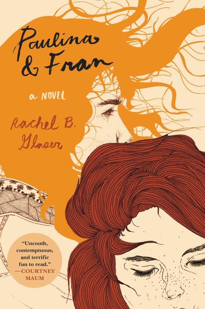
Paulina and Fran by Rachel B. Glaser; illustration Kaethe Butcher; typography Nina LoSchiavo (Harper Perennial / September 2015)
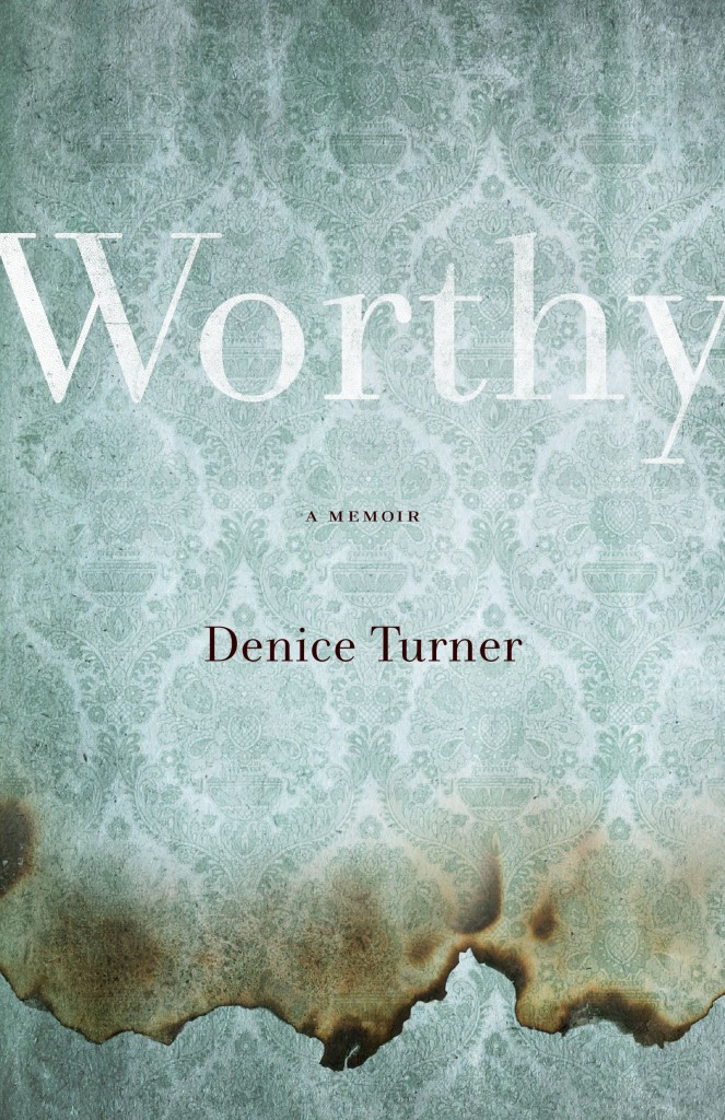
Unbuttoning America by Ardis Cameron; design by Kimberly Glyder; illustration by Al Moore (Cornell University Press / May 2015)Worthy by Denice Turner; design by Kimberly Glyder (University of Nevada Press / April 2015)
A Darker Shade of Magic by V. E. Schwab; design by Will Staehle (Tor / February 2015)I Am Radar by Reif Larsen; design by Will Staehle (Penguin / February 2015)
Pretty Is by Maggie Mitchell; design by Lucy Kim (Henry Holt / July 2015)
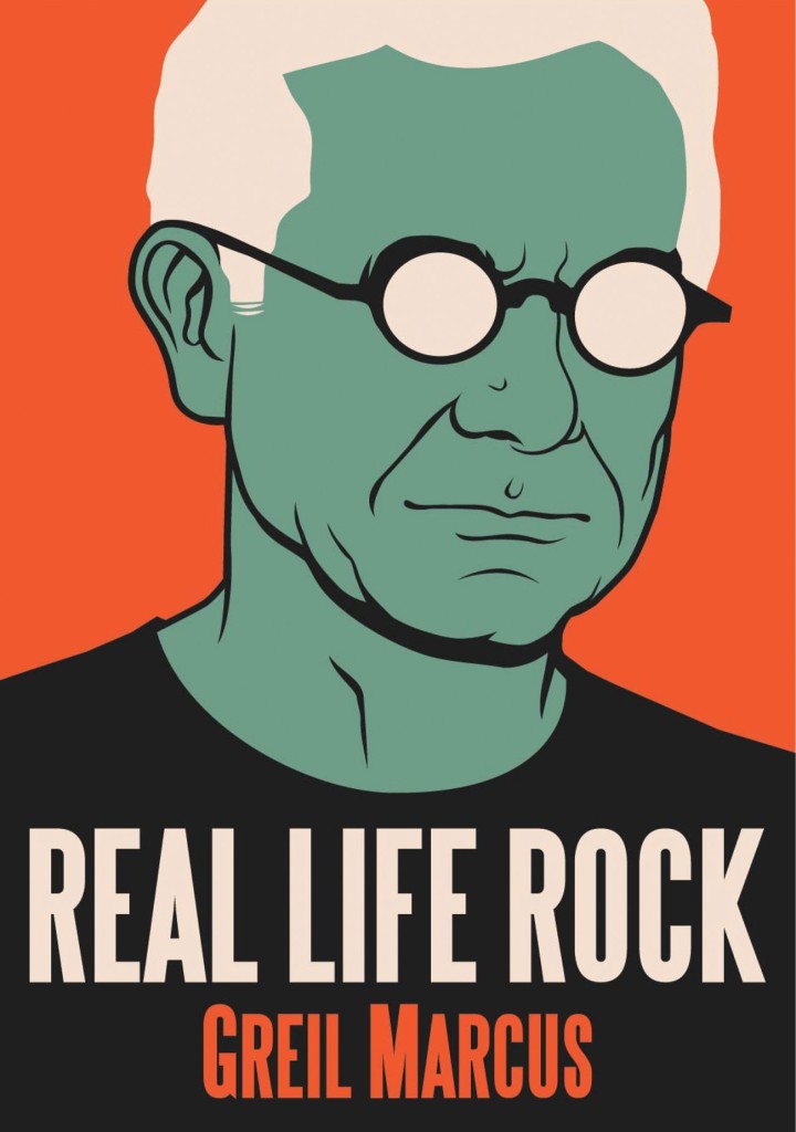
Real Life Rock by Greil Marcus; design by Rich Black (Yale University Press / October 2015)
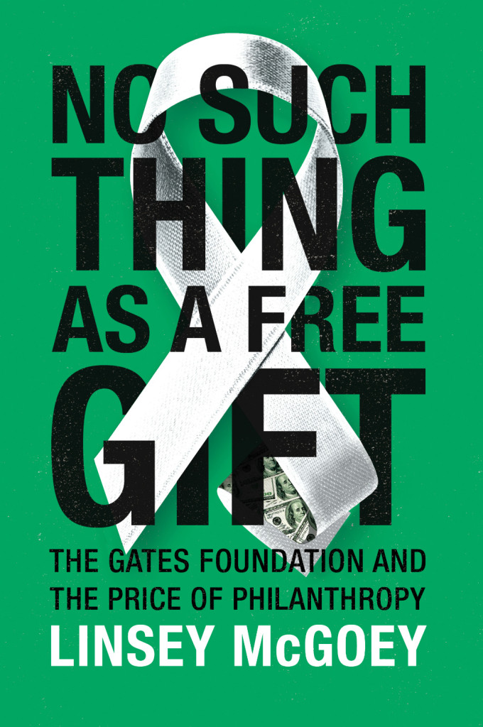
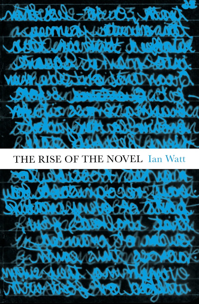
No Such Thing as a Free Gift by Linsey McGoey; design by James Paul Jones (Verso / October 2015)How Music Got Free by Stephen Witt; design by James Paul Jones (The Bodley Head / June 2015)The Rise of the Novel by Ian Watt; design by James Paul Jones (Vintage / October 2015)
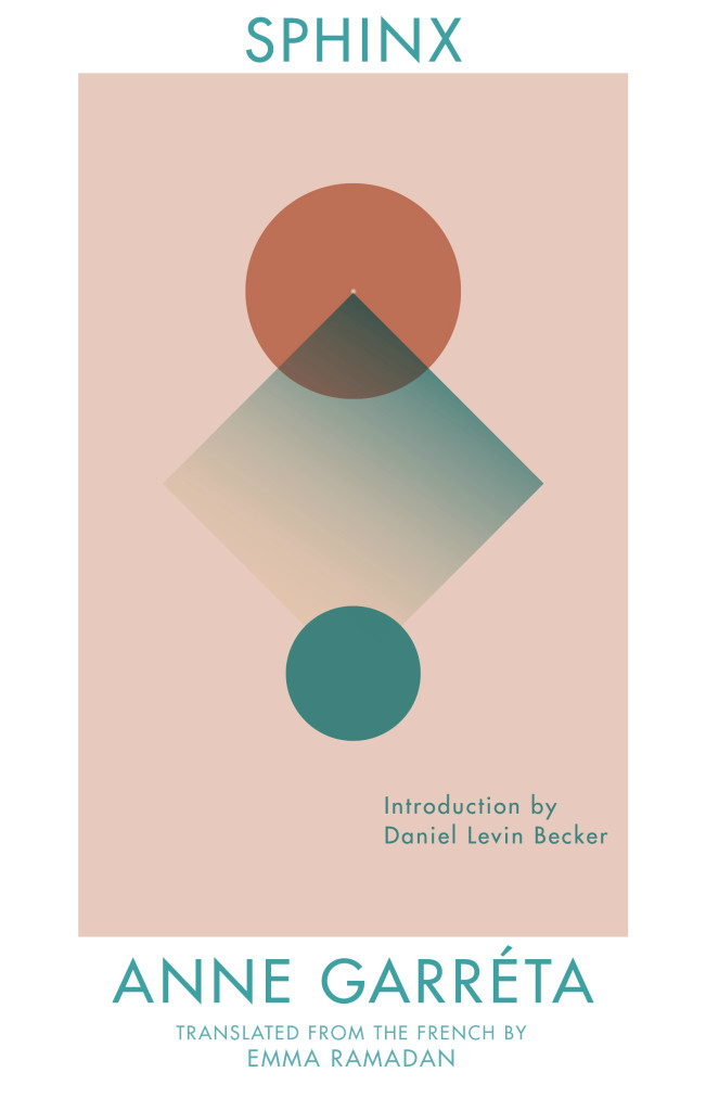
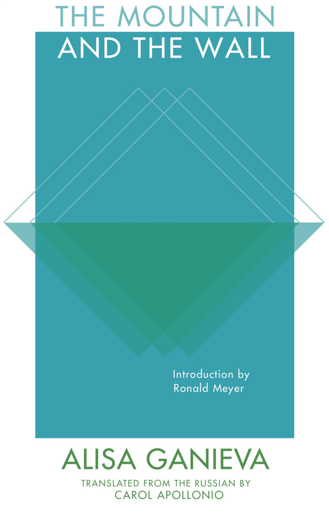
The Sphinx by Anne Garréta; design by Anna Zylicz (Deep Vellum / May 2015)
Also designed by Anna Zylicz:
The Mountain and the Wall by Alisa Ganieva; design by Anna Zylicz (Deep Vellum / June 2015)The Indian by Jón Gnarr ; design by Anna Zylicz (Deep Vellum / May 2015)
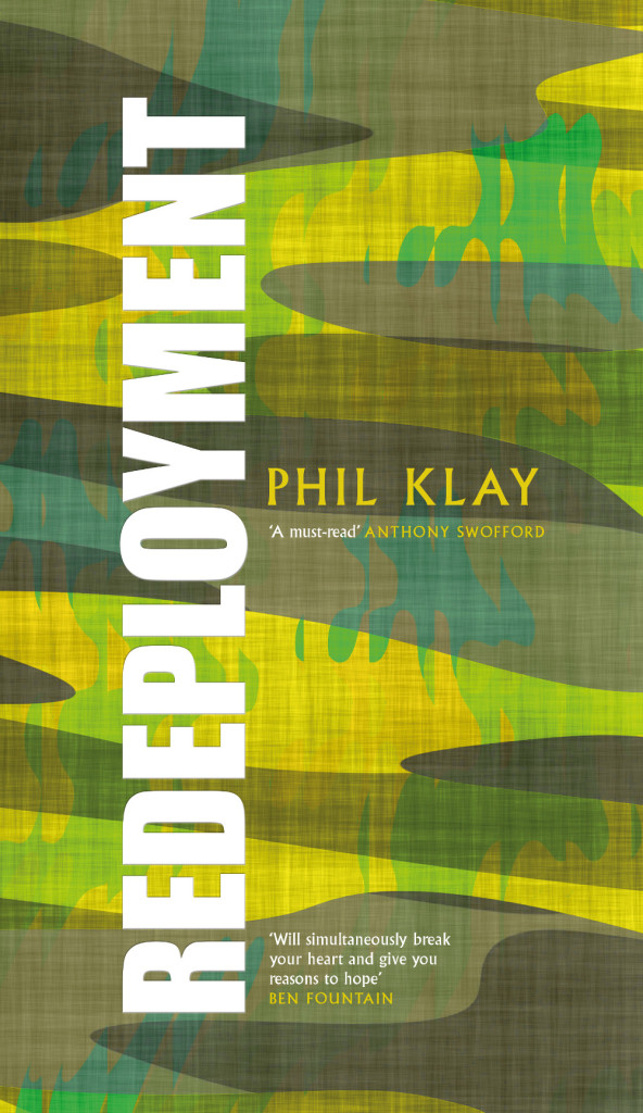
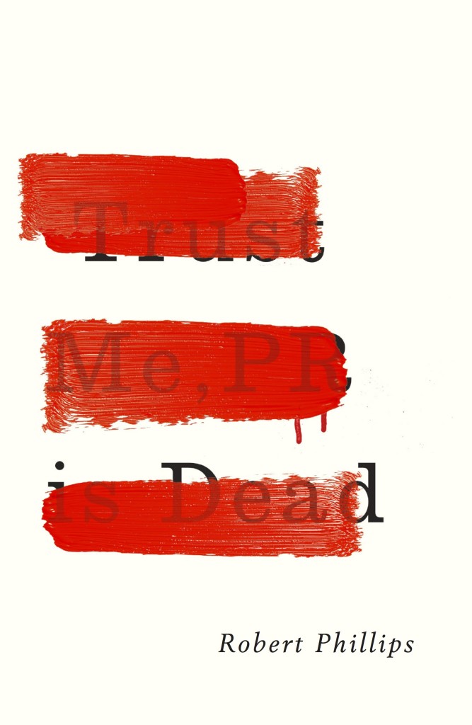
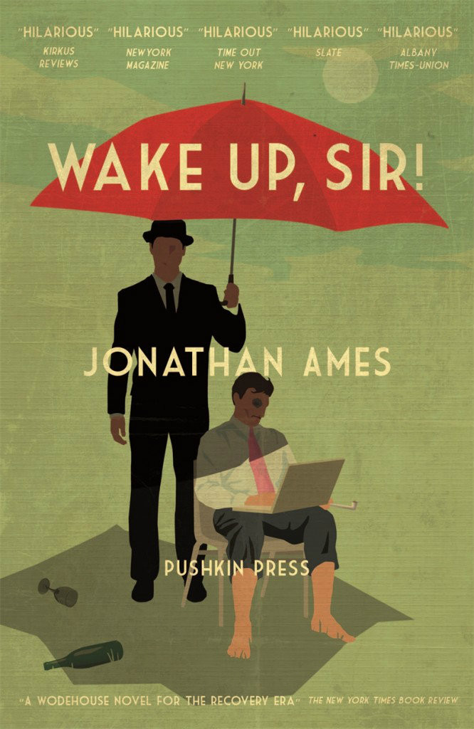
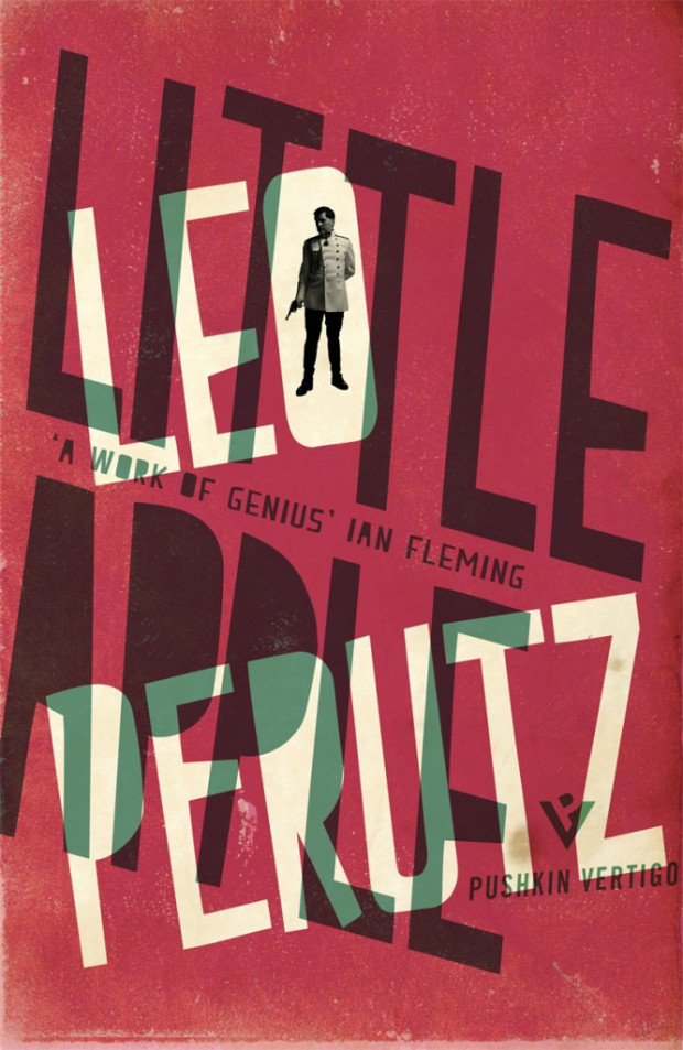
Trust Me, PR is Dead by Robert Phillips; design by Jamie Keenan (Unbound / June 2015)Wake Up, Sir! by Jonathan Ames; design by Jamie Keenan (Pushkin Press / May 2015)
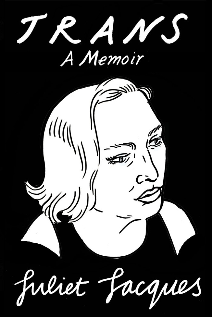
Trans by Juliet Jacques; Design and illustration by Joanna Walsh (Verso / September 2015)
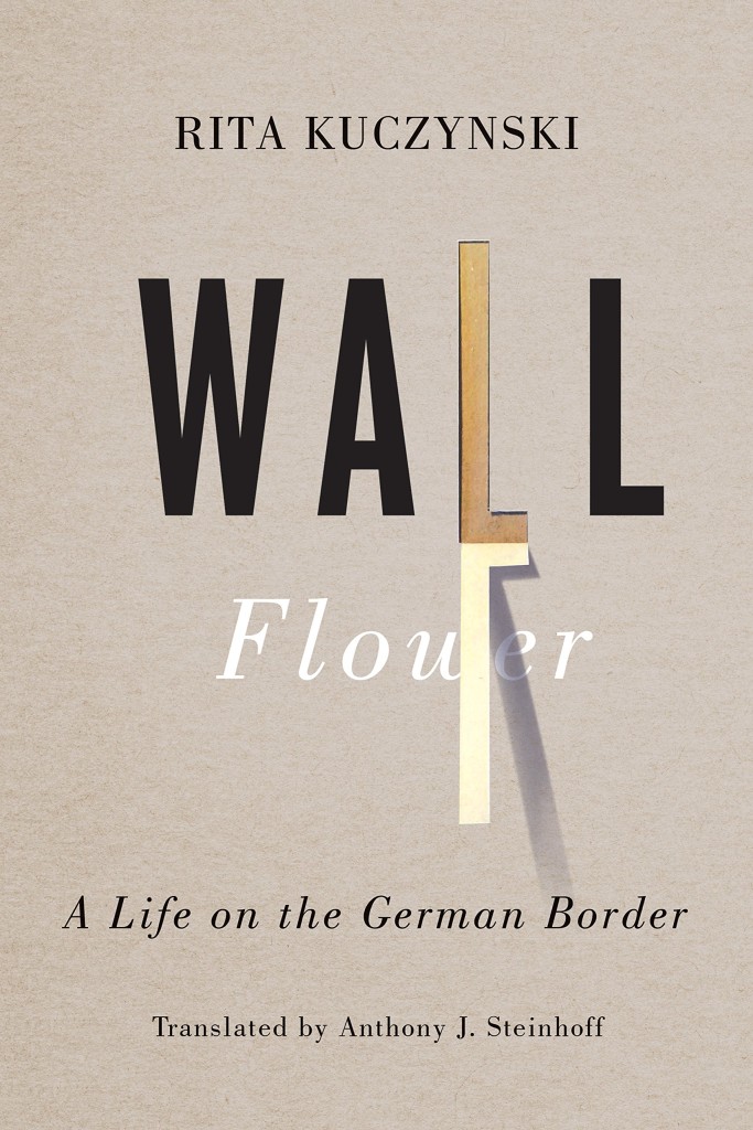
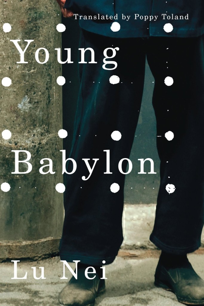
Wall Flower by Rita Kuczynski; design by David Drummond (University of Toronto Press / August 2015)Young Babylon by Lu Nei; design by David Drummond (AmazonCrossing / September 2015)
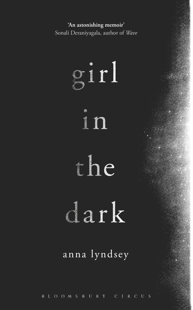
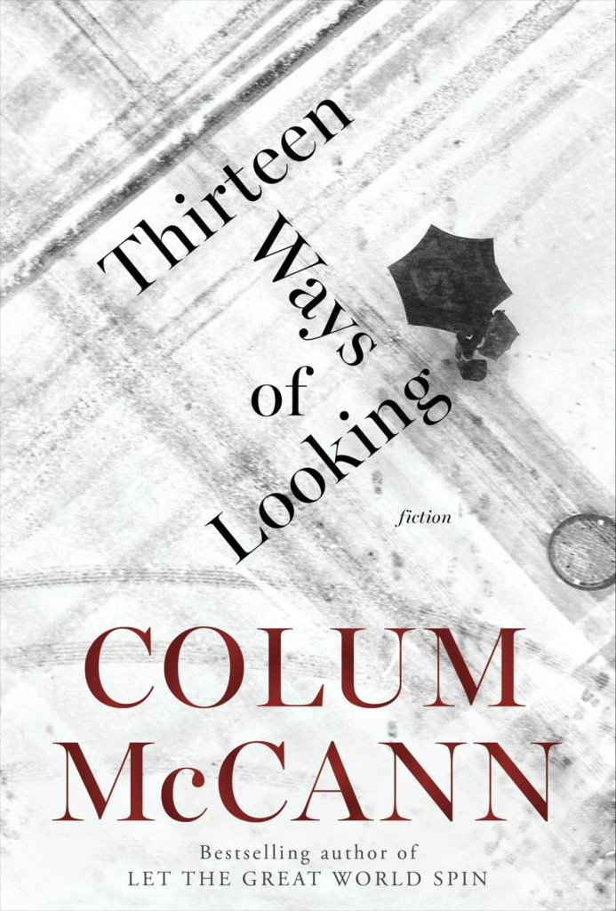
Girl in the Dark by Anna Lyndsey; design by Greg Heinimann (Bloomsbury / February 2015)Thirteen Ways of Looking by Colum McCann; design by Greg Heinimann; photograph by Julio Gamboa (Random House / October 2015)
Souffles-Anfas edited by Olivia C. Harrison and Teresa Villa-Ignacio; design Anne Jordan and Mitch Goldstein (Stanford University Press / November 2015)Capitalism in the Web of Life by Jason W. Moore; design by Anne Jordan and Mitch Goldstein (Verso / August 2015)
I think designers might have brains that are set up slightly differently to ‘normal’ people (there are always a lot of left handed people design departments). Quite often someone will mention authors and titles of books to me and it won’t mean anything, but when I look those books up on Amazon and see some pictures, I’ll realise I’ve read them or even worked on them. Words don’t seem to lodge in my brain in the same way that images do – I’m useless at remembering people’s names, but I can recognise someone because I sat next to them on a bus three years ago. When I read a book, I’m not sure if I experience in the way you’re supposed to do. It’s hard to describe, but from reading a book I get a sense, in quite an abstract way, of what the tone of the cover for that book should be. Each book seems to create its own world with its own rules and logic. And working on a book you don’t like is always easier – there’s nothing worse that trying to design a cover for your favourite book. It’s like being so keen to be friends with someone that you instantly become the most boring person in the world.
Book designers, you do amazing work. Thank you. I am especially grateful to all the designers and art directors (not to mention publicists and other publishing folk) who have shared their wisdom, provided me with images, and helped me with design credits this year — these posts would not be possible without you. I also want thank my fellow book design bloggers, notably Book Covrs, Booketing, and Caustic Cover Critic, for their sterling work, and my local bookstores, Type, Book City on the Danforth, Ben McNally Books, and Indigo Bay & Bloor, for letting me browse their shelves.
Here are my covers of 2014:
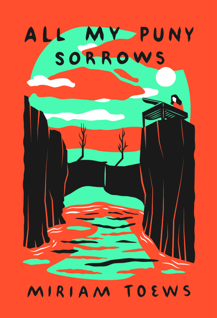
All My Puny Sorrows by Miriam Toews; design by Sunra Thompson (McSweeney’s / November 2014)
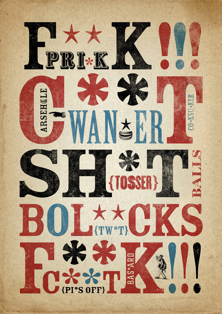
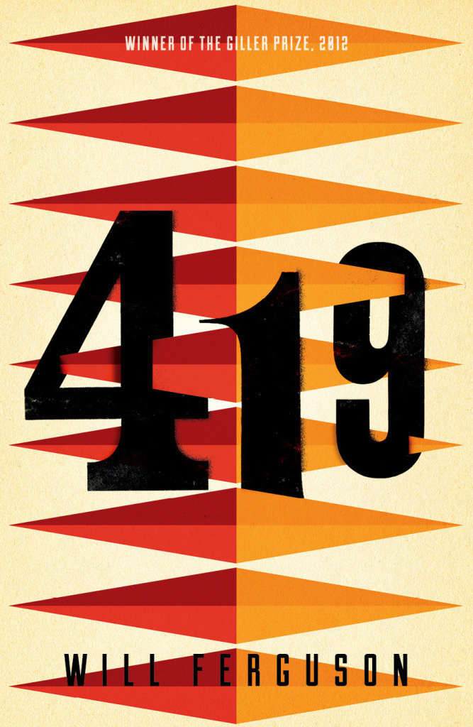
If you’ve followed this blog for a while, you will surely have a come across the work of London-based freelance designer Dan Mogford before. His work — including covers for 419 by Will Ferguson, All Over the Map by Michael Sorkin, and Filthy English by Peter Silverton (pictured above, and now available as a poster should need the swears on your wall) — has been featured here on numerous occasions over the years. A longer feature on Dan’s work has felt overdue for some time now, and so I’m very pleased to finally have Q & A with the designer himself on the blog today. Dan and I corresponded by email…
Do you remember when you first became interested in design?
Although I was exposed to design from a young age. I was always sure I would end up in a scientific career – I was all set on becoming an oceanographer or marine biologist, then around the age of 16 I was given a black and white darkroom kit by a friend of the family and was hooked on the whole process immediately. Within a year I’d applied and been accepted onto a foundation art course despite the fact I was doing science and maths A-levels. This was also around the time that Pixies came screaming onto the indie music scene and Vaughan Oliver and Simon Larbalestier’s bonkers, twisted, dark and sexy artwork for the albums struck a chord with my tortured 18-year-old psyche…
Was anyone else in your family creative?
My father was an engraver for The Royal Mint, first in London then later in Wales where we relocated when I was 4. He designed and engraved coins and commemorative medals for a variety of countries and organisations around the world so I spent a lot of time watching him hand-lettering then intricately carving type and images into these large plaster discs, which would later be somehow magically turned into little metal stamps for coin minting.
Did you study design at school?
When I finished secondary (high) school I went off to do a one year art foundation course with a fantastic array of tutors and access to screen printing, etching and some very clunky early Macs (1991!) which eventually lured me away from the darkrooms. From there I went to Central Saint Martins to study Graphic Design after I realised that type didn’t just belong on a label underneath photographs.
Are your kids interested in design?
My wife is a textile designer so their exposure to art & design has been a constant, whether it’s books at home or trips to galleries and visits to friends who work in similar fields. I’m secretly hoping one or all of them will rebel and go into law or marine biology though.
Where did you start your career?
During the second year of my degree course I wrote to the art departments of virtually every major publishing house in London asking for a summer holiday work placement/internship – only one of them replied! I did 3 seperate placements with the Pan Macmillan design crew thanks to the lovely Art Director Fiona Carpenter. When I left college Fiona put me in touch with a design studio called The Senate where I ended up working for 4 years on predominantly book related projects for the likes of Penguin, Random House and Macmillan – among many others.
Why did you decide to go freelance?
I went freelance in January 2000, bitten by millenium fever and the realisation that I’d gone about as far as I could in the small design studio I was at. I think being freelance was for me inevitable as I’ve never been very good at being told what to do by other people! I’m lucky it worked out for me, I’ve had certain clients since I went freelance fourteen (!) years ago and have worked with a huge variety of brilliant people in that time. Also some idiots.
What advice would you give a designer thinking about going out own on their own?
If you’re considering it then you’re halfway there. Don’t overthink it, don’t fret, go for it. What’s the worse that could happen?
What are your favourite kinds of projects?
I seem to have worked on quite a few series designs in the last couple of years and have realised that I really enjoy the challenge and constraints that entails. I like solving the problem of branding a set of books that hang together while still letting each have their own distinct, individual voice – and it really appeals to the collector in me.
What kind of books present the greatest creative challenges?
Again a series design can be challenging but very rewarding if you crack it. I’m really not a fan of the hastily written brief with a scattering of Amazon thumbnails ‘for reference’ and a ‘do whatever’ undertone. You’d think that carte blanche was a gift to a designer but those jobs always end up rumbling on and becoming headaches as there’s been no thought about a clear direction or postioning for the book. Some constraints are a good thing to rub against and work with.
Can you describe your process for designing a book cover?
Sketching and doodling and hot shower meditation. I always draw lots of scrappy little thumbnails of ideas as they occur to me along with word lists and diagrams with arrows linking things. Lots of arrows for some reason… When I have a good feeling about an idea I’ll refine it to a more polished visual on the Mac to a point where it can go into a cover meeting by itself and face the scrutinity of the meeting without me there to defend or excuse it. Then of course comes the email requesting a few tweaks and so it goes on. Occasionally a great idea will survive the sales department waterboarding unscathed – that makes it all worthwhile.
Do you approach music packaging differently from book covers?
I think they’re actually very similar disciplines in that you’re trying to distill the essence of the thing into a visual that will connect with people in some way while respecting the content that another person has poured a good chunk of their life into creating. I think as with great book designs the conent and the package can become inextricably linked but record design can only do so much – music can be quite resistant to visual interpretation, more so than the written word I think.
You were suddenly taken ill at the end of 2012. Have you fully recovered?
For anyone who hasn’t yet been bored to tears by my health history, I had a heart infection which came out of the blue and very nearly killed me. I had open-heart surgery followed by several months of hospitalisation and recovery but can safely say I’m 99% back to the stubborn, easily distracted muppet I was before my illness. Thanks for asking.
Did your illness change your approach to work? Do have a different perspective on it than before?
Absolutely. I’m a lot less tolerant of bad clients! I sacked a few within a couple of months of getting back to work properly and am much more picky about who I work with and what on. Life actually is too short. I’ve also started a little sideline business producing art prints from my collection of printed ephemera and packaging because it makes me happy and the marketing department consists of ME.
Who are some of your design heroes?
Vaughan Oliver is the main reason I got into this graphic design lark. He let me shadow him at 4AD for a day while I was doing my design degree which only confirmed his likeability and genius.
Who do you think is doing interesting work right now?
In terms of book design, I’m not going to stroke/stoke the egos of the UK book design Mafia anymore, they know who they are and they’re all bloody fabulous people and constanly inspiring. Same goes for that lot over the pond. Bastards. Also more generally: Dan Cassaro, Elana Schlenker, Rob Lowe, Marcus Walters, Steven Wilson, Dan Matutina…
What‘s in your ‘to read’ pile?
I’m gradually working my way through a list of classics I feel I should really have read by this point in my life – I’ve just finished Jamaica Inn and made a start on Love in the Time of Cholera. I also have a few classic ghost stories lined up for the darkening autumn evenings…
Do you have system for organizing your books?
None whatsoever. I love having slippery piles of books all around my studio. They give off a barely discernible warmth and are good company now I work alone.
Do you have a favourite book? Enid Blyton’s Faraway Tree series were the first books I remember my mum reading to me as a child. She carefully kept them in pristine condition and I’ve just finished reading them to my son Milo who adored them too.
What does the future hold for book cover design?
I think we’re at an interesting point in the story of books and their covers. I’m certainly being asked to consider the whole book package more frequently than I once was – things like cloth colours and foils on hardbacks as well as endpaper designs, varnishes and other little flourishes that make the physical book the covetable item an ebook can never be. Some design briefs demand that the cover works strongly as an Amazon thumbnail which is an interesting constraint akin to designing stamps or matchbox labels – a reductive process and simplification that isn’t necessarily a bad thing. I don’t think books as objects are going to vanish any time soon and whatever happens down the line – products physical or digital – will always be packaged.
I first came across Jessica’s name in 2009. I was trying to convince Peter Cocking, then art director at Douglas & McIntyre, to agree to an interview. Peter, in his way, was having absolutely none of it (and still isn’t, really), but he did suggest that I talk to his senior designer Jessica Sullivan, “the best book designer in the country.” Nothing came of it then, but I did start to pay attention to Jessica’s work — to be honest, it was hard to miss her distinctive style, impeccable typography, and quite how many Alcuin Awards she was winning!
Now, five years after that original conversation with Peter, Jess is now working as a freelance designer and part-time art director for Greystone Books, and still delivering some of the best book covers in the country. In this interview she discusses her work, her career, and offers some advice for designers starting out today.
Jess and I corresponded by email.
When did you first become interested in design?
I took an art class for the very first time in grade ten. My teacher was a graphic designer and one of his clients was A & W. My 15-year-old self thought that was just about the coolest job I could have imagined.
From that day forward any time anyone asked me what I wanted to be when I grew up, I said Graphic Designer. Even though I didn’t really know what that meant.
Did you study design at school?
My determination to be a designer was thwarted by a scholarship to UBC, so after a bit of a detour, I rerouted and attended the Emily Carr Institute of Art + Design and received a BA in Communication Design.
Where did you start your career?
I think I started my career at school. I had this perception that landing a design job on my own was going to be impossible (I’m not sure why). I had it in my head that my first job would materialize through one of my instructors. I treated school like a very long job interview, only not so well-dressed. By fourth year an offer came by way of my typography instructor Peter Cocking, then Art Director at Douglas & McIntyre. A position was created for me and the two of us became the new in-house design department. And a book designer was born.
How long were you at Douglas & McIntyre?
9.5 years. During my tenure I married, had babies, designed hundreds of books and experienced a bankruptcy—theirs, not mine.
Has working freelance been very different from working in-house?
In almost every way. I’ve always enjoyed my job, but now I enjoy so many more aspects of it. There is a lot that’s rewarding outside of the work itself. You’re fairly invisible in an in-house scenario. There’s little you can change about process and there is an historical nucleus to the way things are done. It’s a lot simpler to affect change when it’s just me I’m dealing with. I’m pretty easy to work with.
Are you still designing books and book covers?
Yes, absolutely. I just design more than books now.
What have you worked on recently?
I’ve recently designed a book series for MOA [Museum of Anthropology] at UBC, I’m currently working on a visual identity for an editing and writing services company which I’m having a lot of fun with, and I just wrapped up a project for an exhibition of Japanese woodblock prints from the 1800s. I also continue my work with Greystone Books as their art director. A position which adds balance and bit of chaos to my work flow and ensures I leave the house at least once a week. It also guarantees a few good laughs—it’s a great office to work in.
What are your favourite kinds of projects?
I love it when after your first meeting you’ve not only fallen for the project itself (you have a vision for it, you can’t wait to get started, you can SEE how you’re going to make a difference and bring something to this thing) but you’ve also fallen for the people, the client. Every time this happens, and I’ve been very fortunate over the past 14 months as it’s happened quite frequently, I walk away from those meetings like there are tiny, little clouds under my feet.
What kind of books present the greatest creative challenges?
Fiction covers. I don’t know if I hate them or love them. It’s such a hard market, competitive and over saturated, so the cover becomes of utmost importance. It’s usually the most painful genre when designs are rejected, and I’m generally unfazed by rejections at this point in my career, it’s just part of the job. But I’m fairly opinionated regarding fiction and powerless in terms of persuasion, so it can make for a tortured process. And I might be over exaggerating a bit here.
Can you describe your process for designing a book cover?
If it’s fiction, I read the book, otherwise I read the synopsis and familiarize myself with the content and tone. Then I think. That’s probably the most important stage. Generate as many ideas and concepts from all that thinking. Source imagery or create imagery or have imagery created. Add type. Explore, test, judge, select, refine. Judge, select, refine. Judge, select, refine. Sleep. Wake up and see if I still agree with myself. Submit.
What advice would you give a designer starting their career?
1. Be professional at school. Be on time, hand things in by deadline. Design communities are often small. You will encounter your instructors out in the world. They will remember you if you pissed them off with your laziness. They will not hire you.
2. You only get out of school what you put into it. They can’t teach you to be a good designer; that comes from work and practice. Ensure that every instructor you encounter enriches your education—you are paying for it.
3. Continue to grow. If your job becomes boring—challenge yourself. Give yourself personal goals within your projects. Ensure that everything you create is adding to your own personal archive. When you’ve amassed what you need don’t be scared to leave and move on to the next challenge.
Is there a supportive design community in Vancouver?
I’m not really sure. I do feel I am part of a supportive community—although it’s not actually composed entirely (or much at all) of fellow designers. I’ve been told one exists in Toronto, and I have to admit, I am very curious about it all.
Where do you look for inspiration, and who are some of your design heroes?
I try to be aware of my surroundings, to makes connections of all kinds, not just in design. I like old things and new things and mixing the two together. I’m always looking at stuff. Printed stuff: books, magazines, wallpaper, packaging. Moving stuff: movies, documentaries, TV, birds. Invented stuff: art, architecture, interior design, music, fashion. Stuff that just exists: fish—which have the most amazing colour palettes, snow affirms the beauty of white space.
That’s a hard one. I’ve been so busy lately that I honestly haven’t had time to read anything besides work related matter. I used to read in transit and at night, so I consumed a lot of books on a monthly basis. Now I write proposals and tend to email on the bus rides and research in the evenings and fall asleep before I can finish a page of the book that’s sitting next to my bed, Ingenious Pain. The last book I read that I really devoured was Million Little Pieces which is strange because I almost exclusively read novels.
I don’t really see that much changing, to be honest. Unless we’re no longer allowed to use paper, and we go back to the time where stories are housed in people’s memories. And then I’ll be useless for a number of reasons. I have a terrible memory for that kind of detail.
I think graphic design is an important profession because it’s part of what we put out into the world, and it’s what people see and perceive. It’s not just about doing design for the “public good.” The design community currently thinks that if you design something to help the victims of Hurricane Sandy, then that’s good, but if you design something for a bank, then that’s bad. I disagree. I think all design matters and all design deserves to be intelligent.
Obviously, we don’t want to advertise products that are horrible for people because that’s immoral. But if we can raise the expectation of what something can be, then we’ve done a huge service for our community. For example, consider the way most strip malls and shopping centers think they have to appear and behave: it’s horrible. Why can’t there be a different kind of experience? Why can’t we see them as something potentially terrific? There’s an architect named James Wines, whose Structure In the Environment architecture firm designed facades for a chain of BEST stores in the 1970s. He took big box stores and turned them into fantastic outdoor sculptures. He raised the expectation of what those experiences could be.
To me, that’s the most responsible design there is: taking something “bad” and making it terrific by raising the expectation. That’s what we do.