Special effects designer Adam Savage (Mythbusters) visits the warehouse of The Earl Hayes Press, a prop house that’s been making printed material for Hollywood movies for over hundred years. Fake newspapers, magazines, currency, and product labels all came from their printing presses. Historian and archivist Michael Corrie of YouTube channel Props To History walks Adam through some of the iconic props that originated by the press, including Blade Runner‘s ID badges and, incredibly, the passports and letters of transit from Casablanca. So good.
Hey, I hope you are keeping safe and well. There’s a wide variety of styles this month, but pink, yellow and orange are something of a minor theme (although since writing this I’ve actually removed one of the covers that combined bright pink and yellow because the book isn’t out until September — you’ll see it in a couple of months).
I think we’re also starting to see a potential new trend with photographic covers for fiction. I don’t have the vocabulary to neatly identify the style of photography I mean (sorry photography people — I mostly studied paintings in school!), but it’s basically contemporary colour photographs of candid, and sometimes intimate, social moments. It’s different, if adjacent, to the more posed ‘stylish sad girl’ phenomenon, or the use of black and white photography for ‘serious’ literary fiction I think. Anyway, maybe it’s a thing? Time will tell…
I was wondering why the weirdly wonderful art seemed familiar and then I remembered that the cover of Lisa Wells’ nonfiction book Believersdesigned by Na Kim also makes use of Lisa Ericson painting…
I know I say everything gives me Annihilation vibes but Lisa Ericson’s art definitely gives me Annihilation vibes. And speaking of weird Vandermeer vibes…
I love these Matt Blease illustrations celebrating iconic furniture designs for The Conran Shop in London. I think my favourite is probably the Noguchi coffee table illustration, but that might just be because I’ve always wanted one and there’s a book in it! (Although I wouldn’t mind an Eames lounge chair either! That illustration also features a book funnily enough!).
The cover for the UK and Australian edition of Blue Hunger, published by Scribe, was designed by Luke Bird (and thank you to Guy Ivison at Scribe for providing the design credit). It’s an interesting contrast I think:
This made me think of the opening credits to a movie from the 1960s. I think it’s partly the type, but the colours also reminded me of Maurice Binder’s title sequence of Charade. Maybe it’s more of the overall vibe than anything else?
The New Life by Tom Crewe; design by Jaya Miceli (Scribner / January 2023)
Interestingly, the cover of the UK edition published by Chatto & Windus uses the same photograph but it’s flipped the other way and printed on one of those fancy half dust jackets (forgive me for not remembering their technical name). I believe the design is by Kris Potter.
The cover of the UK edition published by Fourth Estate was designed by Jo Thomson. It’s interesting to see the same basic concept executed in two very different styles.
The cover of Granta edition The Devil’s Workshop by Jáchym Topol designed by Telegramme Studios was on my list of favourite covers back in 2013 (there were some great covers published that year!). Interesting that the colour palettes are similar.
I should, at this point, rename this post “Young Adult Book Covers I Saw Last Year, Quite Liked, and Could Find Some Credits For.” It would be accurate.
December turned out to be really busy. It is every year. I’m not sure why it still catches me out. That said, 2022 did seem to be especially busy for reasons far, far too boring to get into here (yes, I got sick amongst other things).
I had thought, in fact, that it might be time to retire this particular annual post. But then I looked around to see what other YA cover lists had been posted and… well, it wasn’t great. If I don’t do it, who will?
This year’s list — like last year’s — is full of illustrated covers. It seems to be the dominant trend, and I would really like someone more knowledgeable than me to profile some of the illustrators and put their work in its proper context. Maybe there is an art book in it for an enterprising publisher, if there isn’t one already? There are so many great covers from the past couple of years to choose from. 1
Anyway, I hope you enjoy this very late look at some of the YA covers of 2022. Feel free to leave your thoughts below.
Founded by designers Jon Gray and Jamie Keenan, the Academy of British Cover Design (ABCD) held its first book cover design competition in 2014. To celebrate its tenth awards ceremony this year (where does the time go?), the Academy has decided to allow regular folks to vote for a ‘Winner of All Winners’ from the last nine years – ABCD X.
Committed to making the awards to be as inclusive as possible, ABCD includes categories that frequently get overlooked by other competitions, and the work itself is judged by book cover designers themselves, so there is a diverse selection of winning cover to choose from including children’s books, science fiction and fantasy, series design and non-fiction.
Entries to this year’s regular competition, ABCD’23, are also now open.
The winners of both ABCD X and ABCD’23 with be announced at an awards ceremony on the 23 March.
“Cover design in the US went from being house-styled, design driven and idiosyncratic (think Grove Press or New Directions or whatever Push Pin was up to) to the ‘big book look’ of the 1970s defined by designers like Paul Bacon. Make the type as large as possible, centre it, and combine with some non-specific imagery. That look still defines what we see on the bestseller list to this day. It established a generic way for covers to look and a familiar shorthand for sales teams and booksellers to understand – ‘aah, this must be a … big book!’. It ignored design principles of layout, composition and conceptual thinking that had been codified over the previous 50 years in favour of a commercial literal-ness. It also took away a lot of the fun.”
Jamie Keenan’s review of Joe Orton and Kenneth Halliwell’s naughty cover for The Secret of Chimneys by Agatha Christie is also a good time.
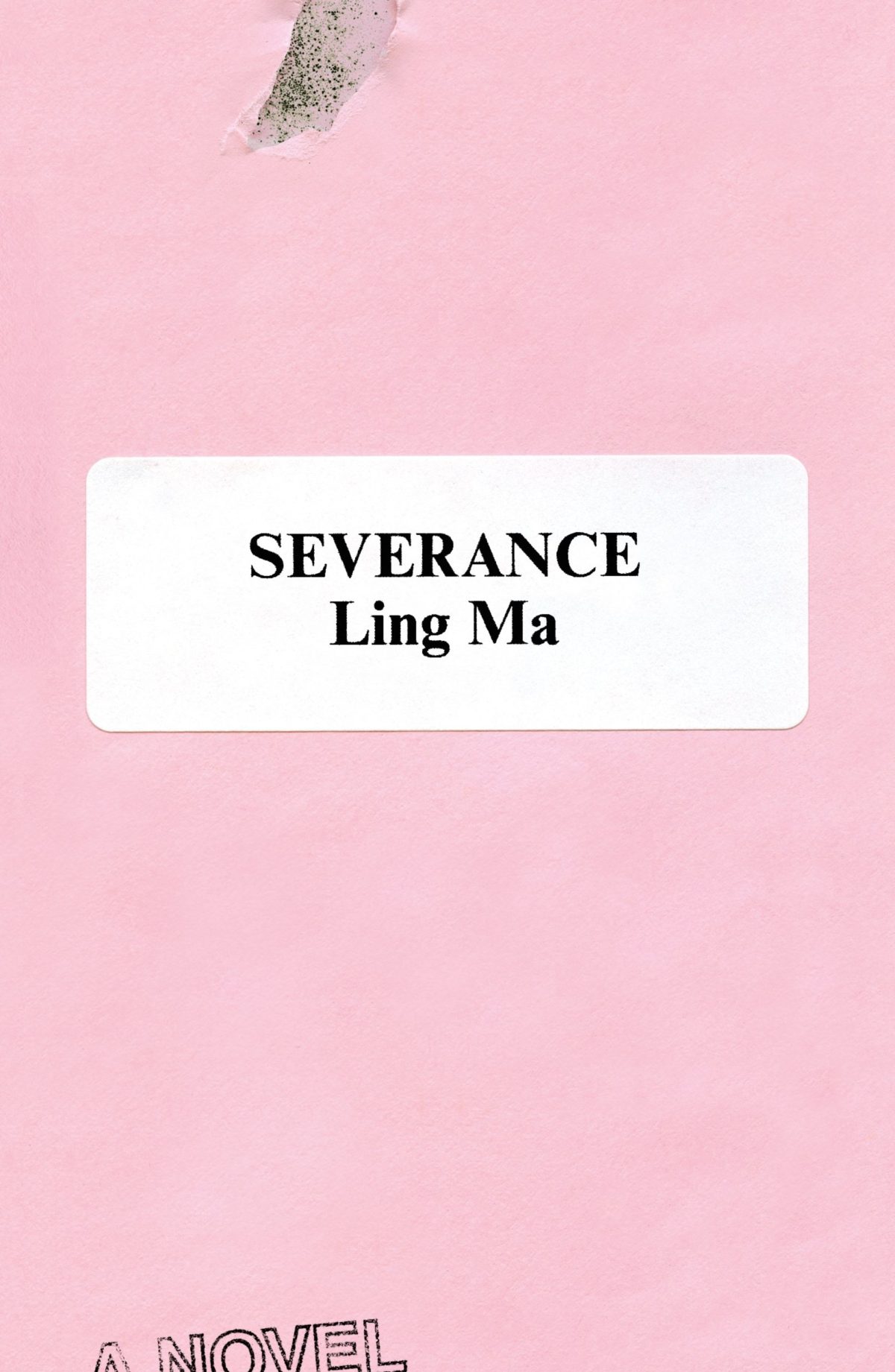
Rodrigo Corral also designed the cover of Ling Ma’s previous novel Severance.
Canción by Eduardo Halfon; design by Alban Fischer (Bellevue Literary Press / September 2022)
Drive by James Sallis; design by David Litman (Poisoned Pen Press / September 2022)
I was just talking about this book — how it is a near perfect thriller, but also great for dudes who don’t read a lot of fiction — so I was happy to see it’s been given a new lick of paint. And pink covers are, as I keep saying ad nauseam, a thing…
I’m including this because of the beautiful photo (with a colour palette remarkably on trend in 2022) and my inevitable teenage crush on indie style icon Miki from Lush.
Sacrificio by Ernesto Mestre-Reed; design by Dana Li (SoHo Press / September 2022)
This reminded me Peter Mendelsund‘s Amerika cover for Schocken back in the day. But, as is the norm around here, the two covers do not actually look that much alike side by side…
It’s been a while since I posted about author, illustrator and designer Coralie Bickford-Smith. In a new video for Penguin Books she talks about her creative process, her work on the original Clothbound Classics, and Penguin’s new Little Clothbound editions.
I’m doing my best to catch up a little bit this month, but there’s no such thing as a quiet month in publishing any more. Just rest assured nobody knows what they’re doing — we’re just here for the chaos and romance…