Hey. I hope you’re keeping safe and well, especially my friends and colleagues in snowy NYC. Thanks to everyone who helped with images and design credits this month — it’s been a really busy month so I really appreciate it!
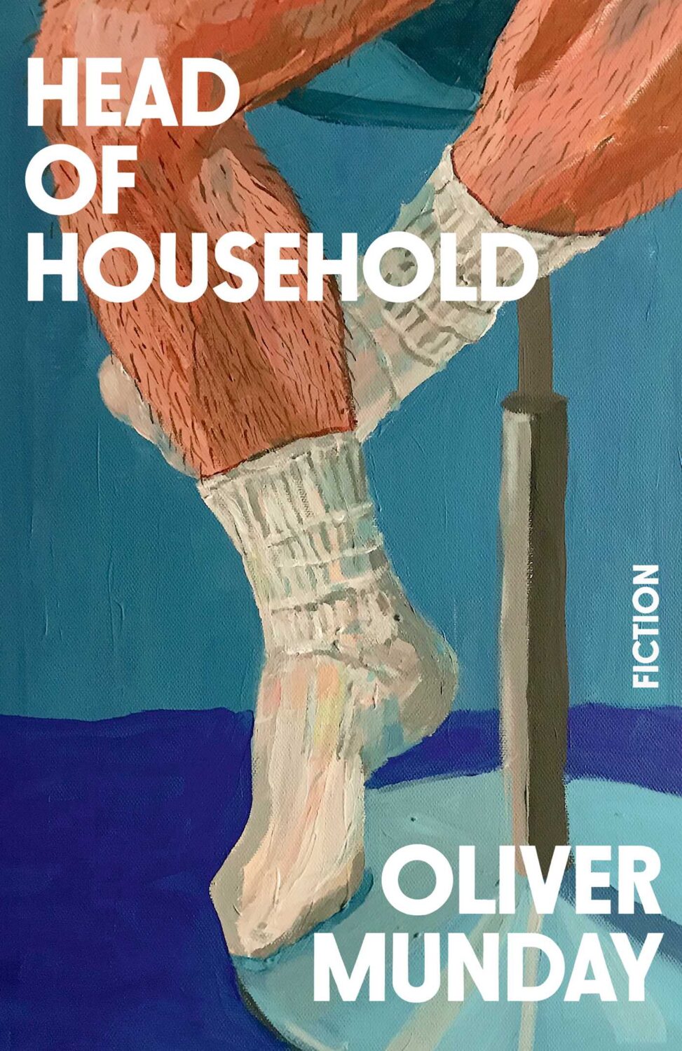
Oliver’s own novel, Head of Household, is out from Simon & Schuster in the US this month too. The cover was designed by Christopher Brand, and you can read a conversation between the two about the design process at LitHub.
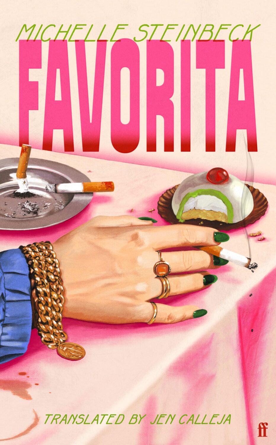
Favorita by Michelle Steinbeck; translated by Jen Calleja; design by Henry Petrides (Faber & Faber / February 2026)
Somehow it is the end of July, and I am once again rushing to get this done. I think it’s a decent mix of covers this month though, with some big books, some indies, a few type-only covers, some nice art, and a couple of trends to watch out for. I’m glad it’s all come together, even if it is last minute!
Thanks to everyone who took time to help me with cover images and design credits over the past couple of weeks (days!) — it’s really, really appreciated! I hope everyone is having a good summer.
It is the time of year for lists and I should’ve been done weeks ago, but I am late and already well behind the pack. Apologies for that.
I admire Matt Dorfman‘s ability to whittle his list down to a dozen covers for the New York Times. I imagine it takes him a lot less time for one thing, but I’m sure Matt still agonizes over every cover. It requires a level of discipline and restraint that I do not possess to keep it that tight year after year.
PRINT’s list of best book covers of 2024, compiled by editor-at-large Zachary Petit, is also long. It’s a 100 covers. Last year it was 50.
I’m not trying to throw stones here. We are all seeing more covers than we used to. There are more books for one thing. But they’re not just something we just experience in print in anymore. You don’t have to go into a bookstore or read the newspaper or magazine to see them. They’ve become something we see and share all the time online. Designers are promoting their own work and (slowly) getting more credit for it (although there is a lot more to be done in that area. Publishers — credit your designers!). My monthly round-ups are now one of several you can choose from.
And it is not like my list is short. This year it features work by 48 designers — more than half of them women — and 86 covers (plus a couple of supplementary images).
The consensus seems to be that it was a decent year for covers, and it’s hard to argue with other people’s selections even if I don’t love them all.
It is telling though that 100 of LitHub’s selections were individual picks. There are covers on my list that are not on the anyone else’s despite their length. So while I think we agree there were lots of good covers, I’m less certain we entirely agree on which ones were actually the outstanding ones.
A recent article Spine argued that there is a battle between minimalism and maximalism going on (you can find Spine’s end of year list here by the way). I think that could be true. Different approaches work for different audiences. But I also think it’s messier than that. I get the sense that publishers are less sure of what they want and what sells (certain genres notwithstanding).
It has been a rough year for a lot of publishers, so there is undoubtedly a lot of uncertainty, and no small amount of anxiety. I could go on about why that it is (and the publishing’s self-inflicted wounds) but, in short, what I think we’re also seeing with book covers is more meddling and less direction.
Anyway, I don’t want to end this on a bleak note. This year was shit enough. Despite it all, there genuinely were a lot of good covers in 2024, and some that I did think we’re outstanding. A couple of them made me laugh, which was no small thing. It was a strong year for several individual designers in particular and, despite the pressures, many produced work that was recognizably theirs. I thought there were more interesting covers coming out of the UK and Ireland (that mercifully wasn’t just about the inks or the finishes!), and there were some fun Canadian covers too.
Thanks, as always, for reading, and I hope you’re all keeping safe and well. Happy Holidays!
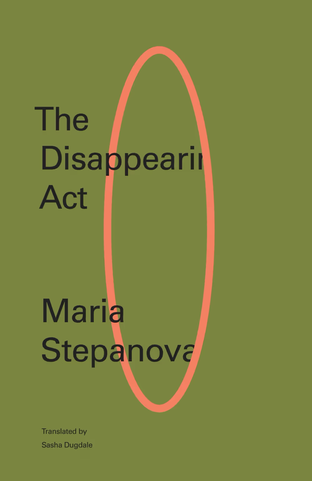
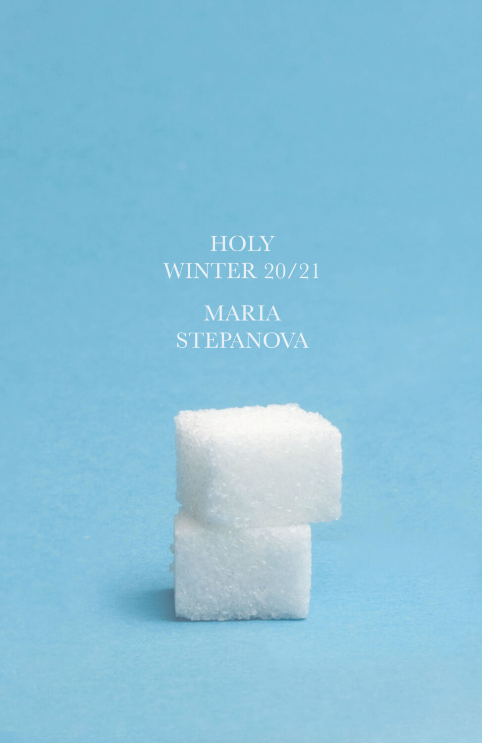
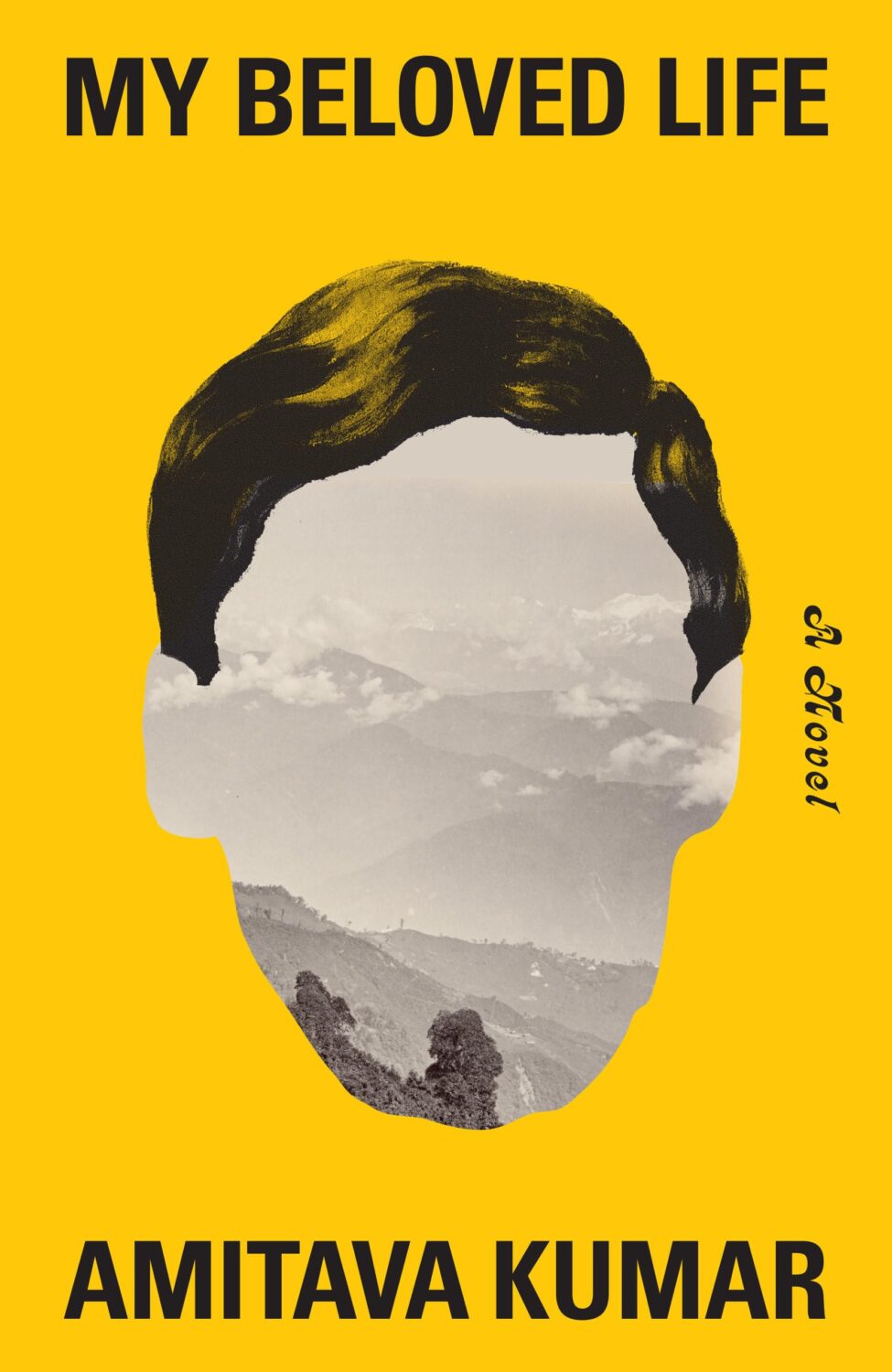
Holy Winter 20/21 by Maria Stepanova; design by Oliver Munday (New Directions / October 2024)My Beloved Life by Amitava Kumar; design by Oliver Munday (Knopf / February 2024)
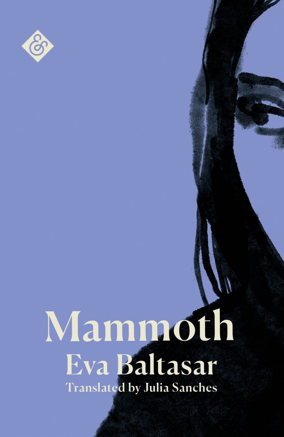
Mammoth by Eva Baltasar; design by Anna Morrison (And Other Stories / August 2025)
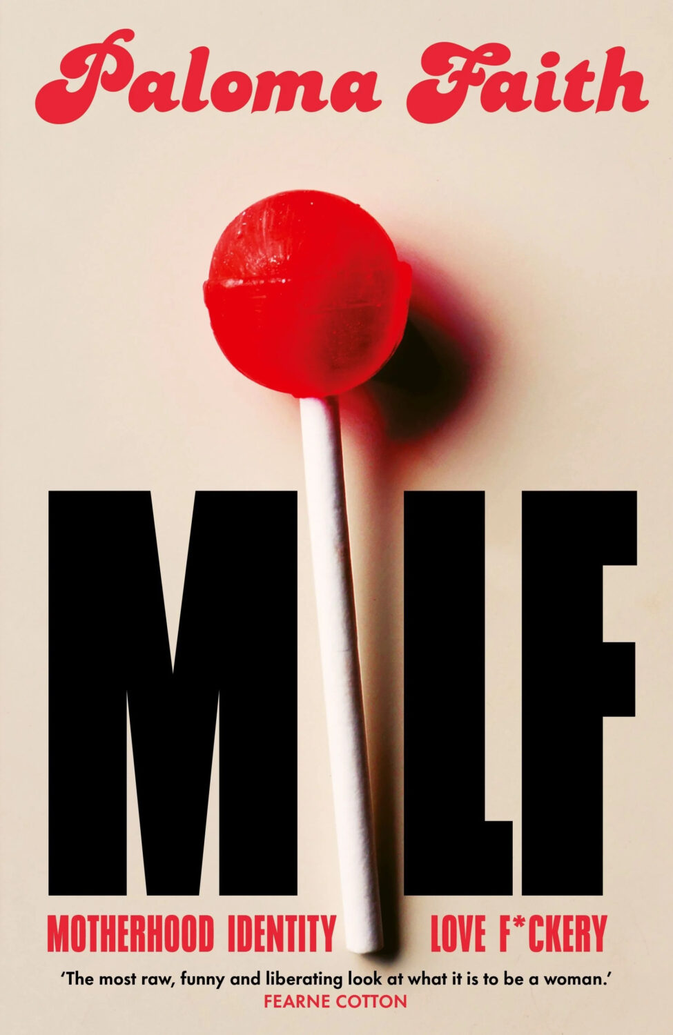
MILF by Paloma Faith; design by Jack Smyth (Ebury / June 2024)
Also designed by Jack Smith:
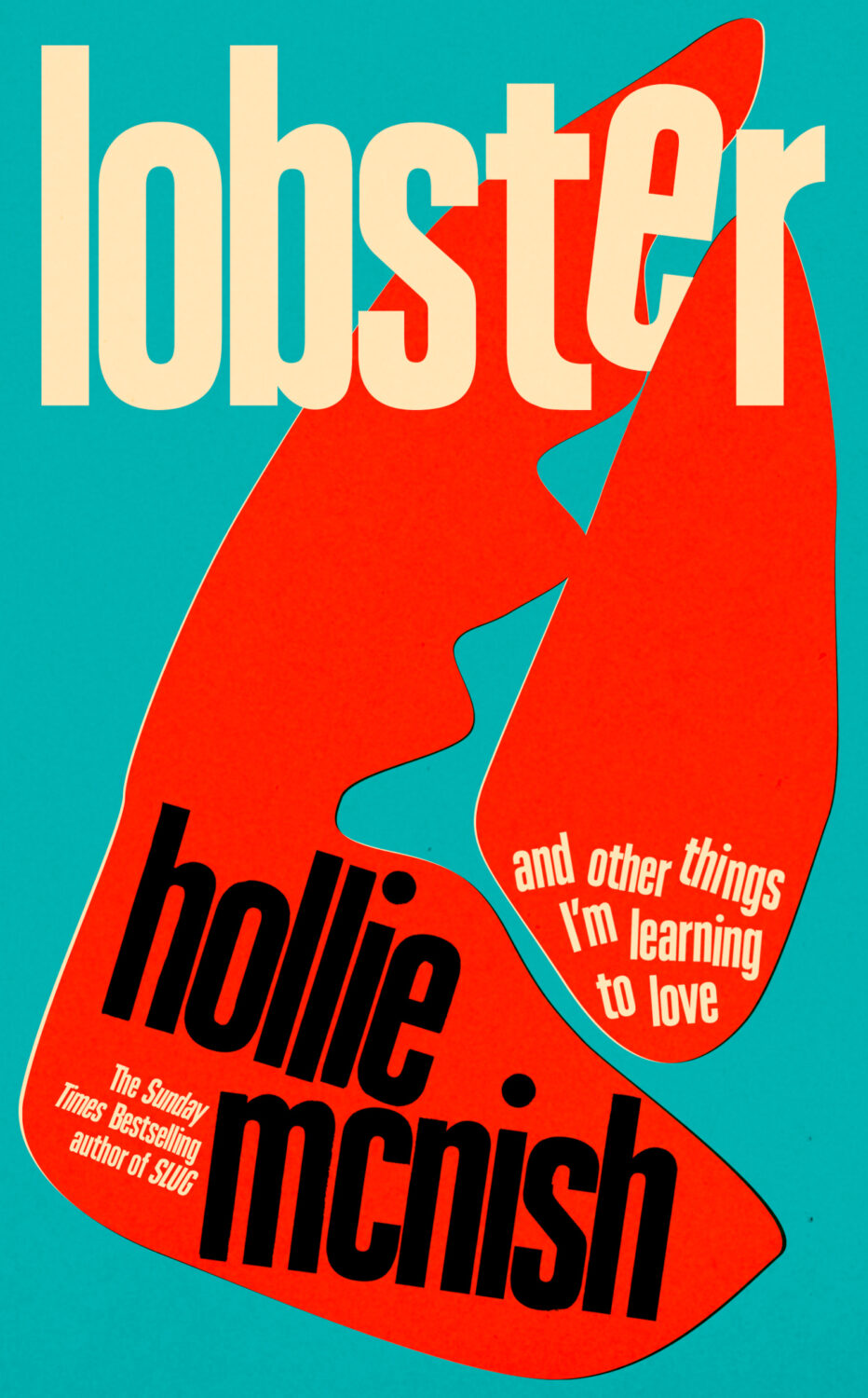
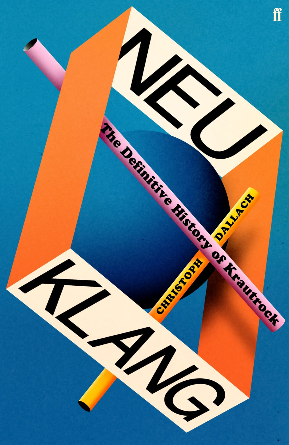
Lobster by Hollie McNish; design by Jack Smyth (Little, Brown / March 2024)Neu Klang by Christoph Dallach; design by Jack Smyth (Faber & Faber / May 2024)
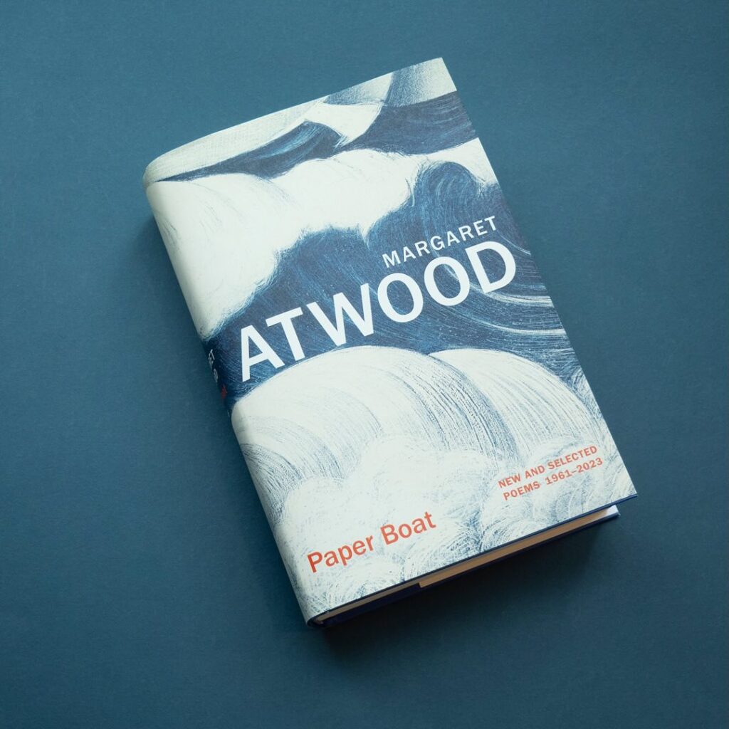
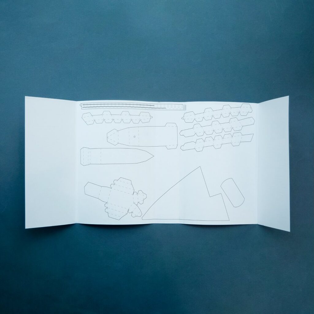
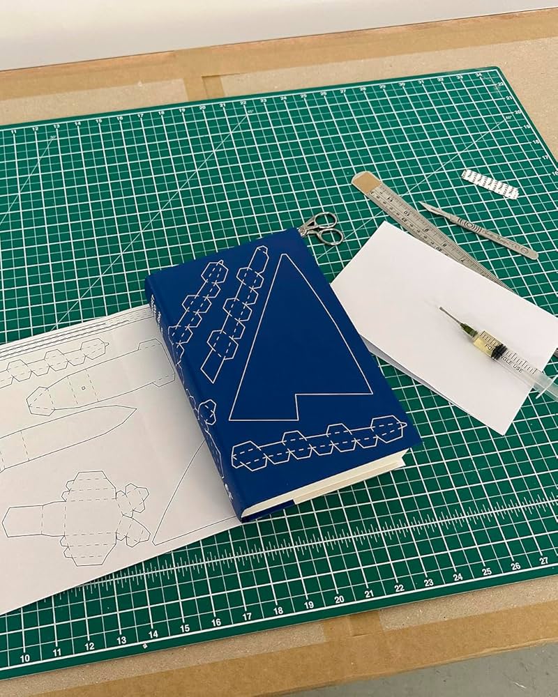
I also have to give a special shout out to the cover for Paper Boat by Margaret Atwood (Chatto & Windus / October 2024). Suzanne commissioned paper art by Nathan Ward to design a template for a paper boat that could be cut out from the dust jacket and stuck together.
Hey everyone. I hope you keeping well. It’s another big post this month. There are lots of new covers, but also quite a few that I missed (or didn’t have the design credit for!) from earlier this year too. I expect that’ll keep happening over the next couple of posts as I try to catch up over the summer, so feel free to send me stuff I might have overlooked. Now is the time!
The cover of the UK edition published by Penguin earlier this year, designed by Richard Bravery (I think?), uses the same painting by Tosin Kalejaye but it’s interesting to see the differences in the approach side by side.
Another example of the US and the UK cover sharing the same image but with differing approaches. I like the type and the retro poster vibe of the UK cover a lot. I don’t have the design credit though so please drop me a note if you know whose work it is and I’ll add it in!
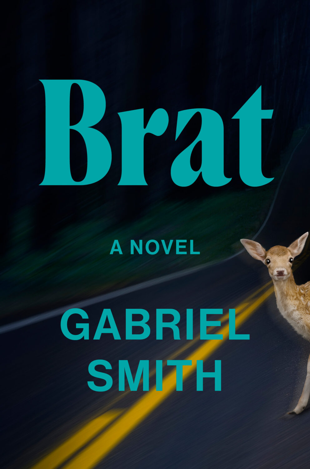
Brat by Gabriel Smith; design by Stephanie Ross (Penguin Press / June 2024)
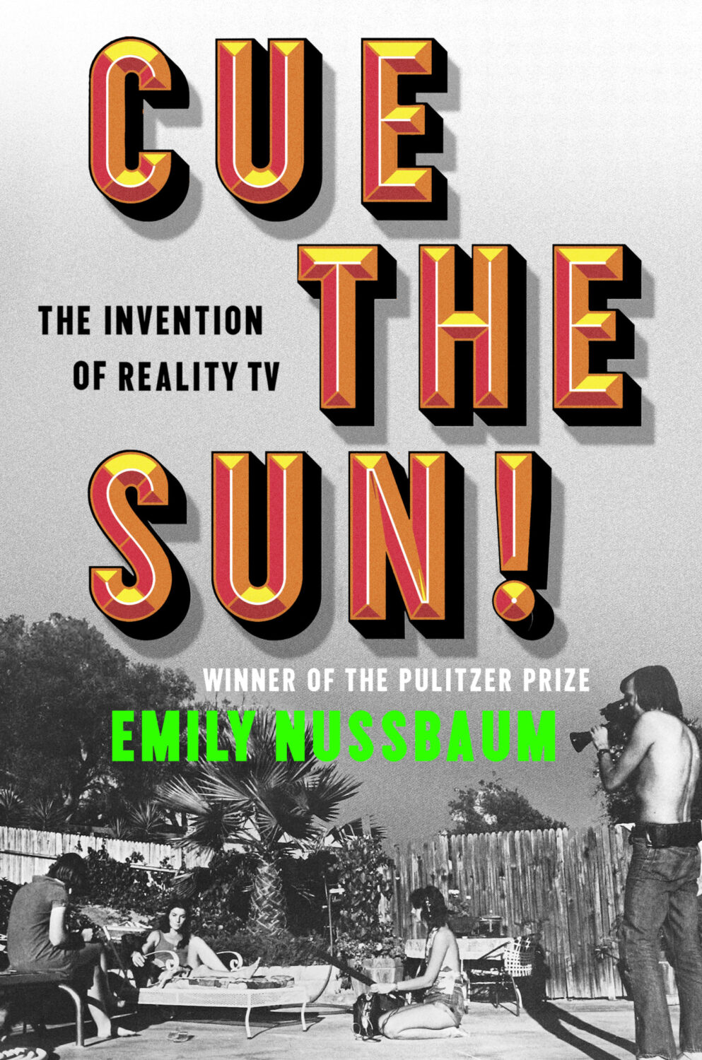
Cue the Sun by Emily Nussbaum; design by Michael Morris (Random House / June 2024)
I’m a bit late to this. An Excellent Host, a short story by Chelsea G. Summers author of the cult hit A Certain Hunger, was originally printed exclusively for Independent Bookstore Day back in April. Signed copies are still currently available from the publisher. Jaya Nicely also designed the cover of A Certain Hunger of course…
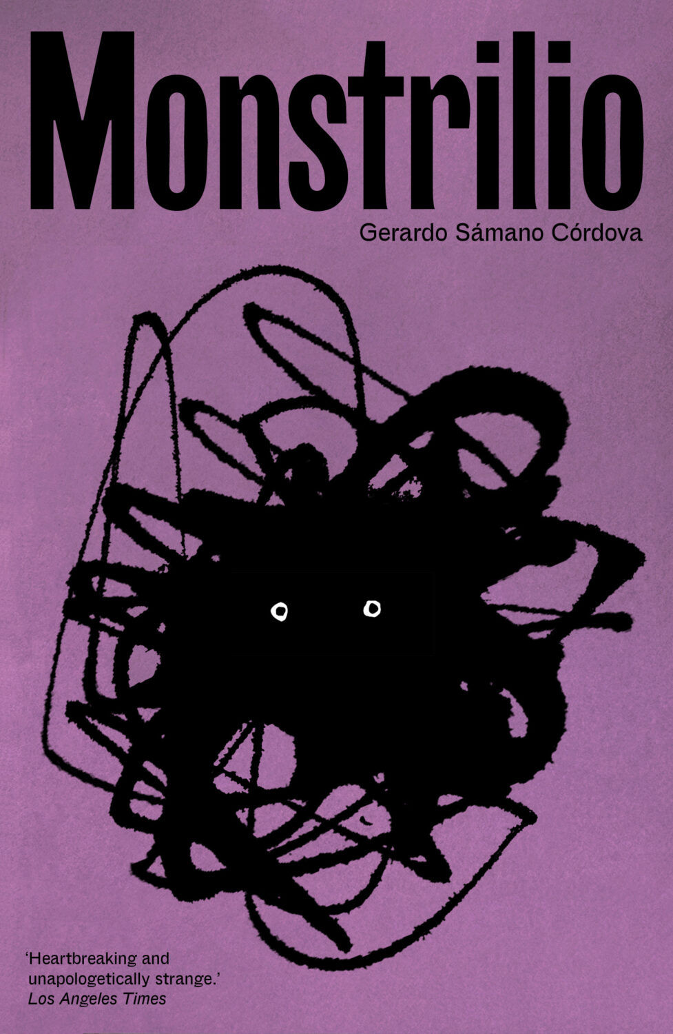
The cover of the US edition of Monstrilio, published by Zando in March last year, was designed by Alex Merto. I was a little late to it, but it was included in my September round-up.
I’m not much of a horror fan so my frame of reference is very dated, but this cover immediately made me thing of the 1998 Japanese movie Ringu (and the end of The Blair Witch Project).
This makes a nice pair with the cover of The Upstairs Delicatessen by Dwight Garner designed by June Park and published by Farrar, Straus & Giroux in October last year.
Even though it’s still just about July — a supposedly “quiet” month in publishing — I’m running late once again. Hopefully everyone is on vacation and won’t notice that it’s basically August already and I am here sliding in under the wire. There are some great covers this month though. A bit of collage, some really nice typography, and lots of pink and red. Enjoy!
The Absolutes by Molly Dektar; design by Yeon Kim (Mariner / July 2023)
I like this cover a lot, but I’m shamelessly stealing it from Lit Hub’s most recent book cover round-up (a benefit of being last to post!), so I hope the design credit is correct because I couldn’t verify it before posting!
I had this noted as down as July cover, but the book was actually released in June. The cover of the Two Lines Press edition of Running Through Beijing by Xu Zechen has also been re-designed to match.
This reminded me of the 2017 cover of Smoke by Dan Vyleta designed by Mark Abrams with an illustration by the late Colombian artist Alejandro García Restrepo who passed away last month.
I’m even later than usual this month and everyoneelse posted their selections days ago, so you must really like book covers if you’re still jonesing for more! (And just a reminder: if you are in fact addicted to book covers and don’t want to miss any new posts, you can get them automatically sent to your inbox now. It’s not a newsletter, just magical RSS. But subscribing will confirm that you have a problem and should seek help!)
A bit of a Saul Bass / Hitchcock thing happening at the moment…? (The cover of the Faber edition of The Premonitions Bureau by Sam Knight was designed by Jack Smyth)
We’ve almost made it to the end of April, so that’s something. Thanks to Daniel Benneworth-Gray for the mention earlier this month. It surely means I’m about to disappoint a large number of people — if I have not, in fact, already done so — but I hope you find something you like here…
I believe the Elizabeth Finch cover also comes in yellow, but I wasn’t able to find a hi-res image. If anyone wants to send it over, I’ll be happy to add it.
The jacket also comes in yellow, which feels very on trend to me and the blue and yellow look lovely side by side. Thank you to Suzanne for taking the time to send over the image of the yellow version.
Suzanne also sent over an image of the boards for those of you curious to see what is under the jacket, peeking through the die-cuts. The gorgeous photograph is from René Groebli’s photoessay The Eye of Love.
This is the problem with seeing covers/jackets primarily online. You rarely get to appreciate these finer details. This must be a beautiful book to hold and unwrap.
And I have been trying to recall what both these covers remind me of. Possibly ‘Composition of Circles and Semicircles‘ by abstract artist Sophie Taeuber-Arp?
Earlier this year, a Canadian magazine asked me what the latest trends in book cover design were. I don’t think I had a very satisfactory answer. 2021 felt very much like a continuation of 2020, which itself felt like a year on hold.
The trends that came to mind were not exactly new. In no particular order: big faces (big sunglasses!); cropped faces; hands; mouths; postmodern typefaces;1 big skies; rainbows; gradients; the colour orange; psychedelia; collage; contemporary painting.
A lot was made of “blob” covers this year. I’m not sure that anything has really changed since Vulture published this article about “blocky” covers in 2019. They seemed like much the same thing.
Design is about the constraints and, as it turns out, the constraints around designing commercial literary fiction covers that have to work just as well online as in bookstores can lead to similar design solutions — large, legible type, and bright, abstract backgrounds. 2 The surprising thing is not that a few covers look the same when you squint; it’s that more of them don’t.
There were a lot of good covers (that didn’t look alike) in 2021. LitHub posted 101 of them. Still, it didn’t exactly feel like a vintage year.
Do I say that every December? Possibly.
A few years ago I worried that covers were moving in a more conservative direction, particularly at the big publishers. I’m not sure this has come to pass, at least not in the US. There are plenty of covers from the big, prestigious American literary imprints in this year’s list, as there were last year, and every year before that.
There are fewer covers from the UK in this year’s list than in previous years though, and I feel less confident about the situation there. From a distance, things seem a little sedate. I may be mistaken. It’s quite possible I haven’t see enough covers — or perhaps enough of the right ones — from British publishers to get a good sense of the overall picture.3
It would not be a surprise, however, if publishers were feeling a little risk-averse at the moment. We are two years into a global pandemic, experiencing a major supply chain issues, and living through a seemingly endless series of sociopolitical crises.
Nor would it be a surprise if designers were personally feeling the effects too — I’m not sure we are talking about this enough, and I’m not sure I know how to.
Thank you to everyone who has supported the blog in 2021. It means a lot. Here are this year’s book covers of note…
Na Kim talked to PRINT about her career and the designs for the Ditlevsen series in February. If, like me, you were wondering about typeface on the covers, it’s Prophet from Dinamo apparently.
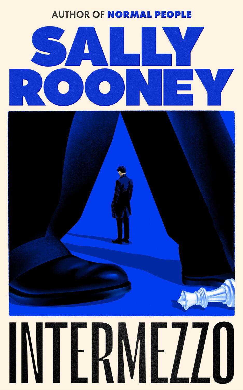
If you’re wondering about the Super-Seventies Sally Rooney typeface, it is Ronda designed by Herb Lubalin and Tom Carnese (I only know because I asked).
Thank you to everyone who has supported the blog in 2021. It means a lot.
I am not convinced that the term “postmodern” quite captures what I mean here (and/or worse, implies something different in the context of typography), but it’s the best I’ve got. I’m not talking about the kind of experimental typography you might associate with the likes of Wim Crouwel or Emigre, or the aesthetic of someone like David Carson. What I am trying to get at is idiosyncratic type that purposely exaggerates or plays with letterforms, and doesn’t conform to function-first modernism. To my mind, this would include some typefaces from the 1960s and 70s, as well as some more contemporary type. In a sense what I am describing is display faces — and I think the eclectic, innovative use of type in Victorian advertising might be an inspiration to designers here — but I don’t think it is just about size. ↩
A big, messy post this month as I catch up on the new releases and some of the covers I missed over the summer. I expect the next couple of month’s might be a bit like this as I work towards my round-up of the year, so feel free to let me know about stuff that you think I’ve overlooked in 2021.
For some reason, I was reminded of this saucy Jacob Covey cover, which I thought was killed in favour of something more (ahem) traditional, but it still exists on Amazon, so who knows? (Jacob probably knows; I do not).
Sisters by Daisy Johnson; design by Suzanne Dean; photograph Simon Kerola (Jonathan Cape / August 2020)
The cover of the US edition of Sisters, published by Riverhead this month, was designed by Jaya Miceli. The painting is by Jeremy Olson. (Thank you to the folks on Twitter who helped me with this!)
Maybe someone has done this before and I didn’t notice (or, more likely forgotten), but it’s great to see a photograph from the EPA’s remarkable DOCUMERICA Project — available through the US National Archives on Flickr — on a book cover.
Rodham by Curtis Sittenfeld; design by Jo Thomson (Doubleday / July 2020)
It’s interesting that the US cover of Rodham is essentially the same as the UK one. I would’ve thought for sure that they would take different approaches.


