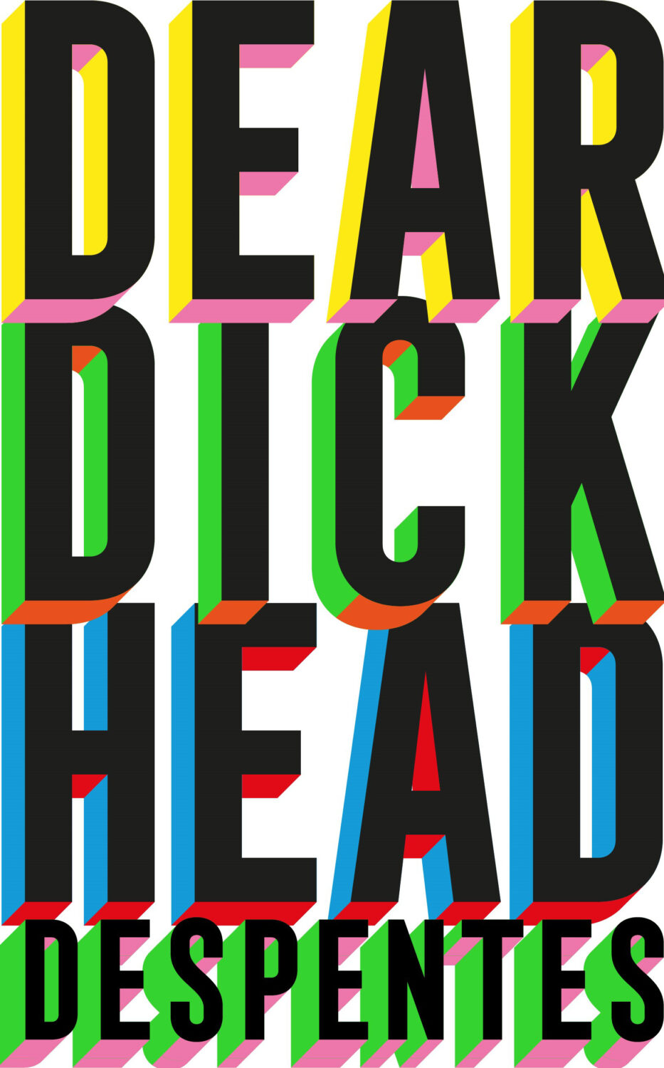
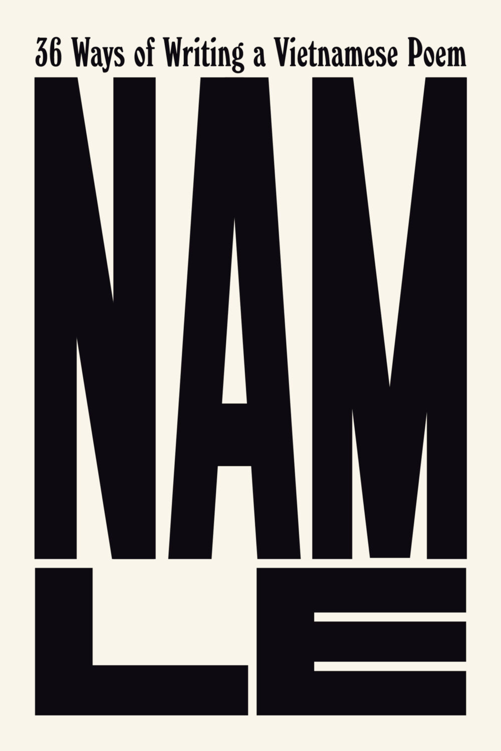
Well, it’s been a month. I hope you’re all keeping safe and well, especially my friends and publishing colleagues in Minnesota. Stay Strong.
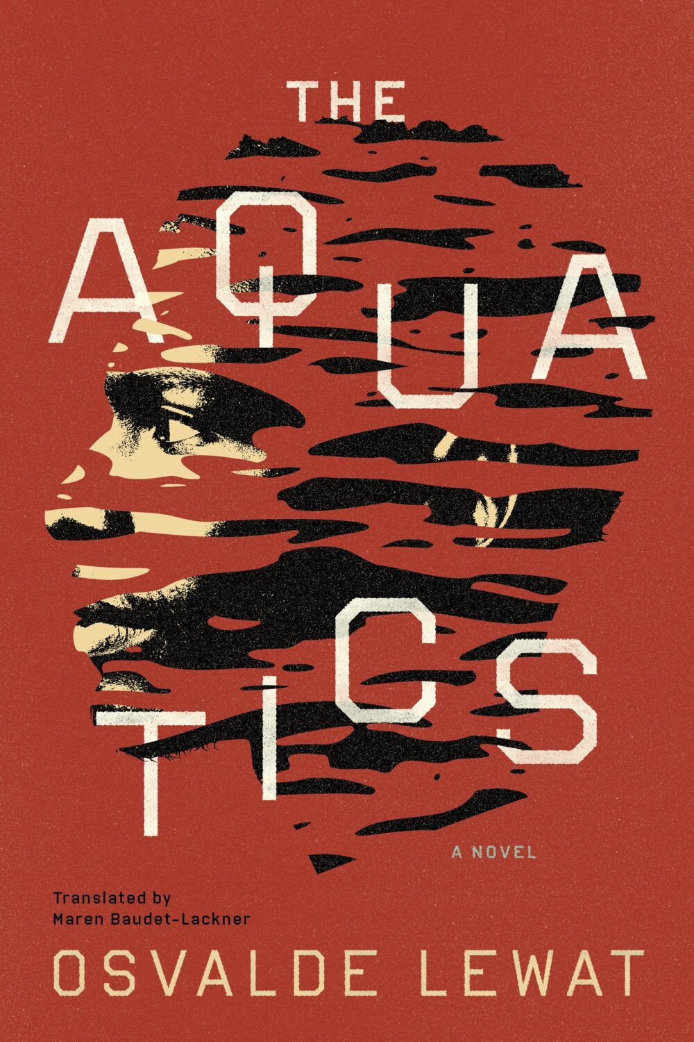
The Aquatics by Osvalde Lewat, translated by Maren Baudet-Lackner; design by Alban Fischer (Coffee House Press / December 2025)
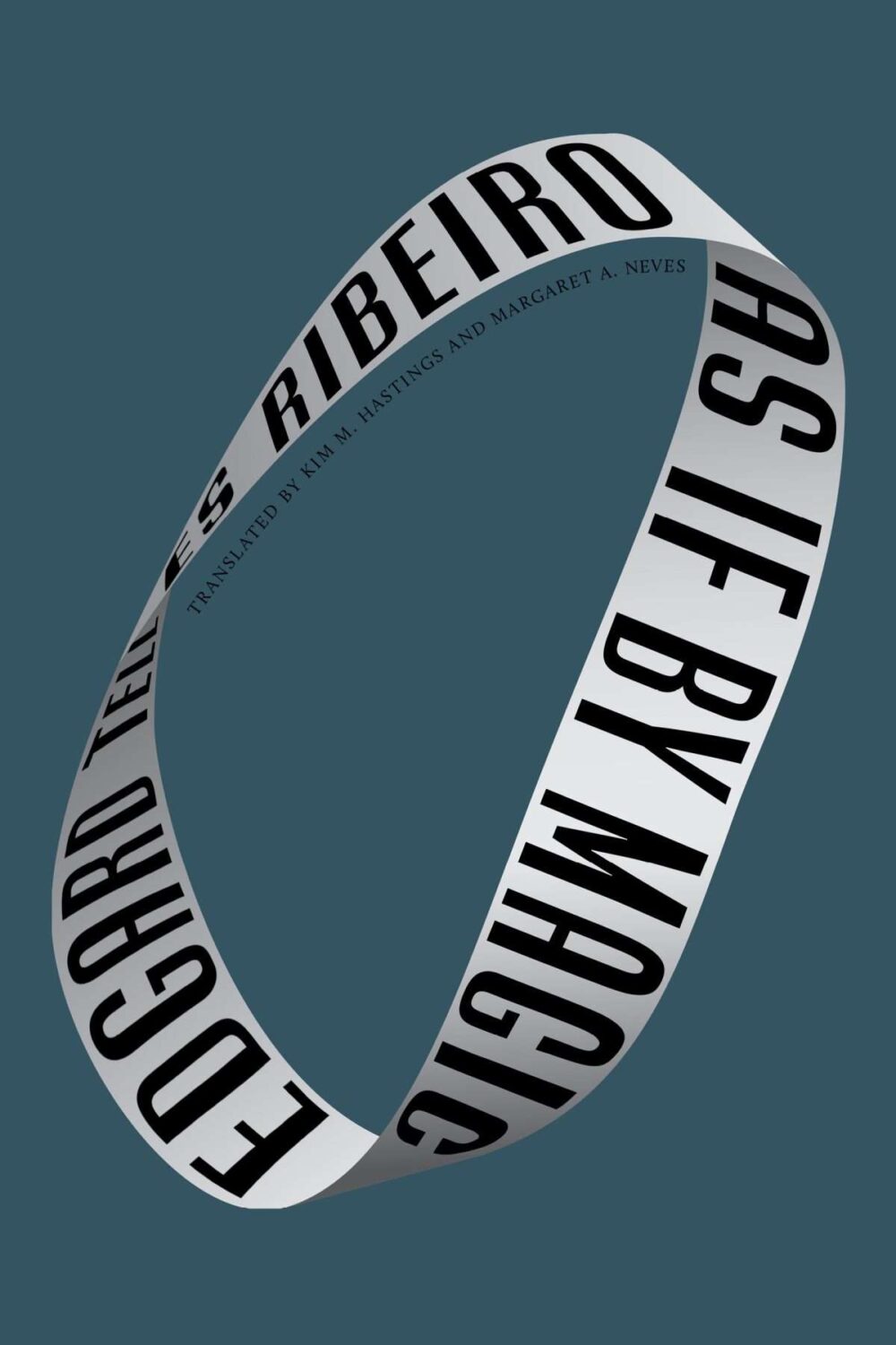
As If by Magic by Edgard Telles Ribeiro, translated by Kim M Hastings & Margaret A Neves; design by Alban Fischer (Bellevue Literary Press / January 2026)
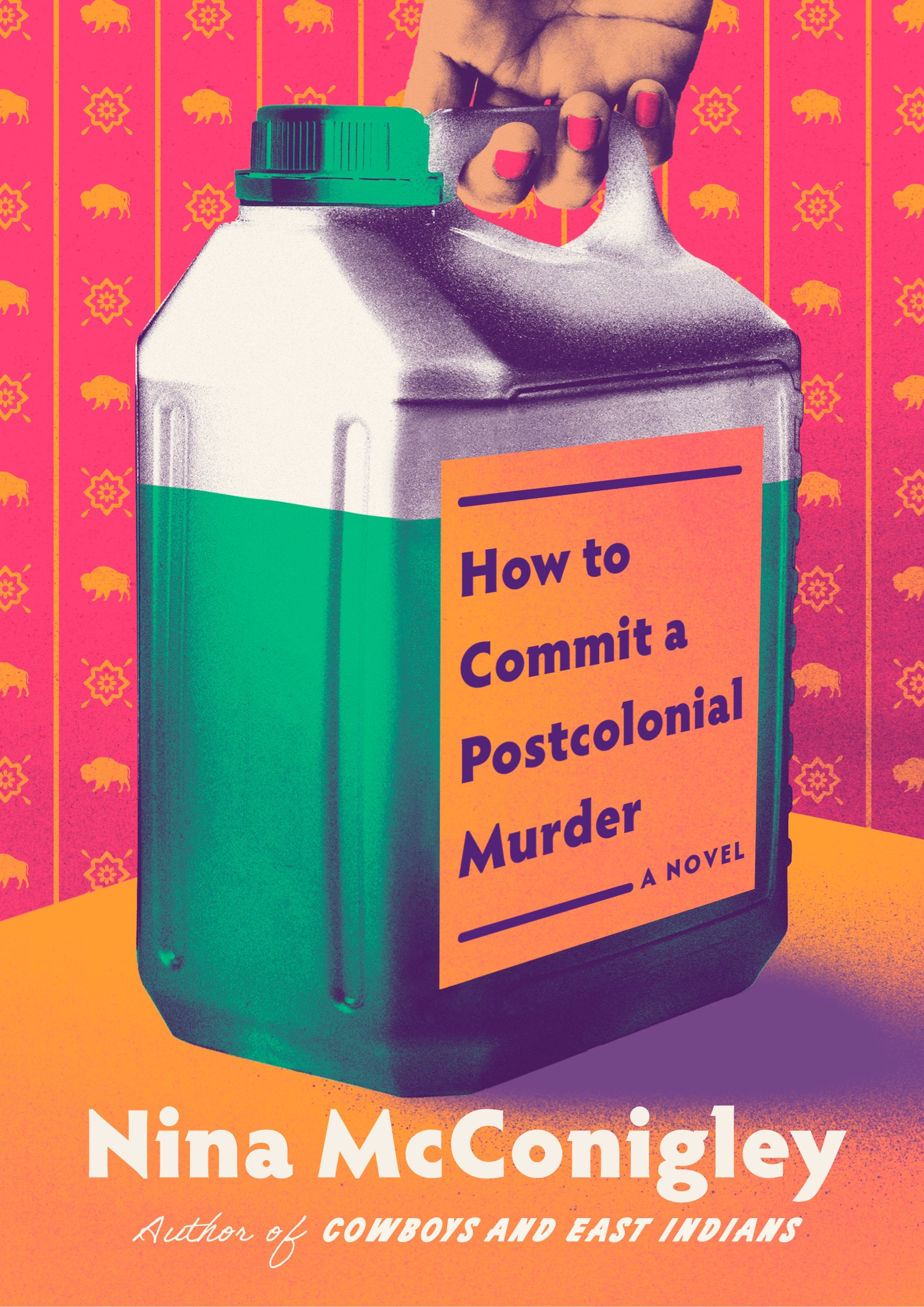
Yes, starting off the year with two covers designed by Alban, but also two books from nonprofit publishers based in Minneapolis, Coffee House Press and Bellevue Literary Press.
Crux by Gabriel Tallent; design by Jaya Miceli (Riverhead / January 2026)
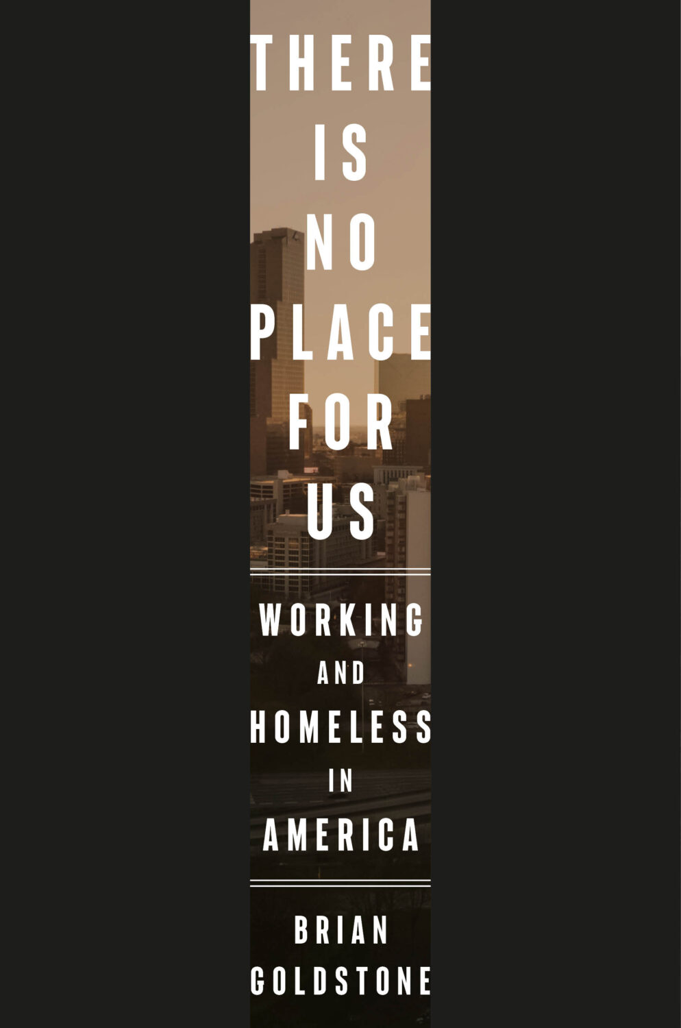
This reminded me of the cover of There Is No Place For Us by Brian Goldstone designed by Anna Kochman for Crown, which featured in March’s post. I’m no Barnett Newman, I do like a bold stripe.
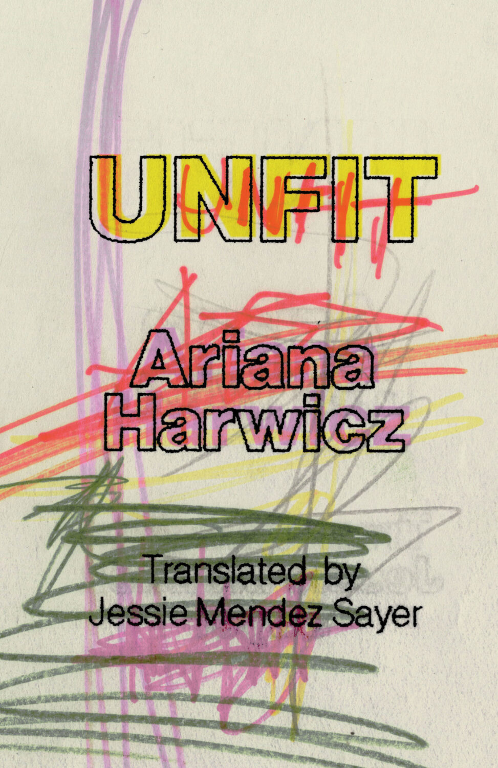
Unfit by Ariana Harwicz, translated by Jessie Mendez Sayer; design by Erik Carter (New Directions / October 2025)
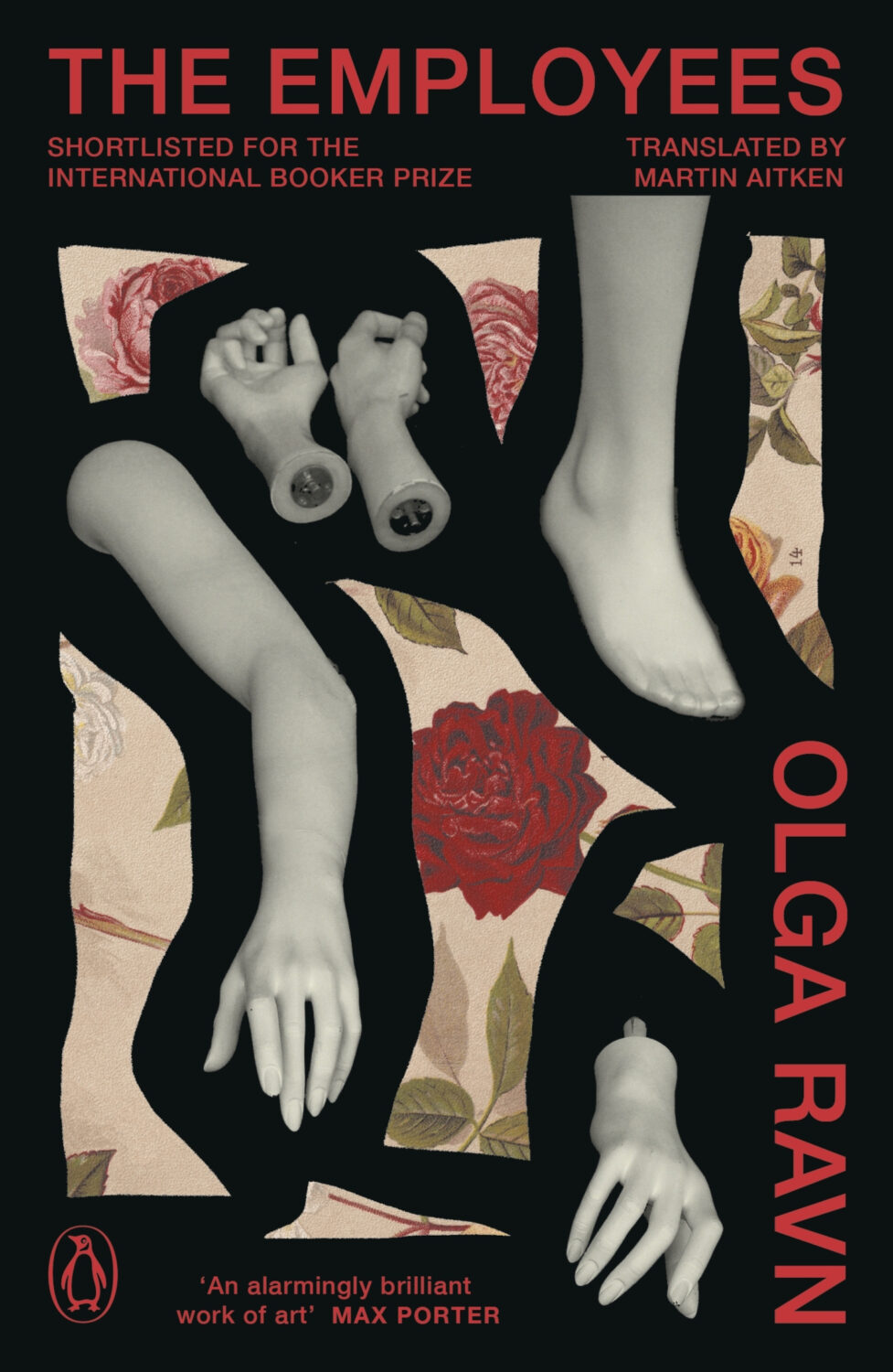
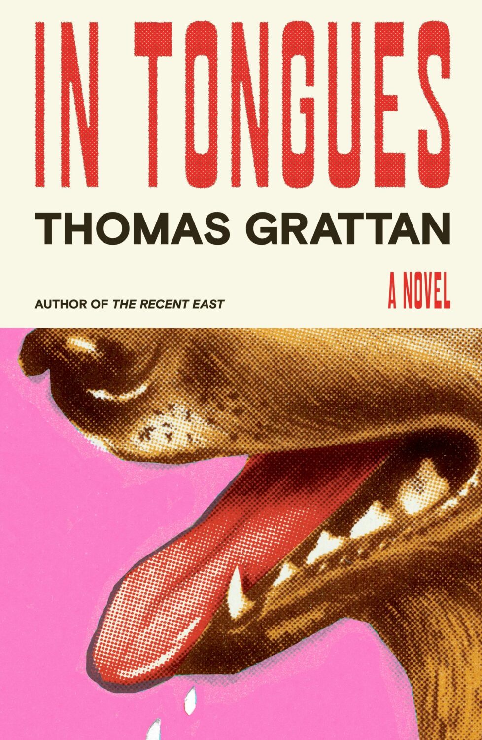
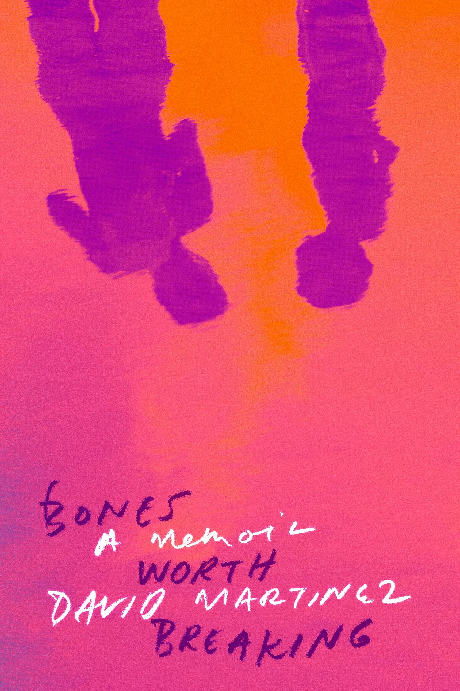
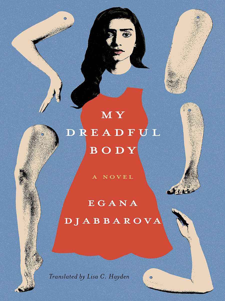
Dan Jackson also designed a new cover for the paperback edition of The Employees by Olga Ravn out next month in the UK from Penguin, which weirdly kind of looks like a Joan Wong collage, but could also be part of a dismembered / disembodied limbs on covers trend? I’m struggling to think of too many examples off the top of my head. Alban Fischer‘s cover design for My Dreadful Body by Egana Djabbarova? But that’s not out until next year. I’m sure there are a couple of others out there. I will have a think on it.
I am very late to this one, but the art is fun and it kind of fits with recent trends so I didn’t want to leave it out. Let me know if there is a design credit to add.
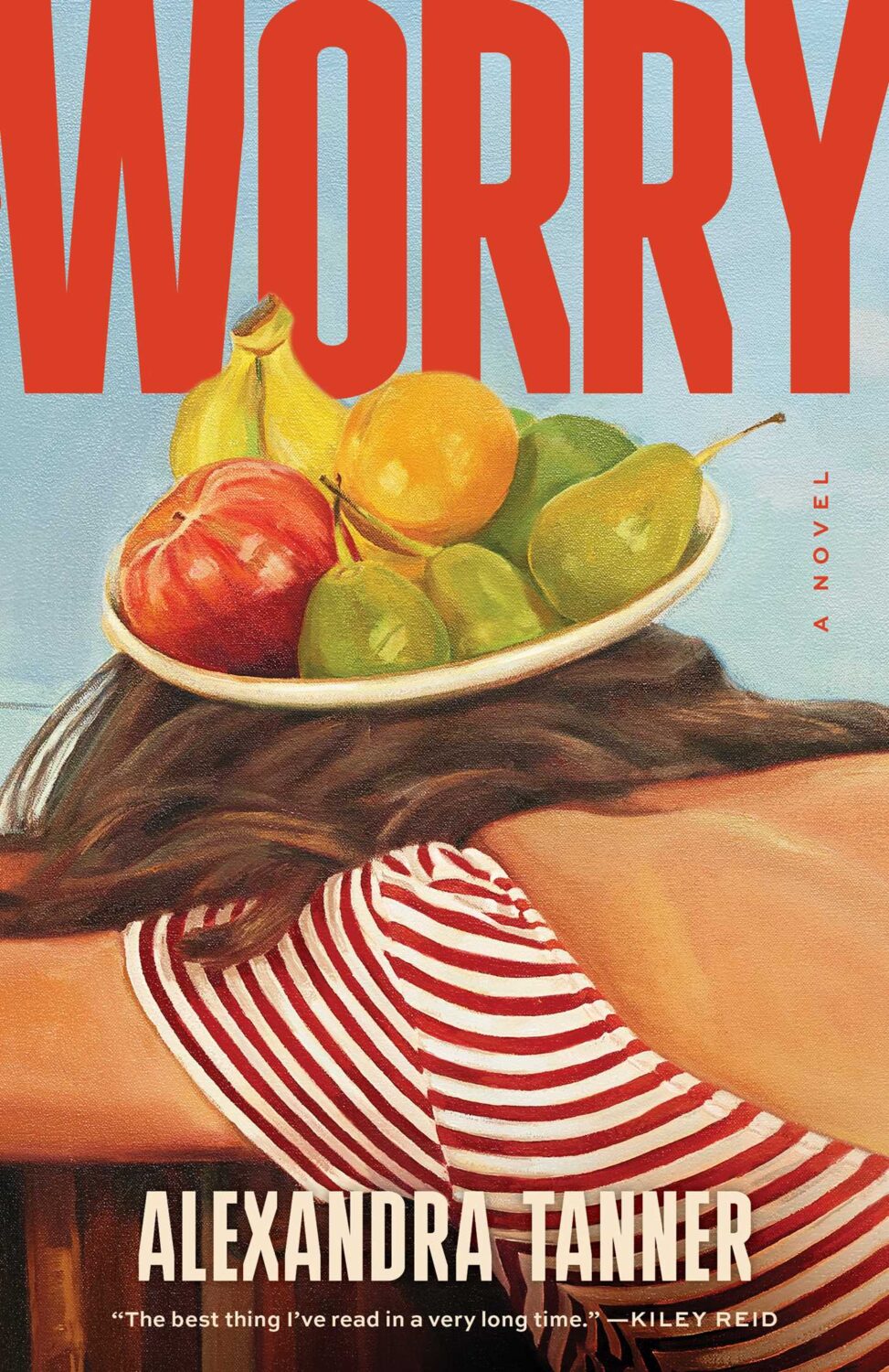
Interestingly, Shannon Cartier Lucy’s art was also used on the cover of Worry by Alexandra Tanner designed by Alicia Tatone for Scribner from last year…
Well, I don’t know about you, but I certainly didn’t miss the ceaseless chaos and constant anxiety. It is exhausting.
Anyway… I hope you’re keeping safe and well despite it all. I don’t know where March has gone, but this month’s post is another bumper edition with lots of great covers. I’m happy to have a bit more nonfiction in the mix, and there are lots of covers from indie publishers and even a university press along side the usual suspects. There are also a couple of Canadians if you’re keeping score.
Disposable by Sarah Jones; design by Keith Hayes; photograph by Susan Goldstein (Avid Reader / February 2025)
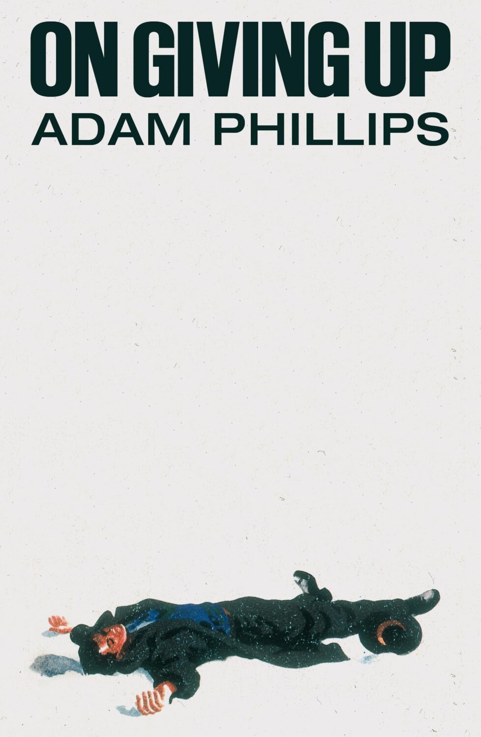
On Giving Up by Adam Phillips; design by Alex Merto (Farrar, Straus & Giroux / March 2024)
Yes, this is from March 2024, so I am precisely a year late posting it. Either I didn’t see it last year or I couldn’t find the credit at the time. Anyway, Alex posted or re-posted this cover relatively recently and it spoke to me.
I also thought it went quite well with this cover…
The slightly less bonkers, but also fun cover of the US edition (published by Scribner this month) was designed by Math Monahan. I’m also quite partial to the definitely bonkers Polish(?) cover designed by Tomasz Majewski.
Hey, I hope you’re safe and well. This month’s post is a big one so I’m pretty much going to let you get on with it, but before I do, I just wanted to mention that I’ve included a gallery of all this month’s covers as the bottom of the post so you can click through them all. This is in response to a reader email about the size of the covers on screen. I think the gallery looks nice, but I am worried that it’s going to play absolute havoc with the RSS / email so apologies in advance if that’s case. Anyway, enjoy this month’s covers, and let me know what you think.
It is the time of year for lists and I should’ve been done weeks ago, but I am late and already well behind the pack. Apologies for that.
I admire Matt Dorfman‘s ability to whittle his list down to a dozen covers for the New York Times. I imagine it takes him a lot less time for one thing, but I’m sure Matt still agonizes over every cover. It requires a level of discipline and restraint that I do not possess to keep it that tight year after year.
PRINT’s list of best book covers of 2024, compiled by editor-at-large Zachary Petit, is also long. It’s a 100 covers. Last year it was 50.
I’m not trying to throw stones here. We are all seeing more covers than we used to. There are more books for one thing. But they’re not just something we just experience in print in anymore. You don’t have to go into a bookstore or read the newspaper or magazine to see them. They’ve become something we see and share all the time online. Designers are promoting their own work and (slowly) getting more credit for it (although there is a lot more to be done in that area. Publishers — credit your designers!). My monthly round-ups are now one of several you can choose from.
And it is not like my list is short. This year it features work by 48 designers — more than half of them women — and 86 covers (plus a couple of supplementary images).
The consensus seems to be that it was a decent year for covers, and it’s hard to argue with other people’s selections even if I don’t love them all.
It is telling though that 100 of LitHub’s selections were individual picks. There are covers on my list that are not on the anyone else’s despite their length. So while I think we agree there were lots of good covers, I’m less certain we entirely agree on which ones were actually the outstanding ones.
A recent article Spine argued that there is a battle between minimalism and maximalism going on (you can find Spine’s end of year list here by the way). I think that could be true. Different approaches work for different audiences. But I also think it’s messier than that. I get the sense that publishers are less sure of what they want and what sells (certain genres notwithstanding).
It has been a rough year for a lot of publishers, so there is undoubtedly a lot of uncertainty, and no small amount of anxiety. I could go on about why that it is (and the publishing’s self-inflicted wounds) but, in short, what I think we’re also seeing with book covers is more meddling and less direction.
Anyway, I don’t want to end this on a bleak note. This year was shit enough. Despite it all, there genuinely were a lot of good covers in 2024, and some that I did think we’re outstanding. A couple of them made me laugh, which was no small thing. It was a strong year for several individual designers in particular and, despite the pressures, many produced work that was recognizably theirs. I thought there were more interesting covers coming out of the UK and Ireland (that mercifully wasn’t just about the inks or the finishes!), and there were some fun Canadian covers too.
Thanks, as always, for reading, and I hope you’re all keeping safe and well. Happy Holidays!
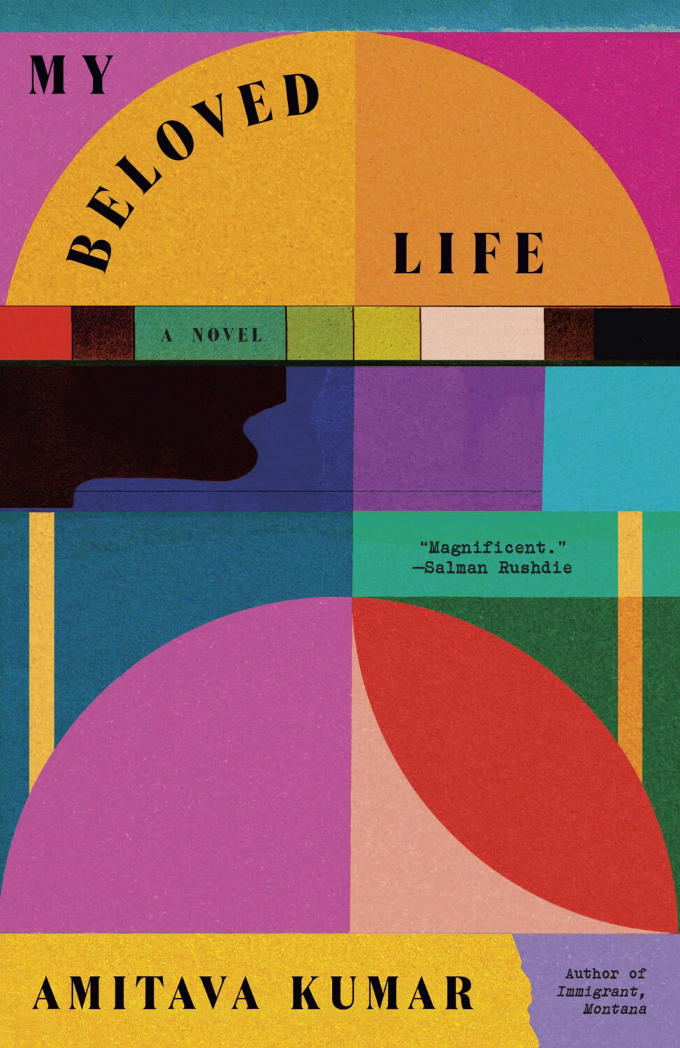
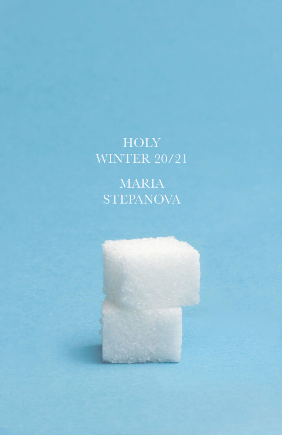
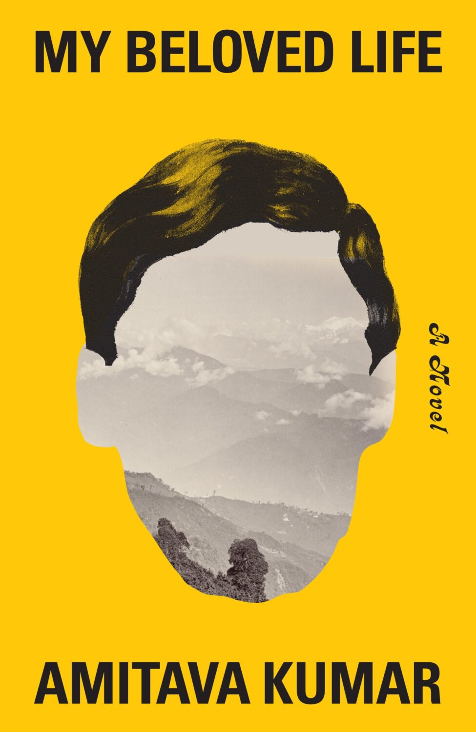
Holy Winter 20/21 by Maria Stepanova; design by Oliver Munday (New Directions / October 2024)My Beloved Life by Amitava Kumar; design by Oliver Munday (Knopf / February 2024)
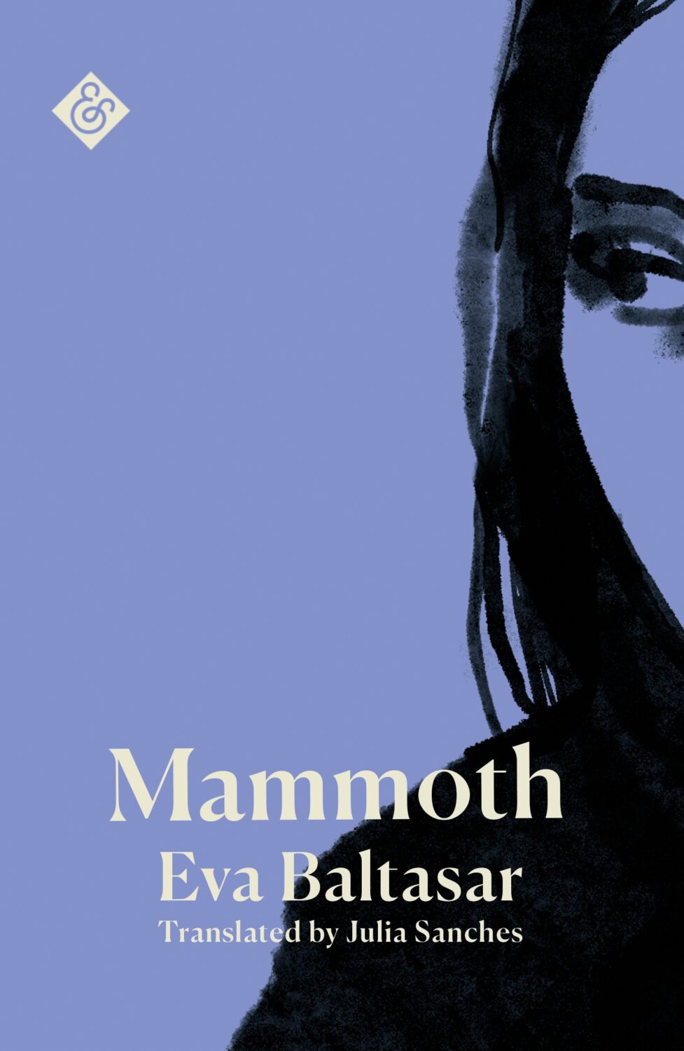
Mammoth by Eva Baltasar; design by Anna Morrison (And Other Stories / August 2025)
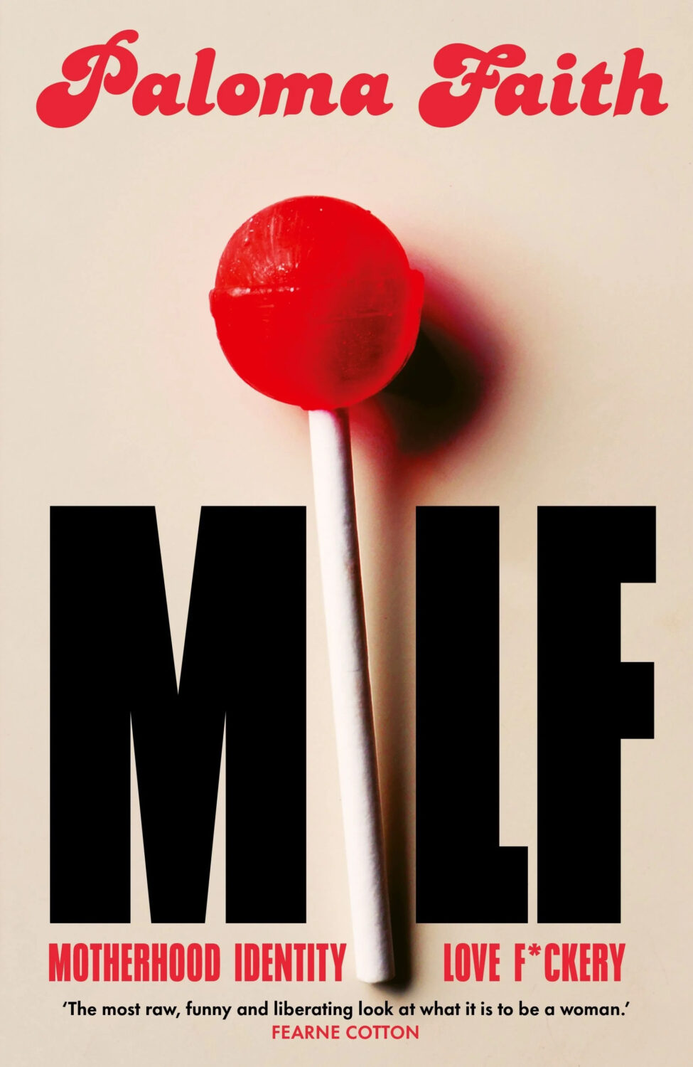
MILF by Paloma Faith; design by Jack Smyth (Ebury / June 2024)
Also designed by Jack Smith:
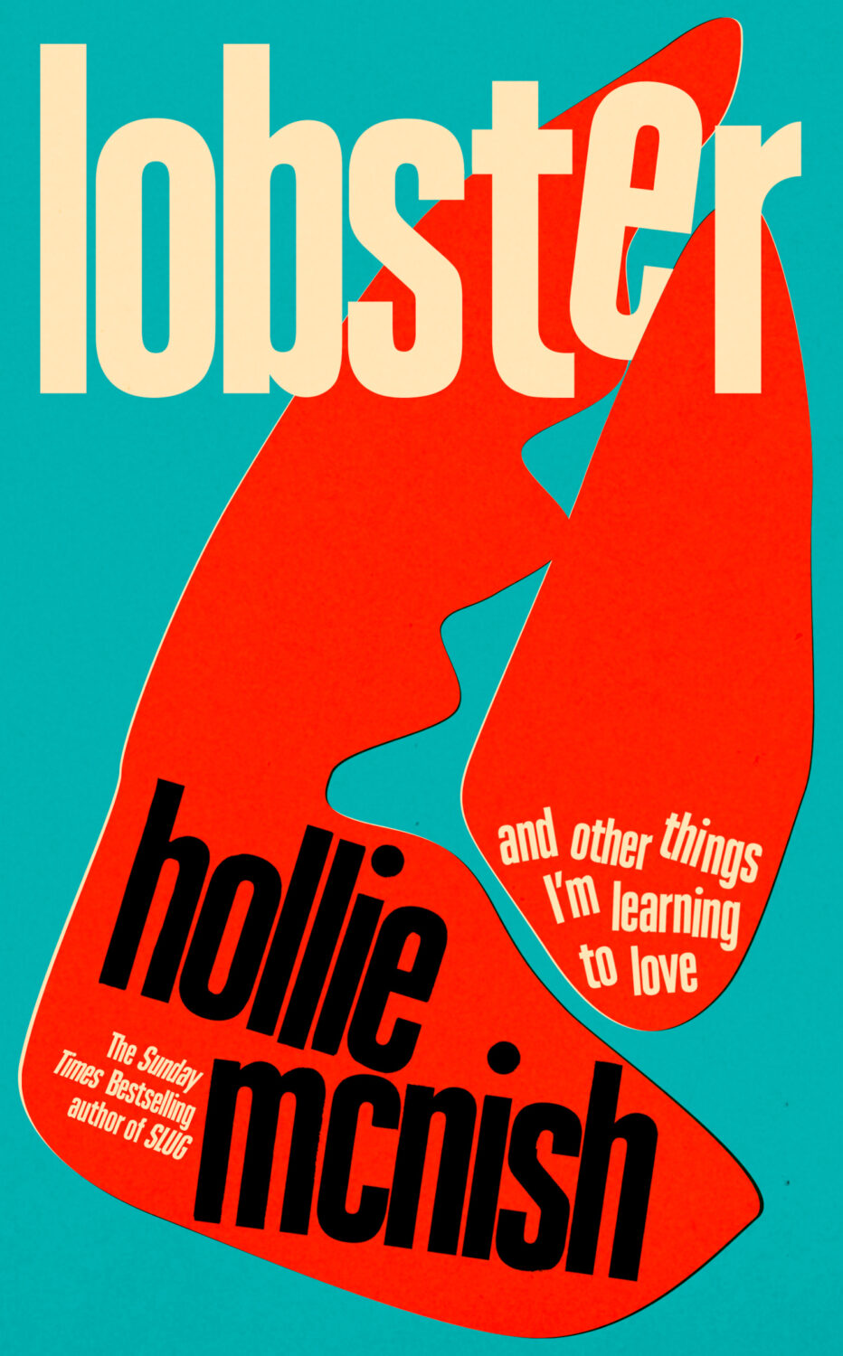
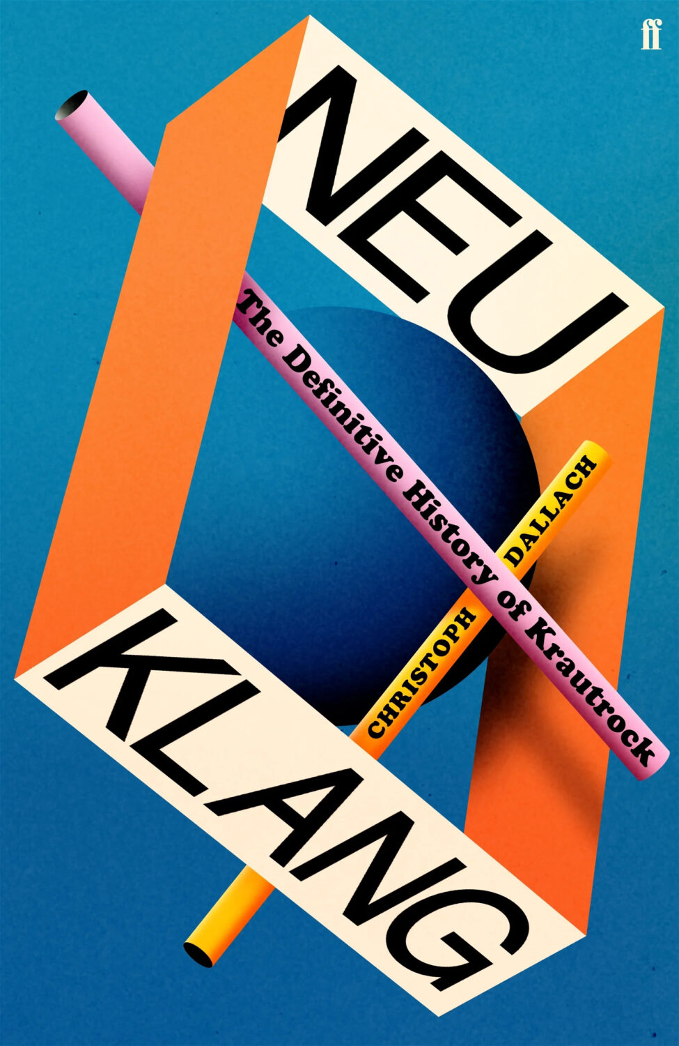
Lobster by Hollie McNish; design by Jack Smyth (Little, Brown / March 2024)Neu Klang by Christoph Dallach; design by Jack Smyth (Faber & Faber / May 2024)
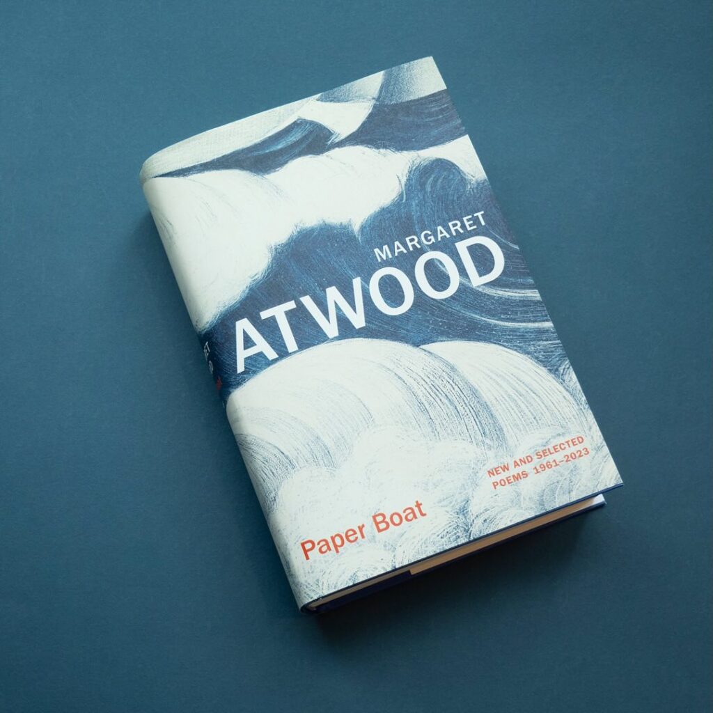
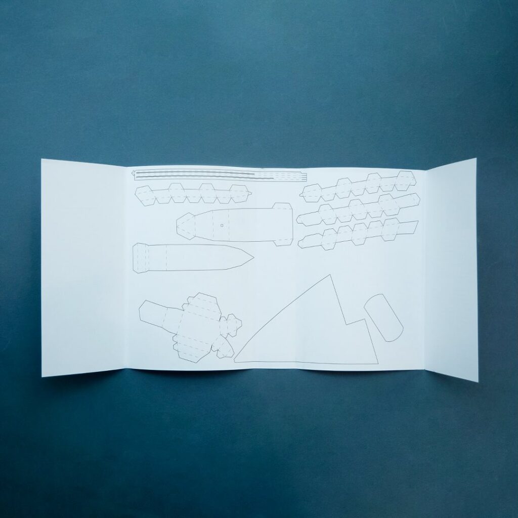
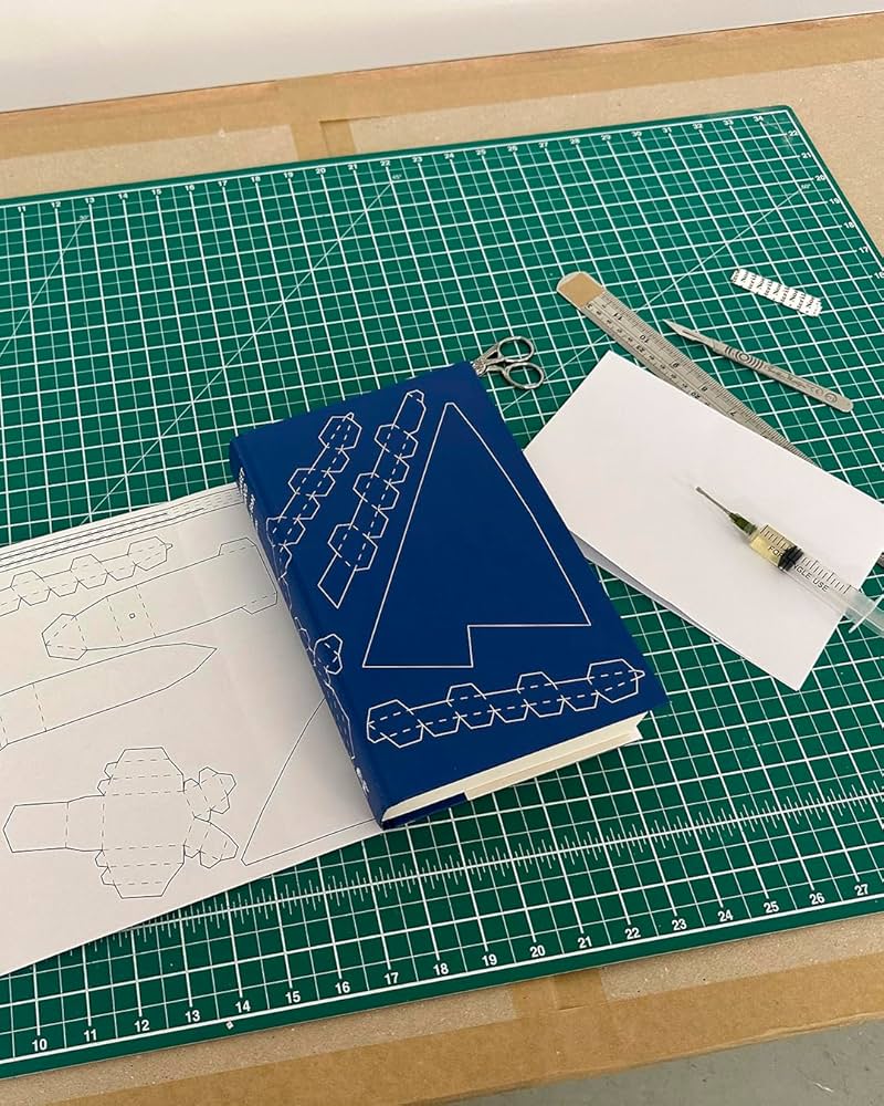
I also have to give a special shout out to the cover for Paper Boat by Margaret Atwood (Chatto & Windus / October 2024). Suzanne commissioned paper art by Nathan Ward to design a template for a paper boat that could be cut out from the dust jacket and stuck together.
Hey, I hope you’re safe and well. I’m a little bit ahead of schedule because fall sales conference season is upon us, and I have to be in New York for work next week. I’m less ahead than I would’ve liked — PRINT has already beaten me to the punch! — but here we are, a couple of days earlier than usual, with another look at some new and recent book covers. April is National Poetry Month in the US so there are a few poetry covers in the mix, as well as a couple of covers from independent presses, an Australian cover, and all the usual suspects.
The Formula by Joshua Robinson and Jonathan Clegg; design by Pete Garceau (Mariner Books / March 2024)
Two nonfiction sports books in one post! Does Formula One really count as a sport? Not for me, Clive. But the subtitle says it is, and a Canadian friend once told me that for something to qualify as a sport it has to endanger your life in some fundamental way, so I guess F1 qualifies under Quebec Rules for Teen Boys if nothing else.
Anyway, it might be fun to do a post of interesting sports books covers at some point if I can find the time (let me know if any great examples come to mind!).
I feel like this is a bit different for a psychological thriller? I like the type a lot.
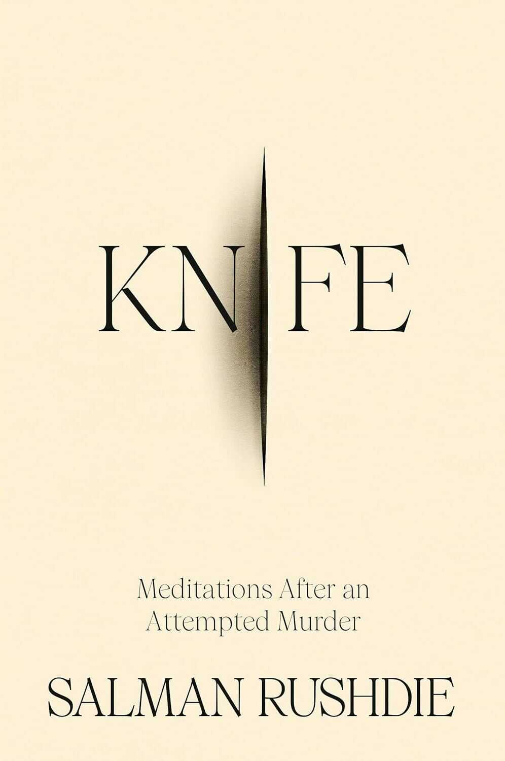
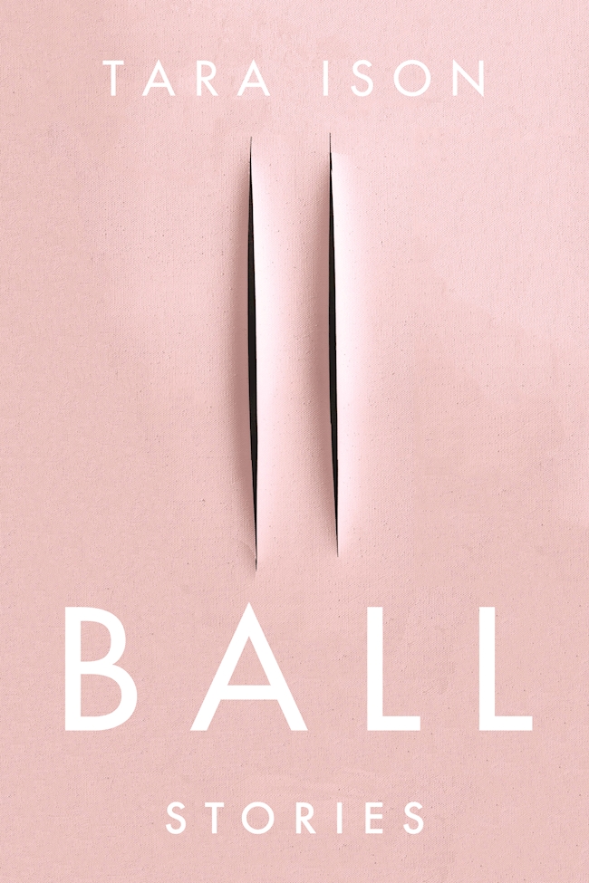
Knife by Salman Rushdie; design by Arsh Raziuddin (Random House / April 2024)
Interestingly, there is an “eye” motif on the spine with the Random House logo in the centre. Look for it next time you’re in a bookstore.
Also, this cover isn’t the first to riff, consciously or otherwise, on the cut canvases of Italian artist Lucio Fontana. The cover of Ball by Tara Ison, designed by Kelly Winton, comes to mind. I’m sure there are other examples (David Gee’s unpublished cover for Lolita. Are the more?).
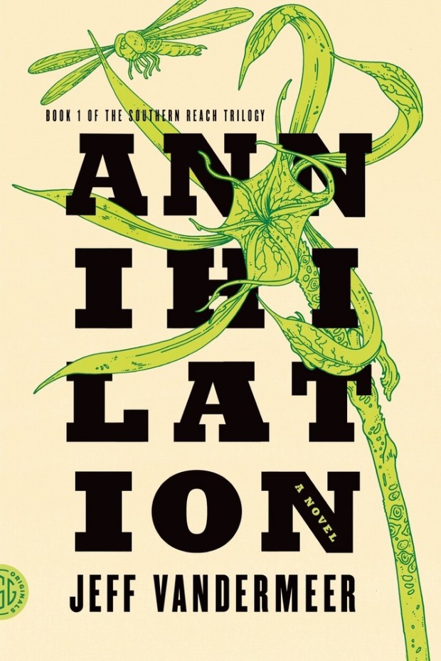
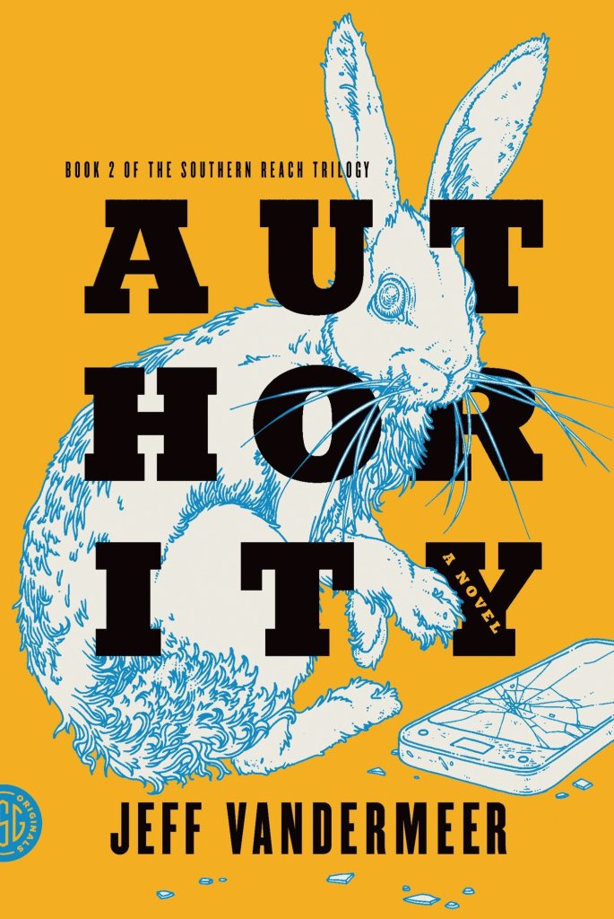
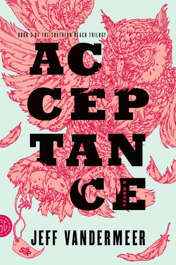
This reminded me of Eric’s illustrations for the covers of Jeff Vandermeer’s Southern Reach trilogy designed by Charlotte Strick.
Annihilation by Jeff VanderMeer (US); design by Charlotte Strick; Illustration by Eric Nyquist (FSG / 2014)Acceptance by Jeff VanderMeer (US); design by Charlotte Strick; Illustration by Eric Nyquist (FSG / 2014)
Earlier this year, a Canadian magazine asked me what the latest trends in book cover design were. I don’t think I had a very satisfactory answer. 2021 felt very much like a continuation of 2020, which itself felt like a year on hold.
The trends that came to mind were not exactly new. In no particular order: big faces (big sunglasses!); cropped faces; hands; mouths; postmodern typefaces;1 big skies; rainbows; gradients; the colour orange; psychedelia; collage; contemporary painting.
A lot was made of “blob” covers this year. I’m not sure that anything has really changed since Vulture published this article about “blocky” covers in 2019. They seemed like much the same thing.
Design is about the constraints and, as it turns out, the constraints around designing commercial literary fiction covers that have to work just as well online as in bookstores can lead to similar design solutions — large, legible type, and bright, abstract backgrounds. 2 The surprising thing is not that a few covers look the same when you squint; it’s that more of them don’t.
There were a lot of good covers (that didn’t look alike) in 2021. LitHub posted 101 of them. Still, it didn’t exactly feel like a vintage year.
Do I say that every December? Possibly.
A few years ago I worried that covers were moving in a more conservative direction, particularly at the big publishers. I’m not sure this has come to pass, at least not in the US. There are plenty of covers from the big, prestigious American literary imprints in this year’s list, as there were last year, and every year before that.
There are fewer covers from the UK in this year’s list than in previous years though, and I feel less confident about the situation there. From a distance, things seem a little sedate. I may be mistaken. It’s quite possible I haven’t see enough covers — or perhaps enough of the right ones — from British publishers to get a good sense of the overall picture.3
It would not be a surprise, however, if publishers were feeling a little risk-averse at the moment. We are two years into a global pandemic, experiencing a major supply chain issues, and living through a seemingly endless series of sociopolitical crises.
Nor would it be a surprise if designers were personally feeling the effects too — I’m not sure we are talking about this enough, and I’m not sure I know how to.
Thank you to everyone who has supported the blog in 2021. It means a lot. Here are this year’s book covers of note…
Na Kim talked to PRINT about her career and the designs for the Ditlevsen series in February. If, like me, you were wondering about typeface on the covers, it’s Prophet from Dinamo apparently.
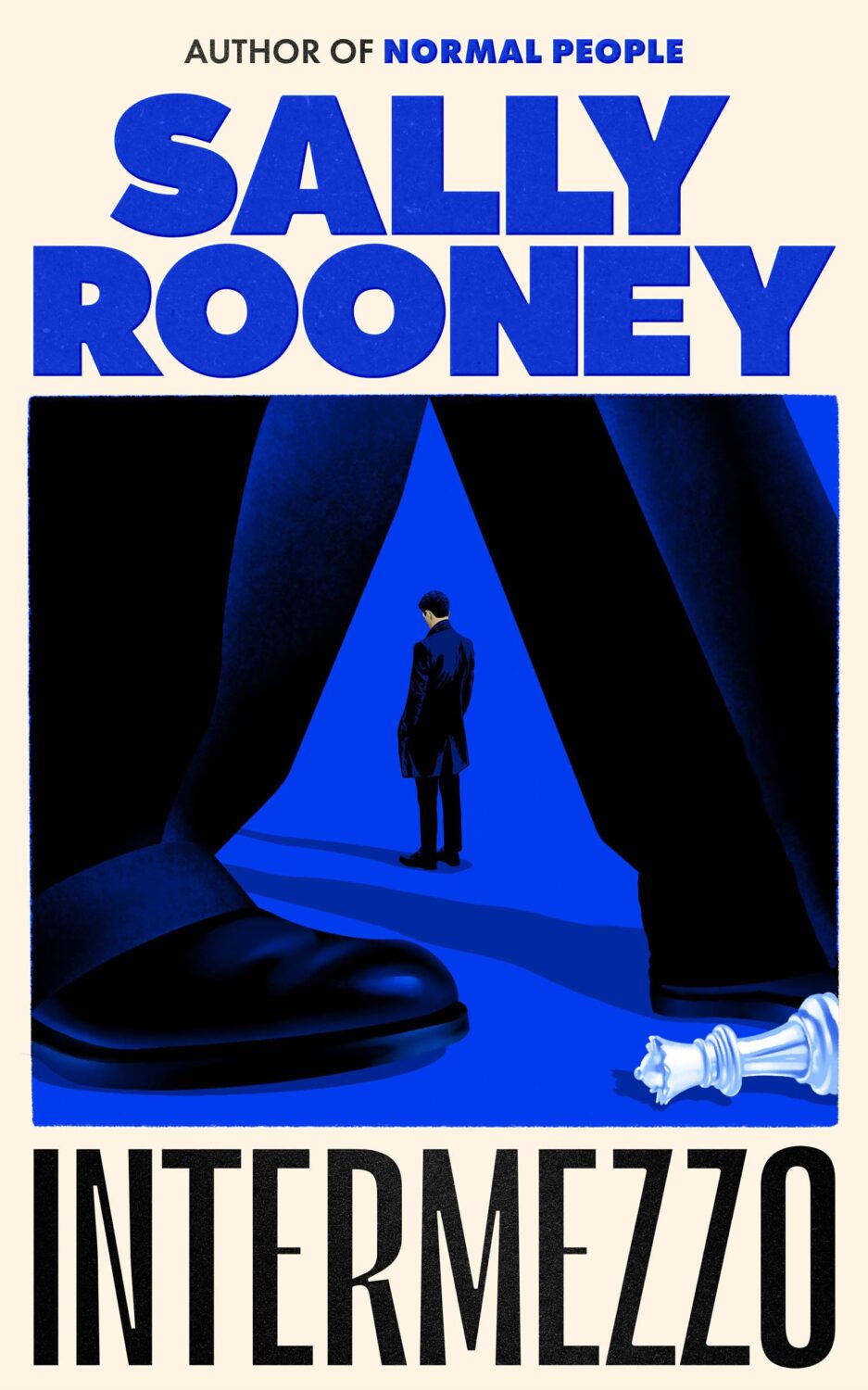
If you’re wondering about the Super-Seventies Sally Rooney typeface, it is Ronda designed by Herb Lubalin and Tom Carnese (I only know because I asked).
Thank you to everyone who has supported the blog in 2021. It means a lot.
I am not convinced that the term “postmodern” quite captures what I mean here (and/or worse, implies something different in the context of typography), but it’s the best I’ve got. I’m not talking about the kind of experimental typography you might associate with the likes of Wim Crouwel or Emigre, or the aesthetic of someone like David Carson. What I am trying to get at is idiosyncratic type that purposely exaggerates or plays with letterforms, and doesn’t conform to function-first modernism. To my mind, this would include some typefaces from the 1960s and 70s, as well as some more contemporary type. In a sense what I am describing is display faces — and I think the eclectic, innovative use of type in Victorian advertising might be an inspiration to designers here — but I don’t think it is just about size. ↩


